

It’s a helpful manual that puts into words the very essence of who we are as a brand. It’s the ultimate guide for everyone here who wears our Fruit badge with confidence. It helps us understand our brand better, sets a course that we can all follow, and makes sure we’re all speaking the same language.
This book not only defines who we are and what makes Fruit of the Loom special, it captures the spirit of what will continue to make us great tomorrow. That means this is kind of a big deal.


F EWER STILL THAT CONTINUE TO g ROW WITH EACH PASSIN g DAY.
W ITH EVERY SIN g LE STITCH SEWN OR INNOVATION LAUNCHED, WE ’ RE CREATIN g OUR BRAND STORY FOR TODAY AND TOMORROW.


We’re proud to be 160-years young. While other apparel brands were just starting to think about getting their stitches in order, we were already putting positivity on America, one stitch at a time. We’re one of the oldest apparel brands out there. We even had trademarks before it was cool. You could call us trademark hipsters. But really, we had our trademark before the Patent Office was even built. And we’ve stood the test of time.
We’re the longest lasting company of our kind. Now if that’s not something worth high-fiving someone over, then we don’t know what is.
It all started in 1851 with the Loom leader himself, Mr. Robert Knight. This guy had platefuls of can-do for breakfast. He made get-up-and-go an American trait, and most importantly, he never settled for anything less than stellar because putting confidence on America’s bottoms was his bottom line. That’s why even after 160 years, we’re still striving for ways to make our products better. Heck, we want them to be the best.

After seeing a painting by a friend’s young daughter, Knight decided to make it his trademark. People began asking for “cloth with the fruit on it,” and Fruit of the Loom became a world famous symbol of quality.


When the first transcontinental railroad arrived in 1879, we were there for the ride. Our union suit gave workers the comfort and confidence to do their jobs—helping to make America great.
In 1940, we invented the world’s first packaged underwear by understanding what people wanted: great quality, value and a lot of happiness, all bundled up.

We wanted to make sure every soldier knew we had their backside.
That’s why we made underwear for troops throughout World War II.
We’ve always stood firmly and proudly behind the things we make. That’s why we were the first brand to stamp unconditional guarantees on our products. Mr. Knight was proud.


American servicemen needed something to protect their skin from scratchy wool uniforms and to help shoulder the weight of their world. Our lightweight but durable white cotton t-shirts did both. When they started wearing their undershirts as outerwear, the t-shirt became a wardrobe staple for us all. The simple, close-fitting white tee became symbolic of easy confidence.
Here’s to you Brando, Newman and Dean.


A LO g O, OR THE ADS IT MAKES . A NY jOE WITH CASH CAN DO THOSE THIN g S . A BRAND IS SOMETHIN g MORE .
I T ’ S THE INHERENT IDEA AT THE VERY CORE OF A BUSINESS THAT MAKES IT A BRAND .
I T SAYS WHAT WE’RE ABOUT AND RALLIES LIKE - MINDED PEOPLE AROUND US, g IVIN g US CHAMPIONS TO OUR CAUSE .
WE’RE THE CAN - DO WEAR MA g ICIANS.

PEOPLE THINK WE MAKE BASICS, BUT THERE’S NOTHIN g BASIC ABOUT IT. WE MAKE
‘CAN - DO WEAR . ’ CLOTHES THAT g IVE YOU THE CONFIDENCE TO g RAB THE WORLD BY THE WAISTBAND. OVER 32,000 DESI g NERS, SEAMSTRESSES, AND INNOVATORS WAKE UP EVERY DAY TO CRAFT g OODS THAT g IVE PEOPLE THE ULTIMATE SUPERPOWER—TO BE THEMSELVES.

TO g ETHER, WE’VE BEEN PIONEERIN g CAN - DO WEAR FOR 160 YEARS. OUR PRODUCTS AND OUR ATTITUDE ARE ABOUT ROLL- UP -YOURSLEEVES - AND - TAKE - ON - THE - WORLD DOIN g . FROM SMALL TWEAKS TO BACK - TO - THE DRAWIN g - BOARD REINVENTIONS, WE NEVER STOP INNOVATIN g TO MAKE SURE WE ARE RAISIN g THE BAR OF WHAT’S POSSIBLE.


WE KNOW THE QUALITY OUR CUSTOMERS DESERVE, AND WE COMBINE IT WITH WELLDESI g NED PIECES THAT ALWAYS LOOK g OOD AND FEEL COMFORTABLE. IT’S APPAREL THAT MAKES THEM FEEL LIKE ANYTHIN g IS POSSIBLE. WE CALL IT CAN - DO WEAR.


WE HAVE E x CEPTIONAL SKILL AT PRODUCIN g
SURPRISIN g VALUE — THE PERFECT BLEND OF g REAT QUALITY, ICONIC DESI g N AND A g RIN - WORTHY PRICE. ALL THIS MAKES US
UNMISTAKABLY FRUIT OF THE LOOM. g ETTIN g
IT RI g HT TRULY SEEMS LIKE MA g IC. WE ARE THE CAN - DO WEAR MA g ICIANS.


Our products are for everyone who believes the first thing they put on affects their entire day. We know the surprising value that our customers deserve, and we have a proven formula to deliver it to them—high quality, well-designed apparel at an eye-widening, surprisingly good price.
Our products are consistently perceived as high quality. Because they are. We achieve this by looking at all facets of quality—from the technical make of the material and the finishing touches, to the comfort in terms of fit and feel and everything in between.
We create can-do wear: well-designed, colorful pieces that always look good and feel comfortable. No restrictions, no limits. They are pieces that can be worn every day, and that make customers feel like anything and everything is achievable. Our fits are designed to feel like a natural part of you, to always stay true. And the best part? We promise a fit that does n’t quit.
Iconic design and good quality is accompanied by a price that is surprisingly low. A price that is almost too good to be true. It’s a win-win.
What makes us truly awesome? Our values. They’re woven into the very fabric of Fruit of the Loom. These threads are our DNA. DNA you can see in our halls, in our people, and in our product. No microscope necessary.

Our relentless pursuit of better isn’t just for a select few. We make our innovations accessible to all. Our continuous people-centric, price-centric innovations are both evolutionary (upgrades) and revolutionary (overhauls).
And we’re never satisfied until we get it right.
True to our pioneering nature, we’re constantly looking to deliver the fit our customers want and need, and the colors they like, at a price they love.
We have a positive outlook on life. A job well done makes our customers feel good. Which makes us feel good. And we can’t wait to do it all over again tomorrow. This built-in positivity is what gets us out of bed in the morning, smiling, as we put on confidence and optimism.

Every choice we make starts with conviction. We’re an iconic brand and we act like one. We know what’s good and what doesn’t make the cut.
Sometimes we take risks, and if they don’t pay off, we learn. And we move on. We’re always moving toward tomorrow with a bright optimism that doesn’t shrink or fade.

We aren’t just a logo on a package. We’re a brand that feels more like an old friend—fun and lovable. Our personality makes our customers wish they could give us a high-five, because we’re the brand that always has their backside.


We’ve always been honest. Meaning, we always keep it real. What you see is what you get. We’re grounded, genuine, and down to earth. We’re confident and comfortable in our own skin.
We’re for the every guy, gal, boy and girl. Inclusivity and openness are at our core. We’re the brand-next-door—likeable, honest, hard-working, never pretentious. You’ll never find our noses in the air.


When you say our name, people can’t help but smile. We’re a warm, colorful, fun brand with a light-hearted spirit. We have a natural charm and spark. You won’t find us getting ourselves in a bunch.


WE ARE A BRAND FOR EVERYONE, NOT ONLY FOR THE PRICE - CONSCIOUS.
WE DELIVER SURPRISIN g VALUE , NOT ALWAYS THE LOWEST PRICE .
W E ARE CONFIDENT, NOT ARRO g ANT. WE ARE PLAYFUL AND OPTIMISTIC , NEVER NA ï VE .
W E ARE ICONIC WITH A RICH HERITA g E , NOT OLD - FASHIONED AND PASS É.
WE ARE ABOUT g OOD DESI g N, NOT ABOUT OVERCOMPLICATED FASHION.
g N, QUALITY AND PRICE WORK AS ONE COMBINATION, NOT j UST AS INDIVIDUAL COMPONENTS.
WE FOCUS ON THE OVERALL QUALITY OF OUR PRODUCTS, NOT j UST THE TECHNICAL FEATURES.

We make can-do wear for the ‘Everyman.’ The good, down-to-earth guys and gals next door. The honest, hard-working folks who believe that you choose to be happy and that life is what you make of it. They’re comfortable in their own skin and confident in who they are. Just like us. It’s those same traits that make our connection to our consumers strong. We’d like to think we’re cut from the same cloth.
These are warm, genuine, upbeat people with strong convictions who truly understand the meaning of value in life. They see that every waistband has a silver lining, but still keep both feet on the ground.


IT’S WITH OUR UNBRIDLED POSITIVITY, RELENTLESS INNOVATION AND DESIRE TO TRULY MAKE FRUIT OF THE LOOM g REAT THAT WE CHAR g E ONWARD, MEETIN g EVERY CHALLEN g E WITH OPTIMISM, HARD WORK AND HONESTY. THIS BOOK WILL BE YOUR g UIDE. REFER TO IT OFTEN AS A REMINDER OF WHO WE ARE AND AN INSPIRATION FOR WHO YOU’LL MAKE US TOMORROW.
OUR BRAND IDEA
WE’RE THE CAN - DO WEAR MA g ICIANS.
OF COPY, WE HAVE THIS.
OUR BRAND PROMISE
HI g H QUALITY + ICONIC DESI g N
+ LOW PRICE
= SURPRISIN g VALUE
OUR BRAND VALUES
• PERPETUAL IMPROVEMENT
• POSITIVITY
• ACTIN g WITH CONVICTION
WE MAKE PEOPLE FEEL g OOD, EVEN A LITTLE HAPPIER, EVERY DAY.
It’s our proven formula: high quality, well-designed apparel at a surprisingly good price. We constantly strive to improve—and perfectly blend—these three ingredients. We call that perfect blend surprising value.
We know the quality our customers deserve, and we combine it with well-designed pieces that always look good and feel comfortable. It’s apparel that makes them feel like anything is possible. No restrictions. No limits. We call it can-do wear.
We act with conviction. We’re an iconic brand and we behave like one. We set trends. We know what’s good and what doesn’t quite cut it. Sometimes we take risks, and if they don’t pay off, we learn and move on.
We believe in positivity. A job well done makes our customers feel good. Which makes us feel good. So much so that we can’t wait to do it all again tomorrow. This positive drive is what gets us out of bed in the morning.
We’re confident, which helps us make the right decisions. That’s why we’ve been able to create firsts since 1851—it’s in our DNA. We’re of the people, for the people, a truly inclusive brand for everyone. Because our spirit, just like our products, is warm and down-to-earth.
We’re playful, we do business with a twinkle in our eyes. We never take ourselves too seriously.
OUR BRAND PERSONALITY
• CONFIDENT
• OF THE PEOPLE, FOR THE PEOPLE
• PLAYFUL
All this makes us unmistakably Fruit of the Loom. Getting it right truly seems like magic. We are the can-do wear magicians.
F L G Q R O H R U O I S I M J T T A K U O B L V F C M W T D N X H E O Y E F P Z

W E ’ RE F RUIT OF THE L OOM . W E ’ RE ALL IN WHO THEY ARE . W E ’ RE NOT ABOUT BEEN ONE TO BREAK OUT THE AIRBRUSH . B EING REAL . T AKING RISKS . T AKING WHO ARE HAPPY WITH WHO THEY ARE SERIOUSLY. T HAT ’ S WHY OUR COLORS , THE FUN , BRIGHT PERSONALITY THAT ’ S ABOUT MAKING PEOPLE FEEL CONFIDENT FABRICATED APPEARANCES . W E’ VE NEVER W E THINK AUTHENTICITY IS MORE FUN . LEAPS . WE SAY “ HIGH - FIVE ” TO THOSE AND NEVER EVER TAKE THEMSELVES TOO FONTS AND OVERALL DESIGN REFLECTS UNIQUELY F RUIT OF THE L OOM .
The Fruit of the Loom primary logo contains three components: the fruit cluster, (no bananas or kumquats, please), the word mark and the registered trademark symbol. This logo should be used in all instances when the background is either light or neutral.
To maximize the power and simplicity of the Fruit of the Loom logo, no type, design elements, fun subliminal messages or objects should come within the established safety zones. As a rule of thumb, the width of the word “FRUIT” from the logotype establishes the amount of safety zone that must be applied around the logo. The only exception is approved taglines.
If the preferred 4-color version is not possible because of color limitations, the logos on the next page are recommended for maximum legibility. The situations when these have to be used will be rare. Not Bigfoot sighting rare, but still pretty rare. The white logo on gray shown on the right is only a representation of a dark-colored background. It is not being suggested to use a gray box behind the white logo.
There are different versions of the Fruit of the Loom logo for a reason: legibility.
Sometimes it reads best with black type, sometimes with white. Deciding which one to use requires good judgment. Choose wisely.

Use the full color logo with white type on photos.
Use the full color logo with black type on light backgrounds.
Use the full color logo with white type on dark backgrounds.
Use the full color logo with black type on white backgrounds.

The power of a corporate identity is strengthened by using it correctly on a consistent basis. This is particularly true for the logo. Here are some clear examples of what not to do. Ever.
Do not add drop shadows to the logo
Do not squeeze, stretch or rotate the logo
Do not add Photoshop tricks to the logo

Do not put the logo on busy backgrounds
Do not change the typeface
Do not add a hungry chipmunk to the logo
Fruit of the Loom is known for its color choices. To convey that notion, we use splashes of color in our communications. We’re not talking Jackson Pollock splashes, here. Our logo serves as our color source. These are the primary colors for Fruit of the Loom. In our advertisements, our type is colorful, but our backgrounds and design are clean and white.
S O HERE ’ S THE THING ABOUT W ELL , EXCEPT FOR OUR LOGO
IS ALL ABOUT HAPPINESS . COLORFUL , THE WAISTBAND HAPPINESS . BLACK NO OFFENSE . S O , UNTIL A LEOPARD BECOMES HAPPY - INDUCING , WE ’ LL BLACK , I T SHOULDN’ T BE USED . P ERIOD . OR P REMIUM PACKAGING . O UR BRAND ALL- CONSUMING , GRAB THE WORLD BY ISN ’ T SO GOOD AT EXPRESSING THAT, CAN CHANGE ITS SPOTS AND BLACK STICK TO COLORS . THANKS .
Alright, we said no black, but it is allowable when used to denote “premium” on packaging. Pretty simple, right?
COLOR BACKGROUNDS 101: OUR BRAND ON WHITE BACKGROUNDS. IN CASES OF CONTENT, COLOR ED BACKGROUNDS PRIORITIZE INFORMATION. BOOKS AND COLOR ED BACKGROUNDS TO VISUALLY COMMUNICATIONS USE COLORED TYPE WHERE THERE’S A SIGNIFICANT AMOUNT CAN BE USED TO HELP SEPARATE AND BROCHURES, FOR EXAMPLE, CAN ADOPT BREAK THINGS UP. LIKE THIS PAGE HERE.
When color backgrounds are being used to break up monotony or large chunks of information, there are a few color combinations that work well. Here are a few that maximize contrast, readability and optimism.
D ON’ T GET YOURSELF IN A BUNCH.
D ON’ T GET YOURSELF IN A BUNCH.
D ON’ T GET YOURSELF IN A BUNCH.
D ON’ T GET YOURSELF IN A BUNCH.
D ON’ T GET YOURSELF IN A BUNCH.
D ON’ T GET YOURSELF IN A BUNCH.
D ON’ T GET YOURSELF IN A BUNCH.
D ON’ T GET YOURSELF IN A BUNCH.
D ON’ T GET YOURSELF IN A BUNCH.
D ON’ T GET YOURSELF IN A BUNCH.
D ON’ T GET YOURSELF IN A BUNCH.
D ON’ T GET YOURSELF IN A BUNCH.
D ON’ T GET YOURSELF IN A BUNCH.
D ON’ T GET YOURSELF IN A BUNCH.
FEEL OVERJOYED IN YOUR UNDERWEAR.
The power of a corporate identity is strengthened by using it correctly on a consistent basis. This is especially true for our colors. We’re bright, but not manically color happy. That’s why we try not to use black, and also discourage low-contrast combinations and Christmas themes, unless it’s specifically for a holiday layout. Here are some color combinations that are not recommended. In some cases where the asset is small, don’t use white type on yellow.
S OFT AS OLD F ITS LIKE NEW.
S OFT AS OLD F ITS LIKE NEW.
Do not use red and purple next to each other.
Do not use light green on yellow.
Do not set each word in different colors.
S OFT AS OLD F ITS LIKE NEW.
S OFT AS OLD F ITS LIKE NEW.
S OFT AS OLD F ITS LIKE NEW.
Do not use black and 2-color sequencing.
Do not use red and green next to each other.
Do not use purple on red.
Fruit of the Loom uses the Futura Std Bold typeface to support the brand persona. It’s a utilitarian typeface that can convey different emotions ranging from optimism to confidence and everything in between. It has a simplicity that helps our brand happily stand out in a sea of sameness. Futura Std Bold is recommended for headlines. Never, ever, ever use Avant Garde or Comic Sans. Thank you.
abcdefghijklmnopqrstuvwxyz!@#$%&
We use the Futura Std Medium typeface for subheads, body copy and call to actions. It’s an easy-to-read font that has a fun simplicity that supports our brand personality.
abcdefghijklmnopqrstuvwxyz!@#$%&
Headlines in all communications should follow the guidelines below for typeface and tracking. The information hierarchy consists of a headline and body copy. All the type in the headline must be the same size.
Headlines should end with a period. Period.
Treat headlines in Futura Std Bold. Tracking should be set at 80. Headlines are flush left, rarely right in specific cases of photography, but never centered.
Set body copy in Futura Std Medium. Tracking should be set at 60. It should be flush to match the headline. We never center the type. That’s bad.
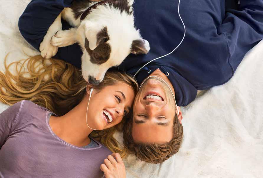
Fruit of the Loom’s super-soft hoodies are made with 10% more cotton and 100% more yippee. And not to mention the first ever tech pocket for your phone or mp3 player. This unique pocket is specially tucked inside, keeping you from scratching the screen or the dreaded “I just dropped my phone” moment. Pull on a pick-me-up, just in time for fall.
To bring vibrant energy to our work, we use color in our layouts. To maintain readability, the rule is to have no more than three colors in one layout, including the lockup and button. Subheads and sub-copy are always in gray. To add emphasis to a word, put it in a different color. On the next page are more examples of best practices.
The body copy should be set in gray as well. In digital formats, use a darker gray if needed, keeping legibility in mind. Do not use gray for headlines because it would make things look a little drab. Plus, it could be mistaken as part of the body copy. That’s no good. The use of gray for headlines should be avoided even if used in conjunction with other colors. We want the headlines to be happy. And the body copy to be simple, and easy to read.
TOUGH, WITH A SOFT SIDE.
The power of a corporate identity is strengthened by using it correctly on a consistent basis. This is particularly true for the way we treat the type. Here are some clear examples of what not to do.
Do not make one word larger than the rest.
GRAB
FROM THE TOP DRAWER TO THE TOP OF THE CLASS.
Do not center the type.
Do not tighten the kerning, tracking or leading.
. SOFT AS OLD, FITS LIKE NEW. SOFT AS OLD, FITS LIKE NEW.
Do not force justify the type.
Do not mix Cool Gray 9 with another color. Do not mix typefaces.

ALWAYS, ALWAYS USE WHITE.
To use white type over an image, it’s important to make sure that the copy is easy to read. Making it hard to read is the opposite of what we want. Make sure that the image area isn’t overly busy. In cases where there are lots of light areas where copy can get hard to read, adding a subtle gradient to slightly darken the background (based off the tones found in the image) across the image is suggested to enhance legibility. The areas where the gradient is not necessarily needed can be masked out in Photoshop.

A NOTE
USING TYPE
PHOTOGRAP H Y: ALWAYS, ALWAYS USE WHITE TYPE.

A NOTE ABOUT USING TYPE ON PHOTOGRAP H Y: ALWAYS, ALWAYS USE WHITE TYPE.
To maintain the light, fresh and contemporary vibe associated with Fruit of the Loom, there are a couple of things that are discouraged. Like dark glows, drop shadows, or any other Photoshop effects that hurt the eyes.
NEVER, EVER
NEVER, EVER
We use stitching in our layouts to create a subtle visual interest and nod to our craftsmanship. The rule on using stitching, when appropriate, is to use them vertically or horizontally, one row for layouts with photography and two rows for layouts without photography.
WORN - IN BEFORE YOU’LL EVER WEAR IT OUT.


Some stitches are just too big for their britches. And our layouts. We suggest scaling them so there are four stitches per headline type height. Not too big, not too small. The idea is to have the stitches as a visual detail, not the protagonist.
These supporting graphic elements are used to complement typography and photography—adding visual interest to the layout, while aiding in the construction of a clearly defined information hierarchy. To clarify, they make the layout clearer. Here are the recommended color options. While these graphics are great, if we do say so ourselves, they should be used sparingly.

O UR PHOTOS ARE SLICES OF EVERYDAY LIFE .

T HEY ’ RE SHOT “ DOCUMENTARY STYLE ,” AS IF WE ’ RE
SECRET SPECTATORS VIEWING PRIVATE LIFE .
W E CELEBRATE PEOPLE ’ S UNIQUENESS AND RICHNESS
ON THEIR OWN TERMS . O UR MODELS AREN ’ T IN
SITUATIONS THAT FEEL FORCED OR UNREALISTIC .
O UR SHOTS DON ’ T LOOK STAGED . O UR MODELS ’
EMOTIONS FEEL REAL , AUTHENTIC AND NEVER OVER - ACTED OR DIRECTED BY SOMEONE BEHIND THE CAMERA . T HEIR BODY LANGUAGE EXUDES HAPPINESS , CONFIDENCE AND HAS TONS OF MOVEMENT.


O UR CASTING IS RICH IN DIVERSITY, ETHNICITY
AND SHAPES . O UR MODELS LOOK FIT, HEALTHY
AND ATHLETIC , BUT NOT OVERLY “ RIPPED .”
W E CAST FAMILIES , TEENAGERS , MILLENNIALS , AND PARENTS HAVING FUN , NATURALLY.


When showcasing product photography, it’s key to showcase product quality through natural placement. Our product should look real and not overly retouched. The folds and creases add depth and help our garments stand out against the background. Especially in the instance of white-on-white. Because if the people can’t see the underwear, they can’t see the awesome.


We’re honest, confident and filled with positivity. You have to be when your first priority is the first thing people put on in the morning. We’re playful and optimistic, but we also keep it real. Our tone should always reflect that—no matter if it’s a simple post or a manifesto, we use a voice that always brings a smile.
BEGIN EVERY DAY HAPPY WITH A SUPER- SOFT HOODIE. MAKE YOUR GADGETS FEEL GIDDY TOO. DON’T GET YOURSELF IN A BUNCH.
H
ARE SOME EXAMPLES OF HOW ALL THE ELEMENTS
WORK TOGETHER . T HE HEADLINES ARE SHORT, BIG AND GRAPHIC . O THERWISE THEY JUST MIGHT BECOME
A TRAFFIC LIABILITY, AND THAT ’S NO GOOD.
H ERE ’S HOW IT WORKS WITH THE S TART H APPY TM CAMPAIGN . T HESE LOCKUPS CAN BE SET WITH OR WITHOUT PHOTOGRAPHY.


OF COPY, WE HAVE THIS.
WE DON’T USE BLACK IN OUR MARKETING .
in
collections. ALWAYS USE WHITE TYPE OVER IMAGES. OUR TONE IS ALWAYS LIKE A CONVERSATION WITH AN OLD FRIEND: FAMILIAR, HONEST, PLAYFUL & REAL.
