INVESTIGATING THE PERCEPTION, USAGE AND STIGMA OF UNIVERSITY
MENTAL HEALTH SERVICES AT EDINBURGH NAPIER UNIVERSITY
DESIGN SOLUTION PROPOSAL
Design Thinking and Doing
3rd Year Digital Media and Interaction Design
Edinburgh Napier University
1
Jasmine Millington
01
PERCEPTION, USAGE AND STIGMA OF MENTAL HEALTH SERVICES AT EDINBURGH NAPIER UNIVERSITY
DESIGN SOLUTION PROPOSAL - TABLE OF CONTENTS
SOLUTION STRUCTURE
Solution Definition
Stakeholder Feedback
Presentation Format 3
BRANDING AND STYLING
Branding Guidelines
Moodboards and Environment Styling Guidelines 4-5
PART 1: EXTERIOR
Commentary, Supporting Context
Stakeholder Feedback
Concept Image with Annotations 6-7
PART 2: INTERIOR GROUND FLOOR
Commentary, Supporting Context
Stakeholder Feedback
Concept Image with Annotations 8-9
PART 3: INTERIOR UPPER FLOOR
Commentary, Supporting Context
Stakeholder Feedback
Concept Image with Annotations 10-11
PROCESS AND EVALUATION
Concept Art Process
Feedback Details 12-13
FURTHER RECOMMENDED DEVELOPMENTS
Key Points from Stakeholder Feedback 14
SOLUTION DEFINITION
The design solution is defined as "an initial proposal or concept of a campus building dedicated to the Mental Health Services and general student community, to be located on Edinburgh Napier University's Merchiston Campus".
The design solution proposal is comprised of three concept images one exterior concept and two interior concepts and this accompanying proposal booklet. The building's proposed name is the "Cesso Building", or simply the "Cesso".
SOLUTION STRUCTURE
STAKEHOLDER FEEDBACK
Stakeholders, defined as two parties of "current students" and "ENU or MHS staff", were given these concept images and a small amount of context for feedback in a survey.
This feedback forms part of the recommended further developments and justifications for design decisions featured in these images.
PRESENTATION FORMAT
Each image has dedicated spread explaining its key functionality as part of the design solution, important design features and the context of the characters within each image.
Three characters feature to contextualise the spaces: MHS staff persona "Peter", student persona "Mia" and student persona "Michael".
Full overviews of branding and styling guidelines, accessibility requirements, stakeholder feedback, and recommended further developments each have their own separate spread within this booklet.
CONTENTS
The Design Solution Concept Images
BRANDING GUIDELINES
Edinburgh Napier University is known as one of the best modern universities in Scotland, and that is one of the key attributes of the branding identity.
Clean, strong lines with simple staple colours are the general form for advertising material. The logo theming follows this pattern in a simple angled triangle that is often only edited in small details to allow for easy recognition while having differentiation between cluster entities, such ENSA and other ENU affiliated groups.
Bold red is the standard, main colour for any branding marks, but this colour does not support the general peaceful intent of the intended Cesso building, so efforts must be made to integrate the triangle motif in place of the more eye-catching bold reds and forward-reaching lines.
Buildings on the Merchiston Campus are varied as some are historical markers, while other large sections are modern additions. In general, a more modern-leaning style is advised, since it is difficult to truly replicate older architectural designs in already visually mixed, limited spaces.
BRANDING AND STYLING


MOODBOARDS AND ENVIRONMENT STYLING GUIDELINES
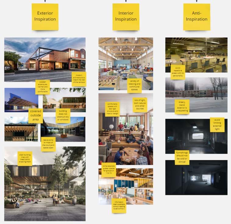
Three moodboards were created for the design solution Exterior, Interior and Anti-Inspiration. The Exterior and Interior moodboards note general trends and appraised factors that would benefit the Cesso's overarching design, while the AntiInspiration board denotes aspects that should avoided.
The Exterior inspiration features modern buildings with clean, simple colourways, and places emphasis on not obstructing natural factors such as trees or the sky. Wooden accents are noted to be comfortable and approachable, and the overall building style leans towards glass and elegant, straight linework.
The Interior inspiration comments on the features needed within the Cesso building; ability to find information, a variety of accessible group spaces, and a good amount of natural light if possible.
Anti-inspiration points stand as dreary, bland colourings, cold or clinical furnishings and repetitive, unappealing and monotonous spaces.
 Exterior, Interior and Anti-Inspiration Moodboards
Edinburgh Napier University Websites, Demonstrating Brand Identity
Exterior, Interior and Anti-Inspiration Moodboards
Edinburgh Napier University Websites, Demonstrating Brand Identity
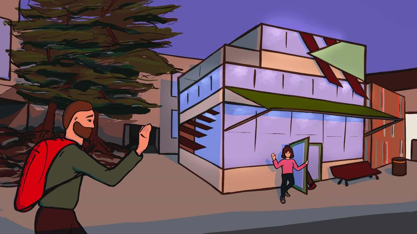
PART 1: EXTERIOR
COMMENTARY, SUPPORTING CONTEXT
This is a proposed design for the exterior of the Cesso, imagined in the back courtyard opposite the cafeteria and beside the music school buildings.
The building design has two and a half floors with a double door entrance, an awning to protect people from the rain and a bench outside for general use. The highest floor is the half floor, with an openair balcony overlooking the grounds around the building. Opening hours are suggested as 24/7, similar to the existing Kilby Centre, so the lighting has been visualised as either sunset or sunrise.
Various materials are integrated into the building's external facade, such as wooden elements contrasting large, frosted windows for warmth and texture. The windows are key to allowing light to shine into and out of the building, a welcoming, bright point for all students to rest within.
Character context: Peter, an ENU MHS worker, waves hello to a student as he approaches the building.
STAKEHOLDER FEEDBACK
Students noted the clean, warm atmosphere and very much appreciated the idea of a balcony available for public use. The windows were also appreciated as a good factor for natural light, and the internal lights shining through the glass was said to be inviting and welcoming.
Staff said that the design suits the other Napier buildings in the courtyard and looks modern and up-to-date, keeping in line with Napier University's MO. Further comments supported the building as looking like a good place to build community and a place to make the MHS workers more accessible.
1. Balcony area, accessible to students and staff.
2. Appropriate Cesso/Napier branding.
3. Wooden accents, only partially obscuring windows.
4. Large, wrap-around windows, partly frosted for less glare.
5. Overhead awning protecting entrance area from weather conditions.
6. Outside seating to provide a resting place or meeting point.
7. Rubbish bins to prevent littering.
"Cesso Building" External Concept Image, pictured at sunset or sunrise
KEY
1.
7.
6.
5.
3.
4.
2.
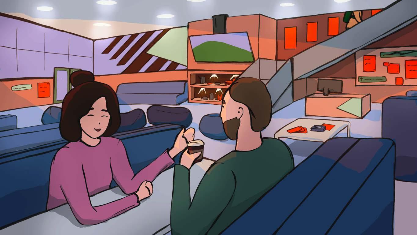
PART 2: INTERIOR GROUND FLOOR
COMMENTARY, SUPPORTING CONTEXT
This is a proposed design for the ground floor interior of the Cesso, imagined during quiet, nonpeak hours.
The ground floor design has various side booths for chatting or working, extra seating with bean bags and sofas, and a media centre with entertainment devices for community use. There are mental health and wellness information leaflets and posters available in casual places like shelves and coffee tables, and the reception area has a pinboard with FAQs and details about the MHS' and Cesso buildings' facilities.
Colour themes perpetrate different categories across the space; places to sit or rest are various tones of blue, walls and architecture are muted oranges and browns, and information for students has been denoted with high-contrast red-tones for visualisation purposes. Cesso branding has been kept to a pale green for its calming associations.
Character context: Mia, a student has a quick, casual chat with a MHS worker over a coffee, while another student passes by to another area on the stairs in the background.
STAKEHOLDER FEEDBACK
Students once again praised the personable and welcoming atmosphere, and reacted positively to the idea of a casual place to interact with staff. Communal resources and information was said to appear clear and well-marked.
Staff said that the design of the seating matches the style and colouring across other Napier spaces, cementing the building's fit to the Napier identity. The contextual student personas appeared relaxed and genuine to the staff, supporting the design with realistic events and possibilities.
1. Appropriate Cesso/Napier branding.
2. Communal media centre of information and devices.
3. Staff point, MHS workers to be visible and accessible.
4. Communal pin board with events, FAQs etc.
5. Varied seating such as sofas and bean bags.
6. Coffee tables with leaflets, tissues, contact information etc.
7. Tabled talk booths lining the room, for any open use.
"Cesso Building" Internal Ground Floor Concept Image, pictured at sunset or sunrise
KEY
4.
3.
6.
7.
5.
1.
2.
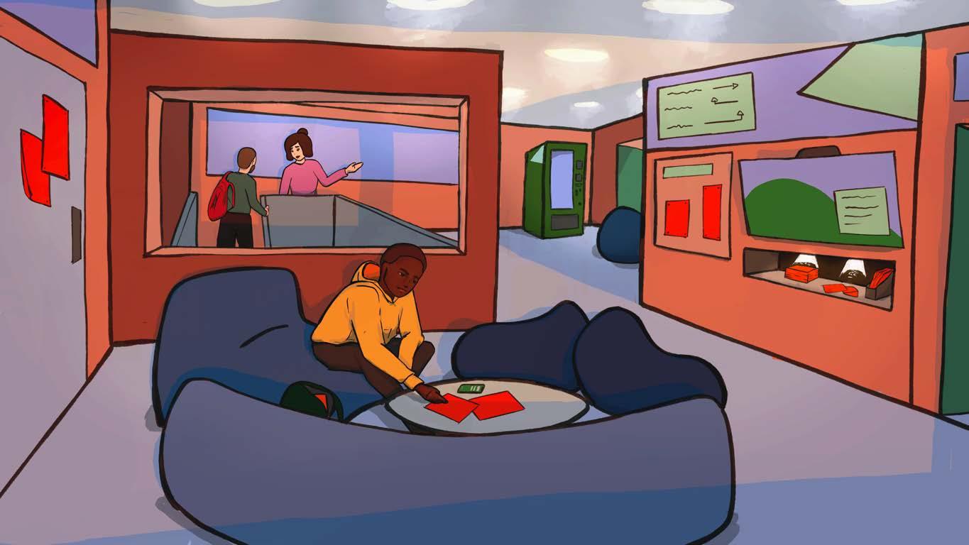
PART 3: INTERIOR UPPER FLOOR
COMMENTARY, SUPPORTING CONTEXT
This is a proposed design for the ground floor interior of the Cesso, imagined during quiet, nonpeak hours.
The 2nd floor design has various separate rooms for chatting or working, communal seating throughout with bean bags and sofas and a vending machine with affordable snacks and drinks. There are mental health and wellness information leaflets and posters available in casual places like shelves and coffee tables, and an information wall is clearly marked and central to the space. On the left of the image is a door to the external balcony area for fresh air or relaxing outside when the weather is nice.
Other doors lead off into 1-to-1 or quiet rooms, where students can come and go as they please.
Character context: Michael, a shy student, looks through the easy-to-access MHS information quietly at his own pace, while another student and a MHS worker move towards a breakout room in the background.
STAKEHOLDER FEEDBACK
Students liked the idea of separate group spaces and solo/quiet spaces. The open frame wall was noticed as interesting and unique, and the casual seating looked comfortable and unintimidating.
Staff liked the informal, low-pressure atmosphere, and modern architectural style that enabled good lighting.
1. Feature wall with large open "frame" to increase light pass-through.
2. Wide windows even at the rear of the building.
3. Affordable vending machine, with various options.
4. Side rooms, available for booking or open use by students and/or staff.
5. Clearly marked navigation of the facilities.
6. Appropriate Cesso/Napier branding.
7. Door to the balcony area.
8. Communal media centre of information and devices.
9. Solo or quiet spaces, available for open use by students.
10. Various seating with appropriate tables, such as sofas and bean bags.
10 11
"Cesso Building" Internal Upper Floor Concept Image, pictured at sunset or sunrise KEY 9.
6.
8. 5. 4.
3.
10. 7.
2. 1.
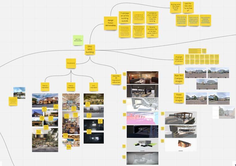
CONCEPT ART PROCESS
The design process began with cohesive moodboarding as explored in the earlier pages, followed by gathering references from Sketchfab and Google Maps for basic photobashing. From there, basic lineart sketches and flat colours established each composition. Clean lineart followed by clean colours completed the base illustration stage. Finally, atmospheric touches were added with two lighting passes (one for external sunlight and the other for interior lighting), the accompanying shadow passes, and minor adjustment layers.
Further developments would have been along the lines of fine detailing, text/branding detailing, lighting and shadow corrections, geometry corrections, full rendering of depth and tones and final adjustment layers.
PROCESS AND EVALUATION
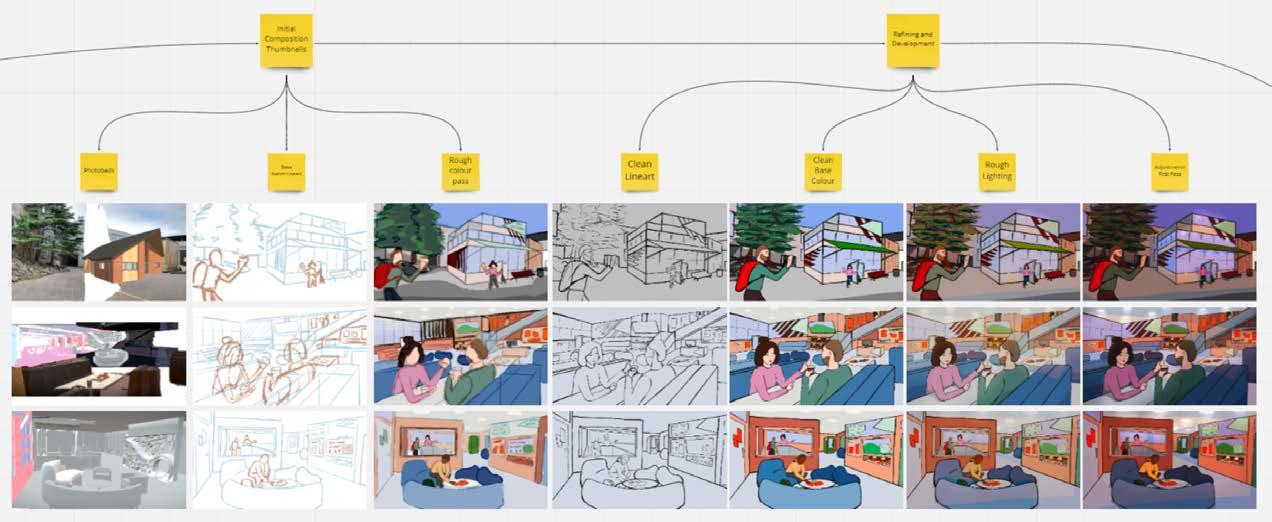
Cesso Building Concept Art Development Art Stages, Left to Right: Initial Photobash, Base Sketch, Base Colour, Clean Lineart, Clean Flat Colours, Base Lighting/Shadows, Adjustments
Narrative/Character Focus, Top to Bottom: MHS Staff Persona "Peter", Student Persona "Mia", Student Persona "Michael"
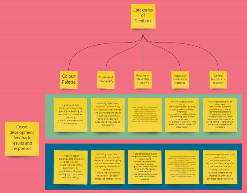
STAKEHOLDER FEEDBACK DETAILS
Both sets of stakeholders were sent the above images with relevant contexts and explanations, and were asked a series of questions around the images' colour palettes, contextual readability and positive or negative features, as well as openings for any other feedback they had to offer.
The feedback has been anonymised and summarised in the image on the left, with a general approval of the facilities and layouts, but room for exploring and developing more areas and their accompanying activity contexts, experiments with other colourways and meeting accessibility concerns and health and safety requirements.
12 13
Outline, Moodboards, Anti-Inspiration and References
Building
Feedback for Cesso Building Concept from Stakeholders.
Upper Data Set from Students, Lower Data Set from ENU MHS Staff.
FURTHER RECOMMENDED DEVELOPMENTS
EXPLORE ALTERNATIVE COLOURWAYS
While the green and blue set up was generally noted as calming, some student responses indicated a dislike for the "corporate-like" grey/ green detailing, while other MHS staff deemed the overall orange/blue/green mixture not relaxing at all. There were several requests for options to see different palettes visualised, or even the current colour scheme reworked in its theming over the seating, walls and ceilings.
DESIGNATE AND SHOW CLEAR SPACES FOR SOLO OR GROUP SETTINGS
All three of the spaces and character contexts shown to stakeholders were well-received, however there were requests to see further variations across the whole building. Specifically, students requested concept images of the 1-to-1 session spaces to talk privately with the MHS staff, and clear public spaces to rest and relax alone, with no indication of need or desire for company.
ENSURE ACCESSIBILITY AND HEALTH AND SAFETY CONCERNS ARE MET
Concerns were raised over the lack of variety in seating heights - not everyone can use either beanbags or standard height chairs - as well as buttons for doors, a lift in case the stairs are inaccessible, and a sloped roof to prevent leaks or damage from strong weather. Additional health and safety standards must be adhered to, such as suitable fire exits and ventilated storage spaces.
EXPLORE FLEXIBLE, RELAXED LAYOUTS AND COMPOSITIONS
Some staff feedback commented on the general layouts and facilities offered by the building, in that the composition of facilities could appear crowded and not clear in their intended use.
Further exploration into flexible spaces and obvious "territories" of possible use cases is recommended.
EXTERNAL SIGNPOSTING OR INDICATORS OF THE BUILDING'S FACILITIES
Both students and staff were pleased with the integration of the proposed building's style and location on campus, but there were questions asking after external indicators for the building's functions. Students suggested paving stones, streetlamp-style outdoor lighting or signposts directing people towards the building, while staff had want for signage indicating what support is available within the building.
ENSURE MINIMAL OVERLAP WITH EXISTING SPACES/BUILDINGS
While the building's internal and external styling garnered praise for keeping in line with Napier's current interior design and branding, this raised a particular worry from some staff that the building could accidentally turn into another study/work space, of which there are already plenty available. Care and thought should be taken to avoid this, and to keep the building as open and welcoming as possible while staying true to its original intent and purpose.
14