

1. Fill in the blank. When creating a scatterplot, one should use the _______________ axis for the explanatory variable if a regression line is to be fit to the data.
2. Fill in the blank. A study is conducted to determine if one can predict the yield of a crop based on the amount of yearly rainfall. The variable _______________ is the response variable in this study.
3. Fill in the blank. A researcher is interested in determining if one could predict the score on a statistics exam from the amount of time spent studying for the exam. The variable _______________ is the explanatory variable in this study.
4. Fill in the blank. The Environmental Protection Agency records data on the fuel economy of many different makes of cars. They are interested in determining if one could predict the mileage of the car (in miles per gallon) from the weight of the car (in lbs.). The variable _______________ is the response variable in this study.
5. Fill in the blank. The owner of a winery collects data on competing wineries every year. He would like to predict the gross sales (in number of cases) from the size of the wineries (in acres). The variable _______________ is the explanatory variable in this study.
6. Fill in the blank. A scatterplot is a graphical tool for displaying the relationship between two __________ variables measured on the same individuals.
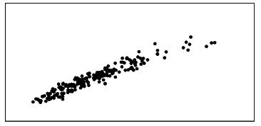
7. A researcher measured the height (in feet) and volume of usable lumber (in cubic feet) of 32 cherry trees. The goal is to determine if the volume of usable lumber can be estimated from the height of a tree. The results are plotted below:
Fill in the blank. The variable _______________ is the response variable in this study.
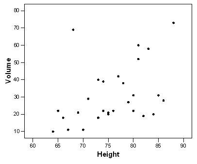
8. A researcher measured the height (in feet) and volume of usable lumber (in cubic feet) of 32 cherry trees. The goal is to determine if the volume of usable lumber can be estimated from the height of a tree. The results are plotted below:
Select all descriptions that apply to the scatterplot.
A) There is a positive association between height and volume.
B) There is a negative association between height and volume.
C) There is an outlier in the plot.
D) The plot is skewed to the left.
E) Both A and C
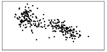
9. The graph below is a plot of the fuel efficiency (in miles per gallon, or mpg) of various cars versus the weight of these cars (in thousands of pounds).
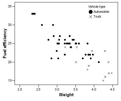
The points denoted by the plotting symbol × correspond to pick-up trucks and SUVs. The points denoted by the plotting symbol correspond to automobiles (sedans and station wagons). What can we conclude from this plot?
A) There is little difference between trucks and automobiles.
B) Trucks tend to be higher in weight than automobiles.
C) Trucks tend to get poorer gas mileage than automobiles.
D) The plot is invalid. A scatterplot is used to represent quantitative variables, and the vehicle type is a qualitative variable.
E) Both B and C
10. Volunteers for a research study were divided into three groups. Group 1 listened to Western religious music, Group 2 listened to Western rock music, and Group 3 listened to Chinese religious music. The blood pressure of each volunteer was measured before and after listening to the music, and the change in blood pressure (blood pressure before listening minus blood pressure after listening) was recorded.
What could we do to explore the relationship between type of music and change in blood pressure?
A) See if blood pressure decreases as type of music increases by examining a scatterplot.
B) Make a histogram of the change in blood pressure for all of the volunteers.
C) Make side-by-side boxplots of the change in blood pressure, with a separate boxplot for each group.
D) All of the above
11. Volunteers for a research study were divided into three groups. Group 1 listened to Western religious music, Group 2 listened to Western rock music, and Group 3 listened to Chinese religious music. The blood pressure of each volunteer was measured before and after listening to the music, and the change in blood pressure (blood pressure before listening minus blood pressure after listening) was recorded.
A scatterplot of change in blood pressure (mmHg) versus the type of music listened to is given below:
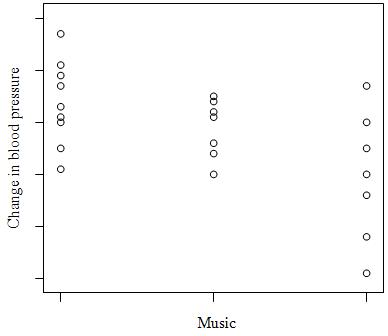
What do we know about the correlation between change in blood pressure and type of music?
A) It is negative.
B) It is positive.
C) It is first negative then positive.
D) None of the above
12. To examine the relationship between two variables, the variables must be measured from the same _______.
A) cases
B) labels
C) units
D) values
13. Variables measured on the same cases are _______ if knowing the values of one of the variables gives you information about the values of another variable that was not known beforehand.
A) transformed
B) categorical
C) associated
D) quantitative
14. A variable that explains or causes change to another variable is called a(n) _______ variable.
A) independent
B) dependent
C) response
15. Two variables are ______ if knowing the values of one of the variables gives one information about the other variable.
A) associated
B) lurking
C) confounded
16. We are interested in determining if students who graduate from larger universities receive greater starting salaries than students who graduate from smaller universities. We collected data from 50 small universities and 50 large universities to examine this relationship. This is an example of ________
A) exploratory data analysis.
B) benchmarking.
C) data mining.
17. True or False. A categorical variable can be added to a scatterplot.
A) True
B) False
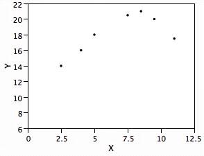
18. The scatterplot below displays data collected from 20 adults on their age and overall GPA at graduation.
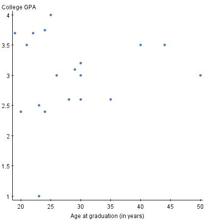
True or False. The scatterplot shows a strong relationship.
A) True
B) False
19. The scatterplot below displays data collected from 20 adults on their age and overall GPA at graduation.
True or False. If you switched the variables on the x and y axis, the relationship between the two variables would appear much stronger.
A) True
B) False
20. The scatterplot below displays data collected from 20 adults on their age and overall GPA at graduation.
True or False. There appear to be outliers in the data set.
A) True
B) False
21. Which type of transformation may help change a curved relationship into a more linear relationship?
A) Log
B) Arcsin
C) Reciprocal
D) Cubed-root
22. Transformations are used to ______.
A) make curved relationships more linear
B) make data more normal
C) change the scale of measurements
D) All of the above
23. True or False. To use a log transformation, all values must be positive.
A) True
B) False
24. The “direction” in scatterplots refers to the _________ direction.
A) horizontal and vertical
B) positive and negative
C) left and right
D) None of the above
25. Scatterplot “smoothing” is used to determine the ______ of the data.
A) direction
B) form
C) variation
D) None of the above
26. Scatterplots can be used to determine ______ relationships between variables.
A) linear
B) quadratic
C) cubic
D) All of the above
E) None of the above
27. When trying to explain the relationship between two quantitative variables, it would be best to use a _______.
A) density curve
B) scatterplot
C) boxplot
D) histogram
28. True or False. Scatterplots can be used to explain the relationship between one categorical variable and one quantitative variable.
A) True
B) False
29. Which of the following statements about a scatterplot is/are TRUE?
A) It is always necessary to identify one of the two variables as the explanatory variable and the other as the response variable.
B) On a scatterplot we look for overall patterns showing the form, direction, and the shape of the relationship.
C) Because a scatterplot requires the values of two quantitative variables, it is never possible to add one or more categorical variables to the graph.
D) Both A and B are true statements.
E) None of the above statements are true.
30. Which of the following statements is/are FALSE?
A) A scatterplot is a useful graphical tool for displaying the strength of the relationship between two quantitative variables.
B) The only relationship that a scatterplot can usefully display is linear with no outliers.
C) If above-average values of two quantitative variables and below-average values of the same two quantitative variables tend to occur together, the two variables are positively associated.
D) An individual value that deviates from the overall pattern displayed on a scatterplot is called an outlier.
E) A categorical variable can be added to a scatterplot by using a different color or symbol for each category.
31. Fill in the blank. Explanatory variables are also called ___________ variables.
32. Fill in the blank. Response variables are also called ____________ variables.
33. True or False. Time plots are special scatterplots where the explanatory variable, x, is a measure of time.
A) True
B) False
34. You can describe the overall pattern of a scatterplot by the _____.
A) form, direction, and strength
B) Normal distribution
C) number of points in the plot
D) None of the above
35. When examining a scatterplot for form, you are looking to see if _____.
A) the points in the scatterplot show a straight line pattern
B) the points in the scatterplot show a curved relationship
C) there are clusters in the scatterplot
D) None of the above
E) A, B, C
36. When examining a scatterplot for direction, you are looking to see if __________.
A) high values of the two variables in the scatterplot tend to occur together
B) high values of one variable tend to occur with low values of the other variable
C) there is a positive association
D) there is a negative association
E) All of the above
F) A and C only
G) B and D only
37. When examining a scatterplot for strength, you are looking to see _______.
A) how close the points in the scatterplot follow a line
B) how close the points in the scatterplot follow a curve
C) All of the above
D) None of the above
38. When looking for relationships between two quantitative variables, you are looking for ___________.
A) linear relationships
B) nonlinear relationships
C) All of the above
D) None of the above
39. An outlier is ______.
A) a point in a scatterplot that follows the same pattern as the other points
B) a point in a scatterplot that does not follow the same pattern as the other points
C) All of the above
D) None of the above
40. Two variables are positively associated when _______.
A) above-average values of one tend to accompany above-average values of the other and vice versa
B) above-average values of one tend to accompany below-average values of the other, and vice versa
C) both variables have an outlier
D) None of the above
41. If you have two quantitative variables, one way to study them is to use a ______.
A) scatterplot
B) two-way table
C) None of the above
42. When the explanatory variable is categorical and the response variable is quantitative, what type of plot would be appropriate?
A) Boxplot
B) Time plot
C) Scatterplot
43. Malaria is a leading cause of infectious disease and death worldwide. It is also a popular example of a vector-borne disease that could be greatly affected by the influence of climate change. The scatterplot shows total precipitation (in mm) in select cities in West Africa on the x axis and the percent of people who tested positive for malaria in the select cities on the y axis in 2000.
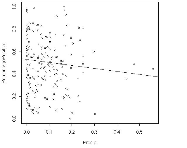
True or False. There is a strong linear relationship between percentage of people who tested positive for malaria and precipitation.
A) True
B) False
44. Malaria is a leading cause of infectious disease and death worldwide. It is also a popular example of a vector-borne disease that could be greatly affected by the influence of climate change. The scatterplot shows total precipitation (in mm) in select cities in West Africa on the x axis and the percent of people who tested positive for malaria in the select cities on the y axis in 2000.
True or False. There are influential points in the scatterplot.
A) True
B) False
45. Malaria is a leading cause of infectious disease and death worldwide. It is also a popular example of a vector-borne disease that could be greatly affected by the influence of climate change. The scatterplot shows total precipitation (in mm) in select cities in West Africa on the x axis and the percent of people who tested positive for malaria in the select cities on the y axis in 2000.
Precipitation is the __________ variable.
A) independent
B) dependent
C) response
D) explanatory
E) A and B
F) A and D
46. Malaria is a leading cause of infectious disease and death worldwide. It is also a popular example of a vector-borne disease that could be greatly affected by the influence of climate change. The scatterplot shows total precipitation (in mm) in select cities in West Africa on the x axis and the percent of people who tested positive for malaria in the select cities on the y axis in 2000.
Percent tested positive for malaria is the __________ variable.
A) independent
B) dependent
C) response
D) explanatory
E) B and C
F) A and B
47. Malaria is a leading cause of infectious disease and death worldwide. It is also a popular example of a vector-borne disease that could be greatly affected by the influence of climate change. The scatterplot shows total precipitation (in mm) in select cities in West Africa on the x axis and the percent of people who tested positive for malaria in the select cities on the y axis in 2000.
The correlation between precipitation and percent who tested positive for malaria is probably close to _____.
A) 1
B) 0
C) Can't tell.
48. Malaria is a leading cause of infectious disease and death worldwide. It is also a popular example of a vector-borne disease that could be greatly affected by the influence of climate change. The table below is a summary from a linear regression that uses dewpoint (°C) to predict malaria prevalence in West Africa.
Fill in the blank. The equation of the least-square regression line is

49. Malaria is a leading cause of infectious disease and death worldwide. It is also a popular example of a vector-borne disease that could be greatly affected by the influence of climate change. The table below is a summary from a linear regression that uses dewpoint (°C) to predict malaria prevalence in West Africa.
Fill in the blank. The correlation coefficient, r, is ___.
50. Malaria is a leading cause of infectious disease and death worldwide. It is also a popular example of a vector-borne disease that could be greatly affected by the influence of climate change. The table below is a summary from a linear regression that uses dewpoint (°C) to predict malaria prevalence in West Africa.
True or False. There is a strong correlation between dewpoint and malaria prevalence in West Africa.
A) True
B) False
51. Malaria is a leading cause of infectious disease and death worldwide. It is also a popular example of a vector-borne disease that could be greatly affected by the influence of climate change. The table below is a summary from a linear regression that uses dewpoint (°C) to predict malaria prevalence in West Africa.
True or False. There is a negative association between dewpoint and malaria prevalence in West Africa.
A) True
B) False
52. Answer true or false to the following statements.
A) The correlation, r, is always positive.
B) The correlation, r, is always negative.
C) The correlation, r, is a number between –100 and 100.
D) The correlation, r, measures the shape of a scatterplot.
53. Which one of the following statements is TRUE?
A) When calculating the correlation, r, it is important to make sure y is the explanatory variable and the x is the response variable.
B) When calculating the correlation, r, it is important to make sure x is the explanatory variable and the y is the response variable.
C) None of the above
54. Which one of the following statements is TRUE?
A) The correlation, r, measures the strength of the linear relationship between two quantitative variables.
B) The correlation, r, measures the strength of the linear relationship between two categorical variables.
C) The correlation, r, measures the strength between one quantitative variable and one categorical variable.
55. Positive linear relationships are represented by values of the correlation, r, that are ____.
A) greater than zero
B) less than zero
C) zero
56. Negative linear relationships are represented by values of the correlation, r, that are ____.
A) greater than zero
B) less than zero
C) zero
57. The lack of a linear relationship between two quantitative variables is represented by the correlation, r, with values ________.
A) greater than zero
B) less than zero
C) equal to zero
D) equal to 1 or –1.
58. A college newspaper interviews a psychologist about a proposed system for rating the teaching ability of faculty members. The psychologist says, “The evidence indicates that the correlation between a faculty member's research productivity and teaching rating is close to zero.” What would be a correct interpretation of this statement?
A) Good researchers tend to be poor teachers and vice versa.
B) Good teachers tend to be poor researchers and vice versa.
C) Good researchers are just as likely to be good teachers as they are bad teachers. Likewise for poor researchers.
D) Good research and good teaching go together.
59. A student wonders if people of similar heights tend to date each other. She measures herself, her dormitory roommate, and the women in the adjoining rooms and then she measures the next man whom each woman dates. Here are the data (heights in inches):
Women 64 65 65 66 66 70
Men 68 68 69 70 72 74
Determine whether each of the following statements is true or false.
A) If we had measured the heights of the men and women in centimeters (1 inch 2.5 cm the correlation coefficient would have been 2.5 times larger.
B) There is a strong negative association between the heights of men and women because the women are always smaller than the men they date.
C) There is a positive association between the heights of men and women.
D) Any height above 70 inches must be considered an outlier.
60. Determine whether each of the following statements regarding the correlation coefficient is true or false.
A) The correlation coefficient equals the proportion of times that two variables lie on a straight line.
B) The correlation coefficient will be +1.0 if all the data points lie on a perfectly horizontal straight line.
C) The correlation coefficient measures the strength of any relationship that may be present between two variables.
D) The correlation coefficient is a unitless number and must always lie between –1.0 and +1.0, inclusive.
61. A study found a correlation of r = –0.61 between the gender of a worker and his or her income. Determine whether each of the following conclusions regarding this correlation coefficient is true or false.
A) Women earn more than men on the average.
B) Women earn less than men on the average.
C) An arithmetic mistake was made. Correlation must be positive.
D) This measurement makes no sense; r can only be measured between two quantitative variables.
62. Determine whether each of the following statements regarding the correlation coefficient is true or false.
A) The correlation coefficient is a resistant measure of association.
B) –1 < r < 1.
C) If r is the correlation between x and y, then –r is the correlation between y and x
D) If r is the correlation between x and y, then 2r is the correlation between 2x and y.
63. As Swiss cheese matures, a variety of chemical processes take place. The taste of matured cheese is related to the concentration of several chemicals in the final product. In a study of cheese in a certain region of Switzerland, samples of cheese were analyzed for lactic acid concentration and were subjected to taste tests. The numerical taste scores were obtained by combining the scores from several tasters. A scatterplot of the observed data is shown below:
What is a plausible value for the correlation between lactic acid concentration and taste rating?
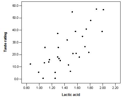
A) 0.999
B) 0.7
C) 0.07
D) –0.7
64. Consider the following scatterplot of two variables x and y:
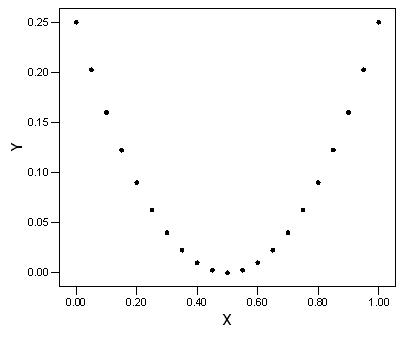
What can we conclude from this graph?
A) The correlation between x and y must be close to 1 because there is nearly a perfect relationship between them.
B) The correlation between x and y must be close to –1 because there is nearly a perfect relationship between them, but it is not a straight-line relation.
C) The correlation between x and y is close to 0.
D) The correlation between x and y could be any number between –1 and +1. Without knowing the actual values, we can say nothing more.
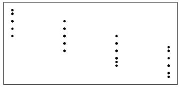
65. The scatterplot below represents a small data set. The data were classified as either type 1 or type 2. Those of type 1 are indicated by x's and those of type 2 by o's.
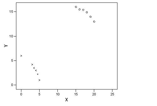
What do we know about the overall correlation of the data in this scatterplot?
A) It is positive.
B) It is negative because the o's display a negative trend and the x's display a negative trend.
C) It is near 0 because the o's display a negative trend and the x's display a negative trend, but the trend from the o's to the x's is positive. The different trends will cancel each other out.
D) It is impossible to compute for such a data set.
66. A scatterplot of a variable y versus a variable x produced the scatterplot shown below. The value of y for all values of x is exactly 1.0.
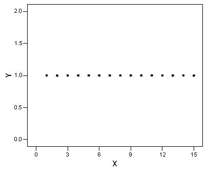
What do we know about the correlation between x and y?
A) It is +1 because the points lie perfectly on a line.
B) It is either +1 or –1, because the points lie perfectly on a line.
C) It is 0 because y does not change as x increases.
D) None of the above
67. In a skills competition involving many different events, two particular contestants were tied on each and every event, always getting the identical score. For the competition, the correlation between the scores of these two contestants is
A) impossible to determine without knowing the actual scores.
B) 0.
C) –1.
D) inappropriate because the variable “event” is categorical.
E) 1.
68. The length and width for a sample of products made by a certain company are plotted below:
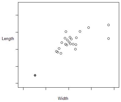
The correlation between length and width is calculated to be r = 0.827.
In the plot, notice that length is treated as the response variable and width as the explanatory variable. Suppose we had taken width to be the response variable and length to be the explanatory variable. What would be the correlation between width and length in this case?
A) 0.827
B) –0.827
C) 0.000
D) Any number between 0.827 and –0.827, but we cannot determine the exact value.
69. The length and width for a sample of products made by a certain company are plotted below:
The correlation between length and width is calculated to be r = 0.827.
Suppose we removed the point that is indicated by a ☼ from the data represented in the plot. What would the correlation between length and width then be?
A) 0.827
B) Larger than 0.827
C) Smaller than 0.827
D) Either larger or smaller than 0.827; it is impossible to say which.
70. Match the four graphs labeled A, B, C, and D, with the following four possible values of the correlation coefficient: –0.9, –0.7, 0.4, 0.95. Assume all four graphs are made on the same scale.
71. The British government conducts regular surveys of household spending. The average weekly household spending on tobacco products and spending on alcoholic beverages for each of 11 regions in Great Britain were recorded. A scatterplot of spending on tobacco versus spending on alcohol is given below:
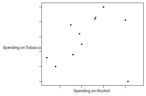
What is the most plausible value for the correlation between spending on tobacco and spending on alcohol?
A) 0.99
B) 0.8
C) 0.08
D) –0.8
72. The British government conducts regular surveys of household spending. The average weekly household spending on tobacco products and spending on alcoholic beverages for each of 11 regions in Great Britain were recorded. A scatterplot of spending on tobacco versus spending on alcohol is given below:
Determine whether each of the following statements is true or false.
A) The observation in the lower-right corner of the plot is influential.
B) There is clear evidence of a negative association between spending on alcohol and spending on tobacco.
C) The equation of the least-squares regression line for this plot would be approximately y = 10 – 2x.
D) If we measured the spending in dollars instead of pounds, the correlation coefficient would decrease because a dollar is worth less than a pound.
73. An experiment is conducted to study the bonding strength of adhesives that contain varying amounts of a particular chemical additive. Wafers of a specified material are glued together using the adhesive with each amount of additive, allowed to set for 24 hours, and then the strength needed to separate the wafers is determined. It is reported that the correlation between strength required and amount of additive was 0.86 pounds-force per square inch. This report is ___________ because correlation _________________.
A) incorrect; is unitless
B) correct; is positive
C) incorrect; should be negative here
D) None of the above
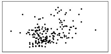
74. Consider the following scatterplot:
The correlation between the two quantitative variables, x and y, was determined to be 0.68.
Determine if each of the following statements is true or false.
A) Because the correlation is positive, we know that high values of one of the variables are always associated with high values of the other variable.
B) The result is surprising because the plot seems to suggest there may be a negative association between the variables.
C) Correlation is inappropriate here because the relationship between the variables does not appear to be linear.
D) To get a better idea of the true relationship, the values of the observations should be standardized before calculating r.
75. Which of the following best describes correlation?
A) Correlation measures the strength of the relationship between two quantitative variables whether or not the relationship is linear.
B) Correlation measures how much a change in the explanatory variable causes a change in the response variable.
C) Correlation measures the strength of the relationship between any two variables.
D) Correlation measures the strength of the linear relationship between two quantitative variables.
E) Correlation measures the strength of the linear association between two categorical variables.
76. Correlation is a measure of the direction and strength of the linear (straight-line) association between two quantitative variables. The analysis of data from a study found that the scatterplot between two variables, x and y, appeared to show a straight-line relationship and the correlation was calculated to be –0.84. This tells us that
A) there is little reason to believe that the two variables have a linear association relationship.
B) all of the data values for the two variables lie on a straight line.
C) there is a strong linear relationship between the two variables with larger values of x tending to be associated with larger values of the y variable.
D) there is a strong linear relationship between x and y with smaller x values tending to be associated with larger values of the y variable.
E) there is a weak linear relationship between x and y with smaller x values tending to be associated with smaller values of the y variable.
77. In a study of 1991 model cars, a researcher computed the least-squares regression line of price (in dollars) on horsepower. He obtained the following equation for this line.
price = –6677 + 175 × horsepower
Based on the least-squares regression line, what would we predict the cost to be of a 1991 model car with horsepower equal to 200?
A) $41,677
B) $35,000
C) $28,323
D) $13,354
78. The correlation, r, is a number between _______.
A) 0 and 1
B) 1 and 100
C) –1 and 1
D) None of the above
79. Suppose you are examining the relationship between two quantitative variables, and the relationship appears to show a curve. Therefore, you use a log transformation of the data to form a more linear relationship between the two variables. How would the transformation affect the correlation, r?
A) r should be lower once the data are transformed.
B) r should be higher once the data are transformed.
C) There would be no change in r once the data are transformed.
80. When examining scatterplots to determine the correlation, r, the explanatory variable should be on ____ axis.
A) the x
B) the y
C) either
81. The scatterplot below displays data collected from 20 adults on their age and overall GPA at graduation.
How would removing the outliers located at the points (23, 1.00) and (50, 3.00) affect the correlation, r?
A) r would not change.
B) r would likely increase.
C) r would likely decrease.
82. The scatterplot below displays data collected from 20 adults on their age and overall GPA at graduation.
After removing the outliers located at the points (23, 1.00) and (50, 3.00) the correlation, r, is likely ____.
A) positive
B) negative
C) zero
D) one
83. The scatterplot below displays data collected from 20 adults on their age and overall GPA at graduation.
The correlation, r, would likely reveal _______ between the two variables.
A) a strong correlation
B) a weak correlation
C) no relationship
D) a curved relationship
84. Before using the correlation, r, you should do which of the following?
A) Look at the scatterplot of the data to determine if the relationship appears linear.
B) Look at a histogram to be sure your data are approximately normal.
C) Look at a stemplot to determine if the data are symmetric.
D) All of the above
85. The measurement units for the correlation, r, are determined from ______.
A) the variable on the x axis
B) the variable on the y axis
C) either variable on the x axis or y axis
D) None of the above
86. Which plot helps you visualize the value of the correlation, r?
A) Histogram
B) Boxplots
C) Scatterplots
D) Density curves
87. True or False. The correlation, r, is positive if the relationship between two quantitative variables is strong.
A) True
B) False
88. True or False. The correlation, r, is negative if the relationship between two quantitative variables is weak.
A) True
B) False
89. Which of the following is/are NOT resistant to outliers?
A) Mean
B) Median
C) r
D) Standard deviation
E) A, C, and D
90. Suppose you are examining the correlation between two quantitative variables and the correlation, r, is very small. However, you expected it to be larger. What could you do?
A) Examine the data to determine if there are any outliers that could be removed. If so, remove the outliers and recalculate r.
B) Change the units of measurement to something else (e.g., convert data measured in inches to centimeters.)
C) Plot the data on a smaller scale.
D) None of the above
91. The equation for calculating the correlation, r, between two quantitative variables, x and y, is

D) None of the above
92. It is not appropriate to use the correlation, r, when _____.
A) your data are not normal
B) the relationship between two quantitative variables is not linear
C) the relationship between two quantitative variables is linear
D) you have transformed your data
93. Which of the following is true about the range of r2
A) Ranges between –1 and 1
B) Ranges between 0 and 1
C) Ranges between 0 and 100
D) Ranges between –100 and 100
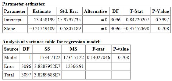
94. Colorectal cancer (CRC) is the third most commonly diagnosed cancer among Americans (with nearly 147,000 new cases), and the third leading cause of cancer death (with over 50,000 deaths annually). Research was done to determine whether there is a link between obesity and CRC mortality rates among African Americans in the United States by county. Below are the results of a least-squares regression analysis from the software StatCrunch
Simple linear regression results: Dependent Variable: Mortality.rate Independent Variable: Obesity.rate
Mortality.rate = 13.458199 – 0.21749489 Obesity.rate
Sample size: 3098
R (correlation coefficient) = –0.0067
R-sq = 4.5304943E-5
Estimate of error standard deviation: 111.20661
What fraction of the variation in mortality rates is explained by the least-squares regression?
A) 0
B) 1
C) –0.0067
D) 13.45
95. Colorectal cancer (CRC) is the third most commonly diagnosed cancer among Americans (with nearly 147,000 new cases), and the third leading cause of cancer death (with over 50,000 deaths annually). Research was done to determine whether there is a link between obesity and CRC mortality rates among African Americans in the United States by county. Below are the results of a least-squares regression analysis from the software StatCrunch
Simple linear regression results: Dependent Variable: Mortality.rate
Independent Variable: Obesity.rate
Mortality.rate = 13.458199 – 0.21749489 Obesity.rate
Sample size: 3098
R (correlation coefficient) = –0.0067
R-sq = 4.5304943E-5
Estimate of error standard deviation: 111.20661
What is the equation to predict mortality rates from obesity rates?
A) Mortality.rate = 13.458199 – 0.21749489 Obesity.rate
B) Obesity.rate = 13.458199 - 0.21749489 Mortality.rate
C) Mortality.rate = 13.458199 + 0.21749489 Obesity.rate
D) Mortality.rate = 13.458199 – 0.0067 Obesity.rate
96. Colorectal cancer (CRC) is the third most commonly diagnosed cancer among Americans (with nearly 147,000 new cases), and the third leading cause of cancer death (with over 50,000 deaths annually). Research was done to determine whether there is a link between obesity and CRC mortality rates among African Americans in the United States by county. Below are the results of a least-squares regression analysis from the software StatCrunch
Simple linear regression results: Dependent Variable: Mortality.rate
Independent Variable: Obesity.rate
Mortality.rate = 13.458199 – 0.21749489 Obesity.rate
Sample size: 3098
R (correlation coefficient) = –0.0067
R-sq = 4.5304943E-5
Estimate of error standard deviation: 111.20661
The correlation between obesity rates and mortality rates is ______.
A) very strong
B) very weak
C) moderately strong
D) moderately weak
97. Colorectal cancer (CRC) is the third most commonly diagnosed cancer among Americans (with nearly 147,000 new cases), and the third leading cause of cancer death (with over 50,000 deaths annually). Research was done to determine whether there is a link between obesity and CRC mortality rates among African Americans in the United States by county. Below are the results of a least-squares regression analysis from the software StatCrunch
Simple linear regression results:
Dependent Variable: Mortality.rate
Independent Variable: Obesity.rate
Mortality.rate = 13.458199 – 0.21749489 Obesity.rate
Sample size: 3098
R (correlation coefficient) = –0.0067
R-sq = 4.5304943E-5
Estimate of error standard deviation: 111.20661
The explanatory variable is _______.
A) obesity rates
B) mortality rates
C) slope
D) intercept