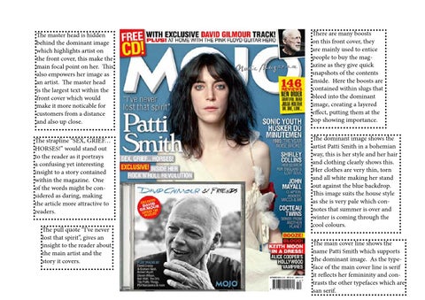
The master head is hidden behind the dominant image which highlights artist on the front cover, this make the main focal point on her. This also empowers her image as an artist. The master head is the largest text within the front cover which would make it more noticable for customers from a distance and also up close.
There are many boosts on this front cover, they are mainly used to entice people to buy the magazine as they give quick snapshots of the contents inside. Here the boosts are contained within slugs that bleed into the dominant image, creating a layered effect, putting them at the top showing importance.
The strapline “SEX, GRIEF… HORSES!” would stand out to the reader as it portrays a confusing yet interesting insight to a story contained within the magazine. One of the words might be considered as daring, making the article more attractive to readers.
The dominant image shows the artist Patti Smith in a bohemian way, this is her style and her hair and clothing clearly shows this. Her clothes are very thin, torn and all white making her stand out against the blue backdrop. This image suits the house style as she is very pale which connotes that summer is over and winter is coming through the cool colours.
The pull quote “I’ve never lost that spirit”, gives an insight to the reader about the main artist and the story it covers.
The main cover line shows the name Patti Smith which supports the dominant image. As the typeface of the main cover line is serif it reflects her femininity and contrasts the other typefaces which are san serif.