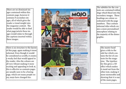
There are no dominant images contained within this contents page, however it contains 8 secondary images, all of which gives the reader a visual insight into the magazine content. The reader would be able to find what page/article these images would relate to through the captions inserted within these images. There is no structure to the layout of this page, again making it more informal. Even though it would be considered as scruffy, it creates a wacky feel that would appeal to the reader. Also the colours are all very vibrant making it more exciting and appealing to look at, this is effective as contents pages are usually seen to be a boring page, which not many people enjoy, mojo have changed this.
The subtitles for the contents are contained within slugs which bleed into the secondary images. These headings are colour coordinated with the page numbers. They contain informal titles which creates a more personalised atmosphere relating to the majority of the demographic.
The master head gives a title to the side bar which contains the list of contents for the magazine. The typeface for this gives a 3D effect which makes it stand out from the other text, making it more memorable and showing that it is one of the main pages.