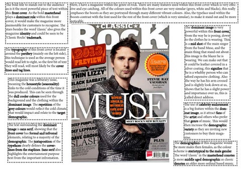
The bold title to stands out to the audience as is it the most powerful piece of text within this front cover. As the bold masterhead plays a dominant role within this front cover, it would make the magazine more memorable for customers to recognise. The stars besides the word ‘classic’ also gives the magazine identity and could be seen to be ‘Classic Rocks’ trademark. The typography of this front cover is located around the perifery (mainly on the left side), this technique is used as the average person would read left to right, so the first bit of text they will read, will most likely be the cover lines and tag lines. This magazine was a feburary issue, meaning the housestyle (seasonality) links to the cold conditions of the time it was produced. This can be seen through the dull cooler colours used for the background and the clothing within the dominant image. The repetition of the grey colours would reflect the cold climate that would impact and relate to the target demographic. The text surrounding the dominant image is sans serif, showing that the front cover has formal and infromal elements, relating to a majority of the demographic. The juxtaposition of the typefaces clearly defines the coverlines from the staplines. Sans serif also highlights the entertainment purpose text from the important infromation.
Here, I have a magazine within the genre of rock. There are many features used within this front cover which is very effective and eye catching. All of the colours used within this front cover are very simular (greys, white and blacks), this really emphases the boosts as they are portrayed through many different vibrant colours. Also, the typeface used within the boosts contrast with the font used for the rest of the front cover (which is very simular), to make it stand out and be more noticable. The dominant image is very powerful within this front cover, from the way he is posing, down to the clothes he is wearing. This is a mid shot of the main singer from the band Muse, and the main thing that stand out about this image is the blazer he is wearing. We can make out that it could be leather covered in a silver coating, this signifies that he is a whelthy person who can afford expensive clothing. Also the way he has his arm crossed and is slightly look down at us, shows that he has a slight power and importance over us, this is called direct address. The use of celebrity endorsment is a big feature within the dominat image, as it attract fans of the artist and others who prefer that genre of music. This would then increase the demographic variety as they are inviting new customers to buy their magazine. The demographics of this magazine would be more males then females, as the colour scheme is steriotypical to the male gender. The word ‘classic’ in the masterhead conotes a more middle aged demographic as classic denotes an older more ordinal based music.