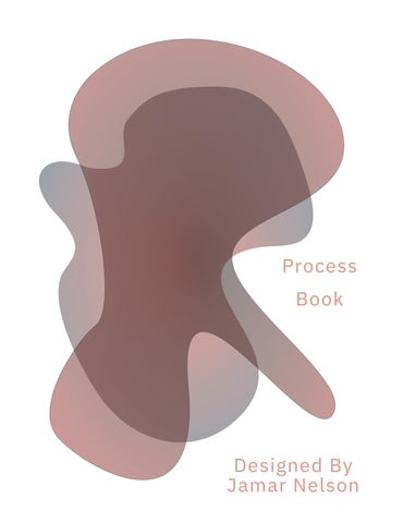
Book Process
Jamar
Designed By
Nelson
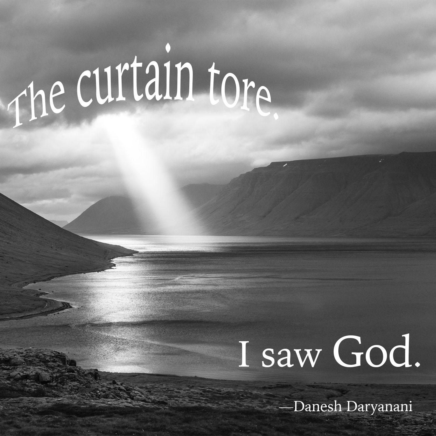
For the first project I created a image using a six-word quote of my choice. I found a interesting quote by Danesh Daryanani which stated “The curtain tore. I saw God.” After selecting a quote I then created a word map, which then could help me break down the words so that I could get a direction of where I wanted to go. After gaining some understanding of the di rection I wanted to pursue, I then Wshowed a beam of light coming out of clouds. I felt like this specific image complemented the quote. The original image was in full color, but I felt like the word God had a major role in the image needing to be black and white. When placing the text on the image I wanted to find a plain, but interesting, font so that the words could stand out. After that I then arched “The curtain tore” to make it seem like the words actually tore.
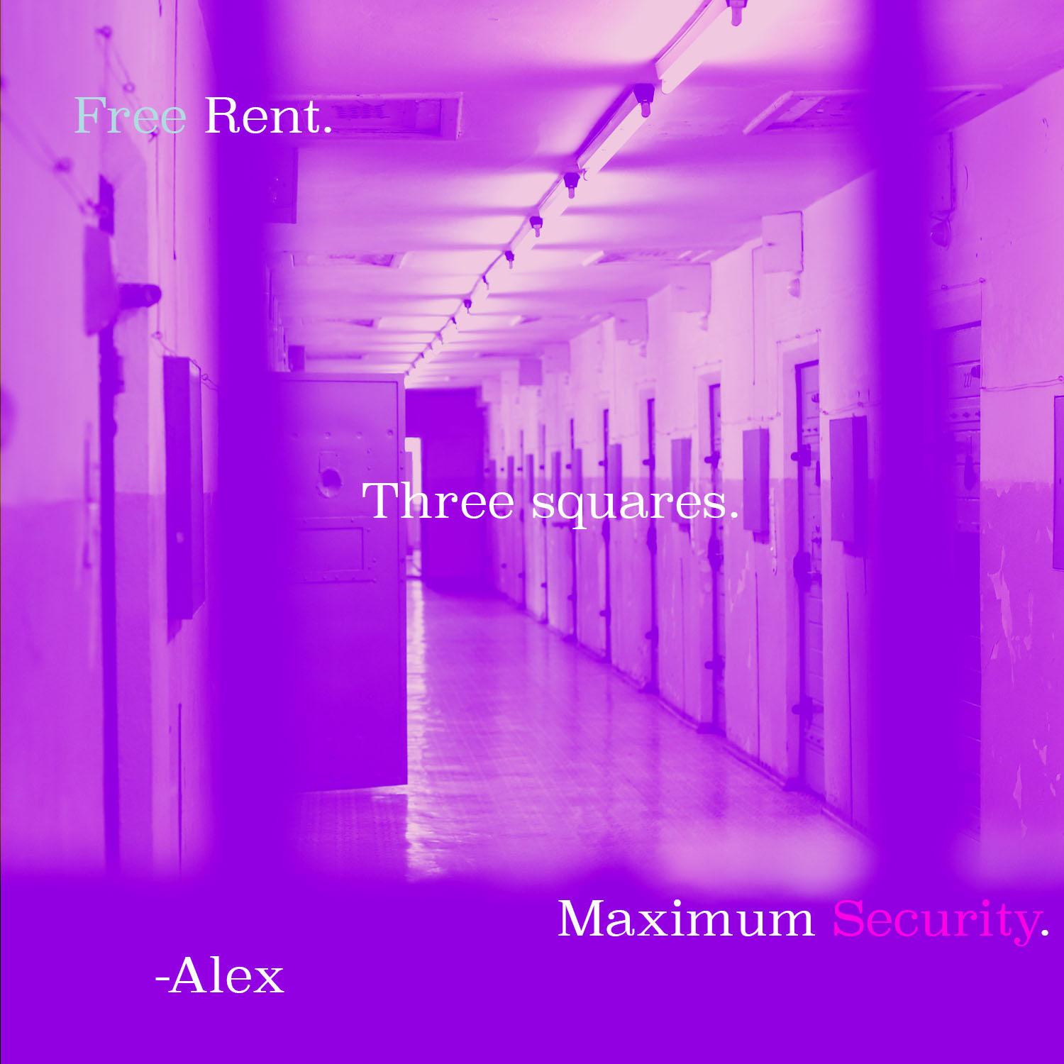
The thought for this portion of the project was to create a second image using a quote of my choice. I found a quote which stated “Free rent. Three squares. Maximum security.” Doing the same steps as the first image above, I created a word map. This word map made me think of a few things, such as security systems, identity theft, and prisons. So i stuck with the last option, which was a prison cell. I found a image of a prison, in which I added a purple filter over to make it seem like it is from a televison show. After that I added my text. Again I wanted my typography to be simplistic yet interesting. Prisons are a type of reform for anyone who was doing something that goes against law.
The aim for this project was to create a distinctive work of art using three different letters of my choice. Using the four basic design elements, I was able to make these individual pieces stand out. For my first piece, I used the letters “JVN” in representation of my initials. The typography is thick and bold, which took up most of the frame. The letters repeat many times throughout the entirety of the
piece, making the piece feel dense. The second piece uses the letter “TFN”. This specific typography allowed each one of the letters to bleed through the next. This effectively gives the typography a unique contrast from each other. The last piece is the letters “MAR”. This typography is also bold, but with a sleeker design. This piece focuses more on repetition and alignment between the letters.
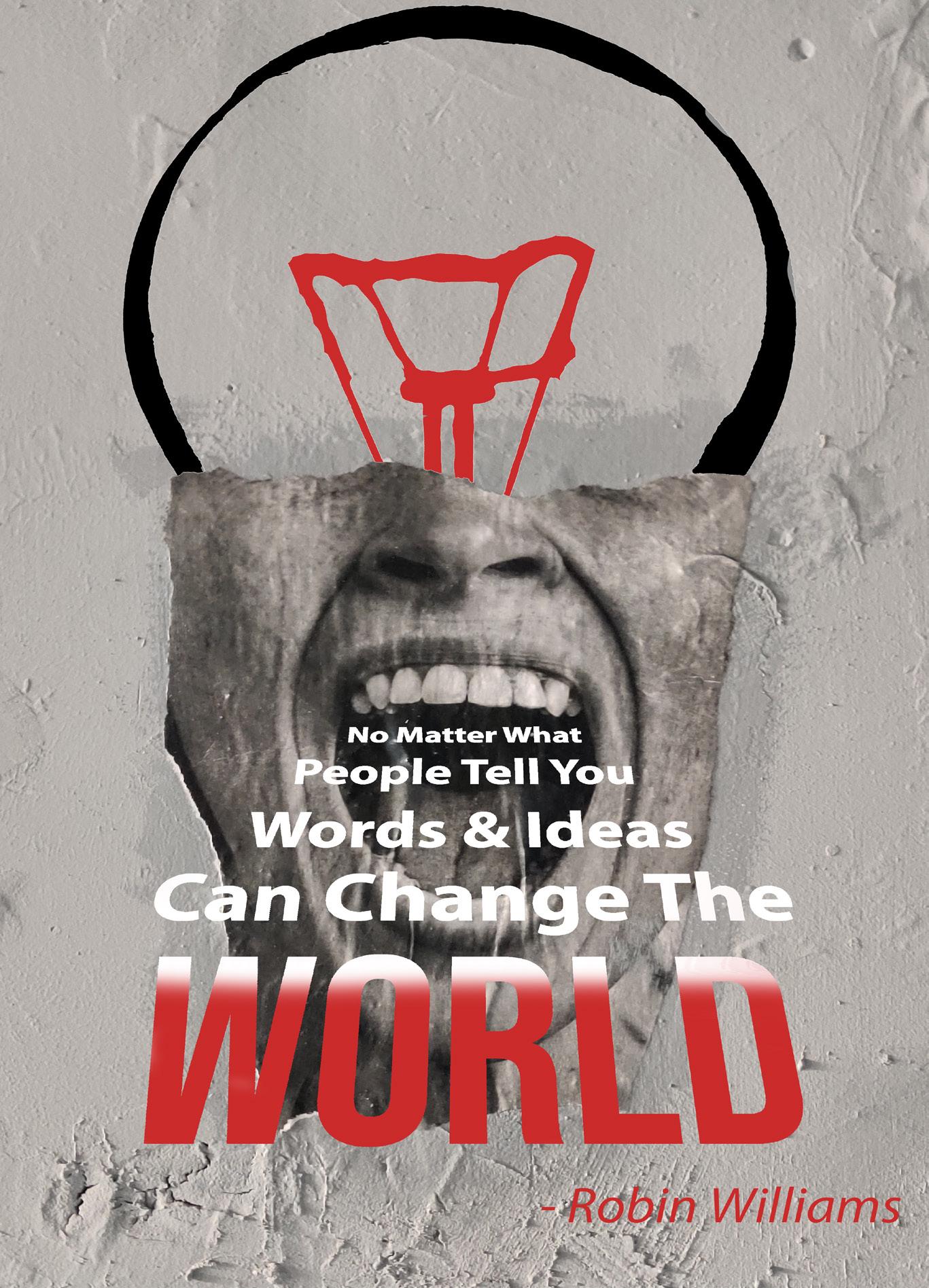
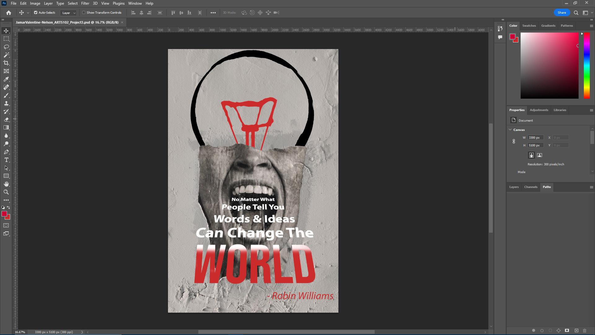
The intention for this project was to create a poster for the AIGA’s Get Out to Vote Campaign using select quotes. The quote I chose was “No matter what people tell you, words and ideas can change the world” by the late Robin Williams. Starting off I created a word map based on the words in the quote. From here, I created a mood board using the various words. This allowed me to understand what elements of design needed to be placed within the piece. My initial thought for this
project is that it was going to be a hard task. After some trial and error, I was able to complete the tasks on hand. My poster uses juxtaposition of two different elements. The top half is a light bulb, while the lower half is a mouth yelling out the words. By doing this it allowed a great amount of contrast for the viewer (you) to be able to look back and forth at the piece. Overall, the design for this project was simple yet intriguing. It allowed me to have a open and creative thought space.
My intention for this project was to create a logo based on a cartoon character from a film. I chose to do one of my family’s favorite movies, Finding Nemo. Specifically, I chose to make logos for the characters Squirt the friendly turtle and Darla, the fish killer. The overall process for creating the logo was straight forward, yet there was a great amount of work that needed to be complete beforehand. I started off by gathering elements that I thought captured these characters. I then started to sketch some basic elements. After completing these, I started to create line on Adobe Illustrator. Before this point, I never used this program, so it was a small learning curve. Overall, I thought that this project was fun. There was a great amount of refinement that the pieces had to go through. At the end, everything that I did was worth it in the long run.
SYNTAX: (visual elements & relationships)
Metal and plastic that is painted a birght orange. There are two slick transparent pieces on the front of the object. Below the orange object are four all black round objects. Across the side of the objects are two black raindrop shapes. At the top of the ob ject are four pieces of transparent material. Overall the object is flat and sleek. There are some sort of trapezoid flaps at the front of the object.
SEMANTICS: DENOTATION (Specified)
Car > Coupe > Sports Car > McLaren 570S
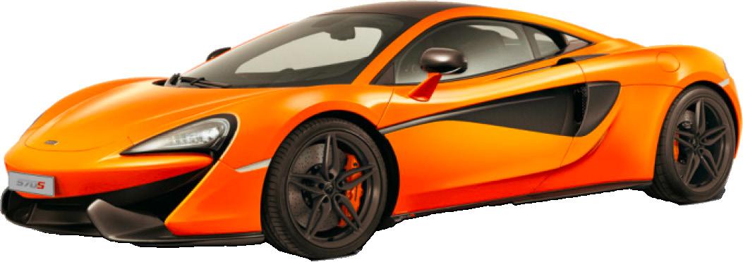
SEMANTICS: EXPRESSION (feelings) Fast, Performance
SEMANTICS: CONNOTATION (associations)
Wealthy, British, Foreign
PRESENCE (contextual)
Little: Sports Car Show Lots: On a Ranch
SYNTAX: (visual elements & relationships)
A large metal rectangle shaped blue object. Along the bottom of the blue object lies four black round rubbery objects. There are round bright silver object with holes sandwhiched between the four round rubbery objects. At the front of the blue object lies a bright silver grate. Below the silver grate is anoter silver grate. Above the top and bottom of the paint ed blue object is four dark black transparent pieces of glass.
SEMANTICS: DENOTATION (Specified)
Truck > Heavy Duty > Chevy Silverado LTZ
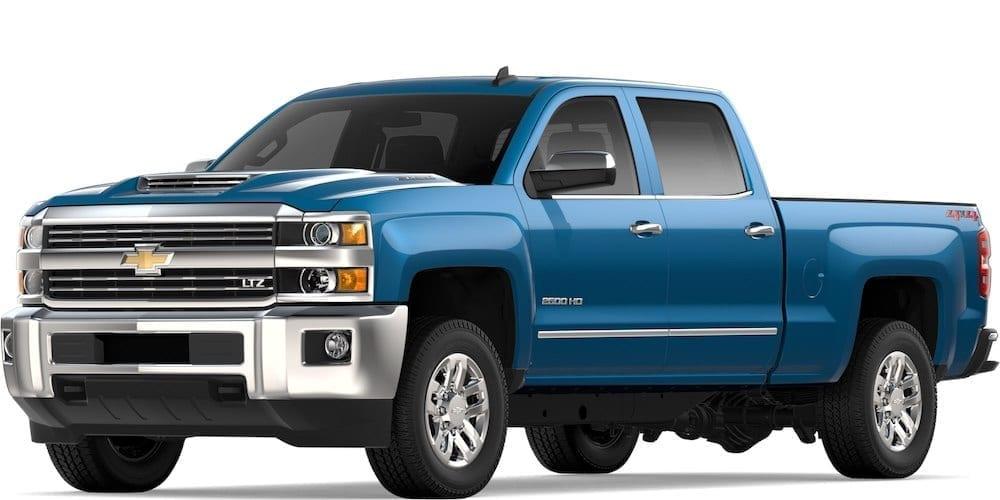
SEMANTICS: EXPRESSION (feelings) Hard Working, Building
SEMANTICS: CONNOTATION (associations)
Construction Worker, American, Tough
PRESENCE (contextual)
Little: On a Construction Site Lots: At the Race Track
The purpose of this project was to describe four similar objects using words. Specifically, I wanted to describe the objects by combining words for a better understanding. For my four objects I chose to do cars, specifically I chose a McLaren 570s (My Favorite Car), a Chevy Silverado LTZ, a Toyota 4 Runner, and a Cargo Delivery Truck.
SYNTAX:
(visual elements & relationships)
This object is painted all white with black accents. At the bottom of the white object lies four round black rubbery objects. Within those four black rub bery objects are silver round plastic objects. At the front of the box like white object are a round logo, along with some transparent linings for lights. At the top of the white box are two rows of storage bars.
SEMANTICS: DENOTATION (Specified)
Suv > Mid-Size > 4 Runner
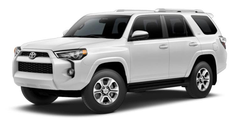
SEMANTICS: EXPRESSION (feelings) Spacious, Slow
SEMANTICS: CONNOTATION (associations)
Family, Vacation, Students
PRESENCE (contextual)
Little: At the Beach Lots: Construction Site
SYNTAX: (visual elements & relationships)
This object is very large white box container. In the front of the large white box is a smaller triangle shaped white object. This triangle shaped object has 3 pieces of clear glass. In the front of the triangle shaped object lies a silver grate. To the left and the right of the silver grates are transparent oval shaped objects for light. Below the box and the triangle shaped objects are a total of four round black rub bery objects. At the bottom of the whole white object is a black round bar.
SEMANTICS: DENOTATION (Specified) Truck > Box Truck > Cargo Delievery Truck
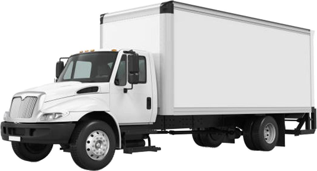
SEMANTICS: EXPRESSION (feelings) Slow, Roomy,
SEMANTICS: CONNOTATION (associations) Moving, Cargo,
PRESENCE (contextual)
Little: In the City Lots: On the Beach
Jamar Valentine-Nelson Arts 102 Professor Donna Smith University of South Carolina Columbia, South Carolina 2022