
Interior Design Portfolio
About Me
Hi there! My name is Jaime Luckey and I am a fourth year design student studying at Florida State University maintaining a 3.8 GPA and minoring in General Business. Attending FSU’s CIDA accredited design program, which was also ranked 3rd in the nation by CollegeRank, has taught me many valuable skills, keeping focus on the steps throughout each design processes and adjusting to continually meet the needs of the client.
My love for design sparked from walking through antique shops with my stepmom, where we would dream about where each piece would go and how the space would feel with each piece in it. It wasn’t until I started thinking about what I wanted to do with my life that I realized I was addicted to the way designers could control the feel of a room by influencing just one element at a time. I am a very detail oriented person and when all of the small details in a design come together to form one elegant and cohesive whole, I swoon.
I thrive on creating designs that leave a lasting impact and give each small detail purpose. I strive to create spaces and looks that rise above current trends and design fads by mixing the old with the new and focusing on long term functionality rather than short term satisfaction.
Experience
RGA Design Intern, Tampa, FL
May 2023 - August 2023
Conducted correspondence between firm and clients
Consulted with engineers and MEP’s
Aided in disaster relief residential rebuilds
Presented new build floorplans to clients
Cottages to Castles of Sanibel & Captiva, Inc.
Property Management Assistant
June 2020 - August 2020
Learned the basics of managing rental properties
Conducted inventory in all of the acquired rental units
Organized units to make sure units were renter ready
Education
Florida State University
Interior Architecture & Design
Ranked 3rd in the nation by CollegeRank
Minor in General Business Tallahassee, FL
H.B. Plant High School
Tampa. FL
2015-2019
Achievements
Presidents List
Deans List
CIDA Project Recognition Design Work Scholarship
1st Place on Group Age in Place Competition
Affiliations
IIDA
Interior Design Student Organization
Pi Beta Phi Sorority
National Society of Leadership and Success
Phi Eta Sigma Honor Society
Leadership
Student Advisory Council for 2024 Class
Nominated by department and faculty to represent the Department of Interior Architecture and Design graduating class of 2024
Responsible for meeting with the department head and voicing the perceptions, suggestions, and concerns of the 2024 class about the
Captain of Danceros Dance Team
Selected by audition, as captain of the 30 member Danceros dance team
Learned valuable skills about being a leader, a choreographer, as well as learning to properly manage a 30-member team
Facilitated communicating to all members, creating a weekly schedule with accomplishments for daily practices, and keeping members engaged and on track throughout practices
Team Lead for Community Service Events
Organized and managed a team for each community service event and planned out activities at each event for attendees to participate in
Participated in events with these organizations: Humane Society
Tux and Tails fundraiser, NFL Buccaneers Breast Cancer Awareness
Halftime Show, Oasis Fundraiser, Junior League of Tampa Holiday Market fundraiser, Tampa Parks and Rec Santa Fest community event, and Relay for Life South Tampa fundraiser
2 Luckey
Portfolio


of
A Place
Devotion 1 History & Elegance 2 Artistic Pursuits 3
4 Aging with Grace A Cultured Connection 5

6 A Cove of Comfort
Hawaiian Heritage


9 Rethinking Retail
7
8 Historic Hospitality

10 Other Projects

Contents
4 Luckey
1 Sikhism Guardwara:
Site: New York City, New York
SF: 2,000
Type: Worship Space
Concept: Gold

Overlooking New York City, New York, sits the Sikhism Guardwara. This modern building is part of a new initiative celebrating United States diversity at the Statue of Liberty complex. It is a small space that is visited by believers of the Sikhism faith and is used as a system for reflection and worship. The space was designed with an emphasis on procession and circulation in spiritual architecture and universal design standards, as these were at the forefront of the clients wants and needs.
Guardwara Floor Plan

Concept:
Gold is used throughout the temples, worship spaces, and decorations of the Sikhism religion. It represents a balance between naturalistic elements and lavish living which is a fundamental of Sikhism. All Sikh teachings are founded on the basis that everyone is created as equals and you must be able to give to those in need to enrich your own life so the monotone, but detailed molding embodies this message. Gold’s light reflective qualities also attribute the ideals of self-reflection in the form of meditation, which is also a big part of Sikh worship.
Section Cut:
Hand-drawn and rendered in grayscale to show a section cut through the main pathway of the space. The main hallway provides easy access to all of the spaces with a direct line leading from the front entrance to the back Guardwara worship space. This depiction also highlights the materials such as limestone that were used on the interior.


Floor Plan: Materials:


Front Facade:
Hand-drawn and rendered in gray-scale to show the building entrance, which includes tradition elements from Sikhism culture, including the shoe holder and foot bath.
Hand-drawn and rendered in gray scale to show spatial correlation between each of the designated areas. A large central hallway leads worshipers straight to the worship room. Plenty of room was added in the gathering/breakout space as this is where group meals are conducted.


8
Luckey
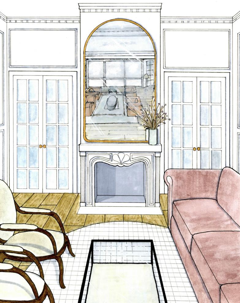
2 Paris Apartment:
Site: Paris, France
SF: 850
Type: Residential
Concept: Haussman
In this project, I was tasked with designing and rendering a Haussman-Era Parisian apartment. Research was done to make sure the designs, which were completely drawn and rendered by hand, honored the clients wants of making it a historical renovation while adding modern elements.

Library Perspective

Floor Plan:
Completely hand-drawn and rendered in color to show the layout of the apartment, highlighting the use of wood flooring in the lounge and living areas as well as traditional tiling in the kitchen.

Haussman Era:

Library:
Hand-drawn and rendered in color to show detailed elements such as the wainsscotting and crown molding. This rendering also portrays the furniture selections and built-in bookshelves.

Kitchen: Sitting Room:
Completely hand-drawn and rendered in color. This drawing highlights the historic detailing on the fireplace as well as the large golden mirror that sits centered on the mantel. The double French doors on either side of the fireplace place intention of symmetry and fluidity, transferring from this lounge area to the dining room.
This hand-sketched and rendered drawing portrays the chosen kitchen materials. Dark green cabinetry was used to create contrast against the white detailing on the walls, cabinetry and back splash. Natural wooden shelves were also placed on either side of the hood vent to add warmth.

12
Luckey
Artist Retreat: 3
Site: Laguna Beach, California
SF: 1,000
Type: Residential Workplace
Concept: Serene
Near the gorgeous coast of California, sits a serene landscape painters heaven. With large views to the outside, this 1,000 sq.ft retreat, gives an abundant amount of inspiration alongside a private area to conduct work. With ample storage and a large work surface, the client is able to carry out their wildest artistic ambitions.

Workspace Perspective


This project was inspired by the natural tones that can be found on californias native beaches. The dark hue of the water contrasted with the tan sand create a peaceful composition that embodies the feel of the space the client wanted designed.


Materials: Concept:
Floor Plan:
In this serene artist retreat, two main requirements were set forth by the client; a large place to paint with enough storage to store all of their supplies, and a small separate break area for them to gain inspiration from. Both of these needs were satisfied by the creation of a storage wall which creates separation between the two spaces while not feeling closed off, and a wall wide storage system with closed bottom cabinetry and open upper shelving. A large curtain wall with movable doors supplies the artist with a direct connection to the outdoors, giving them loads of inspiration for their landscape paintings.


Art Station:
This art area was established to be a maneuverable station that enables the client to move around and pick the most ideal lighting spot for them to produce their paintings. The dark blue color that was used on the built in storage shelves draws the eye towards the window wall that is placed right behind this area.
Large Art Desk:
A large artists desk was placed near the storage area to provide ample surface to layout paints and brainstorm ideas. A wall length drying rack with pegs for each painting to sit on was also provided so the client can allow their paintings to dry out of the way of commotion and all of the other areas.

Luckey 16
Park Overlook: 4
Site: 123 Park Overlook, Austin, Texas
SF: 2,914
Type: Residential Concept: Water
Mr. and Mrs. Kimura are building a residence in Austin, TX and both enjoy a mid-century modern style. Mr. Kimura, 72, is a retired architect and enjoys sketching and watercolor drawing. Mrs. Kimura, 68, is a retired textile saleswoman and enjoys making fresh flower arrangements. They both engage in the practice of Tai Chi and remain active in upholding the traditions of their Japanese heritage.

Kitchen Perspective


Process Work: Concept:
Water was the driving force for the Kimuras residential space. With Mr. Kimura’s watercolors, Mrs. Kimura’s flower arrangements, and the calming nature of Japanese culture, water is the element that ties together these components. Water trickles movement into every nook and cranny as it flows. This was reflected in the home through the use of each square foot of the house working together to form a unified home that also embodies the feel and relaxing composition of water under multiple contexts.
This hand-drawn and hybridrendered floor plan shows the layout of the home, including all ADA requirements and client needs. Wood flooring was carried throughout the main living spaces to provide warmth.


Mood Board:

Floor Plan:
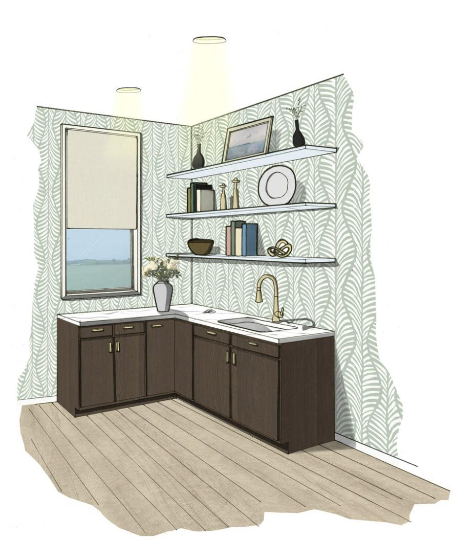
Kitchen Pantry:
Bathroom Elevation:


Dining Room:
This hand-sketched and hybrid-rendered drawing portrays the pantry/flower space. A large window was implemented to give the client ample natural light to arrange her flower bouquets and a fun wallpaper was added to create visual interest.

Hand-drawn and hybrid rendered in color to depict the material selections for the dining and kitchen areas. Large dining table and kitchen island were incorporated to meet clients needs.
Luckey 20
Park Overlook Rear Patio:


Mood Board:
1.Wellness Element: Living moss wall creates calming scenery that promotes relaxation
2.Biophilic Element: Use of natural wood creates sense of place in nature
3.Wellness Element: Hanging flower planter contributes to Mrs. Kimuras’ flower arranging hobby
4.Biophilic Element: Limestone is naturally sourced from Austin providing a reminder of the native natural texture
Outdoor Kitchen:

Luckey 22
Burrell Communications: 5
Site: Chicago, Illinois
SF: 10,000
Type: Office Space
Concept: A Cultured Connection
In this Project I was instructed to design the interior of a 10,000 square foot office building in a large downtown area. Open concpet plans were incorporated to encourage positive communication between staff and management. Moments of privacy were still prioritized through the use of soundproof materials and the seperation of spaces.

Upstairs Work Cafe


Process Work: Concept:
Feeling a cultured connection is about being part of something that gives individuals a sense of purpose and in order to feel motivated, we need this sense of purpose to be something we are passionate about. Today, individuals who present marketing products strive to feel a sense of connection to help them fulfill what they feel is their brand’s higher purpose is and this is what makes Burrell so successful. Burrell takes on projects that they feel are driven towards a higher purpose and this allows them to expand their cultural horizon to meet the needs of each one of their diverse clients. By providing their headquarters with a series of diverse spaces connected by a central and open area, their employees will be able to think about their clients brands with an invigorated and out of the box approach. inclusion and moving forward, improved communication.
First Floor:
These not to scale floor plans detail the contents of the Burrell Communications office spaces. The first floor consists of a work cafe, coffee bar, manager offices, 10-person conference room, print room, and staff training room. The second floor consists of a smaller work cafe, kitchenette, workstations, HR, IT HelpBar/ workstations, and a 6-person conference room.

Second Floor: Floor Plans:


Reception/Waiting Area Monumental Stair Accounting Workstations Executive Staff Workstation HR Workstations Legal Workstations Management Workstations Marketing Workstations Development Workstations Relations Workstations Short Term Enclaves Long Term Enclaves 2-4 Person Meeting Rooms 6-Person Confefence Room 10-Person Confefence Room Staff Training Room Work Cafe Coffee Bar IT Server Room/Help Bar IT Workstations Employee Entrance Agile Workstations Desired Adjacency Undesired Adjacency Neutral Adjacency

Front Entrance:
The wooden slats in the front lobby create a separation between the work cafe and waiting area without creating a visual divide or closing the area in. The logo wall is combined with biophilic elements to create a visually appealing environmental and marketing graphic. This perspective was created using Revit and the rendering extension Enscape. Adobe photoshop was also used to complete final touches.
Downstairs Work Cafe:
The coffee bar creates an interactive space where employees can feel surrounded by a cafe-like environment while they conduct their work. Large overhead lighting provides a visual appeal that leads your eye to the back of the office space which assists with wayfinding. The meeting pod on the right side of the image provides a private sanctuaray where employees can meet or work individually.


Upstairs Area:
The Marketing, Product development, and Vendor Relation work areas are signified by a environmental graphic wall with Tom Burrell, the company founders, quote to keep them motivated and grounded towards the companies purpose. The long term enclave area to the left is indicated with a drop down slatted ceiling and organically formed desk spaces.
Luckey 26
Le Bon Viveur: 6
Site: Cascades Park, Tallahassee, FL
SF: 2,000
Type: Retail Space
Concept: Reverie
In this project, a partner and myself were tasked with rethinking the presence of retail spaces in todays digital age. We were given the building shell and decided to create an area where guest could come and take classes in the art of craft ciocktail making.

Retail Entrance

Branding & Concept:
Driven by the idea of “reverie”, a state of being pleaseantly lost in a daydream, the design of Le Bon Vivier transports visitors into a luxurious, sensual, and vibrant frame of mind. Influenced by a blend of Art Deco and Art Nouveau styles, the design of this mixology bar emphasizes bold geometry and exuberant forms, exhibiting decorative detailing that proves to be an integral part of the design, rather than mere ornamentation.
The mixology lounge is founded on the belief that people should seek to understand more about the history, science, and culture that cocktails bring to an environment. Over the years, the art of cocktail making has been lost to the general public, as our society gets caught up in the hustle, never stopping to take a moment and enjoy. The mixology lounge is luxurious, leisurely, and convivial, reminiscent of the Art Deco movement that was once rooted in the essence of kindered spirits. Le Bon Viveur is bringing back the character of the craft cocktail.
Process Work:


Floor Plan:
The floor plan for this space flows seamlessly from the front to the back of the unit and is organized so that guests have to pass through the retail/merchandise shop before entering the main mixology area. The space consists of one large bar and two smaller bars, lounge seating , a front waiting area and a merchandise shop for branding products and mixology trinkets.
FF&E:

Front Entrance:
An enchanting foyer invites visitors inside to freely browse merchandising along the left walls and sit in the comfortable lounge while they wait for their session to begin. The rich coloring on the walls contrasted with the intricate tiling on the floor creates a dramatic visual effect for guests. This rendering was worked on by both my partner and myself.
Lounge Seating:
The main area ties in the concept of reverie through its energetic nature brought to life through unique finishes, bright accents, and detailed architectural elements. The large marble column feature and layered ceiling elements draw the eye up while dramatic lighting on the bar shelving and walls create a textured look with several points of visual interest. This rendering was completed by my oartner and myself using Revit, Enscape , and Adobe Photoshop.


Personal Bars:
The two mirrored bars enable smaller parties to have a more intimate experience, retreating to their own booth seats after their session concludes. Glass and gold shelving extends down from the ceiling to create grounding above each bar and vibrant colors and patterns on the ground and bar help with way finding. This rendering was created by both my partner and myself.
Luckey 30
Liljestrand Lookout: 7
Site: Pu`u Ohia, Hawaii
SF: NA
Type: Residential
Concept: Embracing One’s Roots
Project won first place for our studio competition
In this two week project, a group and myself were tasked with designing a senior living facility in a location of our choosing. We chose to take a historic building called the Liljestrand Lookout building and remake it assuming there would be damages 100 years from now. We expanded the building shell preserving as much as the historic building structure as we could.

Communal Dining Area

Concept:
Tradition and heritage are defining characteristics of the Hawaiian culture. The design of the Liljestrand senior living facility centers on “embracing one’s roots”. This concept will embody the idea of adapting a historically important residence to an assisted living facility, housing residents adapting to senior living. In these cases, individuals can experience high states of confusion, anxiety, and stress, where it’s important to maintain a sense of normalcy. Biophilic elements calling to the Honolulu environment will boost cognitive function and mental well-being. Embracing tradition while adopting autonomy and new technologies will enhance the experience of residents and staff.

The first floor of the liljestrand lookout consists of a communal area, full kitchen and dining space, living suites, and outdoor spaces to take in the views. The second floor consists of fitness and clinic areas, living suites, and a communal movie room, as well as outdoor areas to socialize. These floorplans are not to scale.
Floor Plans:

Second Floor:
Dining Area:

This view shows a perspective standing from the kitchen looking out towards the dining space. Large communal tables are in place to encourage socializing among residents. Large windows allow a connection to the outdoors while being able to enjoy to the accesibilty of being inside. Natural tones and materials such as the teak wood pay tribute to the heritage that surrounds the building. This perspective was produced by me using Revit, Enscape, and Adobe Photoshop.
Luckey 34
Canton Cove Pediatrics:
8
Site: Baltimore, Maryland
SF: 3,298
Type: Healthcare Concept: A Cove of Comfort
In this Project, a partner and myself were tasked with designing the interiors of pediatric clinic located in Baltimore, Maryland. The building outline, parameters, and requirements were provided by a 2024 IIDA Student Competition.

Pediatric Waiting Area

Concept:
Nestled beside Chesapeake Bay, Baltimore offers a natural shelter from the open waters, evoking a sense of tranquility akin to that of a cove. The concept for Canton Cove Pediatrics is cultivating the comforting conditions a cove provides. Oceanic attributes are incorporated into the space through a soothing color palette, fluid forms, and alcoves for privacy. These attributes emulate the calming and captivating environment of a cove allowing children to feel sheltered within the space. Organic elements and interactive zones provide positive distractions for the patients and their family members to encourage positive emotions. Broad windows within common areas bring the outdoors into the space creating an open and airy feeling. Clear sightlines and wayfinding systems allow children to feel a sense of control while navigating the clinic. Together these elements make Canton Cove Pediatrics a haven of healing for young patients and their families.


Exam Rooms:

Floor Plan:
On the floor plan, the front desk acts as an architectural focal point adjacent to the entrance to promote wayfinding. The designed path circulation helps to mitigate heavy mixed traffic flow between staff and visitors. Separate hallway will be provided for staff areas. this will be made obvious through the use of exclusive access doors and a change in design features. The staff lounge will provide locker storage and a full kitchenette with calming colors to encourage workers to decompress. This floor plan is not to scale.

Waiting Area:
Unique curvilinear forms and playful colors in this space provide positive distractions for young patients and plenty of visual interest for families while they wait. This rendering was completed by me using Revit, Enscape, and Adobe Photoshop.
Upstairs Area:
Soft lighting and muted colors allow this staff space to become a sanctuary. It encourages them to decompress from the stressors and constant movement of their job. This rendering was completed by me using Revit, Enscape, and Adobe Photoshop.

Luckey 38
Site: Florianopolis, Brazil
SF: 100,000
Type: Hospitality
Concept: To be determined...
Hospitality Project: 9
This project will be my last project completed at FSU. We were assigned a location and get to choose a hotel typology and have just started designing this 8-story hotel that will be completed the end of April.
In Progress . . .
Luckey 40
Other Projects: 10
Projects: CAD Door, Construction Systems Detail Drawings, Sketches, Garage Mock Drawing
In this section you will see a series of CAD drawings, Revit plans and other creations that represent the technical skills I have learned so far. Each project has helped me to further my love of design and reconfirm my confidence in the abilities I have obtained as a student so far.
Kravet Fabric Pattern :
The design of this pattern was abstractly taken from the pitches of notes in a song titled “Water Crystals” by Nao Yamashita. Throughout the song, distinct high and low notes are “hit” repeatedly. To create this repeated pattern, the notes pitches were recorded through a series of points then connected by a single continuous line. This line, with its curvatures, reflects the ebbs and flows of water.


FSU Reynolds Hall :
Reynold's dormitory hall was built in 1913 but underwent major renovations, along with 4 other historical dorms, and reopened in 1996. The front door is elegantly decorated with a Jacobean arch, brick and cement detailing, and decorative glass window panes. The detailing extends past the front face of the main building, creating an awning with a pointed top and symmetrical geometric detailing on either side. The brick pattern is a simple staggered stack lay with cement detailing providing the main design appeal. CAD was used to draw this replica of the halls front entrance.
Luckey 42
Argonaut Office Building Construction Documents:


Reception Desk Front Elevation:

Reception Desk Section One:

Reception Desk Rear Elevation:
Partition Plan:
Level One
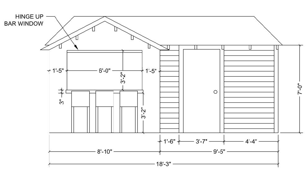
Outdoor Garage Technical AutoCAD Drawing:
Front Elevation:
This project was drawn using CAD and produced for a resident living in the Seminole Heights area of Tampa, FL. She wanted a few ideas and drawings of what she could do to her outdoor shed to make it a more enjoyable place to spend time.
Plan View:

Side Elevation:
Luckey 44

- Anonymous ThankYou! Phone: 727-744-1511 Email: jaime.luckey.o@gmail.com
“If the plan doesn’t work, change the plan, but never the goal.”
- Anonymous
46
Luckey
2024