Jaedun Wilson
Architecture Portfolio
Table of Contents

01 : Thesis
The Language of Color; bridging the gap between elders and the youth
Fall 2023 - Present
Pages 1-4
02 : 4th Year Studio
Hotel For Architects
Spring 2023
Pages 5-8
03 : 4th Year Studio
Project Life Urban Renewal
Fall 2022
Pages 9-14
04 : 2nd Year Studio
Art Gallery for Barnett Newman
Fall 2020- Spring 2021
Pages 15-20
05 : Internship Experience
Williamsburg Events and Sports Center
May 2023 - August 2023
Pages 21-22
01. The Language of Color; bridging the gap between elders and the youth
5th year Thesis
Fall 2023 - Present
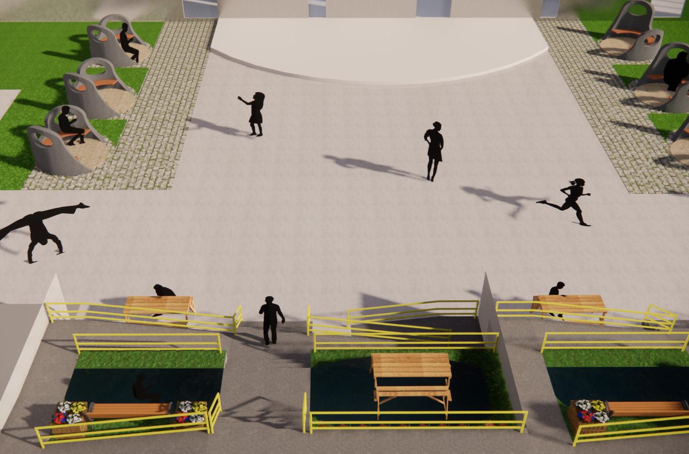
Playground Coleman Place Elementary 1 1
Site Plan
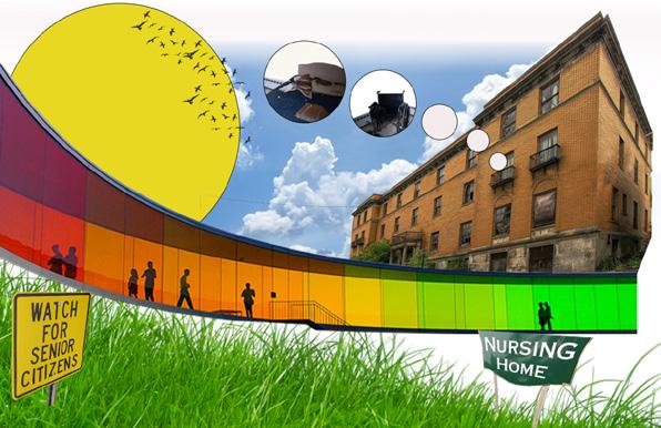
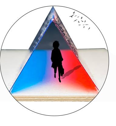
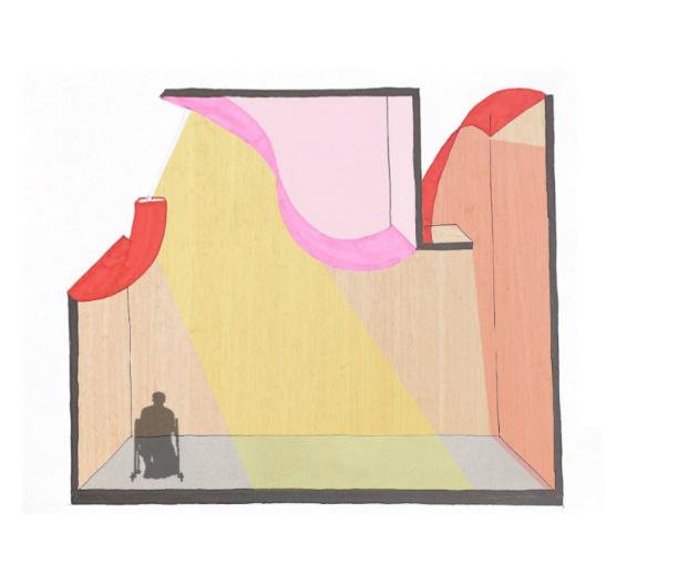
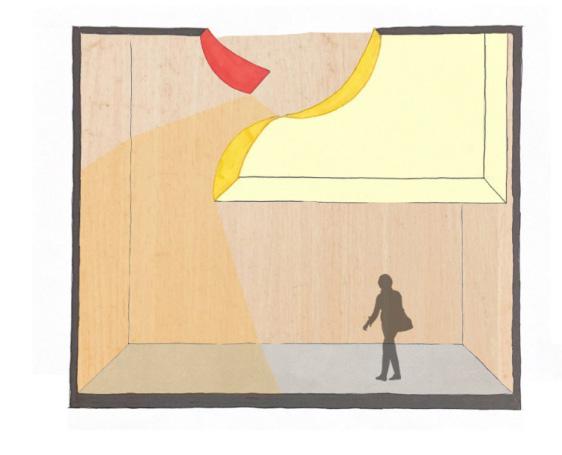
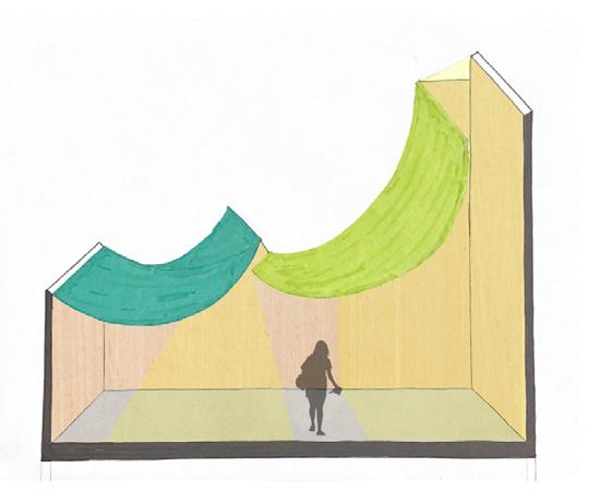
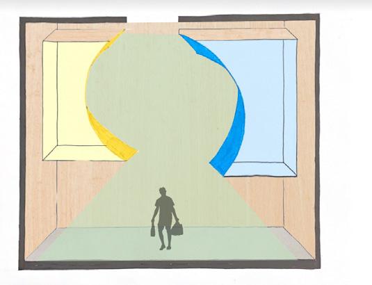
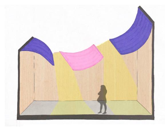
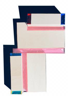
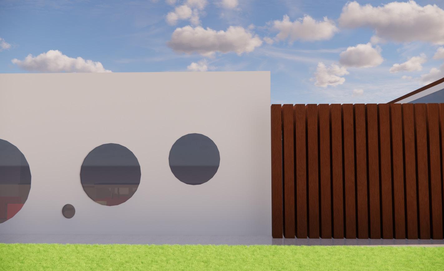
This work showcases the ability of color, glass and different viewpoints as these elements create architecture with a sense of youth and playfulness. With the assistance of sunlight, the colorful palette creates an experience for all users. The light is crucial as it marks time throughout the day creating shadows in the spaces. The change in color represent a bigger meaning; reflection. As you manuver through the building, the user shall reflection on one’s life as the different shades capture a different viewpoint. The different portals also serves as a transition element that connects the different spaces and engages with the broader site and surrounding context.
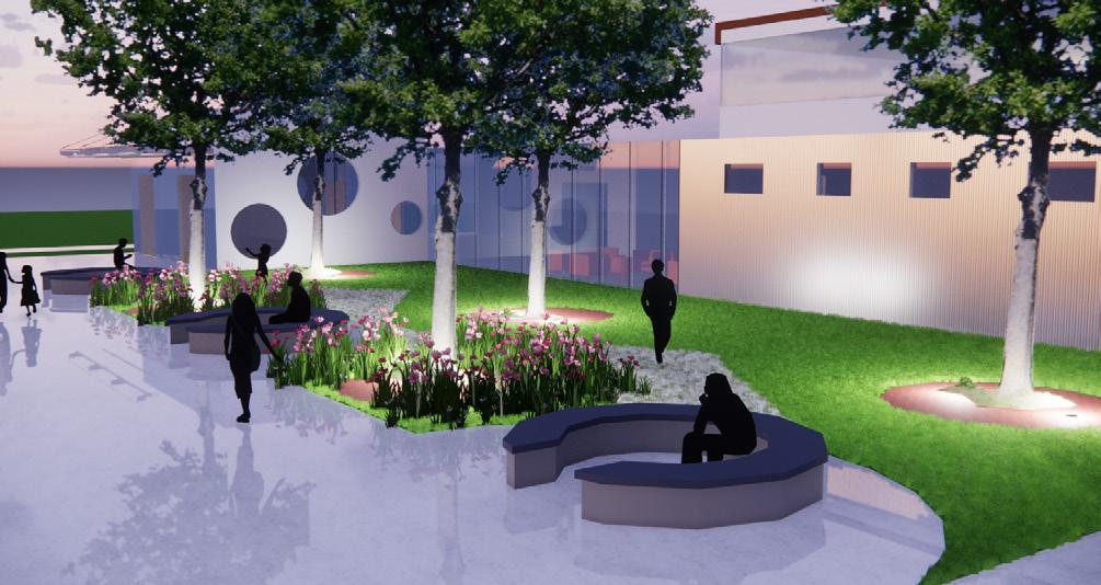
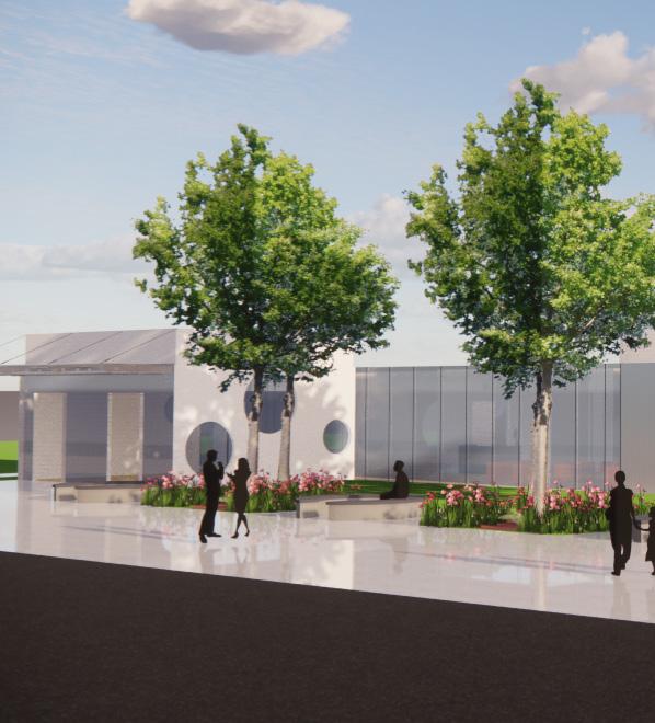
Loacted in a suburan neighborhood, the shared space between the elementary school and the nursing home helps to bridge the gap between the youth and their elders. It creates opportunities for engagement, pen pals, and interactive activities. The facade of the nursing home will serve as an interactive and learning opportunity for the students. Essentially the design serves multiple purposes and will be a staple on the school’s campus. Elders tend to feel neglected when placed in these nurisng homes for many reasons, so it’s important to change this narrative and bring life back into these facilites for a full circle moment. The goal is to dismiss the negative pessimistic views of nursing homes in Western cultures and create a more optimistic community. Giving back to the community and its elders helps to create a positive cycle of englightenment, community engagement and the passing down of wisdom.
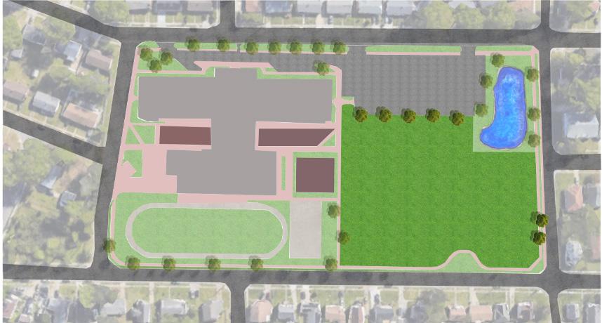
Coleman Place Elementary Shared Garden N
Shared Garden Playground Parking
Coleman Place Elementary School Site Basketball Courts
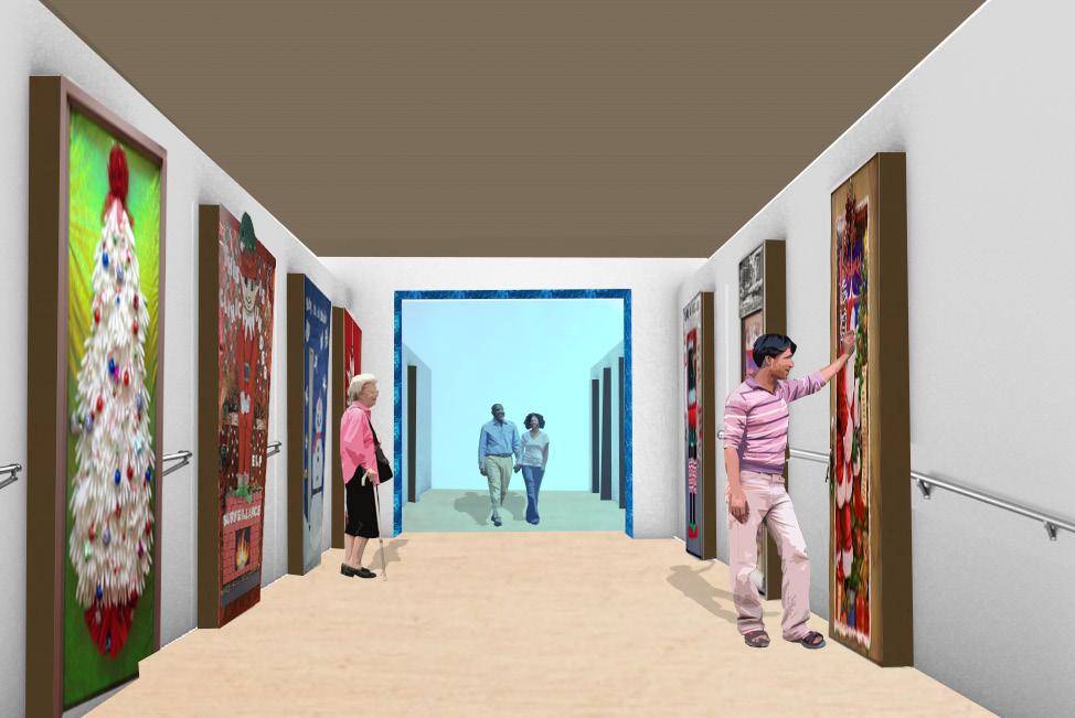
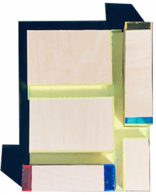
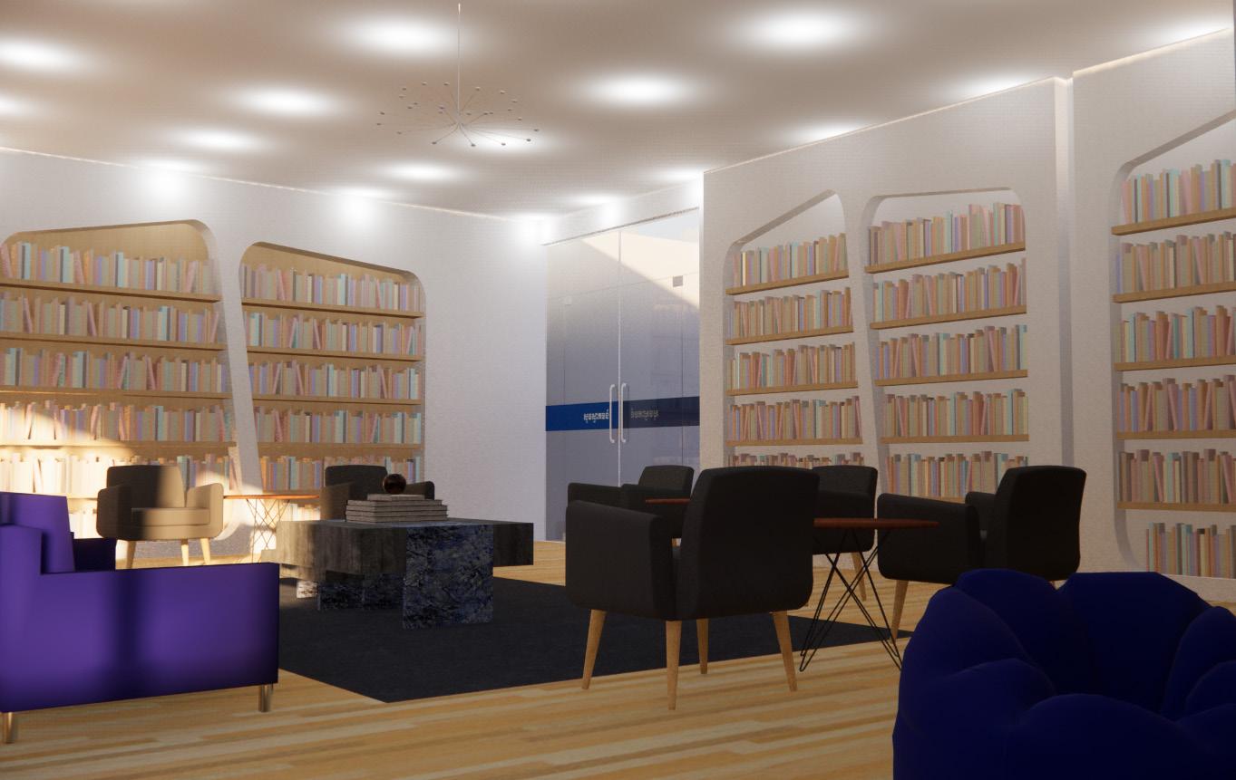
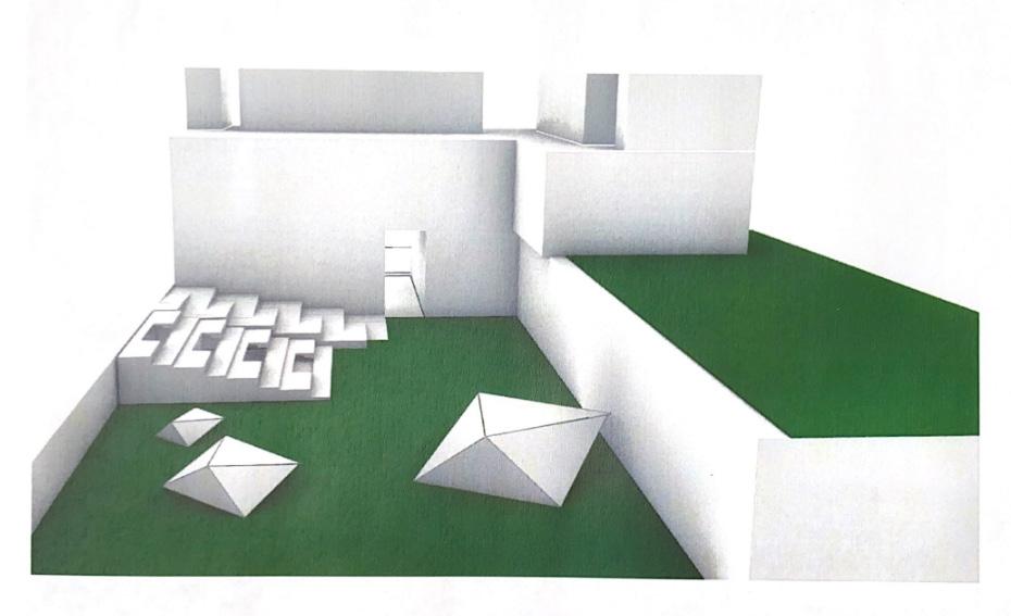
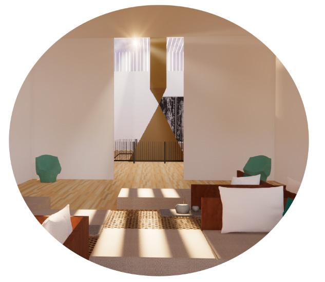
Showcasing the doors in the corridor
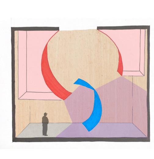
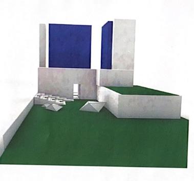
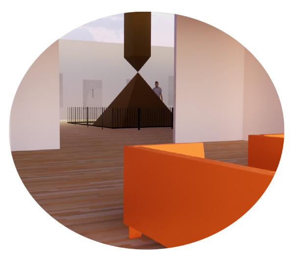
The corridors will be elevated as residents will be able to personalize their doors. Each resident will be able to make their room feel like a home with the addition of personal mailboxes for certain rooms. This gives patients a sense of individuality and ownership. The goal is to allow patients to feel welcomed and at home. To the right you see the blue “portal” which symbolizes a transition between two different divisions of the building. Together this creates a sense of youthful territory.
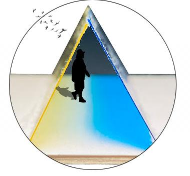
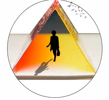
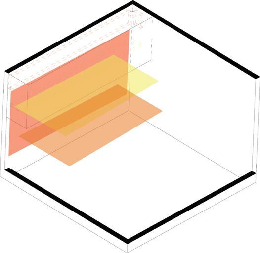
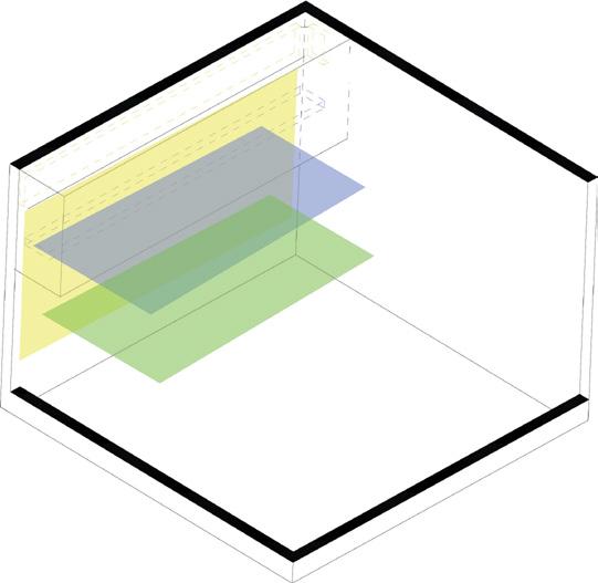
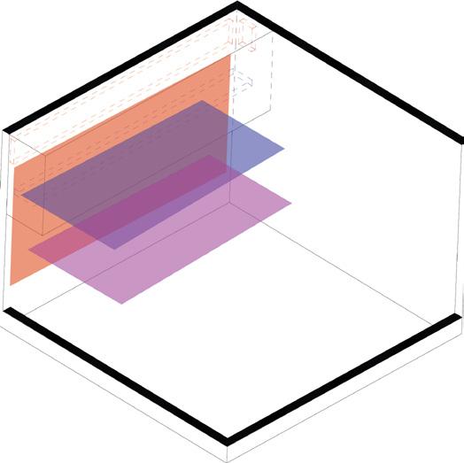
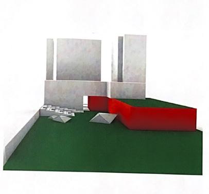
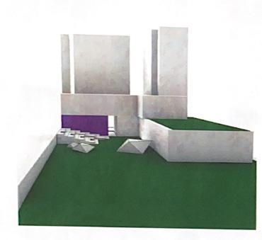
The study and use of primary colors such as red, yellow and blue creates secondary colors. The three primary colors will overlap and create the three secondary colors to give the perception that all six colors are physically present. The overlapping of colors will be arranged so that as the colors intersect, there’s moments of rest and reflection and shown as you look out outo the garden. The exterior glass flows into the interior space, assiting with creating vibrant atmosphere in the corridor.
On the color wheel, red and yellow are neighboring colors that merge together to create orange. The overlaping of the two colors showcases the vibrant connection the two colors have. Yellow and blue are primary colors. The boldness of the color blue is dimmed when mixed with yellow, creating what we know as green. Blue and red are primary colors meaning when mixed, they create the color purple. Although the two aren’t directly next to each other on the color, the two bold colors have a strong relationship and neither fades away when mixed
Interior Portals
With the use of extrusions, the work displayed showcases the use of light and color as tools to suggest a sense of youth and playfulness. Time will be marked with the assistance of the light as it causes shadows in the interior space. The objective is to have the colorful gradient serve as a portal to reflect on one’s life as they maneuver through the corridor and the interior space. The portal also serves as a transition element, corridors, as it wraps around the building, connecting the different spaces. The portal hints at what’s to come and helps define spaces.
Connecting the Young with the Elders
The connection between the youth and their elders is one to be reiginited. The goal is to create an intergenerational space where the youth and the elders can learn together. The connection they’ll experience is one of nostalgia and wisdom. When together, they experience a joyful connection filled with lots of love and energy. This shared space will be used to bridge the gap between the youth and their elders. Parts of the roof for the facility will turn into a playground for the elementary schoolers. Essentially helping to bring life into space. In addition, durig talent shows, graduations or any other scholastic event, the two groups will share memories. This connection will also serve as a pen pal system in which some of the elementary schoolers will be connected to an elder in the nursing home. Patients will also have views of the playground, garden and track during times they aren’t outside and in their room as a way of reflection.
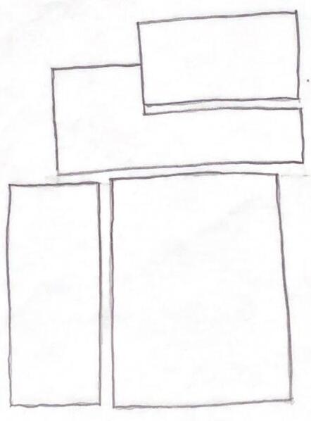
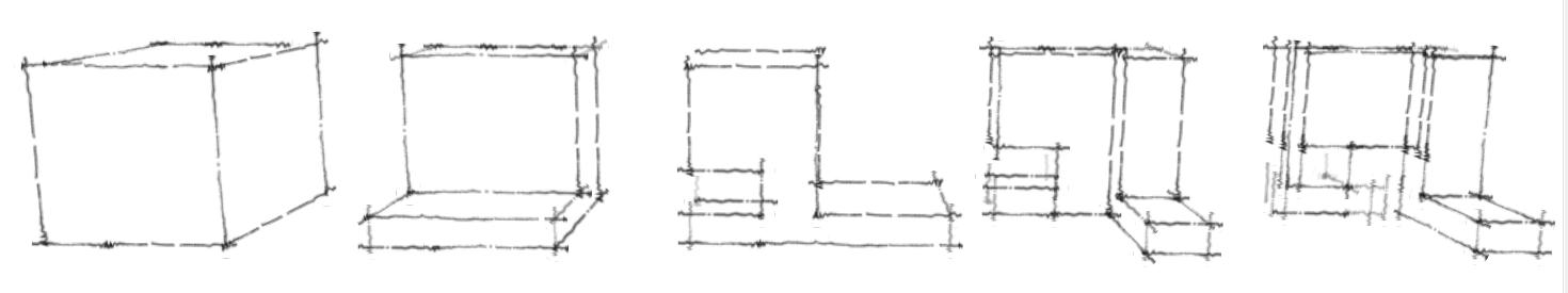
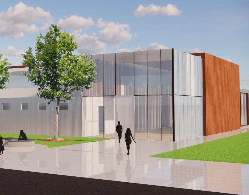
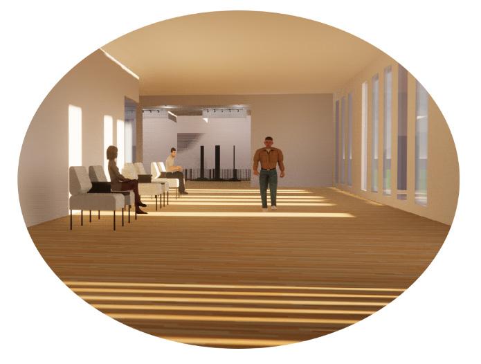
The facility is divided between loud and quiet spaces and short term and long term spaces. The “Language of Light” corridor helps to connect the different spaces and create a sense of playfulness within the design. The design studies below explore the different options the building can be placed on the site. The studies focus on the relationship with coleman place elementary school and the individuality of the nursing facility. The two have a cohesive relationship and the design layout create spaces in which the two groups can interact while also valuing the different purposes of each building.
Quiet spaces
Loud spaces
Short Term Residents
Long Term Residents
Playground Playground
Shared Garden
Basketball Courts Track
Long Term Residents
Short Term Residents Loud spaces Quiet spaces
Short Term Residents
Short Term Residents Quiet spaces
Loud spaces Long Term Residents
Long Term Residents Loud spaces Quiet spaces Quiet spaces
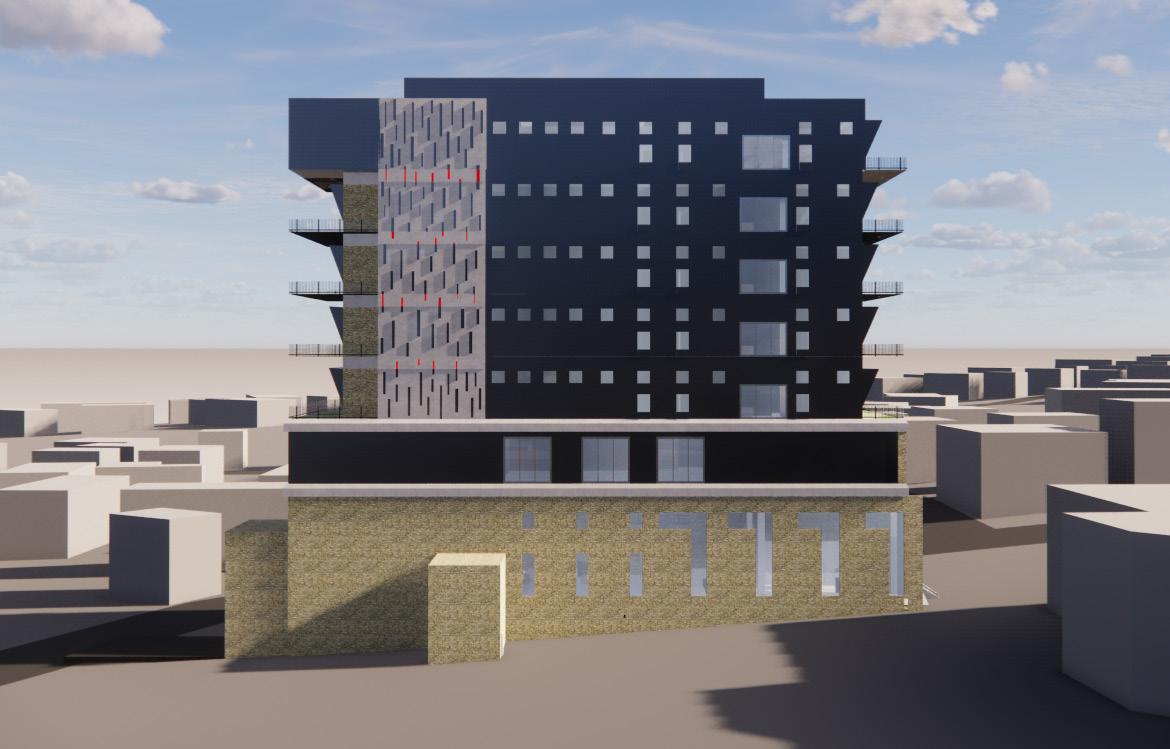
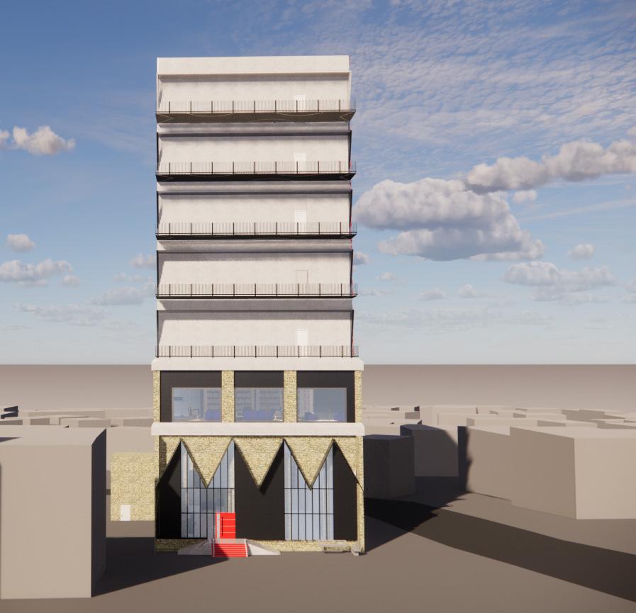
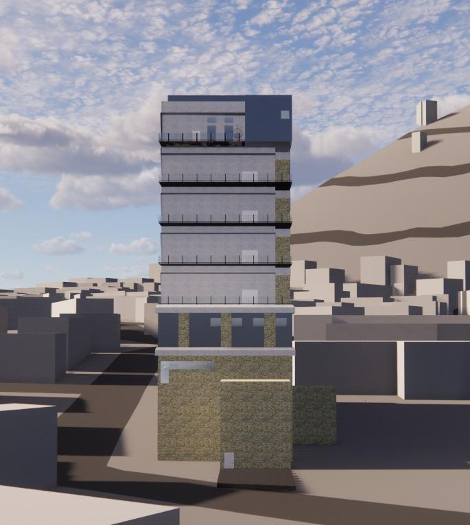
02. Hotel For Architects
4th year studio
Spring 2023
Site Plan
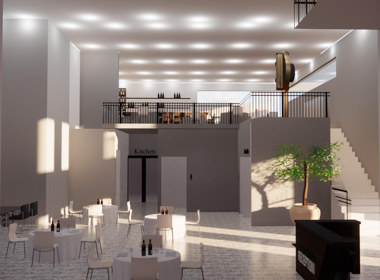
We were tasked to design a hotel for architects in Monte Carasso Switzerland. The site was narrow 47’ x 147’ with a graveyard facing the north of the site. The hotel contained 19 rooms, 10 double and 9 single rooms plus 1 suite. There were typical support spaces such as mechanical rooms, janitorial rooms, electrical rooms, a gym, a sauna, library/ study spaces, a restaurant and a bar, a wine cellar, a front desk, a fireplace, and self serve laundry room. In addition, the hotel program also consisted of operable windows, habitable roof area, fire stairs, below grade spaces, service elevators, and vehicular delivery spaces/storage.
The site is very unique. In addition to being surrounded by mountains, the area is very old and the town is very small. With such a narrow site it was necessary to built of vertically, which helped create the facde for my particular Hotel. The surrounding context really influenced the building’s layout and facade. Designing for architects, means to add specific details that only a designer will recognize and appreciate.
5
N 5
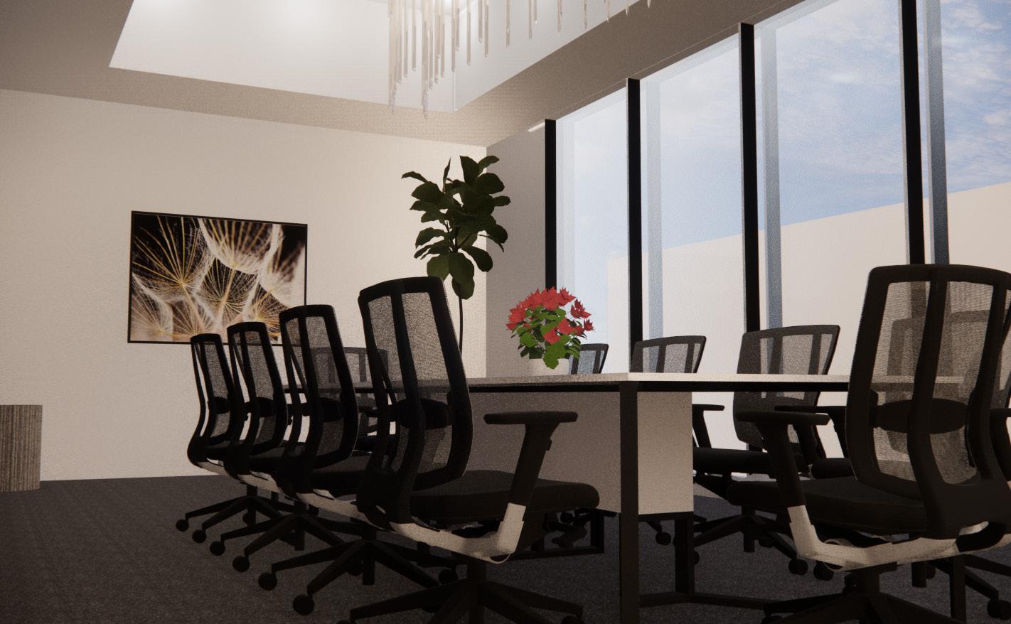
Restaurant Conference Room
Interior Renderings
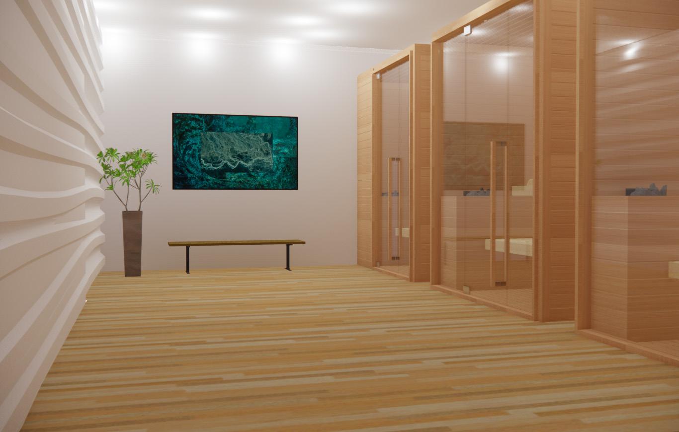
The renderings on the right are interior shots of the conference room, restuarant, sauna and library. The hotel has many amenities that accommodate for both short and long term stay. The conference room and the library are both on the same floor, the second. The layout is designed based on how often the spaces will be used as well as how much noise the space creates. The second floor is the quite floor that’s meant to sensor sound.
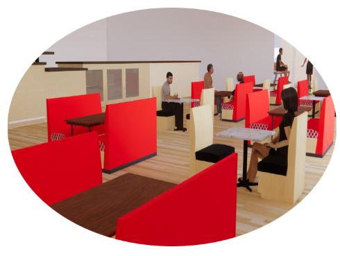
The interiors are designed to create a certain atomsphere based on its usage. For instance, the ceiling in the conference room is carved out directly above the table so a chandelier can be placed in the middle. This makes the room feel bigger while also feeling intimate at the same time. In addition, the sauna has an accent wall that’s a wavy texture that helps to convey a relaxing atomsphere. Lastly, the restuarant is a two story resturant with a bar up on the mezzanine. The double ceiling height exaggerates the experience and with the assistance of sunlight, the spaced is fills very energetic yet relaxed.
The color scheme is based on the use of each room. For the conference room, the color scheme is more neutral tones with the walls being a light gray, the carpet tile being a dark gray, and the painting being a combination of both which compliment the conference table and chairs. The color scheme in the sauna are light browns and wooden textures that creates a soft and relaxing atomsphere. Lastly, the library is filled with blue tones, do to the psychological benefits of the color blue. In addition, the shelves are build into the walls, creating a unique visual design.

Library Sauna


1
Elevations
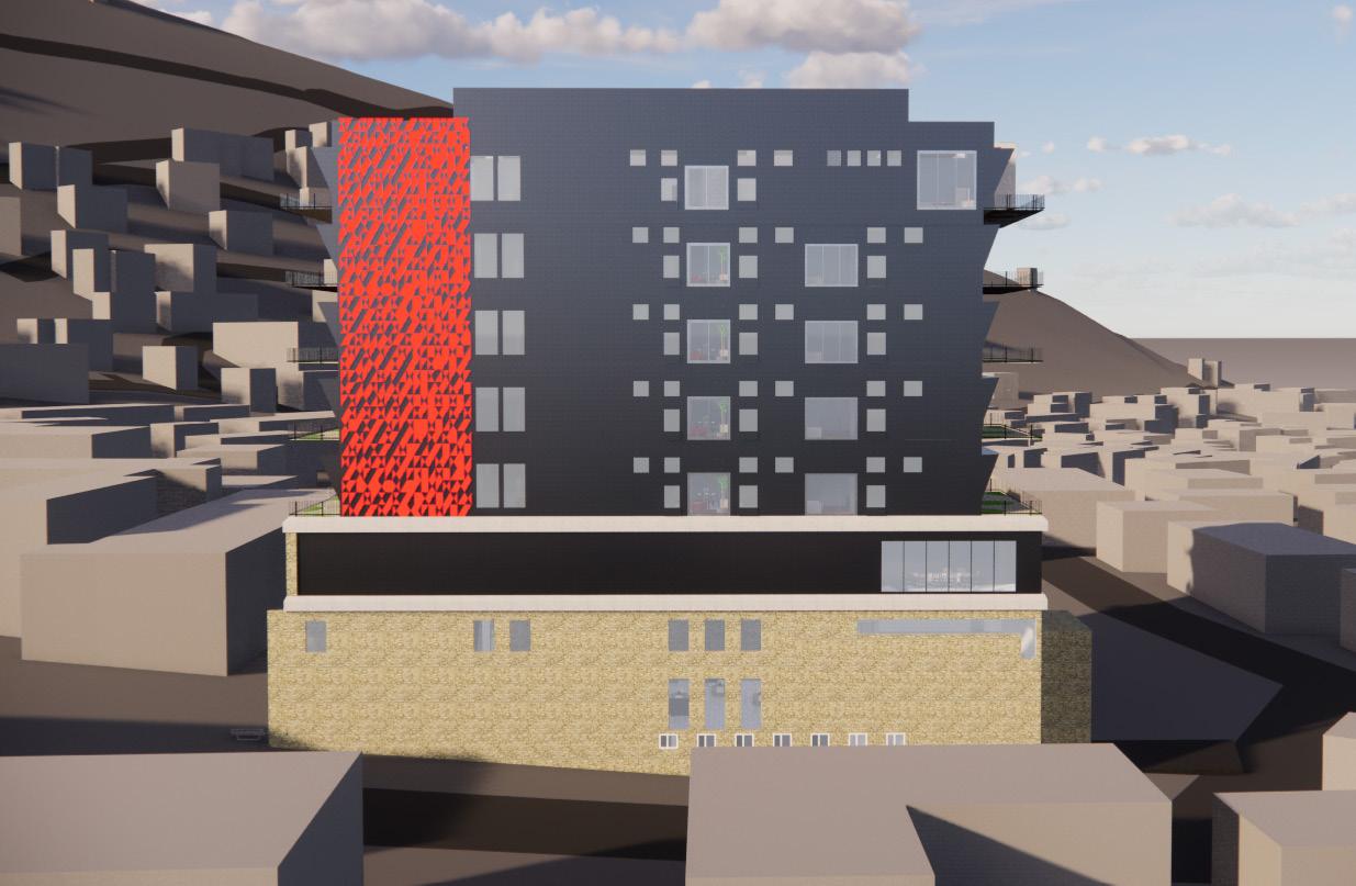
The Hotel is designed to capture light at specific moments throughout the day. The building is designed to give back to the surrounding city and capture the history of the area. The facade of the ground level is covered in beige stone to resemble the surrounding buildings, while the upper floors have metal panels, both dark gray and red. This creates a dialog between the old and new elements of the city. This symbolizes a “change” in the area as if the building is “sprouting” or “growing”. The ground level and the second level are divided with the assistance of concrete and on the east and west elevations, the concrete covers the side of the facade creating its own language. Lastly, the north and south elevations have their own identity, with a strip of concrete and red metal panels along the side of the facade.
South Elevation
North Elevation
East Elevation
East Elevation
 Aluminum Metal Panels
Natural Beige Stone Grey Concrete
Laminated Glass Custom Red Metal
Dark Grey Concrete
Aluminum Metal Panels
Natural Beige Stone Grey Concrete
Laminated Glass Custom Red Metal
Dark Grey Concrete
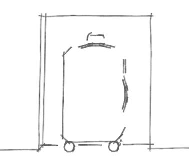
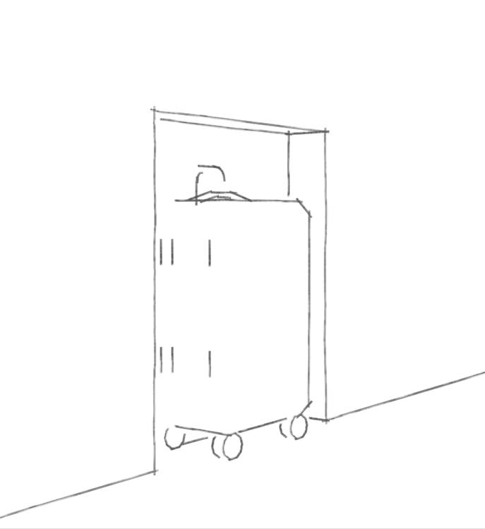
Study Models
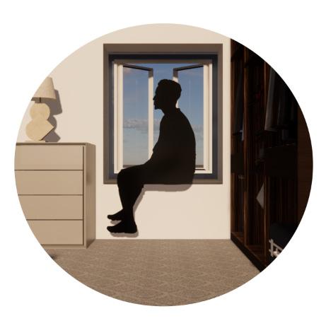
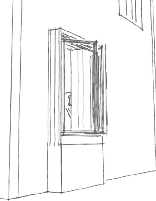
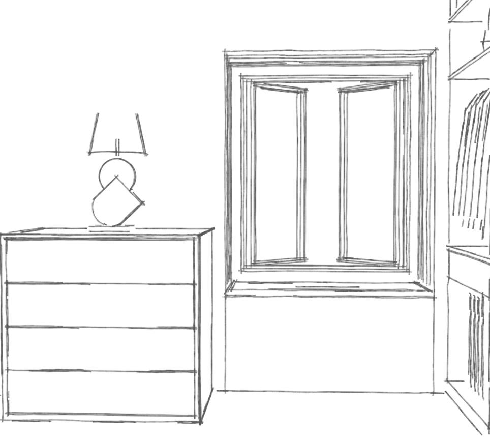
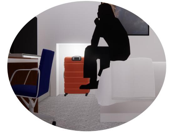
The study models to the right study two special elements of each room. One is a pop-out window and the other is a cubby for one’s luggage. These two unique characteristics bring great details to the room and help define the rooms, which is very fitting for an architect.
The first image to the right is the study of the pop-out window. This window will be used for sitting and viewing the landscape. The pop-out window also serves as a dynamic within the facade and for the elevation of the Hotel. The two upper windows are to filter light into the space while the pop-out is predominately for sitting and viewing.
The second image on the right is a study of the cubby for one’s luggage. To clean the aisle and create more space in the room, the luggae can be stormed within the wall. This puts a certain level of importance for one’s belongings just as we do for any other valuable items.
03. Project Life Urban Renewal
4th year studio
Fall 2022
Site Plan
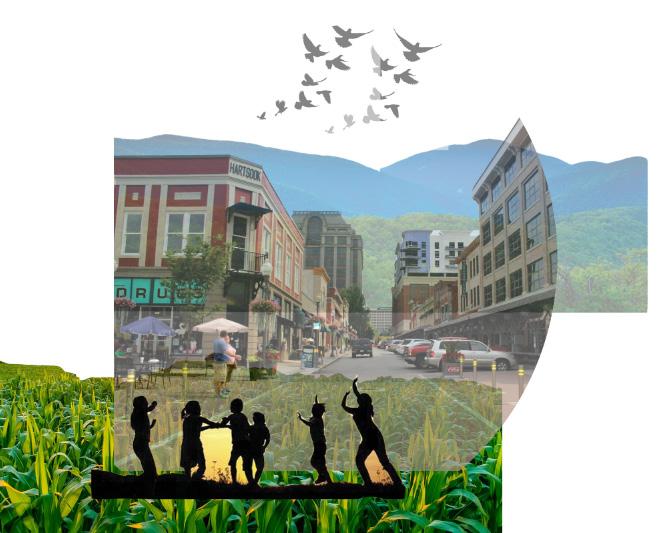
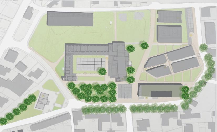
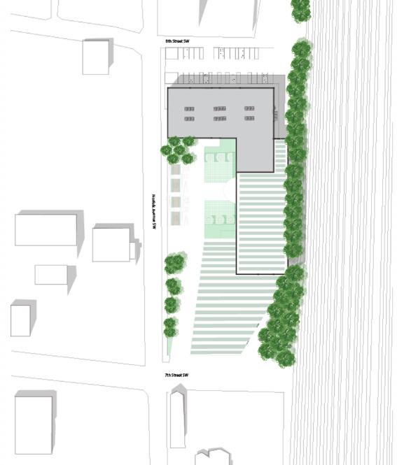
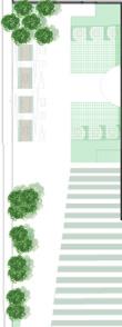
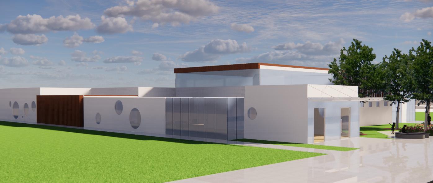
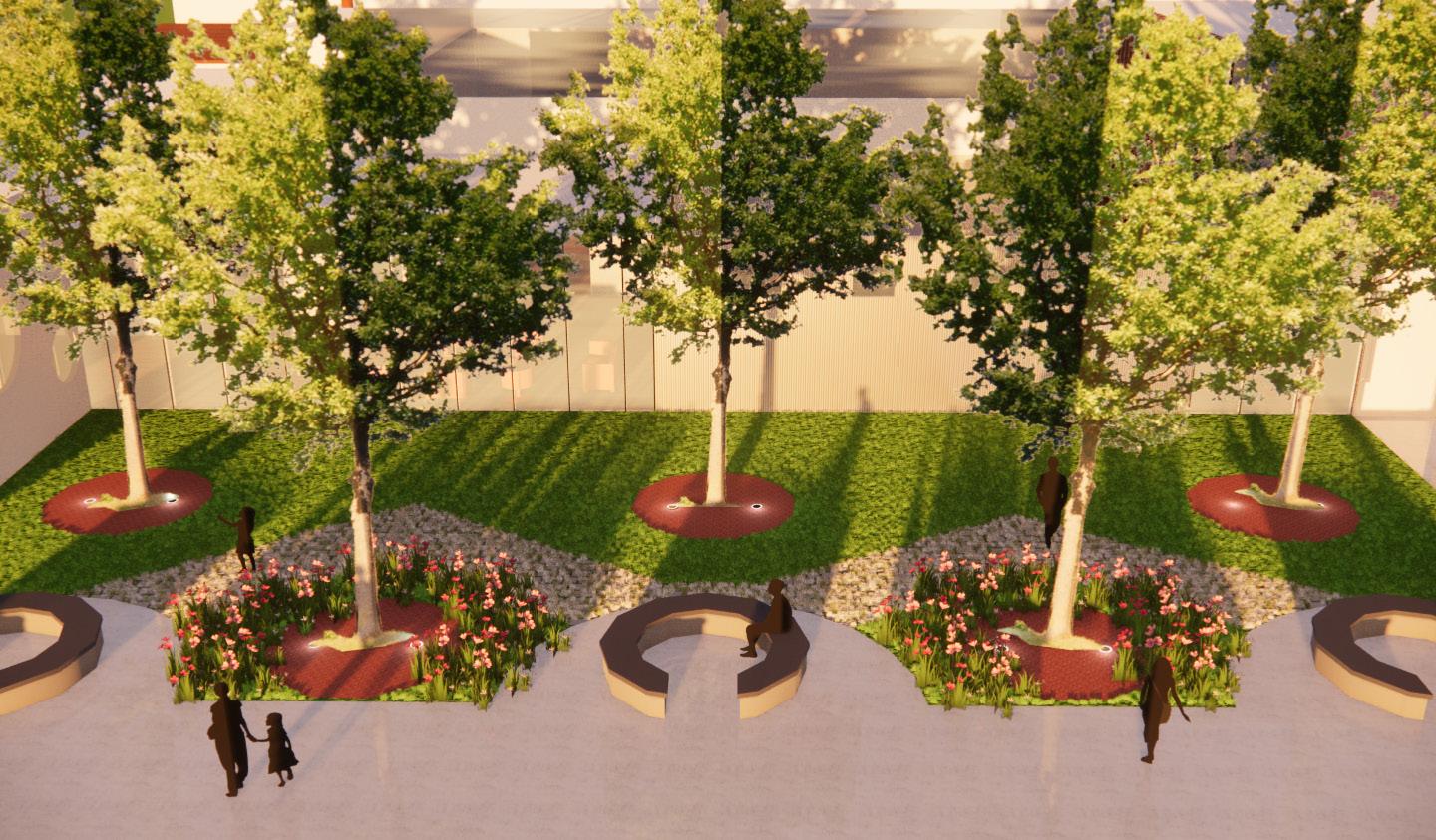
Project Life is loacted west of Downtown Roanoke and in an effort to revive this urban setting, this mixed use building brings an abundance of lively amenities. The building consist of a community hub, an outdoor terrace, a gym, a food market, an urban farm, private study rooms, and 20 studio apartments. This project seeks to provide a space where residents and citizens feel inspired to “create”. This building will be a part of Roanoke’s master urban development plan. The focus is to bring together the city of Roanoke through community gatherings and art. The site is loacted in the Light Industrial District of Roanoke, Virginia and is west of Downtown Roanoke and south of Norfolk-Southern railway.
The site used to be home of a steel and concrete production company leaving behind a solid foundation of conrete. This existing concrete will be used for parking which is loacted on the west side of the building. The existing concrete will also be used as foundation for the building.The site gradually slopes down towards the train tracks, creating a 10ft drop from the edge of the street onto the site. The site currently has no sidewalks and no street lights, so for the safety and comfortability of pedestrians and residents, sidewalks and street lights will be added. In addition, the surrounding buildings and the previous steel manufacturing company will influence the material palette for both the exterior facade and the interior finishings.
N 9 9
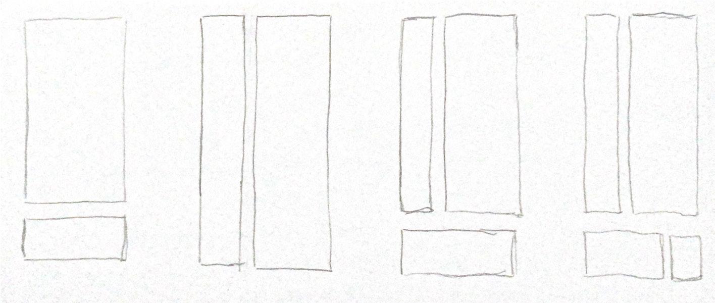
Conceptual Studies
These set of iterations helped to finalize the overall design. To hide the train tracks as much as possible, the market sits south of the train tracks. Also pushing the market to the northen part of the site allowed vistors to get a perspective view as they passed Chandler concrete masonry shop. This also allowed for the possibility explore the plaza. The plaza helps to create a welcoming grand entrance from both Norfolk Avenue and 7th street. The axis that cuts through the space creating a passage between the community hub and the market helped to allow a smooth transition from the parking lot onto the plaza. With the exisiting concrete slab, it was useful to use that to create parking which required for additional concrete to be poured to provide the foundtion for the ground level floors. It was important to thoroughly examine the room adjacency. Residents should feel like they don’t have to leave the space and everything they could possibly need is right downstairs.
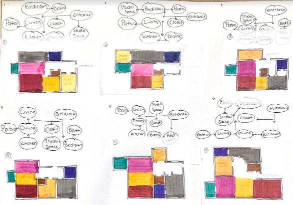
Apartments
Plaza
Market
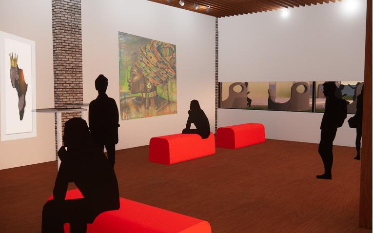
Community Hub Lobby


Stairs Elevators UP Storage Mainten. Stairs Community Hub W. Bath M. Bath O ce Market ce Storage Storage Storage Coolers Entrance Entrance Mechanical Room Seating Sprinkerler Room Electrical Room Elevators DN Gym Lobby Seating Stairs Stairs Entrance Stairs Lobby Outdoor Terrace Urban Farm on Lobby Floor UP Living Room Living Room Bath Bath Bath Bath Bedroom Bedroom Bedroom Bedroom Kitchen Kitchen Studio Studio Studio/Meditation Studio/Meditation Dinning Dinning Studio/Meditation Studio/Meditation Closet Closet Closet Closet Kitchen Kitchen Dinning Dinning Living Room Studio Living Room Studio Co-Op Food Market Market Coolers Sprinkerler Room Mechanical Room Electrical Room Offices Bathrooms Maintenance Storage Community Hub Stairs/Elevators Street Level Urban Farm Gym Lobby Seating Outdoor Terrace Stairs/Elevators Washer/Dryer Study/Meditation/Conference Room Stairs/Elevators Kitchen Dinning Closet Studio Space Living Room Apartment Floors 1-5 Ground Level Street Level
Floor Plan
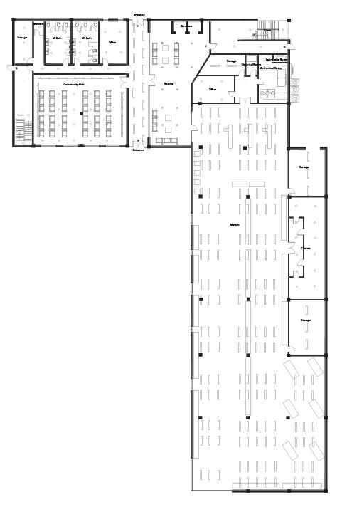
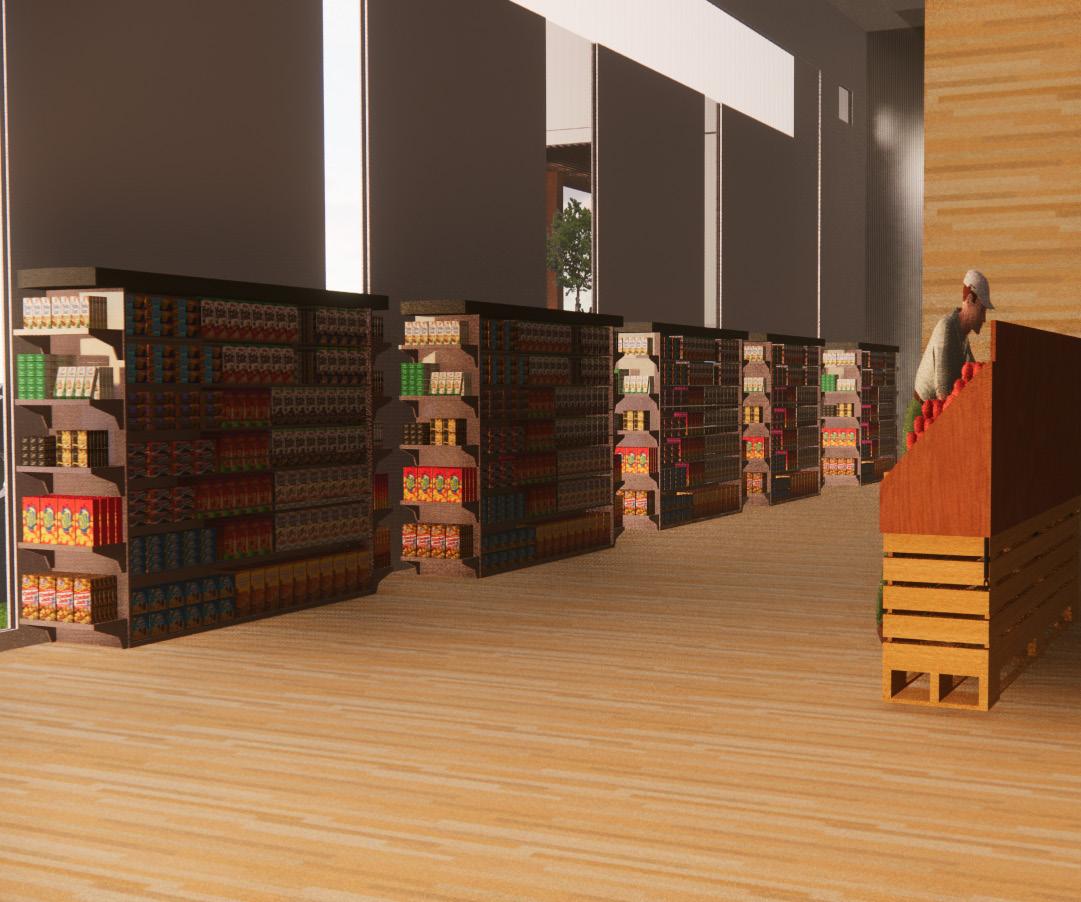

 1. Co-OP Market
2. Community Hub
3. Plaza
1. Co-OP Market
2. Community Hub
3. Plaza
1 2 3 3 Renderings
3. Plaza
Apartment Layout
Patio
Living Room
Kitchen
Dining
Entrance
Studio Space
Bedroom
Closet
Washer/Dryer
Bathroom
Closet

Assembly Details and Material Details


Metal Tie/ Fasteners


Parapet
Roof Membrane


Parapet
Sub Flooring
Interior Finishing/Ceiling
4” Aluminum Gauge Panel
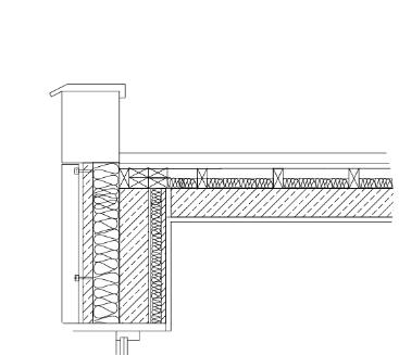
Interior Plywood
Sheathing

8 gauge Aluminum panels around 3” thick. This compliments the previous metal manufacturing company, giving back to the site what once was.
2x4 floor joist
4” Concrete Slab
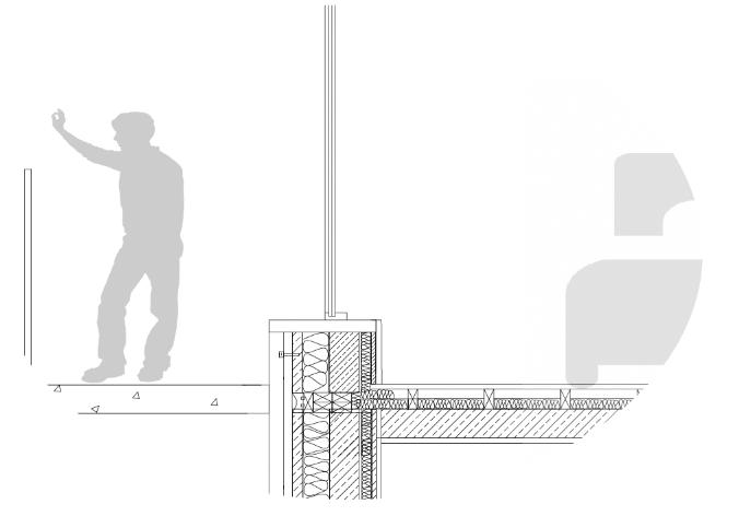
Grey “sand lime” bricks made to fit your hand. The choice of these bricks were influenced by the surrounding buildings and gave an industrial/urban feel.
Laminated glass with a SGP interlayer with 3/16in thickness. For acoustical purposes, this glass helps reduce the transmission of sound made by the passing trains.


Window Seal
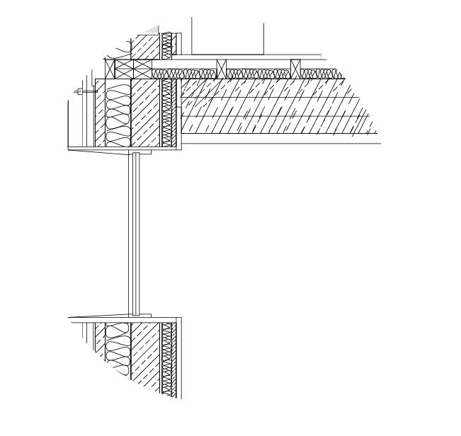
Concrete Leverage/Flashing
Vapor Barrier/ Airtightness
Crawl Space
Concrete Footing
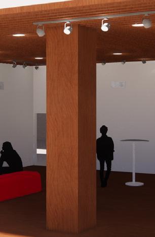
CLT structural columns 3 2x4 creating a 6” thickness will be held togther with adhesives or even welded. The columns will be exposes throughout the space to acknowledge the crisp wooden material
R-20 Rigid Insulation
CLT Timber Beam
Laminated Glass SGP interlayer
6” CLT Timber Beam
4” Concrete Slab
04. Barnett Newman Art Gallery
2nd Year Studio
Fall 2021 - Spring 2022
Site Plan
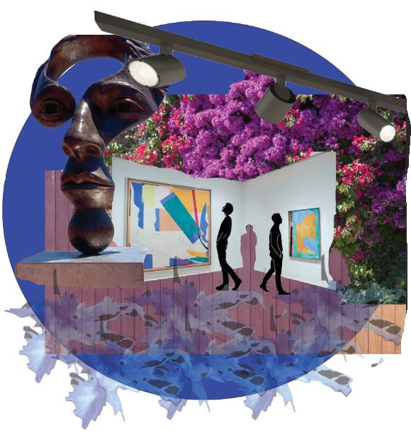
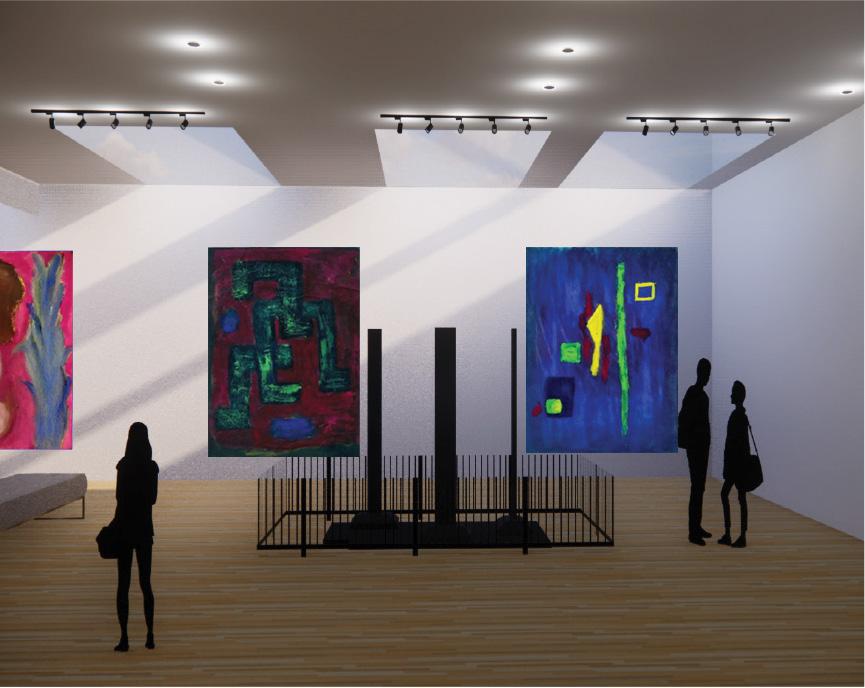
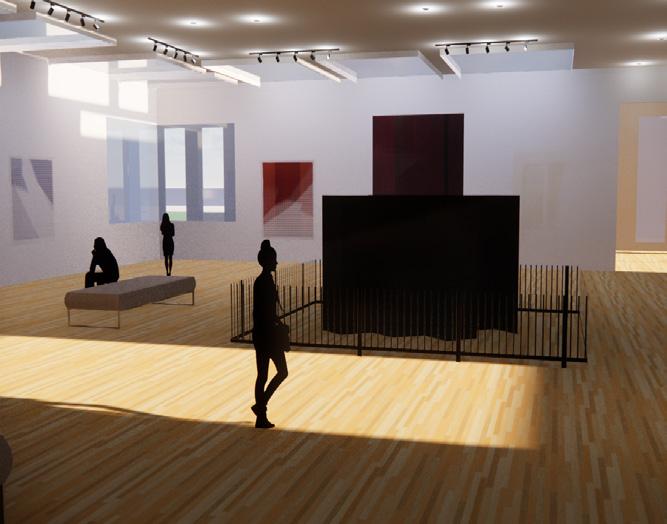
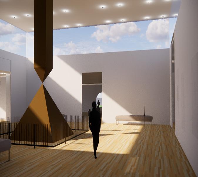
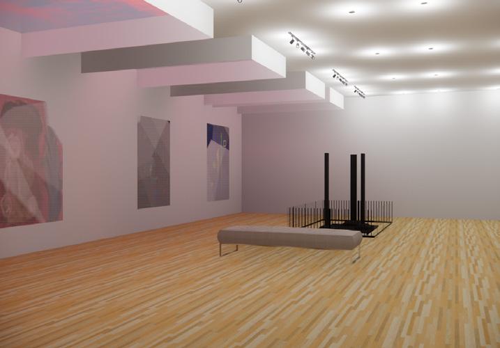
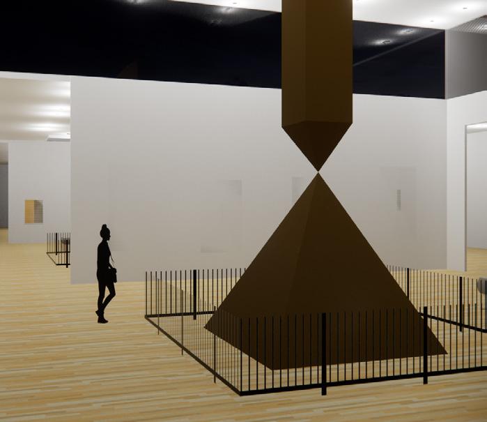
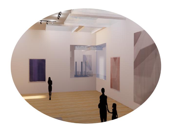
This art gallery designed for a local art collector, wanted to exhibit paintings and sculptures from artist Barnett Newman. Located in Christiansburg, Virginia, the gallery holds 59,000sqft. These paintings are displayed to be sold, thus the layout of the space was designed to accomodate these frequent changes. The client wanted the spaces to be lit through natural lighting thus the use of skylights and high windows were able to accomplish those wishes.
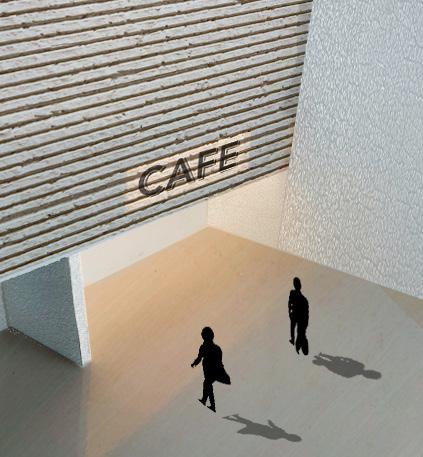
Apart from the exhibition rooms, the gallery inludes the following: entrance/foyer (including an area with lounge chairs); a counter that includes the cashier’s desk and a coffee corner; a small coat room or a coat closet; a small administrative office (in proximity to the cashier’s desk); restrooms; a storage room (for chairs, tables, temporary walls, projection equipment etc.); a janitorial room; and a mechanical room (subdivided into areas for electricity, communication, water, heating, AC-system). It is a requirement that there is one opening to the outside of the building that measures at least 20 ft. by 20 ft. (for the transport of art work), as well as vehicular access to the building for delivery purposes. No parking spaces need to be planned as the gallery is easily accessible by public transportation. Additionally, the public parts of the building are to be handicap accessible (e.g. wheel chair accessible).
N 15 15
Floor Plan
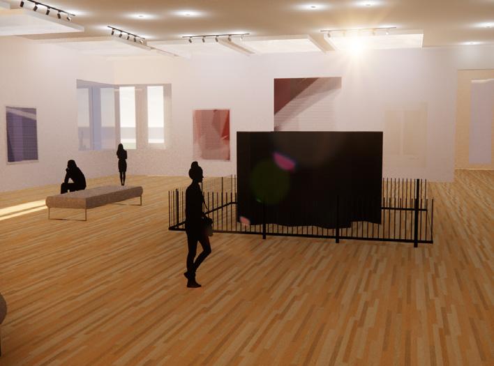
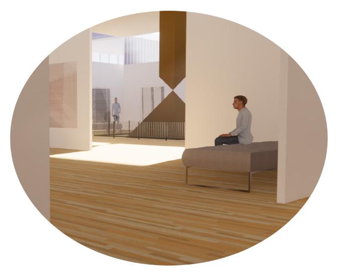
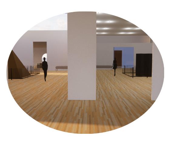
The floor plan is designed to capture multiple views at once. Depending on where you are in the gallery, you can see the artwork in the adjacent spaces. The purpose of this is to connect the artwork despite being in different rooms as well as to entice the user to visit the other artwork. Even when in the waiting area, you are greeted with views of the artwork and sculptures
Divide Separate Connect
Entrance
Mechanical Room
Outdoor Corridor
Gallery Space
Cafe
Morning
Afternoon

Gift Shop
Front Desk
Bathroom
Storage
Afternoon
Evening
Dust Evening
The diagram to the below displays a small foot pattern for vistors highlighted in red. Designed to create a continuous flow, there is an entrance and an egress door. The entrance gives access to the gallery spaces as well as the front desk, and seating. This is to help with the flow of traffic for vistors. Also the gallery has four different vestibule entrances highlighted in yellow, to create transitional space between rooms.

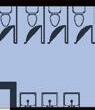
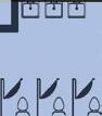
4 8 5 2 4 6 7 9 6 7 7 8 9 3 1 2 3 5 1
B A
A. Longitudinal Section
B. Cross Section
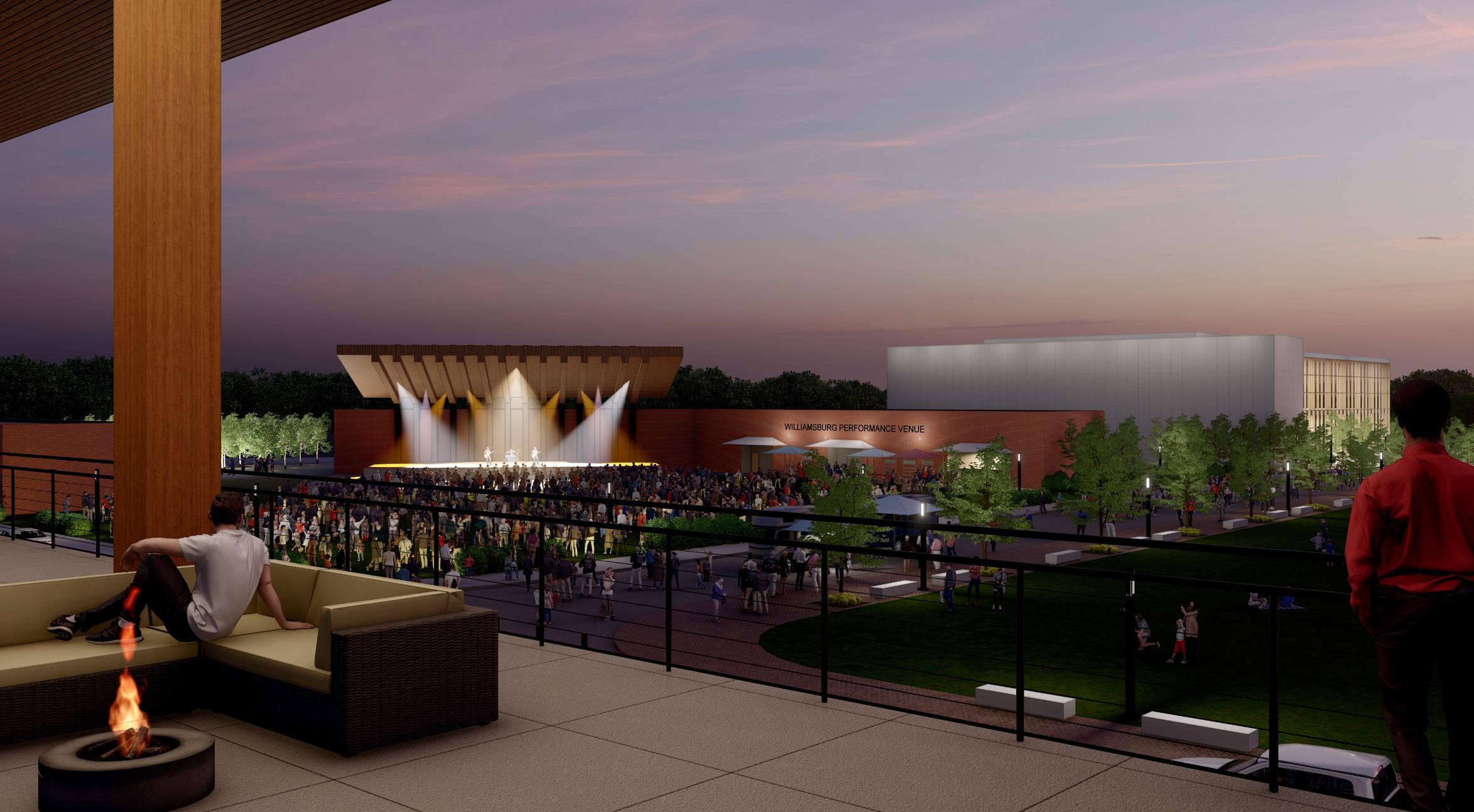
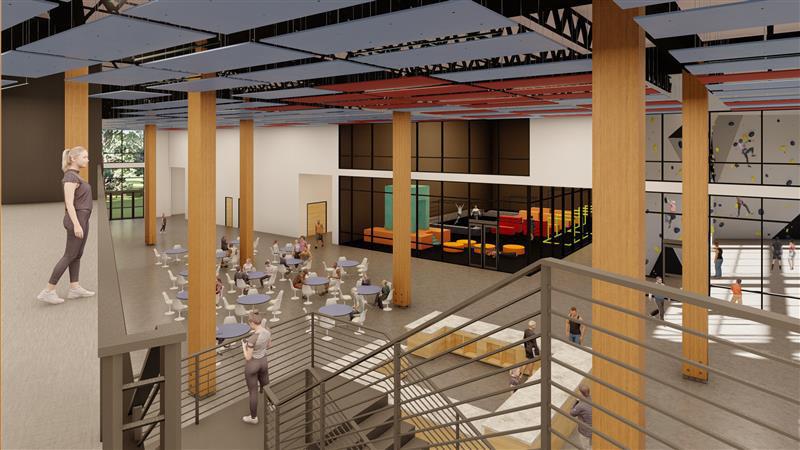
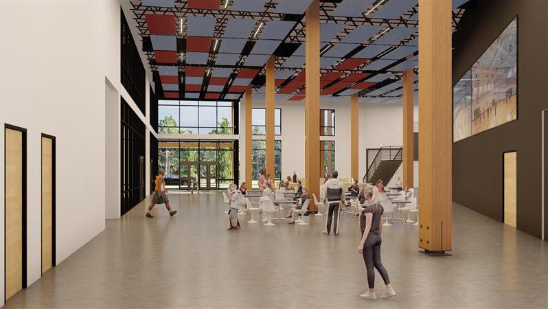
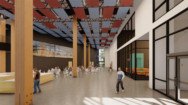
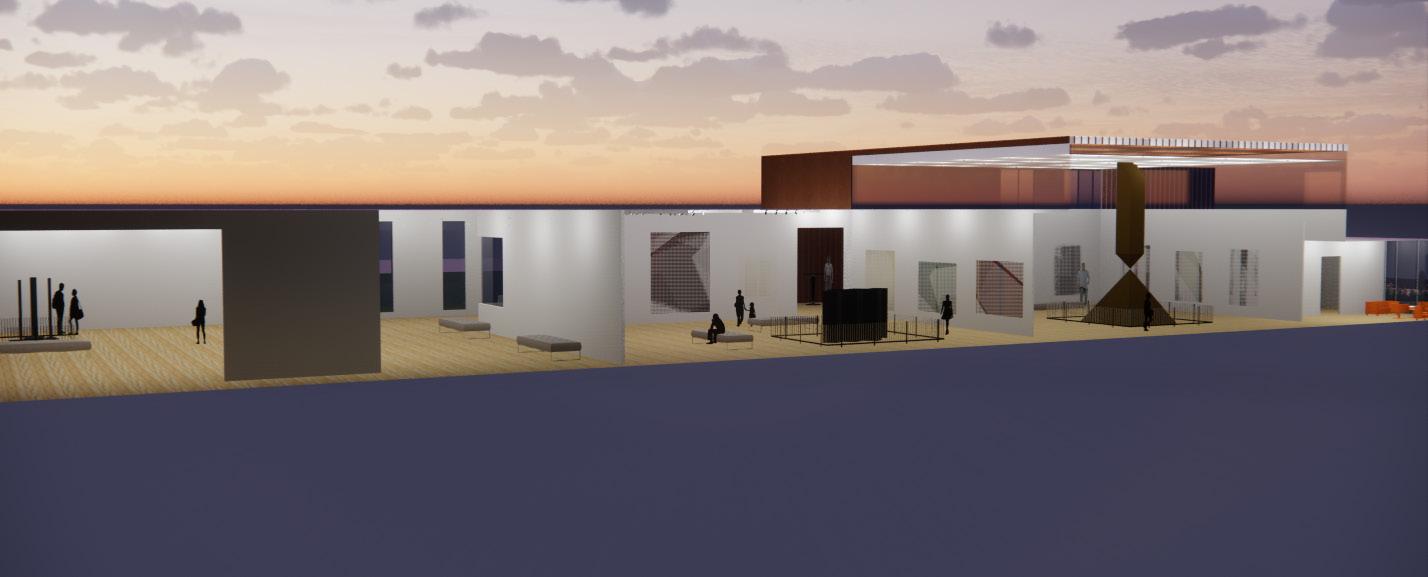
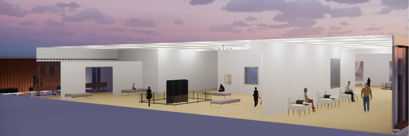
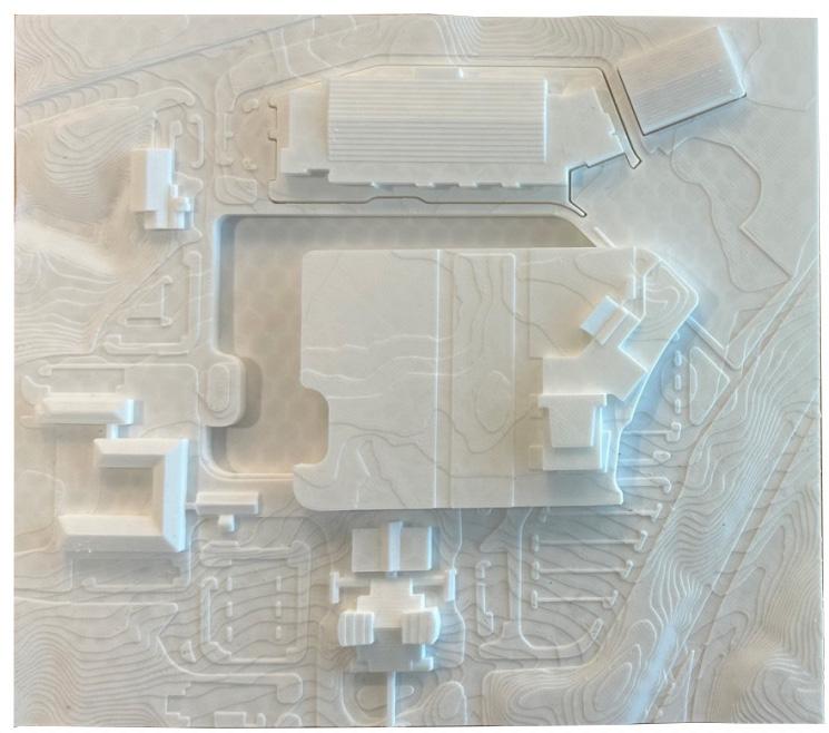
04. Internship Experience
Clark Nexsen; Virginia Beach, Virginia Design Intern
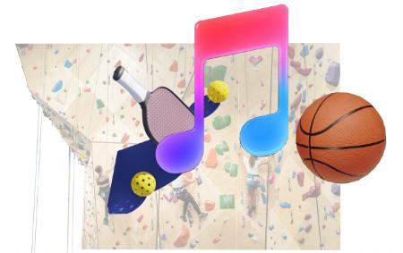
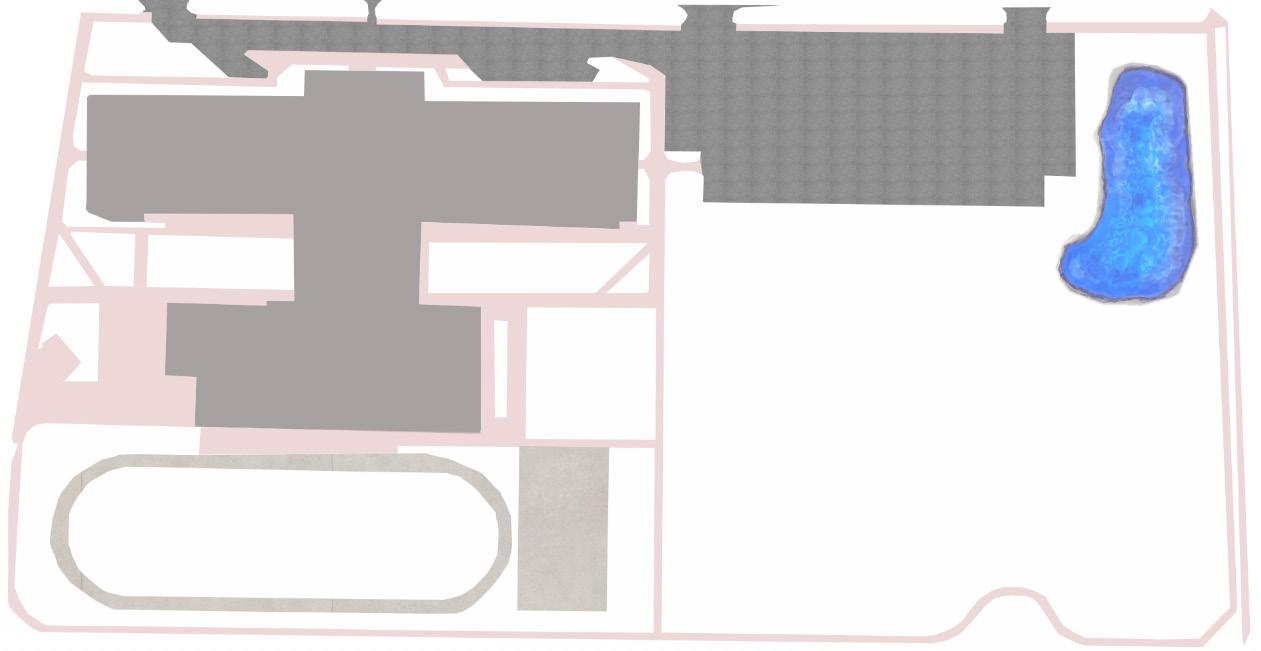
Williamsburg Events and Sports Center
May 2023 - August 2023
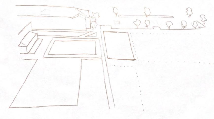
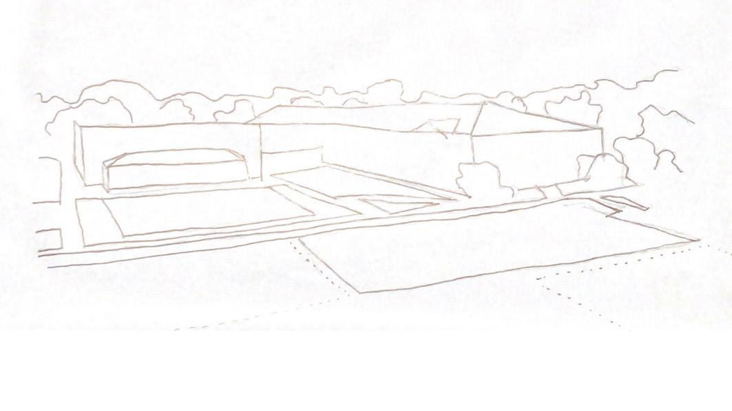
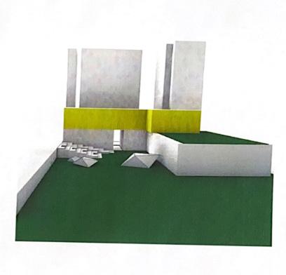
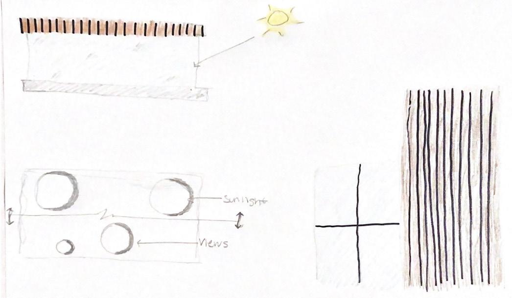
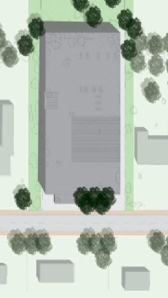
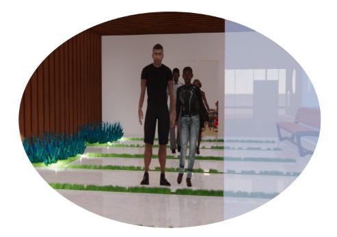
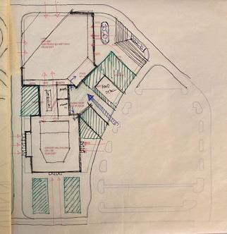
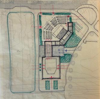
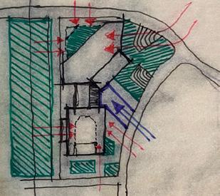
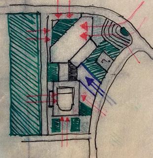
Over the summer of 2023 for my internship, worked on an Events and Sports Center in Williamsburg, Virginia. This venue would be a great economic and social boast for Williamsburg and future development. To the right are sketches and notes for parts of the plan and the site plan. We were wokring on ways vistors would approach the venue as well as capturing views from different angles including the view from the terrace of the sports center looking out at the music venue. The image on the right shows the front entrance/lobby and we focused on fufilling the client’s needs and creating a very welcoming and exciting environment.
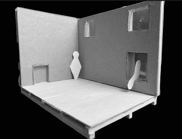
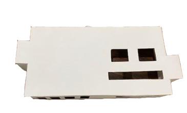
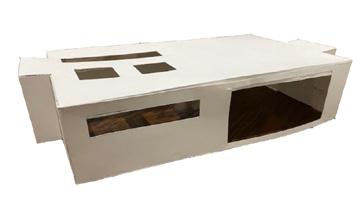
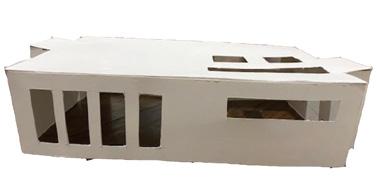
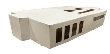
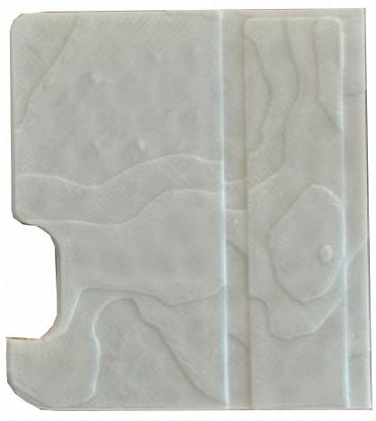
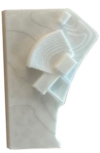
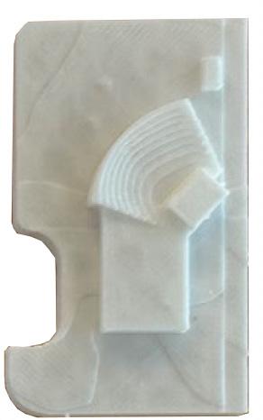
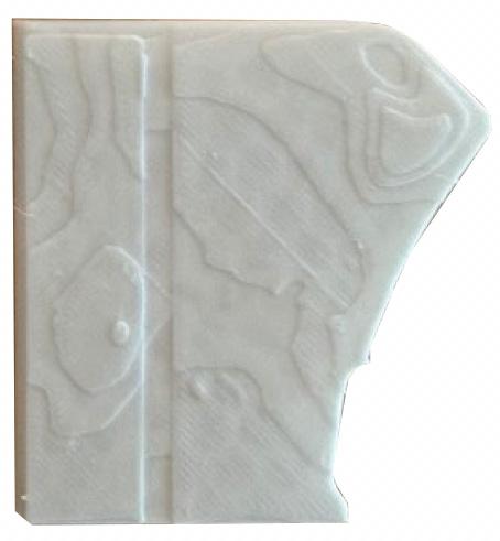
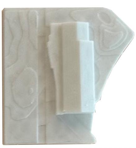
To the right, displays the 3D model we created using a 3D printer. It was roughly a little over a foot long on both sides, which made it easy to transport. To provide flexibity for the client, we designed a few different possible options that were interchangable. Essentially each piece shows a different building footpirnt and approach that can be mixed and matched for the perfect combination. We choose a slick white filament that enchanced the model and provided a sense of elegance.
The exterior and interior renderings are on the right hand page. We really focused on creating a very vibrant atomosphere that would become a staple in the community and for Williamsburg as a whole. The one exterior rendering really emphasizes the nightlife and the music venue while the interior renderings emphasize what a typical Saturday afternoon would be like. We used rhino, lumion, and photoshop to perfect these renderings, which really brought the image to life.

21 21