


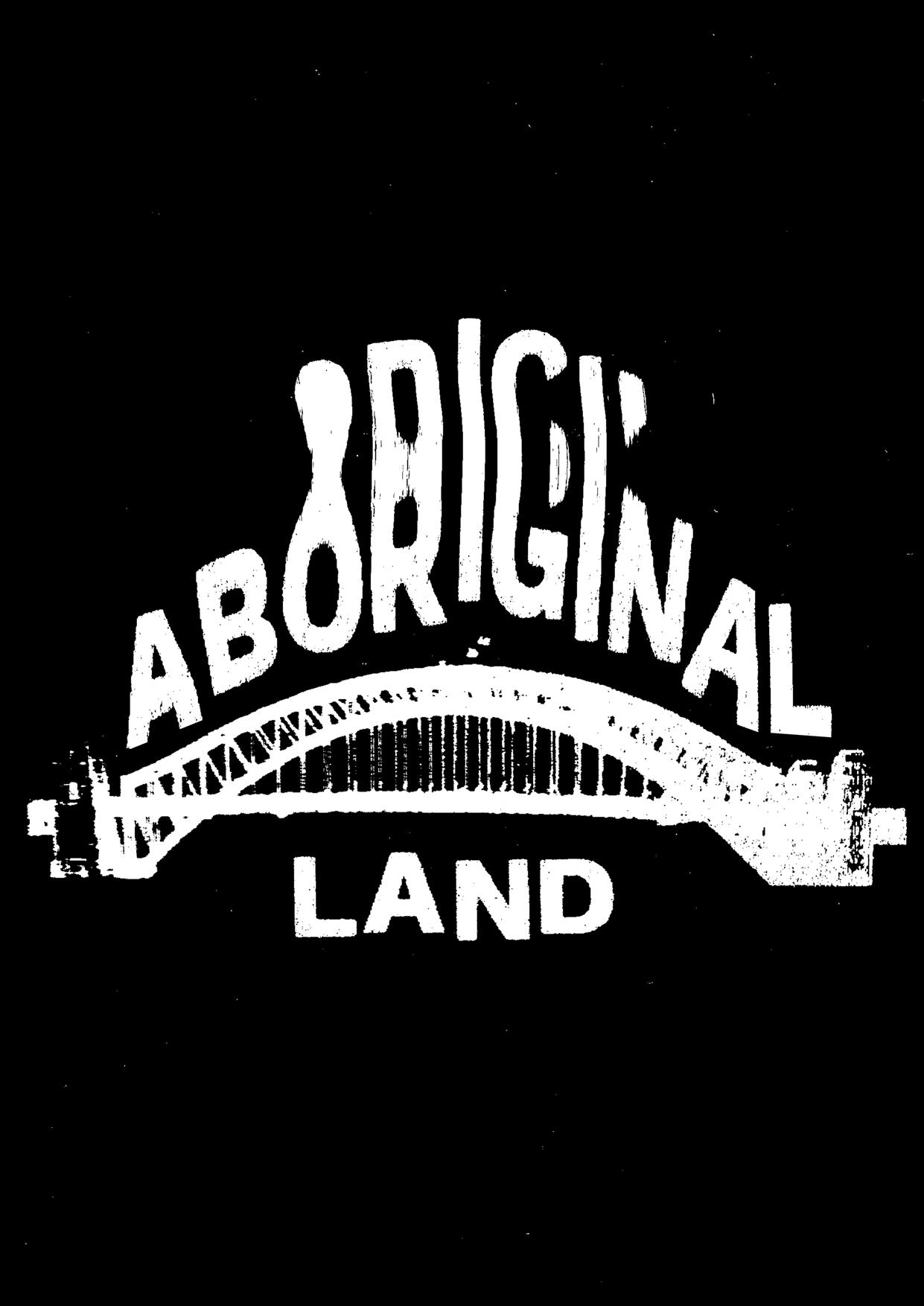


this zine, I’m going to show you exactly how I make my posters. I developed these techniques over a few months and feel they might be helpful to get you started if you wanted to start making graphic work. I’ve used Photoshop for the posters included in this collection, but I’ll show you how I’ve made similar ones with only Google Docs, a scanner and a printer.
The idea is that you take the methods that appeal to you and use them to make your own stuff.
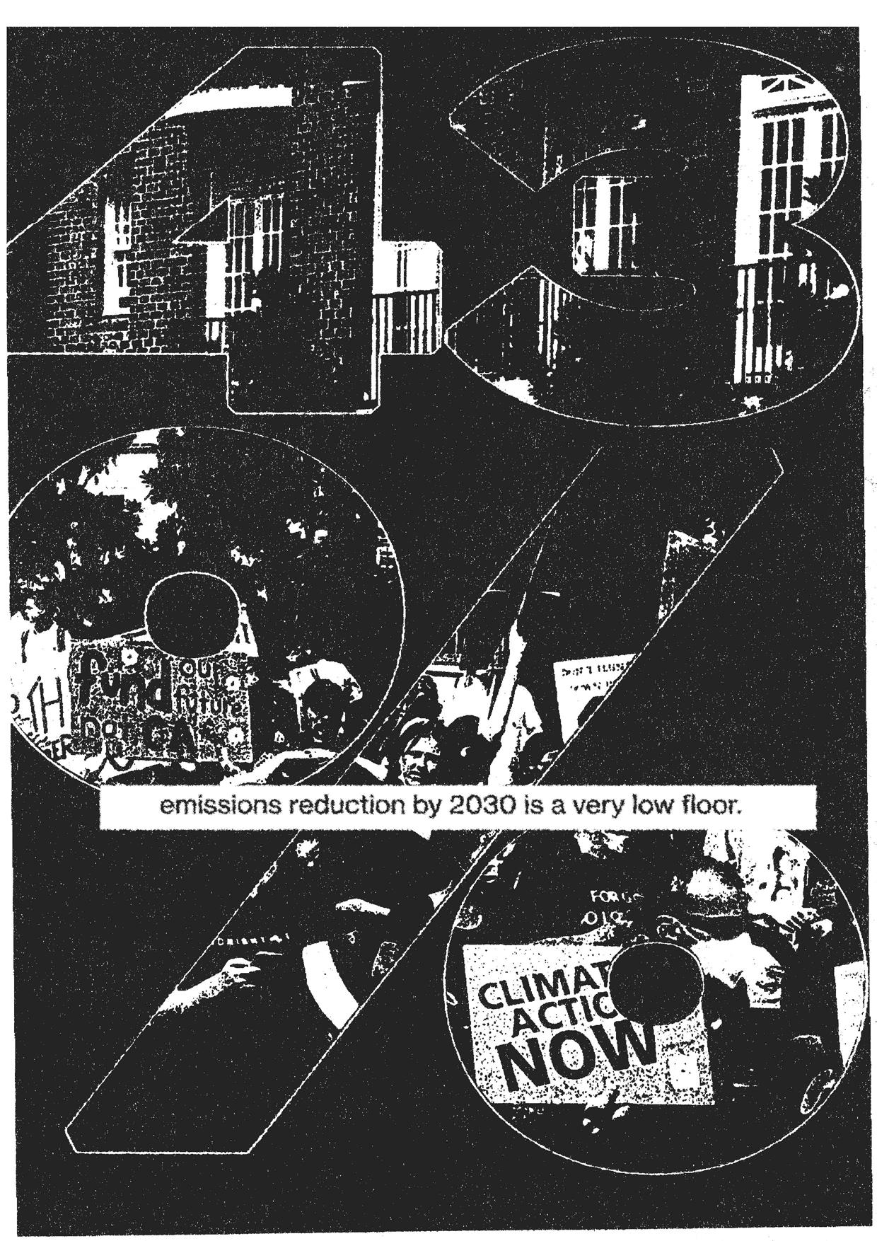
If nothing else, this should show you how easy it is to make a poster, and that you don’t need expensive software to do it. Poster making is a great mode of expression, a medium central to activism and the spread of political ideologies, and it’s also fun as hell.

Setting up the document
First things first–here I’m just setting up an a4 file at 600dpi. If you want other sizes, choose the document size that matches in the ‘print’ tab.

Placing the photograph
I’ve just dropped in one of my own photos and resized it so that only the ground is visible in the canvas. I usually choose photos that I imagine could constitute an interesting background for the poster. I look for patterns and textures.


Filter Gallery
The fun part! Before I go into the filter gallery, I up the contrast to help with splitting the colours into black and white.
Filter > Filter Gallery takes you to the place where the magic happens.
Here I’m adding the grain filter to the photo. This helps for the next step... Grain Filter

Stamp filter
I’m applying the stamp filter on top of the grain filter. This is what gives the photos that really textured photocopy look.
It’s fun to play with all the settings for different effects! This will be necessary for different images, especially if they’re low contrast.
The filter takes the colours you’ve got as your foreground and background. If it appears like the filter isn’t working, it could be because your colours are both the same. I make that mistake all the time.

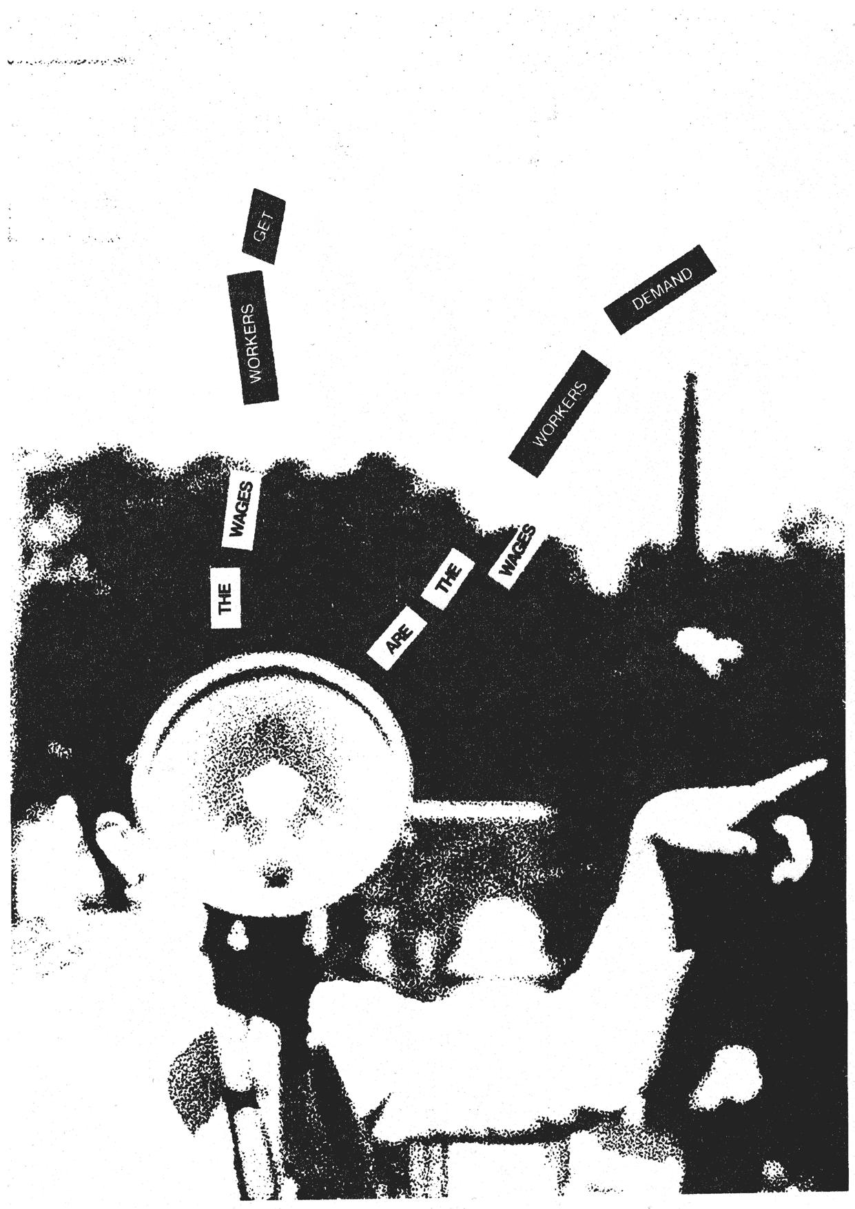
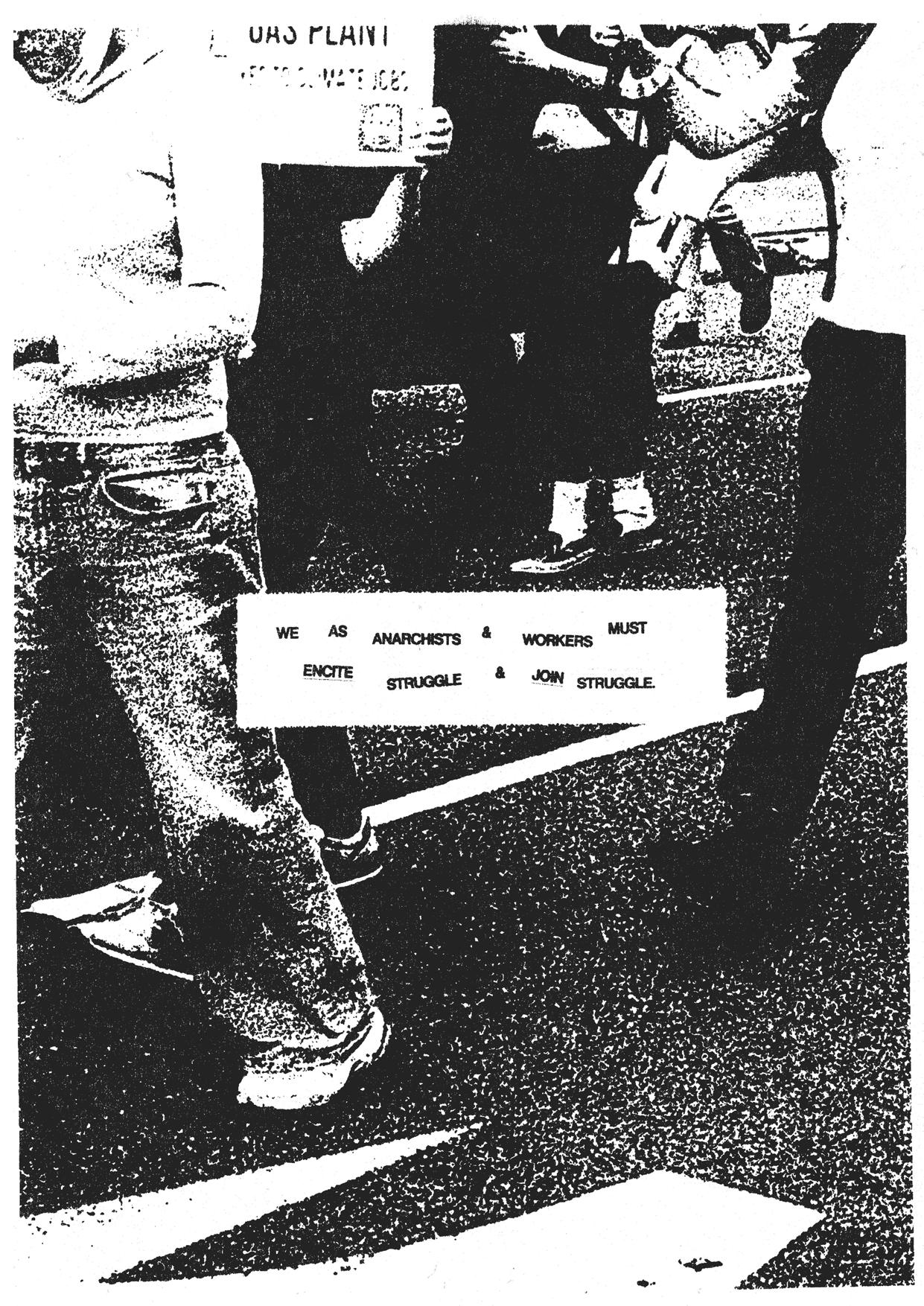
I’m drawing some rectangles and then creating the type over the top.
I use Neue Haas Grotesk. It’s a free Helvetica.
I always try to place my type in places that has a high enough contrast so as to make the first word obvious. You want to ‘guide the eye’–the sequence of words on the poster needs to unambiguous. If you’re finding your text is getting lost in the pattern of the background, sometimes it helps to swap the colour of the rectangle and the text, or to just move it to another spot on the canvas.

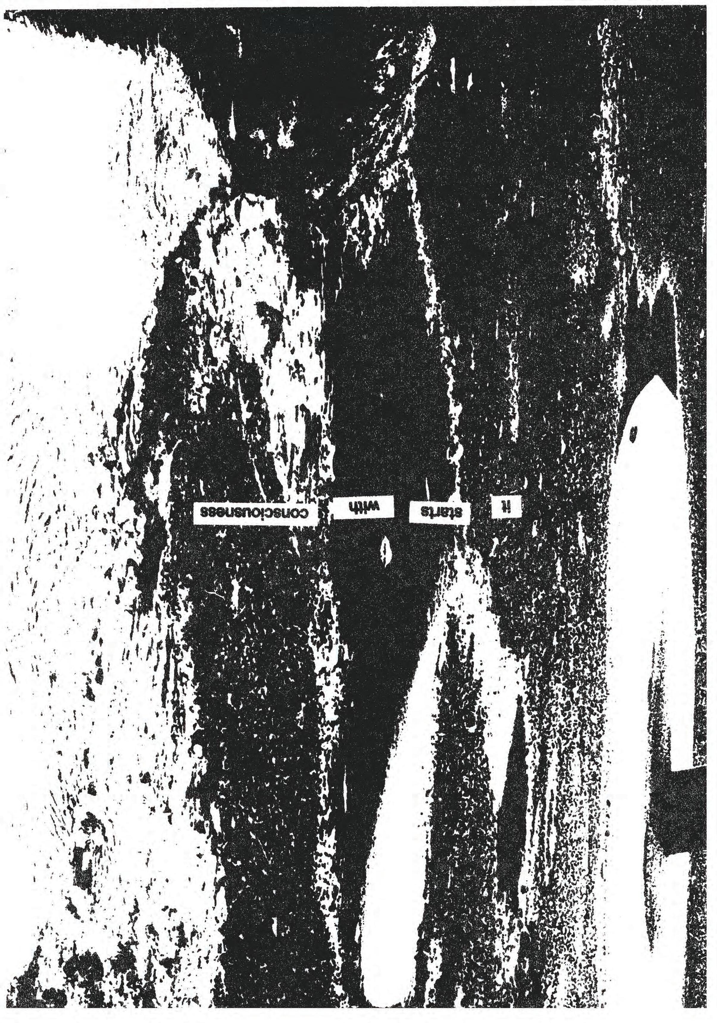
Adding Texture
don’t like having rigid shapes and text in my posters because I prefer to obscure the fact I made them digitally (that’s not how they did it in the ‘80s!). I ultimately want the poster to look like it was hand-made and that it’s been worn down from sitting in the sun or at the bottom of someone’s bag.
I
I use Filter > Distort > Displace to add texture to things. You’ll just need to find an asset that Photoshop can displace the object onto. A good paper texture works for this. Filter > Stylise > Diffuse adds grit to the object, no displacement map needed. You can do this a few times to make the effect more noticeable. Now the whole thing looks a little more tactile.
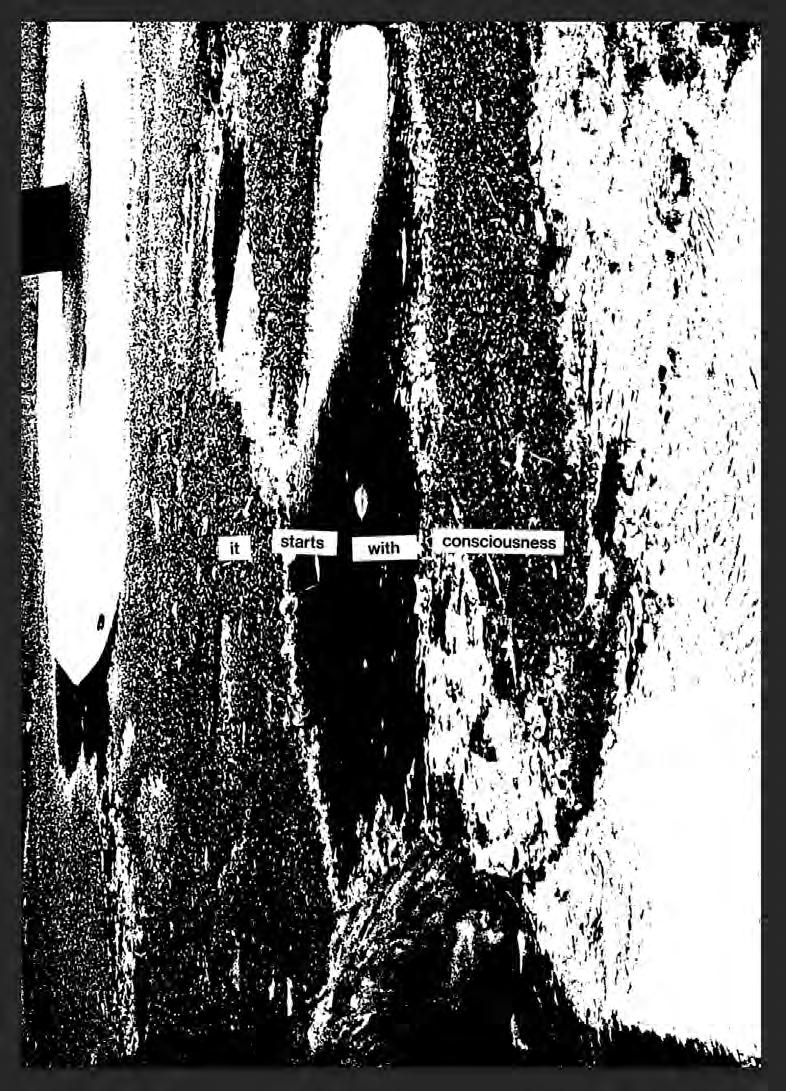
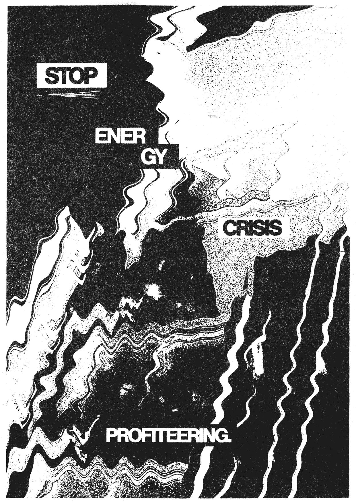
The Digital Poster
Here’s what the poster looks like at this stage. If I’m working on something like an infographic that will only need to be online, I’ll just pile a bunch of textures on top using the ‘screen’ blending mode. These are readily available online. I go for paper textures and scan textures. Usually, though, I just do it for real.
Manual Methods
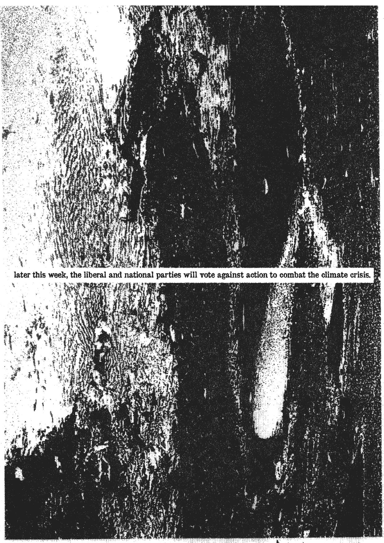
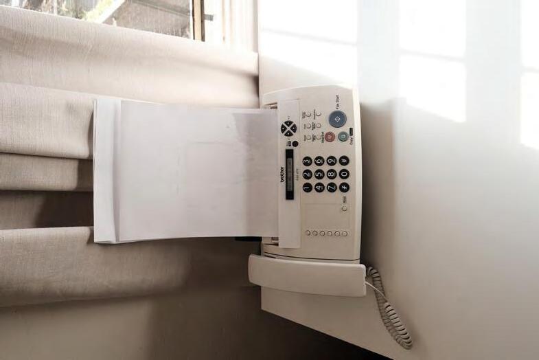
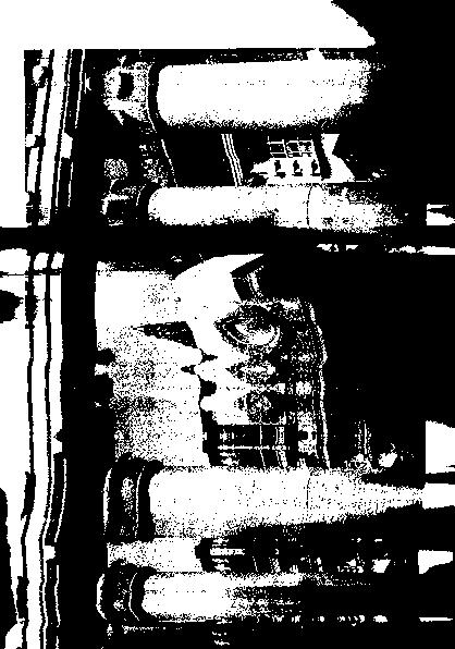
I laser print my posters at home and run them through a fax machine on the ‘super fine’ setting.
If you have a fax machine handy for whatever reason, use it for posters! It adds a lot of gritty texture in less steps than if you were to do it digitally. Modern fax machines use a thermal transfer method, which means it heats up a ribbon of wax and presses it onto to the page in the parts that are black. Some of the detail of the image is inevitably lost in this process, but the look and feel of the wax on the paper makes the whole poster appear more tactile.


Editing the faxed copy
I’ve brought the scanned fax copy back up to play with the contrast / curves. Doing this brings out the darker and lighter bits so that the effect of the fax can be seen properly.
I turn up the ‘lightness’ of the poster (you can do this through ‘create new fill and adjustment layer’ (bottom of the ‘layers’ panel) > hue/saturation.
This makes the poster look like it has faded a little bit, like it’s more worn.


Not many of us can justify spending hundreds of dollars on an Adobe subscription. It is absolutely not neccessary for you to do that to start making posters or other print material. I’m going to show you how I make posters similar to the ones I showed you in the last part using only free software. You could do this without software at all if you were to find enough graphic content from something like a magazine or newspaper.

Photo placement
I’ve opened a new google document and placed a photo on the page. Setting the image wrapping to ‘behind text’ means you have full freedom when you resize it. I’ve made mine the size of the page.
On a new page, I’ve set my type.
I’ve spaced them really far apart because later I’m going to manually cut the words out of the page.
Open sans is the closest typeface I could find to Neue Haas Grotesk. It’s set at 12pt.

I preferred the look of the whole print. It’s harder to move it around the way you want to, but it gives a fuller visual. Scanning
Here
I’ve folded the print so that I can move it around easier. After some trial and error, I noticed

Scanning
To manually distort the images, I move the scans across the scanning plate as it goes along. The higher the resolution of the scan, the slower it scans. This makes it much easier to be in control of how you move the print.

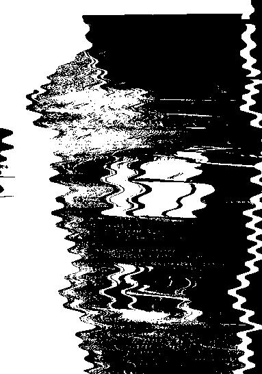

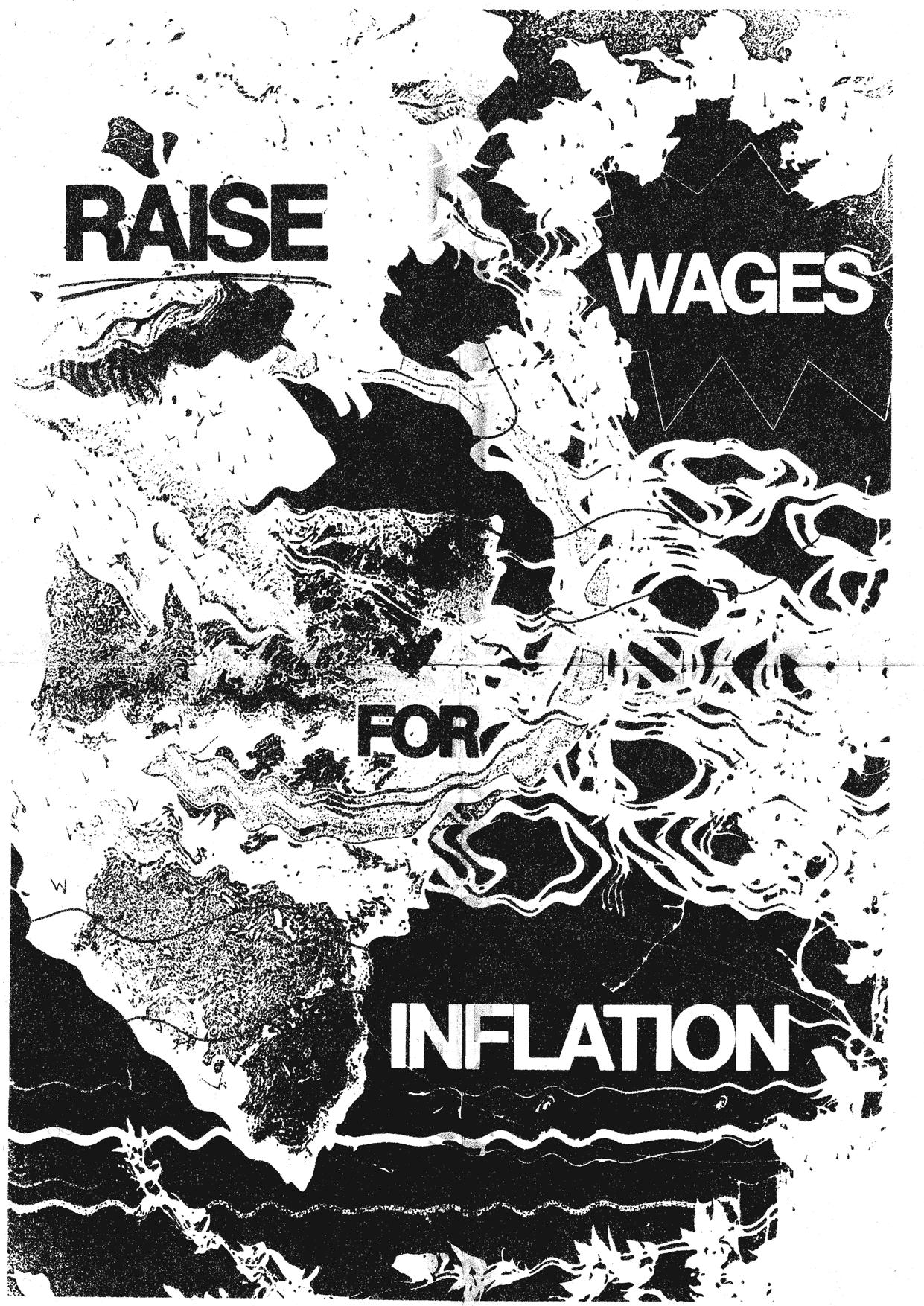
Result
What came out were some really nice images. This method felt more experimental than using distortion effects on photoshop. Every scan comes out different, too.

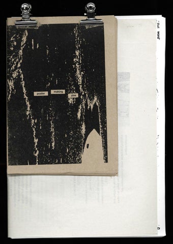
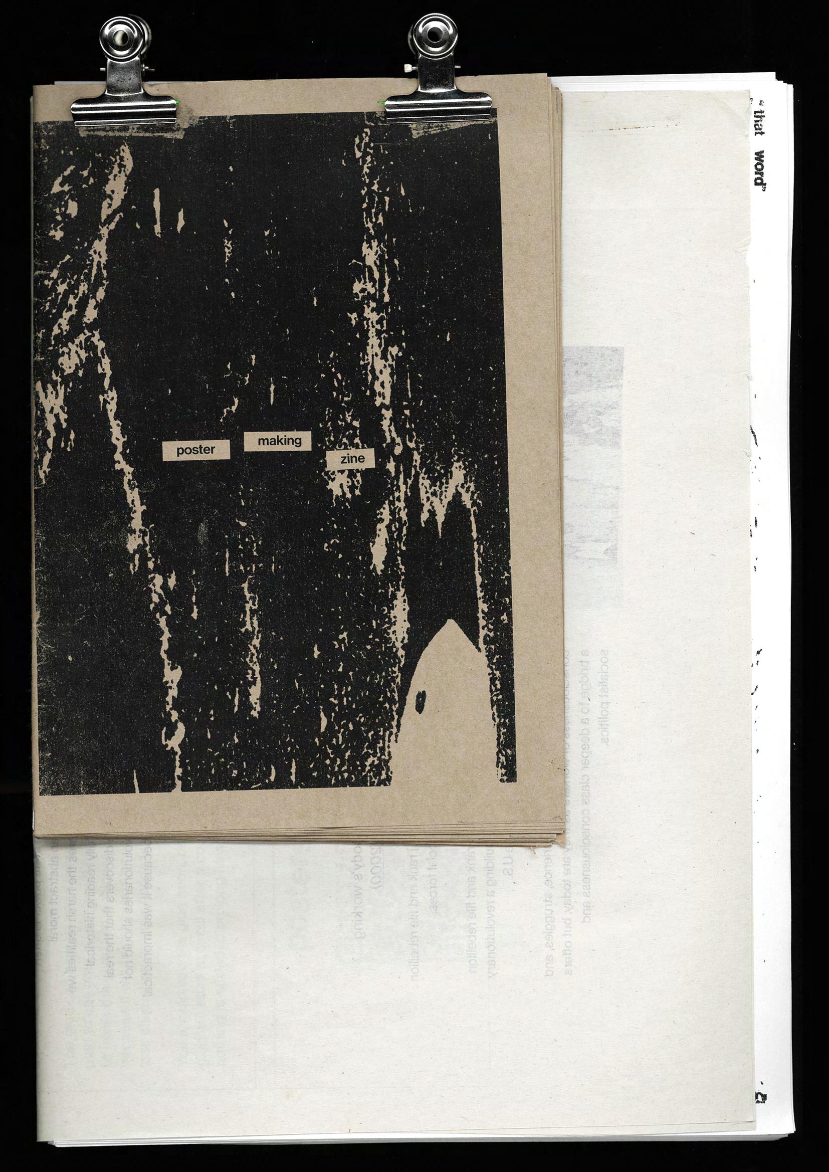
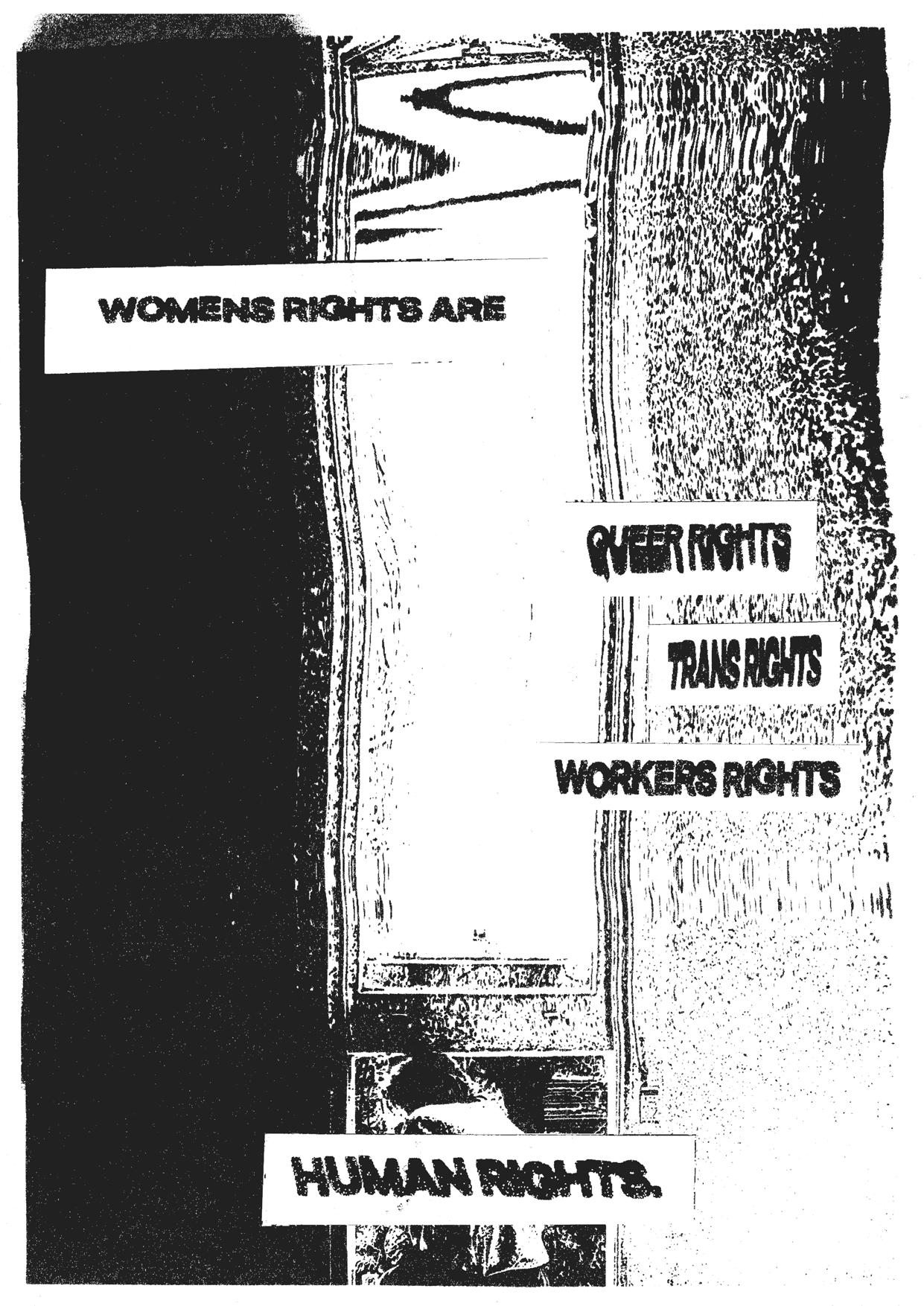
I’ve printed out the page from the word doc with the text, along with the distorted scans that I liked the most. Using a box cutter, a ruler and a glue stick, I cut around the text and glued them onto the image prints. I was sure to determine where I was going to place the text before gluing it down. The same principles of legibility apply here, too. Manual cut and paste
Here


