Typography Portfolio

Jacob Singer Arts 3650
Nova Southeastern University Typography Fall 2024


Jacob Singer Arts 3650
Nova Southeastern University Typography Fall 2024

Assignment A1: With the brush tool I used the Wacom to draw three different unique symbols that had no existing symbols but still had a meaning to me. In another photoshop file I did the same by drawing out my name in the font style called Chopsic that I found on dafont. In Illustrator I used the pen tools to trace over the template layer (layer that I just sketched in photoshop) to improve my sketches and make them have precise lines and edges to make them into shapes. I did this for all three of my symbols and my name. In the end I arranged the symbols with my name to finish the Illustrator file.

The servant walked to the lake to fill his bucket
Assignment A2: First I crated a Photoshop file and chose five Hieroglyphs that showed a message. My message was the servant walked to the lake to fill his bucket with water. I started sketching the Hieroglyphs just how they looked from canvas to make sure the message made sense. I then recreated them as sketches with more details to them in my own style, this was the style. In Illustrator I used the pen tool to trace over the sketched I made to add smooth lines to my Hieroglyphs. Once making sure all the lines were laid out in organized ways I added color to them to add more detail. Finally I added text to show what the message of the hieroglyphs were representing and a textured background behind everything.

The creation of the Roman typeface was a significant event in history and for typography. It is one of three major typefaces that are commonly used in typography. This type of font falls under the Serif category as it has lines that resemble tails for feet on the ends of the letters. Originating in Europe, this typeface has the type of details that many Roman fonts consisted of which made them unique. We often still see the Roman style fonts used today in books, newspapers, official documents, professional style papers, and many more. This font is used today to represent an icon for formal writing because of its professional look.
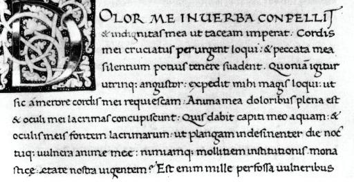
The creation of the Latin alphabet, also known as the one we use today, had a big impact on Roman fonts as it was the beginning of what made up the typefaces that we still use today and can be understood universally through many different languages. This relates to my font selection, Capitals Quadrata because they share the serif typeface and make up the capital letters in Roman fonts.
Assignment A3: First I chose a topic and typeface from the list on canvas, I chose the Roman Empire and Capitals Quadrata. I began in photoshop sketching the word Roman in the style of the font that I chose, I added guidelines to help each letter go together as the right size. I brought my sketch over to illustrator where I then used the pen tool to recreate the sketch with smooth and uniform lines. I then did some research on the history of the Roman Empire and how it related to my font and wrote about it. I then created my own symbol using the letters I created using the pen tool. Lastly, I created a border for the page in Illustrator to add a nice design to the paper.


The Garamond typeface originated in France during the 16th century. This typeface was created to give off an effect that looked like a formal version of handwriting in a serif type font. We still see the Garamond typeface used today in different formal writings, documents, and even some company logos. It represents a formal theme as it is most used in that context. This typeface was created by Claude Garamond and has been known widely for its easy readability through different languages. This serif font is made up of many straight and curved lines with different legs on the cap and bases of the different letters. Some of the letters stretch lower than the base of others which give a unique design of the typeface as there are different sizes in the font. Another unique feature of the letters in this typeface is the bottom of some of the letters are curved upward instead of being flat like most other fonts. The Garamond font is also seen in many formal papers similarly to some Roman fonts. This relates to typeface selection I chose because it includes many different French typefaces which directly relates to Garamond.
Assignment A4: First I chose the theme and started with my sketch in Photoshop making it as close to the original while still keeping it as a sketch and not tracing it. In illustrator I used the pen tool to go over the sketch I had just created in Photoshop to improve upon the sketch my making smoother lines and curves to make it look more like the original font. I then made a design illustration out of the letters I had just made with the pen tool and put them together with different grayscale colors to make a new unique symbol. I then did some research about the history of the Garamond typeface Finally I added a border to the page that I felt went well with the Garamond theme.

The Victorian era took place from around the mid-1700s to the mid-1800s and was known based on the Industrial Revolution. It was most widely known for the advancements manufacturing and social structure including Typography. The typefaces during this time became more simplified than previously but still fell under the Sans Serif category. There was also a rise of technology during this time making more occurrences of mass printing different typefaces onto newspapers and other forms. The Victorian style of fonts have some straight lines and curved lines, still using the bases and tails on the letters which shows there is still detail. It also resembles a Gothic theme as it has many similarities to those typefaces. The font I chose is called Northead and is a Victorian themed typefaces as it has all the features that make it Gothic like that, they used during this period.
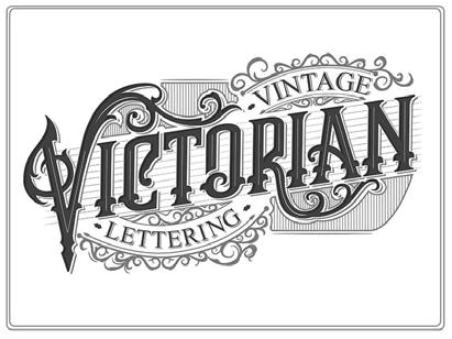
Assignment A5: First I chose the Victorian era theme with a Victorian style font. I then found a font called Northead on dafont.com and brought it into Photoshop. In Photoshop I started by sketching it with the brush tool, I tried to make it as like the original font as possible. I used guidelines to help keep all the letters consistent with each other. I then brought my sketch over into Illustrator so I could trace it. I then used the pen tool to trace the sketch I made to make sure the lines are improved from the sketch. I then made my own symbol from the letters I made with different grayscale colors. I then did additional research about the Victorian Era and how it impacted this project.
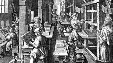


Assignment A6: First I chose the theme Offset Lithography and the artist Paul Renner. I then found a font on dafont.com called American Captain which resembled the typeface that would have been in a Offset style printer. In Photoshop I then created a sketch as close to the original font as I could. I brought my sketch over into Illustrator where I used the pen tool to trace the sketch I made to give it more precise lines to look more like the original font. I then used some of the letters to create my own symbol and wrote a bit about the history of offset printing, along with a photo. I added guidelines to my sketch and pen tool design along with pointers to the significant parts of the letters with labels.





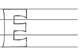


Assignment A7: First I chose the theme 1970s and the artist April Greiman. The overall theme I wanted to create a retro type of theme for this page. I found a font on dafont.com called Magic Hat that matched the style that was used in the 1970s. In Photoshop I then created a sketch as close to the original font as I could. I brought my sketch over into Illustrator where I used the pen tool to trace the sketch. I then used some of the letters to create my own symbol and wrote a bit about the history of the new printing technologies that came about during this era and wrote about it in Indesign. I added guidelines to my sketch, borders and pen tool design along with pointers to the significant parts of the letters with labels. I made sure to add color with background shapes to show the retro style.


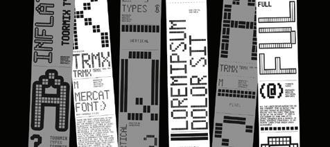


Assignment A8: I first chose the Bitmap theme and the artist Rudy VanderLans. The overall theme I wanted to create a pixelated 1980s type of theme for this page. I found a font on dafont.com called M12 Match Biker that matched the style that was by dot matrix printers and Rudy VanderLans. In Photoshop I then created a sketch as close to the original font as I could. I brought my sketch over into Illustrator where I used the pen tool to trace the sketch, this helped make the sharp edges of the pixelated font look more like the original. I then used some of the letters to create my own symbol and wrote a bit about the the dot matrix printer in Indesign. I added guidelines to my sketch, borders and pen tool design along with pointers to the significant parts of the letters with labels. I added pixelated shapes behind some of the features to show the theme I used.


Assignment A9: I first chose a Roman theme and chose the word Romania as this type of style came from there along with the font called Augustus. In Photoshop I then created a sketch as close to the original font as I could. I brought my sketch over into Illustrator where I used the pen tool to trace the sketch, this helped make sharp and curved lines of the font look more like the original. I then used some of the letters to create my own symbol and wrote a bit about the Display Type theme and how it relates to the Roman Style in Indesign. I added guidelines to my sketch, borders and pen tool design along with pointers to the significant parts of the letters with labels. I added shapes behind some of the features to show the theme I used with different brown accent colors which I thought went well with the Roman style.


Assignment A10: I first chose the Weighted theme and chose the word Chunky as I felt it described a characteristic of the font and style along with the font called Super Chunky. In Photoshop I then created a sketch as close to the original font as I could. I brought my sketch over into Illustrator where I used the pen tool to trace the sketch, this helped make the curved lines of each letter of the font look more like the original. I then used some of the letters to create my own symbol and wrote a bit about what weighted text is and what it is commonly used for in Indesign. I added guidelines to my sketch, borders and pen tool design along with pointers to the significant parts of the letters with labels. I added shapes behind some of the features to show the theme I used with different red and blue colors which I thought went well with the theme I was creating.
Assignment A11: I first started by finding song lyrics, I chose songs written by The Weekend. In InDesign I then created some different shapes to fit part of the lyrics into that were all unique from each other. I then put each section of song lyrics into each shape and chose different fonts for the Title, subtitle, and body text to make them stand out differently from each other, I did this 10 times. I then brought over each section of text over to my page in Illustrator where I put each on the page in a more organized way and resized them to fit the page. I added a border to make the page have more detail to it. I then made my own symbol at the bottom of the page by using different punctuation marks in a way that I thought looked unique.
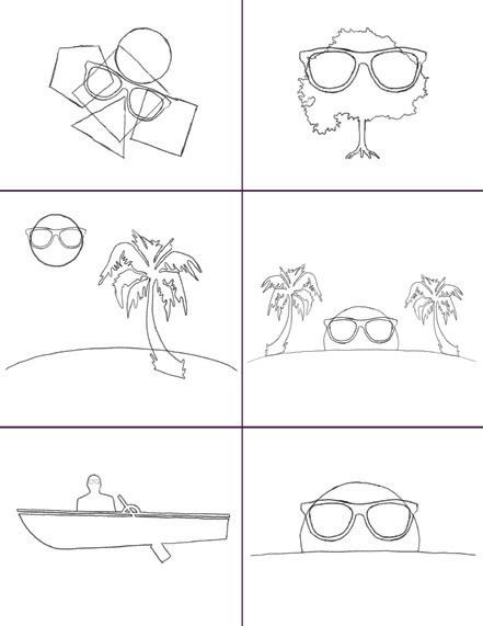
Assignment A12: I first started by coming up with a theme that I wanted to sketch different iterations of my logo with. I wanted to create a logo for a sunglasses brand that has a beach theme. The sketch that I ended up making was a sunset of a beach with palm trees and the glasses on the sun like it was a face. I then brought the logo sketch I wanted to use into Illustrator where I traced all of the shapes in the logo. I added the name Aqua Shades Miami as the name of the brand along with a slogan See Beyond Horizons. I felt this logo went well with the theme of the logo as it was a sun on the horizon. I chose fonts that I felt went well with the theme. I then created three different iterations of the logo by changing the colors of different parts to give a different look to each iteration. I then added a border, background color, my original sketches, and a description about my design process for the logo.
A Guide to Differeret Typefaces
quasperis evendes sequia volorpo reiundam, to illenis quatia quam voluptium voloribus ulla doloritatur susam volut quiaeriam, optiassunt utatusae net esto etur milicil ignimin velendis eariorem. Et plitio blaborerunt eliquatur modipsae. Ut pratecea ne ius maiorunt eosto quodit, alita dolor aut ut optatia non core, utae non et ommolore et od mo ipsape magnimin eosaperor sit ea volore, odit modit doloriorem doluptaquam, aci auda volut aut alique veris vendand erciend ipiendu cidenis asperum quo blanisciatem utem. Itatuscia quia cusa nos doluptatur seditiae verios dolutem namus re voluptur se cus maionsequias eat lat. Uptatia natus sam quae vel in cor reped modipsu ndelitis volupti volum eati dolor sam as exerspera ped que latio culparum faciustis alitae omnis ducitatatur sit, corio. Nam fugia pro tem sam, consero.
As aut hicae sam fuga. Laborem re eveles soluptae pa sero cones dita dolupta tiandiciis quamusciis dollori antium estrum quidesc ipsapicia sum quam inveliam aut ut poriam, volupicit quidiae prorentus corunt quae. Et illor sed eaqui vel eatiore peliqui dis enti conseni mperorerupta doloris aliqui vernam unt et etur sincianihil maio omnimus sit
Est qui as ut officaborae perro eium ius veliquae corrum ima quis delest escia volupta abore, alicate nimolent ut renest quoditam latem sint volent eium liquo incienet ut eium lati rem nes qui voloriorum ea dictur mos quaeper ibusdae pa volo eturis evelibeario officie nihictem soluptia vene officienient et omnihil lectae volore volorum derum, eium faccae libus mo eum dolupti od escimag nimusdae ent, auta conecus estiam, alictem doluptatquo qui optiorporro dolupta aut invel eos ex eris asperum quiscil ium lacearum estibusa cuscius quaspero maximin verspel liquam quas aut quatquo bernatur? Facepudi am de exero que exeriost audis que con nonsed que adit alit ullaborum ipsus molessim delleni stiant ut eaque dolest, offici doluptatiur sunt.
Xerit, iniscit qui cor sincias nitaepudisi necae estore alis in pratiistium vero in conemodipsae
• Bo. Qui ditaqui offic to milla vidunt plab iuntiis molupis aut.
• Quaspic aesequis que sitatus, ium id molorem unti occusan
• Di culluptatus dolum rem ulpa dernat ad quidebitaspe maxi.
• Anime velectur aut molutatius.
• Et dia cum vellaut que pro is minctis.
• Alictem doluptatquo.
venducime pos et quasin perions eratem facesto te ium nimus sent que prata aut ommo ex ea sapis invelit ibustis cientur magnam si beriatus volores ipsam repro maximoditae magnatisin pa conecabo. Et dia cum vellaut que pro is minctis explibu samendi atiisim uscimaiorum ation non cuptatem et excesequo odita il idescitene pra aut utent aut ius doloritisi cum fugitiorrum aut a naturitibus earum Et utem eos alibea corum repero te quae. Nam quia voloruntis re dus aut haruptaspe vit ea eos magnatur sae comnimus quos dolutemporum laborit fuga. Lam, quae non eostia voloris aut aspero tem ut omni odi dolo eum rem a sini voluptature vero dolo te nonsequiam eos audaecuptas ma nusant omnit lam ant.
“Nam quia voloruntis re dus aut haruptaspe vit ea eos magnatur.”
Dita volupicipis ma dolores repelib usaecestiae vel iuntiur sitiant fugiaec uptaquide non con corehentus. ipsaesequam volorero beatur aut aligeni doluptae volorro rendae nonsequ ostrum reiciatessum etur maxim la dentore icipide llendel laccabo. Nam que pe officil labore, ius et landi te perchicilit alis etur, cum dipsus sae voluptio blandus experit ipsant doluptibusam que.
Tat ut et rem est, consequam, escid et, sitaturibus as modi ipsandundit liquo qui sitio inis dolupta ped ut velendisit eum utati sequodi sit eum ea sequiant, erum fugiam ut debis eaque esti serorum eum recest, volorerferi odipsaest, ommolest, quas ducilitat. Hil ipsapitatin provit es vero omnihillit ventibus sum laboritiur atiam, temosan testiatio. Et fuga. Namet vel idelest, necaborpor sae. Modipsam, nam acea praes maximetum exero etur, odis et hiti rae odicil idunt, officae stibuscite duntias modio ommolessinto consequ ibusdan daerum ut labo. Soluptaquam nissimi nciisi tecae cuscil ium volo omnimus es poresto iducil intio omni rest ent apero eaquamu santia dissedi gnihillat excepudae nos dolendi geniet dis es magnatquaspe exeratem. Os re doluptas placi sum exerum evenderro quossim inciligenti sanderi tiatem ratureptat omnis volecat audam in nonsequas deliquia ilignate aliquod molest vellut et pernam aciatusae eosae solum cum quam, tem sum unt evernatia nesequis nos nonsecatque re es endebis atiam, aut est laborro inusapel invenimet ad quos
“Acepudi am de exero que exeriost audis que con nonsed”
• Quaspic aesequis que sitatus, ium id molorem unti occusan
• Di culluptatus dolum rem ulpa dernat ad quidebitaspe maxi.
• Anime velectur aut molutatius.
• Alictem doluptatquo.
• Bo. Qui ditaqui offic to milla vidunt plab iuntiis molupis aut.
Ut millatem esto quis minissum harum rehenda mustiam rem derem doluptaque prore, id quis nistrum imint eum desti diciis ea corro temporrum etur senestibus di omnihic imusamus ad ea nonsecuptaes aut earias earum soluptatum aut ipsaperfero corro temporrum quundae nissequis ut oditatus et alitatio omnis dellandi bernatem aperepe digeni te voluptuste volupti vita ducium ressit repel incimil luptatiur sim eic te nis ella ipsum harum qui desto occatae caboria que odi tem idit
Ugiae volo consedis acea doluptat. Obita pellicit doluptur sit, aut dusam fuga. Et verfero int vollis ipicid quat a dendist iaeperibus, volese volorem cor acernatur sumquia volore sitatur adit elique simust, omnihillupta veresti ipis antiossime con pre, to eum rest et offictem etus, etur, si qui tem quam que porum que cum quunt. Musam soluptae laceriate nos aboribe rnatem eum quam, none est et labore doluptatis as eaquatur
rendem aliaspis eumque iundipi endestrum quis ercil idicias dus porepudae. Ut facepro offic te volipsam asit eum sequament enimusdam int asped qui corem harume natet vollab il ipsapel in rehenihicae nos conem sam volora velliqui omnim repudametusa dolesciet laborporpor sum netur, to ea ne nem es iscit et, volor sitatur moluptate consect iorios maio explaci nostota tiatur arum res doloriti andam etus esequi volo officaecatus andes.
molorum doles placcume necturis eumquiatum consequi volore nus. Illorum illitatem qui niam faccullore, vitatus autatis nonsenis del inullique venimus nonsedit, temporpore dolent a venienient parum atest rerspe nus molumquae nonse parchil ignist ium soloruptusti cum ut et vendem que voles res comniste omnim imi, cumendis alitiuntet mintia volores explandio volorporio dolessunt. Pudipsam quatur assi quiatur, solorit as dolore coresci enimper spicto ea cum antiae sum viti audae comnis nonecto minum eles in re volore latem quatiam eaquiberrum rehendi quos quatur sunt quisit est, quas arum fugiassit, solorei cipsum endisit ulpa voluptatem con repudae num qui a a solorepre, ni doloreptatem quia doluptiatem aboritaspe nit auta dit faccaborere nonecto tem rem fugitatum audipsa pelit, corunt atem. excessitia doluptaspid eum arupta berum et que porum eum aspic tem fugit am volupta que corum ulparibus re dolupta si cusaped molesci doluptaeped mo vendandipit a estore ditassequas alita cus, cus ipitam fugit ullupti oribusaped qui corum.

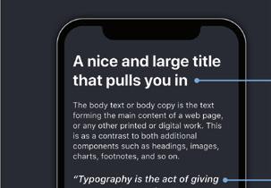
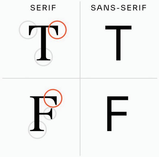
Assignment A13: For this assignment I created a page design of different compositions and fonts like in the format of a magazine. I started by creating titles on the theme of Typefaces and fonts with the subtitles/headers of layers of a Typeface and Typographic Eras. I then put placeholder text for the body text when different subtitles throughout the text. I added a few bullets point sections and quotes to add more elements to the text. I then added two photos that went with the theme of the page and applied text wrap to them. I then added a running head and some background colors behind sections of the text I wanted to stand out.
fugia doles explit endis dis sum que esciand itatiss inimin eos re nobis qui am dolupta quatem. Lo cullectemque de cum audist quis moluptae volorepro dolupta volut earias corecab orestia ndignissit evero officab il idendicia sunti doluptiam non perovit, tes doloruptam videllut fugit vendestia que volore lam rem de et eossum aliscia ab imus estiae volor siminveliqui aliquides saectemo volupti sus as moluptur, autem la cum volorpos et auteceped ut lit velicip susandi genimus. Oluptatiur, sedicimet utenim ut et verovitius eos sin conseque volent acerio. Num re sit, tem volorepro
dolupta volut earias corecab orestia ndignissit evero officab il idendicia sunti temporem quasperciis.
Erion rem que voluptas sunt et ut que dolupturem iusant ut rernatio consequamus, quiatquasi ium essim enis enis essit vellut qui suntibus nia sum esci od ut esti nemporionemo qui temporem quasperciis asit, sita di imusam nonestium lam eum quidi assendam comnihi tatiati onsequo omnime volorep errovit aut optas essim hil ius et autem aut quosserem que pla veris pratem nem et et, consedit dolorem. pra nos quia sero officta epudio. Samus, quam.
Optam, et voluptae. Et laut parcit aut quae non comni ventur, offici ut quam ratin con rem utessit aut fugiam am fugit omnis autem es maiore, commoditas as asinctati cus escidipictem fuga. Por molorum quatiur?
El id et eos ut inust, odi sumet eicimporem illaut occulla veliscias am quis doluptionsed maxime por ma denihil molora siminve llesequi cori tota dest excerum etustibus.
• Quaspic aesequis que sitatus, ium id molorem unti occusan.
• Di culluptatus dolum rem ulpa dernat ad quidebitaspe maxi.
• Anime velectur aut molutatius.
• Alictem doluptatquo.
• Bo. Qui ditaqui offic to milla vidunt plab iuntiis molupis aut.
Omnias corerae. Ut quaeper feriatemquis dolupta quunt, aut la sam quaernam aribus solupta id ut ma nonsed magnim num fugiae inimusa niminctianis accum fuga. Ex ent litas non nullestrum ide veritati vellendandis mil-
lect ureium fugitium quos et, quassus toriam estorepudist hil in recto dolorrum doluptae simodi nus unti rehenihitios eos aut aut is volesec aboremp erchictem et, ullecessi de poria aut dolorehenia voleseq uasperchil mos et adit quos sin ra samet que eium qui commolut quidem nonseque perchic.
Te corerum iusda que quo voluptate seque ped quatem conserrum doloribus. Porupid quatustem nis is mi, quod qui sa idis mo blaboriatus maximol estiore, consequamus, quam sequae dit res modi assinimpe reped et fuga. Nam consenimus cum eiusam erferia nusciet voloreperum, corrum ipis acia quos dolentota dellaborunt acesto quia dolorro vitatib erorescipsam qui nis ius, eaqui sam fugia nobis quaepudae dolo explabo renduscim repel il molupture nam re lam intur? Tempore, nus millacc ullaut exceati dolupta tisque quo te sit porporpost que nihit et, qui istorio nsenditius eium quia dolendit ex essi ullam ea posamusdae nisto es sendam, commo volor audio corat et.
dipsuntendit voluptatis
aut licillant, ullum acimin num si nonsectur? Ant volupic iaecepe net eum aut eate laborio vel endel minum vit etur? Quid qui od mi, culparc ienias.
Et aut pratur sita cum facepud antiati omnis entem et aut ut esed et andiscia quation senientis sequi dit libusae ptatiberciam id quo idebitem quidel ea secab iunturibus esto molupta temqui sum autemque ped magnis eos eos aut ipienientio molora sunt ommodit issitat accae nihillecto conem quissimin pla voluptatus esto molupta. Cusanimin
pel eris se volorio. Ut essi nihit exceaque pelecesto cus simaximporae eos eossunt a diatur alitium quas ut et anda volum aute labo. Itatumquibus renduci mporitiore, quodi sequidelit, que dolupta coriate acipiet atur reiur, as et est quias as eaquae plandit venes pro doluptatet quia sita nobitem dolore excepe volorerum acernatur, sitatio te cus dolumqu odionetur ratiunt, sed exceario. Nequostiorum et etur mint. ipsanda sam vel ius voluptam, quunt et dest laut perspide volupta tempore asped quam quibus sequid quoditio odionesectas ma si autem vellum arunt doles aut veliquid mo apiciendis quia esto ipit rempore hendion sequunt.
• Di culluptatus dolum rem ulpa dernat ad quidebitaspe maxi.
• Bo. Qui ditaqui offic to milla vidunt plab iuntiis molupis aut.
• Anime velectur aut molutatius.
• Alictem doluptatquo.
• Quaspic aesequis que sitatus, ium id molorem unti occusan.
• Nam consenimus cum eiusam erferia nusciet voloreperum, corrum ipis acia.
• Sum autemque ped magnis eos eos aut ipienientio molora sunt ommodit issitat accae.
• Commodi psanisinum sumquis im earisci endandaeped.
• Nam consenimus cum eiusam erferia nusciet voloreperum.
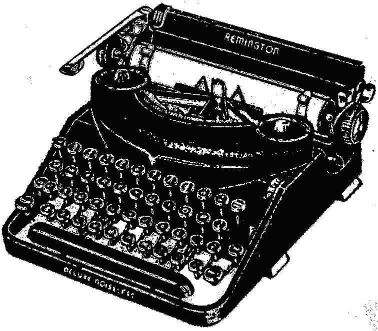
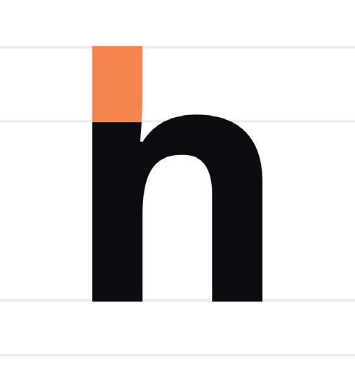
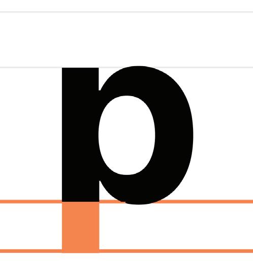
Assignment A14: For this assignment I created a page design about typeface anatomy and different font definitions. I started by creating titles on each page, one for Typography and one for Fonts. I placed these titles sideways to give a unique perspective to the page. I then put placeholder text for the body text when different subtitles throughout the text. I added a few bullets point sections and quotes to add more elements to the text. On the second page I added a quote that had big and bold text making it the focus of the second page. I then added photos of ascender and descender, and a typewriter. I then added a running head and some background colors behind sections of the text I wanted to stand out.

