
Jacob Flores-Popcak MA, MA, LMHC
DESIGN WITH THE MIND IN MIND
Jacob Flores-Popčak (he/him) is a designer specializing in themed entertainment. With a dual foundation in clinical psychology and interdisciplinary design, Jacob brings a rare depth of audience insight to every project. His six years as a licensed psychotherapist uniquely fuel his creative process—translating human behavior into emotionally resonant, story-driven visuals. From theme parks and museums to brand identities and children’s books (12 titles and counting), his work blends analytical rigor with artistic flair. Recognized by the Walt Disney Company and featured in international exhibitions, Jacob leads with empathy, collaborates with clarity, and delivers with precision start-to-finish.
“For our museum client, Jacob looked at our rough sketches, listened to the big idea, asked pertinent questions, and then turned out a set of beautiful concept renderings in a short amount of time. I appreciate his empathy for the visitor and their experience.”
—
John Kelton, Owner/Creative Director, Kelton Design

“I have worked with Jacob on several projects during his involvement with JRA and have enjoyed his collaborative spirit and thoughtful, well-crafted visuals... He’s delivered several imaginative, on-message experiential illustrations for our projects that integrate skillful graphic understanding while also fully emotive and savvy in their execution.”
— Tony Schmidt, Director, Studio, JRA
“It’s a pleasure to collaborate with Jacob. His passion for storytelling and placemaking is evident in his work, and I always appreciate his desire to push himself.”
— Luc Steadman, Principal Concept Designer, Universal Creative
Design Process
MOOD BOARDS, STORYBOARDS & SKETCHES
My psych-informed design process always begins with quick sketches, often created in real time during design charrettes while the team and I bounce around ideas. At this point, emotional resonance is the most important thing to me: What feelings do we want to get across with this piece? How do we want guests to relate to it, or to one another as a result of encountering it? What core memories or references do we want audiences to connect to this piece?
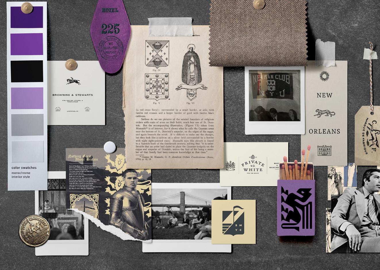
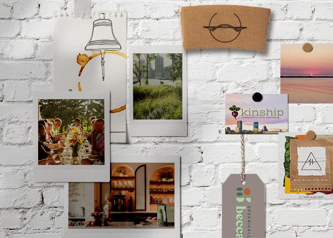
Next, I fine tune the sketches, and when appropriate, take them into storyboarding. Almost all of my projects start with a mood board, which I try to make an immersive scene rather than a mere collection of images. This helps establish emotional tone from the very beginning of the process.

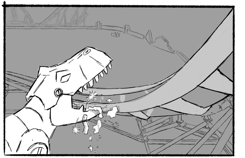
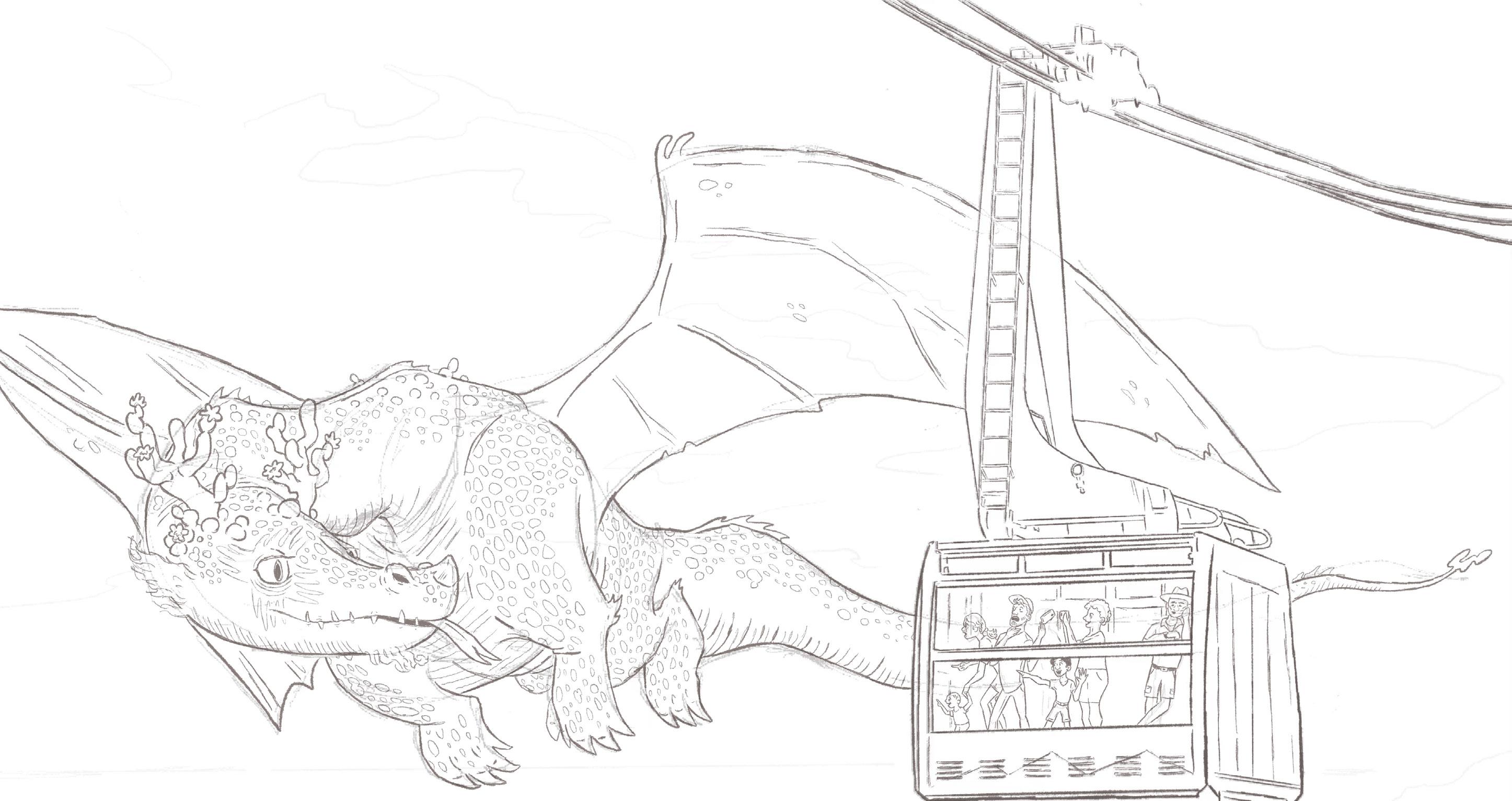

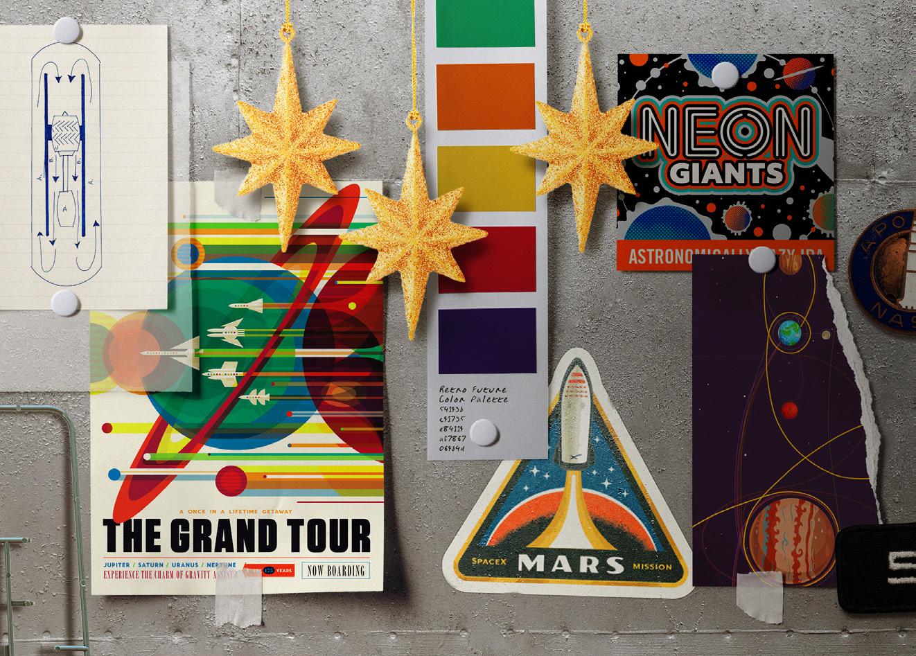
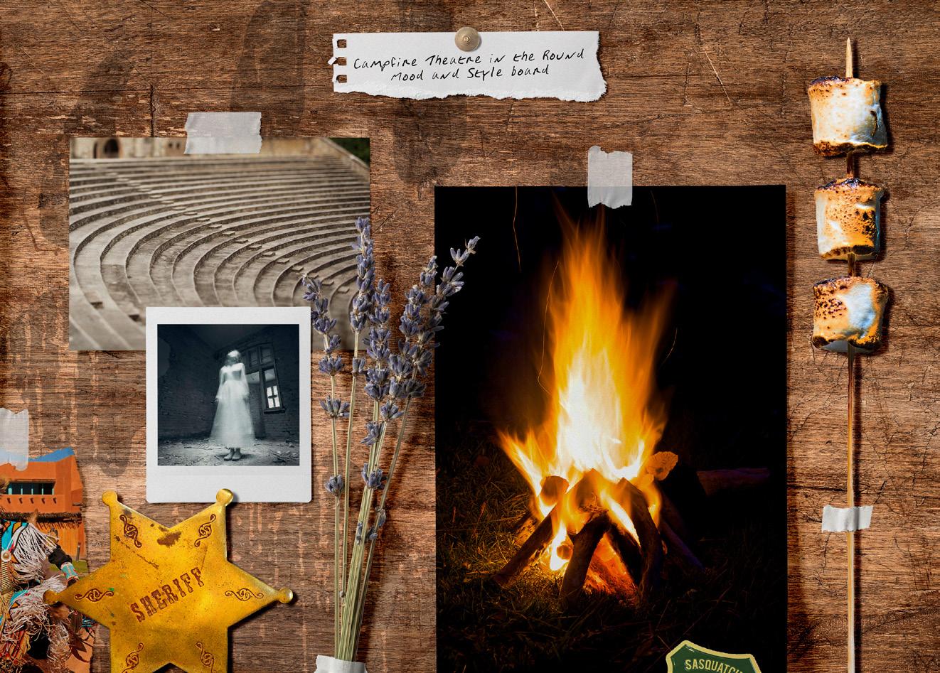
Four mood boards from four very different projects; my mood boards tend to be immersive scenes, rather than collections of images.

Tortuga Taqueria
LOGO DESIGN, SIGNAGE, & MURALS
SeaWorld San Antonio came to me looking to re-imagine their Rosita’s F&B location to reflect both the Hispanic theming surrounding the location and a new Aldabra tortoise-feeding experience launching nearby. The result was Tortuga Taqueria, an eatery drawing aesthetic inspiration from both Mexican folk art and the Aldabra tortoises themselves. I designed all the graphic elements, from the logo and branding to the interior murals and instructional signage. The vibrant color palette and hand painted textures created the perfect environment for dining alongside these adorable reptiles!

Gruseltage!
AD CAMPAIGN POSTER DESIGN
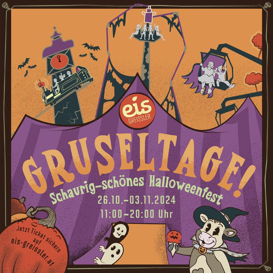
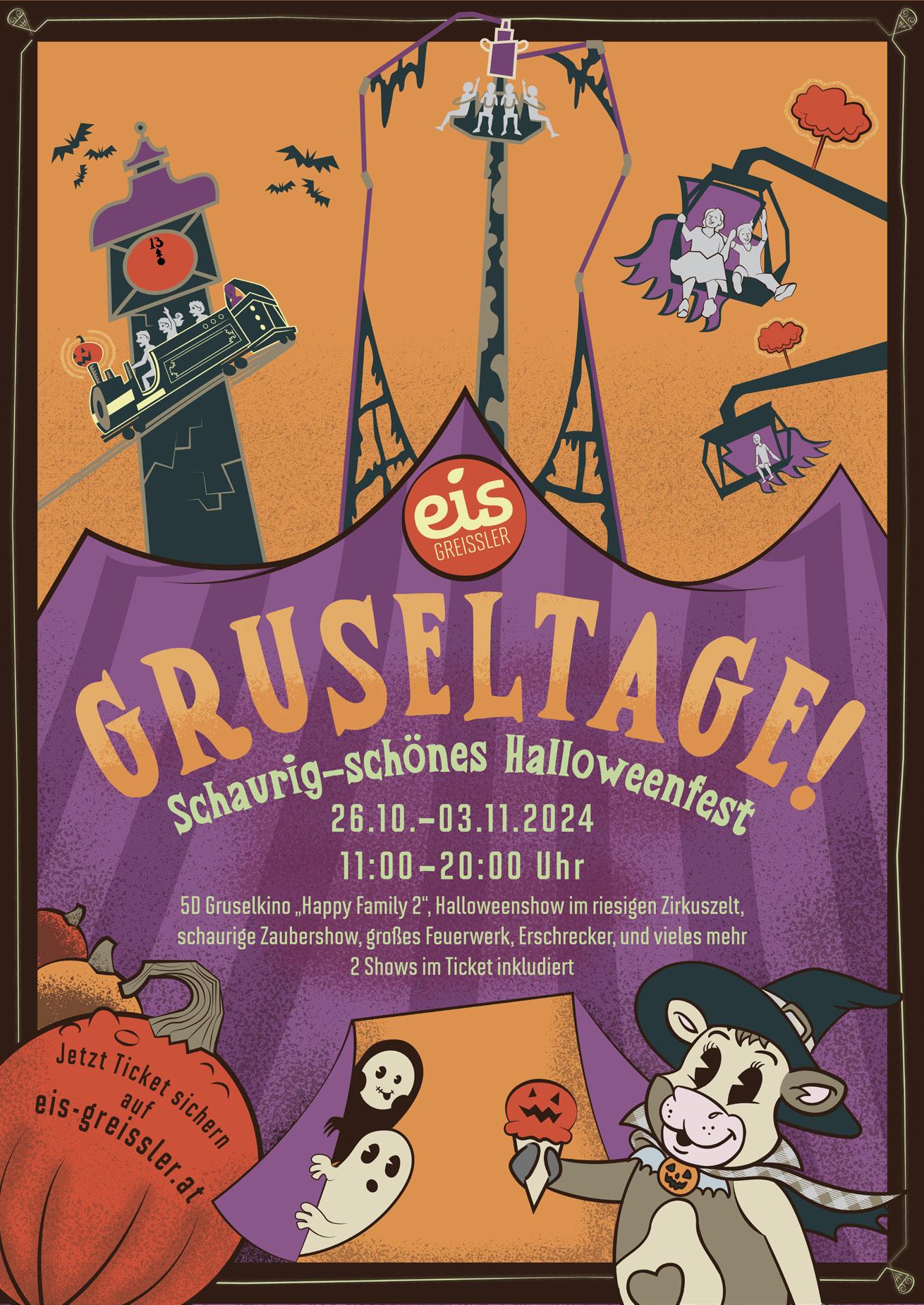
To market the Halloween festivities at Austria’s Eis-Greissler theme park, I was tasked by Alex Korting Themed Entertainment Design to create a series of 7 posters at different dimensions. Drawing from the aesthetics of retro “rubber hose” style animation as well as Halloween posters from the same period, I reimagined both the park’s attractions and their adorable cow mascot Rubi with pie-eyes, gritty textures, and a limited color palette befitting the spooky family event.


Nitro Racer: Supercharged!
LOGO, SIGNAGE, & THEMATIC DESIGN
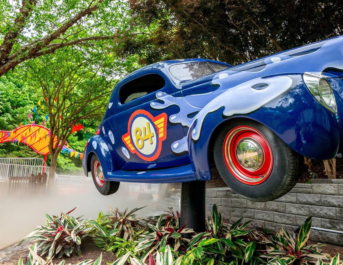
Nitro Racer: Supercharged is a racing waterslide at Water Country USA in Williamsburg, VA. I was thrilled to head up all artistic elements for the refreshed Busch Gardens attraction, from redesigning the logo and theming to creating all the safety signage. We went with a playful retro racing aesthetic that matches the heart-racing waterslide!
Eggspedition : Easter Bunny
DARK RIDE PERSONAL PROJECT
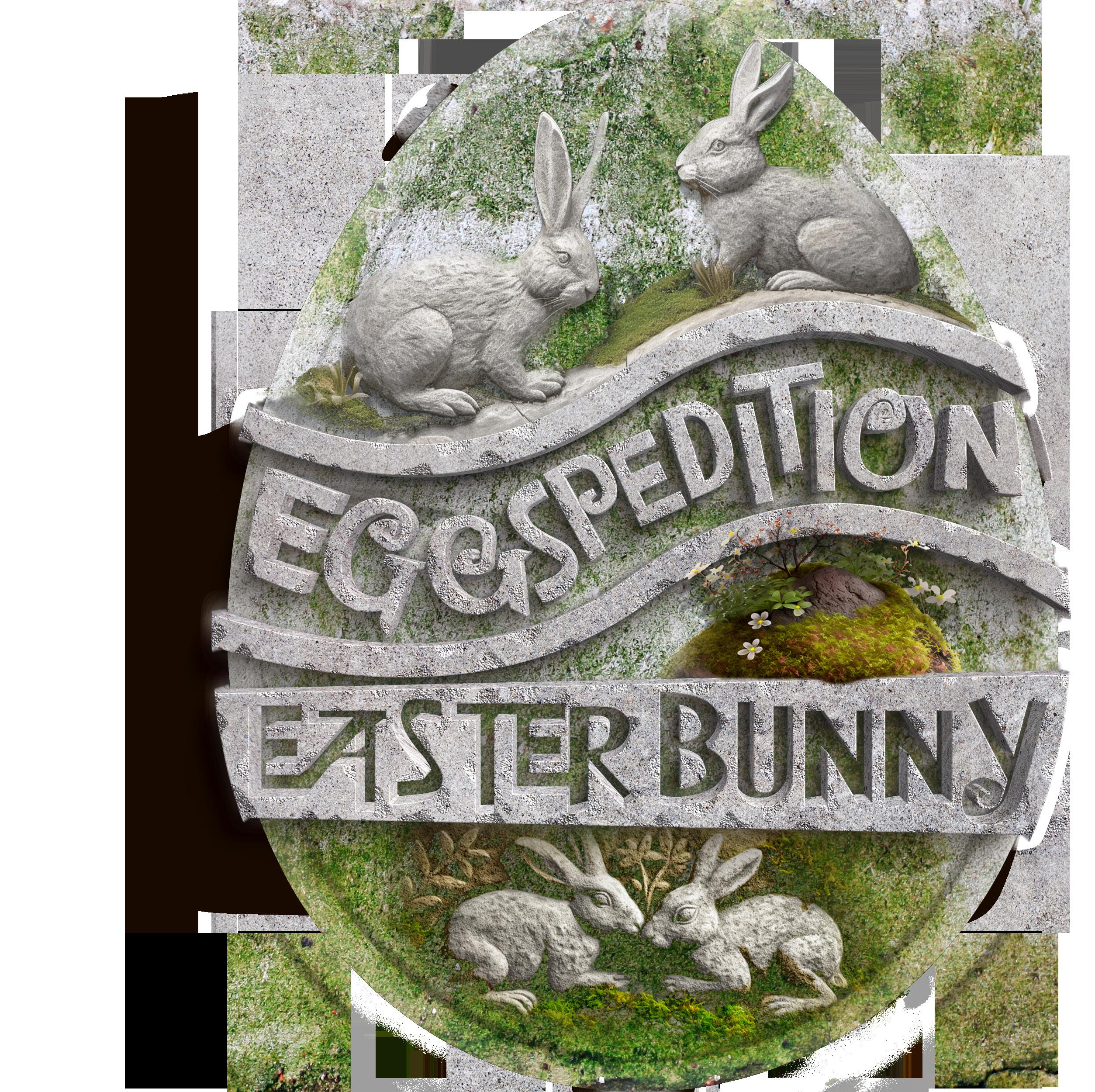
Combining springtime aesthetics with Italian Renaissance architecture, I designed this classic dark ride to take guests down into the burrow of the Easter Bunny. I decided to style the Easter Bunny as one of the Renaissance masters, painting frescoes on eggs and carving masterpieces out of chocolate. Riding in Easter eggs, the guests would help him out with “quality control” and become honorary Easter bunnies by the attraction’s end.

The entrance to the attraction is set into the hills like a
rabbit’s burrow, with Renaissance-inspired dome roofs.
Haunt Logos & Posters
HAUNTED ATTRACTION PROMOTION
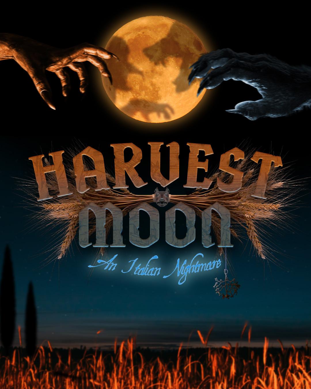
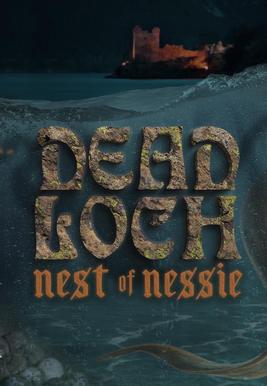
These attraction logos and accompanying posters advertise three haunted maze attractions, themed to Italian medieval werewolves, the Oregon trail, and the Loch Ness Monster respectively:
In 16th century Italy, harvest season means the clashing of two ancient cults. Now you’re trapped in a battle between werewolf zealots and wicked witches, and it’s pray-or-be-prey in this cursed, Inquisition-era village!
A mysterious new disease is sweeping the Oregon trail turning man and beast alike into murderous monsters, and it makes dying of dysentery look like a stroll through the daisies. So caulk your wagon and stock your bullets: things are about to get grizzly.
While exploring the ruins of a Scottish castle, you discover a torn-apart tour boat and a horde of hungry hatchlings before coming face to face with their monstrous mama in a half sunken cave. Can you survive the nest of Nessie?

Belen Aerospace
BRANDING PACKAGE/IDENTITY DESIGN
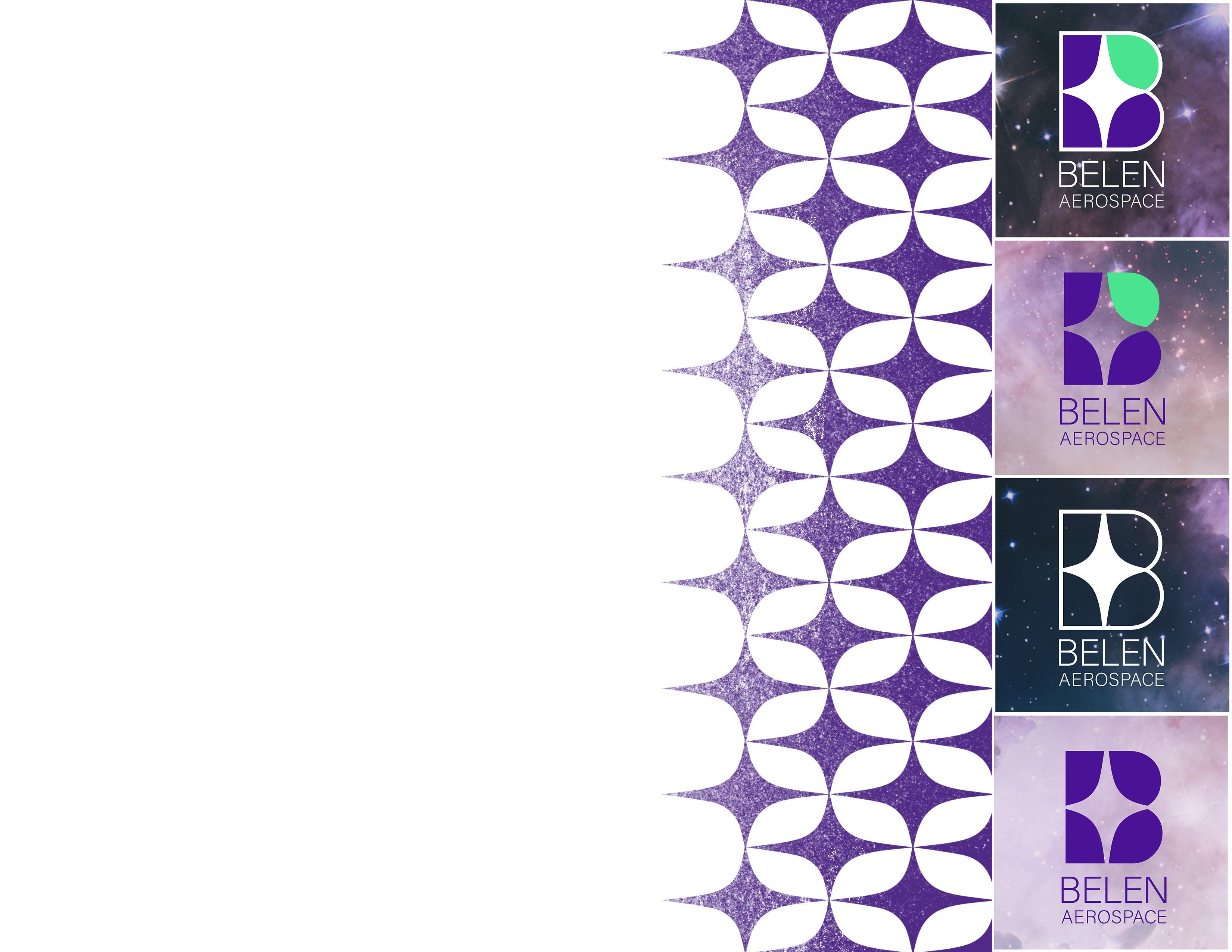
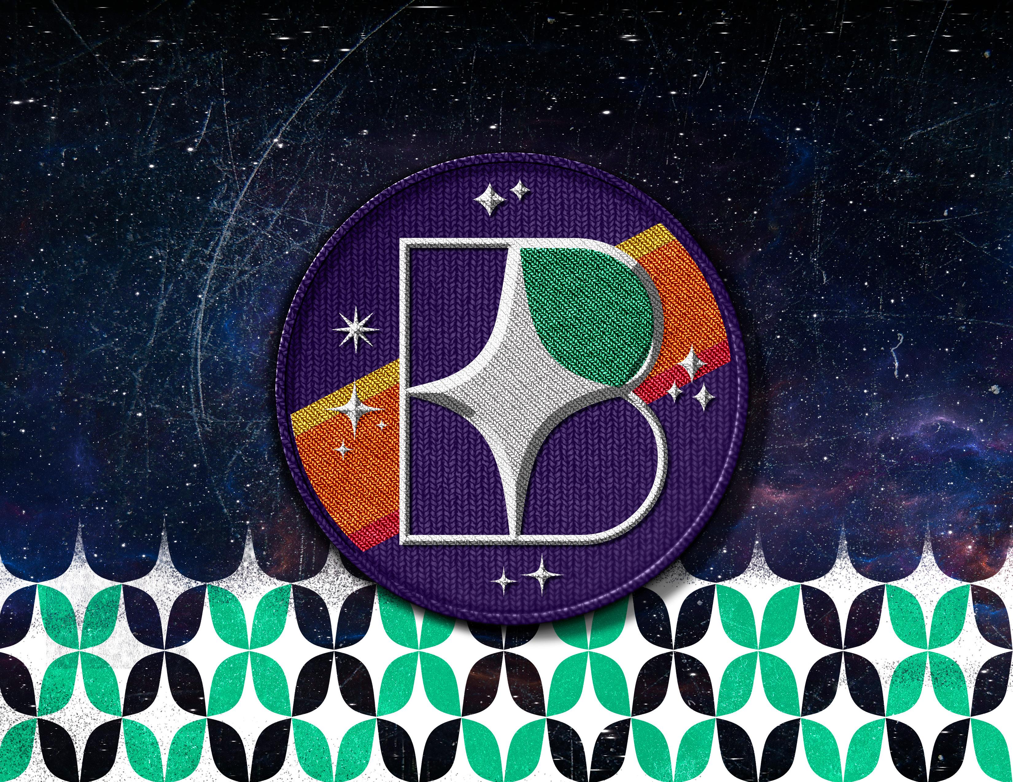
Belen Aerospace seeks to find, cultivate, and promote breakthroughs in Internal Atmospheric Propulsion, a sustainable alternative to traditional chemical propulsion systems. The branding package I designed for them communicates their spirit of hope and is incorporated across web, print, and merchandise like stickers and patches.
The brand was based on a retro-futurist aesthetic, mirroring the brand’s hopeful mission. Anchoring the brand, the logo is made up of an uppercase letter B, the initial of Belen. However, this shape not-coincidentally references the rough shape of the Internal Atmospheric Propulsion system which Belen seeks to promote. The ecologicallysavvy sustainability of this system is further symbolized in the leaf in the upper right hand corner of the shape. This leaf is made possible by the negative space left by a mid-century modern star. Furthermore, the star is made up of 4 asymptotes approaching but never reaching the x or y axis; in analytic geometry, an asymptote of a curve is a line such that the distance between the curve and the line approaches zero as one or both of the x or y coordinates tends to infinity. This represents the infinite possibilities still held in the cosmos.
NYU Newman Club
BRANDING PACKAGE/IDENTITY DESIGN
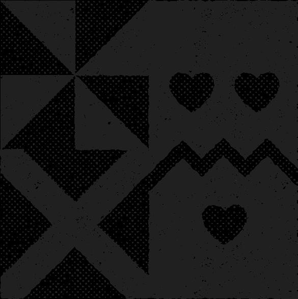
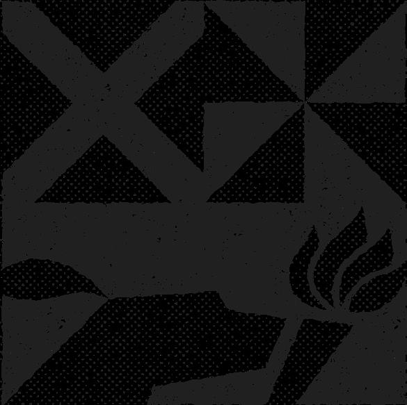
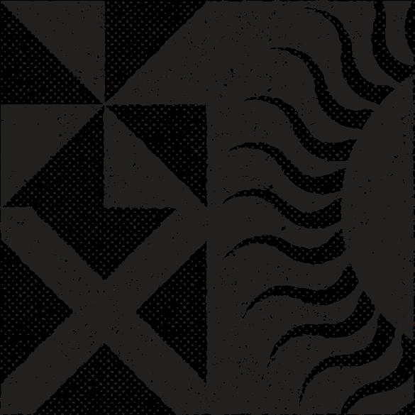
This project reimagines the visual identity of The Newman Center, the Catholic campus ministry serving New York University. Serving the students since 1894, this is one of NYU’s oldest brands. The design process therefore centered on creating a brand that unites the Center’s diverse clubs and ministries under a single, cohesive visual language; one that feels both timeless and contemporary.
Drawing inspiration from the relaxed luxury of midcentury boutique hotels and the tailored restraint of Savile Row ateliers, I developed a system rooted in understated sophistication and subtle symbolism. The hound-and-torch logo, referencing the Dominican Order, was reinterpreted through clean geometry and rendered with a tactile, ink-printed texture evocative of vintage newspapers.
Typography, color, and imagery guidelines further reinforced this analog sensibility: warm neutrals instead of stark black and white, grainy monochrome photography, and restrained layouts emphasizing balance and texture. The result is a unified brand that feels at once intellectual, mysterious, and quietly evangelistic—mirroring the Newman Center’s mission in visual form.




Lumystica
TOURING MUSEUM EXHIBIT
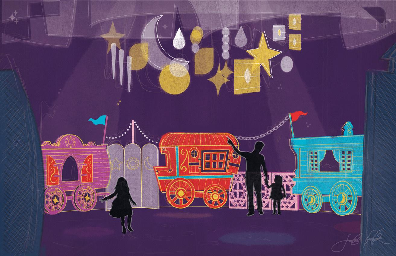
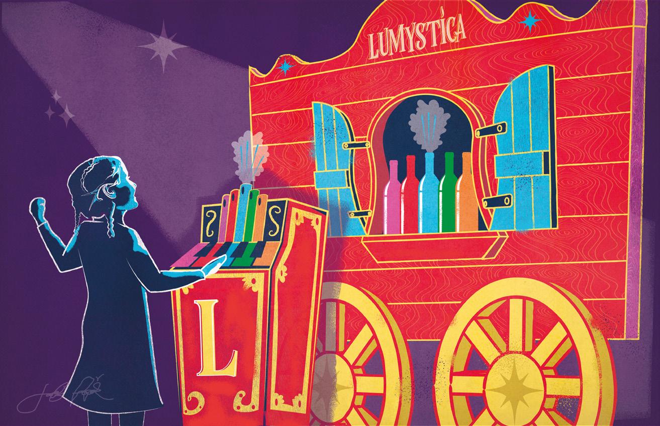
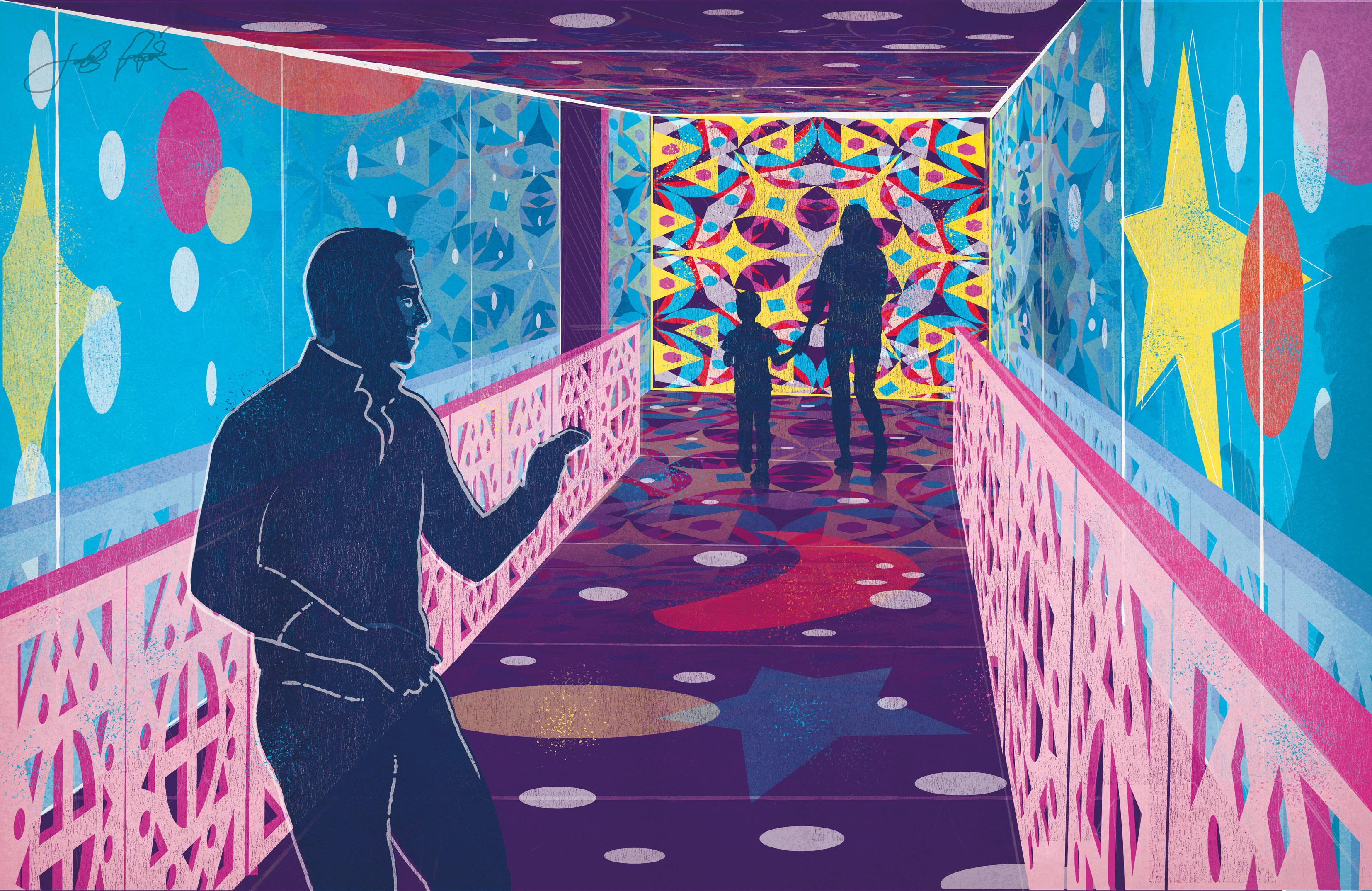
Created by Lightswitch, Lumystica is a dazzling touring event of circus-inspired fun. I created three pieces of highly-stylized concept art, reminiscent of traditional block print posters but with a fittingly modern and funky twist. The art depicts a kaleidoscopic hall of mirrors; a room of circled circus wagons and shimmering astral lanterns; and an interactive game featuring an old-time circus organ!
This concept art package deviated from my normal style but was an incredibly fun challenge. Designer Antonio Pelayo designed the logo and branding package from which I drew the vivid color palette.
Ocean Outpost
MURAL PACKAGE
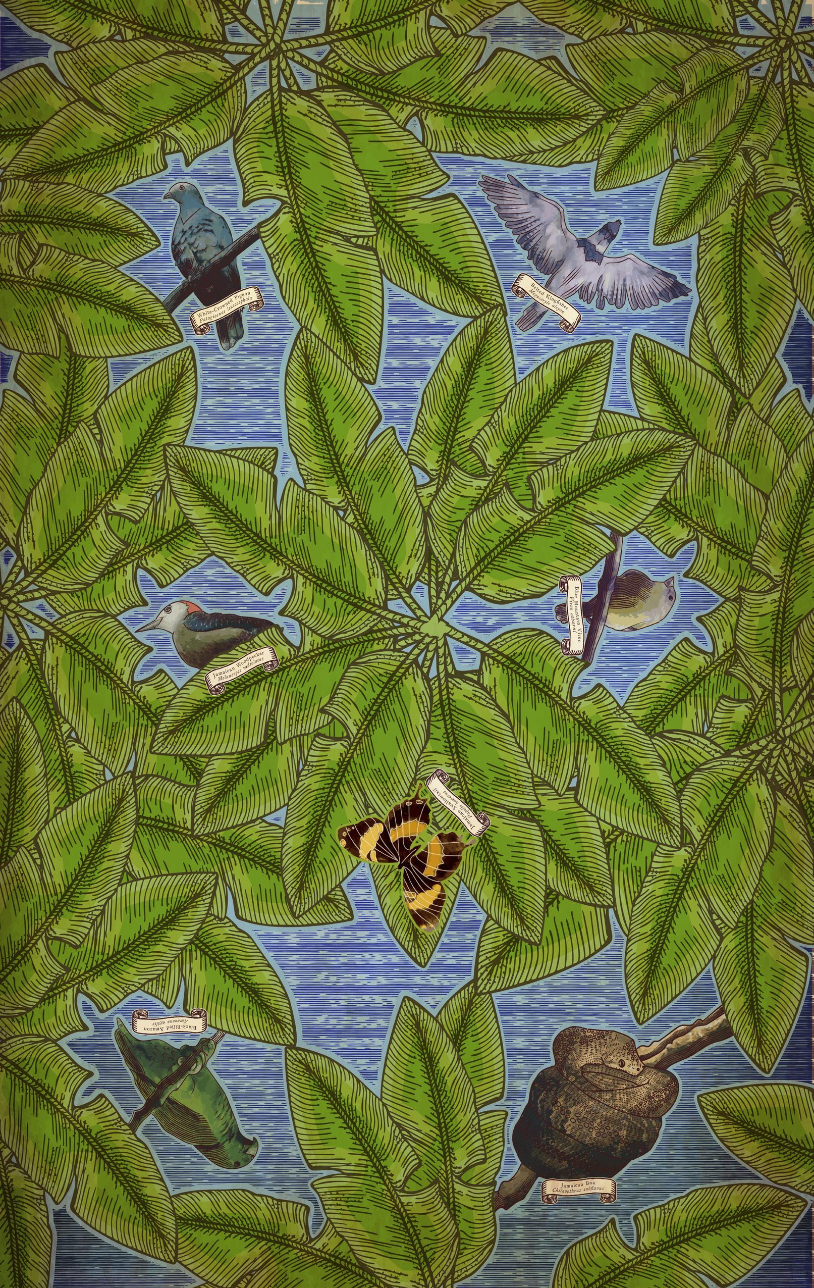
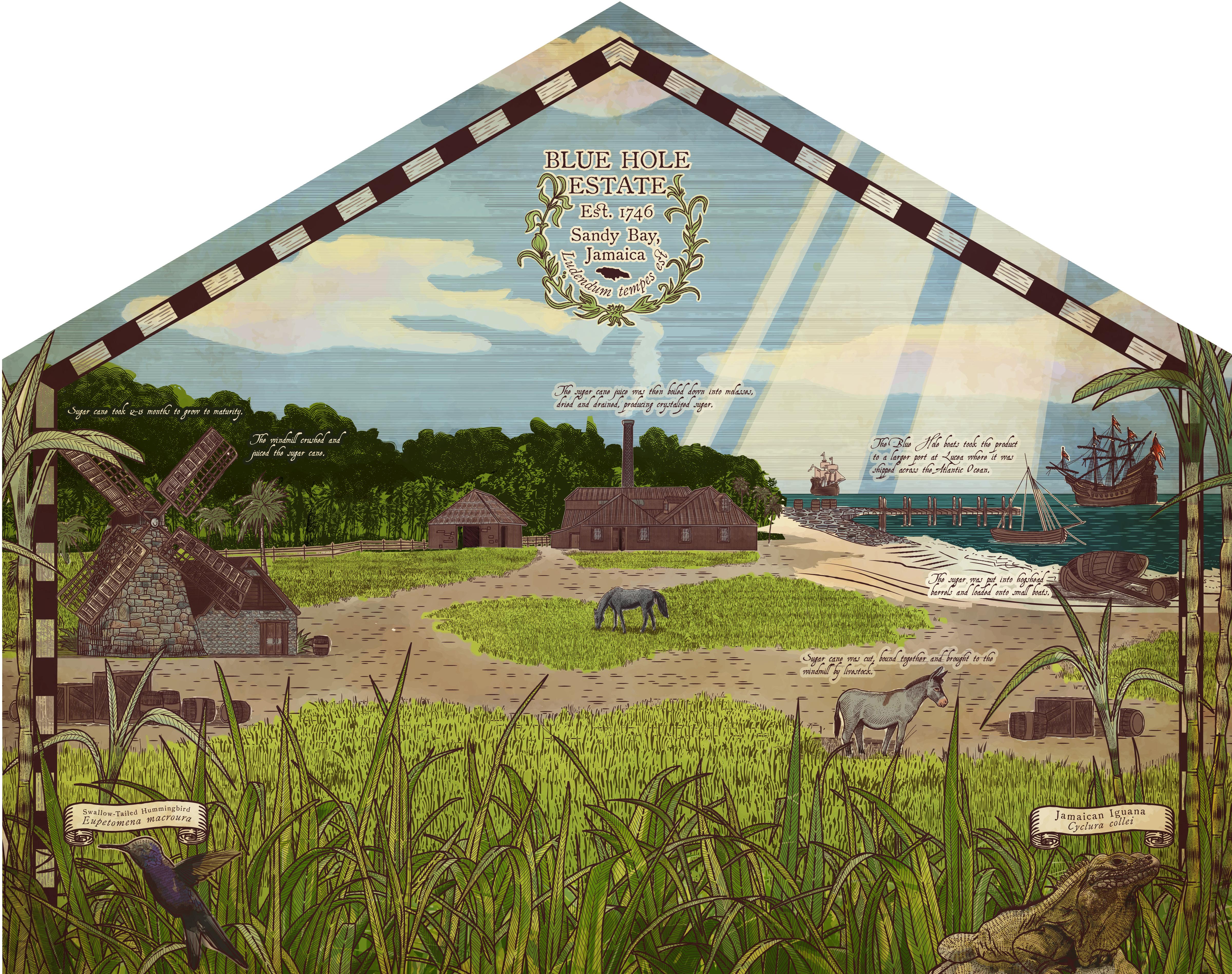
My inner pirate was incredibly excited to be commissioned by Melody Matheny of Melody Matheny Designs to create two huge murals for a newly developed mixed-use space at CHUKKA’s Ocean Outpost. The first mural I created was for an 8’x28’ wall and depicted the 160-acre property as it would have looked in 1746; the second mural was for the ceiling of the same space, and depicted many of the native species one should be on the lookout for when exploring the property. Both murals were rendered in the style of a mid-1700s map, with thousands of intersecting ink lines and lots of hidden illustrative details. The project also required me to render an East India Companystyle “trading stamp” to represent how the estate might have marked its goods.
End of the World
BRANDING PACKAGE, SIGNAGE, UI/UX
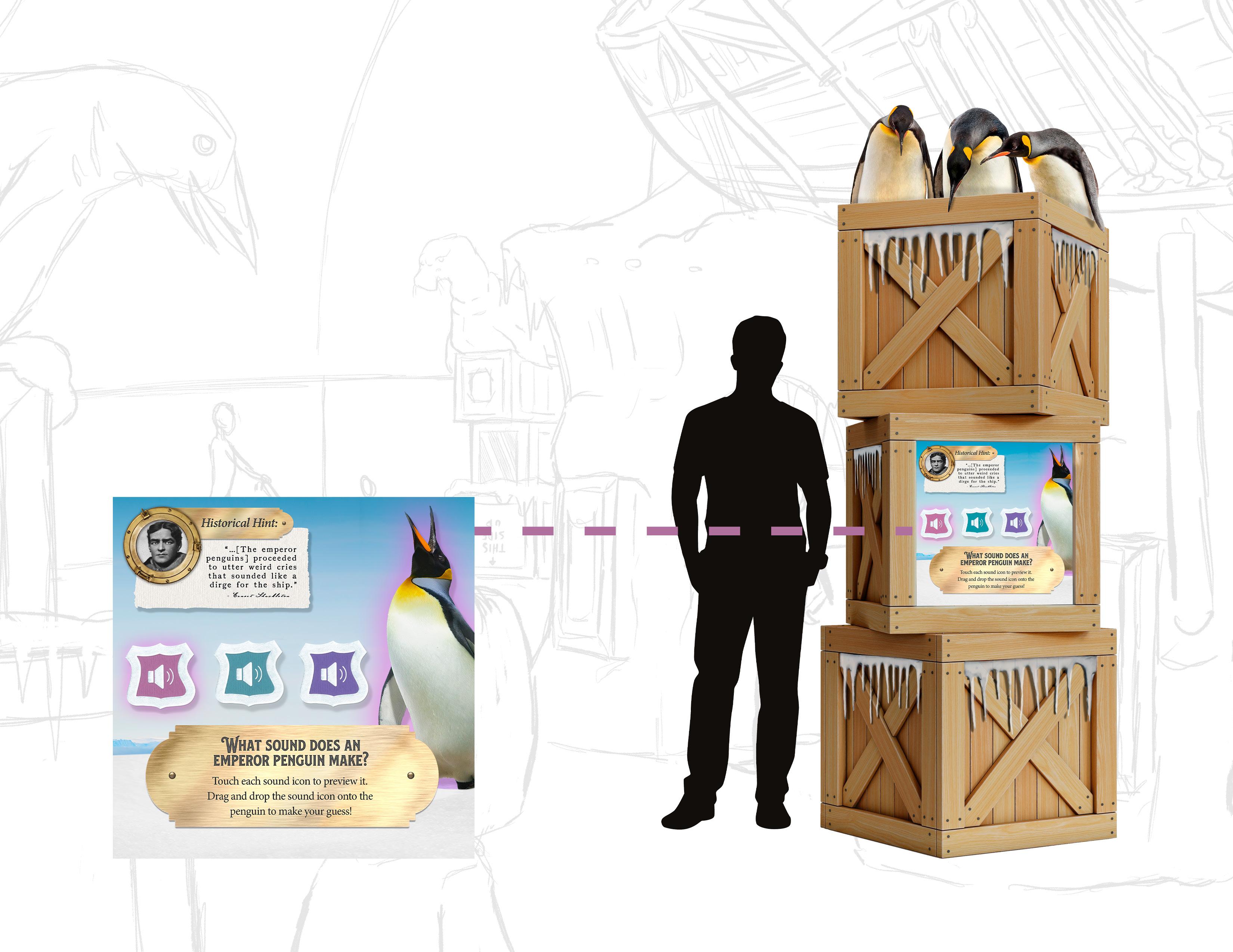
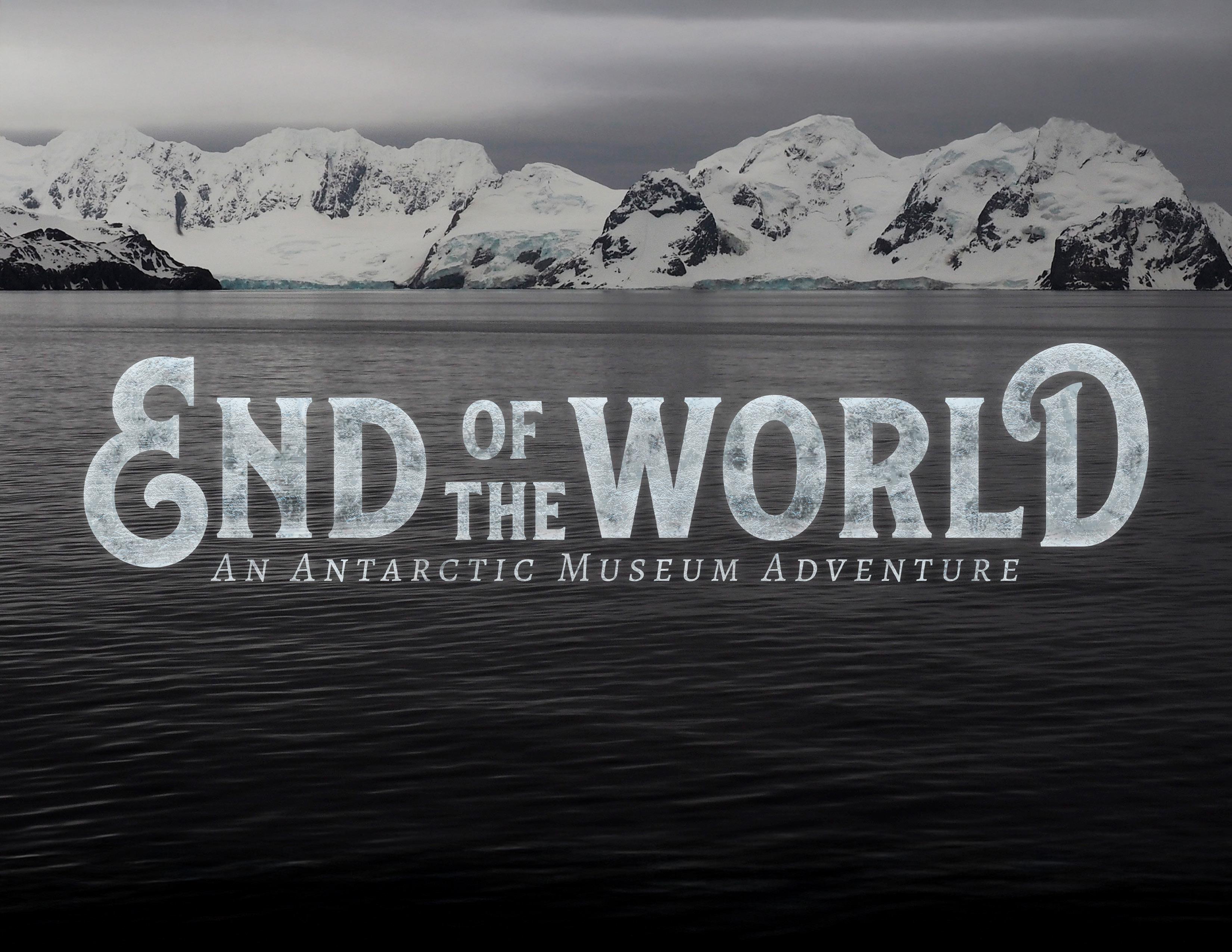
End of the World is an immersive museum experience meant to educate and inspire families with the incredible story of Ernest Shackleton’s daring explorations of Antarctica. In addition to the concept art, I also designed the logo/branding package. It evokes the types of swooping text seen in much of early1900s signage, especially as one might see on ships. The associated branding elements are incorporated across signage and touch screens placed within precariously stacked crates, allowing opportunities for further guest interactivity and way-finding.
Thread International
PACKAGE DESIGN
The pattern shown here was designed as part of a packaging proposal for Thread International, a company which gathers and recycles plastic refuse in Haiti and Honduras, recycles it into cloth, and sells the product to benefit the original communities. At a glance, this pattern appeared to be a weave, as one might see making up a piece of cloth. Upon closer inspection, however, one would be able to see that each “thread” in the weave was in fact a plastic bottle.
Placed on the boxes and product at an angle, the pattern served to give a dynamic edge to otherwise simple packaging. Furthermore, since it was developed with single-color use in mind, the pattern could easily be adapted for a number of branding uses.


The Ol’ Factory
BRANDING & PACKAGE DESIGN
Who doesn’t love a pun? The Ol’ Factory soap brand aims to fill the void of artisan soaps for men, while appealing to harlequin romance novel archetypes of attractiveness. Building on a pun (“olfactory” refers to the science of smell) and styled after rustic woodcuts, each scent is modeled after a traditionally masculine archetype and includes three thematicallyrelated scents.
The brand’s goal was to use entirely sustainable packaging, so a simple wrap-around label was chosen, printed on recycled soap paper with single color soap dye. The soap paper--made by combining recycled paper with the refuse of the soap making process--dissolves in water when the soap is used, meaning there are no leftovers in either the original manufacturing or the use of the product.


