
2 minute read
The Bruges Bus


showcased
2020 NATIONAL STUDENT SHOW AND CONFERENCE
Advertisement
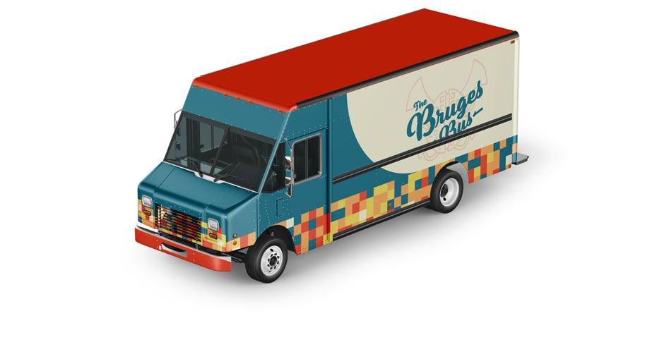
For this project, I had to design a food truck and its branding. The catch is, the food truck had to be based on a country. For my country, I chose Belgium, which is known for their excellent food including chicken and waffles, french fries, and an assortment of delicious condiments.
Bruges, pronounced “Broo-jiz”, is one of the largest cities in Belgium and is rich with culture. So, with a little double aliteration, I came up with the name “The Bruges Bus”.
I created a coat of arms for this food truck consisting of a waffle with classic horns displayed behind it. I used this mainly as a
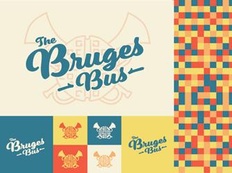
secondary logo, but placed it behind my word mark as a light accent.
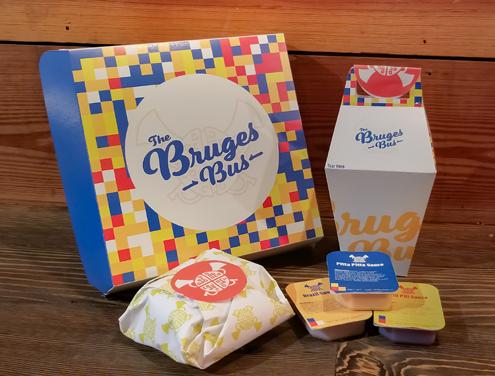
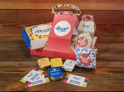
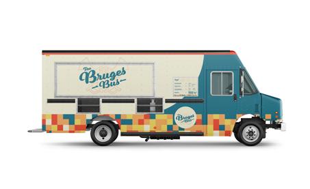
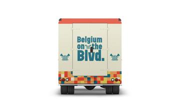
I chose colors similiar to the Belgian flag, but because the Belgian and German flags are so similiar, I altered and switched some colors out to avoid confusion. This also helps to make this truck feel like its own entity. The pattern uses every color, and I used squares to represent the square shapes on waffles.
I also designed packaging consisting of a food box, a fry box, wraps, stickers, sauce packages, punch cards, and a carrying case to hold it all. I used unique box shapes to show just how unique belgium really is.
The food truck itself was very fun to design. The pattern was used as a trim to help carry the branding and give the design weight. The tan meets the blue in the front of the bus in a curved fashion to represent the curve of a waffle. The curve also helps to lead the viewer down to the menu and towards the ordering window.
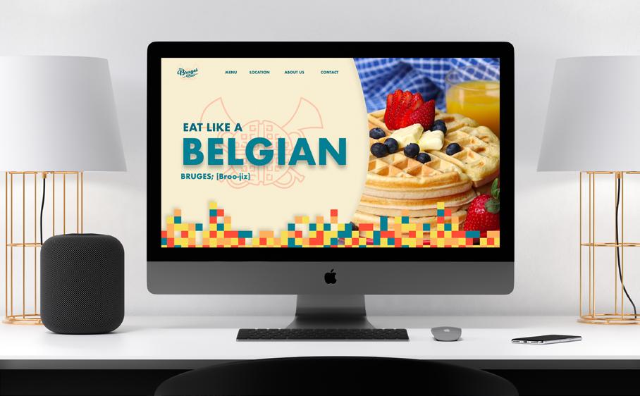
I also created a one page website for the company that includes a homepage, a menu, the location of the truck on any given day, an about us page, and contact information. To see a video of the website, scan the QR code on the left.
Thank You!
To see more Visit traviscumbest.com


