Interior Design
O R T F O L I O
Jack Carroll

O R T F O L I O
My Name is Jack Carroll, and I am applying to work within the realm of interiors. After much research within my work experience I decided to reference the works of Sirin Sundara through a few of my pieces for my portfolio. I am truly in love with the subject interiors and I am extremely enthusiastic to learn and develop my skills at university. My study’s within the world of interiors has allowed me to ignite my passion and to fully immerse myself in the subject. I decided to complete a few studies with various colour palettes in order to show a range of different styles. My love for interior design was curated at a young age where I found my strive and determination which continues to prevail through my current work. I have no doubt that my personal can be well developed throughout my time at university if given the opportunity. During my time at school my love for interiors has been developed while studying in my art A level and I would love to continue my studies within the more specific subject area of interior design.
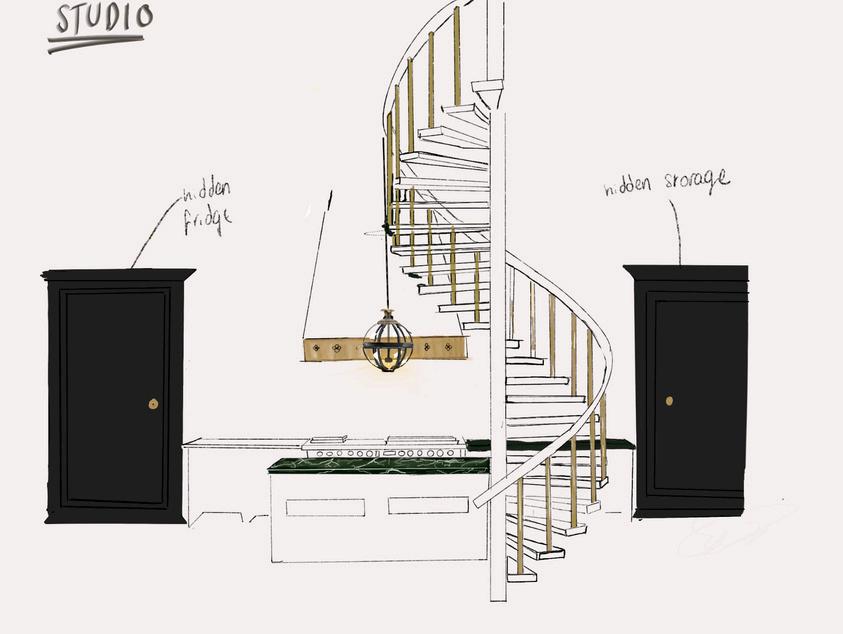
STUDIO APARTMENT SKETCH
LIVING ROOM 1
FLOOR PLAN SKETCH
BEDROOM 1
LIVING ROOM SKETCH
FUTURISTIC STADIUM 3D MODEL
PHOTOGRAPHY
SKETCHBOOK WORK
OIL PASTEL EXPERIMENT
ACRYLIC VS OIL PAINT
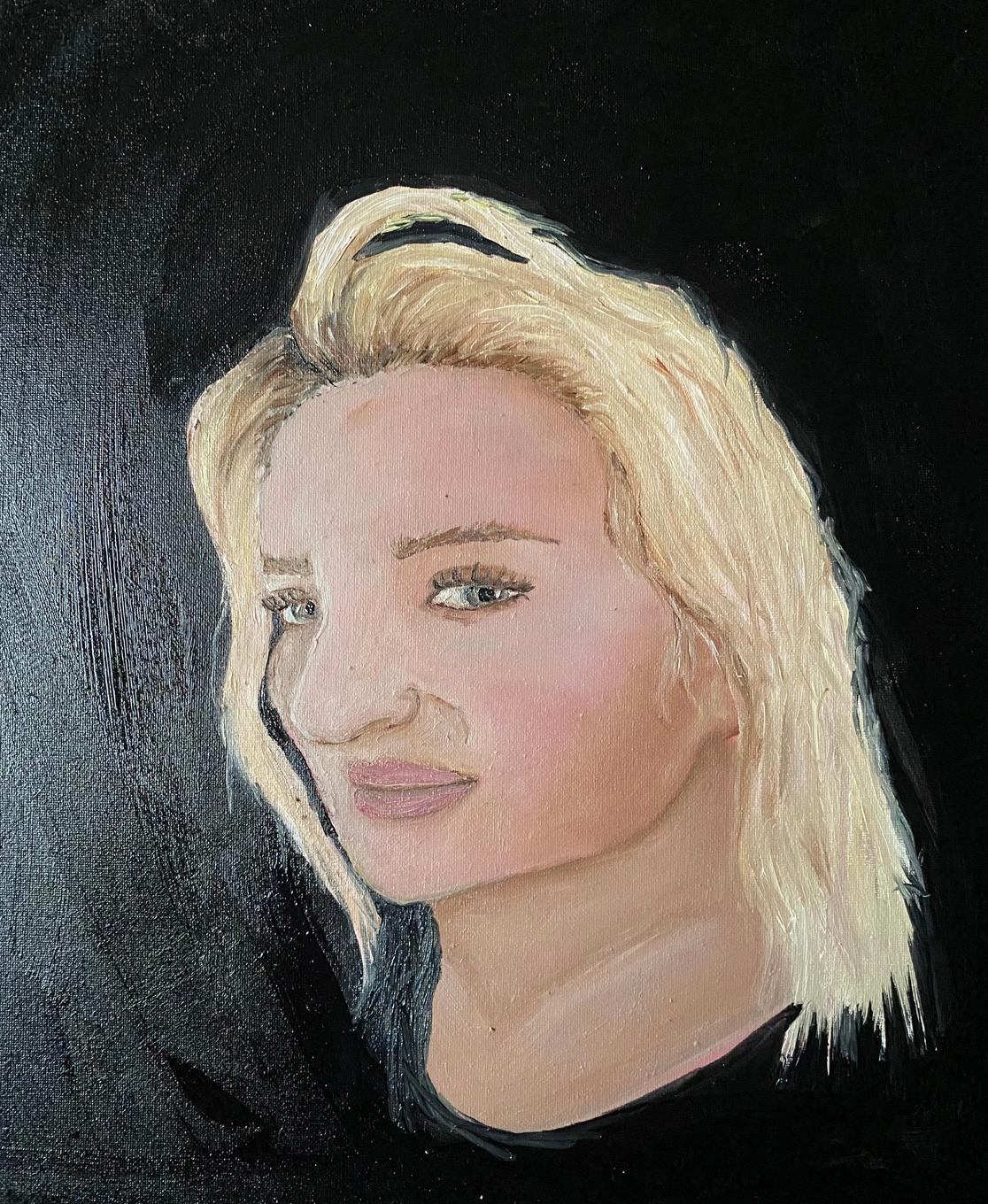
PAINTING FROM LIFE
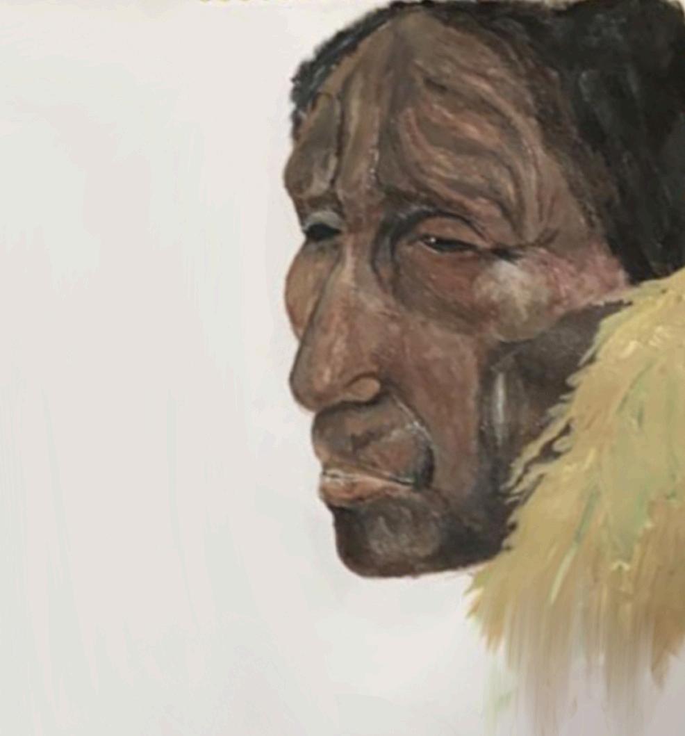
HOWARD TERPNING EXPERIMENT
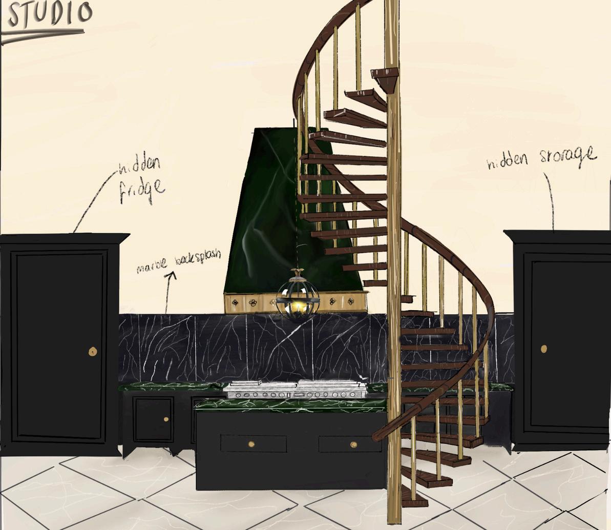
Forthismodernstylestudioapartment Idecidedtouseacolourpalletsofdark andneutraltones,featuringgreensand darkgreys.Thishelpedmeachievealess sterileappearanceconsideringthatthere isstillamodernfeeltotheapartment. WhendesigningthisspaceIdecidedto usenaturalstoneslikemarble,whichis shownalongthebacksplashofthekitchen. D E V E L O P I N G
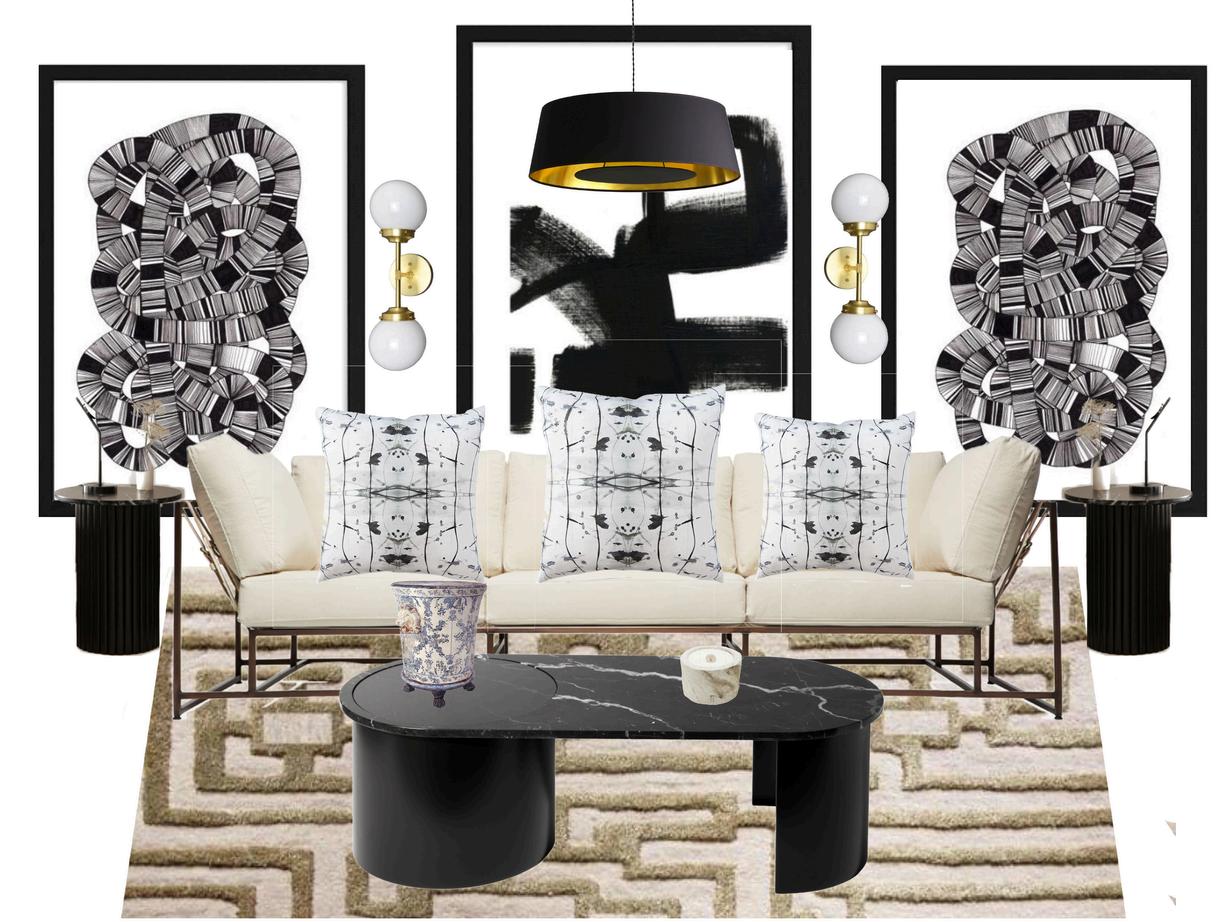
For this design I decided to go for a more flashy and modern appearance, I created this design by using Morpholio on my iPad, which helped with the inspiration for the piece I went through various examples of furniture and discovered a few that correlated to the aesthetic of the design itself.
I then also found that the colours black and gold go well together and create a thought out colour palette. I decided to have various forms of lighting to produce a bright space.
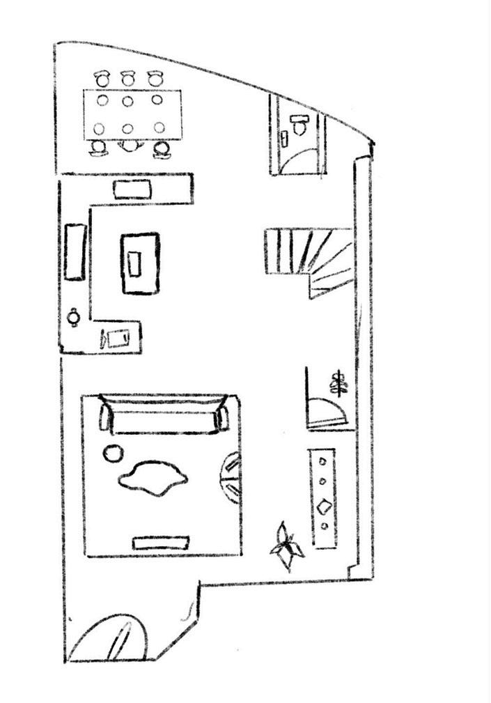
In order to create variety I decided to sketch out a floor plan. I decided to create a townhouse sketch as they remain more common in larger cities. I then decided to compile a range of furniture to create a better visual depiction of my main goal which was to use natural and earthy tones in a cohesive way. As I was sketching the floor plan I decided to create an open plan kitchen and dining room, keeping the living room separate
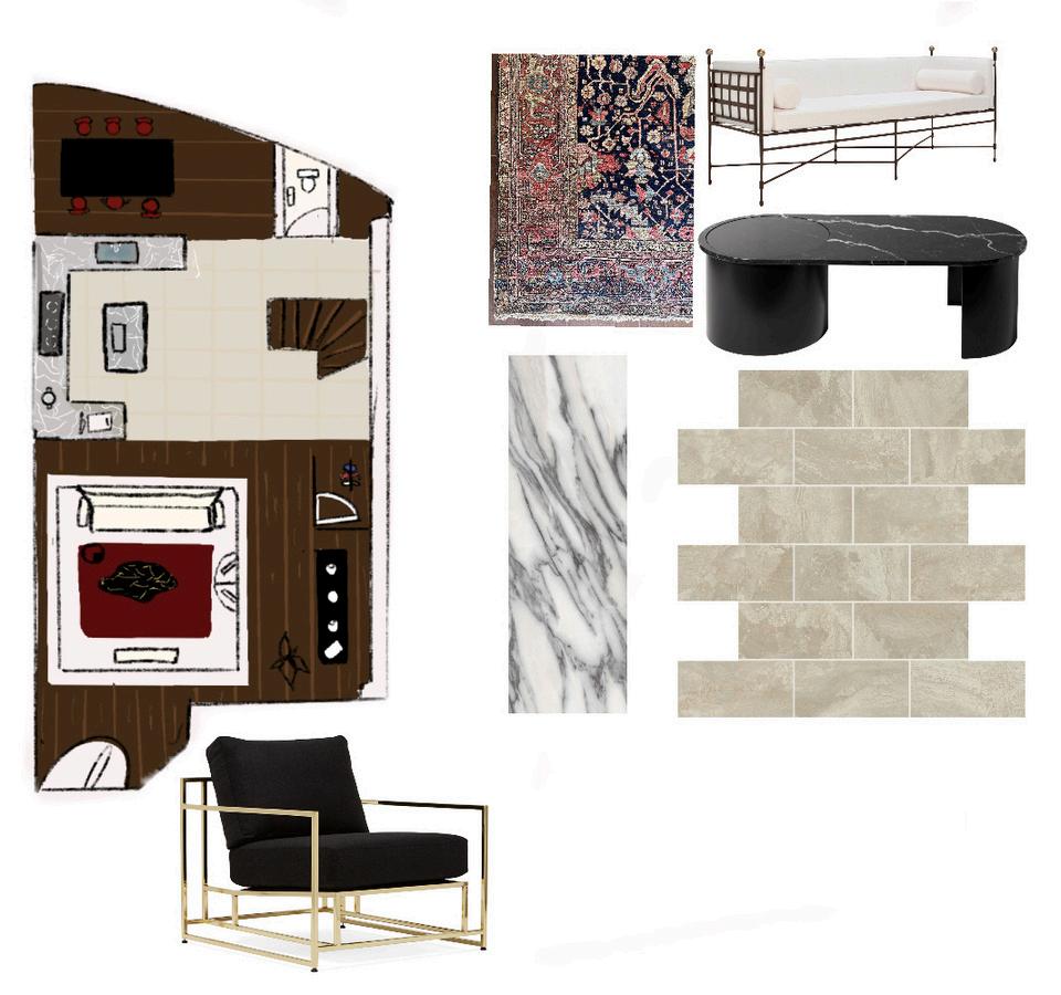
I then decided to use Morpholio to compile different materials that I would use in this design to provide a better picture of the final objective. This creates a better depiction of what will be used in the final construction of the design. I also decided to include different examples of furniture that will be used. When creating this sketch I decided to use wood flooring and marble tile to create contrast. The marble tile is featured in the kitchen for practicality, while the wood flooring is there to create a sleek look.
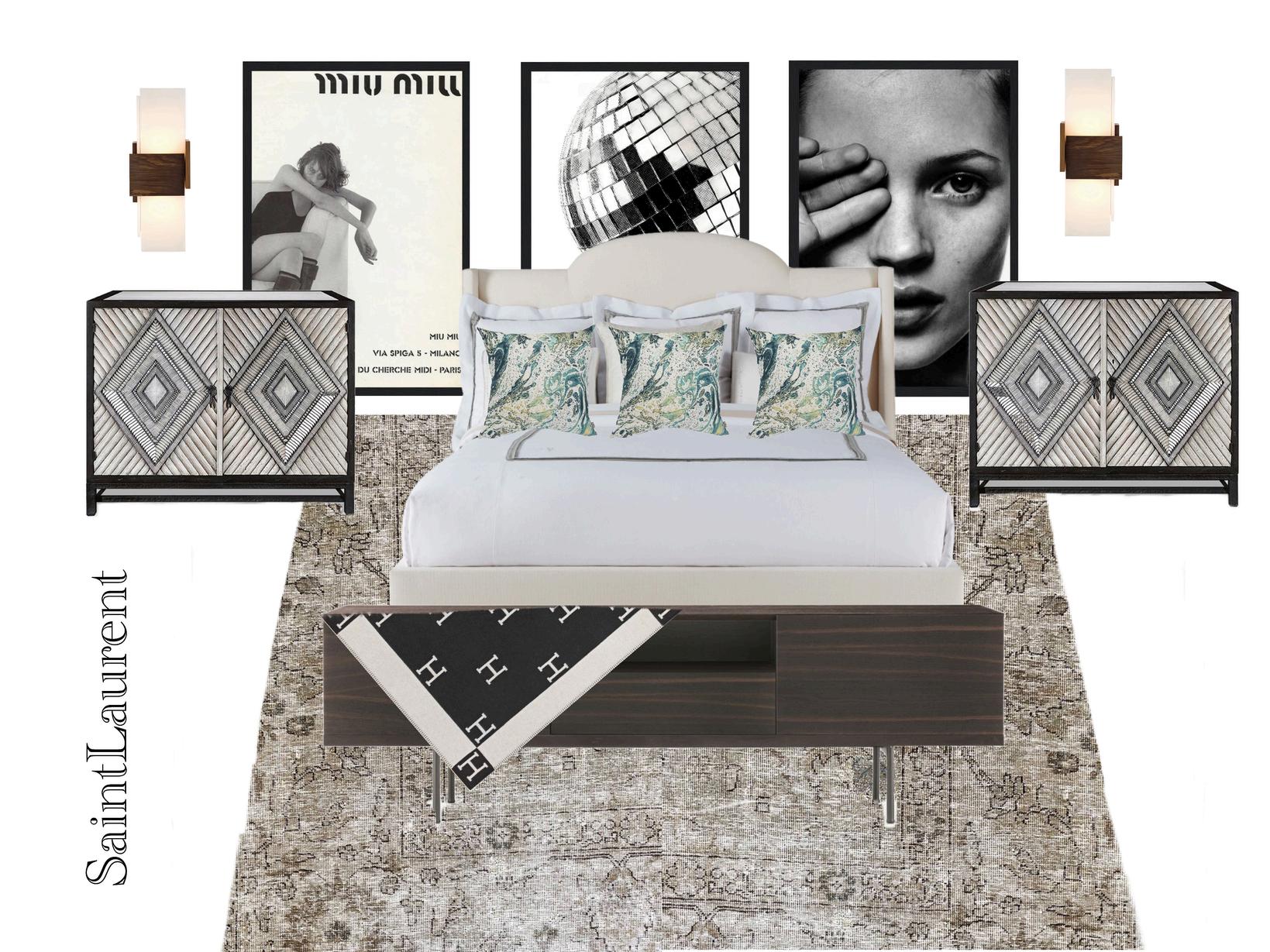
In this design, I decided to go for a neutral colour palette, along with minimal lighting to create a dimly lit bedroom. I decided to use different posters with frames to provide a popular aesthetic which will people gravitate towards. I decided that it would be good to explore different preferences and techniques.
I compiled a series of images in order to create the design, looking at many different types of furniture, I decided to use the ones featured in my piece because I felt that they correlated with each other and created a harmonious look for the bedroom.
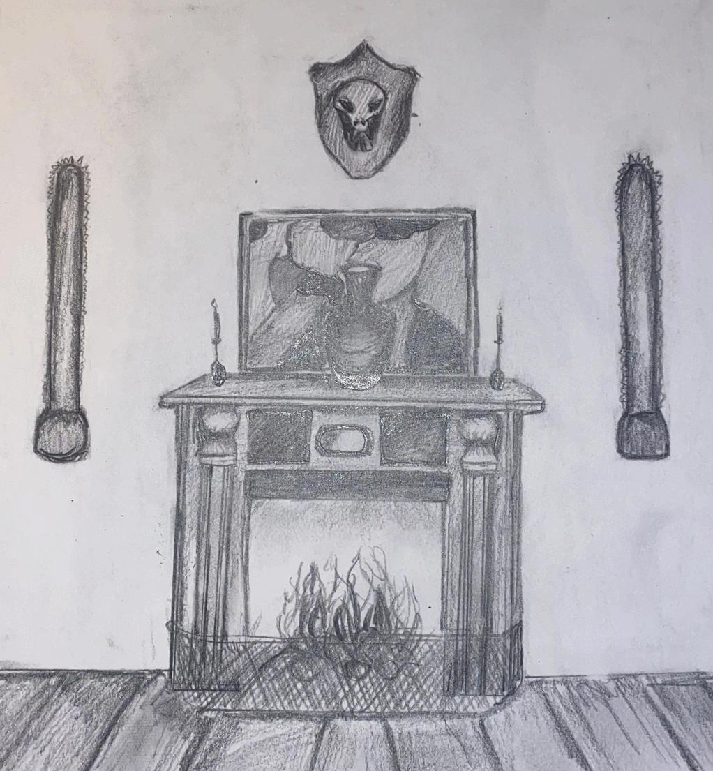
I then decided to create another living room, however, rather than using procreate like my other sketches, I decided to use pencil and paper also using charcoal. I decided to draw a fireplace I had seen featured in Jamb Londons website which provided a great focal point and start for my sketch. Keeping with the theme of classic antiques I decided to sketch a tiger skull reminiscent of those in old country houses. I decided to decorate the fireplace with a large antique vase and two candelabras which further enhanced the theme of classic beauty. This sketch contrasts my previous work and provides a new exploration of Victorian styles and mouldings which are still featured in many houses today. I decided to draw wood flooring and to position a painting behind the vase to further accentuate that vintage feel. I added this because I felt a TV or other electronic devices would not match the space or the objective I was trying to achieve.
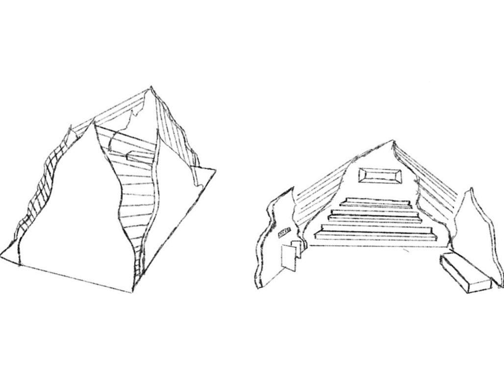
I initially sketched out this design on procreate before drawing it for the 3-D printer I wanted to show the exterior as well as the interior of the stadium and where seats and the stage would be located along with the entrance, which is highlighted in my sketch.
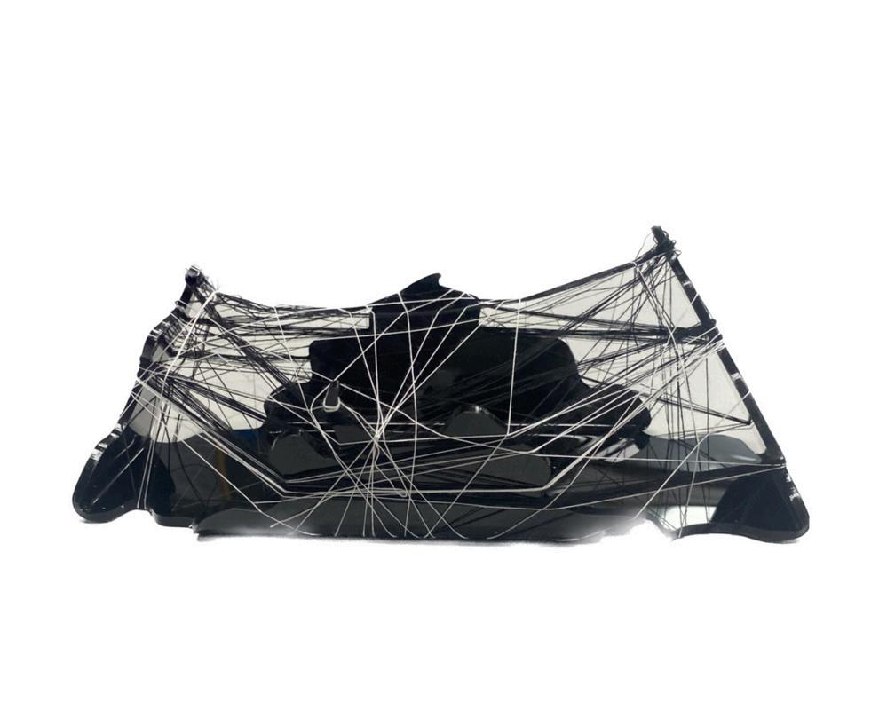
Idecidedtoshowmy3-Dskillsbycreatingafuturisticstyle stadiumusinga3-Dprinterandattachingindividualthreads toencapsulateastadiumlikeappearance.Iwantedthe stadiumtobeblackalongwithsomedetailsofwhiteinthe threadtocreatefuturisticfeel
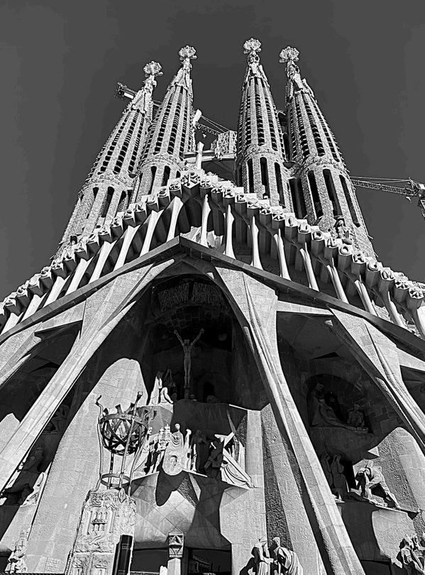
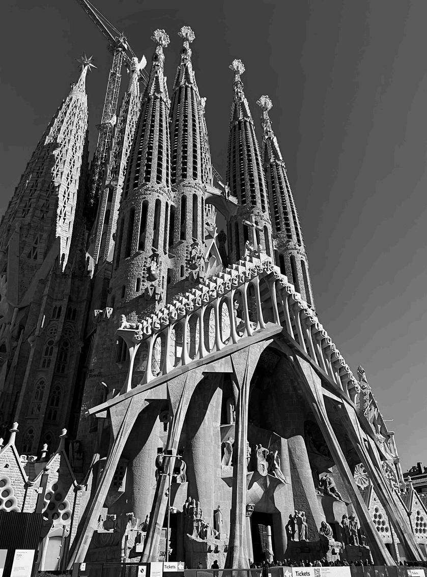
On a trip to Barcelona, my family and I visited the Basílica de la Sagrada Família. I was in disbelief over the amazingly detailed architecture, I decided to take photos to capture the intense detail and colossal size of the building. I kept the settings of my camera in black-and-white, which truly helps to show the intense contrast between light and dark, which captures the magnificence of the Sagrada Familia. When taking these photos I wanted to represent and show the hard work and detail that has been put into the building. I took the first photo from a low point, positioning my camera upwards to show the tall spires which are featured in the building. In my other photo I decided to take the photo from the left, showing the width, while still showing the intense features of the front of the building.
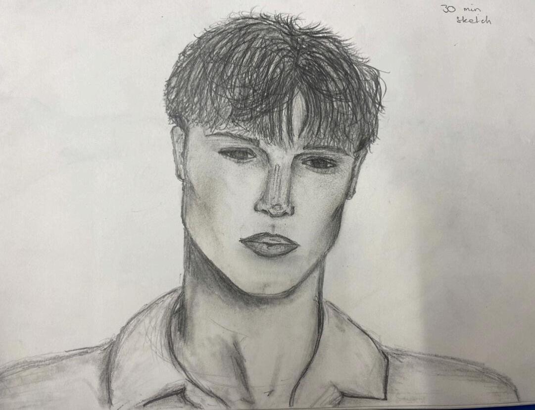
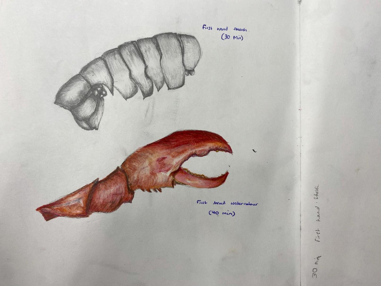
Within my sketchbooks I have done many different studies from looking in detail, at portraiture and observational studies within the classroom. I normally go into intense realism when creating my pieces for my sketchbook to capture the reality of the pieces I am working from. I also used watercolour in my sketch of the lobster claw so I could capture the colour and shades within the reference. When looking at the reference image for my sketch of the portrait, I decided to use a blending stump in order to create a skin like appearance. When drawing the eyes, I struggled to capture the light that was in the original photograph, so I decided to keep them in a range of dark shades, without using bright whites to keep the appearance simple .
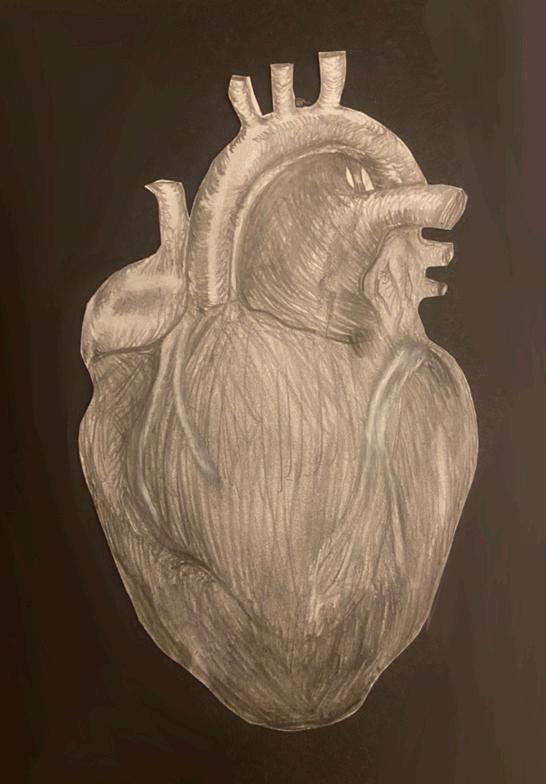
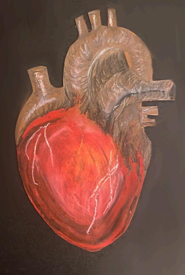
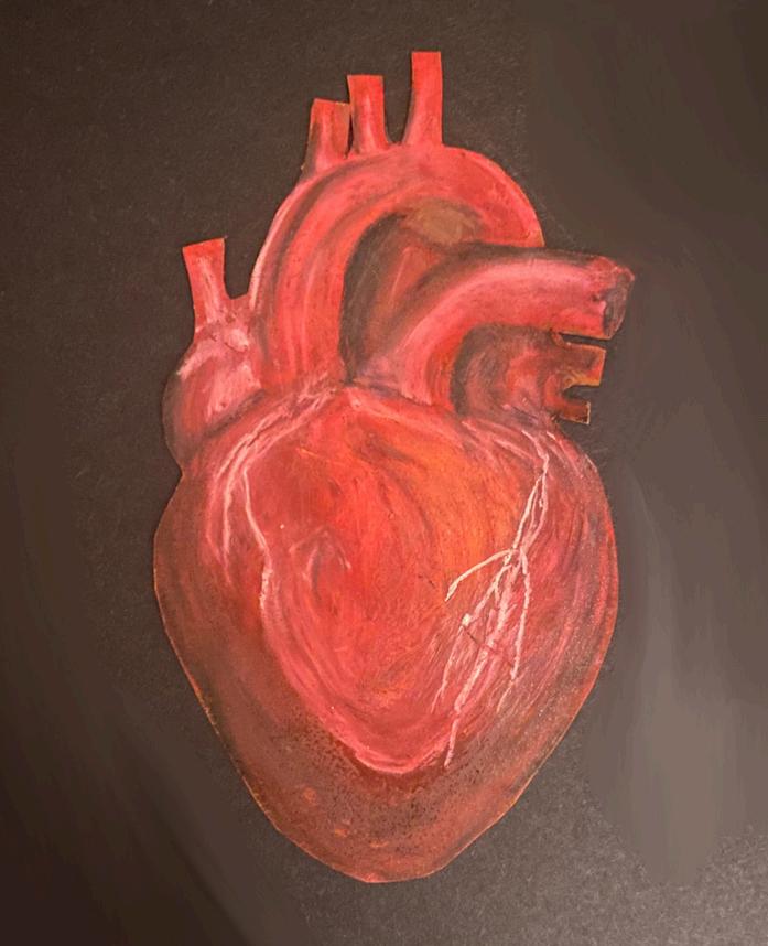
For this experiment I used oil pastels to create a lifelike image of a heart, I sketched out my original plan in pencil shading the areas in dark and light. This allowed me to create a realistic final piece. Working from an image made me see the difference’s in colour throughout the heart.
In this section, I decided to look at the differences between acrylic and oil paint, using the same reference image and the same technique of underpainting with two different paint textures, this allowed me to understand the differences between each example, and find my strong points when painting. After looking at each of my final products, I came to the conclusion that I was stronger using acrylic paint as I could capture the light and different undertones in the reference image better than my oil painting
For this piece, I decided to explore the techniques that Old masters used when painting. Firstly, I under painted using a burnt sienna colour and then started to paint my friend from real life, on site, otherwise known as en plein air, I originally found this difficult as I wasn’t able to go into as much detail as possible. Additionally, this task also proved to be difficult as the lighting I was working with did not provide a high contrast. However, my main objective when painting was to capture the right proportions on the face and make it as accurate as possible, this was achieved and it does represent the facial features of my friend well and captures their reality.
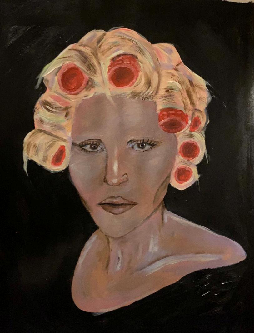
For this experiment, I decided to use acrylic paint to create a piece inspired by Howard Terpning and his work on Native American people. I was inspired by Terpnings ability with capturing reality and wanted to create a similar piece for my portfolio. I decided to paint an older Native American man as the light on the face and wrinkles allowed for a realistic outcome, I used various shades of brown and creams to create the final piece. I believe that I created a realistic painting and an accurate depiction of the reference image.