


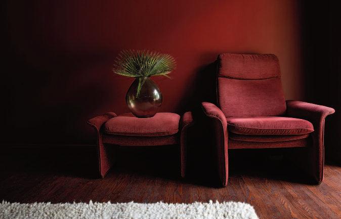
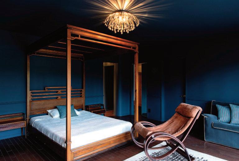
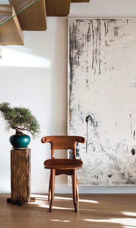
Color plays a central role in this issue of OBJEKT©International. When combined with carefully considered proportions and a thoughtful mix of old and new, color ultimately results in the most compelling interiors It is also a powerful tool for maintaining and reinforcing consistency within a space.
And, of course, art plays an essential part as well no interior is complete without a number of bold artistic statements
A true master of proportion and of blending old with new was Thierry W Despont, for whom I traveled across half of America, all the way to the Bahamas and St. Moritz, to photograph his creations.
Color was likewise embraced in the revitalization of the cabin of the legendary musician Frank Zappa in the Hollywood Hills It offers insight into how an interior that may at first appear randomly assembled can culminate in a dynamic and exciting final result.
At a time when corporate design with its strong inclination toward “safety first” and spreadsheet-driven results has led to widespread uniformity in shades of gray and brown, an increasing number of designers are striving to break free from this straitjacket.
OBJEKT© International is the first to embrace and champion their efforts

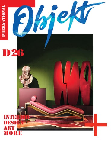
OBJEKT© INTERNATIONAL Living in Style no D26 spring 2026
HF Publications Willemstad Curacao
Creator: Hans Fonk
Publisher amd editor-in-chief: Alaïa Fonk
CFO: Izabel Fonk Alaïa@objekt-international.com
Head Office the Netherlands Raadhuislaan 22-B NL-2451 AV Leimuiden - Netherlands t:+31 172 509 843 www objekt-international com
Head Office Berlin, Germany Rneé Wilms
Unique Company Group Oberwallstraße 14 D-10117 Berlin, Germany
Contributing writers: Izabel Fonk, Sasha Josipovicz, Milosh Pavlovic, Ruud van der Neut, Lorenza Dalla Pozza, Robyn Prince, Raphaëlle de Stanislas, Rene Wilms, Sonja Tijanić
Contributing photographers: Mikael Benard, Jeremy Bittermann, Sebastian van Damme, Alaïa Fonk, Hans Fonk, Douglas Friedman, Piet-Albert Goethals, Selma Gurbuz, Niveditaa Gupta, Kalle Kouhia, Mykhailo Lukashuk, Masaaki Inoue, JT Studio, Ishita Sitwala, Tuomas Uusheimo, Ao Xiang/Shifang Vision
For this issue
Graphics: Hans Fonk Studio
Art directors: Hans Fonk, Alaïa Fonk
Video productions: Alaïa Fonk
FACEBOOK: @OBJEKT.INTERNATIONAL
INSTAGRAM: @OBJEKTINTERNATIONAL
YOUTUBE: @OBJEKTINTERNATIONAL
TWITTER: @OBJEKT INT
VIMEO: @OBJEKTINTERNATIONAL
PINTEREST: @OBJEKT
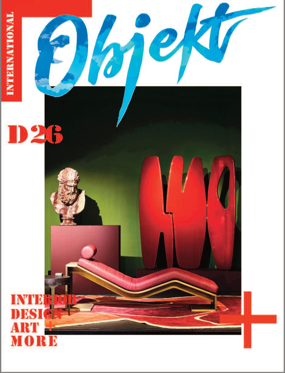
Cover: Secret Gallery - Photo: Mikael Benard


WALTER VAN BEIRENDONCK IN C-MINE
FONDAZIONE PRADA - MONA HATOUM FRANK ZAPPA’S CABIN
PEARLS ON SWINE
WATERCOLOR-INSPIRED SIXPENNY THE HEALTHY LIVING SYSTEM
REED ROOFS
THIERRY DESPONT’S ST MORITZ SHINE MAKER
COME SNOW OR COME SHINE
ENIGMATIC EUROPEAN NOBILIT Y 830 BRICKELL MIAMI
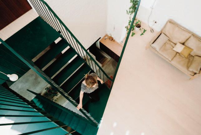
BELGIAN FARMHOUSE
REDA AMALOU DESIGN - PARIS COLOR IS QUEEN SAETTA 1 28 - FERRETTI
ARC ZERO - JAMES TAPSCOTT
CURATIO - THOMAS HAARMANN
FÁBRICA DE ARTE MARCOS AMAROKAAN ARCHITECTS
LIGHT HOUSE - NAGPUR, INDIA A CERTAINE HERBE CALLED CHAA


With Backstories, photographer and video-director Alaïa Fonk uses the fem body to let you into her world. Hoping you find a piece of yours. The book is a hardcover ar t book curated, photographed and designed by Alaïa Fonk. This collector's edition features exclusive photography and content created across the globe, showcasing diverse expressions of beauty, sensuality, and feminine myster y www.backstoriesbook .com


Between self-destruction and self-love, comfort for the in-between.
Dry Your Tears Club creates soft, story-driven comfort wear and lifestyle pieces.


4
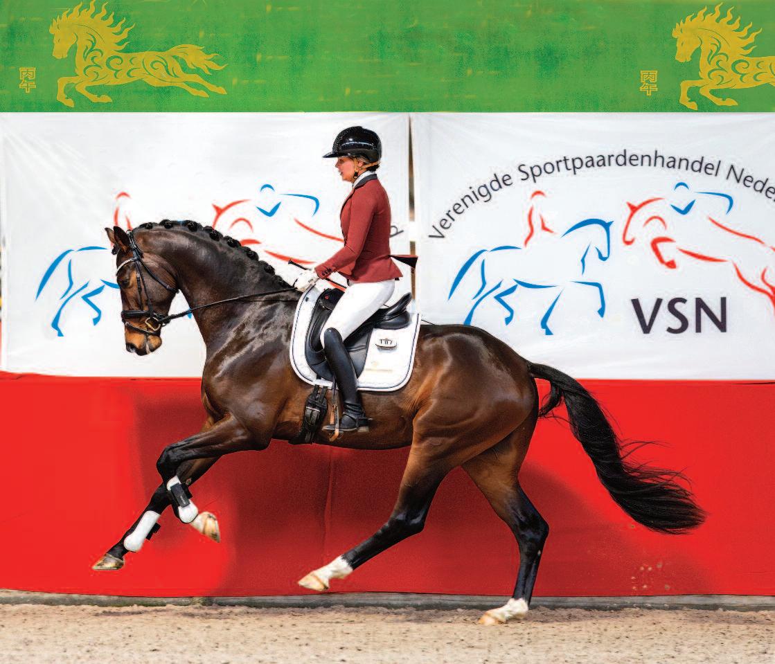
Fonk Spor thorses - Top Quality Horse Training and Breeding
www.fonkspor thor ses.com

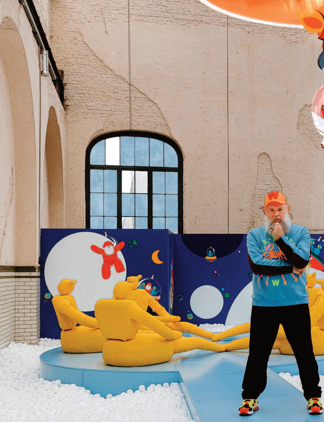
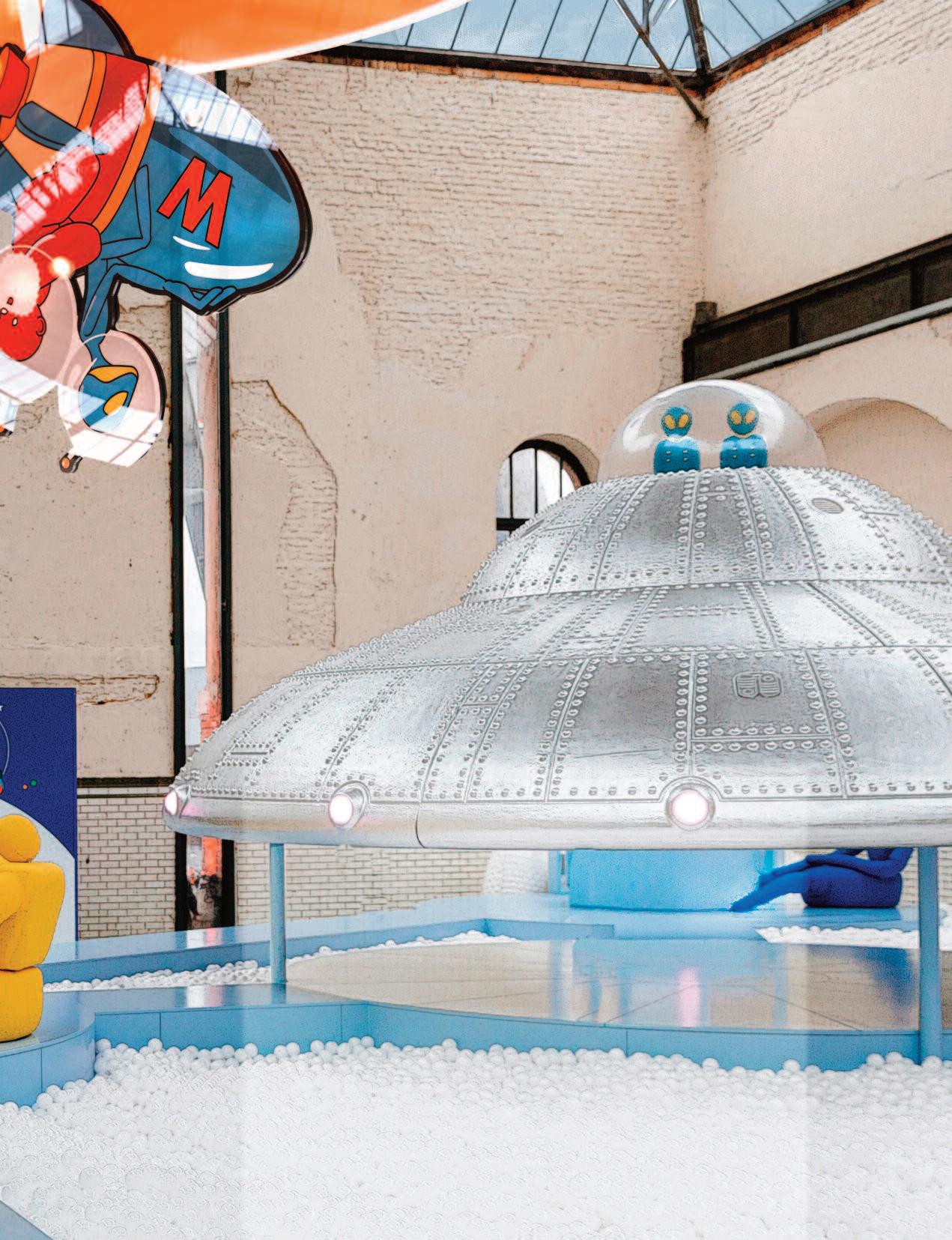
Welcome Little Stranger is Walter Van Beirendonck’s vision of an interactive play space for children. Stepping beyond the realm of fashion, he has created an artistic play environment for children to explore, move and above all, play. The project marks the inaugural edition of Playground at C-mine in Genk, Belgium
Walter Van Beirendonck is an internationally renowned fashion designer, a member of the legendary Antwerp Six, and former head of the prestigious Antwerp Fashion Academy. He is known for his distinctive visual language, vibrant forms, and socially engaged designs. His work frequently explores themes of identity, diversity, and fantasy motifs that also resonate throughout Welcome Little Stranger The installation is inspired by the idea of extraterres--trial life and invites children to embark on a journey of fascination, adventure, fun, and action. At the same time, it encourages a search for knowledge, a sense of belonging, beauty, and freedom.
Walter Van Beirendonck states:“I wanted to design an environment that encourages children to use their own imagination, without screens or digital distractions Welcome Little Stranger is about wonder, the joy of discovery, and playing together without limits.” Photo: Selma Gurbuz
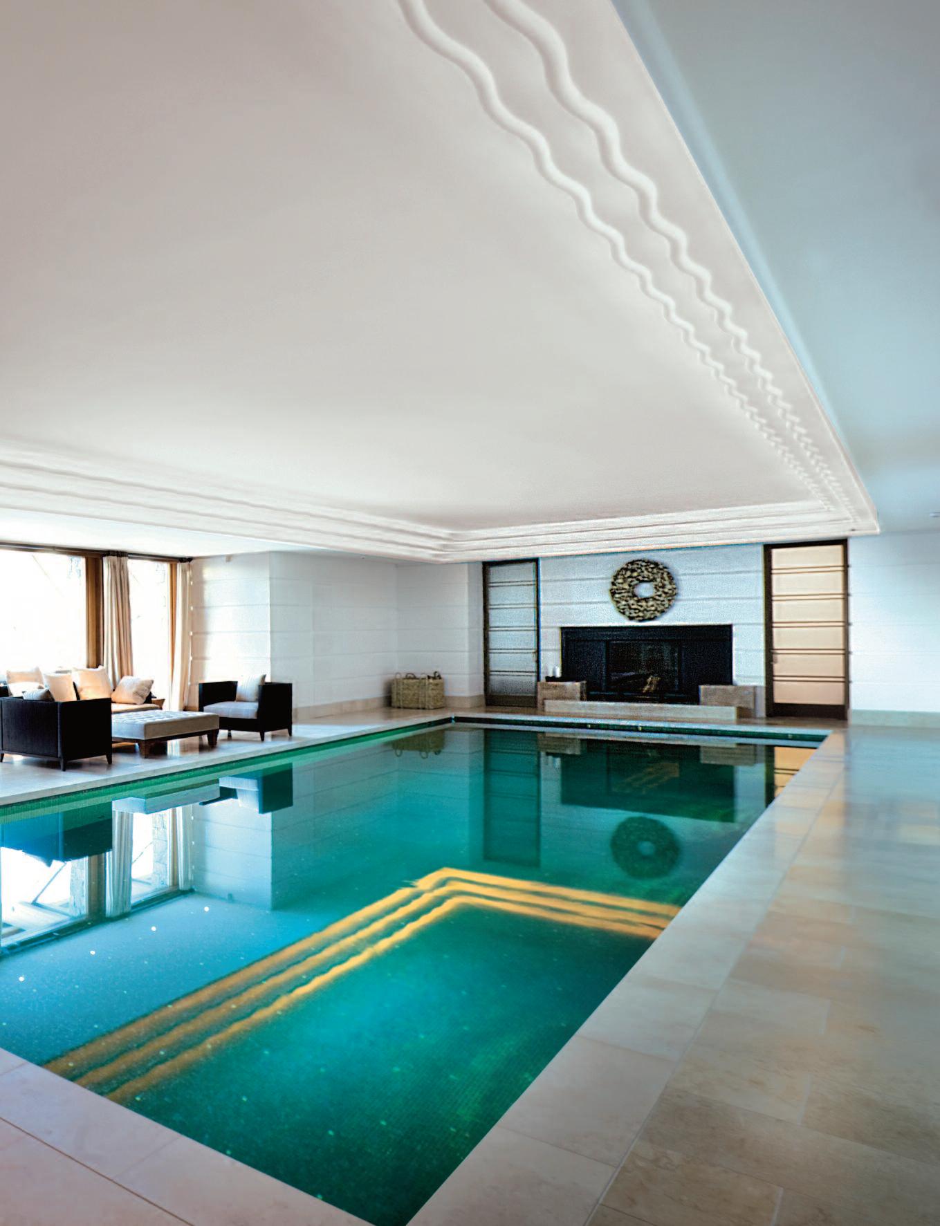
Un i q u e E x p e r i e n c e s the unexpected world of hospitaly and wellness
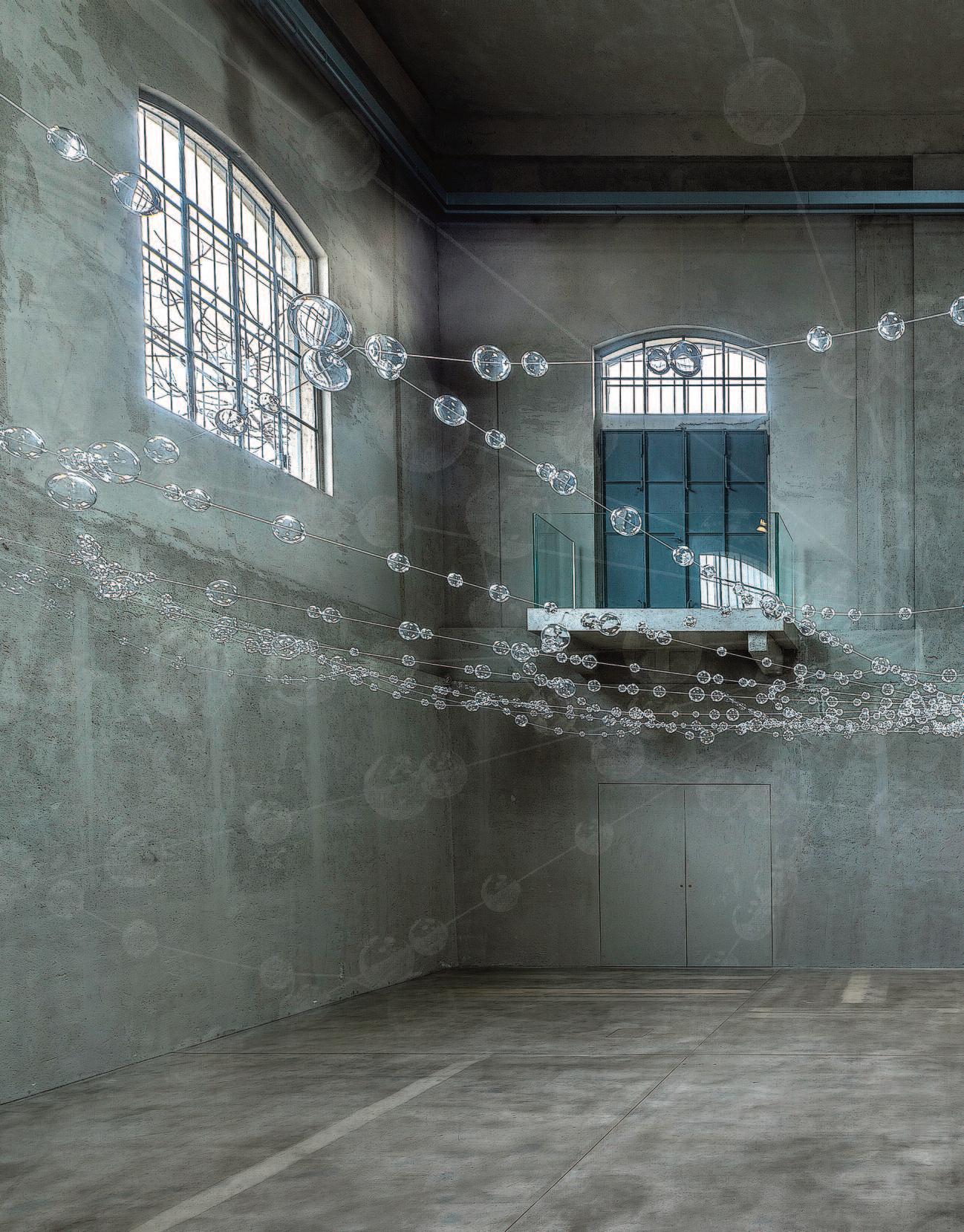
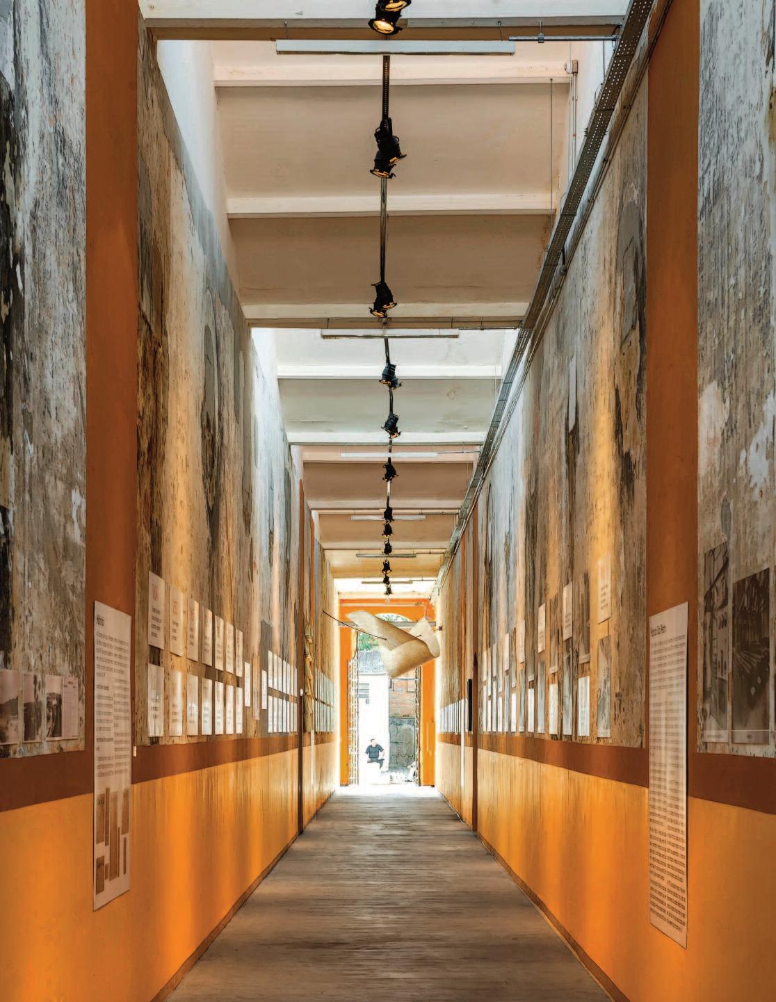
F o n d a z i o n e P r a d a , m i l a n
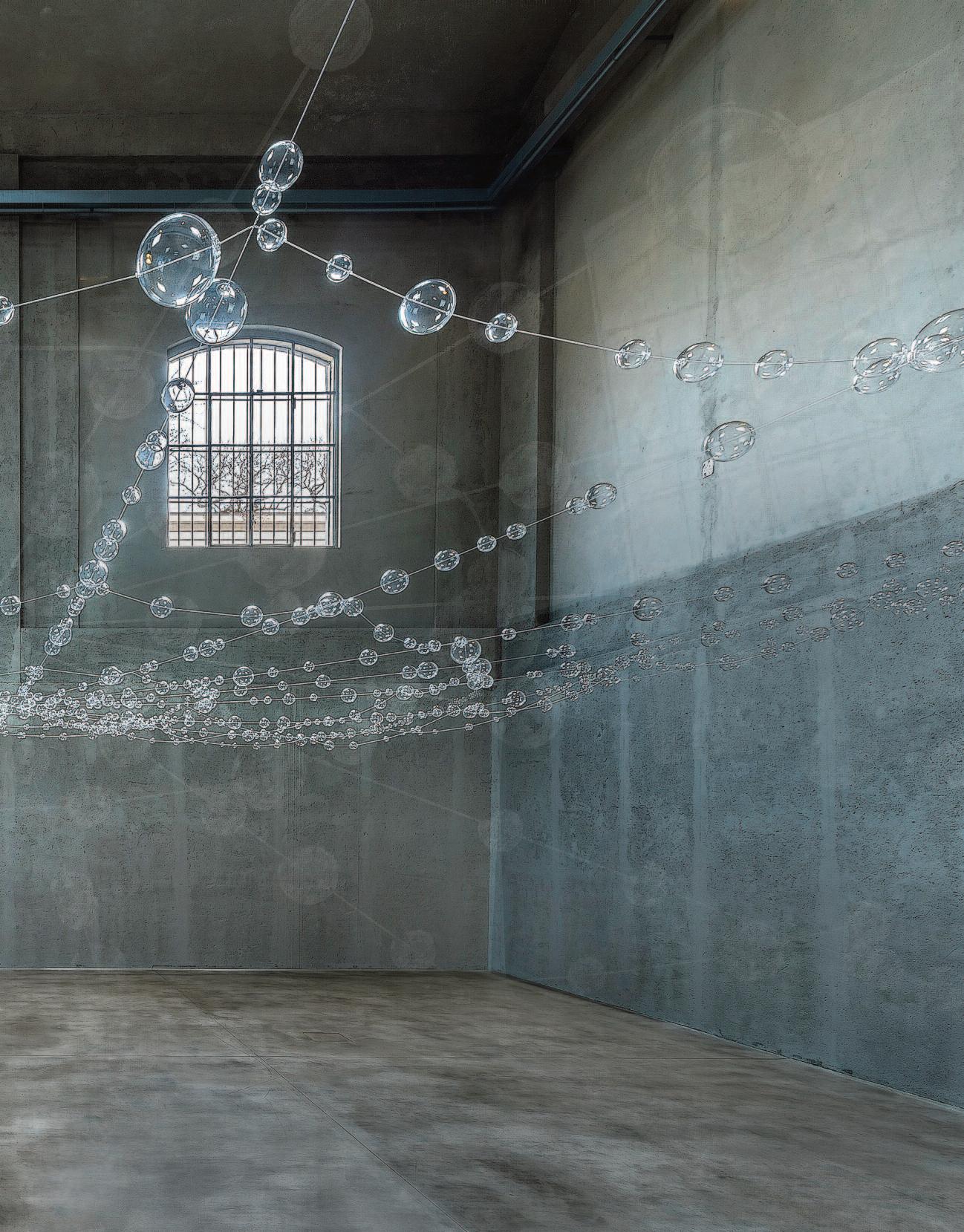
Fondazione Prada presents Over, Under and In Between, a site-specific project conceived by artist Mona Hatoum for its Milan venue. Responding directly to the architectural and exhibition context, Hatoum has developed a three-part project in which each section engages with themes that address the turbulence of contemporary life and the fragility of human existence. The three installations draw upon archetypal elements central to Hatoum’s artistic vocabulary the web, the map, and the grid. Their presence reactivates the spaces of the Cisterna building, which formerly housed the silos and tanks of a distillery. Together, the three independent works evoke notions of instability, danger, and vulnerability. The photograph depicts the entrance hall of the Cisterna, where a constellation of delicate, transparent, hand-blown glass spheres, threaded onto wires, forms a spider’s web suspended overhead. On the photo: Web, 2026, Hand-blown clear glass spheres, stainless steel cables. Courtesy of the Artist.
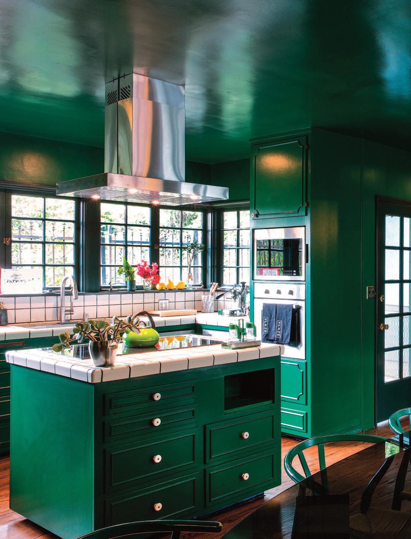
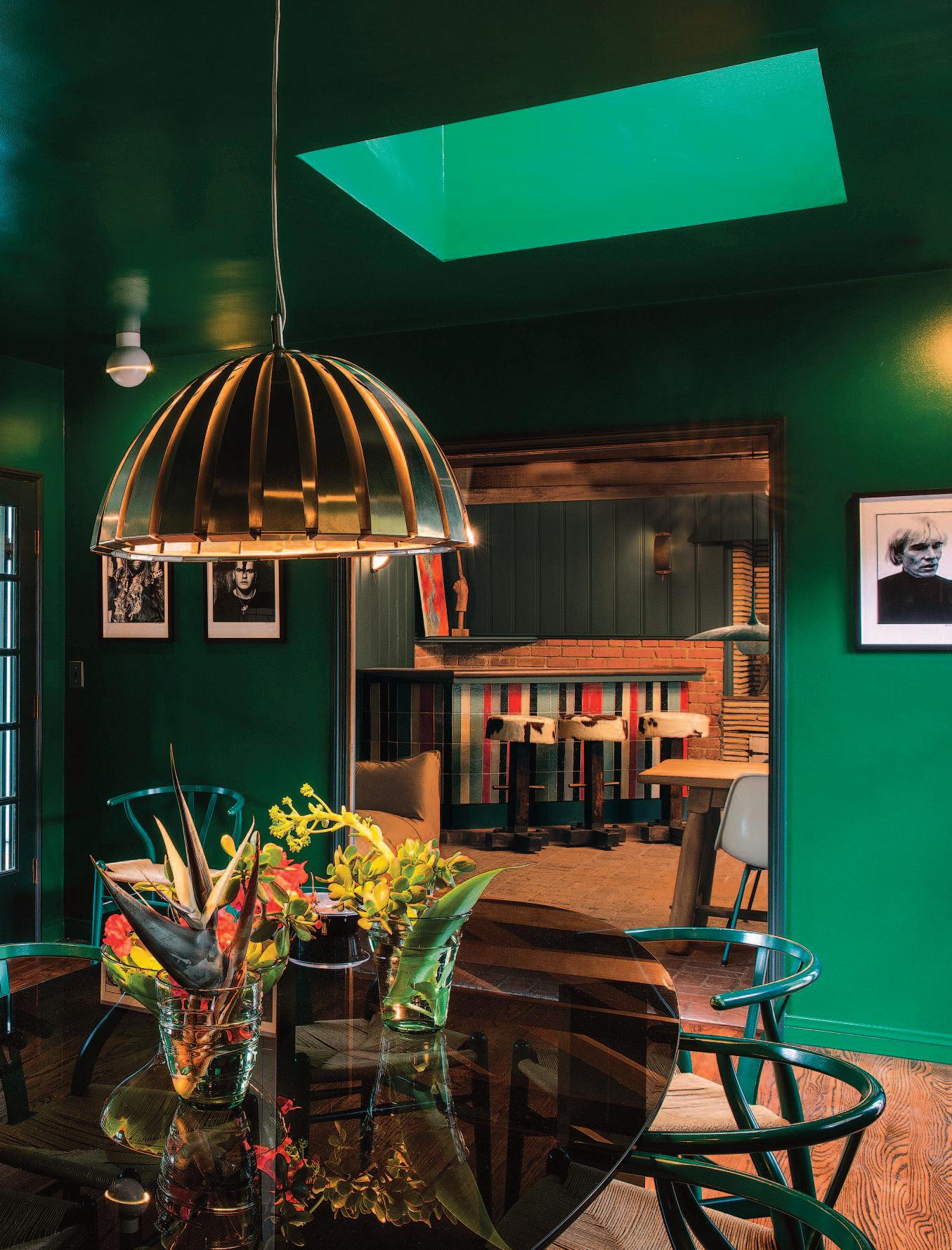
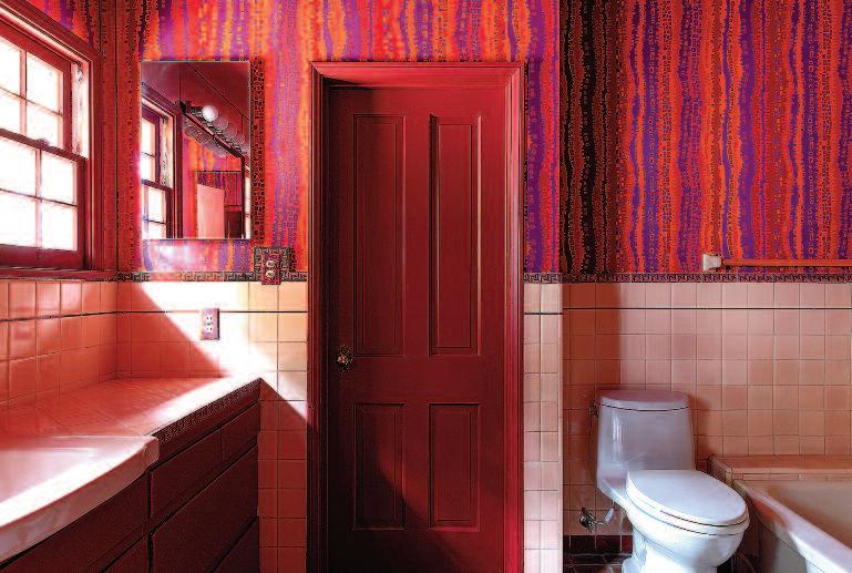
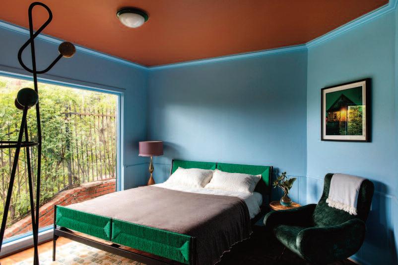
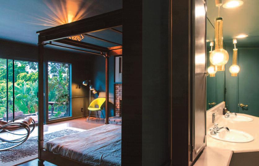
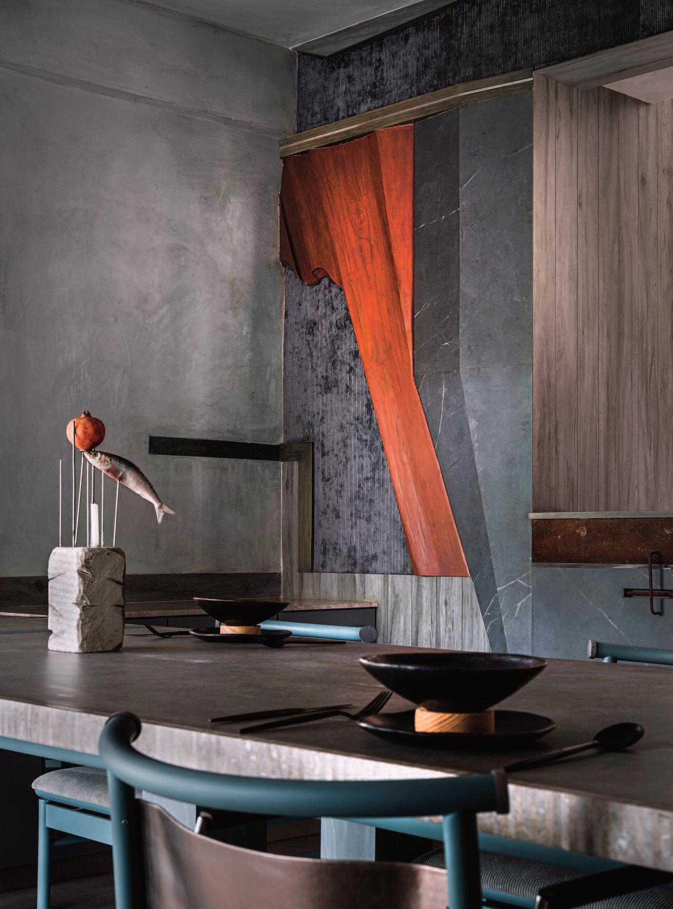
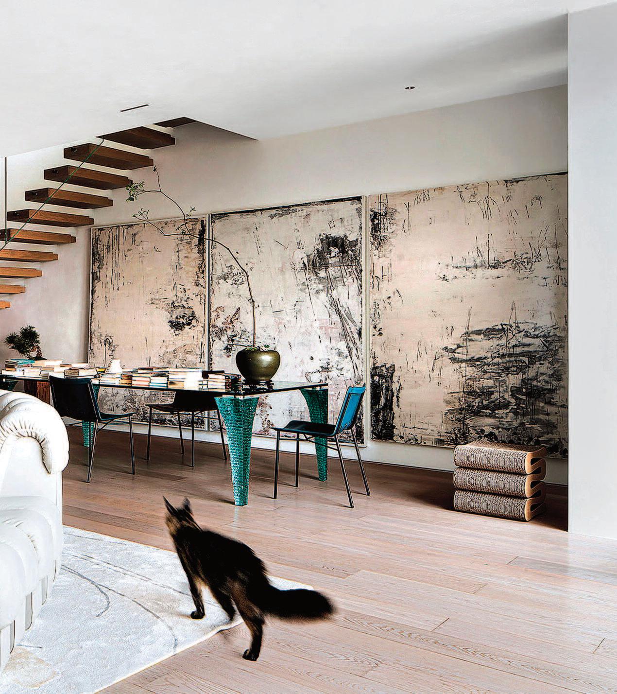
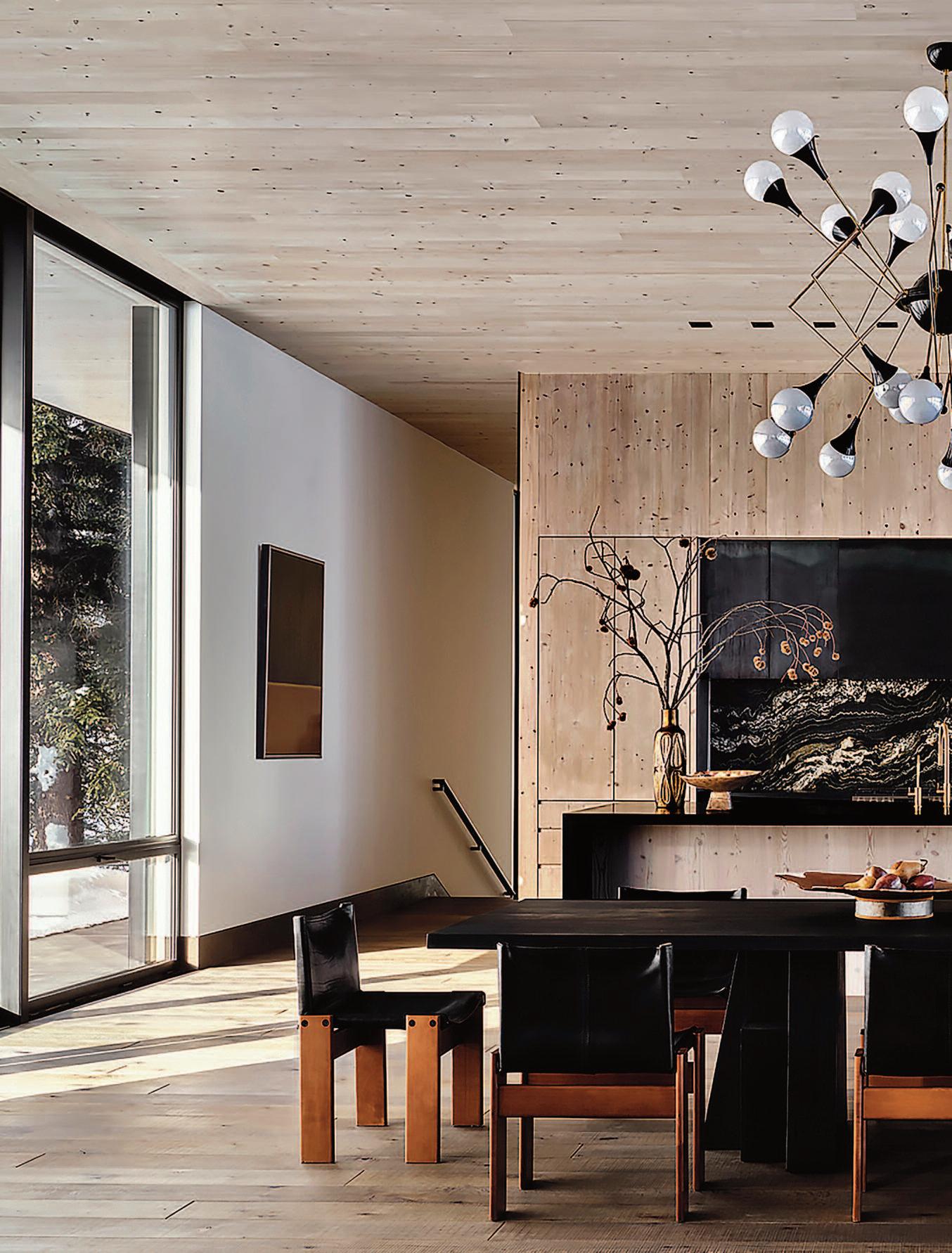
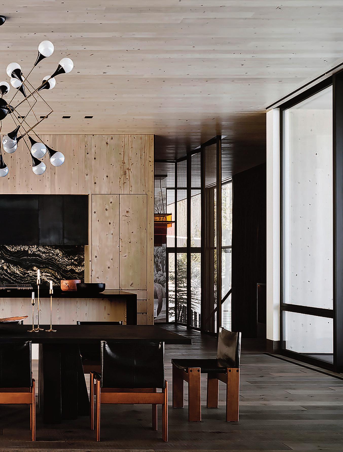
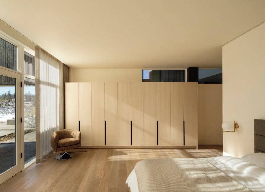
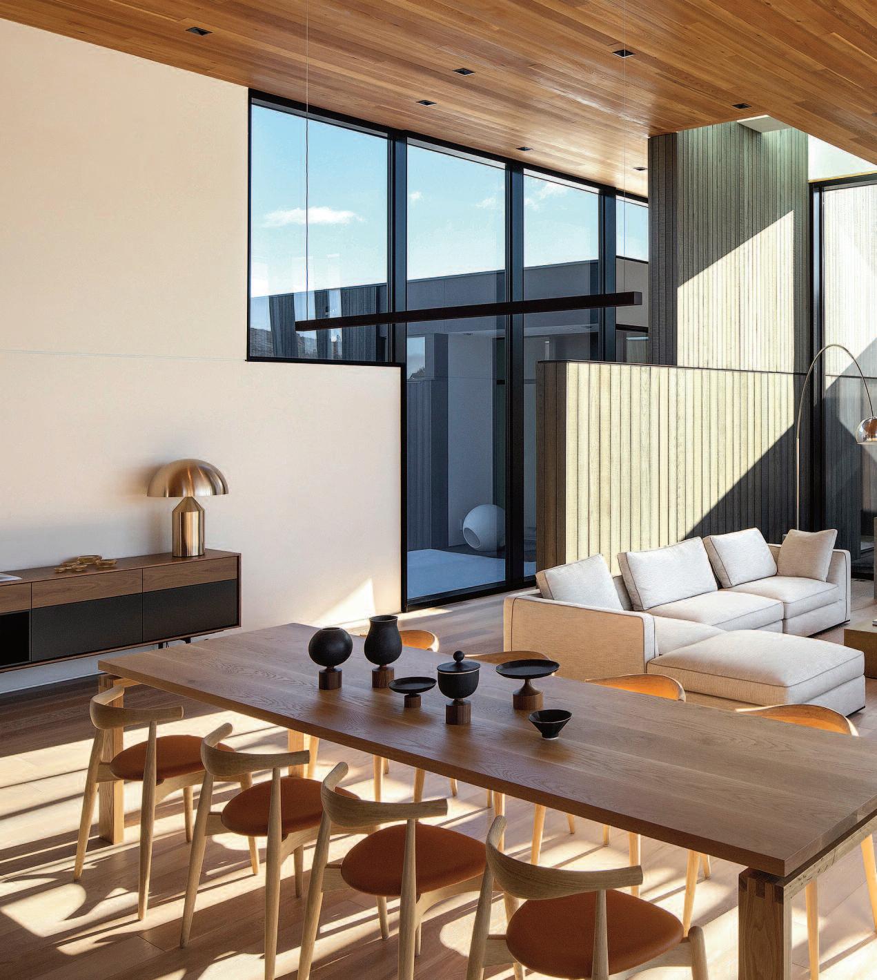
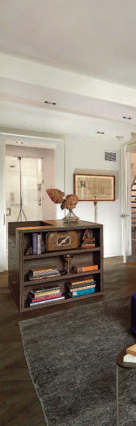
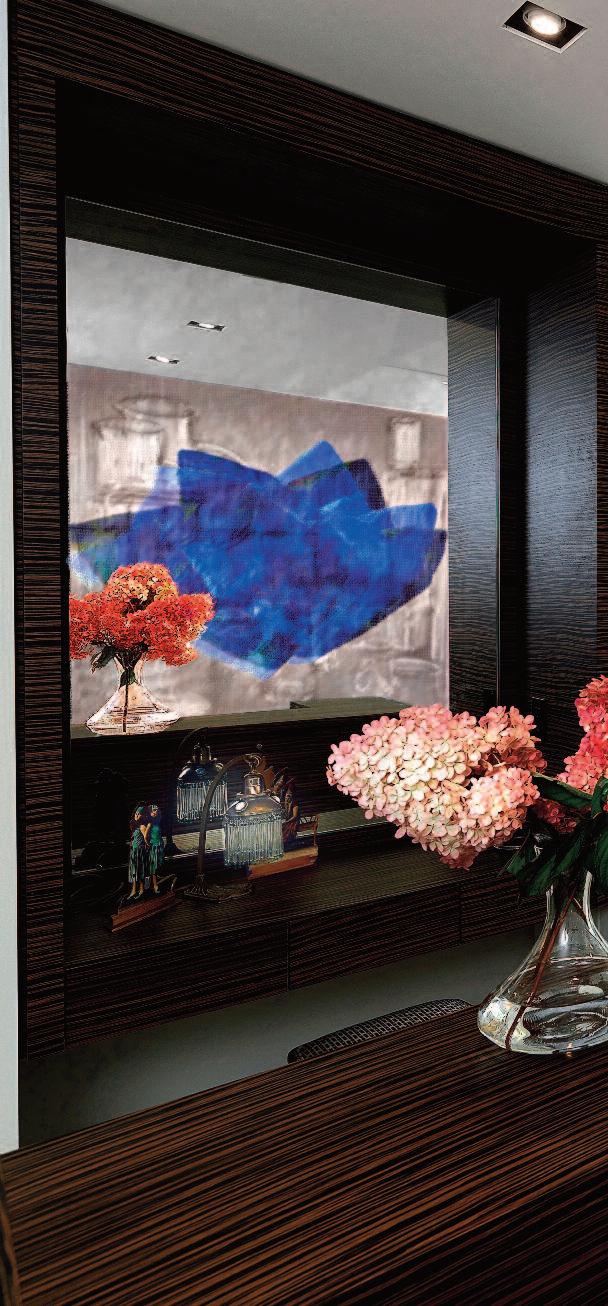
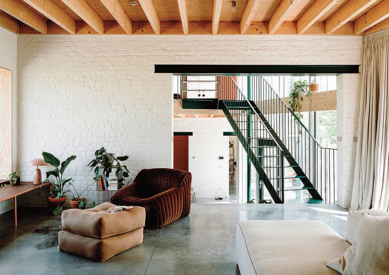
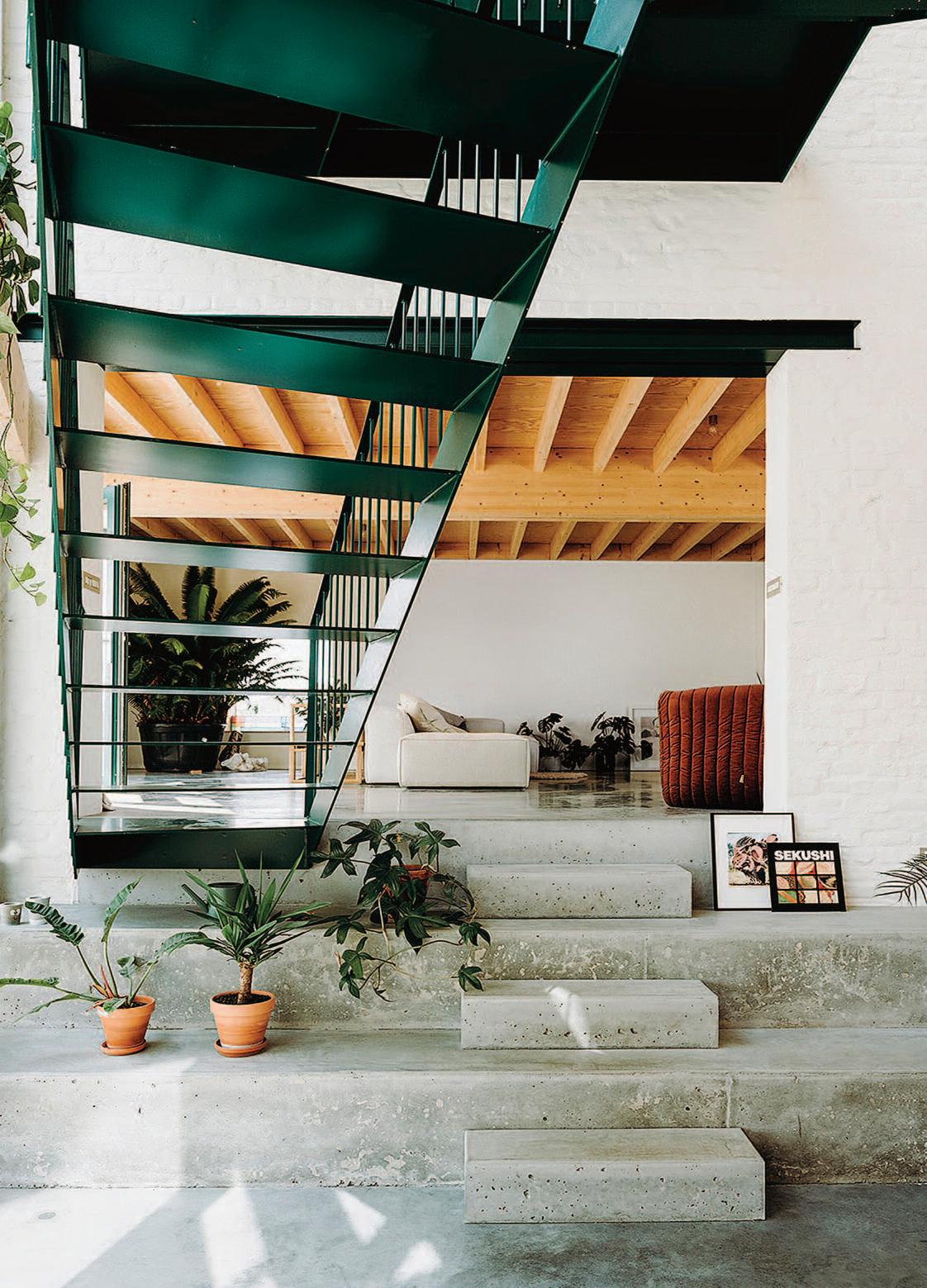
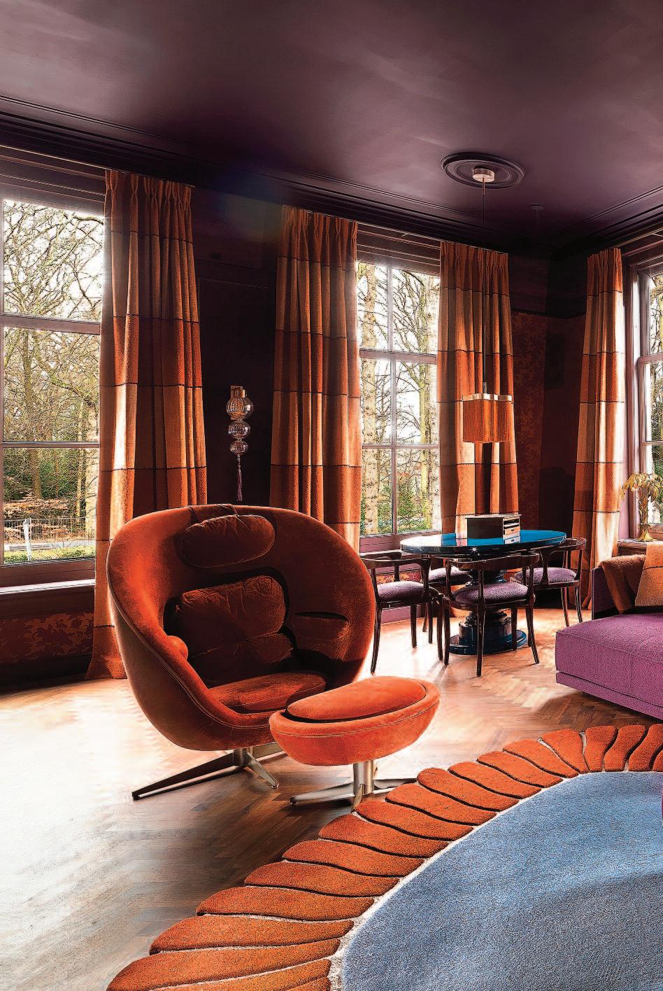
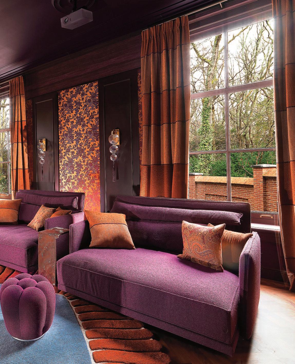
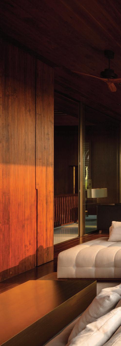
frank

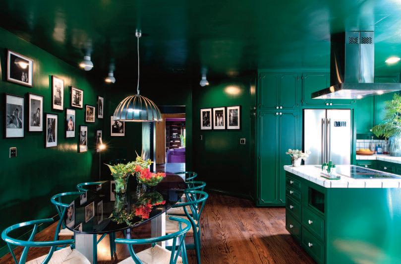
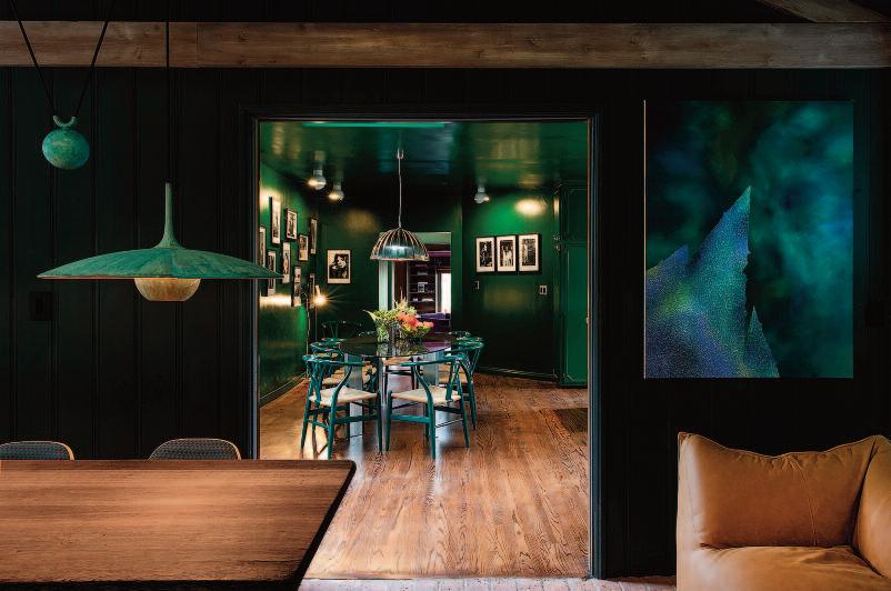
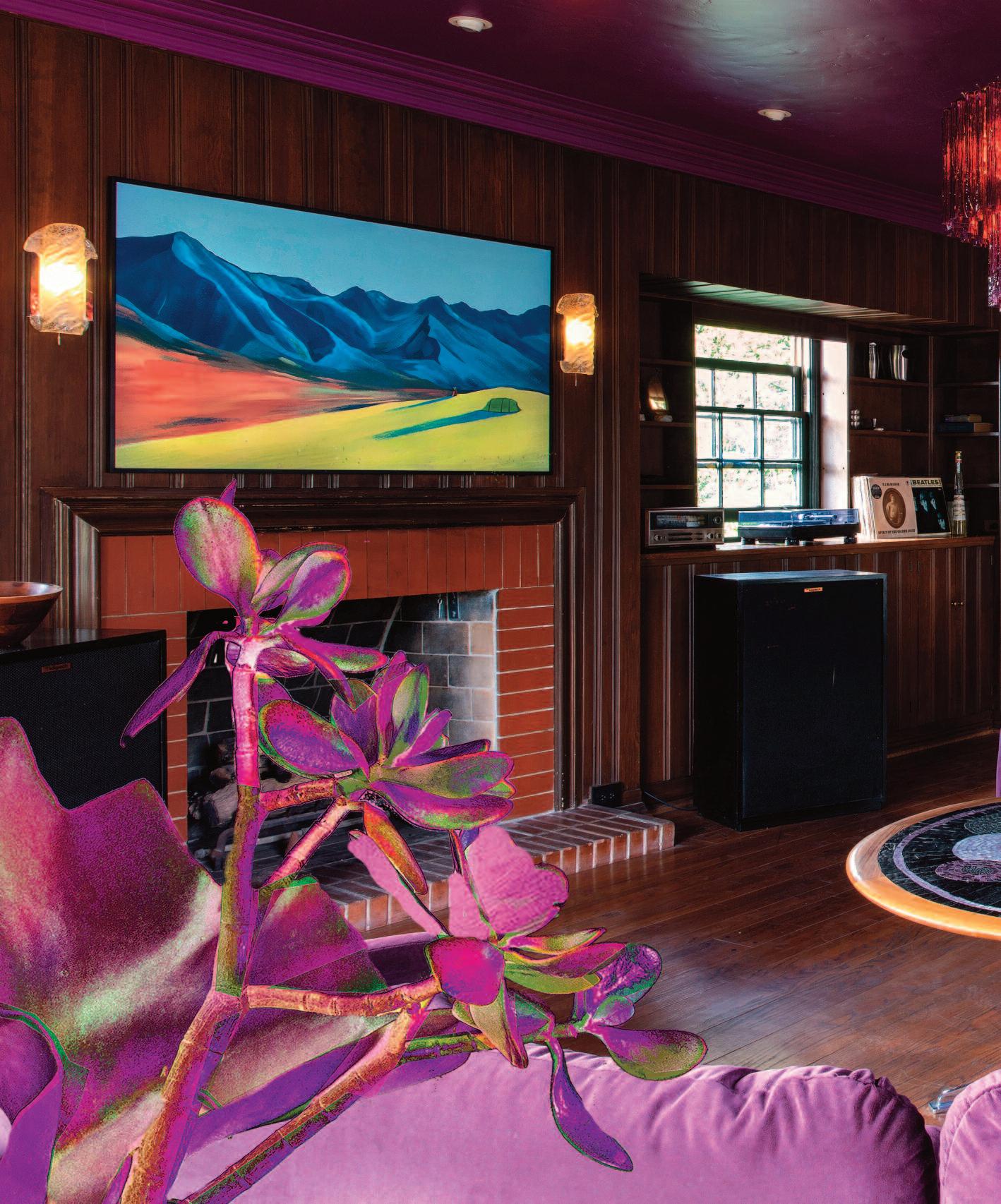
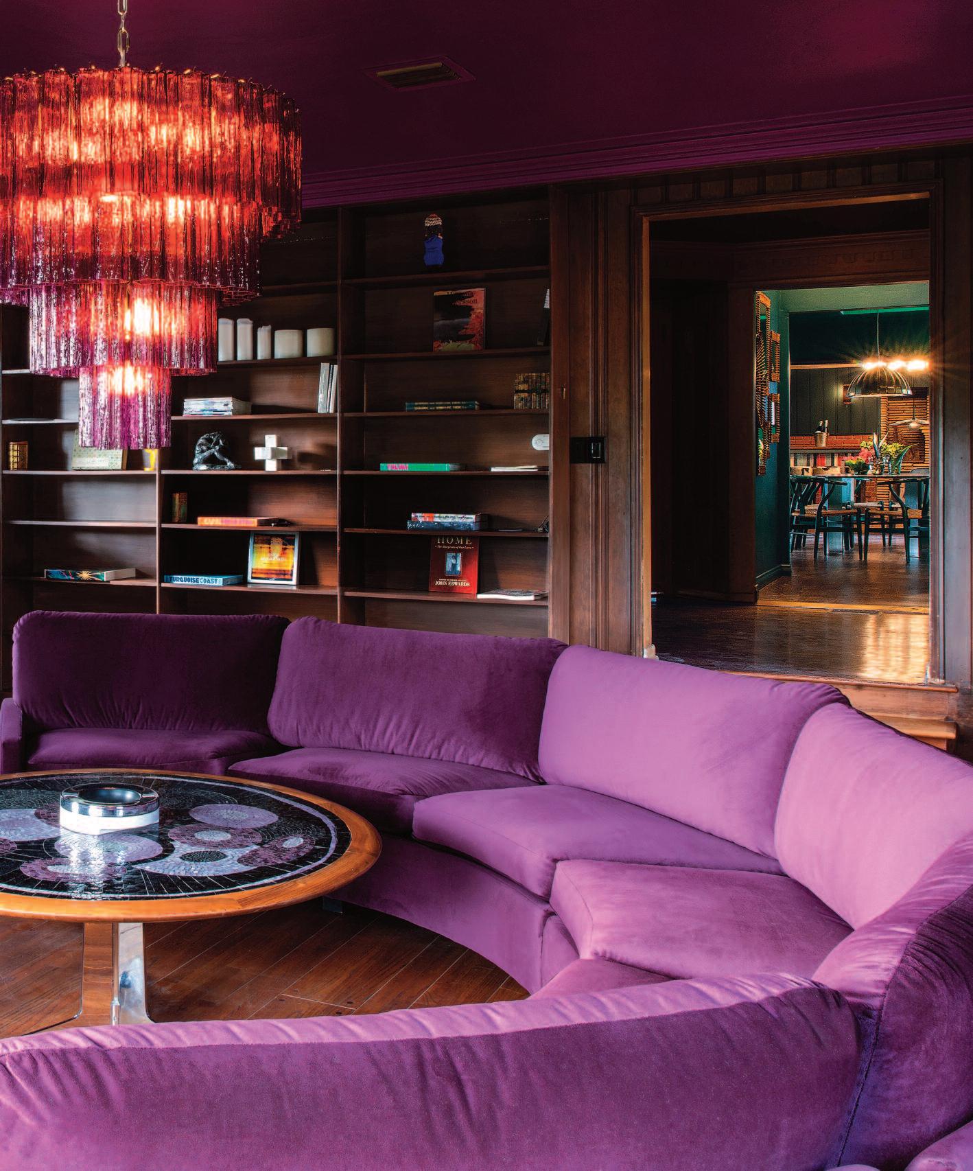
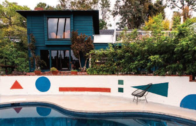
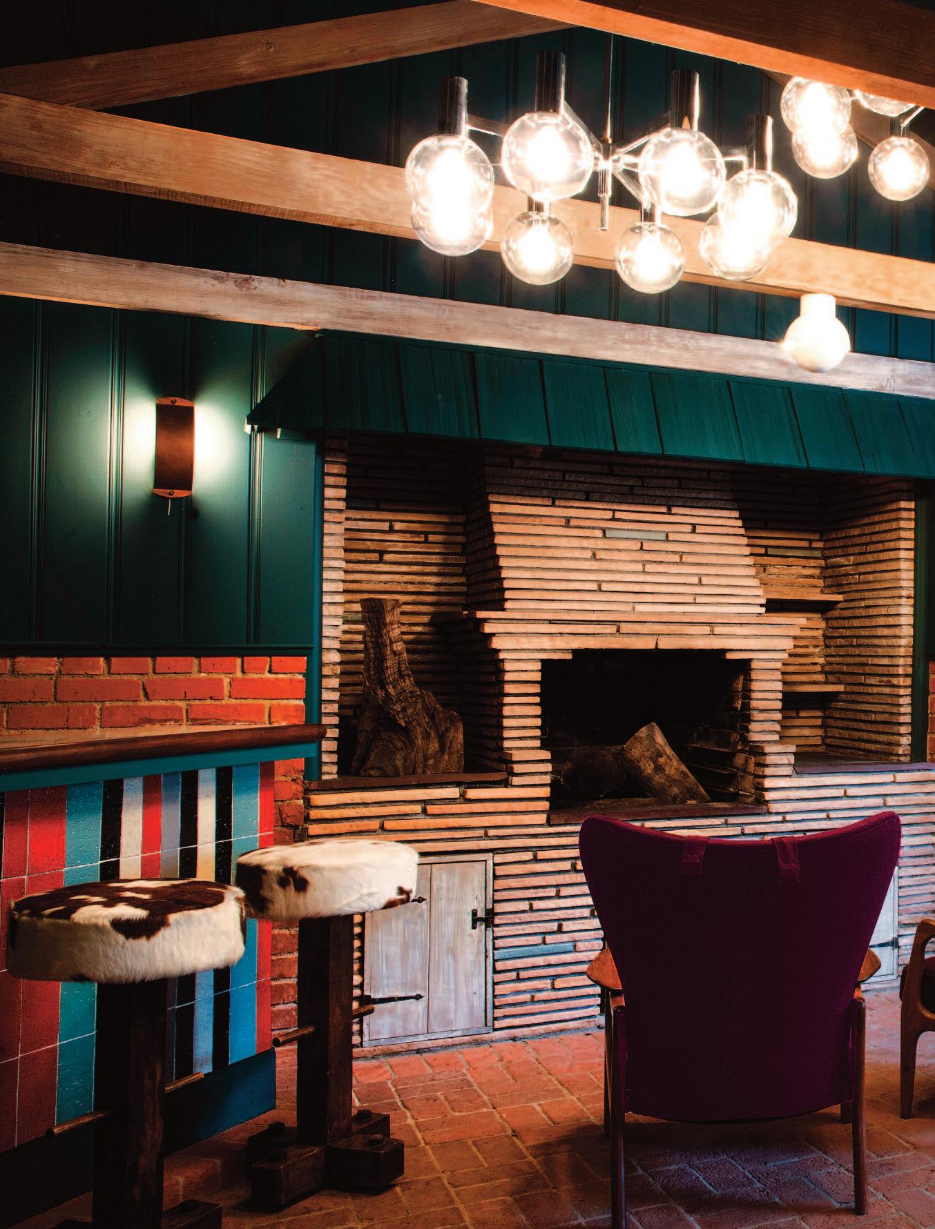
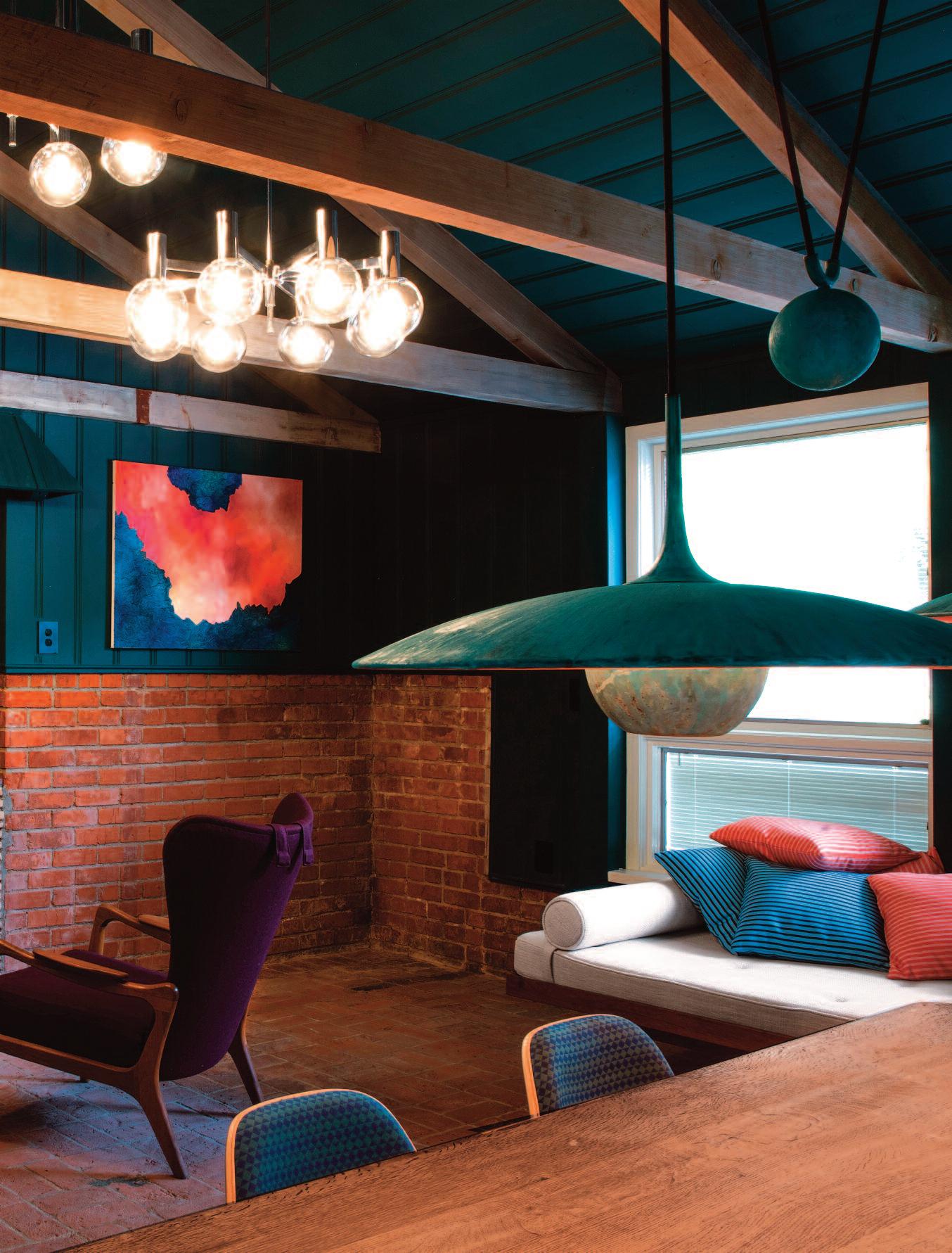
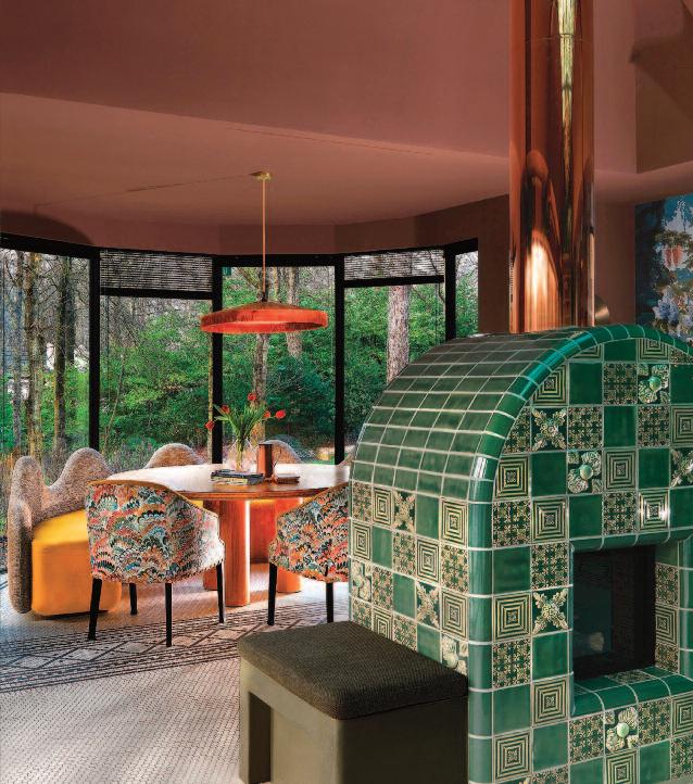
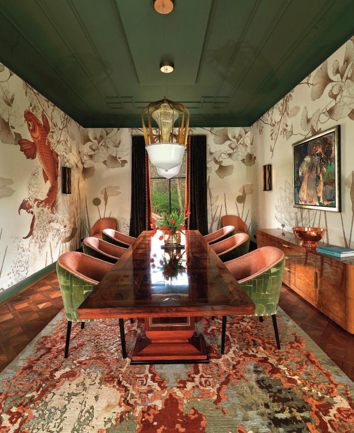
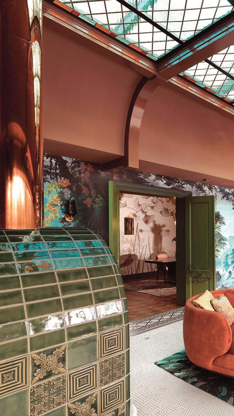
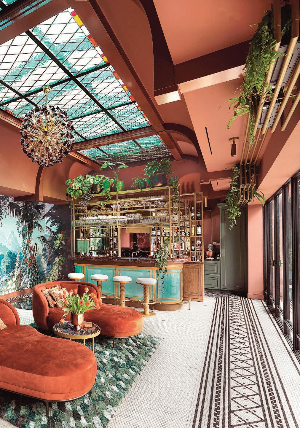
Previous pages: the living area of Frank Zappa’s Nest in the new color scheme . This pages: the kitchen and living area of the guest house and the exterior with pool.
Perched above the historic house of the world famous musician Frank Zappa in the Hollywood Hills, the Zappa Nest is an atmospheric guesthouse conceived as a creative retreat for visiting musicians part sanctuary, part statement piece. Bridging music history with mid-century design, its most defining feature is an unapologetically immersive use of color. This chromatic confidence gives the home its emotional identity, setting the tone for every room and steering the renovation from first idea to final brushstroke
The project also marks a milestone for paint brand Tonester: the Zappa Nest is its first and so far only bespoke exterior paint project. One might say the brand chose its debut wisely.
Originally part of the compound built by Frank Zappa in the 1970s, the Nest has been revived by owner Chris Behlau in collaboration with midcentury specialist and gallerist Lars Triesch, founder of Original in Berlin. Triesch was given full creative freedom to design a space capable of inspiring artists during recording sessions.
His core decision was simple, if bold: let color lead. Saturated pigments and layered tonalities became the foundation of the design language, informing everything from furniture selection to material pairings and the home’s spatial rhythm.
A combination of custom hues developed specifically for the Zappa Nest and select colors from Tonester ’s

existing collection defines the project ’s visual identity. Chosen for their emotional depth, resonance, and ability to shift with natural light, these shades anchor each room in a distinct atmosphere while maintaining a cohesive narrative throughout the house.
The use of richly saturated color across entire rooms including the ceilings reframes the historic property through a contemporary, expressive lens. The result is both a tribute to Frank Zappa’s legacy and a forward-looking creative haven, where color, design, and music intersect to inspire a new generation of artists. With paint firm first-ever bespoke exterior treatment echoing the same spirit, the home’s creative energy announces itself well before the front door.
The interior design follows one of Tonester founder Tony Piloseno’s favorite professional rules: never leave the ceiling white. Extending color overhead or introducing a deliberate contrast wraps the room in an immersive, atmospheric embrace, enhancing mood, energy, and cohesion.
Each color decision was made to amplify natural light and establish visual flow between communal and intimate spaces, defining the home’s expressive personality. Against this backdrop, sculptural mid-century furnishings and collectible design pieces take on renewed presence, as the architecture shifts from passive container to active participant supporting creativity, introspection, and experimentation.


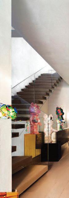
The outdoor space of the Pearls on Swine project in Bangalore, India, designed by Multitude of Sins (MOS), features a net hammock made from a customfabricated metal structure. The house is described by the designers as an exploration of design and personal expression.
Photos: Ishita Sitwala.
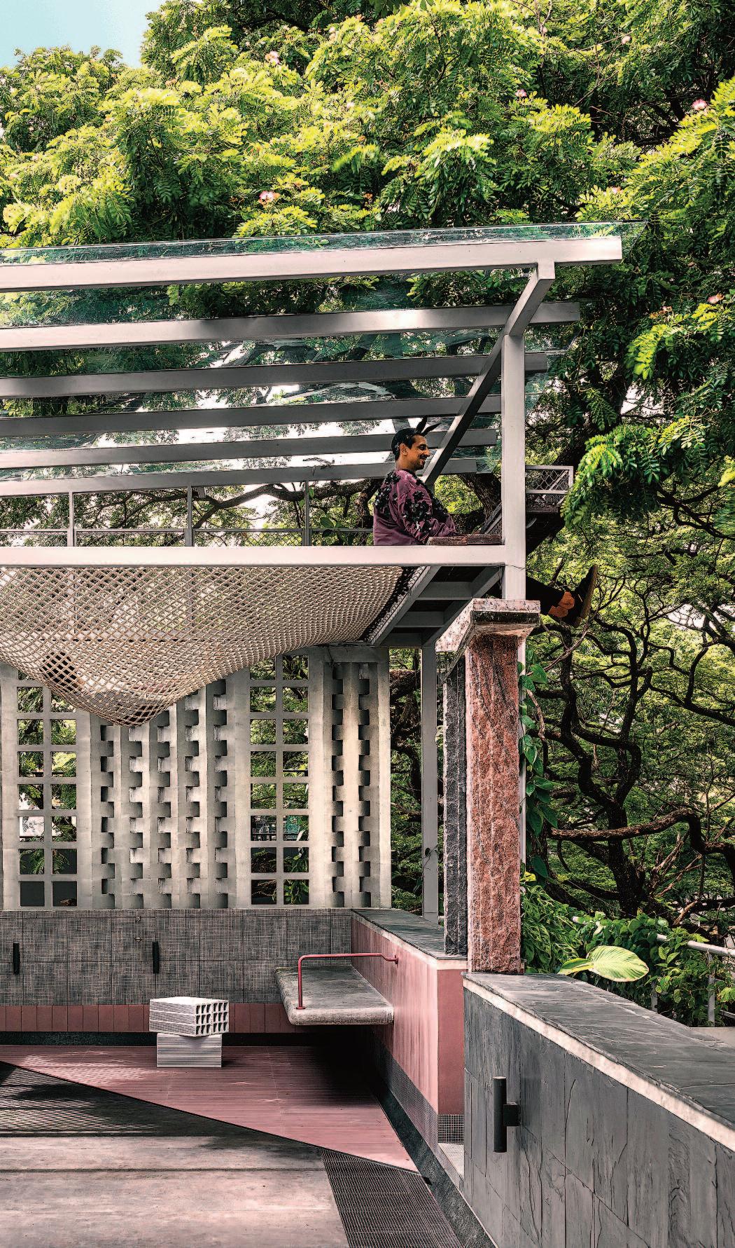
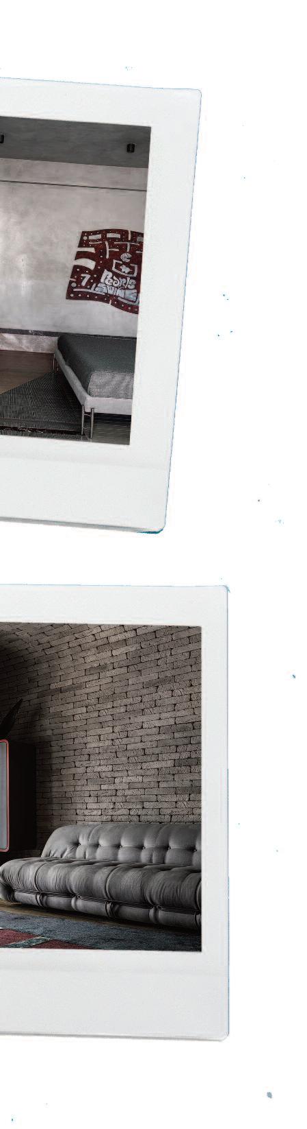
These pages: several areas in the house designed in a more or less brutalist style. The living room is a meticulously planned space with a seating area and a four-seater couch. The outdoor spaces are planned for exercising.
Pearls on Swine is the name of a design-led exploration of per sonal expression located in Bangalore, India.
The project tells the stor y of a man with refined, discerning taste and his wife a designer with a deep af finity for the fantastical. This convergence of contrasting sensibilities has given rise to an exceptional home, one that functions as both a lived-in space and a work of ar t.
The residence is designed by Multitude of Sins (MOS).
The origin of the name Pearls on Swine lies in the couple’s journey with the proper ty Purchased over a decade ago, the home was reimagined once the mor tgage was paid of f, allowing the couple to align the space with their evolved lifestyle.
While the building’s exterior remains modest and unassuming, the renovated duplex within reveals itself as a lustrous gem a radiant pearl concealed within an ordinar y shell, set amid what the couple wr yly refer s to as a “sea of swine.”
The homeowner’s aesthetic sensibility is under stated and sophisticated, favoring minimalism, rich and moody tones, and an uncompromising emphasis on functionality and quality.
His wife, the creative force behind the transformation, is drawn to fantasydriven narratives and brutalist expression. Through her design language, she craf ts immer sive environments that invite imagination and stor ytelling. The project became
These pages: the revolutionary kitchen façade, an innovative fusion of form, function and creativity. The avant-garde design transcends convention, transforming the kitchen into a design statement that balances aesthetic appeal with functionality.
an experiment in balance testing how far creative expression could be stretched without severing the thread of familiarity
The essence of Pearls on Swine lies in the dialogue between these opposing design philosophies
With an intuitive under standing of her par tner’s preferences, the designer carefully negotiated the space between the comfor t of the known and the excitement of the unfamiliar. It was a process of discover y gently challenging boundaries, expanding comfor t zones, and encouraging an openness to the unexpected.
This thoughtful tension between restraint and audacity, familiarity and surprise, lends the home its distinctive character both compelling and welcoming
More than a collection of rooms, the home is conceived as a living organism that reflects the couple’s shared values and daily rituals. Their love for their pets, dedication to fitness, and commitment to healthy living are all thoughtfully integrated into the design
The result is a space that suppor ts and elevates ever y facet of their lifestyle a carefully curated backdrop for ever yday life Here, function and form coexist seamlessly, shaping an environment that mirror s the energy of a modern, active couple
A R A I N Y D AY I N T H E F O R E S T A R A I N Y D AY I N T H E F O R E S T
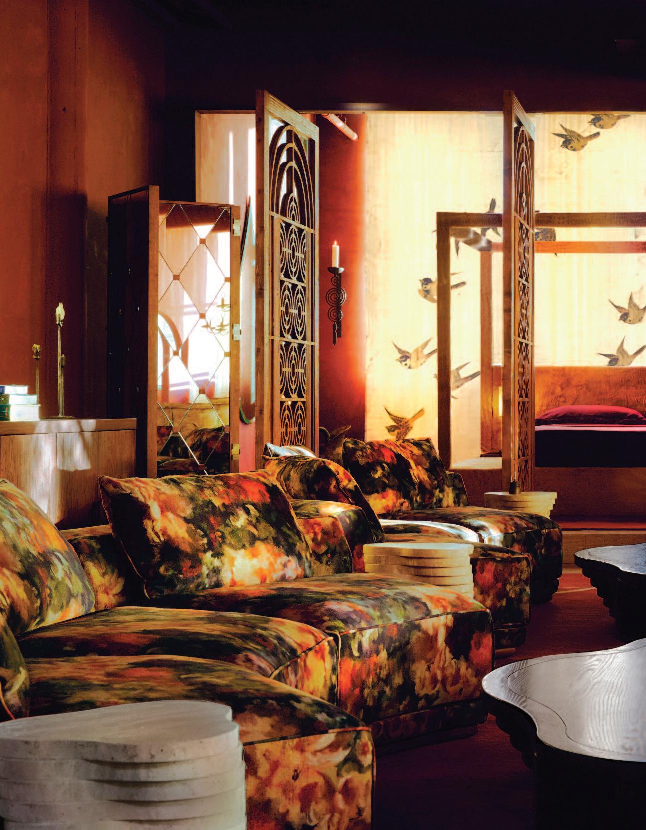
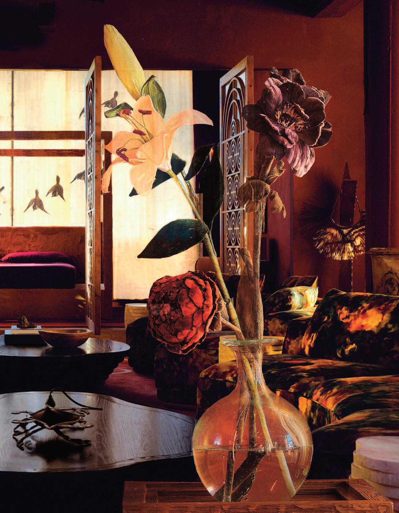
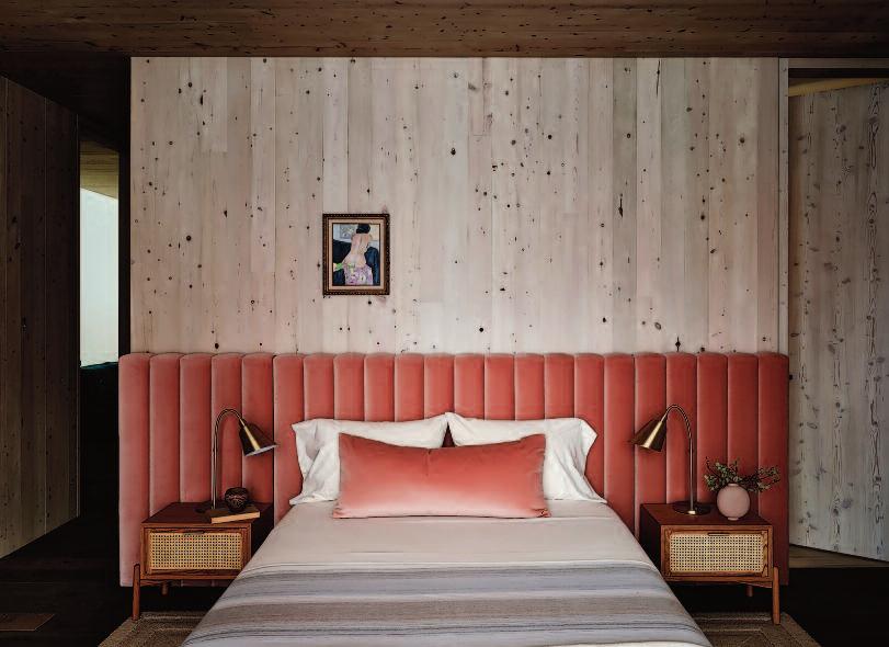
Once defined by golden hues and an open, airy feel, the loft has been reimagined as a bold, atmospheric retreat that introduces warmth, depth, and unexpected richness.
Designed by Robert Natale, CEO and Head of Design at luxury brand Sixpenny, based in China and Brooklyn, New York. the transformation was achieved through a saturated burgundy palette layered with watercolor-inspired shades of red, yellow, and green, evocative of a rainy day in the forest.
Natale believes this natural inspiration enhances the loft ’s sense of comfort and intimacy, creating a welcoming, lived-in atmosphere.
The project reflects a refined evolution of the brand’s design language and signals the next chapter in its creative point of view.


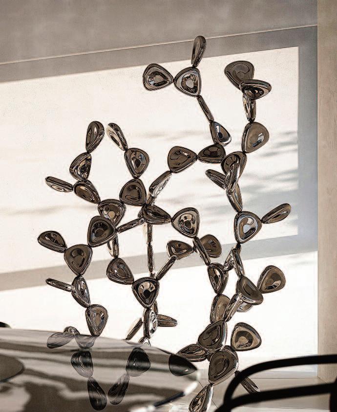
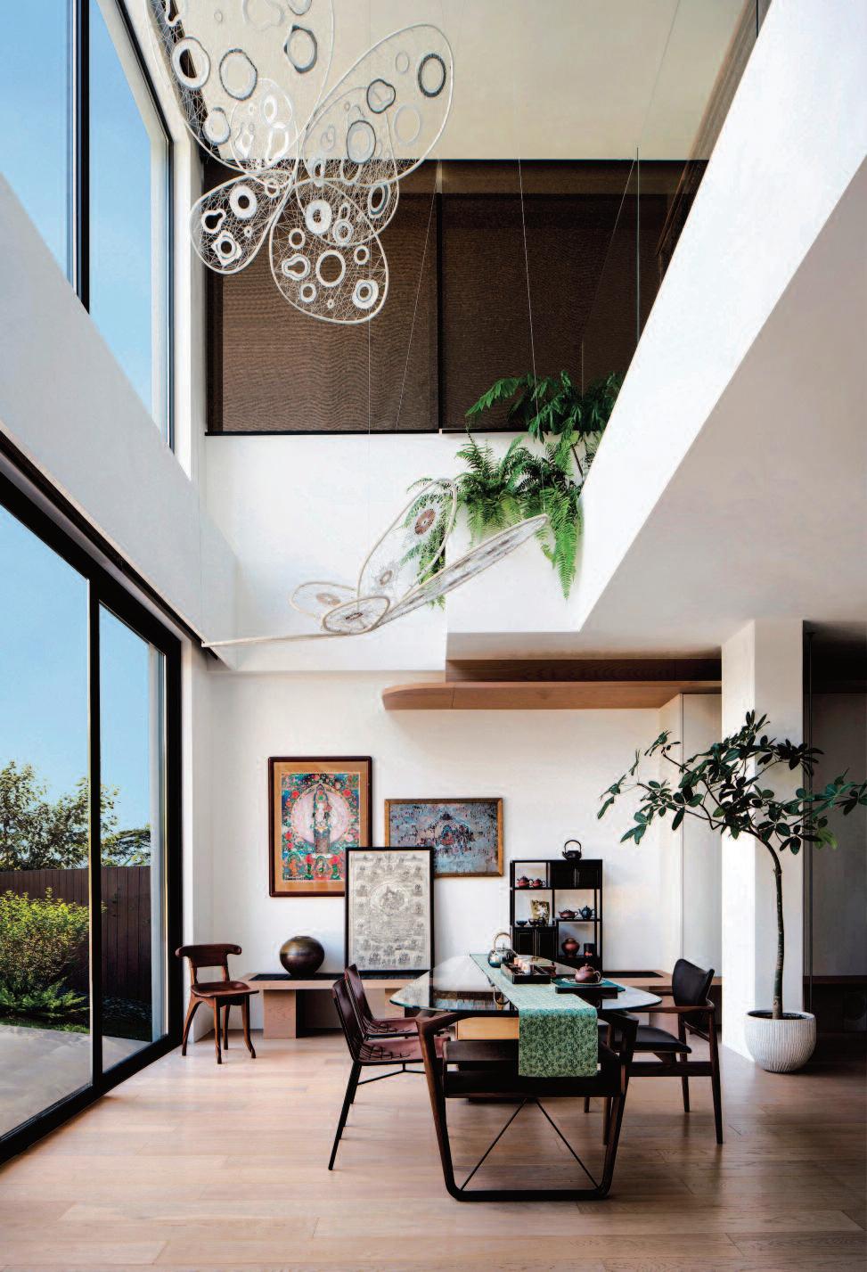
Left: a hollow layout is created to link the separate first and lower ground floor. The two butterflies are by artist Li Zhou's ‘Metamorphosis’ which uses traditional weaving techniques to produce flexible wire in a light and dynamic, form like a butterfly escaping from its cocoon, illustrating the tension of rebirth.
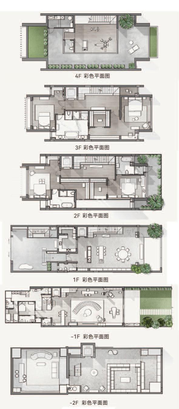
Right: the lay out of the six floors of the house.
Surrounded by lakes and dense woodland, the villa allows its owners to journey seamlessly from their doorstep to Shenzhen Bay and the South China Sea. Situated within a vibrant “city within a city,” the residence achieves a rare balance between urban vitality and natural tranquility.
Within her holistic approach to healthy living, Xie believes that luxury residential design must begin with a deep understanding of its inhabitants. By uncovering residents’ cultural values and artistic preferences, designers can create spaces that are both meaningful and enduring.
“The owner of this residence is an elegant and accomplished woman with a discerning aesthetic sensibility,” explains Xie. “Her collection of modern art reflects a sophisticated lifestyle From the outset, she expressed a desire to create an artistic living environment for herself and her family one in which art is ever-present and resonates with cultural depth ”
She continues: “Nature inspires curiosity, art bestows meaning, and culture elevates experience. The owners’ aesthetic tastes are translated into a realm of physical and emotional enjoyment. Through Ace Design’s interior narrative, beauty becomes part of everyday life. Natural light, in its purest form, acts as a metaphorical guide, shaping movement and perception throughout the space.”
In Xie’s view, contemporary luxury housing demands a holistic vision, rigorous logic, and systematic problemsolving. Only then can design transcend fleeting trends and convey the true essence of lifestyle
This philosophy guided the transformation of the original four-story structure into a six-story residence. The design team addressed the challenges of a long and narrow layout, limited natural light and ventilation from only two façades, and the constraints of a single circulation axis that no longer suited the family’s modern lifestyle Shenzhen’s humid climate further informed material and spatial strategies.
A void was introduced to connect the ground floor with the lower level, enhancing spatial continuity while drawing in abundant natural light. A canyon-like o pening was carved into the structure, resulting in expansive, minimalist white spaces that elevate both form and atmosphere.
These pages: the central place for the family's leisure activities. The vivid echoes of life are found in the works of contemporary Chinese artists such as Shuan Liang, Bing Xu, Shaoji Liang and Li Zhou, as well as the western vision that flows from the works of renowned Italian artist Loris Cecchini.

This page: a canyon gap introduces wind and light in the large areas of the white minimalist space. Righthand page: the entertainment area with a large ‘starry night’ ceiling.
Collaborators villa Shenzhen, China. Design area: 1,000 sqm (including garden Design firm: Ace Design with design director Hui Xie and execution design head Shali Yan. Design team: Hui Xie, Shali Yan, Subing Zhao and Shuai Yang. Soft decoration design and execution: Mushang Art Part of soft furnishing brand: De Sede, Baxter, Thonet,Cassina, Cecccotti, Carl Hansen & Son and House of Finn Juhl.


Alongside the reconfiguration of light and movement, a narrow vertical canyon was created adjacent to the dining room The daughter’s bedroom on the second floor overlooks this space allowing for spontaneous parent-child interaction simply by opening a window: a gesture that strengthens family bonds.
A shared leisure hub was designed as the heart of the home, offering each family member a place to unwind without interruption This flexible area also functions as an auxiliary kitchen, reinforcing its role as a social anchor.
The staircases were conceived not merely as circulation elements, but as sculptural and functional installations that animate the interior while improving airflow. A skylight aligned with the dynamic stair sequence introduces shifting light and shadow, tracing the daily rhythms of family life.
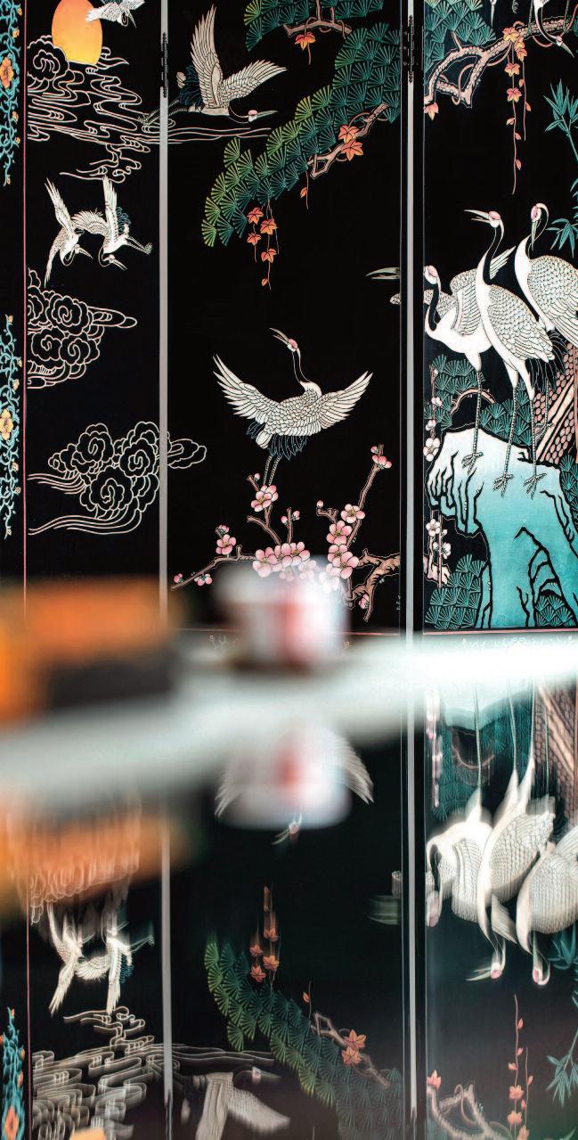
These pages: East and West meet and collide with the artworks and aesthetics in spatial scenes. It is a poetic bridge between the physical space and the inhabitants The staircases, as functional bodies and as artistic installations, mitigate the dullness of the spaces, The artist Shanchun Yan's 'West Lake Series' paintings blend Chinese and Western scholarship, creating an intrinsic c ultural mapping with the spirit of space via a deeper understanding of form, image and meaning exploring the house is a an artistic spirit beyond time and space in home culture, rather than designing a room. East and West also meet with the works by Giovanni Ozzola and the screen with the crane pattern.
“Design must draw from real moments of life to truly resonate,” says Xie “Scenes such as friends gathering, family meals, or gazing at the lake beyond the window are transformed into a poetic narrative embedded within the home
The relationship between people, objects, and art becomes an abstract expression of the spiritual world ultimately elevating design into the realm of art ”
By weaving artistic spatial language with lived experience, Ace Design has created a residence that reflects the owners’ lifestyle while offering a sense of intimacy, richness, and warmth an environment that is both self-contained and deeply human.
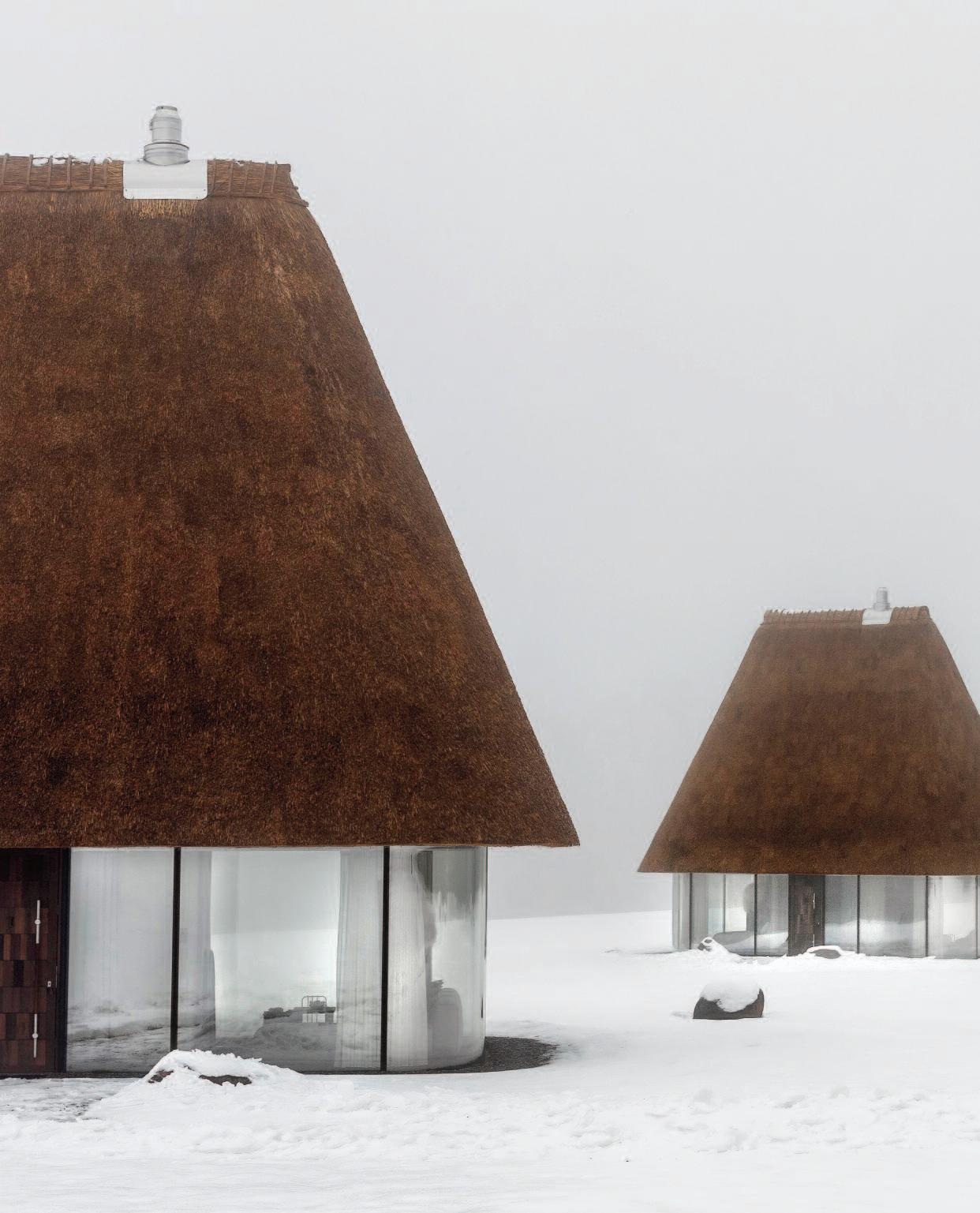


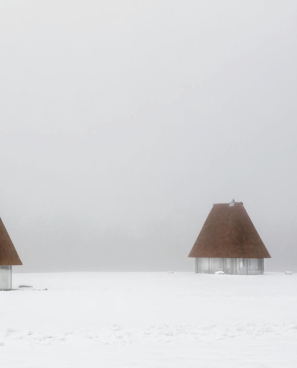
These pages: YOD Group’s contemporar y interpretation of traditional Ukrainian
The houses represent a contemporary interpretation of the traditional Ukrainian mazanka the archetypal rural dwelling shaped by local materials, climate, and cultural rituals. In their pursuit of light and visual purity, the designers at YOD Group chased fully transparent glass façades and deliberately oversized roofs as the project’s primary architectural gesture. The sculptural forms create a strong, instantly recognizable silhouette, evoking both a traditional tall hat and an oversized mushroom emerging from the landscape.
Volodymyr Nepiyvoda, co-owner and managing partner of YOD Group, explains: “Our design philosophy goes beyond working with local materials or familiar forms. It is about uncovering the essence of a place and decoding its cultural meanings. We studied the image of the traditional Ukrainian house, distilled its core characteristics, and reinterpreted them to create a contemporary architectural object ”
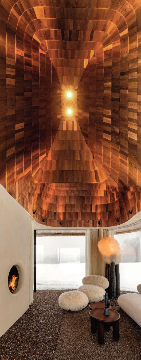
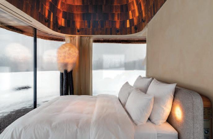
The spatial layout is organized around a functional core a central concrete block housing the bathroom. The bedroom and living area are positioned on either side. The living room features a minimalist fireplace, offering a contemporary interpretation of the traditional Ukrainian stove
The interior is guided by the principles of modern eco-minimalism. A restrained natural color palette, a rich variety of tactile surfaces, and objects by Ukrainian brands combine to create a calm and cohesive environment. The space includes furniture by Noom, black clay décor by Guculiya, and textured wooden elements throughout. A key accent in the bedroom is a large, custom-made floor lamp crafted from ceramics and natural fibers, adding warmth and a sculptural presence.
The inner surface of the roof dome is clad in wooden tiles referencing traditional wooden shingles historically used on Ukrainian rooftops. Rising to a height of 10 meters at its apex, the dome enhances the sense of openness and verticality while concealing all engineering systems, leaving the walls visually clean and uninterrupted
A heat pump system ensures a comfortable indoor climate year-round. Concealedair-conditioning is integrated with supply ventilation and operates through discreet linear slots in vertical grilles, with exhaust outlets incorporated into the dome and the central core The absence of a television was a deliberate choice Watching the live flame through the circular opening of the fireplace and maintaining constant visual contact with the surrounding landscape encourages informational detox and emotional restoration.
Right: contemporary Ukrainian Hata-Mazanka with emphasize on light and cleanliness translated into fully transparent glass façades and an oversized roof are the project’s primary architectural gesture. The central concrete block contains the bathroom. On either side are bedroom and living area. The inner surface of the roof dome is clad in wooden tiles
These pages: the interior follows the principles of modern ecominimalism A restrained, natural color palette, a rich variety of tactile surfaces, and objects by Ukrainian brands create a calm, cohesive environment. The space features furniture by Noom, black clay decor by Guculiya, and textured wooden elements. Inside and outside, the floor is finished with a continuous stone carpet surface.
From the archives of OBJEKT International (2005)
Tribute to the great ierr y W. Despont

He was one of the greatest interior designers of his generation, effortlessly blending classical and modern styles with a mastery few could rival.
Architect and artist Thierry W. Despont made harmony look easy
A long-time New Yorker and AD100 Hall of Fame designer, Despont shaped residences, retail spaces, and hotels for many of the world’s most prominent entrepreneurs. When he passed away in 2023 at the age of 75, the French-born architect left behind an extraordinary legacy. His work included the restoration of the Statue of Liberty, the Woolworth Building in New York’s Financial District, the Carlyle Hotel, and the Ritz in Paris He also designed the decorative arts galleries at the Getty Museum in Los Angeles, proof that his talents extended well beyond private salons and penthouses.
Despont was also an indefatigable collector
Over the years, he amassed hundreds of objects, some created, some discovered, which he displayed across his New York City townhouse, office, atelier, and his Southampton retreat.
Photographer Hans Fonk captured many of Despont’s projects across the United States, the Bahamas, and, in this case, St Moritz, Switzerland Fonk also contributed to three of his highly personal, limited-edition books Despont published for select clients, bespoke creations in the truest sense of the word.
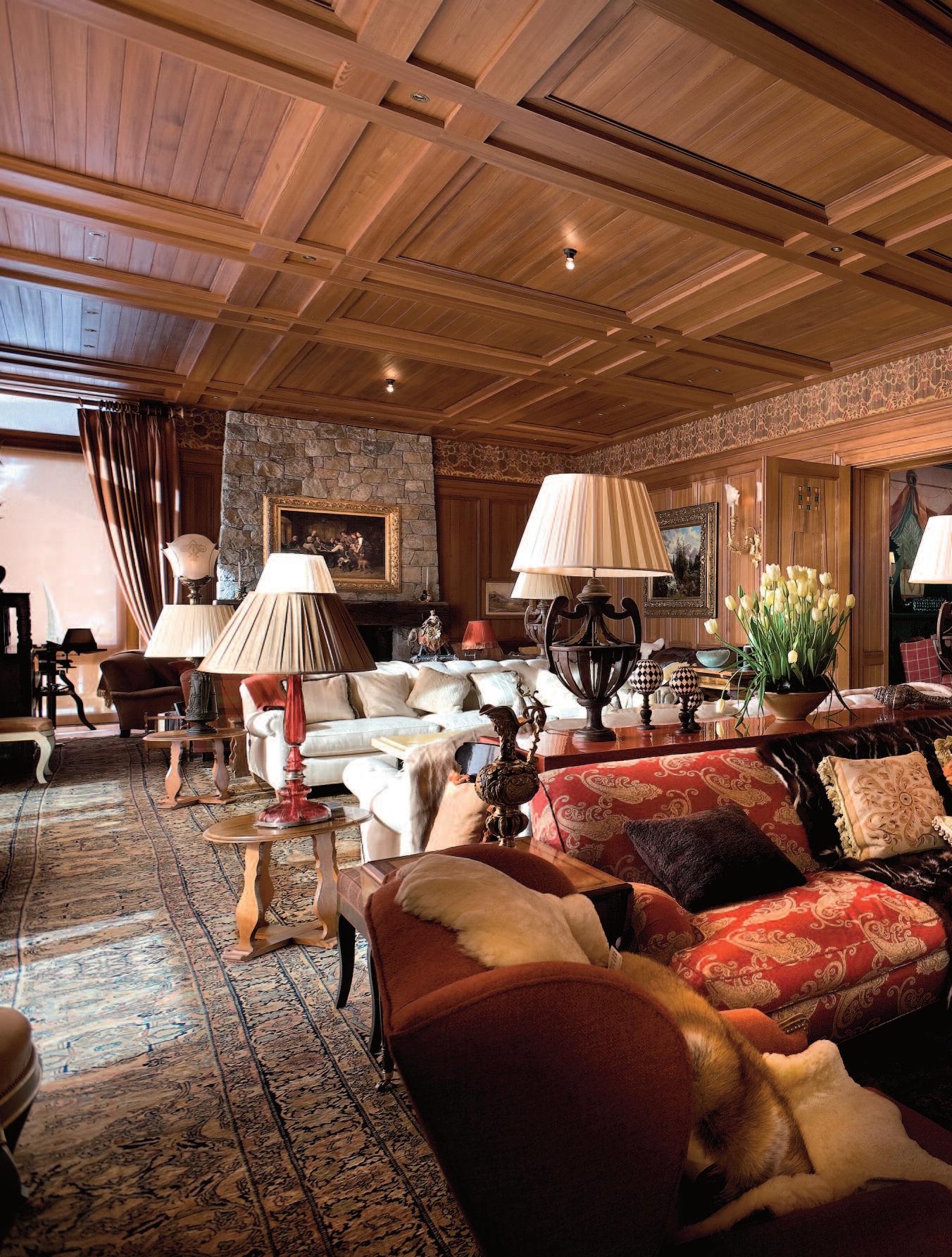
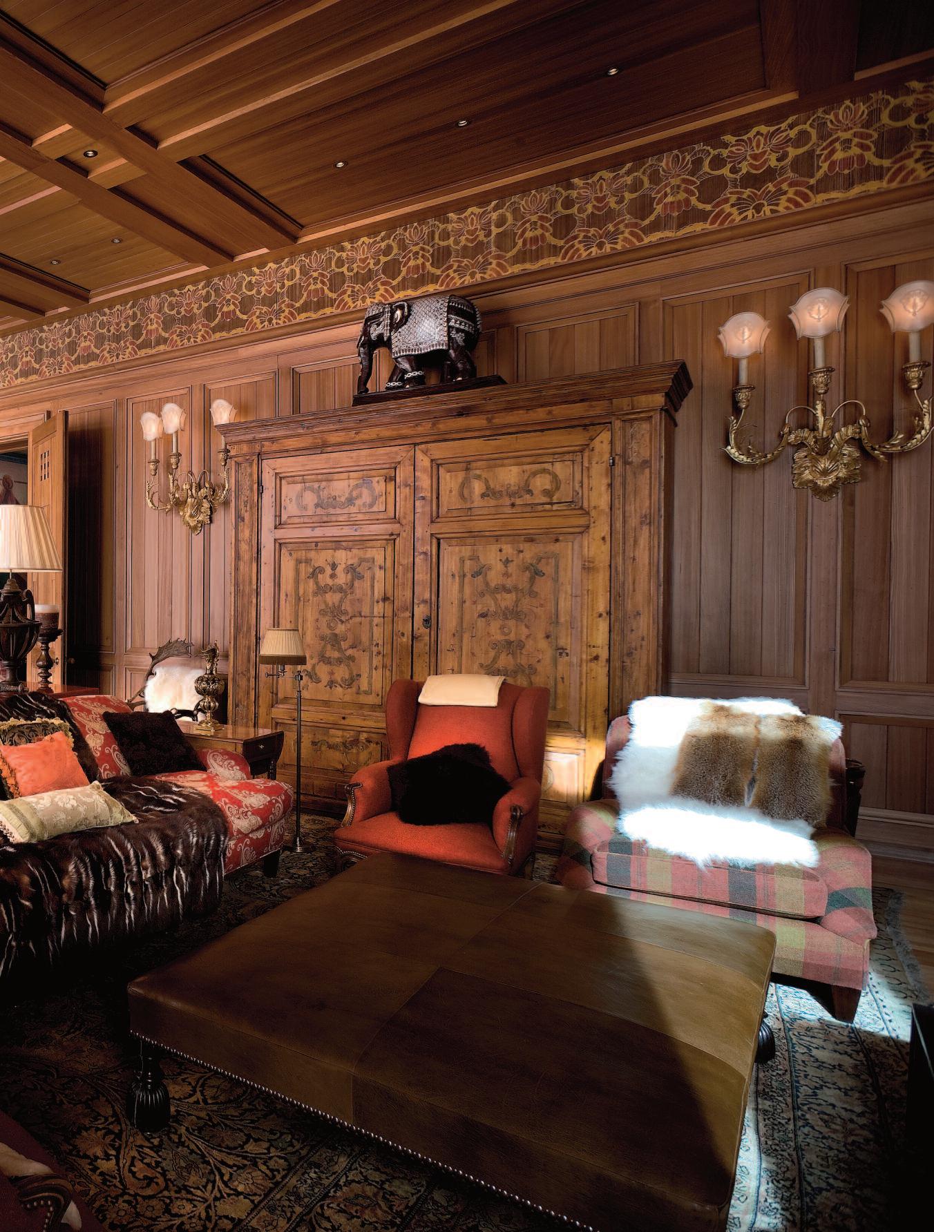
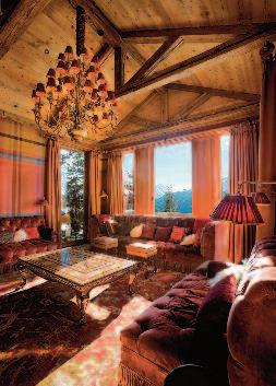
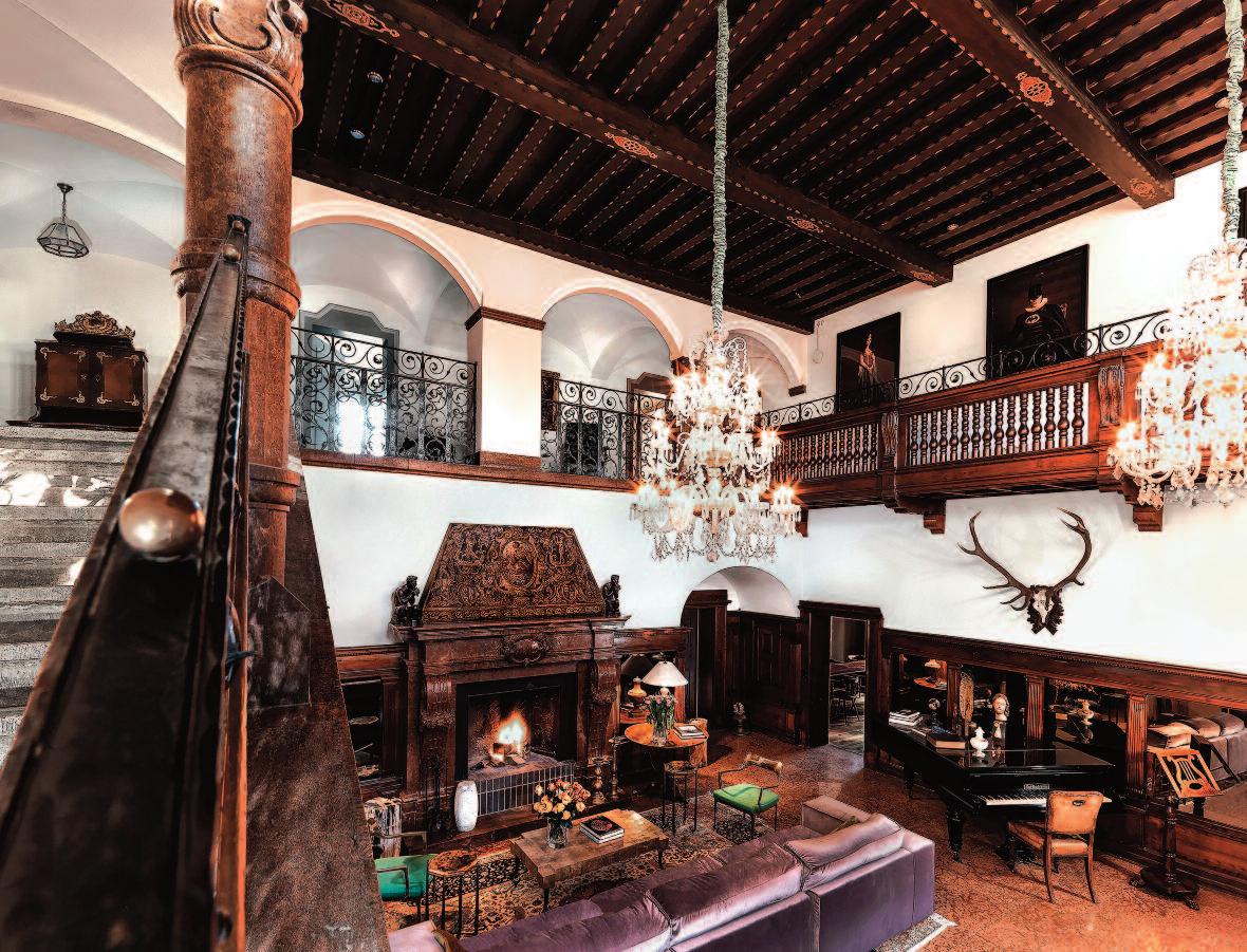
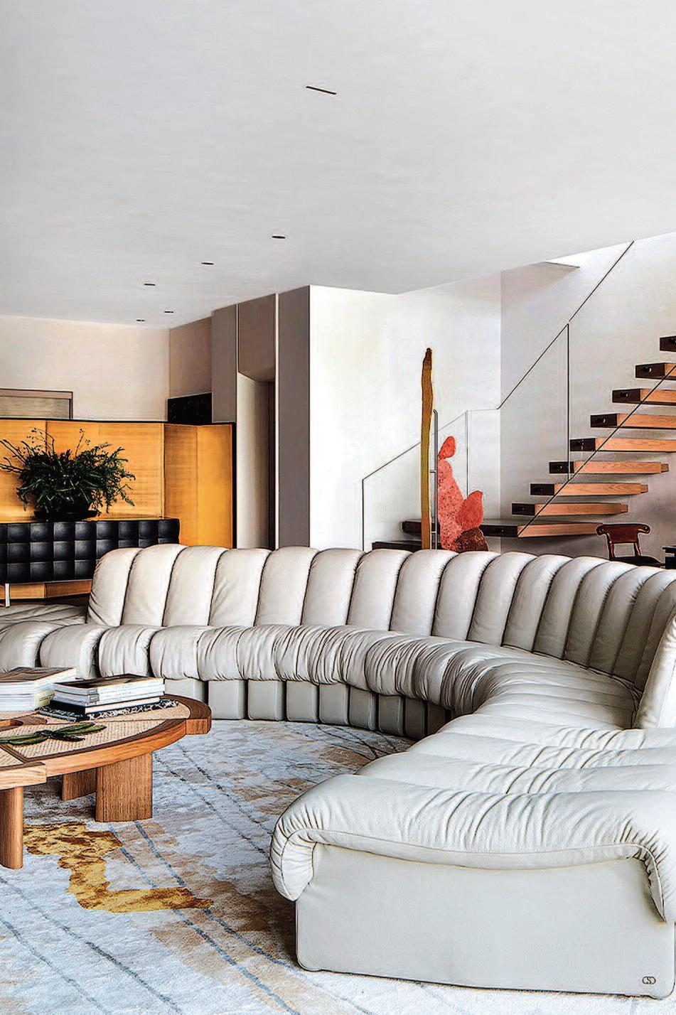
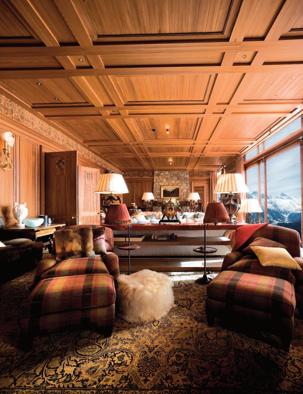
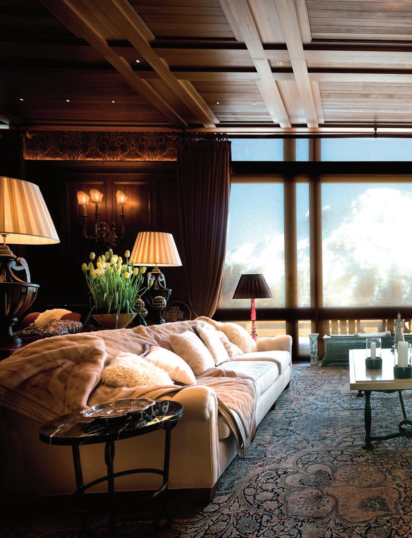
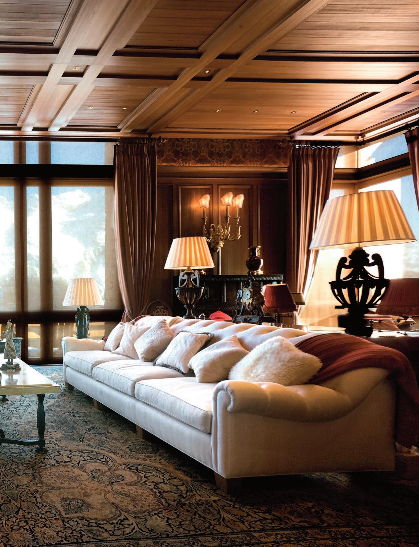
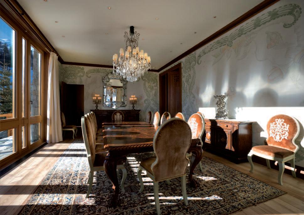
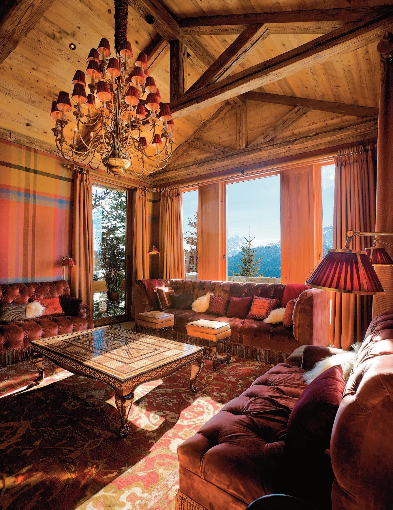
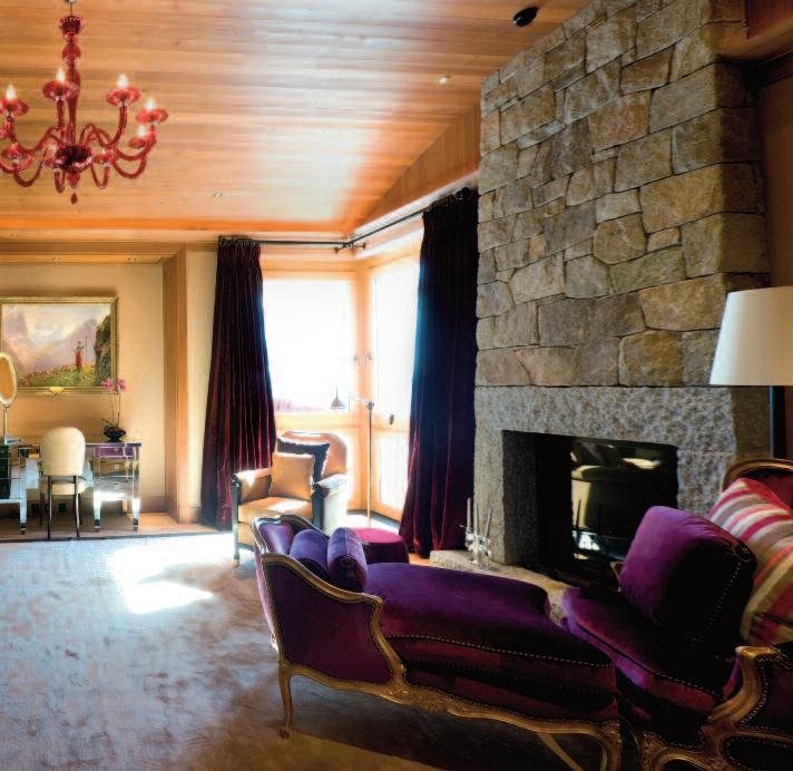
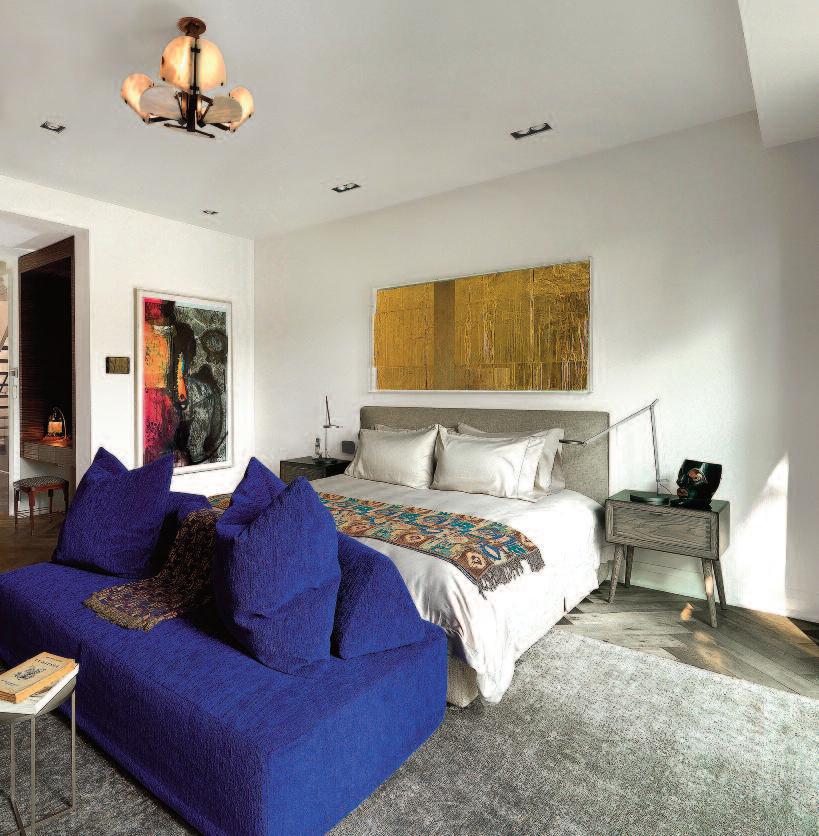
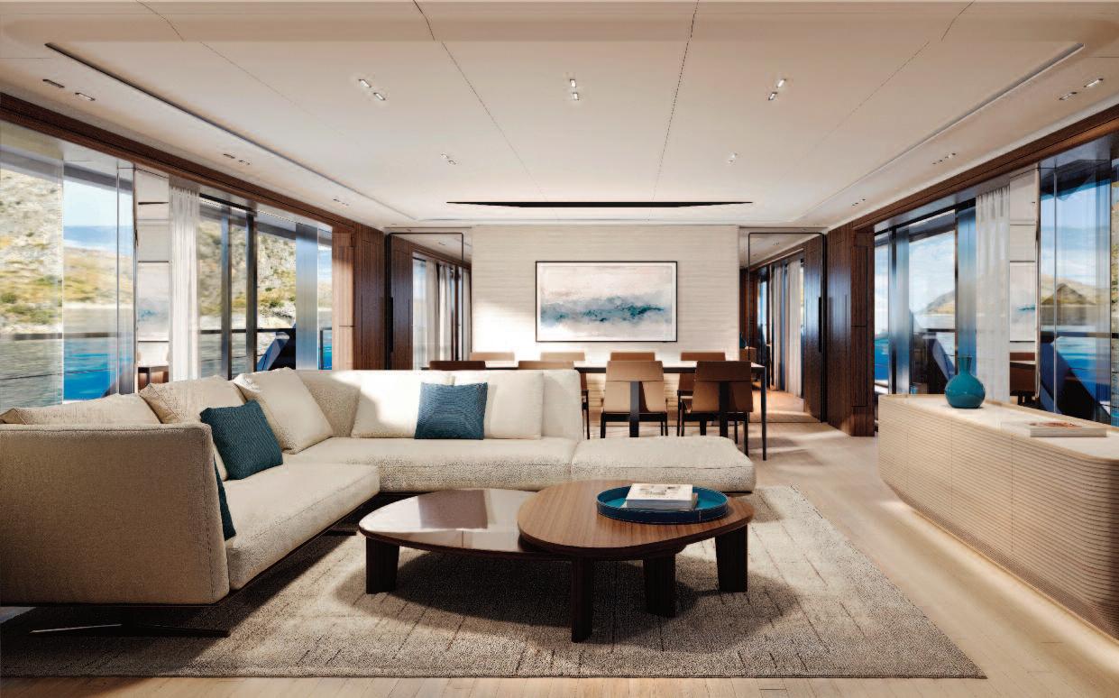
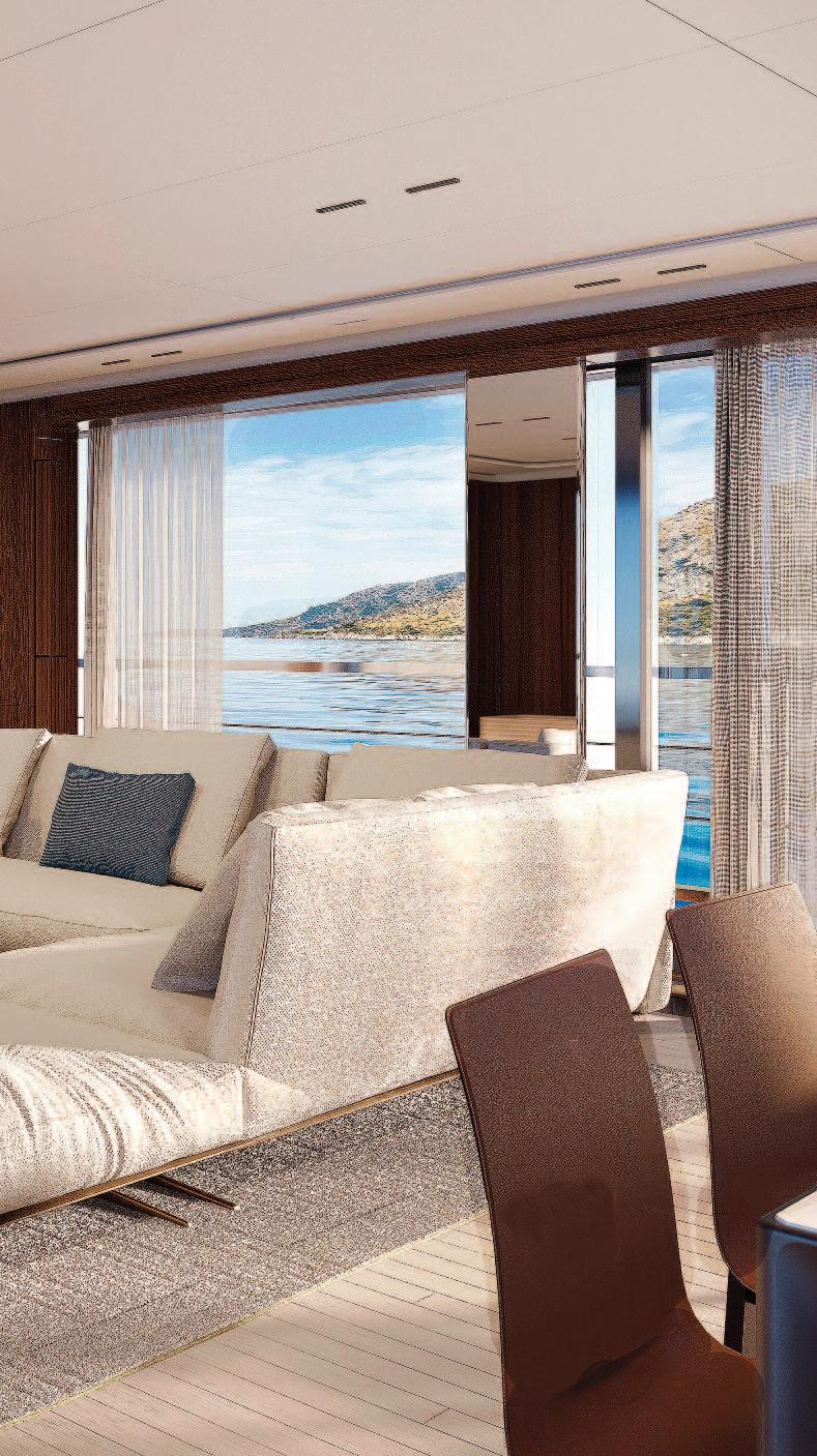
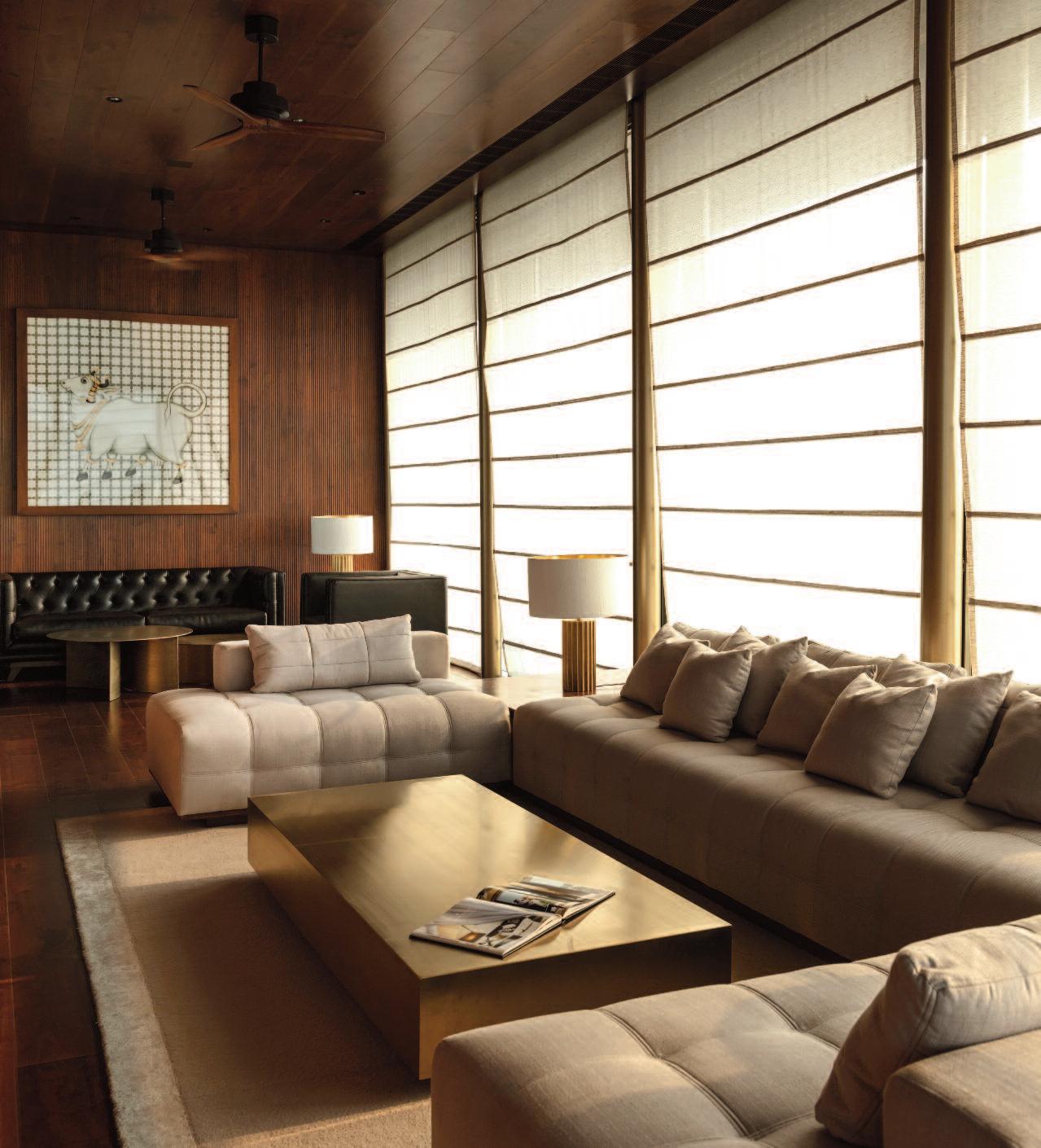
Previous pages: the large living area with its splendid view over the valley of St. Moritz and the mountains behind. On either side of this space there are big fireplaces with stone surrounds The living space has been divided into three large seating areas with wellupholstered sofas, antique objects and artworks from the family collection.
These pages
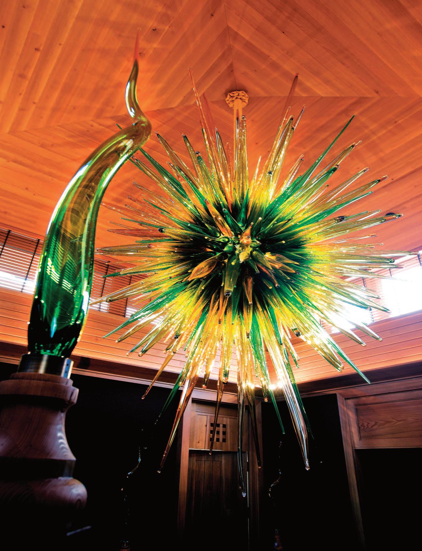
Above: The St. Moritz project. The building work was preceded by a year of concentrated planning with Rolf Schmid of the Swiss architecture firm of Oberholzer + Brüschweiler.
Right: the gigantic glass chandelier designed by Thierry Despont and made in the Czech Republic.
Next pages: the center of the elegant living area in royal Despont size.
Born in Limoges, France, Despont studied at the École des Beaux-Arts in Paris, where he developed his exceptional drafting skills, before earning a master ’s degree in city planning and urban design from Harvard University in 1974. (Yes, talent and discipline did, in fact, coexist.)
After founding the Office of Thierry W. Despont Ltd. in New York in 1980, he rose swiftly to the very top of his profession. Seamlessly merging architecture and interior design, Despont occupied a category almost entirely his own
When he first arrived in New York, he opened an office on Greenwich Street in Tribeca “It was the cheapest place in New
York, and all I could afford,” he later recalled, with characteristic understatement. From there, he began renovating apartments, refining a signature approach that fused classicism with modernism through disciplined proportions and pared-back elegance. His talents did not go unnoticed. Marietta Tree, a former partner at LlewelynDavies, played a key role in introducing Despont to her impeccably connected circle.
The turning point came when Despont was appointed associate architect for the centennial restoration of the Statue of Liberty, completed in 1986. The project firmly placed him on the international map and confirmed what many already suspected: Thierry W. Despont was not just designing interiors;
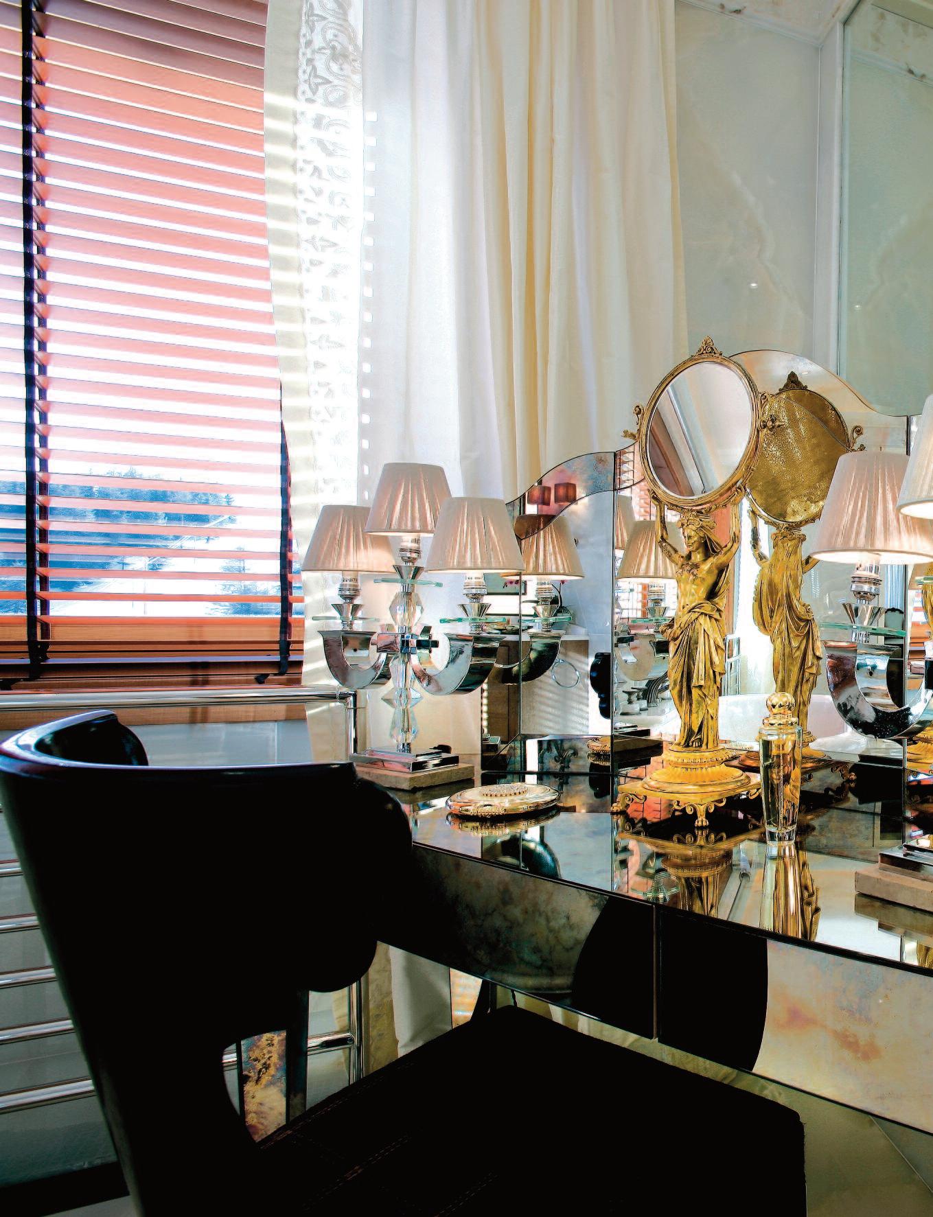
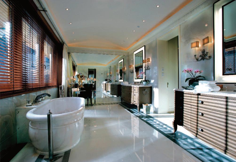
Previous pages: detail of the richly decorated dressing table in the master bathroom
These pages;
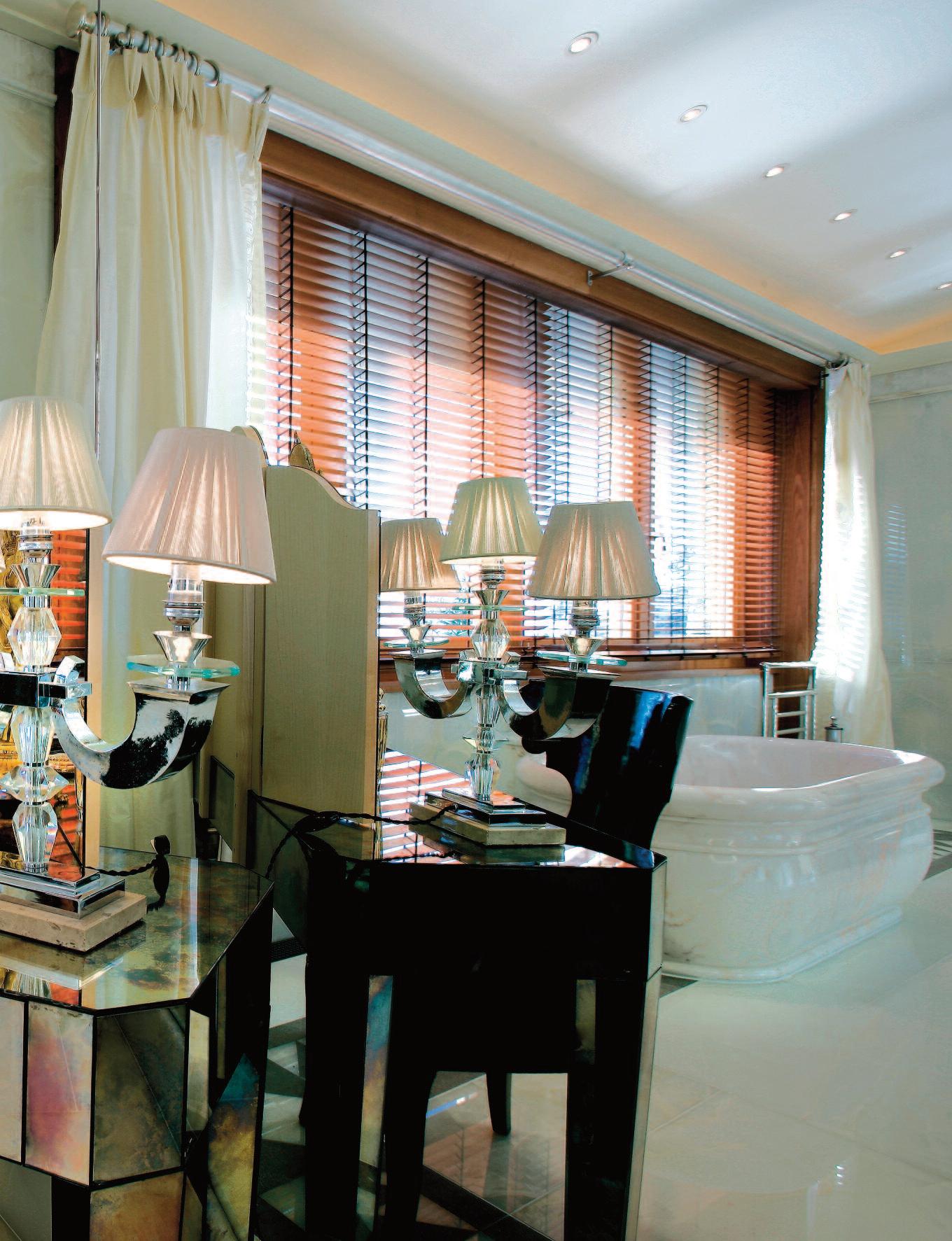
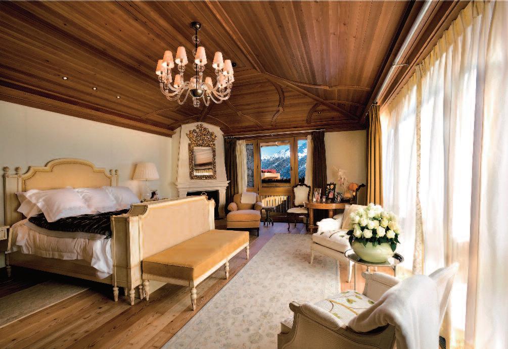
Above: the bright midday sun enters the large dining room. The generous table can accommodate the entire family for dinner together. Right: the house have a large number of bedrooms with a matching number of bathrooms, each with an individual style.
Here a shot of one of the bathrooms with a bath hewn from a single block of marble. Below that the master bathroom.
he was shaping cultural history, one perfectly judged detail at a time.
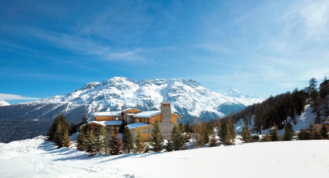
When an interior is thoughtfully conceived, architectural scale need not overwhelm the human one. This principle is demonstrated with quiet confidence by Thierry Despont in St. Moritz, the rarefied winter sports resort perched high in the Swiss Alps.
The result clearly shaped by clients who were enthusiastic collaborators rather than passive observers is a home that delivers the height of luxury without ever losing its warmth or timeless appeal.
Snow blankets the surrounding mountains, lakes lie frozen beneath a brilliant sun, and
the scene could scarcely be more postcardperfect. Welcome to St. Moritz. From the railway station, the ascent continues through a village where the shop names alone signal that this is not a place for modest ambitions. Beyond Sir Norman Foster ’s bold, donut-shaped residential complex, the chalets thin out, horse-drawn carts tastefully disguised as sledges and lined with fur rugs transport skiers to the slopes, and Switzerland performs at its most convincing
High above the town sits the villa that Thierry Despont and his clients transformed into a warm, elegant family home He described himself as a dreamer of beautiful houses, though he would prefer to
be known as an artist His large-scale artistic works crafted using a technique of his own invention involving etched and oxidized copper and composite materials inspired by distant moons and asteroids can be found in collections across the globe. Despont views his work as a continual learning process, refined through close collaboration with his clients. As he likes to say, “ There has never been a great house without a great client.” History, after all, suggests that behind every r emarkable project stands a strong patron and preferably one with good taste
Although much of his work is based in the United States, Despont ’s architectural footprint is truly global The building work
for the St Moritz residence was preceded by a year of concentrated planning with Rolf Schmid of the Swiss architecture firm of Oberholzer + Brüschweiler. That resulted in designs for the exterior structure and the internal planning, in which the unimpeded view of St. Moritz valley and the surrounding mountains was a major consideration.
The exterior and internal layout were carefully designed to frame uninterrupted views of the valley and surrounding mountains because ignoring scenery like this would be unforgivable
Once the structure was complete, Despont and his team turned their attention inward Despite its generous scale, the house feels unmistakably like a family home, with every
detail meticulously considered. Wall coverings and stair carpets were customwoven to precise measurements, antique furniture and objects were sourced with care, and a monumental glass chandelier designed by Despont and produced in the Czech Republic takes pride of place.
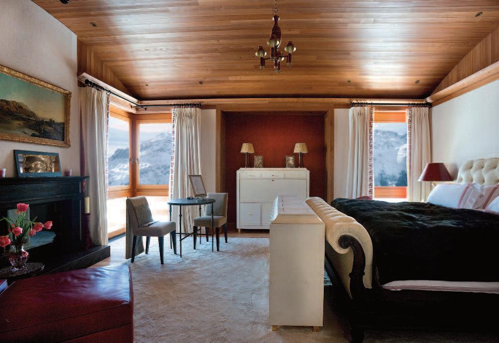
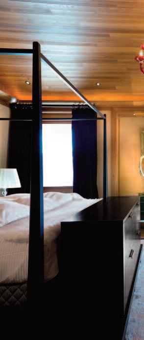
The vast Oriental carpet is anchoring the living room. The individually tailored bedrooms and bath rooms, are reflecting the personality of its occupant.
Artworks are reinforcing the sense that this is a lived-in home rather than a staged interior
The result is not decoration for decoration’s sake, but an environment that radiates genuine enjoyment the very essence of the good life in the Alps.
St. Moritz itself needs little introduction. One of the world’s most famous luxury resorts, its name carries such cachet that it was
registered as a brand in 1987 a move so unusual at the time that it made the front page of The Wall Street Journal.
The town is also the birthplace of winter tourism. In 1864, hotelier Johann Badrutt famously invited four British summer guests to stay for the winter, promising to cover their expenses if they failed to enjoy themselves.
They stayed until Easter, becoming the first winter tourists in the Alps and inadvertently launching an entire industry
While many Alpine resorts have since surrendered to mass tourism, St Moritz has retained its style. Once a favored destination of figures such as Greta Garbo, Alfred Hitchcock, the Kennedys, and Thomas Mann, it continues to attract the rich and famous now with the added luxury of relative anonymity. Some traditions, it seems, are worth preserving
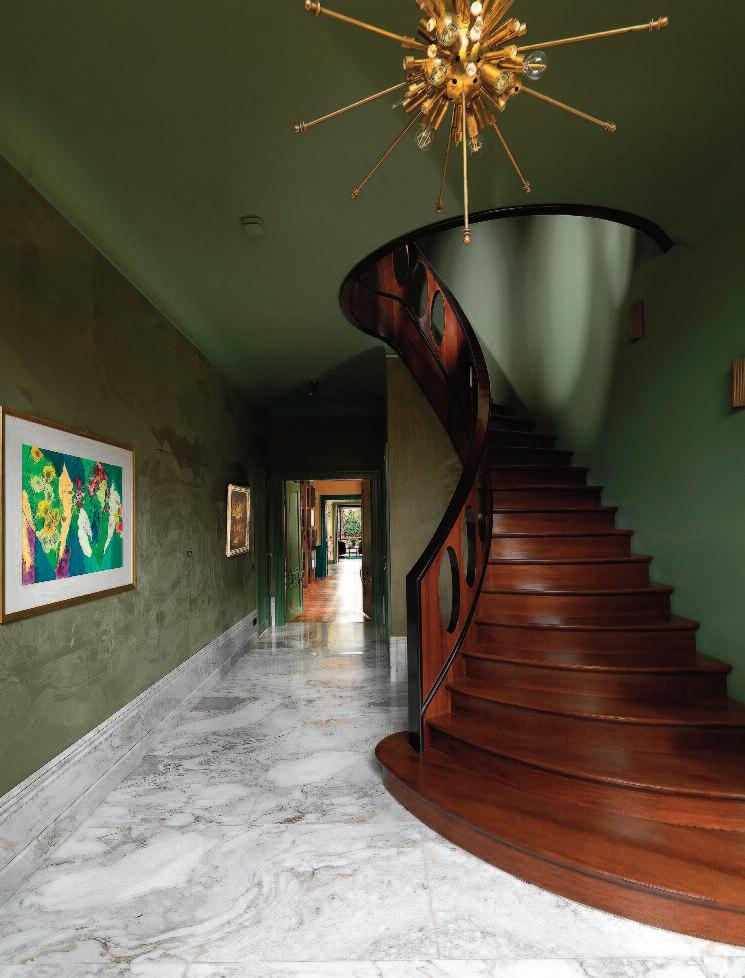
S h i n e M a k e r
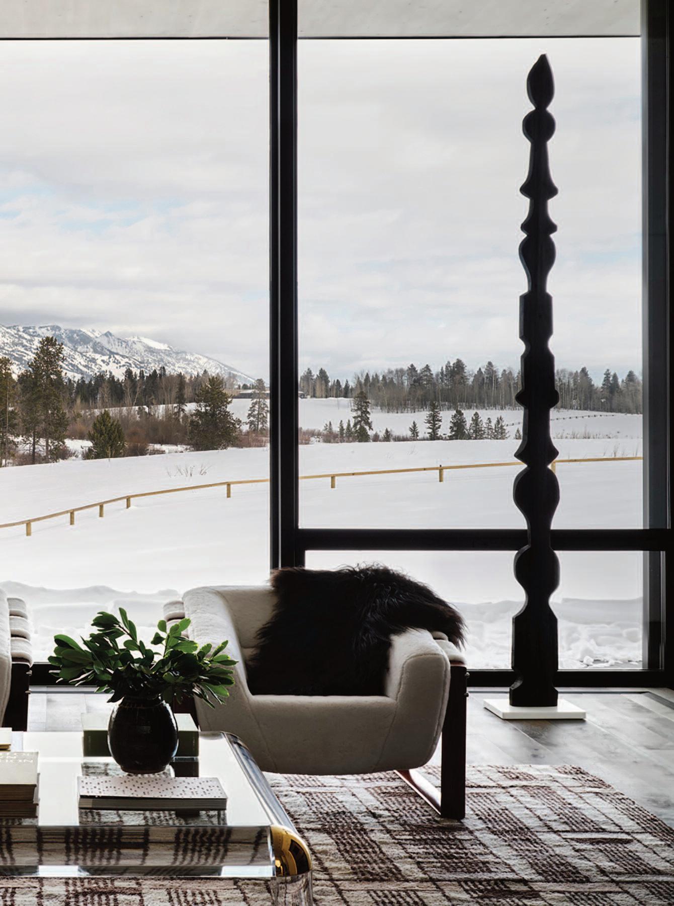
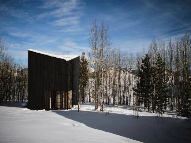
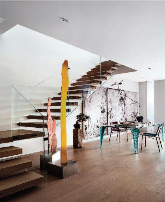
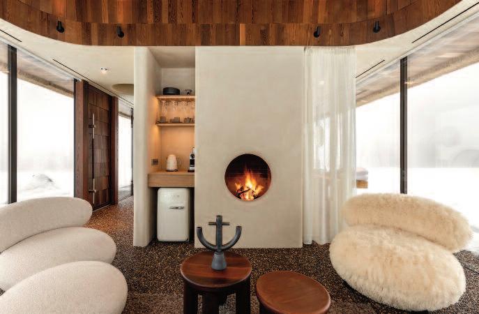
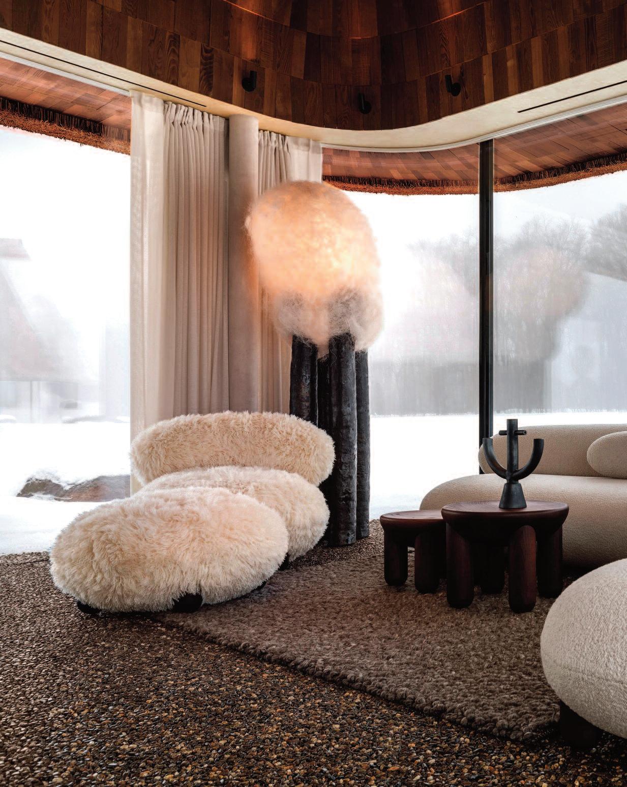
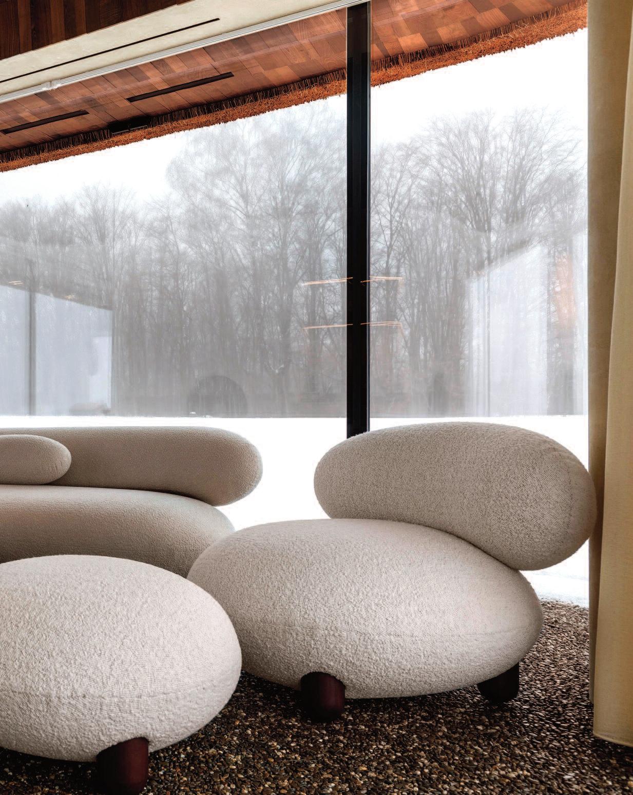
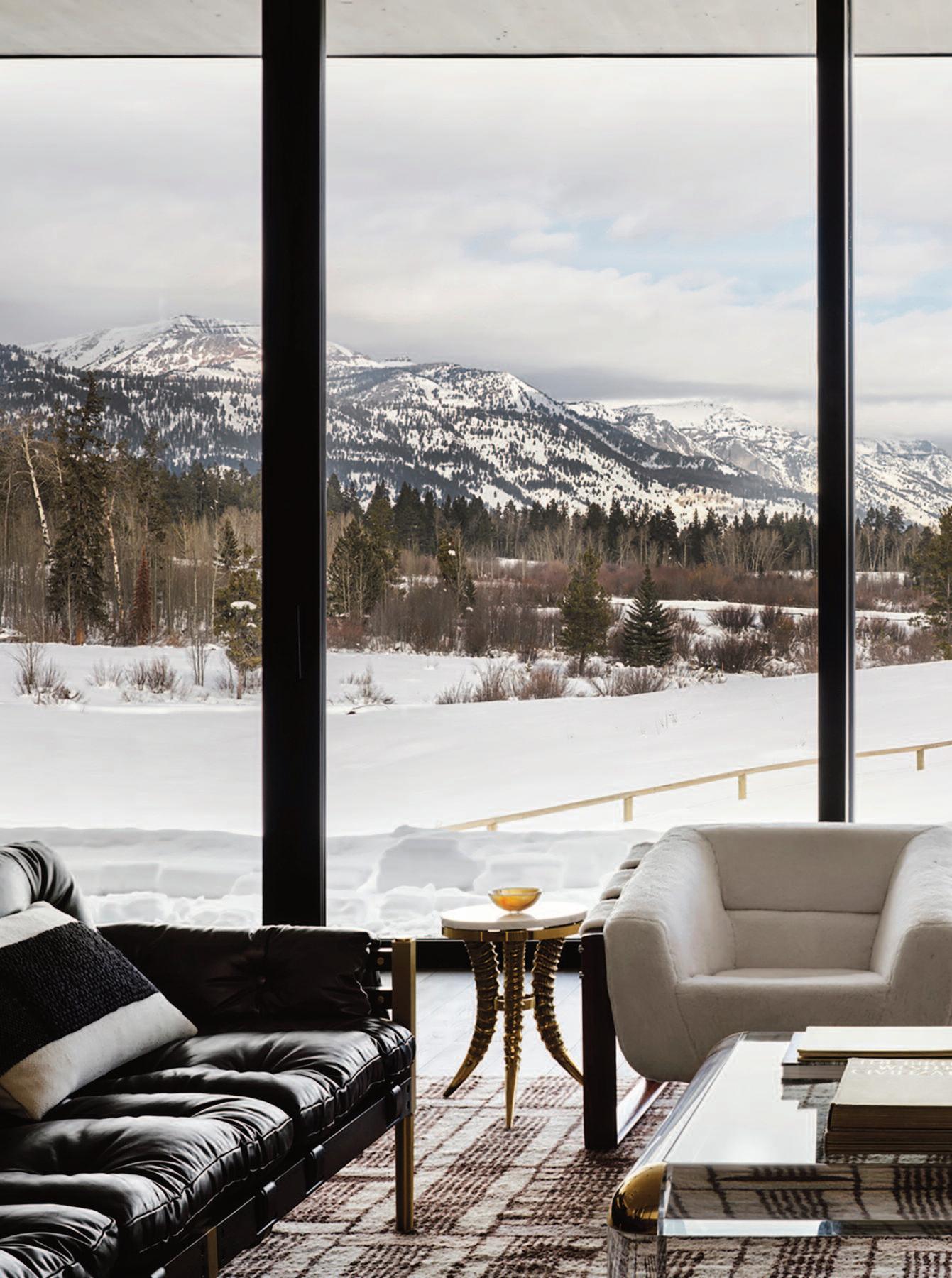
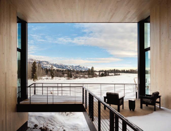
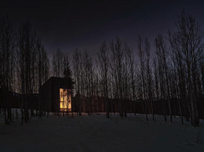
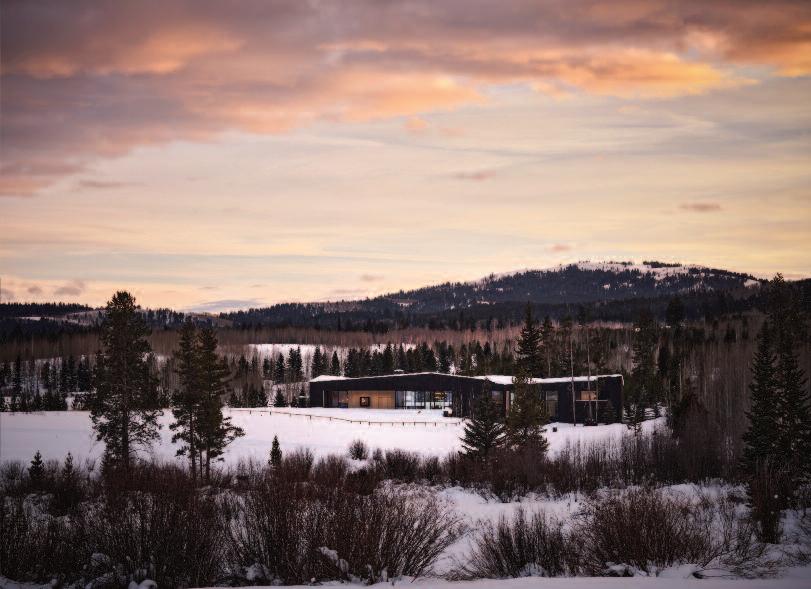
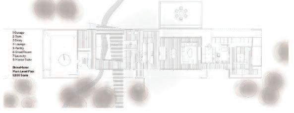
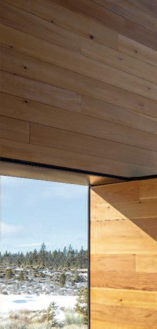
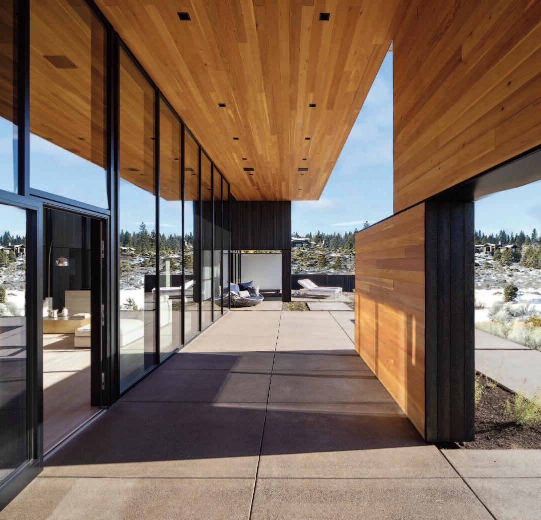
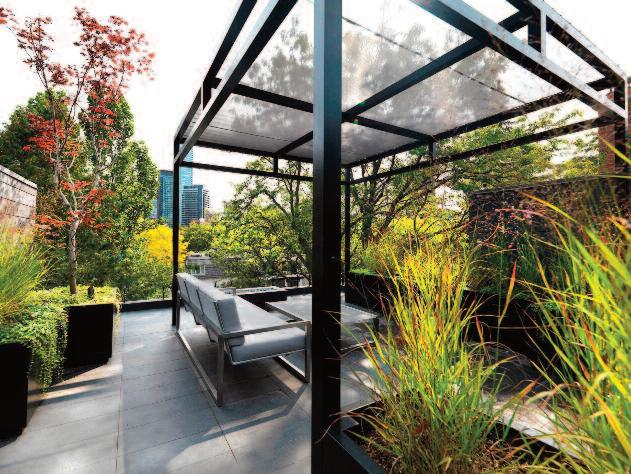
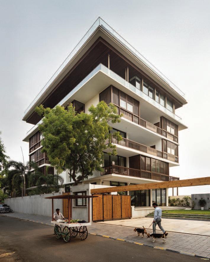
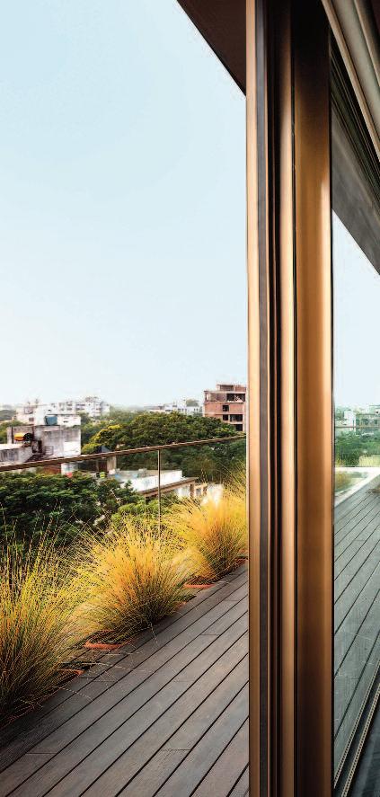
These pages: the 35-acre property is set at the base of the Tetons, near Wilson, Wyoming, USA and encompasses several ecosystems, with old-growth forest merging into stands of young pine and aspen trees before transitioning into rolling meadows. Composed of three buildings (m ain house, guest house, and writer’s studio), the home is arranged as a set of simple box-like volumes, each designed in response to its specific location.

Set against a series of undulating tectonic formations near Wilson, Wyoming, this mountain residence occupies a remarkable 35-acre site at the base of the Teton Range The property encompasses a diverse ecological landscape, where old-growth forest transitions into young stands of pine and aspen before opening to expansive rolling meadows. The homeowners authors and founders of an independent record label based in Mill Valley, California envisioned a nature-centered retreat in Wyoming to support their writing practice. The project was designed by CLB Architects, with interiors by HSH Interiors.
The compound comprises three primary structures: a 6,000-square-foot main residence, a 1,577-square-foot guest house, and a 580-square-foot writer’s studio. Each building is expressed as a refined, rectilinear volume, carefully positioned in response to its immediate landscape context The main house, situated at the threshold between meadow and forest, is conceived as a geological remnant embedded within the terrain. The guest house and studio are set within the wooded environment,
fostering a more intimate relationship with the surrounding forest. A fourth, contemplative structure is planned for a site further to the south
The architecture emphasizes openness and connection to the environment, offering sweeping views of the Teton Range, surrounding forests, meadows, and native wildlife Rectilinear in plan, the main house appears to anchor itself to the surrounding trees Its charred shou sugi ban exterior articulated through strategic carving and cantilevered overhangs reinforces a dynamic interplay between built form and landscape.
The entrance is positioned where the structure extends over a lowland creek, with transparency in the flooring revealing the water below. The dark wood exterior continues into the interior as light Atlantic cedar, which gradually transitions to refined plaster surfaces and expansive floor-to-ceiling glazing
Each window is carefully oriented to frame views of the prairie and the Teton peaks beyond. An east-facing fireplace offers a visual counterpoint to the panoramic

Architecture: CLB Architects
Eric Logan and Andy Ankeny, Principal/ Partners, Sam Ankeny, Principal and Leo Naegele, Project Manager.
Interior Designer: HSH
Interiors: Holly Hollenbeck
Contractor: KWC, Inc.
Landscape: Hershberger
Design
Lighting: Lux Populi. Civil Engineer: Nelson Engineering.
Structural Engineer: KL&A.
Mechanical and Electrical Engineer: Energy I and styling: SPI (Stephen Pappas)
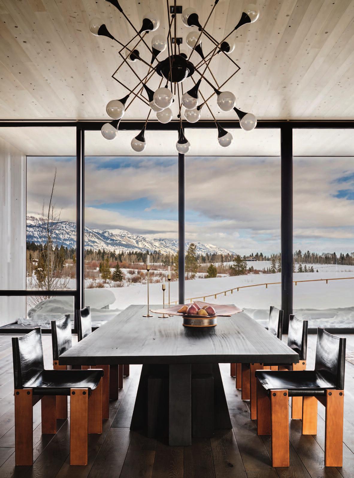
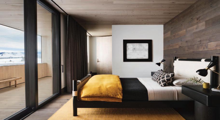
These pages: two of t he bedroom s an d a b athroom with windo ws frami ng th e views o f th e prairie and Tet on range beyo nd. To p right: detai l of th e main living area wit h a F uture Perfect floor sculpt ure. The con temp orary and vin tage fu rn ish ing is by 1 st dibs.


vistas, while a central courtyard introduces southern light into the heart of the home In addition to open kitchen, living, and dining areas, the residence includes three bedrooms, four bathrooms, a laundry room, and an expansive mudroom designed to accommodate the clients’ Irish wolfhounds
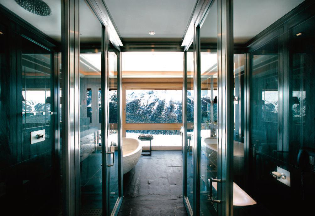
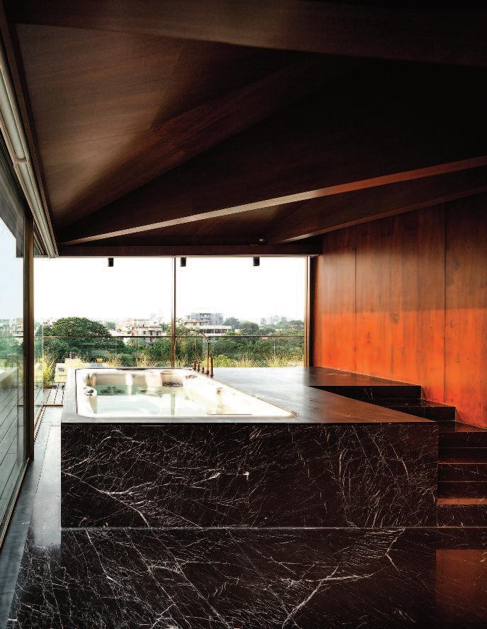
The material palette is defined by wood, steel, bronze, custom-cast white concrete, bleached cedar, and largeformat slabs of travertine and onyx. Italian limestone is featured prominently in the primary bathroom, where it forms both the flooring and a custom bathtub The tub was water-jet cut from a single block of limestone, creating a sculptural, monolithic focal point.
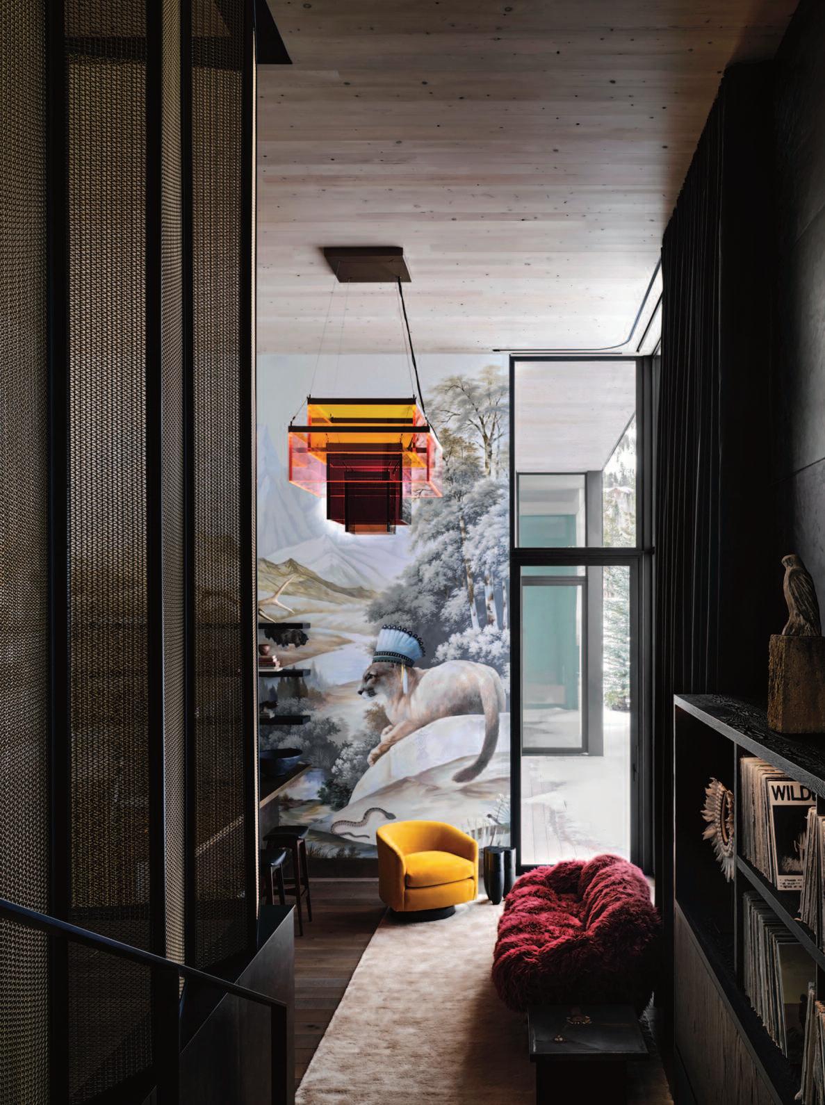
This marks the second collaboration between the interior designer and the clients Their bohemian sensibility and passion for music, literature, and the outdoors informed the design direction. Comfort, layered textures, and tactile materials are complemented by curated vintage
furnishings Artisan details elevate each space, including a custom-designed, tattoo-inspired bas-relief concrete fireplace surround, hand-painted wallpaper murals, and recurring geometric motifs. An earth-toned palette is enriched by collectible objects, vintage finds, and contemporary artwork
Located just steps from the main residence, the threebedroom guest house echoes the carved entry and rectilinear language of the primary structure. Beyond it, the writer’s studio offers a more formal architectural expression The studio includes a living area on the ground floor and a dedicated workspace above Its material palette aligns with the broader compound, incorporating wood, steel, bronze, custom-cast white concrete, bleached cedar, and substantial slabs of t ravertine and onyx Italian limestone is again featured in the primary bath, including a custom monolithic bathtub carved from a single block, reinforcing the project’s sculptural and material continuity.
These pages: the common kitchen, living, and dining space. The earth-toned palette is punctuated by collectible pieces, vintage finds, and contemporary art. The chandelier is by Jean Marc Frey
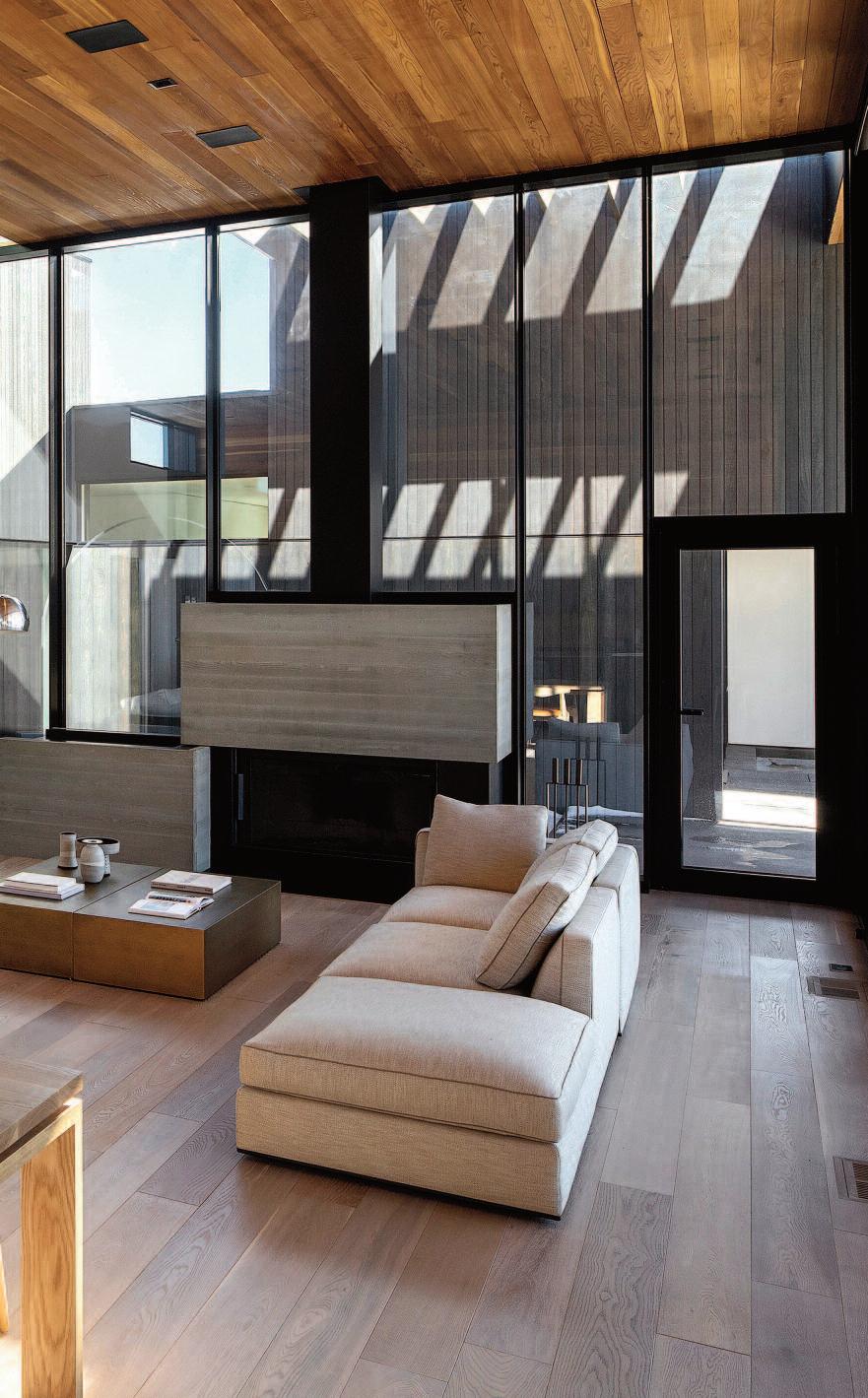
C O M E S N O W
O R C O M E S H I N E
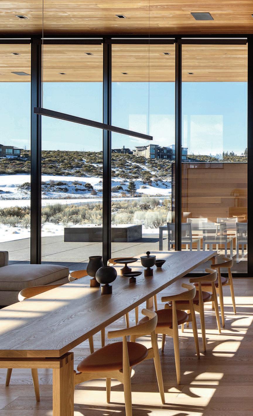
These pages: th e dini ng and kit chen area o f th e High Desert Hou se d esign ed by t he Hack er Design Team in Oregon, USA. Phot os: Jerem y Bitt erm ann.
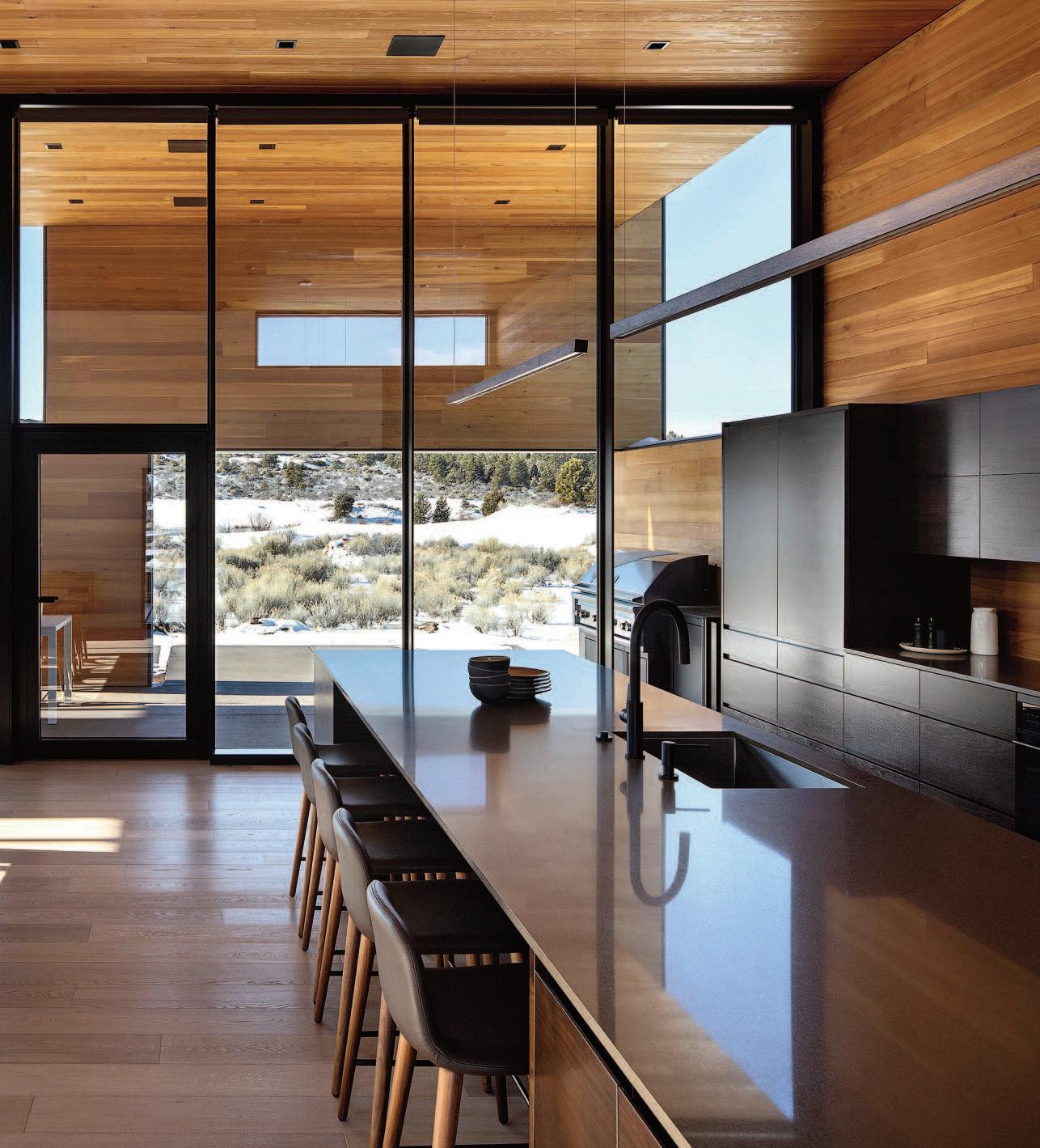
Th ese p ages: the same ced ar used for th e exterio r is al so carried through out the i nteriors, app earin g conti nuou s t hrough the glass from many an gles and strength ening t he indoo r- out door ex perience.
e project embodies a sense of calm and ref ug e, defined by a deliberate balance bet ween landscape and sky
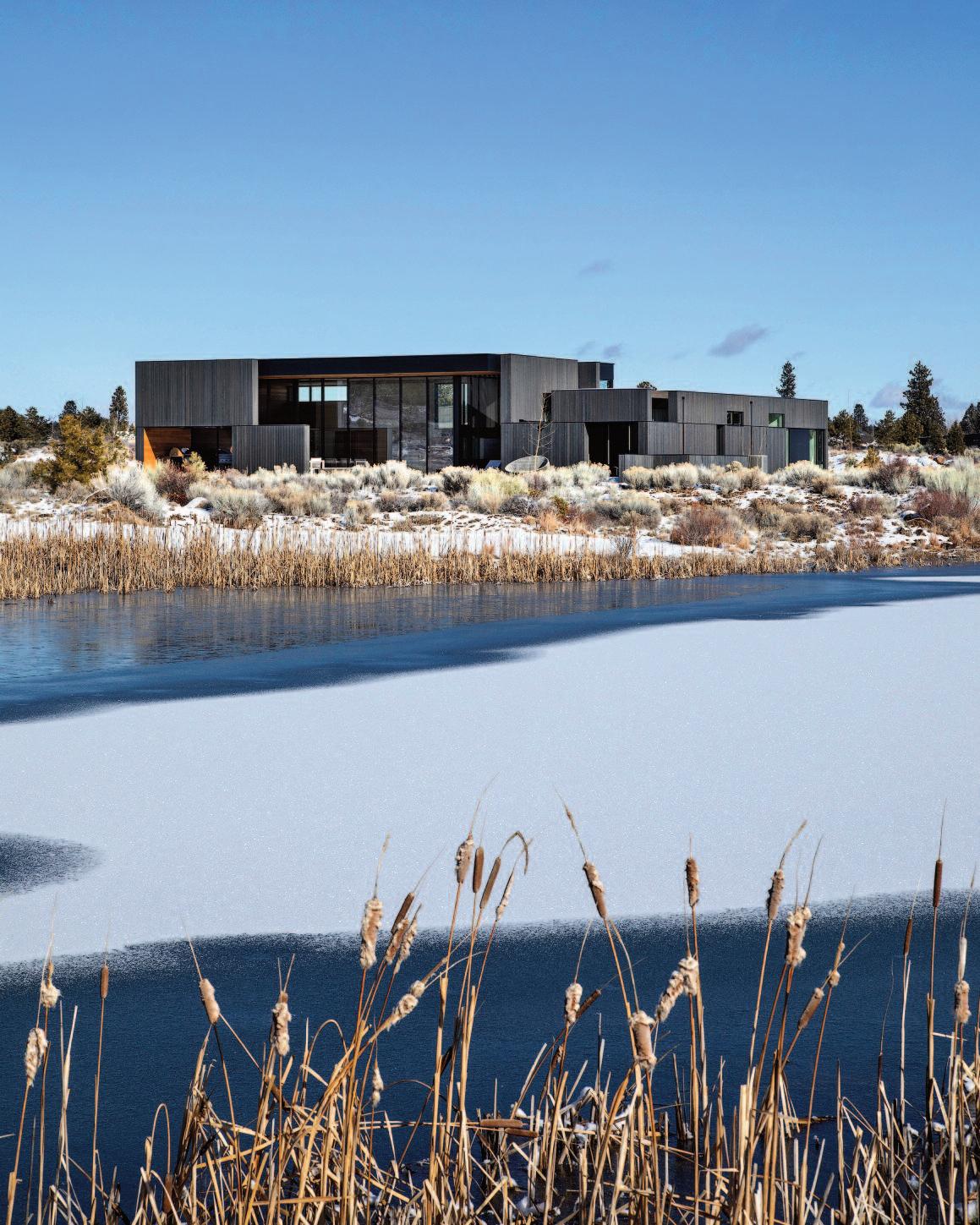
e 4,300-square-foot, four-bedroom Hig h Desert Residence, desig ned by the Hacker Desig n Team, ser ves as a weekend retreat that caref ully balances private accommodations with shared living spaces.
Located near Bend, Oreg on, USA , the residence is deeply influenced by the natural forms, colors, and textures of the hig h desert environment. Geolog ically young , this distinctive reg ion of the Pacific Northwest bears visible traces of recent volcanic activit y from the pure g eometr y of cinder cones to expansive lava flows
and sharply defined mountain rang es Above, the sky is vast and dramatic , shiing from cloudless deep blues to vivid sunsets over the Cascades, punctuated by seasonal extremes including intense hailstorms and heavy winter snow fall. Tog ether, the land and atmosphere create a landscape marked by clarit y, freshness, and a distinctive sensor y presence
e exterior composition of cedar, steel, and g lass establishes a bold yet g rounded presence within the shrubby volcanic terrain. From a distance, the cedar-clad planes read as monolithic forms ; at closer rang e, natural variations in color, texture, and g rain re veal a org anic


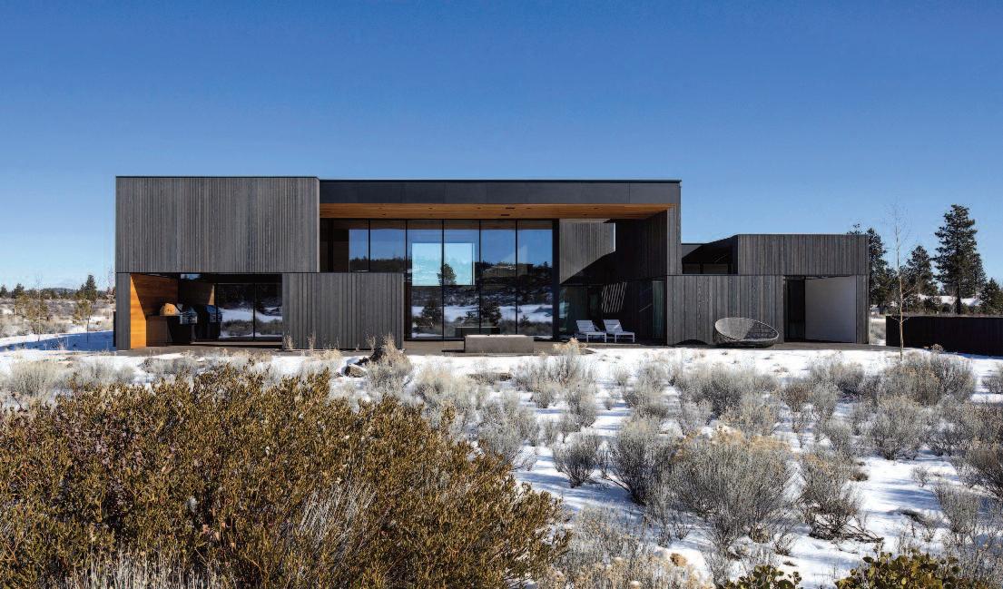
richness that anchors the house to its surrounding s e architecture is intentionally restrained, shaping and refining the relationship bet ween land and sky.
Caref ully positioned planes and opening s frame views in e ver y room, offering both g round and sky perspectives throug h separate apertures is approach emphasizes the immediac y of desert flora and fauna in the entr y court yard and g arden, extends sig htlines to distant hills, and draws the e ye upward to the expansive desert sky. Interior spaces are defined throug h the strateg ic placement of opaque elements rather than f ull enclosure, allowing g enerous volumes to retain a sense of intimac y
e exterior cedar continues inside, creating material continuit y throug hout the home A restrained palette of white, black , and natural wood provides a timeless setting for the owners ’ collection of mid-centur y f urniture.
Desig ned to keep both residents and g uests g rounded and present, the Hig h Desert Residence prioritizes simplicit y in operation and maintenance. Analog solutions are favored over complex technolog ies, ensuring that the home remains intuitive, comfortable, and accessible without the need for specialized knowledg e or instructions
These pages: the l iving area is defined by op aque elem ents rat her than actual physical enclosure, so t hat t he volumi nous room can also provide a sense of int imacy
The Hacker Design Team consist ed of Co rey Martin, design princip al, Jenn ie Fowler, in terior design principal Nic Sm ith, project arch itect / manager an d Jeff Ernst, project designer. Archit ecture and In teriors: Hacker
Con tractor: Kirby Nagelho ut Con st ru ction
Structu ral En gineer: M adden & Baughm an.
These pages: th e sim ple, shi ftin g exterior p lanes and windo ws are carefully aligned so that every ro om h as a f ram ed view to bot h land and sky. The ext erio r of cedar, steel , and glass give the Hi gh Desert Resid ence a bo ld presence in the shrub by, vo lcanic lan dscap e.
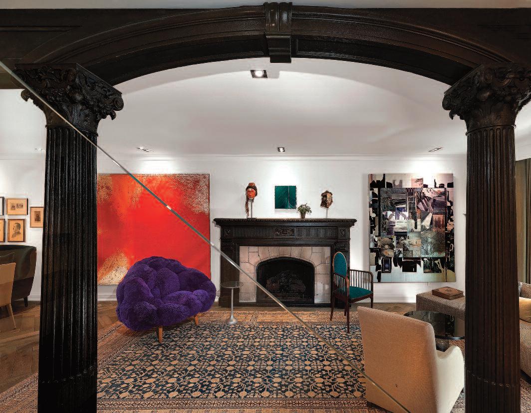
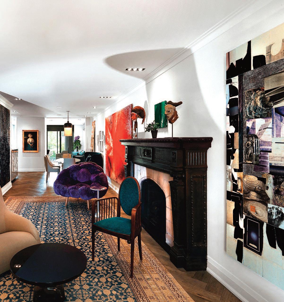
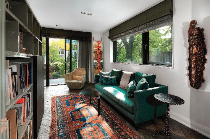
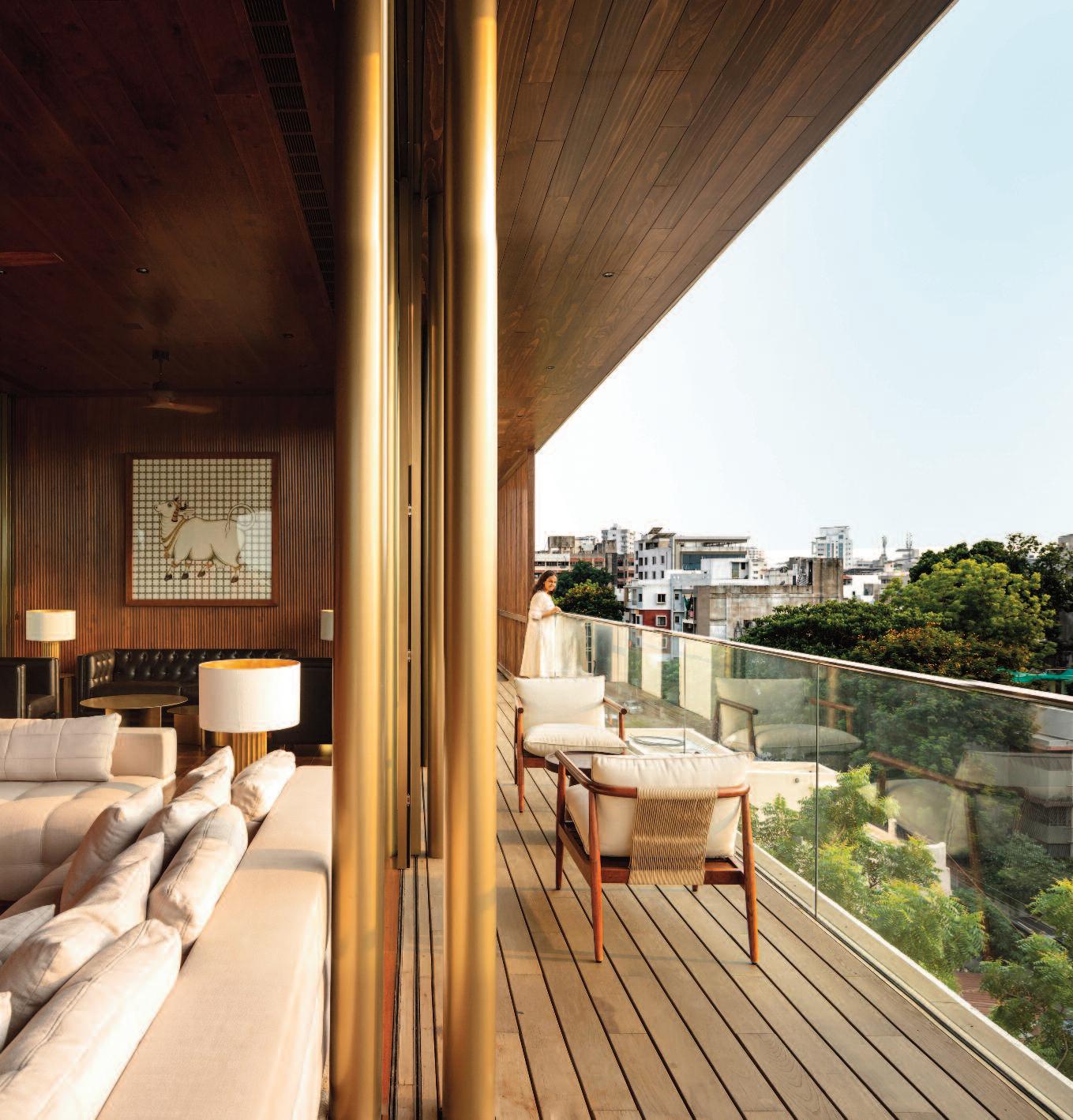
The original fire-place view is framed by Corinthian blackened arches saved from the demolition and restored. The contemporary art collection is curated over several decades The red canvas is by Hermann Nitsch, the artwork with lavender highlights is by Huma Bhabha and the green work is by Jason Martin. The beaver chair is Campana Brothers, limited edition 18c. Iranian carpet by Doris Leslie Blau. Beside that: Camapana Brothers’ buffet reflects art by Peter Doig. Ancestral portrait of a European nobility adds to the overall enigmatic visuals. On the right: the private garden at the back of the house.
Photos: Hans Fonk.

e house is locate d in one of Toronto’s most upscale neig hborhoods, Canada . Surrounde d by lush veg etation and mature tre es, it remains larg ely conceale d from view for much of the year
“It is like a self-containe d, four-stor y New York penthouse private and completely out of sig ht,” says Alexander “Sasha” Josipovicz , Creative Dire ctor of Studio Pyramid, who desig ne d the interiors.
The homeowner is an enigmatic European noblewoman and one of the most respected art collectors in the international art world For over 20 years, she has been Studio Pyramid’s muse, a loyal friend, and a frequent travel companion from Beverly Hills and José Ignacio, Uruguay, to Nice, New York, and London
According to Milosh Pavlovicz, Chief Architect at Studio Pyramid and lead architect on the project, the architectural transformation preserved the home’s traditional character while introducing a sandblasted brick façade at the front From another perspective, the house reveals an unexpected façade composed of sleek, light-gray concrete planks (Oko Skin), contemporary sliding glass walls and railings
“This house inspired us to respond to its constraints by building upon its existing narrative and creating a comprehensive integration of architecture, interior design, art, and landscape,” says Milosh
“Maintaining the client’s privacy was a priority,” explains Elaine Tan, Senior Interior Designer at Studio Pyramid. “We therefore created two separate entrances. The sloped site allowed us to place the public entrance on the second level, facing the main street.
The private entrance is located on the first level at the rear of the house and is accessed via a long, lushly landscaped pathway almost like those found at Tuscan summer homes.”
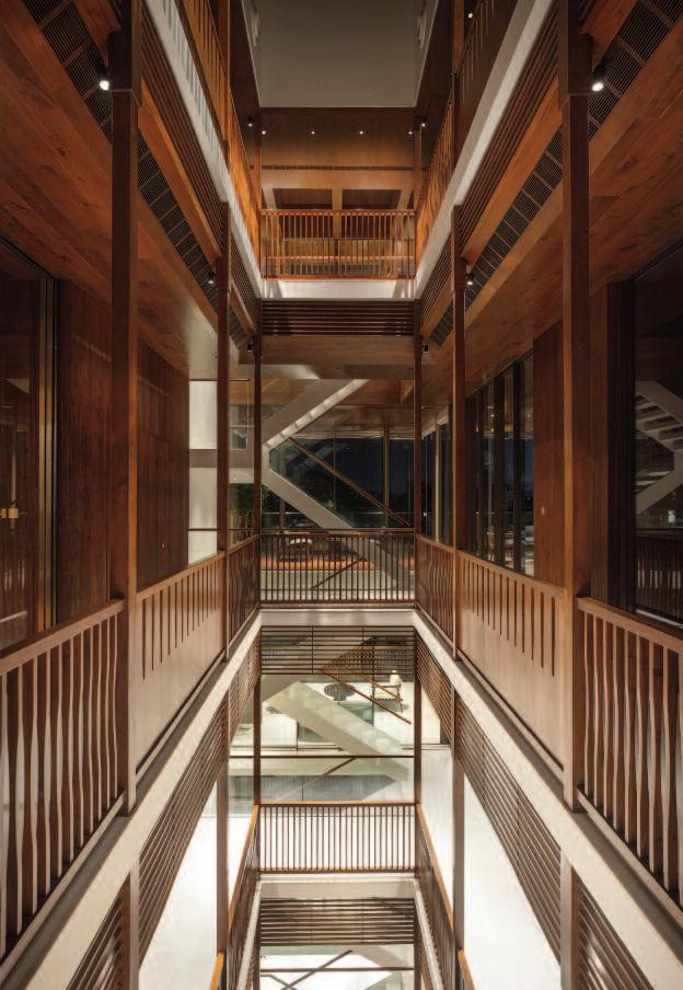
The four-story interior is connected by a newly added elevator and open-riser stairs with glass balustrades, clearly distinguishing the original structure from the new additions. A rooftop
Top left: the Arclinea kitchen and the main bathroom cladded in marble slab with Claybrook free standing tub and Fantini stainless steel faucets. Crustal light pendant is by Christopher Boots. Beside that: the family room overlooking terraced backyards. Sofa by Molteni &C, art totem by Hermann Nitsch and the Syrian mother of pear family heirloom table is pared with African mask. On the right: the new rooftop terrace.
Below left: dining room with Emmobilli Ufo table, Maxalto chars and custom made banquette with family photos above.
Chandelier by Apparatus, buffet by Campana Brothers with Peter Dog art above. In the background art by Rashid Johnson. Beside that: the master bedroom, reachable by elevator, with Camapana Brothers’ day- bed, alabaster chandelier by Pierre Chareau and gold clad initials of the house owner.
Bottom right: Sasha Josipovicz in his modeling years.

hideaway garden with panoramic skyline views was also introduced.
“The idea behind this approach reflects our strong belief that adding contemporary elements and functions to a traditional house reinforces its original design and construction, while honoring its roots,” says Milosh.
For the interior renovation, Sasha’s design compass was guided by the client’s passion for powerful art and originality in furnishings. The creativity of the Campana Brothers proved to be the perfect match for these demands.
Edra furnishings were combined with family heirlooms, including an oversized silk tapestry depicting a battle between her AustroHungarian ancestors and warriors of the Ottoman Empire.
Sasha recalls: “During one visit, a mutual friend a prominent scholar from Istanbul remarked to the client with admiration, ‘Baroness, I believe some of my family’s heads are displayed as trophies on your family’s swords.’
Her bold response was, ‘Did you notice the embroidered squid decoration? You know, we ruled all the way to the Adriatic.’”
“This house holds a long and deeply personal history for me,” Sasha adds. “In the early 1980s, it served as the office of my former modeling agent, Judy Welch. I auditioned here for my first job and got it. Balancing full-time university studies with the demands of modeling could not last, so I chose education, without regrets.
My creative career eventually took me around the world it was meant to be.”


Italian elegance lies at the heart of the interior design of 830 Brickell, created by Iosa Ghini Associati The building in Miami’s financial district with its premium office spaces spread over 55, floors stands as a new architectural landmark, distinguished by its contemporary and forward-looking design
: t
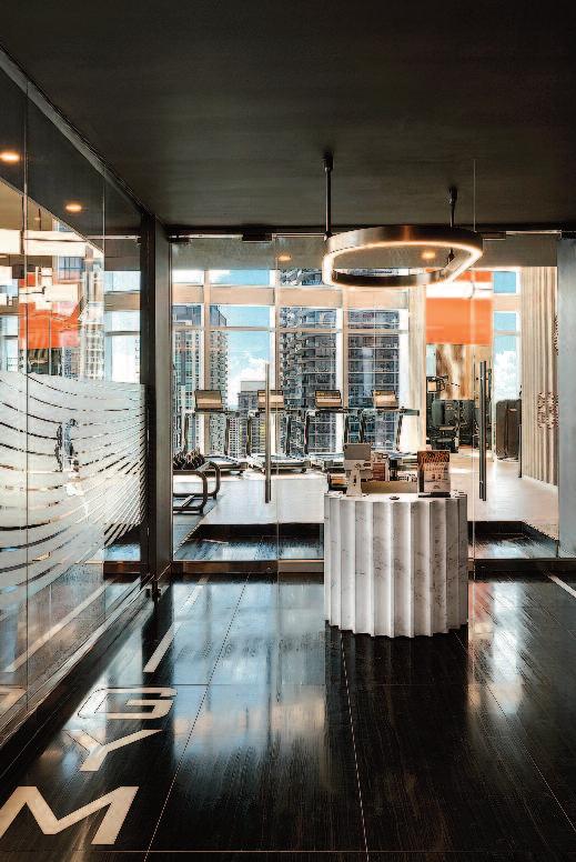
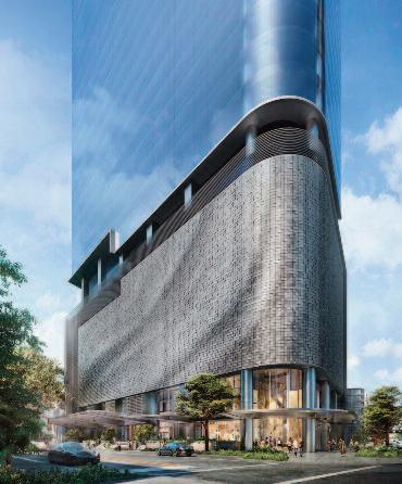
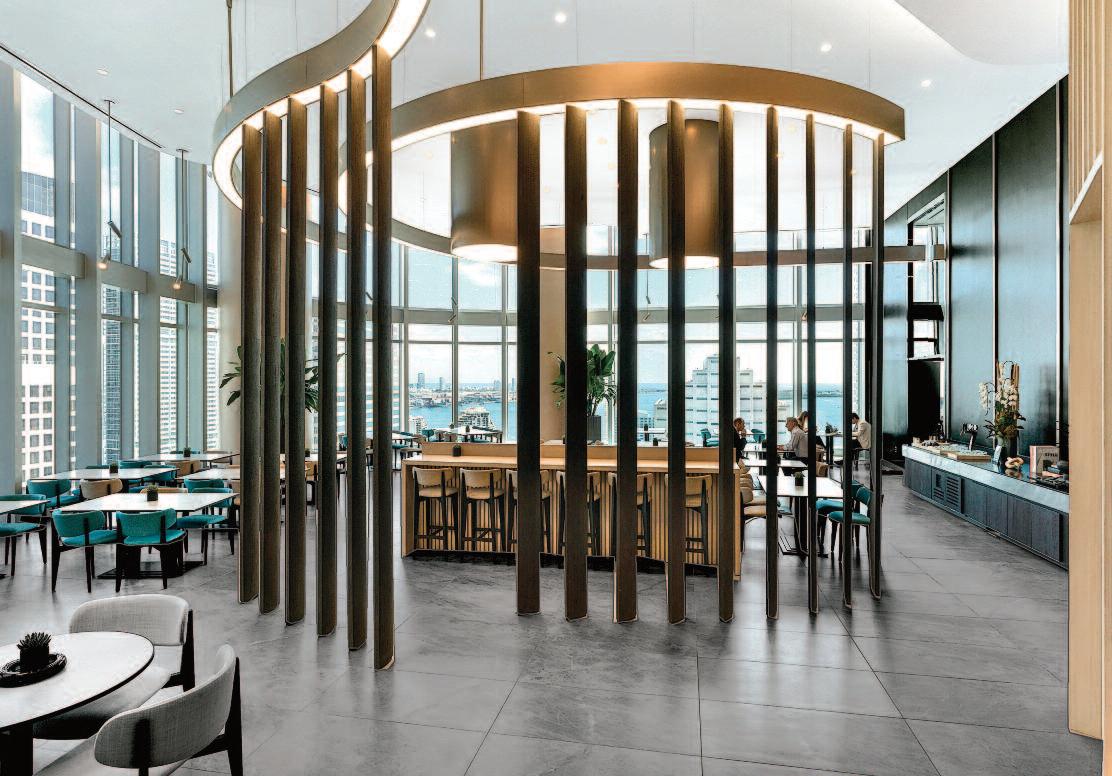
Abo ve: th e conf eren ce cen ter and sky lobby wit h t he corpo rat e rest aurant an d a pan oramic view. Cent er: The gym goes b eyond the t rad ition al co ncept of a fitness en viro nmen t, em bracing visual conti nuity free of d ividing wall s. Left : 8 30 Brickell designed b y Adrian Smit h + Gordo n Gill Archi tecture
The project rekindles the long-standing creative partnership between two visionary figures, Vladislav Doronin and Massimo Iosa Ghini, who have collaborated on major international projects since 2008.
A harmonious dialogue between Adrian Smith + Gordon Gill Architecture, authors of the architectural project, and Iosa Ghini Associati, responsible for the complete interior design, proved to be a decisive and synergistic factor in the project ’s success The Italian studio was c ommissioned to shape the interiors, bringing its distinctive fusion of elegance, dynamism, and architectural poetry

The interior concept interprets a new vision of urban aesthetics, translating the building’s futuristic architectural language into its interiors through a refined continuity of light, form, and materiality.
Massimo Iosa Ghini’s approach reflects a strong commitment to Italian manufacturing excellence, integrating Italian design solutions and products throughout the project In doing so, the architecture becomes both an ambassador and a driving force for Italy’s design expertise and craftsmanship
Massimo Iosa Ghini states:
“As Ambassador of Italian Design I imagined spaces
with great aesthetic impact, inspired by the forms and materials of nature From the main lobby up to the 32nd floor, every detail has been designed. I combined bold, tactile textures such as convex slatted walls with a refined simplicity: finely crafted wood paneling, noble finishes, and sculptural elements
The result is a series of distinctive spaces that together define the soul of 830 Brickell ”
Developed by OKO Group, the iconic tower is the first new office building to rise in Brickell in more than a decade
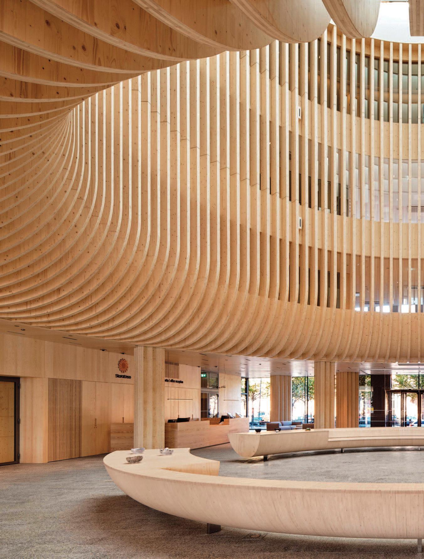
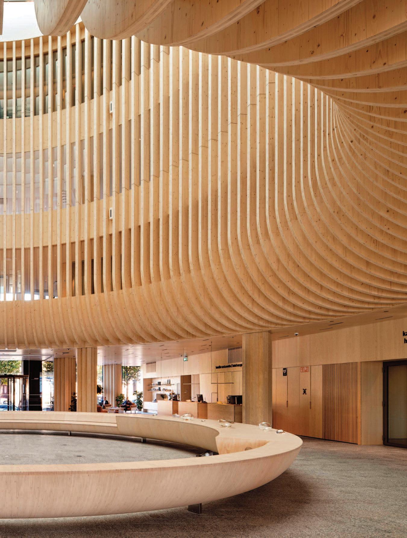
The project demonstrates the potential of wood construction within a sensitive urban context. Katajanokan Laituri is a solid timber office and hotel building located on Helsinki’s formerly industrial waterfront in Finland. The project was designed by Anttinen OivaA rchitects, with interior design by Stora Enso and the design of the premises and main lobby by Anttinen Oiva Architects.
The building was conceived as the new headquarters of the leading Nordic forestry company Stora Enso, with approximately half of the building occupied by a hotel. It comprises four aboveground floors, a publicly accessible green rooftop terrace, and a basement containing technical facilities and parking.
Photos: Kalle Kouhia and Tuomas Uusheimo.
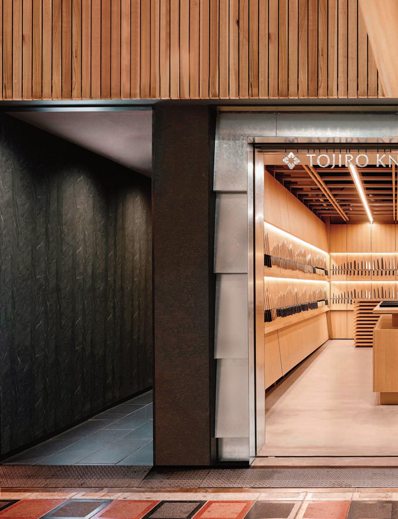
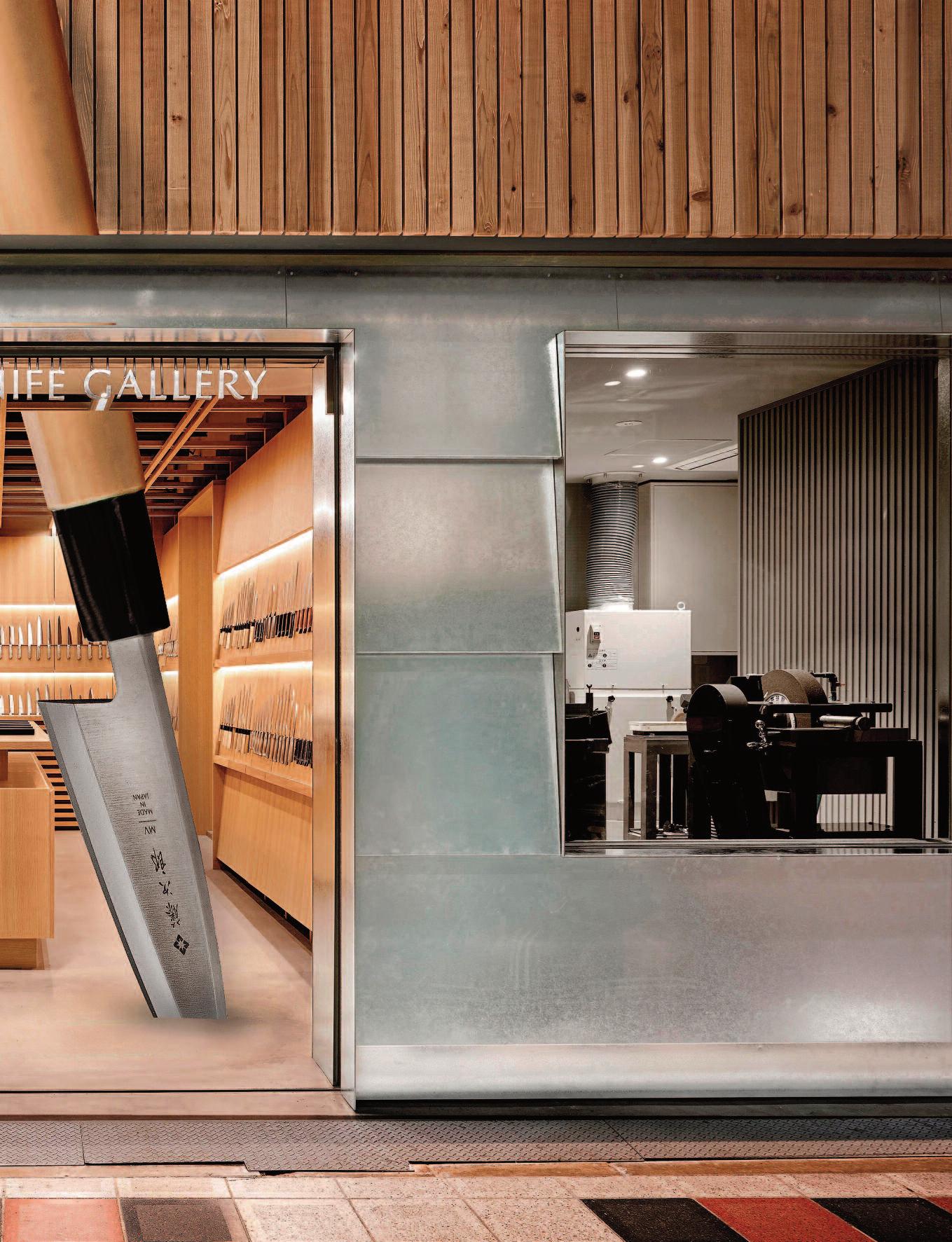
Design led by Japanese creative director Yoshihito K atata of K atata Yoshihito Design, the Tojiro Knife Galler y Osaka is located in Osaka’s historic kitchenware district. e galler y reinterprets Japanese cutler y culture through a contemporar y spatial lang uage. It integrates a knife retail area with an open maintenance workshop, allowing visitors to obser ve sharpening and repair processes performed by skilled crasmen. is transparenc y reflects the Japanese respect for tools, longevit y, and sustainable use.
A defining architectural feature is the reinterpretation of yoroi-bari, a traditional Japanese constr uction technique, transformed into a bespoke knife display system.
e knives appear to float against wooden panels, secured by concealed magnets and precise str uctural detailing that caref ully balances safet y, f unctionalit y, and visual tension. e project received a Dezeen Award in 2025. Photo : the large knife is NOT par t of the original design nor image by Masaaki Inoue.
space and created a central courtyard and transformed a previously dark and enclosed space into a lightfilled retreat.


i a n o u s e
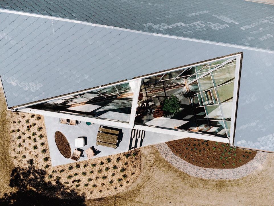
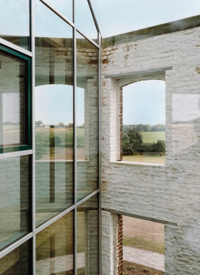
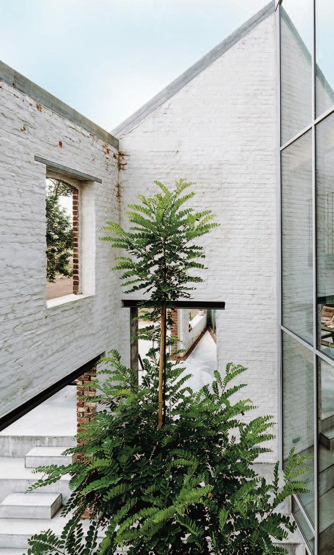
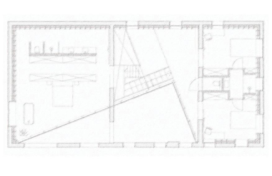
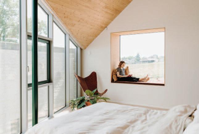
Located in the green countryside of the village of Pepingen, less than 30 kilometres from Brussels, Belgium, an old barn has been transformed into a contemporary and sustainable 312 m² residence Designed by OYO Architects, with offices in Ghent, Belgium, and Barcelona, Spain, the project is distinguished by a striking architectural intervention: a triangular cut carved into the original volume forms an inner courtyard that floods the house with natural light while creating a fluid transition between interior and exterior The project was named Lyco House
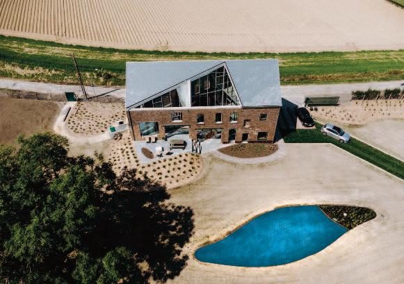
The main challenge of the project was to reconfigure the interior of the old barn without altering its existing façades. By removing part of the building’s volume, the architects reshaped the spatial organization and introduced a central courtyard, transforming what was once a dark and enclosed structure into a light-filled retreat.
Throughout the renovation, OYO Architects carefully respected the building’s integration within the rural landscape While the street façade retains the appearance of a traditional barn, the rear façade reveals the unexpected contemporary transformation.
The architects explain: “ We aimed to balance the need for a homely and secure interior atmosphere while preserving the exceptional views of the surrounding landscape, framed through both existing and newly introduced window openings ”
The interior of Lyco House is organized through a dynamic interplay of levels, mezzanines, and double-height spaces. These are connected by a custom-designed geometric green steel staircase by Atelier Manus, which links the bedrooms to the living spaces, the kitchen to the garden, and the living room to the elevated terrace urther blurring the boundaries between inside and outside
The living spaces revolve around the kitchen, which features a large salmon-pink island as a central focal point. The light pine ceiling and polished grey concrete floors contrast with the darker tones of the bespoke furniture crafted by ‘Hout en Interieur ’ .
A few steps above the kitchen, the living room occupies a slightly elevated level and is defined by its wooden ceiling and large windows opening onto the outdoor terrace Furnishings in neutral tones are complemented by subtle accents of green and terracotta, creating a warm, natural, and balanced atmosphere
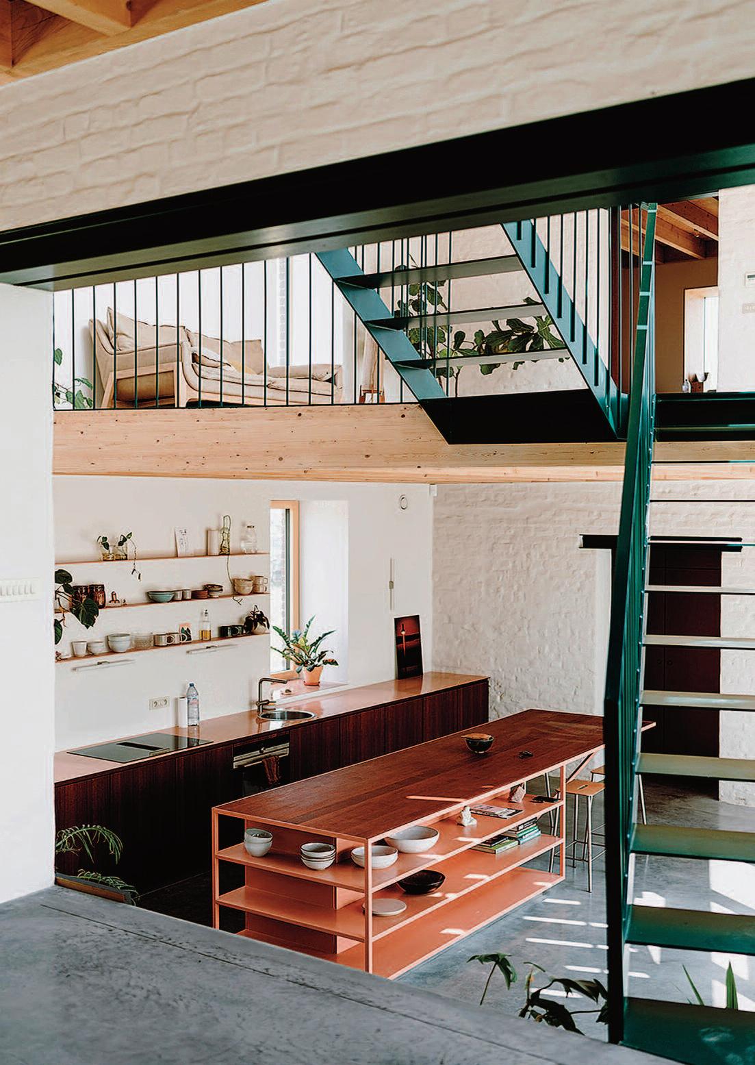
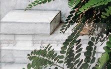
These pages: the pine wood of the ceiling and the polished grey cement contrast with the darker wood of the custom-made furniture by the carpenter ‘Hout en Interieur’. The living room has large windows that give out on the outdoor terrace.
OYO Architects is led by Ferran Massip, Nigel Jooren, Eddy Soete, Veroniek Vanhaecke and Lies Willaert.
To ensure thermal comfort, sustainability, and energy efficiency, the renovation incorporated ecological and circular materials throughout the construction process.
The former asbestos roof was completely removed and replaced, and solar panels along with energy-efficient technologies were installed.
The landscape design by Denis Dujardin plays a fundamental role in shaping the project ’s setting Through the use of local vegetation, the garden achieves a seamless and respectful integration with the surrounding rural environment. In addition, an ingenious and discreet rainwater management system channels excess water into a natural pond, where it is purified and gradually filtered back into the ground.
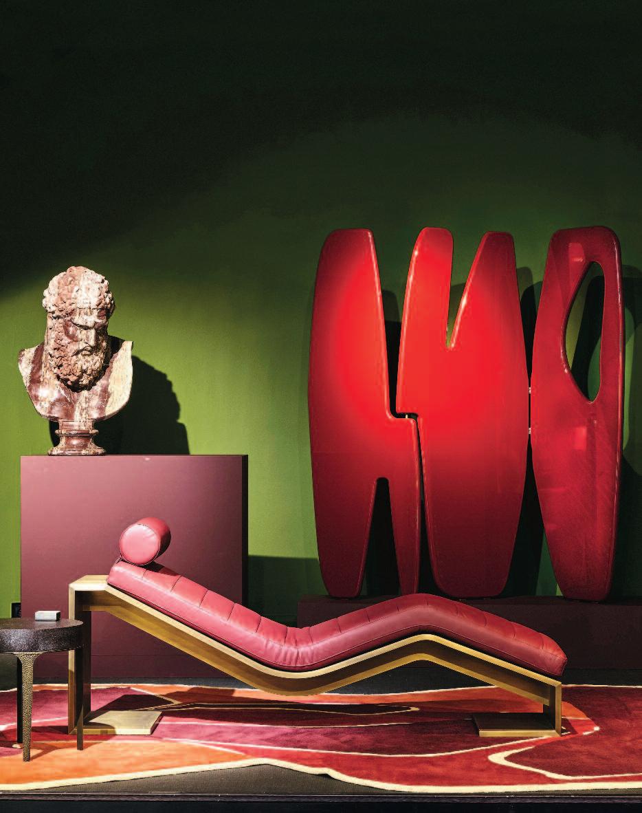
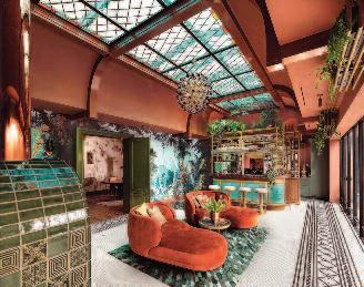
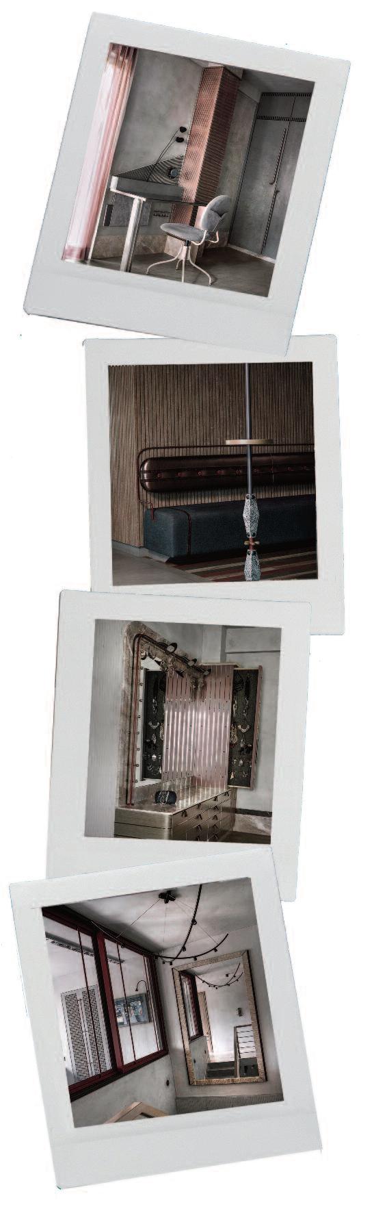
On the occasion of Maison&Objet In the City Paris, 2026, the Secret Gallery presented Beauté du Geste, an art and design exhibition bringing together furniture pieces by Reda Amalou Design and selected works of art. The exhibition highlighted craftsmanship and the mastery of materials, where gesture, material, form, and color enter into dialogue, situating Reda Amalou’s work within an artistic continuum where gesture itself becomes art. In addition, the Mobilier National in Paris has enriched its 2026 contemporary collections with two creations by Reda Amalou Design: the Panama II screen and the Ooma table. Photo: Mikael Benard

Above: Roelfien Vos, Owner and Creative Director of Roelfien Vos Exclusive Design. (Image courtesy of Roelfien Vos Exclusive Design.)
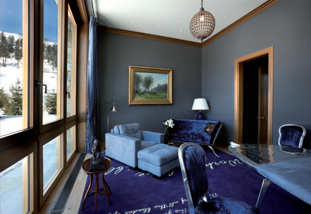
Right: The study features blue vintage armchairs sourced in Milan, a bench by Soho House, and a tiled fireplace designed by Roelfien Vos A antique room screen stands in the background. The curtain fabrics are by Pierre Frey, and the vintage glass table was purchased in Milan.
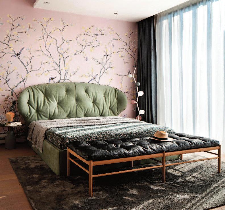
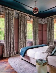
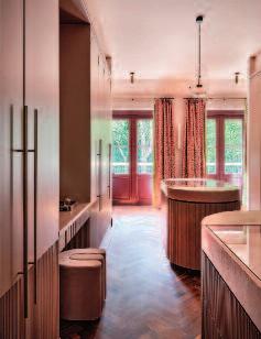
C O L O R I S Q U E E N
R o e l f i e n Vo s i n t e r i o r d e s i g n e r
e newly constructed residence on the North Sea coast of the Netherlands feels as though it has stood there for generations. Although entirely new, the villa blends seamlessly into its surrounding s.
e homeowners granted interior designer
Roelfien Vos complete creative freedom
eir sole directive was clear : push beyond the boundaries of imagination.
That ambition is expressed throughout the villa’s eighteen rooms, each distinguished by a colored ceiling that immediately creates a sense of intimacy.
The carefully orchestrated interplay of color between the various spaces establishes balance and harmony within the luxurious home.
Lavish aesthetics, opulent materials, glamorous lighting, and an exuberant use of color evoke the spirit of the R oaring Twenties reinterpreted through a contemporary lens.
Architecturally, the villa’s classic design aligns with the character of the surrounding neighborhood, despite being newly built from the ground up. The residence comprises an orangery with kitchen, lounge, and seating area, a formal dining room, a spacious living room, a media room, and a private office.
The first floor houses the master suite, complete with bathroom and dressing room, alongside two guest suites, each with their own bathroom and dressing area A full basement accommodates a wine cellar, billiard room, and playroom.
During the design process, several spatial adjustments were made to achieve a more logical and harmonious layout. Roelfien Vos was not convinced by the original positioning of the kitchen and proposed instead the addition of an
orangery, with the kitchen discreetly situated behind the bar wall. The homeowners embraced the revised plans, and the orangery was incorporated into the design, ultimately becoming the project ’s architectural focal point.
On the upper floor, significant modifications redefined the relationship between the master bedroom, bathroom, and dressing room, creating a more fluid and functional sequence of spaces. Even the family dog was thoughtfully considered: a bespoke opening was integrated into the marble skirting of the staircase, providing a discreet and charming retreat.
Reflecting on her overarching vision, Roelfien Vos explains that the clients approached her after seeing her work at an interior design exhibition. She was given full creative freedom, with a clear expectation that her distinctive vision would shape their home.
Her guiding principle was to translate unexpected choices into a cohesive and balanced whole achieved here through a deliberate interplay of color, materials, and form
She describes the result as an interior built on juxtapositions. Layering emerges through the dynamic relationship between color, materiality, and shape, where contrast ultimately creates harmony These creative interventions introduce character and depth, resulting
Above: the seating area in the orangery features a tiled fireplace designed by Roelfien Vos and produced by Quintalisque. She also designed the round sofa, upholstered in a fabric by Dedar. Right-hand page: The formal dining room includes a table acquired in Milan, chairs by Prades, a carpet by CC-Tapis, chandeliers by Barovier & Toso, curtains by Karin Sajo, and wallpaper by Londonart.
These pages: the pièce de résistance: the orangery at the rear of the house, complete with a bar and, beyond it, the kitchen. The chaise longues are by Wittmann, the carpet is by CC-Tapis, and the wallpaper is by Le Grand Siècle The pattern of the Winckelmans floor was designed by Roelfien Vos. The vintage chandelier was sourced in Paris.
the staircase, designed by
and crafted by
features a Carrara marble floor. The wall finish is by Arte. Center: the master bedroom and dressing area. (Images courtesy of Roelfien Vos Exclusive Interiors.) Right-hand page: the master bathroom includes a custom-designed pouf and bespoke cabinetry produced by Steega, as well as a bronze bathtub. Taps are by Samuel Heath, curtains by Karin Sajo, and the lamp is by Heathfield & Co
in a home that feels personal, rich, and timeless
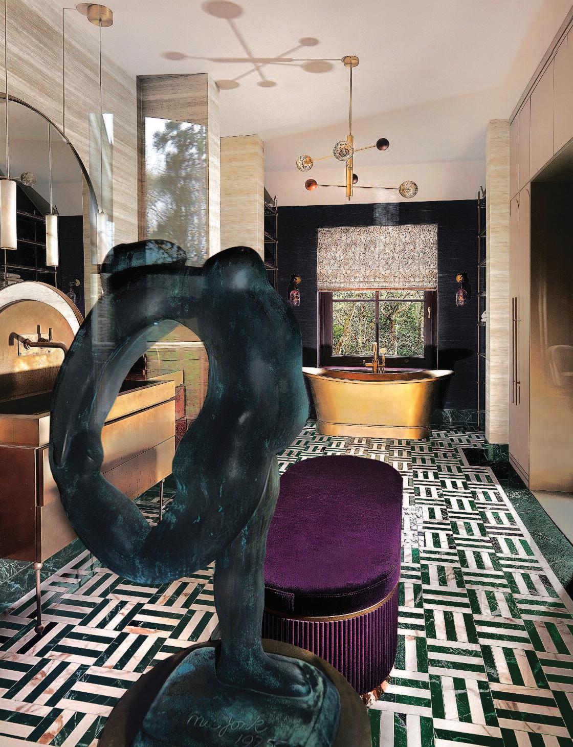
Subtle visual connections reinforce the design narrative throughout the villa. The deep purple of the oversized velvet pouffe in the master bathroom finds r esonance in a similarly hued wall in the media room, where it interacts with a ccents of orange and vivid blue.
Bold dark green-and-white geometric tiles define the master bathroom, centered around a freestanding brass bathtub.
In the living room, a Versailles-patterned parquet floor enhances the sense of classic grandeur, while handmade cognac-toned tiles from Quintalisque frame the mantelpiece.
These pages: The media room, located in one of the corners of the house, features furniture by Hamilton Conte and Bielefelder Werkstätten. Fabrics are by Rubelli and Élitis. The wall lights are by Heathfield, the table lamp is by Contardi, and the carpet is by CC-Tapis. The wall covering is by Métaphores.

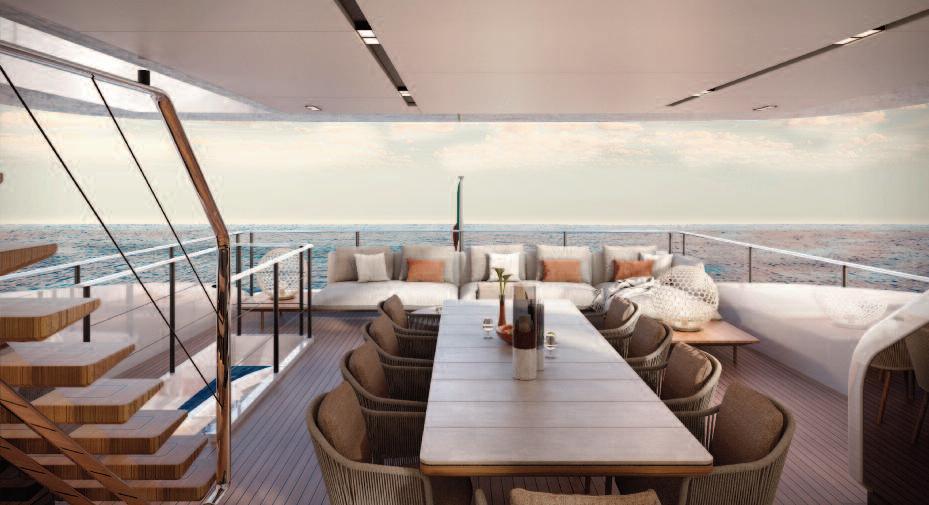
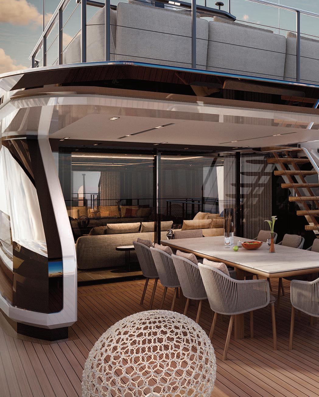
These pages: the plan ing tri -deck super ya cht Saetta 128. The new m ade-to-m easure prototype by Ital ian yac ht buil der Ferretti here i n i ts natu ral env ironm en t. In terior design is by ACPV A ra chitects A ntonio Ci tterio Patrici a Viel .


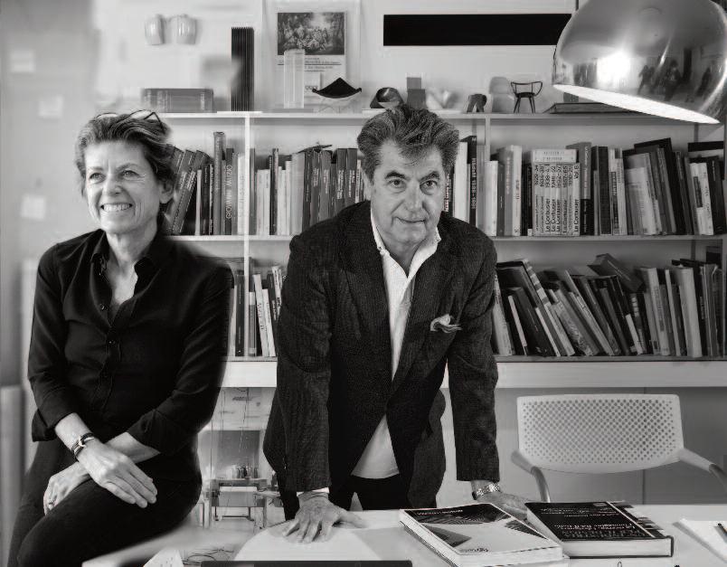

Above: Patricia Viel and Antonio Citterio in their Milan office. Left: architects Veronica Yien and Matteo Sassone, SY Design who designed the exterior. Below: the terrace, on the upper deck has a section shaded by the sundeck superstructure.
Right: the main deck salon contains the dining area. The floor-to-ceiling windows let natural light flood in and point up visual continuity with the exterior.
e tri-deck planing super yacht Saetta 128 is a new made-to -measure protot ype by Italian yacht builder Ferretti Group. Exterior st yling is by SY Desig n, while the interiors are desig ned by ACPV Architects Antonio Citterio Patricia V iel, with strateg ic consulting by Custom L ine Atelier, the brand’s in-house team of architects
e super yacht features sleek , sport y lines and offers g enerous volumes, panoramic terraces, and a seamless connection bet ween interior and exterior spaces Launch is scheduled for 2026 at the Ferretti Group Super yacht Yard in Ancona .
Characterized by innovative exterior st yling and refined interior desig n, Saetta 128 delivers
exceptional comfort and sophistication. e yacht measures 39 80 meters in leng th overall, with a ma ximum beam of 7.69 meters, and is built on a hig h-performance planing hull.
Custom L ine Saetta 128 is the result of a strateg ic vision aimed at expanding the brand’s rang e of planing yachts, combining st yle, performance, versatilit y, and a hig h le vel of personalization
e yacht is desig ned to ma ximize onboard livabilit y and optimize space distribution across all decks, balancing aesthetics with f unctionalit y.
e layout embraces eclectic desig n solutions, where interior and exterior environments interact in seamless harmony.

These pages: the main deck in a flowing design of window frames and ceiling cut-outs are in line with the sleek lines of the custom built furnishings and freestanding pieces, giving the project a strong sense of dynamism.

Patricia V iel, architect and co -founder of ACPV ArchitectsS Antonio Citterio Patricia V iel, comments :
“ e interior desig n is in sync with the sig nature sleek hull lines of the Saetta L ine.
e flowing desig n of the window frames and ceiling cut-outs, taken tog ether with the sleek lines of the custom-built f urnishing s and freestanding pieces, g ives the project a strong sense of dynamism.
e construction details are at once basic and refined, featuring exquisite cabinetr y and a meticulously tailored approach. e clean, pared-down lines tap into tradition, reinterpreted throug h contemporar y lang uag e and timeless eleg ance. ”
e yacht is arrang ed over three decks. e upper deck features a sky loung e with an additional enclosed salon, while the sundeck and main deck are desig ned to ma ximize c omfort and create versatile spaces for
rela xation and entertainment.
e cockpit includes a structural sofa integ rated into the transom
At the stern, on the lower deck , a multipurpose area can accommodate t wo water toys such as a Williams DieselJet 565 and a jet ski and can be extended via a swim platform
Powered by t win 2,638 hp MTU D13 M96L eng ines, the yacht reaches a top speed of 22 knots and a cruising speed of 19 knots. At an economical cruising speed of 11 knots, the yacht offers a rang e of approximately 1,000 nautical miles.
e planing hull delivers hig h performance with an optimal balance bet ween power and efficienc y. Cruising comfort is enhanced by trim interceptors and stabilizer fins, with optional g yroscopic stabilizers available to f urther reduce roll.
These pages: the main deck looking from the outside into the spacious living areas. The clean, pared-down lines tap into tradition, reinterpreted through contemporary language and timeless elegance.
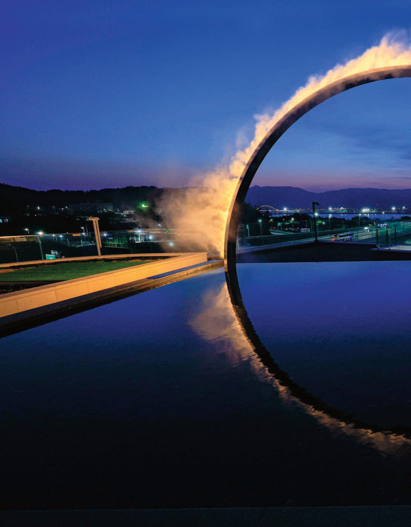
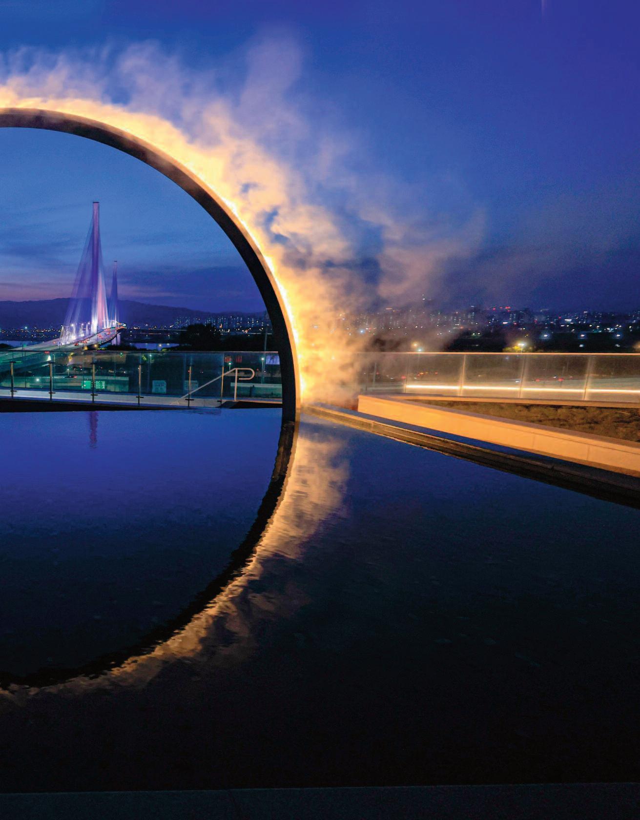
James Ta pscott unveiled a new Arc Zero: Eclipse artwork on a rooftop in Seoul, South Korea This elegant installa tion emplo ys mist and light to evoke a profound sense of the sublime, using ma terials dra wn from ever yday experience
As with much of Ta pscott’s practice, the work explores humanity’s rela tionship with na ture, offering a moment of quiet coexistence. To this end, he consistently fa vors the direct use of na tural, elemental ma terials ra ther than technological simula tions, resulting in delibera tely minimal works tha t deliver immersive, multisensor y experiences.
Based in Melbourne, Australia, Ta pscott recently received Design of the Year a t the prestigious LIT Awards, an interna tional competition recognizing excellence in lighting design
JT Studio
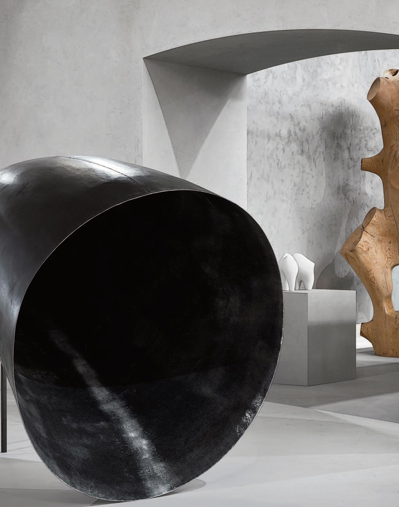
c u r a t i o
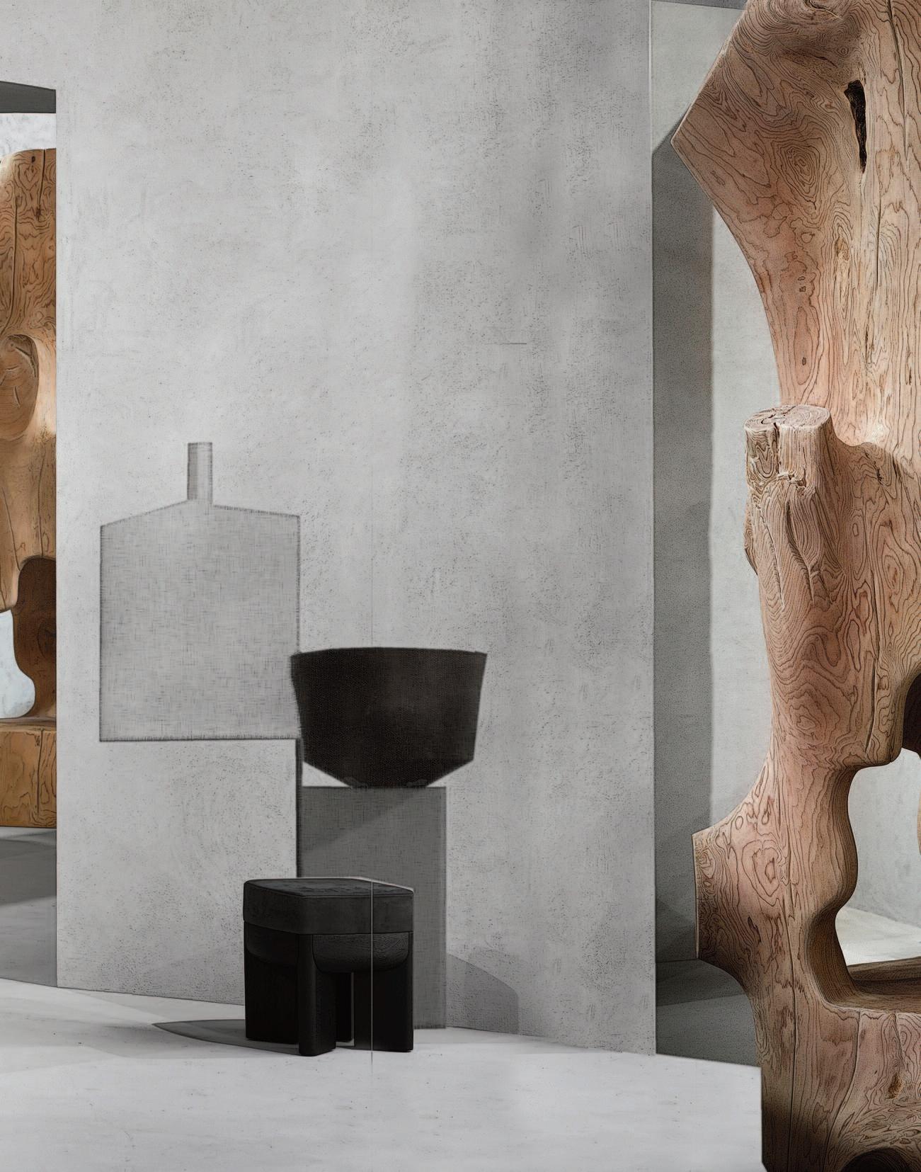
Conceived as a gallery and showcase of craftsmanship by German designer and artistic director Thomas Haarmann, Curatio explored new environmental territories. Designed as a jewel box, the installation brought together 60 signed signature pieces, each carefully selected, marking a new chapter in sensitive and functional design at the imtersection of art and design.
Curatio was presented for the second time at the Paris interior design fair Maison&Objet in January 2026.
The project privileged harmony over competition, and was conceived as a creative encounter within a singular universe. From one capsule to the next, exceptional and raw materials were combined with organic, refined forms to bring pieces of outstanding craftsmanship to life. Often produced in limited editions, each creation approaches the status of a work of art.
Unified by a shared visual identity, the spaces formed an inspiring and cohesive visual journey. Each piece was showcased within a deliberately minimalist setting, allowing its character and materiality to take center stage.
Brazilian project by KAAN Achitecten
while the remaining part is untouched. The beautiful ruins are embracing the past while building for the future.
Photos: Sebastian van Damme.
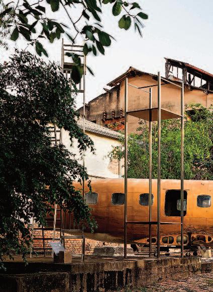
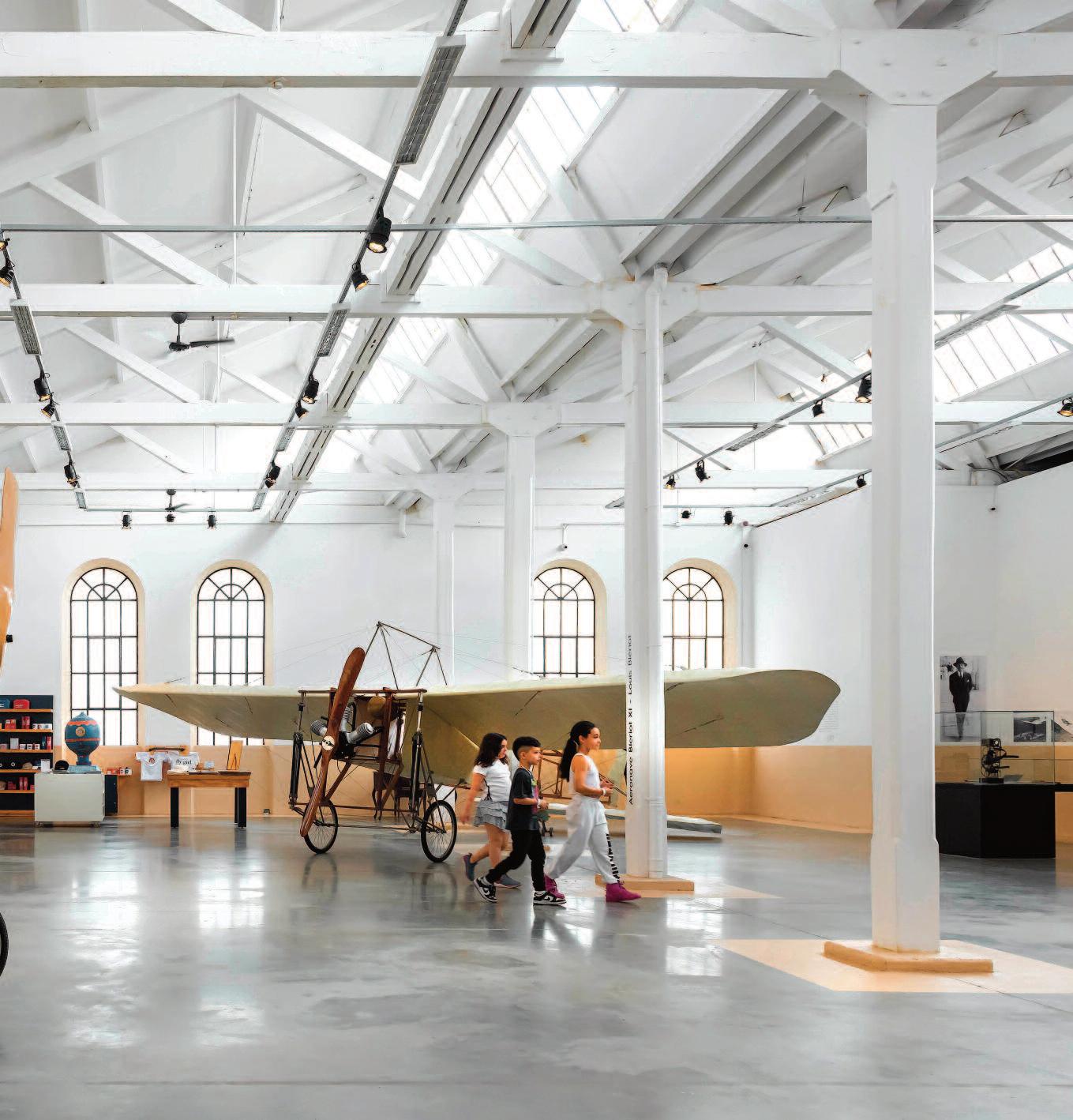
Commissioned to transform the historic São Pedro factory into a state-of-the-art cultural center in Brazil, KAAN Architecten of A msterdam has developed a master plan that carefully weaves c ontemporary architectural interventions into the site’s richly layered history.
The project for the Fábrica de Arte Marcos Amaro (FAMA) treats architecture not as a finished product but as an ongoing conversation one in which the buildings themselves act as the common language. Bridging past and future with quiet confidence, the project stands as a persuasive argument for adaptive reuse as a catalyst for culture, creativity, and longevity (with considerably less demolition dust)
FAMA is a long-term initiative dedicated to cultivating a dynamic environment for the art community. Developed over more than six years of rigorous planning and execution, the project balances the revitalization of a historic industrial complex with the need for flexibility, artistic exchange, and collaboration proof that patience, when paired with good design, pays off.
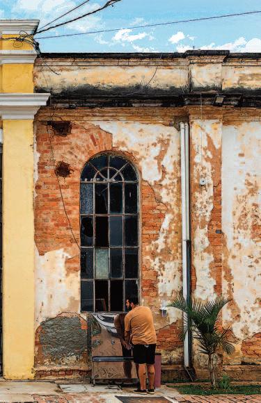
At the beginning of the 20th century, new municipal regulations and a railway connection to Santos Harbor accelerated industrial development in Itu. Founded in 1911, the São Pedro jeans factory became a key industrial player until its closure in the 1990s.
Designed by French-Brazilian master builder Louis Marins Amirat, the complex exemplifies early European-influenced industrial architecture in Brazil, distinguished by innovative brick masonry and monumental façades. Recognizing its cultural significance, the site has been protected since 2003 under Condephaat ’s heritage listing, which safeguards historic assets in the State of São Paulo. In 2012, Brazilian artist, entrepreneur, and collector Marcos Amaro acquired the factory, driven by both a personal connection to the site and a clear vision of its potential as a center for artistic production.
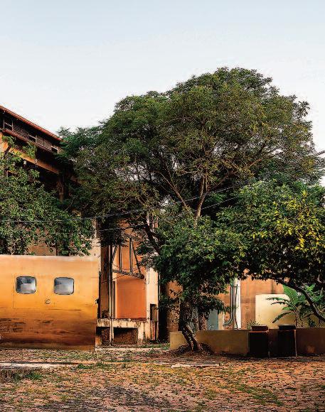
Since then, the complex has evolved from a storage facility into a cultural hub Approximately 60% of the site has been restored, while the remaining 40% remains deliberately untouched.
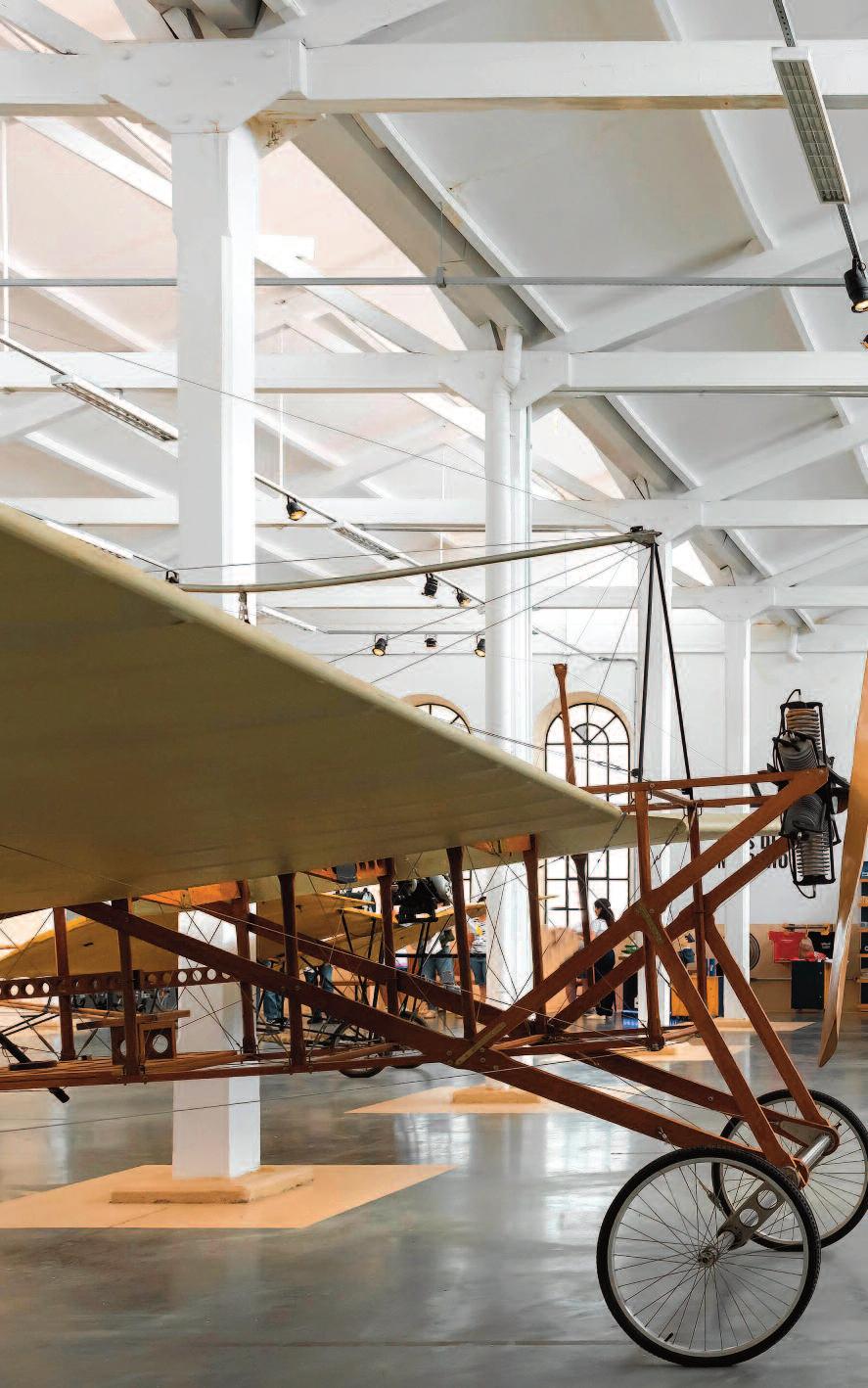
These pages: int erior view of th e exhib ition bui lding M , feat uring t he coll ection of t he San tos Dum ont Foun datio n.
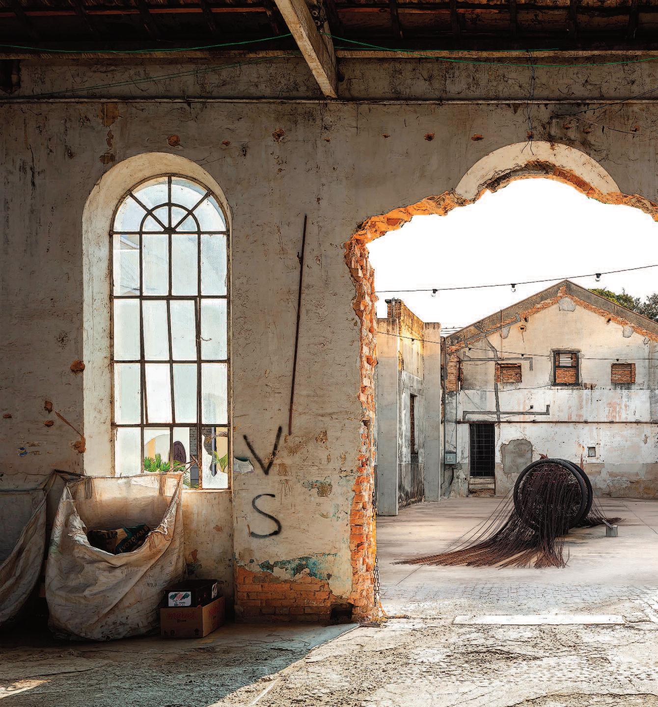
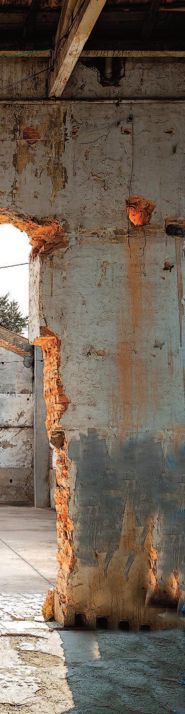
These ruins still compelling in their imperfection embody the project ’s philosophy of acknowledging the past rather than erasing it The initial phase established a formal framework defining the project ’s stages, outlining restoration strategies, fire safety, accessibility, and landscape design, and setting out a clear vision for the site’s future.
Developed in collaboration with local restoration architects and the surrounding community, the master plan proposes carefully calibrated interventions. Adaptability lies at the heart of the concept both in the physical evolution of the spaces and in the flexible roles assigned to artists Notably, the project embraces both physical and emotional traces of decay Rather than polishing history to a uniform finish, it preserves the building’s layered n arratives in varying states of conservation. Artist residencies form a core component, enabling the creation of new work and the preparation of exhibitions, supported by a rotating model that ensures continuous creative exchange
KAAN Architecten adopted a conservation-led approach: preserving what remained, introducing new materials only where necessary, and deliberately avoiding full reconstruction or overly assertive contemporary additions. This strategy resulted in three principal modes of intervention. The “inner volume insertion” places a new functional structure within an existing shell; the “envelope retention with core integration” restores both exterior and interior façades while introducing a new internal core for modern facilities; and “structural infilling” adds new internal elements to stabilize and support the historic envelope.
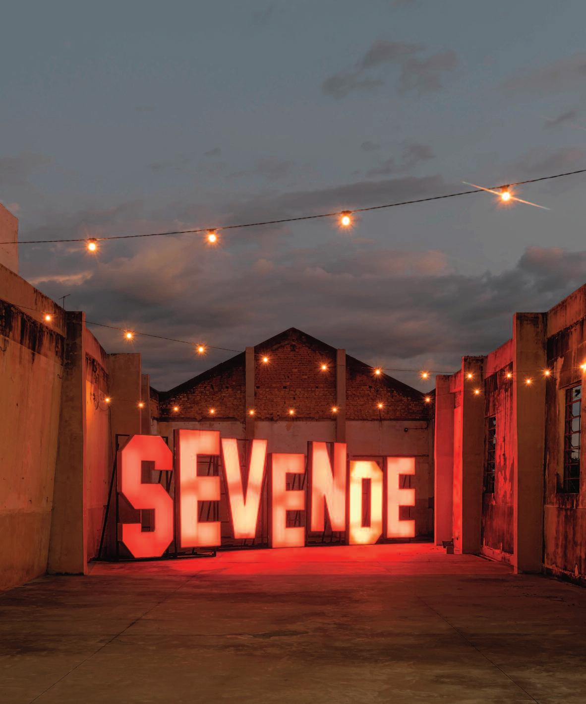
Now open to the public, FAMA has become a cultural landmark where art, history, and architecture meet without competing for attention. What began as a storage space for art collections has evolved into a lively exhibition venue, artist accommodation, and a master plan for future growth. KAAN Architecten’s contribution reflects a clear philosophy: architecture is not only about buildings, but about creating spaces where people can live, create, and connect preferably for many decades to come.
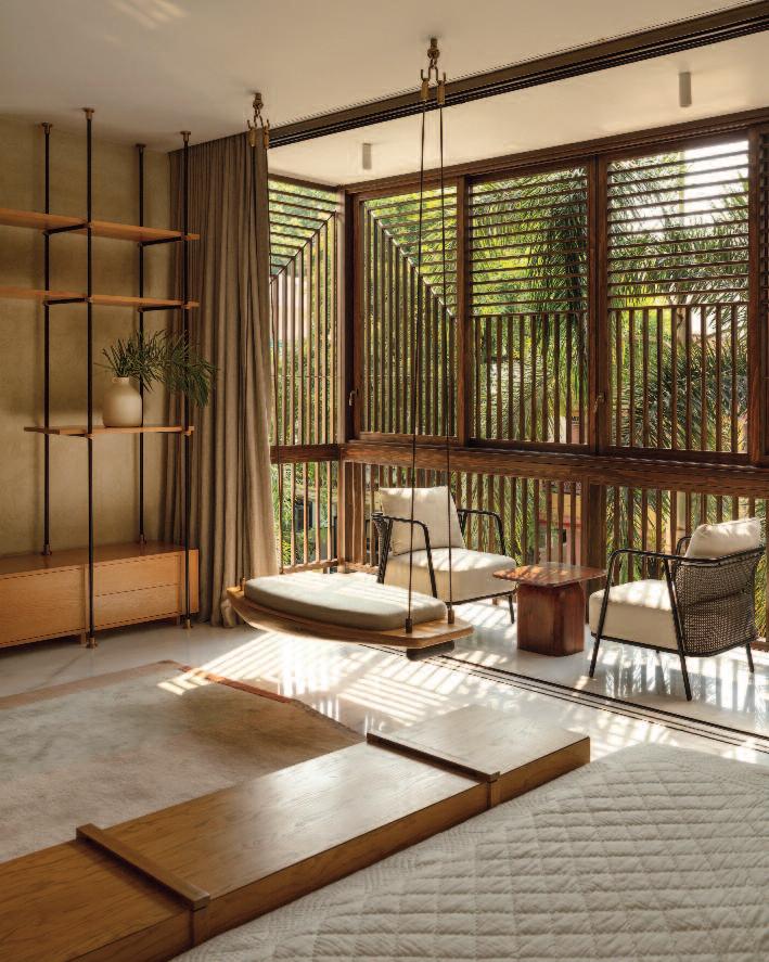
Wrapped in operable timber lattices, the Light House is conceived as a private, sunsoaked (but never sun-struck) residence for a multigenerational family living in the thick of a dense urban neighborhood Located in Nagpur, Maharashtra a city where summers routinely flirt with, and often exced, 40°C the house is designed by SJK Architects as a contemporary family home that celebrates togetherness while keeping the heat firmly at bay
The reinterpreted jaali façade works hard so the family doesn’t have to: it filters harsh sunlight, encourages air flow, and casts ever-changing patterns of light and shadow across the interiors
At ever y level, the design creates pockets of privacy that remain closely connected to nature
Anchoring the home is a central atrium crowned with a skylight an updated take on the traditional cour tyard which tempers the sun, animates the interiors, and doubles as the social nucleus for a family that enjoys being in constant conversation (sometimes across floors)
The six-stor y home sits on a compact 38 m by 23 m plot adjacent to the family’s former two-stor y bungalow, which had finally admitted defeat against the family’s growing needs
SJK Architects were commissioned to design a
residence that could comfor tably house present and future generations a home built not just for today, but for decades of family gatherings, celebrations, and lively debate
Originally from nor th India, the family comprising the grandmother, her two sons and their wives, and three grandchildren shared a fond nostalgia for havelis: expansive homes organised around communal cour tyards (chowks), projecting balconies (jharokhas), and intricately craf ted l attice screens (jaalis)
These climate-responsive typologies, along with Maharashtra’s timber-rich wada architecture, inspired the design language of the house
Keeping the interiors cool while allowing sof t, controlled daylight was a key priority
An eight-foot-wide atrium slices ver tically through
Below: the six-story volume is designed to maximize the use of the buildable site area. The atrium slices through the volume with its proportions derived from detailed studies of scale and sun movement throughout the seasons.
Hailing from north India, the owners held deep nostalgia for ‘havelis,’ large residences with communal courtyards (chowks), projecting balconies (jharokhas), and intricate brick or stone lattice screens (jaalis) vernacular to many western and northern regions of India.
the house, its propor tions carefully calibrated through studies of scale and seasonal sun movement The atrium draws dif fused daylight down to the lowest level, where the informal living area is located establishing a lively social core that allows visual and acoustic connections across all floors (so no one ever really feels far away).
Privacy is thoughtfully layered. The first four levels are dedicated to individual family units, while the fif th level is reser ved for enter taining guests, complete with generous living and dining spaces
The topmost floor houses a spa, jacuzzi, and gym within a recessed, fully glazed structure capped by a hipped roof
Encircled by a landscaped deck, this level of fers a serene retreat with panoramic city views and an excellent excuse to stay home
The grandmother’s suite and the main kitchen are located on the ground floor, ensuring easy access to outdoor dining, lounging, and garden areas
This layout honours her wish to stay close to the ear th and the kitchen. An of fice suite on the same level allows professional discussions to remain discreet, while family conversations freely animate the informal living spaces
The three upper residential floors are allocated to the elder son’s family, the younger son’s family, and the grandson’s future household
Each level includes two master bedrooms with walk-in wardrobes and en-suite bathrooms, a guest bedroom, formal living area, pantr y, and a shared family terrace
The bedrooms open onto eight-foot-deep balconies that visually expand the compact interiors while acting as buf fers against heat and rain One-third of these balconies are shaped into
These pages: balconies expand the perception of space, and serve as a heat and rain buffer One-third of the balcony area is customized into jharokhas positioned differently across levels, creating a dynamic facade. The balconies are furnished as per individual needs.
jharokhas, positioned dif ferently on each level to create a dynamic and ever-changing façade
This outer layer of balconies and projecting jharokhas is wrapped in operable timber lattices, ensuring privacy within the dense neighbourhood
Much like their traditional counterpar ts, these lattices dif fuse intense sunlight, promote cross-ventilation, and significantly reduce heat gain proving that good design can still outsmar t the sun.
Ceated for contemporar y living, the jaali system employs modern materials and detailing to enhance per formance, durability, and sustainability
The lattices are craf ted from Accoya pine a highper formance, FSC-cer tified sof twood sourced from sustainably managed forests in New Zealand
Timber continues as a key material inside the house, paired with white Esil marble and brass to create a timeless and cohesive aesthetic
Recycled Burma teak, finished with fluted d etailing, is used extensively as wall paneling, adding warmth and texture The railings and brise-soleil within the central atrium are also craf ted from recycled Burma teak, reinforcing the architects’ commitment to sustainability.
Designed and executed on site by local carpenters, these elements showcase an inventive reinterpretation of traditional craf tsmanship proof that old skills, when thoughtfully applied, never go out of style
The grandmother’s domain on the ground floor, has direct access to outdoor spaces respecting her desire to remain rooted to the earth. Below: this outermost layer of protruding jharokhas and balconies is veiled in operable timber lattices, offering privacy. The geometric patterns for the lattices cast a dynamic interplay of light and shadows. They are essential for climate control and diffuse the region’s harsh sunlight and facilitate airflow, cooling and ventilating the interiors.
The three upper levels are dedicated to the family members. The furniture exudes comfort and understated luxury. Tactility is introduced by textures, and patterns from regional Saree weaves. Color is added through curated art pieces, including traditional art forms such as Pichwai, intricately detailed ceramic artwork, and rugs in wool and jute-and-hemp. Decorative lights, custommade in brass and glass, introduce an extra layer of crafted embellishment.


Previous pages: in the 17th and 18th centuries well-to-do Dutch burghers bought all manner of scaled-down silver objects, collecting them for display cabinets and doll’s houses.
Back left: a miniature silver tea warmer, height 6.3 cm, made by the Amsterdam silversmith Arnoldus van Geffen in 1739 Centre front: a tiny – 3 2 cm – miniature teapot made by the Amsterdam silversmith Johannes A. van Geffen, 1770. He also made the miniature burner with matching ‘bouilloire’ or kettle (1785).
These pages: three-piece Sterling silver tea set, made in 2013 by the Dutch silversmith Daan Brouwer. He entitled this unicum ‘Transfiguration’, partly as a reference to the different techniques used in making the set Materials: Sterling silver, gold leaf and ebony. Height of teapot and milk jug 20.5 and 11.5 cm respectively.
Originally tea was recommended in the Wester n world as a medicine, not as a delicacy. Consumption of this initially exotic, and therefore costly, article was reserved for the elite. Meanwhile, for over three centuries tea-drinking has been part of our daily life. Countless gold- and silversmiths, ceramists, designers, woodworkers and other craftsmen have applied themselves to designing and producing accouter ments.
The tea ceremony originated in China and Japan, where the preparation and drinking of tea was conducted according to all manner of rules and customs testifying to considerable refinement.
The accessories themselves, which were always handled with greatest care, were considered to be revered, precious possessions. The oldest traces of tea culture in China date from the Tang dynasty (618-916 AD). The Japanese had mastered the tea ritual by the 9th century. Western explorers made mention of these intriguing tea ceremonies in their logbooks
The first Dutch publication in which tea was mentioned dates from 1586. Jan Huygen van Linschoten noted that in Japan they had a ‘certaine hearbe called Chaa, which is much esteemed’. Around 1610 the first – scant –amount of tea was shipped to the Netherlands as a curiosity by the recently established Dutch East India Company (VOC).
Cargo lists reveal that tea purchases were increasing considerably in the course of the 17th century. Much was intended for Dutch residents of Batavia in the Dutch East Indies, where tea consumption was adopted much sooner than in the homeland. However, when, for the first time, a large
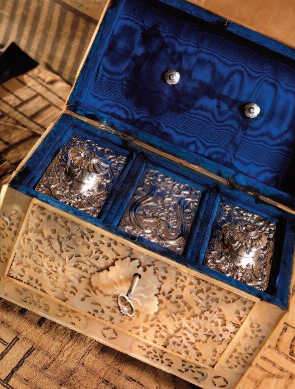
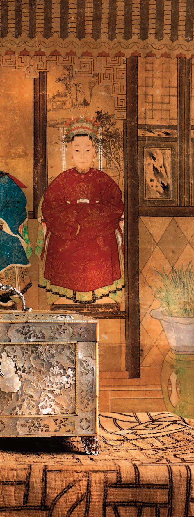
These pages: an exceptionally large and lavishly finished 18th-century tea chest with three interior compartments in silver. The exterior (made in China) partially in carved and incised openwork mother-ofpearl The silver components were made and decorated in Rococo style by the Rotterdam silversmith Rudolph Sondag, in 1768 Measurements: 25 x 14 3 cm Height, including handle: 21 5 cm (Collection: John Endlich antiques, Haarlem)
batch was unloaded in the port of Amsterdam in 1667, it sold like hot cakes – contrary to the VOC’s expectations
The first tea drinkers were mainly from the fashionable, wealthy elite who tried the exotic beverage out of curiosity. The masses were completely unfamiliar with the new drink until around 1680. But a new lucrative market had opened up for the VOC and tea became a normal commodity. Twenty years on and the drinking of tea had become established practice, at least among the moneyed middle classes
Yet contemporary prices suggest it must have been a prohibitively expensive luxury commodity for many. Oddly enough, in the northern –rural – provinces of the Netherlands, tea was used solely as a (soothing) medicine until around 1740, and was almost unknown as a stimulant. By the 17th century tea drinkers had already become accustomed to a dding milk and sugar to their tea.
After 1750 tea prices dropped to such an extent that everyone could afford the beverage. Tea drinking had become so popular that around 1800 three-quarters of the Dutch beer breweries had to close down because c ompetition was so great – all and sundry acquired the tea habit While gentlemen amused themselves in coffee houses and clubs, convivial tea-drinking took on great social significance for ladies. The ‘tea table’ became a meeting-place for women who were expected to stay home. They not only partook of different kinds of tea. Sweetmeats – biscuits, chocolate and cake – were served as well, rounded off by alcoholic beverages Well-to-do families would have tea-houses or garden pavilions at their country villas, or else they appointed a room in their home as a ‘ tea salon’. The urge to participate in the new tea-drinking fashion resulted in the widespread purchase of expensive accessories towards the end of the 17th century.
A variety of attributes used during the drinking of tea were found on and around the tea-table. An 18th-century tea service comprised several pieces: not only a teapot, but also a silver or porcelain ‘candy’ or sugar basin and a pear-shaped porcelain or silver milk jug. ‘Costli’ Chinese cups and saucers, small teapots and all manner of silverware were laid out for tea-time. The tea-table itself was the focal point, with a ‘bouilloire’ or kettle standing on a burner and used for boiling water Relatively small brewing pots
Right hand page: Rare rectangular miniature tea canister made by the Amsterdam silversmith Jan Breda, latter quarter 17th century. A vague incised star decoration can still be seen on the front and the back. In the lid there is a portrait in relief of James II, king of England, Scotland and Ireland (16851701) and a text written in round hand. Height of tea canister: 4.5 cm.

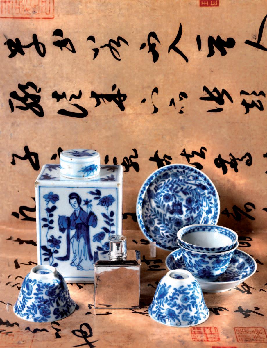
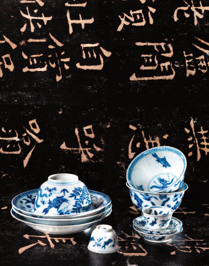
Left: a small size Kangxi Chinese porcelain tea jar with original lid, with a depiction of a Chinese lady surrounded by flowering branches. Height: 8.5 cm, date: c. 1690. The late-17th century miniature silver tea caddy made in Amsterdam has a similar, rectangular shape. The porcelain miniature cups and saucers also date from the Kangxi period.
Above: Chinese cups and saucers decorated with representations of fishes, shrimps and plants. Dating from the Kangxi period – 1662-1722. Saucer diameter: 13 cm, the matching cup is 5.5 cm in height. Beside that, a number of miniature cups and saucers with similar decorations, also from the Kangxi period. Diameter of the saucer: 5 cm, height of the cup: 2.8 cm. Miniature versions of this type which today are rare, were made s pecially to adorn the Chinese room in a doll’s house of the 18th century.
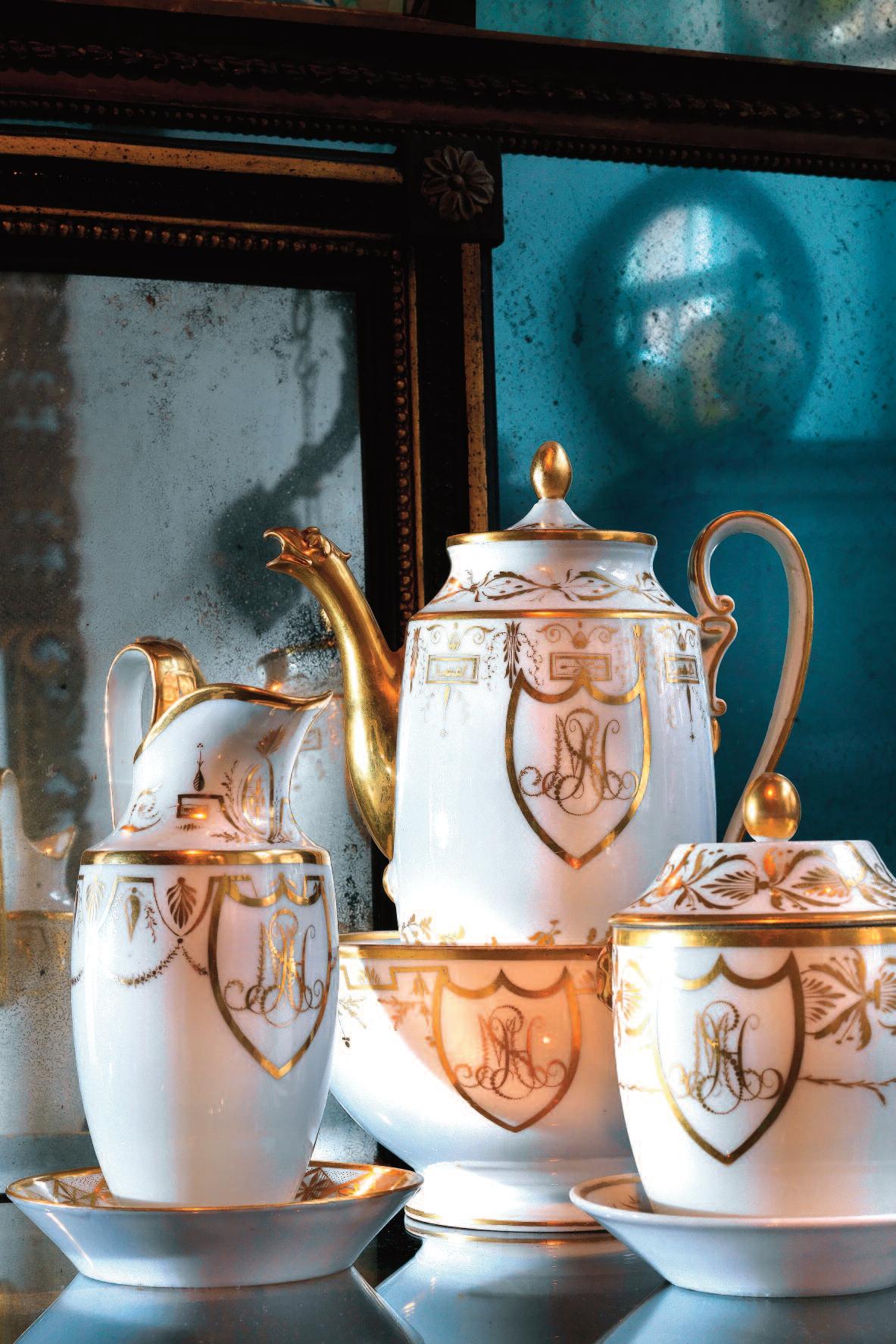
Left: an Empire tea set, porcelain, decorated in white and gold. It was a wedding gift to Julius Dominicus Schulte van Haege and Henriette Elizabeth Mispelblom Beyer in 1804. The stylised initials of the bridal couple are pictured on various items, including the sugar bowl, milk jug and bowl for slops. Height of largest item: 28.5 cm.
would first be rinsed out with hot water and then used to make a strong tea extract.
A small amount of the extract was poured into a porcelain cup and then diluted with hot water.
Larger sized teapots only came into use around 1900 – following the English example – in which tea was made right away in the desired strength. The earliest known brewing pots were made in red stoneware.
There are examples of Chinese brewing pots in existence, also pots made in Delft and Meissen. After that, small Chinese porcelain teapots imported by the VOC came into fashion. Silver teapots in all manner of shapes, types and styles were being made from around 1700.
Tea was stored in those days in porcelain (often Chinese) or silver tea canisters – usually rectangular in shape and closed with a small round cap
The earliest and meanwhile extremely expensive silver versions date from the late-17th century.
From around 1750 onwards tea was also kept in small chests made from costly inlaid wood, silver or tortoiseshell. Their styles varied – sometimes neoclassical Louis XVI, sometimes plainer Empire. Some tea caddies contained three copper or lead compartments: one for green tea, one for black tea and one for a mixture of the two. Wooden or tortoiseshell chests for a single type of tea usually have an extra, lead-lined inner lid to preserve the aroma optimally. Glass and crystal tea caddies date from either the late-18th or the 19th century.
And from the late-19th century, tea companies started selling tea in tins with appropriate painted or printed, often Chinese, scenes. Traditionally, tea has been drunk from a porcelain cup which stands on a saucer. Over the years, the East India Company shipped vast numbers of cups and saucers to Europe, with either blue-and-white or polychrome decorations.
As tea was relatively light compared with its volume, ballast would be added to the tea cargo for the ship’s stability The tea ships carried porcelain wares for that purpose, and also because porcelain is odorless and would not have an adverse effect on the aroma of the tea.
Both Chinese and Japanese tea bowls were originally smooth and round, but in the course of the 18th century they started to be supplied with
These pages: ribbed Dutch s ilver tea set, maker’s mark Van Kempen, date letter for 1921, in classical design. In the spoon holder, various silver teaspoons, late 19th century. From the same period, a Dutch silver tea strainer, left front, on a silver stand with blue glass liner. Back right: a lithographed tea tin (advertising material) made in Holland with a Chinese scene. Date: 1892, height: 11 cm
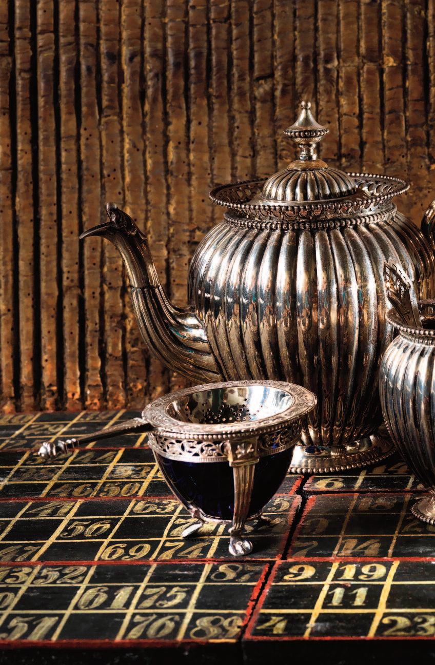
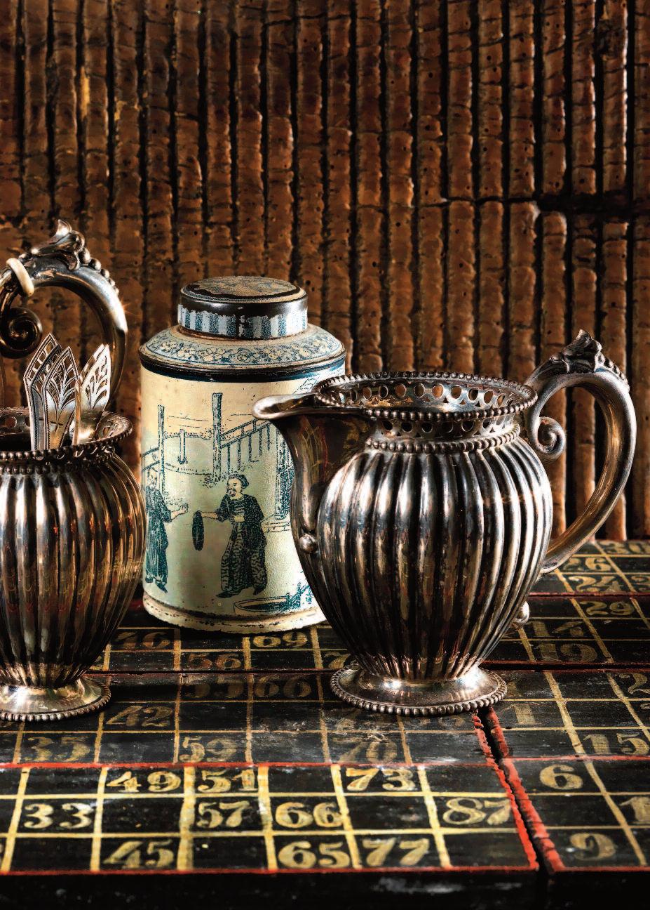
handles, at the request of Western clients, and in hexagonal or octagonal versions. However, as soon as craftsmen in Europe mastered the art of porcelain production, local factories emerged where tea paraphernalia could be produced.
French, Saxe and Holland porcelain, decorated in keeping with European taste, found its way to the discerning buyer. Since the wares were produced in these parts it was possible to pick up quicker on the latest fashions in color ways, favorite styles and preferred illustrations.
And that resulted in a waning popularity of Chinese porcelain. That is illustrated by developments beginning in the Empire period: the fashion was for custom-made, entirely white tea sets with gold decorations. The owner ’s initials are marked on each item, with colorful depictions of buildings or landscapes, or else some form of blessing for the user.
Apart from the components required specifically for tea drinking, other items came into vogue, including tea boards or trays made from wood, oriental lacquer-ware or silver. There were also tea warmers containing a burner – used for heating the kettle. In the course of the 19th century oval mahogany serving trays with copper banding were highly popular. As were sundry smaller items used with tea-drinking: silver teaspoons, sugar spoons and tongs, and tea strainers. The strainer or sieve was designed as a shallow, round or oval pierced bowl with a handle.
Late 18th-century teaspoons had a wide variety of shapes: Empire models from around 1800 are elongated and have an almond-shaped bowl. On the other hand, Biedermeier spoons, made in thinner silver, often have exuberantly incised decorations. Teaspoons of that type were usually kept in teaspoon boxes with tortoiseshell veneer or applied mother-of-pearl. The silver vase-shaped spoon holder is also a typical 19th-century product.
Contemporary industrial designers like Michael Graves and Philippe Starck, and design studios like Alessi do make specific designs of tea services and appurtenances, but customized tea ware for one client is rare these days. Only a true collector or design aficionado would have a unique silver tea service designed for him/her nowadays. And then it would be for the sake of possession rather than for everyday use.
Rightt: Dutch marquetry tea chest, inlaid with geometric patterns in exotic woods; brass fittings. Measurements: 19.5 x 13 x10.5 cm. Date: c. 1760 And the interior of a Dutch marquetry tea chest, dating from c. 1760, with three, brass-lidded compartments. The outer two compartments would have been used for storing green and black tea; the middle compartment was for mixing the two kinds of tea.
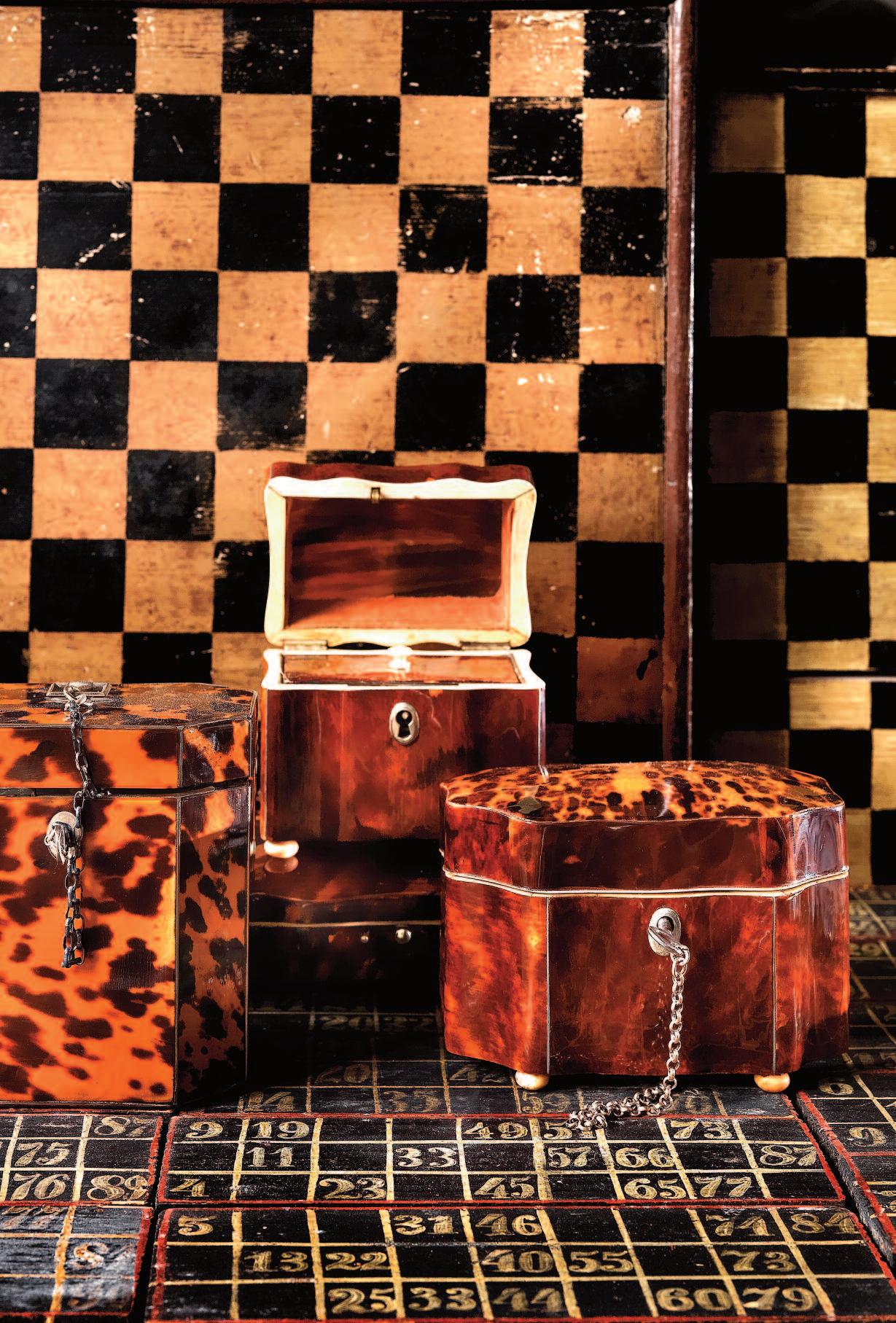


OBJEKT©International is the authoritative and bespoke title for the upscale urban modernist with a passion for interiors, art & antiques, modern design and outstanding architecture.
Thanks to the general concept, unexpected topics, the selection of designers, and quality of the photos,
OBJEKT©International has gained the highest authority in its field. The magazine was first published end of 1991.