brand guidelines
BACKGROUND
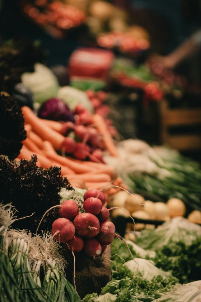
katy & co is a catering company dedicated to delivering simple, wholesome and tasty food. Where possible we use locally grown produce and everything is cooked from scratch. Our food is colourful, healthy and non-processed - no beige buffet here. Our aim is to make you feel good after eating!
We can cater for your corporate events, please blah blah blah - Kate this is your domain lol xxx
The katy & co logo is a text-based representation of the brand. Its design features an elegant and clean font which creates a minimalist appearance paired with an optional icon which has been made up using the ‘k’ and the ‘c’ of the brand name which has created a rustic , organic mark that can be used in multiple applications.
Overall, the logo conveys an earthy, organic yet professional presence associated with the katy & co brand.
Main logo
For documents such as invoices, letter heads or where use without the icon is needed.
Stacked logo
For when a square logo is required.
Logo with icon
For packaging and marketing with an aim to getting the icon recognised alone.
Visual identity system
THE ICON
The icon is a combination of the ‘k’ and ‘c’ in the brand name which has been integrated into an abstract image of half and onion and half a lemon.
While the brand is young, try to use the logos that integrate the icon where possible. This will help the icon become recognised as part of the brand when used on its own.
The icon will be perfect for uses such as; favicons, small profile pictures, stickers, stamps, badges etc.
LOGO PRESERVATION
When using the logo, please ensure there is a good amount of space around it. A good way of measuring if you’ve left enough space is use the ‘o’ in the logo as a spacer. This applies to all variants of the logo.
Woodland on white For official printed documents, where they can be printed in colour. Eg. Invoices, letter heads
Woodland on Satin Linen For professionally printed items such as brochures (where colour use is unlimited) and for screens
Satin Linen on Woodland For professionally printed items such as brochures (where colour use is unlimited) and for screens
PRIMARY COLOURS
These two will be your main colours. With Woodland being the highest in importance. Woodland can be used on its own on a white background or it can be paired with Satin Linen, the inverse of this can also be used.
ACCENT COLOURS
These are your accent colours. They can be used when bringing more colour into your applications are necessary. A good example of this will be stickers, uniform, website etc
BLACK
There will be times where it will feel more appropriate to use a much darker colour, or a black. In this case please use an off-black.
WHITE
In the same way, white may also feel more appropriate. When it does please use pure white.
Woodland
HEX #534F20
CMYK 57 51 100 42
RGB 83 79 32
Moccasin
HEX #797938
CMYK 51 39 95 18
RGB 121 121 56
Tulip Tree
HEX #E5B344
CMYK 10 30 87 0
RGB 229 179 68
Rust
HEX #B05B34
CMYK 23 73 89 11
RGB 176 91 52
Satin Linen
HEX #EEE2D7
CMYK 5 10 13 0
RGB 238 226 215
Sea Pink
HEX #E0A08B
CMYK 10 42 42 0
RGB 224 160 139
Pansy Purple
HEX #711B3A
CMYK 38 96 58 39
RGB 113 27 58
BLACK & WHITE
Here are two examples of when using black or white is more appropriate. Generally, it’ll be when the focus is on something other then the logo, such as a colourful photograph.
Using black or white allows the image to shine and eliminates the possibility of clashing.