GRAPHIC DESIGN | CONCEPT ART


2023


curricul um v itae logofolio 04 01 .monogram. hibis tea laundromatte the frozen sting a good boy the fresh. nonna look good bonbonne polar 06 08 07 09 07 09 07 08 08 09
CO NTENTS


graphic design concept art 10 22 bharatayuda bharatayuda bauhaus poster conexion NOTION 3 theory of form poster invitera janji jiwa 3rd anniversary 12 24 20 16 18 14 28 21


LOGOFOLIO


4
nonna
polar
BONBONNE
5
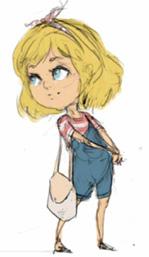
These are the logofolios that i’ve done during my study and my spare time.
.monogram.
this is the monogram that i made during my typography class in semester 3
6
nonna
is a trendy laundry place which was launched in Ney York, 2020. Not just trendy, it can also be rented with reservation prior for photoshoots.
laundromatte a good boy
is an exercise to design a brand logo for dog treats. The owner of the brand wants to showcase the playfulness of their dog and wished to incorporate their very good boy into the final output.
nonna
is a family owned pasta and pesto business, dated back to 1822. The recipe is inherited from generations prior and has never changed. The aim for the logo is to look fresh, younger, and more sustainable with the touch of its traditional root.
7
is a newly opened ice cream parlour in Manhattan, New York. It serves a diverse variant of flavours and aimed for modern look that should be chic, clean, and minimal.
BONBONNE


hibis
tea
is the tea brand that sells tea made from flowers. It started off by selling hibiscus tea, and now expanding its products for more flower types and variants of tea.
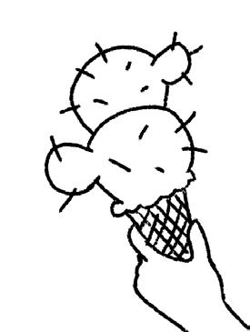
bonbonne the frozen sting
is an icecream brand and the owner, Jan really love his cacti collections and also ice cream. He wants to put his love of both into a mobile store and showcase these two elements.
8
is a new skincare brand which focused on producing vegan and cruelty free products for all skin type. The owner has been working on this series for two years and aimed for more inclusive design.
look good
the fresh polar
is a model agency based in New York that needs new branding. They specialize in diversity and aimed for fresher, younger look to rebrand from the old image of model agency. polar
is a Norwegian based cosmetic company with honest and cruelty free testing products. The brief were to make an eye-catching logo for the brand.

9
GRAPHIC DESIGN

10
These
design projects
11
are the
that i’ve done in uni and in my spare time ((for fun)).
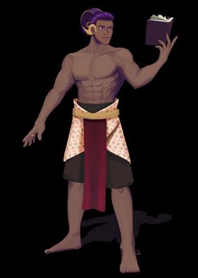
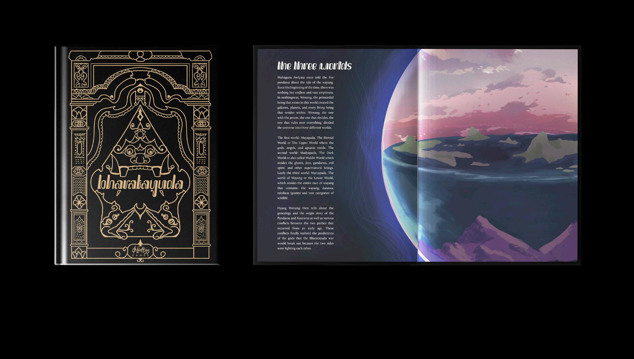
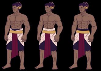
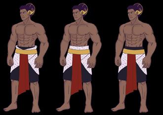
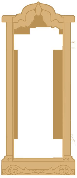
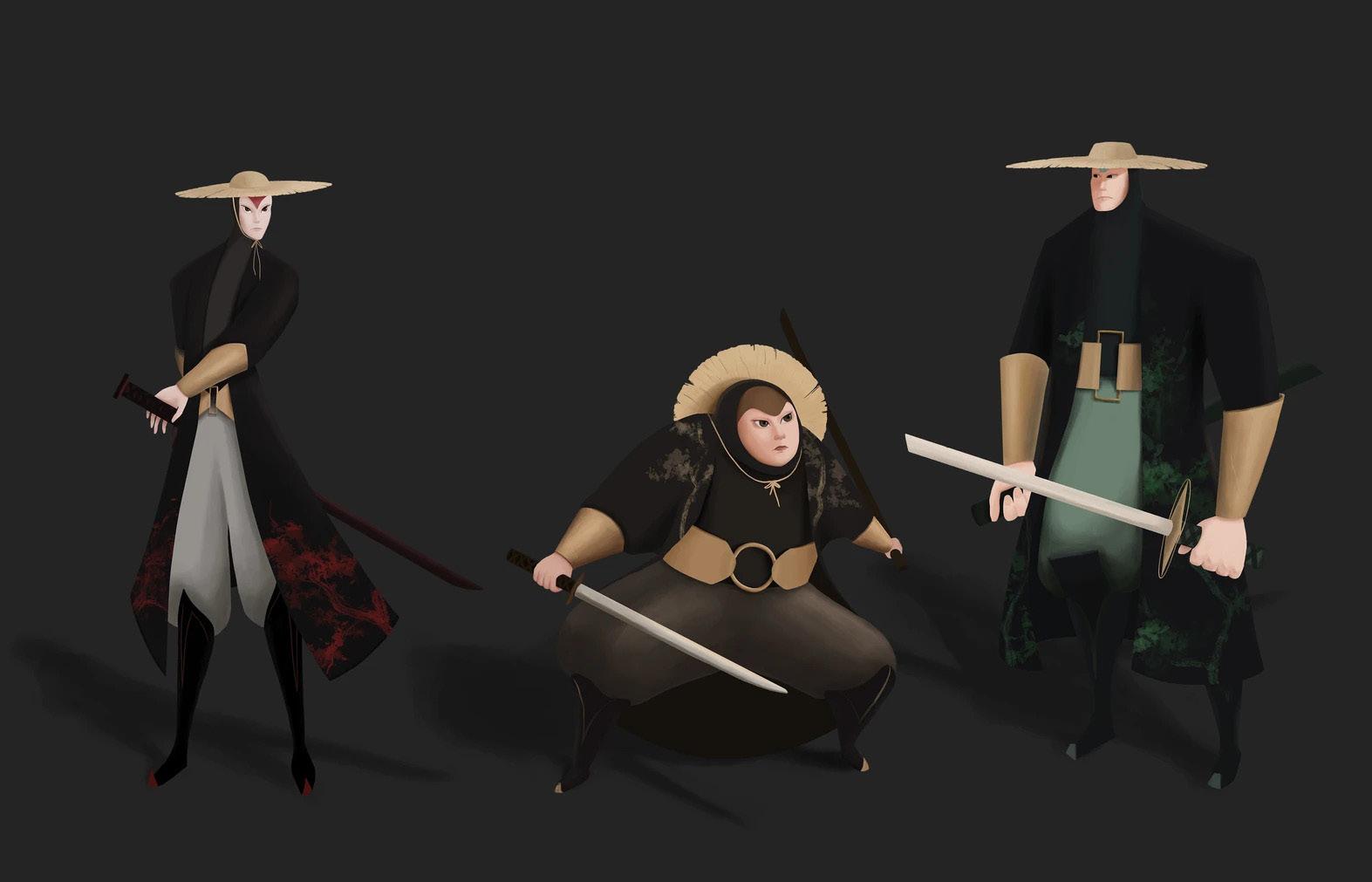
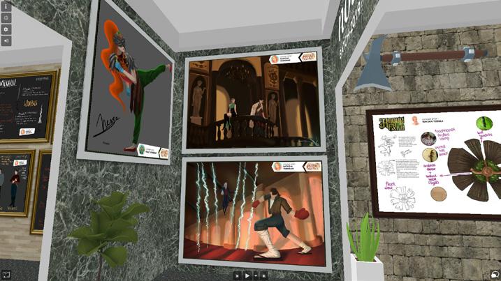
bharatayuda

Bharatayuda is the title of my concept art final project. The overall theme of the prjoject is about the story of Wayang Mahabarata, based on N. Riantiarno’s book titled Mahabarata Jawa. The logotype design incorporates the handwritten aksara jawa, with the element of traditional wooden carving called ulir.
The story is about the two factions of Pandawa and Kurawa facing off each other in the Bharatayuda war
12
terms of body and also above average strength. Bima also has the nature of wanting to help and also loves his family.

It is said that Bima managed to save the Pandawa and also his mother Kunti when the Kurawas wanted to harm their family at a celebratory banquet by treating the Pandawa with drinks which made the Pandawa unconscious. Then the Kurawa will launch their action to burn the Palace where the banquet is taking place. However, it turned out that Bima was still vigilant and Bima alone was able to bring his four siblings and mother out through the tunnel that had been prepared by Yama Widura.
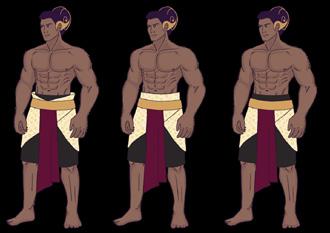
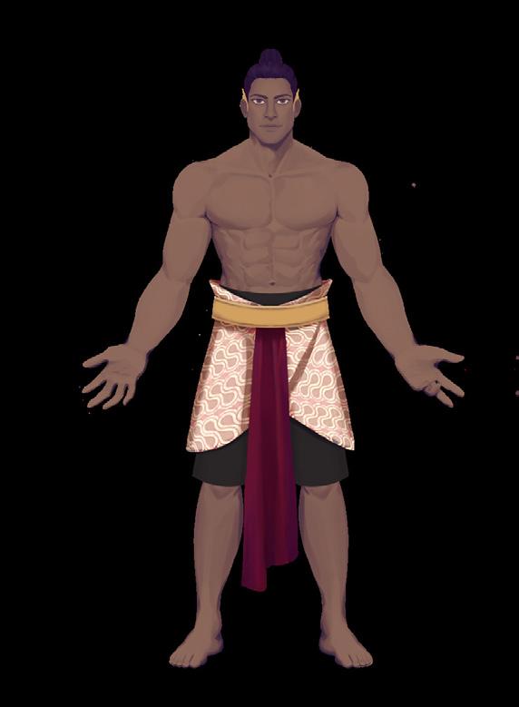
Bima belongs in the Pandawa Faction and he is a hero in the Warrior class. Because his proficiency of using big and heavy weapons like gada and his immense physical prowess, he is well fitted to be in the warrior class.

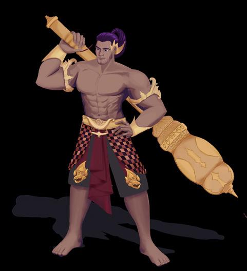
Bima’s character design is made using basic shapes, namely circles and squares. This is done as one of the symbols of character traits that are what they are, firm, but kind. In Bima’s character design,

the completeness of accessories on Bima is also adjusted to reference the purwa wayang kulit.
In his attire, Bima wears: sumping pudhak sinumpet, kelatbahu candrakirana, candrakirana bracelet, and also kroncong raton/dhapur naga. The kampuh cloth that is applied to the waist is also adjusted to the wayang kulit pattern, namely the kampuh poleng or cloth with a checkered motif. Apart from that, Bima also wears shorts as basic outfit before wearing the kampuh.
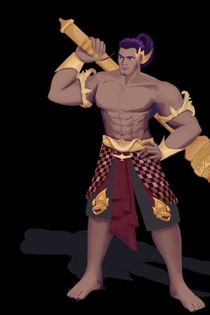
Bima’s height has also been adjusted so that he has a larger size, according to his wayang reference. In addition, Bima’s skin color is also described as darker or tanned as a symbol of his maturity and inner perfection after meeting Dewa Ruci, a literally small god in terms of size during his journey to find holy water.

Bima’s tanned skin color also refers to Bima’s face color in shadow puppets.

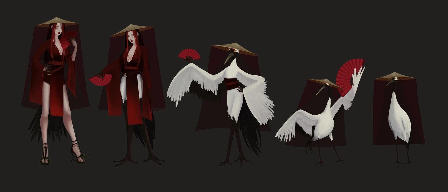
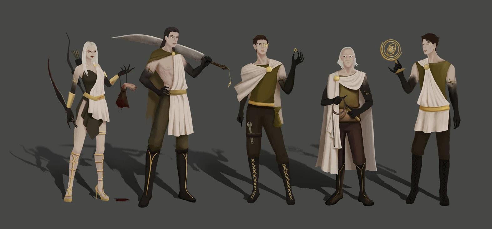
13 FACTIONS PANDAWA Pandawa is the faction that represents the good in the story of Mahabharata lore. Pandawa is initially the rightful heir and owner of Hastinapura’s throne. They mainly fight with Kurawa, and this has been going on for all of their lives. Pandawa have a factional advantage over Kurawa, however, they are weak against the Gods. Pandawa are made up of wayang race. Pandawa are the most advanced faction in Jawa and have the most kingdom alliances despite its core members only consisting of five wayang. Contrary to its small number of troops compared to the seemingly humongous amount of troops that are deployed by Kurawa faction, their overall strength and strategy are far more superior. The allies of the Pandawa formed by marriage with foreign kingdom, or simply a formed alliance in exchange of the goodwill that the pandawa have shown to specific kingdom/person. Pandawa have the strongest affinity towards the good and pursuing the good than any other faction. Some like Bima practiced physical strength and showed his proficiency in wielding a gada while possessing the perfect body and enlightenment of oneself. Arjuna also possessed a great mastery of archery and was crowned as the greatest archer in Jawa by his own teacher, Resi Drona. Meanwhile others like Yudhistira do not possess the physical ability of weapon proficiency like Bima or Arjuna but instead he honed a great depth and vast knowledge of various things on top of being the most righteous wayang in Jawa. They are also the most morally correct side that are polite, respectful, and willing to help others. They strive to be able to take what’s rightfully theirs and out from the vicious plots that are concocted by Kurawa. Pandawa bima 33 THE ARTBOOK OF BHARATAYUDA bima FACTION PANDAWA CLASS WARRIOR BIMA is the second child of Kunti who was born thanks to Dewa Bayu. Physically, Bima has an advantage in
Screening Details
Foreword by Aflian Zulkarnain
A nimasi dan sinematografi merupakan bagian dari komunikasi visual dalam kebudayaan populer. Dalam ranah akademisi penggambaran dan pemahaman realita sosial diangkat sebagai representasi dalam sinematografi dan animasi.
Peminatan Animasi dan Sinematografi Universitas Pelita Harapan yang berada dibawah jurusan Desain Komunikasi Visual, memberikan ruang kreasi untuk mengekspresikan konsep dari realita sosial dalam ruang gerak dan lingkungan mahasiswa. Mahasiswa diharapkan untuk menjadi pribadi yang peka, disiplin, memiliki etos kerja yang baik, dan memiliki empati terhadap masalah sosial yang relevan di Indonesia.
Karya-karya mahasiswa ini secara berkala ditayangkan dalam Film Screening setiap tahun.
Tema Film Screening yang sudah diadakan sebelumnya adalah “Idiom”pada Film Screening 2016, “Dialectic” pada Film Screening 2017, dan “Representation” pada Film Screening 2018.
“Conexion: Piece by piece” ini diangkat sebagai tema untuk Film Screening tahun 2020. Dengan permasalahan dan keadaan masa kini yang semakin kompleks juga berimbas dalam karya mahasiswa yang memiliki keberagaman tema dan kecanggihan dalam bidang teknologi dan seni.

Kegiatan tahunan ini diadakan untuk memberikan semangat untuk generasi muda untuk dapat berkreasi dan mengekspresikan secara positif kinerja mahasiswa sebagai akademisi.
4 5 Conexion: Piece by piece UPH FILM FESTIVAL


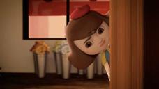


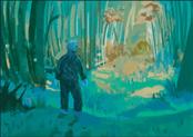
L that decides to fight off all of his insecurities to confess to a girl he likes.

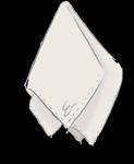
This is a story about a boy fights off his fears to approach a gir he likes. The story progress as he tries to give back a handkerchief of a girl he met on the street.

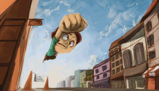
Elliot tries to overcome every possible obstacles to give back the handkerchief that the girl dropped down unknowingly.
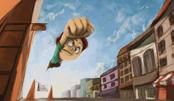
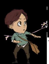
He rarely do something bold and he never made the first moves to any girl. This time, he races off with the traffic light to reach the girl that is way ahead of him.
Elliot, a man who is full of energy, enthusiasm, and perseverance in his life. He will never give up to reach what he believes is right. But his persistence is not able to overcome his struggles, which are shy. He is a very shy person, especially in relation. Many relationships that “fail” are caused by nothing but himself. His thoughts are too complicated, often making everything he does become difficult.
Elliot has no confidence whether he should approach people or not, thus making him struggle harder in terms of relationship.
Commitee Acknowledgement
We


Ronaldo Kilimandu
Valdy Yonatan
Rudolf Himawan
Adrian Pratama

Albert Lorents

In this short film, Elliot wants to break free from his own personal issue about being overly shy in a relationship. Elliot fails in the first place, but he is determined to keep moving forward.
“The boy who barely made any bold moves, finally approaches a girl.”
Elliot fails overtime and was trapped by his own issue but his persistence did not fail him because at the end, he finally found the courage to be brave and finally start a new connection with new people.
J. Baptista Anton

Jeffry Imanuel
Hernandityo Yehezkiel
Kezia Rachel
Yuventia Kalonica
Alvin H.

Michelle Widjaya
Mara Gloria
Karina Olivia
Jessie Rose
Hana Irena
Jessica Laurencia
Emily Patricia
Nathalie Suhendi
Sonia Winner
Michelle Roselin
Erica Josephine
Rivelino Silfanus Silvi Lim
Frans Santoso
Fabian Long
14
14 Conexion: Piece by piece UPH FILM FESTIVAL
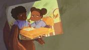
Found Le Traffic Erica Josephine Albert Lorents Nathalie Ronaldo Kilimandu Marcel Valdy Yonatan TYPO Babushka’s Crib Lost Boy The Gift Hank and Hugo Cake Albert Lorents Emily Dotulong Ronaldo Kilimandu Gracia Hani Rudolf Hima Natasha Tamarani Albert Lorents Michelle Roselin Sonia Winner Rudolf Himawan Virgin Oil ESKIMO Babushka’s Crib UGOKI 00:06:57 00:03:51 00:06:00 00:02:47 00:03:54 00:04:05 10 11 Conexion: Piece by piece UPH FILM FESTIVAL
want to thank all the participants and all the commitee that participates to prepare this screening. We would like to thank our lecturers that has guided and supported us throughout our studis in UPH We hope that our future collaborations and works may always be a blessing to all Animation 3D 2D Roby Susanto Nita Virena Yoga Rasahardja Jessica Laurencia Reyhan Naldo Yanuar Penanggung Jawab Penasehat Koordinator 1 Koordinator 2 Koordinator 3 Ketua Ketua Pelaksana Sekretaris Bendahara Alfiansyah Zulkarnain Dr. Martin L. Katoppo Lala Palupi Brian
24 25 Conexion: Piece by piece UPH FILM FESTIVAL
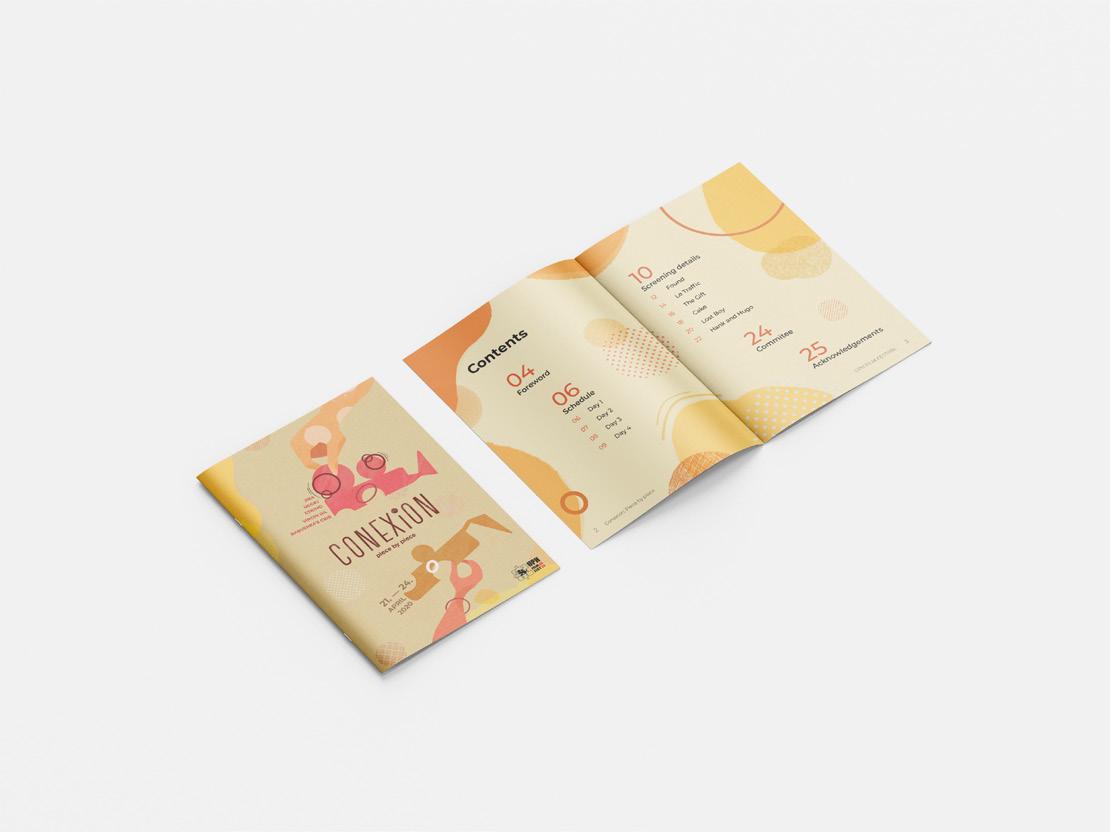
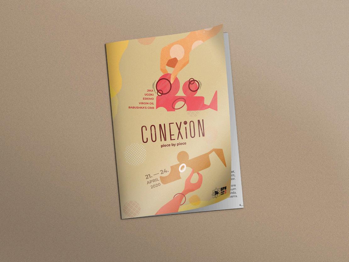
conexion
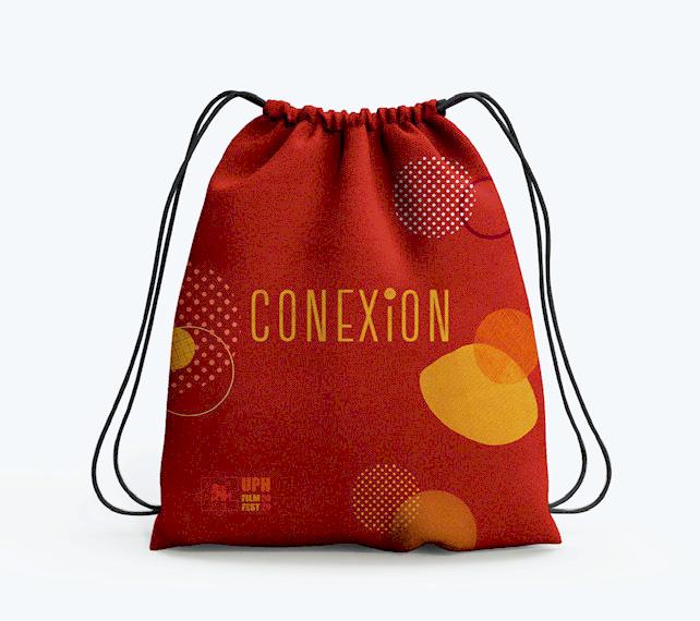

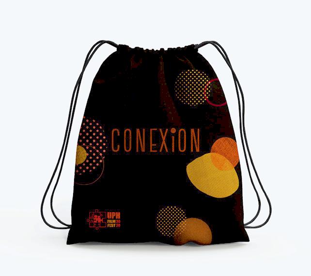

is a team project that i did on my fifth semester in publication class. The goal is to make a booklet for UPH Film Festival for movies and short animation screening, which is held annually. The keyword that was chosen for this project was dynamic, friendly, and playful. These keywords were chosen to represent the overall theme of the animation shorts entries that year.
Scope of work: visual elements, all layouts, mockups

15
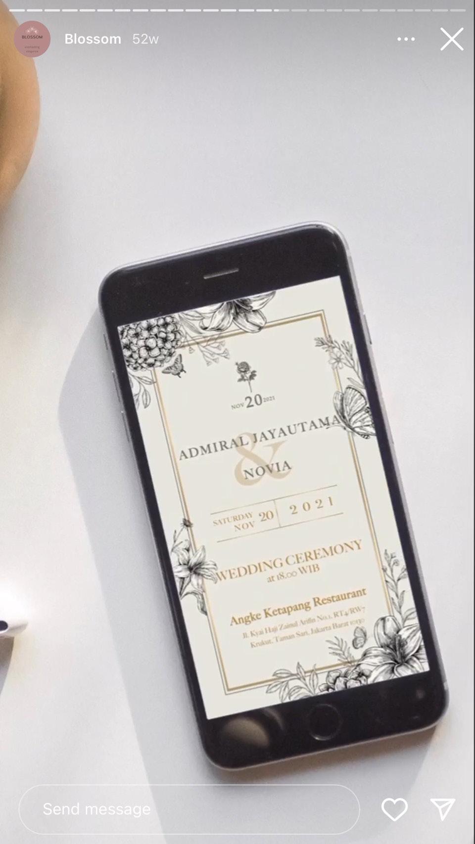
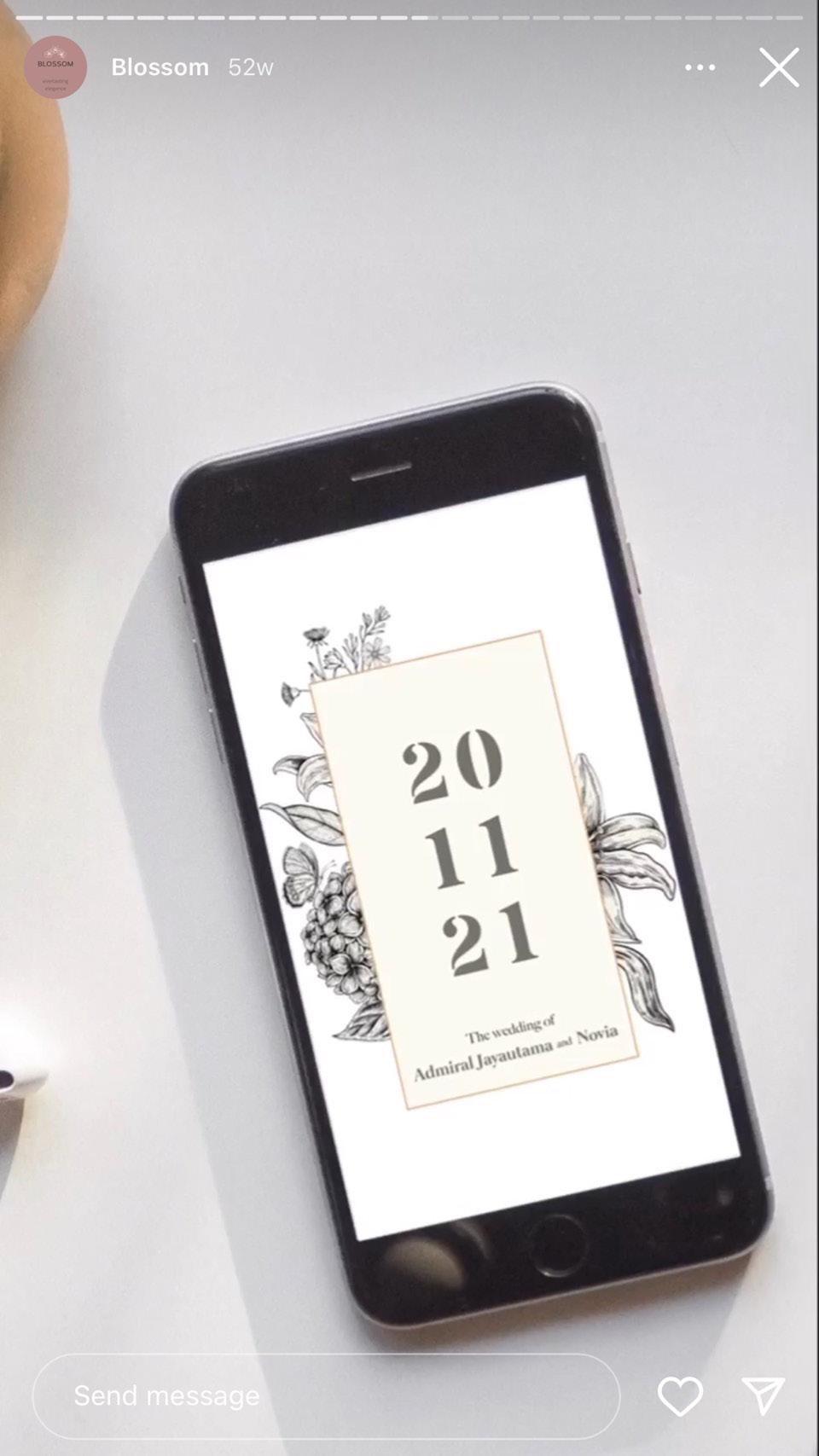
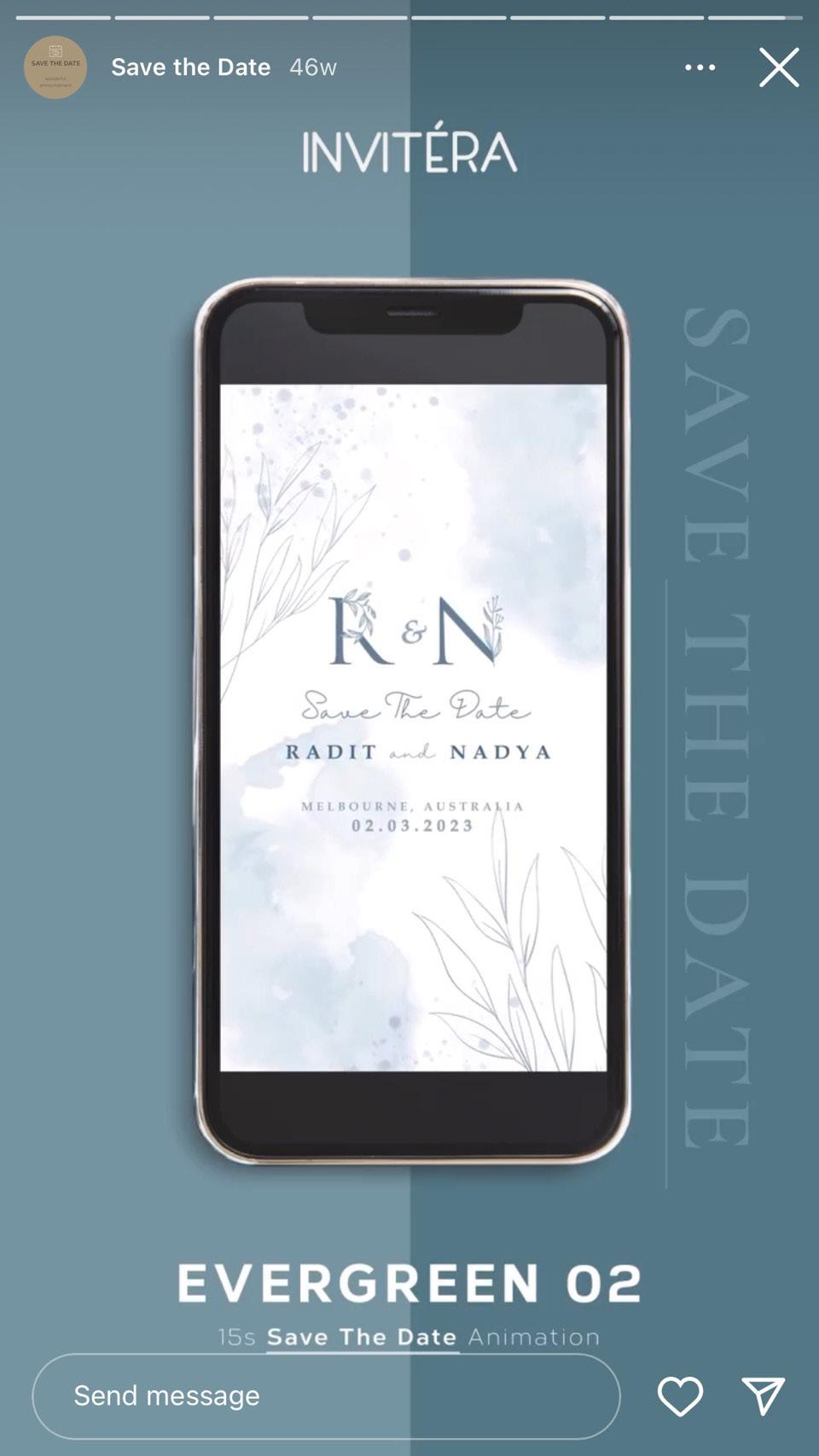
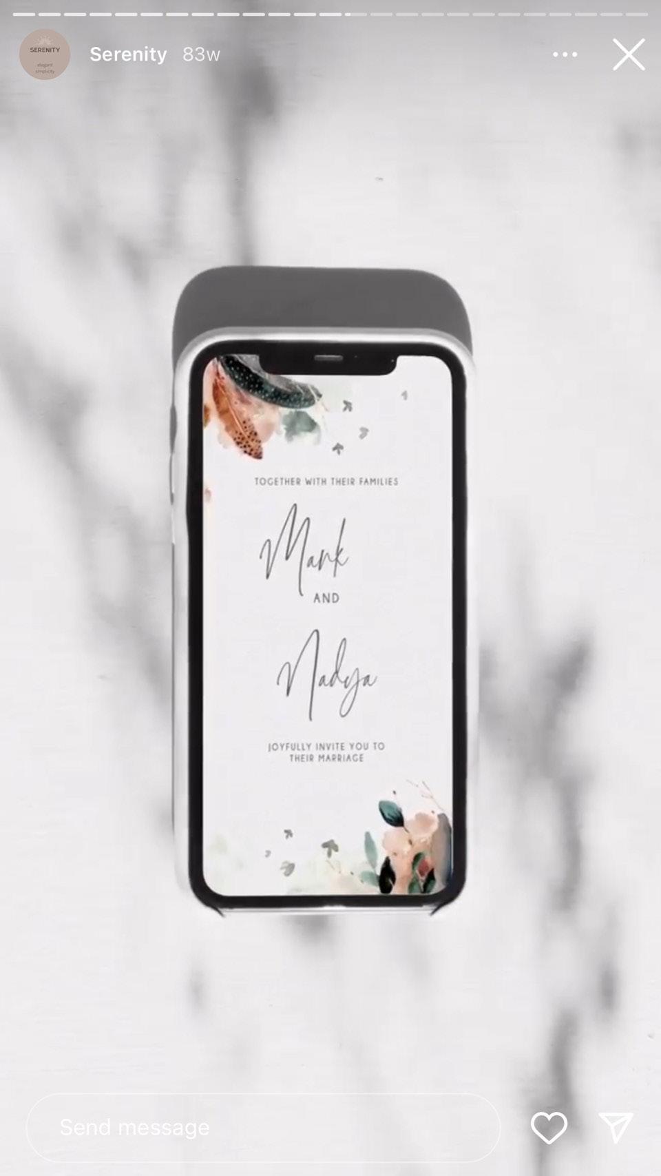
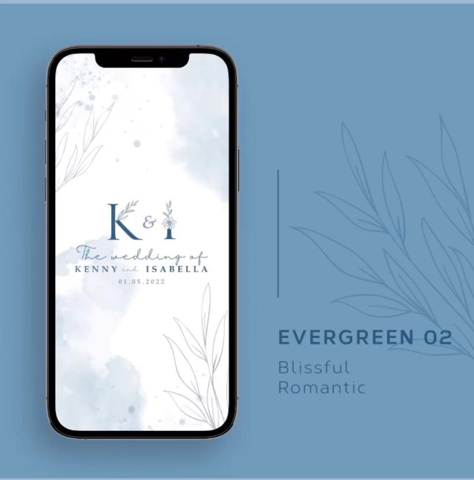
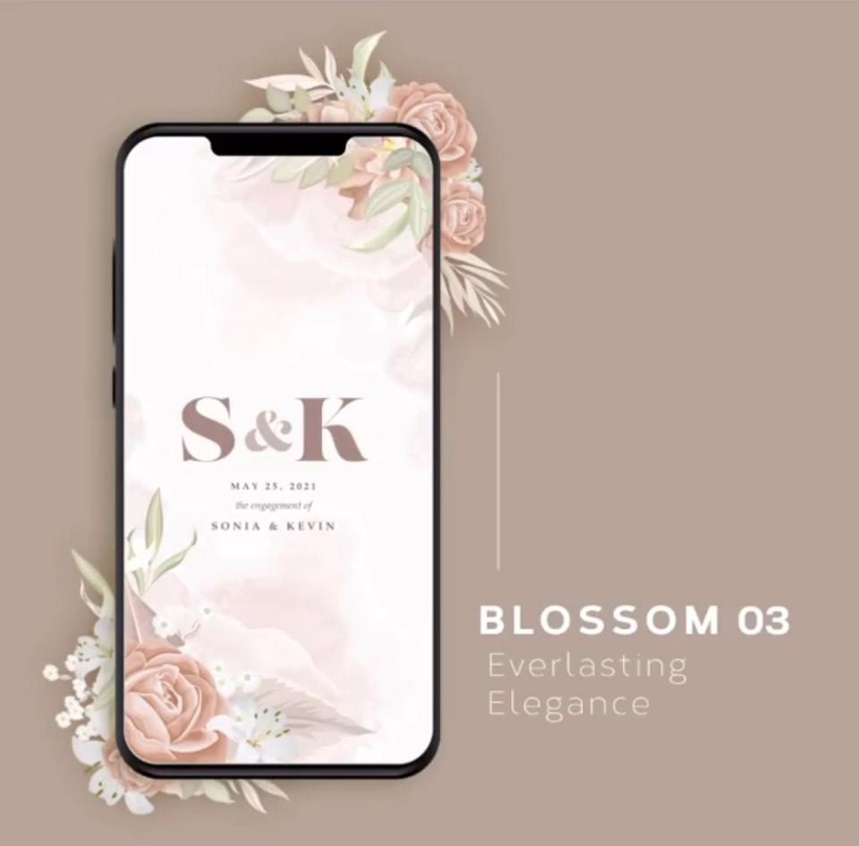
invitera
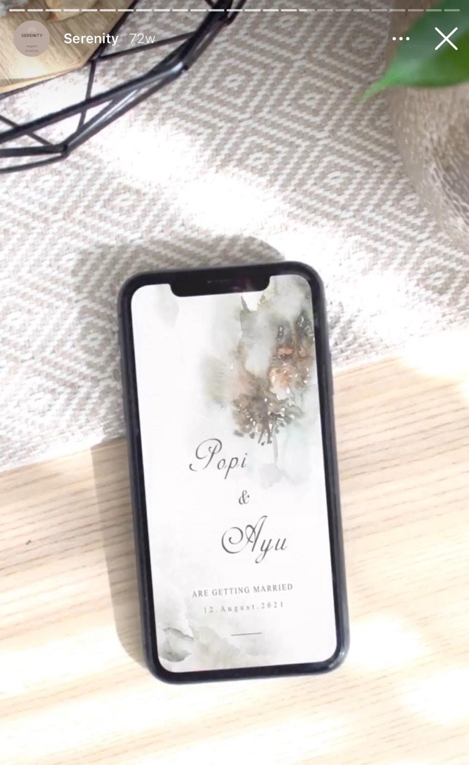
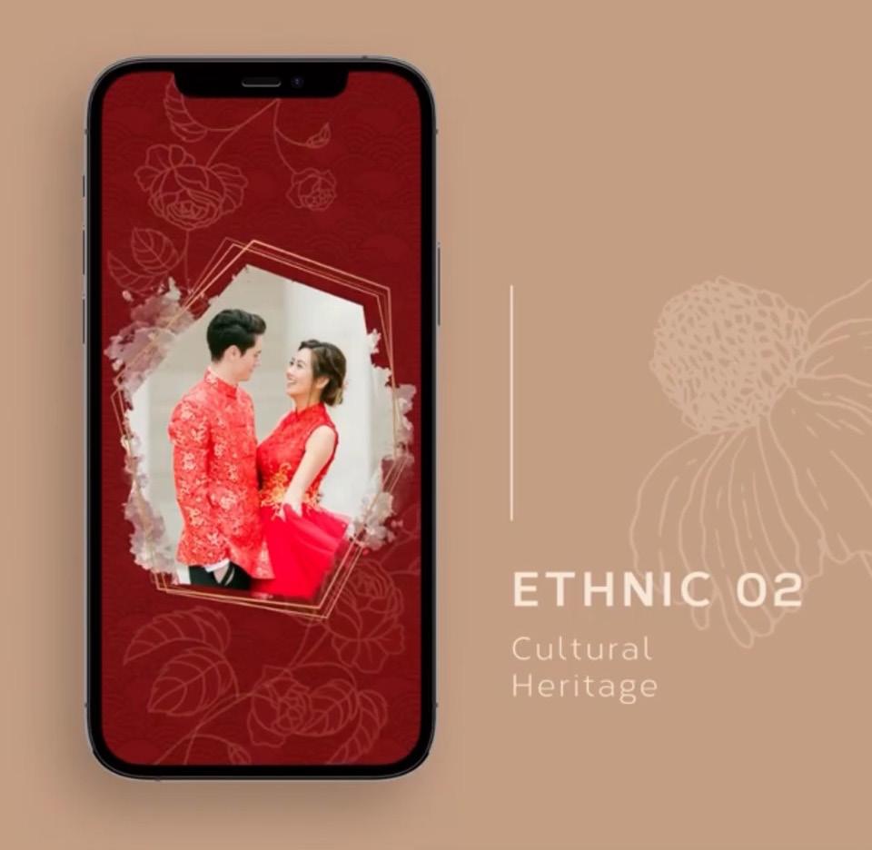
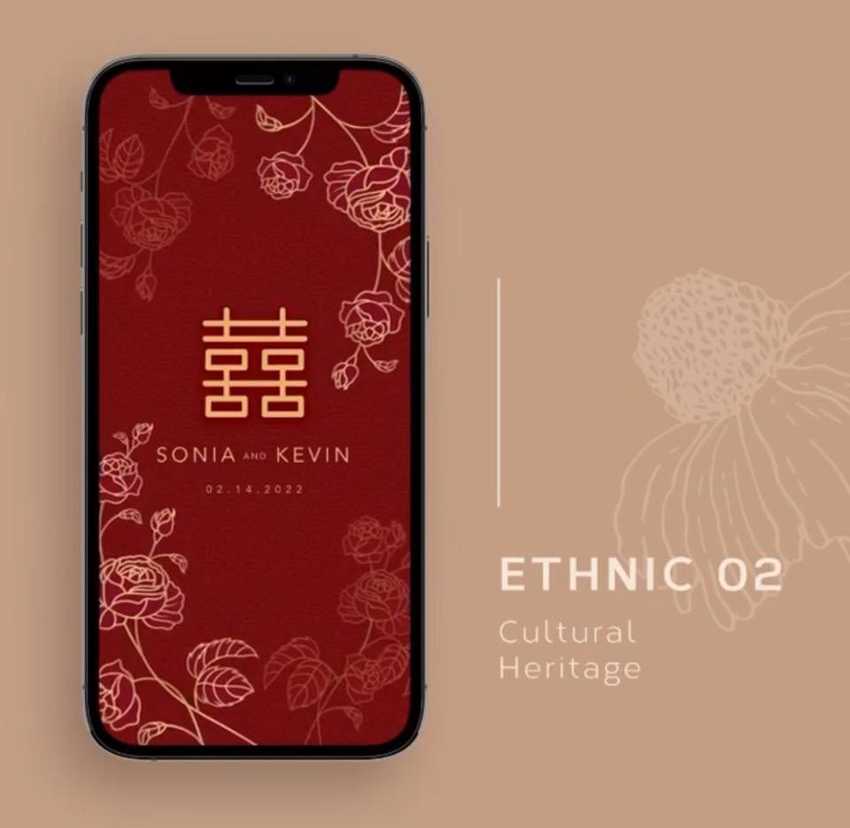
were a brand what i was working on during my internship at Nextframe Studio. The brief was to create invitation designs for wedding and engagement alike. As a brand, Invitera strives to give the best and wide varieties of themed digital invitations, especially during the pandemic era. Scope of work: design and layout, motion graphic, video mockups.
16

17
18
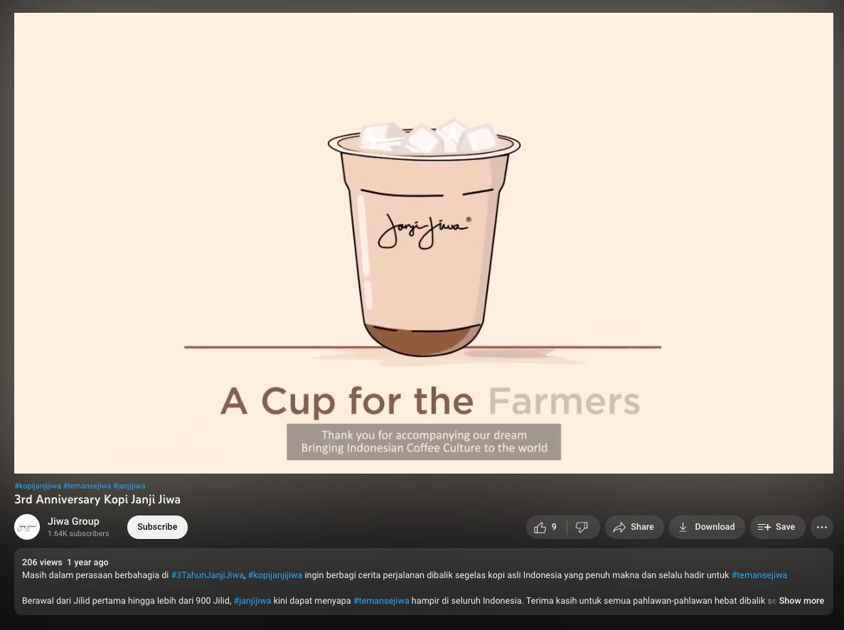
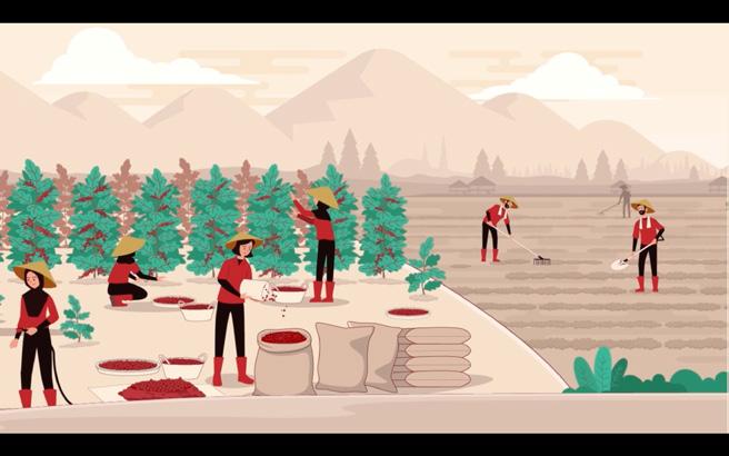
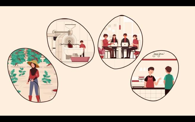
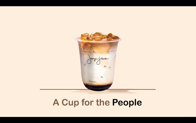
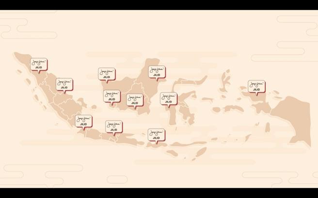
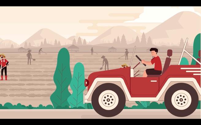
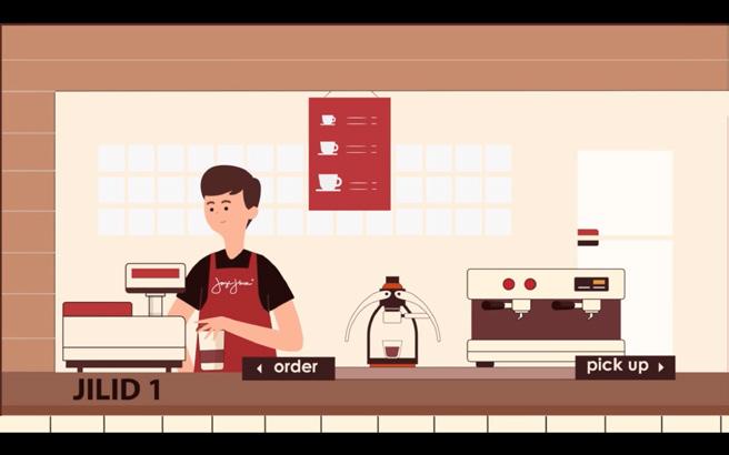
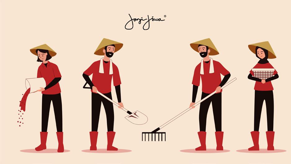
janji jiwa anniversary
is a motion graphic that i did during my internship at Nextframe Studio. The prompt was to make a motion graphic to show the story of how the company has progressed and the the company’s dedication to its consumer.
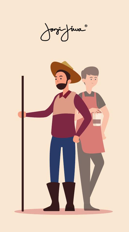
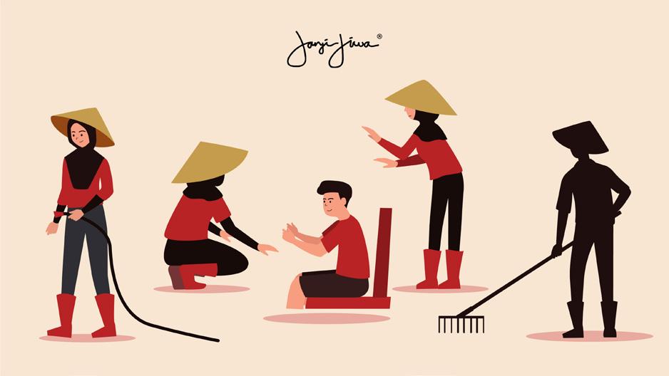
Scope of work:
story board, asset, motion graphic
19
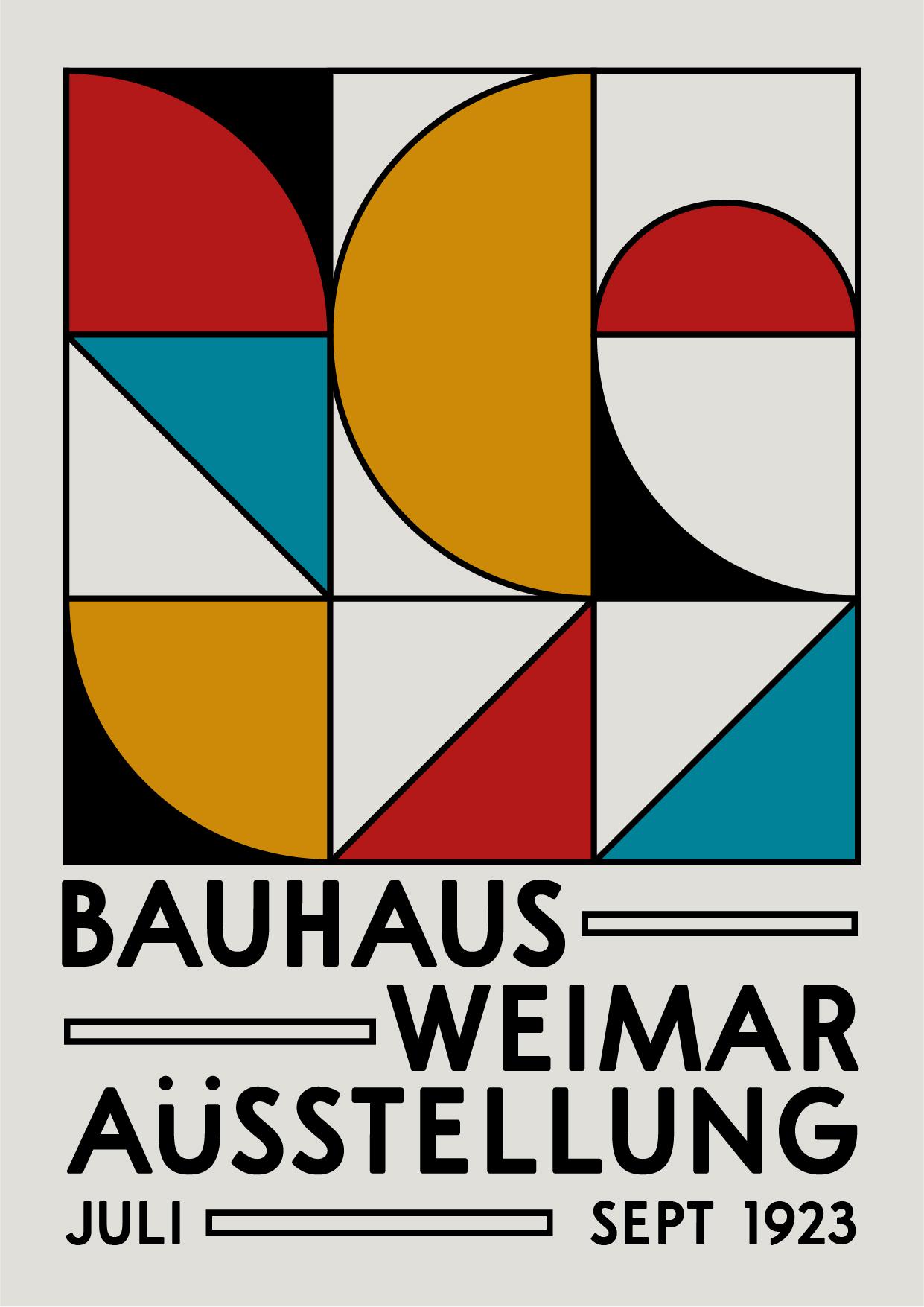
bauhaus poster
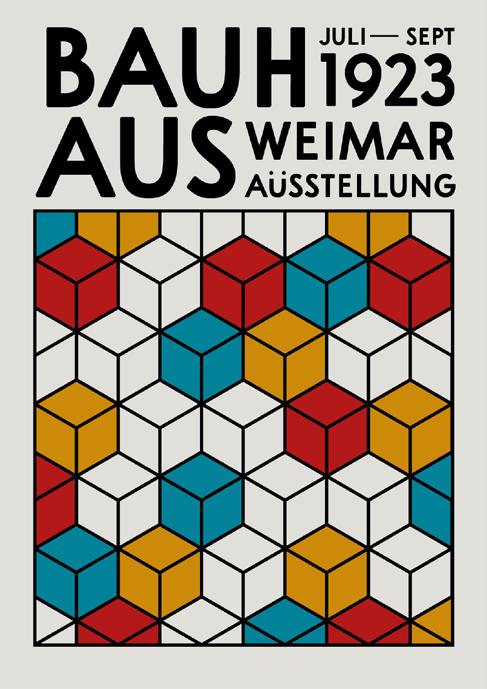
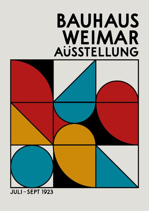
is a poster prompt that i follow alongside my graphic design friends for their assignments. The aim for this poster is to make a graphic poster using the elements akin to bauhaus’s characteristics. The shapes and color that are applied on the design composition showcased the dominant geometrical shapes with primary color to represent dominance using this color harmony.
20
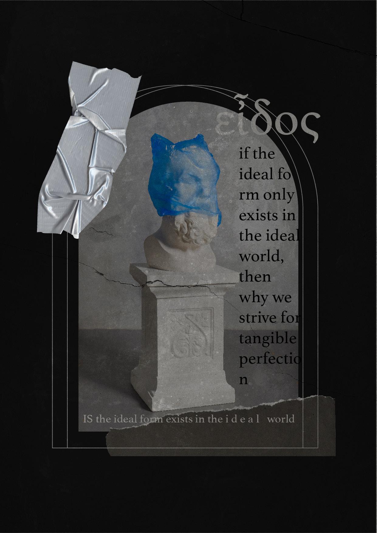
theory of forms poster
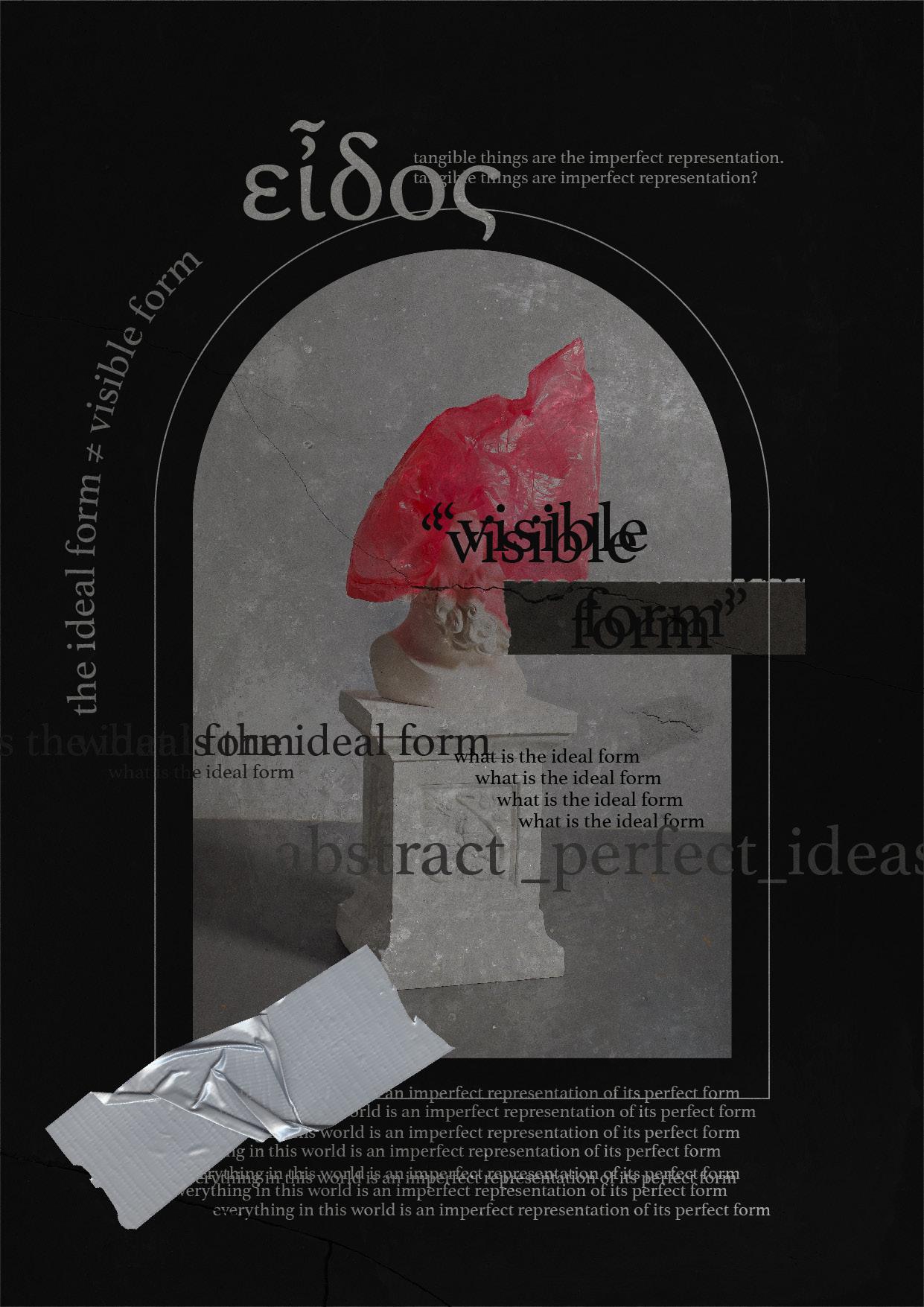
is an experimental project that i made for fun for i was reading my notebook about theory of form and simply got inspired. It also serves as a form of personal exercise of a particular philosophy class back at semester 4.
21
CONCEPTART


22
23
These are the concept arts and illustrations that i’ve done so far.
In the Durasana wayang reference, he is depicted as having a red face. The red face in shadow puppetry has the meaning of an evil character and is generally used in the coloring of giant characters. With this information, the character’s color is not made red, but paler like the character Duryudana. This also serves as a symbolism for Duryudana’s bad character traits.
Dursasana’s character sprites are the same size as Biam’s sprites in that they are shown to be larger. The outfits worn by the Dursasana sprites also follow the character designs.
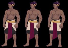

DURSASANA
Dursasana is the name of an important antagonist in the epic Mahabharata. He is the number two brother of Duryudana, the leader of the Kauravas, or the son of King Drestarasta and Gendari. Dursasana has a handsome body, a wide mouth and has an arrogant character, likes to act arbitrarily, seduces women and likes to
Dursasana is the second most famous Kaurava figure after Duryudana. He has an impatient nature and is always looking for trouble with the Pandavas. He also insulted and abused Yudhistira’s wife when the Pandavas lost at dice.
Durasana’s character design has a distinction shape and also the most dominant body shape where he has a large body and also a round stomach. This is based on the circular shape as the primary form of the Dursasana body. This is done by referring to the wayang kulit purwa from the character Dursasana. If you pay attention, the character Dursasana is not shown to have a navel. This is because he is part of a piece of meat that breaks into 100. However, Dursasana is the second oldest brother of the sata Kurawa because
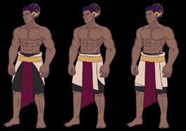
FACTIONS KURAWA


DURYUDANA
Duryudana was the eldest son of Drestrarasta, namely King Hastina. He succeeded in becoming the king of Hastinapura by illegitimate means by giving the disputed lands to the Pandavas in exchange for the Hastina throne.
Duryudana is the character of the King of Hastinapura. He was the eldest son of Drestarasta and became king at a young age. Of the 100 Kaurava figures, only Duryudana had an umbilical cord and he was made the oldest child. He has a cunning, cruel and also greedy nature.
The character design on Duryudana’s body uses a base shape, which is a combination of a square and a triangle. The square shape is used as a symbol of the position he has, namely a king. In addition, the square shape of this character does not indicate that this character is a strong character that can be trusted or relied upon, but as a sign that he has the power to order others to harm people, in this context it is a pandawa.


kana gangsa bracelet, and the dhapur nagaraja keroncong. Apart from that, Duryudana as king also wore additional clothing in the form of a kunca.
The skin color in Duryudana’s character design also has a meaning that is applied from character traits. In the Dursasana leather puppet, he is seen to have a black face which symbolizes supernatural powers and maturity. In the context of Duryudana’s character, he has physical powers, but he is immature spiritually. The application of a lighter skin color to this character symbolizes bad qualities that contradict Duryudana’s strength or supernatural powers.


HEIGHT DIFFERENCES
Duryudana is the leader of Kurawa Faction and as a hero, he is categorized in Tank class. The weapon used on Duryudana’s sprites is the mace. This is written in the story where the Bharatayuda war is almost over. Duryudana was the only remaining Kurawa at the end of the war, and when he finished meditating, he came to the battlefield with a mace.


The height of each character is different based on the reference taken by the Purwa shadow puppets. In the characters Bima, Duryudana, Dursasana, there is a significant difference in their height compared to the other four because the actual wayang of these characters were depicted to have a larger size. This tall stature is also applied in a more detailed way where Duryudana’s body height is slightly shorter than Bima and Dursasana. Bima has the tallest stature because the writer’s original description of Bima and the reference of wayang Bima shows that he is depicted to have the largest size when compared to the five Pandawa
As the King, he wore irah-irahan, namely makuta. Makuta itself is a headpiece that can be used by the king. Unlike the topong, makuta is quite tall. Other accessories worn by Duryudana are the panaggalan necklace, the nagamangsa kelatbahu, the
1
2
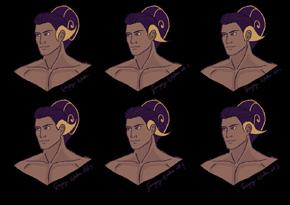
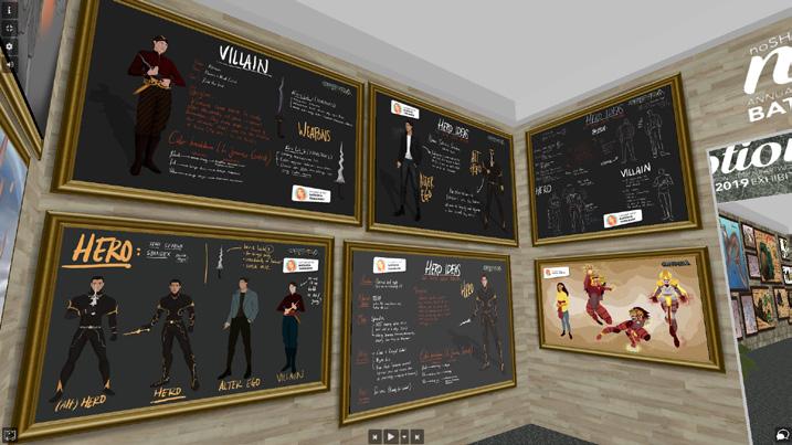
• Character design exploration

• Character stats
3

24
KURAWA
FACTION KURAWA • CLASS TANK
55 THE ARTBOOK OF BHARATAYUDA
THE KING OF SATA KURAWA
ACCURACY DEFENSE SPEED WISDOM
STRENGTH
HEALTH
• Character sheet
FACTION KURAWA • CLASS WARRIOR THE DESPOTIC ONE 59 THE ARTBOOK OF BHARATAYUDA
1 • Dialogue pose 2 • Dursasana’s character stats 3 • Character sheet STRENGTH ACCURACY DEFENSE SPEED WISDOM HEALTH
FACTIONS
FACTIONS PANDAWA The alternative design of Yudhistira will consist of the alternative design for his kampuh, for the alternative pants, alternative clothing and accessories designs, hair design alternatives, and different color applications. Yudhistira’s design alternatives can feature a more traditional as well as a simplified design. An alternative design for trousers that are worn at knee length but with a different styling applied. The alternative design with the addition of accessories was also done as a way to give an idea of Yudhistira’s clothes that he wore when he was young. The alternative design to his hair bun is also done as a more realistic design option or a design option that references wayang kulit or wayang wong performances. 1 • Sumping exploration 2 • Gelung keling exploration 25 THE ARTBOOK OF BHARATAYUDA 4 • Kampuh color exploration
and also has a large size when compared to the previous wayang funds. Another reason that supports Bima’s large body is Bima’s strength.


Meanwhile, the height of Yudistira, Arjuna, Karna, and also Drona does not have a significant di one another. This is because the wayang reference visually shows that these characters are of the same type of wayang and have the same size.


Side by side, the application of the shapes in the individual character can be seen more prominently. While two of the

biggest characters share a similar height, the shape application to their respective design is shown through the shapen of their body and also the shape of their clothes so they have a di silhouette. The Pandawa characters are primarily using the square and round shapes as their base, while the Kurawa primarily uses more triangular shape, mixed with square shape. The application of these shapes also symbolizes the characteristics of the faction, Pandawa is the reliable and strong faction, meanwhile Kurawa is overall a cunning and evil faction.


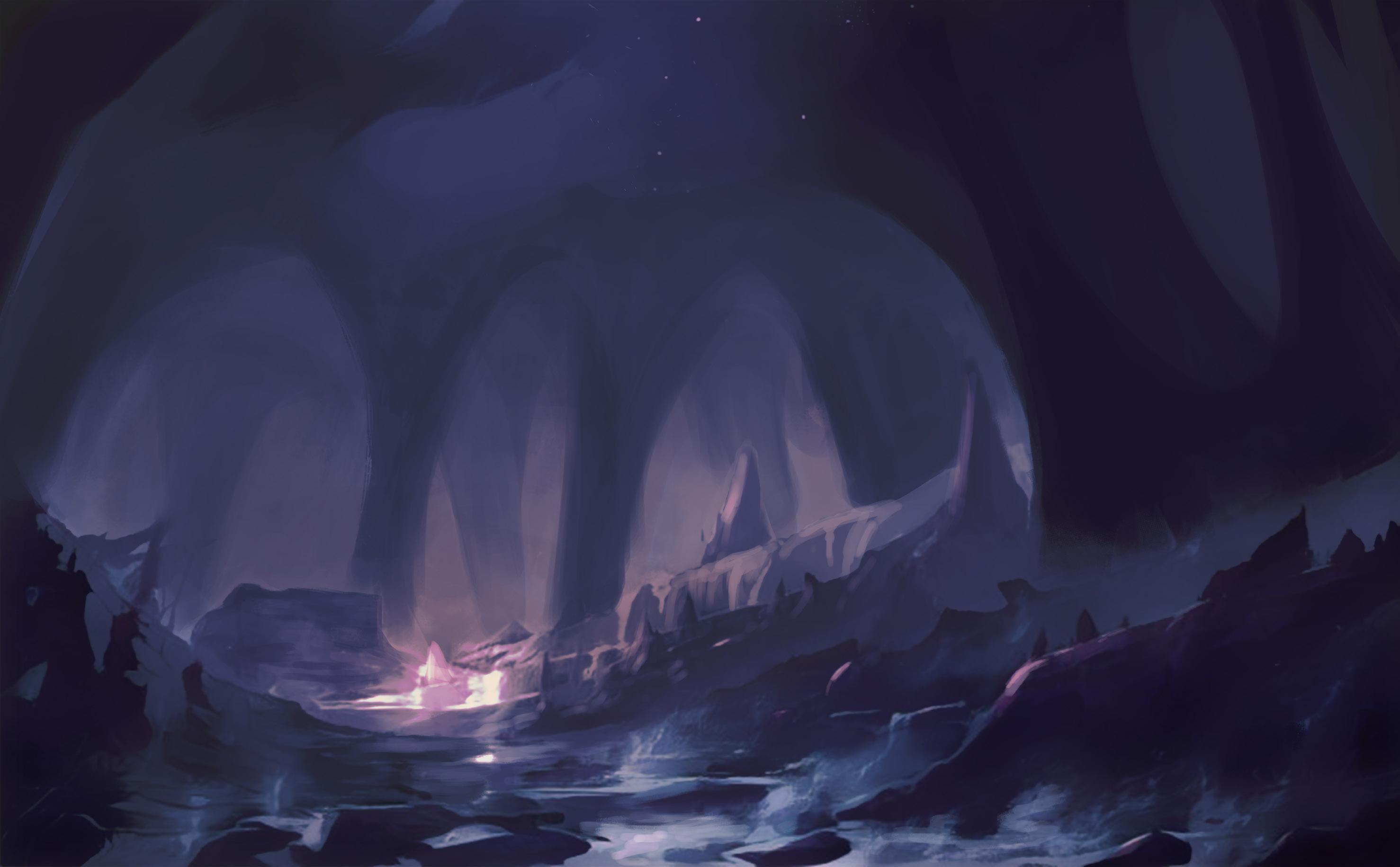
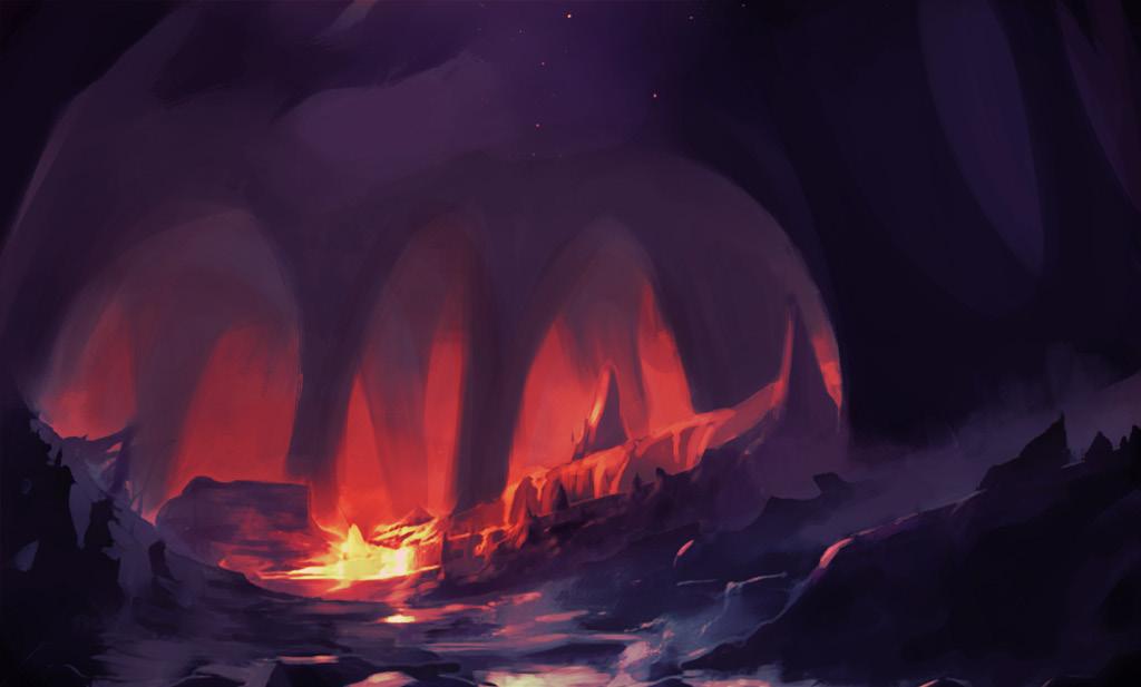
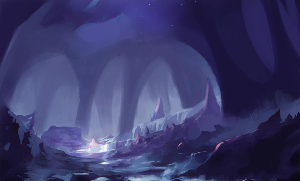
bharatayuda
25
is my final project which to make a concept art for a mobile idle game called “bharatayuda” which based on the book Mahabarata Jawa by N. Riantiarno. The concept contains the character design, weapon design, and environment design.
69 THE ARTBOOK OF BHARATAYUDA
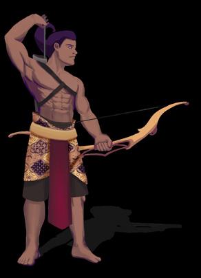
CLASSES RANGER
1 • Karna and Arjuna’s bow alternatives (full size) 2 • Karna, Drona and Arjuna sprites bow alternatives
79 THE ARTBOOK OF BHARATAYUDA
3
• Konta 4 • Arrowhead
26
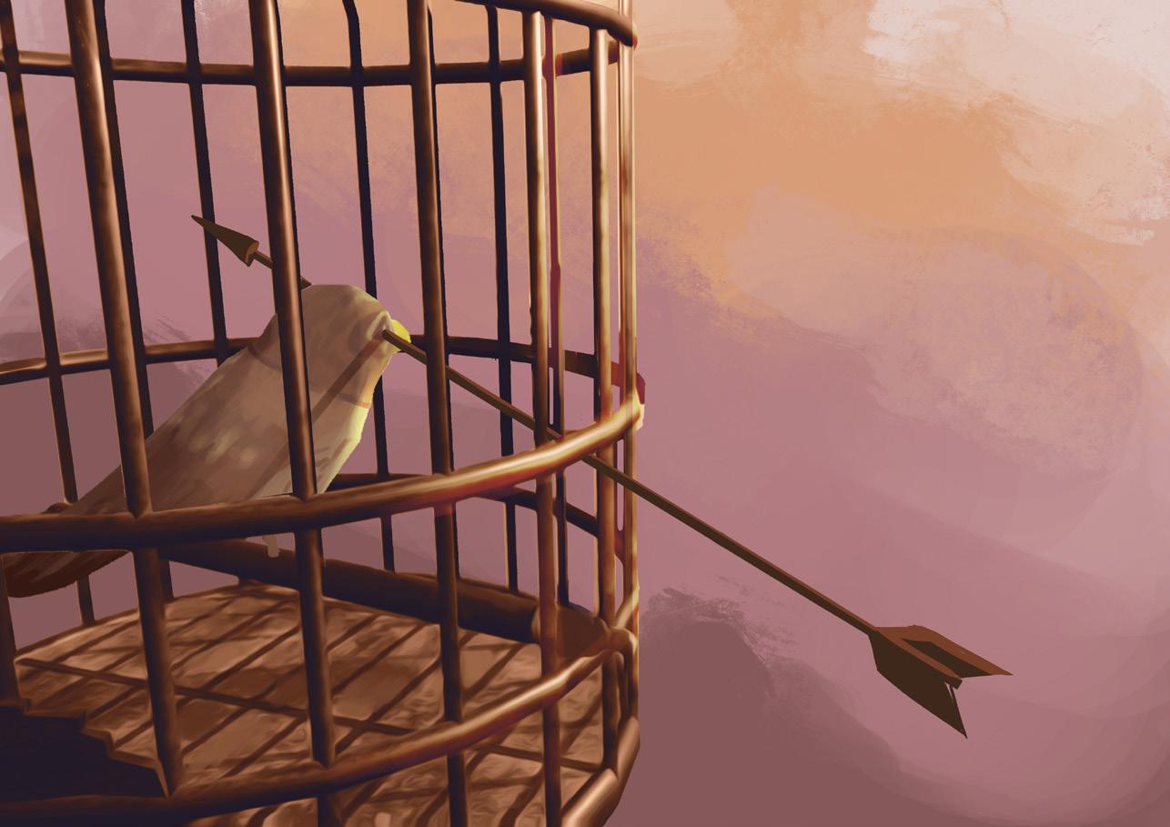
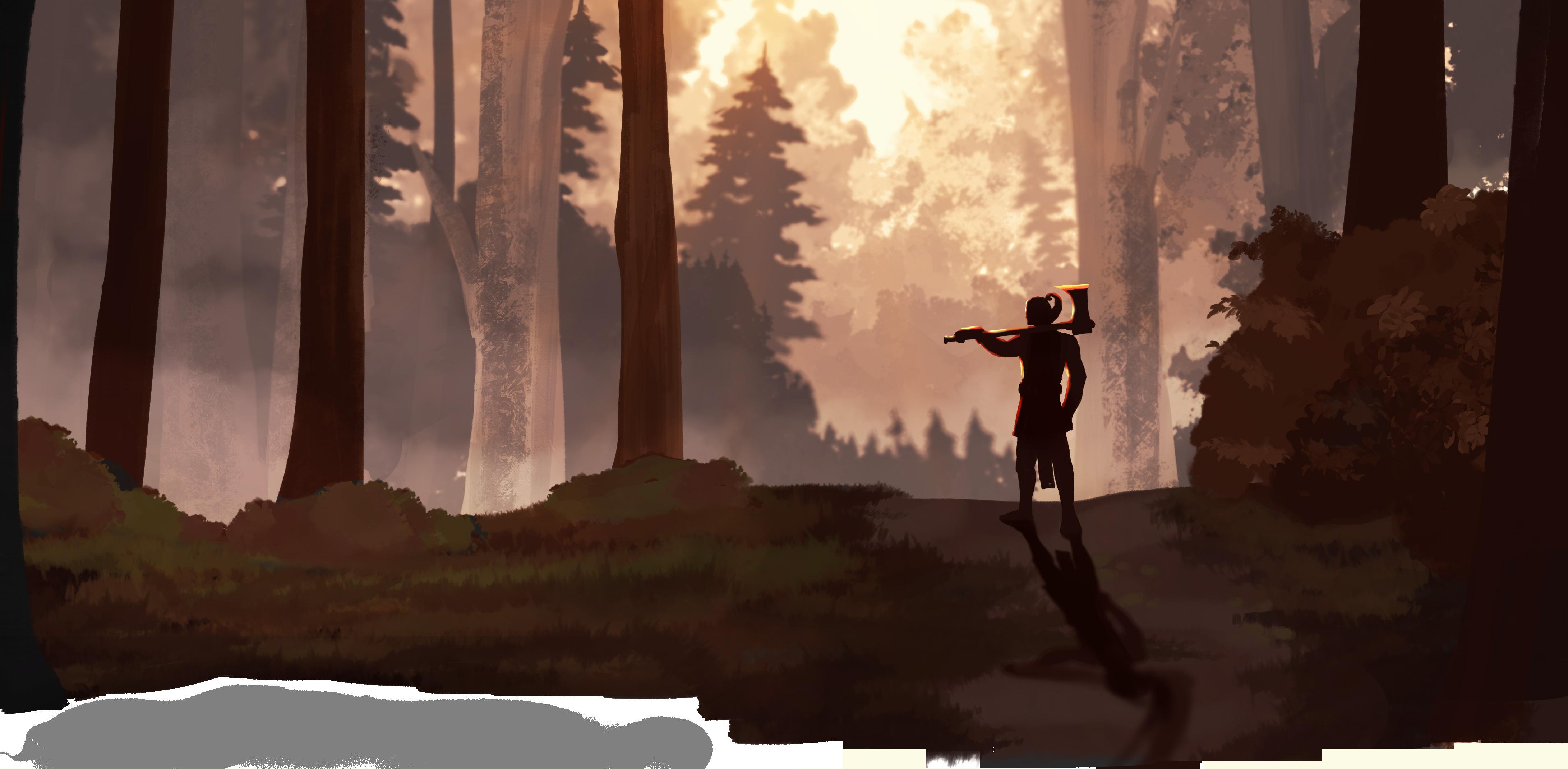
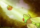
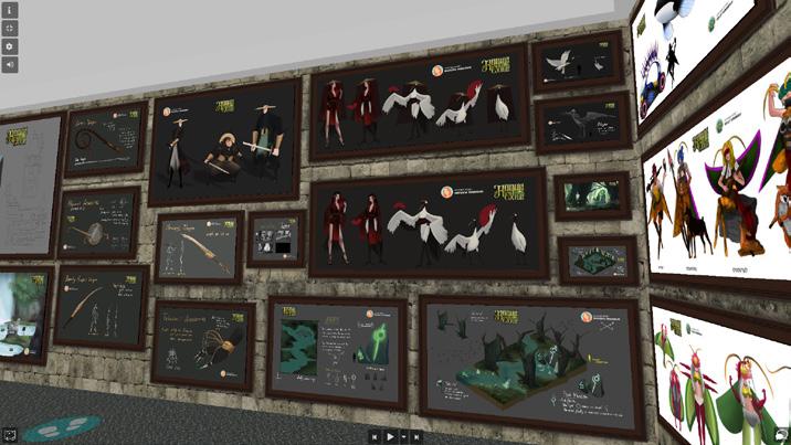
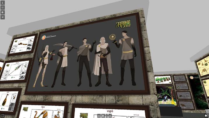
concept arts
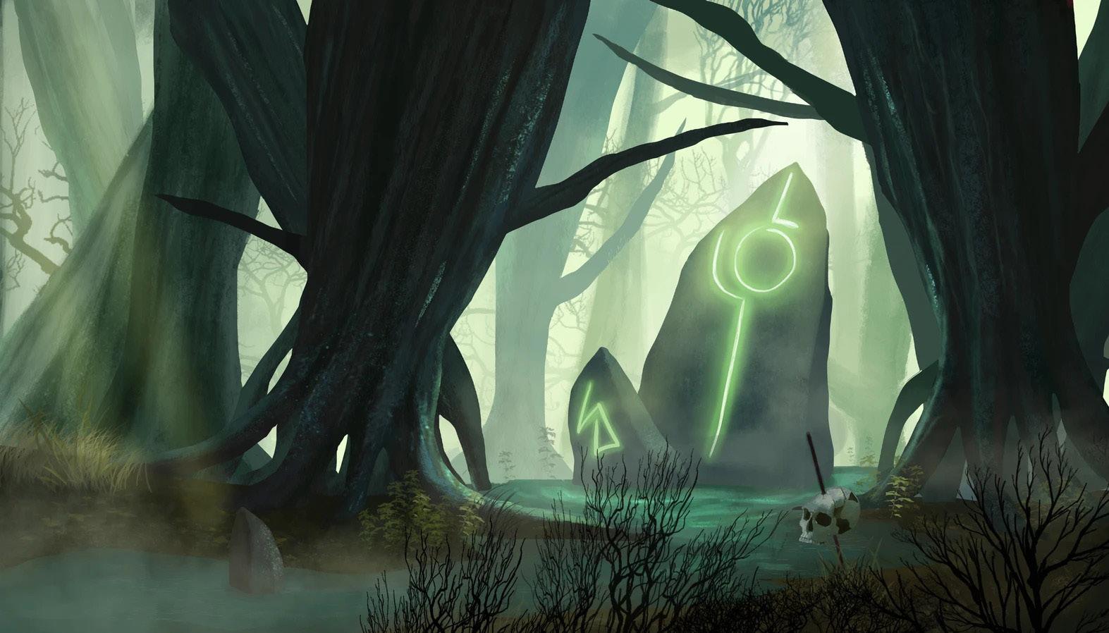
for the exhibition entry NOTION 3 which was hosted in online platform called artstep. The prompt varies of character design, anthromorphic character design, weapon design, environment design, and keyart.
28
29
THANK YOU
For reading, I look forward to work with you.