International Research Journal of Engineering and Technology (IRJET)
e-ISSN: 2395-0056
Volume: 07 Issue: 07 | July 2020
p-ISSN: 2395-0072
www.irjet.net
The Power of D3.js – Data Visualization S. Varun Prakash 1, M. Mohamed Suhal 2, M. Charan Mithesh 3, Mrs. R. K. Santhiya 4 1B.Tech,
Computer Science & Engineering, Manakula Vinayagar Institute of Technology, Puducherry, India. 2B.Tech, Computer Science & Engineering, Manakula Vinayagar Institute of Technology Puducherry, India. 3Assistant Professor, Dept. of Computer Science & Engineering, Manakula Vinayagar Institute of Technology Puducherry, India. ---------------------------------------------------------------------***----------------------------------------------------------------------
Abstract - This paper explores about building complex
front-end systems for businesses or to represent a general cause. The data dashboard that is built using D3.js revolves much around the principles of design to effectively showcase the ideas - to explore, analyze and present data in the most meaningful way. Design decisions are precisely made to create exciting visualizations and to differentiate between good & bad designs.
1. INTRODUCTION The Term “Data Visualization” is the representation of a situation, an object or a set of information as a chart or another image. Basically, abstracting the content in visual form. As a whole, visualization is used for 3 most common cases such as (i) to explore for finding the unknown, (ii) to analyze for testing a hypothesis and (iii) to present data for telling a story).
2. LITERATURE SURVEY A. Explore
(Figure. 2) In 1854, John Snow used a heat map of cholera cases in areas of London to prove his hypothesis that these deaths were spread by water pumps in the area rather than decaying organic matters as the world initially believed. C. Present The goal is to communicate some kind of story and hopefully inspire people to take some action. The New York Times often run interactive data visualizations on their website. These stories are accompanied by a block of text, and their related viewings are made to support it better.
In 1887, Eadweard Muybridge, needed to find out if the legs of a galloping horse have all 4 of its foot in the air which is critically hard for the naked eye to figure it out. A series of experiments with photographs were used to find out the results, which seemed to prove the matter once and for all.
(Figure. 3)
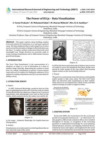
3. EXISTING SYSTEM (Figure. 1) In the image - Eadweard Muybridge (An English-American Photographer). B. Analyze Visualizations are mostly made to test the hypothesis that we have about the state of the world. © 2020, IRJET
|
Impact Factor value: 7.529
|
By the mid-1800s, the circumstances for the accelerated growth of visualization had been set — an "ideal storm" for data graphics. Official state analytical offices were installed throughout 13 Europe, in recognition of the increasing greatness of mathematical knowledge for social planning, industrialization, business, and shipping. Statistical theory, initiated by Gauss and Laplace, and lengthened to the social realm by Guerry and Quetelet, presented the means to make ISO 9001:2008 Certified Journal
|
Page 5750