Wax Fusion


A digital publication of International-Encaustic-Artists.org Michael Bossom Joanna Kidney Linda Robertson Kelly Williams Lonnie Zarem Spring Issue X:2024 Kaleidoscope
Board of Directors
Regina B Quinn President Social Media Director
Lyn Belisle Vice President
Isabelle Gaborit European Member-at-large
S. Kay Burnett Executive Editor Wax Fusion
Mary Jo Reutter Treasurer
Rhonda Raulston Secretary Tech Director
Melissa Lackman Grants Director
Melissa Stephens Exhibitions Director Membership & Chapters Director
Michele Randall Member-at-large
Paul Kline Member-at-large
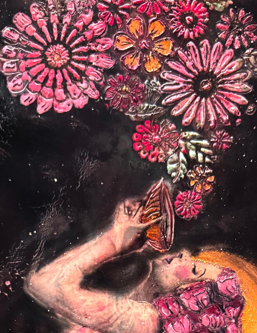
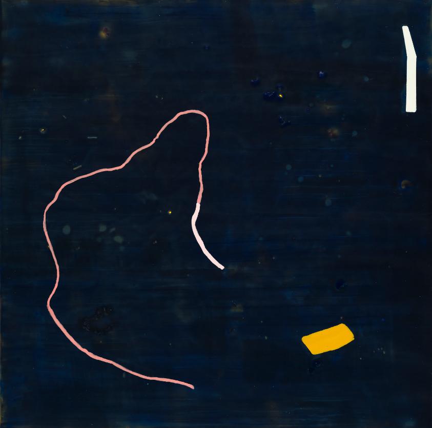
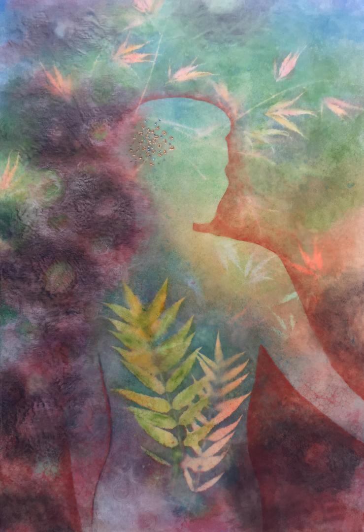
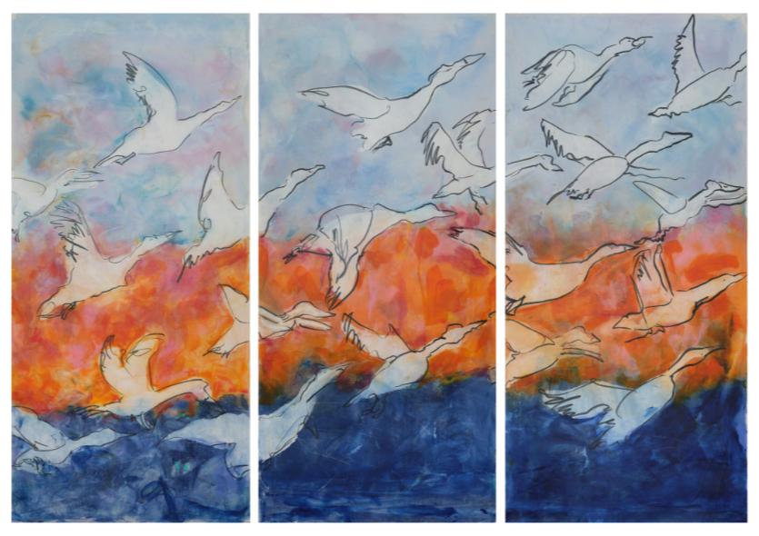
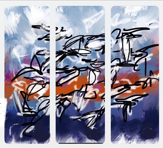
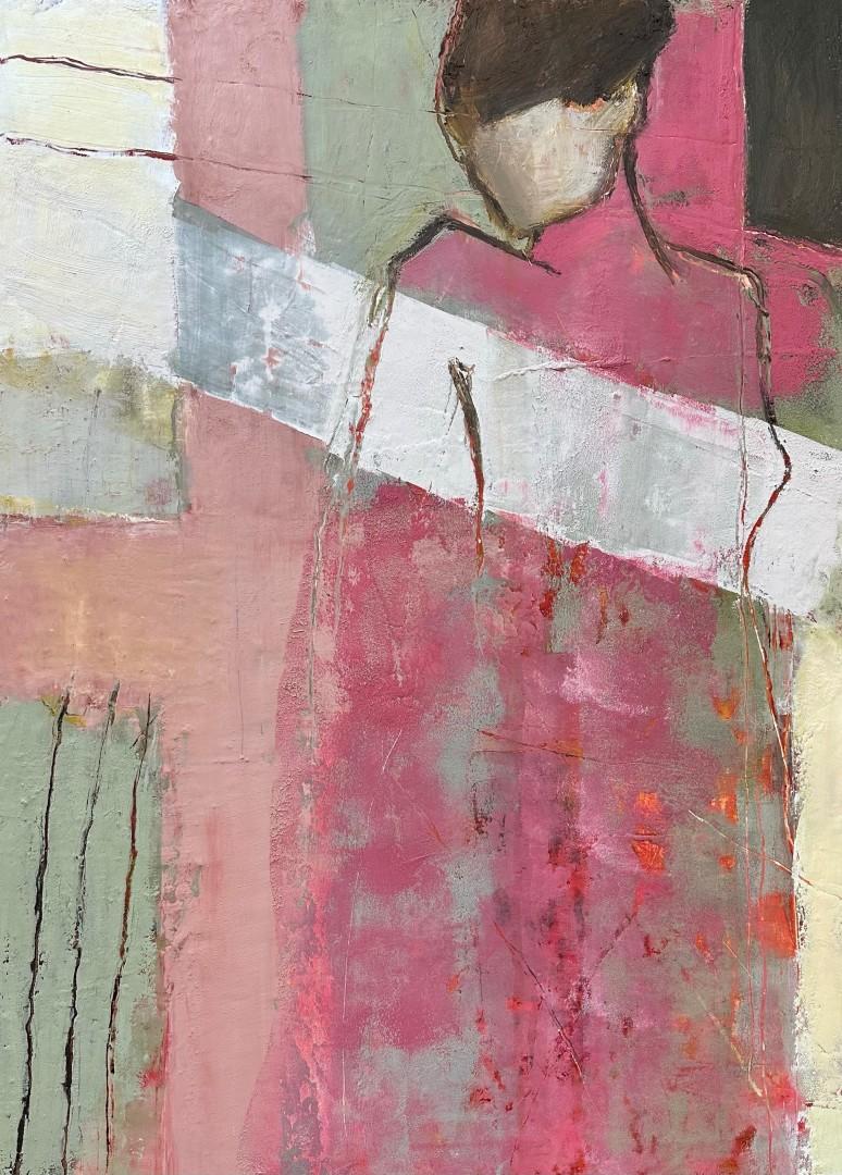
Front cover, Submerged in Shadow, Sustained by Hope - The Midnight Elixir (detail) Encaustic and mixed media by Kelly Williams
From the Editors
Kaleidoscopes work with loose bits of material placed between two flat plates and two plane mirrors to reflect an endless variety of fascinating patterns. Kaleidoscope can also describe a constantly changing pattern or shifting sequence of objects or elements. Metaphorically, the kaleidoscope can illustrate how we manage information diferently depending on context, and how old pieces of information shift each time new information filters in. These patterns of information mirror our thoughts, which are endlessly dynamic rather than static.
As artists, we explore various ways to explore an infinite variety of these dynamic shifting themes and narratives. In this issue, each of the artists has generously shared the personal tools and techniques they use to tell their stories through their unique styles and focuses. Their tools include an encaustic iron, heat guns, torches, hot boxes, hot tools, carving tools, stencils, scrapers, brushes, and more. Their materials include encaustic medium, found objects, pastel sticks, PanPastels, pigment sticks, foil, gold leaf, inks, transfers, watercolors, and gouache.
Also in this issue, we shift the pattern a bit to include some of the Juror’s (and our) favorite pieces from the recently juried IEA exhibition Changing the Narrative. Works in this show, much like a kaleidoscope, can expand a viewer’s perception or even create a change in their perspective. And we’ve captured some of the memorable moments at the exhibition reception in Palo Alto.
We hope you enjoy reading this Kaleidoscope issue of Wax Fusion. And, as always, we appreciate your feedback. Please contact us at WaxFusion@InternationalEncaustic-Artists.org with comments, questions, ideas, and suggestions. While this journal exists to serve the needs of IEA members, it is also free and available to the public. You are welcome to share this journal with anyone interested or working in the visual arts, looking for information on encaustics, or beginning to explore the world of encaustics.
S. Kay Burnett
Lyn Belisle
Paul Kline
3
and the IEA Board of Directors
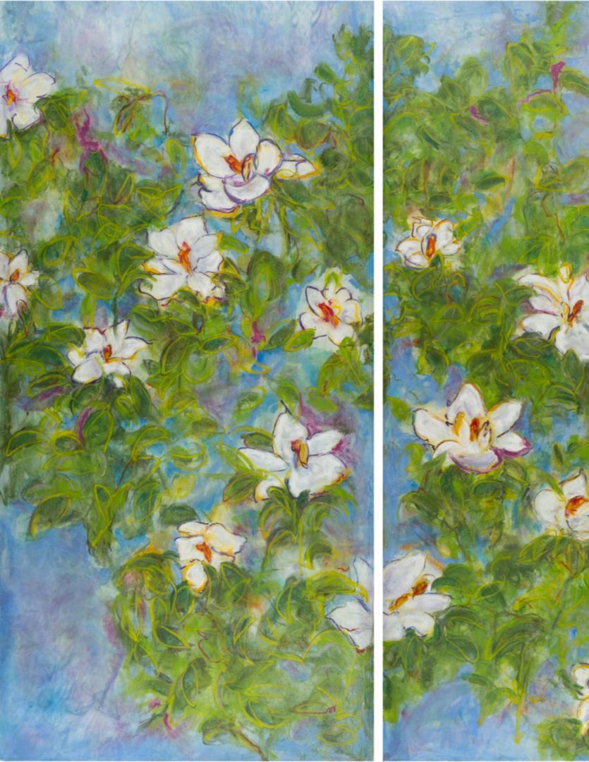
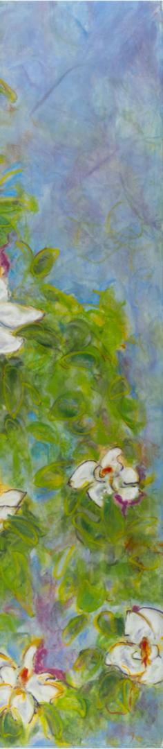
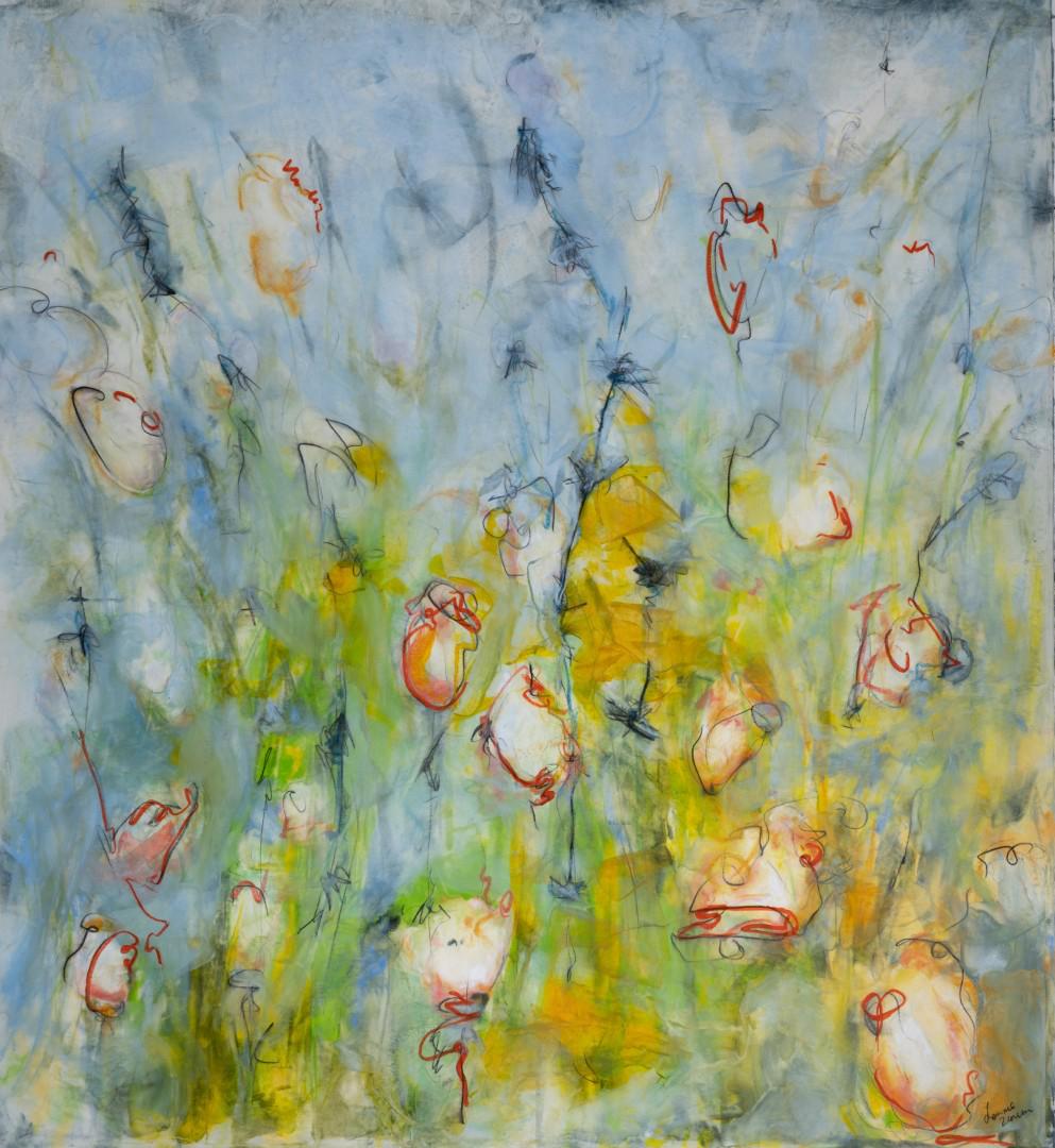
Savannah Magnolias by Lonnie Zarem
monotype, 64 x 66 in
Back Cover, Warm Room by Michael Bossom
on canvas, 760 mm x 510 mm
5 Content Ironing Encaustic Wax 6 Michael Bossom Abstraction through a 26 Kaleidoscopic Lens Joanna Kidney Expressing My Shadow Self 46 Linda Robertson Rebel Rose and the Golden Cage 60 Kelly Williams My Encaustic Monotype Process 78 Lonnie Zarem Changing the Narrative 102
2024 Palo Alto Pacific Art League In Memory of Melissa Morton Lackman 118 Regina Quinn
IEA Juried Exhibition
Encaustic
Encaustic
Ironing Encaustic Wax
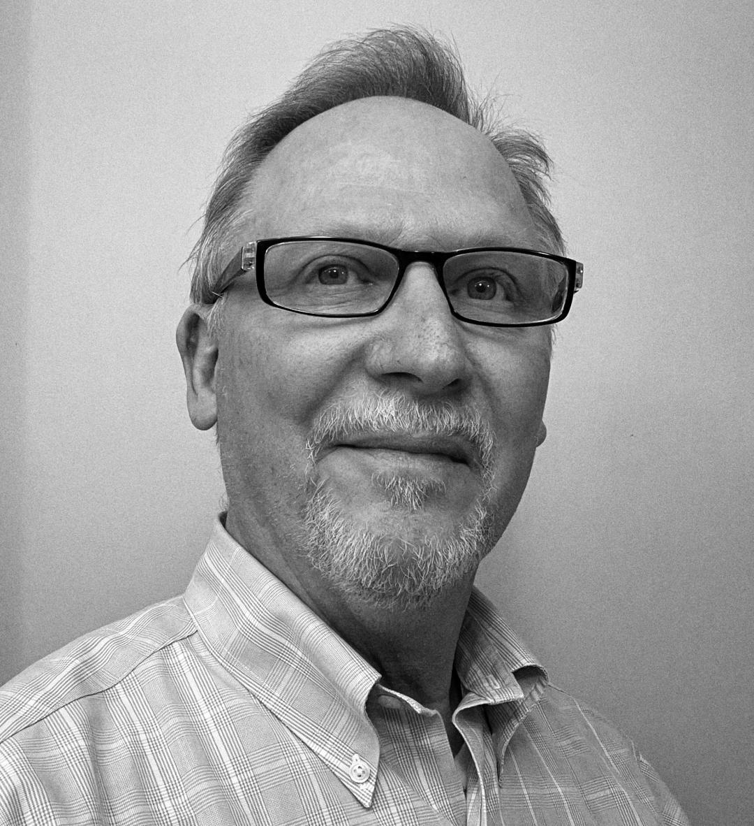
Michael Bossom
“Do you do the ironing at home?” they ask with a grin.
“No” I say, “But I did begin
ironing wax with
my wife’s domestic iron.”
And that is how it all started way back in 1986. That is how my life changed completely; how hundreds of thousands of encaustic irons came into being! Simple iron techniques and marks, achievable by almost anyone, became a pathway to expansion and promotion of the encaustic process. Some finer artists have found this hobby-art aspect of the encaustic genre distasteful, but of every thousand hobby-card makers there are a few who rise higher, who realise art is something for them, who evolve. We all start at the beginning.
Wax can be applied as an encaustic medium through two main approaches.
Hot wax applied with cold tools, often brushes.
Cold wax melted by hot or heating tools:
• Irons for spreading, pushing, dribbling, and tooling.
• Hot air guns for blowing and fusing.
• Low heat stylus-type tools for details, shading, graphics, etc.
• Hotplates for underheating, as palettes, for enabling coating.
These are some of the main tools, although there are more.
6
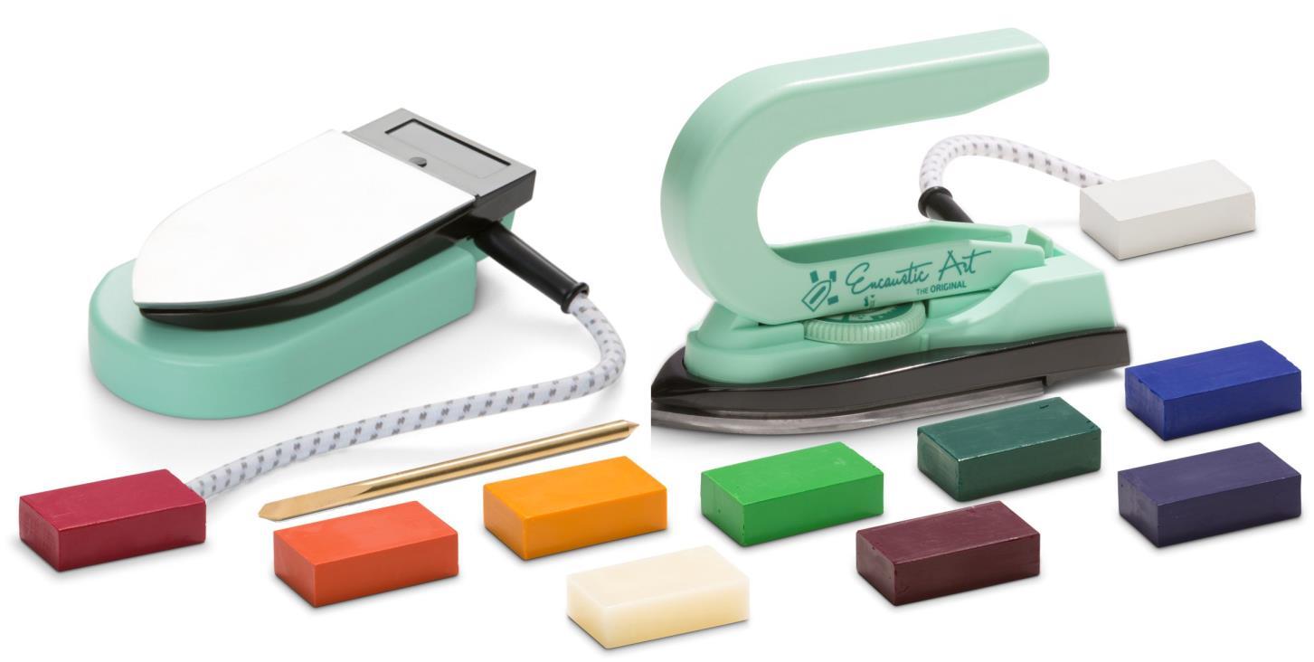
Encaustic Art Painting Iron and inverted mini-hotplate plus scribing tool and wax block colours
A palette knife is recognised as an obvious tool for oils and acrylics. So why are people surprised to find an iron being used in much the same fashion, for working a medium that uses heat as its solvent? Well, irons can be big and can feel clumsy to an unpractised hand, but the iron ofers so much that it is a logical tool to reach for and use when wax needs melting.
Size, shape, weight, temperature control, and manoeuvrability are all qualities to consider in the choice of iron. An adjustable yet stable temperature is vital. This is governed by a thermostat, which ideally needs to have a maximum rise and fall of 10 degrees Celsius (18 Fahrenheit). It then behaves in use pretty much as if the temperature is constant. The base plate needs to avoid shedding any molecules of metal during use. Some irons use a cheap aluminium, which is soft and causes grey matter to mix into the wax during work – not good. A hard metal base is ideal. Coatings will wear of and non-stick coatings cause the wax to gather in drops or small puddles, making it far less controllable. And what quality of metal hides under the coating?
7
The weight of the iron will afect your ability to hold it and control it. A smaller travel-iron size is far easier to brandish than a big domestic one. And no steam holes please, unless you want wax inside the iron and “hole patterns” left after every lifting stroke. I use the Encaustic Art Painting Iron, which, although not perfect, does the job adequately. It can also invert into a mini hotplate!
As a tool the iron ofers amazing opportunities for control, despite the apparent clumsiness of the bulk and the attached drag of the electric power cable. An iron is easy to use for creation of four basic mark types.
• The flat baseplate melts, spreads, and smooths wax over a surface.
• When lifted of a waxed surface, the iron creates suctional patterns, much like coral or foliage.
• The edge of the iron can produce straight or curved lines and push wax around.
• The point of the iron can make spots and be dragged through wax.
• And of course, wax melted on the iron can also be dribbled onto surfaces.
Take note that card stock is a non-abrasive surface. The iron works very well on almost all smooth surfaces, but any abrasive substrate will cause scratching of the metal iron base. This will interfere with the purity of the colour and wax medium. Rigidabrasive-surfaced materials are best avoided. Some gesso can be abrasive – be aware!
8
Simple A6 landscape card using four basic effects
In a simplistic way, these four main efect types can be combined into a landscape representation. With practise and a bit more understanding of the subject, a fuller and more convincing landscape can be created. At the end of the day, it’s all an illusion; it’s just some wax colours on a piece of card. But what this idea allows is accessibility of an artistic experience to everyone, especially if abstract results are included as a satisfying outcome. The truth seems to be that for most people, who have not yet found artistic expression, landscape is a popular initial direction.
9
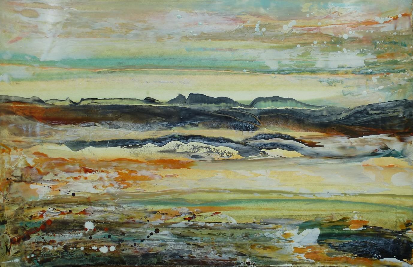
A4 ironed landscape, Encaustic on white card (300 gems), 297mm x 210 mm
As I write this, I’m forced to acknowledge what an amazing tool the iron is for any level of encaustic artistry. It turns your hand into a tool and solvent all at once. The magic of encaustic is literally exposed by a move of the hand, now behaving “as one” with this large, heated palette-knife object.
I should point out that I do not like the smell nor fumes that resins create when heated, so I prefer to use non-resin wax mixtures. Sometimes I make my own wax mediums, but for colours I generally use the readily available encaustic art waxblock brand. These contain carnauba wax to increase the melting point, along with beeswax and parafns. I like these colours for the self-fusing methods and applications I mainly use.
10
Foxgloves are made by the iron tip, a bit fiddly but always appealing to the public. This is an A2 painting which I filmed in the making, so if you are curious to see exactly how it was created then please take a look at the 20-minute YouTube video.
The Foxglove Video:
https://www.youtube.com/watch?v=2ajNwfsLNTs
artsencaustic Channel:
https://www.youtube.com/c/artsencaustic
Foxgloves, A2 ironed landscape, Encaustic on white card (300 gms), 420 mm x 594 mm
12
A2 ironed landscape, Encaustic on white card (300 gms), 420 mm x 594 mm
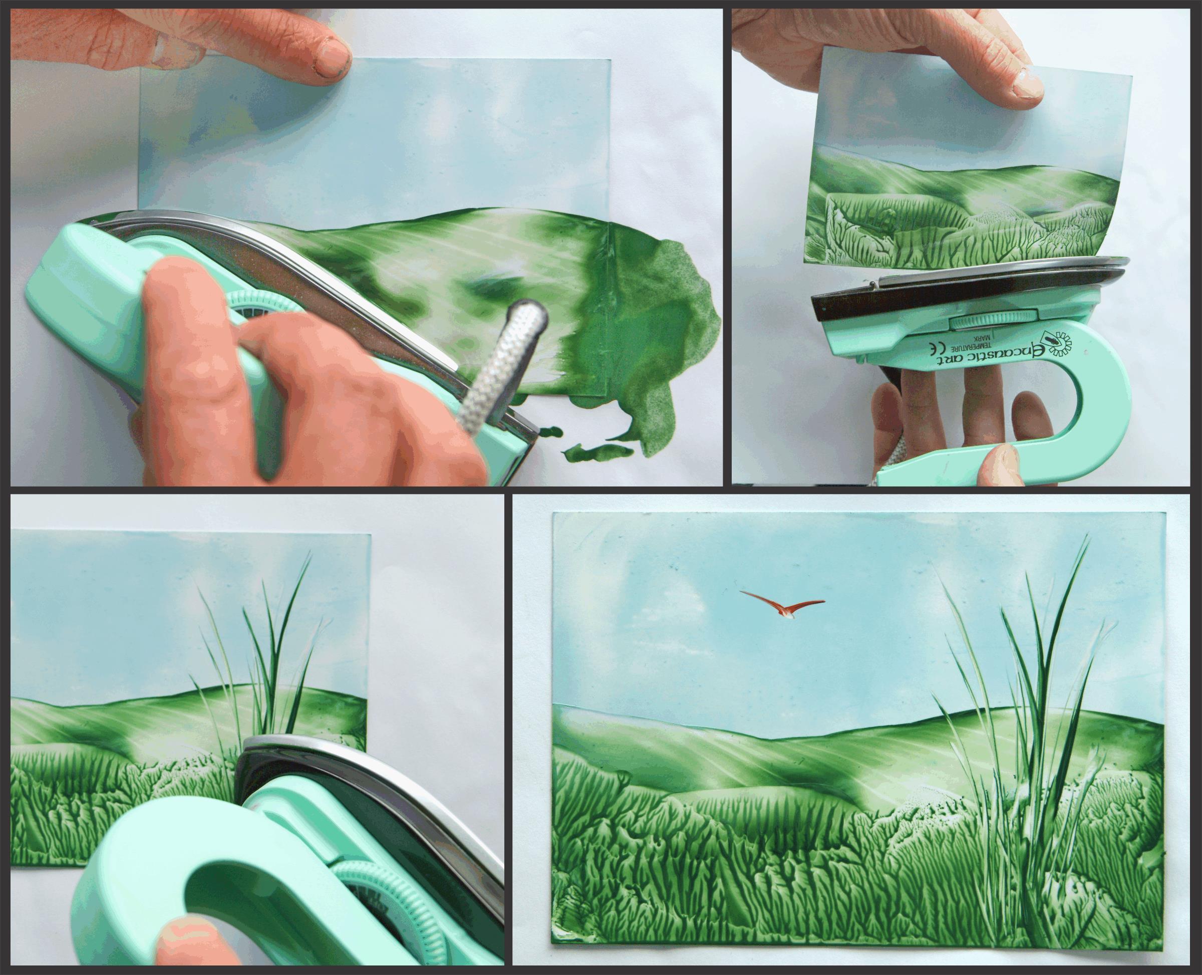
Here is one more landscape to show the way the iron can smoothly deposit molten colours. It also spreads any existing wax layer to blend and merge with further new colours. This card is much larger than the iron, so I usually turn the tool up to a hotter setting. During each stroke, the iron baseplate loses heat into the cooler work surface. Even then, there can be some slight waiting time for the iron to reheat between strokes. But I love the freedom of the iron as an applicator and fusing device all in one.
13
Kaleidoscopes were mentioned at the time that I was invited into this space. Their mirrored illusions ofer organisation to random patterns.
That would be a fairly good description of my approach toward the art of encaustic creativity: To be out of control, and then make sense of what has occurred. I don’t like working with too much preconception. I prefer to allow the wax a voice, to allow the medium to be just that—A medium between me and whatever it is that reveals the imagery I am so often surprised to discover. The Ancients used encaustic wax for soul portraits. In my view there is a special value in wax that is well suited to that end.
This image was created by using the back square edge of that little iron. The creation was worked from the central zone outwards. When the iron is placed, then anything and everything underneath will change form; the solid becomes liquid and then reverts to solid once more when the iron is moved away.
This image, like most of the work I do, is painted onto white card. As resin is not part of the mix, the wax layer is very thin, but cracking is not an issue.
A scribing tool, basically any non-sharp pointed tool, became the detail maker, scratching and etching away the wax to add line, design, and interest.
Overthinking abstract iron square back
Encaustic on white card (300 gms), 297 mm x 210 mm
14

Another aspect of kaleidoscopes is their perfect reflective duplication. The internal mirrors organise the random mixtures of trapped material into beautiful patterns, unique to every twist of the device itself. And this reflective idea is another I have used to encourage uptake of encaustic exploration.
The mandala square is a simple development and accessible to all. Simple can often mean accessible too.
While small things are great starting places for exploring techniques on a small scale, they also ofer their creators an option to share work through greetings cards. Most of us tend to keep such gifts if they are original.
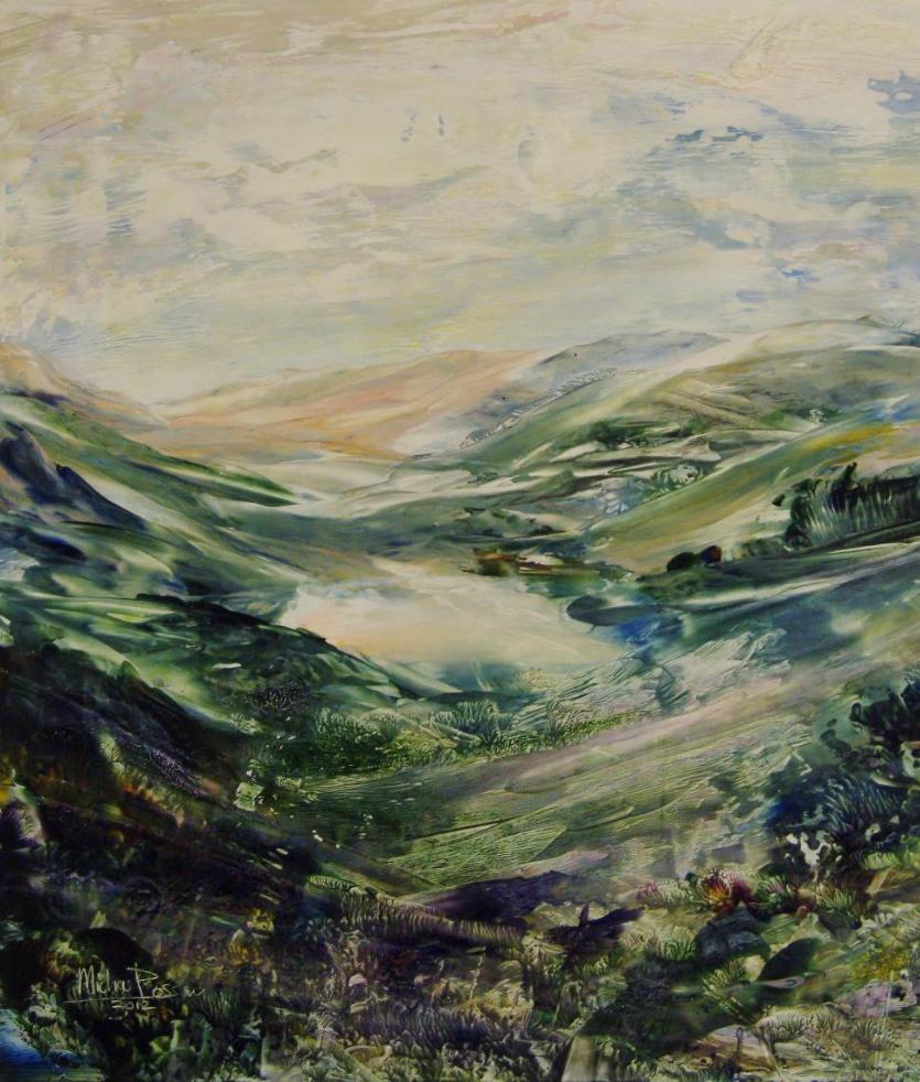
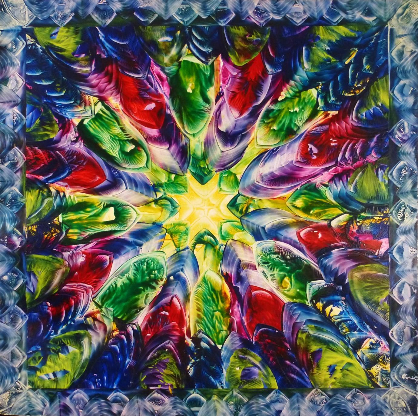
But to impress from a greater visual distance, scale must grow. So here are a couple of bigger pieces, both kaleidoscopic in nature, but formed in quite diferent ways, still using the iron as the main tool.
16
First, this work is a very evidently an “iron-made” piece. This was intentional and created as a display piece for the Art Materials Exhibition in Islington, London. That inward pointing energy does have a visual taste of kaleidoscope flavour.
Remember, these mandala-type constructions start with applications in the centre, always working outwards.
Encaustic on white card (300 gms), 640 mm x 640 mm
Encaustic on white card (300 gms), 520 mm x 520 mm
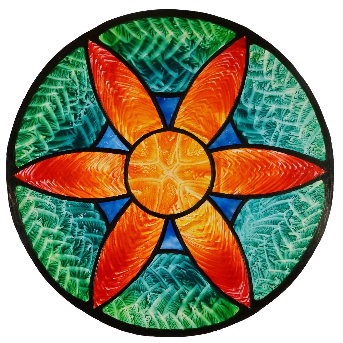
The flower mandala is in homage to stained glass, and the brilliance of light which can occur therein. It is a combination of multiple pieces; first waxed and patterned, then cut to shape. The pieces were carefully glued onto a rigid board. Finally, a stylus tool fitted with a drawing tip was used to make the black “leading” which covers and hides the edges of the pieces, making it feel more complete.
18
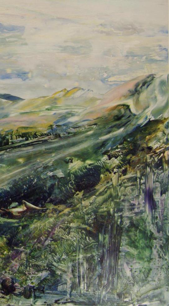
The iron is such a versatile tool, and encaustic wax is such a versatile medium that it is a difcult thing in the confines of this article to express its diversity. There are two more approaches worth a good mention though, pushing with the iron’s edge and pressing with its tip. I love them both as ways of working.
This initial one is on paper, which absorbs the wax immediately. Drops of wax can be splattered or dripped on first. Then loading the iron with bands of colour across the plate, the straight edge is used as a sort of “bulldozer.” The wax can be pushed across the surface, melting those drips or blobs as it passes over them, leaving a trail of absorbed colour.
Abstract edge work, Encaustic on white paper (90 gms), 297 mm x 210 mm
Stretched canvas is available everywhere, but often overlooked as a substrate for encaustic work. This is usually for one of two reasons. Firstly, a brittle wax type can more easily crack if applied at any thickness onto a flexible surface. Secondly, the keying value of ready primed canvases is intended for oils and acrylics, but proves poor for wax.
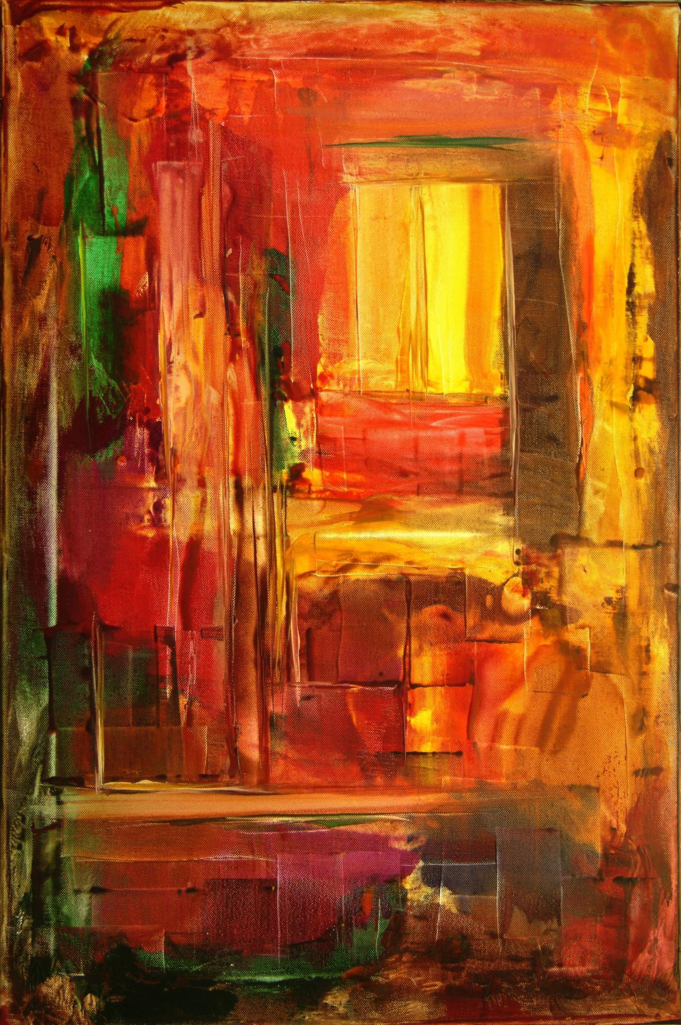
This example was done many years ago. I called it Warm Room and it still lives with me.
When working onto primed stretched canvas, I tend to use abrasive paper to sand of some of the primer and roughen the surface. This action helps to provide a better key.
The other critical thing is to ensure the wax and surface are hot enough for a proper bond to occur. Imagine a candle dripping wax onto a slick tabletop. It is usually easy to pick those wax drops of, because the hot wax has hit a cold surface. Taking time to ensure adequate heat of both substrate and wax seems to improve the adhesion and bond between them. In creating the Warm Room canvas, the iron was loaded with wax, then pushed along on its edge “bulldozer” style. Sometimes it was used as a spreading tool; sometimes it was slid along following the narrow line of the edge. So much is possible with an iron.
Warm Room
Encaustic on canvas
760 mm x 510 mm
Also featured on the back cover
20
Edgescape, Encaustic on watercolour paper, 400 mm x 600 mm
Of course, using this edge-pushing idea, the technique can be used for an interesting landscape too. If you are interested to see how the small iron created this landscape, there is a video on YouTube which covers it all. It is less than 10 minutes long and was created around 2015.
The Edgescapes Video:
https://www.youtube.com/watch?v=-kTkc517ipc
Artsencaustic Channel:
https://www.youtube.com/c/artsencaustic
22
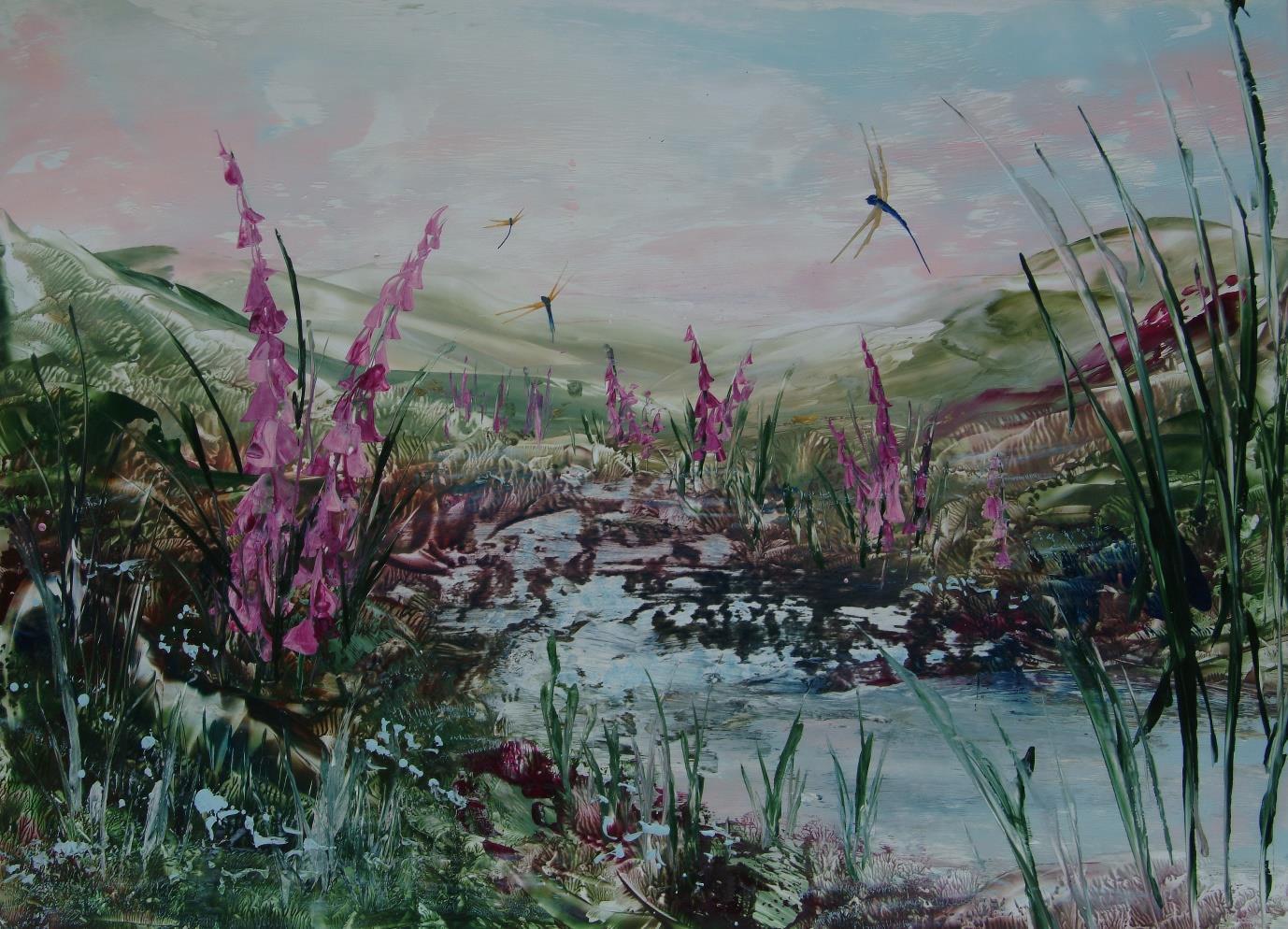
Here is another approach, before I finish the ironing for today. I called this “indirect-wax transfer” for obvious reasons. A boxed-type of tissue is impregnated with wax colours. I find that some colour overlap is good. Tissue is now the wax colour carrier, and all one must do to liberate that wax colour is use the iron’s point or edge to deposit the medium. It is surprisingly controllable. The little dragonfly-pool card image has inspired many people to want to master this approach.
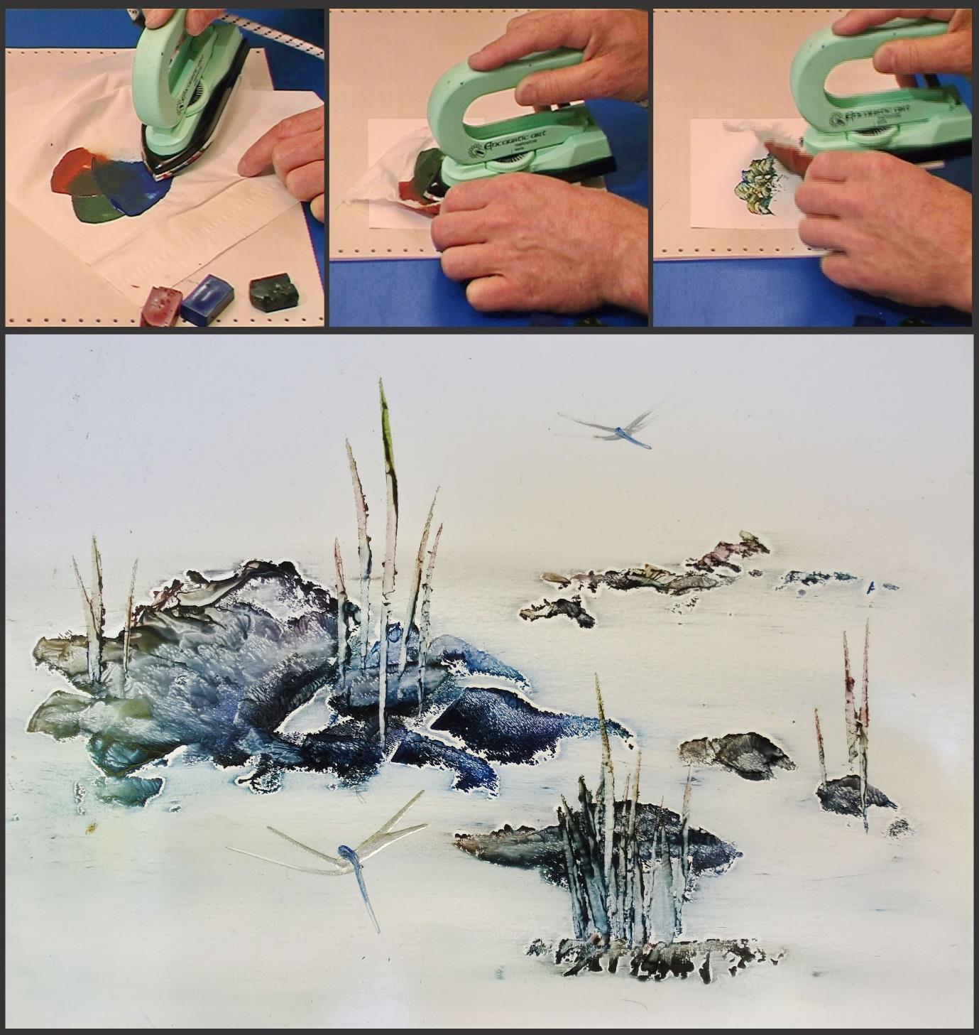
23
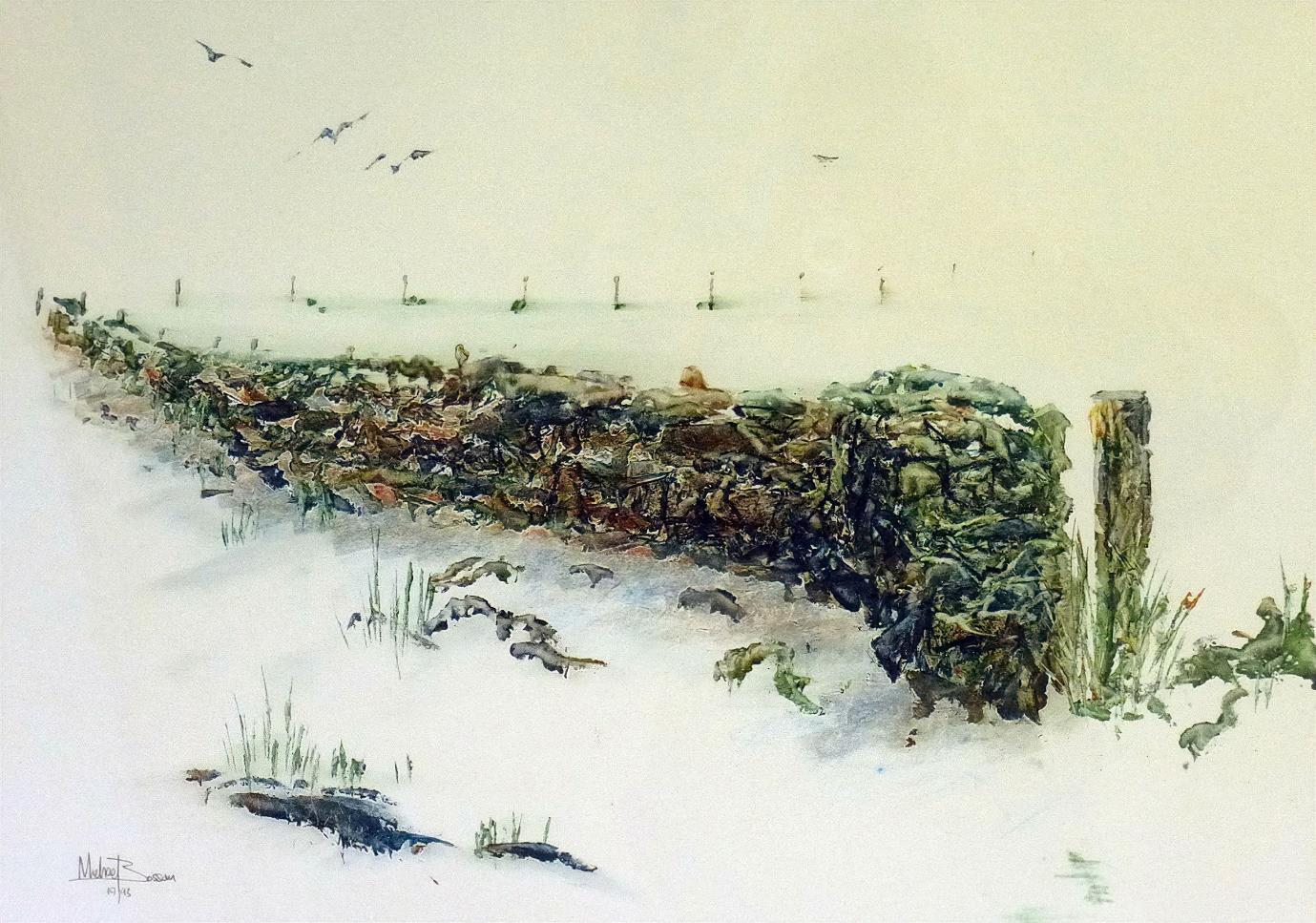
The beauty of using tissue as a wax carrier is that the softness of the tissue somehow finds expression in the softness of the result being created. The large white card used here already implies the possibility of snow. The wall, posts, birds, and grasses are a touch of the iron through that waxed tissue.
One more simple technique is to rub the waxed areas of the painting with a firm but sensitive finger. This action is quite vigorous because the wax needs to be softened by the friction from that rubbing. Too much rubbing or pressure and it all is smudged. The wall shadow, baseline of the post fence, and the slight colouration of the sky area are all results of finger rubbing.
Wall in Snow, Encaustic on white card (300 gms), 420 mm x 297 mm
I could go on and on about encaustic potentials and other areas of technical approach. But this article is about some iron ideas. If you are interested in a simple but expansive course on basis iron skills, through a set of creative cards, then visit www.encaustichouse.com for the BASICS course. A great deal of information is there. Thank you for taking time to read my contribution. Good luck with your own wax melting journeys!
About the Author
I’ve lived in rural West Wales since the age of six. A farmer’s son, I became a carpenter, then a woodturner. At 30, I began encaustic art, creating a business and livelihood for the next 35 years. I developed and promoted the encaustic art brands and hot wax working, with the dream of spreading it around the globe. I’m not art trained, but do have a strong imagination, adaptability, and dexterity. I don’t remain set in any one style for too long. I like a wide vista of possibilities to explore. I seek to connect my inner reality to my outer one. In encaustic artistry, I find a unique medium that connects me to the creative wellspring itself.
You can view Michael’s work at
www.MichaelBossom.com
www.encaustic.com
Arts Encaustic YouTube channel
www.youtube.com/c/artsencaustic
You can find a supplier for encaustic irons at www.encausticart.com
25
Abstraction through a Kaleidoscopic Lens
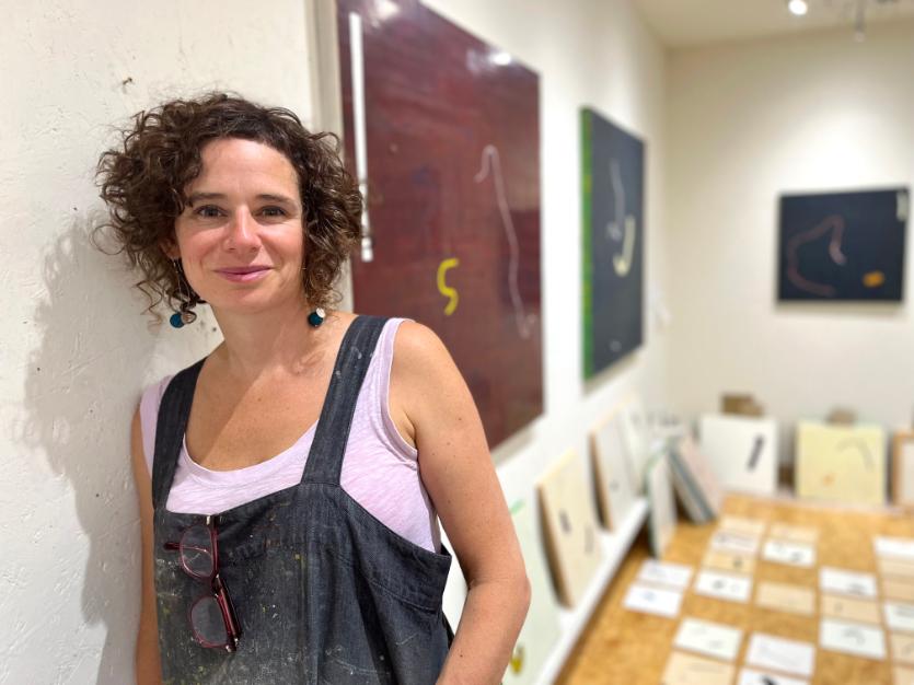
Joanna Kidney
Life is in endless motion and flux, constantly reshaping itself, a kaleidoscopic river. Being an artist, for me, is deeply woven into finding a way of being in this reality. It is a space to reflect on what it means to be a human in this complex, infinite world and time. What I hope to impart in this article is an insight into the thinking and processes of my work as an abstractionist, as well as ways in which we can evolve a practice of abstraction. I will talk about studio methodologies, the open mode, improvisation, visual language, and composition. There will be suggestions, which can be dipped into if and when relevant to you.
First, a little bit about my work. I consider the non-material, what is not visible and not concrete. I think about our relationship with time and with other living beings. How living matter is interconnected and dependant on each other in sharing the planet. I think about each morsel of food containing the earth, sun, water, human efort, and contact with multiple species. The work alludes to the state of flux and to a world in constant motion, enfolding ideas of impermanence, presence, and time. My work attempts to ofer open, poetic prompts into these ideas.
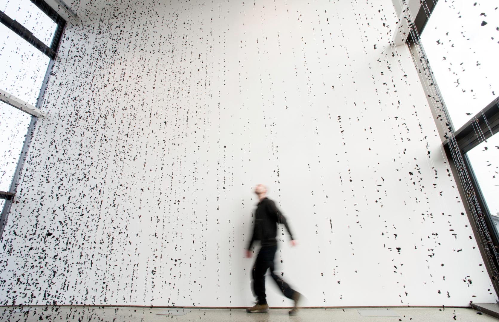
Left, Metamurmuration, Felt and monofilament, dimensions variable
by Tomasz Madajczak
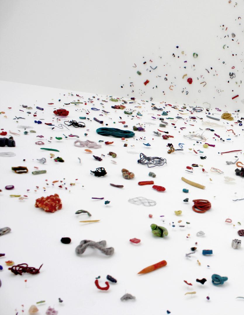
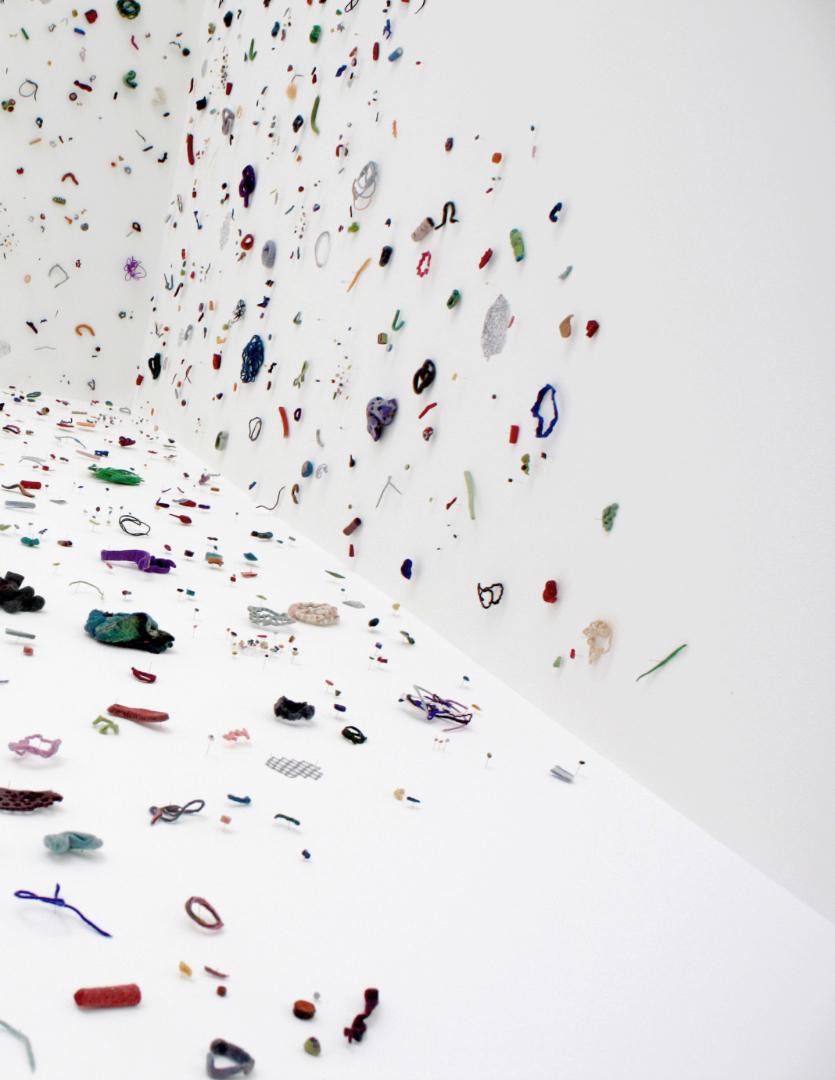
Next Page, Everything and Everywhere (detail)
Felt and monotypes on paper, 430 x 340 x 190 cm
26
Photo
There is a continual enquiry of an abstract vocabulary through drawing and the expansion of drawing into paint and space. The mark and the line are fundamental, holding ideas of the fragment, notation, gesture, and trace. The humanity of the hand-made mark connects me to its immediate, intimate, and primal qualities. The simplicity of the mark is extended through the physicality of encaustic paint, becoming complex and resonant with colour and time. With spatial installations, I work with tactile materials, such as felt, thread, and found objects in order to bring drawing into space, an invitation to physically engage.
My methodology is shaped by process, evolving ideas, and contemplation. The process is an intuitive investigation of material, employing playfulness, improvisation, and a chance to nurture a dynamic quality. Pace and time are companions in this process.

Studio Process
I started to work with wax as a medium in 2001, instantly hooked by its transparency, substance, and immediacy. I first used its transparency, layering it with drawings, then as a ground to incise into before setting up a full encaustic studio. All these years later, I continue to be intrigued by its material qualities of translucency, malleability, brutality, sensuality, and luminosity. Through its immediacy and subtractive properties, it allows me to expand the essentials of drawing into the complexity and nuance of painting.
We Move in Infinite Space, Encaustic on board, 20 x 22.5 cm
Everything and Everywhere (detail)
Felt and monotypes on paper, 430 x 340 x 190 cm
31
My workshops are a deep exploration of materials, processes, theory, and ideas. Experimental exercises and prompts lead to a more playful and intuitive use of techniques and tools for adding/subtracting/manipulating layers. We experiment separately with subtractive (mark making and scraping) and additive processes to nurture a richer conversation with the wax. There is a particular focus on exploring the wax’s subtractive and translucent properties to build history, visual complexity, and optical depth. (While this article is focused on encaustic, the same information can be applied to any paint medium.) Here are snippets of content I highlight in the workshops:
Gesture is the imprint of energy.
Think about the possibilities of mark and line making through both adding and subtracting wax. Using action as a jumping of point is helpful in accessing a wide range of marks. Richard Serra’s inspirational “Verb List” (1967) compiled a series of what he called "actions to relate to oneself, material, place, and process.” Some actions prompt for adding and subtracting experiments: daub, dot, scribble, rotate, bounce, curve, blur, glide, swirl, dash, stagger, splatter, wobble, flow, accumulate, pick, pock, hit, gouge. Be bold, work from the shoulder, move the hips!
Painting is a somatic practice. Be aware of the body movement inherent to your process. Think about how the repetitive body movements connect to the muscle memory of everyday actions, domestic realms of life—stirring, spreading, pouring, rubbing, wiping, and gliding.
Fine tune your awareness of temperature.
As we know, temperature is key to the quality of brushstroke. To gain a more nuanced control of the wax, build your awareness of the temperature of three things: the wax, the surface, and the bristles of the brush.
32
Knowledge that Comes from the Dancing Feet, Encaustic on panel, 60 x 60 cm
33
Photo by Ros Kavanagh
Variety enlivens things.
• Play with a fast and slow pace to see how it impacts the gesture, the mark, the stroke, and the scrape.
• Surface topography—Creating “mountains and valleys” yields a richer history to scrape back through. Create mountains via raised, lumpy deposits of wax (useful prompts: drip, drizzle, daub, accumulate).
• Update your tools: gather, improvise, repurpose! One person’s rubbish is another person’s treasure!
• Brushes: Harness the bristle quality of your brushes to achieve diferent qualities of brushstroke. As we know, hake brushes will give the smoothest deposit, hog hair a coarser result. Old, worn out brushes can sometimes yield an interesting mark.
• Vary how you hold the brush or tool to find new marks.
34
The Open Mode
The open mode, as John Cleese describes it, is a relaxed and receptive state of mind. It's the mode where creativity flourishes, new ideas are born, and problem-solving becomes innovative. When we are playful and in a state of flow, we are receptive to improvisation and therefore chance.
Strategies and practices to nurture improvisation and to expand your visual vocabulary
• Create a time-space oasis with no distractions.
• Drawing flexes the muscle of instinct and connects the hand to the subtler parts of self. It is a brilliant tool to warm up, discover, think through, expand visual vocabulary, recall, imagine, and more! Drawings think their way into the paintings.
• Trust your instinct.
• To help with letting go of expectations, tune into the hand and the materials you’re working with.
• Working fast unlocks the light touch, improvisation, and chance. It reveals that which can only be revealed through working fast.
• Working on multiple panels loosens up your engagement with the wax.
• Working on a small scale is helpful in the exploratory phase of new work.
35
• Playfulness is an openness to anything that may happen. Find pleasure in working with the materials. Activate a curious, not critical state. “Let’s just see what this is and how it unfolds,” Sonia Boyce
• A mantra: What’s possible with this tool, gesture, technique, and colour?
• Listen to fast music. Dance!
• Get out of your head, into the thinking body. Body awareness aids working from the gut and nervous system at a cellular level.
• Remind yourself not knowing is part of making art, especially abstract work.
• Block of occasional periods of wide and open exploration (hours, days, weeks, however long feels right with what the work needs).
• Take the senses for a walk, attuning to the sounds, feel, and details of the living world.
• Create afrmations for yourself—such as “This is an experiment,” “I am researching,” or “Taking risks opens up discovery.”
36
Buíochas, Encaustic on panel, 15 x 15 cm
37
Language and Composition
Two vast areas! I’ve highlighted some thoughts around them.
The Elements and Principles of Art
Developing a more conscious relationship with the elements and principles of art has been very helpful in maturing my visual language and relationship with composition. I often look to the elements to help me focus what my intention is with a body or a series of work. They are an anchor, a goalpost.
The Principles of Art are more complex, often evolving in the work as it develops. They are helpful in problem solvingwhat’s missing, what does the painting need more or less of?
For example, is more movement, variety, unity, or balance required?
The Transmitter, Installation of 147 paintings (20 x 20 cm each) Encaustic on panel, 165 x 490 cm, Photo by Ros Kavanagh
The Picture Plane
The picture plane is a window into another world. A world shifting as its forming. To extend your relationship with composition, consider the various parts of the picture plane— think of the edges, the centre, the rule of thirds. What is the eye’s pathway through the image? Where are the focal points? Is there a hierarchy of elements? Think about emphasis with regards to proportion of the marks, lines, and shapes. Consider negative space.
Drawing
Keep drawing! The immediacy of drawing is a shortcut to discovering new marks, lines, shapes, and arrangements. Also, drawing can be helpful to explore compositional options via quick thumbnails.
40
The Transmitter, Details, Photo by Ros Kavanagh
Objects
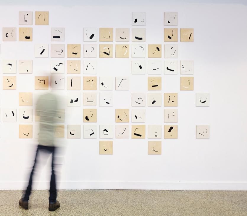
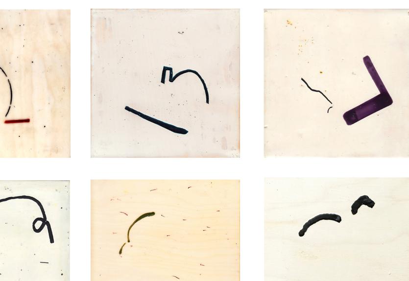
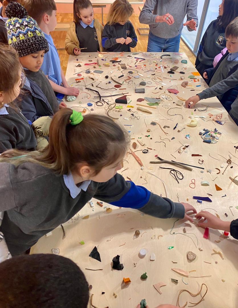
Small objects have woven their way into developing my language and relationship to composition.
I’ve collected found and discarded objects for many years. Through picking up these small objects as I move through daily life, I keep alive the connection to fragments of possible drawings and paintings, simmering always on the side burner. During the pandemic, I began making arrangements with the objects alongside the paintings. Starting in the studio within my own making methodology, this project has grown to become an invitation for others to make temporary threedimensional drawings using small found objects.
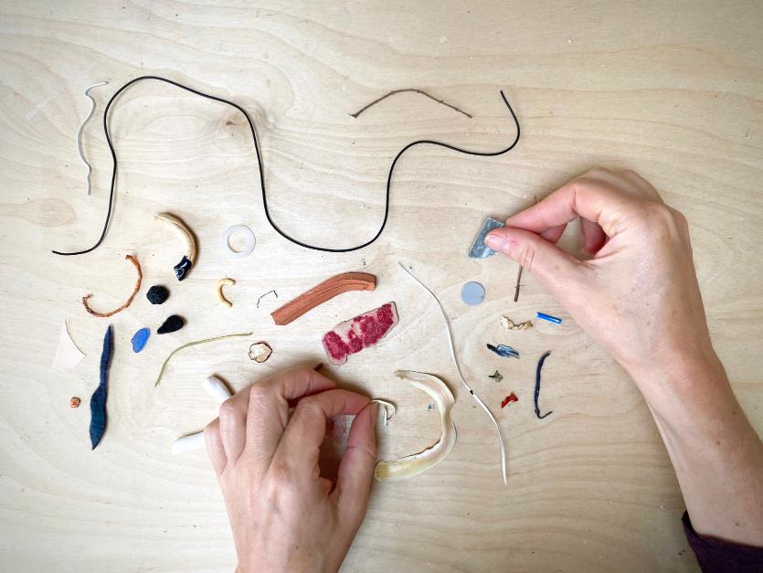
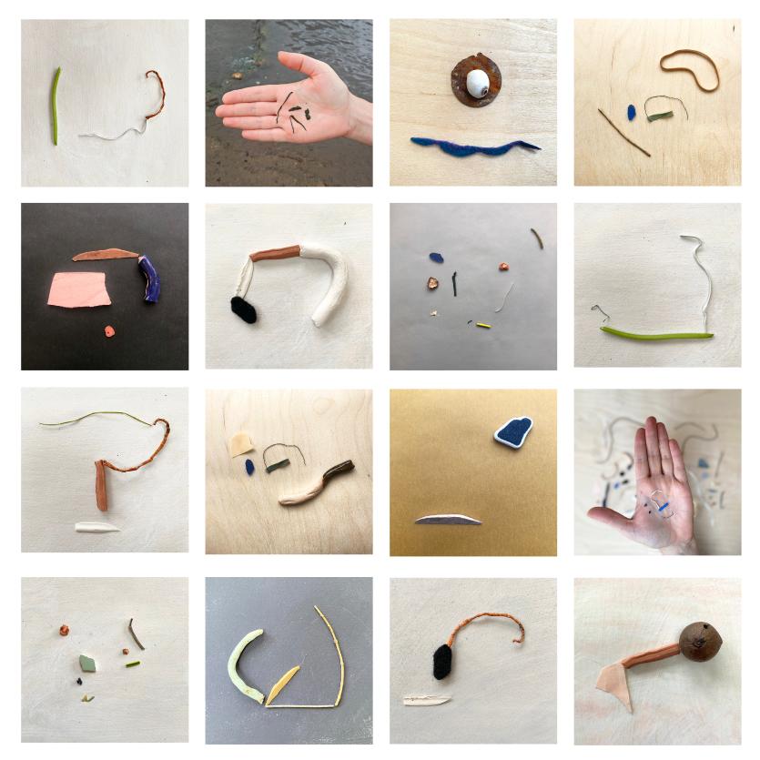
Photographing them to include on the instagram hashtag is optional. See www.joannakidney.com/drawings for full details.
42
I will finish up with some thoughts on evolving a practice of abstraction:
• It’s a filtration process which takes time to evolve. Lean into it gently and persevere.
• Trust your instinct. Follow the pleasure in the making. Ask what the work needs.
• Experimenting is the key to discovery. Make space for periods of it and analyse your findings.
• Write alongside making. Writing can be helpful, even vital, to recognise what the work is about (during or after its making). Or what the next work needs to be about. I keep a writing notebook beside me as I work to capture words, phrases, and fragments of things. It’s there when I need to sit down and splurge it out with words. Though this writing is private, it always informs more formal public writing that may need to be done. And I couldn’t title a work without it.
• Know which artists work you like and why.
• Keep your environment rich, nourish yourself...nature, music, art, reading, exercise, and down time.
If you wish to join Joanna’s mailing list for workshop updates, send your email to joanna@joannakidney.com
43
About the Author
Joanna has been an artist for over 20 years and an educator for 15. Born in Dublin and living now in Co. Wicklow Ireland, she has exhibited in Ireland, France, Germany, the United Kingdom, and United States. She is the recipient of many awards including a Cooper Foundation Grant, Arts Council of Ireland Awards, and a Royal Hibernian Academy Studio Award. International residencies include Kiðjaberg, Iceland and Brigham Young University, Utah.
Joanna is an R&F Artist Instructor, teaching encaustic painting and drawing in Ireland and internationally. Her teaching approach nurtures each individual's personal vision with oneto-one support, encouraging an experimental and intuitive approach with materials, processes, theory, ideas, and reflection. She ofers in person and online classes, with an annual nine-day class at Ballinglen Arts Foundation, Co. Mayo, Ireland.
You can view Joanna’s work at www.joannakidney.com www.instagram.com/joanna_kidney www.facebook.com/joanna.kidney
45
Expressing My Shadow Self
Linda Robertson
Inspiration is all around us, if we can just train ourselves to see it. It’s easy to get swept up in the duties of the day, but with a little practice you’ll usually find something to use later in your studio. My creative sparks are often based on the patterns and movement of shadows, and I find myself observing them as I let my mind wander. Several years ago, I started consciously including some of these forms in my paintings. I grew up in sunny Hawaii, where shadows in exotic shapes were everywhere. I sketched and traced the shadows on the ground and started creating stencils from those drawings.
It’s a bit more of a challenge in the Pacific Northwest, where the light is usually more difused and it often rains. When it’s too cloudy outside, I set up my own back-lit vignettes in the studio, using objects or plants. I also take photographs of forms that intrigue me and project them onto a wall so that I can create larger stencils to use in larger paintings. These experiments have often produced cherished stencils, which I use extensively in my work.
Incorporating stencils into your work can be a nice counterpoint to the beautiful organic forms, for which encaustic painting is known. Commercial stencils are often what first come to mind, and they can be a great option.
I especially love the products from StencilGirl because they are designed by artists for artists. They use heat resistant materials, which make them perfect for working with encaustic. I can use a torch to fuse wax through their stencils, and if I’m careful, it won’t hurt the material.
46
Seeds of Things to Come, Encaustic, oil, graphite, 11 x 14 in
When using stencils from other manufacturers, I test them first by using a heat gun or torch directly on an unimportant area to see if the materials will buckle or melt. Then, I know if I can use that stencil with wax, or if I should save it for other media such as watercolor, gouache, pastel, or pigment sticks.
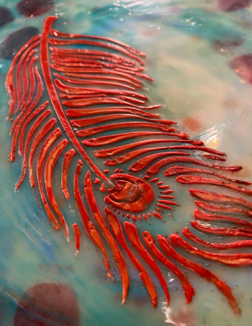
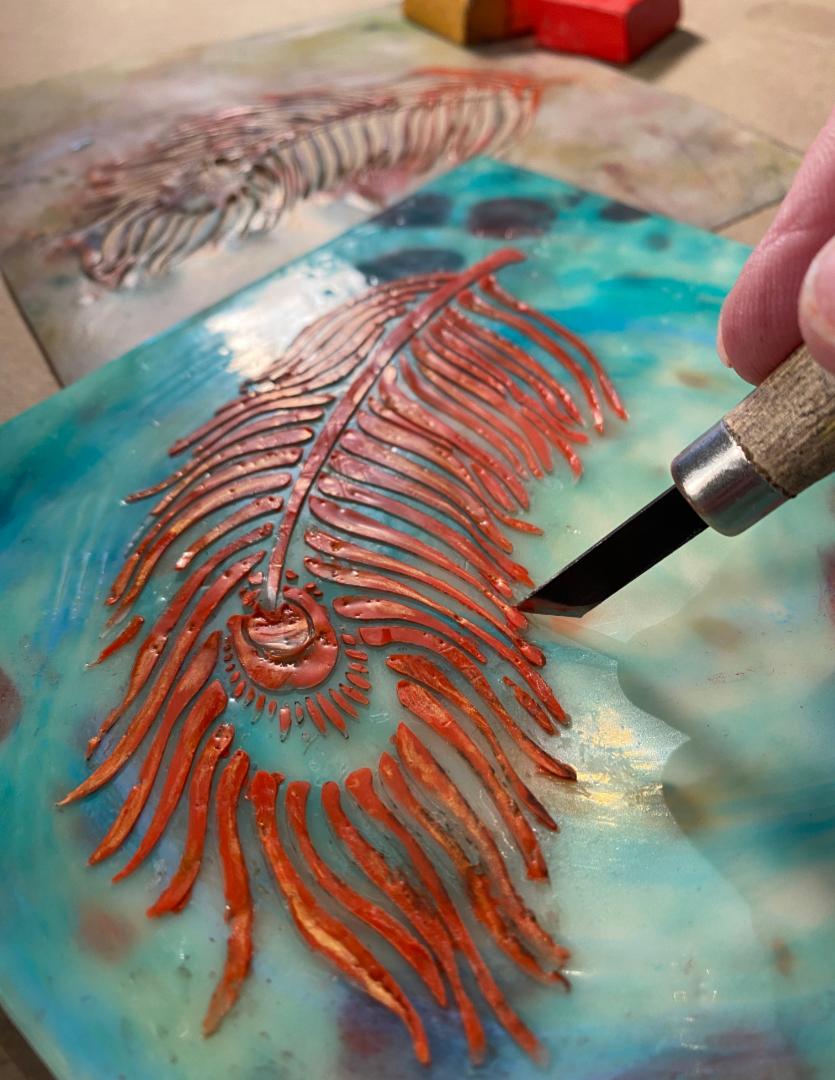
Here are a few tips to make it easier when you want to use encaustic with stencils. For this example, I used StencilGirl’s Peacock Feather, designed by Kae Pea, and a couple of other stencils that weren’t branded. In keeping with the theme of kaleidoscope, I used encaustic paint colors from my own Tropical Set from Enkaustikos.
47
Using Stencils in Your Encaustic Paintings
I used watercolor for a loose color application behind the more detailed shapes that I planned to add later. I like to use a rigid panel, so I chose Ampersand Encausticbord® for the best results. Bending the stencil gave me more control over where and how I added the dots.
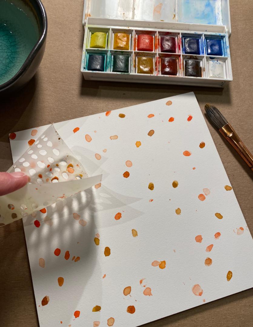
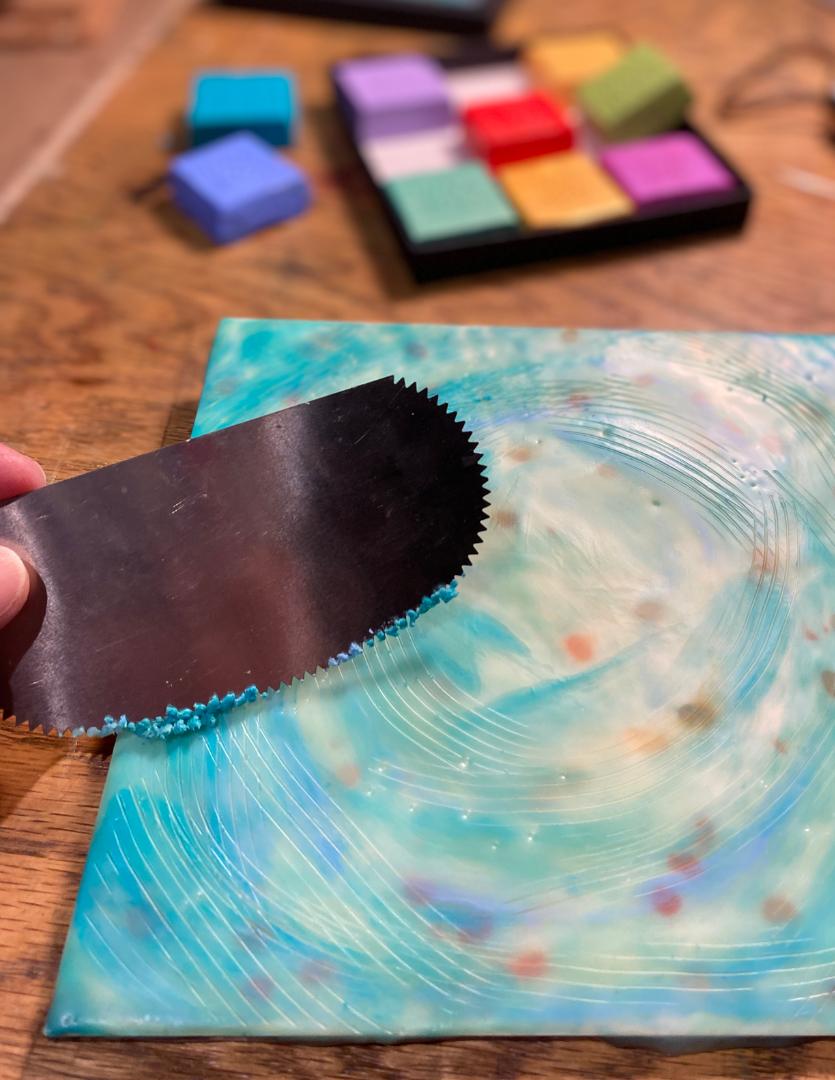
After the background was completely dry, I added two layers of clear encaustic medium. Cobalt Aqua and Atmosphere were added next, to add some cooler colors and create some movement over the background. I fused each layer until I got the look that I wanted and used a serrated rib scraper to help break up any brush strokes that I thought were too bold.
49
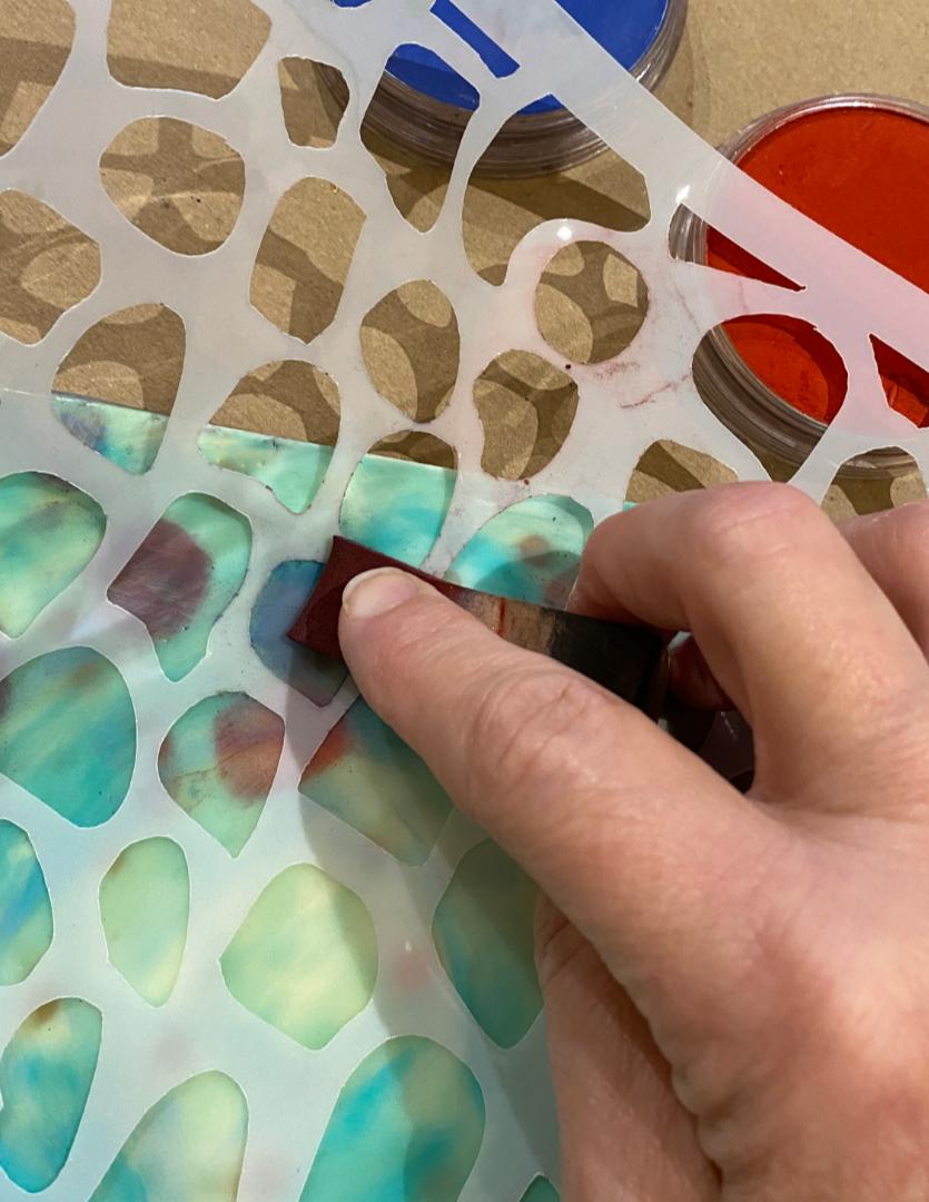
I used a small sponge to apply PanPastel through the stencil. Next, I removed the stencil and fused gently to bond the powder to the wax surface without moving it. By adding pastel when the wax is cool, you can easily remove any marks you don’t like before fusing. I use a citrus-degreasing solvent called Zep, purchased from a home improvement store.
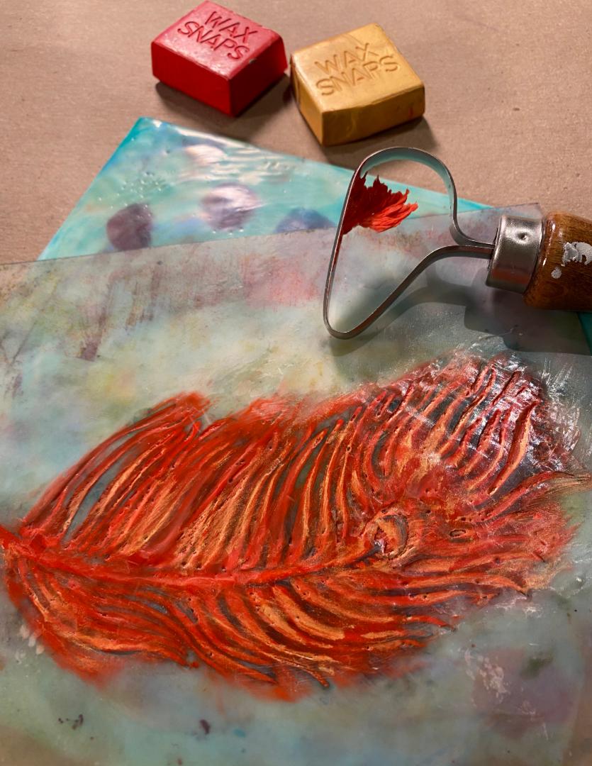
I wanted the feather to be dimensional on the surface of my painting as if it were floating on water. I used encaustic paint for that application. I created a flat area and gently pressed the stencil onto barely warm wax. I’ve found that adding a very thin layer of encaustic medium before adding color keeps the stencil in place and reduces the issue of color seeping under the stencil in the next step. Don’t fuse this application of wax.
50
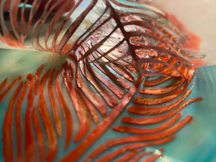
Knowing that cool colors appear to recede, I chose Cadmium Red Light and Opal Sun for the feather to add more visual depth to my painting. I thinned the paint with some encaustic medium and added wax with as few brushstrokes as possible. Fewer strokes mean faster fusing, which lowers the chance of damage to the stencil. After applying the encaustic paint, but before fusing, I scraped of any excess wax.
I get my best results using a torch to fuse, but use what you’re most comfortable with. If you want a looser design, you can pull up the stencil and fuse without it. Try both ways and see which you prefer.
51
If you fused with the stencil in place, make sure the wax is completely cool before continuing, otherwise you may pull up wax all the way from the base of your painting. My favorite trick? I cool my wax with an ice pack for about 30-seconds, then I barely heat the top layer of wax, which helps to release the stencil from the wax as I remove it.
If any wax has gone under the stencil, you can easily remove that with a scraper. I prefer the Niji®-angled tool shown here.
That’s it! There’s no need to fuse the raised design again unless you see wax that isn’t well adhered. Sometimes, I fuse just to soften the edges or to get rid of any tool marks from scraping. Be very gentle if you choose to fuse.

52
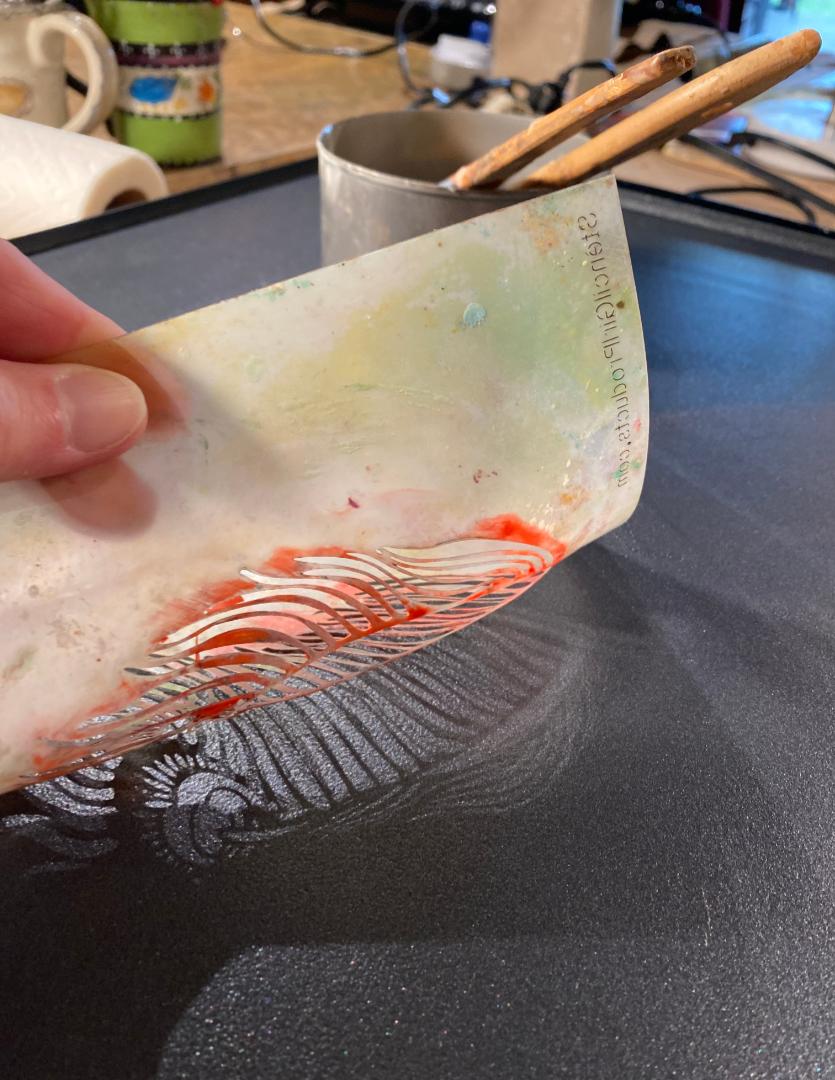
You can clean heatresistant stencils by laying them directly on the surface of your griddle and wiping of the warm wax. If your stencil is not heat resistant, try freezing it and popping the wax of the surface.
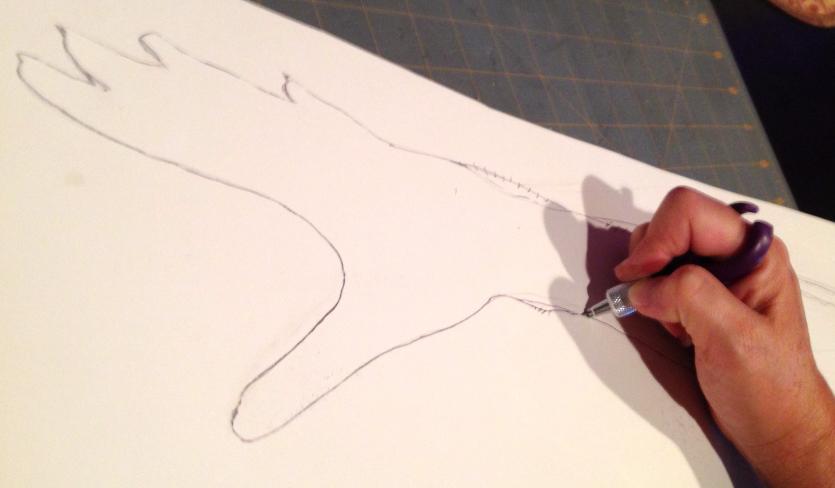
When I first started working on my Choose to Rise series, I wanted imagery that was more personalized. I started by customizing commercial stencils, but I eventually started creating my own.
I tried using acetate and Duralar with a heated stencil cutter, but quickly found that to be too cumbersome (and stinky!). I had trouble getting a smooth line, while trying to melt plastic. I continued experimenting with other materials. I tried an X-Acto knife on the same material, but eventually found that paper is my absolute favorite material for stencils!
It doesn’t really matter what type of paper you use as long as you have the right weight. I often use paper around 90 lbs. (165 gsm), but most papers will work, as long as they are thick enough to keep the wax or pigment sticks from penetrating the paper and are thin enough to be easily cut. Card stock from an ofce supply store, or something slightly heavier, is usually perfect for me and produces a stencil that can (usually) be used several times.
53
I know I could automate this with a stencil-cutting machine, but I prefer the look of an imperfect line in a hand-cut stencil. I suggest using a swivel tip knife, which makes cutting curves much easier. My favorite tool is the Fiskars Fingertip Swivel Detail Knife.
After a few stencils were ready for my Choose to Rise series, I found myself looking at them in a whole new way. I decided to use pigment sticks around the outside edge of the stencils, instead of adding wax through the openings. This allows for a mysterious silhouette to emerge as the focal point of the paintings. These forms were also borne from my love of shadows.
Dreaming New Dreams
54
Encaustic, oil, foil, 36 x 24 in
The backgrounds for these paintings were created by spraying ink over plants, commercial stencils, or other objects before adding encaustic medium and paint. I experimented with this method for years to give my work a distinctive look and feel.
56
Moments of Surrender
Encaustic, oil, foil, 12 x 28 in
The shiny letters pressed into the wax signify a visual representation of past conversations and are a reminder that everything we say leaves an impression that cannot be undone.
57
About the Author
Linda Robertson is an artist, art instructor, and author of the Embracing Encaustic book series. She has exhibited her paintings and taught art workshops throughout the United States and ofers online courses bringing together a community of artists.
Linda has been a featured instructor in the year-long online course, Painting with Fire, since its inception in 2020.
In 2023, Linda was a presenter at Celtic ConVergence in Ireland and will lead her third retreat there June 19-26, 2024. She also has a workshop on Widbey Island in Washington from August 23-26, 2024.
Join Linda’s Studio Stories list to hear about her favorite resources, upcoming workshops, and latest paintings at LindaRobertsonArts.com
You can view Linda’s work at LindaRobertsonArts.com www.instagram.com/LindaRobertsonArts www.facebook.com/LindaRobertsonArts
Parting Glance
Encaustic, oil, foil, 12 x 9 in
59
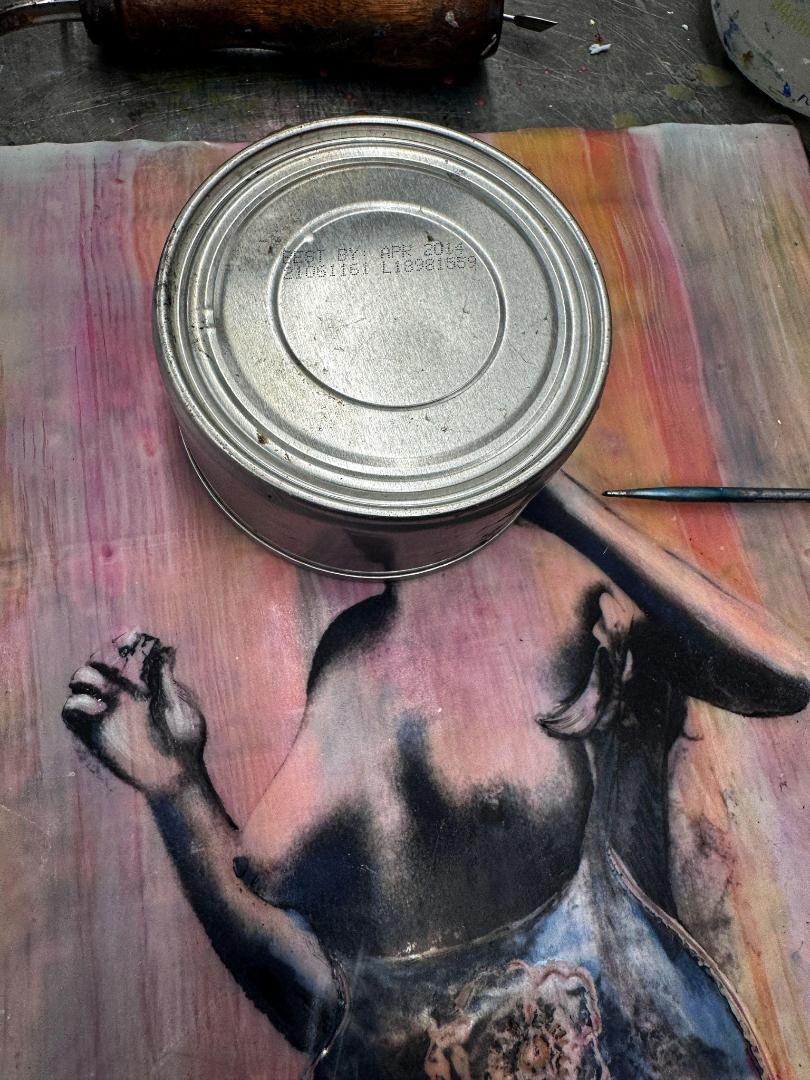
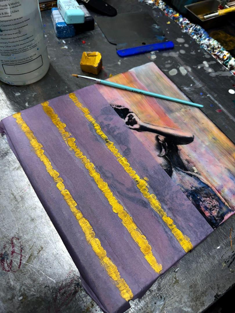
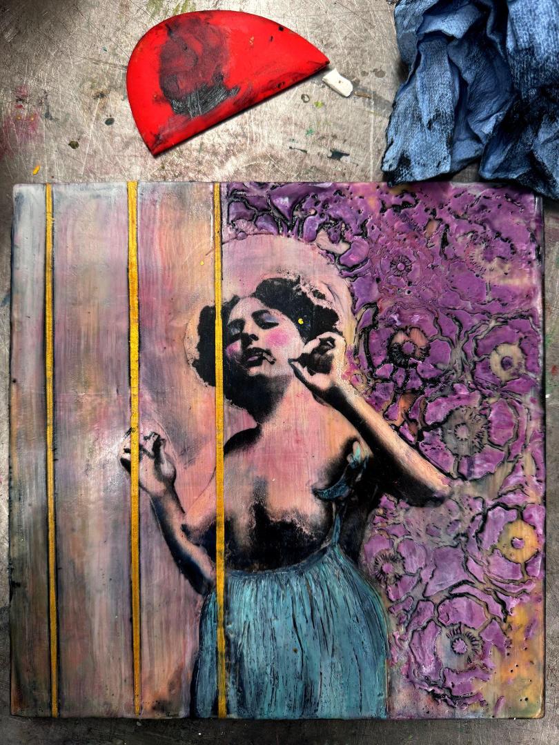
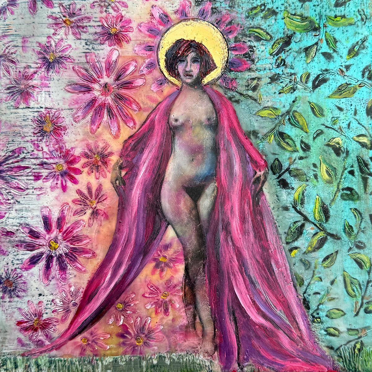
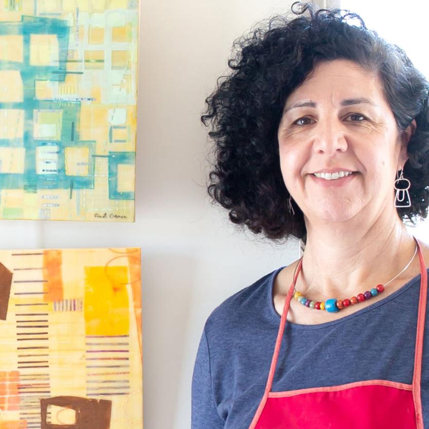
Rebel Rose and the Golden Cage Kelly Williams
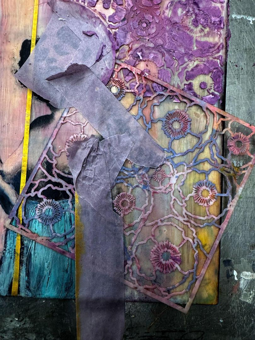
In the Erotic Saint series, I explore the nuanced and layered identities of femininity, creating narratives that examine these complex roles. This series is meant to be both a witty expression and a critical commentary, examining the fluctuating standards of beauty, morality, and societal expectations. It confronts the contrasting images of sanctity and sensuality in female identity, highlighting the often unrealistic and unattainable expectations imposed on women. Through the fusion of vintage erotic imagery with diverse and often conflicting symbols, motifs, and archetypes, I play with the layers of the feminine ideal, challenging the societal tendency to compartmentalize women into binary archetypes like the “sainted whore.”
I personally opt for vintage photos to highlight the enduring complexity and contradictions of women's roles throughout history. By splitting the composition into contrasting halves, I am exploring the dichotomies and dissonance in my own life, as well as women in general.
The choices you make in creating this style of work are very personal. You need to decide what type of imagery to include and how the elements in the composition will amplify your narrative or message. This story is uniquely yours and the possibilities are endless. Who is the central figure? Do you want to use personal photos, self portraits, or vintage imagery? What are you trying to communicate? How can you use the techniques and tools you have learned to express your specific messaging? What symbols and motifs hold meaning or power for you?
60
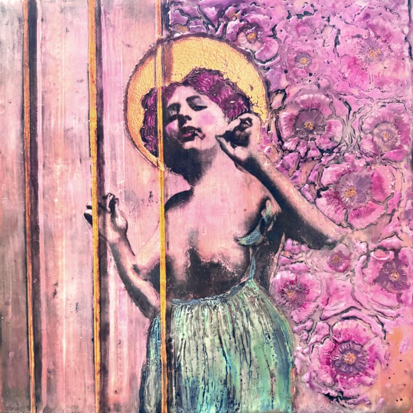
Rebel Rose and the Golden Cage, Encaustic and mixed media, 10 x 10 in
In Rebel Rose and the Golden Cage, I emphasized the figure's rebellious spirit by placing part of her behind the bars of a golden cage, set against a background of vivid blossoms. This choice of imagery aims to provoke a variety of metaphors and emotions, expressing my own experience while keeping it general enough for multiple layers of interpretation.
61
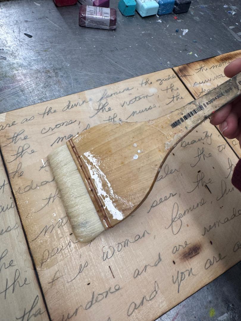
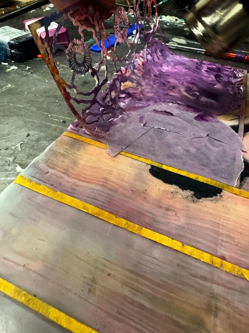
Preparing the Surface
Often when I begin a piece, no matter what series I am working on, I start by activating the surface in some way. I may include burning, writing, or using other media directly on the wood before applying wax. This helps to center my intentions or communicate messaging that is often “under the surface,” both literally and metaphorically.
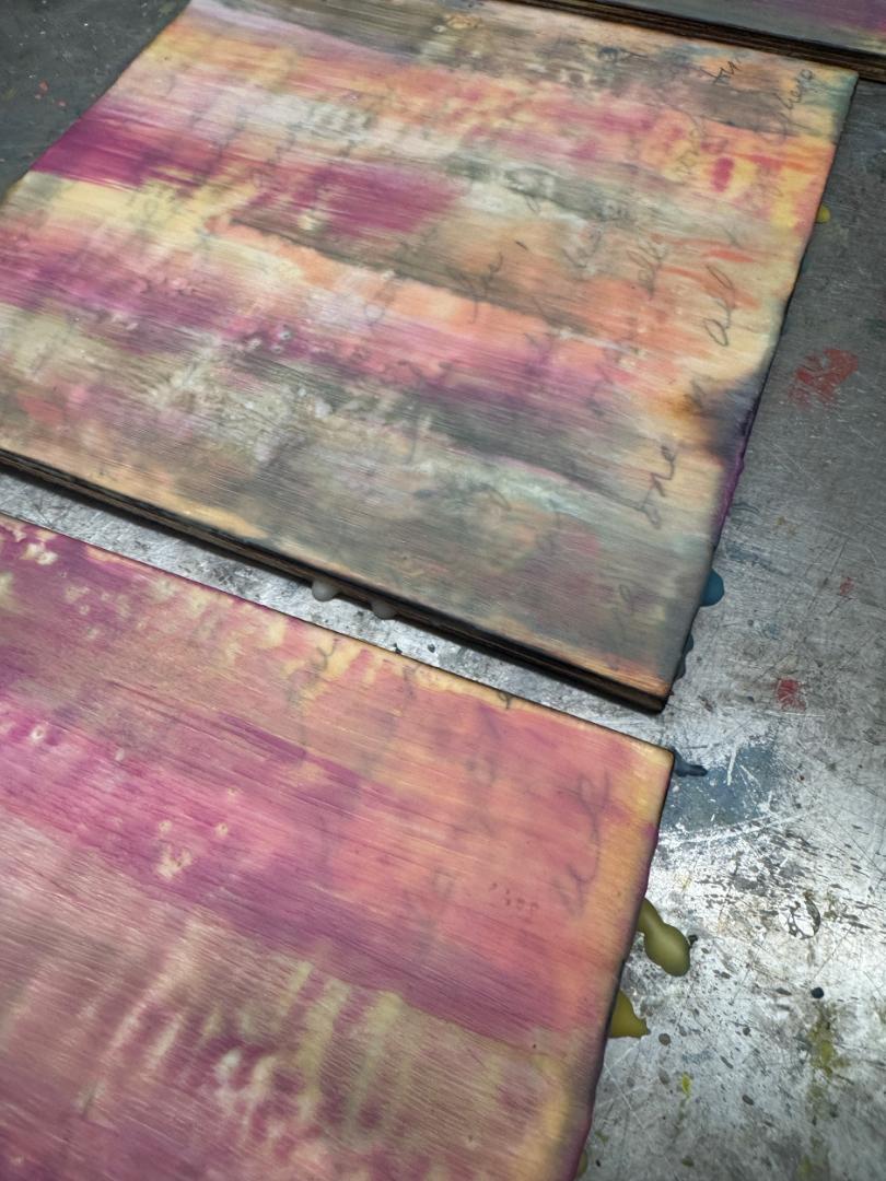
To prepare the surface I fused it lightly before I added several layers of clear medium and some very transparent veils of color. I continued to build a foundation, adding more color as I progressed with layers of clear medium between color washes to set the palette and mood of the piece. I tried to keep it loose and then fused to a controlled flow.
By following the “wet edge” with the flame at a slight tilt, I created enough movement to disrupt the obvious brushstrokes and achieved a more organic background. I heated in multiple passes vs. going in hot to create movement.
62
Transfer Preparation and Process
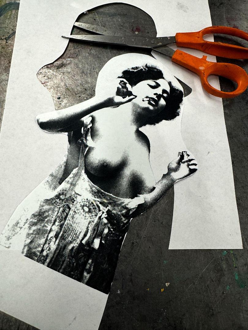
A few notes on choosing and preparing images for transfers.
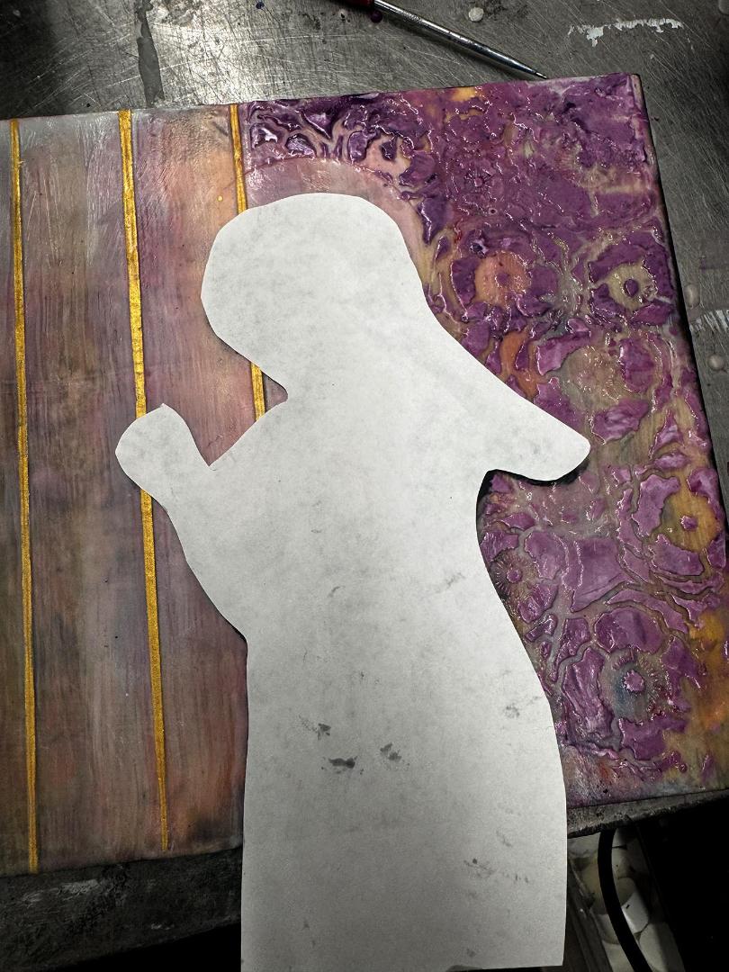
Choose images that have space around the image. If any part of the image does go of the picture plane, it will have to rest on the edge so that it doesn’t appear to be floating. I frequently use photos of figures that are cropped at the waist. These work well, but I ensure they appear connected to the panel's bottom edge; or alternatively, I craft a setting that seamlessly incorporates the absent portions of the figure not included in the photo.
Dark backgrounds are difcult to transfer cleanly, so try to choose images with white or light backgrounds or cut-out images digitally by removing the background. In Photoshop this is done easily, but there are other apps that also serve this function. If you physically cut out the image, it can leave weird indentations during the transfer process. I often cut out the image and place it on white paper and rephotograph before printing again. If you do transfer an image with a dark background, be very thorough in the burnishing process. You can use black pan pastel to feather the edges or fill in the background completely.
I print three versions of the image I plan on using. The first is used for the primary transfer. The second is an extra just in case a portion does not fully transfer, or I want to double up for intensity. Transfers can be a tricky process when beginning. It is always better to have two images ready to go so that you don’t have to stop and start fussing with the computer/printer. I also print a mirror copy of the image so that I have a visual reference while I am working. This serves multiple purposes. One, it helps me with placement and aligning the image to the surface colors, keeping in mind that I need the lighter, brighter values under the focal points and edges.
63
Always double check your placement so that you don’t end up with a random bubble or imperfection on the important bits, like the face or hands or other focal points-wink wink. Our brains will forgive certain distortions or imperfections, but facial features and hands are crucial to the emotional expression and critical to have those correct in the beginning. Finally, I use the third reversed reference image as a mask to protect the transferred image when doing gold leafing or stenciling around the subject.
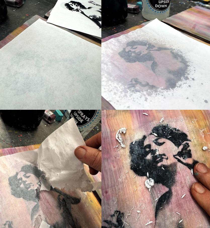
64
The Transfer Process
1. Have your surface very warm (almost hot to the touch but set so that wax does not transfer back onto the paper). Align image (see prior notes) with image down and use your palm, working from the center out to firmly situate the image. Do not press too hard as to mush the wax. Image 1
2. As you feel the wax starting to cool, begin burnishing lightly with the chosen tool and increase pressure as the wax begins to cool further. The back of a spoon works great for burnishing. Go in multiple directions, up and down, back and forth, diagonally and in circles so that all parts of the image are transferred. Take extra care on edges, facial features, and hands.
3. Spray the back of the transfer lightly with water (don’t allow a puddle to form which can mess up your protective sheet). The image should start to appear and show if any area was not fully burnished. Image 2
4. Grab a protective sheet and burnish AGAIN while the paper is wet. If you don’t use a protective sheet, you will likely tear the transfer. You can use parchment paper, contact paper, or I like using the backer sheet of a used computer label page.
5. Pull up a loose edge of the transfer lifting as much paper as possible and then start rubbing until ALL the paper pulp is gone. Spray water occasionally to maintain the right grit.
Image 3-4
6. Wait until dry and check for any paper remaining. You will know because it will fog up. You must remove ALL of the paper for a clear transfer.
65
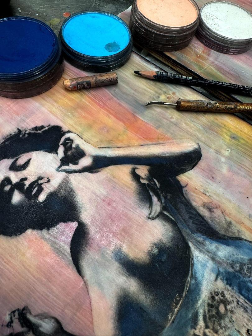
Before I fully fuse the image transfer, I will use pan pastels judiciously to pull out highlights and darken shadows or to colorize the photo (best applied while the surface is still warm, and you may need to do a light fuse).
When the wax has cooled, the use of Stabilo All Pencils and Neocolor II Aquarelle Wax Pastels by Caran d'Ache are used to fill in any lines that didn’t transfer or to add additional color efects not accomplished with the pan pastels.
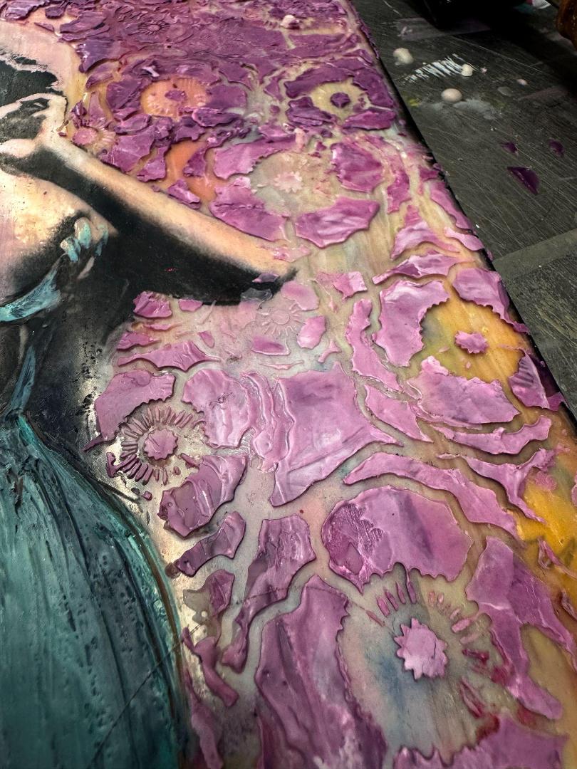
66
In this example I chose to use more pan pastels and encaustic paint on her slip and recreated the pleats and details using carving techniques with a needle tool. You can also embellish using stencils to carve patterns into the costuming.

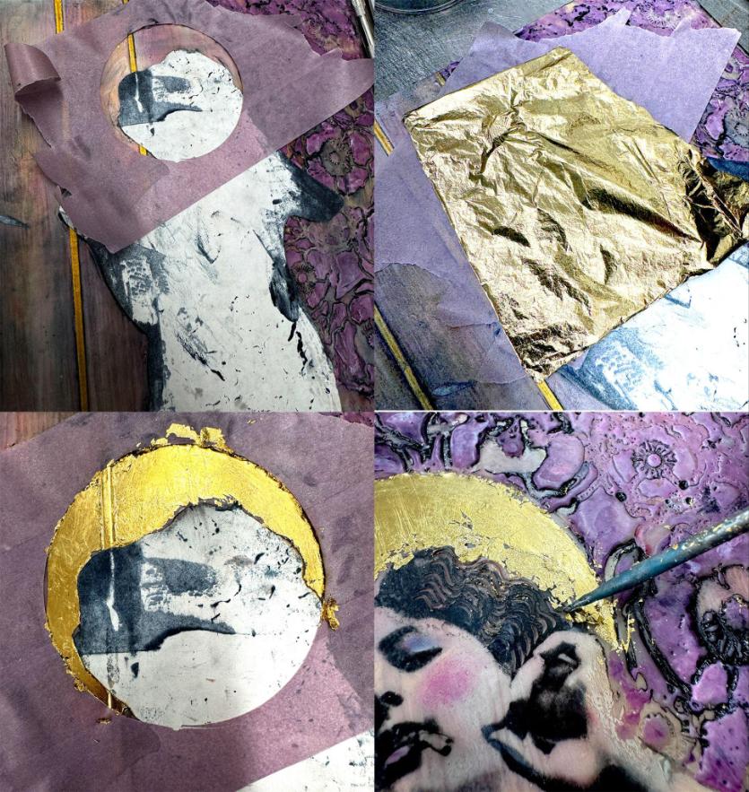
I will rough in the halo using whatever circle I find that is the proper scale to the particular image. Often I use a random round can used for holding the wax or the lid of a pan pastel, although a set of circle stencils can also be useful.
I wait to gold leaf/paint or pan pastel the halo until the background is complete to ensure the final efect remains undisturbed.
67
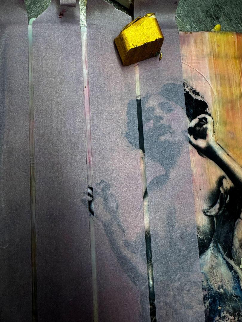
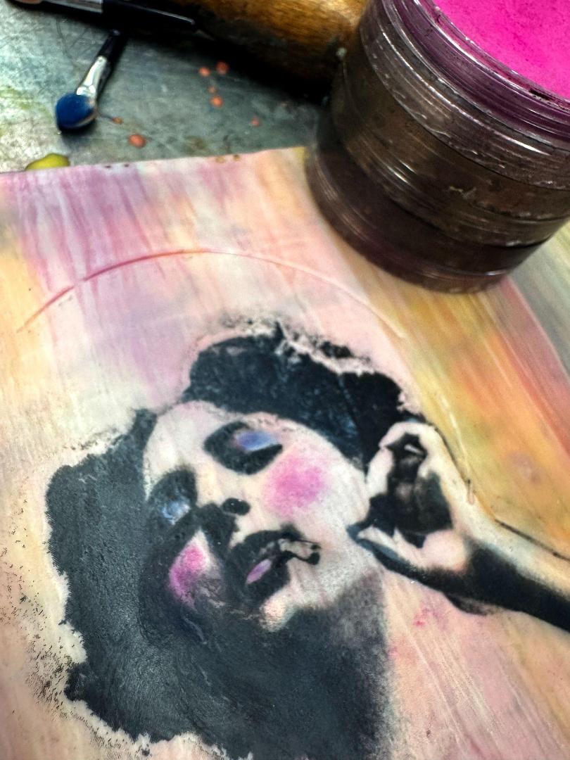
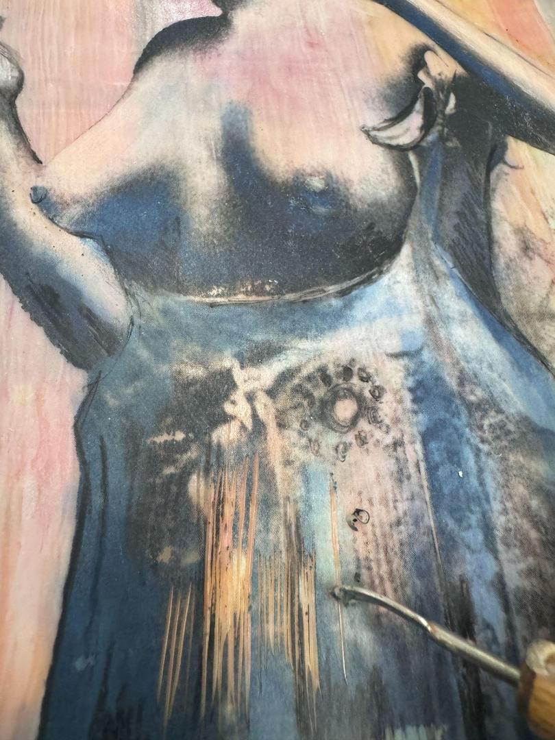
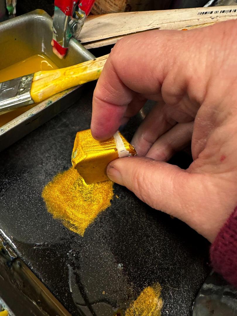
The HOW of my particular choices are done through a variety of techniques. The golden cage bars were created by taping of the bars with low tack artist tape. I made sure the area is warm and receptive to another layer and used a layer of clear medium first to help prevent leakage of the next color occurring under the tape edge. In this case the use of the R&F ancient gold at full strength was perfect.
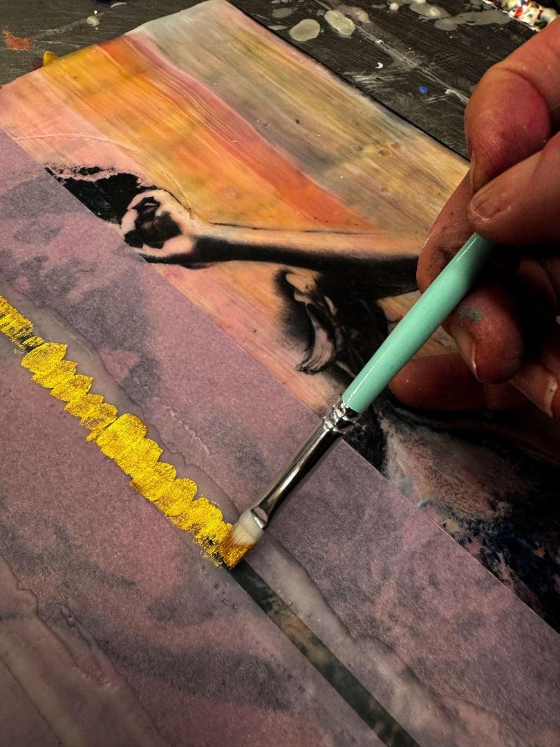
I also added more subtle line and shadow work to echo and emphasize the cage efect, implying the diferent metaphorical cages women find themselves trapped within. The shadows were created with more pan pastel, carving out the golden bars with a needle tool for emphasis.
68
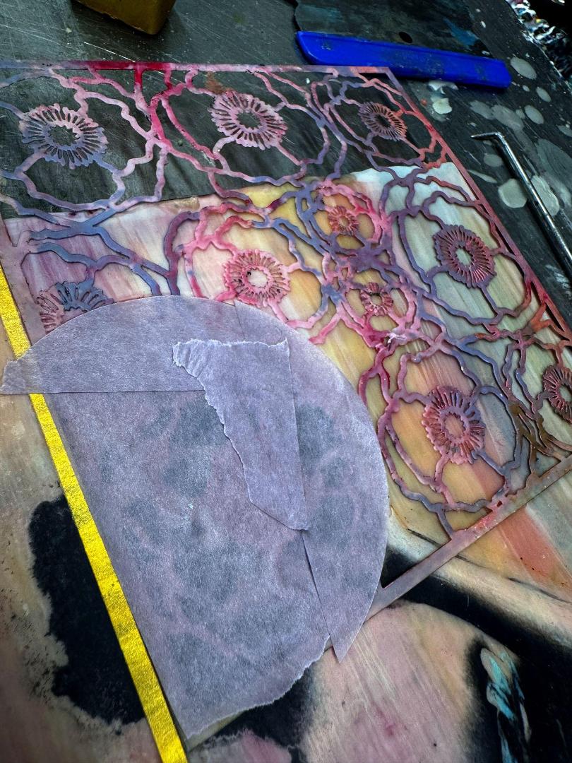
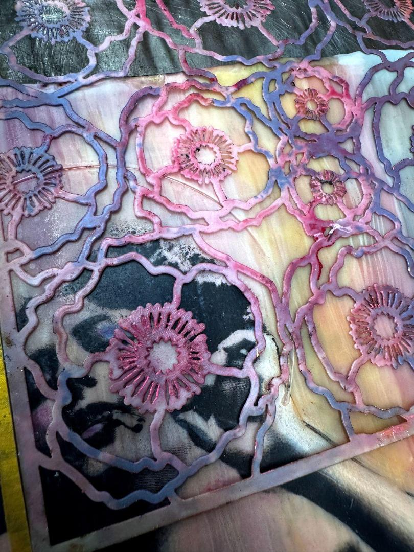
For the counterpoint, I selected a floral stencil to represent the blossoming and freedom that my figure is striving to achieve. After placing the stencil I used the roughed in halo to guide where I would tape, both to secure the stencil and protect the halo. I applied encaustic paint directly to the stencil altering the values to create depth. By fusing with an iron between layers, the mixing of additional textures and color created a more visual dimension. I carefully masked of the figure as I moved down the piece and aligned the stencil to continue the pattern.
69
I used a heat gun for the last step of fusing, gently peeling of the stencil at the moment the paint solidifies. This method helps avoid the stencil disturbing the newly applied paint, proving especially efective for intricate stencils.
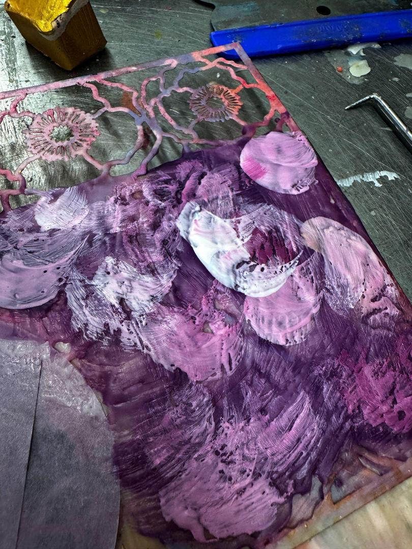
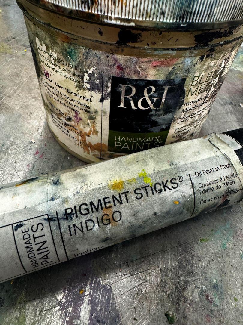
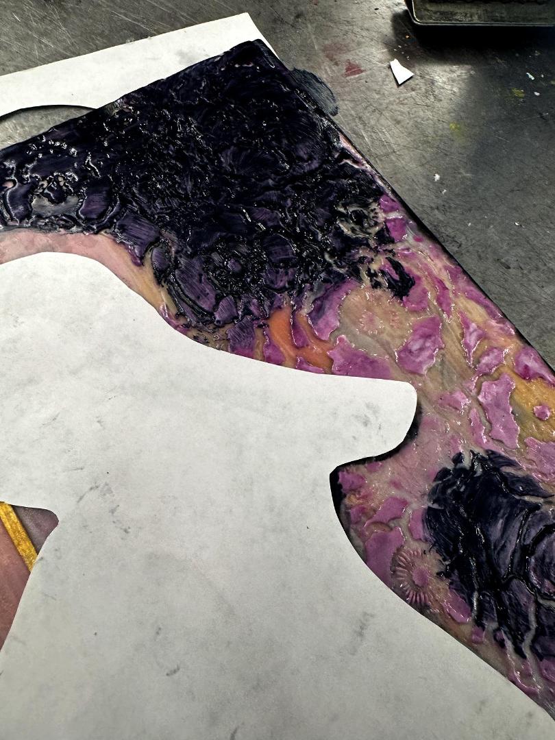
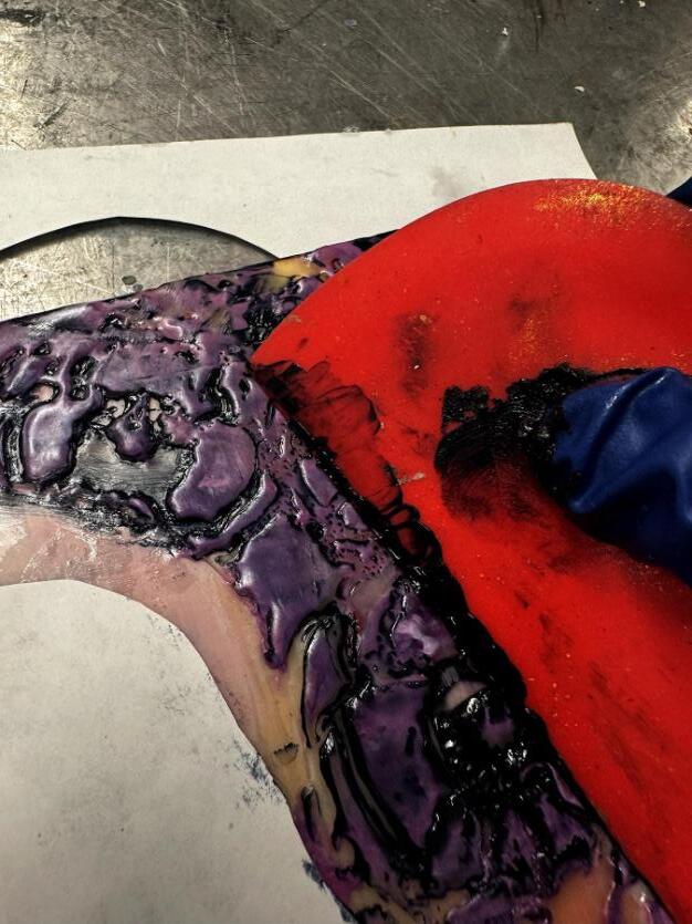
At this point, my aim is to unify the artwork and enhance its intricate lines by darkening them. First, I carefully cut out the additional image I had printed earlier to safeguard the image transfer. Then I start by applying a transparent glaze using an R&F pigment stick. To contrast with the pinks and add depth, I mixed a blending medium with indigo, which accentuated the details of the flowers, the texture of the slip, and the golden cage's bars.
With gloved hands and a small catalyst wedge, I worked the pigment stick into all the grooves and carved details. Next, I lightly wiped the raised surfaces with a paper towel with a touch of blending medium to bring back the pinks. After allowing it to dry from a few hours to several days, I scraped the surface to accentuate additional highlights.
70
The Halo and Final Touches
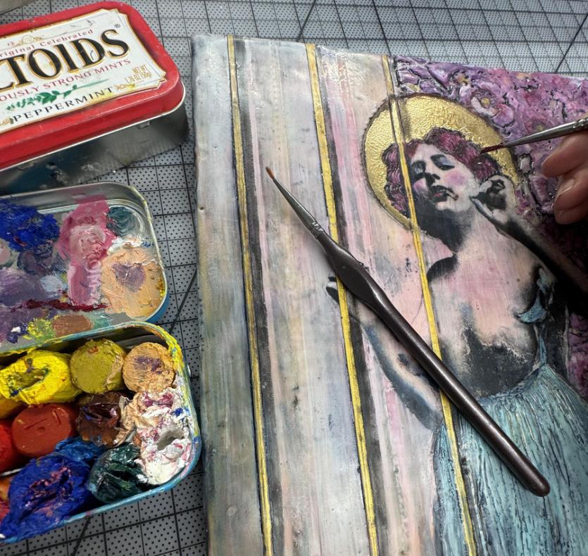
There are various methods for crafting the halo (or crown or other symbols of feminine honor). To paint the halo, I used a small brush to apply R&F ancient gold pigment stick or encaustic paint. Make sure to move quickly as the small brushes cool quickly. Keeping the area warm is crucial, particularly for the successful application of encaustic paint, PanPastels, or gold leafing.
71
To avoid the gold leaf from moving everywhere and from sticking where it doesn’t belong, I used tape and the same mask from the pigment stick glazing step to shield the areas surrounding the halo and the figure, ensuring their protection during the process. This technique also ensured a clean, sharp edge for the leafing, making sure to extend it fully to the edge. If necessary, I will use a needle tool after removing the masking to further define the edges.
72
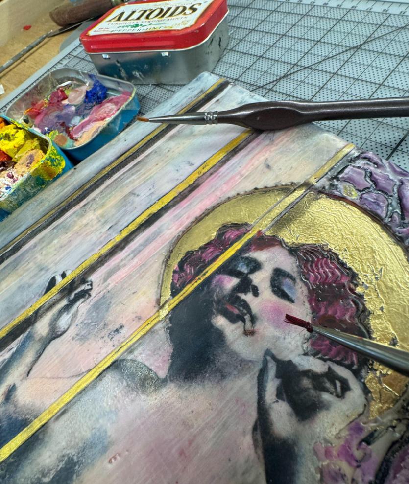
The last step involved a thorough fusing, but with a light touch to avoid shifting detailed elements or excessively softening the edges of the stencil work. Then, I applied oil paint to add the most delicate details. I always have an Altoids tin with the ends of R&F pigment sticks in my favorite colors and a tiny brush at the ready to embellish the hair, makeup, or garments of my lovely ladies.
This process will be in this year’s Online Masterclass: Painting with Fire. Sign up so that you can watch how I create an Erotic Saint and answer any questions you have along the way.
https://bit.ly/KellyWilliamsPaintingwithfire
73
Grace Amongst Thorns
Encaustic and mixed media, 10 x 10 in
74
About the Author
Kelly Williams, a contemporary artist and educator based in Portland, OR, has been active in her field for 20 years. Her art encompasses a range of styles and mediums, from large abstracts to intimate, psychologically-focused figurative pieces. With her background in psychology and social work, Kelly uses art to express complex emotions and experiences that are often difcult to articulate and blends intuition with intentional content to create a layered narrative. She employs this visual storytelling for psychological processing, both in her personal art and in teaching. As an Artist Instructor for R&F Handmade Paints, she conducts technical to concept-oriented workshops for both small groups and private clients.
Kelly has received multiple grants from the Regional Arts and Culture Council (RACC), Oregon Arts Commission, and the Ford Family Foundation for various projects. These grants have supported projects that assist marginalized communities, using art as a healing tool and fostering in-depth discussions about mental health, in addition to international residencies and conference presentations.
Kelly is a regular presenter/educator at multiple venues, including the International Encaustic Conference in Provincetown, the Celtic Convergence Retreat in Mulranny, and the IEA Retreat in Portland.
75
Also featured on the front cover
76
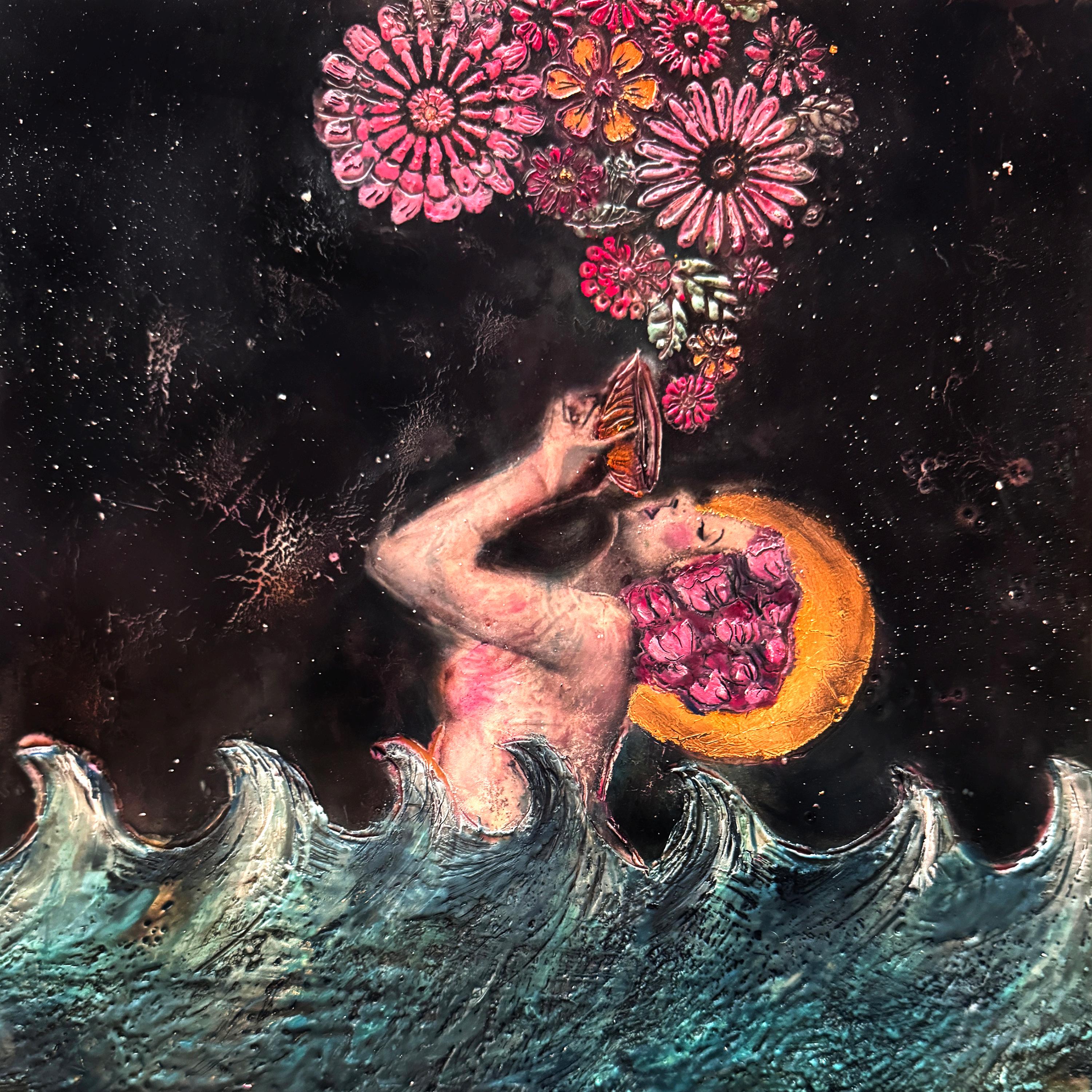
Submerged in Shadow, Sustained by Hope - The Midnight Elixir Encaustic and mixed media, 10 x 10 in
She has been featured in various media, including print publications, blogs, podcasts, TV, and radio interviews. Her work continues to be featured in multiple galleries, universities, and art spaces around the world, and her artwork continues to be acquired for both private and corporate collections.
You can view Kelly’s work at www.kellywilliamsart.com www.instagram.com/kellywilliamsart www.facebook.com/kellywilliamsart69
77
78
Field of Spring, Encaustic monotype, 48 x 44 in
My Encaustic Monotype Process
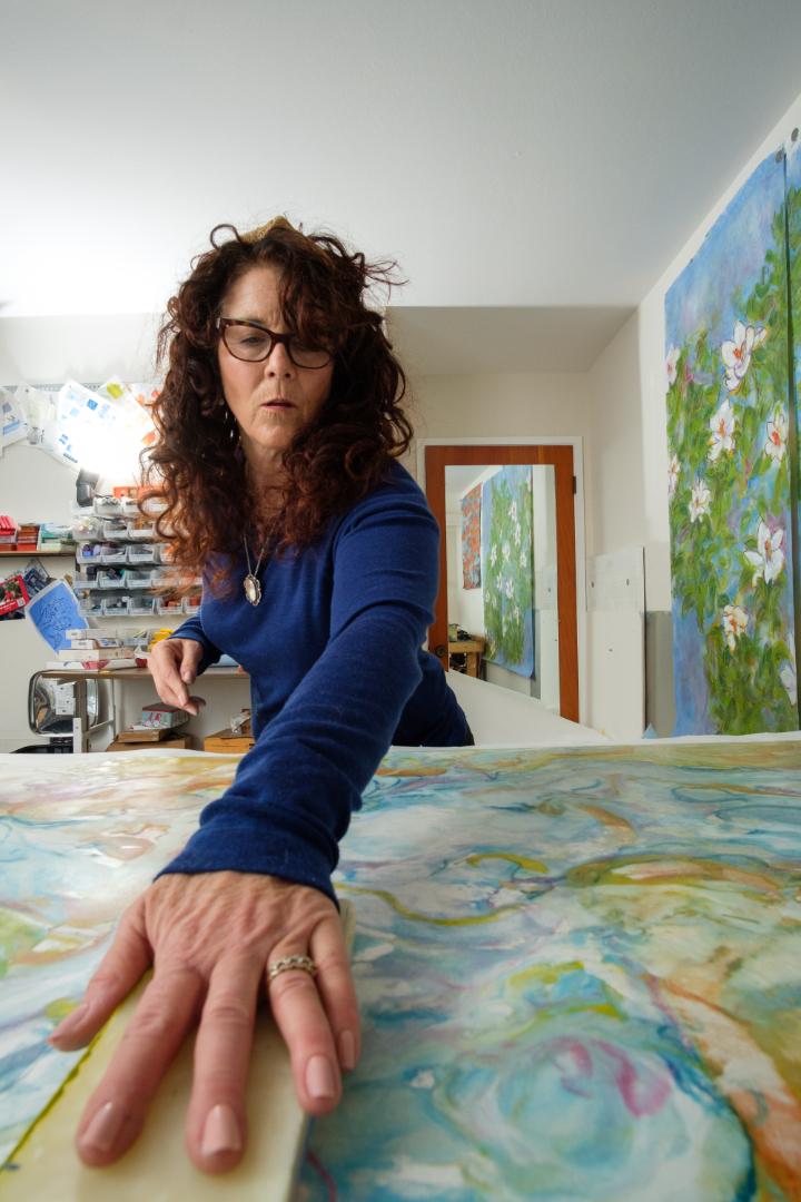
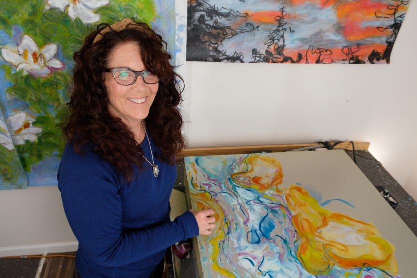
Lonnie Zarem
Early in my art career, I focused on oil painting, lithography, and intaglio printing with a special interest in figurative work. Over time I moved on to encaustic painting and began to feel increasingly comfortable working more abstractly. My artistic "aha" moment came about 15 years ago, when I was introduced to the encaustic monotype process—a perfect combination of painting, drawing, and printing with wax, a hot plate, and rice paper! This medium and the monotype process has given way to years of joyful exploration and new opportunities to express myself and has provided continual inspiration to advance my work.
While I do considerable planning prior to making an encaustic print, the physical execution of my pieces is relatively fast, feels somewhat spontaneous, and always yields unforeseen surprises. Understanding the heat, the fluid medium, diferences in waxes and papers, the way the wax is applied, the order it is applied, and the scale of the piece presents so many choices, often matched with an equal number of surprises. The magnificent color options and broad range of additive and reductive techniques provides the flexibility I need to create an expressive piece, which is faithful to my ideas, visions, and fundamental truths. Choosing to make a highly structured image and/or let the wax flow freely keeps me fully present and constantly responding to the dynamic changes on the plate. On a physical level, the pleasure of moving my arms and continually circling around the plate to create my images feels a lot like dancing!
79
My Work Process
I work out of a modest studio in my home with multiple Paula Roland Hot Boxes. By rewiring the electrical outlet locations and acquiring custom plates, I am now able to work quite large and utilize diferent plate configurations. The 32 x 66 inch and 44 x 48 inch plates are used to create single pieces or diptych and triptych combinations. I have bins that hold a “wall of paint” to choose from including R&F, Miles Conrad paints, Kama Paints, and select colors from other suppliers.
Diferences in resin ratios, pigments, and other properties mean the paints behave diferently when melted together or are near each other on the plate. While I do use some tools for reductive purposes, I tend to focus more on layer building, which often means multiple printings on the front and back of the paper. I vary the heat of the plate and the amount of wax I use depending on how I am constructing the image.
80
I generally spend three to four days in my studio a week, typically three to five hours at a time, bolstered by lots of cofee and a beautiful view of the trees and the bay! The most important part of my work in and out of the studio is making connections from inspiration to visualizations, and then lining up the necessary materials and determining how my hands will work so my voice can be clearly heard through the images I create.
When I begin a project, I take close note of what’s on my mind and what has my attention. It could be a past experience, something I just witnessed, a new emotion or feeling that's been bubbling up, or something I had previously heard, smelled, or dreamed. This sense of noticing, and the awe and love of that moment, becomes the inspiration for a painting. I constantly ask myself what really matters to me and apply that to visualize an image that delivers meaning. In my mind's eye, I typically see the images and see myself creating them long before I get started. I watch my hands holding the colors and moving to build the image. I start to be “in” my piece - the essential first step in bringing a vision to reality.
81
From Inspiration to Execution
An important step in my artistic process is developing the criteria for making the image. I ask myself questions such as:
• What would be a meaningful focus of my expression?
• What are the key elements?
• What is most in line with my sensibilities?
• Is the focus a subject, specific forms, or just a feeling I need to impart?
• Should its expression be sweet, dramatic, mysterious, subtle, have notable movement, and/or be filled with contradictions?
• How much meaning do the colors have in the piece, and how will they deliver the emotion, mood, movement and speed, and depth of the piece?
• How will I apply the wax layers to achieve the depth or flatness I am looking for?
• Will I incorporate line work? Why? Why not?
• What combination of structure, subject focus, and abstraction will work best?
• How will space and clear translucency enhance or detract from the point?
• What perspective will I chose? Where will I be “in” the painting? Am I in the foreground, looking from afar, walking along every line, running through it at a fast pace, or stuck in a color field?
For me, this analytical approach ignites and defines the creative path I’ll take with room for the work to ultimately take on a life of its own, with both its planned and unforeseen surprises.
82
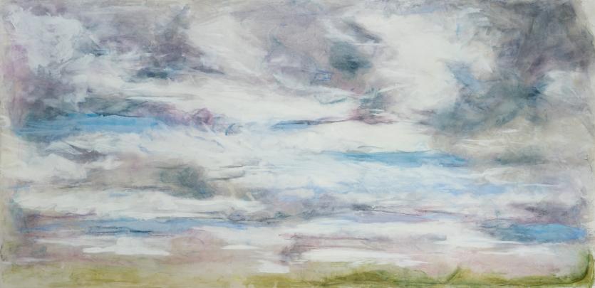
Iceland Sky, Encaustic monotype, 32 x 66 in
My Work
Iceland Sky provides my portrayal of an intriguing lesson I learned during my first visit to the island. The state of the sky is part of everyday survival for Icelanders. Their sky is beautiful, powerful, and frequently unstable, demanding constant attention.
For this piece, I chose a very large plate size to work at a scale that would allow me to be “in” the painting, while also creating distance and a sense of grandness. I wanted this painting to take me back to the majesty of the island every time I looked at it. I wanted to convey the intensity in the sky through the light/ dark contrast and to demonstrate the power of it by featuring strong, clear, active marks. In the making, I am “in” the sky with every stroke. The color palette needed to highlight the contrast between perfect bluebird moments and the looming dark power in the threatening storm clouds. I wanted it to feel light and inspiring, while hinting at the instability.
83
Adding line work would feel constraining and limit the flow, so I chose to focus on showing movement by going in and out of color planes. Making the image was about solving the puzzle of color, layers, and movement.
For the top layer, what I refer to as the foundation layer, I chose four warm blues, and white and pale yellows for lighter clouds to convey a sense of openness. Lavender, lavender/ grays, lavender/blues, pewter, and a graphite wax stick defined the deeper more powerful areas, and greens were used for grounding — all deliberately warm tones.
On the plate, I began to create the image in melted waxes starting with the medium blues applied horizontally to define the core composition and establish the fading perspective. Later I revisited the blue areas to bring brightness to the open sky and added whites and pale yellows in the areas surrounding blues to give the impression of airy open clouds.
Next, I added the lavender and lavender light grays into white areas. This mapped out the dark power points in the sky, always with a fading perspective. I then came in with the darker grays to highlight the intensity of the storm power right up next to the springtime blues. It was at this point that the intensity of a moving, ever-changing sky started to emerge. The last part of the foundational image was a note of green at the bottom edge to situate the viewer, in this case, me.
Next, I covered the image with 50 grm Masa rice paper and let it absorb the wax. I later ran clear medium over the paper to further saturate the piece and achieve full color absorption. The foundation print on the front was done and pulled of the plate.
84
Next up, the dance! There are many trade-ofs between the easy flow of the wax, the combining of color, the blurred forms, and where and how much structure I need to make an abstraction recognizable. This wrestling can cause me to change temperatures of diferent areas of the plate to stop the free flow in specific regions. It might mean adding color back to render forms more clearly, or adding line work to regain structure and create movement. I often use clear medium to combine colors, soften colors, and add fluidity to the wax.
For the Iceland sky, I placed the front side up on the plate and grabbed more of the encaustic medium to lightly refresh some of the color areas that had run together. It was also necessary to add highlights in the lightest white areas and in some of the darker areas. I let my color strokes stand out to create a more dynamic image. I needed to feel it, to be in it more, and to further activate the power of the piece.
Finally satisfied, I pulled of the final print. It felt as honest and complete to my memories and expression as I could make it. I had been somewhere, somewhere that will be with me always, and the piece that emerged was done!
Looking closely at some of my other pieces, you will see diferent ways I have managed the flow and relative intention of the structure, or lack of it. In each piece, the challenges and criteria for my expression are diferent, with the materials, the focus, and the puzzle and strategies used to achieve my best in expression, being diferent as well.
85
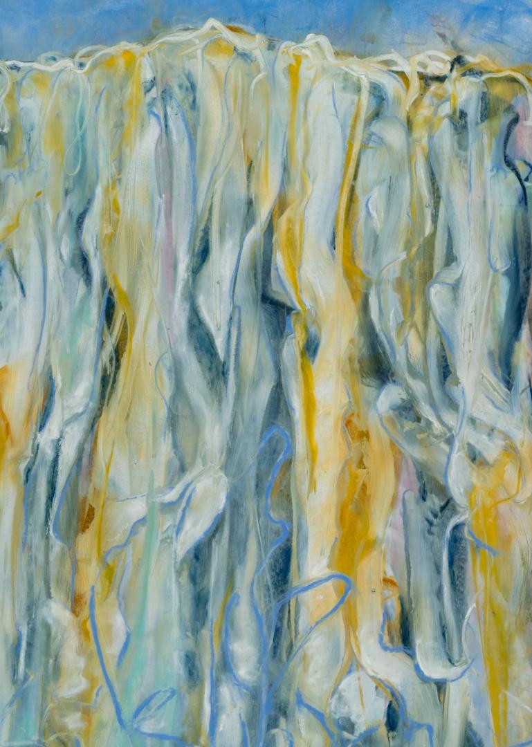
Waterfall seeks to show a soft flow and convey the dampness of the scene. My motivation was to make the spot seem so grand and interesting that someone would want to follow each rivulet of water. I wanted to do justice to the range of colors one could experience by looking deep into the falls. The viewing experience was to feel soft and meditative, while introducing the surprising power of water hitting the bottom and flying back up. Finally, I wanted the piece to sparkle with light.
The process of creating this piece began by starting with applying blue ochre and putting myself in the mindset of riding down the waterfall as I made my marks. Then added further layers of vertical marks in diferent shades of blues, golds, and pale yellows. Slowly the softness, depth, and movement emerged. I added more line work to highlight the diferent paths of the water streams and integrated pinks, blue, greens, and whites to address the complexity of the falls. After the foundational print was pulled, I applied further sky blue colored wax and printed from the back. This addition provided a strong horizon line and greater color separation. In the final step, I added more pigmented wax to the front of the print to further saturate the color. I also increased the water movement by adding a strong lavender/blue element, which was repeated to hint at the crashing of the water below.
Waterfall, Encaustic monotype, 33 x 46 in
86
88
Low Tide, Encaustic monotype, 44 x 48 in
In Low Tide, I wanted to capture the structure of the rocks and unique colors of the seaweed on a beach in northern Iceland. The combination of the magenta and rust colors of the seaweed was astounding to me. I positioned myself in the foreground in the thick of the intense color. Texture also had a big place in my memory of this spot. It was important that the contrast of the colors was strong and that a sense of light was evident though textural shifts. The foundational image on the front side of the print shows bright, light blues, magenta, reds, and oranges. I used several warm tones for the rocks and seaweed. I then applied a blue ochre to print the back side which gave some interesting shadowing and depth, as well as better integrating the rocks and seaweed. After I pulled the backside print, I noticed some of the early structure on the front was lost by wax melting together. To remedy this, I saturated my image with clear medium and then drew into the wax with a woodless pencil, recovering enough of the structure to be recognizable. See a close up of the marks.
89
Rush Creek is an example where color and line work were again used in combination, in this case to depict a childhood memory of fishing with my father in this mysterious and beautiful creek. I started this piece with dark blue and walked from one end of my plate to another, as if I was “in” the flow of the creek. I repeated this process over and over while applying a series of lighter blues and greens.
90
Rush Creek, Encaustic monotype, 30 x 66 in
After the plate became dense with color and movement, I pulled it and then printed the back of the print with deeper blues to add depth and contrast to the lighter upper layers. My goal was to convey the depth, movement, and obstacles in the flow and to reflect light to give shape and form to the water. In the end, I revisited the top layer and added bits of contrasting color, which I felt added to the mystery and helped capture the intensity of how I experienced this creek as a child.
91
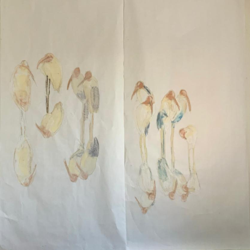
Migration, Encaustic monotype, 102 x 70 in
Working Bigger
In the last year, I have produced several large pieces, triptychs, and diptychs comprised of 32" x 66" vertical panels. Working large gives me the opportunity to dig deeper into the creative process because the composition of each panel needs to work individually, as well as contribute to the complete set. Multiple panels also engage the viewers in a more active way as their focus shifts from one panel to another. Like all of my work, the way in which I solve for the added complexity of multi-panel work is specific to the needs of the piece.
92
Migration was the first large triptych I completed. I am often asked if I sketch my pieces in advance, and typically, I don't. However, a sketch for this piece helped me work out both the general composition and color scheme that was ultimately advanced in the final piece.
 Procreate sketch of Migration
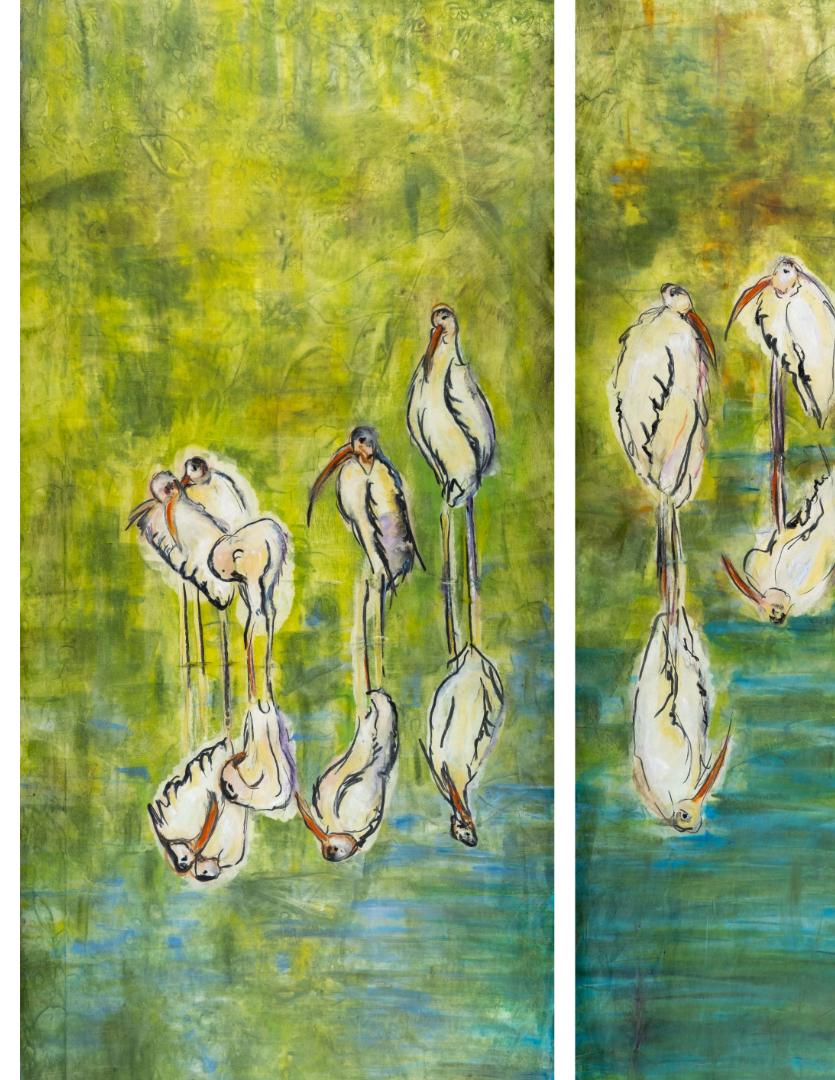
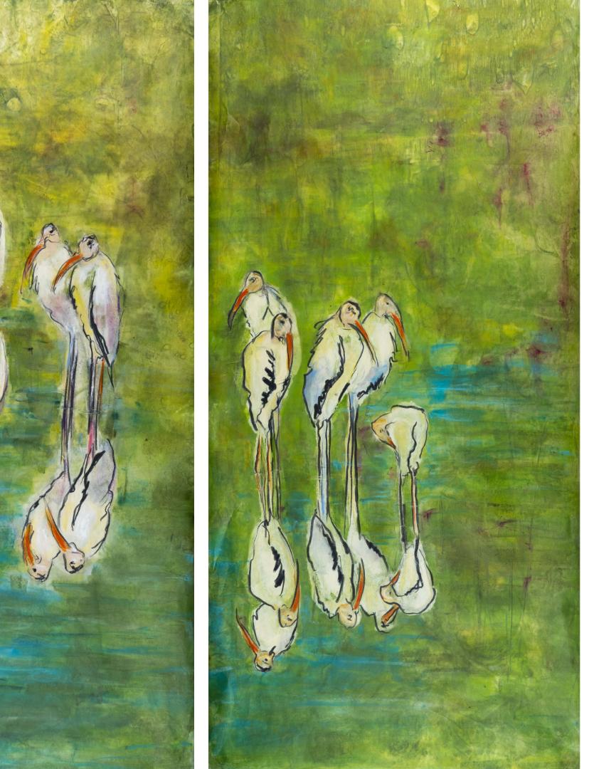
Birds of the Marsh is the product of many layers and iterations. The focus of the subject matter centers around my experience exploring the vast marshlands in Georgia and South Carolina. I wanted to highlight the quiet of these moments, the elegance of the birds in their daily routines, and the blue and green contrasts of the water, birds, sky, and marsh.
To begin, I arranged the composition on the panels and created a loose print of the birds on the front side of each panel. Once the composition was set, I cleaned the plate and created the entire marsh/water environment on the plate and printed each individual panel again, but this time from the back.
I love how the color came through the birds. This example has two panels with front print only, and one that has been printed both on the back and the front of the panel.
The three pieces each went through several add-ins on the plate in order to unite the color, forms, and movement of the diferent panels. In the final step, I used graphite black encaustic wax to draw very loosely into the birds, adding the structure to make them more identifiable.
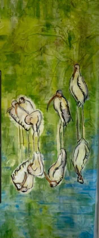
96
Previous Page, Birds of the Marsh, Encaustic monotype, 102 x 70 in Birds of the Marsh, Work in progress
98
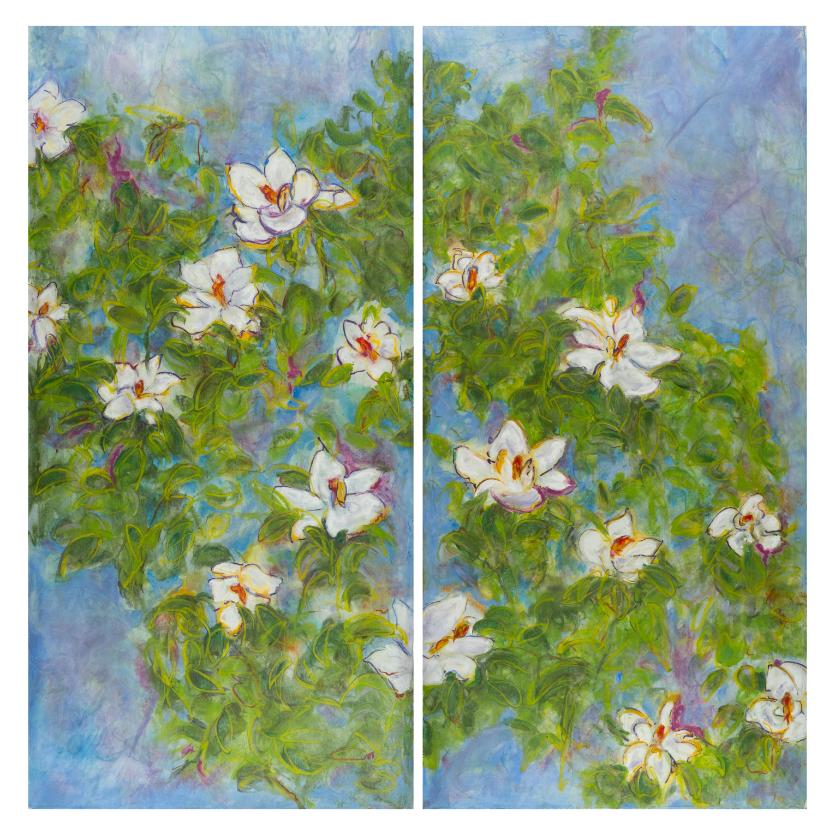
Savannah Magnolias, Encaustic monotype, 64 x 66 in
In this diptych, Savannah Magnolias, I wanted to capture the beauty, the smell, and lightless of the magnificent magnolia trees that brighten Georgia. I wanted them bold and rough and filled with color the way I observed them in the moment. This image called for many layers. I completed one layer of leaves and flowers on the front side, created another image of sky with many colors and more leaves and printed that on the back side. I then came in on top to loosen and define the piece by drawing leaf lines, adding highlights, and introducing darks to activate the foliage.
Looking forward
As you've seen in this article, each of my encaustic monotype pieces compels the use of a unique approach. This amazing medium and the opportunity to innovate excites me every time I create a new piece!
Currently, large works are being exhibited at Art Ark Gallery in San Jose, CA—FUSED, A Celebration of Encaustic Art, April 11 to June 8. Please feel free to be in touch and follow my work at www.lonniezarem.com .
99
About the Author
Lonnie Zarem is a professional fine artist with a focus on making encaustic monotypes. Following art school and several years of oil painting, she started to paint with encaustic wax, a medium consisting of beeswax, resin, and pigment. This means creating an image by painting with blocks of pigmented wax on a hot flat plate, and then placing rice paper on it to absorb the melted wax image. Lastly, she pulls it of for a one time print. For the last 15 years, Lonnie has been pushing the possibilities of making contemporary encaustic monotypes— developing new methods, stretching and modifying wax application, working large scale, incorporating varied drawing approaches, and exploring color to achieve her highly expressive representationally—abstract monotypes.
Here are Lonnie’s thoughts on what inspires her work. “I have always been fundamentally inspired by my relationship with the natural world. I want to experience the special moments that arrive from being aware, when it’s most beautiful, when it’s most simple, when it’s most profound, when contrasts are arresting. I want to visually capture it in my mind before it’s gone, to register it in a pure, simple, and honest way. I look to see things raw, wild, and unbundled from the demands of daily life. It’s my intension to capture natures’ announcements of change, of transition. I am urged to respond and interpret these moments in terms of the emotion and meaning they have for me, to find these beautiful memories and make them seeable and shareable!”
100
Lonnie currently lives and works in her studio in Los Altos Hills, CA. She was born in Southern California, where she grew up playing tennis with the intention of turning professional. This led to her recruitment to UC Irvine where she graduated with a B.A. in economics. After years working as a marketing professional, she married Hal Zarem and had three sons. The family moved to Northern California in 2000, at which time Lonnie decided to formally pursue her art career. This led to art school at San Jose State University’s School of Fine Arts and the many years of making, showing, and selling her work, as well as being an art instructor for the last eight years. She enjoys family, friends, and an active life filled with the wonder, beauty, nature’s wildness, and the quest for new adventures!
You can view Lonnie’s work at www.lonniezarem.com www.instagram.com/lonniezarem www.facebook.com/lonnie.zarem pacificartleague.org
All photos were taken by Andrew Zarem
101
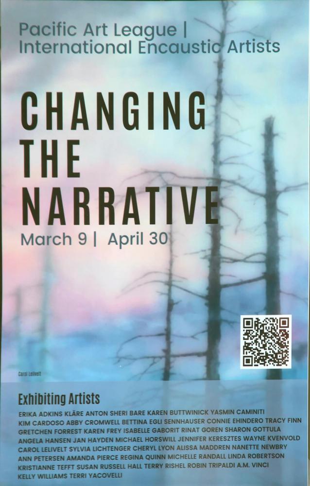
Changing the Narrative
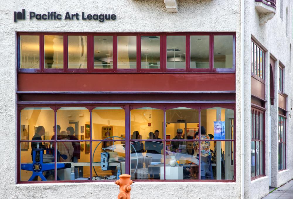
IEA/Pacific Art League Juried Exhibition 2024
The Pacific Art League (PAL) has been promoting art, training emerging artists, and enriching lives in the San Francisco Peninsula for more than a 100 years. The building sits at one of the main entrances leading to downtown Palo Alto, with its many specialty retail markets, popular restaurants, bookstores, and cofee shops. Full of natural light, there are two gallery spaces that also serve as the PAL’s art classrooms.
102
Photo by DeWitt Cheng
We are fortunate to have one of our IEA members, Lonnie Zarem, as an instructor at this important organization. In September 2023, Zarem received an IEA Project Grant to purchase additional encaustic hot boxes and launched an Encaustic Monotype Center at the PAL. Zarem’s project served as the IEA’s introduction to the PAL’s Gallery Director, Aly Gould, and when an exhibition was suggested, Changing the Narrative was born.
Juror DeWitt Cheng, selected 54 paintings from the 224 entries that he reviewed from nearly 90 artists. Cheng, who is based in the San Francisco Bay Area, has written for 20 years for regional and national publication, in print and online, including San Francisco Art Magazine, Daily Gusto, Art Business, Artweek, East Bay Express and Sculpture, among others.
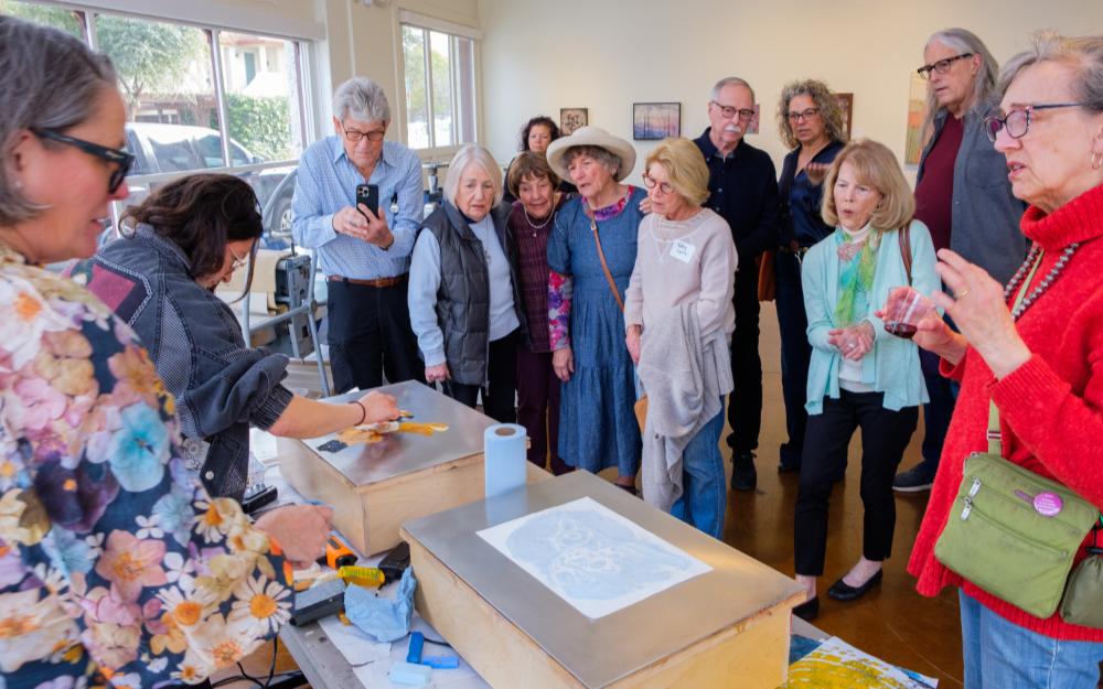 Photo by Andrew Zarem
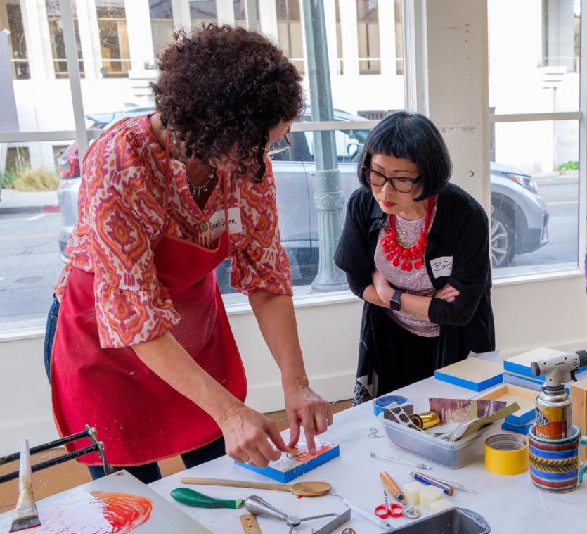
Changing the Narrative, was an international exhibition of encaustic and cold wax at the Pacific Art League that included fantastical artwork brimming with representational and abstracted stories from dreams, cultures, fairy tales, and family histories. The opening reception was Saturday, March 9, from 4 - 6 pm, and more than 75 people attended. A number of the visitors were artists who participated in the exhibition, some who traveled from Los Angeles, Oregon, and Seattle to attend.
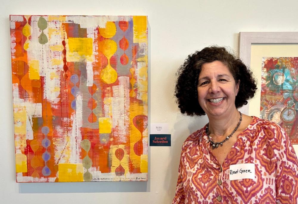
Six awards of excellence were presented. The four Juror Awards of Excellence were: Layers of Joy by Rinat Goren; Spiral Pod by Angela Hansen; Untitled by Wayne Kvenfold; and Diary of a Cave Artist by Susan Russell Hall and Terry Rishel.
 Photo by Andrew Zarem
Photo by Melissa Stephens
Photos by DeWitt Cheng
Photo by Andrew Zarem
Photo by Melissa Stephens
Photos by DeWitt Cheng
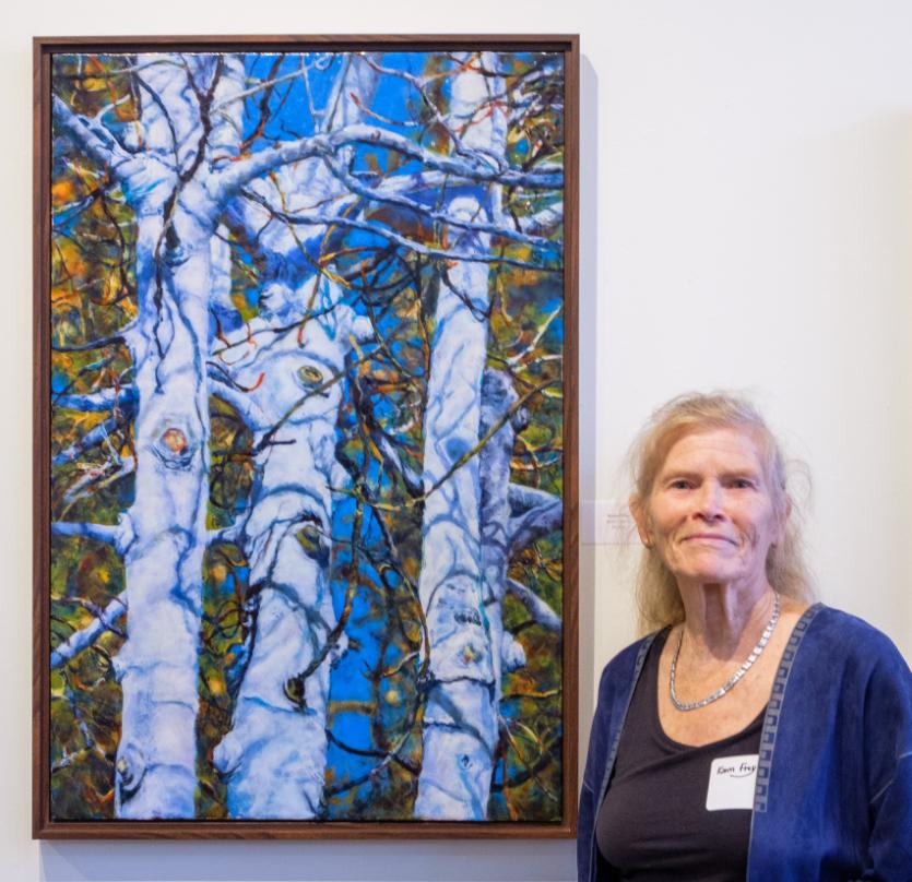
The IEA Award of Excellence was awarded to Let the Light In by Sylvia Lichtenger, and the PAL Award of Excellence went to Tokyo Fish Market - Breakfast by Karen Frey. Congratulations to all of the artists who were selected for this exhibition.
Changing the Narrative is unique because the PAL elected to host the exhibition for two months, rather than the usual one month’s time. The show ran from March 7 to April 30, 2024.
You can view the Changing the Narrative exhibition at changingthenarrative2024.artcall.org/pages/web-gallery
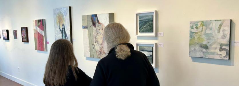 Photo by Melissa Stephens
Photo by Andrew Zarem
Photos by DeWitt Cheng
Photo by Melissa Stephens
Photo by Andrew Zarem
Photos by DeWitt Cheng
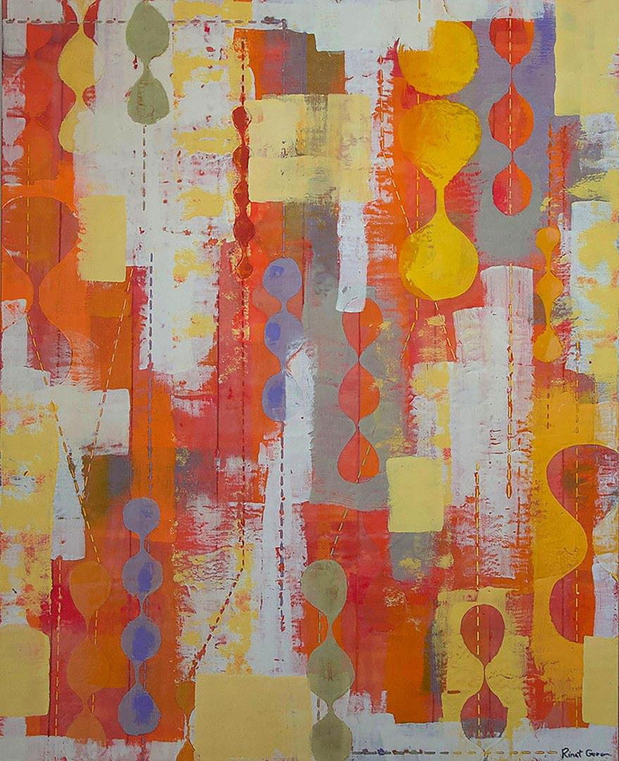
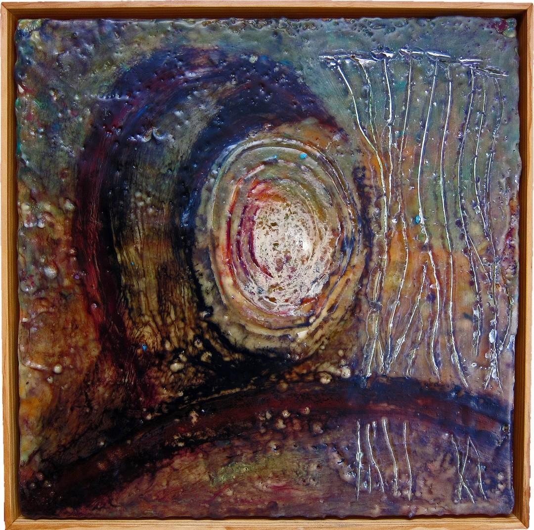
Layers of Joy Rinat Goren
Juror Award of Excellence
Layers of Joy is an invitation to recognize the precious moments of joy and beauty in our world. It is a challenge to find these moments when we are overwhelmed, sad, and afected by local and world events. This piece is a promise that joy and beauty do exist, and we just have to identify and/or create them.
This is an abstract, encaustic work on a wood panel. The shapes and the elements in this piece are superimposed and layered to create depth. It is an encouragement to dig deep and engage our imagination to explore, search, and be curious about life. Please find your moments of joy in it.
You can view Rinat’s work at www.rinatgoren.com www.instagram.com/gorenrinat
Layers of Joy, Encaustic on cradled panel, 30 x 24 x 1 1/2 in
107
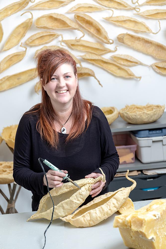
Spiral Pod
Angela
Hansen
Juror Award of Excellence
Spiral Pod is a wall-sculpture, constructed of encaustic and fosshape, which is indicative of my visual vocabulary since my first childhood explorations in artistic expression. Encaustic is usually seen as a 2D medium, but its role in my art making is very diferent. This narrative is about the way the encaustic allows for me to pull from mental imagery and manipulate or sculpt it into physical being. It is a symbiotic relationship with no parameters or rules - only creative and purposeful play.
My interests in natural forms arise from growing up on a farm surrounded by forests and abundant flora and fauna and the ever changing life-cycles of nature, which pervade such an environment making an everlasting impression upon my psyche.
You can view Angela’s work at www.angelahansenart.com www.instagram.com/angelahansenart www.facebook.com/morphlings
108
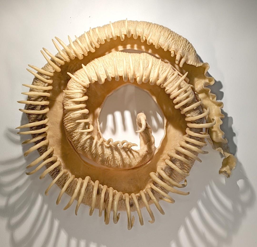
Spiral Pod, Encaustic, fosshape fabric, thread, d-rings, 21 x 21 x 9 in
109
110
Untitled, Encaustic, 16 x 16 in
Untitled Wayne Kvenfold
Juror Award of Excellence
Life presents many challenges, especially over the last few years. For me, these paintings represent a passage away from the personal challenges that I've experienced during this time, leaving them locked away.
Wayne Kvenvold works in a variety of media, but finds encaustic to be a favorite. It's a very expressive medium that has the ability for limitless artistic flexibility. His art is an expression of his experiences, emotions, failures, and inspirations encountered throughout his lifetime.
111
Diary of a Cave Artist
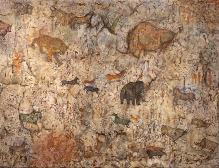
Susan Russell Hall and Terry Rishel Juror Award of Excellence
This work reflects many conversations about the beautiful variations of art throughout our human history. Eventually we agreed that we had an unrealized passion for cave art. In our younger years as artists, we both made many drawings as well as small paintings reflecting the discovered caves at Lascaux in France, as well as caves in Spain, Africa, Australia, and all over the world. We have also studied petroglyphs that are found on almost all the continents.
As this artwork progressed it seemed liberating to define the animals, human figures, and symbols in our own unique view, staying loosely tied to the many cave paintings. We took liberty with time frames, locations, and fantasy, adding the patina of age as it slowly partnered with the wax.
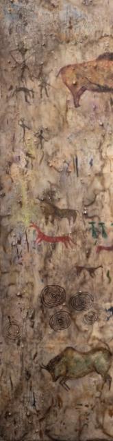
Although the true purpose behind cave art may never be revealed, its mere existence strengthens the bonds between modern day people and their earliest ancestors and serves as a beautiful reminder of the essential role art plays in the lives of all humans.
You can view Susan and Terry’s work at www.russellrishel.com
112
113
Encaustic
27
42 in
Diary of a Cave Artist
and mixed media
x
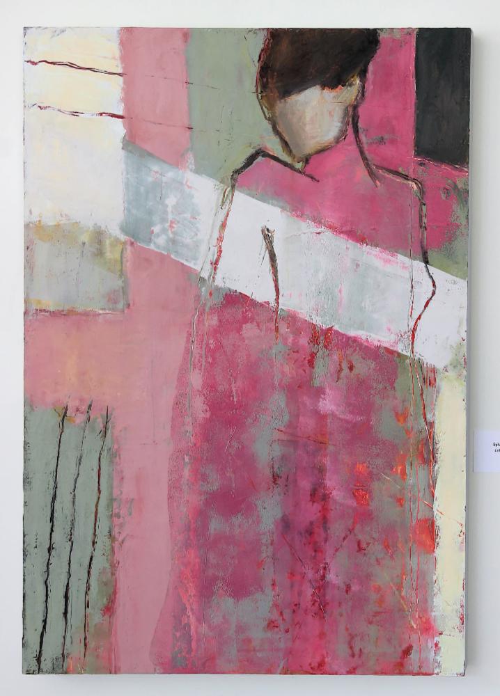
Let the Light In Sylvia Lichtenger
IEA Award of Excellence
I love working with oil and cold wax. Let The Light In is an abstract figurative piece that expresses my optimism and reminds me (and hopefully the viewer) to turn away from the dark and "let the light in."
Sylvia was originally trained as a portrait painter at The Arts Students League in New York City. Over the past decade, she has moved away from representational art to the more provocative style of abstraction. When she starts a painting, she doesn't really know where it's going to end up. She adds layers and layers, scrapes away, and adds more layers. Finally, the colors and textures are right and the figure emerges.
You can view Sylvia’s work at www.sylvialichtenger.com www.instagram.com/sylvialichtenger www.facebook.com/SylviaLichtenger
Let the Light in, Oil and cold wax on cradled panel, 30 x 33 x 1 1/2 in
115
Tokyo Fish Market - Breakfast Karen Frey
Pacific Art League Award of Excellence
My work is inspired by those things in life that speak to me in a visual sense, whether they be environmental or living beings around me who compel a response. This is often imagery one might see in your everyday life, transformed by color and light into something beautiful. I want content to initiate a narrative in a vague way, allowing the viewer to experience the work on a personal level.
While my work is representational, my challenge is to translate what I am actually seeing. I interpret reality through an organized array of shapes, colors, and marks that rely on my drawing skills to be construed as recognizable.
Technical skills partner equally with content in my approach to painting. I work in both encaustic and watercolor. I respect the unique properties, possibilities, and boundaries of each medium and do my best to celebrate them.
You can view Karen’s work at www.karenfrey.com
Tokyo Fish Market - Breakfast, Encaustic on birch panel, 29 x 23 x 1 in
116
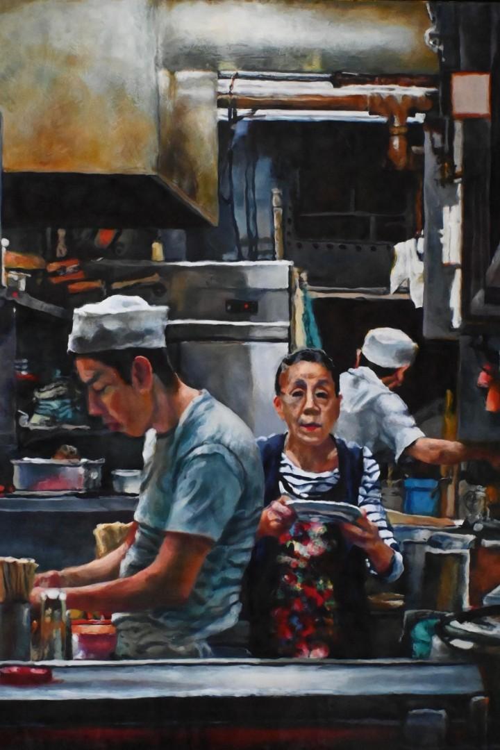
In Memory of Melissa Morton Lackman
Regina Quinn and the IEA Board of Directors
We have lost a dear friend and longtime supporter of the encaustic community, Melissa Morton Lackman. Recently diagnosed with APL, a form of Leukemia that has a high survival rate, Melissa was undergoing chemotherapy. She, her doctors, family, and friends were optimistic about her chances for recovery. Sadly, she had difculty with treatment and passed away on April 2, just weeks after her diagnosis.
Melissa was as an active IEA Board member for more than a decade, serving in a variety of leadership roles. Shortly after joining the board in 2013, Melissa was elected President. She served in that role until reaching the end of her four-year term and then served as Vice President. In 2020, she took on the role of Grants Director and served in that role until her passing. Those of us who had the good fortune of working with her frequently describe her as “a rock”—steadfast in her support, compassion, and encouragement of others.
In addition to her degree in fine arts, Melissa also held a law degree. Whenever the IEA Board faced a complex decision, we turned to Melissa for the remarkable clarity of thought she brought to even the most challenging issues—a clarity that was illuminated by her sense of fairness, her compassionate nature, and her very generous spirit.
Her generosity and commitment to IEA members made Melissa an ideal steward of IEA’s Grants Program. Melissa was passionate about providing support and resources to IEA members.
118
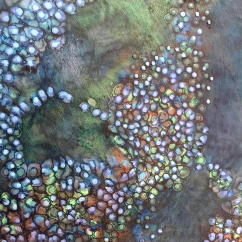
119
Detail, Neural Networks by Melissa Lackman
Perhaps the only difcult part of the role for her was that she wanted to fund all applicants. In fact, in my collaboration with her over the past three and half years, I think the only thing she wasn’t good at was rejecting an applicant because she always recognized the value, worth, and potential in each artist’s proposal. This desire to find ways to help artists realize their visions led her to frequently advocate for finding ways to fund more IEA members’ projects than we had originally planned. Melissa also worked closely with our generous sponsors, Enkaustikos and R&F Handmade Paints, to provide free paints to numerous encaustic artists around the world.
Outside her work with International Encaustic Artists, Melissa served in a wide variety of board leadership roles for local and national nonprofit organizations since the mid 1990s. In addition to her studio practice, Melissa practiced law for 11 years after earning her J.D. at UC Berkeley in 1981. Her passions included children’s mental health, children’s arts education, music, language learning, and travel, as well as major league baseball. Melissa rarely missed an IEA Board meeting except when her team, the LA Dodgers, was in the playofs!
As you can see by reading the Board comments that follow this article, Melissa was appreciated by fellow IEA Board members not only as a treasured friend and colleague, but also as a mentor. Helping others grow and succeed was an integral part of Melissa’s character. Over the past several months, her main focus with IEA was on launching a new Mentorship Initiative and Grants Program. In discussions with the Grants Committee, Melissa recognized that many members were successful in receiving Project Grants, Artist Residencies, and Emerging Artist Grants; however, we were missing a segment of our membership population.
120
In particular, members who were relatively new to encaustics or to careers as professional artists could greatly benefit by the opportunity to work with an experienced mentor, assisting them to navigate forward in their practice and in their careers. Noting that gap in our grants programs, she advocated for funding for the Mentorship Initiative, to which the Board wholeheartedly and unanimously agreed.
The development of this initiative is well underway, and we are committed to bringing the project to fruition in honor of Melissa’s vision and legacy.
***
Melissa Lackman, we already miss you dearly and will be forever grateful to have known you!
We send our deepest sympathies and condolences to Melissa’s family and to all who knew and loved her. We hope that by knowing how much Melissa was loved and appreciated will bring you some comfort as you grieve her passing.
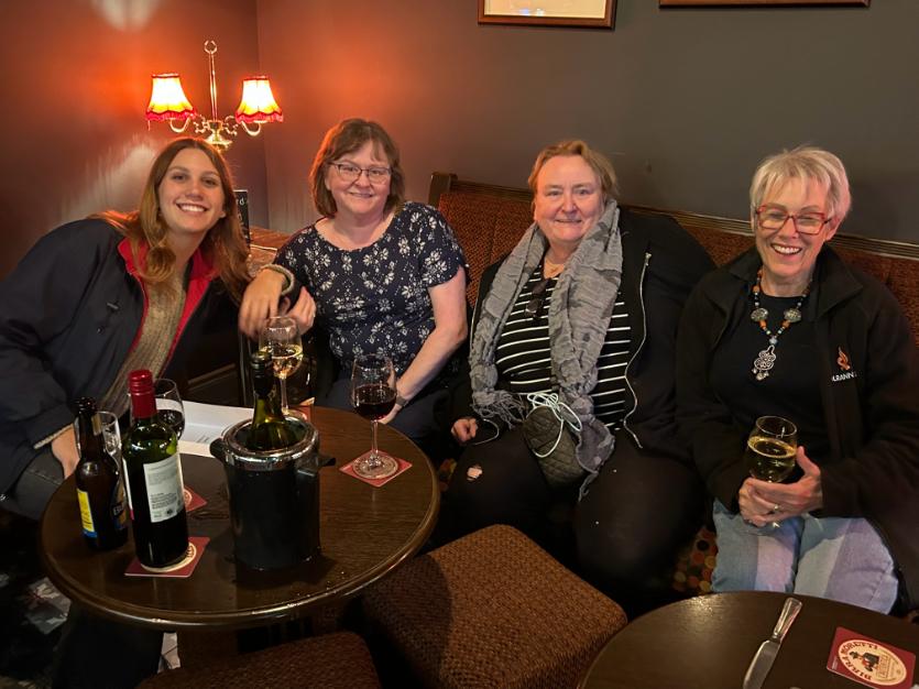 Melissa at Celtic ConVergence with family and friends
Photo by Melissa Stephens
Melissa at Celtic ConVergence with family and friends
Photo by Melissa Stephens
Melissa was so kind to me when I first became involved with IEA in Santa Fe years ago. She was brilliant and compassionate, funny, and smart. It's a hard loss.
Lyn Belisle
Melissa was so supportive and helpful to me personally when I first joined IEA, and throughout the years, she was unfailingly generous and supportive in IEA's leadership. Smart and funny, caring and insightful, creative and curious, she left lasting and positive impressions with everyone. I will miss her deeply.
Rhonda Raulston
I was able to spend a small amount of time with Melissa while in Ireland. Even during that brief experience, it was clear that she was a warm and caring person. She dedicated so much to the organization and will be truly missed.
Michele Randall
I am in shock. Melissa was such a rock for the encaustic community and her friends. She had faith in the people around her. I count myself lucky to have known her. We will miss her.
Melissa Stephens
Melissa has been such a strong member of the board and so supportive to the group. She is going to be missed dearly. We will all miss her historical knowledge of IEA. I will always remember how lit up and delighted she would get when awarding the scholarships. She truly contributed to our community with heart and soul.
MJ Reutter
122
When I joined the IEA Board, Melissa was the rock that held the group together. When she termed out as President and no one else on the board stepped up, Melissa agreed to be Vice President and guide me through my journey as President. She was my mentor and friend, and she will be missed.
As MJ said, Melissa truly contributed to our community with heart and soul. She was always eager to give our members the support they needed to grow and thrive as artists. And we should honor that memory.
Kay Burnett
I knew Melissa for almost 11 years. In 2013, IEA held an encaustic conference in Santa Fe, NM. I had been elected to the board position of Treasurer, and I was attending the conference and the board meeting to follow.
I met Melissa and her family the night before in the hotel restaurant. We struck up a conversation which began our longtime friendship.
At our Board meeting following the conference, which had some logistical and financial challenges, I saw the intelligence, humility, and dedication that Melissa demonstrated then and throughout her tenure with IEA. Melissa was one of the most trusted and dedicated advocates of the encaustic arts, and I have lost a dear friend.
Paul Kline
123
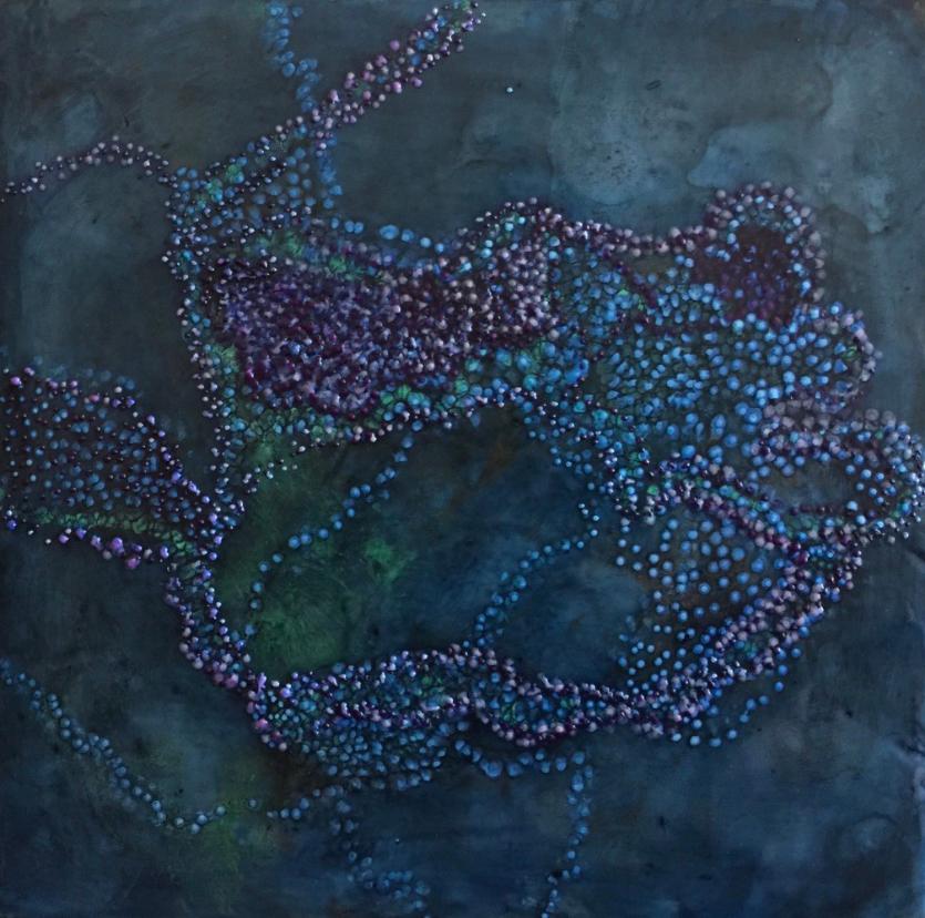
Neural Networks 1 by Melissa Lackman
Encaustic, pigment stick, 12 x 12 in
You can view Melissa’s work at www.melissalackman.com
124
I am inspired by the human need to explore, map, and make sense of an environment. This may be expressed at times in ornamental ways. The repeated dots in my paintings reference the repeated babblings of an infant, who is exploring his world through mapping the sounds he hears. They reference the careful marks of an explorer, who maps a new frontier so others may follow. They reference the careful stitches of a decorative sewist. The story told is of a universal human desire to explore, conquer chaos, and beautify our surroundings.
Melissa Lackman
125
kaleidoscope
1: an instrument containing loose bits of colored material (such as glass or plastic) between two flat plates and two plane mirrors so placed that changes of position of the bits of material are reflected in an endless variety of patterns
2: something resembling a kaleidoscope: such as
a: a variegated changing pattern or scene
b: a succession of changing phases or actions
c: a diverse collection Merriam-Webster.com

A digital publication of International-Encaustic-Artists.org Wax Fusion Spring Issue X:2024 Kaleidoscope
2024
