best indesign


Welcome to Best in Design, 2022, a compendium celebrating the best of a wide range of project types spanning the globe. Between the tactile soft-matte covers are chapters on market segments covering residential, workplace, and hospitality, plus one eclectic mix devoted to categories from resi developments to religious institutions. All provide a taste of things to come: A wine cellar clad in 1,000 tiles that resurrects a lost glazing practice from the Song Dynasty; a Philip Johnson country estate sympathetically added to and a modernist Eero Saarinen complex brought back to life; the L.A.-cool headquarters of Gwyneth Paltrow’s growing wellness brand; and a world-first stadium that feeds live media to its roof screen for the benefit of passengers in planes overhead. It’s a resourceful collection, and one sure to inspire.
The wide array provides a snapshot-in-time of notable work from firms both large and small: Interior Design Hall of Famers including Patrick Tighe, Alexandra Champalimaud, Clodagh, and more; giants such as Skidmore, Owings & Merrill and up-and-coming firms like Matrix Design Co. and August Green. All projects give insight into that studio’s design point of view—and useful on-page links to the firm’s Instagram account and website point the way to the rest of their output. Encompassing clever renovations and ambitious new builds, you will find mid-century abodes, glamorous restaurants, cheeky boutique hotels and sprawling resorts, examples of the new amenity-rich “flex” workplaces, and many an iconic institution (think Raffles Singapore and New York’s Morgan Library & Museum). In short, there’s the best in design for everyone...enjoy!
COUNTRY ESTATE / ROGER FERRIS + PARTNERS PHOTOGRAPHER’S LOFT / DESAI CHIA ARCHITECTURE HOLLYWOOD HILLS HOUSE / PATRICK TIGHE ARCHITECTURE
SHAKER HEIGHTS RESIDENCE / DIMIT ARCHITECTS
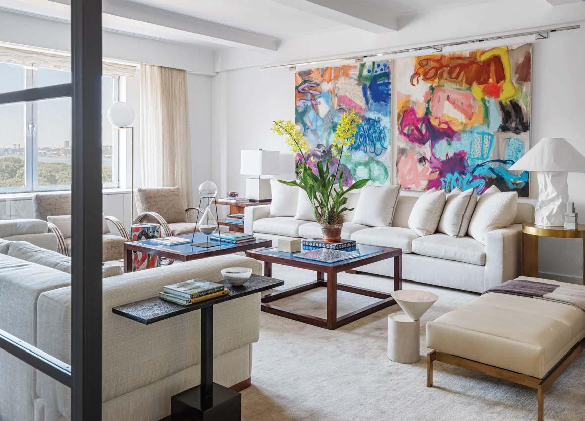
UPPER FIFTH AVENUE APARTMENT / ANIK PEARSON ARCHITECT MID-CENTURY DREAM / HARTE BROWNLEE & ASSOCIATES
THE BARN / D’APOSTROPHE DESIGN LEDGE HOUSE / DESAI CHIA ARCHITECTURE SCULPTURAL DESERT HOUSE / ICONIC BY KAITLYN WOLFE SEASIDE / DSK
BROOKLYN HEIGHTS RESIDENCE / BIA INTERIORS WASHINGTON D.C. RENOVATION / MARY DOUGLAS DRYSDALE LA GORCE ISLAND RESIDENCE / POGGI DESIGN PERRY STREET LOFT / D’APOSTROPHE DESIGN RESIDENCE / JULIA ROTH DESIGN GLOBAL HOME IN THE SKY / ANTROBUS DESIGN COLLECTIVE UPPER WEST SIDE LUXURY APARTMENT / FOLEY&COX INTERIORS AND SPG ARCHITECTS MENDOSA RESIDENCE / HUANG IBOSHI ARCHITECTURE PARK AVENUE DUPLEX / RONNETTE RILEY ARCHITECT LANDMARK VICTORIAN / LOCZIDESIGN
10 14 16 18 20
RELATED GROUP / MKDA ARUP CANADIAN HEADQUARTERS / IN STUDIO MAJOR LEAGUE BASEBALL / STUDIOS ARCHITECTURE GOOP HEADQUARTERS / RAPT STUDIO OSWX / STUDIO BV MAM COMPETENCE CENTER / INNOCAD ARCHITECTURE
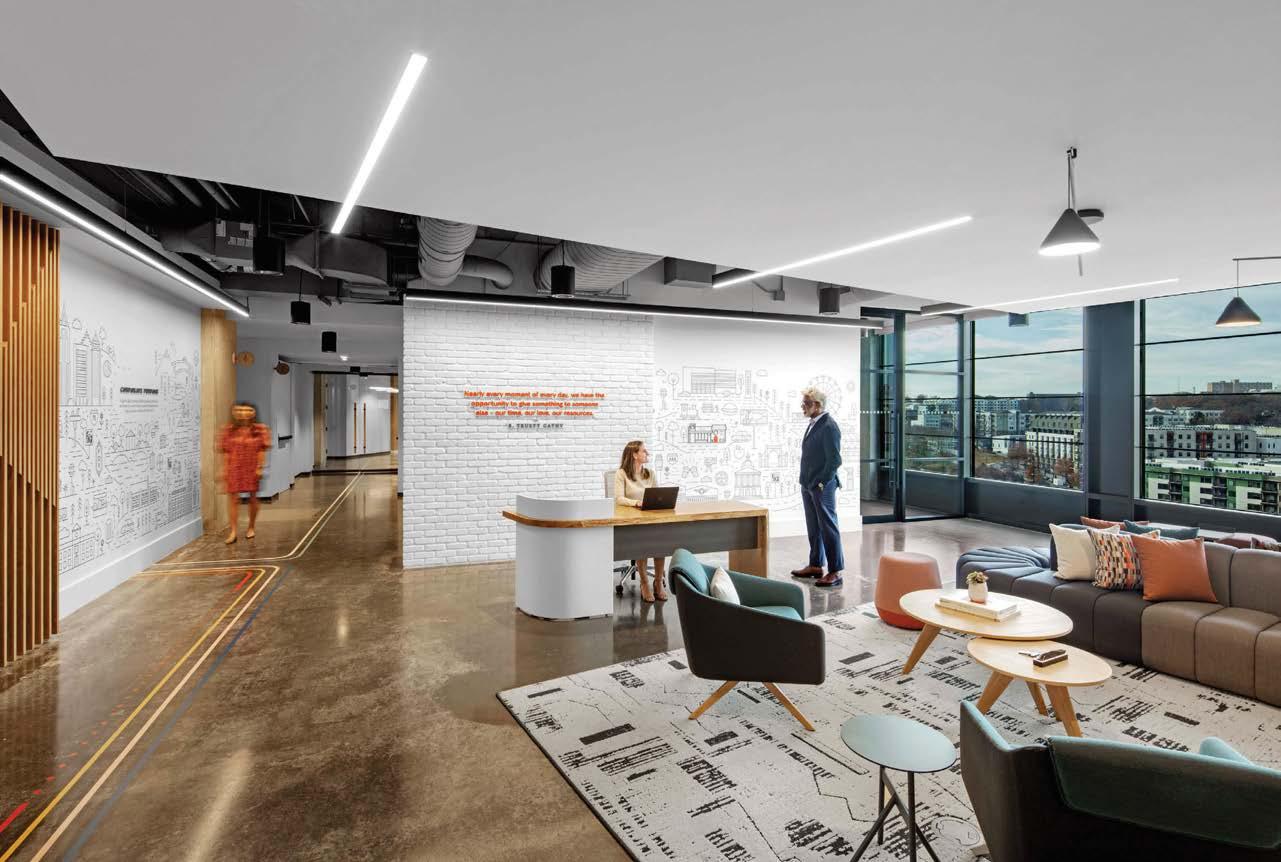
UNDISCOVERED WEST TEXAS WORKPLACE / CUSHING TERRELL CHICK-FIL-A PONCE CAMPUS / SMALLWOOD VF CORPORATION / RAPT STUDIO MISSION VETERINARY PARTNERS / DAVIS & DAVIS INTERIOR DESIGN
MAKING SPACE FOR INNOVATION / SKIDMORE, OWINGS & MERRILL SAVILLS / PDR COSENTINI ASSOCIATES / MKDA ABRAMS BOOKS / SPACESMITH
AKAMAI TECHNOLOGIES GLOBAL HEADQUARTERS / SASAKI BEVERAGE HEADQUARTERS / IN STUDIO STUDIO PENTHOUSE / JHL DESIGN WOODRUFF SAWYER / BRERETON RMS / WILLIAMS BLACKSTOCK ARCHITECTS FRESHLY / MKDA
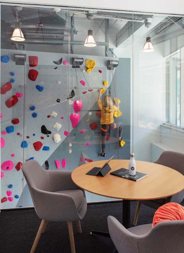
WIZARDS OF THE COAST GAME ROOM / JPC ARCHITECTS
58 62 64 66 68 70 74 76 78 80 82 86 88 90 92 96 98
AURORA LODGE / SNORRE STINESSEN ARCHITECTURE 1 HOTEL SOUTH BEACH / MEYER DAVIS BO ¯ / AGENCE SPATIALE GARDEN PAVILION / NC DESIGN & ARCHITECTURE BUDDHA-BAR NEW YORK / YOD GROUP SU CASA AT DORADO BEACH / CHAMPALIMAUD
TRINITY CHURCH WALL STREET / SCIAME CONSTRUCTION AND MBB ARCHITECTS CITY EXHIBITION CENTER OF MAWAN BAY / MATRIX DESIGN CO. ROBERT R. DOUGLASS PEDESTRIAN BRIDGE / WXY ARCHITECTURE + URBAN DESIGN THE BARRETT AT CHEVY CHASE LAKE / RD JONES + ASSOCIATES THE PEACOCK / AUGUST GREEN SOFI STADIUM / HKS ONE PARK GROVE / MEYER DAVIS GREENPOINT LIBRARY AND ENVIRONMENTAL EDUCATION CENTER / MARBLE FAIRBANKS ARCHITECTS “TELL ME MORE” / RAPT STUDIO GEORGETOWN UNIVERSITY SCHOOL OF CONTINUING STUDIES / STUDIOS ARCHITECTURE SLOAN SHOWROOM / LAMAR JOHNSON COLLABORATIVE DERFNER JUDAICA MUSEUM / LOUISE BRAVERMAN ARCHITECT CR WENZHOU BINJIANG MIXC SALES CENTER / MATRIX DESIGN CO. THE DRAWING CENTER / WXY ARCHITECTURE + URBAN DESIGN TRIANGLE SQUARE APARTMENTS / LAMAR JOHNSON COLLABORATIVE MARCO ISLAND ACADEMY / JEWEL TONED INTERIORS HARBOR LANDING AT GARVIES POINT / THE CHILDS DREYFUS GROUP NIO HOUSE / AUGUST GREEN CLODAGH SIGNATURE / CLODAGH THE MORGAN LIBRARY & MUSEUM / SCIAME CONSTRUCTION BELL WORKS / NPZ STYLE + DÉCOR 5POINTZ LIC / MOJO STUMER ASSOCIATES VERMELLA UNION / THE CHILDS DREYFUS GROUP WATERMARK AT NAPA VALLEY / DESIGNPOINT
THE NATIONAL ARCHIVES AT ATLANTA / PECK PECK + ASSOCIATES
156 160 162 164 166 168 170 172 174 176 178 180 182 184 186 188 190 192 194 196 198 200 202 204 206
Home is the most personal of all spaces, so it can be a challenge for residential architects and designers to deliver a client’s vision while retaining the point of view that endeared them to the client in the first place. When true collaboration succeeds, however, there is nothing more special. Whether it’s a luxury mansion or a smaller-size apartment, when a dwelling is suffused with its owner’s unique character—as seen through a designer’s conceptual lens—the result is nothing short of a home run.
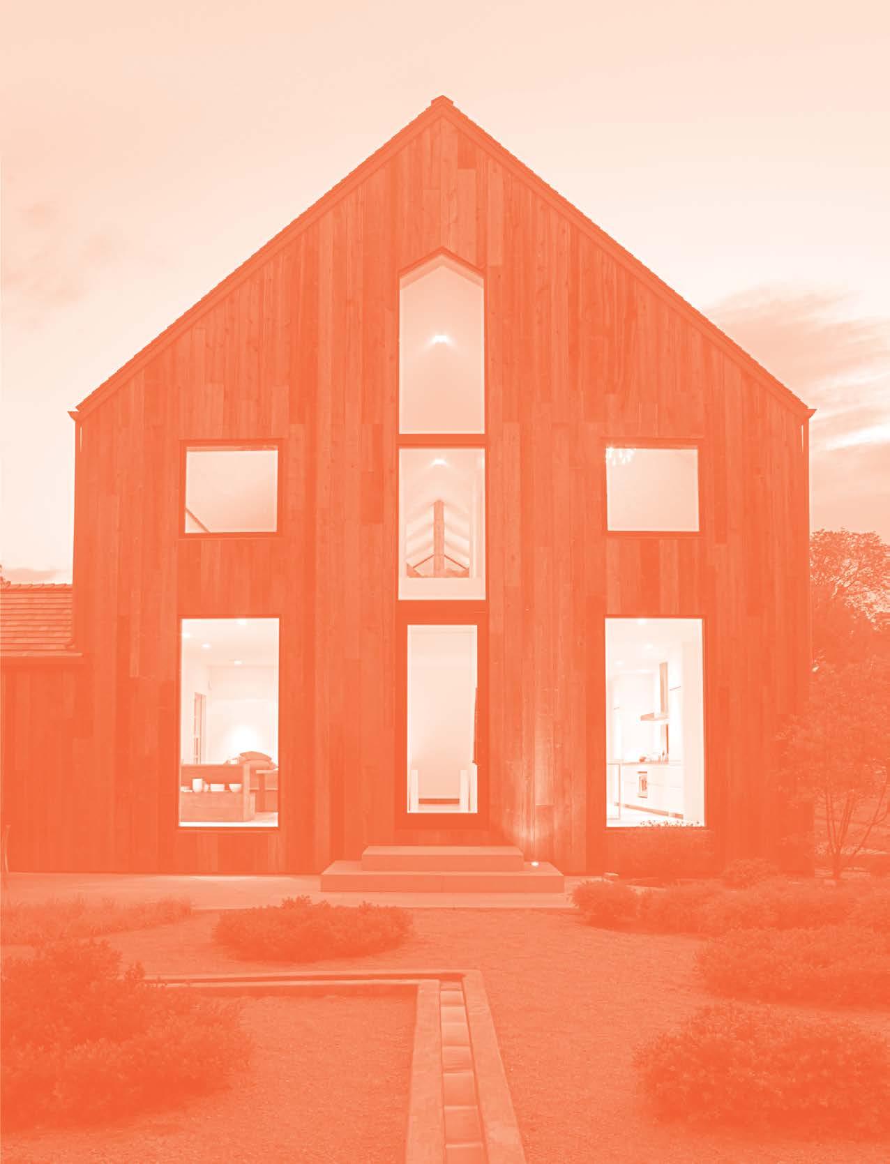
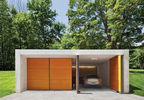
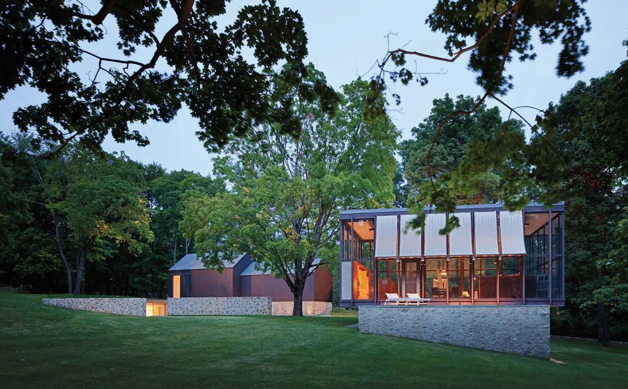
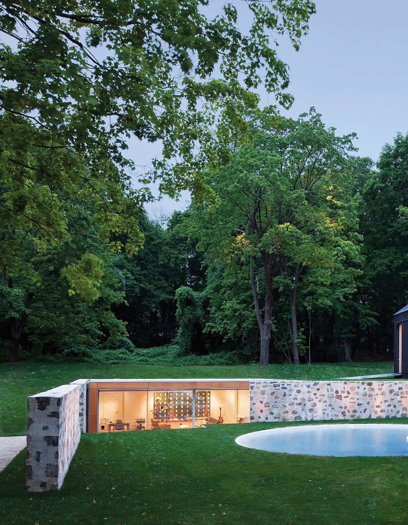
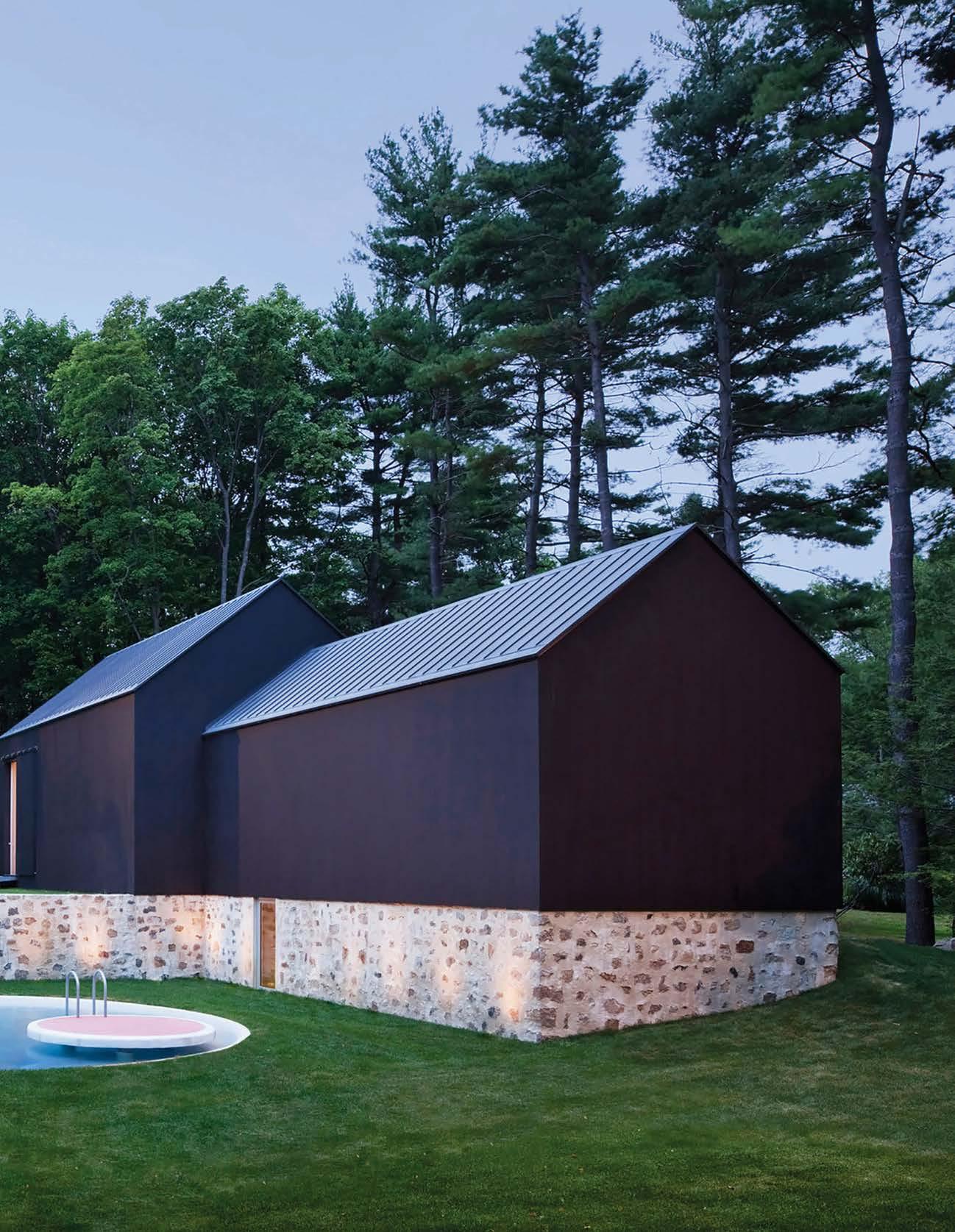
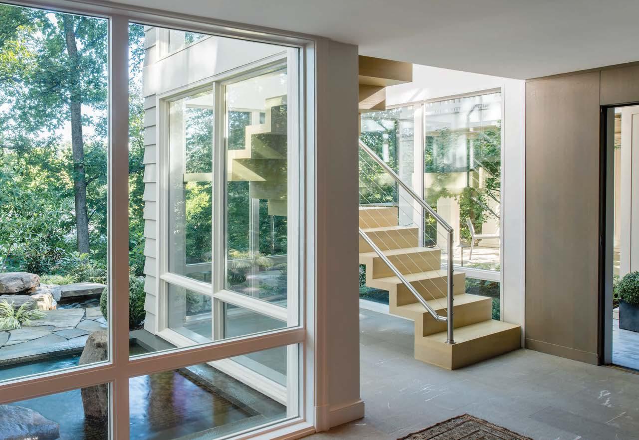
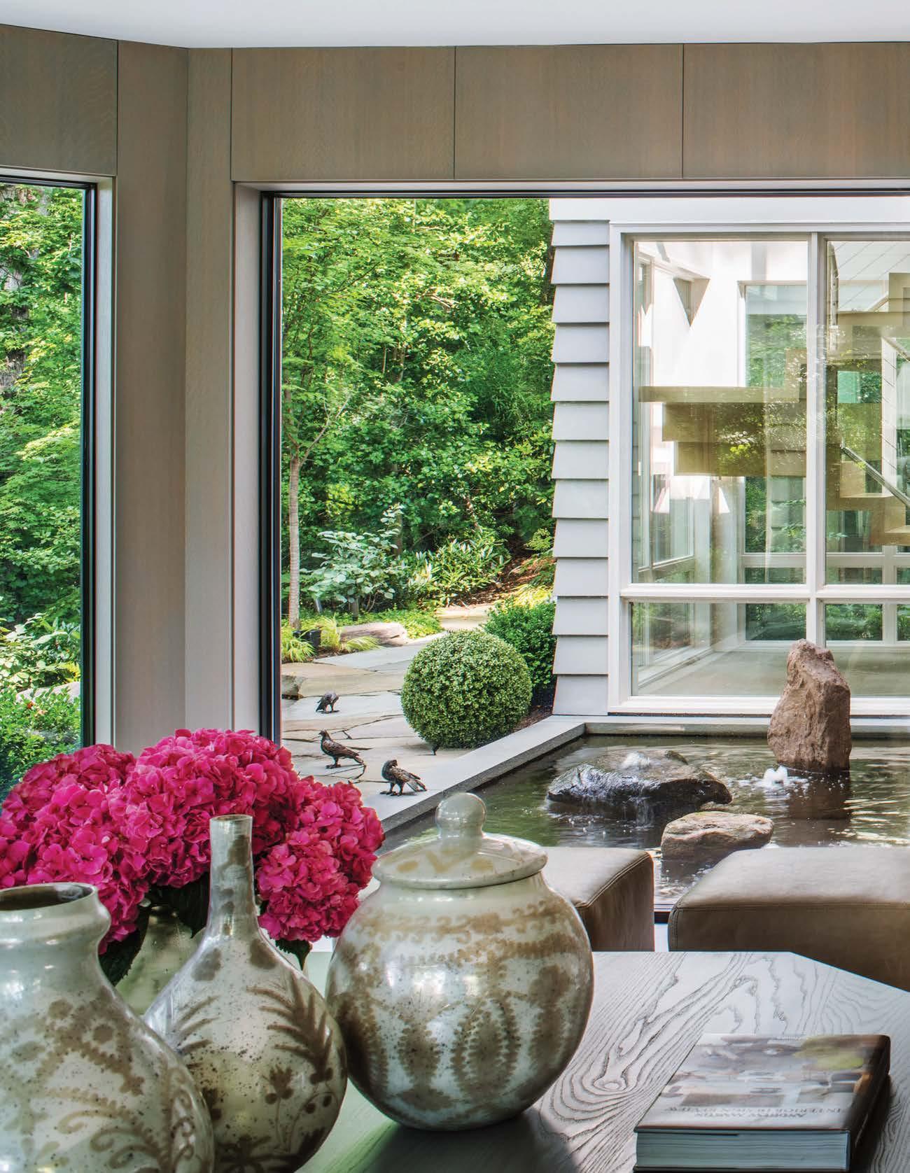
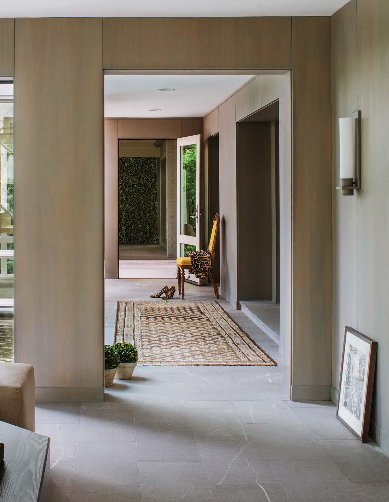
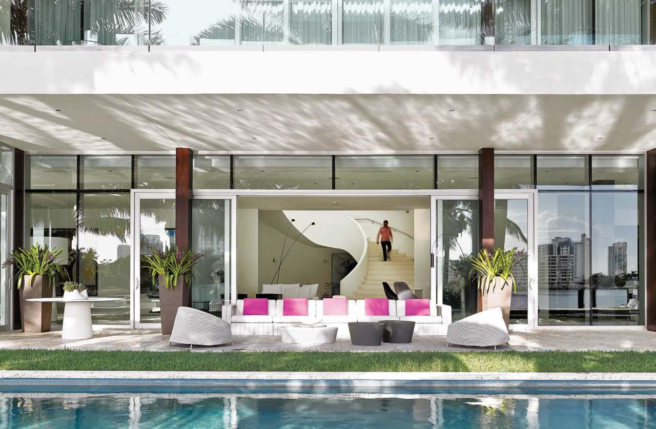
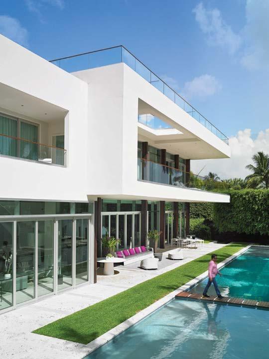
Country Estate is a restoration and expansion of Wiley House, a mid-century modern residence by architect Philip Johnson. Roger Ferris’s scheme integrates 4,600 square feet of new structures into the tranquil Connecticut setting. The Johnson house, a glass pavilion sitting atop a low stone plinth, was carefully renovated to reflect the original 1953 design. The stone plinth of the house inspired a parged stone farmer’s wall, carried throughout the new scheme, to create a datum and situate the new pool house, garage, and art gallery within the site. The pool house and garage are tucked into the hillside behind single exposed walls to recall Johnson’s architecture while respecting the open landscape. The garage, a low cast-in-place exposed concrete structure, acts as a gateway to the site and a visual transition to the midcentury modern architecture. The minimalist pool house doubles as a gallery for the owner’s collection of iconic mid-century furniture while embracing Johnson’s original circular pool. Its main stone wall extends to encompass the new art barn.
The art barn, vertically clad in black wood, is reminiscent of a dilapidated 19th-century barn that once stood on the property. Repositioned and gently set on the new stone plinth, the barn creates two new gallery spaces for the owner’s art collection. The art barn’s solid black exterior reinforces the architectural clarity of the original glass house while serving as a counterpoint to its transparency.
Clockwise from above: The art barn, pool house, and garage respond to the original architecture while creating new spatial experiences. A view of the cast-in-place garage. The interior of the new pool house was designed to be simple and clean of line. The new parged stone wall acts as a datum that integrates the new structures with the original glass pavilion while also producing a dynamic sequence of spaces as guests move throughout the hilly landscape. The art barn contains two galleries for the owner’s collection.
 PROJECT TEAM ROGER FERRIS, AIA, RIBA; ROBERT MARX, AIA, LEED AP; MYRON MIRGORODSKY PHOTOGRAPHY PAÙL RIVERA ferrisarch.com; @rogerferrisarchitects
“The outbuildings are organized and arranged in dialogue with the Wiley House plinth”
 The new scheme centers around a renovated circular pool; the composition is a response to the open landscape of the site and a small nod to Philip Johnson’s iconic geometric gesturalism.
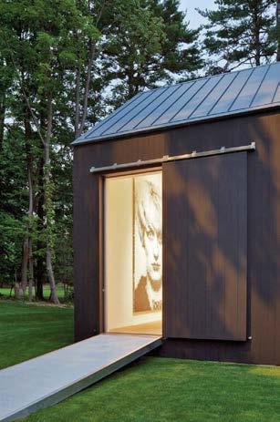
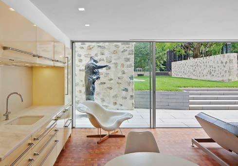
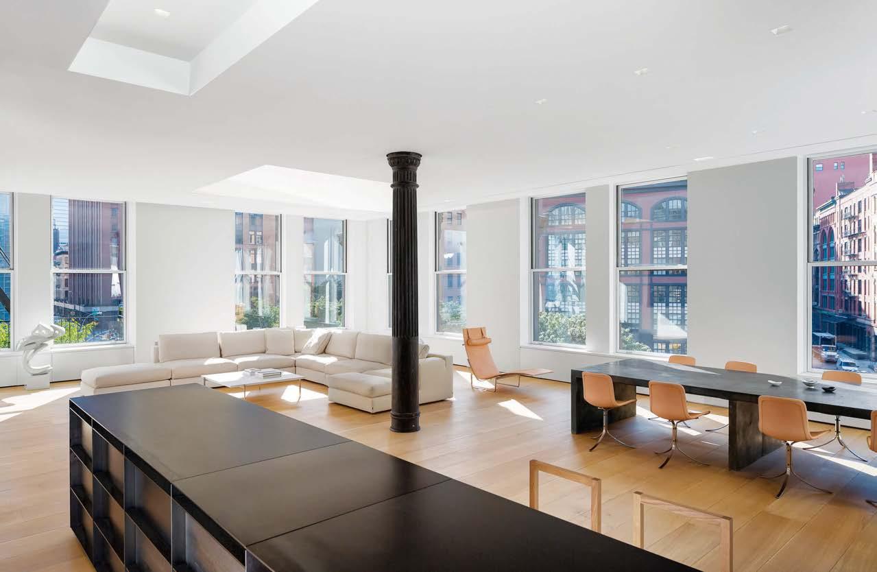
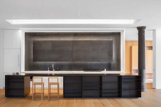
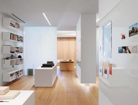
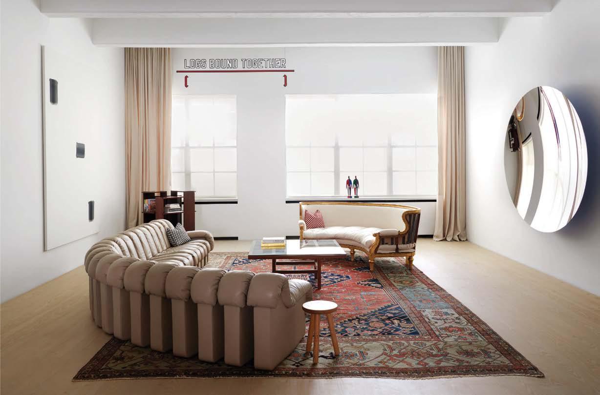
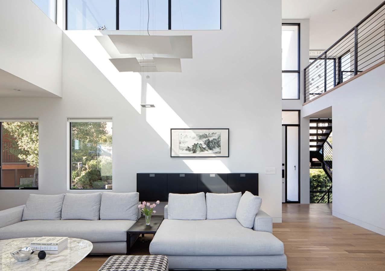
It was a milestone for Desai Chia Architecture. Shortly after founding the firm, Arjun Desai and his wife, Katherine Chia, combined two artists’ lofts into a sweeping apartment for a banker client. “We came in and knocked down all the walls,” Chia recalls of the 5,000-square-foot space with windows on three exposures. The floating oak floor was stained medium gray, the overall aesthetic the epitome of 1990’s minimalism. The design, which attracted clients to the firm, essentially stayed the same until the apartment sold 20 years later to a photographer in search of a live-work setup. Bringing back Desai Chia was the idea of the real-estate broker, who’d also handled the earlier sale.
 PROJECT TEAM KATHERINE CHIA; ARJUN DESAI KEY CONSULTANTS RODKIN CARDINALE CONSULTING ENGINEERS; CHRISTINE SCIULLI LIGHT + DESIGN; DESCIENCELAB; NORANDA SP PHOTOGRAPHY PAUL WARCHOL desaichia.com; @desaichiaarchitecture
That sparked months of intense conversation during which almost everything was up for grabs. “We kept the cast-iron columns,” Desai says. “But it was pretty much a gut.” The tone is warmer now, thanks to 12-inch-wide blond oak floor planks. Marble floor slabs provide pattern in the bathrooms and lighting strategies inspired by the art of James Turrell enhance the architecture while giving form to the light. The new owner’s kitchen is gourmet-grade, fronted by a massive blackened-steel island. An almost equally wide plate of the metal dominates the back wall, the mesmerizing hovering effect produced by subtle backlighting.
Clockwise from right: Stools at the monolithic steel kitchen island pay homage to Donald Judd. The bathroom was designed as an immersive chamber of light and striated stone, a soothing respite from the intensity of the city. Desai Chia and the client are big Judd fans, as witnessed by the bona fide chairs and table in the library. Folded and recessed lighting coves on the ceiling anchor the living room seating areas and wash them with a warm glow at night. A library/reception area immediately off the entry vestibule gives the client, a photographer, a place to meet with gallerists.
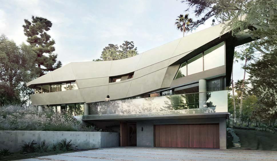
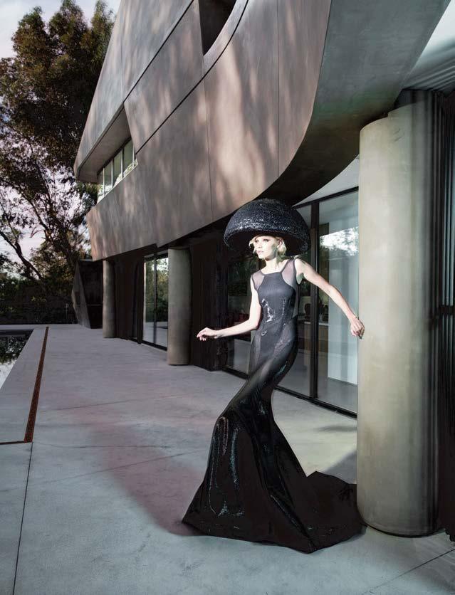
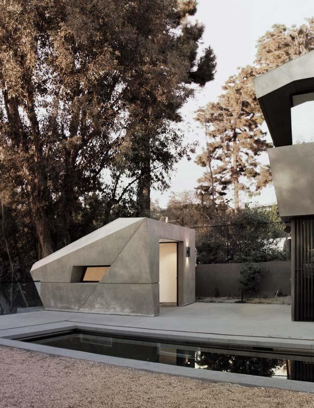
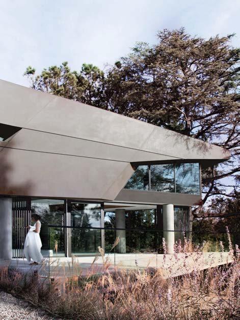
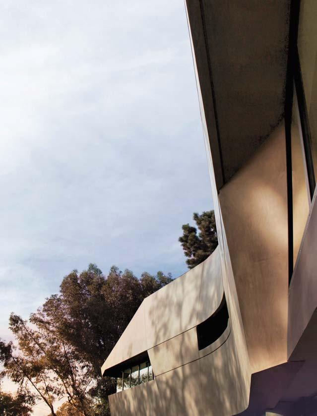
Clockwise from above: Custom pendant fixtures descend through the home’s triple height. While the glass-enclosed main level offers wide-angle vistas, the upper floor is all about controlled, framed views through punched windows. A three-level wedge shape, the layered form was conceived to be compatible with the sloped site, a heavily wooded half-acre up a winding road from the Hollywood Strip. A fashion shoot at the residence saw photographer Marta Elena Vassilakis juxtapose columnar gowns by Merlin Castell against the house, which appears drone-delivered straight from the future. A tentlike portal at the end of the terrace provides entry to the subterranean music studio. Castell’s aerodynamic tailoring and Tighe’s swooping architecture are a perfect aesthetic pairing.
Patrick Tighe was lured into the field of architecture because it is, he says, “both technical and creative.” The architect began his career at Frank O. Gehry and Associates, moved on to Morphosis, and then founded his own firm in 2001. A quintessential Tighe project, one that earned him an Interior Design cover no less, is this 5,200-square-foot threebedroom house in the Hollywood Hills, which he nicknamed “The Slither.” Distinguished by a subtly faceted form that appears weathered into windblown curves, the structure is the opposite of the orthogonal midcentury glass boxes populating the neighborhood.
The three-level wedge shape comes into full view as guests pull around the driveway’s hairpin bend. The tripartite form is designed, Tighe says, like a series of geological strata, with layers alternating between solid and ethereal. The lowest level, partially embedded in the hillside, is board-formed concrete, punctuated by massive cedar-clad entry and garage portals. One flight up is the main living floor, where sliding glass walls provide unimpeded access to a terrace with an infinity-edge lap pool. The third floor, where the bedrooms are located, is wood-framed but dressed up in steel-troweled plaster to mimic concrete. Perhaps the project’s most singular aspect is the 650-square-foot music studio, a bunker accessed by an above-ground tentlike portal. Inside the soundproof facility, windows afford underwater views into the lap pool, the dappled light giving the space an otherworldly quality.
 PROJECT TEAM PATRICK TIGHE; ANTONIO FOLLO; MICHAEL HO; KERVIN LAU; LUKE LUPTON; PIERINA MERINO; CHIA MING WANG; ALBERT CHAVEZ; JOANNE KIM; KATARINA RITCHER; BEN MAERTENS; JENNIFER MAHAN KEY CONSULTANTS SALTAIR GROUP; MMC ASSOCIATES; OBRADO PHOTOGRAPHY ANTONIO FOLLO; MARTA ELENA VASSILAKIS
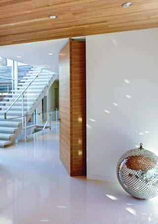
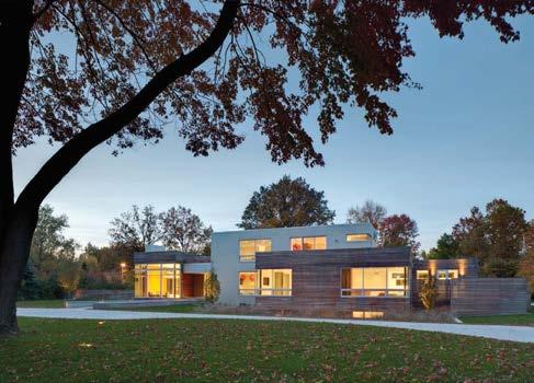
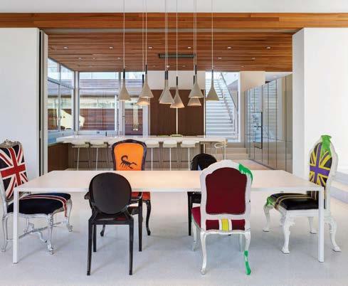
“This is the first truly modernist house designed by our firm,” says Dimit Architects managing principal Scott Dimit. The single-family residence needed to be modern and elegant yet vibrant and unexpected—and it had to incorporate the clients’ love of music, especially ’70s rock (hence an epic disco ball resting on the entry floor). “The architecture of Cleveland’s leafy Shaker Heights neighborhood has generally leaned toward a more traditional expression,” he continues. “This project provided our small studio the opportunity to explore a new direction with the support of a very forward-thinking client.”
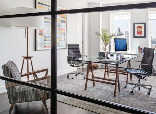
The plan is arranged into two wings: a more public one encompassing living, dining, and entertaining spaces, and a more private one providing bedrooms, home office, exercise room, and support spaces. The two wings meet at the heart of the house, where an open kitchen has views to a protected rear courtyard with swimming and reflecting pools. The lower level includes a basketball court and a recording studio. A key feature of the architecture is floor-to-ceiling glass panels that create reflections and transparencies to expand the space visually. The interiors, designed in collaboration with Patrizio Fradiani of Studio F, incorporate the clean lines of early modernism, warmed by splashes of color and a contemporary interpretation of traditional boiserie.
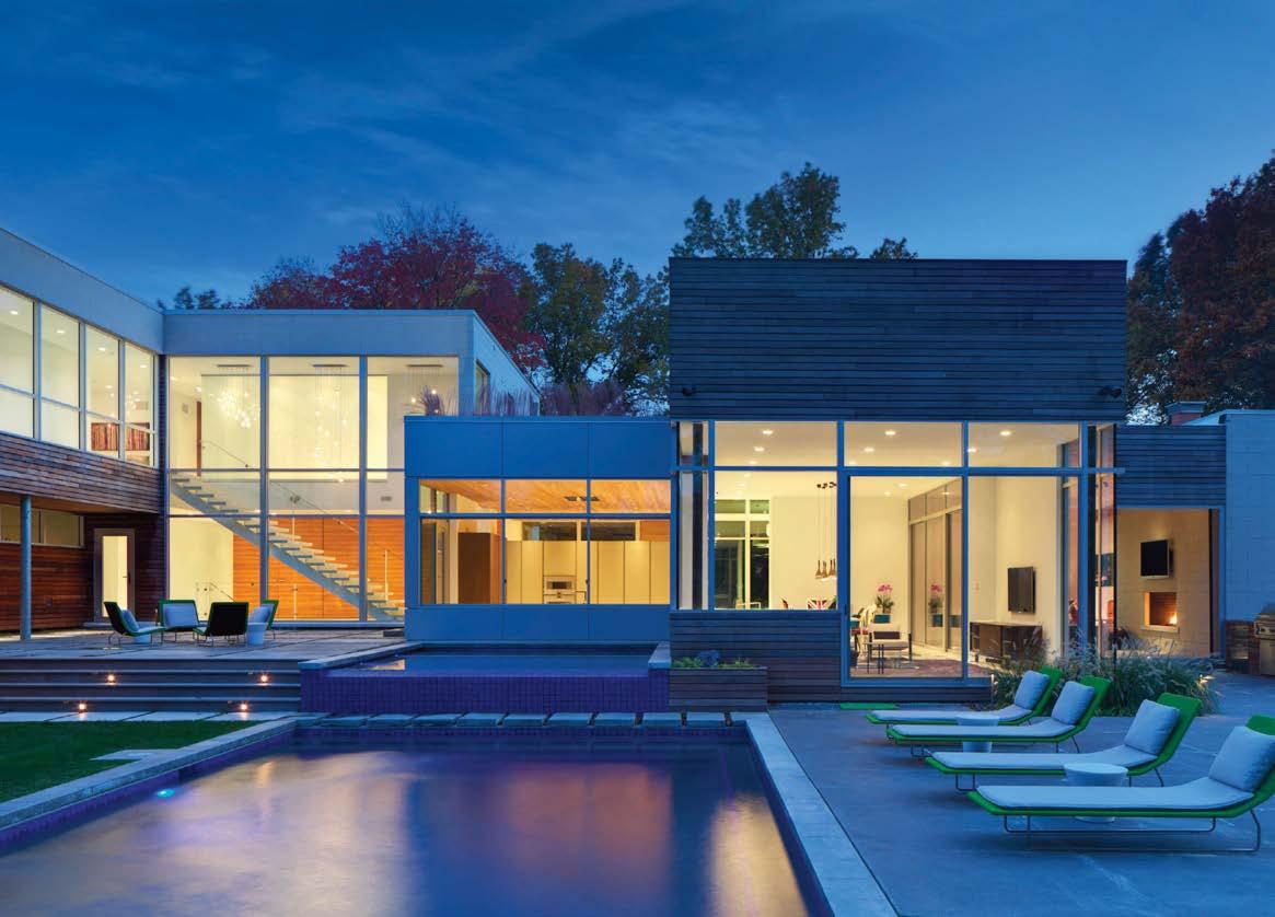
Clockwise from top left: A playful sense of fun permeates the home (note the entry’s disco ball). The architecture emphasizes visual transparency and connection to the outdoors. The rectilinear masses of the house are clad in a cast-stone veneer with ipe wood slats, arranged over a rain-screen membrane. Interiors exhibit a balanced contrast of modernist and contemporary palettes, fixtures, and furnishings. Generous walk-out roof decks surfaced with ipe boards provide extensions for each of the second-floor bedroom spaces; the remaining flat roofs are planted with prairie grasses.
dimitarchitects.com; @dimitarchitects
 PROJECT TEAM SCOTT M. DIMIT; ANALÍA NANNI DIMIT; SCOTT CSUTORA; ADAM PARRIS KEY CONSULTANTS PATRIZIO FRADIANI; 9TH AVENUE DESIGNS; AUSTRIAN ASSOCIATES; ISAAC LEWIN ENGINEERS; PISTONE & TESAURO BUILDERS PHOTOGRAPHY BRAD FEINKOPF
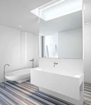
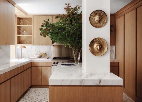
The daughter of European artisans, Anik Pearson was raised in an environment where craft, science, and art intertwined seamlessly. That made her the ideal architect for Manhattan clients who had bought the adjoining apartment in their tony prewar co-op on Upper Fifth Avenue and wanted the two spaces joined—seamlessly—into a full-floor aerie. The biggest challenge was to reconfigure both apartments in a way that would allow circulation around an existing elevator foyer at the center of the floor plan. A gut renovation allowed Pearson to redistribute the rooms around this central core, so that movement is free and easy between the public side of the apartment (facing northwest with views of Central Park) and the private side (at the southeast).
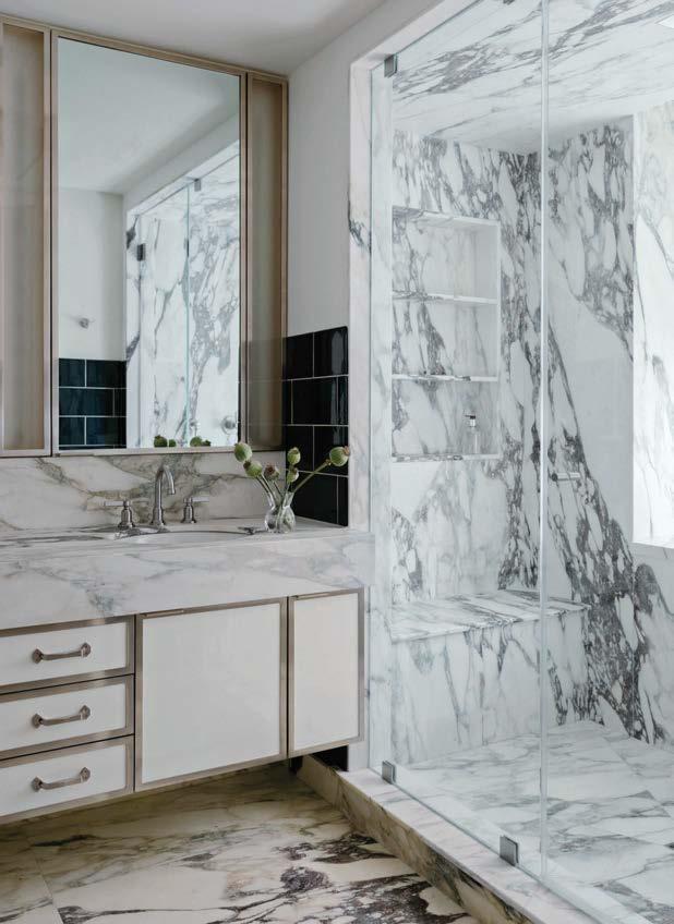
PROJECT ARCHITECT ANIK PEARSON, AIA CONSULTANTS STUDIO MELLONE; URBAN BUILDERS GROUP WILLIAM JESS LAIRD, STYLING BY COLIN KING aparch.net; @anikpearsonarchitectThe client, an enthusiast of the Italian and French moderne movements of the 1940s and ’50s, wished to create an aesthetic environment inspired by the best designers of the period, including but not limited to Gio Ponti, Le Corbusier, Charlotte Perriand, Pierre Chareau, Carlo Bugatti, and Achille Castiglioni. “This has been a key project for us to showcase our fluency in the language of European modernism,” Pearson notes. She created stylish yet functional living spaces with warm oak-paneled doorways and baseboards that contrast with the crisp lines of white-painted panel molding and angular trim. Figured marble around the fireplace and in the kitchen and bathrooms provides a welcome dash of organic glamour.
Clockwise from below: Imperial Danby marble countertops contrast with white-oak millwork in the kitchen; mounted on the island column are two Brazilian art deco plates. Interior designer Andre Mellone curated the apartment’s vintage furnishings and custom upholsteries in delicate muted colors. In the primary bedroom, the walls are bathed in Benjamin Moore’s Dove Wing paint while the headboard is dressed in Maharam corduroy. The primary bathroom is clad in Calacatta Monet stone. The sunlit dining room’s table and chairs are by Green River Project. The living room, an open-plan space for entertaining guests, features herringbone oak floors and a custom Calacatta Viola mantle.
MID-CENTURY DREAM, PALM SPRINGS, CALIFORNIA
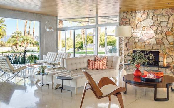
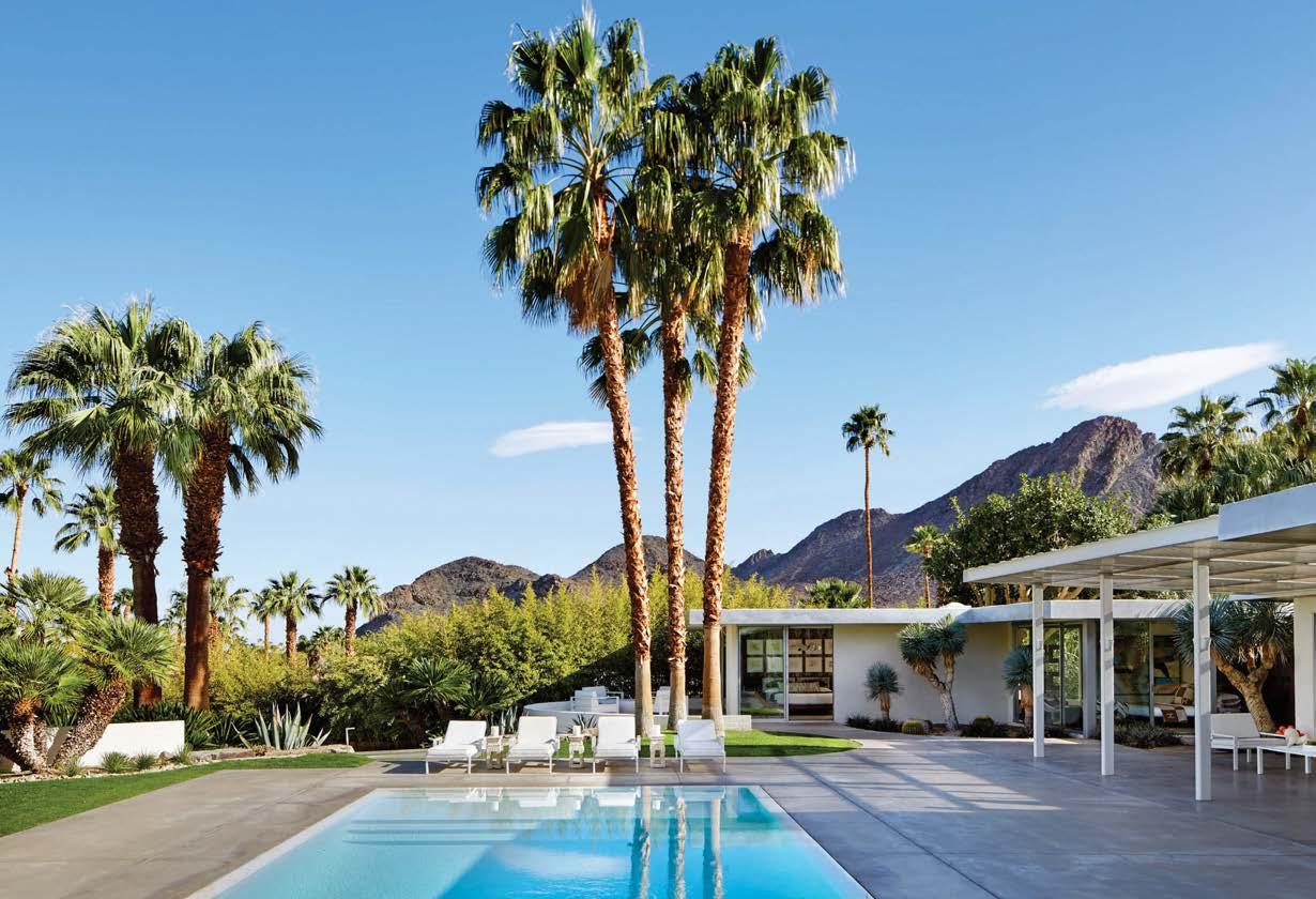
Sheldon Harte’s remodel of a mid-century Palm Springs home at the fabled Thunderbird Country Club in Rancho Mirage returned the property to its vintage roots while updating elements with care. The result is an invigorating blend of original furnishings from William Haines, Eero Saarinen, Frank Gehry, and Ludwig Mies van der Rohe, color-suffused modern paintings, and contemporary designs.
Thunderbird, opened in 1951, had a star-studded past. It was a favorite of celebrities such as Frank Sinatra, Lucille Ball and Desi Arnaz, and Bob Hope. But with its brown exterior and period interiors, this 1957 house had strayed far from the stylish trappings that the country club once symbolized.
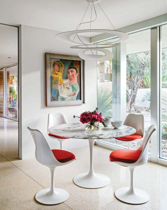
Harte preserved the stone fireplace walls and other emblems of the era when the house was built but tore out the carpeting and restored all of the floors to the original terrazzo. The period-appropriate furniture selected is the crème de la crème of mid-mod style: cream-color Haines sofas and vintage Barcelona chairs in the living room, Knoll chairs in the breakfast nook, and Pucci fabric on chairs in the main bedroom. “It’s a delight to work on a house in an area with a storied past, imagining how people dressed and sat in the furniture of that time,” Harte says. “To recreate the feeling, the vibe—without being too literal—is an adventure.”
Clockwise from above: Harte Brownlee & Associates renovated a 1957 Palm Springs house with sensitive furnishings that run the gamut from mid-century to contemporary. Eero Saarinen’s Tulip dining table and chairs make a fine breakfast nook. Even the textiles are era appropriate. The late Marcello Villano designed the garden and pool landscaping. Firm principal Sheldon Harte kept the fireplace’s original limestone. He also unearthed original terrazzo flooring under the existing dingy carpet.
 PROJECT TEAM SHELDON HARTE KEY CONSULTANT MARCELLO VILLANO PHOTOGRAPHY TREVOR TONDRO hartebrown.com; @sheldonharte
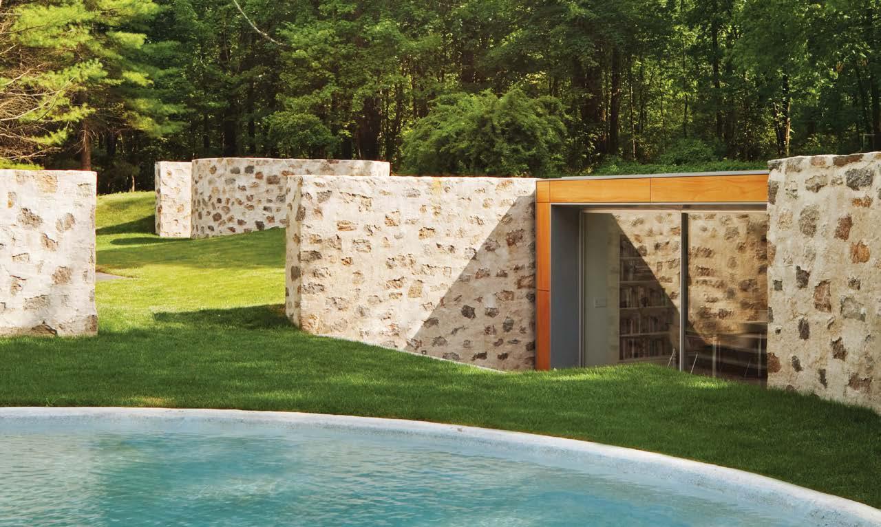
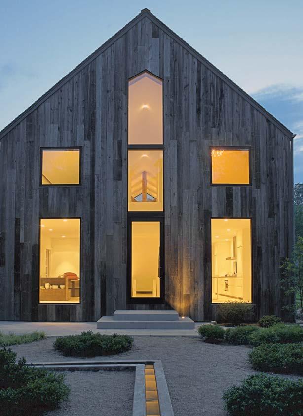
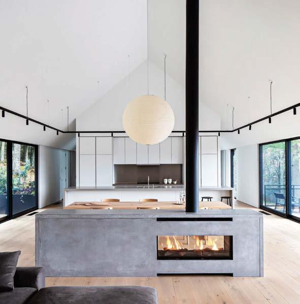
An imperfect silvery-gray shell with an elemental geometric insert. That’s this project in a nutshell. Both ascetic and rustic, the design is a direct response to the clients’ desire to renovate their rural New York abode in a manner inspired by a stirring visit to an 18th-century French farmhouse.
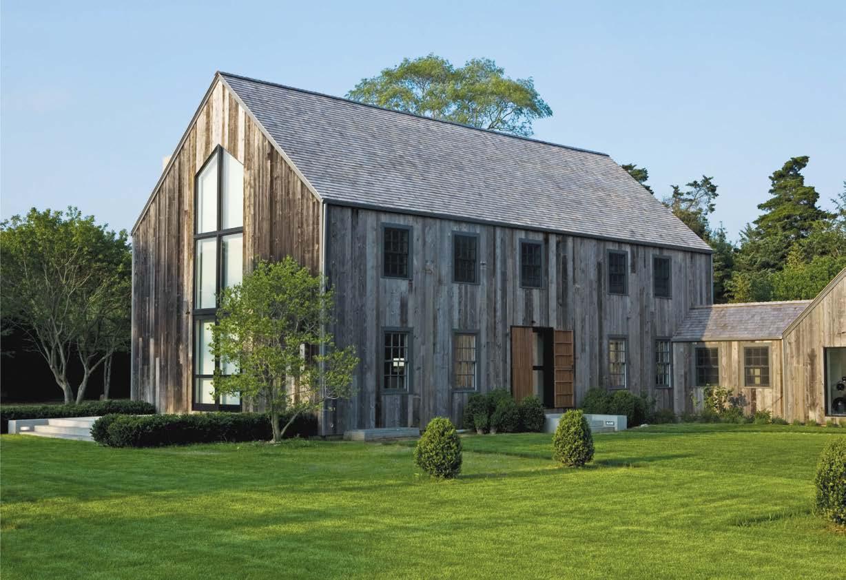
The barn interiors were entirely reconfigured, with two floating, symmetrical volumes now flanking a central void that’s crowned by hand-hewn oak
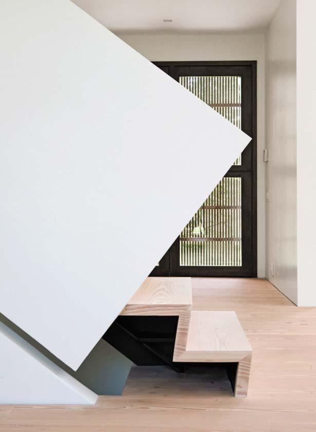
beams. All-white walls are illuminated by natural light spilling in through double-hung mullioned windows that accent the gabled front and back facades. The central architectural force is the folded stair that connects the main level to the bedroom volumes above. “We always knew the stair would take a central role,” D’Apostrophe principal and lead designer Francis D’Haene says. “Once we had that situated, everything fell into place.”
To one side of the staircase is a dining area with a walnut banquette; to the other is a pristine kitchen with white-lacquer cabinetry. Sculptural furnishings abound, most notably pendant lights by Tom Dixon, vintage chairs by Allan Gould, and low-slung sofas from Living Divani. Outside, a Zen garden is paired with a 70-foot infinity pool, and board-formed concrete was applied to the new pool house and the existing garage. The concrete forms echo the elemental geometries of the barn interior. “It’s minimalist architecture,” D’Haene says. “But most important, it has to be a home.”
PROJECT TEAM FRANCIS D’HAENE; DAVID MCALPINE; KEVIN ESTRADA; OLGA BUKUR KEY CONSULTANTS JOHN BEITEL; BLUE SKY DESIGN PHOTOGRAPHY GREGORY HOLM; WILLIAM WALDRON dapostrophe.com; @dapostrophedesignClockwise from above: Vintage Allan Gould chairs decorate the living room in D’Apostrophe’s iconic (and Interior Design Best of Year Award–winning) project from 2010. Two new symmetrical volumes housing bedrooms float on either side of the stairs. “The clients questioned everything, from the shape of the staircase to the placement of the pool; they were interested in exploring possibilities,” lead designer Francis D’Haene says. Weathered wood siding from a 200-year-old Canadian barn clads the Remsenburg, New York, residence. Picture windows invite the landscape in; “We wanted to play with the views instead of hanging a lot of art,” D’Haene notes. Elegant symmetry defines the front and back gabled facades.
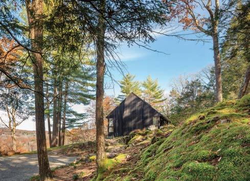
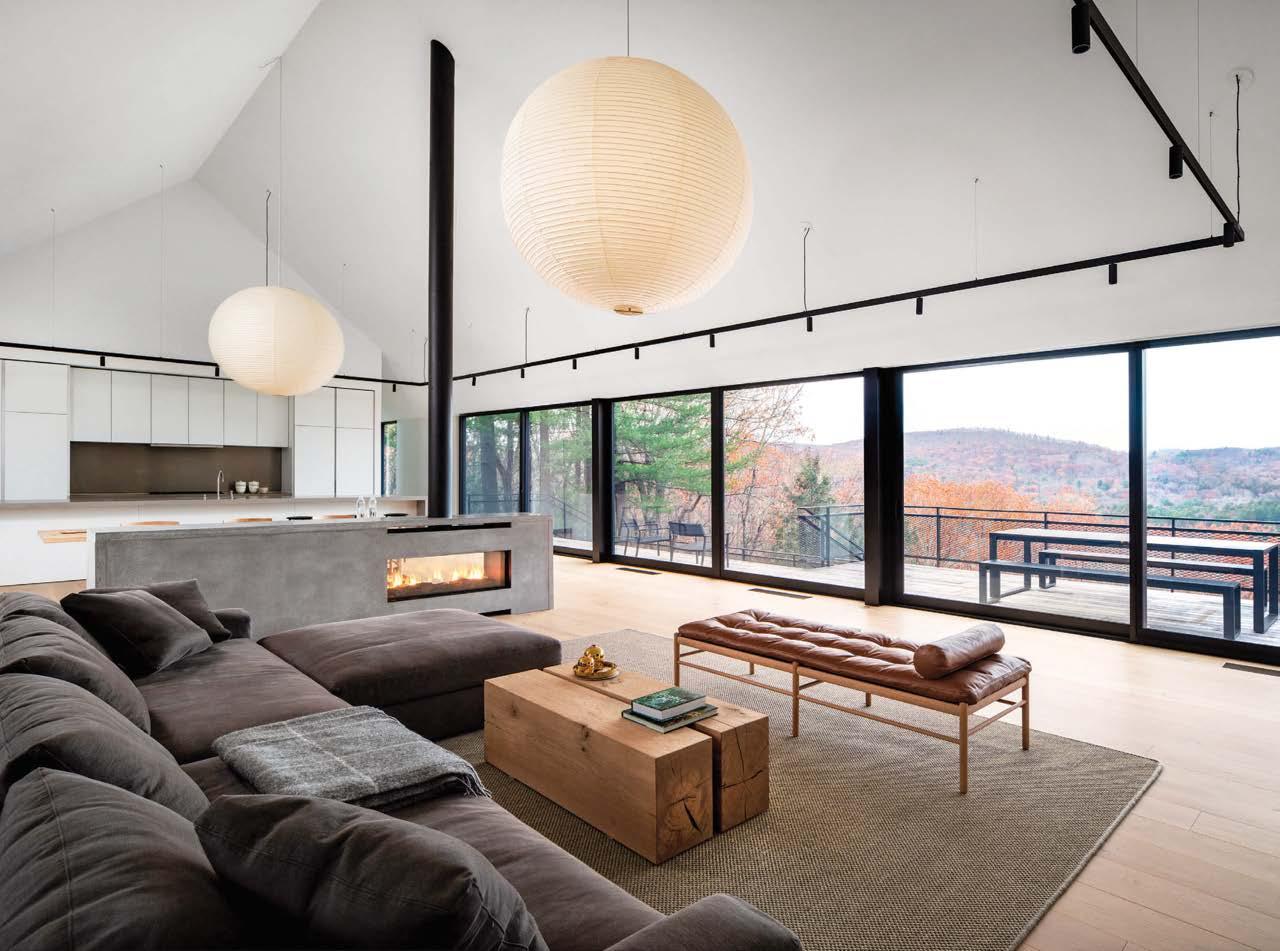
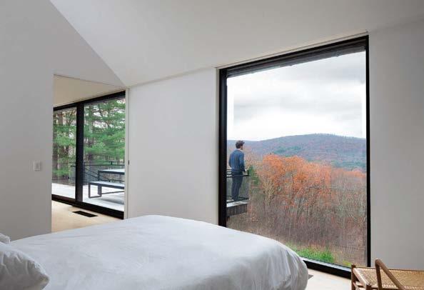
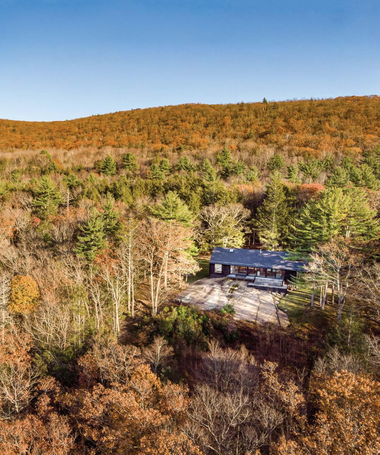
The making of this multi-award-winning weekend getaway involved the removal of an existing cabin that had been expanded in unsuccessful ways by a previous owner. Desai Chia was able to reuse the cabin’s sound foundation (saving money and reducing construction waste) and add to it to simplify the footprint of the building while amplifying the program.
The long, lean exterior is clad in shou sugi ban–treated cypress siding that offers a rot- and bug-resistant finish while also articulating the building’s form, which was inspired by nearby historic West Cornwall Covered Bridge. In contrast, interior finishes are light and airy. The main bedroom suite is located at one end of the house, with two guest bedrooms at the other. The living zone between them allows the owners and their guests to socialize in a lofted, open space that connects to a deck and a terrace so that the indoor-outdoor flow is seamless. The aesthetically spare and sophisticated living-dining-kitchen space forms the nucleus of a large breezeway through the structure. It is strategically positioned to take advantage of views to the valley, uphill cross-ventilating breezes, and an existing boulder that has become a much-loved rugged companion to the house.
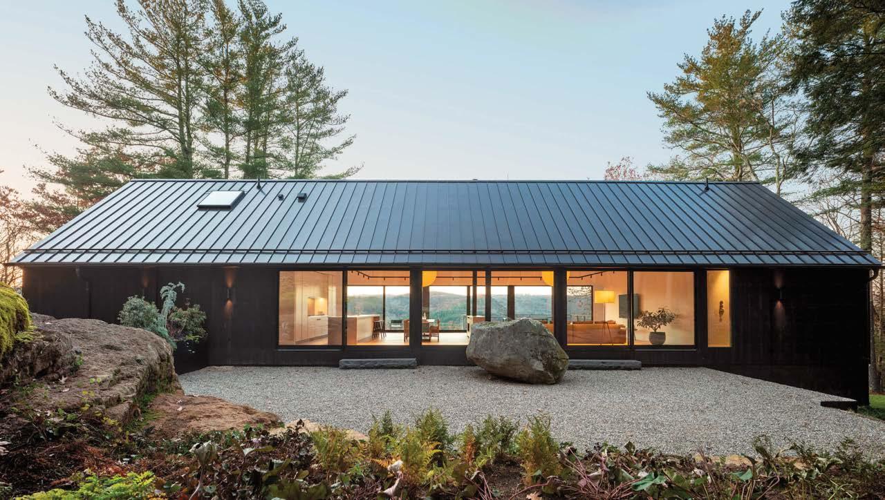
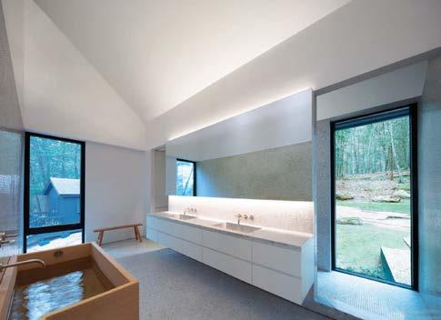
Clockwise from above: A clever structural system—the use of framing techniques so beams, walls, and sheathing perform as a unified diaphragm—eliminates the need for exposed interior cross bracing. A handsome Japanese wood tub strikes an organic note in the primary bathroom. The weekend retreat sits on the foundation of a demolished cabin. The striking boulder on the gravel terrace became the project’s muse. The primary bedroom suite is located at one end of the long house.
 PROJECT TEAM KATHERINE CHIA; ARJUN DESAI; BRAD ISNARD; TROY LACOMBE KEY CONSULTANTS DAVID KUFFERMAN; ARTHUR H. HOWLAND & ASSOCIATES; CLASSIC RENOVATIONS
PHOTOGRAPHY PAUL WARCHOL desaichia.com; @desaichiaarchitecture
PROJECT TEAM KATHERINE CHIA; ARJUN DESAI; BRAD ISNARD; TROY LACOMBE KEY CONSULTANTS DAVID KUFFERMAN; ARTHUR H. HOWLAND & ASSOCIATES; CLASSIC RENOVATIONS
PHOTOGRAPHY PAUL WARCHOL desaichia.com; @desaichiaarchitecture
Clockwise from right: The back of the house looks out onto dense forest while the front surveys the valley. The all-white kitchen and concrete fireplace are simple geometric inserts in the open plan. Floor-to-ceiling glazing overlooks the forest terrace, defined by a natural boulder. The valley-facing deck cantilevers out from the communal living area between the primary bedroom suite and the guest bedroom wing.
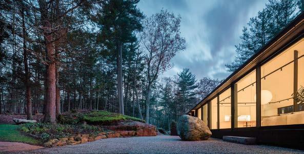

“The form of the house was inspired by local barns as well as the nearby historic West Cornwall Covered Bridge”
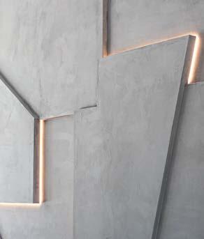
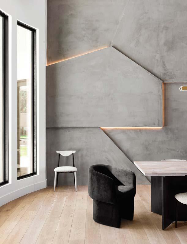
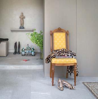
“When naming this project, the word ‘sculptural’ kept coming to mind because so many of the elements are soft and curvy or brutalist and geometric,” Iconic’s owner and principal Kaitlyn Wolfe says of this residence in Scottsdale, Arizona. Wolfe, who is the sought-after combination of interior designer plus licensed general contractor, was given complete creative freedom by her clients, a young family who informed her they simply wanted something memorable and different. Colors and textures from the Sonoran Desert abound, as do vintage designs, minimalist Scandinavian furnishings, and custom pieces, many from Syfte Collective, Iconic’s own functional goods, lighting, and cabinetry studio. Materials like brass will patina over time “giving a charming, European feel,” Wolfe explains. The standout feature is arguably the LED-lit 3D gray plaster wall in the dining room. “Essentially, we created a canvas out of an entire wall by framing, drywalling, and plastering shapes at varying depths,” she continues. A second key move is the wet bar, which the client couple wanted to add to the lounge for entertaining and as a separate chill space for when the children commandeer the living room. From the deep emerald stone used for the countertop and backsplash to the round blackened-oak knobs on the cabinet uppers, the scheme is a knockout.

SCULPTURAL DESERT HOUSE, SCOTTSDALE, ARIZONA
Clockwise from above: The floor lamp in the lounge is by Syfte Collective, Iconic’s functional goods studio. A studied hallway vignette incorporates a natural stone bench. A dimensional feature wall dominates the dining room. Emerald marble-look stone clads the bar countertop and backsplash. The dining room’s gray-plaster shapes, all at different depths, are highlighted by hidden LEDs. In the kitchen dining nook, a forest-green Verner Panton pendant echoes the tone of the nearby bar.
DSK
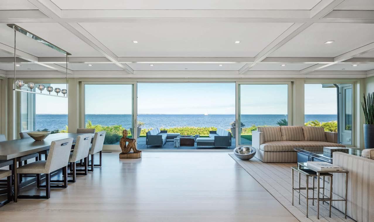
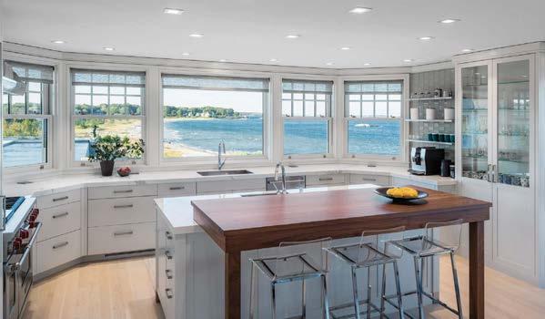
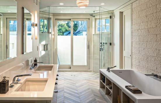
This home is a modern interpretation of the shingled houses found along the East Coast waterfront, with its hipped gambrel and shiplap siding complemented by Alaskan yellow cedar. The design direction by New England architecture and interiors firm DSK | Dewing Schmid Kearns Architects + Planners invites its residents and visitors to the sea through a layered composition of unspoiled landscapes, architectural portals, and open interior environments.
The interiors are fresh and modern, reflecting the owners’ taste for simplicity and informality. DSK designed the project as a summer residence for a large family but the house also flexes to respond to the year-round influx of extended family, friends, and neighbors, balancing community and privacy. DSK | Interiors filled the space with contemporary furniture, indoor-outdoor fabrics, and a light-neutral color palette of fixtures and finishes. The kitchen features an island designed with light Neolith counters and a walnut bar contrasted by clear acrylic barstools. In the living area, a linear pattern on the rug and vertical pinstripes on the sofa point to the sea, while large panes of sliding glass frame the shoreline of Buzzards Bay. One challenge that the designers faced was a request for a linked indoor/outdoor shower…in Massachusetts! Their clever solution was to create an all-glass, exterior-zoned shower divided by a glass slider. It provides year-round enjoyment of open air and sunny skies with the ability to shelter the user from inclement weather.
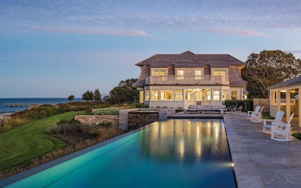
Clockwise from above: Drawing eyes to the Atlantic Ocean, the living and dining areas are bridged by sand-tone white-oak flooring, which echoes the beach outside. The bathroom features an indoor/outdoor shower. The kitchen’s walnut bar affords another spectacular vista. The main house and pool are sited to take advantage of uninterrupted views of the horizon. The house exterior reflects the traditional New England use of shingles, white trim, and double-hung windows.
PROJECT TEAM EMILIE TUCKER; MARK SCHMID; JUSTIN R. MELLO
KEY CONSULTANTS KOCHMAN REIDT + HAIGH CABINETMAKERS; PARKER CONSTRUCTION; GREGORY LOMBARDI DESIGN
PHOTOGRAPHY ANTON GRASSL dskap.com; @studiodsk
Looking to retrofit a two-family home into a house for their family with a garden-level guest suite, BIA’s clients asked that it have the character of a town house with the open feeling of a loft. The story begins on the parlor level, where relocating the primary kitchen to the center of the floorplan helped circulation. A south-facing bay at the rear now accommodates a dining area with a chic hand-painted tile floor that leads to a suntrap roof deck.
The project was a rarity among Brooklyn row houses because the second through fourth floors all have three exposures. The design team took advantage of several lot-line windows to pull ample light into the stair hall and down into the heart of the home. Removing a portion of the second floor carved out a stupendous double-height living area that the designers enclosed with a steel-frame glass wall system. It cleverly allows light to flood through the house while keeping noise from the secondfloor TV room at bay.
The garden floor was conceived as a space for long-term guests, designed with out-of-country relatives in mind. Passive House–certified windows on the street front ensure a serene guest bedroom. Meanwhile, the guest bathroom has walls swathed in a dark cementitious microtopping that communicates dramatically with rose-gold shower fittings.
 PROJECT TEAM HEATHER TILEV; FRANKIE FAILLA; MICHAEL INGUI; CHIN-RONG JENNY LEE; LISSY BENAVIDES PHOTOGRAPHY ADAM KANE MACCHIA biainteriors.com; @biainteriors
Clockwise from top left: BIA Interiors worked with sister firm Baxt Ingui Architects on the renovation of a two-family Brooklyn town house into a family home with a garden-level guest suite. Boldly striated marble and artisan wallpaper form a studied contrast in the powder room. A sophisticated mix of materials abounds in the main kitchen. Wallpaper splashed with bathing beauties decorates niches in the primary bathroom. Micro-cement covers the guest bathroom walls. Throughout, a minimalist black-and-white color palette creates a clean, modern feeling, as seen in the steel-frame glass wall system that cleverly substitutes for drywall in the living area.
“This project started my career,” Mary Douglas Drysdale declares. “Over 30 years ago, a lovely family called me to make minor changes to their 1930s Colonial home in Washington D.C.” The designer began by adding a porch and then a kitchen. Finally, after a huge tree crashed through the roof, she embarked on a major renovation of the whole house. This included the addition of two new structures in back—an octagonal one for a new kitchen, a square one for a stair connecting to a new family room and guest suite on the lower level—and the introduction of extensive decking that brings the outdoors in. The interiors were updated while preserving the fundamental character of the main rooms—sleek and spare yet furnished with many of the family’s traditional pieces—and bathrooms were modernized. The facade remains classical, but the rear of the house was opened up with a more contemporary architectural expression to reveal extraordinary views of the forested property. “The most difficult part was adding to the basic Colonial frame while pushing up against a very tight buildable lot,” Drysdale recalls. “We worked together over the years with an open spirit. I saw their children grow up and come home with their own families.” It’s a testament to the rewards of long-term collaborations.
Clockwise from above: The hallway connecting the new stair to the new lower-level family room and guest suite. The rear elevation showcases two additions by Drysdale: the octagonal structure with a cupola, which houses the kitchen, and the squared-off one, which encloses the new stair. French doors with faux balconies open up the master bedroom to vistas of the wooded property. A view of the living room through the center hall into the dining room. Drysdale updated some family pieces such as this chair, which she reupholstered with a colorful, modern textile.
 PROJECT TEAM MARY DOUGLAS DRYSDALE KEY CONSULTANTS TERRANCE CHARLES; TROUT DESIGN; DCA LANDSCAPE ARCHITECTURE PHOTOGRAPHY JOHN COLE marydouglasdrysdale.com; @marydouglasdrysdale
“We nicknamed this room the terrarium,” says Drysdale. Located below the kitchen, this lower-level family room is used primarily during visits by the clients’ children and grandchildren.
“This project reflects work begun over 30 years ago and added to over time”
Located on an exclusive island with views of Biscayne Bay, this 35,000-squarefoot geometric house was in need of fresh interiors sympathetic to both the scale of the building and its clean-lined architecture. For interior designer Juan Poggi, that meant custom pieces paired with world-class art and sculptural seating by major designers such as Frank Gehry and Noé Duchaufour Lawrance.
“We played with transparency and flow,” Poggi notes. (Hence the many pieces made of glass.) “One of the largest areas in the house contains a lobby, studio, and living area, but is so open the spaces are in constant conversation.”
“I am influenced by foreign travels, which expand my design vocabulary,” Poggi continues. “Some places are serene; others are full of loud musical complexity. In my years of working in the design field I have come to understand each client as a unique universe, and each project as a lesson in communication. I carefully observe and try to understand how objects are collected and gathered, and how humans populate their homes with them. Are homes nests or temples, or both? I am often asked if it is an ‘a priori’ process. My answer is always, I don’t know. It is only when I see the space through the client’s eyes that I can begin to formulate the design.”
PROJECT TEAM JUAN POGGI; ROSMINA DI BARTOLOMEO; MARIA GABRIELA ROJAS MONTES DE OCA KEY CONSULTANT TOUZET ARCHITECTS PHOTOGRAPHY CARLOS DOMENECH poggidesign.com; @poggidesignClockwise from bottom left: Custom Paola Lenti furniture populates the poolside covered terrace. An Ingo Maurer chandelier surveys the elegantly detailed dining room. The crisp, clean lines of furniture and landscaping echo the contemporary architecture. Teak boards provide a pathway across the pool to a palm-shaded bayside lounge area. Frank Gehry’s Hat Trick chairs—ribbon like objects composed of maple-veneer strips—cozy up to a custom desk from the Italian glass masters Santambrogio Milano.
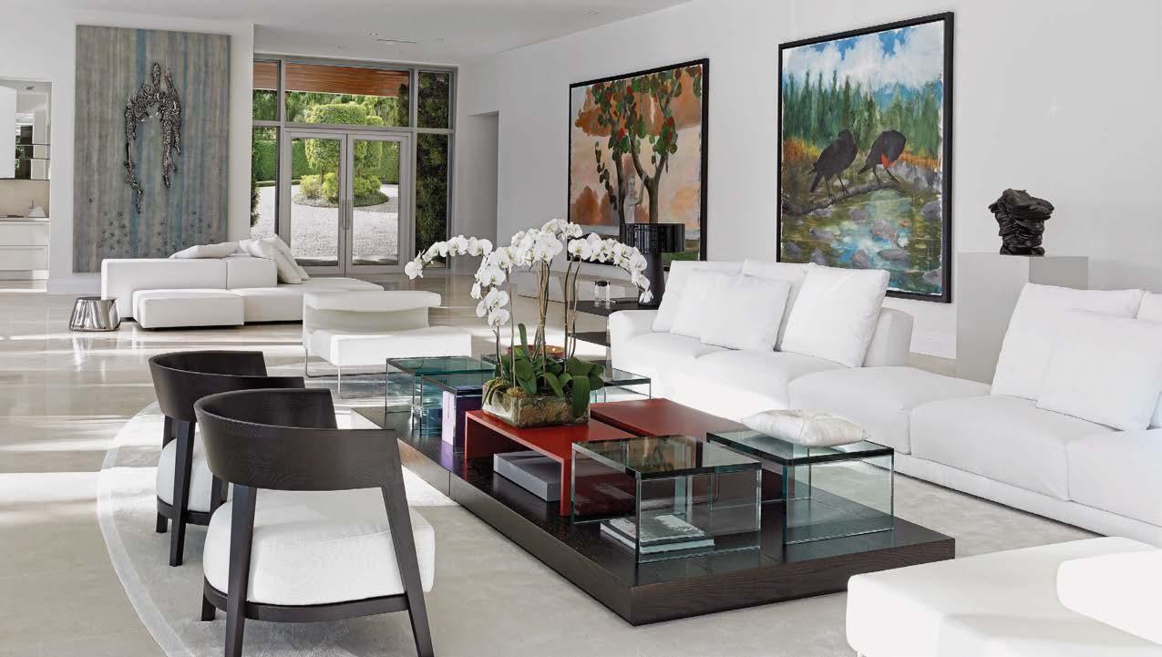
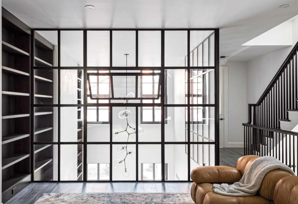
“This project is key for us as it encompasses all aspects of our design philosophy in terms of materiality, detail, and simplicity,” says Francis D’Haene, the Belgian-born, New York–based founder of D’Apostrophe Design. The brief was the full renovation and reconfiguration of a British art dealer and gallery owner’s downtown apartment, a duplex loft on the ground floor and basement level of a prewar, five-story condominium building. Most surfaces in the 4,000-square-foot space were concrete and steel, making it feel bunkerlike, cavernous, and industrial. The main challenge was to brighten and warm it. A new skylight, walkable-glass floor insets, and the large opening around a new sculptural steel-and-wood stair allow natural light to permeate the depths of the apartment. Twelve-inch-wide Douglas fir floor planks accentuate the 100-foot length of the space, which is now open plan and painted white, while adding the warmth of wood. Natural materials, simple forms, and minimalistic details create an environment in which artworks and people are equally at home. “The harmony is the outcome of multiple conversations with the client about not only design and art but also life and philosophy,” D’Haene says. “It’s satisfying to design challenging spaces for someone who has a vision.”
 PROJECT TEAM FRANCIS D’HAENE; MORI BUTTON; DAVID MCALPINE; BRYAN HOU KEY CONSULTANTS BLUE SKY DESIGN; HII CORP PHOTOGRAPHY JASON SCHMIDT dapostrophe.com; @dapostrophedesign
Clockwise from above: The architecture and interiors of D’Apostrophe Design are characterized by a mixture of simplicity and sensuality with a preference for primary forms. Honest materials combine with simple shapes in the kitchen. A sculptural stair with a painted steel balustrade descends to the duplex’s basement level. Opening up the space and creating sight lines from front to back allows natural light to suffuse the entire apartment. The art-dealer homeowner can enjoy the blue-chip artwork from myriad vantage points. The polished, minimal, yet relaxed design throughout is an outcome of progressive refinement.
A family with four young children was on the move: from New York City to a waterfront site in Rye, a coastal suburb of the city in nearby Westchester County. The house by Barnes Coy Architects— christened “Translucence”–achieves privacy from its neighbors alongside openness to the Long Island Sound via expert siting. The interiors by Julia Roth Design bring layers of richness and personal meaning to the architecture.
The house has a relationship to the water views at every level: the basement gymnasium leading to the private dock; the terrace off the living area on the first floor; the primary bedroom with its glazed corner window on the second floor; and the roof terrace at the top of the stairs.
Throughout, the dialogue established is a contrast between the solidly substantial and the open, airy, and ethereal. The long living area is anchored at one end with a marble volume inset with an Elena Colombo fire feature, while the opposite end is delineated by a millwork portal to the kitchen.
A delicate handblown Murano glass vessel is just one of several lovely objects in the house Roth procured during globe-trotting shopping trips with the client—an important part of the JRD process.
The final touch was layering in art, from a painting found on a family trip to Utah to specially commissioned works.
Clockwise from bottom left: The house has an enviable waterfront position overlooking the Long Island Sound. Through the finely crafted front door, a volume of acid-etched Bardiglio marble is adorned with a playful assemblage of shimmering brass sconces. The far end of the living area is anchored by a marble volume carved out to accommodate an artistic fire feature by Elena Colombo. Above the dining table by Ian Ingersoll, a Quasar Cosmos chandelier from DDC strikes a note of ethereality, with its geometric array of delicate points of light. Bunk beds in the basement guest bedroom are also by Ingersoll.
Clockwise from above: Arte wallpaper provides a canopy of leaves in the primary bedroom.
Velvet-upholstered curved-back chairs form an intimate seating area in the custom wine room.
A Medusa Bloom Oval chandelier by Ochre surveys
Vladimir Kagan’s Shield Back chairs and a Meridiani Gong table in the dining area. The design team widened the formerly narrow corridor to the guest bedrooms by 15 inches. A Jory Brigham ping-pong table and a niche displaying the clients’ vinyl collection occupy the record gallery. A guest bedroom inspired by Venice, Italy, takes color cues from the blue Murano glass of its chandelier; in the hall outside, a nook swathed in floral Jane Churchill fabric climbs all the way to the ceiling
“This project spoke to my Caribbean heart and theatrical soul unlike any other,” interior designer Alison Antrobus admits. The first client meeting introduced Antrobus to artifacts the couple had acquired during their global adventures, a 1940s record collection with hand-annotated covers, and heirloom linens and furniture from their Colombian families. “I knew instantly that the design of their home not only had to feature their inherited treasures but that it also should evoke some of their favorite travel destinations,” she says. Each guest bedroom became a mini “stage set” inspired by countries close to their heart (even the scented candles are transportive, no passport required).
The primary bedroom and the main corridor presented the two main challenges. The dilemma with the former was convincing the clients to open it up to the living area. “For a couple living on their own with no children, I like to visually link the primary bedroom to the rest of the home so that it feels like one massive suite when the doors are open,” Antrobus explains. The main corridor, meanwhile, was merely 5 feet wide and registered like a tunnel. The team demolished one sidewall, widening the hall and carving out vestibules wrapped with wood marquetry panels at each bedroom door.
PROJECT TEAM ALISON ANTROBUS; BEATRIZ DI POLO CONSULTANTS CH CONSTRUCTION; SELEZIONE INTERIORSPHOTOGRAPHY BARRY GROSSMAN antrobus-collective.design; @antrobus_design_collective

This prewar apartment on Riverside Drive was last renovated in the 1980s and thus badly in need of a refresh. The client couple, lifelong friends of foley&cox, approached the design firm and Eric A. Gartner of SPG Architects to open the three-bedroom residence to expansive Hudson River views and brighten and update the interiors with a quirky point of view inspired by those seen in the TV series
Empire. “They wanted us to translate some of the ‘bling’ and tongue-in-cheek brashness of those sets into a comfortable home,” explains foley&cox design director Zunilda Madera. Interpreting the spirit of the program was a fun exercise in creativity and pop culture. It was also an exercise in balance: eliminating existing details that were unwanted, updating elements that had value, and carefully inserting new features that would bring function and harmony to the home.
The bones of the 1926 Schwartz and Gross Architects building were respected but enhanced, while new interventions were clearly differentiated. The apartment had floor-to-ceiling millwork (“it made the space feel like you were on a ship,” notes foley&cox principal Michael Cox). SPG removed the abundance of veneered cabinetry that encroached on the footprint of the entrance foyer, replacing it and a bedroom wall with a partition in blackened-bronze and glass that reveals a new home office. Throughout, the design teams selected neutral furnishings punctuated by bold and colorful art. Sweetly, many considerations were prioritized for the comfort of Annie, the couple’s beloved dog.
 Clockwise from above: In a prewar Upper West Side apartment, steel-frame glass walls partition the home office, animated by Lloyd Martin art, from the entry foyer. The primary bedroom features vintage lighting and side tables from Egg Collective. A metallic console is joined by a shagreen mirror in the same room. Ethan Boisvert paintings grace the living room. The kitchen includes a layered, textured breakfast nook.
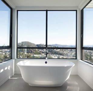
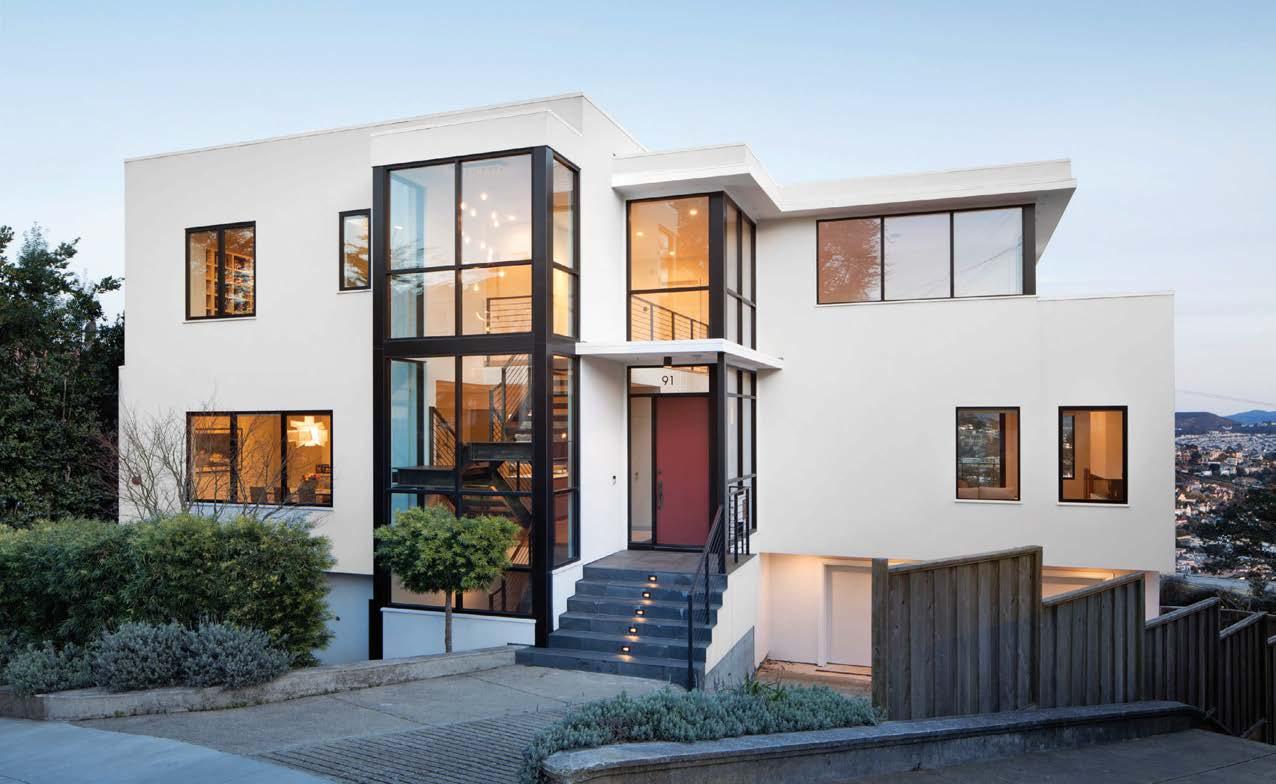
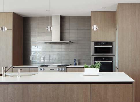
This San Francisco residence appears newly built but is actually the regeneration of an old house in need of a complete overhaul. “Tired and falling apart,” is how Emily Huang of Huang Iboshi Architecture describes her first impression of the 1950s abode. Mindful of resources and economics, Huang and partner Gregory Iboshi reused the existing foundation and wood framing, added a new third level to the structure, and converted basement storage into livable space. “We more than doubled the home’s useable space and saved almost a million dollars through not demolishing the entire building,” Huang recounts.
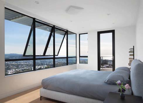
The newly serene 5,000-square-foot, three-story house provides quality living for a growing family with two active boys. With the money saved from reusing the original structure, the clients were able to afford custom windows specifically designed to capture maximum natural light and views while minimizing heat gain with thermally broken, ultrainsulated units. The residence has enviable views to the east, south, and west sides of San Francisco. “We think that windows are the eyes of a house,” Iboshi notes. See the triptych windows looking west that recall sequential landscape paintings, with ever-changing views of the Pacific Ocean. A triple-height glass gallery containing the stair also pulls in daylight and, when illuminated at night, provides a beautiful lanternlike effect from the street.
Clockwise from above: Clerestory windows on the front elevation usher light into the double-height living space without compromising privacy. Behind the home’s neutral and natural wood surfaces are a plethora of sustainable elements, including under-floor hydronic radiant heating. The primary bedroom pulls in views of the South Bay. An open, sculptural stair crafted by local steel artisans connects all three floors and, thanks to triple-height glazing, is visible from the street. The primary suite bathroom tub nestles in a cantilevered bay window with full views of the South Bay skyline.
 PROJECT TEAM EMILY HUANG; GREGORY IBOSHI; JOHN CHOI; MATTHEW KELLY; ANDREA CAMARENA GAMBOA KEY CONSULTANT DOUBLE D ENGINEERING PHOTOGRAPHY PAUL DYER hi-arch.com; @huang_iboshi_architecture
Ronnette Riley Architect was commissioned to combine two vertically stacked apartments into one single-family home for a recently married couple with three daughters between them. The newly blended family purchased the eighth-floor flat above the seventh-floor apartment half the family already owned, as soon as the rare opportunity arose. “It was important to create shared living spaces that were open and expansive when combining the residences,” says lead designer Yumi Moriwaki. A folded-plate stair with glass balustrade floating in front of a double-story bookcase now connects the two living rooms and foyers. “It provides visual and spatial continuity within the common areas of the duplex,” she continues. Inserting the stair along the wall of the living rooms neatly preserved the prewar character of the generous 10-by-17-foot foyers on each floor. Traditional elements such as decorative plaster, wood trim, and lacquered millwork seamlessly integrate with contemporary technology, like hidden speakers, wireless devices, and motorized blinds.
The couple’s bedroom suite on the lower level and the daughters’ bedrooms on the upper have all been refinished with custom lighting, floor finishes, and bathrooms. The kitchen was expanded by taking over the former maid’s room to create an eat-in nook and a separate pantry and laundry. Off the kitchen is the dining room, its walls lacquered a fantastic high-gloss hot pink.
PHOTOGRAPHY FRANK OUDEMAN ronnetteriley.com; @ronnetterileyarchitect
Clockwise from above: The upper-level office has a small pantry with a sink and mini fridge. High-gloss hot-pink lacquer walls surround the dining room. A new folded-plate stair with glass balustrade connects the duplex’s two stacked living rooms and foyers. The serene upper-floor powder room is a study in shades of gray. Deep-blue lacquer covers the walls and built-in bookcases in the upper-level library.
 PROJECT TEAM RONNETTE RILEY, FAIA, FARA, LEED AP; YUMI MORIWAKI, AIA, RA, LEED AP; WILLIAM B. TOEDTMANN, AIA, RA
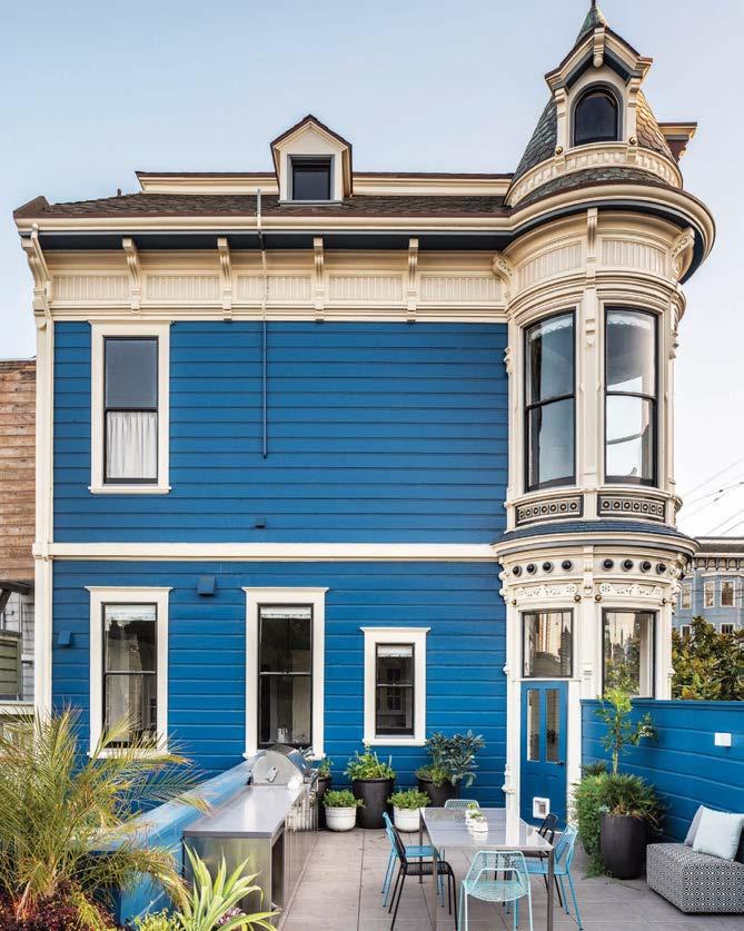
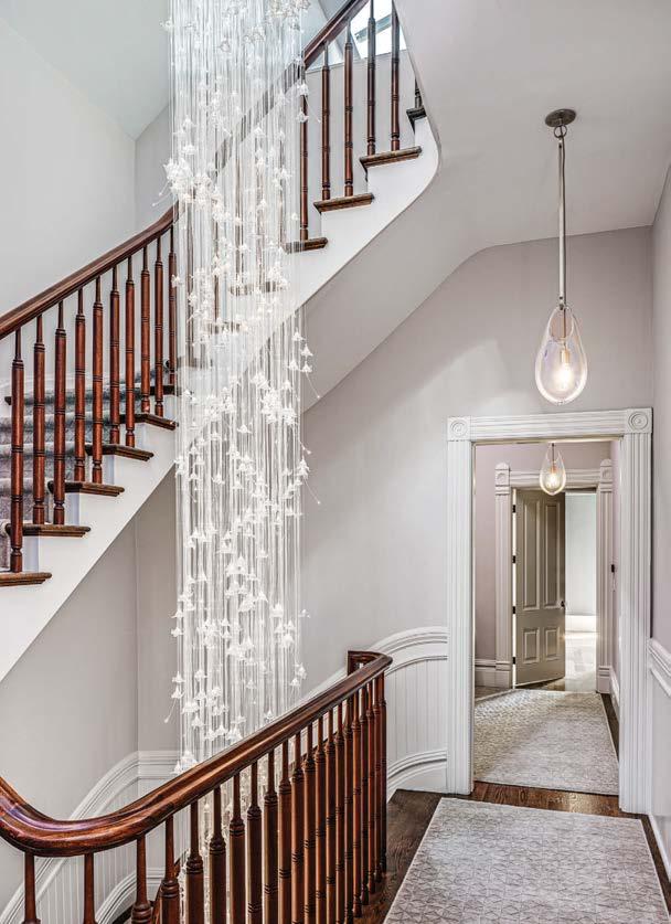
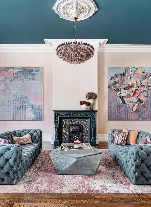
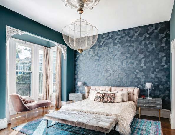
In collaboration with Sutro Architects and the Toboni Group, Paige Loczi of LOCZIdesign has achieved the masterful restoration of a landmarked 19th-century house in San Francisco. Original architectural elements are set against seismically necessary changes and decoratively motivated interventions, the latter influenced by the homeowners’ penchant for bold color— teal, fuchsia, and purple being favorites!
The main staircase now encircles a stunning 24-foot-high chandelier by lighting designer
Sharon Marston, whose work the clients had encountered a decade before. The original winding banister and newel posts frame the 850 glass bells that make up the dazzling fixture, which cascades down the vertiginous space. “We loved how the lightness of the blown-glass shapes creates the appearance of floating ghosts, especially when juxtaposed with the fiber optic lights,” Loczi says. Another ornate chandelier, this one original, hangs from the tealpainted ceiling in the dining room, which also retains its extraordinary Victorian-era casework juxtaposed with modernizing wallpaper, an Egg Collective table, and sleek Naoto Fukasawa chairs. “The home holds such history and needed to be respected like the grand lady that she is,” Loczi says. “The clients entrusted us with breathing new life into this San Francisco classic. Outlandish features like the teal ceiling required patience (and a few Hail Mary’s) as we allowed the vision to coalesce.” Needless to say, it all came together, perfectly.
PROJECT TEAM PAIGE LOCZI; MIKE UFFERMAN; CATRINA COOPER; JENNIFER FRISBIE KEY CONSULTANTS SUTRO ARCHITECTS; TOBONI GROUP; TRIPLE BK LANDSCAPE GARDENING; THE RUG ESTABLISHMENT; MARTIN KORBUS DESIGNS PHOTOGRAPHY CHRISTOPHER STARK loczidesign.com; @loczidesignClockwise from above: Moody blues, soft silks, and a Meshmatics chandelier by Moooi—the first to be ordered in the U.S.—set the tone in the primary bedroom. The extended deck and outdoor kitchen now offer sweeping city views. SKLO drop pendants light the hallway next to the stairwell’s Sharon Marston blown-glass chandelier. The Egg Collective dining table’s weighty brass base and travertine top balance the room’s original ornate chandelier and Victorian millwork. A Zhuang Hong 3D painting picks up on the purple veining of marble in a bathroom. The living room is grand, accentuated with paintings by Laurel Shear and an amethyst chandelier.
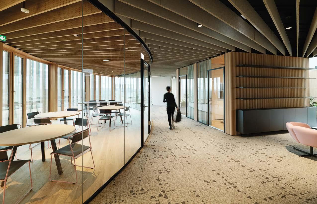
After a multiyear hiatus, offices are back—and better than ever. As they have to be. With WFH the norm for so long, workplaces must stand head and shoulders above the crowd to attract and retain talent. Today’s best examples are wellness-centered and offer employees both alluring amenities and true flexibility. They provide both the peace and quiet necessary for heads-down work and the opportunity for collegial collaboration, all in intelligently designed surroundings that, more hotel lobby than cubicle farm, are a pleasure to behold.
MKDA
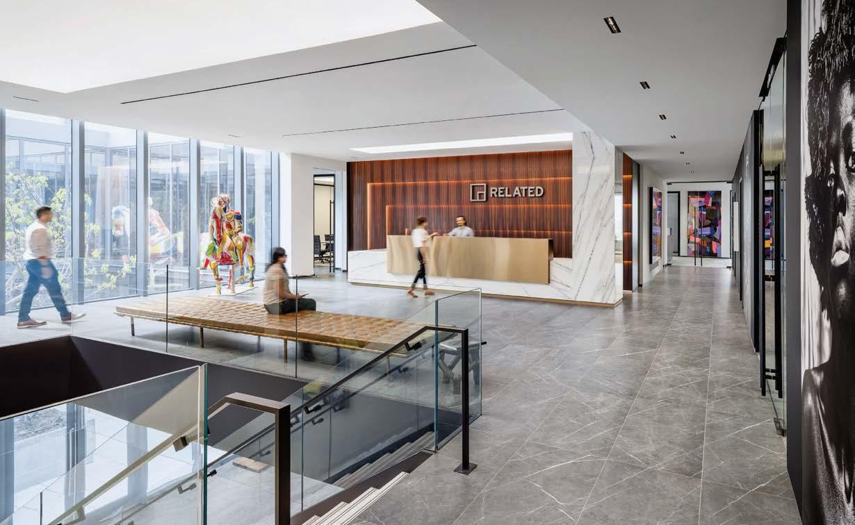
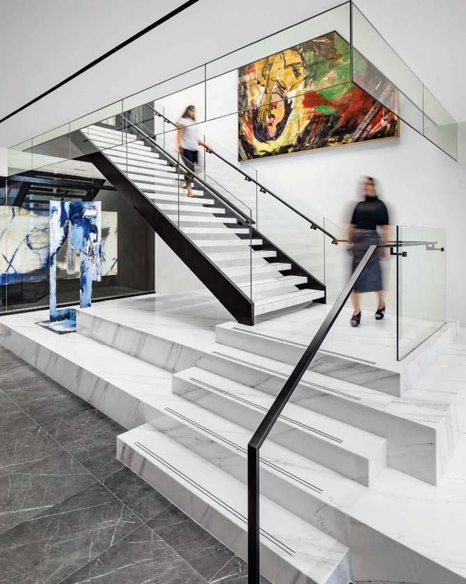
Art gallery or office? How about both. In 2021, development company Related Group relocated its headquarters to the top two floors of a new Arquitectonicadesigned building in Coconut Grove, historically Miami’s art-minded neighborhood. To create the building’s interiors, Related turned to the local studio of multicity firm MKDA. The art the designers had to work with for the project was world class: namely pieces from the museum-ready collection of philanthropist Jorge M. Pérez, Related’s founder. “Because we were going to install a lot of art, we kept the materials muted and neutral,” regional managing principal Amanda Hertzler reports. Think gray marble, limestone, glass, and rosewood.
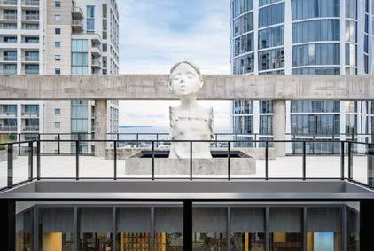
Related’s main reception and executive offices occupy the top floor, while employee work spaces and facilities, including a lounge, fill the floor below. A twostory glass-enclosed atrium at the center of the headquarters floods the interiors with light. Of course, there is art everywhere, some 300 pieces that range in form from traditional oil on canvas to every imaginable “alternative” medium, including an Ai Weiwei “painting” composed of Lego bricks and a supersize bronze-painted fiberglass-and-steel version of a Mies van der Rohe Barcelona daybed. Even the grand marble staircase that connects the floors acts as a platform for the display of artworks. “One of the nicest things about the art installation,” says Hertzler, “is how approachable it is, even in the common areas.”
 PROJECT TEAM AMANDA HERTZLER; KAMILAH BERMUDEZ; TONYA WATTS; ERIN LONDON KEY CONSULTANTS JALRW ENGINEERING GROUP; RHYTON ENGINEERING; ADVANCED MILLWORK; ARCHITILE; CITY CONSTRUCTION PHOTOGRAPHY ALEXANDER SEVERIN mkda.com; @mkda_designs
Clockwise from above: The lounge outside the executive offices includes a Sol LeWitt folding screen, vintage Emiel Veranneman armchairs, a Robert Kuo coffee table, and Nocturnal Plaza, a dark bronze sculpture by Jorge Mendez Blake. Italian marble forms the grand staircase, which also functions as a platform for a rotating display of artworks, such as Donna Huanca’s sculpture Cliona Chilenis on the left. David Geckeler chairs supplement a wall of built-in banquettes in the employee lounge. An elongated version of Mies van der Rohe’s Barcelona daybed, rendered in bronze-painted fiberglass by Judy Niedermaier, faces the reception desk. The Well, a 13-foot-tall bronze sculpture by Enrique Martínez Celaya, sits in the rooftop garden overlooking the two-story atrium. Untitled #1 by John Castles dominates the ground-floor elevator lobby.

“The beauty of this workplace is that the art is shared with employees and guests across all spaces”
The lobby’s coffered ceiling is a modernized nod to the carved-wood versions found in Coconut Grove’s historic Mediterranean-style mansions. “We changed the shapes of the coffers, so they’re all different,” notes Hertzler, who backed each recess with a sheet of LumaFilm—a flexible, paper-thin membrane incorporating tiny LEDs—to provide soft, ambient light overhead.
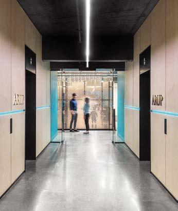
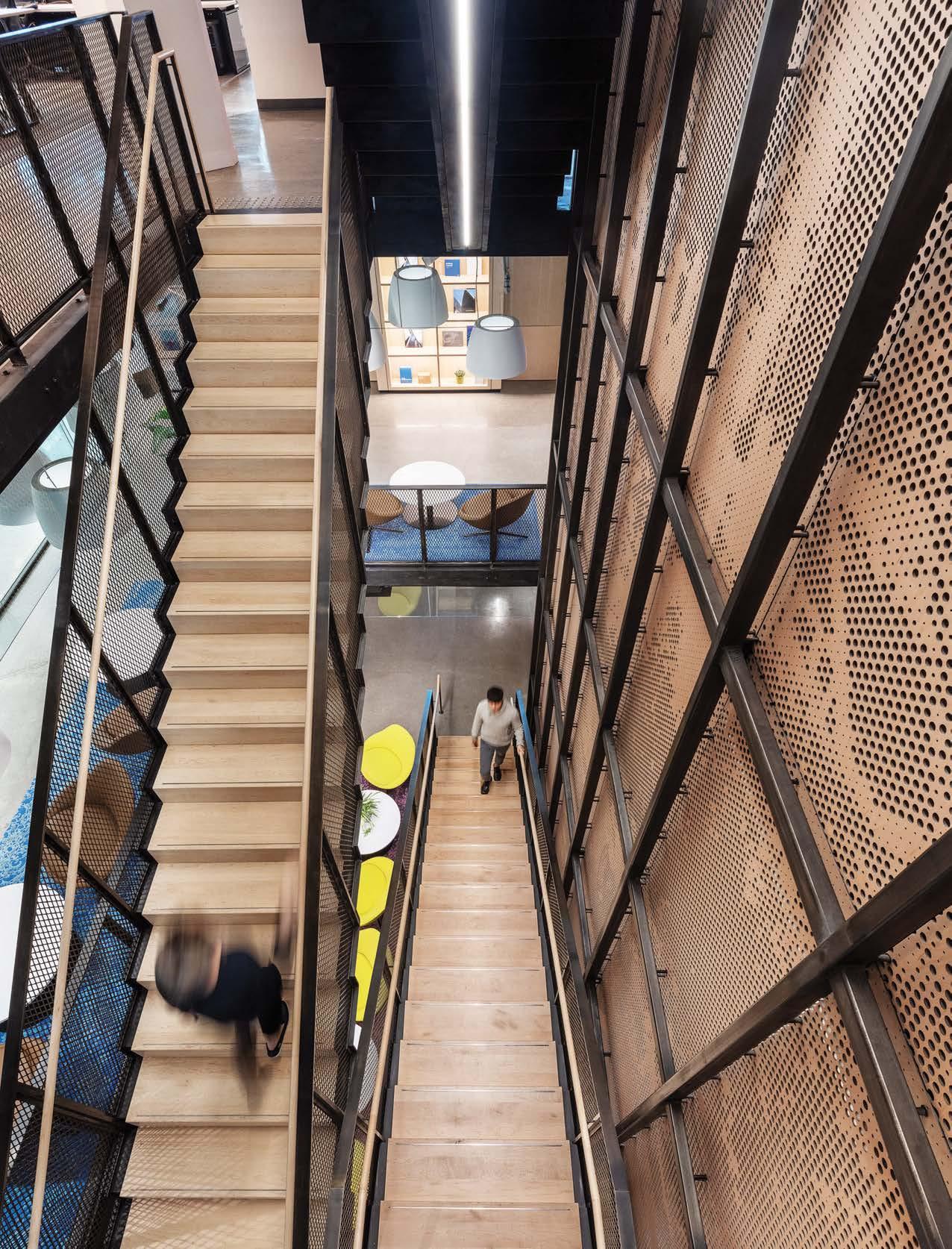
When multinational architecture and engineering firm Arup was ready to create a new template for its North American offices, the firm’s leadership engaged iN STUDIO for the task. A year would be spent by the design team studying existing offices, interviewing user groups, compiling data, and eventually authoring the design guidelines. The next task was to apply these principles to two beta sites. Montreal, the smaller, would be the first, followed by the 75,000-square-foot Canadian headquarters, in Toronto. The latter, a fully open-plan workplace for 500 of the awardwinning firm’s employees, serves to reflect Arup’s expressive, dynamic, and focused company ethos.
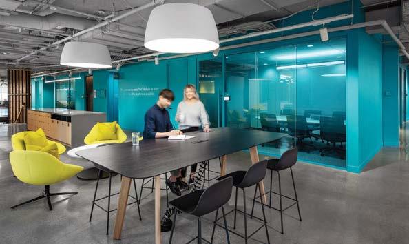
iN STUDIO created a flexible, four-story environment made to feel as if it is one large, connected studio empowering creativity and collaboration. Although each level has its own distinct personality, all are connected by one central feature staircase, creating a link that flows from the 8th floor to the 9th-floor reception, and then through to the 11th floor. Spanning all levels, a custom laser-etched plywood screen depicts abstracted, iconic Arup designs. This bold medium tells a subtle story that is threaded through the stair structure from bottom to top. On each floor, there is a gathering hub directly adjacent to the stair, seamlessly allowing for social interactions as well as idea-sharing between teams.
Clockwise from right: A custom laser-etched plywood screen depicting abstracted Arup designs stretches through all four levels next to the stair. Co-creation between Arup and iN STUDIO yielded innovative results. Work booths incorporate acoustic fabric. The plywood screen also forms a backdrop to the reception desk. Color-tunable lighting co-designed with Arup mimics the shifting spectrum of daylight.
 PROJECT TEAM ANTHONY ORASI; DEANNA HAYKO; BETTY CHOR; KATIE FERRIER; DANIELA BRATU; ROSEMARY RATKAJ KEY CONSULTANTS ALEXIS HUR CONSULTING; MULVEY AND BANANI; SMITH & ANDERSEN; RJC; MCM MILLWORK PHOTOGRAPHY STEVE TSAI PHOTOGRAPHY instudiocreative.com
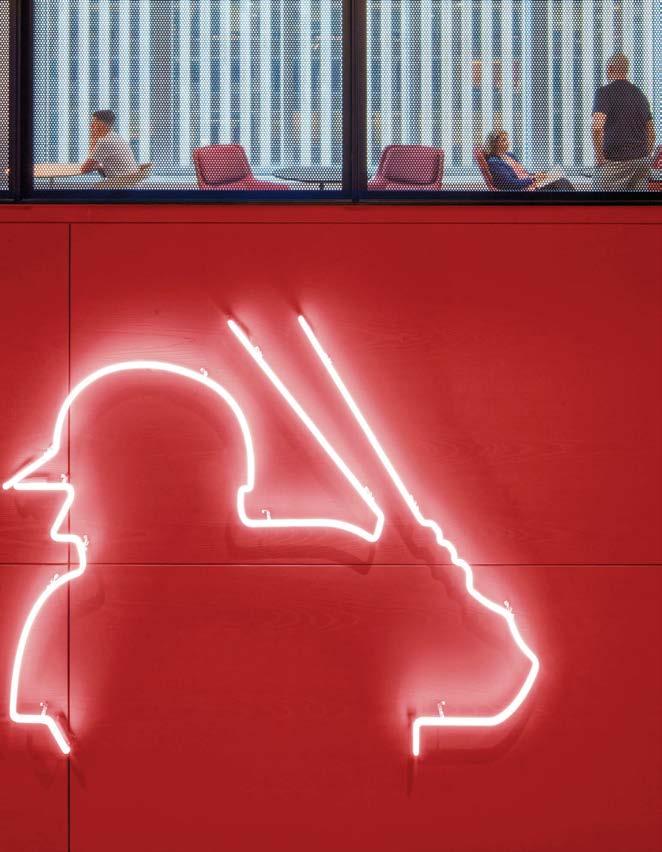
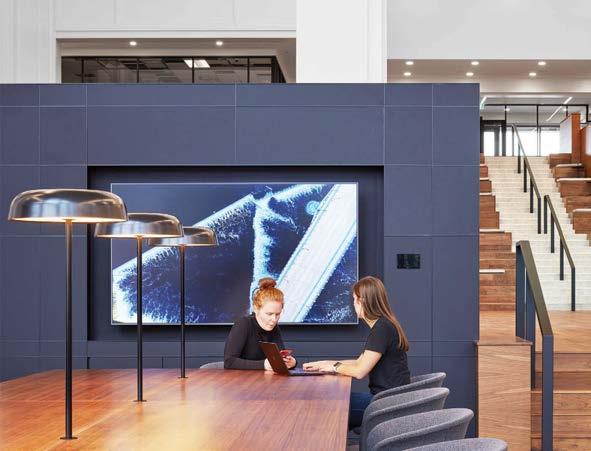
Major League Baseball’s headquarters provides a refined home for the organization in the bustling heart of midtown Manhattan. Aesthetically, the design by STUDIOS weaves together textures and patterns rooted in the sport, such as the red stitching on the leather-wrapped reception desk. It’s all about baseball, but never in an obvious way. Even the facets on the concourse’s projection wall are in on it: They are an abstraction of the geometry of a baseball diamond.
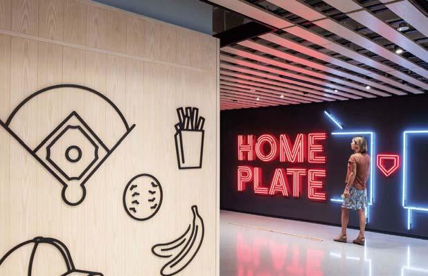
PROJECT TEAM JOSH RIDER; JORDAN EVANS; NELSON TANG; REBECCA FREDERICK; LEE SEWELL; FRANK GESUALDI KEY CONSULTANT ESI DESIGN PHOTOGRAPHY ERIC LAIGNEL studios.com; @studiosarchitectureThe site, spanning five floors of the former Time & Life Building, had large, deep floor plates that proved tricky to navigate. STUDIOS found a creative solution. Facilities that don’t need natural light or, in fact, require darkness—such as screen-lined broadcast studios—sit in the middle of each floor, leaving the daylit perimeter for circulation, meeting areas, and the open office with its equitable landscape of five workstation types. To foster interaction across the floors, STUDIOS developed the concourse, which serves as the project’s social hub. Just like their awe-inspiring stadiums, the concourse connects people via amenities, soaring stairs, and open sight lines. It also boasts a triple-height architectural feature wall on which visual media is projected, neatly catering to the 21st-century MLB. To cap it all off, the headquarters provides flexible entertaining spaces for internal events as well as community initiatives like its Youth and International programs working to broaden the appeal of baseball.
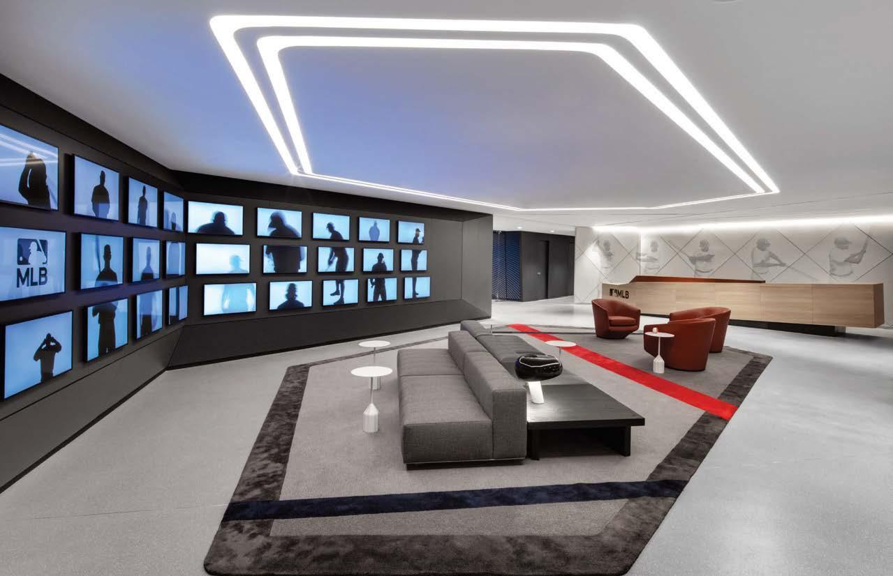
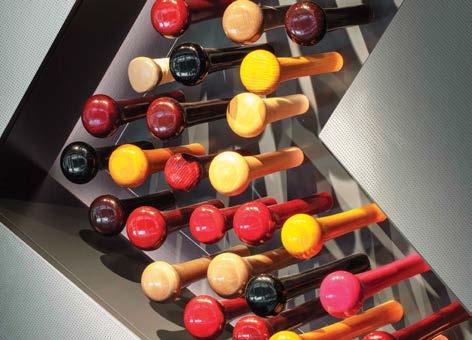
Clockwise from right: Baseball iconography—like this ash wood and powder-coated bronze feature wall outside the Home Plate cafeteria— drove the concept of the five-story headquarters. Bat handles on exhibit.
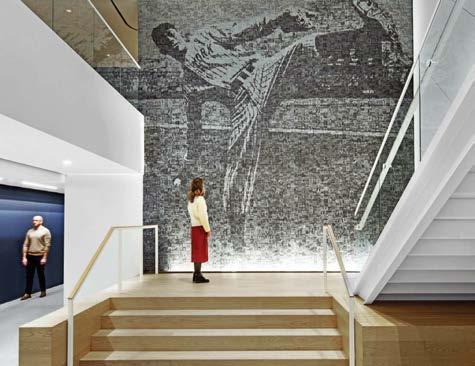
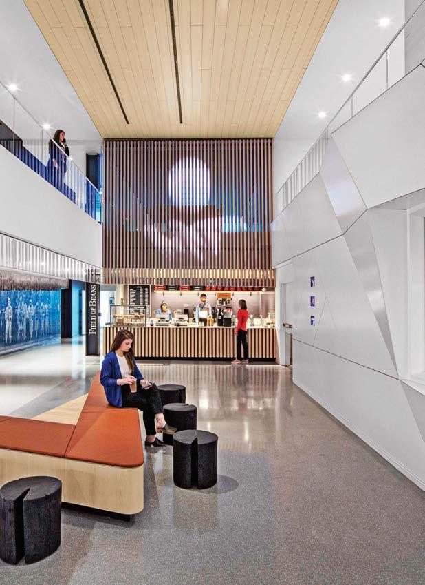
At the Field of Beans coffee bar, leather benches are joined by Uhuru Hono stools. The MLB logo rendered in neon. Surrounded by 30 screens, one for each team, reception features Rodolfo Dordoni’s Freeman sectionals on a custom rug with a design derived from baseball field mowing patterns. A mosaic of Hall of Fame pitcher Satchel Paige anchors a staircase.
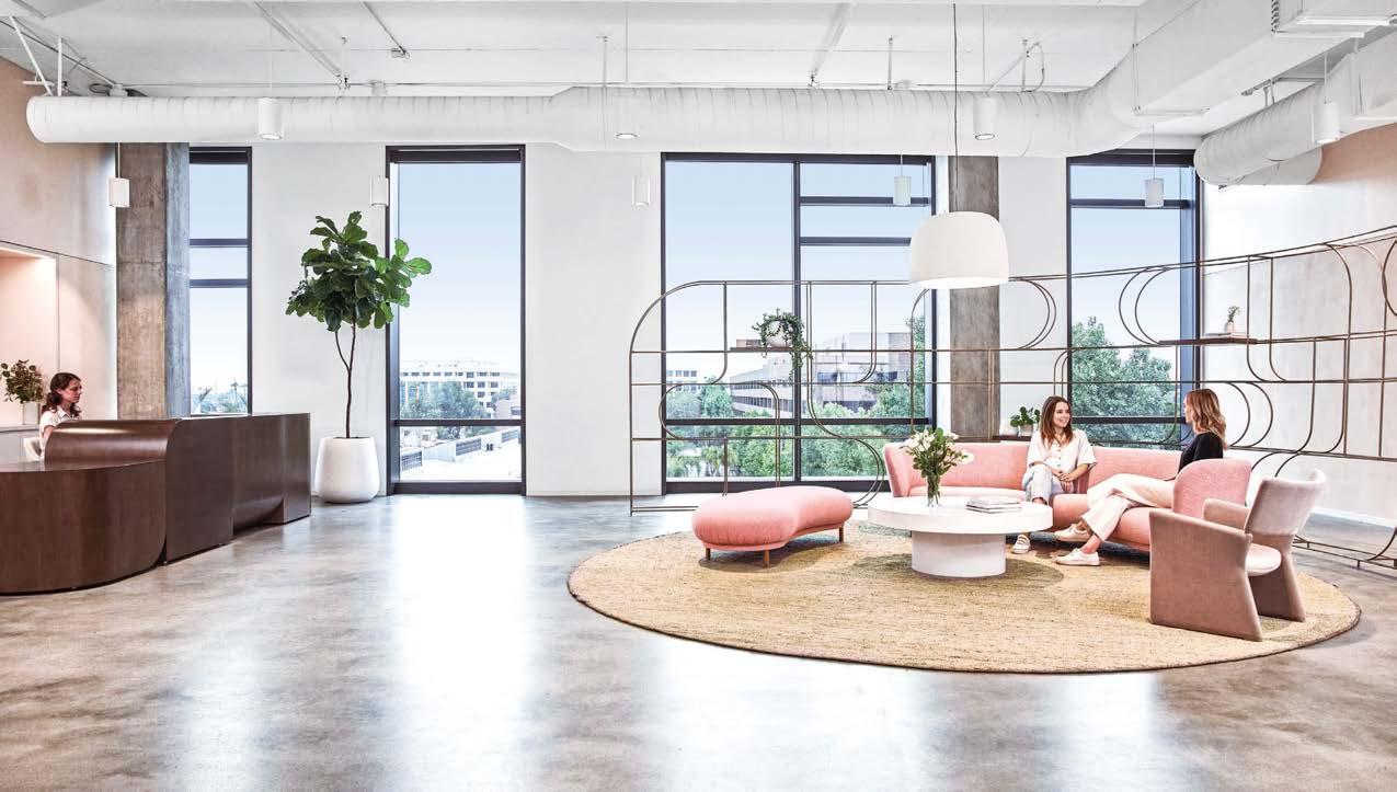
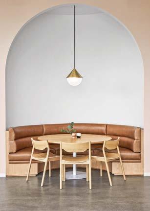
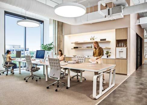
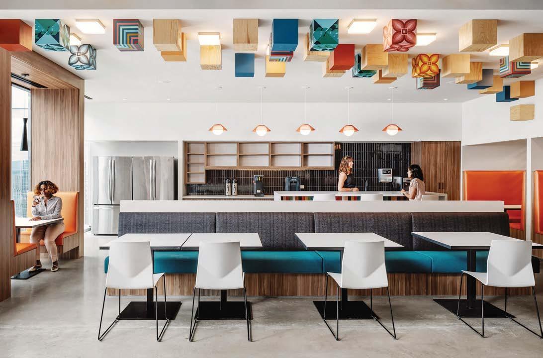
Founded by Gwyneth Paltrow, goop is a modern lifestyle brand and resource that takes a multifaceted approach to health, travel, and style, creating and recommending products while producing content on living holistically. Rapt designed the company’s new headquarters, gathering its various teams into a single 55,000-square-foot light-filled building where they can concentrate their energy on creative development.
Because Paltrow thinks of goop as a family, the space feels like home. A sculptural reception desk welcomes visitors, its shape mimicking the scooped forms in the company’s name. More sweeping curves emerge in larger architectural elements and are echoed in small furniture details, gestures that create intrinsic flow. The color palette—soft, warm, and inviting—is equally pleasing to the senses. New facilities include photo, video, and podcast studios, a product lab, a test kitchen, and a design workroom. An all-hands area hosts weekly meetings; lined by a kitchen, it’s used for meals, too. The adjacent deck, outfitted with Galanter & Jones outdoor furniture, is home to office social hours and outdoor meetings. Equally important but wholly different in nature is the string of sanctuaries, such as a yoga room, secluded lounge spaces, and cozy booths, that offers employees private moments to balance the social, extroverted work of collaboration.
Clockwise from above: Curved architectural elements and a warm, pleasing color palette define the all-hands area and adjacent kitchen. Tailor-made workstations were crafted in collaboration with MASH Studios. Light fixtures by Roll & Hill, found throughout the headquarters, are simple, geometric, and refined. A wide, rounded metal screen fabricated by Bayly Art defines a seating vignette in reception, where a custom sculptural desk by local studio Artcrafters welcomes visitors. Along with secluded lounge spaces and personal phone rooms, cozy booths with scooped seating offer employees moments of rest and relaxation.
raptstudio.com; @raptstudio
 PROJECT TEAM SAM FARHANG; DERRICK PRODIGALIDAD; GARETH PAYNE; NICOLA KERGER; GIGI ALLEN; JUSTIN CHEN; KATIE UBBEN; GABBY O’CONNOR PHOTOGRAPHY COURTESY OF GOOP AND RAPT STUDIO
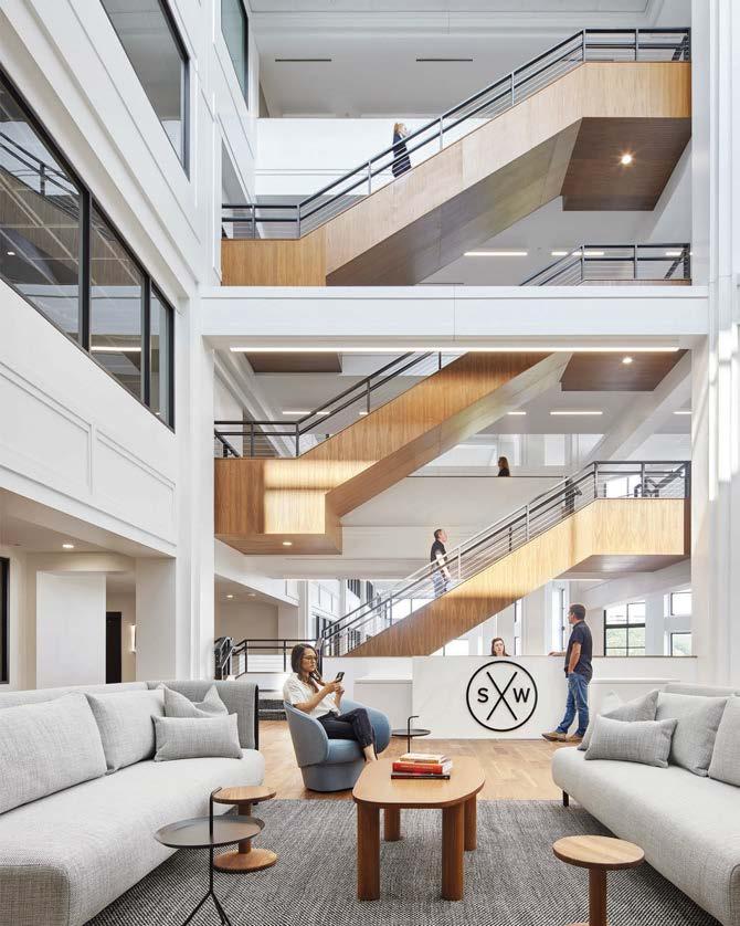
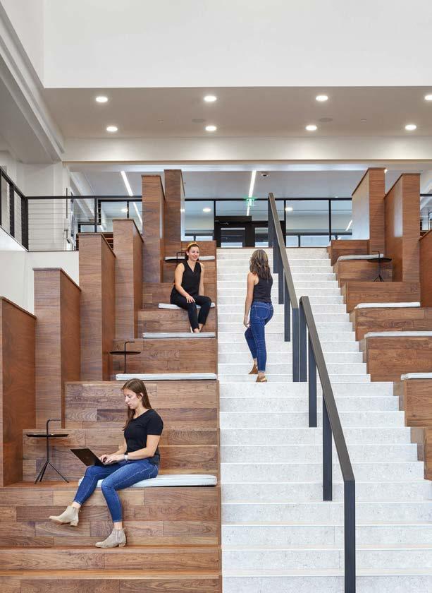
Work norms and behaviors are radically evolving. “Suburban office design is more relevant than it has been in 40 years,” Studio BV founder Betsy Vohs says. “Post pandemic, workplace design trends are shifting to embrace the suburban office landscape.” The renovation of the One Southwest Office Building (OSWX) is a case in point. The building was 90 percent vacant before the recent remodel. It is now 90 percent leased, in less than one year. Several factors influenced the change: the exodus of commercial tenants from downtown areas; the relocation of offices back to the suburbs to align with where people live; and the makeover of the building into an adaptable, contemporary office. Companies look for three key components in suburban office developments: easy parking, access to highways, and fabulous amenities. OSWX checked two of those boxes but lacked covetable amenities. Plus, the building was outdated and desolate. To entice tenants, Studio BV reimagined the atrium as a space for lounging and casual meetings with new furnishings, plants, lighting, and digital media. Other design moves included shifting the main entry to align with the parking deck and adding a new exterior plaza, reception, and two staircases. One stair connects underutilized catwalks, while the grand stair, in warm wood, provides welcoming bleacher seating. A buzzy coffee shop tops it all off.
OSWX, EDEN PRAIRIE, MINNESOTA
JACOBSON-NOYES
COREY
@studio__bv
DWR; HEM;
Clockwise from above: Digital media animates the atrium. Furnishings bring contemporary Scandinavian style to lounge areas. Open floor plans and interconnected levels have comfortable corners carved out for private conversations and relaxation. The atrium is designed to increase creativity and innovation by bringing people together. The grand stair incorporates bleacher seating, making it an ideal place for quick breaks.
 PROJECT
Founded in Austria in 1999 by Martin Lesjak and Peter Schwaiger, INNOCAD’s name stands for interdisciplinary, nonconformist, caring, and distinctive. “All our projects are united by our working philosophy of ‘New Holism,’ trying to find answers to the rapid evolution of digitalization, urbanization, and globalization,” says Lesjak. “Today’s continuous exposure to technology poses challenges on physical, mental, and cognitive levels. It is necessary to put humans and their elemental needs back front and center.”
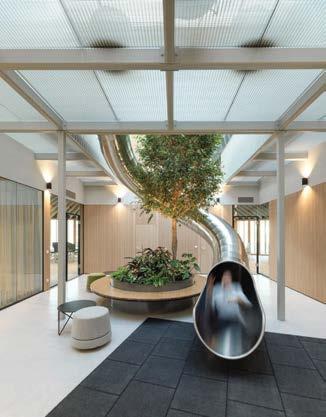
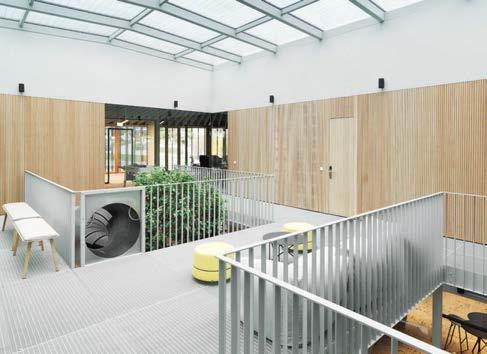
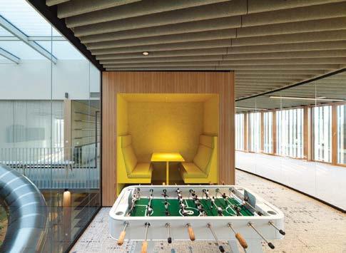
Since MAM, a leading manufacturer of childcare products, is like a growing organism, its new 48,500-square-foot competence center resembles one, too. The principle of cellular division guided INNOCAD’s design of the complex, which comprises three intersecting circular buildings or “cells,” each with a two-story atrium topped by a greenhouse roof as its nucleus. Arranged around these interior gardens, which offer a hybrid indoor-outdoor experience, are the principal business facilities followed by collaborative zones. These are encircled by a single, broad corridor, which also provides access to the glass-enclosed rooms for focused work that line the exterior walls. The plan’s circular geometry and interlinked levels form a dynamic loop weaving through all levels, fostering employee interaction as well as physical activity and cognitive diversion. The cleverly meandering layout with inspiring, serpentine space patterns balances the human need for spatial clarity and generosity as well as retreat and security.
Clockwise from above: This atrium includes a playful slide that connects the two levels. Outfitted with a greenhouse roof, and planted with lush vegetation, each atrium offers employees a hybrid indoor-outdoor experience. These central spaces, which function like the nucleus of a cell, are surrounded by work booths and amenities such as foosball tables. The circulation-loop flooring, which incorporates science-based fractal patterns that reduce stress, was developed by 13&9 Design (INNOCAD’s product design division) in collaboration with Fractal Research and Mohawk Group. The atrium slide epitomizes a holistic, humanistic approach to design that prioritizes the physical, cognitive, and social needs of end users.
PROJECT TEAM MARTIN LESJAK; OLIVER KUPFNER; JÖRG KINDERMANN; ANASTASIJA LESJAK; MICHAEL GATTERMEYER; HARALD GLANZ; THOMAS GÖSSLER; MICHAL KNIAZ; ALEXANDER ROTHBART
KEY CONSULTANTS PILZ & PARTNER ZT; M.O.O.CON; DIE HAUSTECHNIKER TECHNISCHES BÜRO; NORBERT RABL ZT; SCOPE ZT
PHOTOGRAPHY PAUL OTT
innocad.at; @innocad
“This project summarizes our knowledge of humanistic design: the principle of focusing on the human being with his or her psychological, physiological, cognitive, and social needs”
 The sensor-controlled anodized bronze and perforated-aluminum lamellae facade automatically reacts to the sun’s positioning.
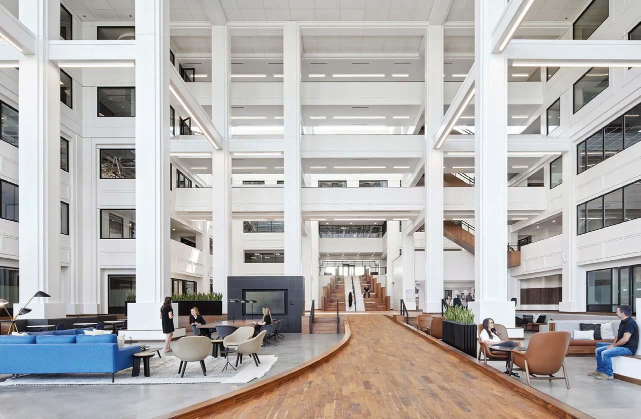
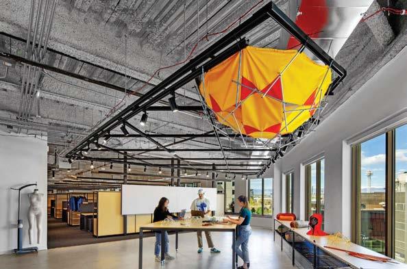
Encompassing 250,000 square feet spread across seven levels, this vast workplace was designed for a tech company wanting to communicate its culture through the lens of what West Texas represents. The space, modeled on a road trip, captures the surprising traits of seven destinations or concepts (one per floor), including Marfa, Terlingua, Big Bend, and Balmorhea. The area is varied and unique: Terlingua is home to the world’s largest chili cook-off, while Lajitas has a goat as mayor (yes, really!). To capture the region’s essence, the designers tapped into this magic. Funky design elements and spatial transitions are enhanced by art, accessories, and colors that characterize the area’s rivers, valleys, and canyons. Cushing Terrell prioritized use of local resources in order to add authenticity and to maximize sustainability and equity. Contributors included a builder based in Austin’s neighboring Hill Country, who provided the rammed-earth reception desk, and an artist from Mexico who made custom indigenous artwork. “Similar to wild West Texas, this project had unexpected twists,” lead designer Grace Kirby says. “What started as a small design team grew into a large, collaborative cohort of artists, interior designers, architects, and contractors that pushed the boundaries of creativity to create a functional space filled with surprising moments and regional details.”
Clockwise from above: Situated within a gray-shell office building, the space provided a blank slate— both literally and metaphorically—upon which the designers could paint their West Texas concept.
Vibrant wallpaper backdrops dining booths in the canteen. The client’s vision was to design a forwardthinking workplace that encourages wellness and enhances productivity. The design scheme is modeled on a Texas road trip. Materials used throughout are sustainable and local.
 PROJECT TEAM GRACE KIRBY; BRAD SPERRY; BRAD FEELEY; SANDI RUDY KEY CONSULTANTS SWINERTON; HARGIS ENGINEERS; BAI; ITZÉ PAVÓN PHOTOGRAPHY CHASE DANIEL
“The workplace of the future is no longer all enclosed offices or all open; it is about finding balance,” SMALLWOOD principal Amanda Wing observes. Her team perfectly toed the line between the two for a longtime client looking for a satellite office and separate meeting center independent from its current campus.
SMALLWOOD’s design solution was to allocate two-thirds of the floor plate to office space, with an automated glass partition cordoning off the remaining one-third serving as a meeting center. Breakout team spaces, phone nooks, and heads-down areas flank the meeting rooms. For the open office, the designers planned a mix of flexible workstations, collaborative team spaces, reconfigurable meeting areas, and project rooms. There are also gracious work/ lounge zones, perimeter seating, sit-stand desks, high-top worktables, open booths, and writable walls. Agile furniture allows the office to be reconfigured at will to mimic the fluidity of the teams utilizing this space. These elements combined have drawn staffers back into the office to collaborate, while allowing the flexibility needed to connect with those that are remote. “No two people work the same, so providing spaces that answer a variety of human needs is crucial,” Wing says. “In a world where we can all be virtual, we must create spaces that attract and engage end users through design.”
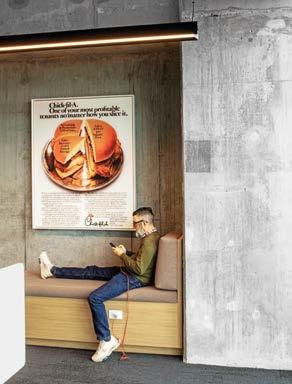
CHICK-FIL-A PONCE CAMPUS, ATLANTA
Clockwise from above: The building is on the Atlanta BeltLine, so the goal was to incorporate natural, industrial materials that would tie the office into the surrounding environment. Small pods with acoustic surrounds are placed throughout the office to allow for heads-down work needs as well as small confabs. Acoustic baffles overhead control noise in the café. Built-in booths and tiered seating form overflow breakout spaces adjacent to the meeting center. Vintage advertisements serve as artwork.
PHOTOGRAPHY ERIC LAIGNEL smallwood-us.com; @smallwoodinc
 PROJECT TEAM AMANDA WING, IIDA; CHARLES G. HULL, AIA; LINDSEY MORRIS; JEFF VINCENT; ALLY YORK; CHRISTINA MINNER; PIERRE MAELI KEY CONSULTANTS GENSLER ATLANTA; AV TECH MEDIA SOLUTIONS; CHOATE CONSTRUCTION; JORDAN AND SKALA ENGINEERS; CWC OFFICE FURNITURE; CORPORATE ENVIRONMENTS
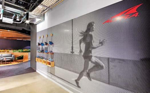
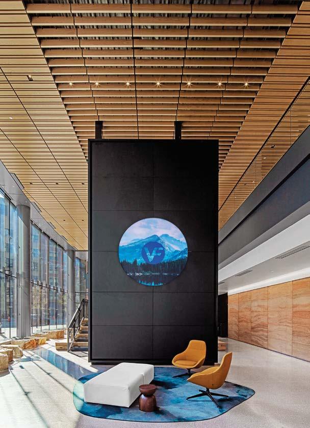
VF has come a long way since its 1899 founding as a maker of gloves and lingerie. Today, its portfolio comprises 13 global apparel and footwear brands. Recently, the conglomerate relocated its headquarters from North Carolina to Denver, where it shares a 10-story high-rise with five of its previously dispersed brands. For this major move, VF called on trusted partner Rapt Studio to design a workplace that reflects the corporation’s ethos as well as the character of its subsidiaries, which make everything from socks (Smartwool) to outdoor gear (The North Face).
Rapt began with spatial organization, envisioning how employees would move through the 285,000-square-foot building. While each brand has its own offices, lounge, and tinker zone, all employees share the double-height lobby and fitness center on the ground floor, coffee bar on the second level, and café on the fourth. In common areas, interactive graphics and earthy materials channel the companywide focus on technology and the outdoors. Entering the lobby, staff encounter both a mammoth screen displaying nature photography and a rammed-earth wall that looks like sedimentary rock. Beyond is the fitness center, where a climbing wall is overlooked by a glass-faced interview room. “You could be interviewing for a job while someone is climbing 15 feet away,” Rapt design director Mike Dubitsky notes.
“It presents a notion of purpose around the company, that it’s a lifestyle.”
 PROJECT TEAM DAVID GALULLO; MIKE DUBITSKY; CHRISTINE SHAW; TERESA MCWALTERS; JACK SOLOMON; NICK TEDESCO; ASHLYNNE CAMUTI; YUECHEN WU; BRETT SU KEY CONSULTANTS DNA ASSOCIATES; STUDIO NYL PHOTOGRAPHY ERIC LAIGNEL raptstudio.com; @raptstudio
Clockwise from above: Rapt Studio employed an outdoorsy/tech aesthetic for global multibrand VF Corporation’s headquarters in Denver. In the double-height lobby, a connecting stair incorporates bleacher seating. The second-floor interview room, with a Jephson Robb table and Naoto Fukasawa chairs, gets a close-up view of the fitness center’s climbing wall. Fixtures, finishes, and textures pull from nature’s color palette with honest, weathered materials like stone and wood. Graphics are based on brand advertising campaigns. Naughtone’s Always Lounge chairs and Stylex’s Yoom sofa provide additional lobby seating.
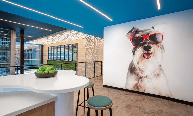
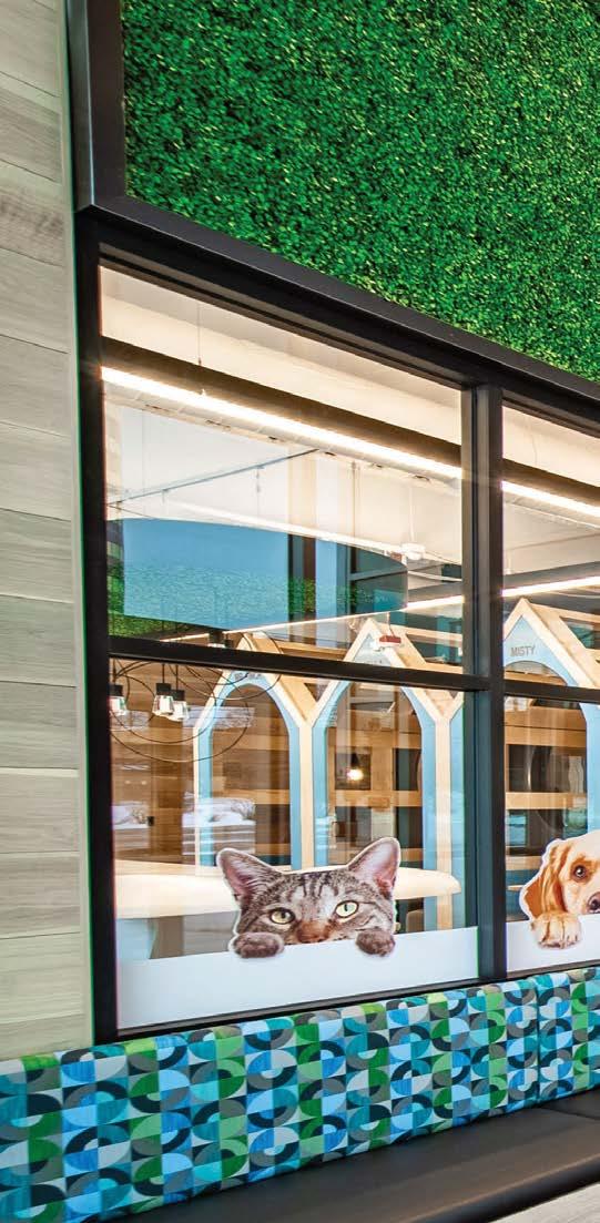
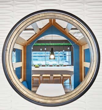
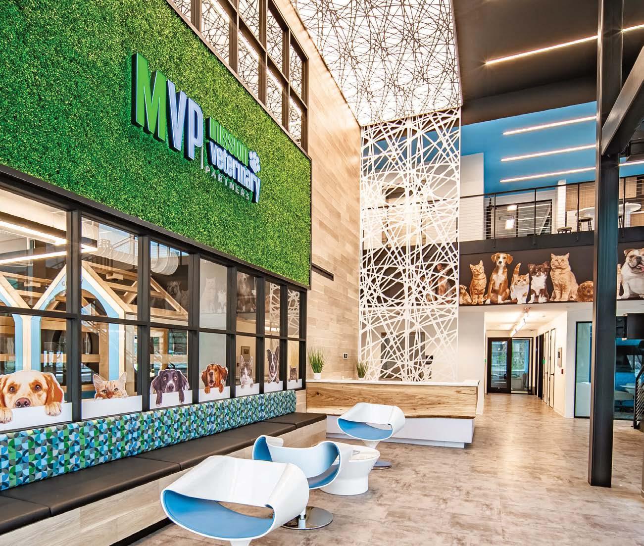
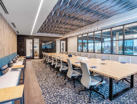
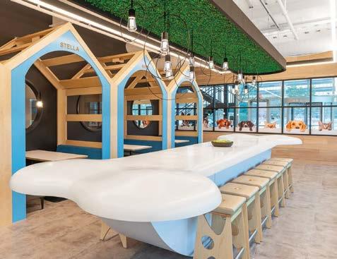
“The COVID pandemic has created a new mindset regarding lifestyle, worklife balance, and wellness,” says Davis & Davis principal Michelle Davis. “Transforming the former American Cancer Society building in Southfield, Michigan, into a headquarters for Mission Veterinary Partners at the apex of the pandemic reinforced our team’s belief in the power of design. It was vital to conceptualize a social, collaborative environment that people would ultimately want to return to.” MVP does just that, establishing a positive, uplifting mood right from the lobby. The materiality is warm and inviting: TerraMai natural wood planks, concrete, wood-look LVT, industrial metals, and greenery. The first floor provides veterinarians a place to gather, convening for conferences in the training room that overlooks the on-site surgery clinic. On the floor above, a boardroom has a view into the lobby with its exterior glass, letting in ample sunlight. Team member offices, workstations, printers, conference rooms, and focus rooms are strategically located throughout the two-story building. And whimsy abounds: Furry faces on decals peek out from the café window to reception, while within the café proper cheeky “doghouse” booths are named for employees’ pets—Misty, Charley, Stella, and Mr. Finch. “Humans have a physiological response to place,” Davis summarizes. “Our sense of well-being is realized when our physical space functions well, provides safety, and is engaging and beautiful.” Check, check, and check.
Clockwise from left: Lively and whimsical murals of pets are a feature of the characterful office. The conference room overlooks the lobby and its exterior glass, letting in sunlight. A view through a portal window surveys one of the quirky “doghouse” dining booths in the café. In the same space, a show-stopping dog-bone-shape center island is sculpted from Corian. An inviting tapestry of organic materials flows throughout, like the live-edge wood that wraps the reception desk.
PROJECT TEAM MICHELLE DAVIS; HOWARD DAVIS; JAMIE JORDAN; AMER SAHOURY; LIZ THOMPSON-DYKES; KRYSTEL ROBINSON; IVONA GRUJEVSKI
KEY CONSULTANTS INTERIOR SPACE MANAGEMENT OF MICHIGAN; MA ENGINEERING; INTERIOR ENVIRONMENTS PHOTOGRAPHY VANSEN MEDIA davisinteriordesign.com; @davis_and_davis
 SOM
SAN FRANCISCO, NEW YORK, AND CHICAGO
SOM
SAN FRANCISCO, NEW YORK, AND CHICAGO
SOM is known for skyline-defining feats of architecture and engineering. To achieve this, it has spent close to a century pushing the boundaries of technical innovation, using design and engineering to reimagine structures, materials, public space, and tall buildings, always with an eye towards the future—SOM was the first architecture firm to adopt digital technologies in the design process, and among the first to commit to the World Green Building Council’s Net Zero Carbon Buildings. Today, the firm is expanding the frontiers of architecture by unveiling a concept for buildings and cities to absorb carbon at the UN Climate Change Conference, collaborating with space agencies to envision habitation beyond earth, and partnering with fabricators to develop bio-based building materials. To do this work, SOM needed flexible studios that can accommodate nimble, highly collaborative, and interdisciplinary teams. At a time when the world is wondering what the future of the office will be, SOM is betting on tall buildings—many its own—to reimagine its studios in San Francisco, New York, and Chicago.
The new San Francisco studio, located in the 1967 SOM-designed One Maritime Plaza, highlights spaces for creation and experimentation with unparalleled views of the Bay. Transparency is at the heart of the New York studio housed in SOM’s 7 World Trade Center, where a two-story sculptural stair built entirely of cross-laminated timber—the only structural material that doesn’t emit carbon in its production—is an experiment in structural and environmental design. Encircling the air y, terra-cotta-clad atrium in Daniel Burnham’s iconic 1904 Railway Exchange Building on Michigan Avenue, SOM’s Chicago studio draws upon the latest research on neurodiversity and well-being to improve focus and comfort, with a “ribbon” of analog and digital process materials on display.
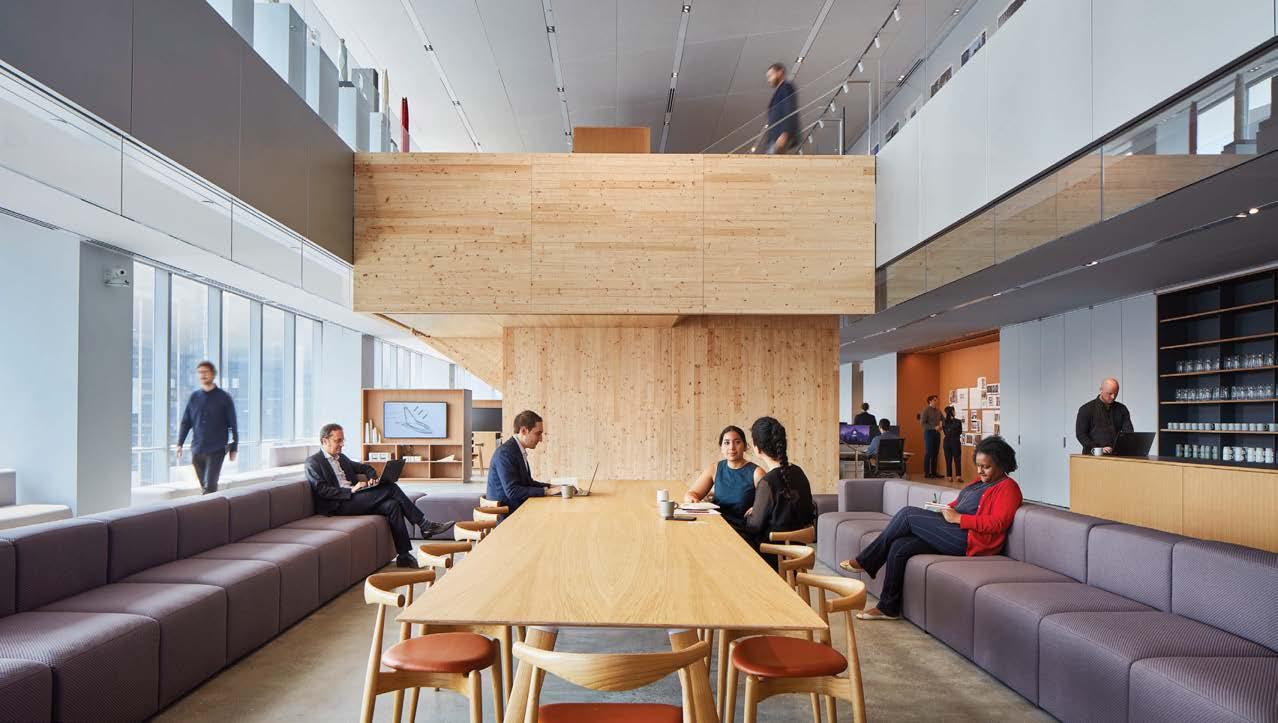
Clockwise from above: In SOM’s Chicago studio, a communicating stair with custom perforatedsteel balustrades connects two levels of design studios and creates opportunities for unplanned encounters. Open to the building’s airy, terra-cotta-clad lightwell, the studio is a visible hive of activity, embodying the atmosphere of a design atelier. In San Francisco, a blackened-steel staircase at the heart of the office leads to a space for the entire team to connect and enjoy stunning views of the Bay. In New York, collaboration zones are at the heart of the space, enabling designers to work anywhere, with the city’s striking skyline providing an inspirational backdrop. A close-up view of SOM San Francisco’s blackened-steel staircase.
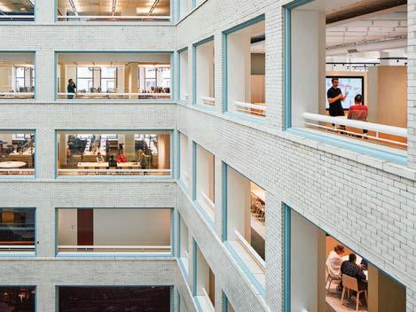
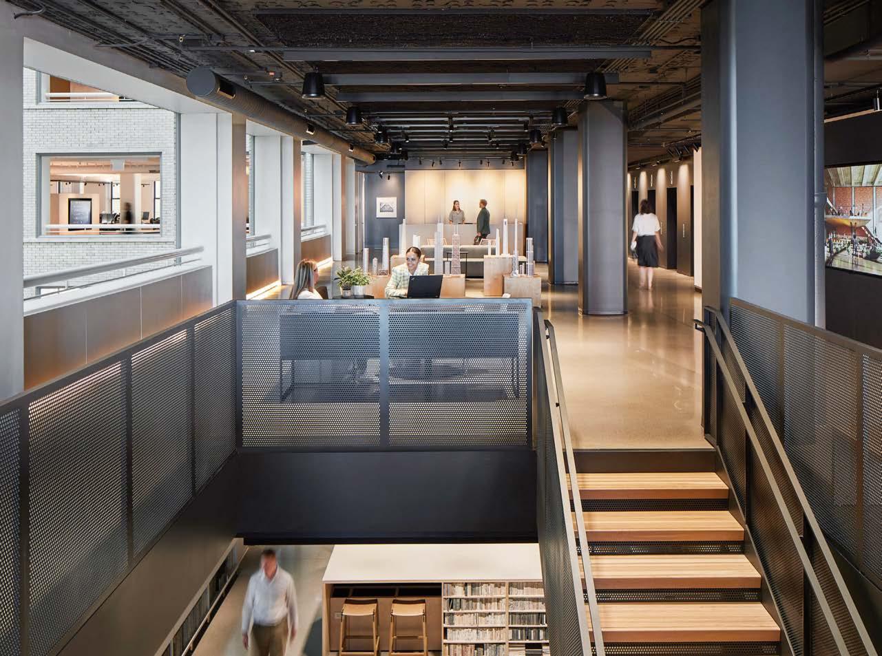
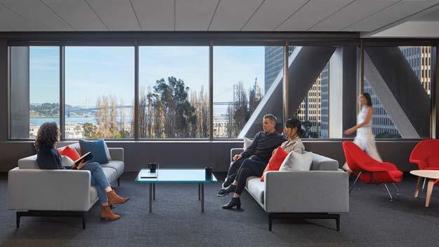 PROJECT TEAM LEO CHOW, FAIA (SAN FRANCISCO); CHRIS COOPER, FAIA (NEW YORK); JULIE MICHIELS, AIA (CHICAGO) PHOTOGRAPHY DAVE BURK som.com; @skidmoreowingsmerrill
Clockwise from right: The sculptural stair in the New York studio creates semi-enclosed enclaves for one-on-one conversations both above and below but can also be configured for large-scale events. To reduce noise, SOM installed a fabric-wrapped acoustic panel ceiling—a concept commonly used in Europe but relatively new to the U.S. In San Francisco, light-filled reception and collaboration spaces wrap around a vast, glass-enclosed makers space and materials library. In Chicago, a gathering space with a custom terrazzo bar encourages informal gathering with views of Lake Michigan and a “living lab” green wall enables design experimentation with plants.
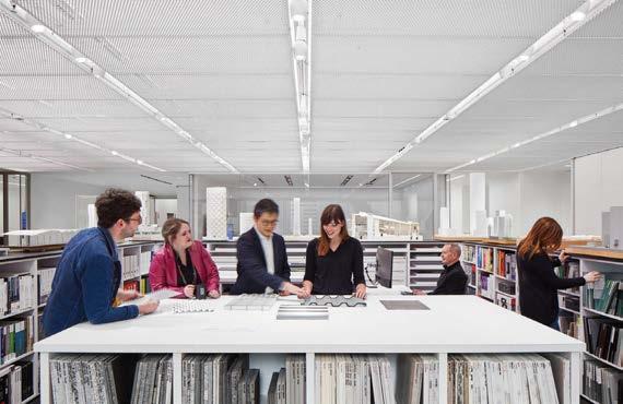
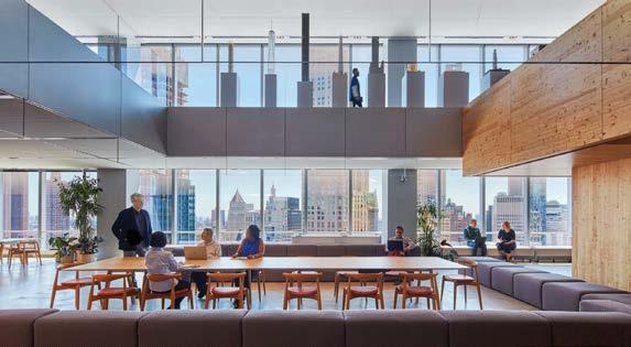
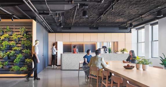
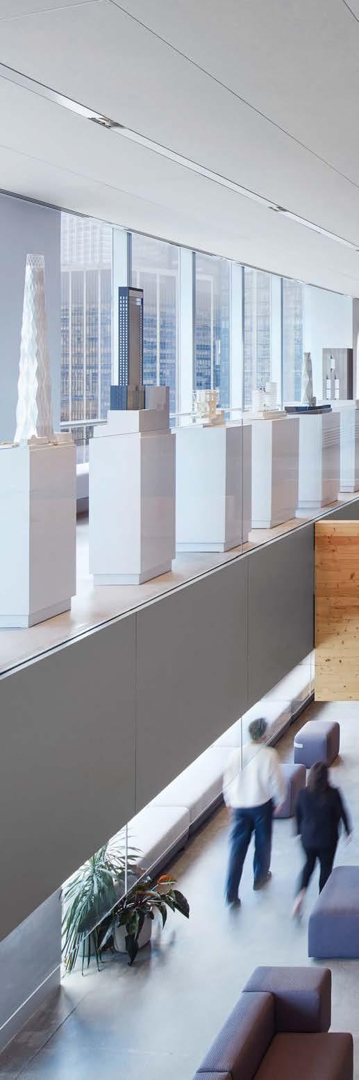
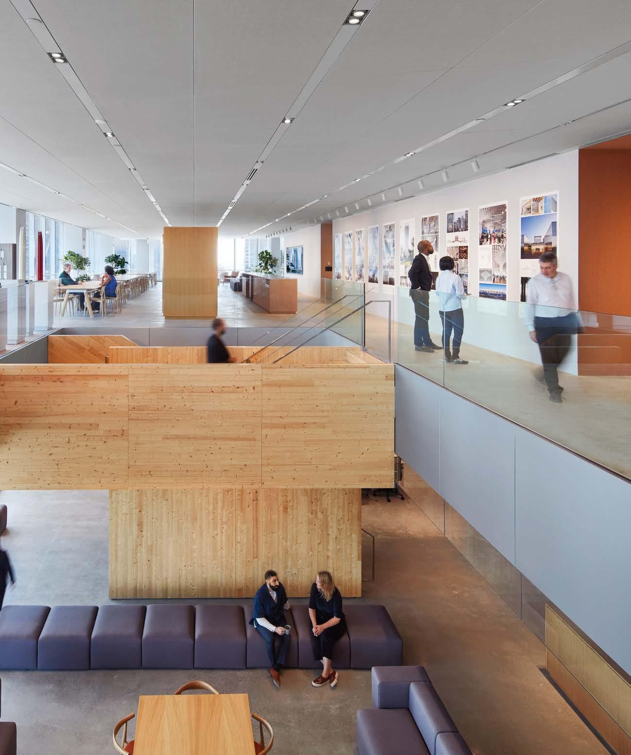
“Our new spaces are flexible and welcoming, reflecting the fluid nature of our design process—teams today need to move easily between projects while encouraging mentorship, collaboration, and cultivating connections”
Savills, an international real-estate services company, hired PDR to help create a contemporary Houston office with the “cool factor,” a place employees would be drawn to. As a tribute to the Houston skyline that Savills has helped shape since the 1970s, PDR’s design was inspired by the surrounding architectural landscape of gilded art deco towers and postmodern black geometrics. With the welcoming and comforting atmosphere of the Savills office, it could easily be a favorite coffee bar or cocktail lounge.
Clockwise from above: The library lounge is stocked with rebound vintage books. Unobstructed views of the Houston skyline are a defining feature of the office. Floor-to-ceiling glass doors slide into walls to create more space. Custom millwork distinguishes the bar in the Buzz Zone, a spot for coffee during the day or cocktails in the evening. Plush seating vignettes offer ample access to natural light. Arches evoke the look of historic libraries.
PDR incorporated a library as a place to experience inclusion, knowledge sharing, and new ideas. The wooden floors and paneling add warmth, emphasized by the glow of brass lighting fixtures and an abundance of natural light. Shelves of colorful rebound antique books and architectural arches mimic the aesthetics of historical libraries, while the transparent glass walls give a modern feel and provide plentiful access to daylight. With expansive views and cozy communal areas, the new office solidifies its position as a favored destination for Savills employees and visitors alike.
Additionally, the centrally located Buzz Zone provides a multifunctional entry space for staffers and clients to work, meet, and refresh over a cup of coffee by day, or cocktail by night. The space now reflects the culture of the people: one team working together to achieve amazing things.
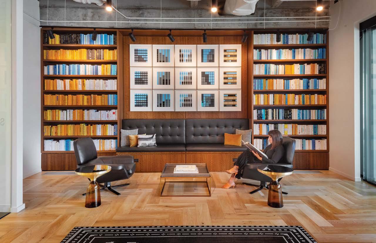
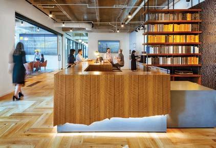
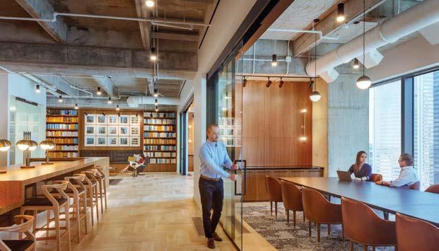
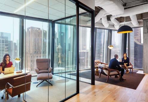
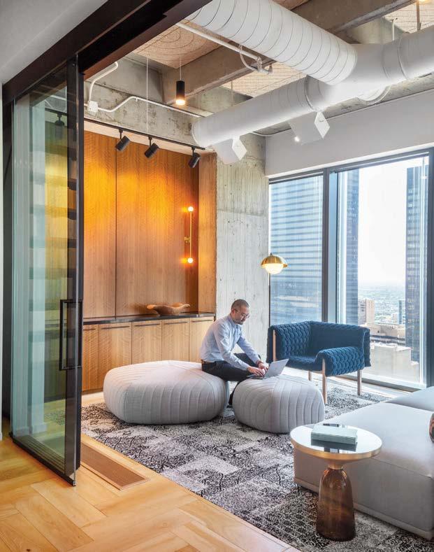
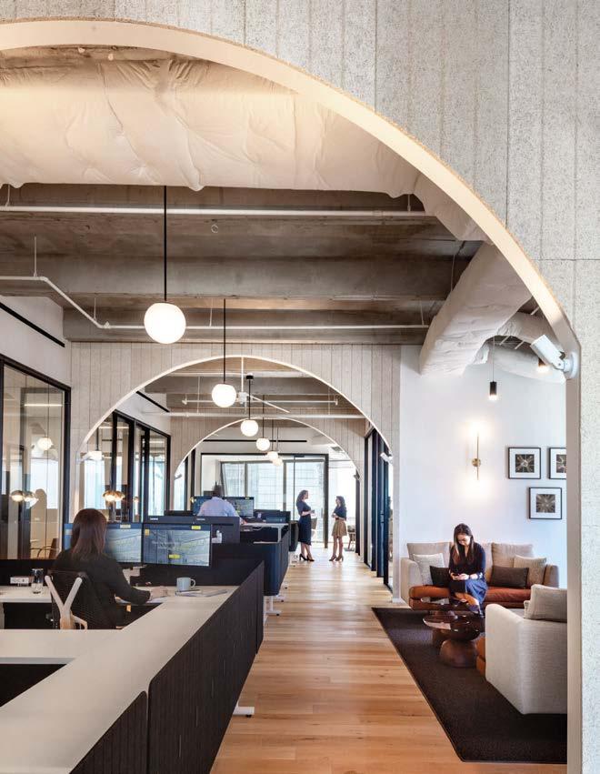
Clockwise from left: At Cosentini’s New York office, height-adjustable workstations promote employee well-being and productivity through ergonomic comfort. The open pantry area serves as an alternative space for individuals to socialize and collaborate. The office functions as a living lab for new technology, where IT, AV, and lighting systems are explored and examined for effectiveness. Open ceilings throughout showcase the ductwork, cabling, and lighting that Cosentini regularly installs for clients.
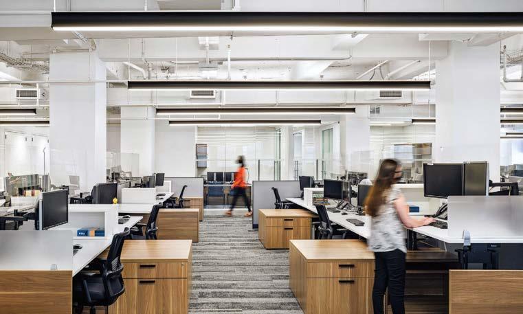
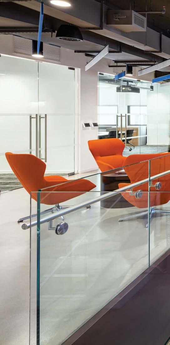
As an engineering firm that provides telecommunications, AV, and security services to corporate tenants, it was clear Cosentini’s own workplace needed to be smartly engineered with an abundance of integrated technology. MKDA helped the company successfully realize its vision for an employee-centered office that doubles as a “living lab” for testing and showcasing new advances in the firm’s sustainability, technology, and lighting practices.
The design centers on flexible environments that provide universal access and comfort, opportunities to collaborate and socialize, and room for future growth. The communal stair, for example, is a vertical spine that connects the site’s two floors and promotes community camaraderie. Surrounding the staircase, open common areas create hubs of connection, and a conference center is primed to host formal and informal events.
Because sustainability is ingrained in Cosentini’s culture, it was at the forefront of all early design conversations. The company’s sustainability team worked closely with MKDA and a handful of subconsultants to achieve LEED Gold certification and WELL Building certification. Efficient lighting systems that conserve some 30 percent of energy daily, ionic air purification, a flex space that can be reserved as a lactation or meditation room, and universal access to operable windows, natural light, and fresh air ventilation all go toward the achievement.
PROJECT TEAM JULIA RISO LIVINGSTON; ANGELA RAIMONDO; MARIO QUAGLIANI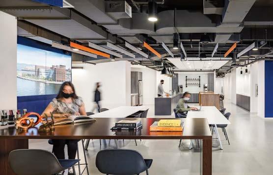
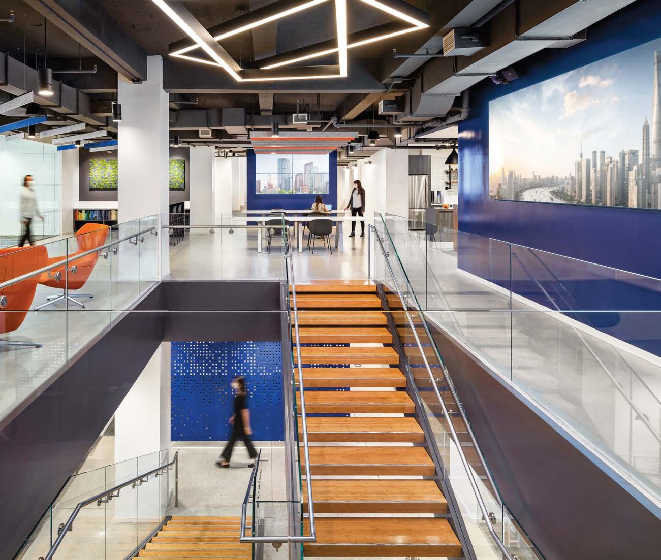
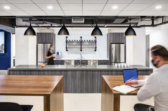
ABRAMS BOOKS, NEW YORK
PROJECT TEAM ELISABETH POST-MARNER, AIA, LEED AP, WELL AP; JANE SMITH, WILLIAM WONG; AMY JARVIS; AMBAR MARGARIDA; VANESSA LACAYO; DANIELLE KACHLER KEY CONSULTANTS COSENTINI; JAS CONSULTING; LIGHTING WORKSHOP; HENRICKSEN; CLUNE CONSTRUCTION PHOTOGRAPHY ERIC LAIGNEL spacesmith.com; @spacesmith_ny
Just as the word smith means “to craft, forge, or design,” the name Spacesmith reflects the New York architecture and design firm’s commitment to the tradition of great craftsmanship. Here, the client wanted a workplace that felt more like a library in a residence, so Spacesmith designed an office that does not look like an office. The project began with the team helping Abrams select a new site in a prewar building. To support heads-down editorial work, the team designed workstations that cleverly fit within the existing column bays. In the lobby, glass office fronts create a visual line directly into the 3,000-book library of Abrams’ extensive catalog, housed on over 600 linear feet of custom blackened-steel and raw-oak displays. One of the client’s favorite areas, the library, has boothlike reading nooks nestled throughout and a rolling ladder that navigates the 10-foot-tall stacks. Opposite reception, modeled after a reading room, is a flexible breakout space sprinkled with colorful, easily reconfigured lounge furniture, orbited by a pantry, banquette seating, and a lunchroom. Throughout, the brand is highlighted in fun details such as banquettes upholstered in toile by artist Shantell Martin. Like Abrams, these textiles tell stories: in this case, stories of New York with cityscapes that repeat in simple, eye-catching patterns.
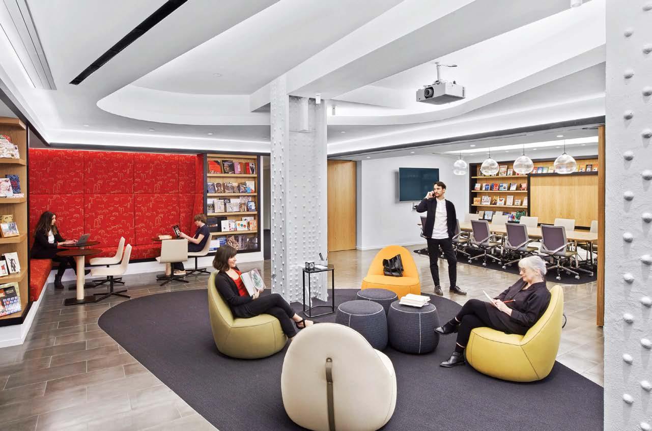
Clockwise from left: A conference room’s moveable walls open to the lounge to create one large space for town hall meetings and events; banquettes in the lounge are upholstered in toile designed by Shantell Martin. Simple moves such as keeping the existing terra-cotta ceiling kept costs low while highlighting the solid bones of the landmarked building. A cozy niche within the library. Accessed by a rolling ladder that navigates the 10-foot-tall stacks, the library holds a first edition of each book ever published by Abrams. The publisher’s renowned art collection is displayed throughout.
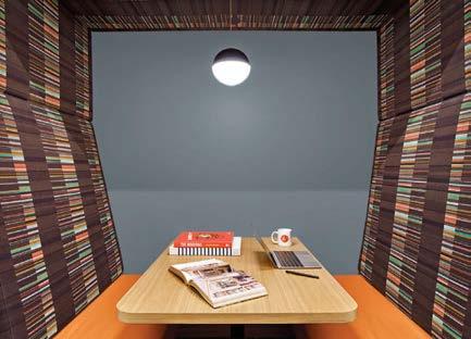
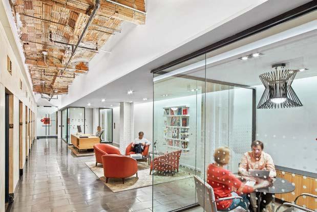
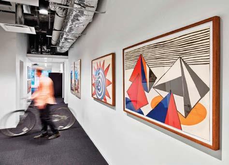

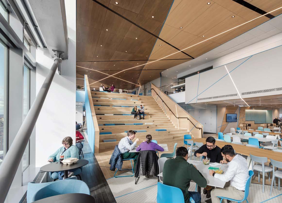
Cybersecurity and cloud services company Akamai Technologies was looking to reinvent itself with new headquarters in Cambridge, Massachusetts. Located in six different buildings in Kendall Square, the fastest-growing tech hub in the U.S., Akamai knew that having all employees under one roof would improve efficiency, productivity, and innovation through heightened collaboration, cultural unity, and company pride. Maintaining roots in the area was important to keep a strong connection to MIT, from which they sprouted as a startup 20 years ago.
Akamai turned to Sasaki, a Boston firm that has pioneered interdisciplinary design since 1953, to realize the new HQ. The 19-story, 480,000-square-foot building is organized around a continuous path of collaboration that starts at the front door and extends through the top floor, linking all levels, departments, and social spaces. Larger conference rooms paired with smaller team and focus booths join destinations like libraries, cafés, game rooms, and a cafeteria to create the mile-long vertical path, dubbed the “AkaMile,” that turns the building into a singular, integrated campus. The competing needs for focused work and teamwork resulted in a new approach to the open office, in which individual desk areas are not mixed with collaborative spaces. Instead, the AkaMile contains all group zones, allowing individuals to work solo in small neighborhoods nearby. Interconnecting stairs tie the floors together, promoting uninterrupted circulation as well as a robust wellness strategy that has put Akamai on target to be one of the largest WELL Building–certified projects in New England.
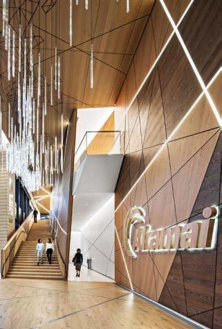
Clockwise from above: All 19 floors of the Akamai Technologies headquarters building are connected by a mile-long continuous vertical path—the AkaMile—encouraging foot travel between levels. The Network Operations Command Center boasts a 100-foot-long digital wall broadcasting live data from around the world. A pattern of intersecting lines traverses each floor, growing more concentrated in collaboration spaces and sparser near quiet workstations. The top-floor employee cafeteria doubles as a place for large presentations. An interactive light installation in the lobby highlights Internet traffic around the world, conveying Akamai’s brand story through an artful digital interface that is intuitive to grasp and memorable.
PROJECT TEAM VICTOR VIZGAITIS, AIA, LEED AP; COLLEEN BARRETT; MEREDITH MCCARTHY; ERIC LAMBIASO; JULIE JAENICKE; HELEN WU; JESSICA KORTHUIS; KATE VANHEUSEN; VICTORIA STEVEN; KENDRA GULINO; STACEY CHAPMAN; GINA MOSCA; JEN IMBARO; ILARIA GIARDIELLO
KEY CONSULTANTS TURNER CONSTRUCTION; NORTHSTAR PROJECT AND REAL ESTATE SERVICES; WSP GROUP; HLB LIGHTING DESIGN; MAGNUSSON KLEMENCIC ASSOCIATES; COSENTINI; ACENTECH
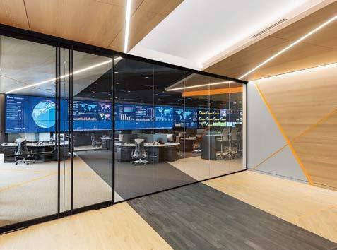
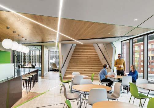
PHOTOGRAPHY ANTON GRASSL sasaki.com; @sasakidesign
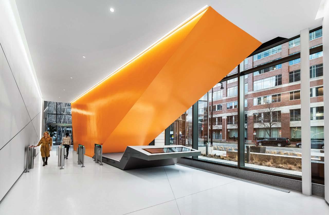
Clockwise from right: The new headquarters is a singular and integrated campus, connecting all departments and groups seamlessly and thoughtfully. The AkaMile purposefully weaves its way through the office floors in a series of interconnecting stairs. Sasaki collaborated with artist Erik Jensen on a world map showcasing Akamai’s global offices, which are represented by hand-dyed keys in the company’s brand colors.
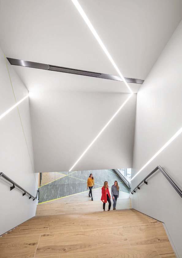
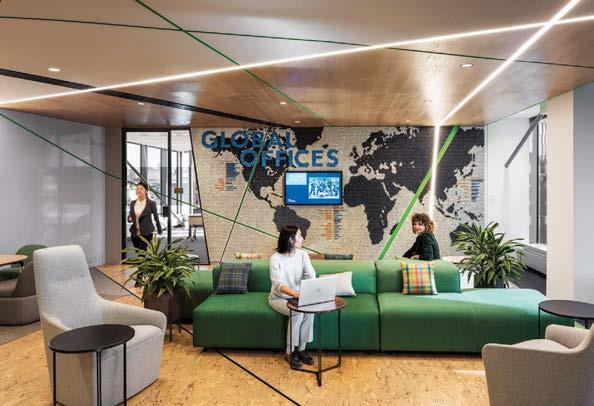
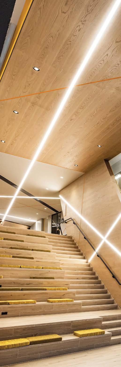
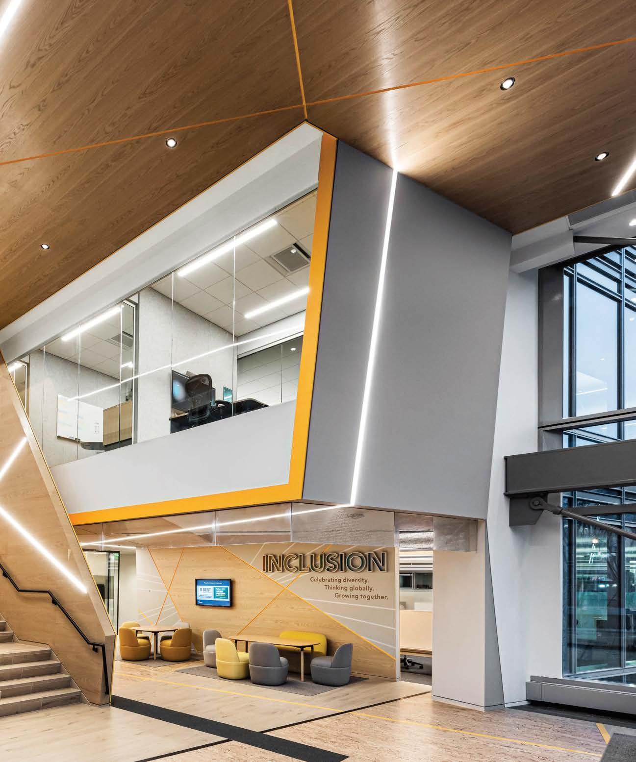
“The building is specially tailored to Akamai’s culture, not the latest trend”
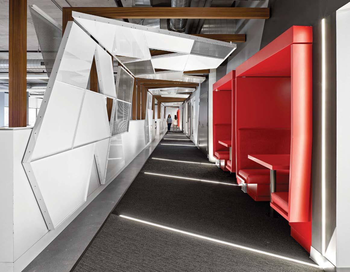
The hip and historic Liberty Village in Toronto’s west end is a hub for contemporary leaders in art, design, and media. The latest company to land in the area, a well-known energy-drink brand, partnered with local design firm iN STUDIO on the design of its Canadian headquarters. “The challenge for our team was how to capture and present the client and its product without putting logos everywhere,” says iN STUDIO partner Guy Painchaud. “I believe we succeeded in created an exciting environment that reflects the client’s passion and drive.”
The site is a long, linear volume with an entrance at one end and a terrace at the other. The parti became a simple path—dubbed “the vortex”—that functions as a central spine connecting all programmatic elements. Metal panels, some perforated, jut at wild angles along the hall, enveloping staffers and visitors as they walk down the vortex. The forced perspective of the corridor “creates its own bubble of energy,” explains Painchaud. (The perforated panels also subdue visual access to the open office area, limiting distraction.) Meeting booths and other confab spaces—many in the client’s signature red—are conceived as smaller masses within the volume adjacent to the vortex. To top it all off, a high-spec black-box venue for events segues directly onto the terrace.
Clockwise from left: The standout design move at the energy-drink headquarters is the vortex, a dynamic corridor with forced perspective. Perforated metal panels limit visual distraction between the open office and the corridor. Touchdown areas flank the perimeter. iN Studio engaged with the lighting manufacturer to have small reveals on the floors and walls. Fire-engine red is a recurrent accent color in the otherwise industrial surrounds.
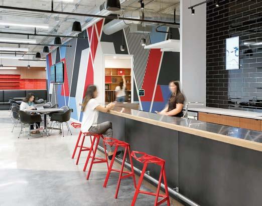
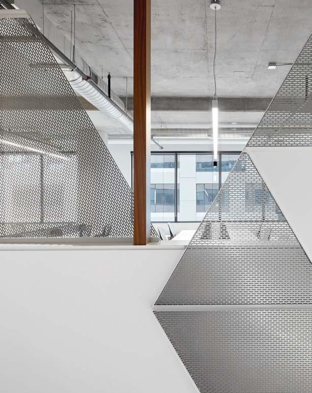
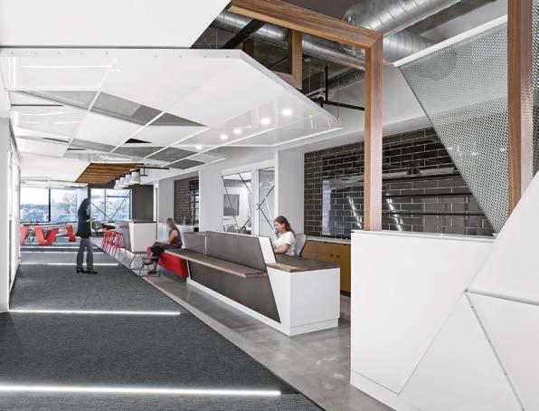
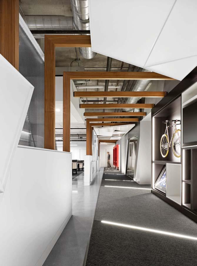
Clockwise from above: The wall system that frames the perimeter office spaces is built of Alaskan yellow cedar, a material typical of Japanese architecture. The restroom is clad in handmade tile to tie into the wabi sabi architecture. In the conference room and throughout, JHL left the original scraped-paint walls as found. A custom community table with built-in library lamps is used as a touchdown workspace by traveling staff. The moody entry vestibule just off the elevator features a bronze sconce by Henry Wilson and woven grass-cloth wallcovering hand-stained a custom shade of black on site.
After spending several years vacant, the penthouse of a 1927 office building in downtown Portland was converted into a boutique consulting firm’s workplace by local studio JHL Design. JHL’s principals David Horning and Holly Freres were determined to maintain the character of the original architecture, including expanses of glass overlooking the city.
Given the unusual layout, which also involved angled walls and a sloped ceiling, the designers’ first order of business was to improve the overall flow of the space. Rather than enclosing the core like a traditional office, the team chose to keep the central area open, accentuating the 14-foot-high ceilings with cloudlike paper lanterns by Molo Design that loom over refined seating vignettes. Through form and materiality, the design gives a gentle nod to the client’s long-standing relationship with Japan. The overall intent was to add to the patina of the space by introducing uneven textures and handmade materials throughout. The walls had originally been painted and then scraped at some point but JHL chose to leave them as is because they add an interesting reminder of the building’s history. The same goes for the intricate terrazzo tile unearthed unexpectedly while treating the concrete floors.
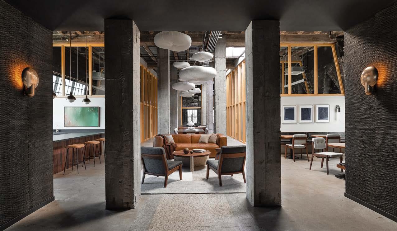 PROJECT TEAM DAVID HORNING; HOLLY FRERES; ELIZABETH MORGAN; CHANDLER REDDING
KEY CONSULTANTS HAMMER & HAND; QUARTERTWENTY; STONE FOREST; WATERMARK; HENRY WILSON; ALLIED MAKER; APPARATUS; JOCELYN RAHM; JULIA MANGOLD; ELIZABETH LEACH GALLERY PHOTOGRAPHY HARIS KENJAR jhldesign.com; @jhldesign
PROJECT TEAM DAVID HORNING; HOLLY FRERES; ELIZABETH MORGAN; CHANDLER REDDING
KEY CONSULTANTS HAMMER & HAND; QUARTERTWENTY; STONE FOREST; WATERMARK; HENRY WILSON; ALLIED MAKER; APPARATUS; JOCELYN RAHM; JULIA MANGOLD; ELIZABETH LEACH GALLERY PHOTOGRAPHY HARIS KENJAR jhldesign.com; @jhldesign
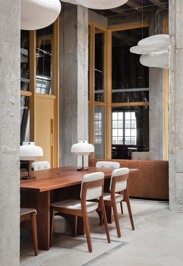
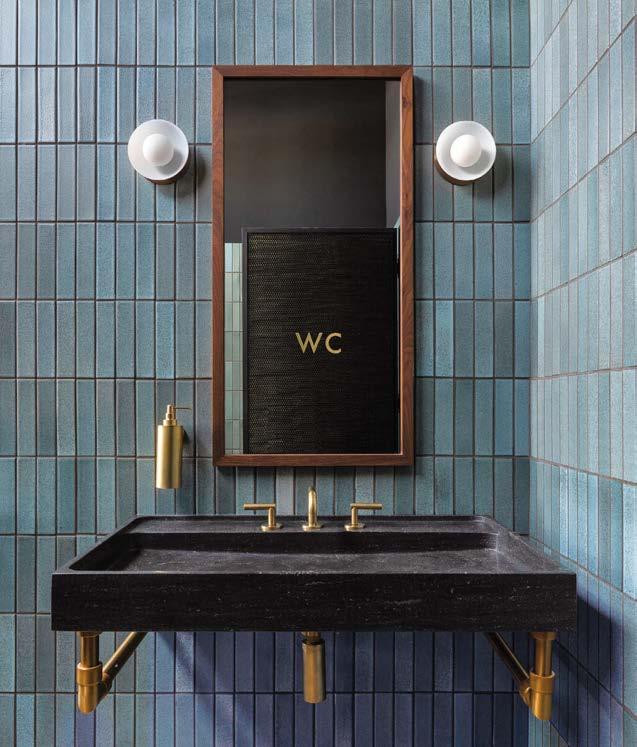
Woodruff Sawyer, one of the largest insurance brokerage and consulting firms in the U.S., started an internal conversation about how to create a headquarters that better supported its staffers’ needs. This culminated in COO Zac Overbay bringing in workplace design firm Brereton to get the ball rolling. In extensive discovery sessions, teams within the organization shared their concepts, which were then ranked by function, aesthetics, and “cool factor” before being voted on. “Working so intimately with the end users during the creative process was paramount to the success of the project,” Brereton associate principal Lance Williams notes. “This is one of our favorite kinds of projects: working with a company’s thoughtful leadership through a journey of self-discovery.”
From these sessions, the idea of “One Woodruff” emerged as a planned space without assigned seating and with increased amenity areas such as lounges, open teamwork areas, traditional conference rooms, huddle rooms, and breakout spaces. The emphasis was on places where people could meet, collaborate, and socialize. The centerpiece of the design is the stair, which connects the two levels while creating a multifloor conferencing and event space, ensuring that employees from different departments have a larger sense of community. Additionally, with its eyecatching perforated canopy, the structure is something that is not merely used but experienced—a cross between function, design, and art.
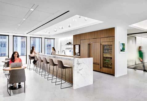
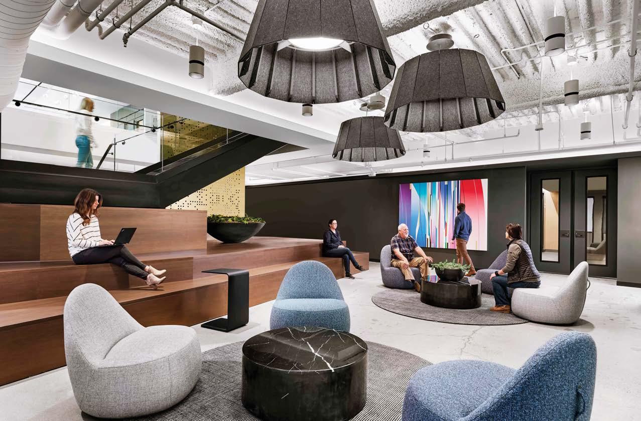
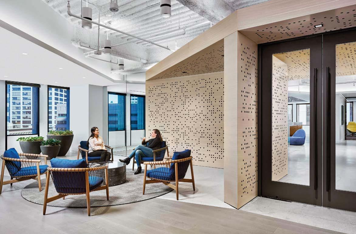
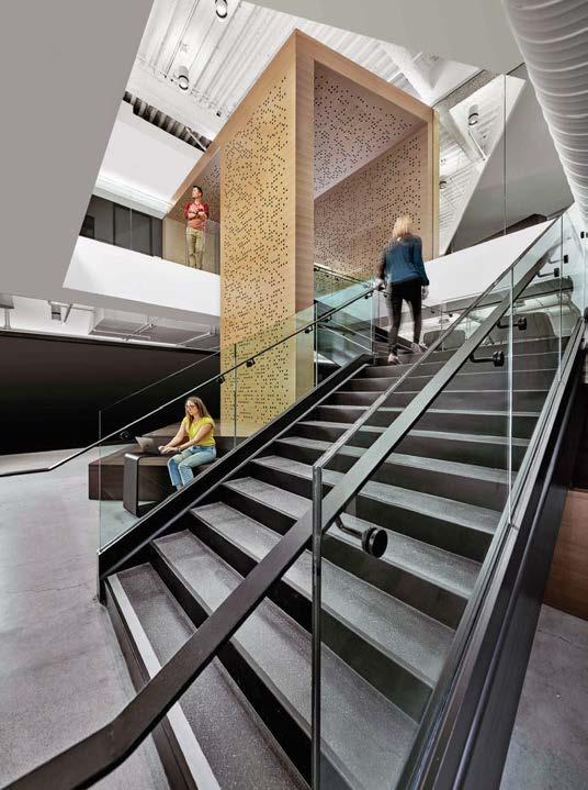
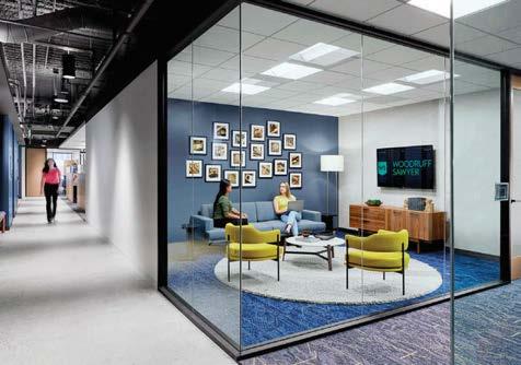 Clockwise from above: Neutral tones are the base for bold pops of color reflected in the company’s branding. The 40,000-square-foot office features breakout vignettes anchored by rugs and acoustic lighting. The kitchen/bar serves as informal meeting space as well as a place for entertaining and events. Exposed concrete, perforated wood, steel, and stone blend to create an environment that’s appropriate for a brokerage headquarters but does not feel stuffy or expected. The central stair links the two levels while functioning as a place of interconnectivity and community.
PROJECT TEAM LANCE WILLIAMS; TANYA AYERS; CHRISTOPHER HEPPEL; ASHLEY MILLER KEY CONSULTANTS AMIT WADHWA AND ASSOCIATES; SIMPSON, GUMPERTZ & HEGER; SIXTEEN5HUNDRED; HATHAWAY DINWIDDIE CONSTRUCTION COMPANY PHOTOGRAPHY CESAR RUBIO brereton.com; @breretonarchitects
Clockwise from above: Neutral tones are the base for bold pops of color reflected in the company’s branding. The 40,000-square-foot office features breakout vignettes anchored by rugs and acoustic lighting. The kitchen/bar serves as informal meeting space as well as a place for entertaining and events. Exposed concrete, perforated wood, steel, and stone blend to create an environment that’s appropriate for a brokerage headquarters but does not feel stuffy or expected. The central stair links the two levels while functioning as a place of interconnectivity and community.
PROJECT TEAM LANCE WILLIAMS; TANYA AYERS; CHRISTOPHER HEPPEL; ASHLEY MILLER KEY CONSULTANTS AMIT WADHWA AND ASSOCIATES; SIMPSON, GUMPERTZ & HEGER; SIXTEEN5HUNDRED; HATHAWAY DINWIDDIE CONSTRUCTION COMPANY PHOTOGRAPHY CESAR RUBIO brereton.com; @breretonarchitects
Collaborative, entrepreneurial, forestry focused. That’s RMS, aka Resource Management Service, to a tee. It makes perfect sense, then, that for the headquarters of the financial firm specializing in timberland investments, Williams Blackstock Architects would highlight the relationship between the property’s wooded lakefront setting and the office’s oak-clad interior.
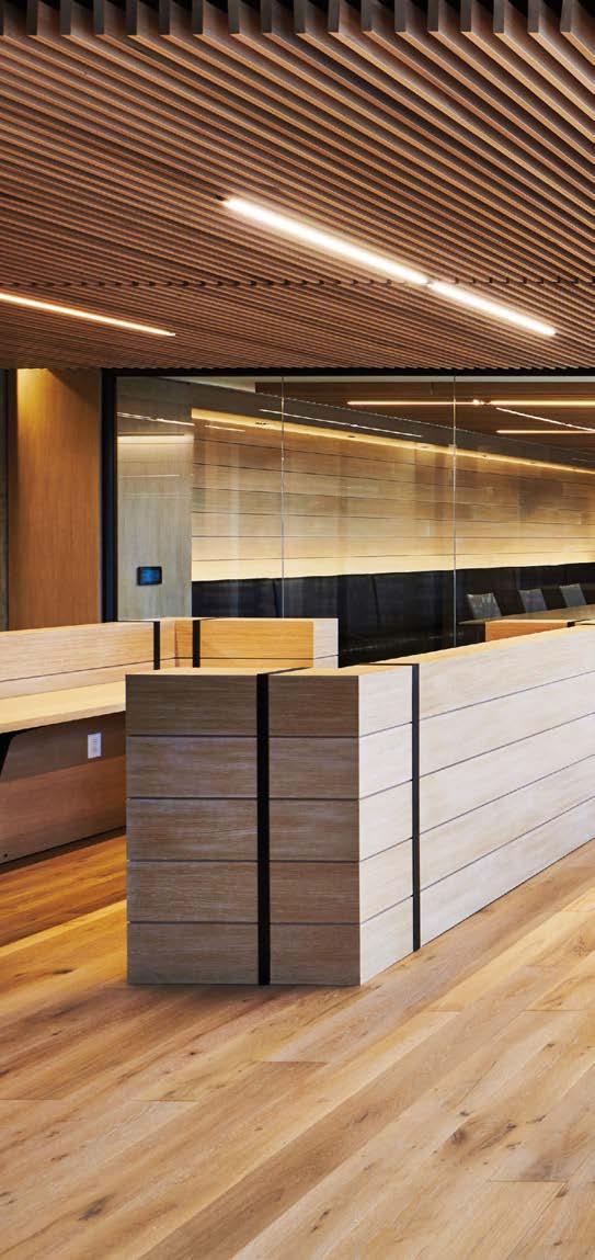
The interior architecture of the third-floor workplace optimizes daylight and transparency, with strong axial views through the building to the forest (on one side) and the lake (on the other). Even from the elevator core, visitors and employees experience a panoramic view of leafy trees, while private offices adjacent to the core have glass fronts to allow natural light and views from the perimeter to reach everyone. The reception “town center,” meanwhile, has formal and informal conference spaces, a café, and refined seating vignettes—all set along the stunning lakefront side of the building. This easy commune with nature is emphasized by the interior finishes: a softly lit wood-louver ceiling articulates the path from the front door to reception, and wide-plank oak walls and flooring contrast with the dark metal frames of interior glass partitions. It’s warm and woodsy, definitely, but without reading “cabin.” Tailored furnishings and sleek lighting add the final decorative touch.
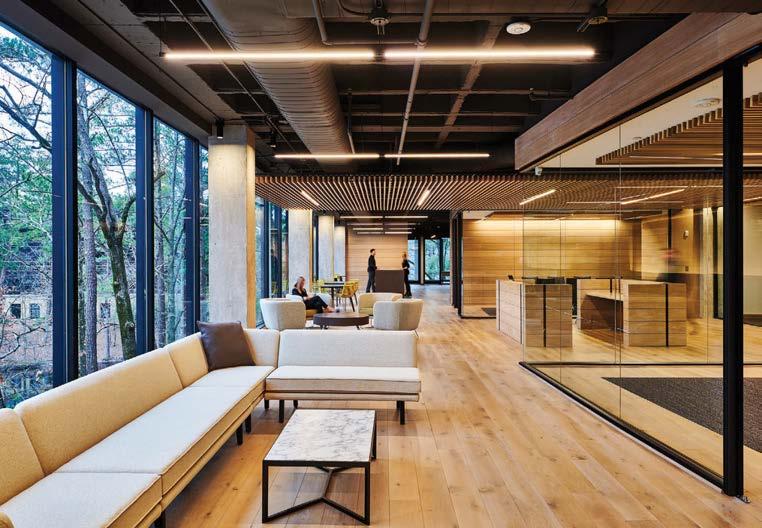 EDWARD BADHAM
@williamsblackstock
EDWARD BADHAM
@williamsblackstock
Clockwise from left: A financial investment firm specializing in timberland revamped its global headquarters, leveraging the surrounding dense woods as design inspiration. Offices feature glass fronts with sliding glass doors to enhance transparency and daylight. The AIA Award–winning design complements rather than competes with its outdoor setting. An informal oak-floored lounge fronts the lake, bringing visitors and employees together.
PROJECT TEAM JOHN BEASON; JOEL BLACKSTOCK; BILL SEGREST; MARY GENTLE KEY CONSULTANT ADAMS, GILMORE & LYNCH, INC.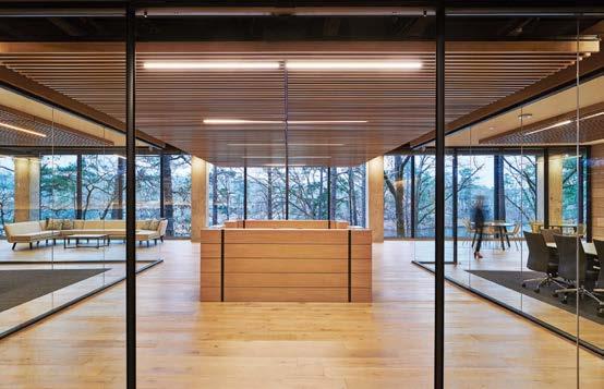
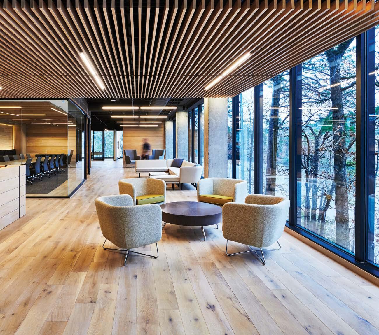
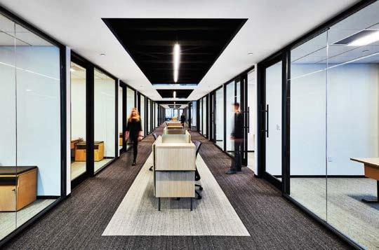
One of MKDA’s first post-COVID projects was the relocation of the New York office of Freshly, which delivers prepared meals. The fast-growing company was moving from a 20,000-square-foot workplace to one that’s over 90,000 square feet, and from traditional digs to an environment better suited to a hybrid work model.
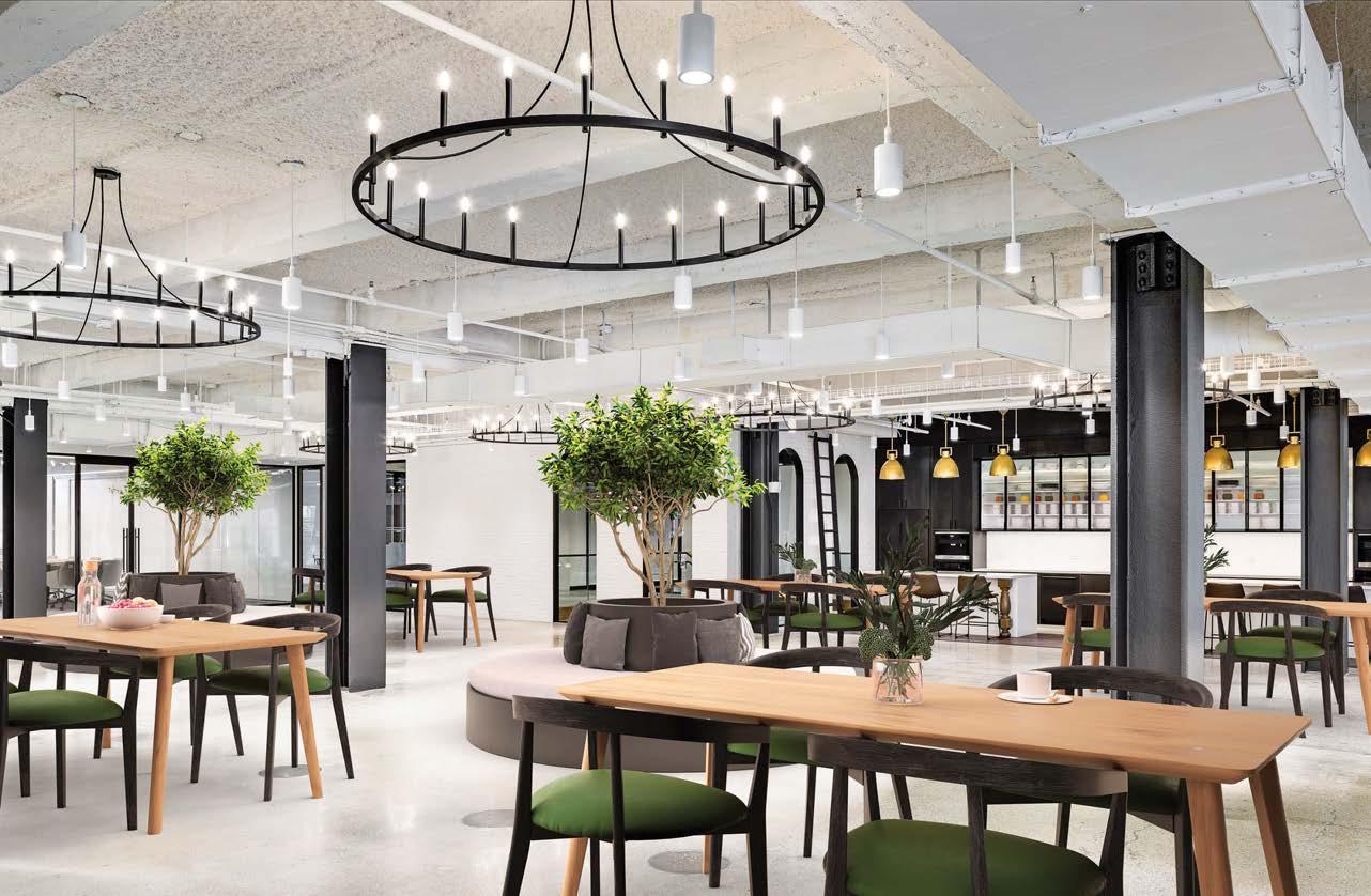
The reception area, with its expansive black ceiling, industrial pendant fixtures, and original arch windows, sets an elegant “resi-mercial” tone. These elements create a sense of grandeur and drama while the desk functions as a concierge service (note that nod to high-end hospitality), supporting both employees and guests.
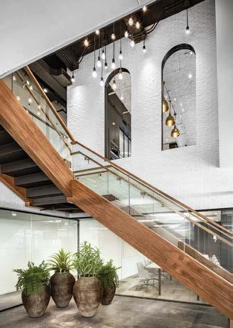
The large café fosters a strong sense of community. Here, mobile planters and reconfigurable furniture provide maximum flexibility to accommodate meetings, presentations, food tastings, and other social events. Putting wellness at the forefront, MKDA’s design delivers a healthy environment, with superlative air quality, biophilic elements, circadian lighting, and top-notch noise control. The open-plan work area includes myriad breakout spaces: microenvironments that support both collaboration and focused work.
One of the key highlights, the library at the perimeter, serves as a haven from the main heads-down work space. Sitting on carpet tiles resembling mown green grass, armchairs facing tall windows connect employees with nature and establish a serene backdrop for unwinding. A fireside lounge completes the ambience.
Clockwise from left: Private offices have branded wallpaper from Surface View featuring Freshly’s stock in trade: fruit and vegetables. The open-plan work area includes myriad breakout spaces to give employees different types of zones to work in throughout the day. The library, which looks straight out of a luxury hospitality project, serves as a relaxing respite from the main work space. At the top of the staircase leading from reception to the main office area, arch windows frame the upstairs café. Freshly’s interior design mixes industrial and residential notes.
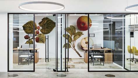
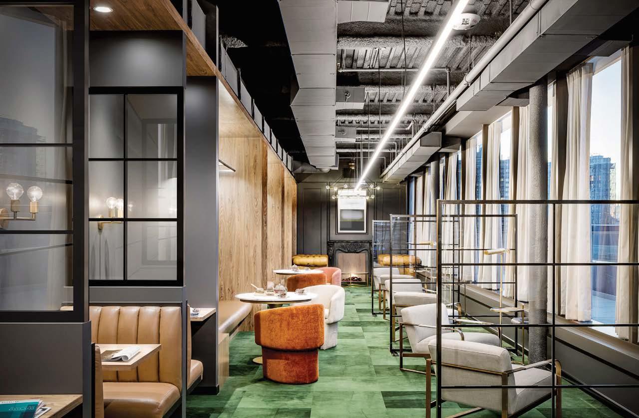
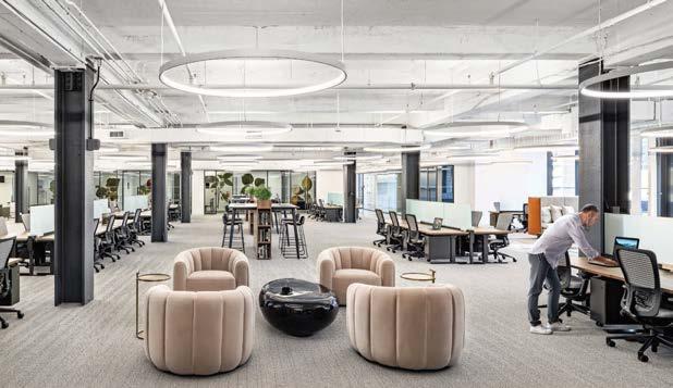 PROJECT TEAM EDIN RUDIC; LON SKIDDS; ADAM MILLER; ANTHONY TAVELLA; KATIE TRIMBLE; ANDREW MARSALA
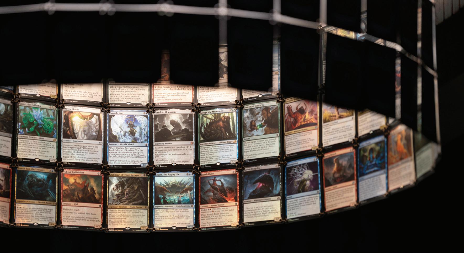
Pacific Northwest company Wizards of the Coast makes trading-card, roleplaying, and digital games (think fantasy, swords, and sorcery). Architecture and interior design firm JPC’s mission was to create an immersive environment for its longtime client that would function as a lab, broadcast studio, and gaming center for the company’s employees and guests. Referencing principles behind Wizards’ two most famous games—Dungeons & Dragons and Magic: The Gathering—as well as historic curiosity and oddity shops, the designers strove to provide a sense of journey, discovery, and wonderment. “We sought not to enter a specific fantasy world per se, but drew references from a multitude,” principal architect Mark Peterson explains. Details large and small unfold on floors, walls, and ceilings. Hidden Easter eggs (and a concealed trap door!) further set the mood and encourage guests to disengage from the distractions of the outside world. At the game room entry, for example, one will find a codex. To the casual eye, it appears to be scrambled letters, but when employees scan their cards on a concealed reader, hidden messages are revealed, and the game room door unlocks. Further in, audio clips play when visitors open drawers in the custom casework to marvel at prop figurines. But the belly of the beast is the custom live-edge wood game table with integrated 50-inch screen, where competitors can play IRL with cards or challenge opponents in a video game that can be cast to one of several monitor walls.
Clockwise from left: In the game room at Wizards of the Coast headquarters, custom light fixtures are formed from Magic: The Gathering cards. Outside the game room is a codex that appears to be scrambled letters but when employees scan their entry cards on the concealed reader, hidden words are illuminated, and the game-room door unlocks. Custom Black Dragon busts on walls were created by local SFX studio Volpin Props using oil-based clay and 3D printing. Custom prop figurines on display. The custom live-edge wood game table has an integrated 50-inch screen.
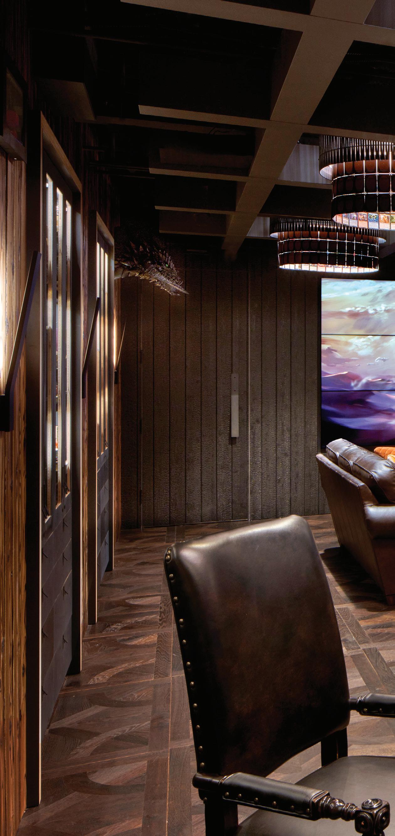 PROJECT TEAM MARK PETERSON; JENNIFER MUKAI; MEGHA VAIDYA; ERIC REITER KEY CONSULTANTS GRAYPANTS; VOLPIN PROPS; TEMPEST AV; MEYER WELLS; WWWELLS; MINIATURE MARKET; BOOKS BY THE FOOT PHOTOGRAPHY CHRIS EDEN/EDEN PHOTOGRAPHY jpcarchitects.com; @jpcarchitects

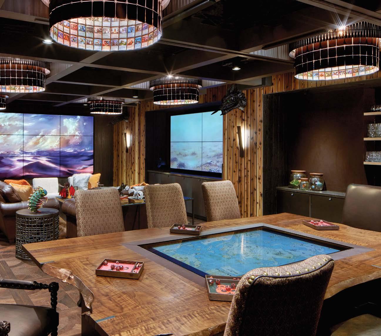
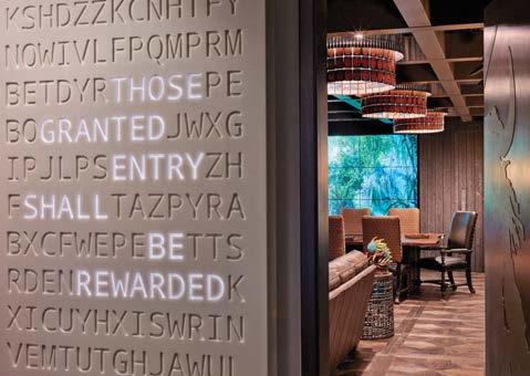

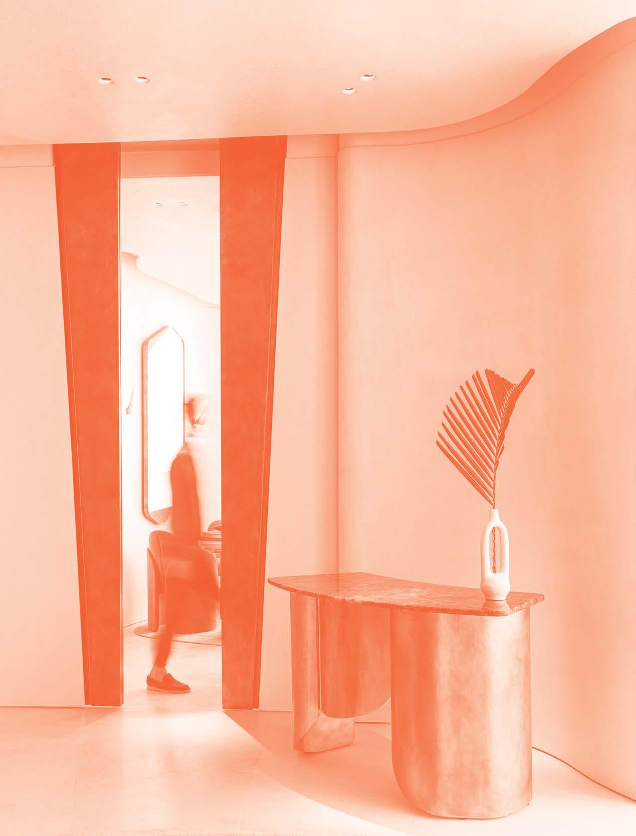
Looking for an escape from the mundane? From island resorts to starry city restaurants, hospitality venues are the places we go to flee the workaday world. No surprise, then, that some of the most imaginative design moves are found in the zeitgeist-setting hotels, spas, and eateries included here. What can we say: They’re always one step ahead of the quotidian crowd.
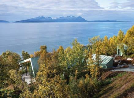
The Lyngen Alps in the Arctic north are famed for freeride skiing amongst glaciers and wild mountain peaks. They’re also home to whales, eagles, and virtually untouched wilderness. Aurora Lodge, part private retreat and part boutique hostelry, occupies a natural plateau on land that slopes down to Lyngen fjord. During winter, the northern lights frequently dance directly above the lodge, to be enjoyed through floor-to-ceiling glass windows (if you turn the lights off) or from the terrace.
The main lodge houses three guest rooms, a kitchen-dining hall, and a covered terrace, while another suite occupies an adjacent annex. A separate sauna hut nearby is slightly withdrawn to ensure privacy but faces the same undisrupted view shared by all the structures. High fir-clad ceilings and seamless glass walls invite the sky and landscape in, while the concrete floors and terraces become an extension of the natural terrain.
The A-frame design of the main building echoes that of a fundamental shelter, but tilted backward to maximize views. The outer cladding of all the structures is Nordic Green pre-patinated copper—the best choice for the salt air and also a close match to the natural colors of the landscape when it is not covered in snow. Every item was curated or custom designed by architect Snorre Stinessen, who originated the project with his acquisition of the site 10 years ago. We call that a worthy odyssey.
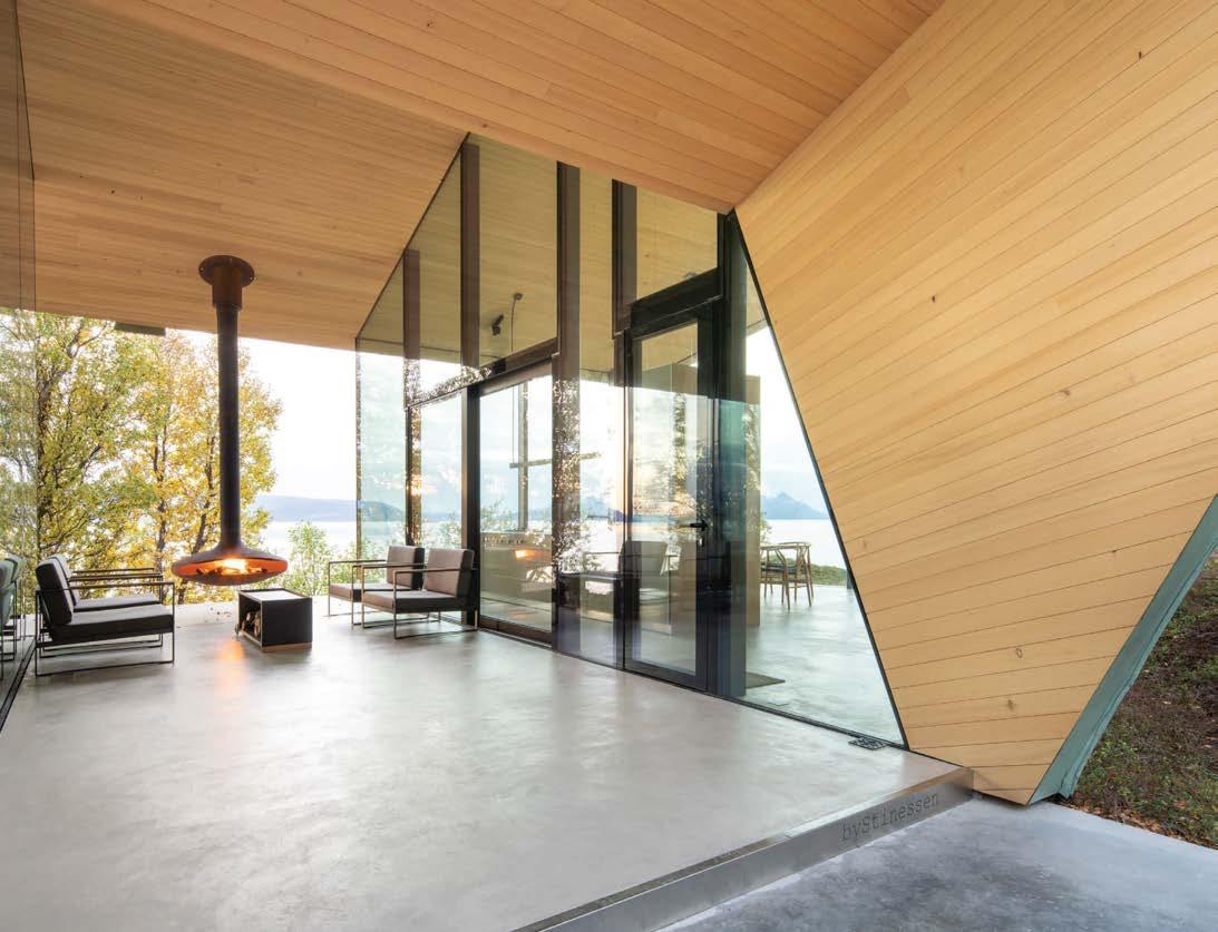
Clockwise from above: Seamlessly embedded in the structure, glass walls disappear into the concrete floor and wood ceiling. The sauna comprises a wood-slat floor that climbs up the slanting walls to create benches. Resistant to salt air, pre-patinated copper clads the exteriors. Guests enter the main lodge via a covered terrace with a suspended fireplace. The little compound ovelooks Lyngen fjord. Bathrooms feature Carrara marble stone tile by Giovanni Barbieri in showers.
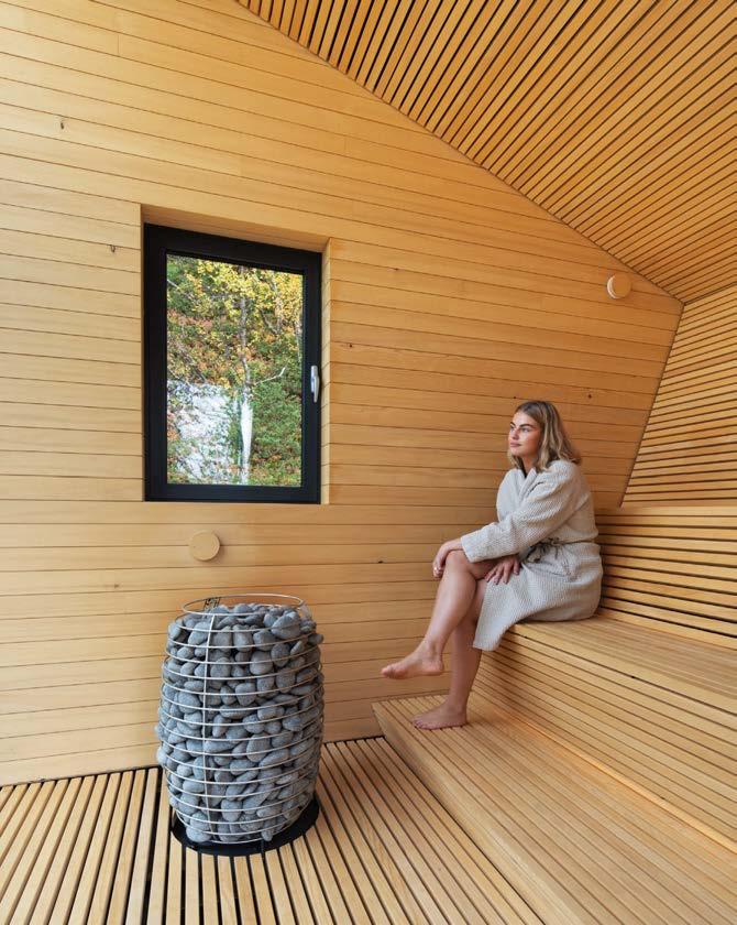
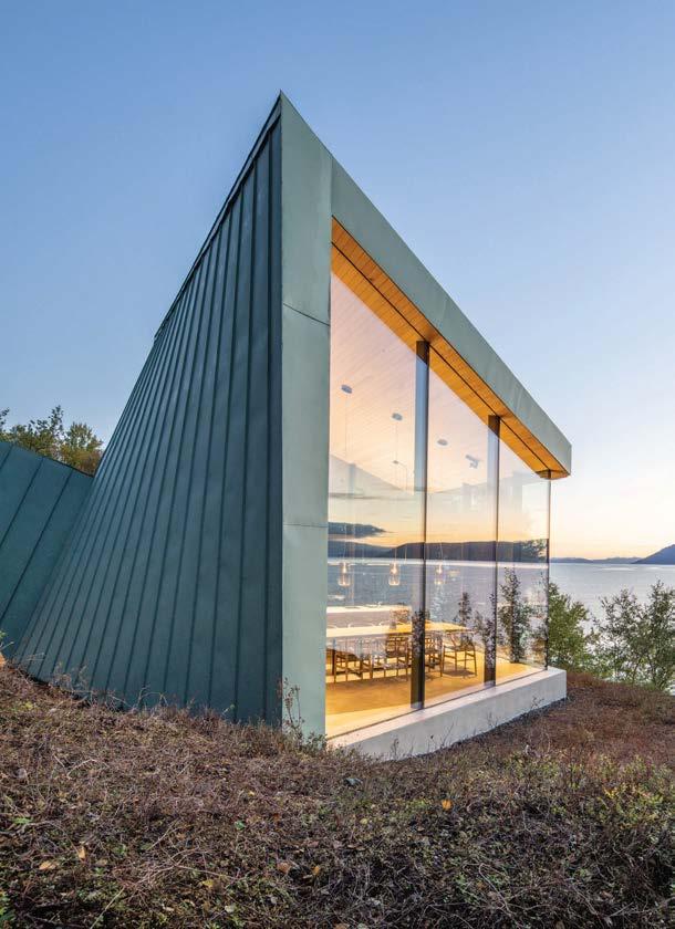
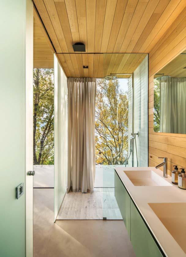
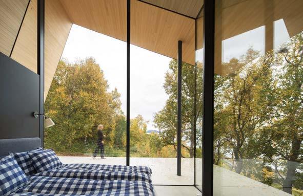 PROJECT TEAM SNORRE STINESSEN; EMANUELA BONARDI; CAMILLA AUSTAD KEY CONSULTANT POLARLIFEHAUS PHOTOGRAPHY MELISSA HEGGE snorrestinessen.com; @snorre_stinessen

“The main building’s classic A-frame shape is pitched backward to better take in the view of Lyngen fjord”
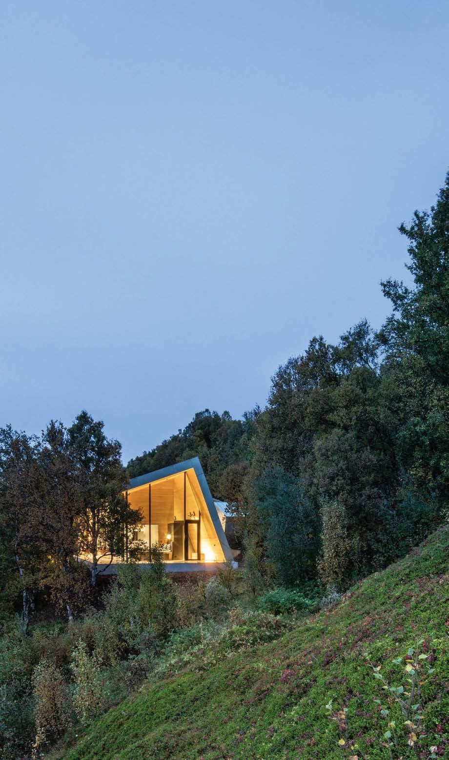 Wood paneling throughout the lodge interiors is ecologically sourced silver fir or oak.
Will Meyer and Gray Davis are experts when it comes to hospitality design. Their first property for 1 Hotels—a brand that seeks to make its name synonymous with eco-consciousness—is about what Meyer calls “the luxury of enough.” The 426-room hotel occupies the lower eight stories of a 1968 building sitting on 600 feet of pristine beachfront. Guests pull up beneath a porte cochere of reclaimed redwood. Just steps inside the lobby is a mural of a swimmer, rendered in live moss growing through slits in a white-painted wall. Beyond the mural stretches a continuum of intimate seating groups alternating with banyan tree trunks, also painted white. “There’s a relaxed peacefulness,” as Davis puts it.
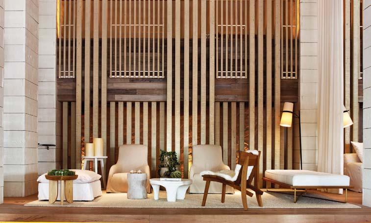
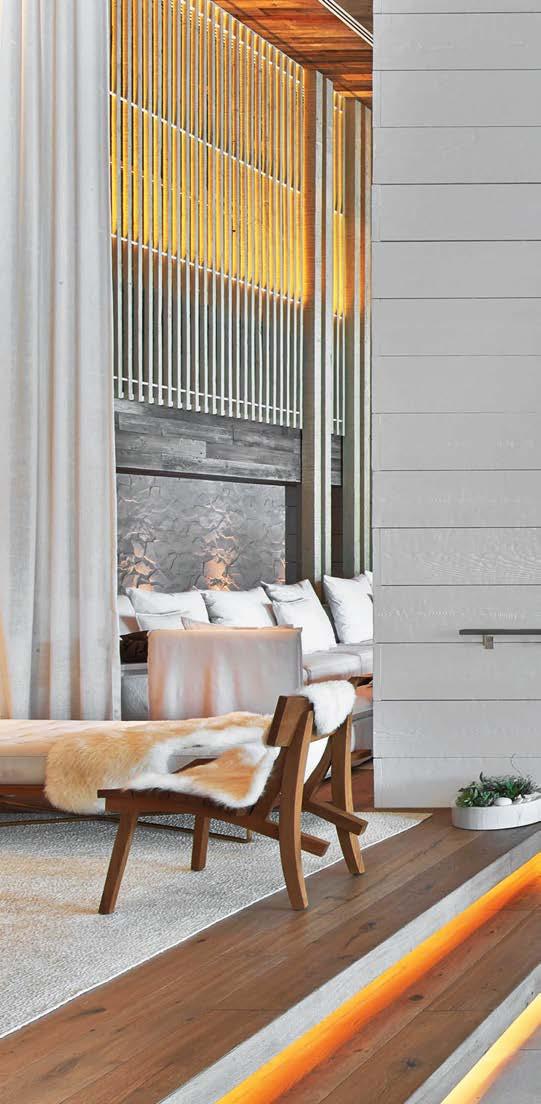
The neutral materials palette throughout is based on various types of natural fiber, wood, and stone. (You can practically feel the nubbly textures with your eyes.) Each design decision aims to use materials in the most honest way: Concrete looks and feels like concrete, wood looks and feels like wood, steel looks and feels like steel. Dialing down to details, the designers specified hemp mattresses, organic bed linens, chalkboards in lieu of bedside note pads, and clothes hangers molded from recycled paper. As good as Meyer and Davis are, they don’t try to call attention to themselves with me-me-me gestures. “You know ‘starchitect contemporary?’” Meyer asks. “This is the antithesis. It celebrates texture, beach tones, and nature.”
Clockwise from left: At 1 Hotel South Beach, Meyer Davis pays homage to the natural oceanside landscape of the Miami area versus the art deco razzle-dazzle typically associated with the city. Ipe wood from the property’s original boardwalk covers the redesigned pool deck. Whenever possible, materials are regional and repurposed like the reclaimed beetle-killed pine used for guest-room headboards. Banyan tree trunks, painted white, tower between lobby seating groups, which can also be separated by gauzy white curtains.
PROJECT TEAM WILL MEYER; GRAY DAVIS; MEI LAU; KRISTEN COCHRAN; MIKE CASEY; LAUREN WILLIAMS; GRACE ESCANO KEY CONSULTANTS PLANT THE FUTURE; EDSA PHOTOGRAPHY ERIC LAIGNEL meyerdavis.com; @meyerdavis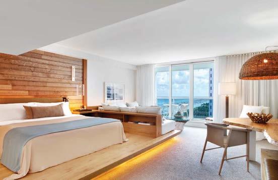
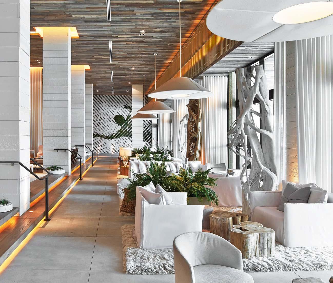
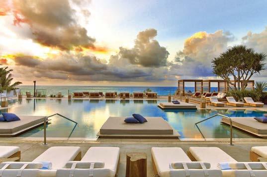
Le Diamant, a glittering new steel-and-glass theater complex, wraps around and incorporates an iconic 19th-century building. Nestled between the ornate facade and the sleekly modern theater lobby is Bo¯, a 4,850-square-foot street-level restaurant serving contemporary Asian cuisine. Designed by Agence Spatiale, the elegant establishment’s strategic position makes it a destination in its own right and the obvious spot for a pre- or post-performance meal.
The main space centers on an oval bar where up to 20 people can watch drinks being mixed or plates being assembled (there’s an elevator to the basement kitchen). Encircling the bar, dining vignettes include window booths, curved banquettes, intimate tables for two, and larger ones for groups. The design of Bo¯, which means wave in Mandarin, evokes a fluid world built around water and mist, suggestive of steam escaping the kitchen. “It seeks to express a bewitching universe,” explains project manager Étienne Bernier, who achieved the desired atmosphere with rounded forms, undulating walls, romantic arches, and a magical ceiling installation of white fabric veils that come to life under the play of shadows created by projectors. Dark wood floors, navy-blue textiles, and other deep hues help create a hushed and elegant ambience.
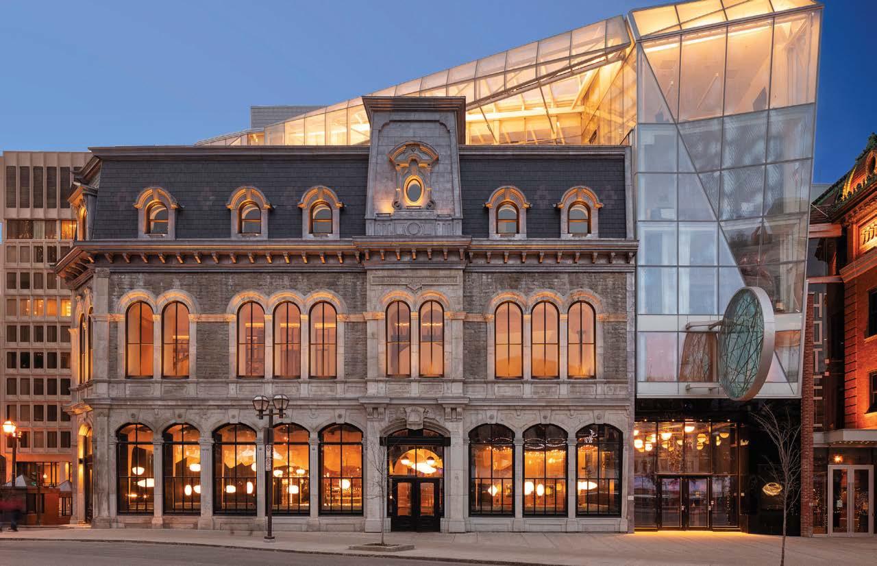 BO, QUÉBEC CITY, CANADA
PROJECT TEAM ÉTIENNE BERNIER; MARIANNE CHARBONNEAU; THOMAS OLIVAIN; JOHANIE BOIVIN; EULALIE LECOQ KEY CONSULTANTS HATEM+D; ATELIER DU CHEF; TUNGSTEN; FNX INNOV PHOTOGRAPHY JESSY BERNIER agencespatiale.ca; @agence_spatiale
BO, QUÉBEC CITY, CANADA
PROJECT TEAM ÉTIENNE BERNIER; MARIANNE CHARBONNEAU; THOMAS OLIVAIN; JOHANIE BOIVIN; EULALIE LECOQ KEY CONSULTANTS HATEM+D; ATELIER DU CHEF; TUNGSTEN; FNX INNOV PHOTOGRAPHY JESSY BERNIER agencespatiale.ca; @agence_spatiale
Clockwise from left: A new theater complex designed by Coarchitecture, Atelier In Situ, and Jacques Plante Architecte incorporates the heritage building housing Boˉ, an Asian restaurant with interiors by Agence Spatiale. Behind the Second-Empire facade, booth and banquette seating lines the wall of street-front windows. A glass wall separates the restaurant from the theater lobby. A custom brass chandelier encircles the bar. Navy-blue textiles and dark-hued materials contrast with the rice-paper pendants and vaporlike canopy of white fabric veils that float overhead. An oval bar dominates the center of the restaurant.
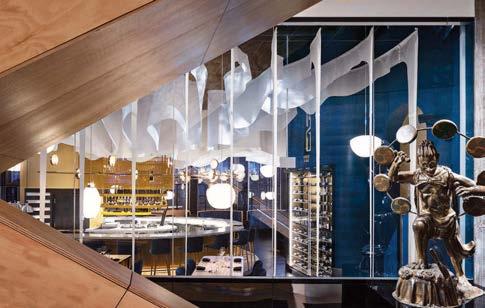
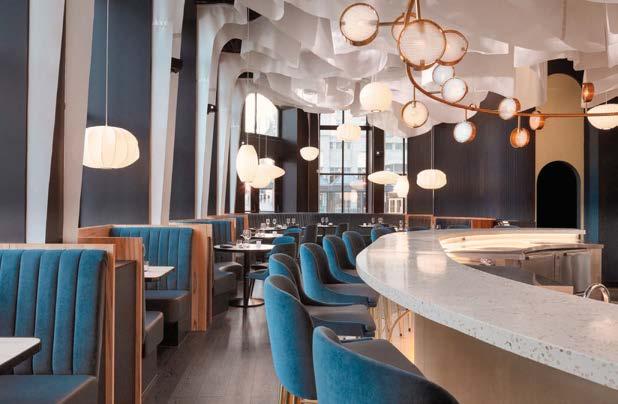
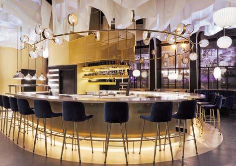
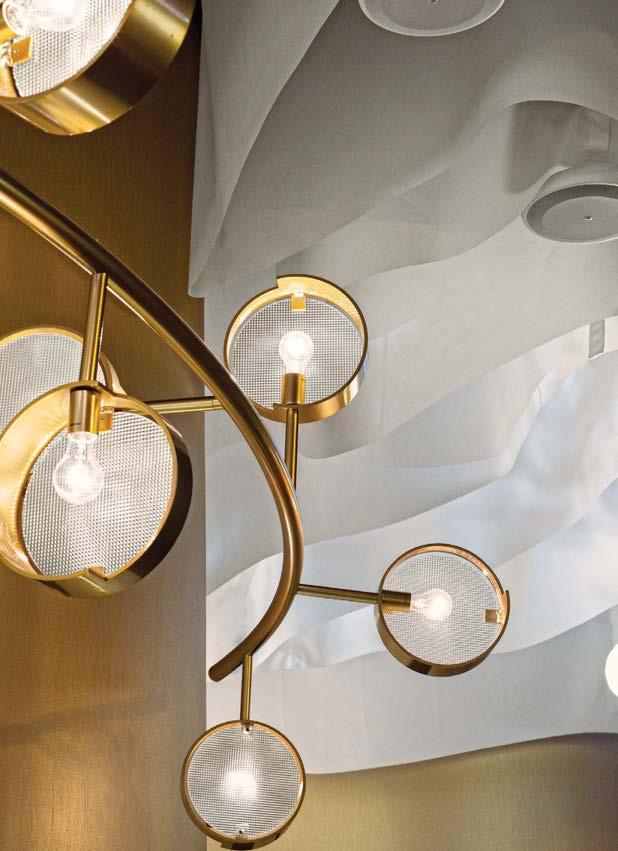
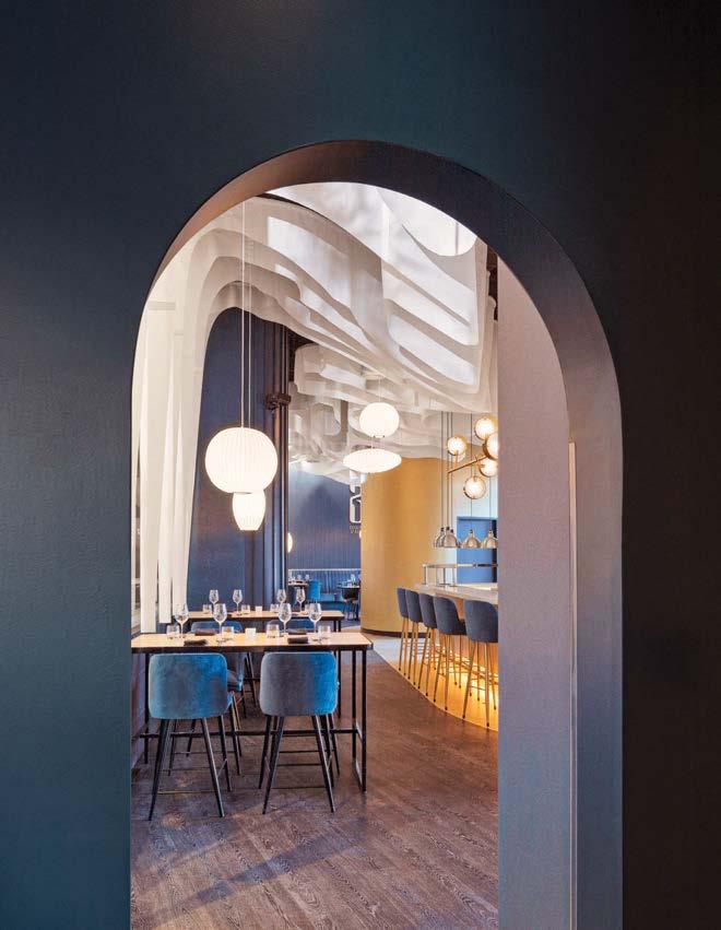 HOSPITALITY
PROJECT TEAM NELSON CHOW; JOHN LIU; RAIN HO; EDDIE WONG; RAFAEL PARDO; JONATHAN NG; XAVIER CHOW; LINUS KUNG; IRENE NOH
CONSULTANT HONG KONG AVANT GARDE CONSTRUCTION MATERIAL CO.
HDP PHOTOGRAPHY ncda.biz; @ncdesignandarchitecture
Commissioned to design amenities in a luxury mall in one of Hong Kong’s busiest shopping districts, NC Design & Architecture took inspiration from the forms and proportions of traditional Japanese Zen gardens. The project covers two areas. The first, a public space dubbed the sculpture garden, is a curving ivory landscape that meanders around a florist’s kiosk, concierge desk, and exhibition area for seasonal floral displays. The second is a cocooning VIP lounge accessed by a sleek 10-foothigh sliding door made from oxidized brass. Sensual and serene, it’s the ideal place to revive from a morning’s shopping.
The two areas are gracefully united through a composition of rounded shapes and voluptuous silhouettes. Varying heights of curved walls offer different degrees of privacy, creating openness in the sculpture garden and intimacy in the lounge. Lines are cut into the plaster ceiling in patterns that suggest raked gravel in a sand garden, while organically shaped sconces and marble tables were fashioned to mimic monolithic rocks. In the VIP lounge, velveteen-and-leather-upholstered serpentine seating dips down to reveal a miniature moss garden. “I see the arrangement of furnishings as akin to making a Zen garden,” states lead designer Nelson Chow. “Yet the design avoids any obvious or simplistic rendering of Japanese gardens. Instead, it’s a sensory homage.”
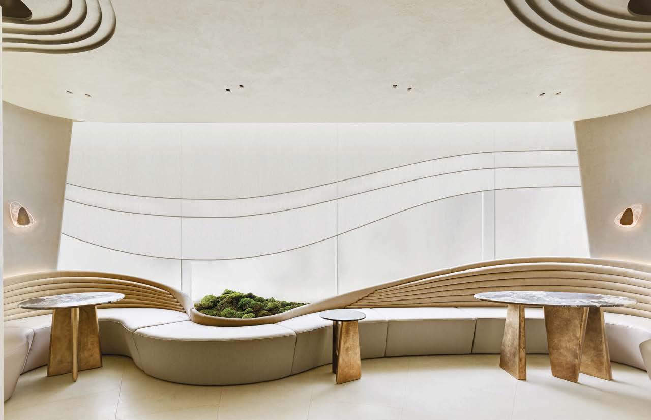
Clockwise from left: Voluptuous silhouettes and a miniature moss garden define the private VIP lounge. “Curved sofas are not only comfortable but also foster an intimate ambience that invites interaction,” says NC Design & Architecture’s Nelson Chow. For tables, Quatre Saisons Printemps marble from the French Pyrenees was chosen for its evocation of scattered blossoms. A custom brass sliding door with marble handle opens onto the VIP lounge. All furnishings, such as this brass-base console, are custom. Nestled into the sinuous, moss-strewn landscape of the sculpture garden is a florist’s kiosk.

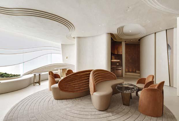
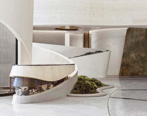
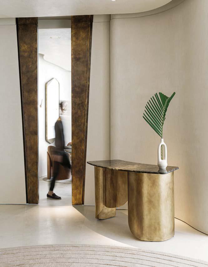
YOD Group, an internationally awarded commercial architectural design studio based in Kyiv, Ukraine, was founded by Volodymyr Nepiyvoda and Dmytro Bonesko in 2004. The firm’s latest project is the chichi BuddhaBar New York, a two-story restaurant in the TriBeCa neighborhood of Manhattan. “It was an honor to create a design for an iconic brand like Buddha-Bar, which first opened in Paris in the ’90s,” says Nepiyvoda. “We aimed to find new ways to express its fusion aesthetics.”
The concept of reincarnation is conveyed in the rebirth of materials, space, and branding. A 15-foot-high glass statue of Buddha dominates the entry. “We stepped away from the idea of a deity made of gold,” adds Bonesko. “Our Buddha is a parametric sculpture made from 1,000 pieces of frosted glass.” 3D digital art projected on the statue creates the illusion of a light hologram. “The statue weighs 15 tons, but you could think it is an empty vessel inside of which life and light is dawning.” The building’s cast-iron columns were preserved while screens made from steel bars are a contemporary nod to the city’s 20th-century industrial boom. Metal pendant fixtures in the main dining room by Kateryna Sokolova, a Ukrainian industrial designer, “have an Eastern sensibility but at the same time resemble futuristic drones silently hanging in the air,” notes Nepiyvoda. Furnishings are similarly darkly atmospheric, with timber ranging from 800 to 4,000 years old “reincarnated” for tabletops.
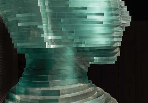
Clockwise from left: YOD aimed to express the Buddha-Bar brand DNA authentically in the context of New York. Gravity pendant fixtures by Kateryna Sokolova for Forestier are influenced by traditional Asian arts, from weaving to bamboo constructions. Low, warm lighting and dark colors foster a sense of intimacy in the main dining room. A million-dollar parametric statue of Buddha made of frosted glass surveys the entry.
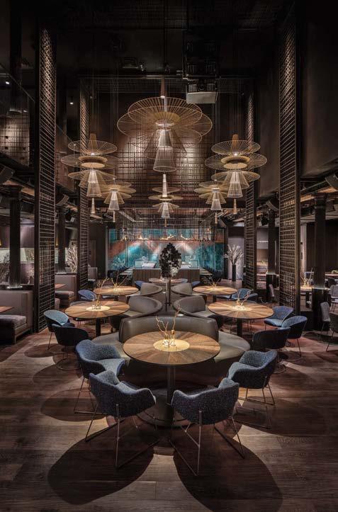
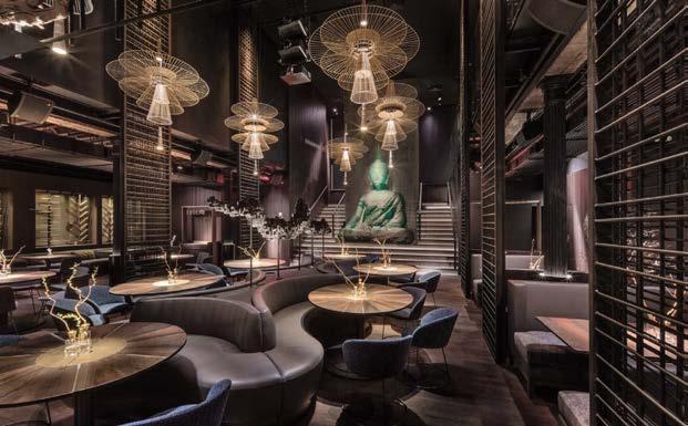 PROJECT TEAM VOLODYMYR NEPIYVODA; DMYTRO BONESKO; YAROSLAV PAVLYVSKIY; ROMAN KUPRIYAN; GLYB MELNYK; MAXIM NETREBA; SERHIY ANDRIYENKO KEY CONSULTANTS EXPOLIGHT; VILLADECOR; PRAVDA DESIGN PHOTOGRAPHY ANDRIY BEZUGLOV yod.group; @yod.group
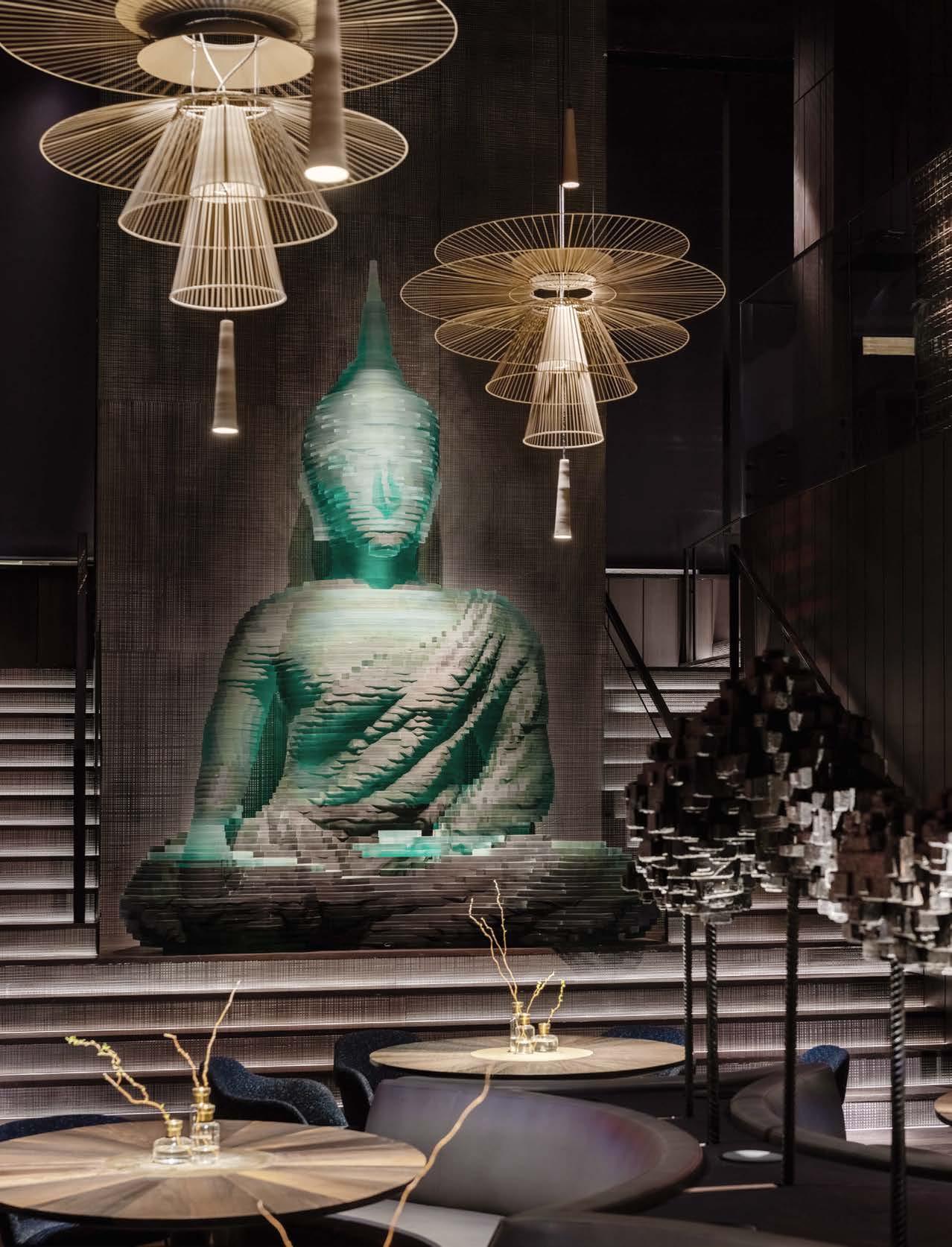

In 1928, pilot Clara Livingston built a hacienda on her father’s property in lush, beachy Dorado, replacing a ruined wooden plantation house destroyed by a 1903 hurricane. Nearly a century later, disaster would strike again: Hurricane Maria ravaged the region in 2017, wrecking the house, which was now the signature villa at the Dorado Beach Ritz-Carlton Reserve. New York studio Champalimaud Design, founded by Interior Design Hall of Fame member Alexandra Champalimaud, oversaw the renovation.
The main structural change to the five-bedroom Mission Revival property was turning a narrow terrace along the front of the house into a lightfilled hallway. Other key design moves such as the new black-and-white checkered stone floor, warm neutral walls, and light wood accents foster a bright and breezy vibe. Nothing is too precious, but everything has style. Some of Livingston’s antiques are still dotted about. The principal challenge was to install on a tight timeline after a natural disaster, when resources, shipping, and labor were all difficult to maneuver. The designers worked with local artists and craftspeople to embrace the heritage of Dorado Beach, circumventing supply chain issues while giving back to a community in need. “Su Casa embodies the idea that a home away from home is a haven,” design principal Elisabeth Rogoff summarizes. “Beauty is synonymous with a memorable experience.”
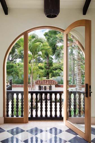
SU CASA AT DORADO BEACH, A RITZ-CARLTON RESERVE, PUERTO RICO
champalimaud.design; @champalimauddesign
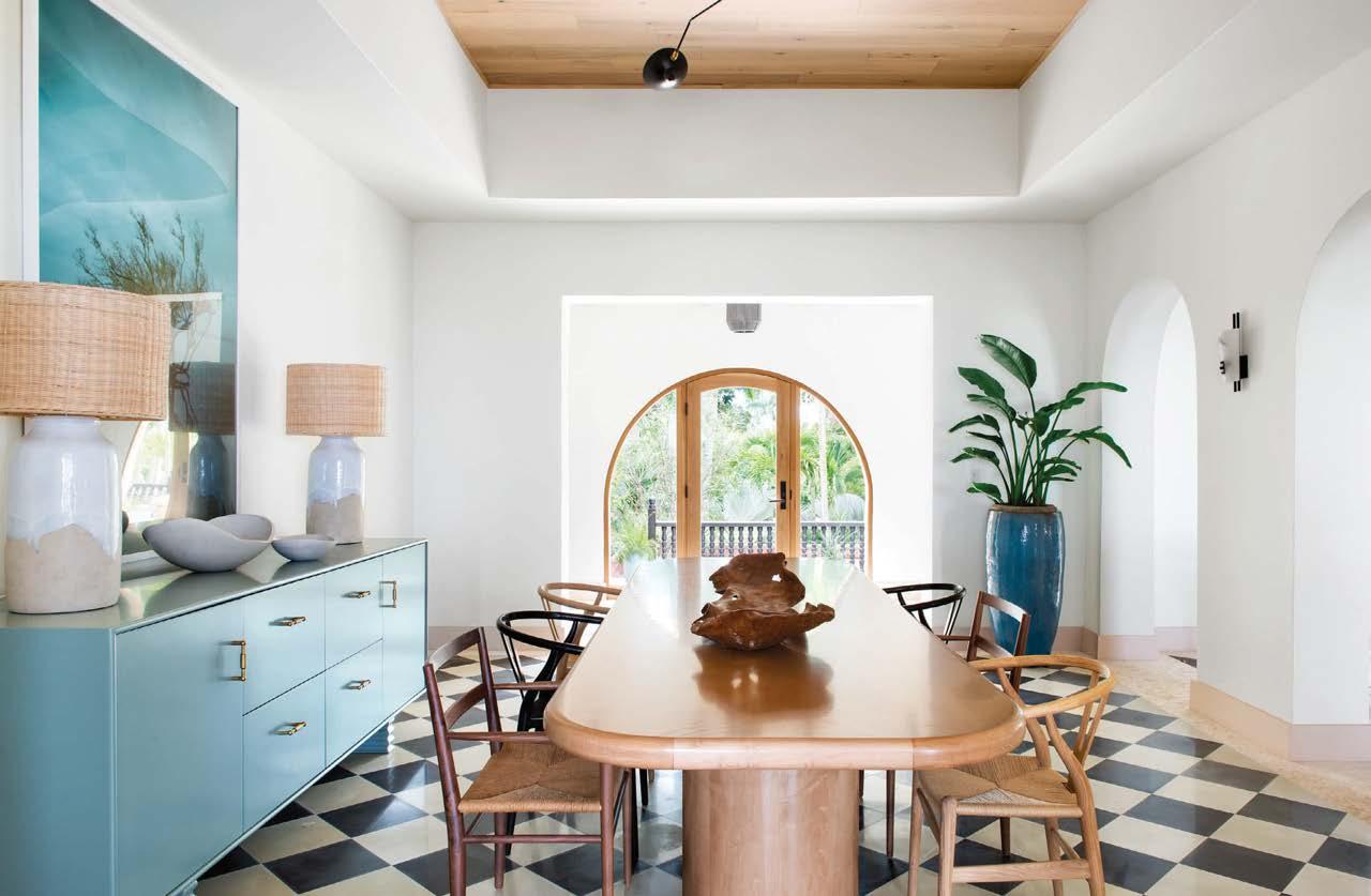
Clockwise from above: Su Casa, the Ritz-Carlton resort’s five-bedroom signature villa, features a grand infinity swimming pool that extends toward the Atlantic Ocean. The luxurious retreat by Champalimaud Design has a residential feel. A new black-and-white stone floor sets off the neutral, organic palette. The original Mission Revival–style residence was built in 1928 by pilot Clara Livingston to replace a plantation house ruined in a 1903 hurricane. A casual yet sophisticated beach cottage was the aesthetic goal.
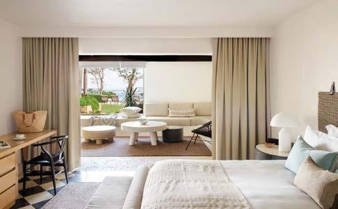
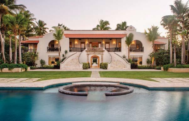 SUSHISAMBA DUBAI ICRAVE
In 2018, ICRAVE was commissioned to design the interiors of a SushiSamba on level 51 of a new tower on Dubai’s Palm Jumeirah, one of a trio of manmade islands on the coast. It was clear from the outset that the incredible view—seen through floor-to-ceiling windows that arch away from guests, giving a bird’s-eye view to the cityscape—would play a central role. The quality of the view, however, was diminished by unwanted reflections off the canted glass curtainwall. That became the central driver of the project: It was critical to celebrate the view and not distract from it. Lead designer Lionel Ohayon and his team expertly sculpted a black rounded ceiling to shade unwanted glare off the windows and shield the outlook from reflection. “We simplified the palette and used black in a very convincing way to ensure that our design would support the view and not obscure it,” he explains. “Our lighting team did an incredible job pulling this off.”
Set against the dark ceiling, a striking LED-lit woven bamboo canopy acts as a mesmeric glowing web for diners to get lost in. It is the centerpiece of expression in the main dining space, embodying the brand’s duality of Japanese minimalism and Latin flamboyance. That one-two punch of softness and strength is carried throughout the details in every room, from tropical up-lit greenery to swanky burnt-orange dining banquettes.
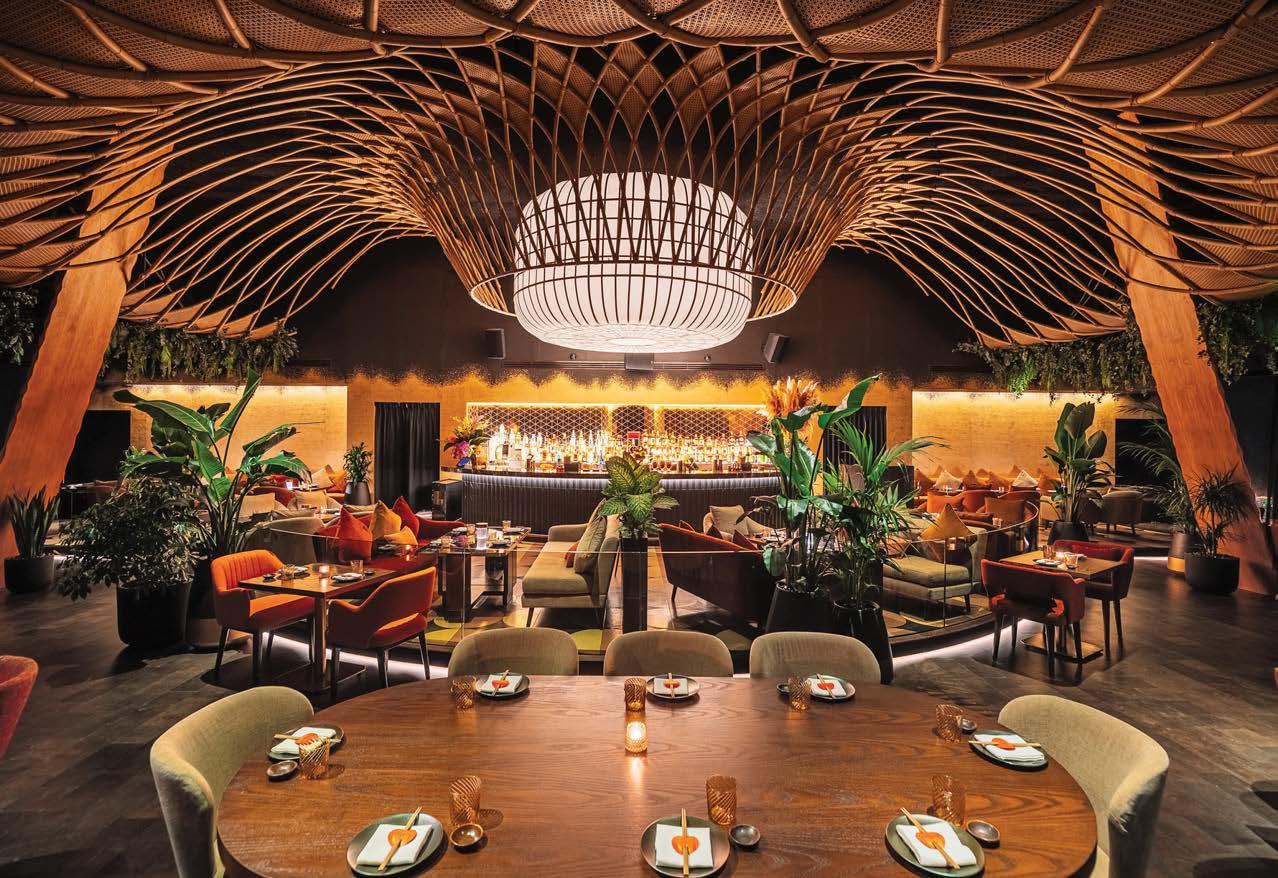
Clockwise from above: The design team expertly sculpted the black, rounded ceiling to shield the outlook from reflection. The restaurant is a synthesis of Japanese Zen sensibility and tropical Brazilian boldness. Up-lighting is used to emphasize the lushness of greenery, turning the plants into light features themselves. The floor-to-ceiling windows of the building slant away from guests, giving a bird’seye view to the cityscape and Palm Islands below.
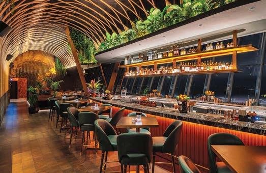
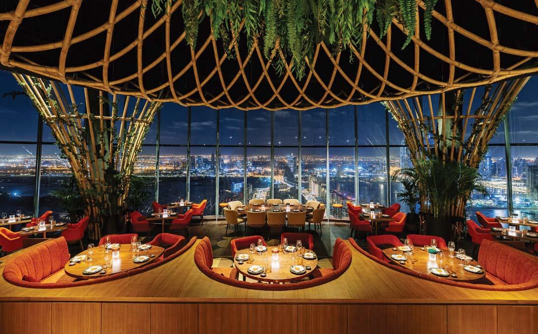
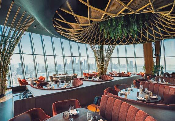 PROJECT TEAM LIONEL OHAYON; GREG MERKEL; RENEE JOOSTEN; SHUANG ZHAO; TARUAN MABRY; RUDI PHAM; NICOLE MONTENEGRO; ROSA CAPO PHOTOGRAPHY COURTESY OF SUSHISAMBA DUBAI icrave.com; @icraveny
In the native Taino language of the Caribbean, Guanahani means Welcome. The lobby of Le Guanahani has been designed to offer the warmest of welcomes. Miami-based designer Luis Pons crafted an immersive experience that connects with the imagination of the hotel’s guests, drawing them into the story of adventure that defines the region.
The Caribbean style and its Creole influences are at the core of Le Guanahani. The cottages around the property feel like a village comprised of many communities, with an authentic tropical design language rooted in the French Caribbean style of St Barths. The three signature colors of Le Guanahani—yellow, blue, and lavender—were chosen from the hotels’ previous color palette. They represent values that are connected to three archetypal personas. Yellow is “the dynamic,” blue is “the sophisticate,” and lavender is “the mystic.”
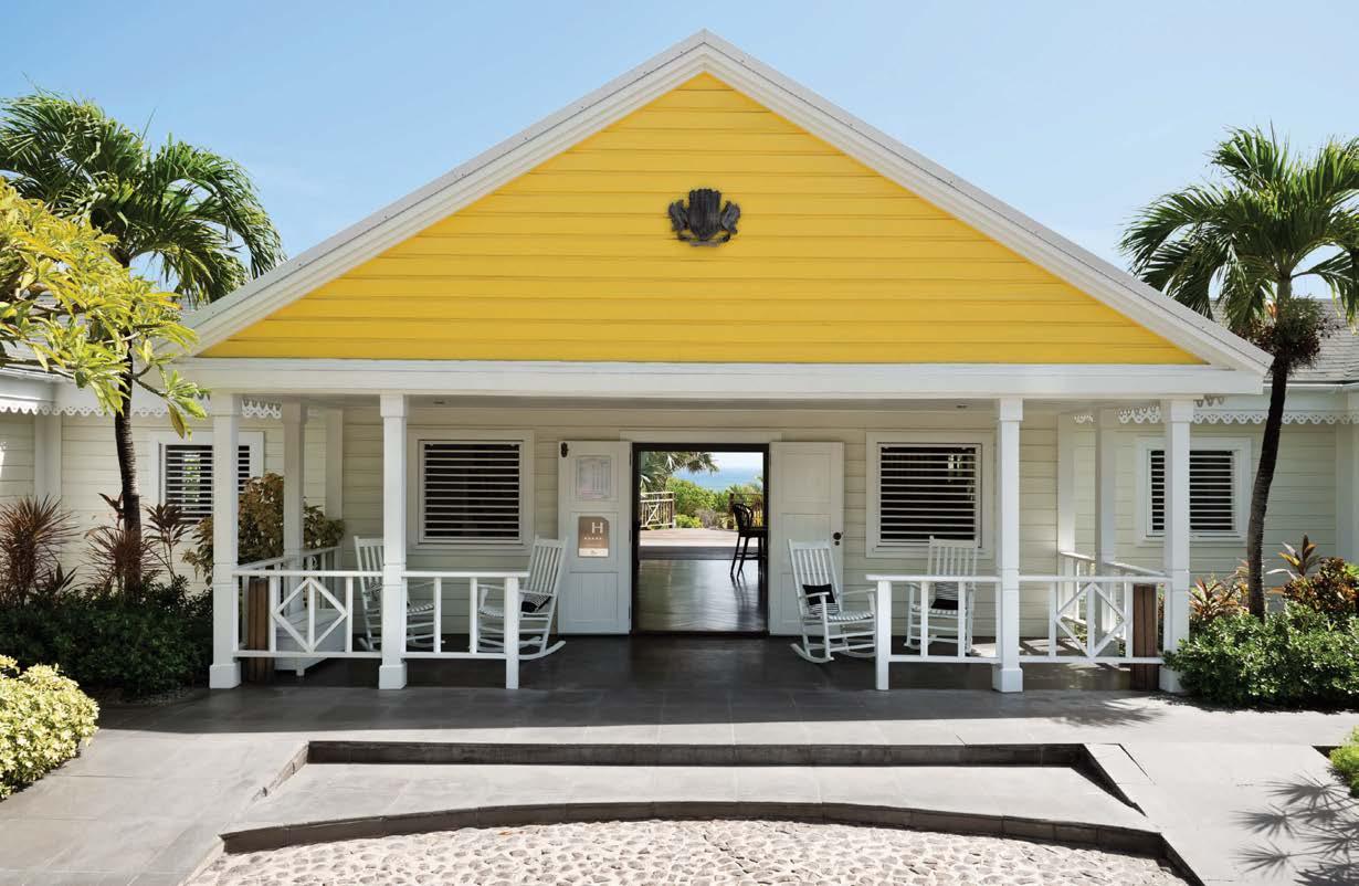
The iconic Panama hat, an artisanal product of Ecuador, became the inspirational object for the Le Guanahani brand, representing craftsmanship and beauty. Associated with the outdoors, it provides shelter to one person as a roof provides shelter to many. In guest rooms, cabinets and drawers crafted from wood are overlaid with an elegant Panama hat weave. In neo-Colonial style, each piece recreates the image of a vintage traveling trunk.
Clockwise from above: A canopy bed by Luis Pons Design Lab defines a guest bedroom. White shutters and dark wood furniture foster a tropical vibe. An aerial view of the resort complex. Colonial-style furniture bedecks the lobby. A view through the lobby from the arrival plaza. The mini bar, part of the St. Barths Collection by Luis Pons created for Le Guanahani, features appliquéd panels of woven straw inspired by Panama hats.

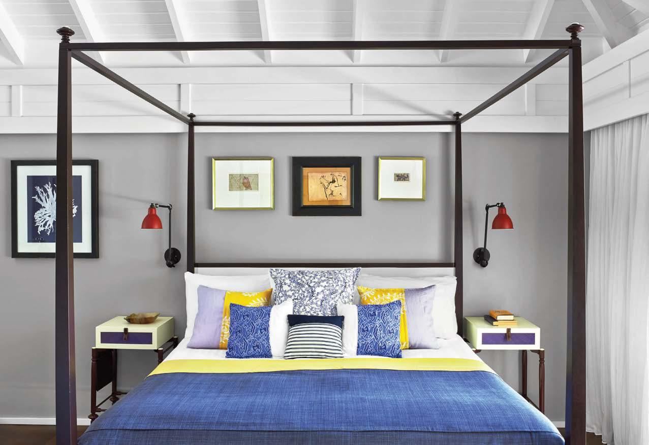 PROJECT TEAM MICHAEL MCCANN; SERGE LINNIK; MARK BROWNSCOMBE; ROSE SORKETH
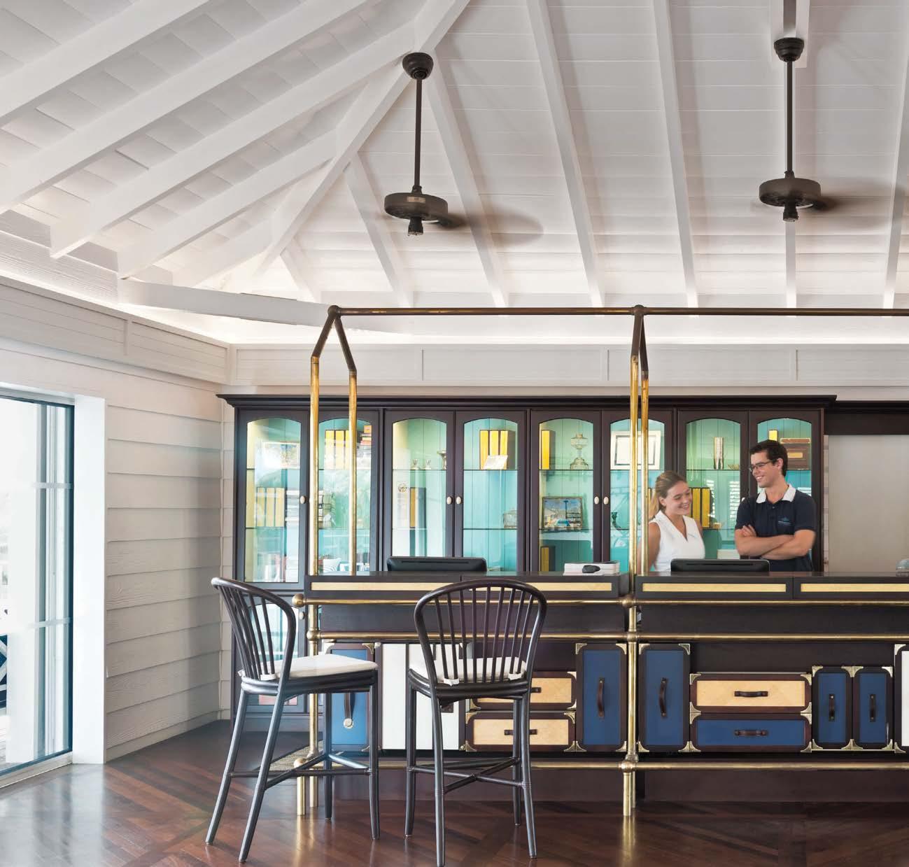
“Le Guanahani allowed us to create an authentic tropical design language rooted in the French Caribbean style of St. Barths”
Clockwise from top left: Walls feature the traditional wood siding typical of the island’s cottages. The Caribbean style and its Creole influences plus the colors yellow, blue, and lavender are at the core of the entire renovation. A sybaritic guest bathroom. The lobby reception incorporates a custom desk by Luis Pons inspired by the trunks used by explorers on their travels through the colonies.
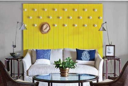
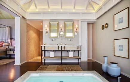
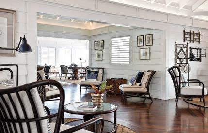
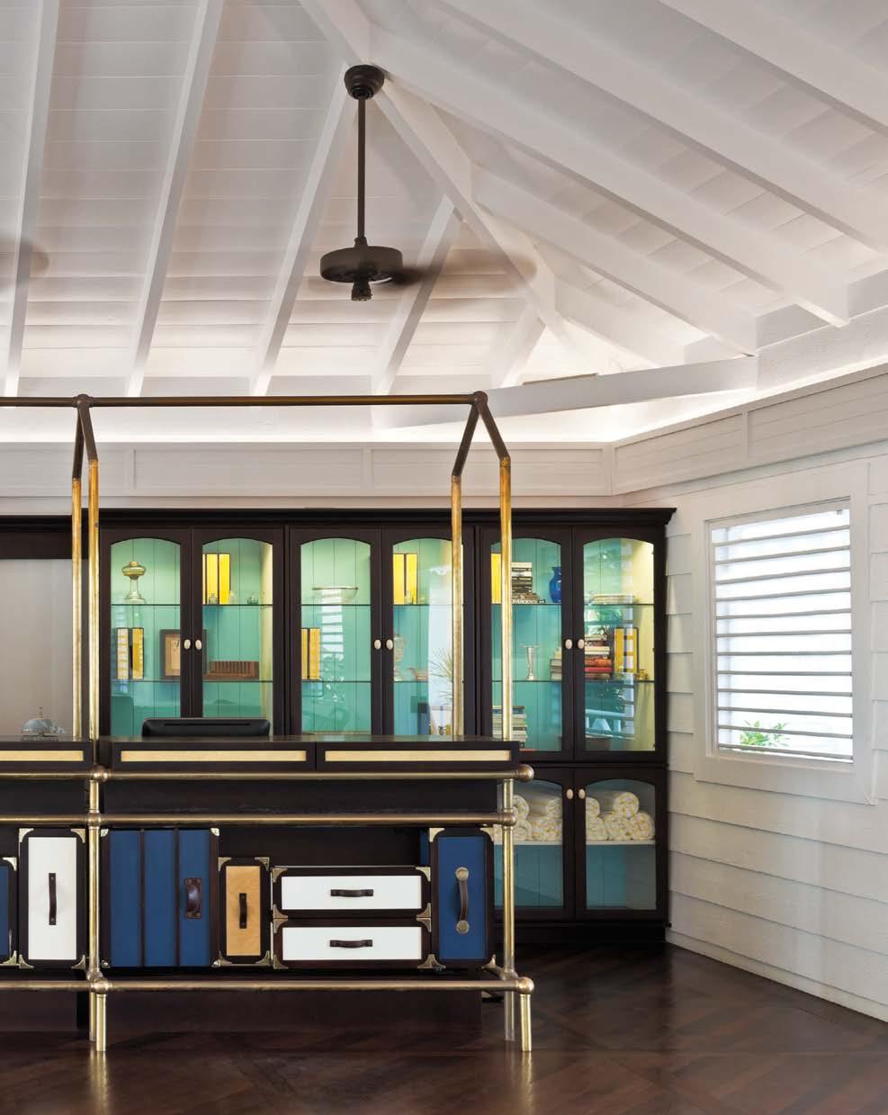
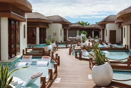
The world’s first guitar-shape high-rise speaks to the universal language of music. It’s no surprise, then, that the incredible structure, a 596,000-square-foot hotel, is a Hard Rock International property. After working with the brand’s owner, the Seminole Tribe of Florida, for more than 20 years, Klai Juba Wald Architecture + Interiors was brought back in to lead the design of this spectacular addition to the Seminole Hard Rock Hotel & Casino Hollywood resort, part of a $1.5 billion renovation and expansion of the 18-acre property. Every evening, a light show dances over the guitar’s 36-story facade, set to music. Talk about rock ’n’ roll!
Along with an outdoor complex of pools, waterfalls, and a lazy river that offer guests the opportunity to swim, kayak, and paddle board, the resort encompasses Bora Bora, an exclusive cabana enclave also designed by KJW. The 16 bungalow-style luxury cabins, which float on a private lagoon and vary in size from 560 to 860 square feet, have butler service, swim access, and in-water loungers. The cabanas connect via meandering teak pathways and docks that are lushly planted and decoratively lit. Inside, crisp white plaster walls complement dark teak beams, and floral screens with sheer draperies allow guests to shade the room. Call it the ultimate VIP experience.
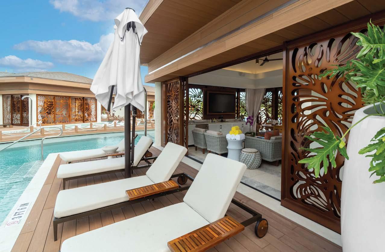
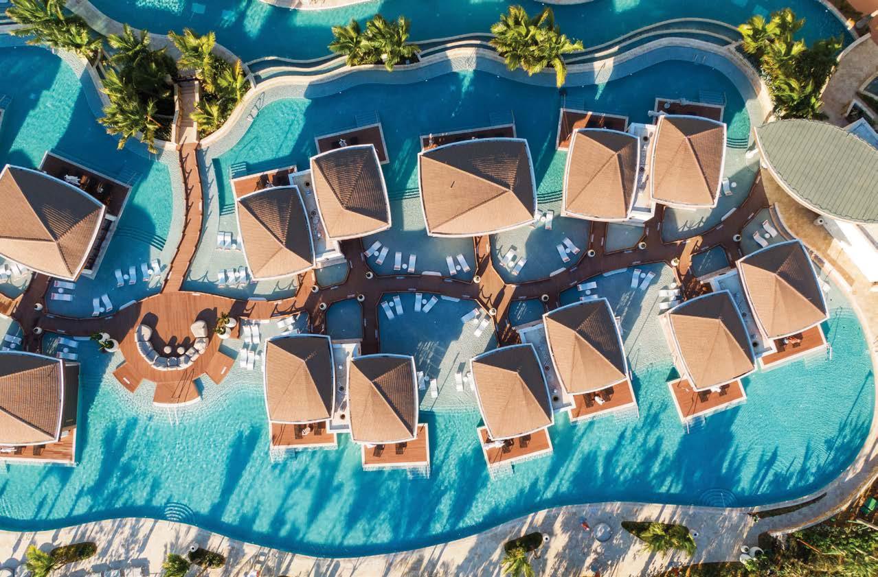
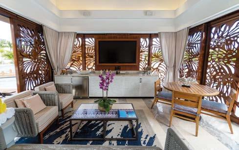
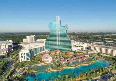 PROJECT TEAM JOHN WALD; ANN FLEMING; BRIAN FINK; LEORA OH; BOBBI JO DE LEON KEY CONSULTANTS RUZIKA LIGHTING; EDSA PHOTOGRAPHY MIGUEL VILLEGAS/KJW kjw.com; @kjwailv
Clockwise from left: The private Bora Bora enclave at the Seminole Hard Rock Hotel & Casino Hollywood resort features luxury cabanas with gauzy sheers and intricate floral screens that provide privacy. Each cabana has in-water loungers. Meandering teak pathways connect the units. The luxury cabins are furnished with modern indoor-outdoor pieces. The resort’s Guitar Tower—a hotel designed to resemble the rock instrument, complete with illuminated strings—rises 450 feet into the Florida sky and houses 638 guest rooms and suites.
PROJECT TEAM JOHN WALD; ANN FLEMING; BRIAN FINK; LEORA OH; BOBBI JO DE LEON KEY CONSULTANTS RUZIKA LIGHTING; EDSA PHOTOGRAPHY MIGUEL VILLEGAS/KJW kjw.com; @kjwailv
Clockwise from left: The private Bora Bora enclave at the Seminole Hard Rock Hotel & Casino Hollywood resort features luxury cabanas with gauzy sheers and intricate floral screens that provide privacy. Each cabana has in-water loungers. Meandering teak pathways connect the units. The luxury cabins are furnished with modern indoor-outdoor pieces. The resort’s Guitar Tower—a hotel designed to resemble the rock instrument, complete with illuminated strings—rises 450 feet into the Florida sky and houses 638 guest rooms and suites.
Japanese influences merge with West Loop grit at Nobu Chicago, Studio K’s first full-service hotel design. It’s a strikingly simple and tranquil space, but the heavy application of textures creates a warmth and intimacy rarely felt in large hotels. Inspired by the weathered beauty of Japan’s oldest buildings, natural materials in varying patinas are left intentionally imperfect as if preserved in the middle of the aging process. Proportions are dramatic: see the unusually high ceilings offset by low furniture. “Our goal was to create a design that references the brand heritage without relying on clichés,” studio principal Karen Herold notes. “We used Japanese design principles to create an authentic interior that feels appropriate for the industrial neighborhood.”
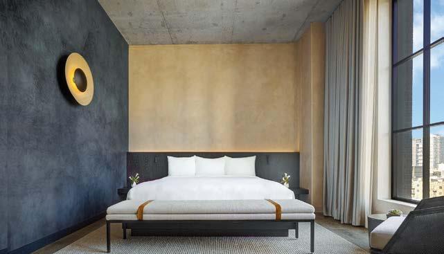
Kintsugi, the Japanese practice of gluing broken pottery together using lacquer mixed with gold, inspired the 26-foot-tall crack in the plaster wall that backs reception. Zen guest rooms challenge the rules of standard hospitality design. Sisal and wool rugs, mango-wood millwork, and indigo plaster walls bring in natural materials with Asian roots. In contrast, Nobu’s famous namesake restaurant is high-energy, with dramatic design statements such as enormous resin-leaf cumuli descending from the towering two-story ceiling. The room is further defined by columns inspired by samurai swords, the woven-rope texture of the weapons’ handles effectively captured in troweled plaster.
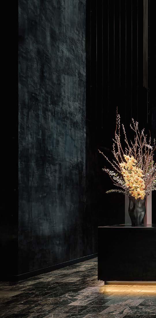 BARBARA KRAFT; ERIC KLEINBERG
@studiokcreative
BARBARA KRAFT; ERIC KLEINBERG
@studiokcreative
Clockwise from left: Indigo plaster provides a foil for the golden sconce in a guest room.
Nobu Chicago’s luxury rooftop. The restaurant is dominated by a resin-leaf sculpture. The Sake Suite bathroom foregrounds a teak tub.
Inspired by the Japanese art of kintsugi, goldlacquer grout repairs a faux crack in the plaster wall behind the lobby reception desk.
PROJECT TEAM KAREN HEROLD; ALICIA KELLY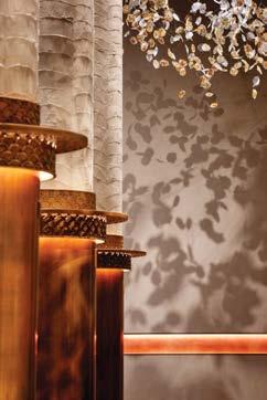
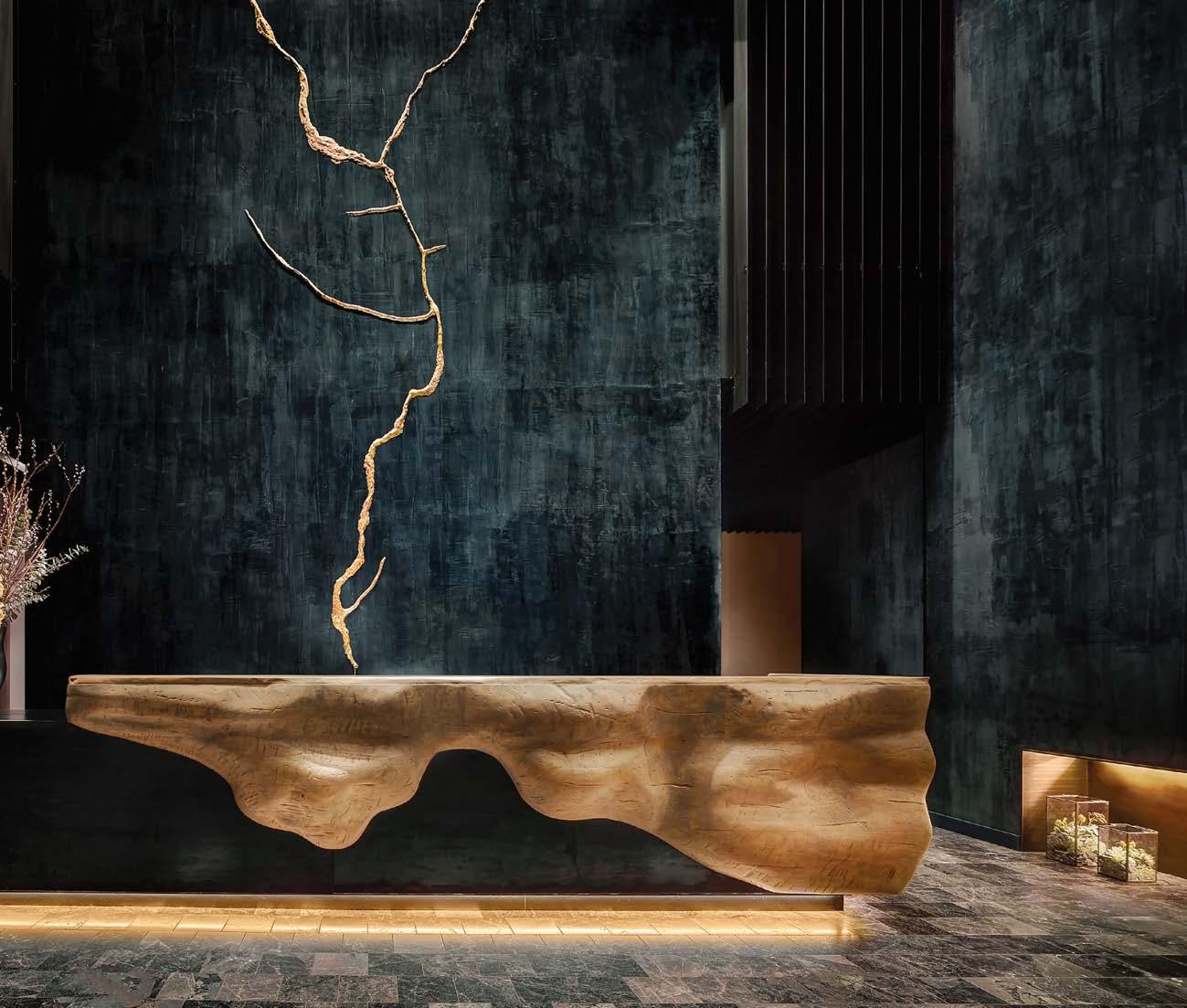
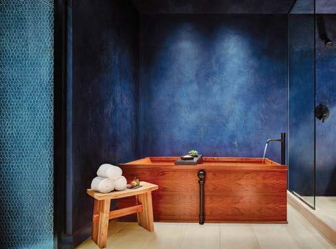
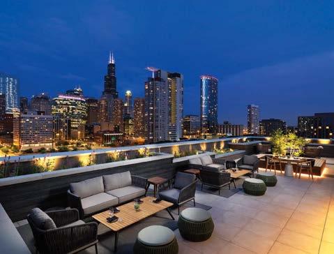
The firm’s unusual name, 2pi r, refers to the circumference of a circle, on which endless points exist—a metaphor for the infinite number of possibilities each design project presents. Led by a talented team under the guidance of principals Calland Lee and Steen Lin, the studio’s work blends cultural awareness with passion for art.
Park Hyatt Beijing—the first of the luxury-brand hotels to be developed in China—required a fresh look after 10 years in business. 2pi r was appointed as the main design firm in charge of the renovation of public spaces such as the Sky Lobby and various dining and events venues.
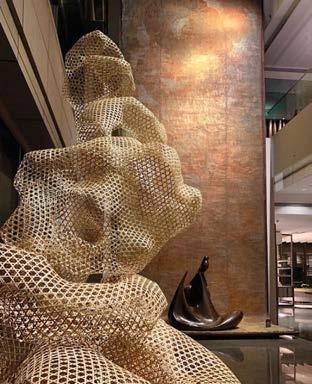
As devised by the studio team, the Living Room, a lounge in the Sky Lobby, works just as well for intimate meetings as it does for large social gatherings. The inspiration for its gentle scheme of light green and cream is a home belonging to a Chinese scholar in the Forbidden City. (There’s even a custom window shade shadowed with leaves, as if this imaginary home looked out onto a tree-filled courtyard.) The Dining Room—a restaurant that offers regional contemporary Chinese cuisine—is similarly sophisticated but with (real) panoramic city and mountain views. The designers redefined and softened this space with detailed, layered finishes and local art and accessories, presenting a new contemporary hospitality style for the new China.
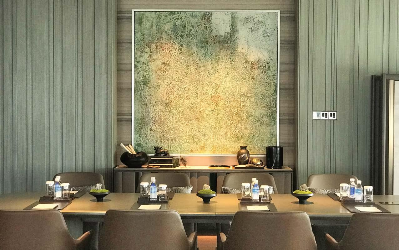
Clockwise from above: A contemporary architectural envelope wraps the Sky Lobby at the renovated Park Hyatt Beijing. The impression of the Sky Lobby’s lounge is that of a Chinese scholar’s living room; the custom window shade is even dappled with shadowy leaves as though this imaginary study looked onto a tree-filled courtyard. A private dining room is grounded by a carpet designed by 2pi r. Custom sage-green millwork, abstract art, and leather-upholstered seating enliven one of the executive meeting rooms. An organically shaped mesh sculpture greets guests on arrival.
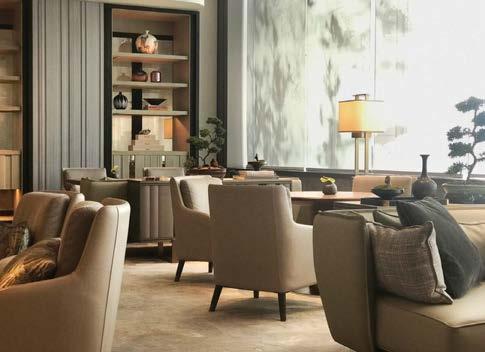
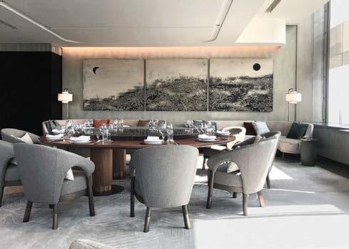
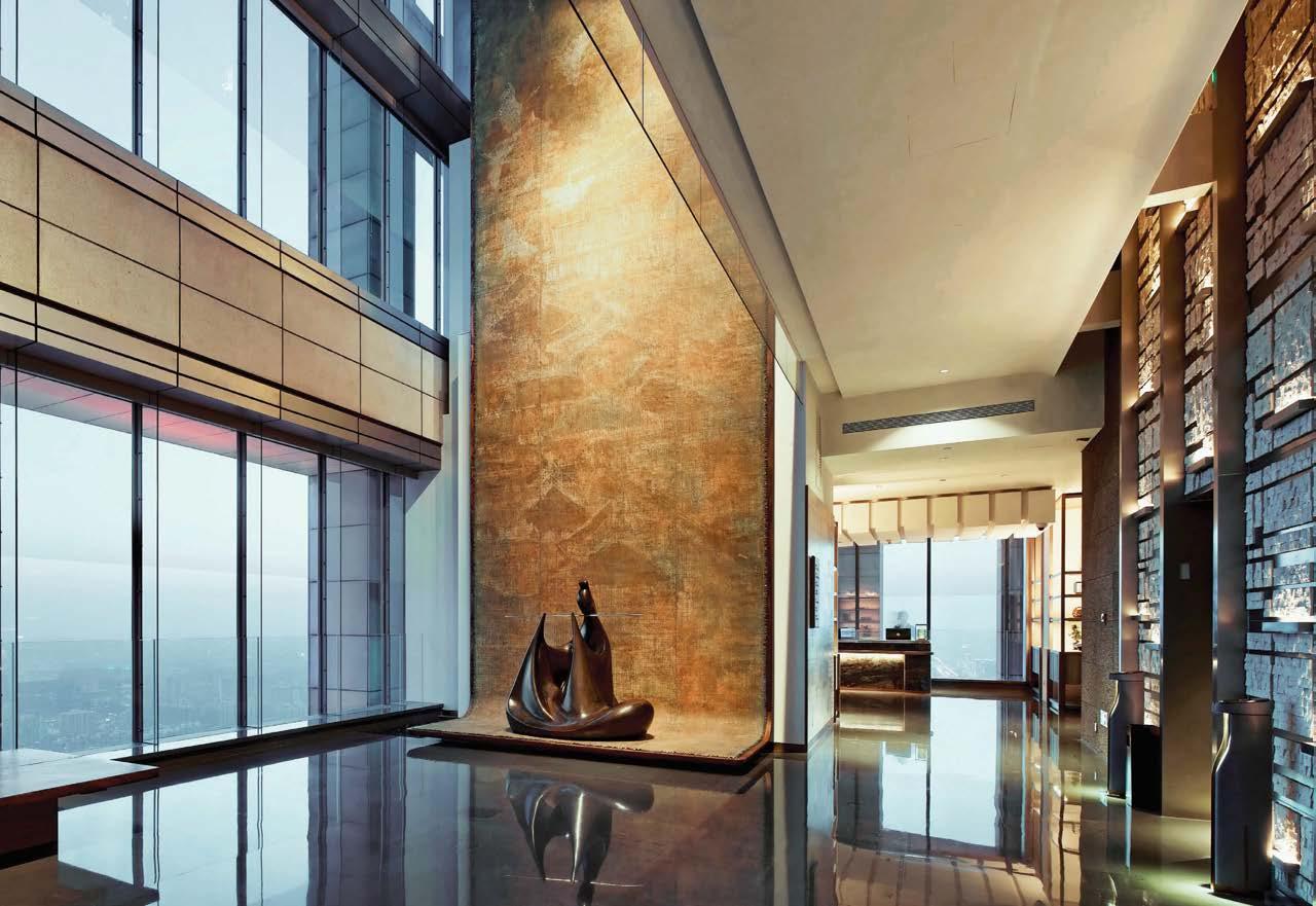 PROJECT TEAM CALLAND LEE; STEEN LIN; MARIA TSANG; TAMMY TAI; JACKY NGAN; JACKY KWONG; ADAM DONOVAN; ADRIAN WYREBEK
THE BOCA RATON, FLORIDA
PROJECT TEAM DAVID ROCKWELL, FAIA; SHAWN SULLIVAN; MERAV LAHR; ERIC HSU; CARMEN CHAN; ISABELLA CHEN; EMILY KAO; DASHA BAREL; JEFFREY CHEN; PATTY GIBBONEY; ELEONORA RINALDI; KOHO WOO; EVA YAU PHOTOGRAPHY SCOTT FRANCES/ROCKWELL GROUP; MICHAEL STAVARIDIS rockwellgroup.com; @rockwellgroup
The Boca Raton had been added to in a piecemeal fashion over the decades. In honor of the 900-key waterfront resort’s centennial, Rockwell Group was asked to redesign many of the core public spaces, including several new restaurants by Major Food Group and Harborside Pool Club, and the Tower lobby and guest suites. RG brought a fresh but sympathetic point of view to the hotel’s Mediterranean Revival and Spanish Colonial vision by architect and Boca Raton’s city planner Addison Mizner. One of the most famed architects of his day, Mizner is credited with establishing the prevailing style of South Florida’s mansions and villas with arched windows, spiraling marble columns, and flowing indoor-outdoor floor plans. Rockwell Group highlighted these historic features while stripping away remnants of previous renovations to re-center the Palm Court as the heart of the property. Embracing Mizner’s ideals, the goal was to create a welcoming indoor/outdoor lobby and lounge that restores its original courtyard experience. (The Palm Court was first conceived as an exterior space.) “We created a flexible, transitional space that offers multiple experiences, from enjoying a morning coffee and working or reading to having a drink and mingling,” says Rockwell Group partner Shawn Sullivan. Spilling out onto a terrace, it’s the ultimate meeting ground for guests.
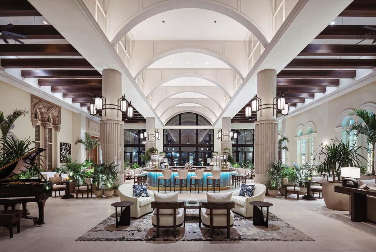
Clockwise from right: Floridian garden motifs animate the Boca Raton resort’s Flamingo Grill, a mid-century chophouse. Previously known as the Garden Room, Sadelle’s brunch restaurant is suffused with the brand’s signature blue lacquer paneling to create the feeling of a European patisserie. The exterior of the Harborside Pool Club. Rockwell Group stripped away remnants of previous renovations to re-center the Palm Court as the heart of the property. Wall-to-ceiling wallpaper makes a bold statement in the Flamingo Grill dining room.
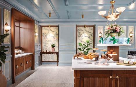
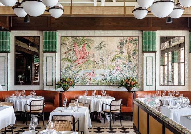
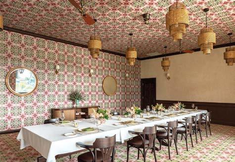
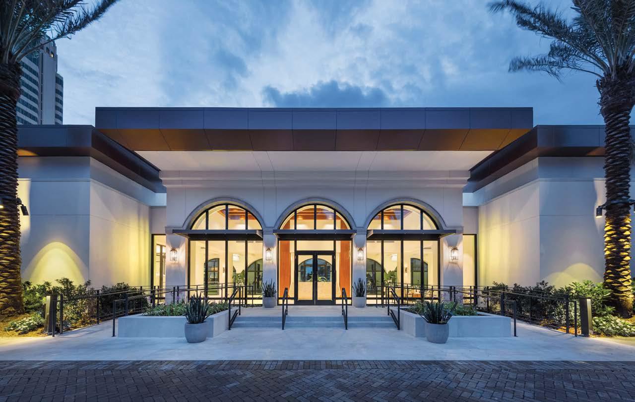 HOSPITALITY
BIÂN aims to be one of the world’s most comprehensive private health and social clubs—a gathering space for holistic well-being. Encompassing more than 25,000 square feet designed by Studio K Creative, the bi-level building’s grounded and refined spa, gym, and social areas are crafted with what studio founder Karen Herold calls an “industrial Zen” approach. Members are first engaged at a welcome desk that takes the form of a round apothecary table. A neutral palette ushers guests into an inviting environment of creams, whites, and taupes accented by shades of petrol and indigo. Suspended, sprawling flora embodies growth and infuses the space with green, which is set against the chalky textures of limewashed exposed-concrete walls throughout. Soft linen sheers and comforting wool curtains cascade across windows; white oak and beechwood radiate a calming, warm atmosphere; and layered, indirect lighting traces the perimeter of the floor and washes walls.
PROJECT TEAM KAREN HEROLD
KEY CONSULTANTS 41 NORTH; JSA; WOW & FLUTTER; ELM SURFACES; SITELINE INTERIOR CARPENTRY; DEMETER MILLWORK; WESTWOOD MILLWORK; FLOS; MOR LIGHTING
PHOTOGRAPHY ANTHONY TAHLIER studiokcreative.com; @studiokcreative
BIÂN’s steam, nap, and listening rooms are curated around notions of balance and belonging. The steam room features a cold plunge pool scented with fresh eucalyptus. The first-of-its-kind nap room has a luxury Hästens bed that allows members to experience quality rest away from home. Outfitted with cutting-edge audio equipment, the listening room’s daily record rotation is hand-selected by BIÂN co-founder Kevin Boehm.
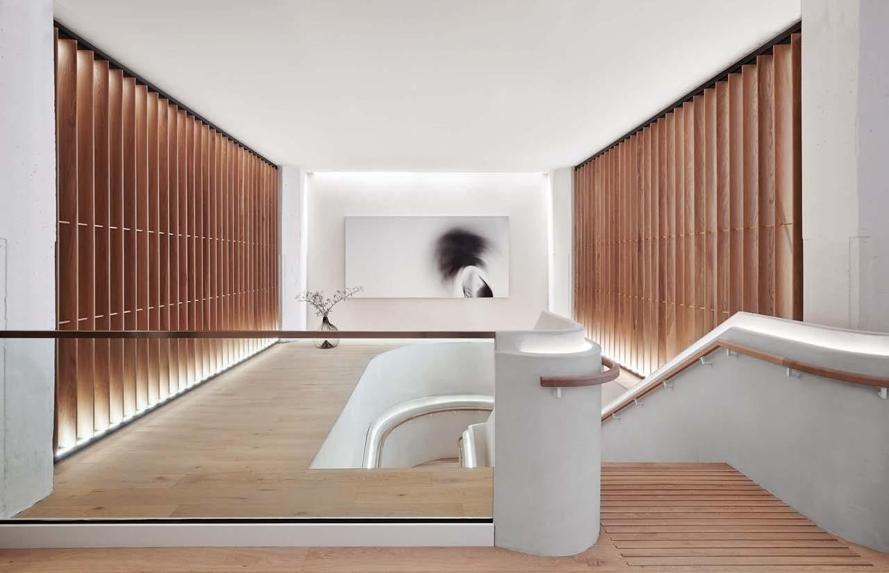
Clockwise from left: Plaster architectural details define the main stair. The serene café serves organic food and wine. Through its highly edited design and equally painstaking services, the club provides members with an unprecedented approach to wellness. Limewashed exposedconcrete walls and minimalist furniture with sensuous curves foster a sense of calm. A quietly sybaritic treatment room.
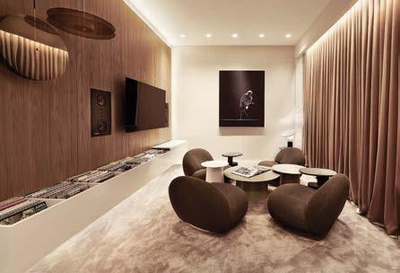
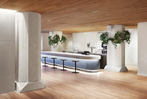
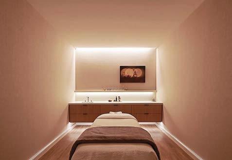
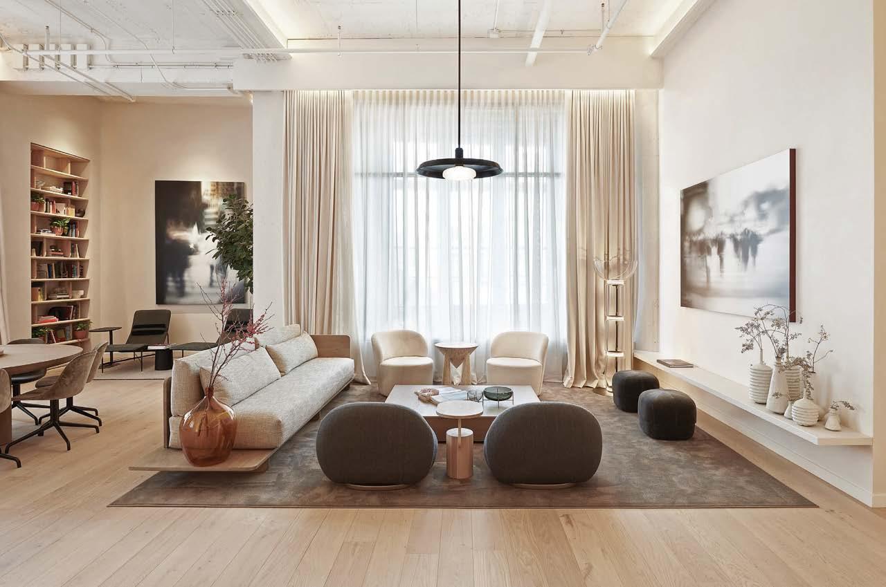
In 2008, SushiSamba Las Vegas was ICRAVE’s first collaboration with the brand. From the beginning, ICRAVE’s approach in designing the project was to accentuate the duality that personifies the SushiSamba brand: Brazilian exuberance with Japanese Zen. “We wanted the space to be both expressive and sculptural—the client wanted celebration. With 14,000 square feet, we were also looking for a way for the space to expand and contract without partitions, allowing for a multiplicity of experiences,” says ICRAVE founder and lead designer Lionel Ohayon. “The ribbon was born to encapsulate these ideas into a singular bold architecture move.”
The restaurant coalesced around double-sided ribbons that weave through the space to create different programs. The ribbon starts as the sushi bar, curves up to envelop a dining space, and ends up wrapping a bottle display. The surface of the ribbon neatly showcases the brand’s duality of Japanese Zen and Latin flamboyance. Graffiti now adorns the “Samba” side of the ribbon, while the “Sushi” side remains subdued. “The strategy to use graffiti was to have the client think about the space as a living gallery,” says Ohayon. “It could be renewed by inviting new artists to update the graffiti just as one would rotate exhibits in a museum.”
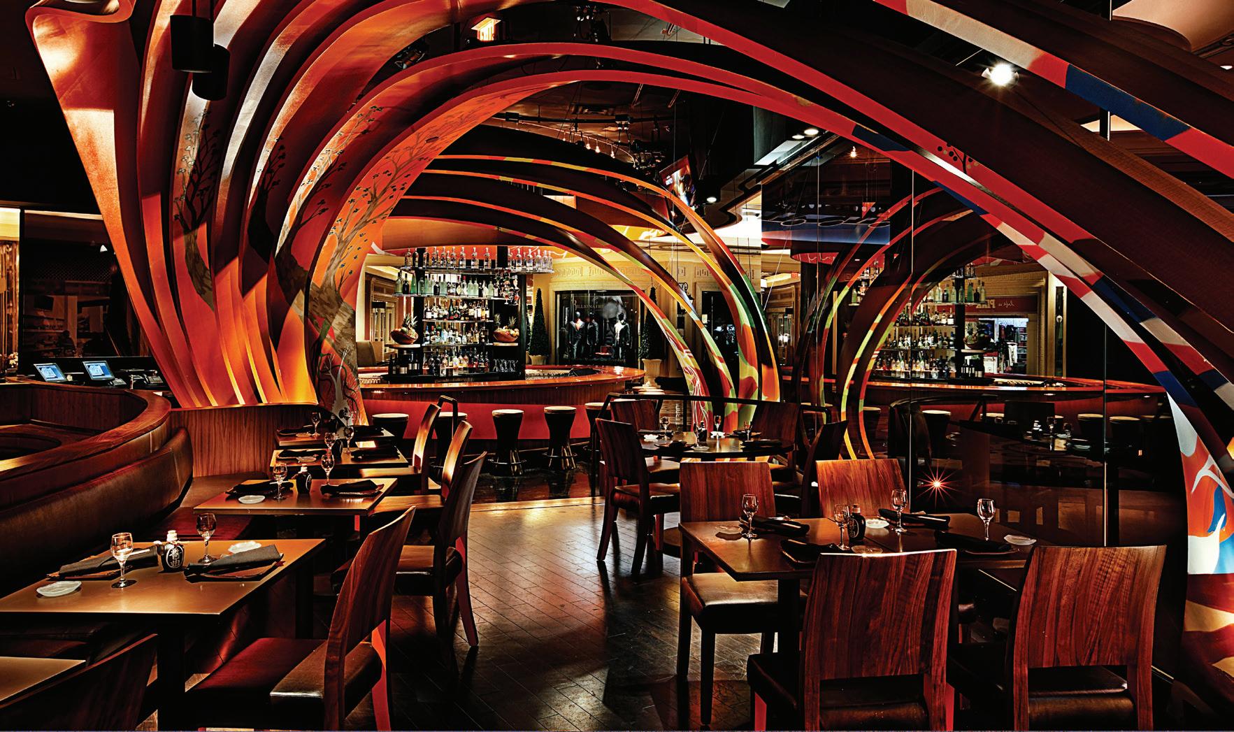
Clockwise from below: Wanting to create a design language that spoke to the fusion of two cultures led ICRAVE to create a sculptural ribbon. It has both Japanese and Brazilian motifs, one on either side, and it travels through the site, defining a series of dining spaces. Graffiti art enlivens walls. Cylinder pendants impart a warm glow.
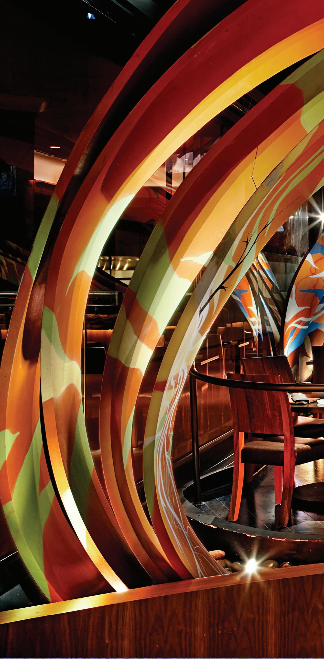 PROJECT TEAM LIONEL OHAYON; ROBERT DEL PAZZO; LIANA CASSEL PHOTOGRAPHY COURTESY OF SUSHISAMBA LAS VEGAS AND ICRAVE icrave.com; @icraveny
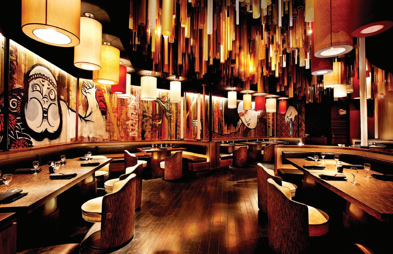
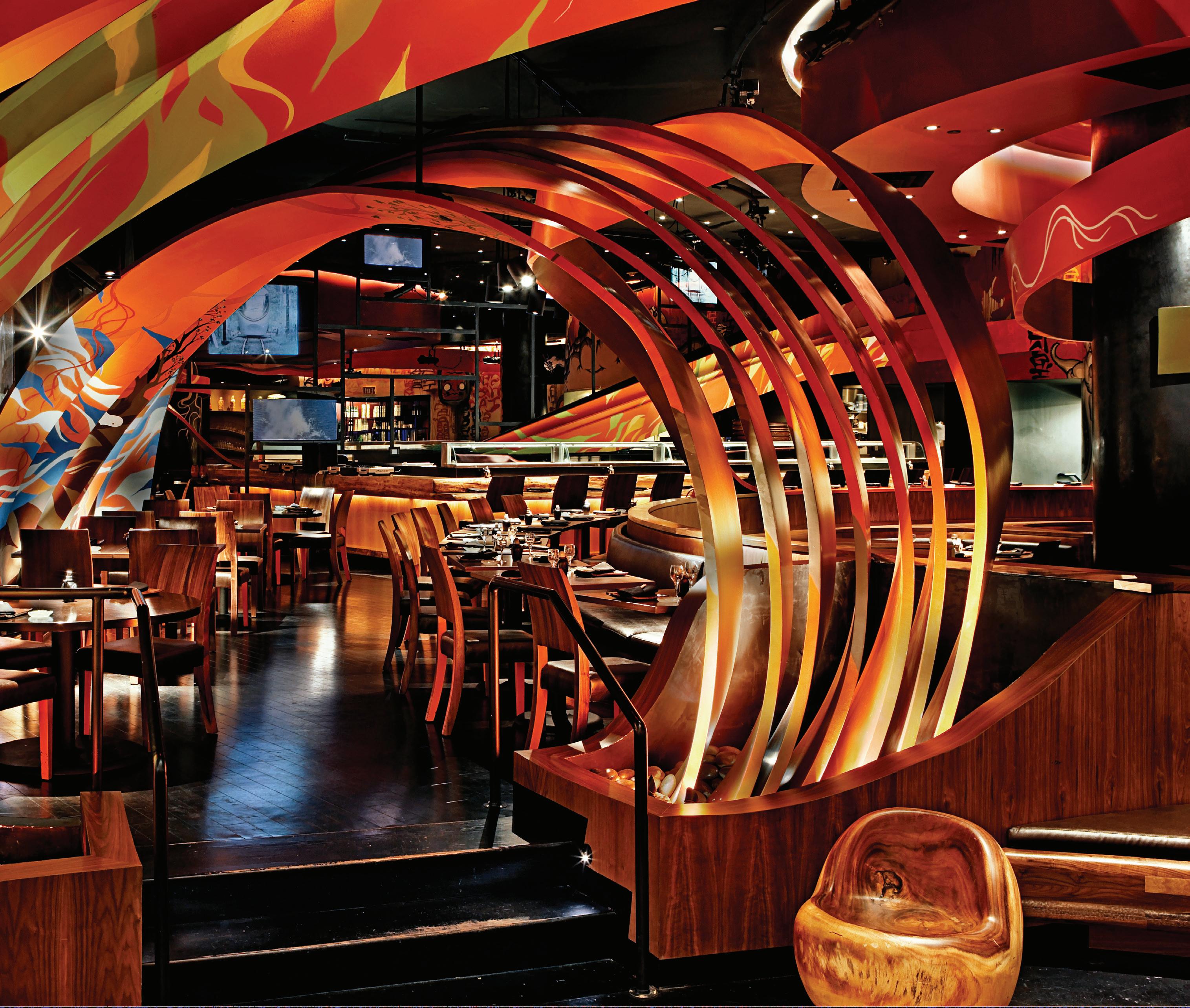
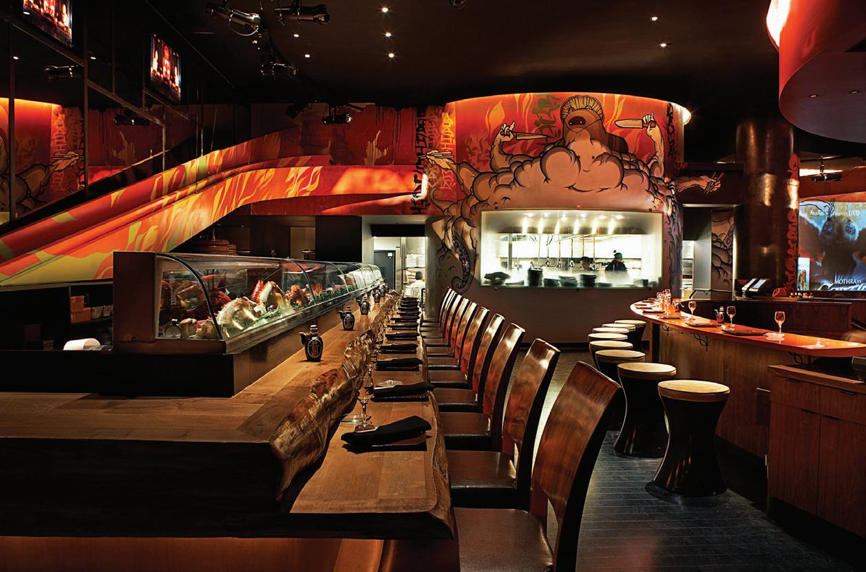
The 27-story Venture apartment and retail tower overlooking the bay beyond Hong Kong’s Kai Tak ferry terminal is crowned with a private club for residents, the Club Cruiser. Cream, led by principal Antony Chan, was supplied with floor plans and given free rein on the interior design. Chan’s central idea was to combine a loosely tropical vibe with the sense of being on a cruise ship—and strictly avoid any sense of ‘bling.’ “The Club Cruiser looks a bit like a spaceship that’s landed on top of the building,” Chan explains. “But inside, and looking out to the sea, you could imagine you’ve touched down somewhere like Phuket.” The interiors give the feel of a private resort floating above Kai Tak and feel connected with nature rather than the city below. Hence the airy inside-outside flow and design references to trees, the sea, fish, and ocean liners.
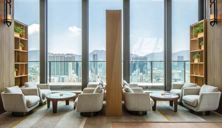
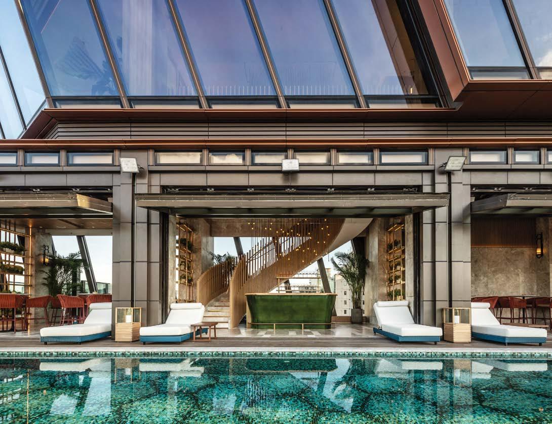
Chan used a subtle, generally pale color palette to create a visual calmness that allows the finer details and fittings to stand out. “The quality of finishes is so important to my studio,” he continues. “There is such pleasure in noticing beautiful details. But we never want these elements to shout. The key is to produce schemes that are coherent rather than a series of over-dramatic volumes without a true design narrative.”
PROJECT TEAM ANTONY CHAN; REEVIS WOO KEY CONSULTANT DLN ARCHITECTS PHOTOGRAPHY COURTESY OF CREAM cream.hk; @c.r.e.a.m.s.t.u.d.i.oClockwise from left: Cream commissioned British artist Owen Bullet to make an abstract whale in hand-worked plywood and wire suspended over the reclaimed-oak captain’s table in the club’s banquet room. Bullet also crafted a stingray sculpture that looms above relaxation pods in the jutting glass-prow Pilot’s Room, with views over Victoria Harbour. In the activities room, lighting fixtures are set into deep, asymmetrically angular wooden hoods that reference the angles of the building envelope by DLN Architects. A detail of the staircase. Chan’s single most important intervention was designing very large glazed up-and-over doors between the bar area and the pool, effectively creating one big open-air social space. The top-floor lounge is an antidote to the hustle and bustle of life in Hong Kong.
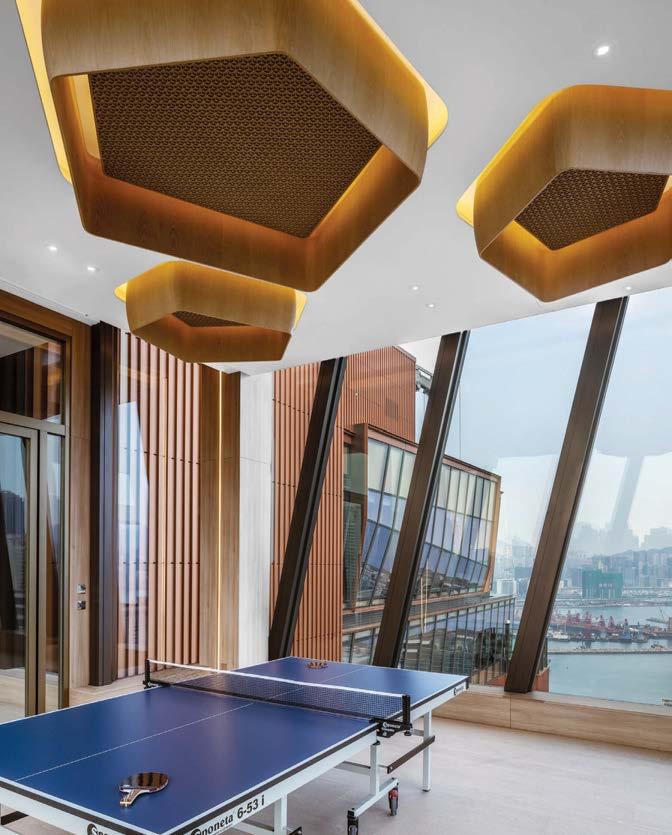
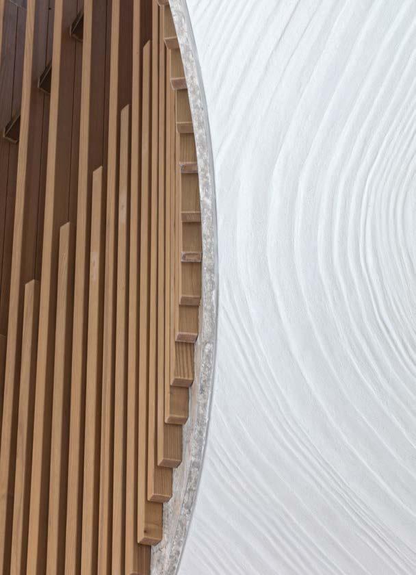
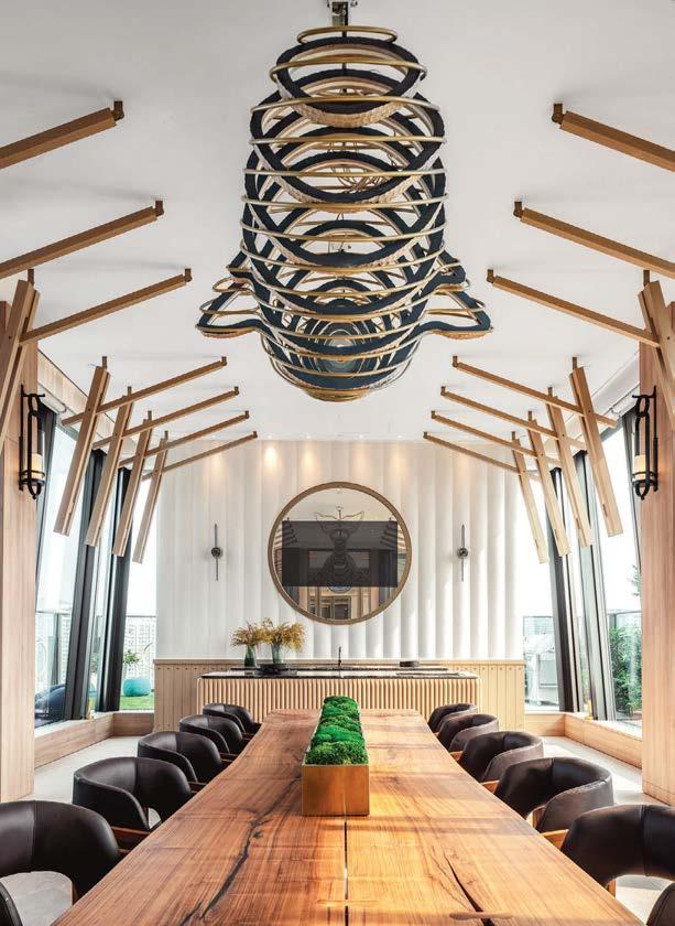
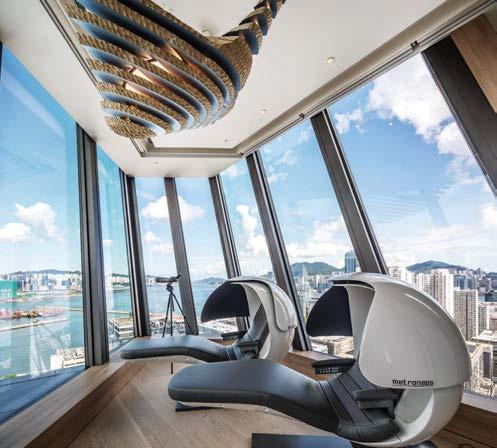
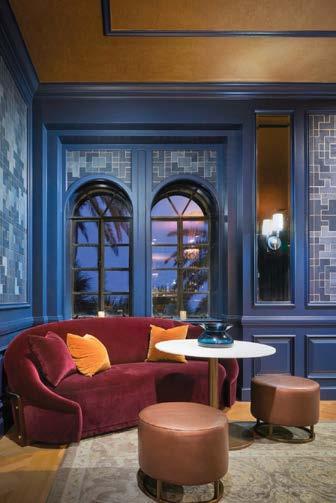
Once a sliver of land laden with coconut palms and mangroves, Fisher Island is today a small residential enclave regularly named the nation’s most expensive ZIP code. The social heart of the private island, a 7-minute ferry ride off the southern tip of Miami Beach, is a Mediterranean-style mansion built by William K. Vanderbilt II in 1925. Now part of a country club for the retreat’s 800 families, it includes an oceanfront restaurant, private drawing room, and snooker bar. It was those key areas that Adriana Hoyos Design Studio remodeled for the Fisher Island Hotel & Resort. Hoyos accessorized the historic rooms in an elegantly fresh manner. “The aim was to celebrate the heritage and history of the Vanderbilt family and translate that to a modern and captivating experience,” Hoyos explains. Bringing back the splendor of the drawing room meant channeling its glamorous history and fostering a connection with nature. Here, typically Floridian colors like white, aqua, and orange evoke the ocean and vegetation. The snooker room, a private bar with live music, is designed in the vein of a 1930’s speakeasy. “Our inspiration was dramatic colors and the high contrast between dark and light,” Hoyos says of the space, in which burgundy and navy-blue pair with a gold-leafed ceiling to create an opulent (but intimate) ambiance. Finally, there is City View, a restaurant with vistas of downtown Miami. It is mainly outdoor, which posed a challenge for the designers. A pergola lends a tropical vibe and helps with shading and rain showers, while the aqua-studded palette harmonizes with the project as a whole.
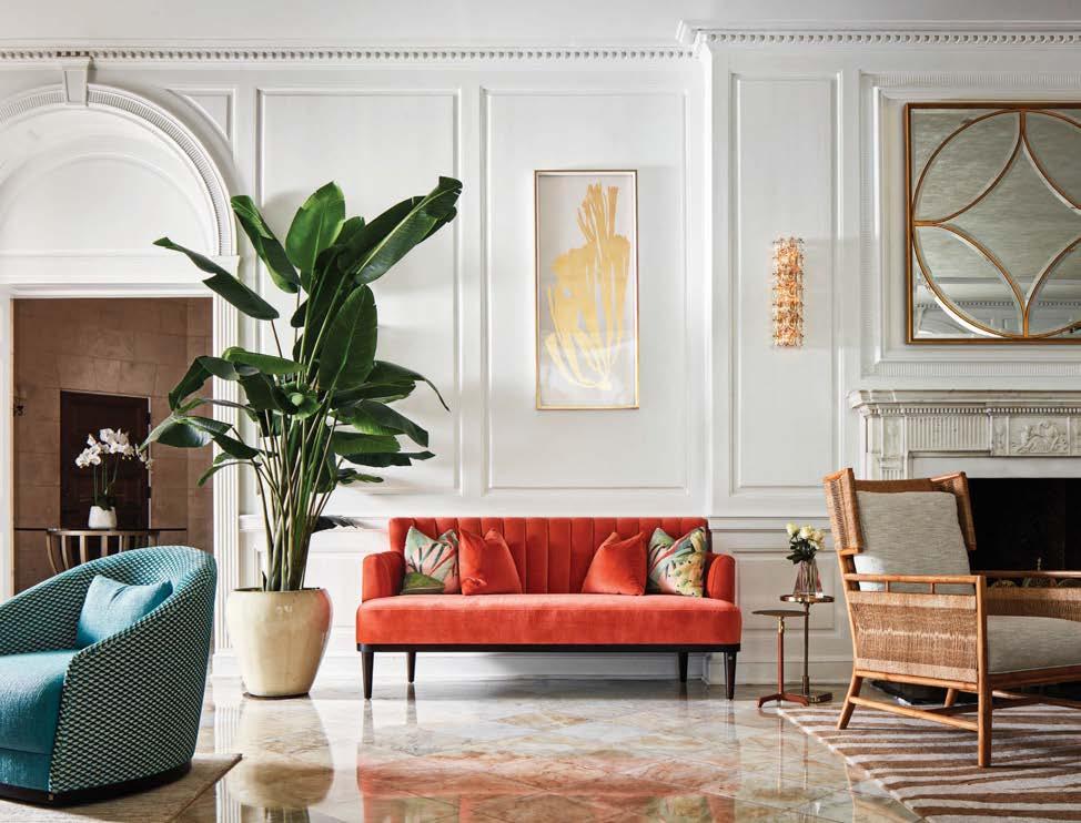 VANDERBILT MANSION, FISHER ISLAND, FLORIDA
PHOTOGRAPHY GABRIEL VOLPI; KRIS TAMBURELLO adrianahoyosdesignstudio.com; @adrianahoyosdesignstudio
Clockwise from left: On Fisher Island, Adriana Hoyos reimagined the historical Vanderbilt Mansion’s storied drawing room with relaxed yet glamorous decor. Aqua and orange are some of the tropics-inspired colors. A variety of seating types and ambiances cater to all club members. City View restaurant, overlooking downtown Miami, resembles a terrace at a fabulous oceanfront palazzo. The speakeasy-style snooker bar features burgundy velvet sofas, moody navy-blue walls, and a gold-leafed ceiling.
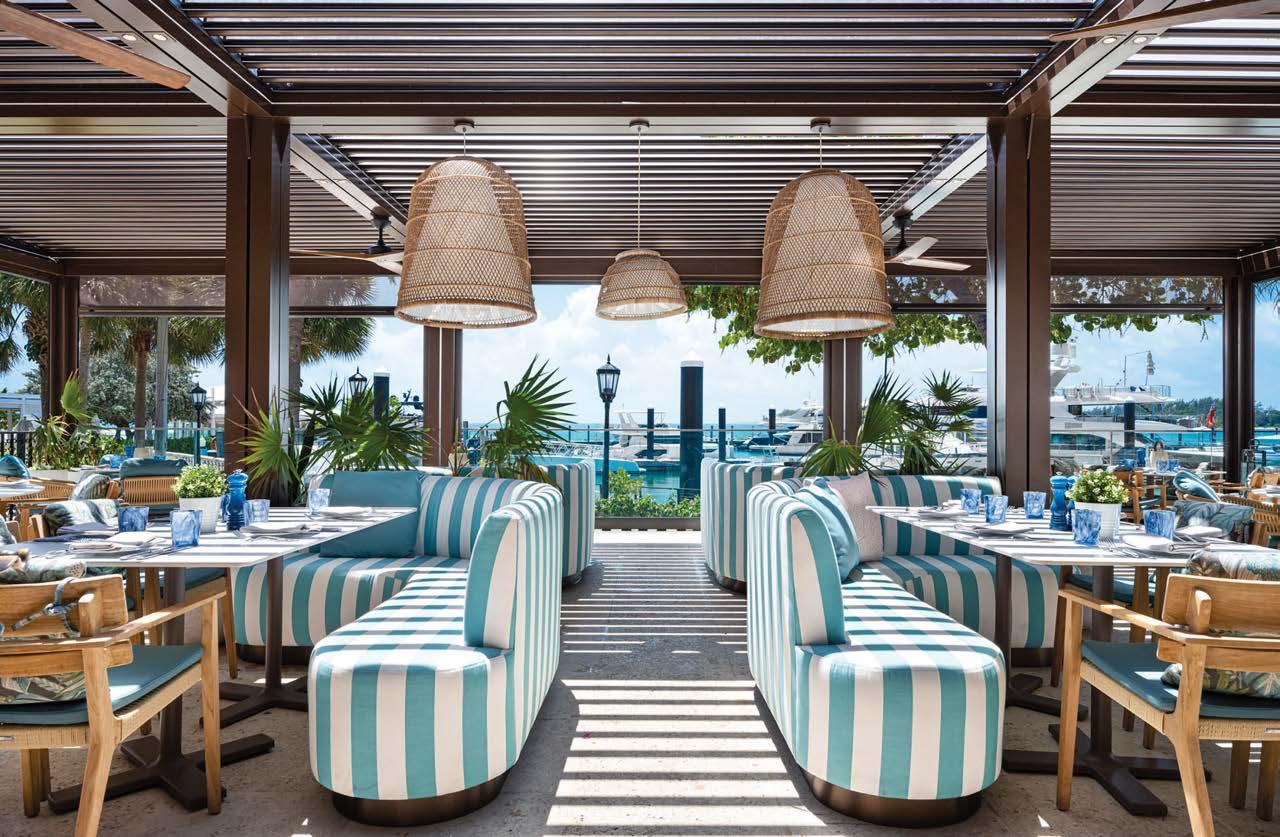
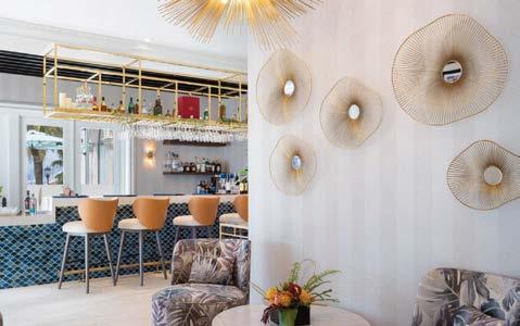
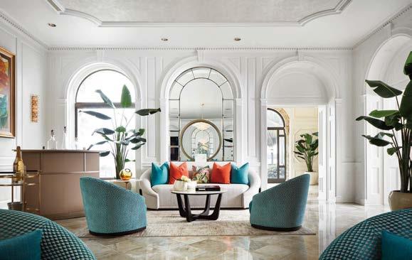 PROJECT TEAM ADRIANA HOYOS; ANDREA PÉREZ HOYOS; RICARDO PÉREZ; ARTURO OCHOA; ALESSANDRA SAGGESE
KEY CONSULTANTS ADRIANA HOYOS FURNISHINGS; POINT OUTDOOR FURNITURE; CIRCA LIGHTING; ARTERIORS; DEKTON; ARCA STONES; GUNITE CONSTRUCTION
PROJECT TEAM ADRIANA HOYOS; ANDREA PÉREZ HOYOS; RICARDO PÉREZ; ARTURO OCHOA; ALESSANDRA SAGGESE
KEY CONSULTANTS ADRIANA HOYOS FURNISHINGS; POINT OUTDOOR FURNITURE; CIRCA LIGHTING; ARTERIORS; DEKTON; ARCA STONES; GUNITE CONSTRUCTION
In a top-to-toe renovation of the public spaces and guest rooms at the Sheraton Reston, architecture and design firm //3877 expertly integrated mid-century tropes with Marriott International’s new design standards for the Sheraton brand. Spanning six floors, the 302-key hotel includes 10 suites, nine meeting rooms, and a grand ballroom. The design team led by Meghan Scott and Catie Cannon emphasized connection to nature, with deep blue and green hues complemented by walnut and whiteoak millwork and tambour details that tie the design to surrounding outdoor destinations such as the Potomac River and Great Falls Park. “Simultaneously, we drew inspiration from Reston’s history as one of the first master-planned towns developed after the height of the mid-century modern movement,” says Cannon. “These influences shine through in the use of deep jewel tones and iconic linework indicative of the period.”
PROJECT TEAM DAVID TRACZ; MEGHAN SCOTT; CATIE CANNON; KAITLIN ECKENROTH; MEGAN GREGORY; MAYYASA ROACH
CONSULTANTS WURZAK HOTEL GROUP & DOVEHILL CAPITAL MANAGEMENT; CM KLING + ASSOCIATES; M-TUCKER; G2 CONSULTING ENGINEERS; WALTER P. MOORE PHOTOGRAPHY JOSEPH TRAN 3877.design; @3877.design
The double-height lobby, which boasts a striking grand staircase, houses a light-filled reception that contrasts the darkened, moody lobby bar. Strategically placed slatted screens produce a conceal-and-reveal effect as guests move through the space. The ambience throughout is warm and familiar, with residential elements balancing those that are linear, industrial, and urban. The project demonstrates //3877’s expertise in marrying influences from modern hotel, F&B, and residential design. The result is a hotel that provides a glimpse into the future of the Marriott International brand “through our firm’s creative lens,” Cannon concludes.
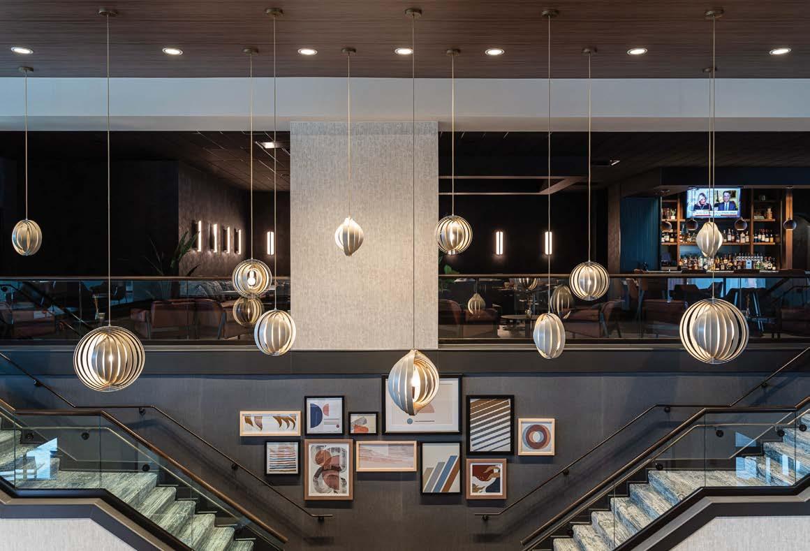
Clockwise from left: By climbing the grand staircase to the mezzanine level, guests gain access to the restaurant, Provisions Kitchen & Cocktails, and the Sheraton Club Lounge. Pendant lighting provides a warm glow in the moody lobby bar. A cozy desk nook in the business center. Pockets of greenery dot communal areas. Throughout, mid-century-inspired artworks grace walls.
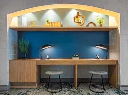
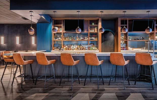
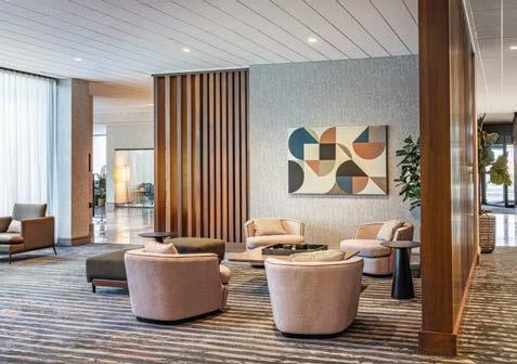
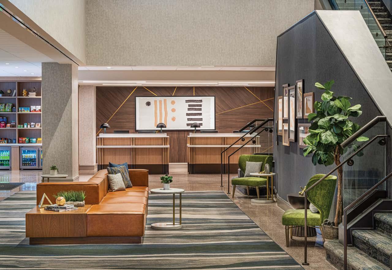
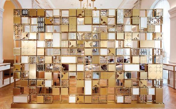
Over six years, Champalimaud Design meticulously updated Raffles Singapore, the iconic British Colonial hotel built in 1895. “It’s a national monument, one of the most beloved and recognized landmarks in all of Asia, so it was important that our design respect that history,” Champalimaud partner and CEO Ed Bakos says. “The ability to invigorate a property while maintaining its sense of place is deeply representative of our practice,” he continues. “When we are given a responsibility like this, we embrace it. We aren’t shy or timid, but we maintain a distinct respect for what the building means to other people.” That translated to celebrating historic elements while inserting features that today’s guest would want and expect.
The restored property introduces renovated dining options, updated accommodations, and a new suite category. Public areas were replanned to increase social engagement. The new lobby lounge serves as the gateway to the myriad spaces for dining and imbibing: The Tiffin Room, Writer’s Bar, La Dame de Pic, Long Bar (home of the delicious Singapore Sling), and Butcher’s Block. The sensibility is more contemporary than previous design iterations, with an emphasis on maximizing scale through impactful lighting and custom furniture. Guest rooms and the six extended-stay rooms are designed with romantic flourishes: rich teak floors, vertiginous ceilings, and the original three-part floor plan. The dark-chocolate wood furniture feels luxurious, while the trunk-inspired minibar offers a moment of surprise.
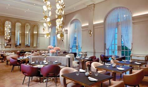
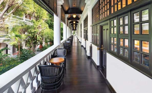
Clockwise from right: All public areas, including the soaring lobby, were replanned to increase social engagement and create an ease of flow between spaces. Each guest room is anchored by a locally produced bed with a carved headboard in the British Colonial style—a nod to the hotel’s original bed designs. A modernist brass screen delineates space in La Dame de Pic, a 56-seat restaurant. Special attention was paid to the preservation of the original architecture throughout the renovation. La Dame de Pic serves as the hotel’s formal dining room and embodies an air of timeless elegance, with brass-disc lighting fixtures and a peony bas-relief decorating the ceiling.
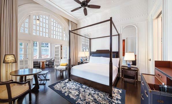
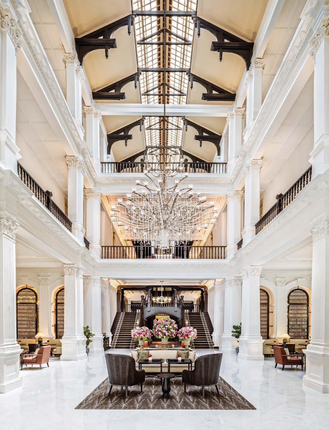
The Curtain hotel and members’ club in London’s Shoreditch is named for the Elizabethan playhouse that once stood nearby. (In fact, the land is so historically significant that the Museum of London had to verify there were no buried Roman antiquities when it came time to excavate the site.) That storied past set the tone for this atmospheric 120-key property from 2017.
PROJECT TEAM KIMBERLEY MILLER; CHAD ROGERS; CHRIS MICHERO; STEPHANIE HUCKABY CHIARAMONTE KEY CONSULTANTS DEXTER MOREN ASSOCIATES; GANSEVOORT HOTEL GROUP PHOTOGRAPHY ADRIAN HOUSTON STUDIO duncanmillerdesign.com; @duncanmillerdesignThe 115,000-square-foot hotel encompasses six stories from rooftop pool to below-grade drinking den at Red Rooster, an outpost of chef Marcus Samuelsson’s soul food restaurant in Harlem, New York. The Curtain is the first European property of Michael Achenbaum, the New York hotelier behind the decadent Gansevoort Hotel Group. Helping him make the leap across the ditch, Duncan & Miller Design took on the interior and lighting design, art curation, visual identity, and branding development. Sharply tailored suites with exposed brickwork and floor-to-ceiling windows feature not-so-mini bars and sartorial tartan accents, while spacious bathrooms have steam showers that easily accommodate two. Common areas are eclectic, rock and roll, and above all, fun. There’s even original Banksy art, plus a live-performance venue for secret gigs. “Being able to design so many experiences in one venue was amazing,” lead designer Kimberley Miller says. “Private club, rocking nightclub, celebrity chef restaurant, rooftop bar, bespoke hotel: it was like creating our own little world.”
Clockwise from left: The eclecticism of The Curtain hotel and members’ club is apparent in the moody, navypainted lounge, where cocktails can be imbibed fireside. A tufted leather banquette and tartan chairs are just some of the seating options at Red Rooster, the London outpost of the Harlem soul food stalwart. Floor-to-ceiling drapes, bottle-green wardrobes, and exposed brick walls define a guest room. Mismatched chairs are a feature of the basement dining room of Red Rooster.
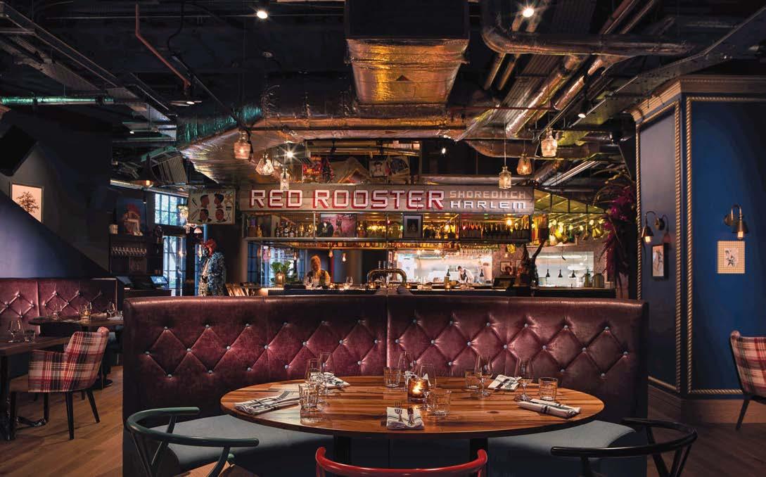
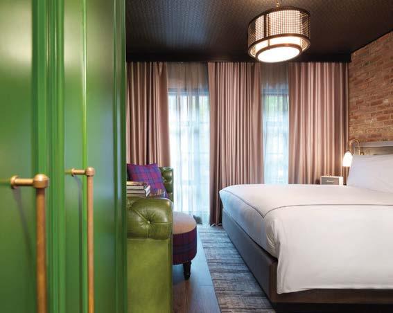

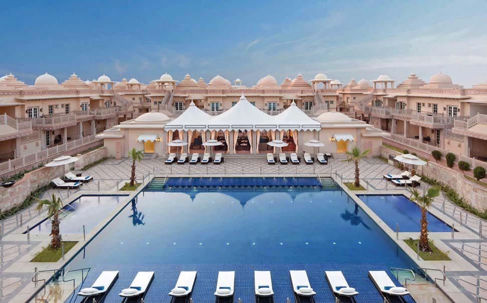
Set amid the ancient Aravalli Range, the award-winning ITC Grand resort is a tribute to 5,000 years of unbroken civilization. For Archiventure, the project presented a unique educational, emotional, and spiritual journey of exploration into the multicultural history of three major religions, numerous dynasties, and thousands of years of design history. “This property was our first international project of such size,” says principal James D. Nordlie. “Our client immersed our firm into a dizzying array of materials, cultural histories, and spiritual/cosmic awakenings.”
The expansive 300,000-square-foot retreat thus expresses an architectural blend of ancient, medieval, and modern Indian influences. Just a short drive from New Delhi, the resort encompasses four presidential villas, 100 suites, a 27-hole golf course, elaborate culinary experiences, conference facilities, and Kaya Kalp The Royal Spa with ayurvedic rituals and yoga. The complex is an architectural confluence of some of the finest design styles, motifs, and techniques that India has generated: the stepped wells of Adalaj, Orissan Nagara-style temples, the royal palace of Baroda, and the eternal ghats of Varanasi. Certified LEED Platinum, the resort operates under the ethos of responsible luxury: luxury that doesn’t compromise the earth and features sustainable practices embedded in authentic indigenous experiences.
Clockwise from above: Aerial view of the resort, known as one of the world’s finest destination-wedding venues. A typical guest suite with a patterned dome ceiling. One of two spa pools (men’s and women’s) on the top floor of the main hotel building. In-water loungers dot the pool. An intricately patterned, light-filled hallway.
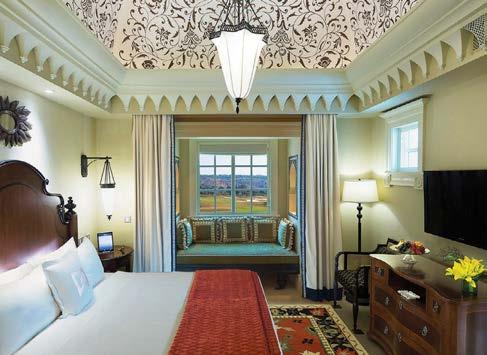
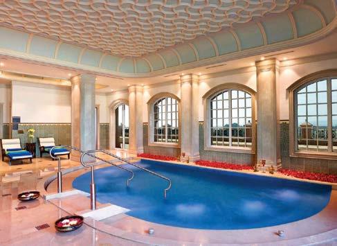
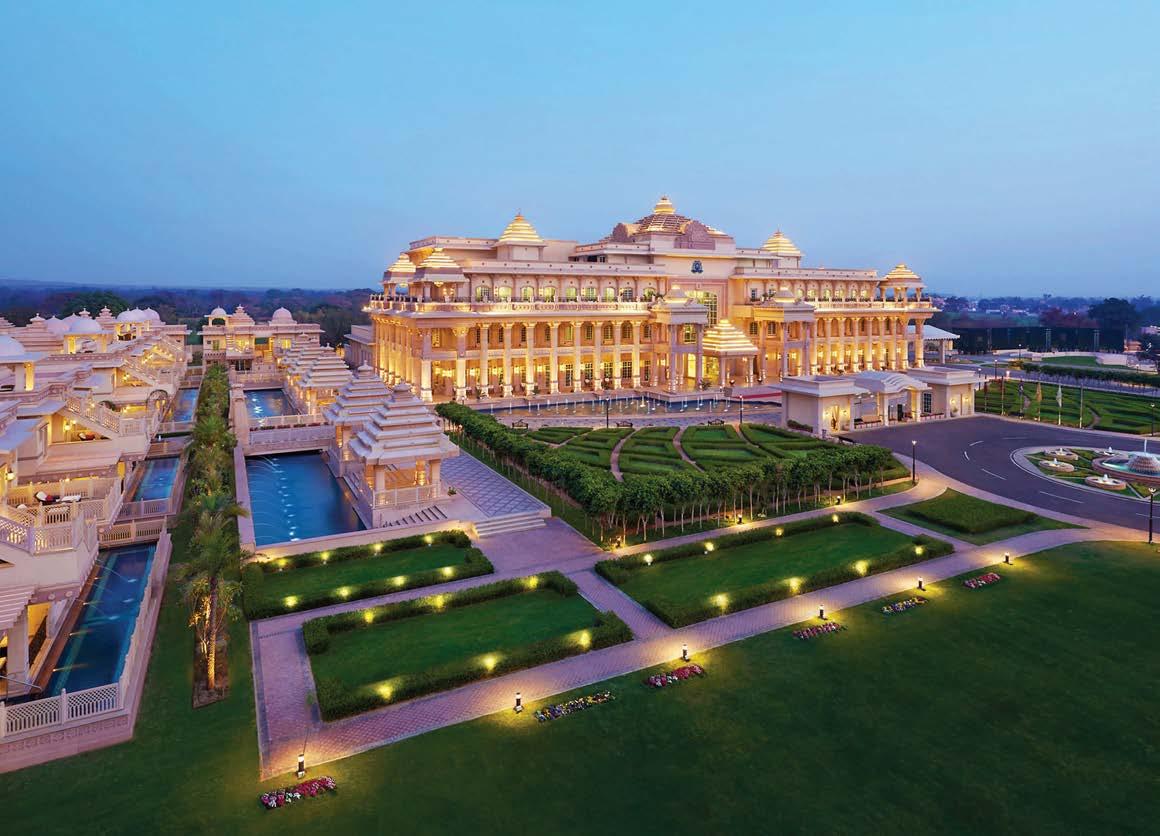 PROJECT TEAM JAMES D. NORDLIE, AIA; REBECCA KENNY, CECILY WATSON; CHRIS CHIDLLEY; RON JEWETT; CORY BROWNELL; ANUBHA SINGH
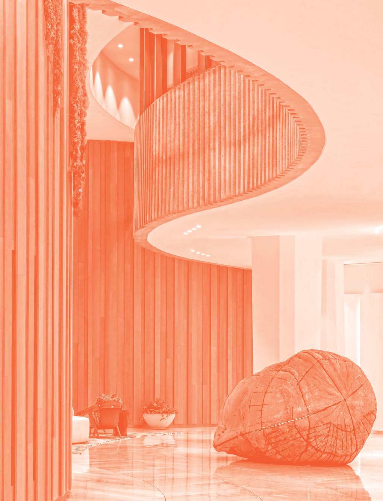
This chapter has it all: a genre-busting outdoor stadium, a heritage church, even furniture by a Hall of Fame design doyenne. In this miscellaneous grouping there are often myriad stakeholders and complex briefs to navigate—which these designers and architects do with aplomb. So, dig in: From institutional projects such as schools, libraries, and museums, to multifamily developments, showrooms and sales centers, and even an art installation, there’s truly something for everyone.
TRINITY CHURCH WALL STREET, NEW YORK
Located just steps away from Sciame’s corporate headquarters, the 25,000-square-foot Trinity Church Wall Street is a revered city, state, and federal neo-Gothic landmark constructed between 1839 and 1846. It had been maintained in a patchwork fashion over the years and now, in the 21st century, was in need of a complex renovation. The project, designed and spearheaded by MBB Architects and executed by construction manager Sciame, was a multiyear, multiphase job that resulted in such honors as the Lucy G. Moses Preservation Award.
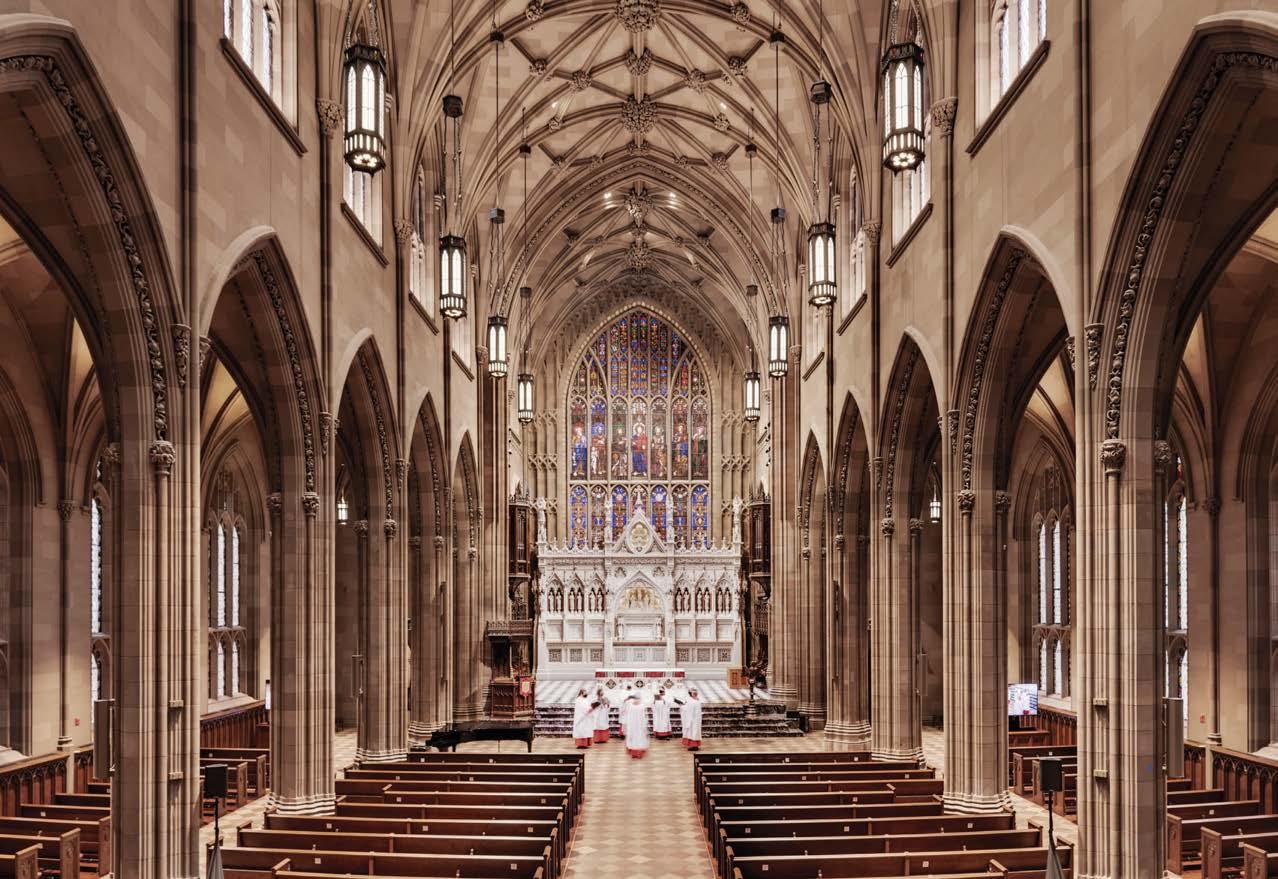
PROJECT TEAM MBB ARCHITECTS; SCIAME CONSTRUCTION KEY CONSULTANTS SILMAN; BUILDING CONSERVATION ASSOCIATES; LIBERTY STAINED GLASS CONSERVATION; MATHEWS NIELSEN LANDSCAPE ARCHITECTS, P.C.; MEP & FA ENGINEER; MELANIE FREUNDLICH LIGHTING DESIGN; AUERBACH POLLOCK FRIEDLANDER PHOTOGRAPHY COLIN WINTERBOTTOM FOR TRINITY CHURCH WALL STREET sciame.com; @sciame_construction mbbarch.com; @mbbarchitects
The complexity of the site, including building additions with separate construction methodologies, required archival research, forensic materials analysis, and the skill sets of experts in stained glass, art conservation, plaster, and wood restoration. All original millwork was restored, which included stripping and refinishing. Stone carvings were cleaned and missing elements replaced. Stained glass windows were taken apart, piece by piece, and re-leaded. Plaster was repaired using injectable materials, new cast-plaster elements, and a custom paint that replicates the look of stone. Bluestone ramps and a concealed wheelchair lift have increased accessibility, and outdated MEP systems were replaced. The mandate was to increase safety and comfort in a way that was rooted in historic research, thus putting the building on the right path for the next 50 years. Mission accomplished.
Clockwise from left: The Nave Chancel was reconfigured, which required new steel and concrete structures. The grounds were re-landscaped with new plantings and lighting to enhance the graveyard in its capacity as a lower Manhattan oasis where parishioners, community members, and tourists often relax. Handcrafted historic ornamentation was conserved. Broadcast lighting and audio equipment is skillfully hidden to allow for the taping and broadcast of services and concerts. Woodwork restoration included stripping, refinishing, and replacement of hand-carved elements. A new permanent glass canopy was added to formalize and shelter the Episcopalian procession.
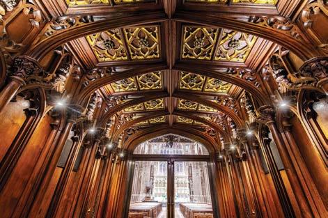
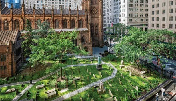
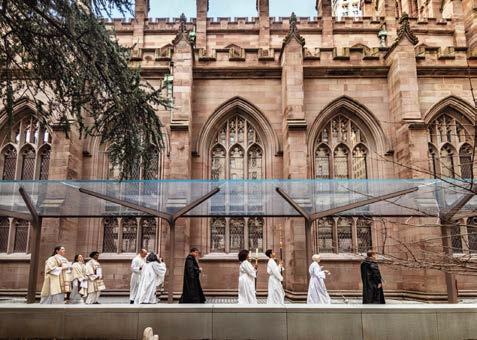
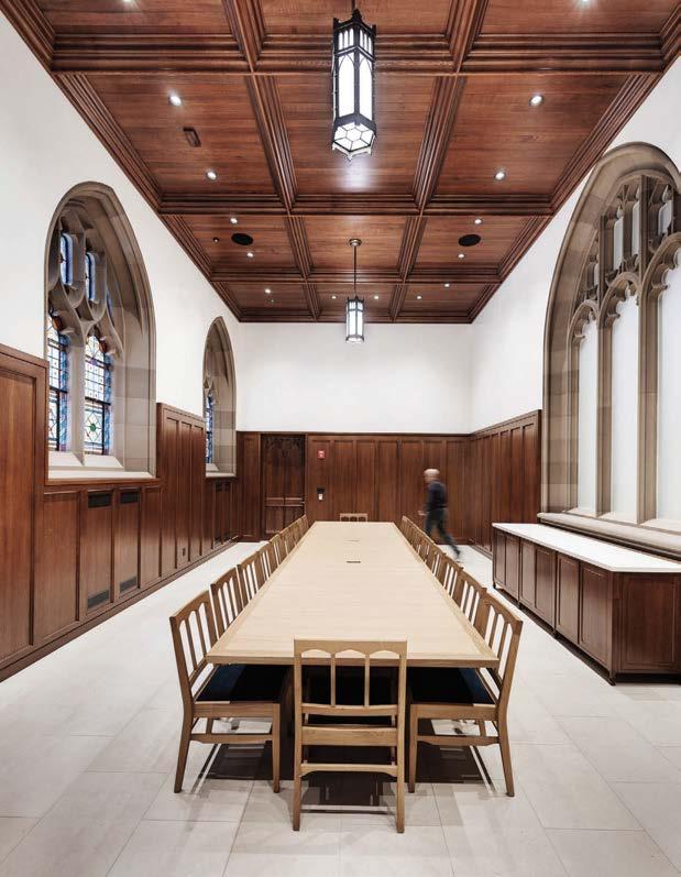
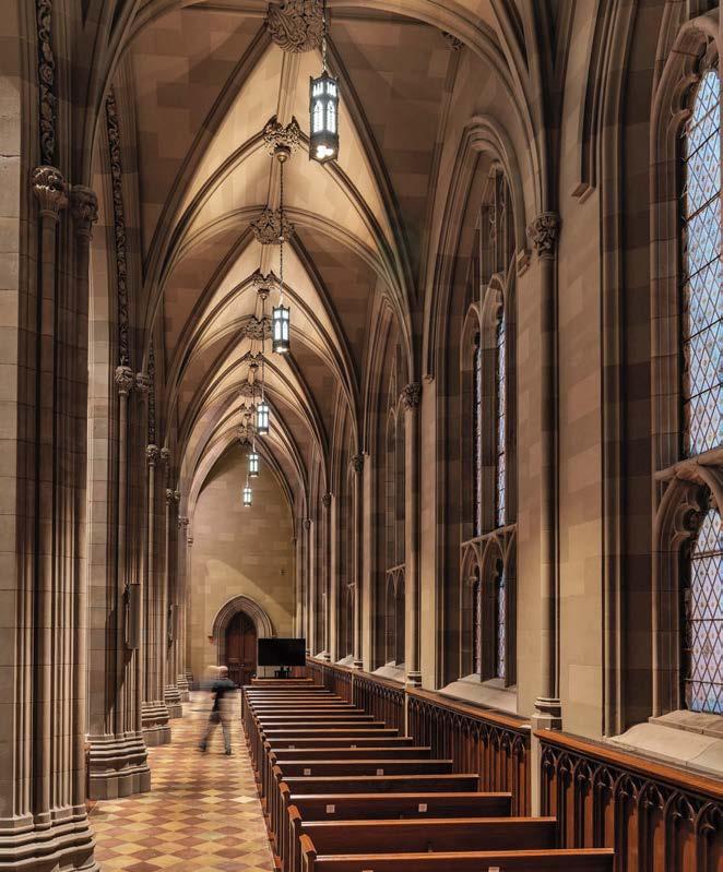
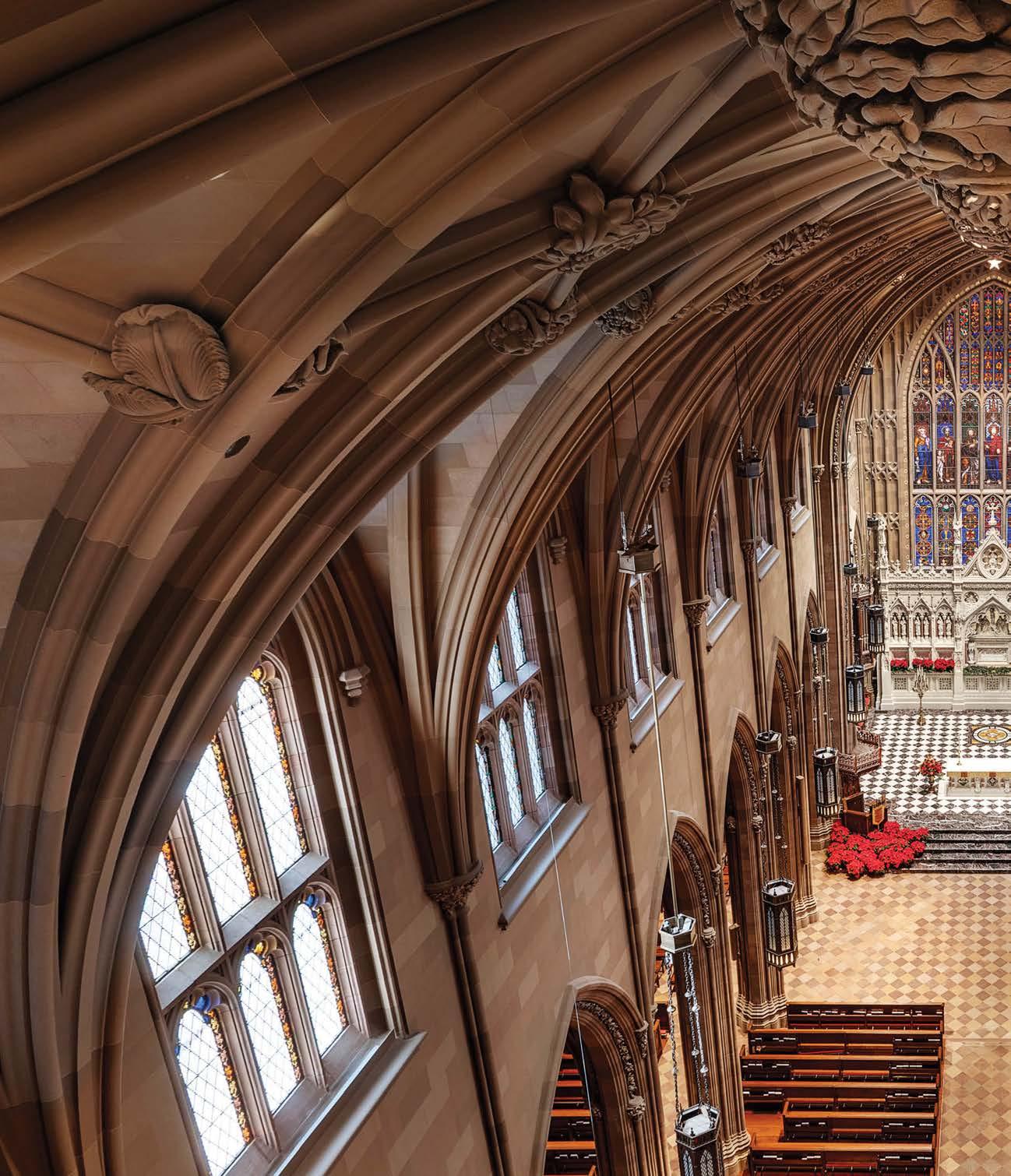 The historic church rejuvenation project was designed to enhance the worship experience, make spaces accessible and welcoming, upgrade technology and infrastructure, and address deferred maintenance.
“The project was the first time that the church was addressed as a whole— strategically considering how religious messaging, functionality, and a healthy, sustainable building could work together to support an active and growing parish”
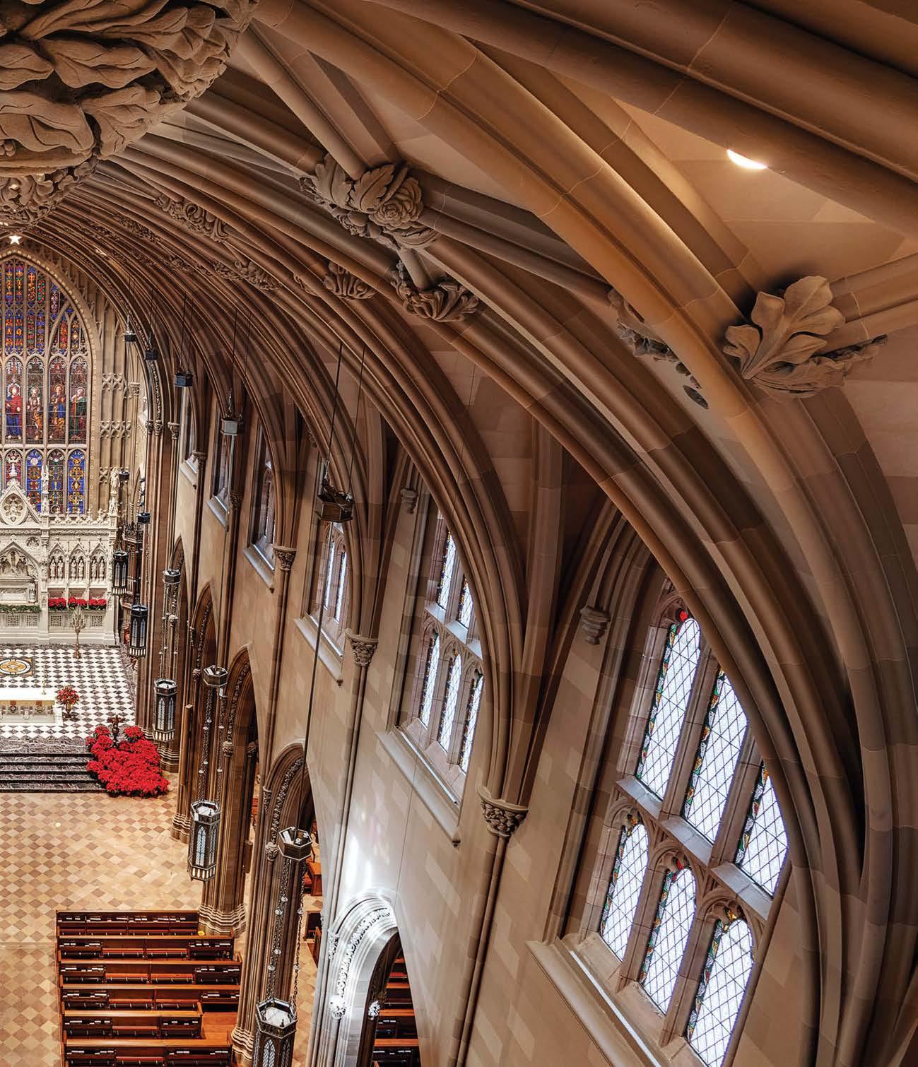
Mawan Bay, the largest among the three components of Shenzhen’s Qianhai district, is set to be the main business development and operations area in South China and the largest regional complex in Shenzhen. The City Exhibition Center of Mawan Bay is a “city showroom” that explores the district’s potential. Call it a window on an ideal future. The interior of the exhibition hall is designed by Matrix and revolves around ecology and economic growth. In particular, it investigates the dimensional relationship between city, nature, and people.
When visitors push open the doors of the exhibition hall, a dreamlike space comes into view, more like an art gallery or theatrical set piece than a dry sales pavilion. A tearoom enclosed in a glass box, mostly transparent but with some panels tinted sky blue and lavender, is intended to be evocative of morning mist on the distant mountains. (There’s even actual water vapor from a fog machine that wafts along the ground.) “When you step into the meditation area, sit alone, and enjoy tea amid the swirling mist, you feel the quiet and stable resonance of the mind,” says Wang Guan, who led the project alongside colleagues Liu Jianhui and Wang Zhaobao. The tinted-glass motif continues throughout, amid blue-chip contemporary sculptures and art, all within an interior of clean and powerful lines that telegraphs a sense of modern architectural strength.
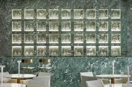
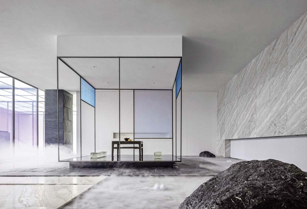
Clockwise from left: A monolithic stair staggers over an urban planning display model. The City Exhibition Center of Mawan Bay showcases the planned development of the area. A stone plinth and dark gray walls set a moody scene. A sculpture of branches draped in yarn has an organicmodern sensibility. The tearoom is engulfed in atmospheric fog, evoking a misty mountaintop landscape. Sage-green marble is inset with illuminated niches that display delicate glass vessels in a café area.
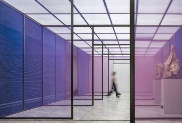
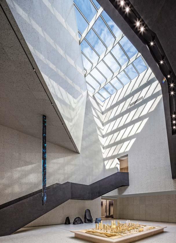
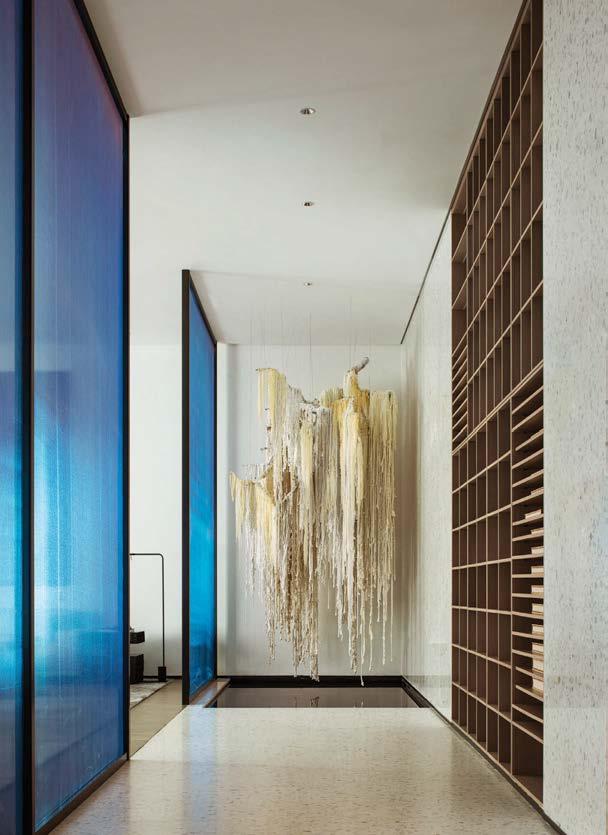
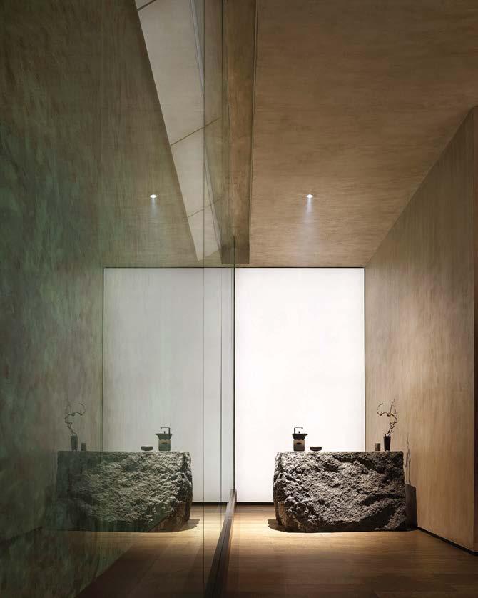 PROJECT TEAM WANG GUAN; LIU JIANHUI; WANG ZHAOBAO; YUJUAN PHOTOGRAPHY COURTESY OF MATRIX DESIGN CO. matrixdesign.com; @matrix_design2010
WXY, in collaboration with structural engineering firm Weidlinger Associates (now Thornton Tomasetti), was commissioned by the NYCEDC to reimagine the pedestrian connection between Battery Park City and the Financial District. This included designing the Robert R. Douglass Pedestrian Bridge, a permanent replacement for a temporary footbridge installed over West Street after its predecessor was destroyed in the attacks on September 11, 2001. Completed just before the 20th anniversary of 9/11, the new bridge served—and continues to serve—as a vital link between Lower Manhattan and its environs as foot traffic escalated during the pandemic.
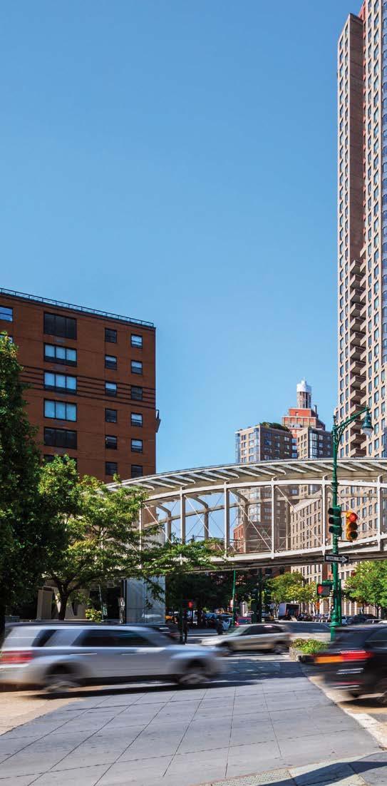
Comprising two spans supported on three individual steel buttresses, the 230-footlong bridge is defined by its distinctive curved lenticular-truss design, which garnered the project an NYCxDesign Award. The lightweight steel superstructure encases a fiber-reinforced plastic footpath, while a protective glass roof creates an airy, open environment that maximizes natural light during the day. Stairs and elevators provide ease of access, but the various points of entry are oriented to minimize their impact on the surrounding community playground and gardens. The spacious walkway accommodates a steady and unimpeded flow of pedestrian traffic but, even during peak periods, provides enough room for the leisurely enjoyment of the close-up views of the Lower Manhattan cityscape.
Clockwise from left: Diamond steel mesh used as fencing allows for air movement and a sense of openness. A glass roof with convex steel supports provides lateral bracing and shields pedestrians from the elements while still flooding the fiberreinforced plastic footpath with sunlight. The bridge is illuminated by LEDs at night. The distinctive lenticular-truss design satisfies the need for a lightweight structure that boldly spans multilane West Street.
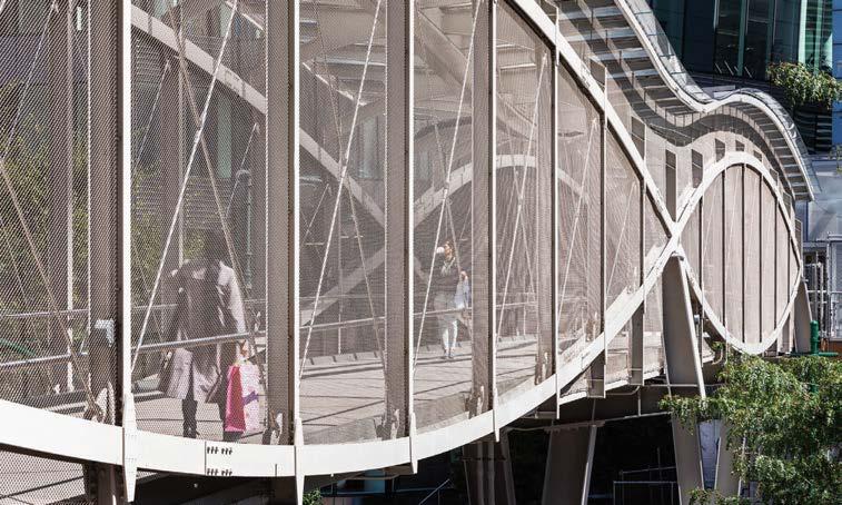 PROJECT
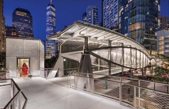
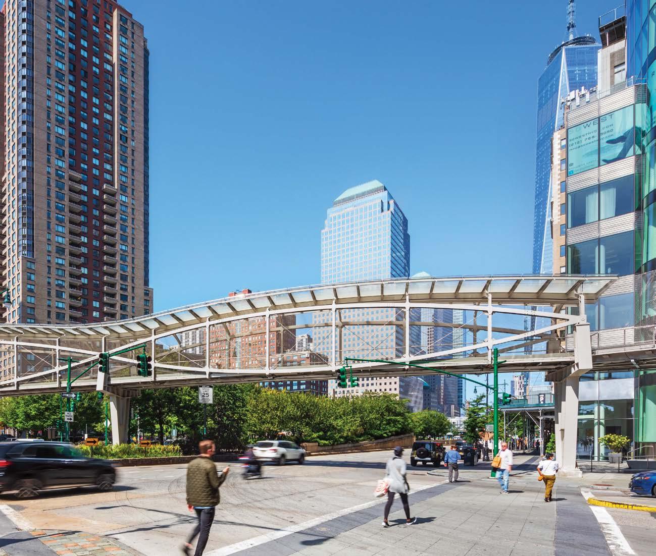
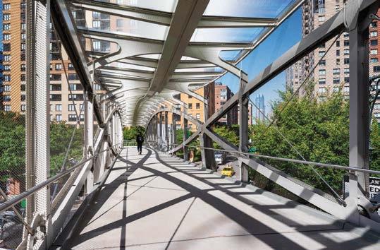
THE BARRETT AT CHEVY CHASE LAKE, MARYLAND
The Barrett luxury apartment development is an expression of contrasts, combining classic exterior architecture with an elegantly contemporary interior. Upon entering the lobby, the focal point is a curving three-story grand stair wrapped in an expertly engineered elliptical metal screen—not merely a pass-through but an experience in and of itself. Wood beams enhance the lobby’s spacious proportions while luminous hand-blown Czech crystal “pearls” swag dramatically from the ceiling, lending movement and artistry to the otherwise crisply architectural design. A natural wood table in the center of the space features a base of timeworn stone mill wheels, tempering the surrounding sleekness. Serving as both sculpture and seating, a 12-legged wood bench at the base of the grand stair lends a measure of quirky charm. The stair leads to the second floor where a multitude of amenities await. Residents can take refuge with a good book in the handsome library, socialize in the polished simplicity of the entertainment kitchen, or shake off the remnants of a long day in the club lounge or billiards room. While the Barrett is in many ways welcoming and leisurely, it is far from ordinary.
KEY CONSULTANTS BECWOOD PURCHASING; PALINDROME LIGHTING DESIGN; CANVAS ART CONSULTANTS; GUITIERREZ STUDIOS; MARTIN ARCHITECTURAL GROUP; DAVID M. SCHWARTZ
PHOTOGRAPHY COURTESY OF RD JONES + ASSOCIATES rdjones.com; @rdjonesassociates
The art collection, for instance, is carefully curated to complement the luxe interiors and highly detailed design. No wonder firm founder Rebecca D. Jones describes the Barrett as a career-defining project.
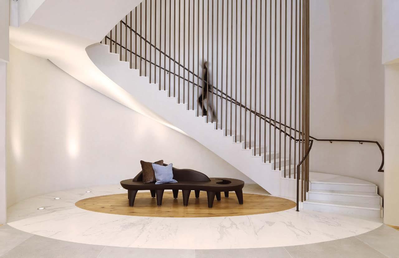 PROJECT TEAM REBECCA D. JONES, IIDA, ISHC; KAMAL MOHEY; MORRIAH MRYSZUK; MONIKA WILSON; HIROMI FUEOKA; ASLAN NAHUM
Clockwise from below: A cozy library is one of many attractive amenities at the Barrett luxury apartment building, the client’s flagship property, designed by RD Jones + Associates. The grand stair joining the lobby to second-floor amenities is encircled by an expertly detailed elliptical metal screen. The entertainment kitchen is defined by organic-shape millwork. A chandelier of hand-blown Czech crystal “pearls” drapes across the lobby ceiling. At the base of the grand stair, an eclectic 12-legged wood bench serves as both seating and sculpture.
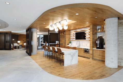
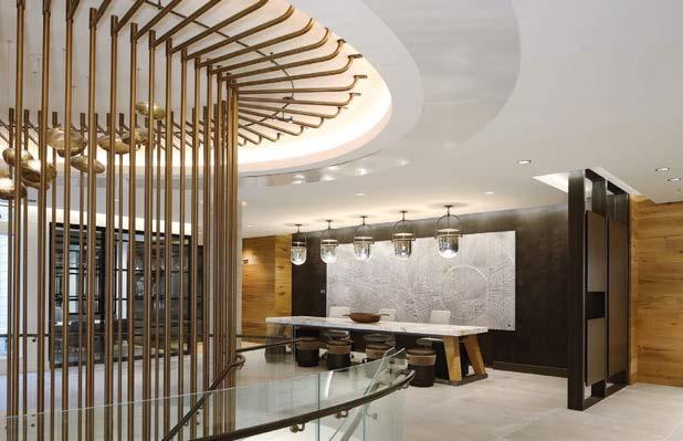
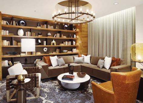
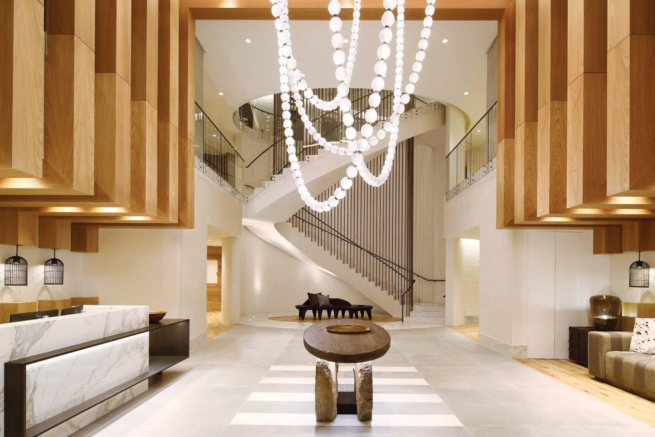
At the Peacock, a private wine cellar, ancient craftsmanship combines with contemporary fabrication technologies, parametric script, and 3D printing in an intentional joining of past and present. The room’s stunning variegated blue tones derive from its innovative wine shelving: 1,000 individually handcrafted glazed-clay tiles that glisten like peacock plumage. From 960 to 1127 CE, during the Song Dynasty, artisans refined a unique style of feather-textured blue porcelain glaze; since then, this Jun technique has disappeared. The August Green team spent months searching for ceramicists in the historic porcelain town of Jingdezhen who could resurrect it. For over two years, the artisans worked to recreate the glazing style on terra-cotta tiles in small kilns. The technique required extreme heat to achieve the right hue, and as a result, only one in ten pieces survived. Those that remained intact are now splayed within the cellar using a triple-curved parametric array inspired by the majestic form of a peacock tail. 3D printing was used to prototype and test the shape of the tiles to keep the bottles still and in place. At the base of each module is a single LED that creates the effect the bottles are floating. There is no additional lighting other than a single downward-directed spotlight above the central table—shaped to resemble a peacock head.
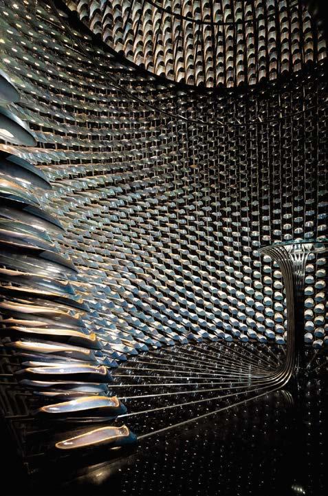
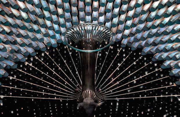 CONSULTANT GODOLPHIN WINE CONSULTANTS
DIRK WEIBLEN; WEN STUDIO
CONSULTANT GODOLPHIN WINE CONSULTANTS
DIRK WEIBLEN; WEN STUDIO
Clockwise from left: The glazed tiles are mounted to a triplecurved parametric array inspired by a peacock’s form; a benefit of using terra-cotta tile is its ability to be fully recycled. August Green worked with artisans from the historic porcelain town of Jingdezhen, China, known for crafting the most exquisite ceramics throughout the dynasties. The 1,000 tiles were arranged to create a light-to-dark gradient. Considering the transience of fast-paced Shanghai life, the team designed the cellar as a kit-of-parts, so it could be dismantled and moved rather than demolished; modules are affixed via nuts and bolts instead of permanent glue.
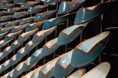 PROJECT TEAM KYLE MERTENSMEYER; NI YANGCHAO; TANG LINWEI; NAN YINGTANG
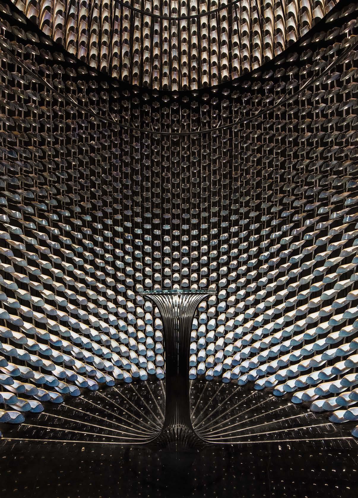
SoFi Stadium stands as the centerpiece of a massive 300-acre mixeduse parcel developed by Los Angeles Rams owner/chairman E. Stanley Kroenke. Along with the 70,000-seat stadium are two additional venues— the 6,000-seat YouTube Theater and the 2.5-acre American Airlines Plaza—all under one swooping roof. The California coastline inspired the structure’s signature form, which blurs the line between exterior and interior spaces and creates an immersive user experience. Because there are no walls—the roof is anchored at four different points—fans feel the Pacific breeze while seated in the stadium. The semitranslucent roof has more than 300 ETFE panels while the porous canopy is made of geometric anodized-aluminum panels, each with its own unique perforation pattern. The roof serves as the stadium’s “fifth elevation,” with an embedded LED system capable of displaying live events that can be seen from the air by the 80 million passengers traveling through LAX annually. The venue’s location in the airport’s flight path posed a challenge: To meet FAA height regulations, the playing field had to be sunk 100 feet below grade. This presented an opportunity to integrate the venue with its natural landscape. HKS worked with Studio-MLA to create a series of “canyons”— landscaped pathways, gardens, and patios—where fans descend on escalators and ramps reminiscent of a trek down bluffs to a Malibu beach.
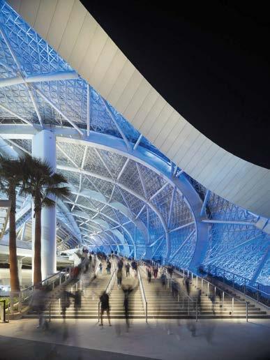
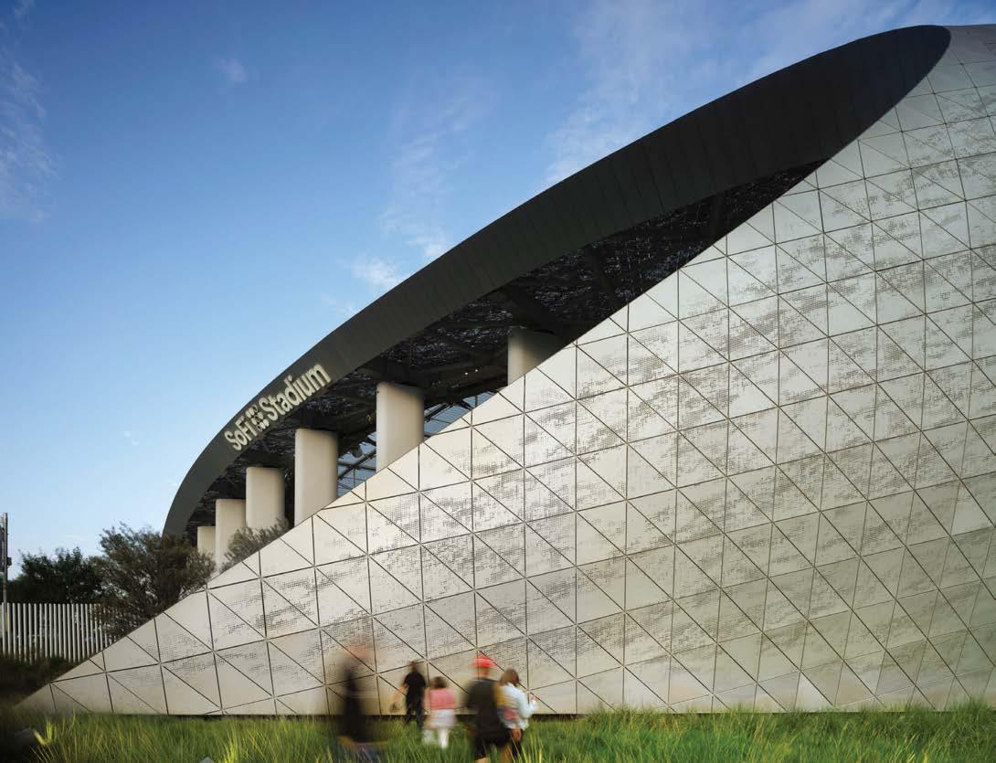 SOFI STADIUM, INGLEWOOD, CALIFORNIA
Clockwise from left: At SoFi Stadium, live games and nighttime concerts play on the LED system in the roof and can be seen from planes in the air. Pocket bars are nestled within the concourses. Light filters in from the roof, which is made of ETFE, a lightweight translucent plastic; 46 of the roof panels are operable to release hot air for ventilation. The porous canopy comprises more than 35,000 perforated anodized-aluminum panels, with no two the same. Two themes drove HKS’s design concept: the stadium would be a living room for the city of Inglewood and a global stage to host mega events visible to the world.
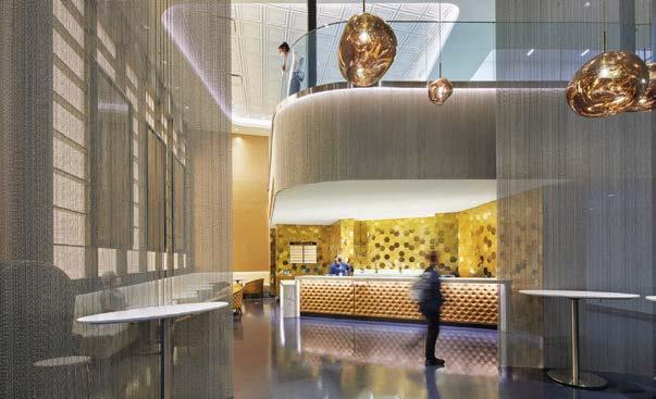
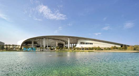
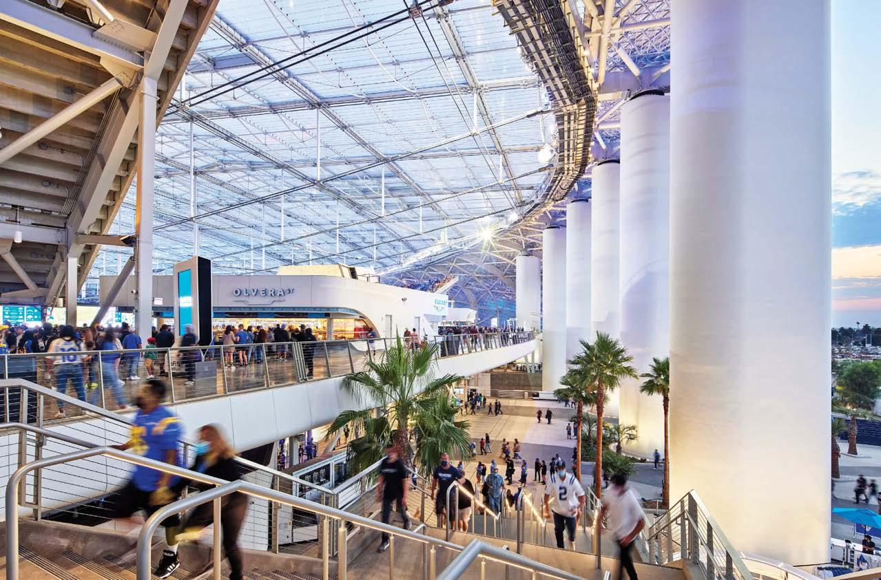 PROJECT TEAM AMANDA TRIMBLE; MARK WILLIAMS; KEVIN TAYLOR; LANCE EVANS; GREG WALSTON; CHAD SCHECKEL; MARK TIMM; KATY CAGLE KEY CONSULTANTS BCV ARCHITECTS; WALTER P. MOORE; HENDERSON ENGINEERS; WJHW; HOWE ENGINEERS; RICCA DESIGN STUDIOS; STUDIO-MLA PHOTOGRAPHY NIC LEHOUX ; BRUCE DAMONTE hksinc.com; @hksarchitects
PHOTOGRAPHY ERIC LAIGNEL meyerdavis.com; @meyerdavis
An all-star lineup was assembled for the architecture and design of this project, the last of three condominium towers to be built in a Coconut Grove waterfront complex. OMA envisioned the undulating exterior concrete columns, which swell and contract like the trunks of palm trees. Meyer Davis designed the lobby and other public areas. Both architect and designers found inspiration in a 1983 Christo and Jeanne-Claude installation that wrapped islets in Biscayne Bay with hot-pink polypropylene. It influenced how the lobby interiors negotiate the tower’s peanut-shape footprint—pinched at the center with two elevator cores—and multiple grade changes. Similar to the way the islands were encircled with concentric bands of fabric, the designers layered ribbons of stone flooring that radiate outward from the core. Where those lines converge and intersect, Meyer Davis created “islands” of seating. Patterned rugs ground those sitting areas—principal Will Meyer calls them “moments of serenity, the residual between waves”—as they float between the core and the curved glass exterior. “It’s not a traditional layout,” Meyer acknowledges. “It’s really a new language with its own logic, rules, and geometry, but it creates its own sense of space.” “There are a lot of branded towers in Miami, but this one has a real personality,” adds principal Gray Davis. “It touches on all the sensory points that make an enjoyable experience and give the project soul.”
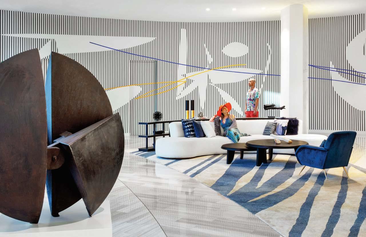 PROJECT TEAM WILL MEYER; GRAY DAVIS; SONYA CHENG; KELLY ARDOIN; MEI LAU; DREW TUCKER
KEY CONSULTANTS THE RELATED GROUP; TERRA GROUP; ARQUITECTONICA; OMA; JOHN MORIARTY & ASSOCIATES
PROJECT TEAM WILL MEYER; GRAY DAVIS; SONYA CHENG; KELLY ARDOIN; MEI LAU; DREW TUCKER
KEY CONSULTANTS THE RELATED GROUP; TERRA GROUP; ARQUITECTONICA; OMA; JOHN MORIARTY & ASSOCIATES
Clockwise from right: Apparatus Studio pendant fixtures hang above a custom marble-clad desk. Polished-brass lockers encircle the wine room. Chairs in this seating area are from William Gray, Meyer Davis’s line of furniture and bath and lighting products. The organic, “out there” layout garnered the project a 2021 Interior Design Best of Year Award for Domestic Lobby/Amenity; the sculpture is by Ledelle Moe. A bronze sculpture by Argentine artist Alberto Bastón Diaz joins a mural by Venezuelan painter Paul Amundarain in the lobby. Lamps by Joan Gaspar and Ramón Úbeda and Otto Canalda light a pool cabana.
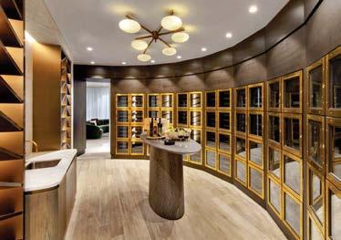
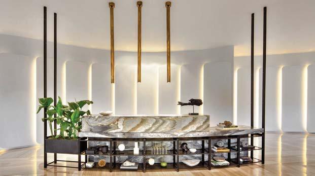
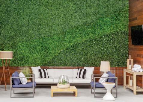
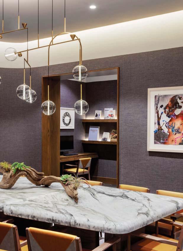
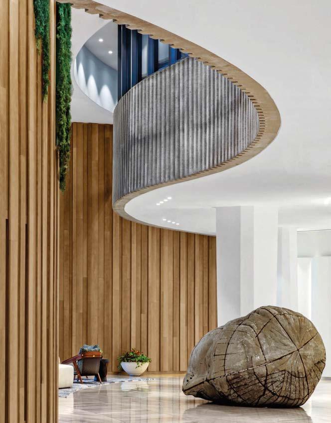
This concrete- and cedar-clad library by Marble Fairbanks is one of 58 neighborhood outposts that make up the Brooklyn Public Library system. Focused on environmental education, the facility offers greatly expanded public spaces (doubling the size of the previous building) while itself being a demonstration of sustainable and resilient design. The two-story building is intended to change over time, transformed by the environment. “The sandblasted cedar panels reveal patterns of growth in their grain and knots,” partner Karen Fairbanks says. “They will gray with age, beginning to match the color of the concrete panels, which were cast using the same wood.”
The 15,000-square foot interior includes a large community event space (which can be divided into lab areas for projects), a lounge, meeting rooms, and staff facilities. Four solar windows are aligned to mark the solstices and equinoxes. Mable Fairbanks instituted street-level exterior green space and two accessible green roofs on the upper floors. Inaugurated during the pandemic, these outdoor spaces were highly valued and remain a favorite feature. The street-level civic space has become a “front porch” for the Greenpoint neighborhood, while the reading garden hosts story time and sewing classes. In addition, the demonstration garden provides food for the community and offers programming ranging from pickling to stargazing.
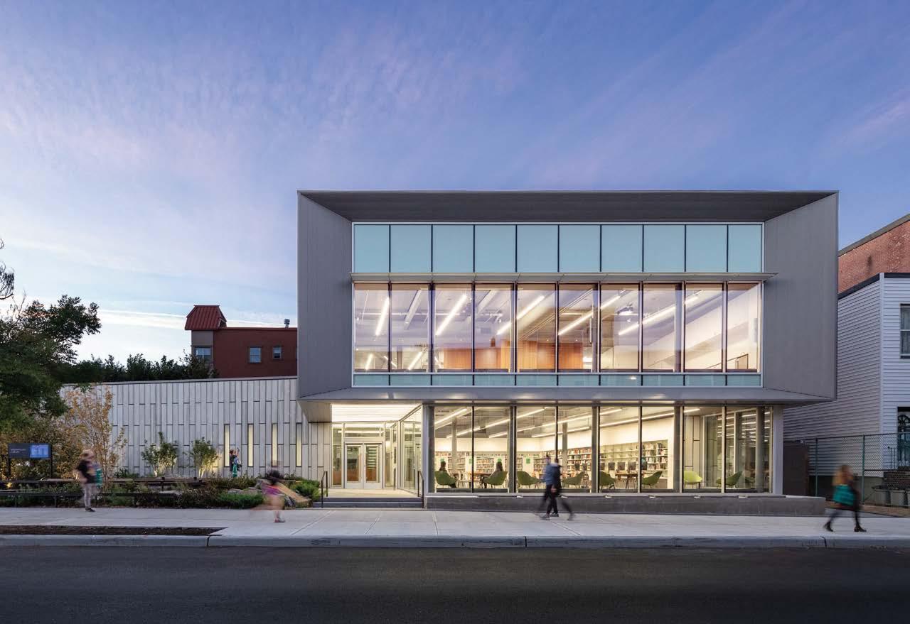
Clockwise from above: The front desk and custom woodwork throughout is cherry, a species native to the area. A reading room on the first level looks out toward the entrance plaza, allowing the community direct connection with the activities inside. Sandblasted cedar planks and concrete panels clad the structure; the street-level plaza is an active civic space with granite outcroppings, native forest plantings, and bioswales that assist in stormwater management. The building exceeded the goal to meet LEED Gold and is targeting LEED Platinum.
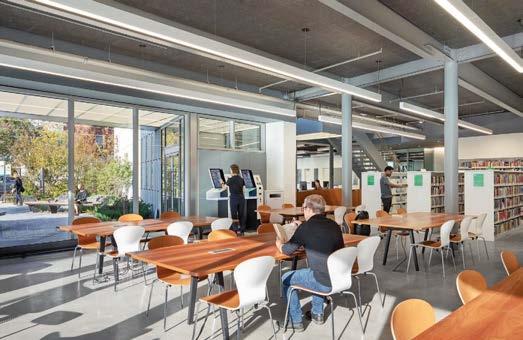
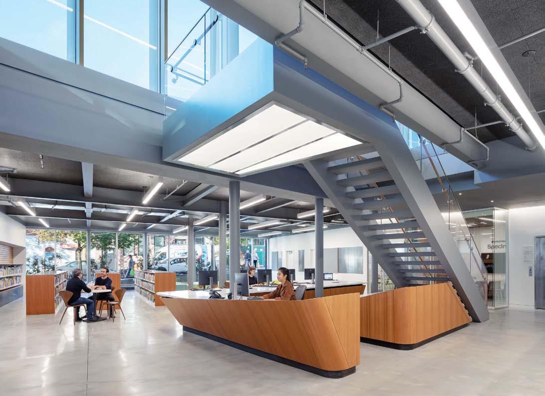
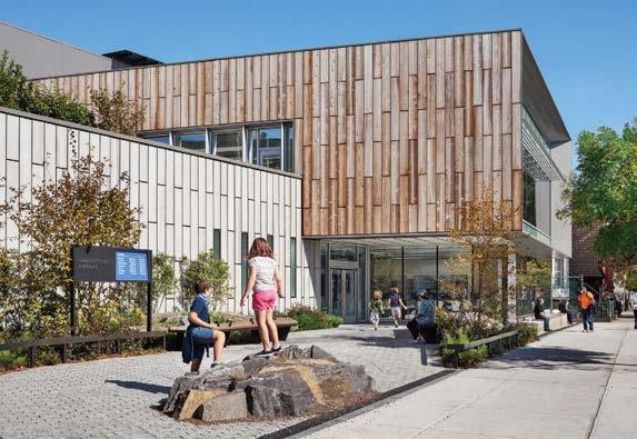 PROJECT TEAM KAREN FAIRBANKS; SCOTT MARBLE; NICHOLAS DESBIENS; JASON ROBERTS; PETER ADAMS; BENJAMIN HAIT; KEENAN KORTH; LAUREN ESPESETH; SPENSER KRUT; TANYA GERSHON; RAVIPA RAMYARUPA; ATRIANNE DOLOM
KEY CONSULTANTS SCAPE LANDSCAPE ARCHITECTURE; ADS ENGINEERS, PC; ROBERT SILMAN ASSOCIATES; COSENTINI ASSOCIATES; INTOTO PROFESSIONAL SERVICES, INC; TILLOTSON DESIGN ASSOCIATES; MTWTF PHOTOGRAPHY MICHAEL MORAN/OTTO marblefairbanks.com; @marblefairbanks
PROJECT TEAM KAREN FAIRBANKS; SCOTT MARBLE; NICHOLAS DESBIENS; JASON ROBERTS; PETER ADAMS; BENJAMIN HAIT; KEENAN KORTH; LAUREN ESPESETH; SPENSER KRUT; TANYA GERSHON; RAVIPA RAMYARUPA; ATRIANNE DOLOM
KEY CONSULTANTS SCAPE LANDSCAPE ARCHITECTURE; ADS ENGINEERS, PC; ROBERT SILMAN ASSOCIATES; COSENTINI ASSOCIATES; INTOTO PROFESSIONAL SERVICES, INC; TILLOTSON DESIGN ASSOCIATES; MTWTF PHOTOGRAPHY MICHAEL MORAN/OTTO marblefairbanks.com; @marblefairbanks
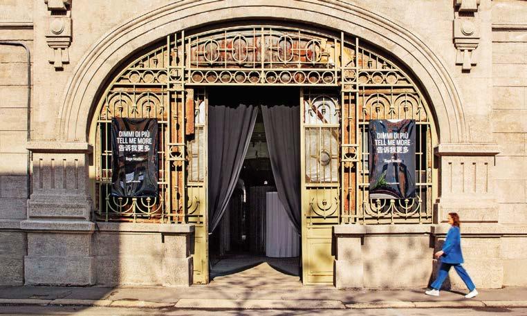
Rapt Studio’s inaugural installation at Milan Design Week 2019 was an artful exercise in placemaking that celebrated connection and conversation. The setting was Ventura Centrale, in one of a dozen vaults carved under railroad tracks that lead to the city’s Central Station. The raw, slowly decaying space, measuring 2,400 square feet, provided a powerful canvas for Rapt’s creativity. As guests entered, they encountered several small “stages” encircled by sheer draperies—their own personal theaters, if you will. Each stage, scaled to the individual and lit from within to glow a cool white, contained a podium with notecards on which visitors were asked to leave an evocative question for the next guest to answer. Afterward, visitors moved into a lounge where a cozier glow emanated from pendants swagged from the vaulted ceiling. Among the lights dangled notecards featuring the questions of all those who had visited the day before, creating a living collage. Guests were encouraged to read the questions and strike up conversations in the lounge, forging personal connections with those around them. As the week wore on, the number of cards grew and the installation became complete. As the space transformed, it became less and less Rapt’s and more and more the product of the participants’ making.
Clockwise from left: Rapt Studio’s “Tell Me More” attracted visitors from across the globe who came to Milan to celebrate design. Erik Bruce fabricated drapery for the individual “stages” where visitors wrote their queries, creating thoughtful compositions with both color and opacity. Brooklyn-based lighting studio Rich Brilliant Willing provided decorative fixtures, including the Vitis chandelier. Underfoot were Mae Engelgeer’s groovy Swell rugs for Moooi Carpets.
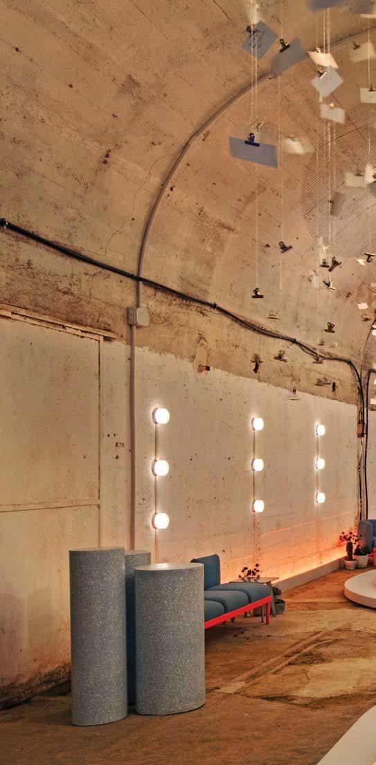 PROJECT TEAM DAVID GALULLO; WENDY CHUAH; DANIEL KORN; DANIEL EPPERSON; SARAH GIESENHAGEN; NICK TEDESCO; SAM GRAY; CHELSEA GIL; BRYANT NGUYEN; CAMILLE ROBINS PHOTOGRAPHY LEILA SEPPA; ERIC LAIGNEL raptstudio.com; @raptstudio
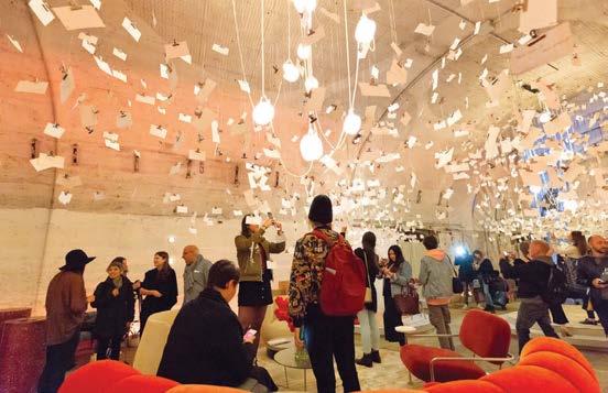
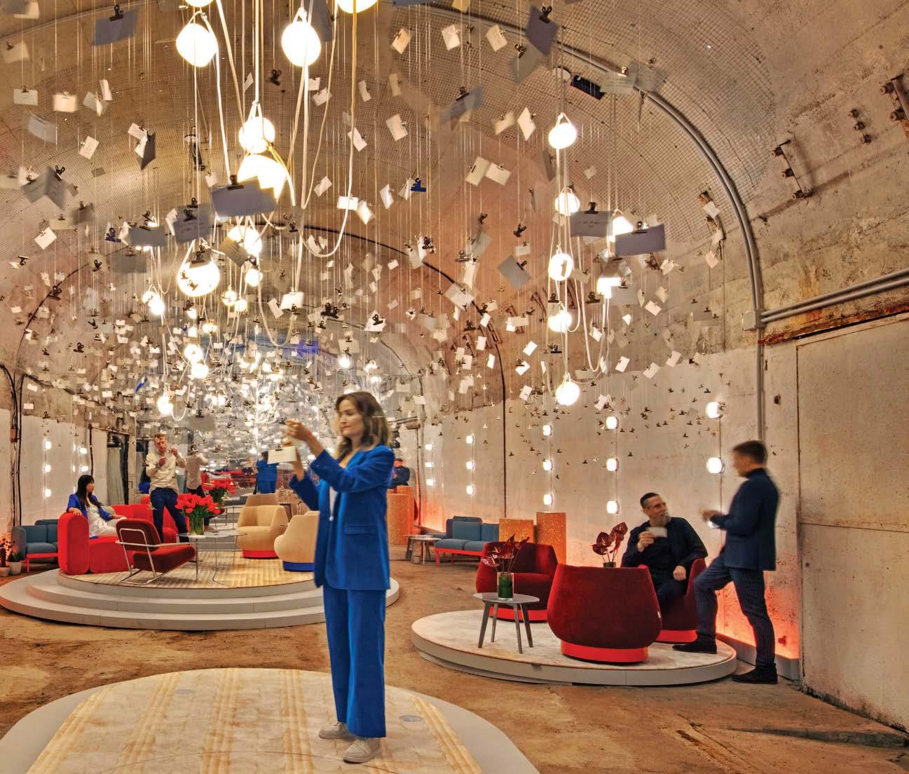
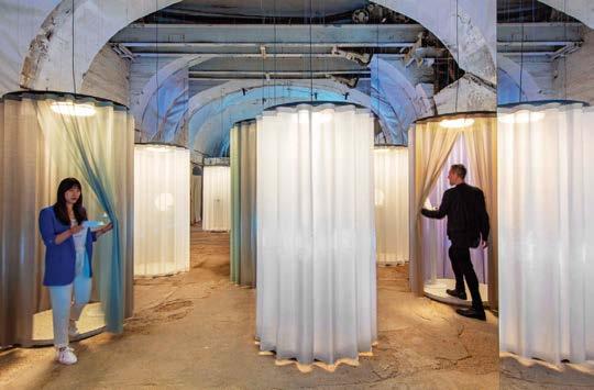
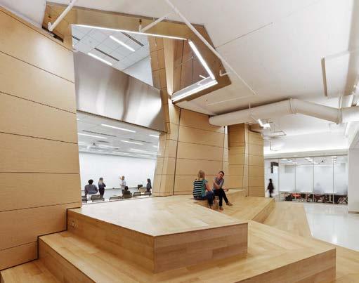
While scouting sites suitable for Georgetown University’s School of Continuing Studies, STUDIOS Architecture principal Brian Pilot found a long-vacant television studio near the main campus. His team took the tomblike building and, in 10 months, transformed it into 100,000 square feet of functional space.
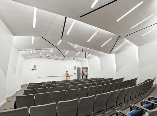
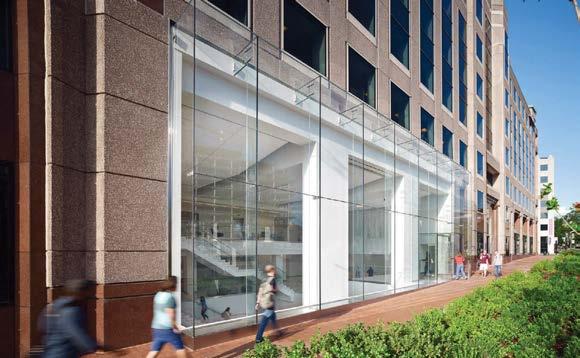
The landlord had puzzled for years over what to do with such a prehistoric production facility, its windowless volumes awkwardly buried on the lower levels.
The designers cracked the claustrophobic setup wide open by removing the floor slab between two double-height studios, combining them into a four-level atrium. Daylight was pulled deep inside by replacing part of the red granite facade with a stretch of glass curtain wall. “In the evening, you can really see right in,” Pilot reports. That’s particularly important for a school of continuing education, where the nontraditional students—midcareer professionals and military veterans—attend class mostly after dark. A pale palette of engineered oak and white-painted walls brightens things up further, while color comes in the form of what the students call “Doritos chairs,” actually modular seating by UNStudio. Up at the top, to either side of the atrium, the team uncovered boarded-up clerestories—the starting point for a chapel and the faculty lounge. They’re screened from the atrium by white powder-coated steel panels preforated with circles ranging in size from a nickel to a cookie.
Clockwise from opposite: Perforated powder-coated steel screens not only provide texture and privacy but also accentuate the atrium’s 53-foot height without screaming “feature wall.” The new tiered auditorium provides a dynamic space for lectures and meetings. Engineered oak and white-painted walls lend brightness to windowless spaces. An M.C. Escher–esque staircase floats through the atrium at slightly skewed angles. The designers pulled daylight deep inside the building by replacing part of the red granite facade with a long stretch of glass curtain wall.
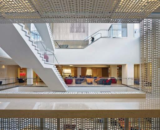 PROJECT TEAM BRIAN PILOT, AIA, LEED AP; TODD DEGARMO, FAIA, LEED AP; ERIN CARLISLE, AIA, LEED AP; MICHAEL DOYLE; EMILY SCHNEIDER, LEED AP; BEN KRACKE, AIA, LEED AP; HIROSHI JACOBS, AIA, LEED AP; LEE SEWELL; MARIA PACHECO; MELISSA FUNKEY, LEED AP
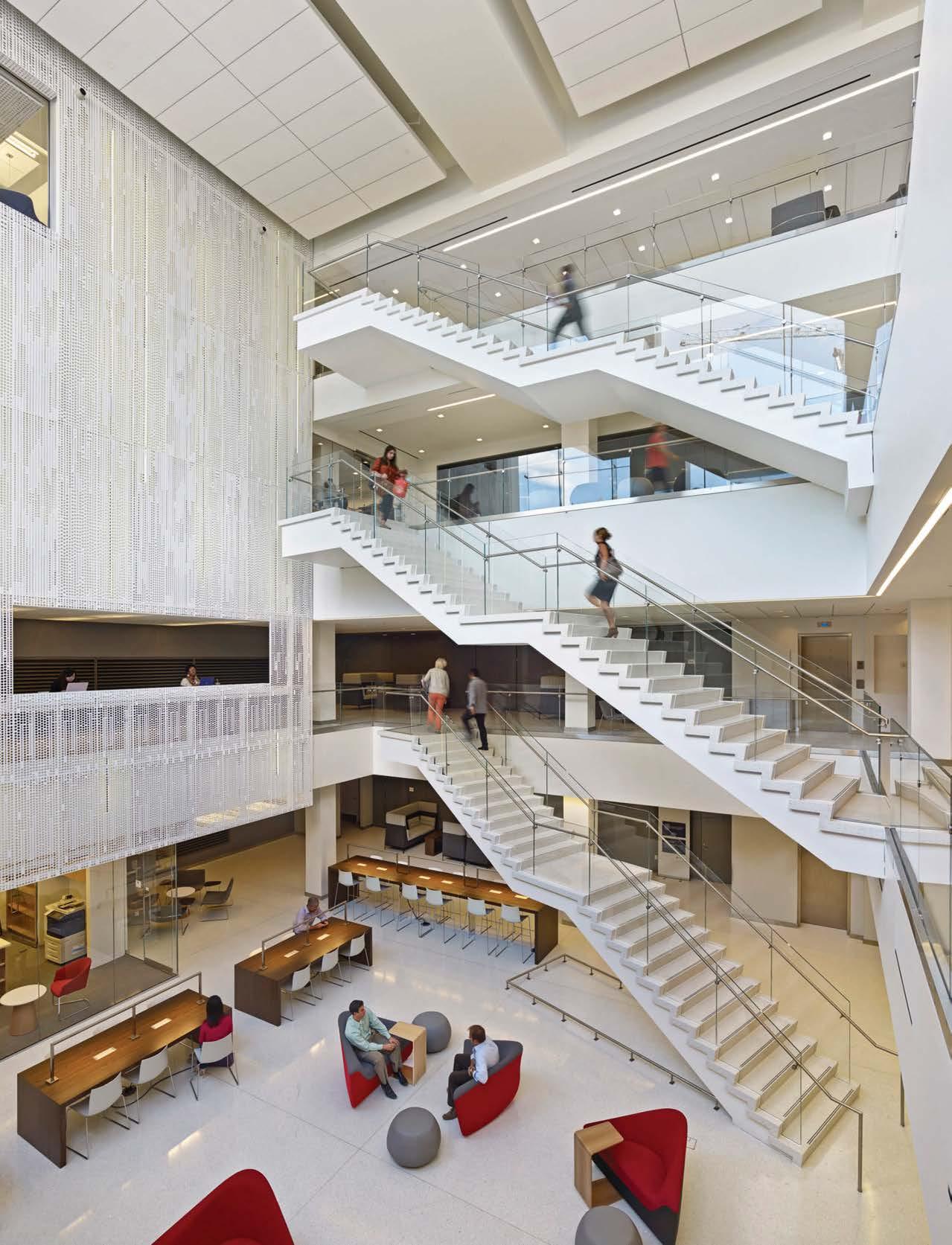
Sustainability and wellness are engrained in Sloan’s business, from its motto of Water Connects Us, to the efficiency of its commercial bathroom products and the research and development that goes into its touch-free innovations. So, when it came time to create its new flagship showroom and adjacent office space in Chicago’s Fulton Market district, sustainability was a priority in the design process to ensure the project was LEED Silver and WELL Gold certified.
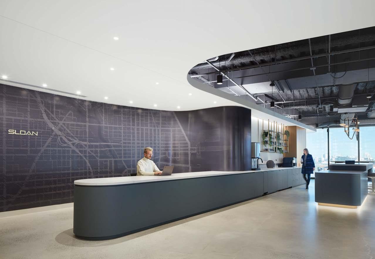
Sloan wanted to create a showroom geared toward hospitality, learning, and collaboration, so the design team developed a flexible space that minimizes its physical footprint while showcasing Sloan’s product offerings. The elegant and impressive showroom helps designers and architects imagine and explore options through interactive product displays and curated design rooms. Clients can experience special finishes firsthand, interact with different products in real-world displays, and engage with touch screens to learn more about Sloan’s commitment to sustainability and wellness.
The Lamar Johnson team worked closely with Sloan’s marketing and product teams to understand the company philosophy. The result is a working showroom curated for interaction with Sloan products and the development of unique design solutions with project partners.
PROJECT TEAM PAUL BRYANT; IMANI DIXON; AL FIESEL; MEGAN SCHULTZ; JESSICA STATZ; LANCE YEARY KEY CONSULTANTS CBRE; SKENDER; SYSKA HENNESY; CORPORATE CONCEPTS; FOUR FOUR DESIGN PHOTOGRAPHY STEVE HALL/HALL+MERRICK+MCCAUGHERTY PHOTOGRAPHERS theljc.com; @lamarjohnsoncollaborative
Clockwise from right: The flexible conference room has glass walls that can open wide to the showroom, allowing Sloan to host continuing education classes, internal training and development programs, and community and philanthropic events. LJC’s design of the interior is sober and refined throughout. A chandelier of twisted copper pipe strikes an industrial note in the kitchen. Sound-absorbing felt cut in geometric patterns backdrops a booth. Flooring in reception is poured concrete. Display stands showcase vignettes where customers can explore product lines.
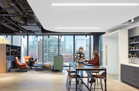
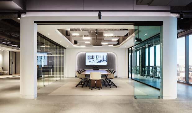
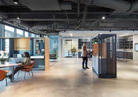
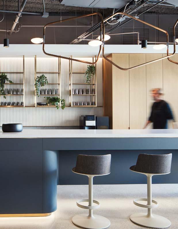
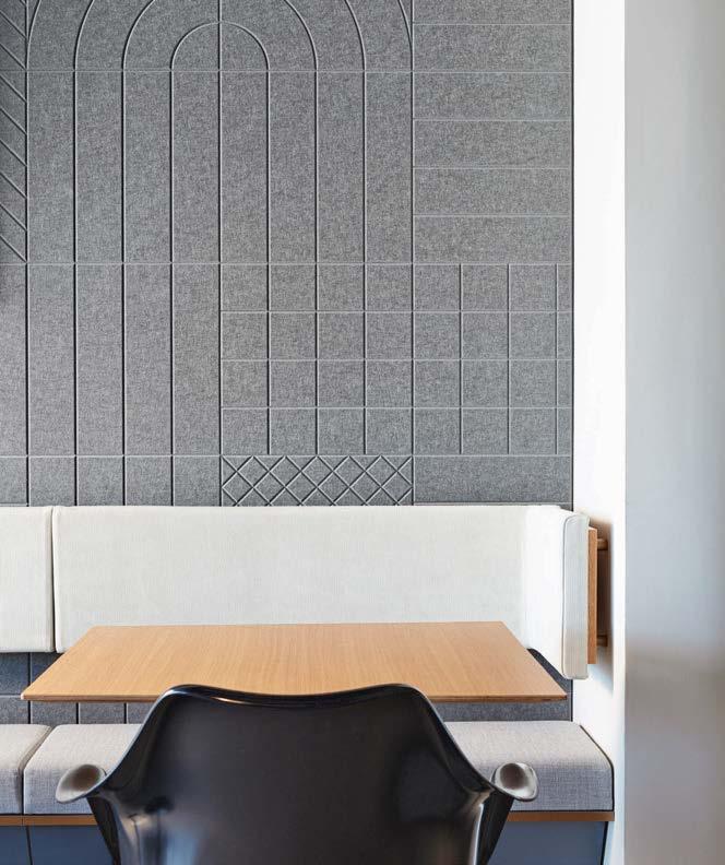

Located within the Jacob Reingold Pavilion at the Hebrew Home for the Aged, Derfner Judaica Museum has an indoor-outdoor sensibility that encourages public participation with the art. It overlooks the Hudson River, with corridors that run perpendicular to the outside, allowing visitors to look out and passersby to look in. Simultaneously, the design permits only indirect light into the museum, preventing degradation of the art from harmful sun rays. “The Derfner Judaica Museum is an early example of our ongoing approach of designing sustainable architecture of art and conscience,” says architect Louise Braverman. “It was during our work on this museum in 2009 that we first focused on creating a transparent art environment that brings the outside in.”
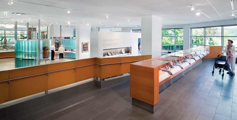
The museum establishes a sophisticated prototype for cultural institutions in the era of aging baby boomers. The display cabinet design allows for everyone, including people affected by disabilities, to experience proximity to the art. Visitors in wheelchairs can roll up under the cantilevered cabinets and easily see the objects and hear the audio text, for an intimate experience of the works displayed. Today’s senior citizens strive to be included in society at large. Since the museum is open to the public, it encourages multigenerational engagement. Children can comfortably enjoy exhibitions with their elders, both learning from the other.
Clockwise from left: Display cabinets are cantilevered so visitors in wheelchairs can easily roll up to see objects at close range. A schematic sketch shows the building in relation to the Hudson River. From the overall layout to the smallest detail of the display cabinets, Louise Braverman Architect gave in-depth thought to what it would take to encourage multigen erational engagement. A curved wall made of channel glass creates a viewing gallery in the center of the museum. Display cabinets foster a sense of intimacy with the art. Translucent glass allows indirect light to enter the space.
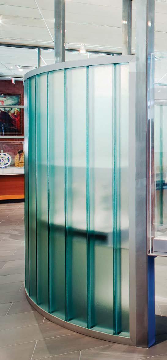 PROJECT TEAM LOUISE BRAVERMAN; JOHN GILLHAM; CATALINA MAYSLES
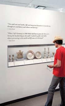
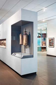
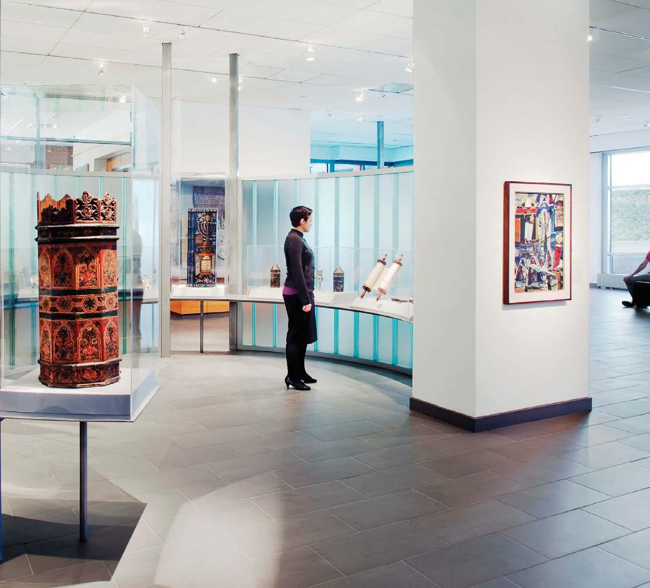
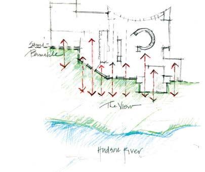
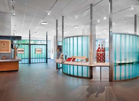
Matrix Design, established in 2010, is headquartered in Shenzhen with satellite offices in Beijing, Shanghai, Chengdu, and Xi’an. For a resort sales center in Wenzhou, China, Matrix’s design team led by Wang Guan, Liu Jianhui, and Wang Zhaobao looked deep into the nation’s past for inspiration, exploring the impact of ancient Chinese paintings on contemporary design. Landscape art depicting mountains, water, and bamboo groves sparked the idea for the interiors to be a miniature oasis of calm: an escape from the bustling metropolis. “We envisioned magnificent buildings surrounded by mountains and sky with clouds leisurely floating by,” Jianhui says.
That translates into a restful environment with soaring triple-height ceilings flooded with daylight. The interiors are a modern interpretation of the power, poetry, and preciousness of two mediums: water and ink. Striated and marbled stones and watercolor blues and grays contrast with brass trim and other reflective or mirrored finishes. In lounge areas, a sea of serene seating in cream and taupe hues is partitioned by traditional Chinese folding screens painted with the most delicate clouds. Cultural elements are reflected in everything from colors to specific objects, and soft furnishings and artworks further the elegant mood.
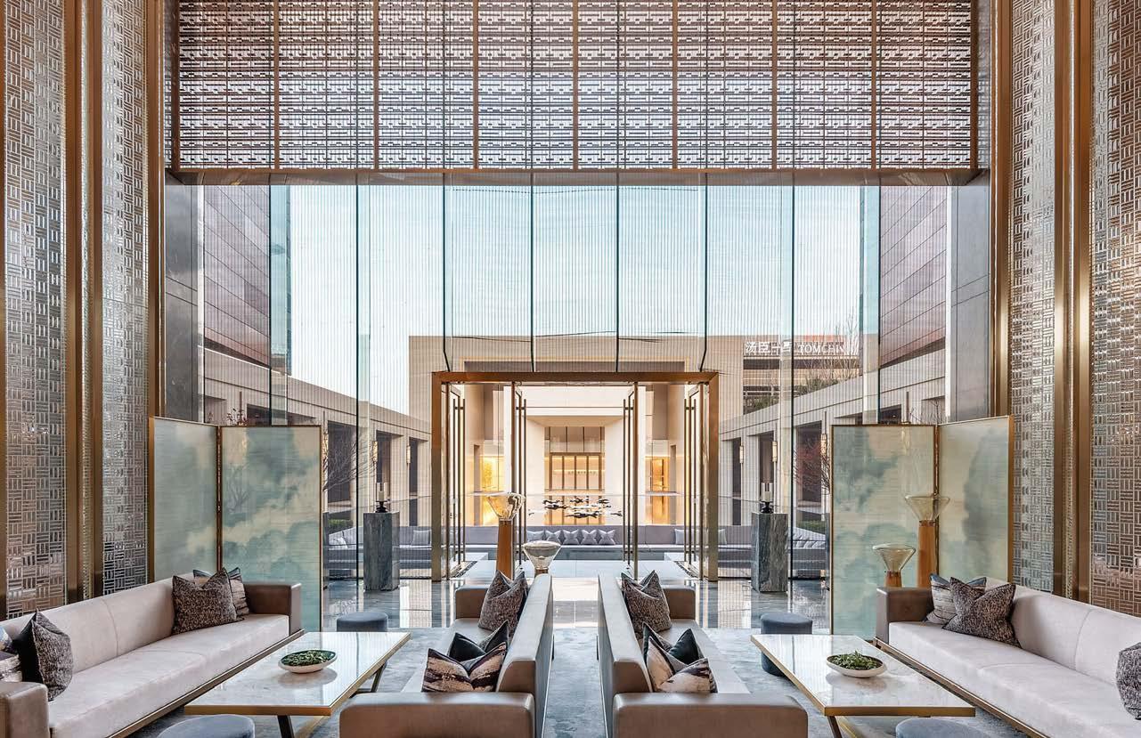
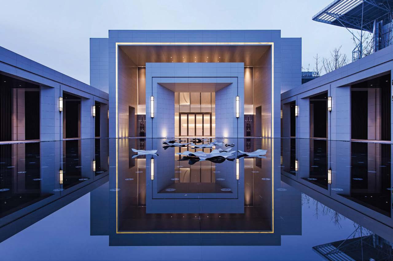
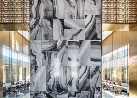
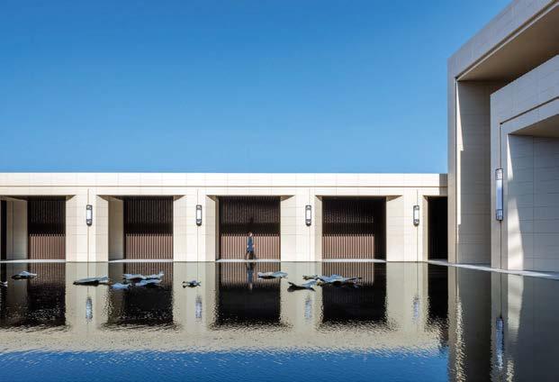
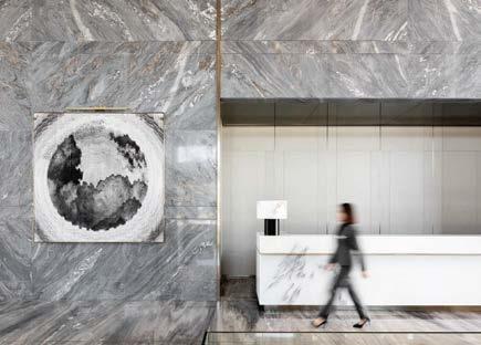 Clockwise from left: Painterly clouds decorate traditional Chinese folding screens in a lounge area. Sculptural “lily pads” float on water. Wang Guan, Liu Jianhui, and Wang Zhaobao’s gray and gold palette strikes a sophisticated tone. A Zen pond reflects the simple, almost austere architecture. Deliberately mismatched marble panels add dynamism to the mise-en-scène.
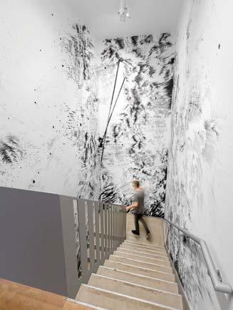 YORK
YORK
WXY is an award-winning multidisciplinary practice specializing in the realization of urban design, planning, and architectural projects in challenging contexts. Nowhere is that more evident than in the firm’s makeover of the Drawing Center, a small institution specializing in works on paper, which required extensive renovations of its public, conservation, and office areas as well as a total upgrade of its climate systems. After completing these improvements in 2000, WXY was asked for a space-need feasibility study that led to a further commission as the consulting architects for the center’s long-term expansion strategy.
The new Drawing Center comprises 9,000 square feet, with 50 percent more gallery and programming space. The seamless architectural plan connects a new ground-level bookstore, visitor services desk, main gallery, and skylit drawing room gallery to office spaces on the second floor and a renovated basement. The new lower level includes a room dedicated to art education, a conference room for artists and curators, and the lab, which features a media system for exhibitions and public programs. Crucial details in the galleries include laminated-glass skylights designed to filter out close to 100 percent of ultraviolet rays and maintain optimal color-rendering in the interior space. It’s thoughtful design for the 21st century: sophisticated, clean of line, and intelligently executed.
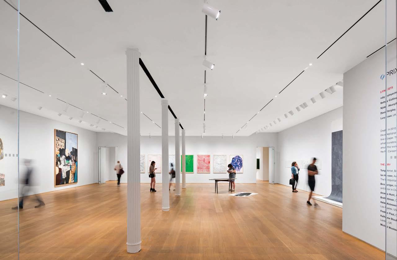
Clockwise from above: In the renovated basement, flooring is poured concrete. The new plan connects the ground-floor bookstore, visitor service desk, main gallery, and skylighted drawing room gallery to office spaces on the second floor and to the basement. The center focuses on the exhibition of works on paper, both historical and contemporary. The stairway to the basement features dynamic sketching directly on walls. The cast-iron columns are original to the 19th-century building.
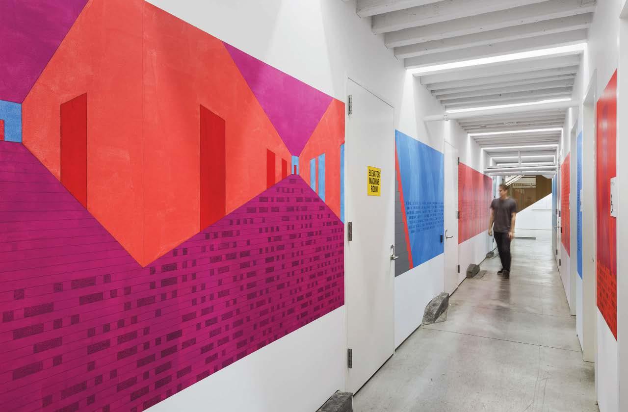
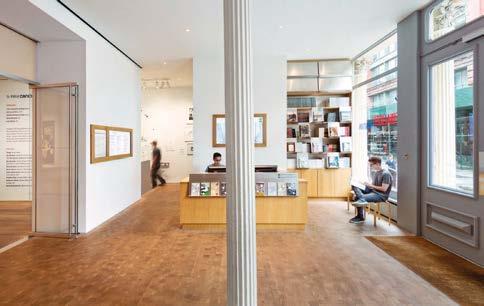
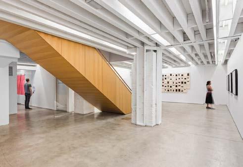 PROJECT TEAM CLAIRE WEISZ, FAIA, AIA; MARK YOES; LAYNG PEW; JACOB DUGOPOLSKI KEY CONSULTANTS BURO HAPPOLD; TECHNICAL ARTISTRY; ARUP ACOUSTICS PHOTOGRAPHY ALBERT VECERKA/ESTO wxystudio.com; @wxystudio
This 330,000-square-foot project required architecture and interior design firm LJC to think outside the box—literally. The brief from the developer client was to create a visually striking, experientially exciting residential building on a vacant lot bounded by Webster Avenue on the north, Elston Avenue on the west, and the Union Pacific train tracks to the east. The oddly shaped sliver of land demanded a unique design solution. LJC obliged with a long, sloped, south-facing roofline that provides most of the apartments with views of downtown Chicago.
The lobby program evolved in parallel with the development of the facade. Angular forms create a fluid dialogue connecting the exterior and interior architectural expressions. A concrete stair cantilevers from the sheer core wall to celebrate the lobby’s height and link reception to the secondfloor terrace and pool, creating a seamless connection between the streetscape and the skyline. A custom bronze-finish balustrade adds refined detail to the stair.
The clubhouse, a multipurpose space with a lounge, fitness center, game room, and coworking area, draws inspiration from the spatial organization already established in the main lobby. The interior design responds to the architecture. Exposed structural concrete reflects the area’s gritty heritage—the masonry warehouses and steel bridges of the neighborhood’s industrial past—while warm materiality and lighting are an inviting counterpoint.
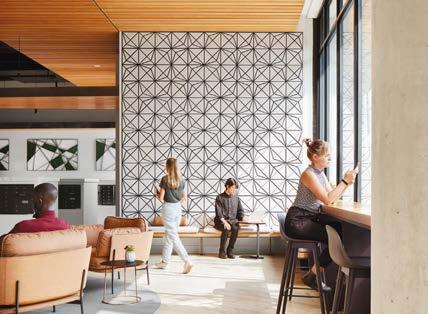
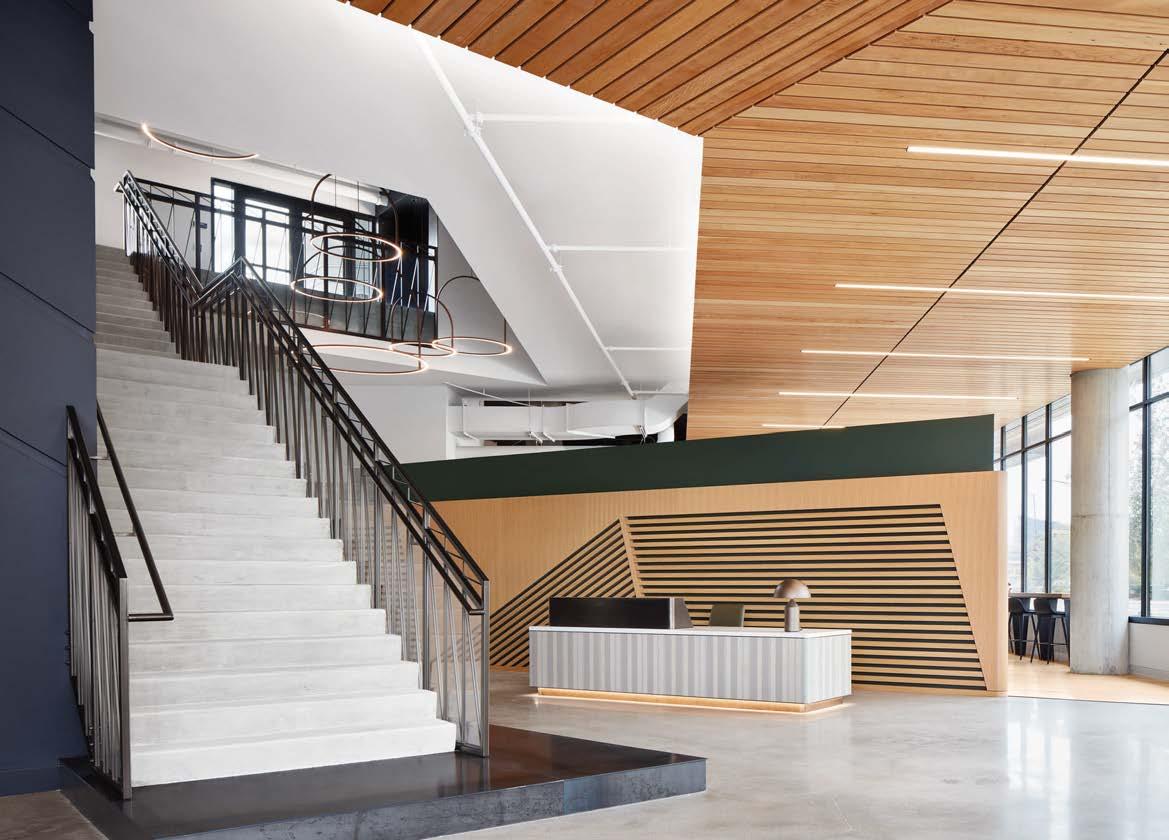 PROJECT TEAM PAUL BRYANT; MICHAEL HANLEY; JEREMY MARGIS; LINGYI TSENG; LANCE YEARY KEY CONSULTANTS POWER CONSTRUCTION; WSP ENGINEERS; SALAS O’BRIEN ENGINEERS; V3 COMPANIES; SITE DESIGN GROUP PHOTOGRAPHY KENDALL MCCAUGHERTY/HALL+MERRICK+MCCAUGHERTY PHOTOGRAPHERS theljc.com; @lamarjohnsoncollaborative
Clockwise from above: The clubhouse, situated on the southeast corner of the site to frame views of the Chicago skyline, offers plenty of cozy spots to sit and socialize. Angular metal screens repeat the lines of the standing-seam metal roofing seen through the curtain wall. Geometric tile vivifies the communal kitchen adjacent to the clubhouse. A concrete stair connects reception to the terrace above. Warm materiality meets industrial cool throughout. Custom bronze-finish railings add refinement.
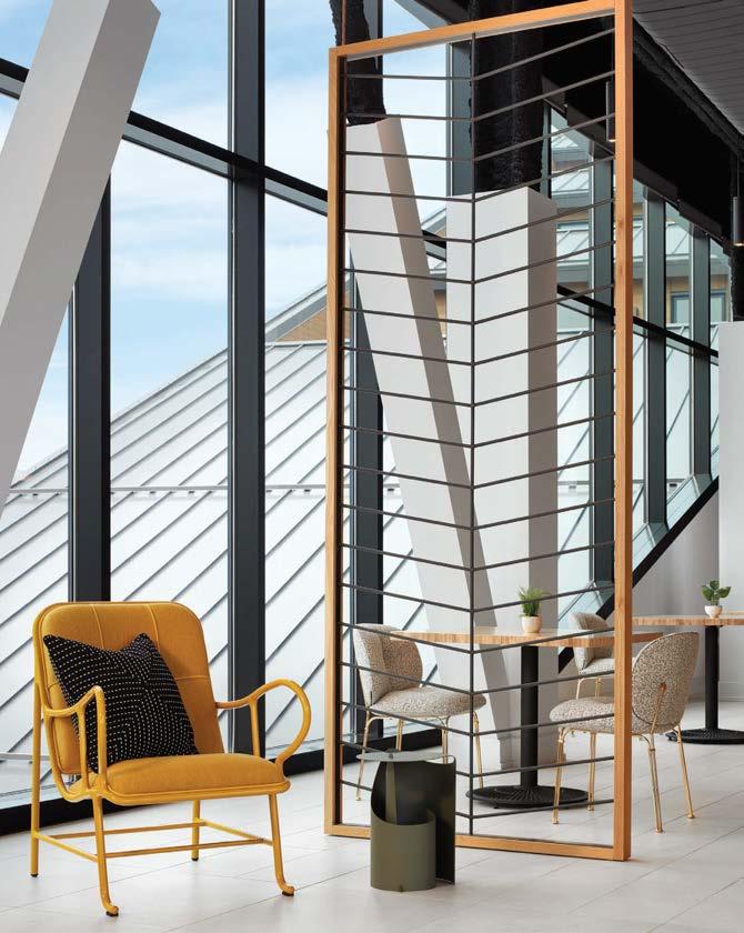
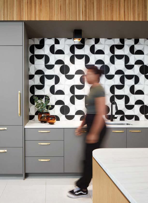
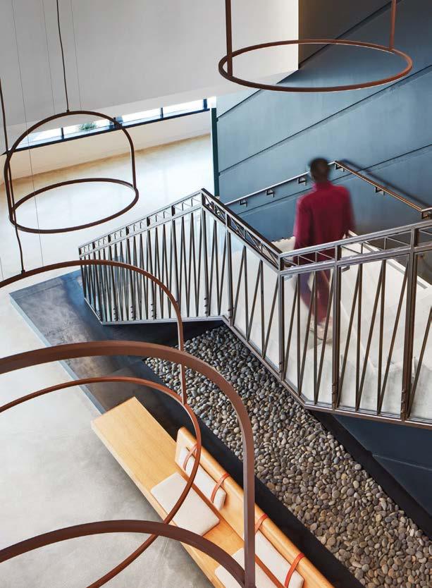
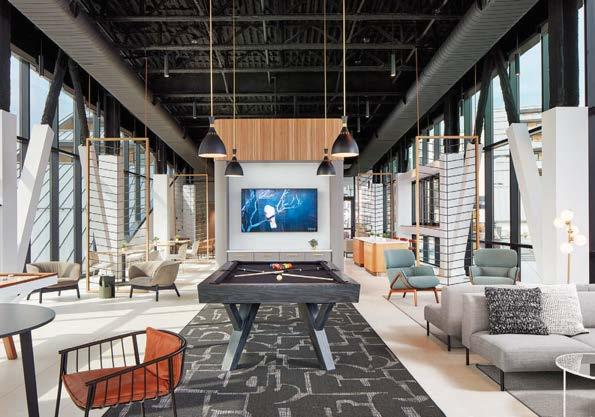
This project was a family affair. Jewel Toned Interiors founding principal Jaclyn Szerdi-Morrison spearheaded the interior design of Marco Island Academy, a public charter high school in Florida’s Collier County, while her father, sister, and brother-in-law were the building architects. To echo the organic nature of the architecture, Szerdi-Morrison designed swooping environmental graphics and selected furniture with subtle curves. Energetic by default, public spaces have bursts of color that you wouldn’t find in more intimate settings. See the blue flooring that folds up the wall in paint of the same hue, breaking up the monotony of long corridors. These swashes of color offer wayfinding to students during busy class transitions. Semipublic spaces for both study and relaxation are intentionally more subdued, allowing downtime for those wanting a break away from the hustle and bustle of the main corridors. Deep blue, tonal grays, and blond wood foster a fresh coastal aesthetic. Inspirational graphics—and illustrations of the school’s manta ray mascot—encourage creativity and out-of-thebox thinking. “It was a dream to collaborate alongside my family on this large educational project,” Szerdi-Morrison sums up. “The research and programming behind an educational facility is complex. Incorporating MIA’s brand and culture was integral to the design of the building’s form and function, with the student experience always kept firmly in mind.”
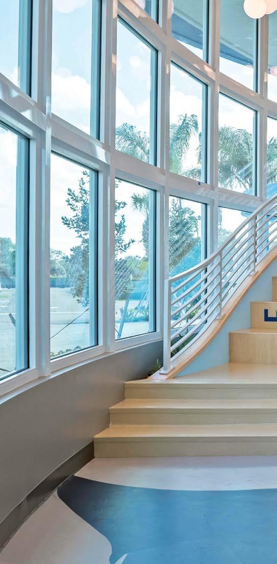
Clockwise from left: Inspired by underwater bubbles, frosted-glass globes play off the repetition of wood baffles overhead. Marco Island Academy’s gymnasium celebrates the school’s manta ray mascot. One of the giant fish swims toward the reception desk, directing visitors to administrative staff. A gracefully curving staircase wraps the perimeter, conveying the key concept of the school’s mission, to empower future generations.
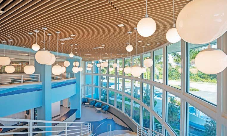 PROJECT TEAM JACLYN SZERDI-MORRISON; JOY LYNSKEY
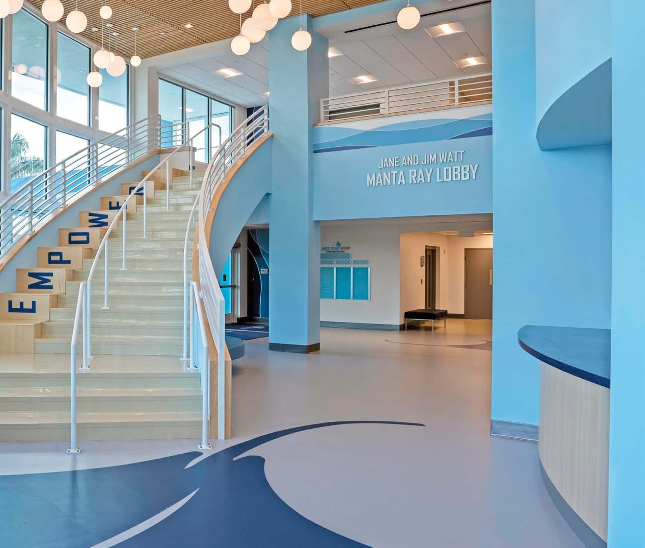
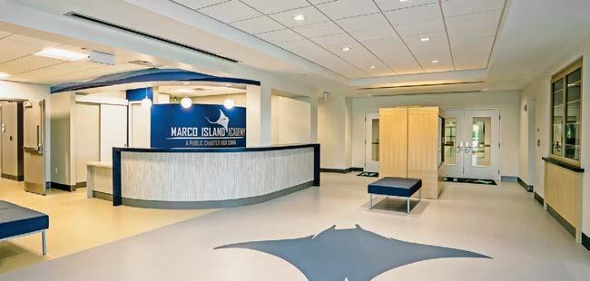
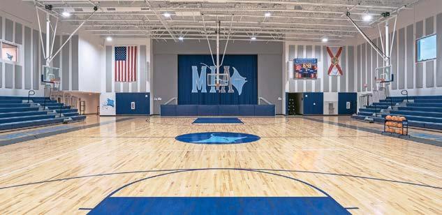
Essentially a new and self-contained neighborhood, this multibuilding complex boasts 28 acres of parklike surroundings, including a milelong waterfront esplanade. For its 385 rental units, the Harbor Landing residential building promises the maximum in modern living thanks to a full panoply of amenities. They include lobby lounges, cafés, business centers, a 24-hour fitness facility with yoga room, club and private dining rooms, bicycle storage, retail, and even a dog spa. Perks extend outdoors too: a pool with sun deck and fire pits to say nothing of neighboring playgrounds and hiking trails. For its part, The Childs Dreyfus Group designed many of the public spaces as well as selected finishes for the apartments. The team went both luxe and industrial, the latter alluding to the area’s manufacturing roots. Ergo reception’s stone desk in a wood-veneered niche and adjacent leather-upholstered seating: The wood’s light tone nods to the nearby white-sand beach while the azure upholstery is inspired by the sparkling sea. In contrast, blackened-metal window frames and exposed steel for a mezzanine read all industrial.
PROJECT TEAM THE CHILDS DREYFUS GROUP PHOTOGRAPHY SANDRA RAYMEN childsdreyfus.com; @childsdreyfus
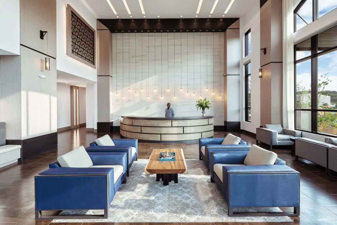
Clockwise from above: Throughout, reclaimed wood and metals pay homage to the history of the industrial waterfront neighborhood. The Childs Dreyfus Group designed many of the public spaces as well as selected finishes for the rental units. A private lounge with kitchenette is defined by timber beams. A half-moon marble desk sits within an elegant wood-lined niche in reception.
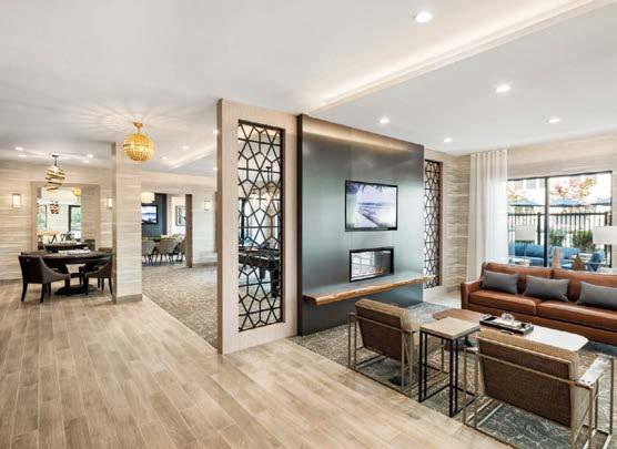
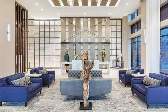
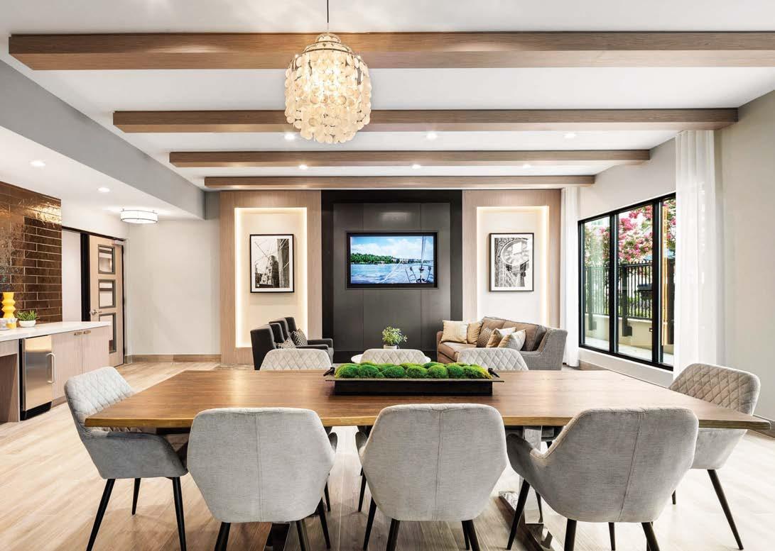
August Green founding principal Kyle MertensMeyer—a former IIDA Will Ching Designer of the Year—leads an interdisciplinary team of designers working across Asia, Europe, and the U.S. The studio’s latest project is a showroom and members’ clubhouse for the electric car brand NIO, whose Chinese name is WeiLai, which translates to the future August Green’s challenge was to design a space capable of adapting to the future demands of the brand rather than one that looked stereotypically “futuristic.”
The ground-floor showroom is where visitors can physically explore features of the company’s electric car models and customize their ideal vehicle with a digital configurator embedded in a mirrored-steel wall.
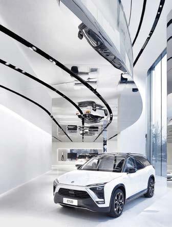
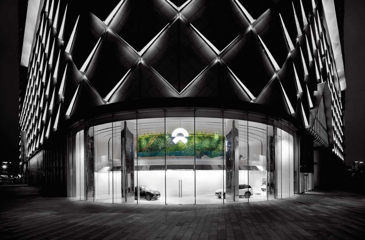
Whereas this level is spare in cool-toned terrazzo and shiny steel, level two is cozier, aiming to draw people together in community and conversation. A secret terrazzo staircase behind a sliding mirrored-glass wall ascends to the mezzanine balcony’s restful café, lounge, library, and conference room.
A mammoth living wall soars up both levels, cleaning the air and refreshing the spirit. “For us, true sustainability is based on understanding that every decision we make will impact lives today and beyond,” MertensMeyer says. “We must always ask: Why are we doing this, and who is it for?”
Clockwise from above: A serene lounge extends the perimeter of the mezzanine balcony. In the forum, a digital screen embedded in a mirrored-glass wall is used for presentations. Level two offers flex space for gathering. All mechanical ducting, lighting, and fire drop-downs are hidden within the ceiling plane. Visible through the glass storefront system, the ground-level showroom is backed by a 500-square-foot living wall.
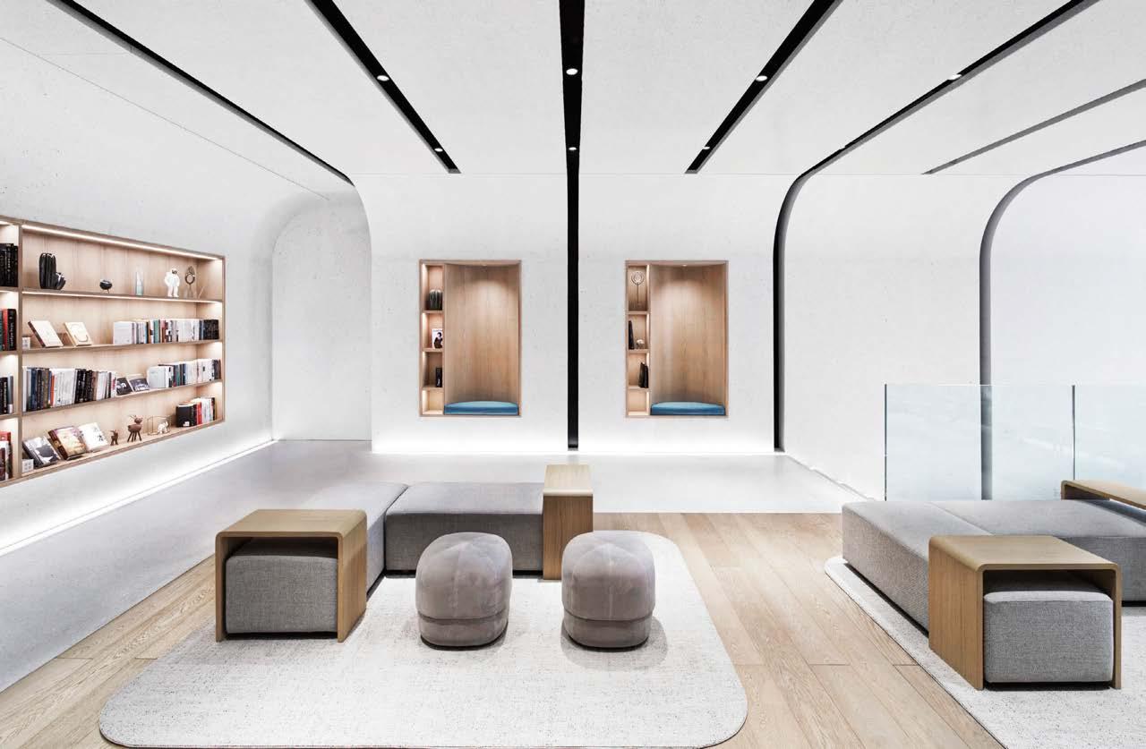
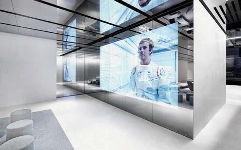
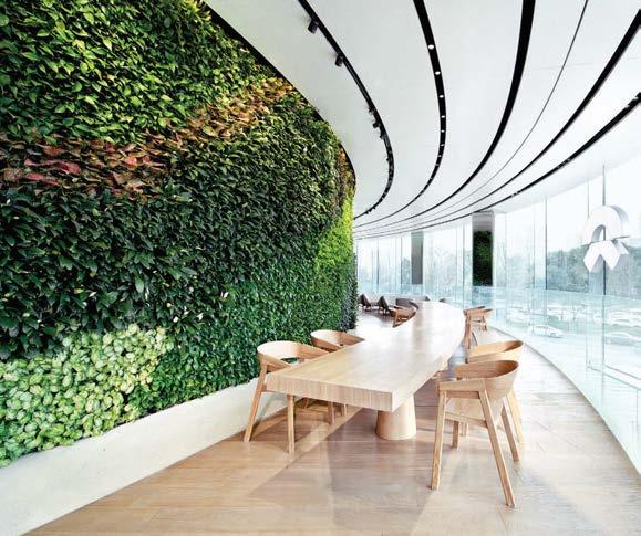 PROJECT TEAM KYLE MERTENSMEYER; BRIAN ZHOU; ROSE DISARNO; SCOTT ALAN JOHNSON; ELLEN ZHU
KEY CONSULTANTS STUDIO ILLUMINE; ARS HAOJING ARCHITECTURAL DESIGN PHOTOGRAPHY DERRYCK MENERE augustgreen.com; @augustgreendesign
PROJECT TEAM KYLE MERTENSMEYER; BRIAN ZHOU; ROSE DISARNO; SCOTT ALAN JOHNSON; ELLEN ZHU
KEY CONSULTANTS STUDIO ILLUMINE; ARS HAOJING ARCHITECTURAL DESIGN PHOTOGRAPHY DERRYCK MENERE augustgreen.com; @augustgreendesign
Clodagh
Now for something a little different. Founded in 1983 by Clodagh, this multidisciplinary practice based in New York works on award-winning residences, retail, healthcare, spas, multifamily buildings, and hospitality interiors. Clodagh Signature, the firm’s licensing division, designs products in collaboration with renowned manufacturers. For AKDO, Clodagh crafts texturedstone subway tiles; for CF Stinson, high-performance textiles inspired by bio-geometric symbols; for Du Verre, tactile hardware. The Irish-born designer’s own photography is translated into evocative wallcoverings for Koroseal. Her collaboration with Trueform Concrete is a perfect marriage of minds, considering Clodagh was a pioneer in the use of concrete for interiors and furniture. Other collaborations include rugs for Tufenkian, fabrics for Perennials, outdoor furniture for Walters, modern fixtures for Speakman, lighting for Visual Comfort, spa tables for Oakworks, and luxury bath accessories for Labrazel.
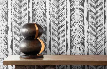
“Designing in collaboration with our dozen Clodagh licensees is rewarding to me in so many ways, mostly because of the pleasure I get out of constantly creating something new in a myriad of diverse categories,” says Clodagh. “I would love to do much more. Anything involving improvements in health and wellness always tempts me. I would especially enjoy designing kitchen products, ceramics, garden accessories, and even women’s kimonos or caftans. I also have fun designing logos. So many ideas, so little time!”
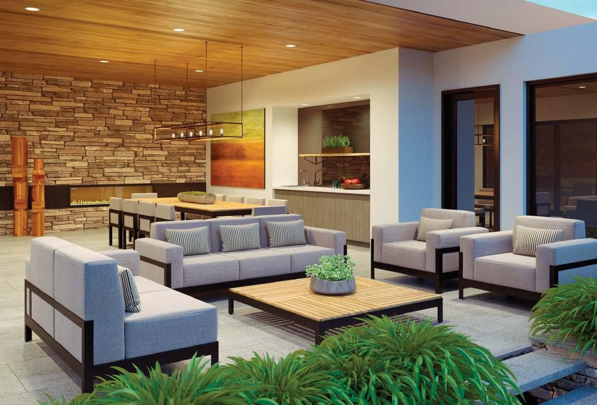 PRODUCT TEAM CLODAGH; PETER O’KENNEDY; HELEN VANLEUVEN PHOTOGRAPHY COURTESY OF CLODAGH clodagh.com; @clodaghdesign
Clockwise from above: The Lura collection faucet for Speakman is backdropped by Kaya tiles for AKDO, with a finger labyrinth inset tile. The Groov sink for Trueform Concrete showcases Clodagh’s love of texture and simplicity of form. A selection from the Sarana collection for CF Stinson incorporates bio-geometric symbols. The 40-piece More Comfort outdoor furniture collection for Walters features clean lines, generous and solid proportions, and thoughtful materiality. Clodagh’s wallcovering collections for Koroseal are inspired by memories of travel and time spent with her family. Sparked by a drum’s primitive form, Clodagh’s Cosimo side table for RH is defined by its sculptural simplicity, unadorned except for a band of texture evoking shifting patterns in the sand.
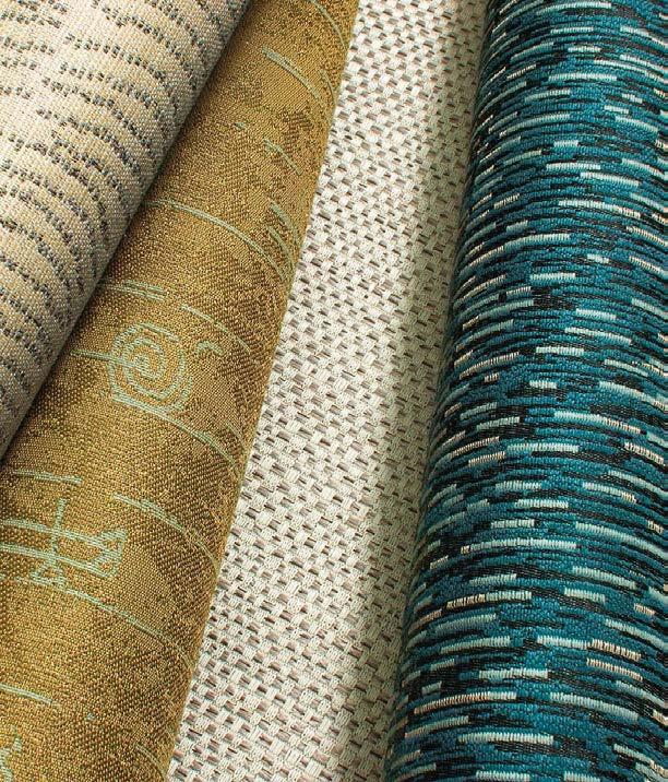
Founded in 1906 to house the personal collection of Gilded Age financier J.P. Morgan, New York’s fabled Morgan Library & Museum underwent a major renovation and expansion in 2006. The project’s architects, Paris- and Genoa-based Renzo Piano Building Workshop in collaboration with local firm Beyer Blinder Belle, depended on construction manager Sciame Construction to bring their bold vision to life.
The widely admired makeover encompassed three historic and very ornate structures—the original 1906 Beaux-Arts library designed by Charles McKim, the 1928 Annex, and the 19thcentury town house that was once the Morgan family residence—all designated landmarks. Sciame undertook the intricate renovation of the 150,000-square-foot complex, which involved not only the restoration and preservation of the historic buildings but also the construction of a 75,000-square-foot glass-enclosed court that ties them together and the installation of an underground vault and jewel-box auditorium. In addition to meeting rigorous landmark regulations, Sciame devised innovative solutions to overcome the challenges of a confined construction site located atop solid bedrock in the middle of a residential neighborhood. Most difficult of all was the creation of the foundation 50 feet below grade, which required underpinning and rock anchors. The Sciame team also painstakingly restored the three historic facades. For the McKim building, that meant new stone installed with a lead joint system—no easy task, as that technique has been rarely used since the early days of the 20th century.
Clockwise from left: A view of the Morgan Library & Museum’s contemporary Madison Avenue entry pavilion, its steel coated in a rosy off-white paint that nods to the pink Tennessee marble of the historic McKim building and Annex. The Sherman Fairchild Reading Room is where visitors can consult the library’s rare manuscripts under natural light. Fine cherry paneling clads Gilder Lehrman Hall, a new jewel-box performance space. The four-story, glass-enclosed Gilbert Court connects the three historic buildings and serves as a gathering space in the spirit of an Italian piazza. Like most of the expansion, the Gilder Lehrman Hall is located below grade.
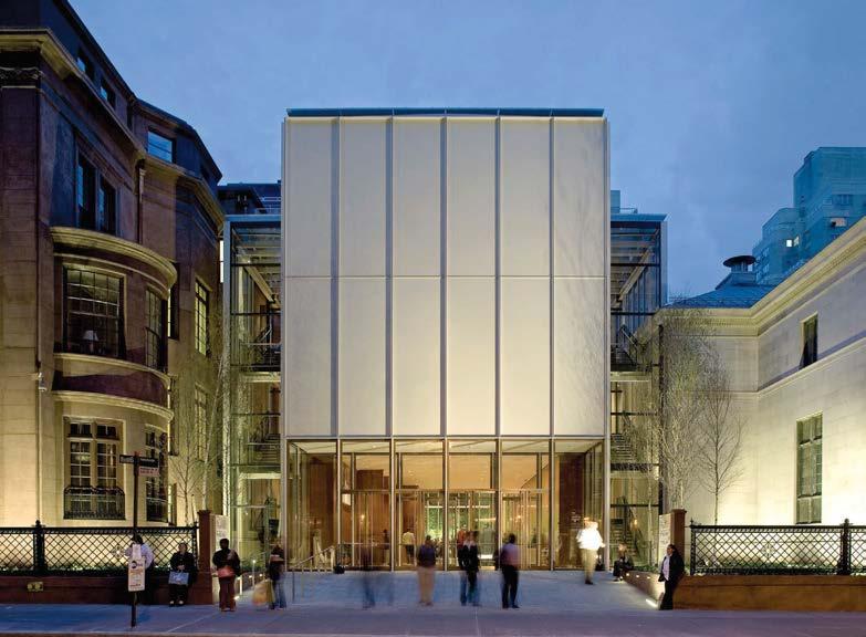
@sciame_construction
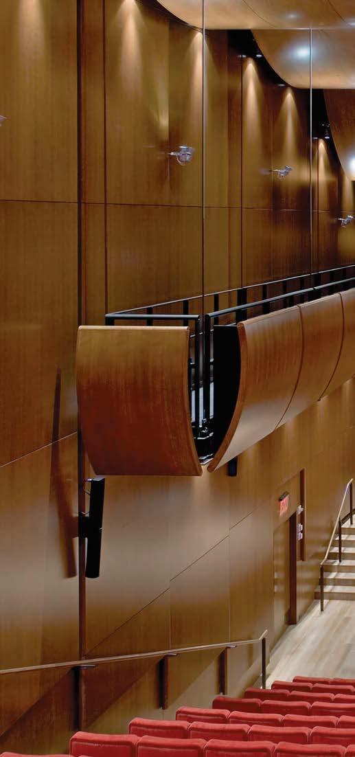 PROJECT ARCHITECT RENZO PIANO BUILDING WORKSHOP KEY CONSULTANTS BEYER BLINDER BELLE; SCIAME CONSTRUCTION; ROBERT SILMAN ASSOCIATES; COSENTINI ASSOCIATES; OVE ARUP & PARTNERS; FRONT; KAHLE ACOUSTICS; HARVEY MARSHALL ASSOCIATES; IROS; HM WHITE; STUART-LYNN COMPANY
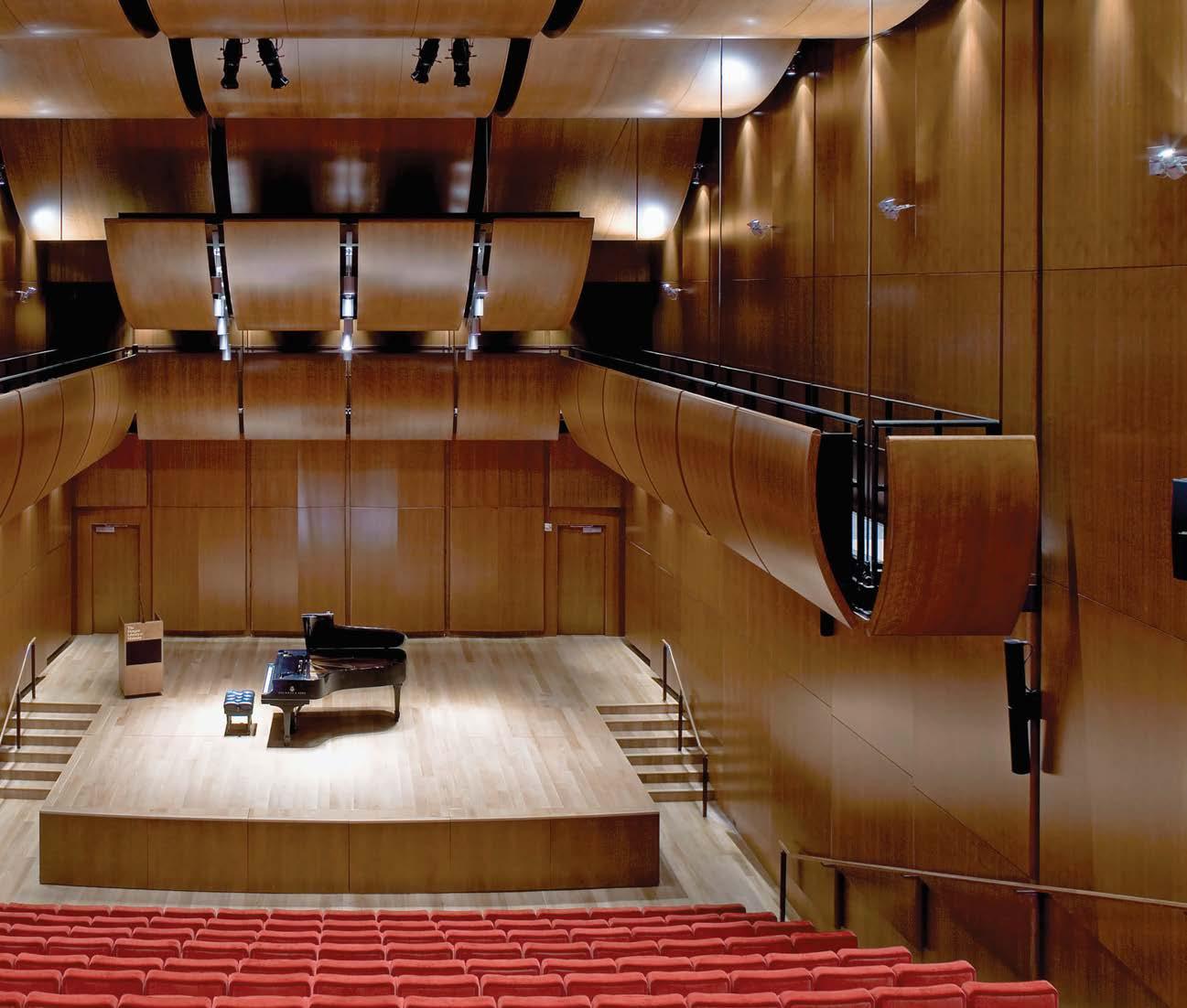
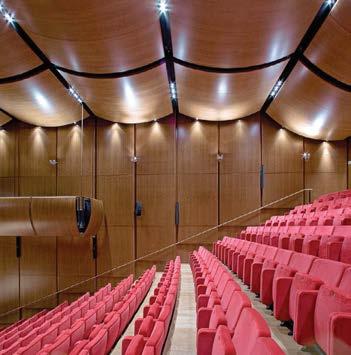
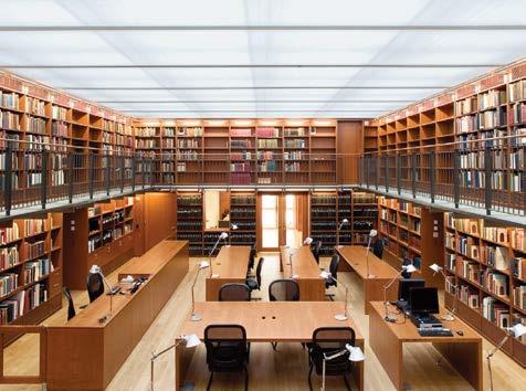
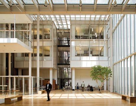
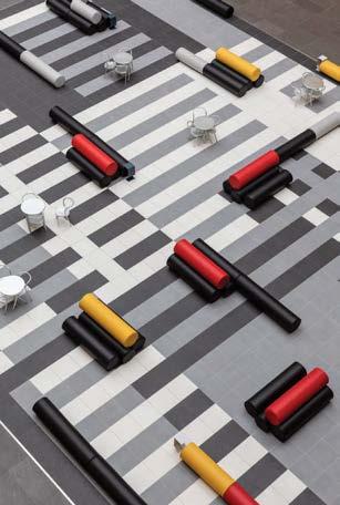
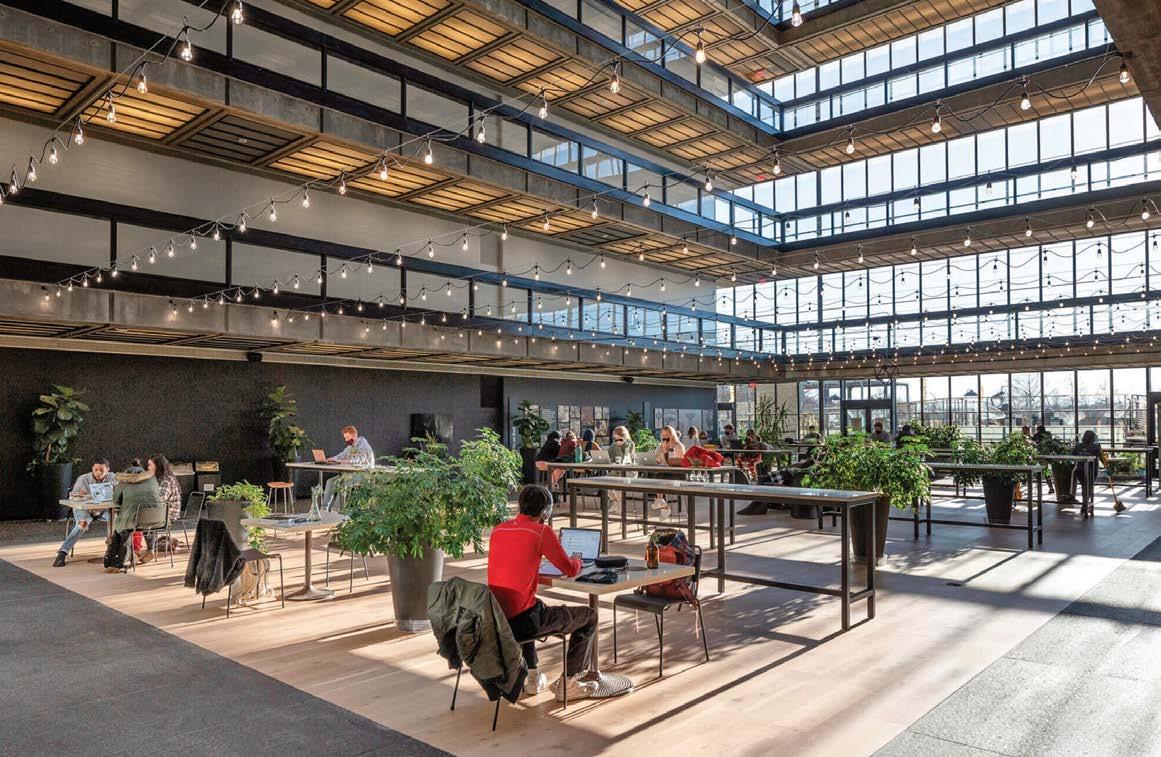
Bell Works New Jersey is the reimagination of the former Bell Laboratories, Eero Saarinen’s historic mid-century architectural masterpiece in which world-changing research took place, resulting in the award of no fewer than eight Nobel Prizes. Today, the complex is a “metroburb,” a metropolis in suburbia that is a one-of-a kind destination for business and culture.
CEO of NPZ Style + Décor Paola Zamudio was first introduced to the project in 2014 when she was commissioned to design a couple of offices and some public spaces in the abandoned 2-million-square-foot facility. With the success of those interventions, Zamudio’s involvement quickly evolved to become lead designer and creative director of the entire Bell Works brand. The designer and her team take charge of all things visual at the complex: environmental graphics, interior design, events, social media—the firm even styles the fresh flowers in communal areas. “What is important to me is to curate experiences that enhance the five senses,” Zamudio explains. Naturally, Saarinen references abound along with midcentury modern features, experimental-science and technological artifacts, and nods to Bauhaus art. (Zamudio calls this retro-futurism, taking the past and connecting it to the world to come.) But that’s not all: NPZ has also transformed another building for Bell Works, this time a former AT&T Ameritech facility from the 1990s just outside Chicago.
PROJECT TEAM PAOLA ZAMUDIO; BROOKE PETRANY KEY CONSULTANTS INSPIRED BY SOMERSET DEVELOPMENT; ALEXANDER GORLIN ARCHITECTS; G3 ARCHITECTS ; WIGHT + COMPANY PHOTOGRAPHY COURTESY OF NPZ STYLE + DÉCOR npzdesign.com; @npz_studioClockwise from right: At Bell Works New Jersey, the reimagination of mid-century architectural masterpiece Bell Laboratories, biophilic design dovetails with original architect Eero Saarinen’s ethos of bringing the outdoors inside. Coworking labs line circulation zones dotted with inviting breakout spaces at Bell Works Chicagoland. Also in Chicagoland, the Square comprises a Josef Albers–inspired tile floor furnished with modular pieces by Lapalma to add color and an interactive element.

A view of the Big Bang Café in the New Jersey complex. In the same location is The Tubes installation, a seating series NPZ designed with Ron Arad and Moroso to pay homage to the works of Bauhaus artists Josef and Anni Albers. Colorful graphics animate a hallway in Bell Works Chicagoland.
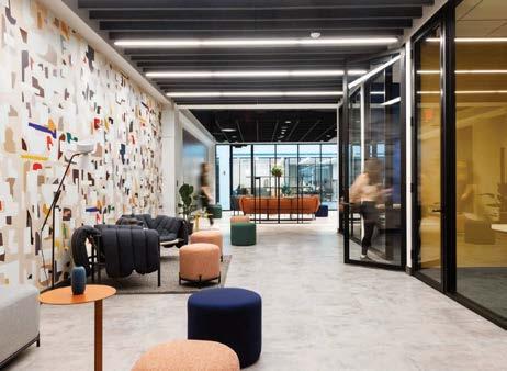
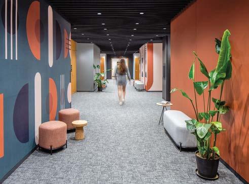
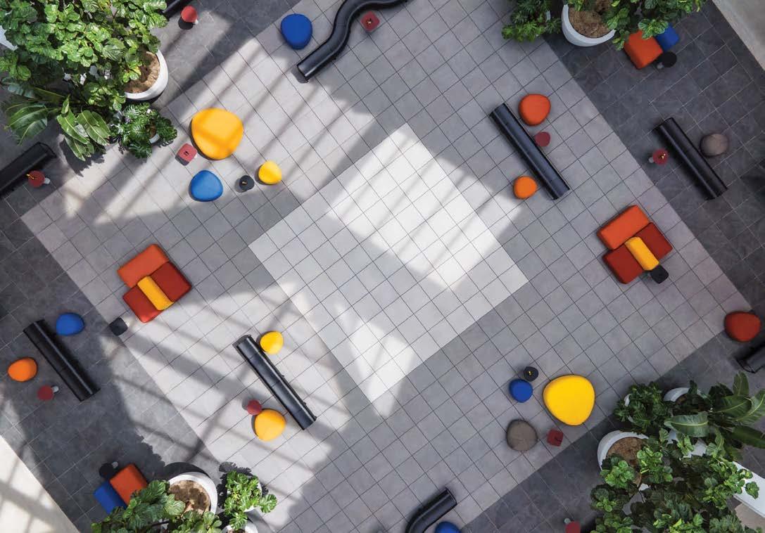
When designing the public areas in a pair of luxury residential towers at 5Pointz—a famed Long Island City graffiti mecca—Mojo Stumer responded to the neighborhood’s storied history by finding harmony between two contrasting visual concepts. The spaces required a cleanlined sophistication suitable for high-end city living but also needed to embrace the dynamic street art the block is known for.
The scope of work encompassed the entry lobbies, gallery, fitness center, business center, and game rooms. A simple architectural palette of polished concrete, wood planks, and blackened steel was used to create a baseline industrial aesthetic familiar to the neighborhood, with cleaner elements of polished marble, gray tile, and stainless-steel plate providing balance. In reception—which doubles as a lounge—an oversized LED TV wall loops archival footage of the area’s history.
The connecting wing between the two towers is not only a circulation path but an elongated casual lounge/workspace intended to foster impromptu social gatherings and to display local graffiti art. These planning decisions, along with the careful location of secondary amenity elements (golf simulator, poker room, vintage video arcade) help create an environment in which residents are encouraged to feel as at home outside their apartments as they are within.
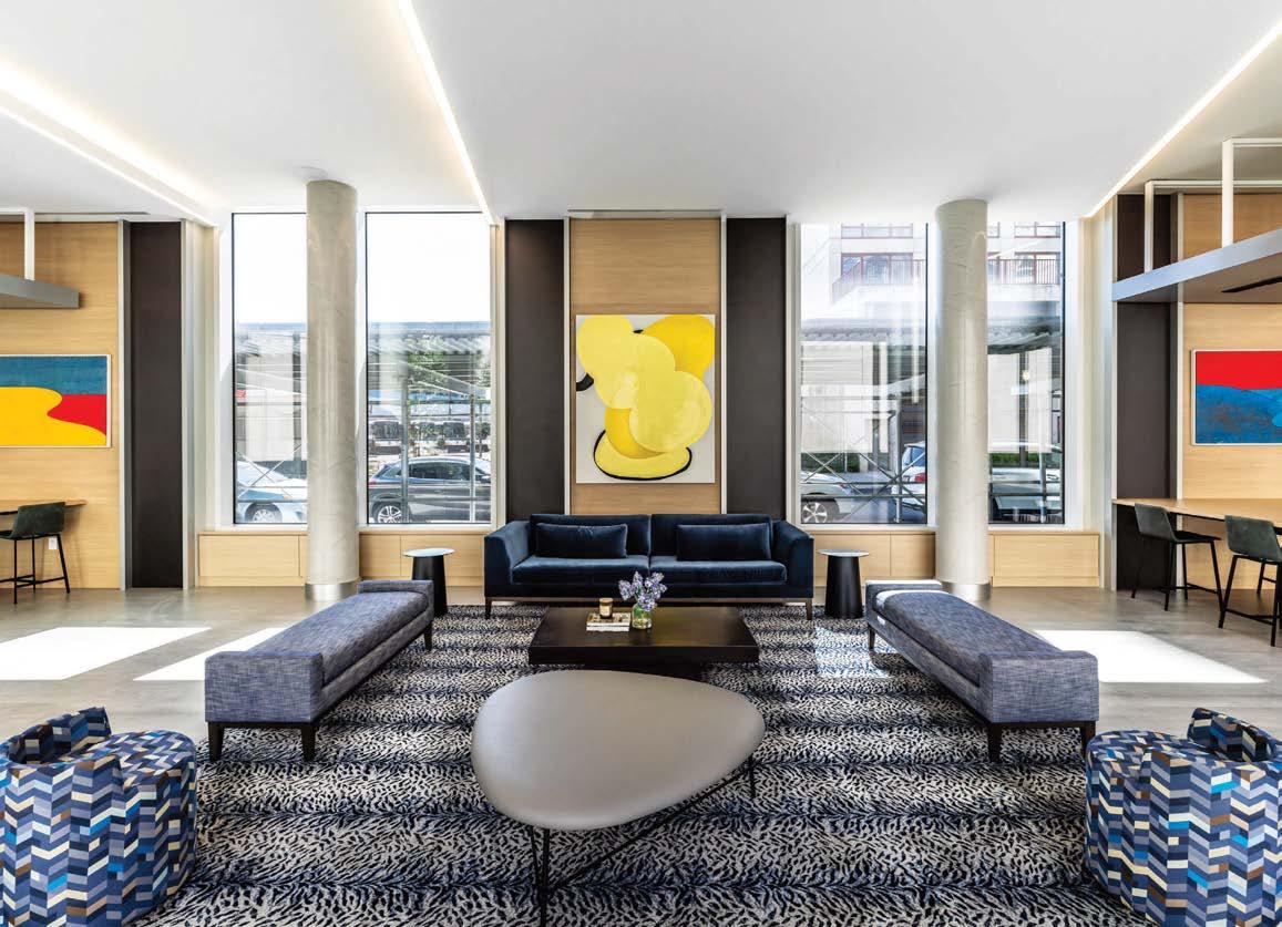 PROJECT TEAM MARK D. STUMER, AIA; JOE YACOBELLIS; ROB MANETTA; JESSICA LICALZI PHOTOGRAPHY M.D. STUMER PHOTOGRAPHY mojostumer.com; @mojostumer
Clockwise from left: Slatted-wood ceiling panels act as wayfinding and highlight primary thresholds. In the gallery walkway that connects the two towers, repeated angular ceiling planes with integrated linear LED lighting break up the length of the space and create a carefully proportioned rhythm while framing seating areas and views both to the courtyard and the street. An LED TV wall loops archival footage of the neighborhood’s street-art history. The refined yet industrial main reception. A rotating gallery of works by local artists animates lounge areas.
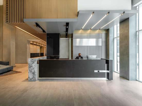
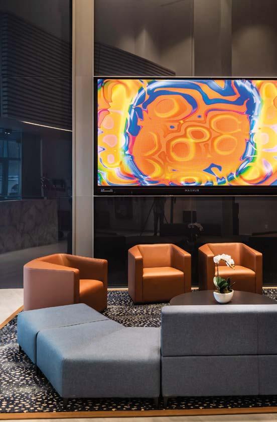
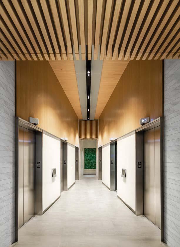
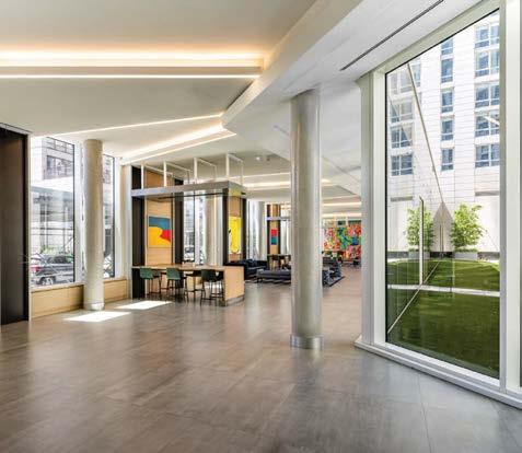
For its wide-ranging multifamily projects, Chicago-based The Childs Dreyfus Group engages dynamic interiors tailored to meet the unique needs of each and every demographic. For Vermella Union, a 415-unit mixed-use development in a burgeoning New Jersey community, CDG was instrumental in right-sizing the existing amenity areas to achieve optimum space utilization. Taking a 30,000-square-foot clubhouse down to 20,000 square feet, for example, redistributed valuable space to areas that had previously been overlooked and undervalued.
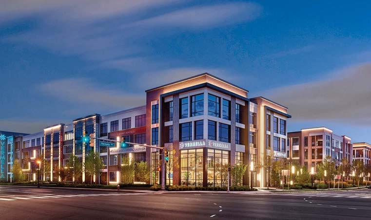
Recognizing that a well-designed place to live, work, and play is more important than ever, CDG enabled connectivity throughout the property while enhancing the myriad coworking spaces, open areas, and lounging nooks. Alongside small key details, special design attention was paid to the building’s long views to ensure the clubhouse amenity was meaningful and functional for individuals, small groups, and large gatherings alike. Smart locks and outlets, audio speakers, and thermostats provide remote access, security, and comfort for residents and guests. With a nod toward summer and the outdoor experience, CDG outfits distinctive gathering spaces with clever designs that allow residents to relax and enjoy fun in the sun.
Clockwise from below: A grand stair showcases CDG’s modern design. Vermella Union offers studio, one-, two-, and three-bedroom apartments and luxury amenities. The complex features an expansive list of amenities including a kitchen/bar. The drama created by the staircase on the first level continues on the second floor with the addition of an architectural skylight.
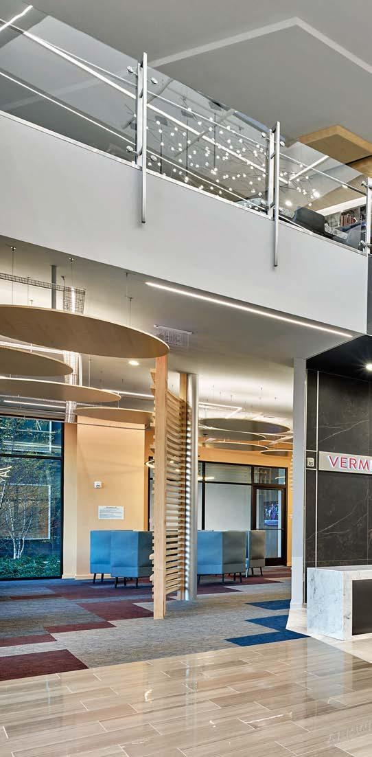
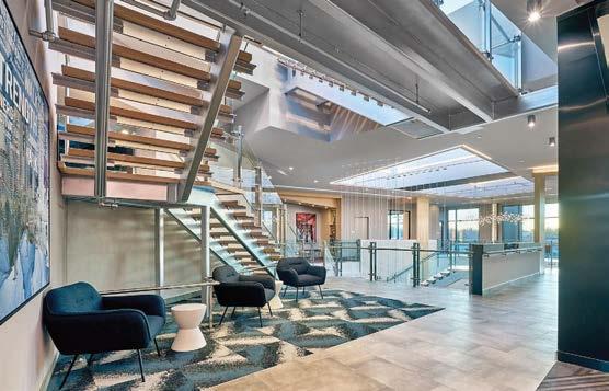
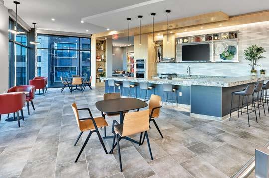
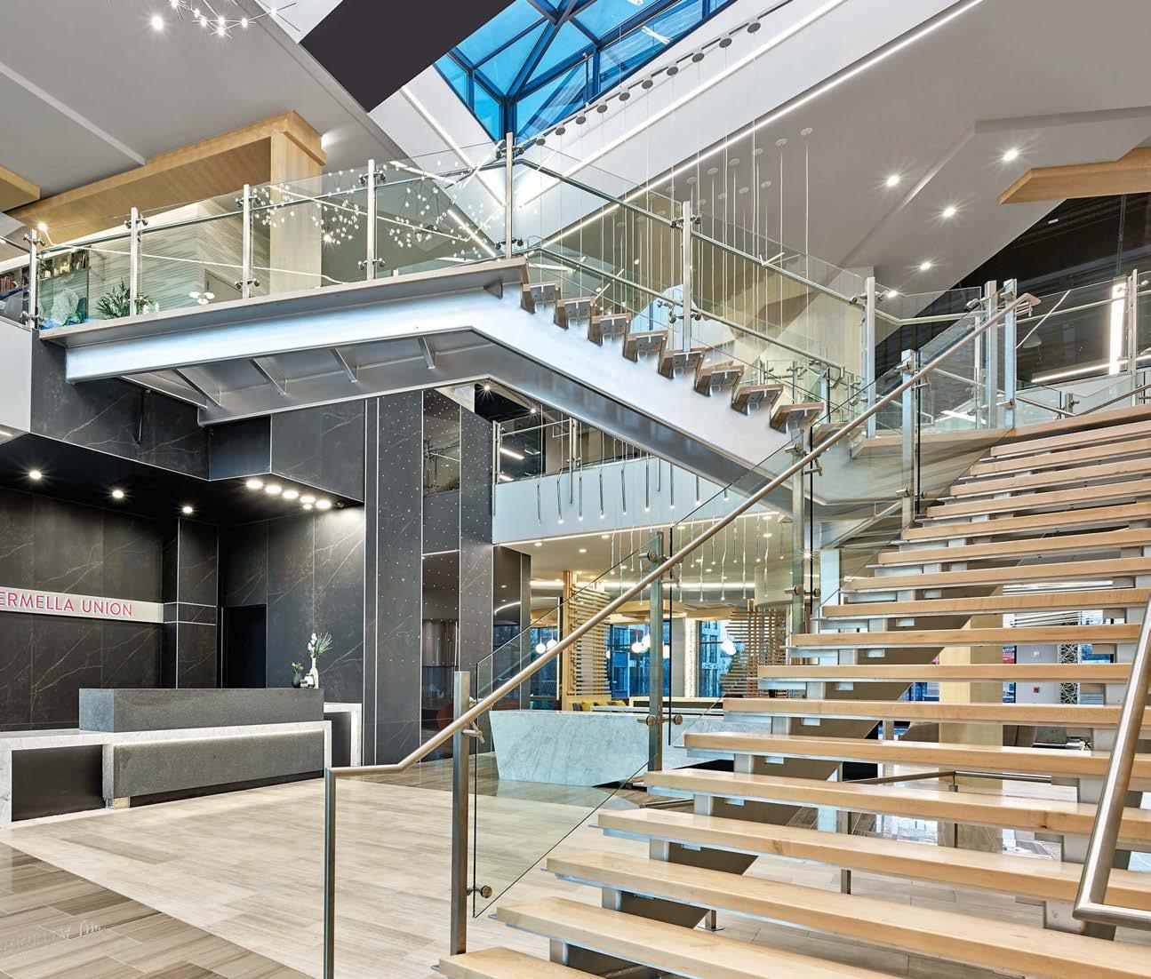
This retirement community, located in Napa Valley, is far from ordinary. The Northern California wine region’s laid-back lifestyle of estate vineyards, boutique shopping, outdoor living, and renowned restaurants permeates every aspect of the 201,000-square-foot design. The senior living facility incorporates three levels of care with independent, assisted, and memorycare neighborhoods. Unique is the inclusion of common independent and assisted-living environments separated only by amenity spaces best suited for different acuity levels. The memory-care area, for example, is oriented around a private courtyard to reflect a nurturing living experience.
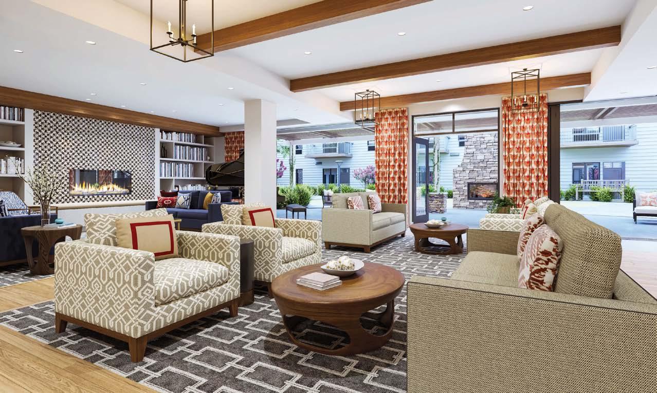
“Our goal was to create a vibrant community that reflects the lifestyle of Napa itself,” says DesignPoint VP and senior designer Kathleen Sportelli. “We approached this through the flow of space, each room opening to the next and bringing the outdoors in. What could be better for a community than sunshine and natural light? That is the focus of the wellness package we developed here.” Indeed, social areas for residents integrate wellness into daily life: There’s an art gallery, library, theater, spa, and fitness room with a heated outdoor deck for morning tai chi. In terms of cuisine, the days of the boring dining room are over: Residents can choose between a formal restaurant, casual bistro, cozy wine bar, or shaded outdoor pergolas.
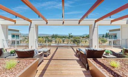
Clockwise from above: Wood ceiling beams warm up the wine bar. The bright and airy Indulge Spa is where residents can receive massage treatments, facials, acupuncture, haircuts, and more. Bedrooms are as serene as any luxury-hotel guest room. Pattern, color, and texture compose a pleasing visual symphony in the relaxing library lounge. Sun loungers dot the third-floor resident terrace, with uninterrupted views of the rolling Napa landscape.
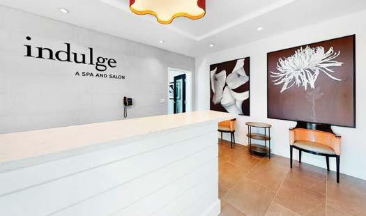
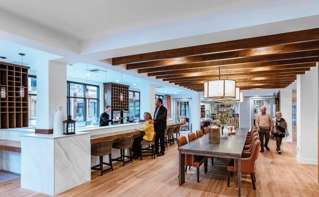
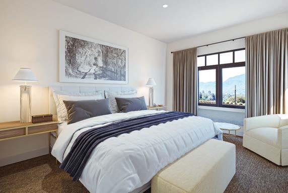 PROJECT TEAM KATHLEEN L SPORTELLI; JENNIFER FRONHEISER; CASSIDY MORAN; JULIE BLUNDETTO; HENRY DELVECCHIO; KAYLA KARAN
Archival material is continually being generated, so adequate storage space is perpetually needed. The National Archives and Records Administration desperately needed a new facility that would house the National Southeast Region’s records, dating from 1716, and that could be easily extended as required. The 22-acre site, selected by stakeholders at NARA, the State of Georgia, and Clayton State College and University, sits just south of the university campus and creates a new urban space used by the local population. A sculptural visitor’s center that visually connects the national archives with the Georgia state archives welcomes visitors to the site, while a landscaped plaza connects the new facility with its surrounding structures. The building is designed to expand (or contract) based on need. A double-decked core support spine runs the length of the building and ends at the loading dock. Off this central spine, bays containing one of the four space types (public, private, research, and storage) branch off at 45-degree angles. This spine can be elongated, and bays of modular construction can be “plugged in” as needed. Aesthetically, the goal was to provide a seamless visual connection between the interior and exterior. Take the swooping ribbonlike paving that segues inside the building, transforming into a pattern on the terrazzo floor.

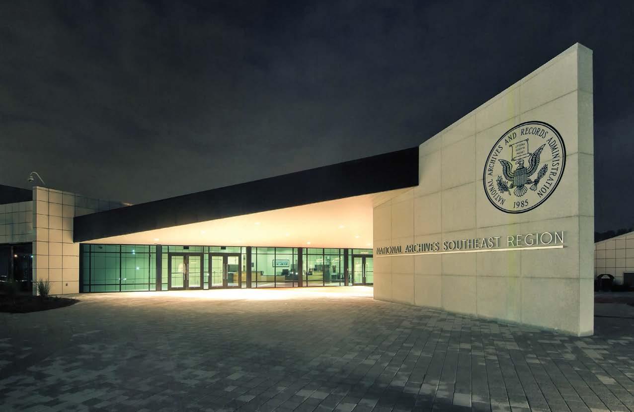
Clockwise from above: A ribbon paving design links the visitor’s center and the two archive facilities. With 230,000 cubic feet of archives across 22 acres, this is the largest federal records building in the country. The plaza’s swooping pavement design flows into the lobby as patterns embedded in the terrazzo floor. A reduction in heat islands was achieved through the landscaped plaza and reflective roofing materials. This facility houses the National Southeast Region’s archival records, dating from 1716, and provides a research facility and exhibit and event space for large functions.
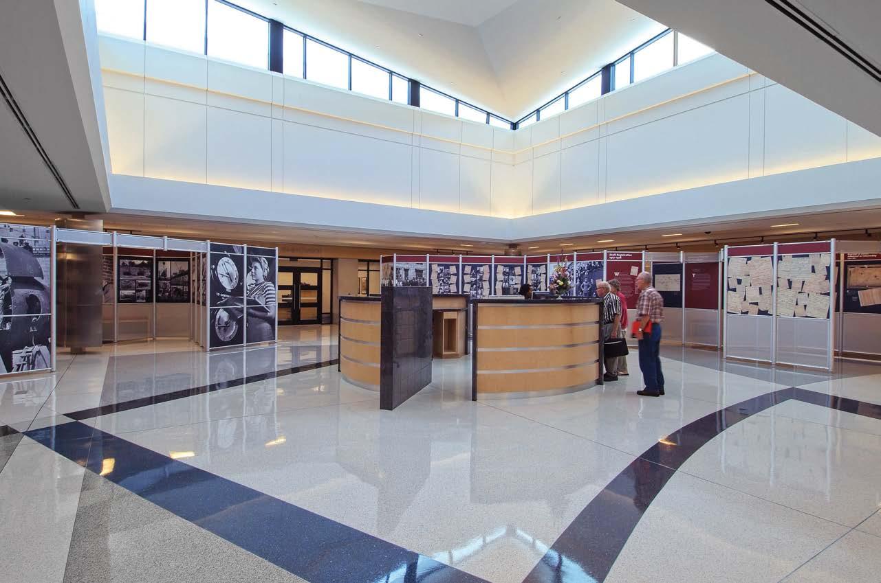
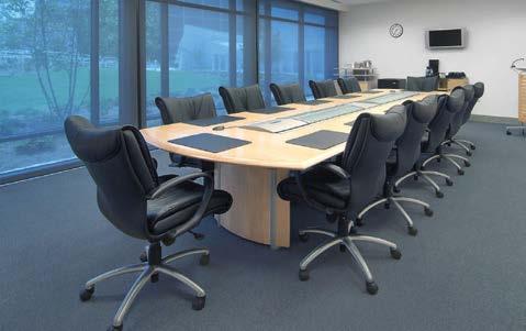
 PROJECT
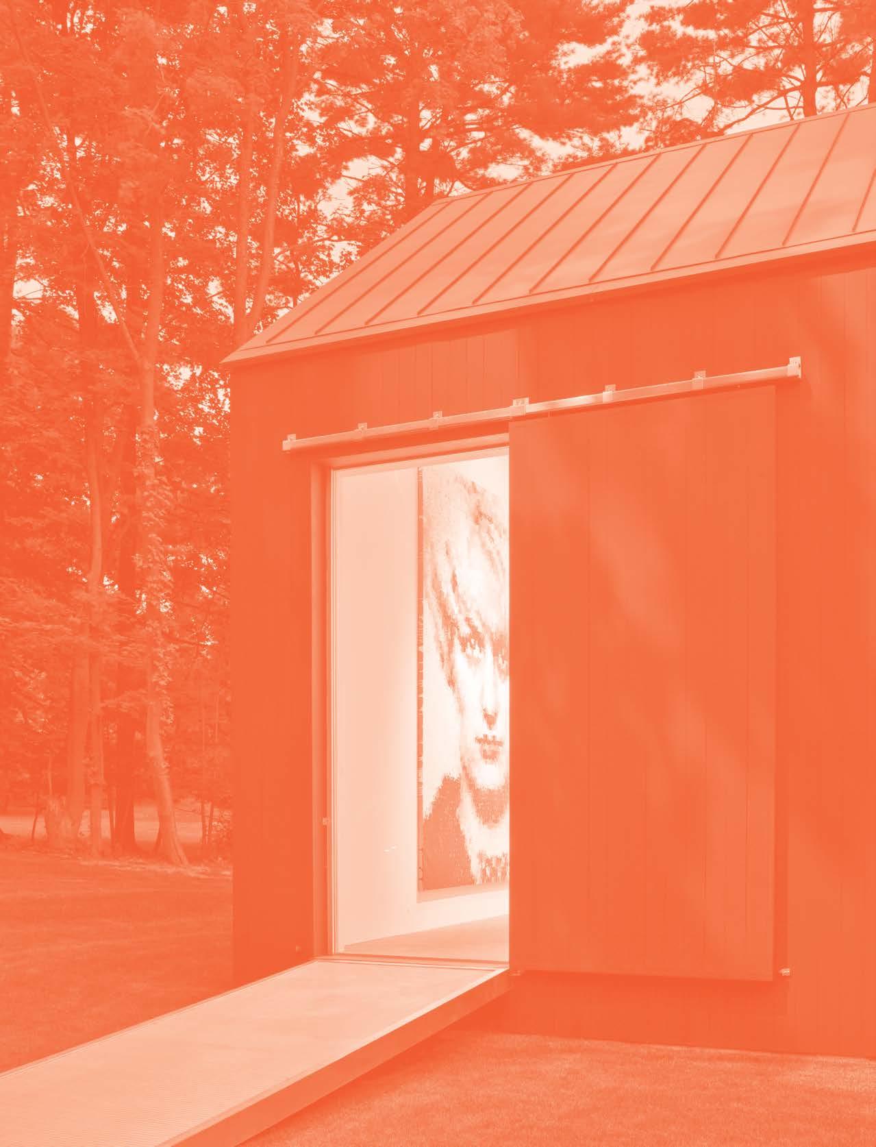
//3877 146
2PI R DESIGN 134
ADRIANA HOYOS DESIGN STUDIO 14 4
AGENCE SPATIALE 116
ANIK PEARSON ARCHITECT 20
A NTROBUS DESIGN COLLECTIVE 46
A RCHIVENTURE GROUP 152
AUGUST GREEN 166, 192
BIA INTERIORS 34 BR ERETON 10 0
CHAMPALIMAUD DESIGN 122, 148 CLODAGH 194
CREAM 142
CUSHING TERRELL 74
D’APOSTROPHE DESIGN 24, 42
DAVIS & DAVIS INTERIOR DESIGN 80 DESAI CHIA ARCHITECTURE 14, 26 DESIGNPOINT 204
D IMIT ARCHITECTS 18 DSK 32
DU NCAN & MILLER DESIGN 150
FOLEY&COX INTERIORS AND SPG ARCHITECTS 48
H ARTE BROWNLEE & ASSOCIATES 22 HK S 16 8
HUANG IBOSHI ARCHITECTURE 50
I CONIC BY KAITLYN WOLFE 30 ICRAVE 124, 140
IN STUDIO 62, 96
INNOCAD ARCHITECTURE 70
JEWEL TONED INTERIORS 188
JHL DESIGN 98
JPC ARCHITECTS 106
JULIA ROTH DESIGN 44
K LAI JUBA WALD ARCHITECTURE + INTERIORS 130
LAMAR JOHNSON COLLABORATIVE 178, 186
LOCZIDESIGN 54 LOUISE BRAVERMAN ARCHITECT 180 LUIS PONS DESIGN LAB 126 MARBLE FAIRBANKS ARCHITECTS 17 2 MARY DOUGLAS DRYSDALE 36 M ATRIX DESIGN CO 160, 182 MBB ARCHITECTS 156 MEYER DAVIS 114, 170 MKDA 58, 88, 104 MOJO STUMER ASSOCIATES 200 N C DESIGN & ARCHITECTURE 118 NPZ STYLE + DÉCOR 198 PATRICK TIGHE ARCHITECTURE 16 P DR 86
PECK PECK + ASSOCIATES 206 P OGGI DESIGN 40 R APT STUDIO 66, 78, 174 RD JONES + ASSOCIATES 16 4 ROCKWELL GROUP 136 ROGER FERRIS + PARTNERS 10 RONNETTE RILEY ARCHITECT 52 SASAKI 92
S CIAME CONSTRUCTION 156, 196 SKIDMORE, OWINGS & MERRILL 82 SMALLWOOD 76
SNORRE STINESSEN ARCHITECTURE 110 SPACESMITH 90 STUDIO BV 68 ST UDIO K CREATIVE 132, 138 STUDIOS ARCHITECTURE 64, 176 THE CHILDS DREYFUS GROUP 190, 202 WILLIAMS BLACKSTOCK ARCHITECTS 102 WXY ARCHITECTURE + URBAN DESIGN 162, 184 YOD GROUP 120
EDITOR IN CHIEF, HON. IIDA Cindy Allen
BOOK EDITORS
Georgina McWhirter Peter Webster
Jen Renzi Annie Block Nicholas Tamarin
ART DIRECTOR Karla Lima
CREATIVE SERVICES
Marino Zullich
PRODUCTION DIRECTOR Kevin Fagan
SENIOR PREPRESS IMAGING SPECIALIST Igor Tsiperson
PARTNER SUCCESS MANAGER Olivia Couture
EXECUTIVE VP + DESIGN FUTURIST AJ Paron
VP, PUBLISHER Carol Cisco
VP, BUSINESS DEVELOPMENT Laura Steele
EXECUTIVE DIRECTOR, BUSINESS DEVELOPMENT Kathryn Kerns
MANAGERS Michael Croft 224-931-8710 Laury Kissane 773-791-1976
SENIOR VP, PARTNER + PROGRAM SUCCESS Tanya Suber
EXECUTIVE DIRECTOR, FINANCE & OPER ATIONS Lorri D’Amico SENIOR DIRECTOR, STRATEGIC OPERATIONS Keith Clements
CHAIRMAN Adam I. Sandow
CHIEF EXECUTIVE OFFICER Erica Holborn
CHIEF OPERATING OFFICER Michael Shavalier
CHIEF DESIGN OFFICER Cindy Allen
CHIEF SALES OFFICER Kate Kelly Smith
CHIEF MANAGING OFFICER Margaux Caniato
SANDOW DESIGN GROUP Corporate Headquarters 3651 Fau Blvd, Boca Raton, FL 33431 sandow.com
Copyright © 2022 by Interior Design magazine
Published by Sandow LLC, Boca Raton, Florida
All rights reserved. No portion of this book may be reproduced, distributed, or trans mitted in any form or by any means, or stored in a database or retrieval system, with out the prior written permission of the publisher. All images in this book have been reproduced with the knowledge and prior consent of the artists concerned and no responsibility is accepted by the producer, publisher, or printer for any infringements of copyright or otherwise, arising from the contents of the publication. Every effort has been made to ensure that credits accurately comply with information supplied.
Printed in the United States of America
ON THE COVER Country Estate, New Canaan, Connecticut, by Roger Ferris + Partners.
Photography: Paúl Rivera. Artwork: Marcus Harvey. All rights reserved, DACS, London / Artists Rights Society (ARS), New York 2022