WHYTHEHELL IS SOCIAL CLASS STILL A TABOO?
COMBATING CLASSISM WITH GRAPHIC DESIGN


COMBATING CLASSISM WITH GRAPHIC DESIGN
According to sociologist Savage (2015), the first efforts to map the class system occurred in the early decades of the nineteenth century, and the Registrar General's Office created the first formal measures of households according to class in Britain in 1911. This occupational classification system placed 'professionals' at the top and 'unskilled manual labourers' at the bottom (Day et al., 2020).
According to social psychologists, class is regarded a taboo subject of conversation in contemporary British culture, and research participants in a study regarding this were found to frequently refer to and discuss it in highly coded ways (Day et al., 2020).
Class is regarded as taboo in the UK due to its long-standing historical connections with inequality and disparity (Gramsci, 1971). Class has historically been a weapon of oppression and discrimination, and overcoming the stigma attached to the topic is challenging.
Incredibly, there is a
multitude of data to indicate that economic disparities and societal inequalities in Britain have grown significantly over the last few decades (see Dorling et al., 2007)! The highest 10% of income producers in Britain are said to earn nearly 17 times more than the bottom 10% (Office for Economic Cooperation and Development [OECD], 2015), and 21% of the population is said to be below the poverty line in modern-day Britain (Duffy, 2013).
Despite being such an obviously large problem, many people find it uncomfortable to bring up in casual conversation.
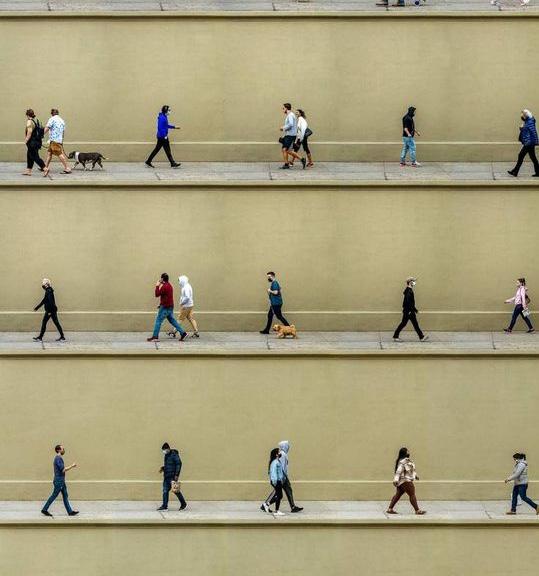
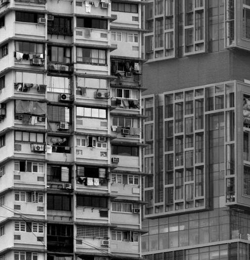
The class structure in the UK is mainly invisible and hardly openly discussed because of the stigma strongly associated (Day et al., 2020). Partially, this stems from an embarrassment of one's social class or an awkwardness talking about it because it may be hard to do so politely and without judgement (Day et al., 2020).
Social class is multifaceted, making it challenging to describe precisely or
quantify. As a result, it can be difficult to comprehend the intricacies of the class structure, meaning that people refrain from discussing it (Argyle, 1994).
The subject of classes is also taboo because it has the potential to cause conflict since it draws attention to the disparities between various social groups(Day et al., 2020). The discrimination resultant of social class disparity thus raises the question of whether it should be discussed openly, especially if the topic was used as a weapon of oppression?
In my opinion, even though the enforcement of social classes was historically (and arguably still is) a tool of oppression, social class should openly and honestly be addressed. Whilst some people may find this a challenging and uneasy discussion, society must advance. The more people are aware of classism's effects, the better prepared they will be to combat it and eventually contribute to its eradication.
For example, discussing the
effects of classism in the workplace can help people comprehend why some jobs are more challenging to obtain than others. It can also spark discussions about fair wages, equal promotion opportunities, and other class-related problems. Understanding how classism affects access to health care, housing, and education can help people identify how their privilege affects these issues and how they can use it to effect positive change (Little, 2008).
Moreover, discussing class can help people realise how their own experiences differ from those of others and how they can use their privilege to assist those less fortunate.
Thus, class should not be a taboo topic. It is essential to openly discuss social class to understand its effects better and work towards eliminating it as a form of oppression. By not openly discussing the topic, we perpetuate the stigma surrounding it, creating a taboo.
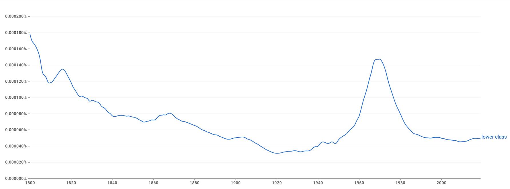
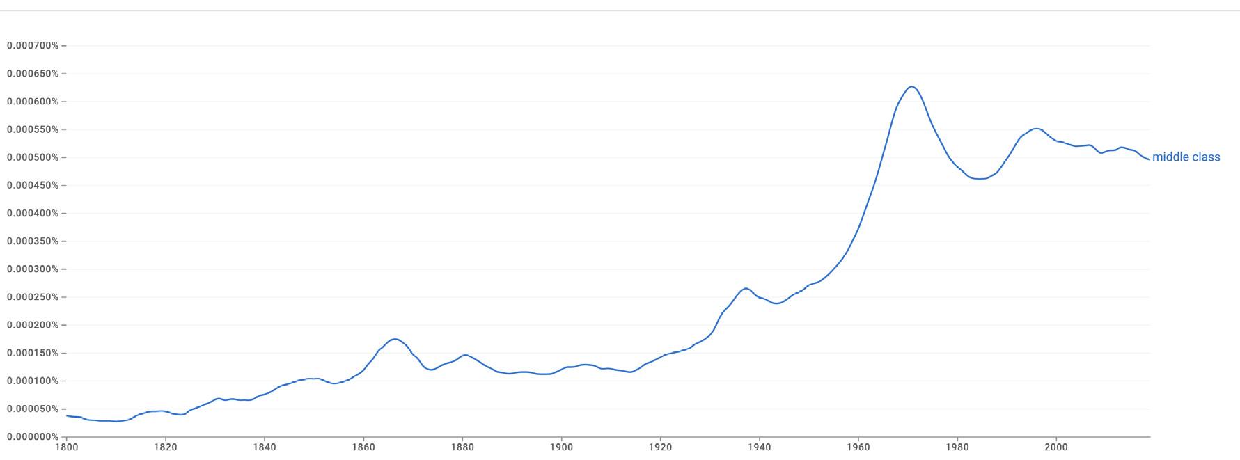
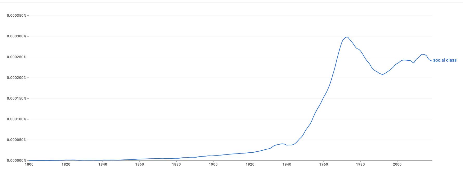
N-gram views are helpful because they enable us to examine text data more comprehensively. This method enables us to spot patterns and connections in text data that would otherwise go undetected by looking at a sequence of words together rather
than just one at a time which can be highly helpful for interpreting the attitude towards a specific topic over the years.
As such, I created N-gram views for class related words from 1800-2019 (the closest to present that data exists
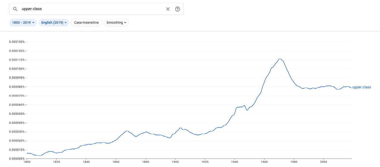
for) in order to compare and analyse.
https://books.google.com/ngrams/graph?content=pepe&year_start=1800&year_end=2019&corpus=en2019&smoothing=3
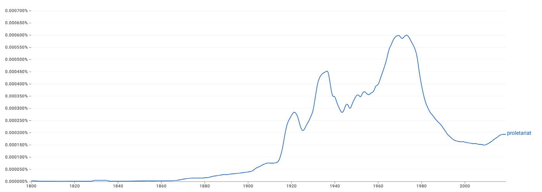
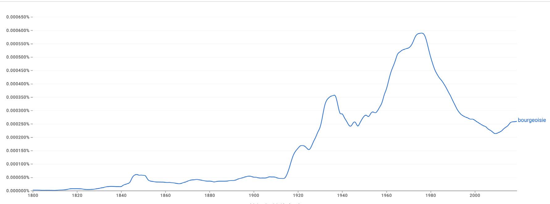
 Bourgeoisie
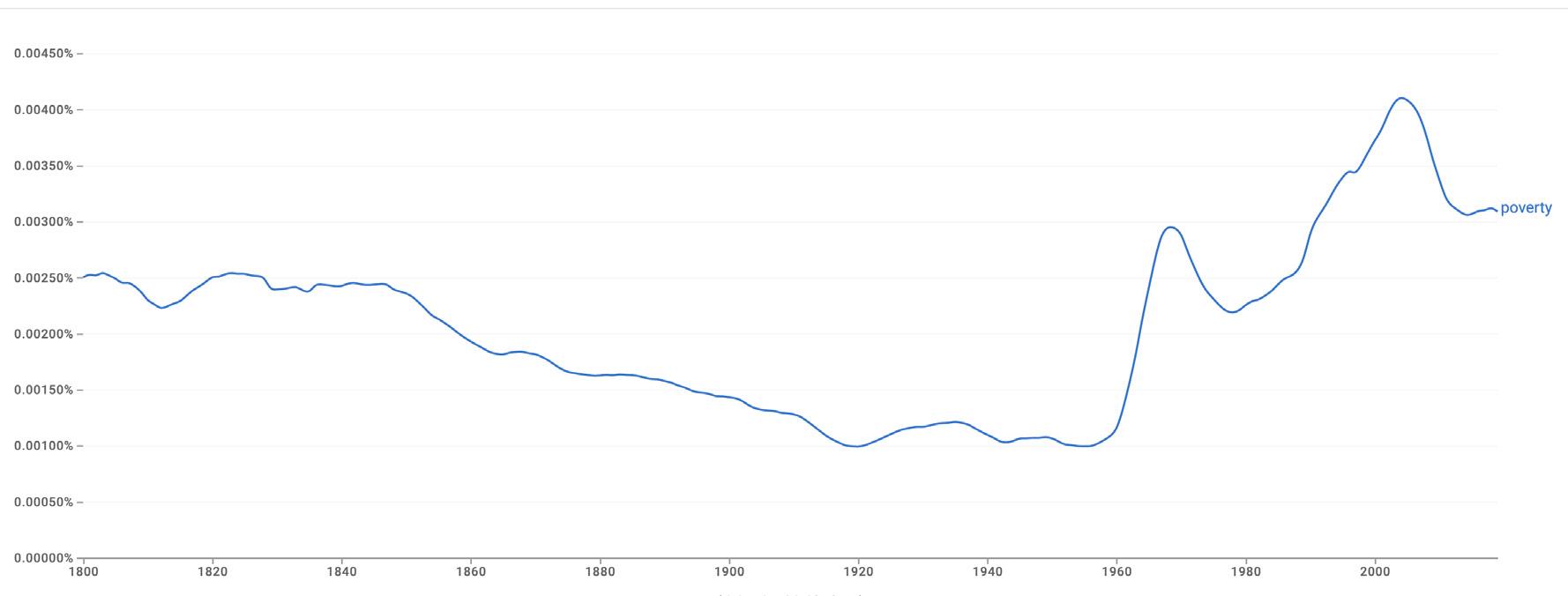
Poverty
Social Class
Middle Class
Bourgeoisie
Poverty
Social Class
Middle Class
The N-Gram view of words relating to social class reveals a general upward trend from the 1800s to the late 1900s before decreasing slightly in the present.
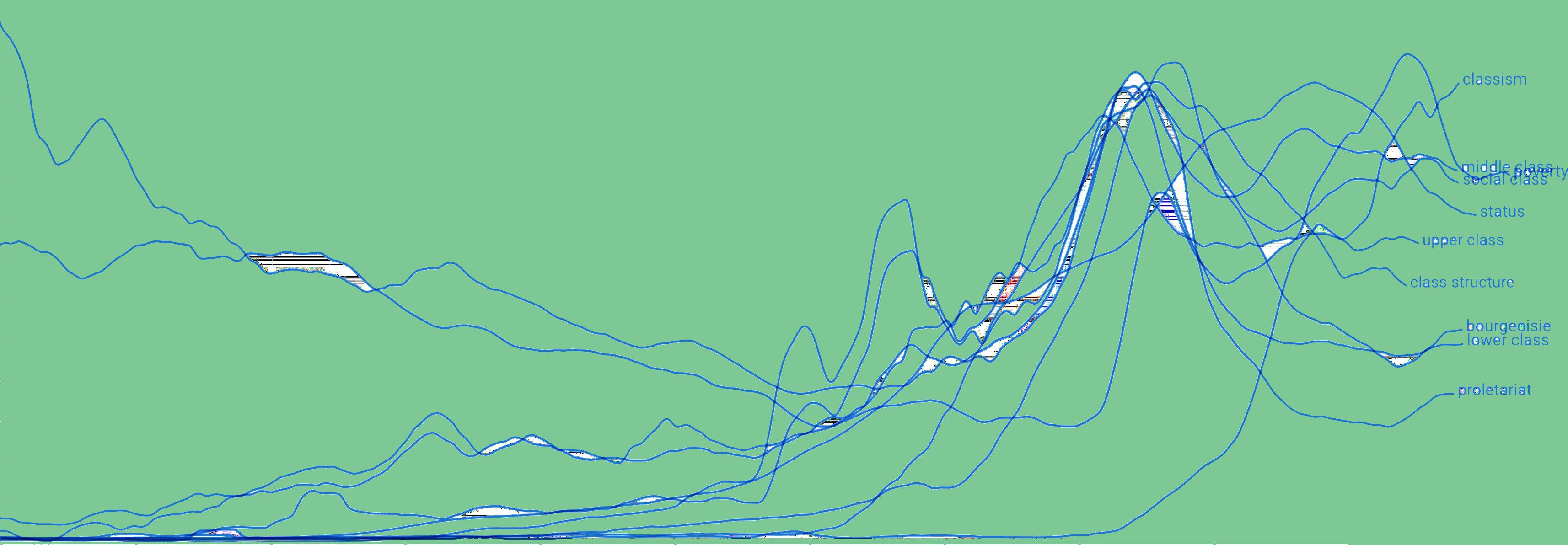
In the late 1800s, the prevalence of classrelated words rises, likely in congruence with the rise of Marxism and more Marxist ways of thinking. However, as
Marxism becoming popular
this began to lose momentum and popularity, the frequency of class-related words began to decrease. Of course, it is impossible to definitively state that this is due to the subject becoming taboo, especially as most words still appear more than in the 1800s. However, class systems were used as oppression at this time, with the bourgeoisie (proletariat) writing the books that these words would appear in, making it less likely for many of them to bring attention to, or condemn the system from which they benefit.
Moreover, in the present, the frequency of words related to social class has decreased; this may indicate that people are now less likely to openly discuss social class, as it is seen as a taboo subject.
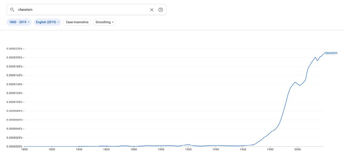
The exception is the term 'classism' (used to describe the discrimination and prejudice faced by people in certain social classes and to challenge the idea that certain social classes were more 'deserving' than others), which increases in modern times. However,
the word only began to be widely used in the UK in the late 1990s. As such, it is not fair to deduce that this suggests less taboo around the topic/more use of it now, as the word was not a widely recognised term in the past.
End of WW2- triggered a lot of change in society (social mobility, increased women's rights, better access to education).
Line of Best Fit
I saw a quote which stuck with me when researching class: 'social Class is immovable' (Robson, 2023). This got me to thinking, what are things that are immovable?
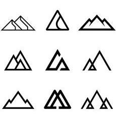
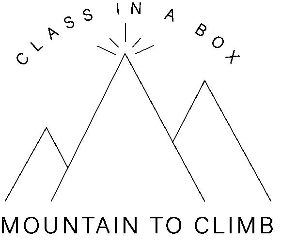
The answer seemed obvious; mountains! They are big, solid, and heavy, aka immovable.
They relate to social class as both are: Immovable. Have a little top (the elite) and big bottom (the working class).
Have a large presence but are silent.
I thus concluded that the obvious primary metaphor is:
I thought that the graph I created from the N-gram Views resembled a mountain range! As such, I wanted to turn the data into a visual representation using my primary metaphor 'class is mountain' (a mountain range).
I did this in Illustrator, turning the graph first into vectors so that I could use the fill function. The top right image was my reference to help with shading and so on.


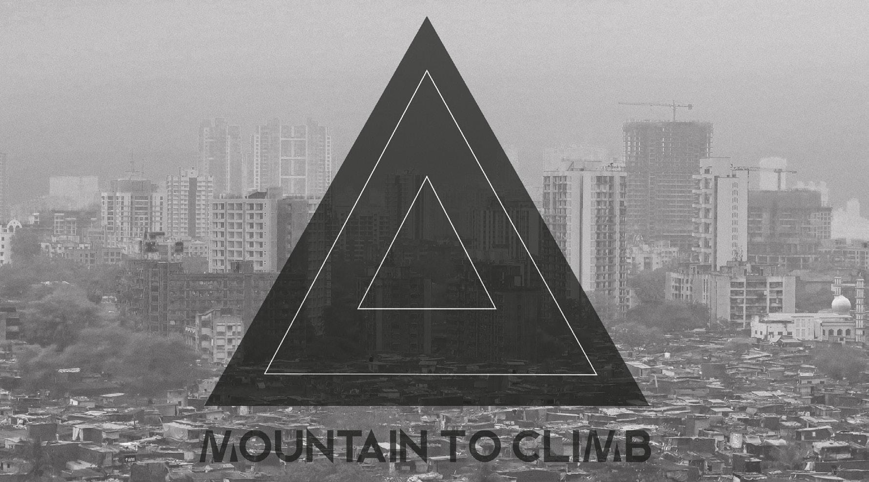
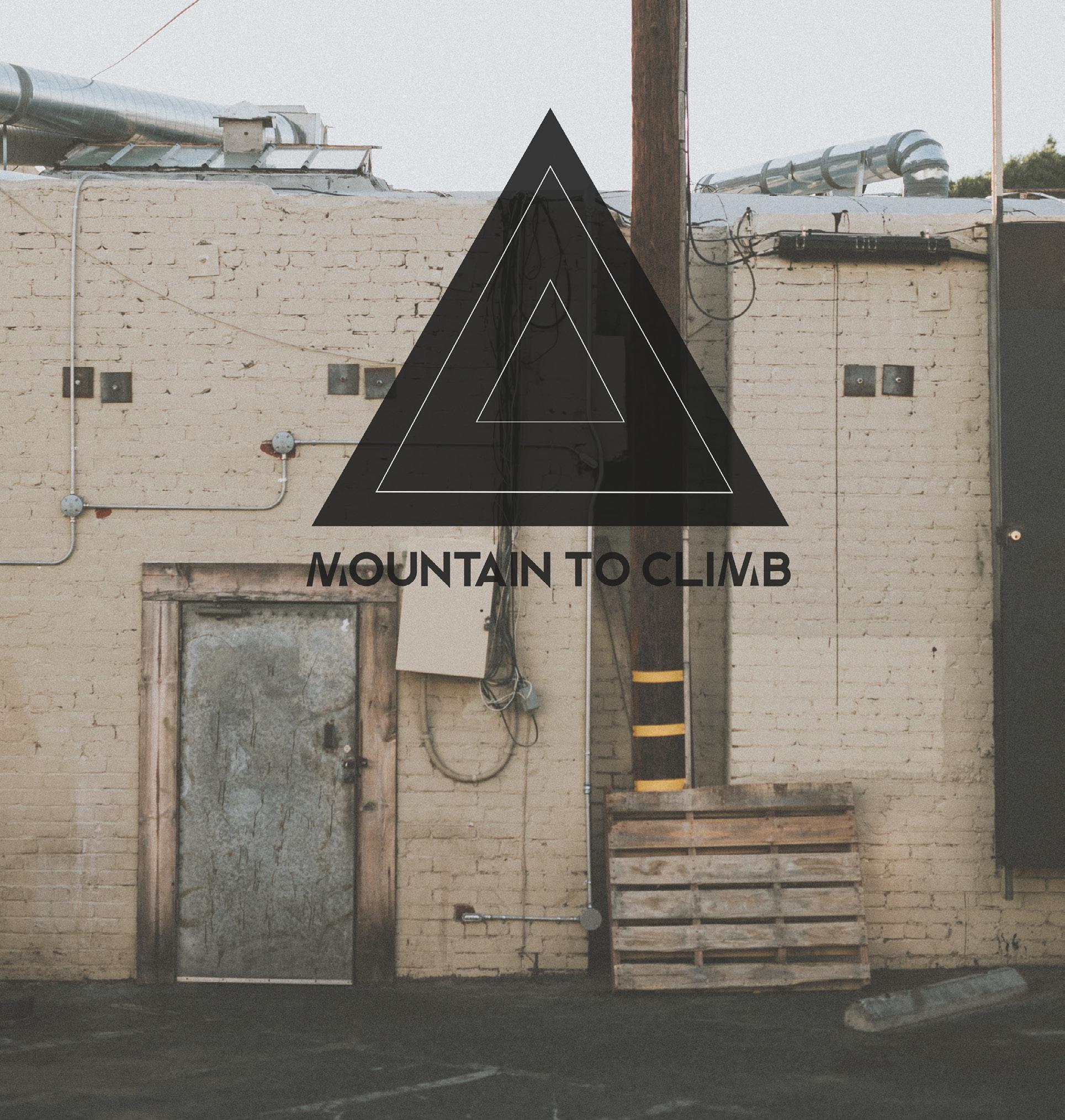
I want to expand on the concept of mountains as a visual representation of class and develop a brand that uses the mountain metaphor to highlight the adverse effects of socioeconomic class. The brand would create awareness and conversations about the class divide, and would effectively help reduce the stigma around the taboo.
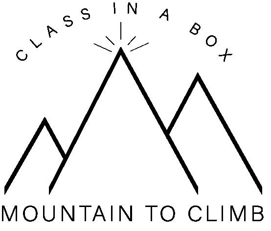
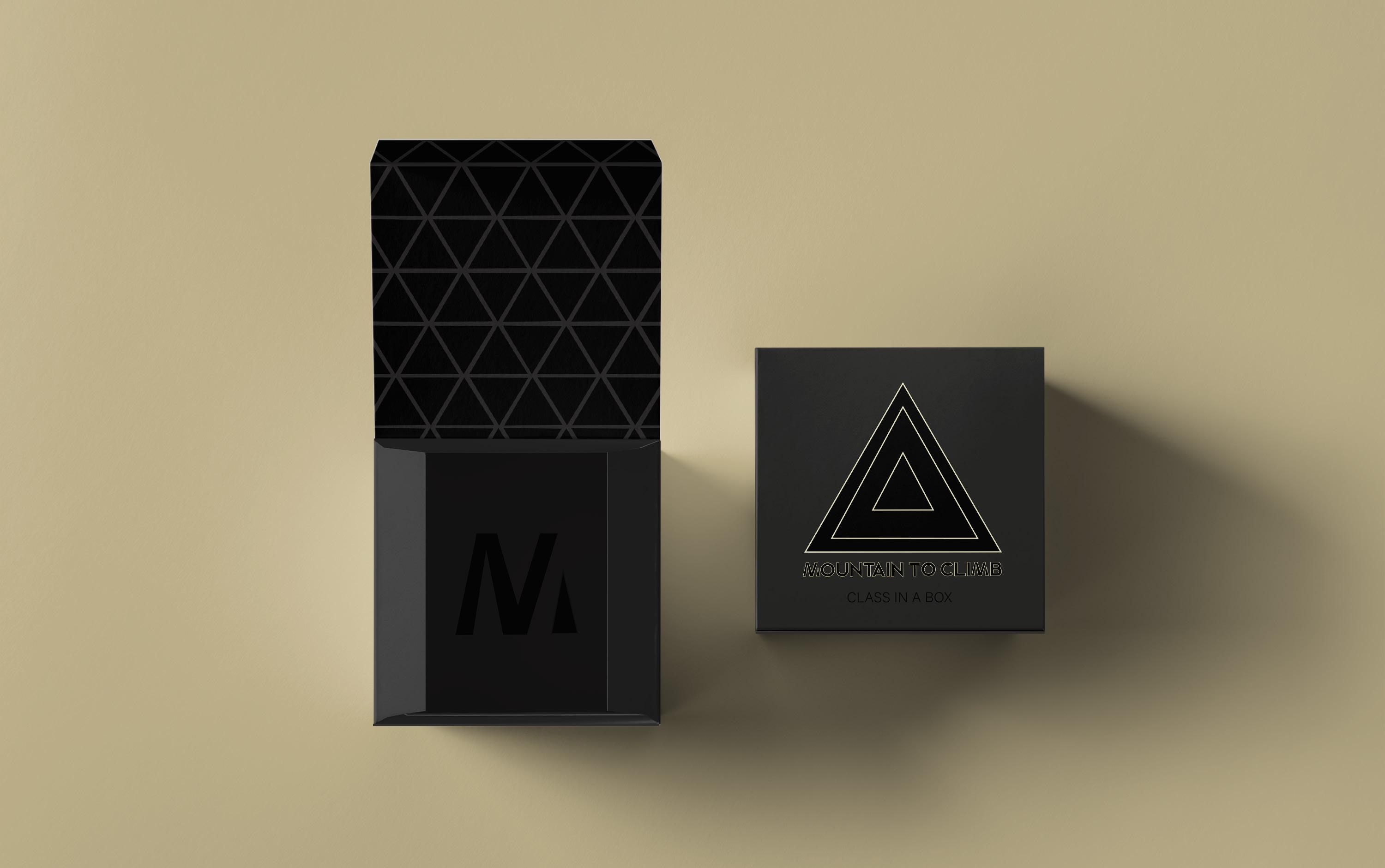
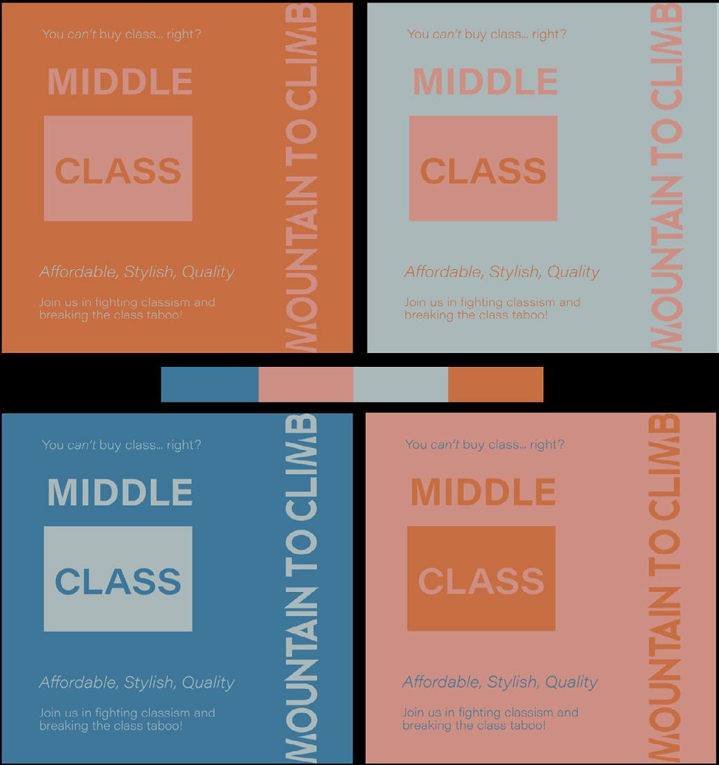
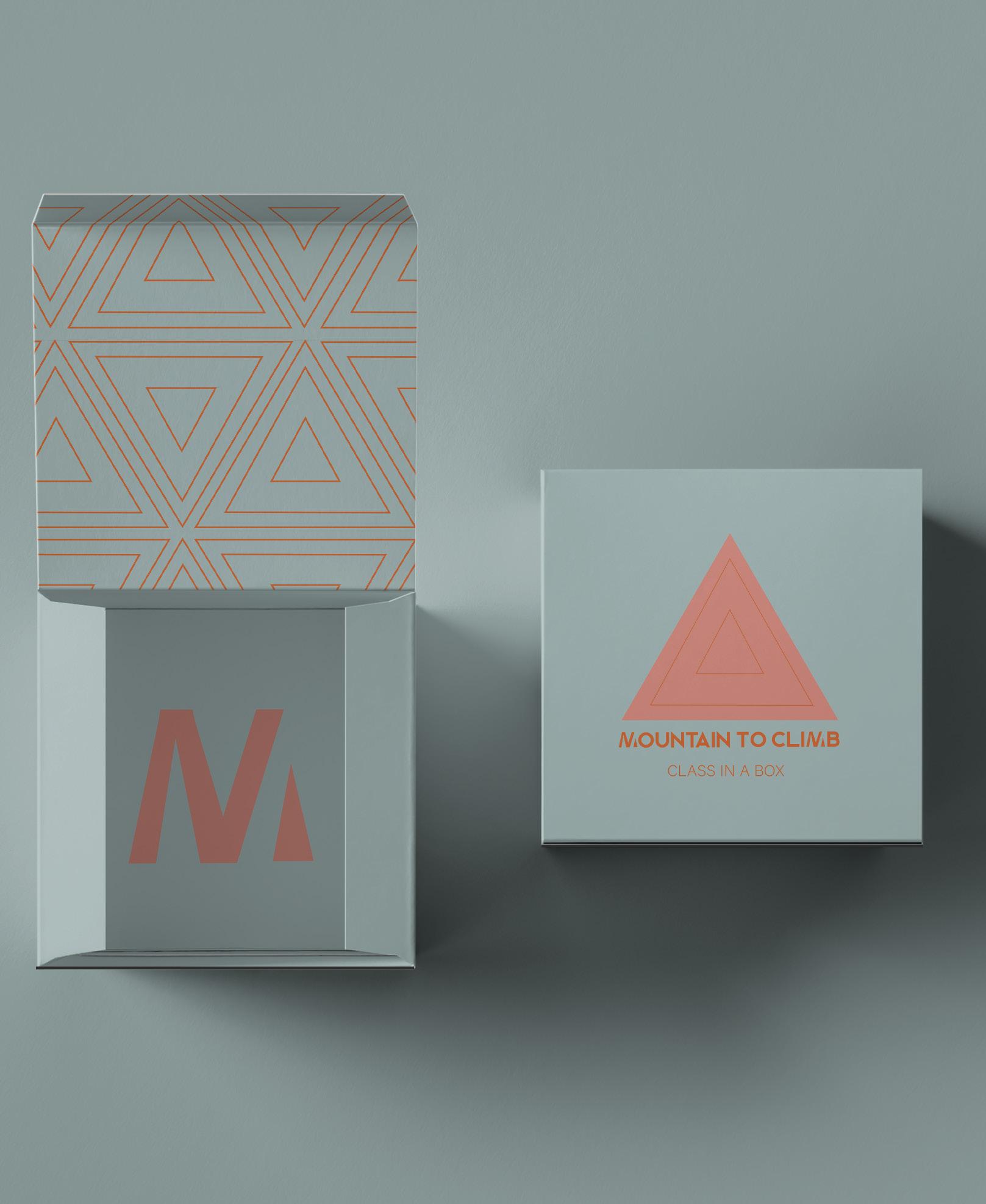
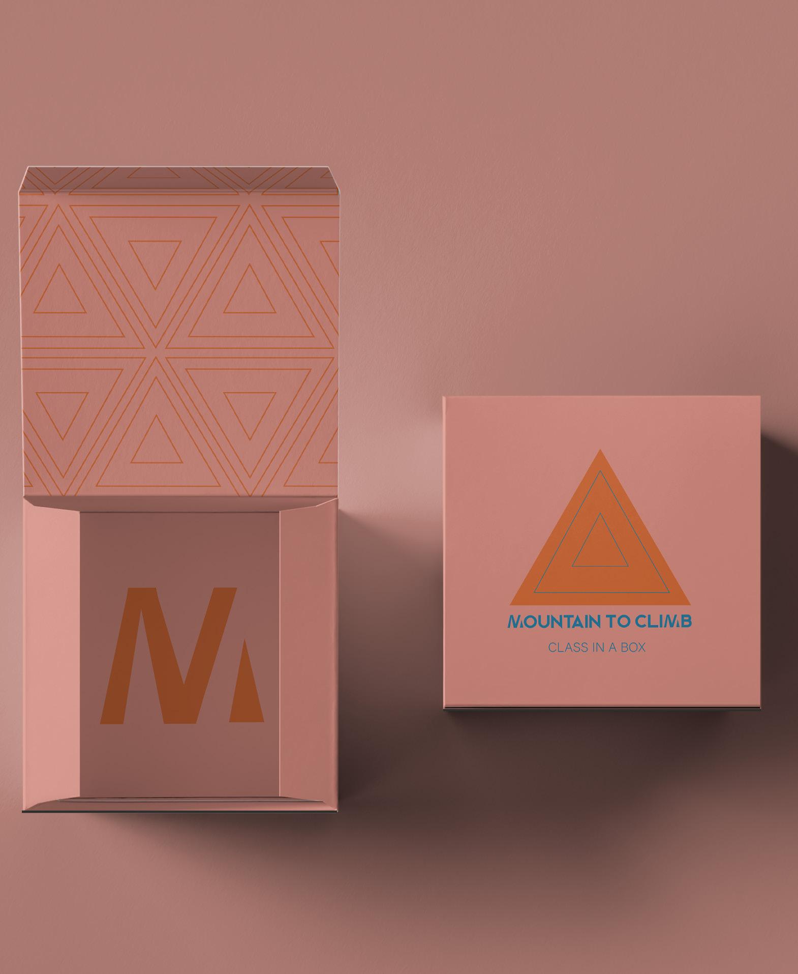
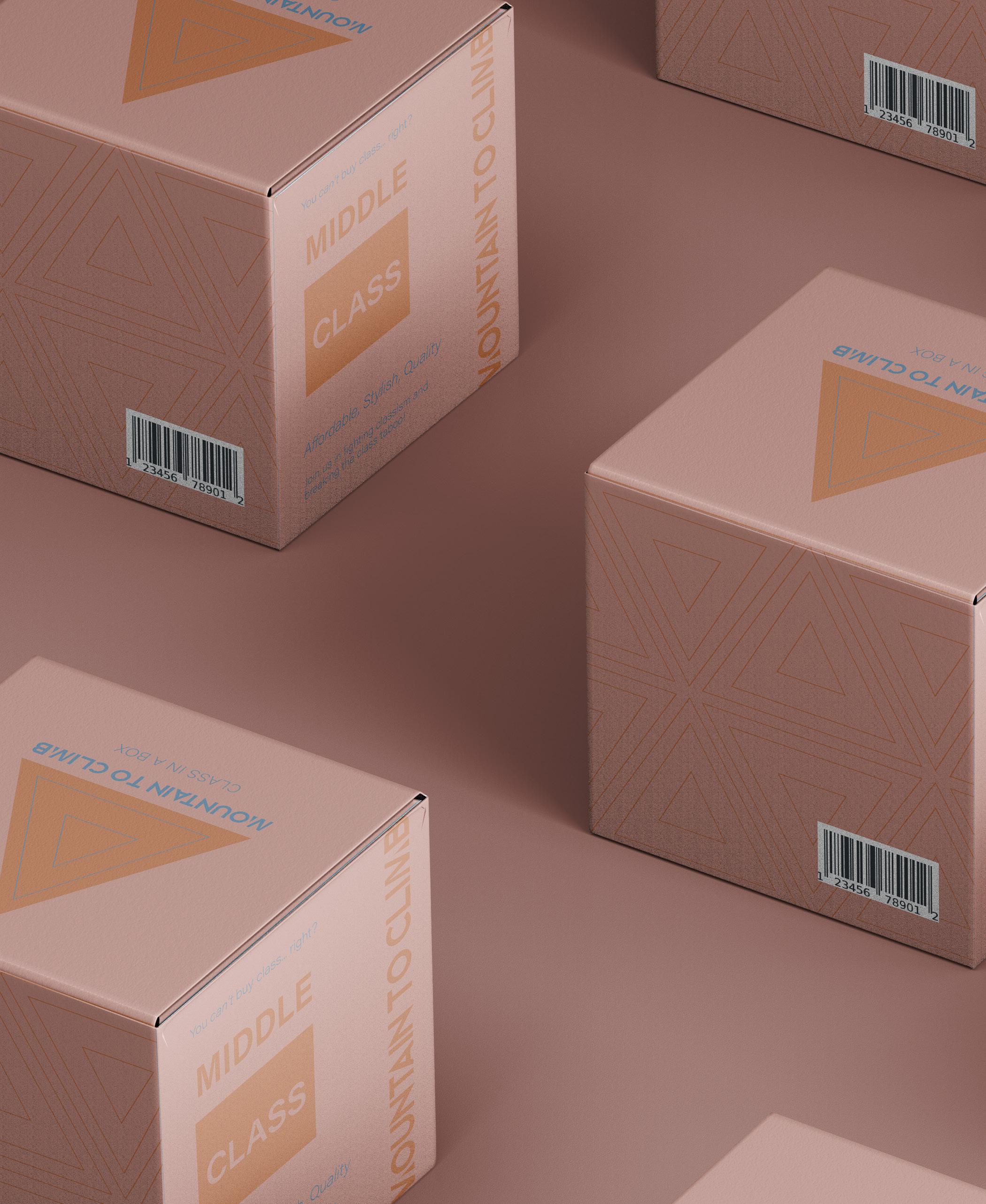
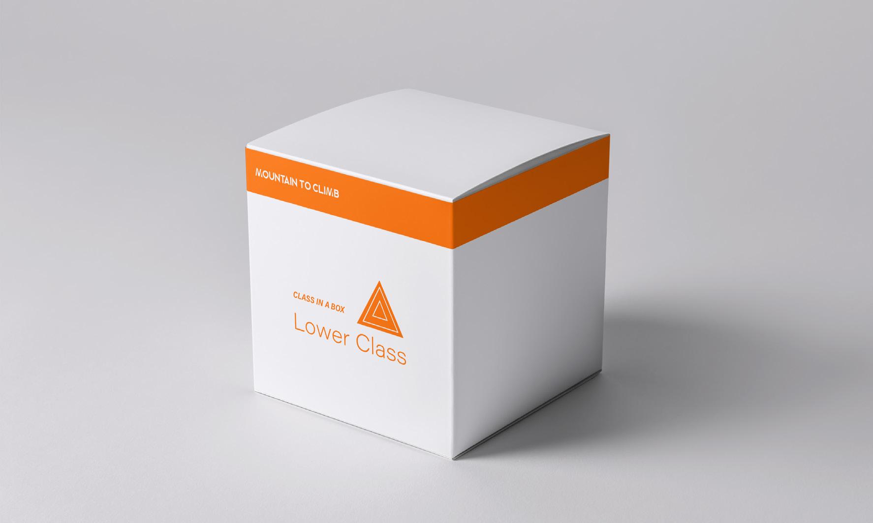
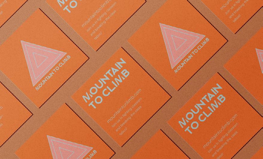
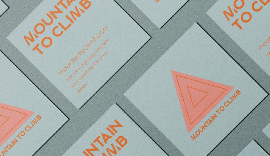
The concept is the creation of a new brand, Mountain to Climb (using the previous mountain metaphor), which uses socioeconomic status to generate conversation starters.
The purpose of Mountain to Climb's products is to initiate important discussions about the difficulties and opportunities of being in various socioeconomic groups.
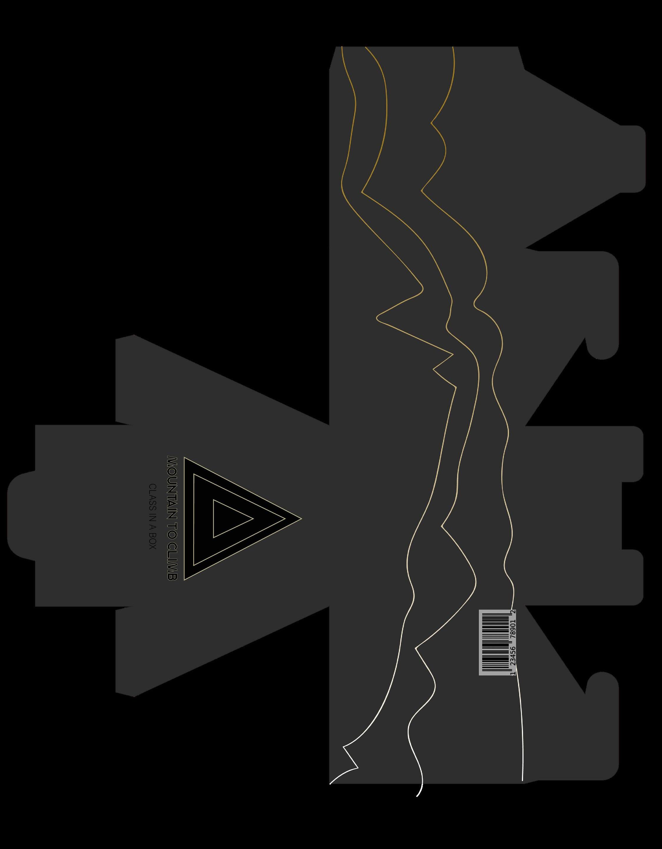
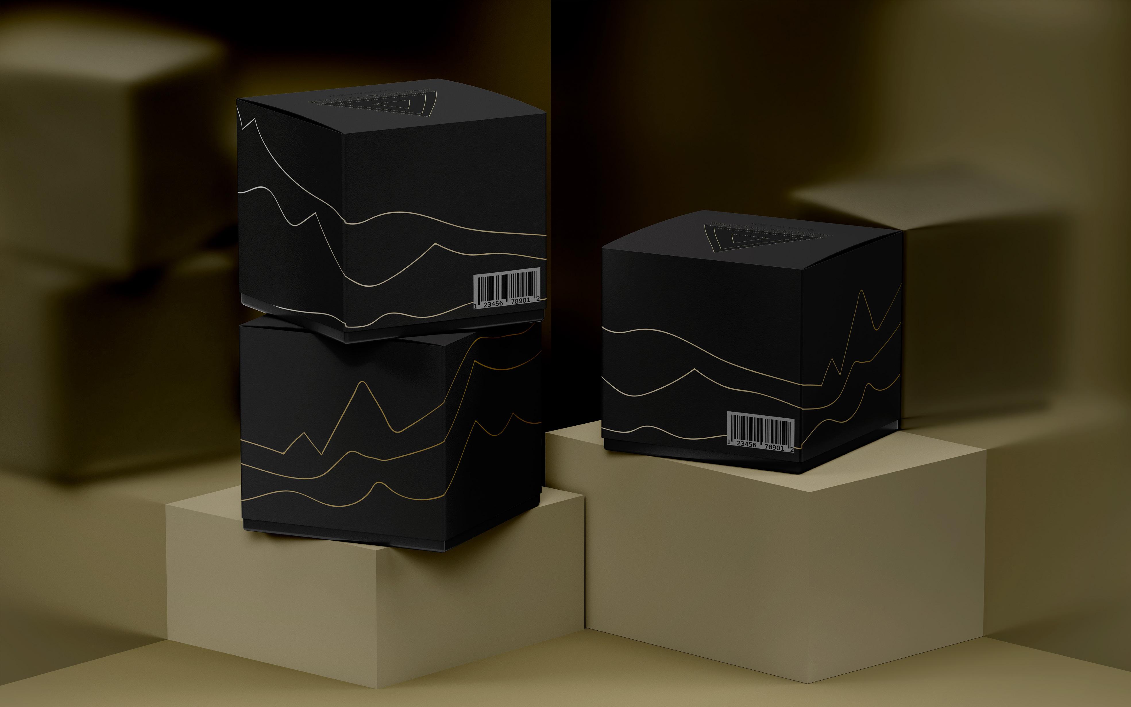
The packaging design will originate from an imaginary product line named Class in a Box', which takes an abstract concept (social class) and makes it physical.
This is interesting, as it will reflect the various social classes and the distinct views they offer. The boxes will be empty, but the design and price will reflect the class
level it represents, playing on the idea that 'money cannot buy you class'. For example, the upper class could be made with gold foil and have a luxury feel, and the working class could be made from cardboard. The upper class box would cost £100; middle class £40 and lower class £5.The rationale behind this is that by turning something non-physical into the physical, it becomes 'real', making it easier to talk about.
This aligns with Mountain to Climb's goal: encourage people to have meaningful conversations about their class and the obstacles they may encounter, thus helping reduce the stigma and taboo around the topic.
Who?
Wide demographic (Low middle and upper class)
All genders
Where?
UK (Supermarket users)
Age?
Adults (25-45 as more likely open to change/progressive conversations).
According to the UK Government (2021), roughly half of the population (48%) considers themselves working class, 36% middle class, and 6% high class. 10% of individuals do not classify themselves (SAGE Publications, 2013).
Those aged 50 to 64 are most likely to identify as working class (54%). The UK has an upper class, with average assets of over £140,000, excellent social connections, sophisticated preferences, and an education at the most renowned institutions (UK Government, 2017).
79% of people across all regions believe there is a big difference between social classes in Britain today,
while 11% believe there is just a small gap Residents of Scotland and Northern Ireland are the aptest to believe there is a substantial disparity (both 84%) (UK Government, 2017).
In addition, 39% of the populace believes it is becoming more difficult for those from less privileged backgrounds to advance in British society 28% believe it is remaining about the same and 23% believe it is becoming simpler (UK Government, 2017).
The All-Seeing Eye, also known as the Eye of Providence, is a potent symbol employed for generations to denote divine protection and direction. It has been used in various settings, such as religious, philosophical, and political debates. Interestingly, it has been related to socioeconomic class in recent years (Wilson, 2020).
According to popular belief, the Eye of Providence represents the higher classes' power and dominance over the lower classes (Potts, 1973). This image reminds people of their authority and the possible repercussions of defying it. This representation is meant to remind them of their control and the dangers of disobeying them. It is thought that those who wear the Eye of Providence are telling society to follow the dictates of the affluent or face the repercussions. This strategy upholds societal hierarchy and the status quo (Wilson, 2020).
Additionally, the Eye of Providence serves to strengthen class distinctions.
As a reminder that people in higher social classes have access to more resources, influence, and privilege than people in lower classes, it is significant (Wilson, 2020). It helps to highlight the differences between the classes and to support the idea that the upper classes have more advantages.
Given this, it is intriguing that The Eye of Providence is displayed on the US $1 bill (Wilson, 2020). Supposedly, it serves as a reminder of the federal government's authority to safeguard and guide its people (Potts, 1973). The Eye of Providence is also regarded as a reflection of the value of individual accountability and perseverance to succeed in America- a reinforcement of capitalist systems in which social class is so intrinsically linked, especially as the symbol is printed on the most basic definer of class (money).
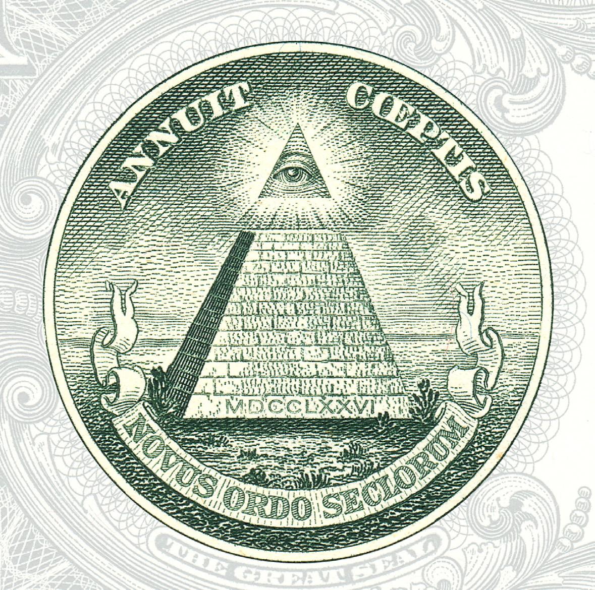
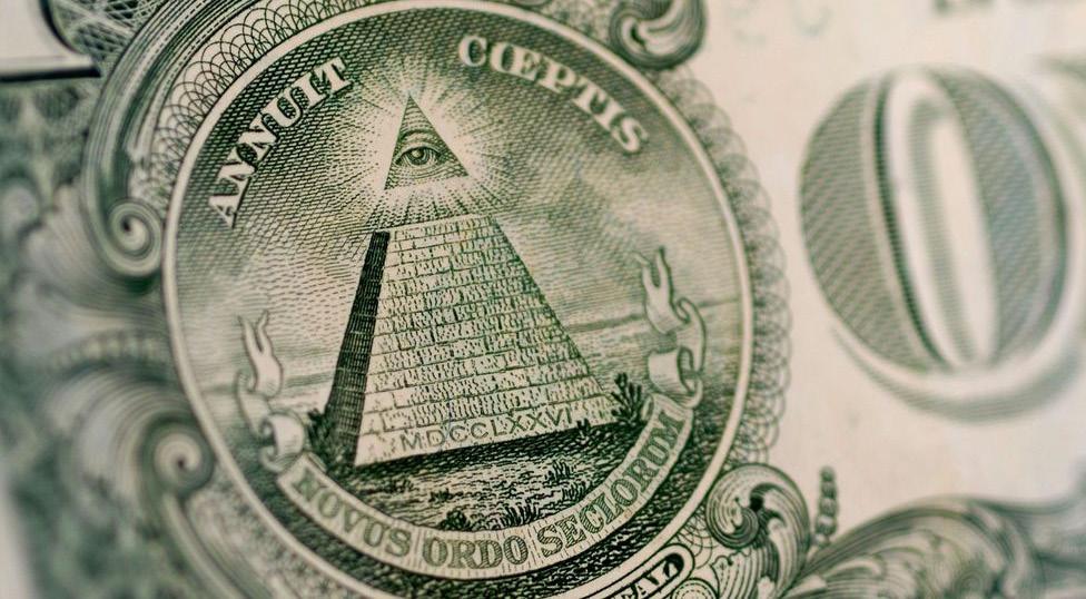

It is also interesting how the symbol is partly a pyramidsimilar to my metaphor that 'class is a mountain'. This
https://www.bbc.com/culture/article/20201112-the-eye-of-providence-the-symbol-with-a-secret-meaning
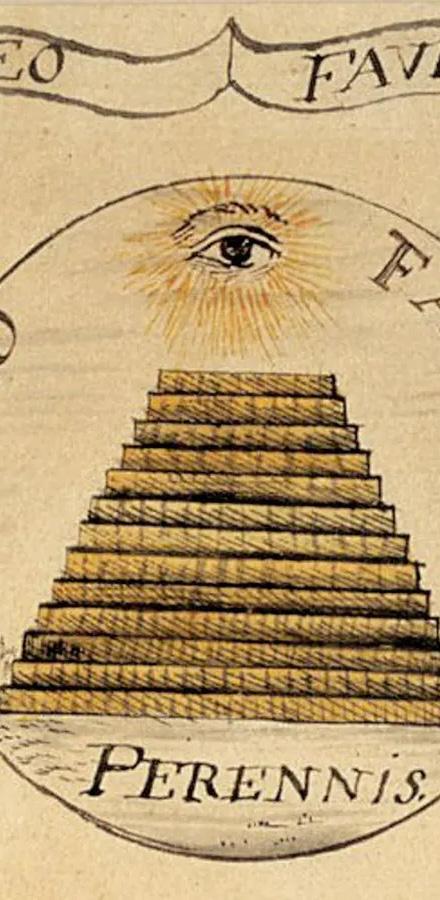
strengthens my decision to use pyramid/mountainouslike shapes and connotations in class-related designs.
Muted colour palette as the brand needs to be versatile to work on packaging for luxury-basics.
Sans-serif typography for a modern and contemporary feel.
Manipulation of certain typography elements to fit with the mountain theme.


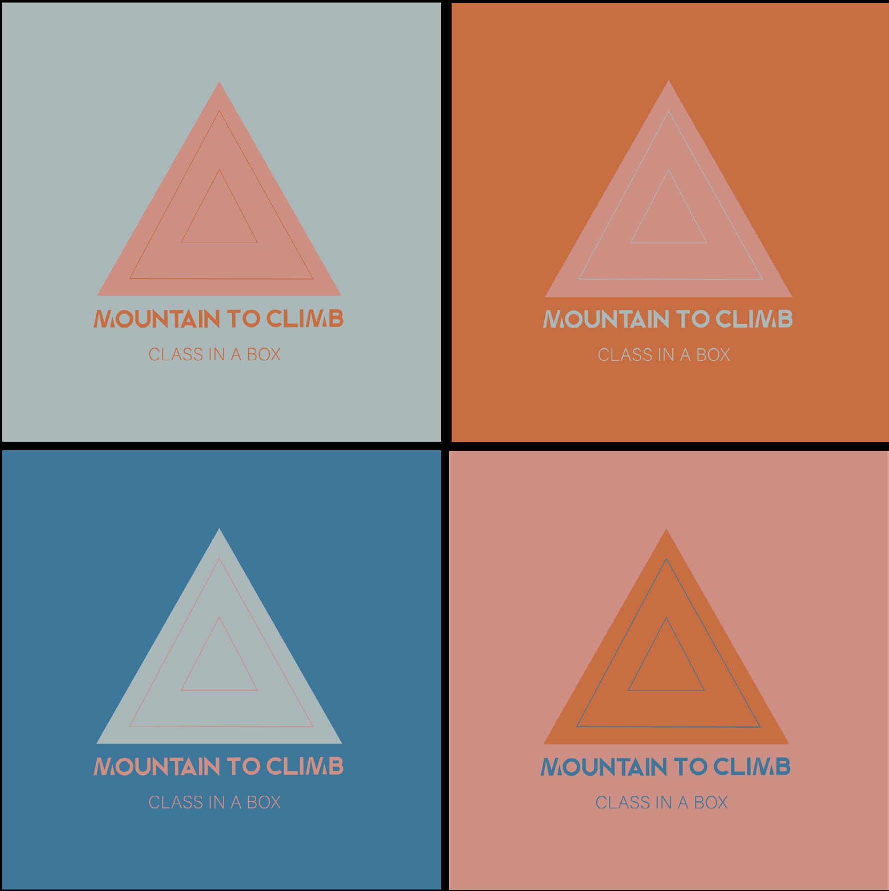
Simple and geometric imagery for the logo mark.

The photography direction symbolises class disparities/the class divides and so on in line with the brand’s mission.


I really liked this concept but realised that the upper class was the largest despite it being the smallest percentage of the population, so I decided to rethink.
Sun beams/light/ halo to represent desirability/ the 'best'
My next idea was to show hierarchy through proximity, so the upper class would be on 'top' (the smallest triangle), then middle class and then lower class. This then resembles a top down view of a mountain.


I also chose a simple sans serif font for the typography as anything too elaborate would be too busy with the triangles as well. This also gave a contemporary feel to the logo and meant that it could be used for upper, middle and lower class packaging.
The idea with this was that the lines represented steps as if 'climbing the mountain'. However, I felt that it was too much and preferred just the wording and the triangle.
First attempt, without measuring the size of the triangles.This idea worked well, taking into account the relative sizes of the different classes in comparison to one another, but I wanted to make the size of the triangles more meaningful and based in research not just randomly sized. Thus, I made them
relate to the statistic of each class size in the UK (for example, the upper class triangle is 6% of the largest triangle size I used).
Biggest triangle (not a part of the design just for the measurement)=
Width: 34mm
Height: 52mm
Lower Class statistic: 48% of the UK
48% of W= 16.32mm
48% of H= 24.96mm
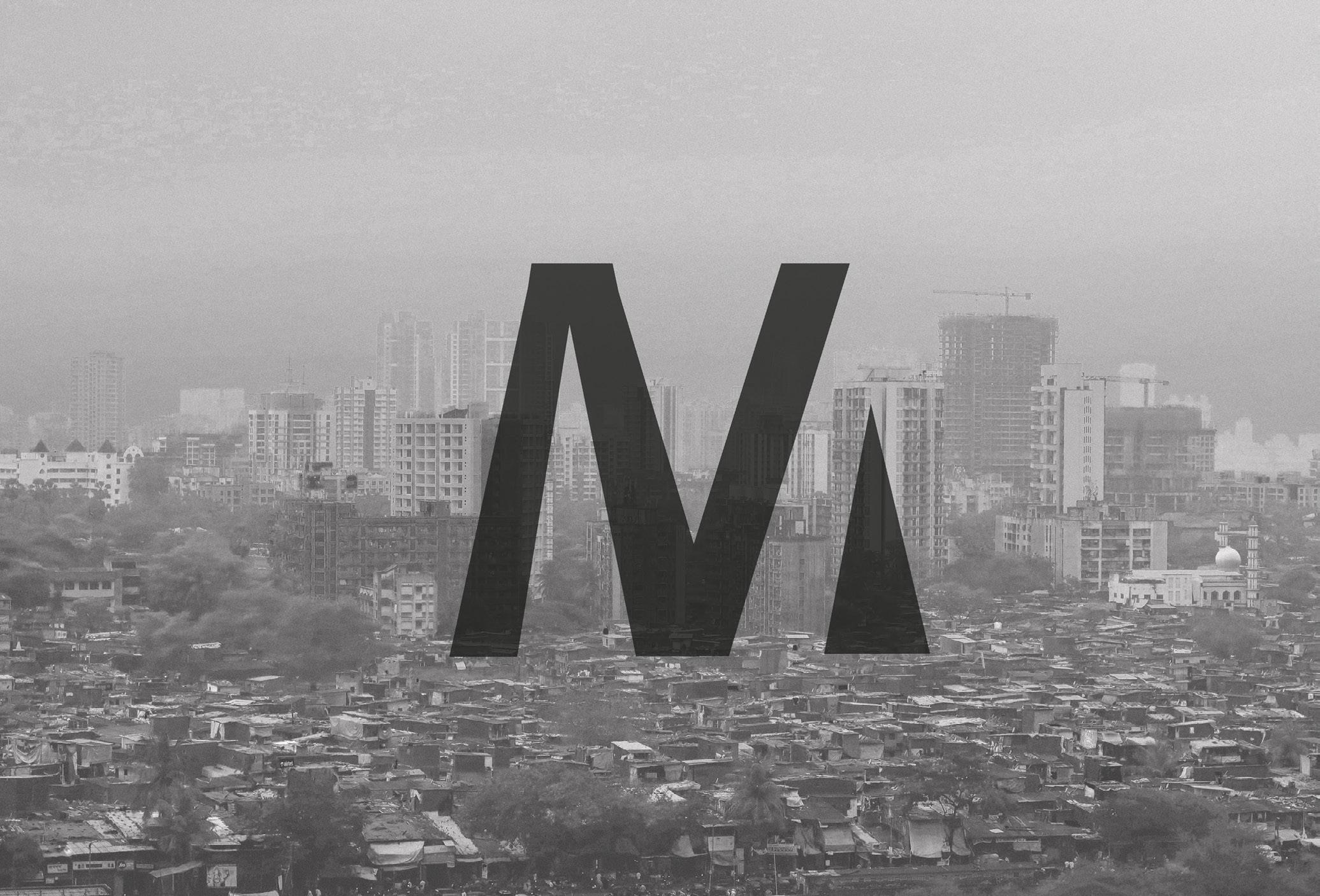
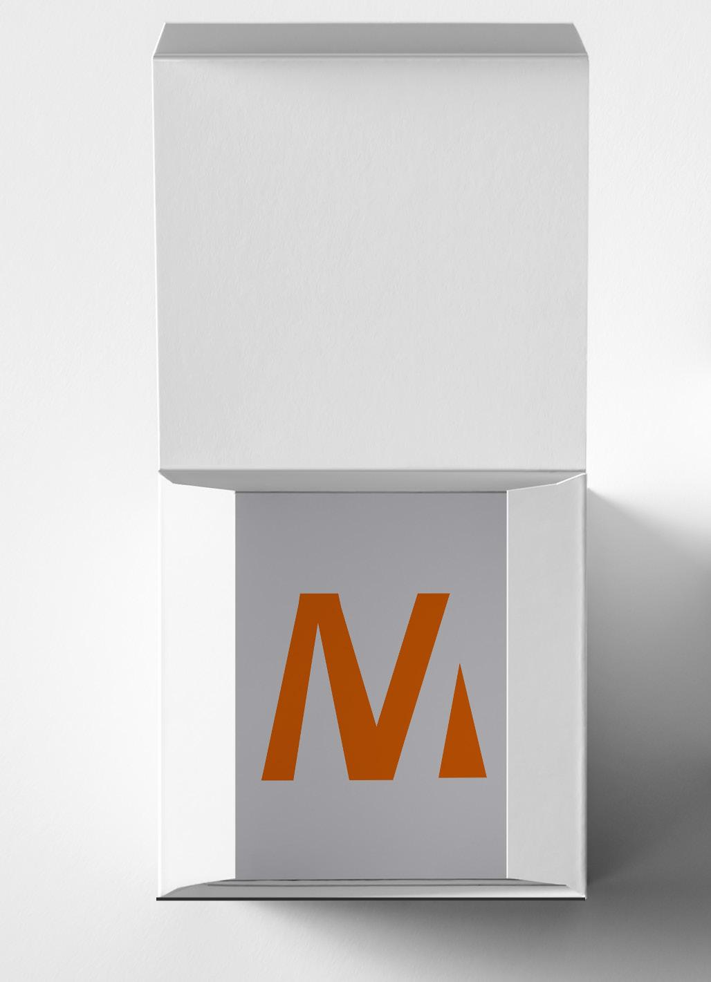
I wanted to create something that could be used as a logo mark for the brand and also add to the typography without being too in your face. I thought
the best way too do this would be to manipulate the M (for mountain), especially as an M is quite pointed and as such can be made to resemble mountain peaks.
Sans serif with equal weighting to give a uniform and contemporary feel.
Early iterations: Originally I used a serif font, but this did not lend itself to being flexible for application over all three classes. Moreover, the M looked to me to be an N with a triangle. I also realised that the varying weight of the stems did not help with the N/M issue. Hence why these designs were refined.
a mountain
Final design M stem/triangle representative ofMountain to Climb is a new brand that conceptualises the idea of social class to create talking points. Through its products, Mountain to Climb seeks to start meaningful
conversations about the challenges and opportunities of being in different social classes. The brand’s products, which currently include the Class in a Box range, represent the different
social classes and the unique perspectives they bring. Mountain to Climb aims to inspire people to engage in meaningful dialogue about their own class and the challenges they may face.
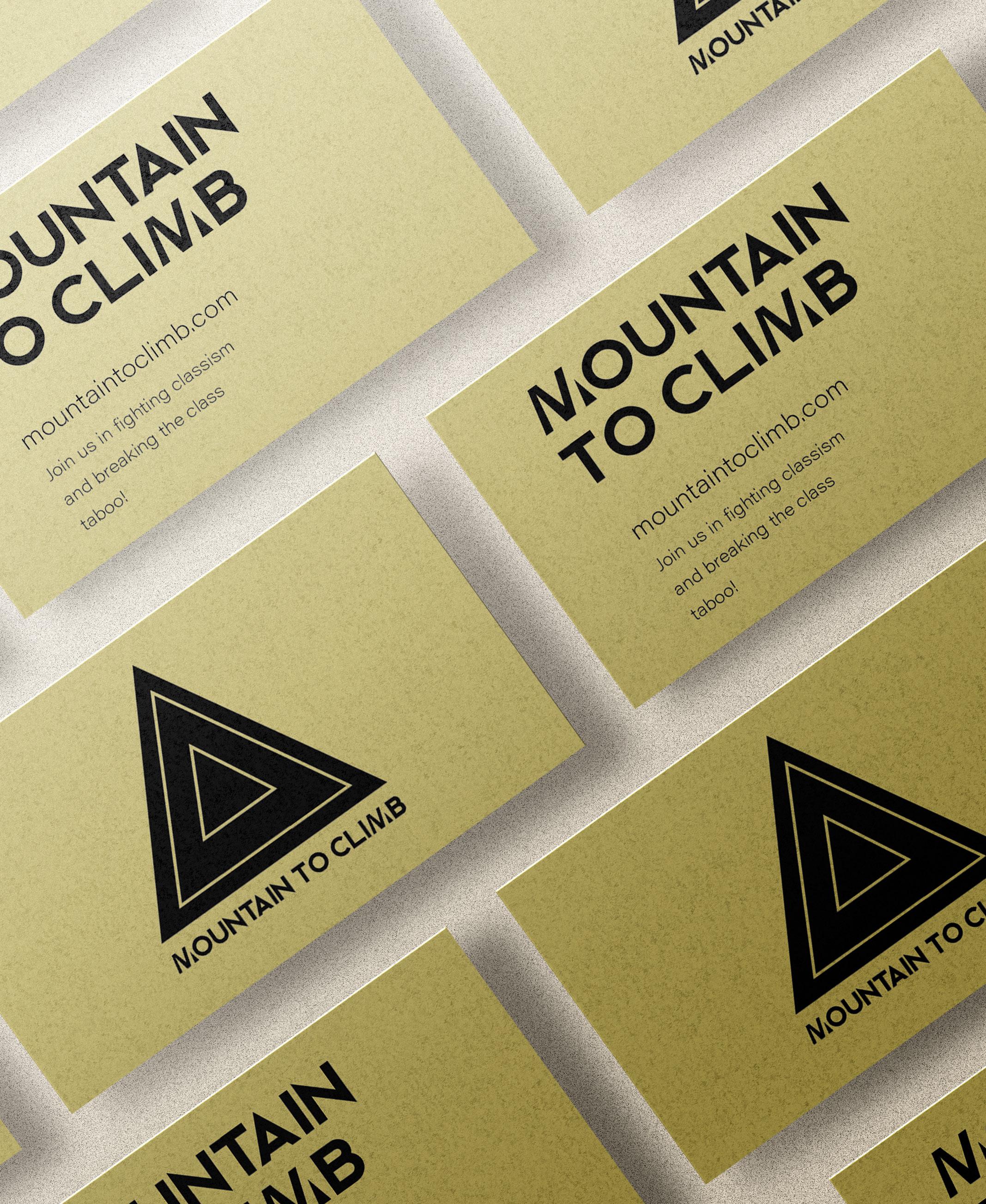
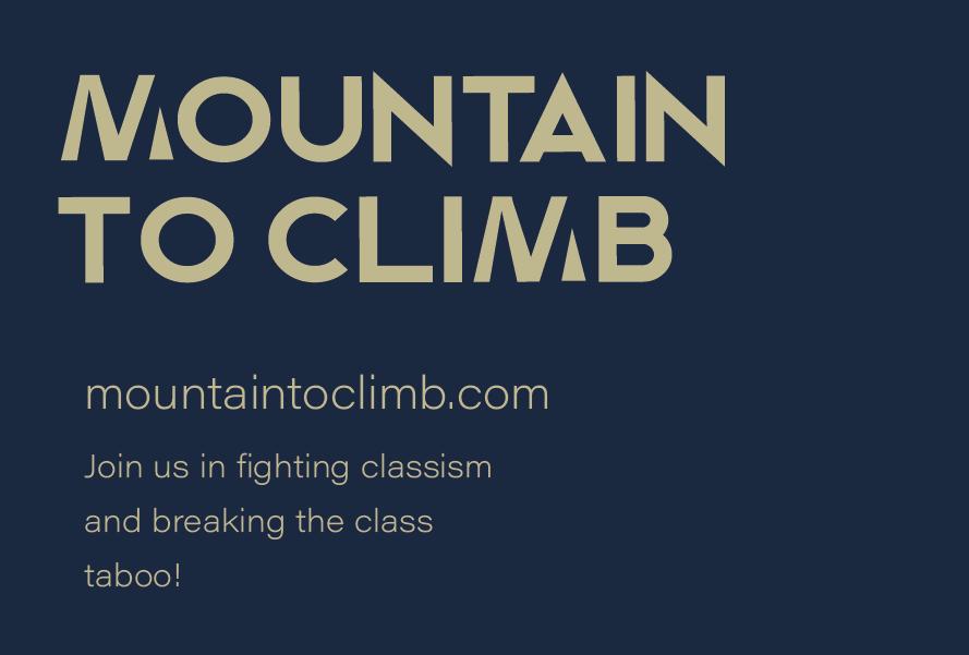
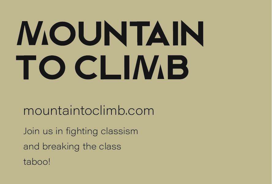
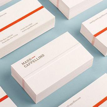
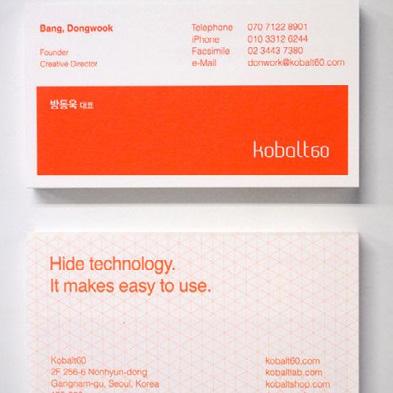
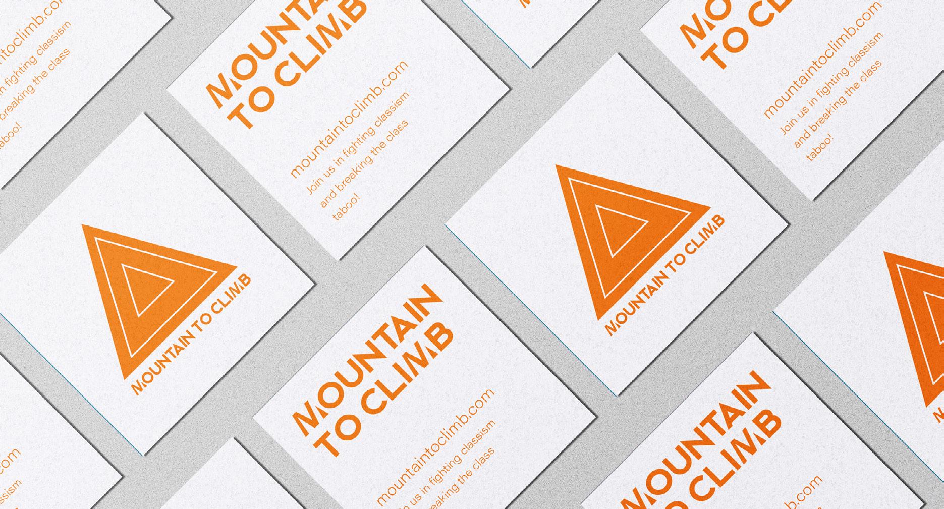
I used the brand colours to create simple business cards. I decided not to add social media but just link to a website as the brand has a large target audience and different demographics are
more/less likely to use certain social media.
I used the logo to make sure the brand is recognisable and also maintained the brand fonts.


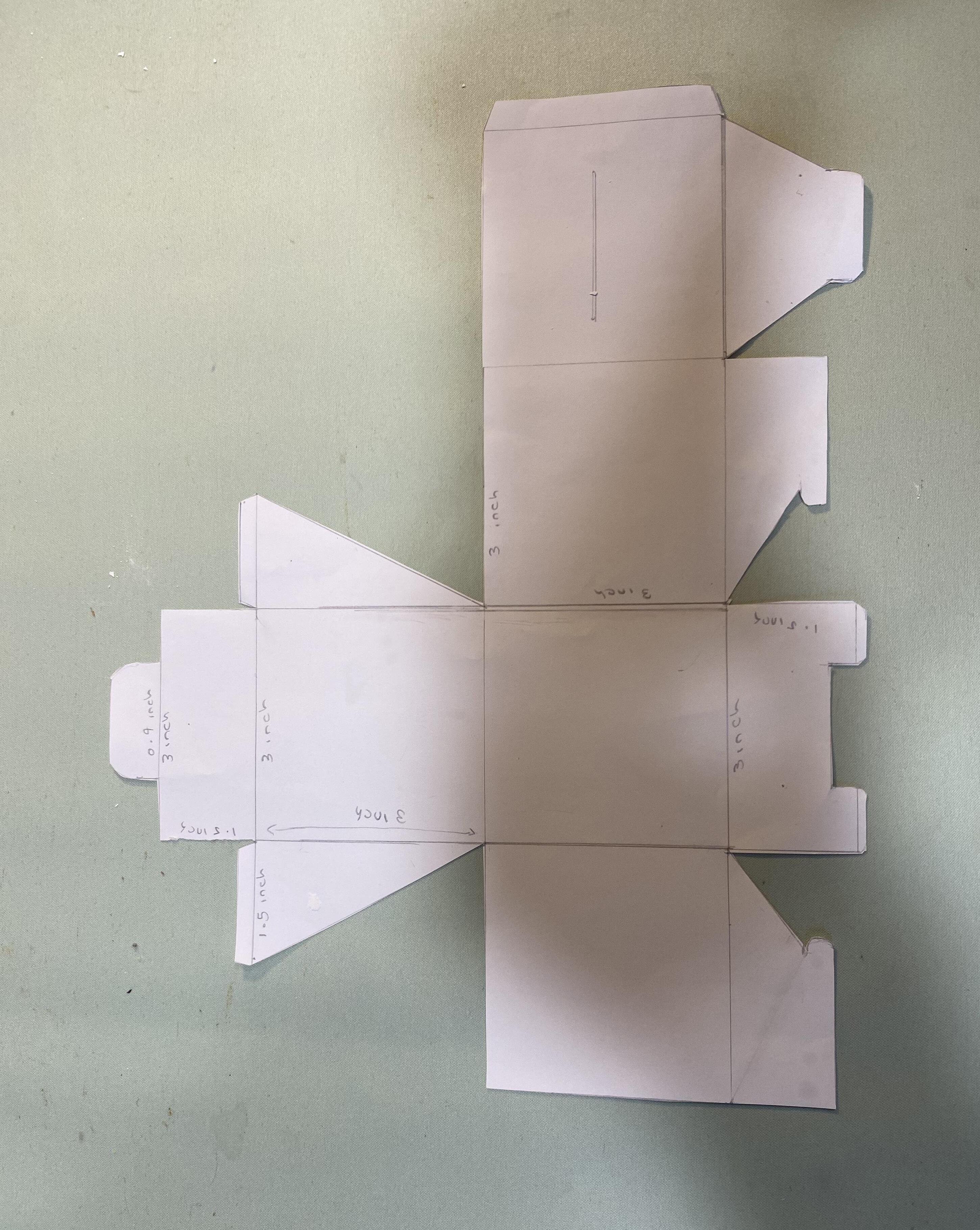
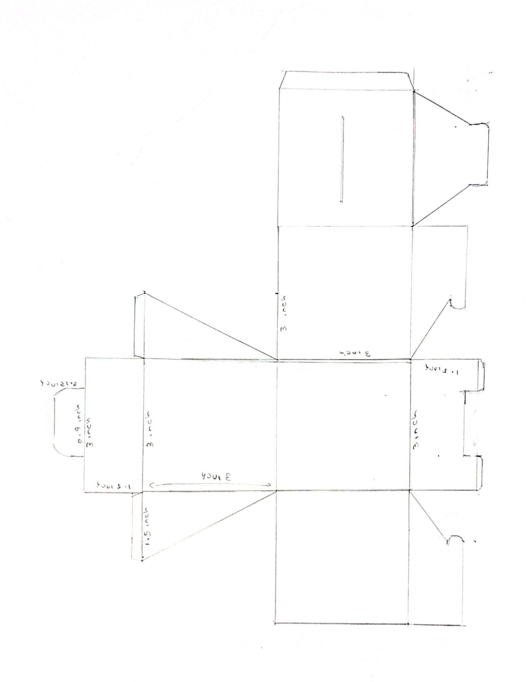
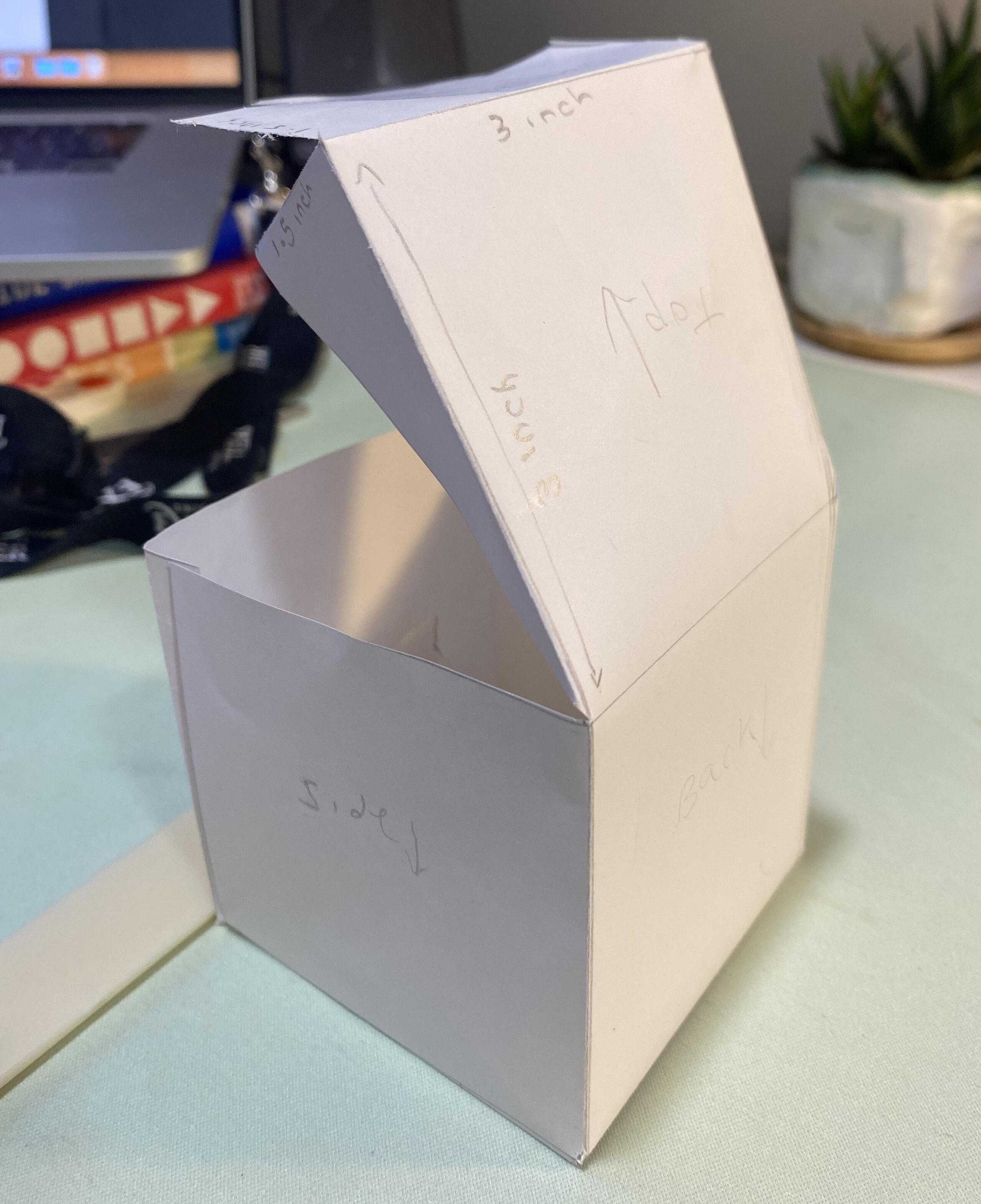
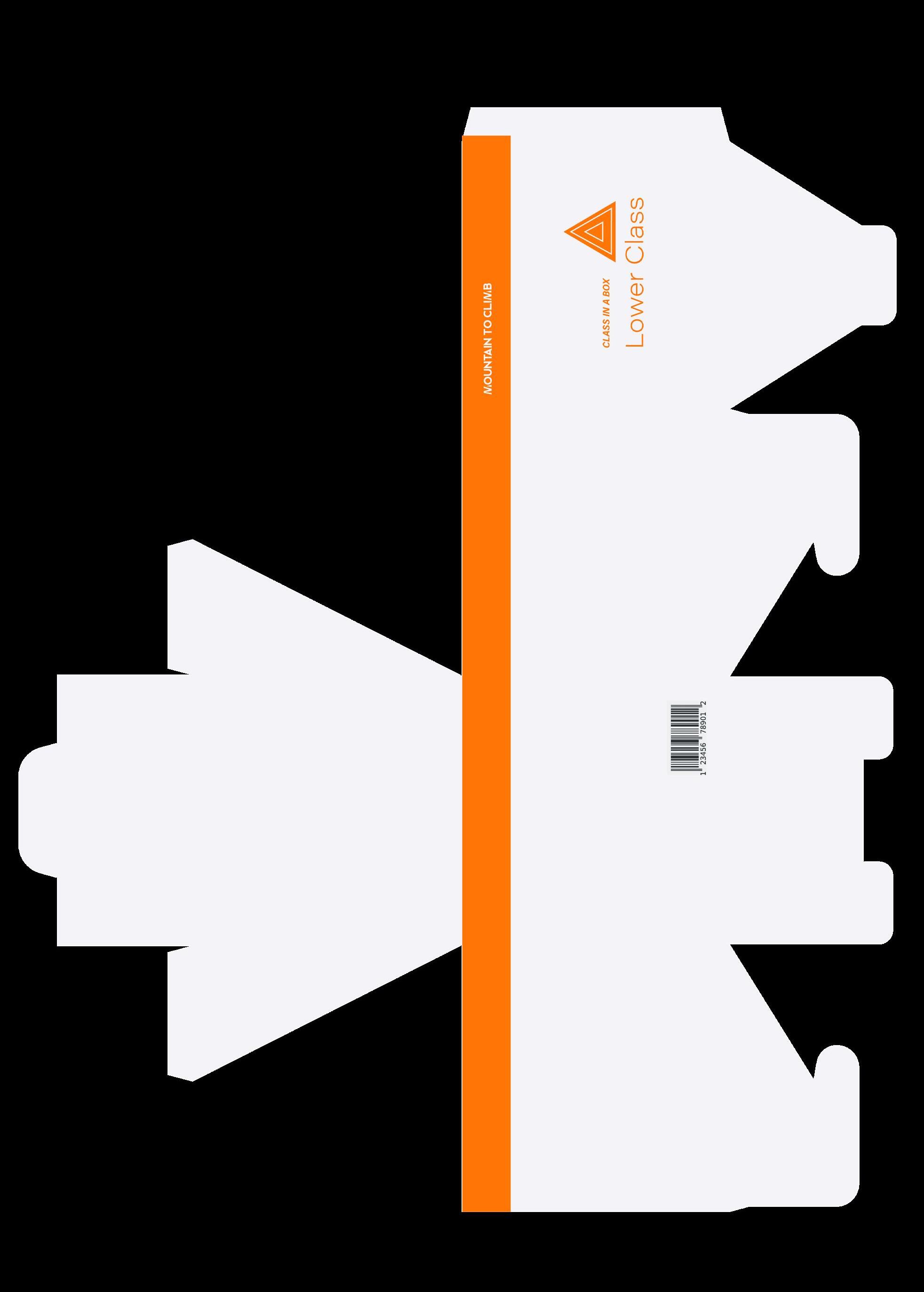
I decided to physically make the box and die-line template as I could not wrap my head around which box face would go where and in what direction. This was likely because this is my first time using a die-line, but I also find that sometimes I need to physically create something to understand it better.
Although very rough looking, by creating the box, I could understand which part of the designs would go where and in what direction they would face. This thus made it easier when designing on the dieline digitally.
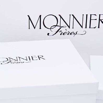
MATERIALS
Moreover, this helped me to understand construction materials better. For example, I decided that all of the boxes would be constructed of varying types of cardboard. The use of cardboard means that the boxes would be biodegradable and recyclable, meaning that the product would be sustainable.
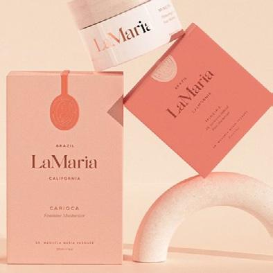
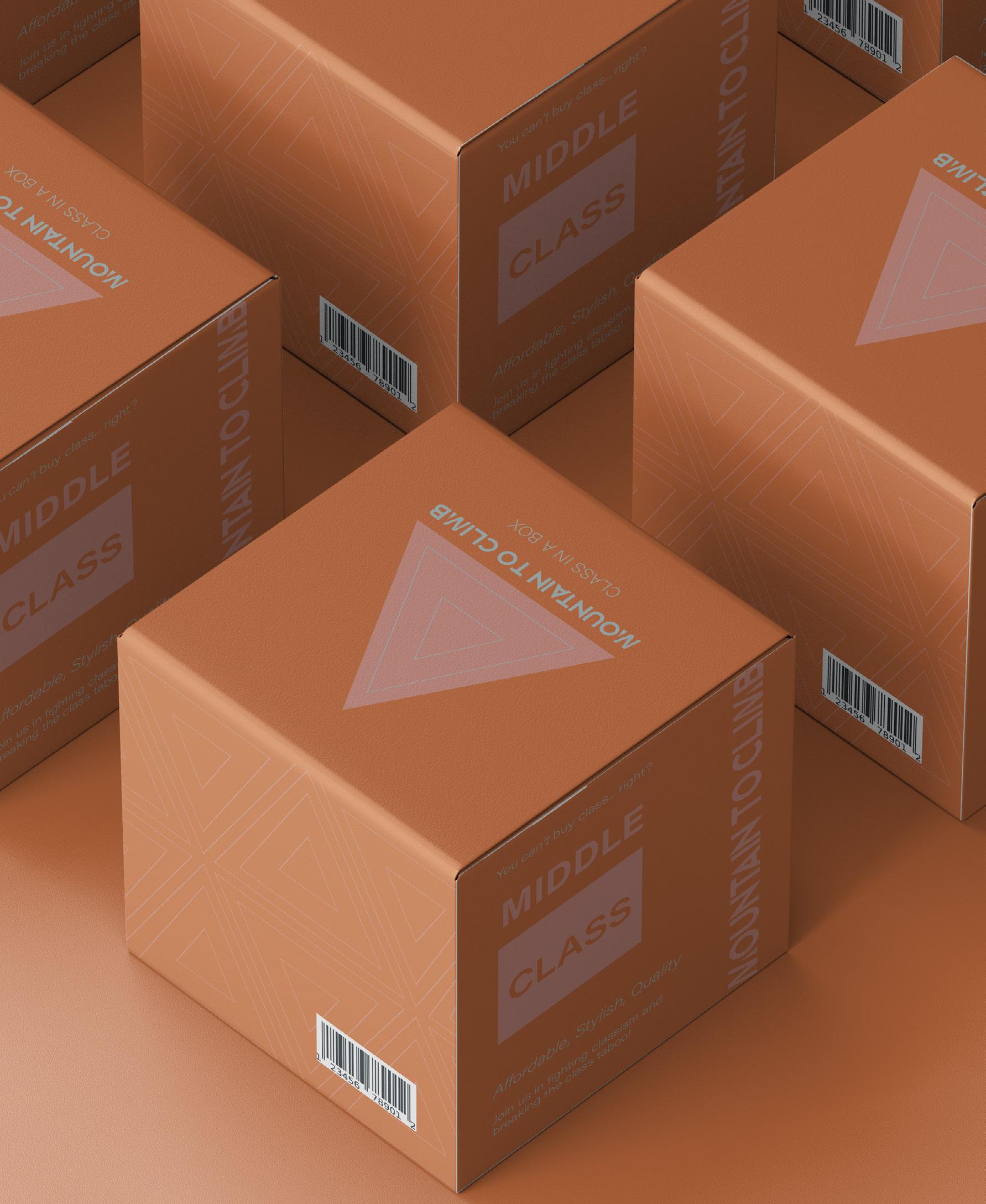
The Upper Class box would be made of premium, strong cardboard, so it will last a long time.
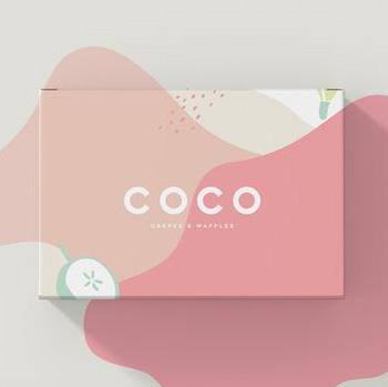
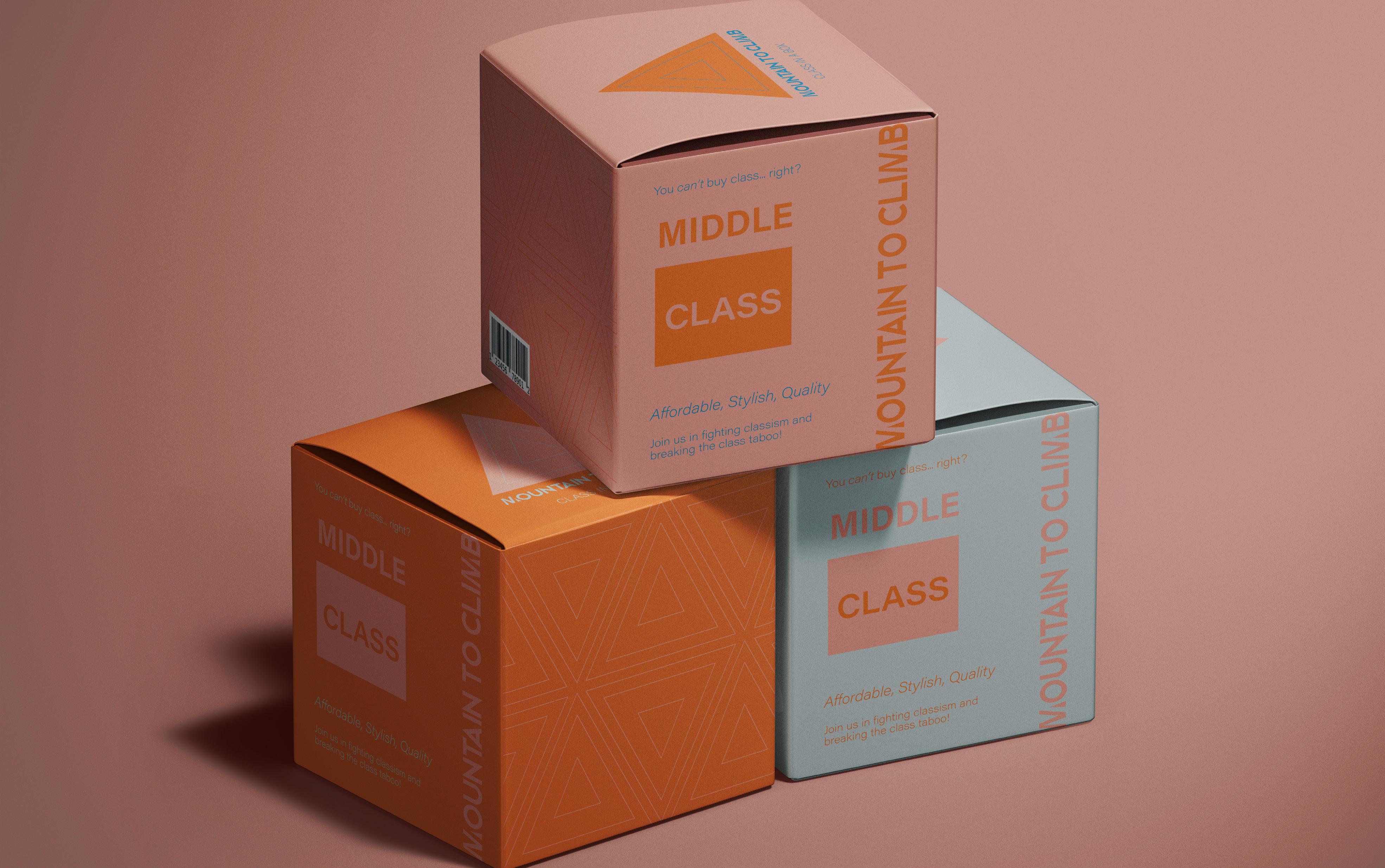
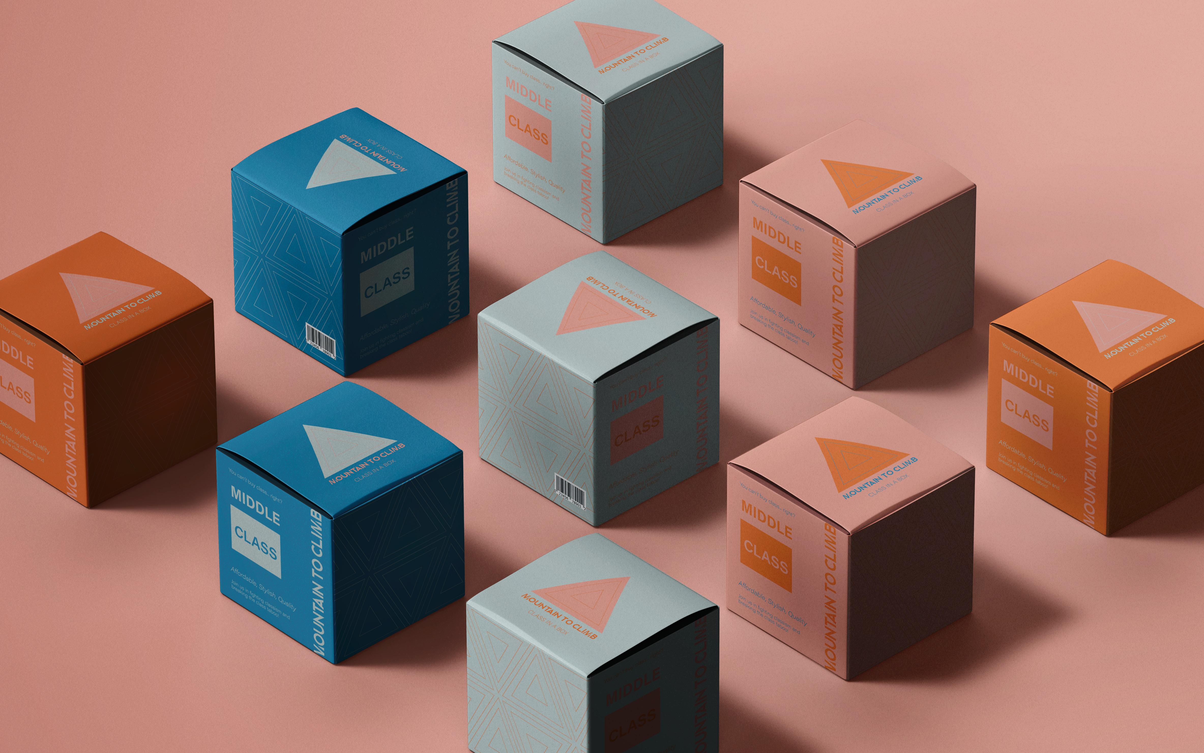
The Middle Class box would be made of a high quality, but slightly cheaper cardboard (as this box would be priced less than the upper class one, meaning that the design style and materials used should reflect that).
Thirdly, the Lower Class box would be made of a cheap cardboard which is less
strong and durable, as the box would be priced much cheaper to reflect the class level to which it pertains.
UPPER CLASS: premium, strong, long-lasting
MIDDLE CLASS: high quality but cheaper than the upper-class
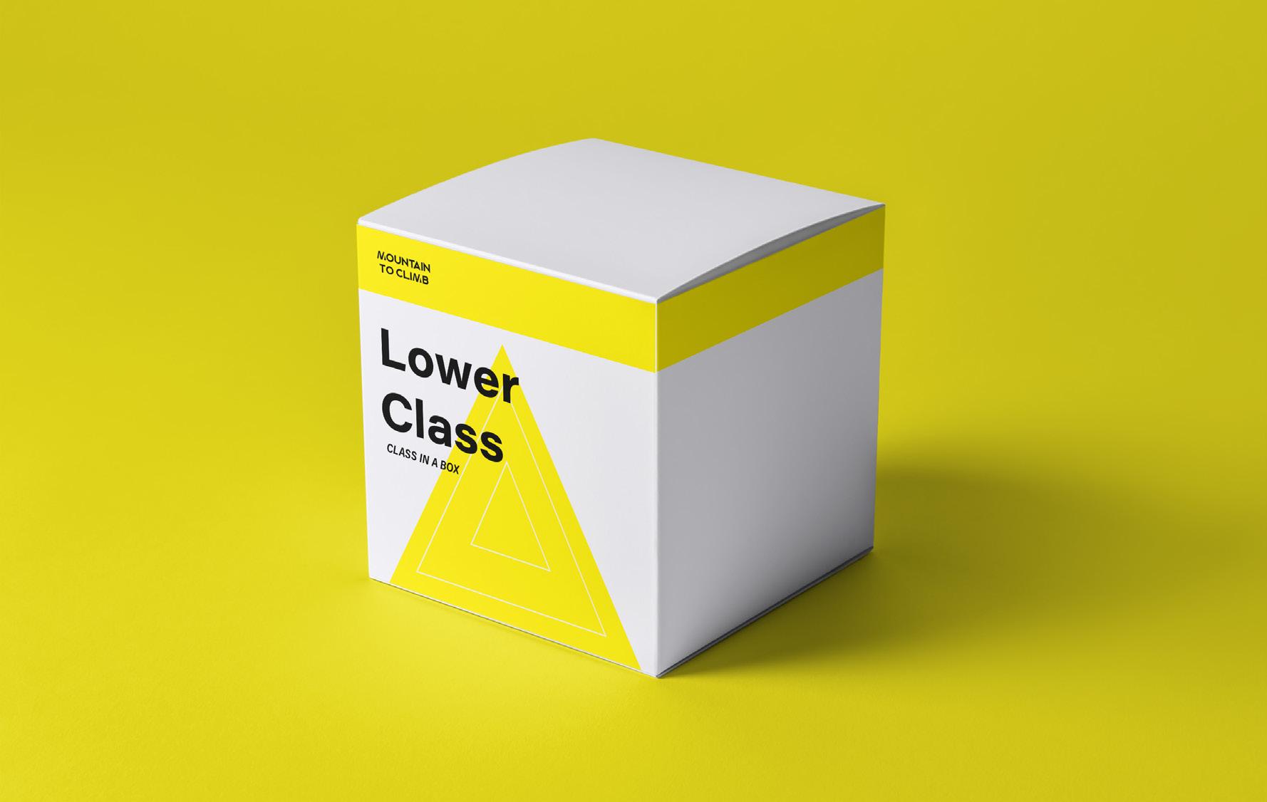
LOWER CLASS: cheap craft cardboard
Analysis:
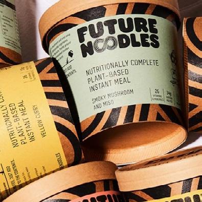
The brands rely on their fame and status to sell their products.
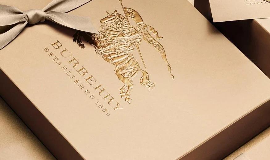
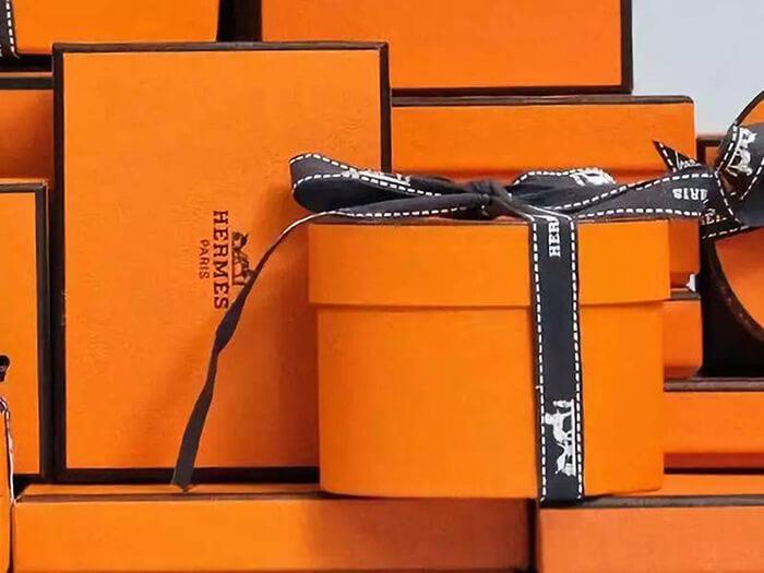
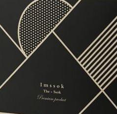
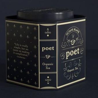
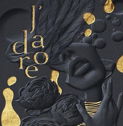
I want to make mine more decadent in feel- using dark blacks and rich golds.
I also want to try using illustration as I think this improves engagement and does not necessarily
have to be off -limits for more luxury style brands, enabling my product to stand out, but still keep a minimalist style. This will also give it a more modern feel, which is important for a contemporary market.
Not engaging.
Honestly this is just boring!
Overview:
Plain
Simple colour palettes
Minimalist
Not engaging- outdated
Little pictures/illustrations
The images used were sourced from Pinterest: https://www.pinterest.co.uk/ bexjstone/upper-class-box/
Plain and simpleOverview:
The images demonstrate the feel and aesthetic that I want to achieve with my Upper Class Box. The use of rich dark colours creates a very mysterious and luxury feel, with the lighter coloured accents giving a decadence that harks to a time when Upper

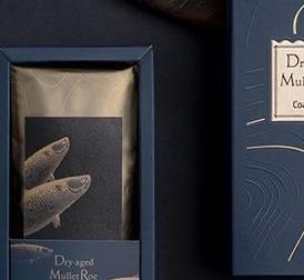
Class was very much associated with glitz and glamour.
The overall effect creates a rich and expensive look whilst still maintaining a modern air.
Notes:
The colours may change in the design process. But this shows you a rough idea of the colours.
The images used were sourced from Pinterest: https://www.pinterest.co.uk/ bexjstone/upper-class-box/
Good contrast between the black and gold. Threads of gold give a luxury feel. Fits the aesthetic I want to emulate. Use of thin lines for the illustration.
One key colour
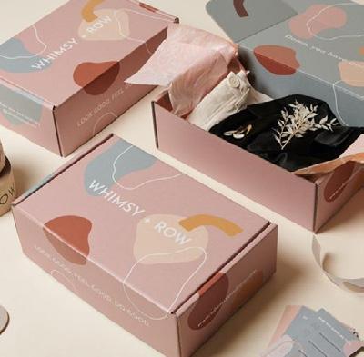
Analysis:
The brands use bold colours to sell their products.
I like this aesthetic and want to incorporate it into my design.
I also want to follow the bold/blocky style, less intricate than the upper class designs. This will also give
it a modern vibe, which is important for a contemporary market.
Overview:
Block Colours
Bold
Bright
Not intricate
Primary colour varients
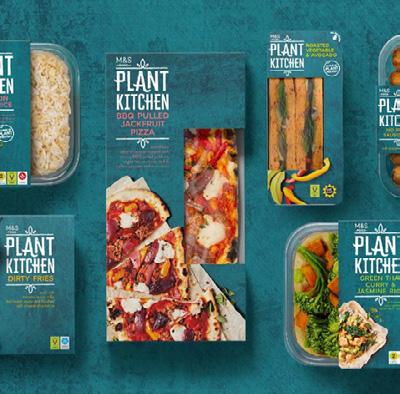
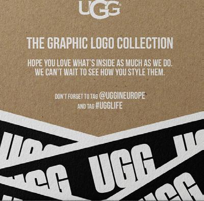
The images used were sourced from https://www. coleyporterbell.com/work/ plant-kitchen/; http://www. createdbyjasmine.com/ project/ugg-x-coachella;
https://www.pinterest.co.uk/ pin/247486942013620724/
Primary colours
Overview:
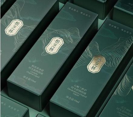
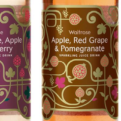
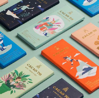
The pictures portray the mood and aesthetic that I hope my Middle Class Box will convey. The use of muted colours, particularly when used in large blocks, gives the design a modern and sleek feel. This links to the research I did (see previous spread)
into the packaging of middle-class brands (like M&S), which also opted for this vibe.
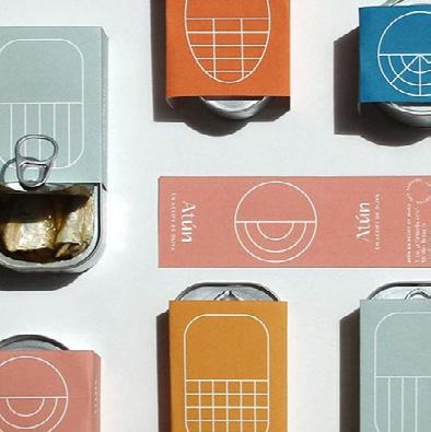
Bright and bold but still maintains a sophisticated air.
Notes:
The colours may change in the design process. But this shows you a rough idea of the colours.
The images used were sourced from Pinterest: https://www.pinterest.co.uk/ bexjstone/middle-class/
Blocks of colours and simple designs. I love how the colours are still bright but the more muted tones bring an air of sophistication which I feel is very apt for a middle class audience.
More wording on the packaging than was common with the more upper class designs.
 Fun and colourful.
I chose to make four colour options for the middle class box as I wanted there to be more variety than the upper
class box (I felt that the upper class box maintained an exclusive feel by being available in only one colour,
and also that the black/gold combination was perfect for that 'tier'). I have named each box according to colour. I
think that the names are sophisticated and would appeal to a middle class audience.
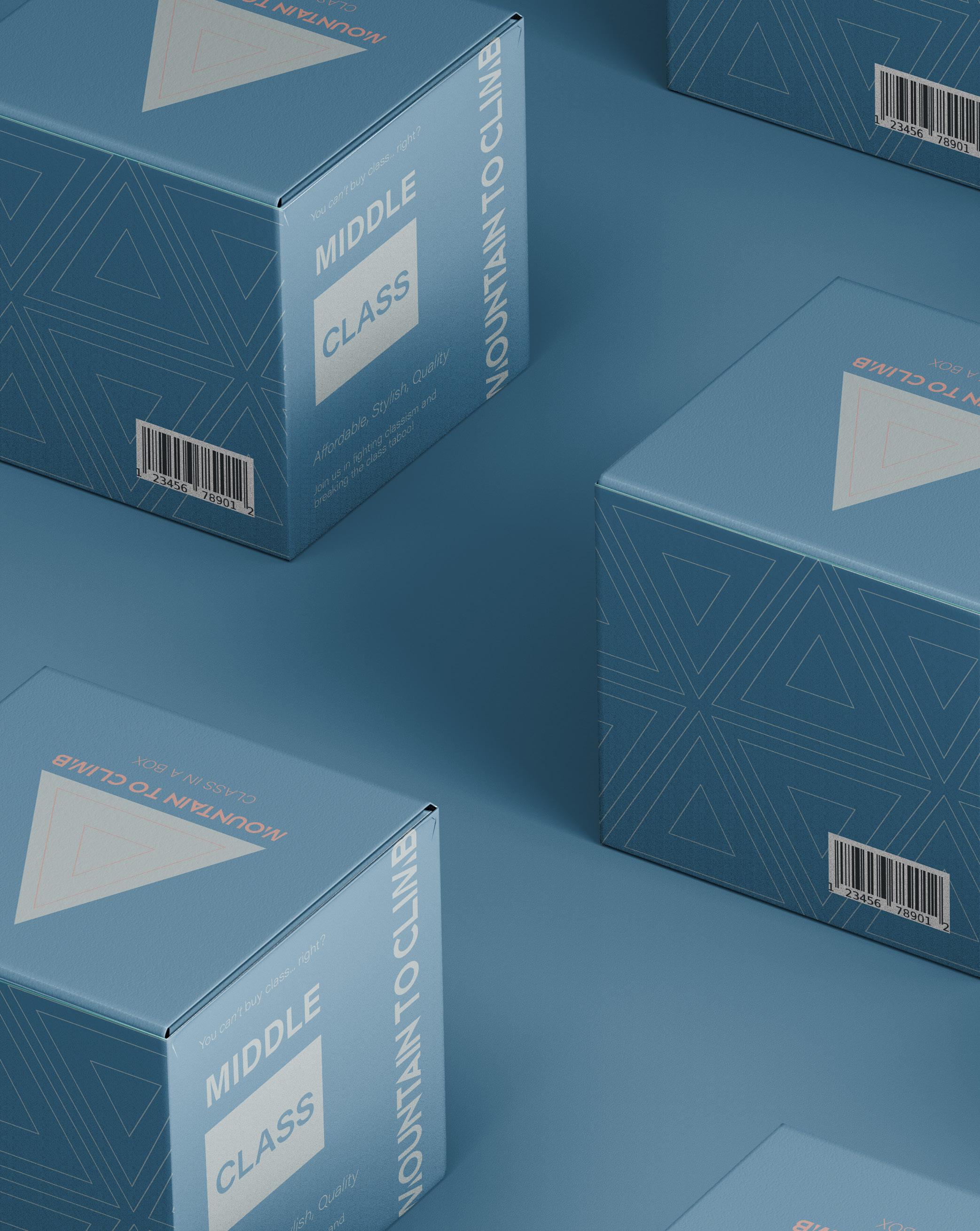
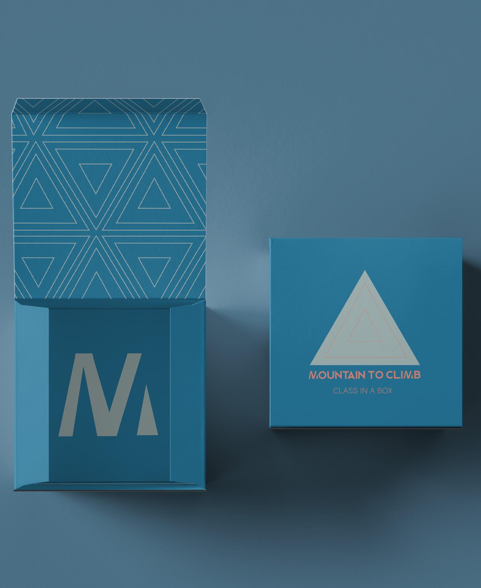
The four colours chosen are pretty and contemporary but muted (as per the research). I named them: duck egg, dusk, ocean and sunset (a slightly more pretentious way of saying: light blue, pink, dark blue and orange)!
The colour palette works well together, creating a sophisticated but modern aesthetic, perfect for the middle class.
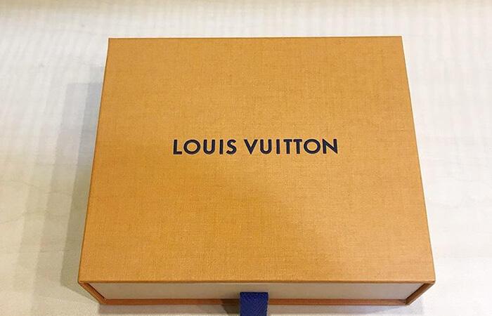
I chose to add more information to these boxes (whereas the upper class only had the logo and product name) as my research found that the middle-class companies (such as M&S, Waitrose and so on) had more wordage on their packaging than the luxury brands (Burberry, Louis Vuitton etc.). The content's slightly playful tone ensures the vibe is less 'proper' than the upper class. Moreover, the addition of the brand mission explains the box's purpose.
Regarding the fonts, I used only the two already incorporated into the logo to maintain consistency and simplicity. Both are sans serifs which compliments the contemporary colour palette.
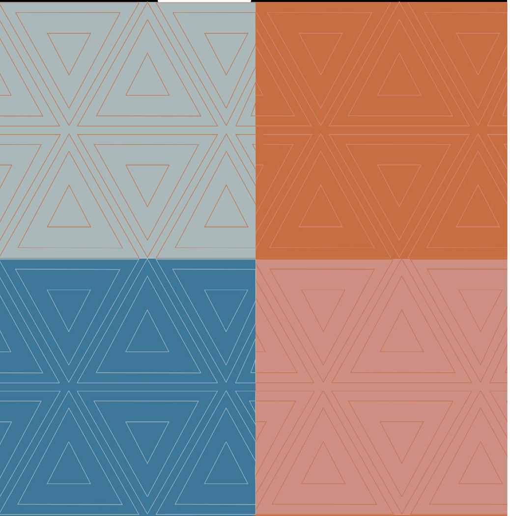
I noticed when researching that a lot of the packaging contained a mix of typography and simple illustration. As such, I utilised the brand logo (the triangles) to create a simple geometric pattern. This complements the more busy typography faces of the boxes.
Overall, using muted colours, straightforward typography, and a geometric design produces a contemporary, modern, and sophisticated appearance that resonates with the middle class.
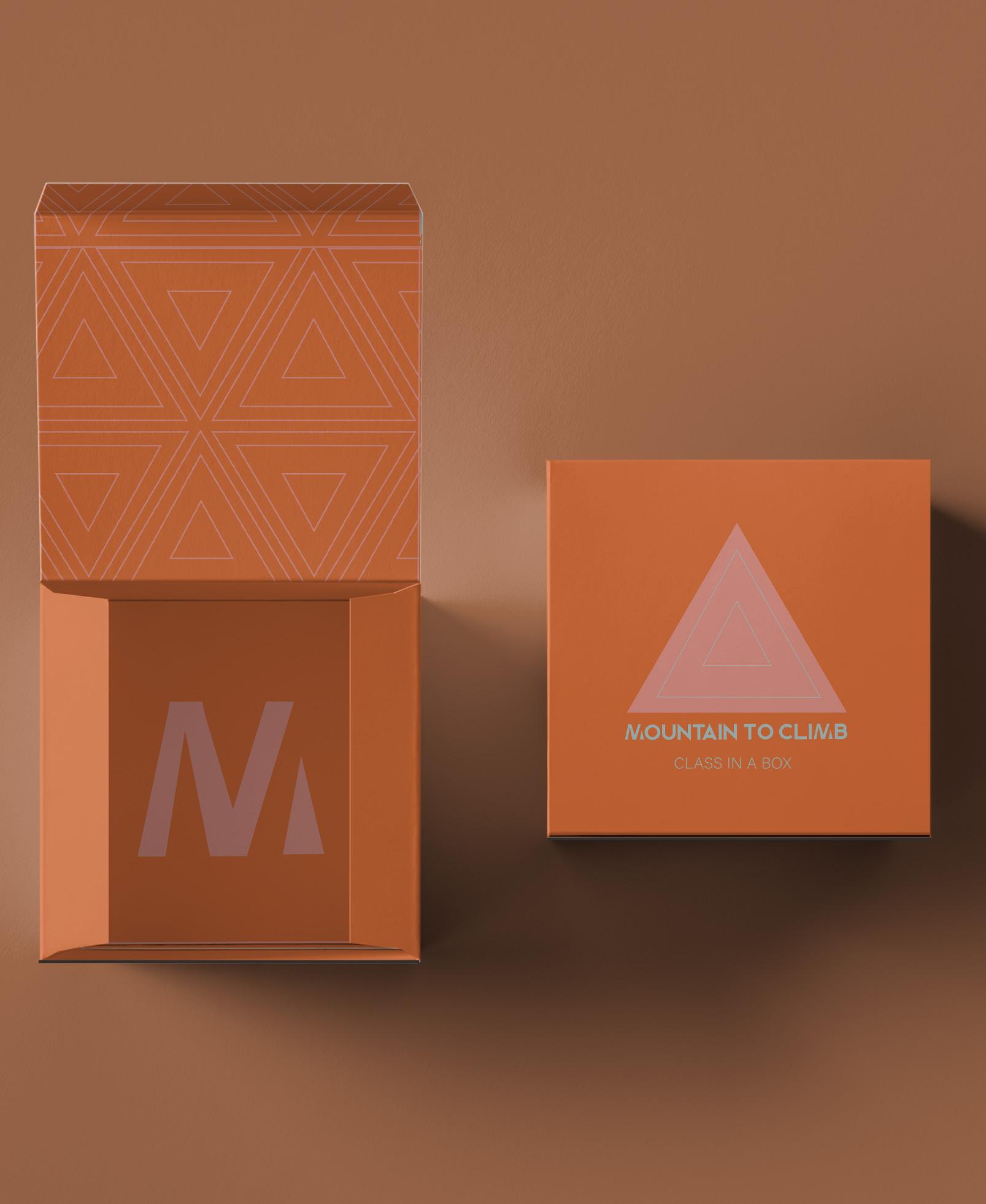
Pattern made from the logo.
Inside flap (lid) features the triangular brand pattern to represent the mountain theme.

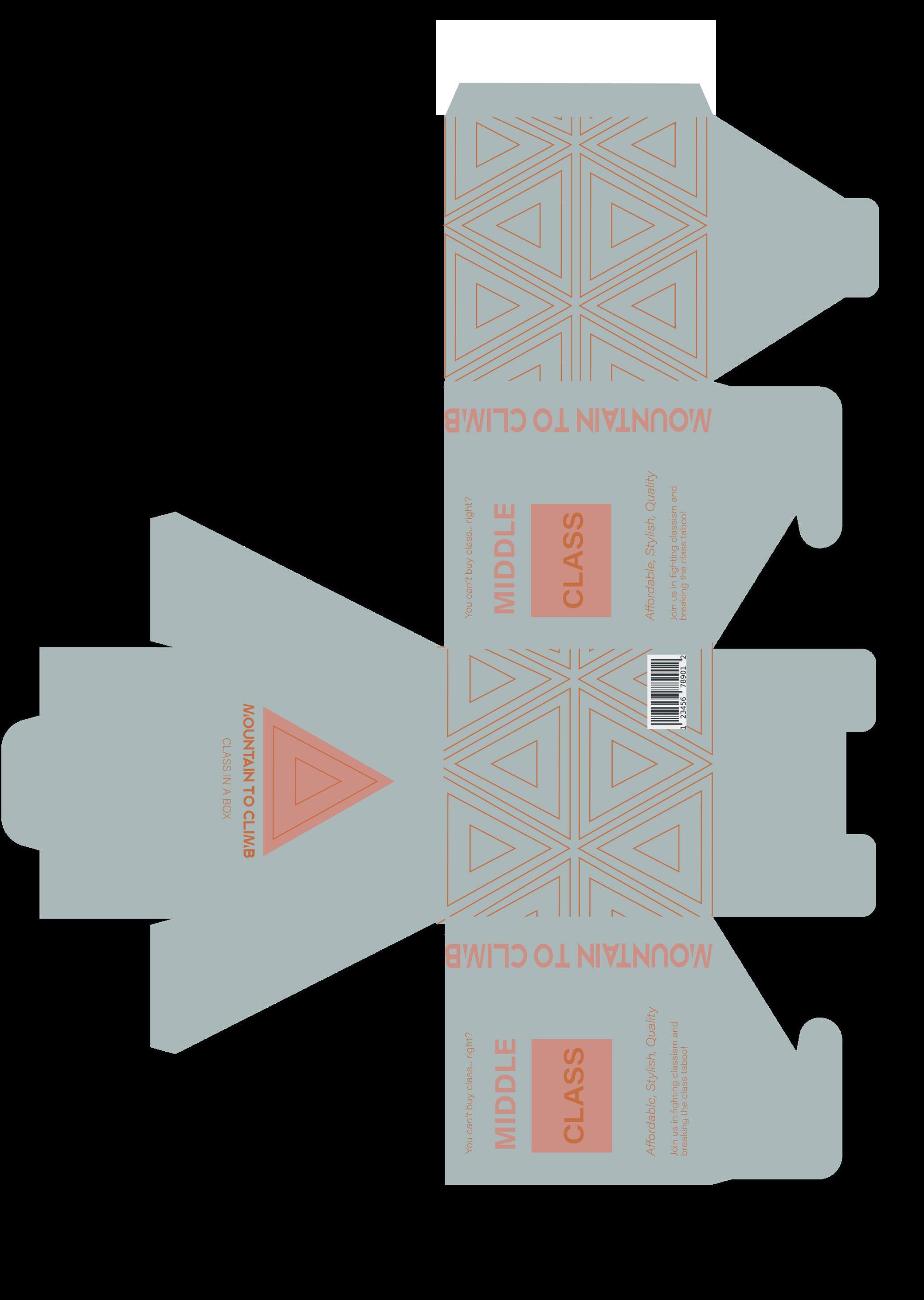
Product Name
Primary Logo
Info about the box. The word class is within a box to represent the product name, 'class in a box'.
Adjectives describing qualities of the Middle Class (Chat GPT, 2023).
Brand logo mark on inner base of box.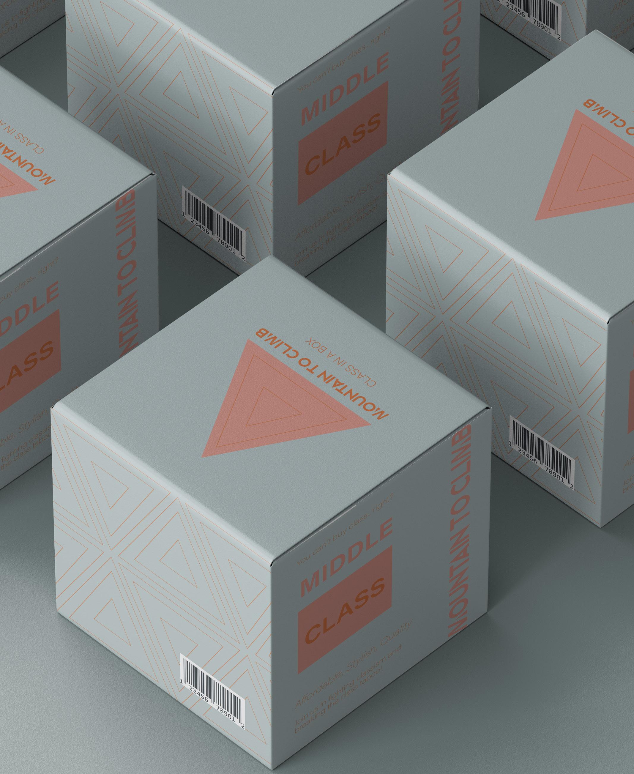
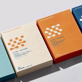
Analysis:
The brands use mainly a single bold colour and negative space (white) to sell their products.
This aesthetic definitely looks cheaper/less well designed.
Bland packaging with little to know illustrations.
All are very similar designs regardless of brand.
Overview:
Block Colours
Negative Space
Ugly
Not intricate
No/little illustrations
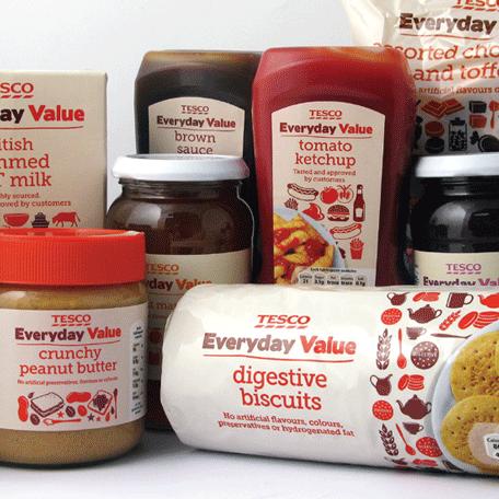
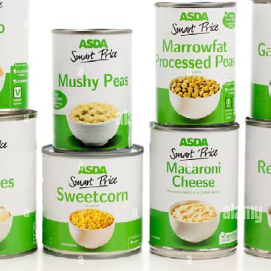
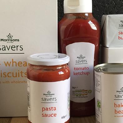
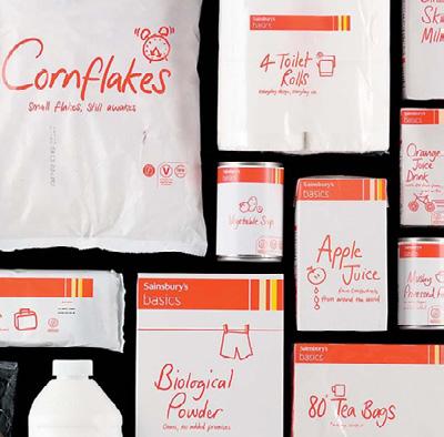
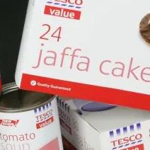
The images used were sourced from https://www. tesco.com/groceries/en-GB/ search?query=Tesco%20 Everyday%20Value&N=0;
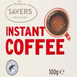
https://my.morrisons.com/ savers/
 Lots of negative space
Unappealing colour shade
Boring and plain
One key colour
Lots of negative space
Unappealing colour shade
Boring and plain
One key colour
Overview:
The pictures portray the mood and aesthetic that I hope my Lower Class Box will convey.
The use of one bright colour, and a white background creates a simple no-nonsence look. This links to the research I did (see previous spread) into the packaging of
lower-class brands (like tesco value, sainsbury's basics, lidls and so on), which also opted for this vibe.
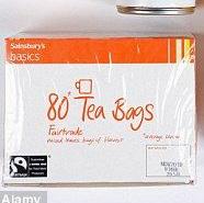
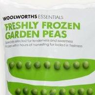
Accents of bright and bold colour but still a lot of negative space.
Notes:
The colours may change in the design process. But this shows you a rough idea of the colours.
The images used were sourced from https://www. pinterest.co.uk/bexjstone/ lower-class/
Blocks of colours and simple designs.
Photography not
Very cheap, no design. I am unsure whether to use the cardboard 'aesthetic' as a lot of more higher class brands now use it for a 'sustainable' look.
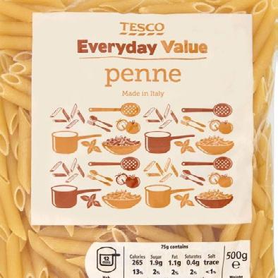
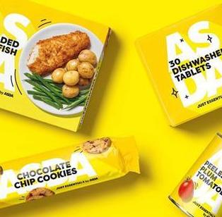
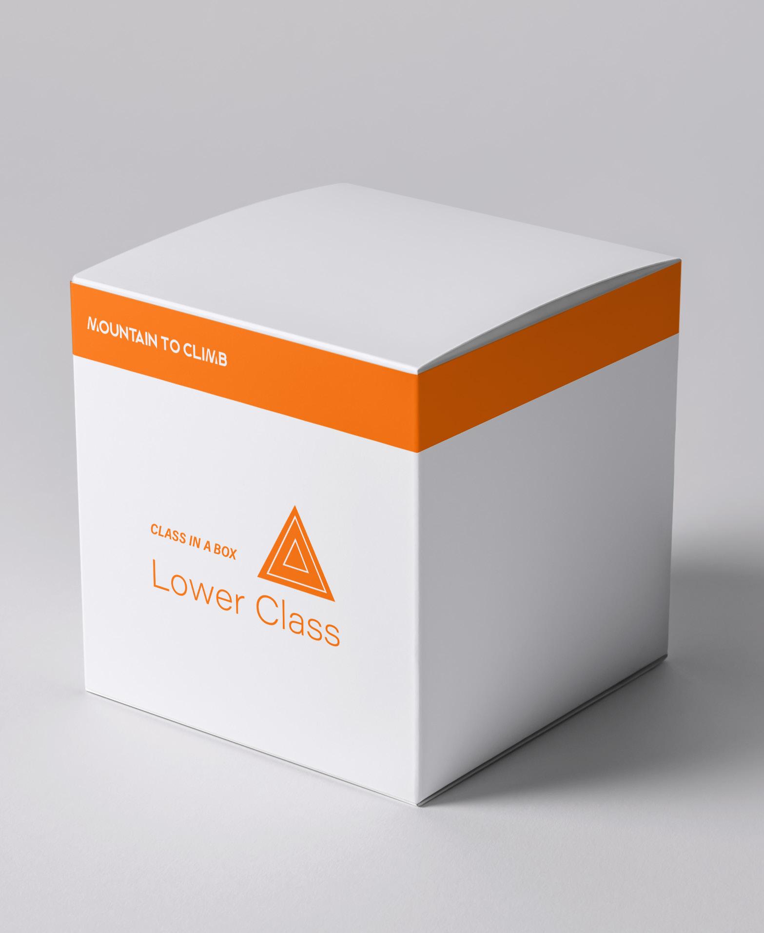
I made two designs for the lowerclass box as I could not decide which aesthetic to favour. The top yellow was more similar to the Asda essentials range, whereas the bottom orange was more similar to the Sainsbury's basics. I decided, however, that the orange one was more apt for the lower class market as it looks cheaper than the yellow one, which has attributes related to the middle-class such as a large amount of bright colour and blocky typography.

It occurred to me that the boxes alone lacked context/ further information that may be used to help break the stigma and taboo around social class.
Whilst the middle-class box did have some additional information on it, the upper and lower-class boxes did not, as it did not match their 'aesthetics' to include much information on the packaging.
As such, a good way around this would be to place a small card inside each box, which would have a website link for the brand.
This website would then have resources, information and so on to help break the taboo. This would work well, especially as the boxes are empty.
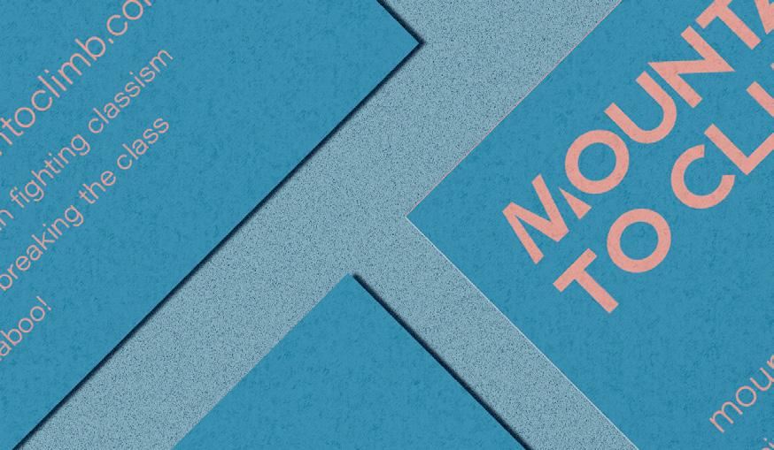
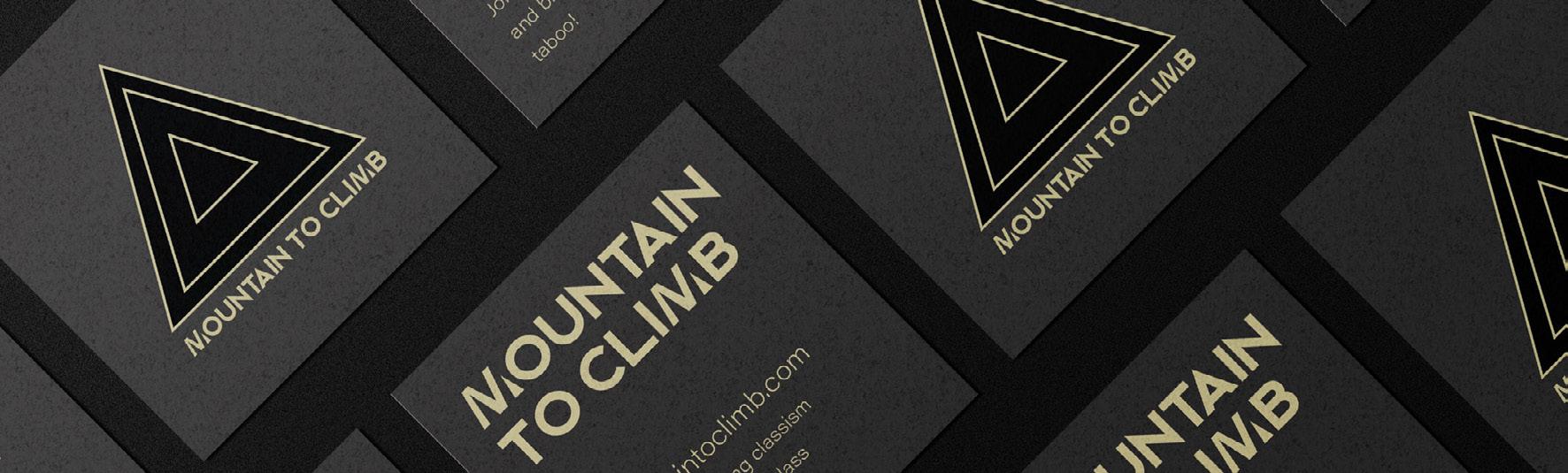
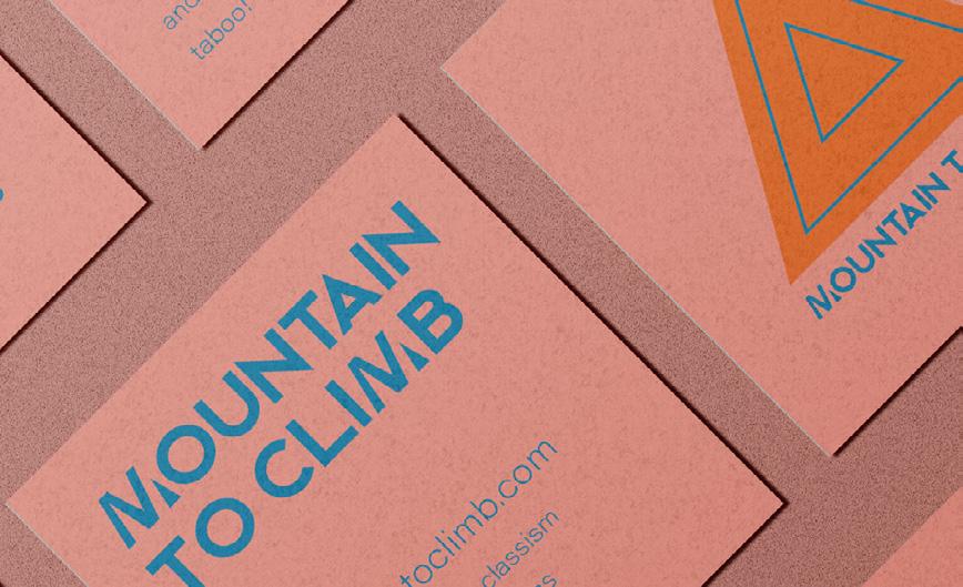
I decided to design separate cards for each box to match the box's aesthetic. As such, the upper-class card uses its box colours and so on.
I chose a square card as this would fit best in the square box. The cards follow
the format of a standard business card with the brand name/logo and information on where to 'find' them.
This is a good idea as the card allows people to investigate more about social class, further helping the conversation continue, even when not in the presence of the box.
This would help to educate and create a healthy discussion about class disparities and classism
In turn, the hope is that this will reduce the stigma and break the taboo regarding talking about social class.
It is clear that classism is still a large issue in the UK.
As such, the hope of this conceptual project is to make a statement about the various socioeconomic classes and the disparity between them. In turn, creating positive change through an increased opportunity for discussion and education about the issue, helping to reduce the taboo and ultimately creating awareness about, and positive change against, classism .
The design's power rests in its capacity to make a point without being overtly explicit. It conveys the concept of social classes and their distinctions without being overt. The consumer is also inspired to consider the ramifications of the design and investigate the idea further.
Overall the design conveys the disparities between social classes and their implications, with the overarching message regarding the breaking down of the class taboo strong and provocative.
Sabri, O and Obermiller, C. (2012). Consumer perception of taboo in ads.Journalofbusinessresearch Vol. 65 No. 6. pp.869-873.
SAGE Publications. (2013). Largest class survey reveals polarized UK society and the rise of new groups.ScienceDaily [online]. Available from: www.sciencedaily.com/releases/2013/04/130403104218.htm. [Accessed 9 March 2023].
Savage, M. (2015).SocialClassinthe21stCentury. London: Random House.
Sharma, A., Thakur, D. and Uniyal, S.K. (2021). Taboos: Traditional beliefs and customs for resource management in the western Himalaya.IndianJournalofTraditionalKnowledge(IJTK).Vol. 20 No.2. pp.575-581.
Argyle, M. (1994).TheSocialPsychologyofClass London: Routledge.
Class Action. (2023).AboutClass . [online]. Available from: https://classism.org/about-class/. [Accessed 23 February 2023].
Dorling, D., Rigby J., Wheeler, B., Ballas, D., Thomas, B., Fahmy, E., Gordon, D. and Lupton, R. (2007).Poverty,wealthandplacein Britain,1968to2005. Bristol: Policy
Day, K., Rickett, B., Woolhouse, M., Day, K., Rickett, B. and Woolhouse, M. (2020). Social Class: What Is It and Why Does It Matter?.CriticalSocialPsychologyofSocialClass. pp.1-32.
Duffy, S. (2013). A fair society? How the cuts target disabled people. [online]. Available from; http://www. centreforwelfarereform.org/uploads/attachment/354/a-fair-society.pdf. [Accessed 24 February 2023].
Gramsci, A. (1971).SelectionsfromthePrisonNotebooks London: Lawrence and Wishart.
Holt, D. B. (2016). Branding in the Age of Social Media.HarvardBusinessReview Vol.94 No.3. pp. 40-50.
Little, D. (2008).UnderstandingSociety . [online]. Available from: https://understandingsociety.blogspot.com/2008/08/powerand-social-class.html. [Accessed 24 February 2023.
Mrug, S., Madan, A. and Windle, M. (2016). Emotional desensitization to violence contributes to adolescents’ violent behavior. Journalofabnormalchildpsychology . Vol. 44. pp.75-86.
OECD. (2015).Inittogether:Whylessinequalitybenefitsall. UK: OECD publishing.
Popper, K. (1945). Theopensocietyanditsenemies. London: Routledge.
Potts, A.M. (1973). The eye of providence.DocumentaOphthalmologica. Vol. 34. pp.327-334.
Robson, D. (2023).HowimportantissocialclassinBritaintoday? [online]. Available from: https://www.bbc.com/future/ article/20160406-how-much-does-social-class-matter-in-britain-today. [Accessed 15 March 2023].
Rogers, C. (2022).ThisMuchILearned:Howtobreakthe‘socialclasstaboo’. [online]. Available from: https://www. marketingweek.com/this-much-i-learned-social-class-taboo/. [Accessed 22 February 2023].
Sinclair, I. (2015).7mythsaboutimmigration.[online]. Available from: https://www.opendemocracy.net/en/ opendemocracyuk/7-myths-about-immigration/. [Accessed 22 February 2023].
Wang, S. (2021).Shapes:geometricformsingraphicdesign. 2nd ed. Barcelona, Spain Hoaki.
Tate .(2022). TateBritainCommission2022:HewLocke.[online]. Available at: https://www.tate.org.uk/press/press-releases/ tate-britain-commission-2022-hew-locke. [Accessed 23 January 2023].
Tate. (2023).HerbertBayer;ASeriesofEightScreenprints;1970.[online]. Available at: https://www.tate.org.uk/art/artworks/ bayer-a-series-of-eight-screenprints-65257/3. [Accessed 8 February 2023].
The School of Life. (2023).COMMUNICATION.[online]. Available at: https://www.theschooloflife.com/article/communication/. [Accessed 21 February 2023].
The Vagina Museum. (2023).HistoryofPeriods.[exhibition]. London: The Vagina Museum, 19th Mar 2022 - 1st Feb 2023.
Triedman, K., and Cullen, C. (2002).ColourGraphics:thepowerofcolouringraphicdesign.Massachusetts: Rockport Publishers.
UK Government. (2017).SocialMobilityCommission,2017.Socialmobilitybarometer:PublicattitudestosocialmobilityintheUK [online]. Available from: https://assets.publishing.service.gov.uk/government/uploads/system/uploads/attachment_data/ file/618627/Social_Mobility_Barometer.pdf [Accessed 9 March 2023].
UK Government. (2021).GreatBritain.SocialMobilityCommission,2021.SocialMobilityBarometer:publicattitudestosocial mobilityintheUK.[online]. Available from: https://www.gov.uk/government/publications/social-mobility-barometer-2021/ social-mobility-barometer-public-attitudes-to-social-mobility-in-the-uk. [Accessed 9 March 2023].
Wehnemann, N. (2020).#TABOOMATTERS:AnEmpoweringStrategyinFeminineHygieneAdvertising.[online]. Available from: https://thesis.eur.nl/ pub/55431/55431.pdf [Accessed 12 December 2022].
Wilson, M. (2021).TheEyeofProvidence:Thesymbolwithasecretmeaning [online]. Available from: https://www.bbc.com/ culture/article/20201112-the-eye-of-providence-the-symbol-with-a-secret-meaning. [Accessed 15 March 2023].