
I. E. N. INTERIOR DESIGN PORTFOLIO
Ingrid E. Noyes
CONTACT
(360)-790-2813
EDUCATION
Washington State University | Undergraduate
edenrose2973@gmail.com
PROFILE
Hard-working individual who is reliable, mature, and wellorganized. Seeking to apply and grow my skills in the Interior Design field, specifically in areas such as retail, hospitality, and residential with a focus on biophilic and sustainable design and an ambition to work on multidisciplinary teams.
AWARDS
Bronze Congressional Award Silver President’s Award
{Oct. 2019}-{July 2020}
AmeriCorps NCCC Member
SKILLS
About Me:
WORK
Washington State University: Graduate School | Clerical Assistant
INTERESTS
{Aug. 2020}-{Present}
MAJOR: Interior Design
• Learned color theory, space planning, material characteristics & applications.
• Introduced to building codes.
• Utilized knowledge in software such as SketchUp, Revit, InDesign, and Photoshop.
MINOR: Construction Management
• Learned Primavera Scheduling software.
• Utilized knowledge in the different positions in the CM Industry and preconstruction and construction processes.
South Puget Sound Community College | Undergraduate
{Aug. 2020}-{Present} {Sept. 2017}-{June 2019}
DEGREE: Associate’s in Arts
REFERENCE: Daniel Vickoren, Supervisor (509)-335-0050
• Responding to emails, processing forms, coordinating with the Programs and Admissions Teams within the office.
AmeriCorps NCCC | Traditional Corps Member
{Oct. 2019}-{July 2020}
REFERENCE: Katherine Pendergrass, Leader (806) 319-0454
• Worked on a team of 8-12 young adults to complete community-based service projects throughout the southwest region of the United States.
Leonor Fuller, Attorney at Law | Personal Assistant
{Oct. 2019}-{July 2020}
REFERENCE: Leonor Fuller, Attorney (350)-3522000
• Assisted in hosting events for up to fifty people
• Duties: meal prep, greeting guests, post-event cleanup, interacting with staff and clients. Revit SketchUp
InDesign Photoshop
AutoCAD
Apart from my interests in design, I also enjoy things such as baking, playing violin, painting, reading, taking walks and hanging out with my cat.
1
2
3Spiral Pavilion
PUBLIC PARK
4Palouse Classroom
ELEMENTARY SCHOOL
5
Union Connect Wireless Services
OFFICE DESIGN
Nature’s Hygge Light,
COMMERCIAL
Table of Contents
Calm, Support
RESIDENTIAL
Nature’s Hygge
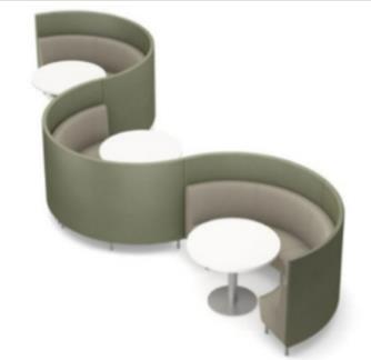
STUDENT DORM LOUNGEThis student dormitory project, located in Pullman, Washington, was inspired by the chosen painting. It introduces neutral, green, and orange color tones, as well as organic and Rayonistic forms (from the word Rayonism, a style of abstract art that originated in Russia). These inspirations can be seen throughout the interiors within the structure/curvature of the walls, specified materials and finishes, and the custom furniture that was designed.

The concept for this project was named “Nature’s Hygge”, relating to the Danish philosophy about life and design. Essentially, it means to have a quality of coziness and comfort that gives a feeling of contentment or well-being. I wanted to use the basis of this concept but use organic forms and landscapes to surround students, as if they were in nature. Incorporation of water features, moss walls, and the rock wall spanning the First and Second floor introduce sensory experiences for the occupants and provides a calming environment. Research shows connection to nature through any of the five senses can help lower cortisol levels.
“THE VILLAGE IN BROWN AND BLACK: RAYONIST COMPOSITION”


Abstract Landscape Painting (1912)
Natalia Goncharova (1881-1962)
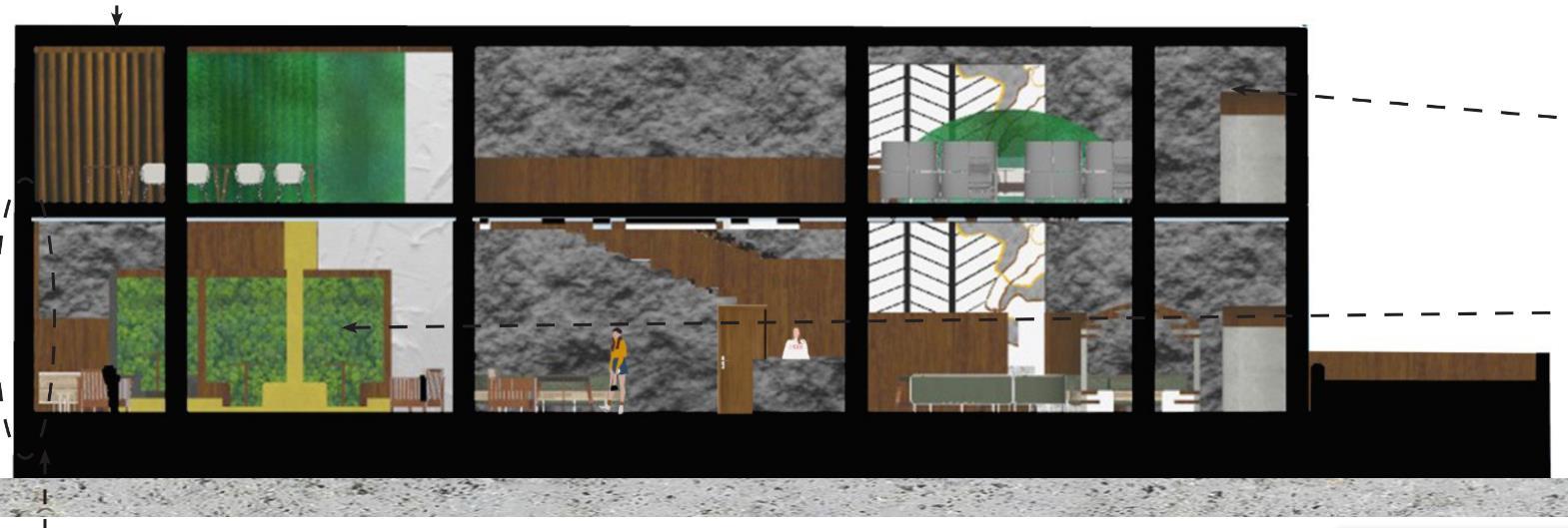
(LEFT TO RIGHT): Custom wall mural, water feature, & booth seating used in project – inspired by the chosen painting.First Floor Zones

KEY OF ZONES
The “starburst” structure is an example of a custom feature designed using Rayonism as inspiration. Rayonism was an abstract art form used to express movement in art through the use of rays originating from an object and directing outwards, creating a fracture effect. This design can be seen in the Lobby/Entrance area and the Cafeteria area.

Entrance Small Lounge Seating Music Synthesis Lounge Social Seating Custom Platform Seating Cafeteria Seating Outside Dining 1 2 3 4 5 6 7 7 6 5 4 3 2 1 NTS
Entryway Perspective


Stained Reclaimed Wood

 Custom Bench Seating
Hampton Modular Seating
Terrazzo Flooring
Custom Bench Seating
Hampton Modular Seating
Terrazzo Flooring
Second Floor Zones


Sections


KEY OF
1 2 1 3 4 2 5 Small Lounge Seating Study Desks Conference Room Study Pods Booth Seating NTS 1 2 3 5 4
ZONES
NTS
NTS
Architectural Resin
Custom Wall Mural Rock Wall Texture on Back Wall
Light, Calm, Support
ACCESSIBLE RESIDENTIAL APARTMENT
This accessible residential apartment project, located in Colfax, Washington, was designed for an elderly couple one of whom uses a wheelchair for their daily activities. The concept was inspired by a childhood blanket and what it represents to me. It introduces a range of color but those used in the project, green and warmer colors such as orange and yellow, represented the owner’s preference and my own interpretation of the blanket.

The concept for this project was named “Light, Calm, Support” as these are the main terms I’ve come to relate to this blanket after the phase of design exploration. The interiors of this apartment incorporate these terms through the color, lighting, furniture, and material and finishes in order to create a comfortable, warm, relaxing environment.
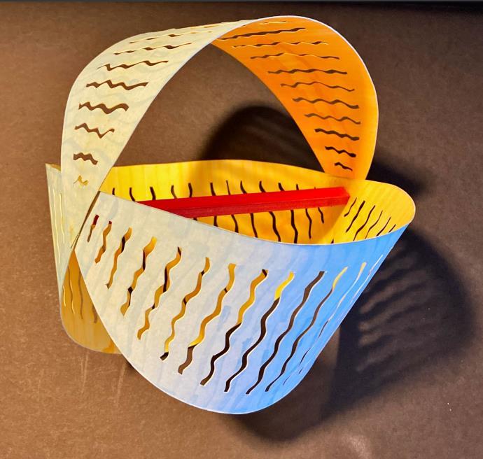
Concept Model
This model represents the layers of protection a blanket offers. The actual functional use of a blanket is to keep one warm. The outer layer represents the cold with the inner layer representing warmth, which is what a home should be for everyone. The curved lines represent the undulating and folding material of the blanket.
Drafted Floor Plan


Needs of Client:

• Use space effectively regarding size of wheelchair, Hoyer lift, and placement of everyday items that can be easily accessible
• Music, art, and gardening are important and a space to create/display work must be designed.
• Kitchen must be accessible and accommodating, open-concept design is preferred (kitchen, dining space, and living room immediately adjacent).
Bubble Diagram Blocking DiagramAccessible Bathroom
BATHROOM BIRD’S EYE VIEW (NTS)
Bathroom Program:
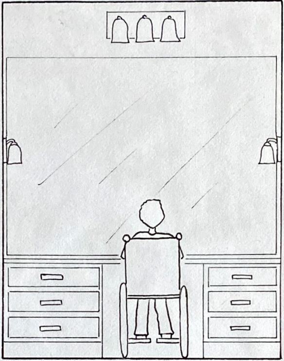
• Neutral and earth tones
• Toilet located to left of tub


• Hoyer lift needs 36”x40” clearance on left side of toilet
• Dimmable lighting, not harsh
• 5’ of counter top space, wall to wall
• Large mirror
• 5’ turnaround for wheelchair
DRAFTED FLOOR PLAN (NTS)

ELEVATIONS (NTS)
Accessible Kitchen

Kitchen Program:


• Neutral and earth tones
• Sink, fridge, and oven close together

• Cleanable backsplash
• Dimmable lighting, not harsh
• Under cabinet lighting
• 32” clearance under sink and oven
• 5’ turnaround for wheelchair
• Oak flooring
• Custom fretwork
PERSPECTIVE
DRAFTED FLOOR PLAN (NTS) ELEVATIONS (NTS)KITCHEN
Model Floor Plan


Floor Plan
Rendered
Spiral Pavilion

PAVILION MODEL
The Spiral Pavilion, located in Salzburg, Austria, was designed and created for public use and is meant to be an additional feature to an outside garden where visitors can interact with both the pavilion and the surrounding area in a temperate climate. It was named after the spiral design created by the different leveled platforms surrounding the main water feature in the center of the pond. The structure is made up of two platforms with the main entry and exit point being a staircase leading to the highest platform. Both platforms provide seating areas and shelter overhead.
Visitors can sit or stand on a small ledge that protrudes from each platform. The second of these ledges is low enough for visitors to interact with the pond by walking across it and through the pavilion's main feature, the waterfall structure, which is located in the pond's center and has a small seating area beneath it. The waterfall is designed as a triangle, with one of the sides being made from glass, and allows visitors to watch the water flow from the top of the structure into the pond. Each of the shaded platforms is connected by two floating step platforms filled with water that flows into the central pond. Visitors are able to walk across the floating step platforms and are eventually led in a downward spiral to the center of the pavilion.
Besides the small seating space underneath the waterfall, there is also a large bench area located at the ground level of the pond that allows visitors to sit directly in the sun rather than on the platforms or under the waterfall. The pond itself is not very deep and has plant life scattered throughout it. The water gently flowing into the pond from the waterfall, as well as the floating step platforms, are intended to create a serene and relaxing atmosphere for anyone visiting the pavilion.
Plan View


Sections NTS NTS
Diagram Portal (Entrance) Place Pathways Water
Built Model
The built model was made from cardboard and blue colored paper was used to differentiate the pathways one can take and where the water is present.


The multiple views show the shadows that can be present throughout the day which allows the viewer to see the relationship between the pavilion and the sun.
The different views of the model also allow the viewer to see the locations where one can sit and view the water or walk along the pathways in order to “spiral” through the pavilion, eventually ending up at the center.
Isometric View + Materials

 Walnut Limestone
Site Placement Temperate Climate

CLIMATE: Temperate
• Temperatures remain consistent throughout most of the year
LOCATION: Salzburg, Austria
• A country in central Europe, located under Germany and above Italy
PLANTLIFE:
• Pine trees

• Deciduous trees

Palouse Elementary
CLASSROOM DESIGN
This project was focused on renovating a 1st-3rd grade classroom in Palouse Elementary School located in Palouse, Washington. The design inspiration came from the sunset of the Palouse, as it is known to bright and vibrant and therefore would incorporate well into a space designed for children.

Careful consideration was taken when specifying materials and especially furniture. During the school day, it’s immensely important for teachers and students to manipulate their surroundings, either for group or individual work. As such, all furniture specified was made sure to have casters and would be easily moved depending on the situation.
Studies show that those who are able to change their environment while working have higher rates of productivity and satisfaction with their interior environment.
Plan and Specifications

Needs of Client:
• Vibrant, warm space that reflects the design concept
• Multiple different forms of storage that can be utilized by both students and the teacher

• Custom student storage for backpacks
• Specify furniture that can be rearranged and easily moved to fit the needs of the classroom


T-3: Kidney Meeting Table
S-2: Flowform Curved Storage (Double Sided)
T-2 & C-1: Diamond Desks and Mobile ChairsNTS
Custom Student Storage


Part of the design was also constructing custom student storage so students would have a place to store their backpacks. This custom design was directly inspired by the Palouse sunset.

g h g
Orange Acoustical Felt
Green Acoustical Felt
Oak Wood
Union Connect

WIRELESS SERVICES OFFICE
This project focused on designing a two-floor office space for a wireless services company called Union Connect located in San Jose, Costa Rica. The inspiration for the design was taken from the nature encompassing the country as a way to help connect occupants to nature within an interior space that is located in a dense city area. Relationships to nature are able to lower cortisol levels in people. Materials and architectural features follow organic forms.
Aspects of space planning and furniture specification was important so workers would be able to be productive and manipulate their environment. Studies show that those who can change their environment have higher rates of satisfaction
Costa Rica also puts a high priority on sustainability initiatives and is the only country to have successfully reversed deforestation. Stress was put on specifying sustainable materials to incorporate into the design.
This project was done in partnership with Samantha Milam, Mia Pignotti, and Sydney Obmann.

Company Name & Logo
Concept Development
The company building for Union Connect is an office space designed to take you through the experience of Costa Rica.
Beginning on the second level where social interaction and collaboration is encouraged, the vibrant colors of the flora are seen.
As one migrates to the third level, the vibrant tones become neutral and toneddown to ease the mind for independent quiet work. With the change in environmental cues between each level, two different atmospheres are welcomed for a diverse range of working styles for office employees.

2nd Floor Look and Feel
Vibrant, Social Spaces

• Inviting
• Colorful
• Upbeat
• Variety
• Immersive
• Lush

• Diversity
3rd Floor Look and Feel
Calm, Quiet Spaces

• Flow
• Organic
• Peaceful
• Adaptive
• Calming
• Natural

The second floor of the Union Connect office is meant to be a vibrant social space, allowing collaboration and a friendly environment. Here one will find the kitchen/community area to be the most social as Costa Ricans put an emphasis on social time during lunch breaks and catching up with their peers. This space is completely open to the glass curtain wall as it is important for those inside to receive natural daylight Conference and huddle rooms are scattered throughout to allow work on this social, vibrant floor and separate lounge areas are also present for smaller collaborative areas.
The third floor is the main workplace of employees and as such, the vibrancy and color from the second floor has been muted to introduce a calming environment, allow concentration and productivity Here the main conference rooms, day offices, and workstations will be found along with a quiet room and mother’s room.

A small kitchen was designed on this floor to allow employees easy access to food without needing to go to the second floor. The small kitchen is the only vibrant space on the third floor and follows the design on the second floor.


2nd Floor Plan & Materials 3rd Floor Plan & Materials
Reception Seating
g h g g


Water Feature:
The water feature in the Reception Seating Area was designed using the logo for Union Connect as inspiration.

The main feature introduces flowing hills across the wall and are positioned slightly forward to allow the water to flow behind them. Some areas were cut out completely to allow a direct view of the flowing water behind.

The material was specified as a green colored glass as this would allow some transparency as well as mimic the logo of Union Connect.

 “Coral” Velvet “Ginger” Fabric
“Hot Pink” Fabric
Green Colored Glass
“Coral” Velvet “Ginger” Fabric
“Hot Pink” Fabric
Green Colored Glass
Floor Lounge
The second floor lounge area offers a social and collaborative atmosphere and is adjacent to the small and large conference rooms in case there is a meeting to be attended. The lounge is also around the corner from the community kitchen and offers a secondary place for employees to sit and eat.
g g g h


g


The seating area in the back is partnered with the lounge and is used as a “landing area” for those who need to complete some work before going into the conference rooms.

A feature wall was designed as a focal point of the space, opposite from the curtain wall.

2nd
Feature Wallcovering
“Sherwood Green” Fabric “Ginger” Fabric
“Utmost II” Yellow Velvet “Genuine Pink” Rug Acoustical Felt Pendant Light
nd Floor Community/Kitchen
The Community/Kitchen Area is the most social space on the second floor. It introduces brightly colored chairs contrasted with green and teal for the sofa, cabinets, backsplash, and ceiling feature.

The lowest ceiling is made from cork and brings in warmth below the rippled glass. The cork can be seen as an island with the rippled glass acting as water.


The two columns on either side became an architectural feature mimicking a plant - starting from the stem to reaching outward once it becomes a leaf.

Inspiration for Columns

2
Rippled Glass Ceiling
Backsplash Cork Ceiling
“Sunset” Seat Fabric
“Magenta” Arm Chair
Thank You
edenrose2973@gmail.com (360)-790-2813