Henry Timi’s universe of truth

Alba Thermal Springs and Spa, Hayball
INDESIGN Luminary Patrick Keane
Darling Quarter South Building, featuring Hassell and Hammond Studio
The ‘Magnetic Workplace’ Issue

Henry Timi’s universe of truth

Alba Thermal Springs and Spa, Hayball
INDESIGN Luminary Patrick Keane
Darling Quarter South Building, featuring Hassell and Hammond Studio
The ‘Magnetic Workplace’ Issue






















































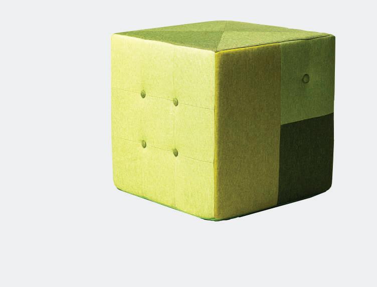





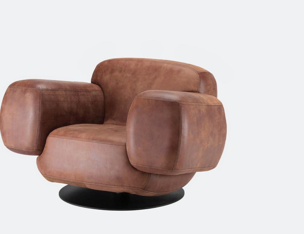


































 Bazooka
Bulldog
Space Chicken
Chip
Box Lounger
Nugget
Sideshow
Billy

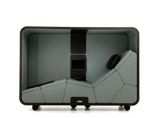
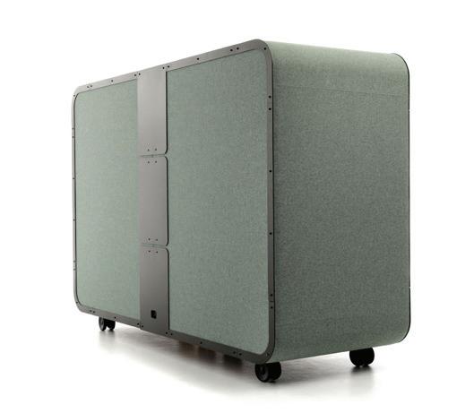
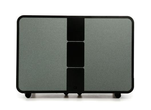
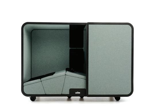
The Neuron Activation Pod is equipped with ground breaking Finnish health technology and is a giant leap towards the workplace of the future. Transmitting low-frequency vibrations through the body, the technology promotes relaxation, natural healing and recovery.

All the conversation right now is around people’s reluctance to return to the workplace. In fact it’s not even mere reluctance, is it? It’s actually the make or break for workers and organisations alike. At the recent Worktech conference in Melbourne, Worktech Academy’s Matthew Myerson referenced two key statistics in which 62 per cent of employees are unwilling to return to the office just to meet company expectation. Meanwhile 73 per cent of leaders are not confident about employee productivity. One thing we do know is that hybrid is here to stay and everything is up in the air.
As people return back to the office, they bring with them a greater appreciation for their personal wellbeing, an awareness for the critical role the environment plays in this equation, and an acute sensitivity for the comforts of home. Choice has become the commodity of the modern-day hybrid worker and the very point of being for the workplace has been forced to shift, rapidly.
In this ‘Magnetic Workplace’ Issue, we seek out the tangible and intangible qualities that will draw people back into the workplace. And we contemplate the new purpose of the office for workers of a ‘fair weather’ mindset.
We address this through five paradigms, starting with wellbeing. Increasingly workplaces are being called upon to nurture and safeguard people’s health and happiness. In fact some workplaces, like MinRes in Perth (page 128), considers itself to be a wellbeing centre first and foremost, with workplace facilities provided as part of that.
Inclusivity: Workplaces have geared up their emotional intelligence in the past 12 months, and designers are leading the charge, helping organisations listen and better understand how an environment can
inclusively support broader demographics (page 142) and positively impact those with neurodiverse needs (page 136).
Comfort: Nothing beats working from home where we can truly be ourselves. So we go to the source – the home office, to better understand the secret sauce that makes working from home so appealing, (page 144).
Belonging: When you’re connecting through a screen for the majority of your working week, it’s quite possible that you begin to feel disconnected from your company’s culture. In the absence of togetherness, that sense of belonging must be delivered through storytelling and empathetic leadership (page 152). It feeds productivity and gives people a common focus.
Purpose: Here we come to the heart of the matter. Melissa Marsden, author of The Next Workplace, refers to purpose as the “bedrock” upon which companies might succeed and elevate their ROI.
As Indesign approaches its 90th issue we, too, have been reflecting on our magnetic qualities: our ‘why’. Over 24 years, Indesign alongside Indesignlive.com, INDE.Awards, and Saturday Indesign has built an international and multidimensional platform of currency, integrity and intelligence that remains open-eyed to the world around us, and astutely attentive to our architecture and design community.
As we step towards our momentous 90 th milestone, we’re proud to be giving your voice and views, your ideas and expertise, and your projects and products the acknowledgment, recognition and exposure that they deserve. Because we deeply believe that architecture and design has the ability to influence the destinies and fortunes of people and companies alike. Powerful and purposeful.
A professional resource for the design curious





We deliver you daily design inspiration through news, opinions, insights, projects and products. Indesignlive.com instantly connects you to the best and most relevant in architecture and design across Australia and internationally. Subscribe to our weekly newsletter, and follow us online.

CEO Raj Nandan raj@indesign.com.au
Managing Director
Kavita Lala kavita@indesign.com.au
Editor Alice Blackwood alice@indesign.com.au
Assistant Editor Timothy Alouani-Roby timothy@indesign.com.au

Editor At Large Gillian Serisier gillian@indesign.com.au
INDE.Awards Program Director Jan Henderson jan@indesign.com.au
Brand Director Colleen Black colleen@indesign.com.au
Business Development Manager
Brunetta Stocco brunetta@indesign.com.au
Media Executive Katie Staver katie@indesign.com.au
Chief Marketing Officer Dana Ciaccia dana@indesign.com.au
Group Operations Manager Sheree Bryant sheree@indesign.com.au

Print Production
Jade Byers-Pointer jade@indesign.com.au
Accounts Vivia Felice vivia@indesign.com.au
Art Direction And Design Louise Gault
Online Manager Radu Enache radu@indesign.com.au
Web Developer Ryan Sumners ryan@indesign.com.au
Indesign Correspondents
Stephen Crafti (Melbourne) Mandi Keighran (London) Andrea Stevens (New Zealand)
Contributing Writers
Gillian Serisier, Jan Henderson, Juliet Taylor, Leanne Amodeo, Mandi Keighran, Nick Jumara, Stephen Crafti, Yen Dao
Featured Photographers;
Featured Artist
Anson Smart, Chris McConville, Christine Francis, Dave Wheeler, Dion Robeson, Earl Carter, Edmund Sumner, Erin Paterson, Gavin Green, Haha Lu, Jack Lovel, Lynnette Griffiths, Marcus Clinton, Rory Gardiner, Sebastian Photography, Shannon McGrath, Terence Chin, William Barrington Binns; Claire Moon (artist)
Head Office
98 Holdsworth Street, Woollahra NSW 2025 Sydney, Australia
(61 2) 9368 0150 indesignlive.com indesignlive.asia
Join our global design community, become an Indesign subscriber!
To subscribe (61 2) 9368 0150 subscriptions@indesign.com.au indesignlive.com/subscriptions
Yearly subscription:
Australia $55 (incl. GST)
International AUD $110
Printed in Australia
Indesign is printed on paper that has been sourced from sustainable forests adhering to PEFC chain of custody and ISO14001 environmental standards.
COVER STORY
Henry Timi
The Milanese artisan offers poetic insights into his practice. Image features HT645 D UOMO kitchen and HT345 D UOMO table, page 48.
70
IN SITU
The most magnetic workplace: CBA Head Office by Hassell, with Lobby and Café by Hammond Studio.
80
Studio Prineas redefines the term ‘industrial-luxe’ in this sumptuously detailed warehouse refurb.
88 Slattery
Elenberg Fraser breaks down the boundaries of the territorial workplace with an open, fluid office.
96
DesignOffice brings Harry Seidler’s iconic Grosvenor Place building into modern work mode.
8 EDITOR’S LETTER The issue at hand, with Alice Blackwood.
17
104
Whare Timu and Jefa Greenaway weave a tricultural narrative into the new Melbourne studio.
112 NUX
Sibling Architecture builds a series of ‘hard’ and ‘soft’ work landscapes into this co-working space.
118
48
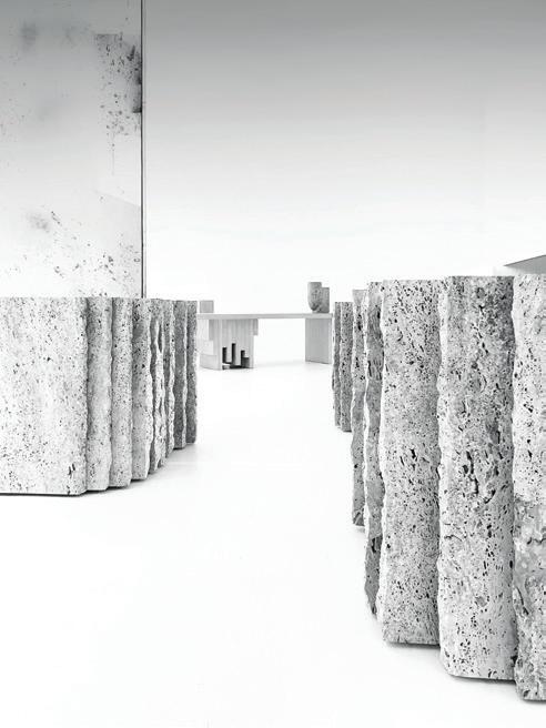
Step into HENRYTIMI’s “universe of truth” based on the relationship between form and nature.
Hayball, with Mala, harnesses design and landscape to create a deeply restorative experience.
54
Master of rattan, Patrick Keane of Enter Projects Asia is our INDESIGN Luminary.
Woods Bagot’s Eva Sue gives us an entrée into the complex hospitality venues she’s designing in Perth.
128
Milieu Creative designs a wellbeing centre that makes health and happiness the priority at work.
Melbourne, Sydney, Canberra, Brisbane
Perth, Adelaide, Auckland, Wellington, Christchurch
Hong Kong, Singapore, Shanghai, Shenzhen
By Formway Design

Two neurodivergent individuals talk about their experiences of workplace environments and culture.
142
Rebecca Trenorden discusses how inclusive environments can support broader demographics.


144
The best home o ces with Greg Natale, Studio Bright, Studio Johnston and Those Architects.
152
Alice Blackwood looks at how leaders must deliver culture in new and emotive ways.


154
Whole Of Lifecycle Furniture approaches that have the most impact on our designs and day-to-day life.
160

The employee ownership model is well established in the UK and the trend is picking up in Australia.
164 DISSECTIONS
168 ADVERTISERS DIRECTORY
BEGA pole-top luminaires with Dark Sky technology direct the light in a highly efficient manner only where it is required. Light pollution of the night sky is avoided. bega.com/darksky
Das gute Licht.

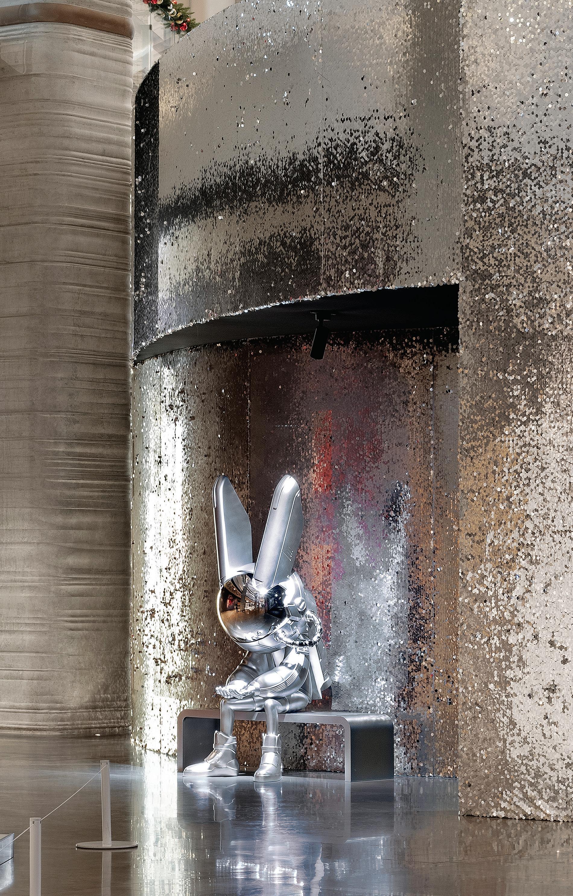
Inspired by the mythological Yùtù, a Chinese rabbit that lives on the moon, ROBBi is one of the most collectable figures on the Chinese market amongst Millennials and Gen Z. We can see why, as the space rabbit is pretty fabulous! ROBBiverse is effectively the world of nine planets that ROBBi inhabits and for 2023, the year of the rabbit, ROBBiArt (the brand behind ROBBi) has collaborated with iconic brands China Aerospace, MCM, NBA, NEW ERA, Aston Martin and Creed to create a new range of ROBBi. These fun characters are showcased in ROBBiverse, a world created by Q&A studio, which posited the notion of a mysterious figure in a rabbit helmet who has just landed in Shanghai. “ROBBi is a mystery to all, as no one knows what lies inside their aerospace helmet. However, their striking resemblance to a rabbit has made them a favourite for brand collaborations, especially during the Year of the Rabbit in the lunar calendar,” says ROBBiArt. Located in Shanghai within the iconic Thomas Heatherwick building, 1000 Trees, the exhibition coincides with the building’s anniversary. To this end, ROBBiverse plays on location with moss and trees within the Space Age settings. That said, for the most, the exhibition is pure space, with sparkling silver rooms, matte black faceted rocks within matte black interiors and glittering distant galaxies. The black faceted rocks defy gravity by being positioned on the floor, mid-air and above. Meanwhile a constellation of stars shimmers through the voids. The exhibition is a delight of figure and fantasy with the ROBBi figures beautifully ensconced within their natural environment. Photo: Haha Lu.


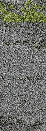


Drawing from the natural world allows us to create spaces that feel grounding, which has a profound impact on the health and wellbeing of all building occupants. Inspired by expansive communities of lichen which grow together on bark and rock formations, and play a key role in our ecosystems, Lichen Community provides a re ned solution for creating collaborative environments. This biophilic designled modular carpet collection, mimics growth patterns of real lichens growing on stone and tree bark, incorporating colours that take us on a visual journey through the forest, with warm bark-grey background and so , muted highlights.


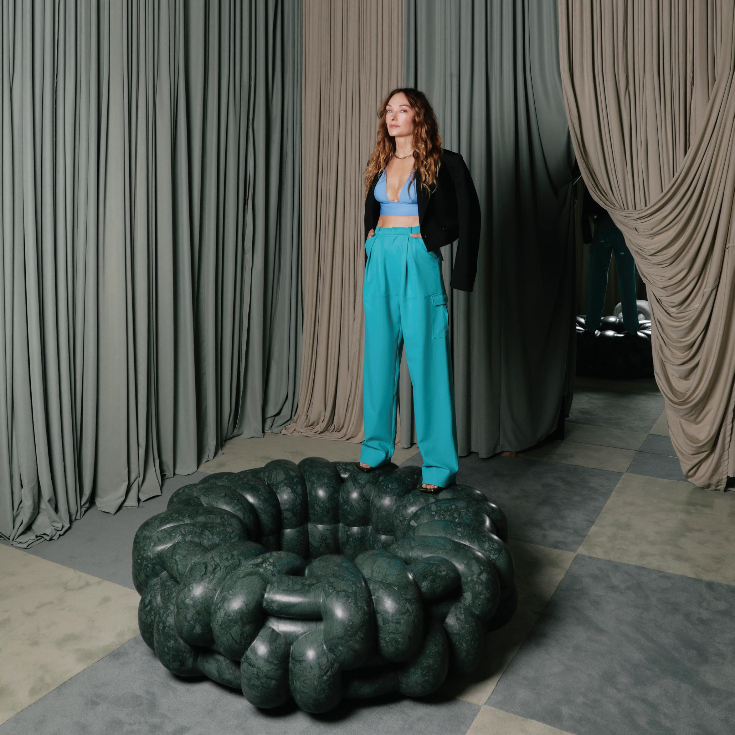
There’s a rugged voluptuousness to Kelly Wearstler’s new NUDO furniture collection, designed in collaboration with ARCA. Made all the more interesting by the apparent softening of such a cold, hard material, the material in question is marble and each piece is carved from one block, 3D-rendered and handcrafted by master craftspeople. As with the NUDO Round Bench, above, strong curves and knot motifs distinguish the forms, and colours range from the palest apricot through to deep jade green.
Indesign Klaro
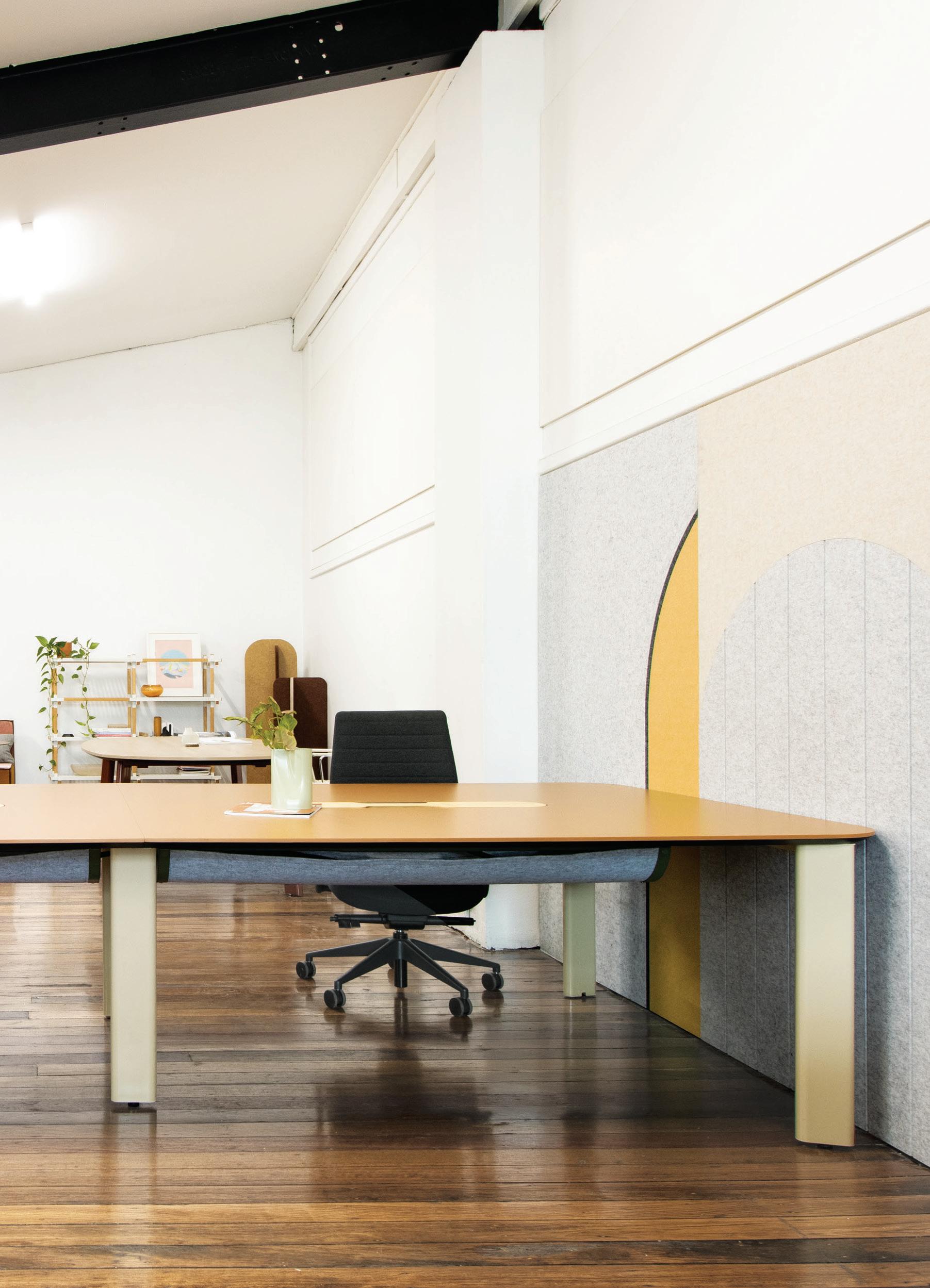
Klaro stands for freedom of choice. Its OBLONG workstation and table base componentry system puts this into action. It has been developed with Australian and Taiwanese manufacturers to offer a variable number of components that are made locally and in Taiwan. This means that designers, in looking for locally manufactured solutions, can work with a product that is traceable, transparent, offers flexible budget options, and has an extensive array of specification options that are aesthetically cohesive. Klaro expands our choices further with colour options for off-the-shelf components that include Paperbark and Iron powdercoat colours – both readily available.
Indesign K5 Furniture
Popsicle sure does live up to its name by resembling an oversized ice block. It’s actually a waste bin, designed by Jangir Maddadi for Swedish brand TreCe, and can be used either indoors or out. “I wanted the design to be playful, happy and respected enough to be left alone in parks and public spaces,” says the designer.

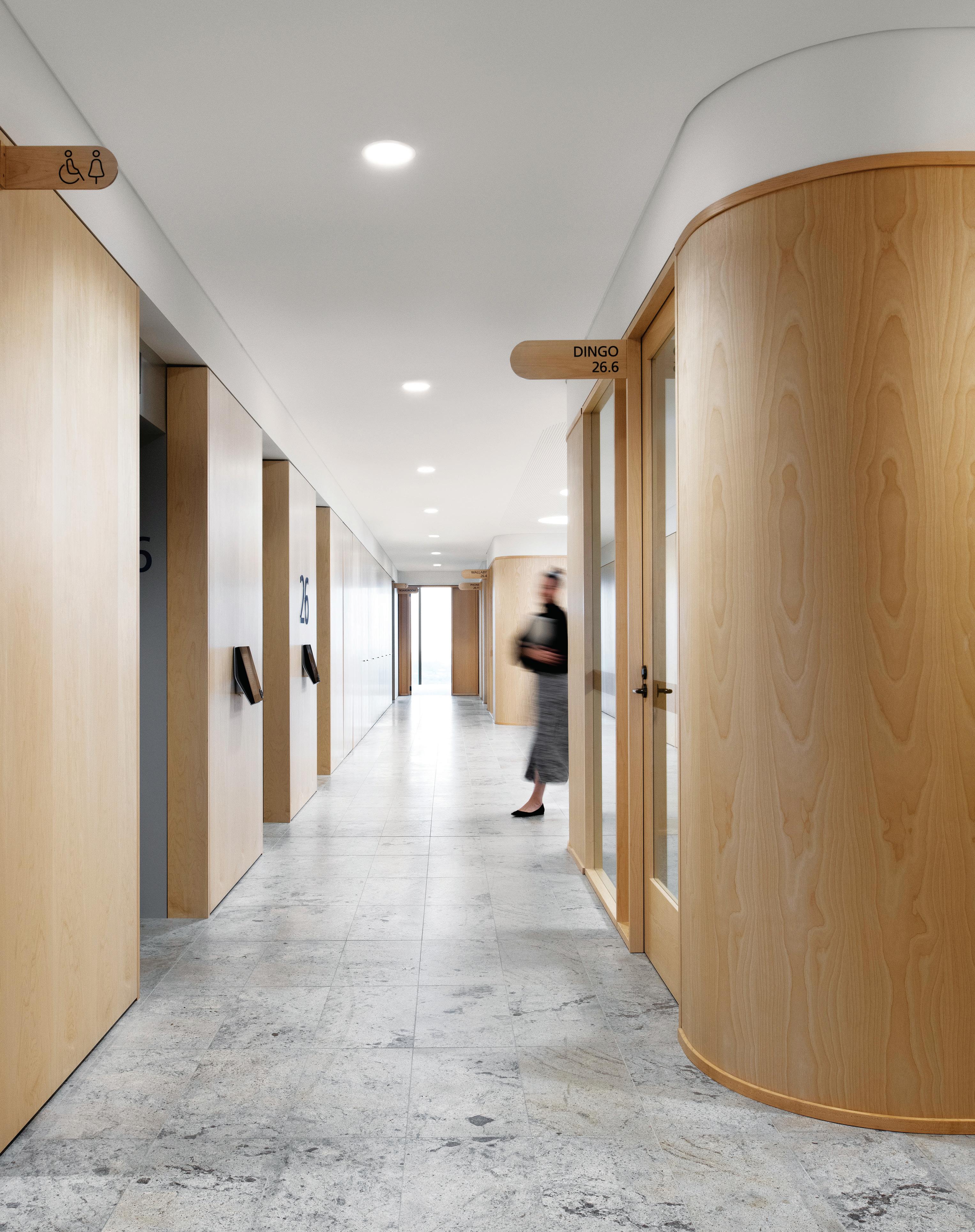
WoodWall® is a pre nished timber veneer that can be applied to walls, ceilings, bulkheads and column surfaces in the manner of a wallpaper. Exclusive to Elton Group, it is a game changer in the slicing, manufacture and application of real timber veneers. WoodWall® comes paper backed for ease of handling, with a total thickness of just 0.5 millimetres. Supplied pre nished with a satin polish in large sheet sizes, WoodWall® o ers a timber panelling solution without the need for framing, substrates, and split battens. For the Zurich workplace in Sydney, Hassell selected WoodWall® Birch-Crown to execute the tout’s signature curves. Installed by Wallpaper Installation Sydney, photo: Nicole England.


Indesign Elton Group



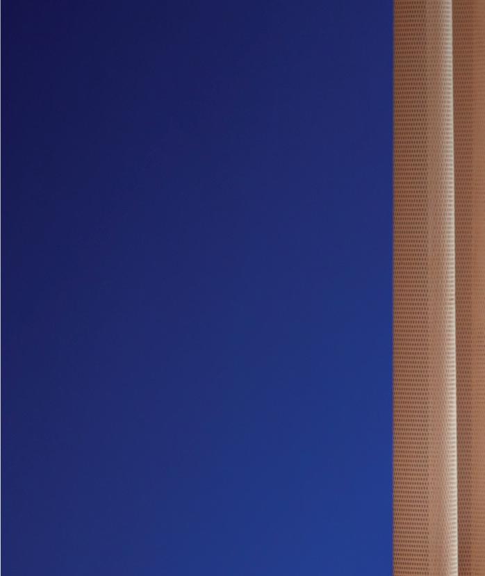

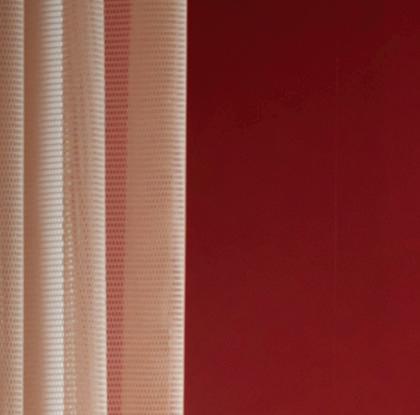



Kicking complacency out the door, Circles of Hair has received a gritty, glamorous renovation at the hands of design studio State Of Kin. Located in Perth’s Subiaco, it stylistically borrows from the Memphis Design and PostModernism movements. State of Kin layers colour, texture, pattern and light, giving rise to an industrially styled interior that’s as dynamic as it is bold. Shades of pink and red sit alongside metallic tones and pops of electric blue, while a material palette of glass, concrete and steel accentuates the graphic feel of the space.
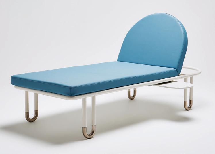
“Designing and manufacturing outdoor furniture is very different to designing and manufacturing interior pieces. Every element must be carefully considered to ensure suitability to withstand the sun, rain, wind and often corrosive salt air,” comments Grazia & Co’s Grazia Materia. For Goldie, the magnet-shaped leg system was developed so it could be moved without wheels and while this has become its defining feature, the raw magnet-shaped detail ensures the frame’s powdercoat won’t be chipped and damaged when the lounger is moved.

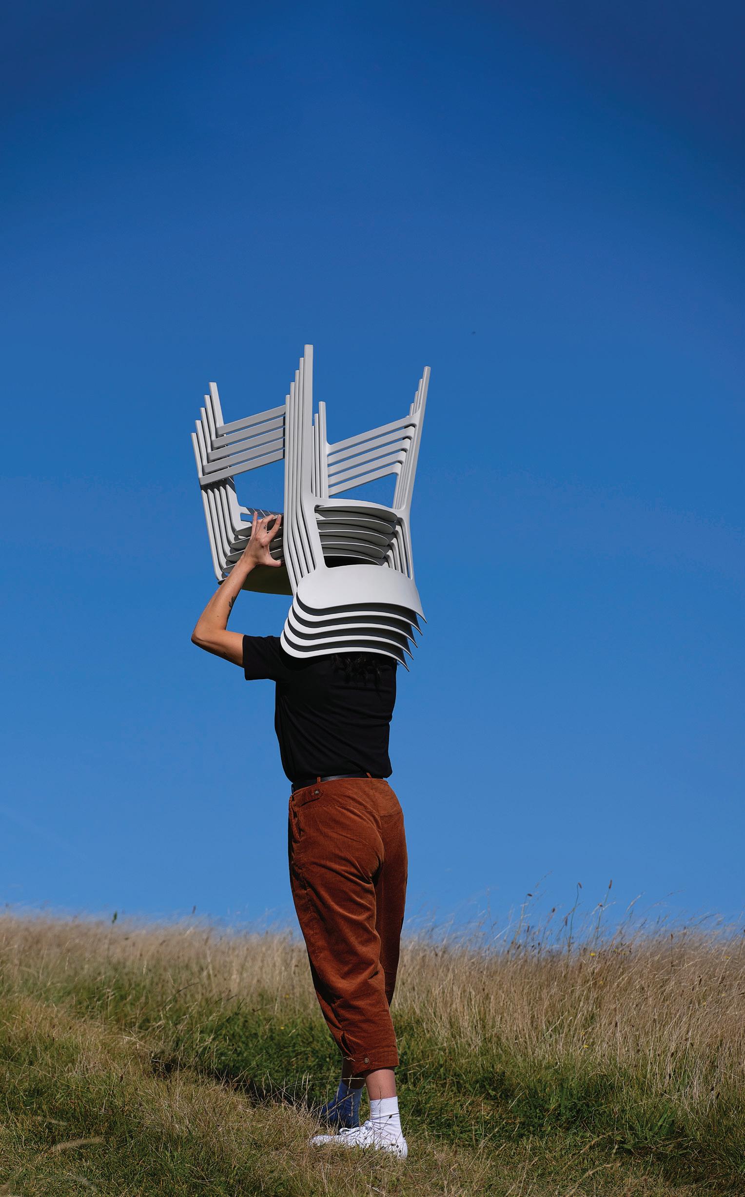
Designer Andraž Šapec’s Collodi chair for Donar is a direct response to the ever-growing problem of plastic pollution and proof that sustainable design can enhance the ergonomic and aesthetic features of a product. Its shell is made entirely of industrial waste that is 100 per cent recyclable. Just like Carlo Collodi’s Pinocchio, Šapec set out to infuse this piece of furniture with life, to make a statement in any room. Available in Australia from ducksnest.
Indesign Woven Image
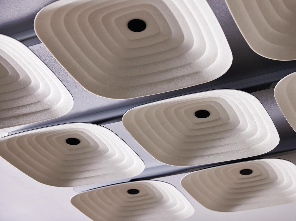
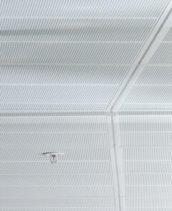
Looking to Japonisme and Art Deco for inspiration, Fuji is a new acoustic ceiling tile that enhances ceiling aesthetics and acoustic control in commercial interiors. These uniquely embossed tiles come in square and rectangular sizes – Roku, Juni and Ku – in single and dual colourways. They can be suspended individually for a clean, minimalist look or installed en masse to create a large-scale ceiling solution. Either way, their slick profile is understated yet stylish. To top it all off, Fuji’s composition is highly sustainable, compromising 64 per cent post-consumer recycled PET per tile.
French-born interior designer Léo Terrando started his own design studio in mid-2021. His advice? Don’t wait for something to happen or arrive. You have to go after what you want.
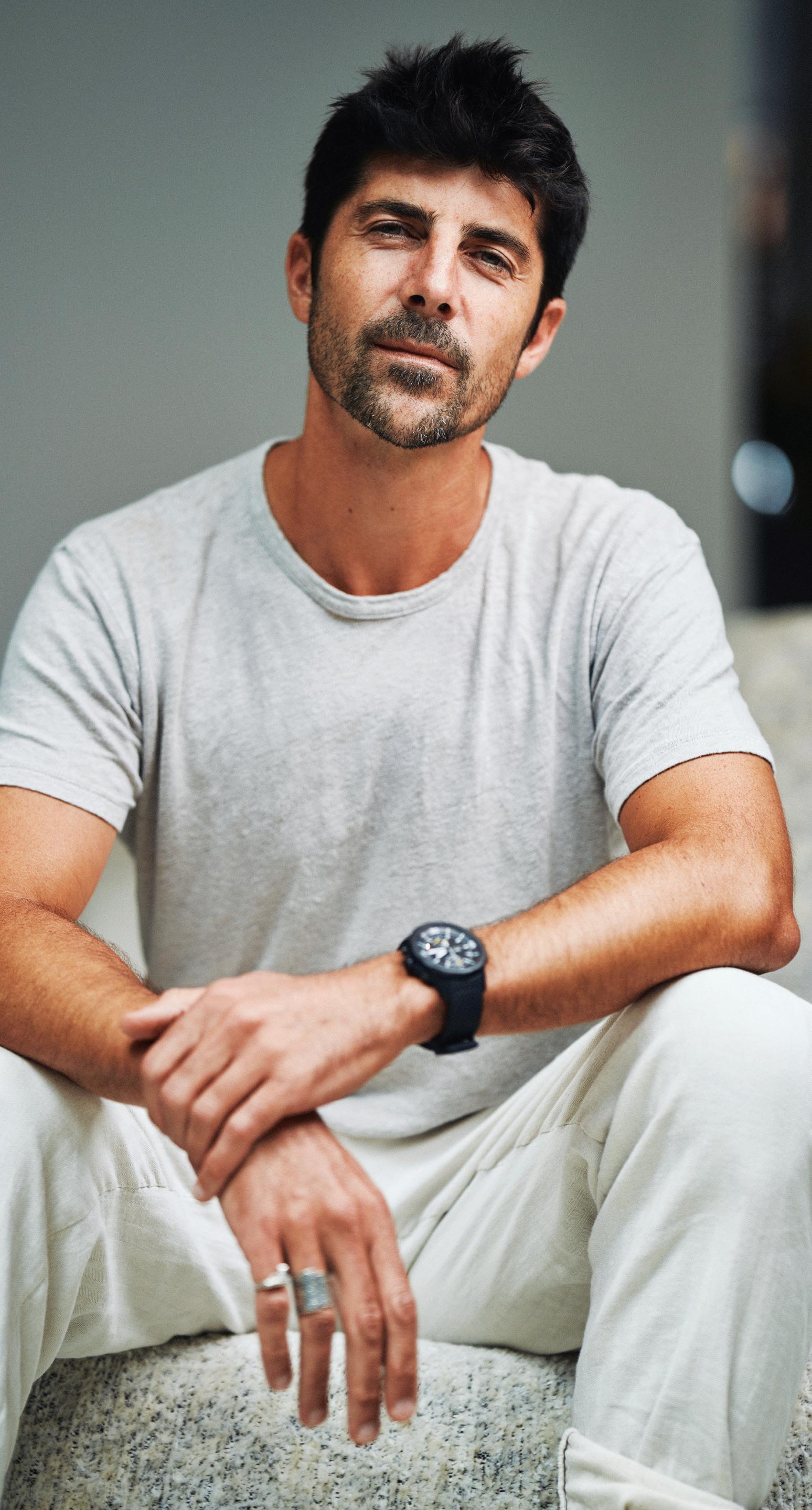
What are the origins of Léo Terrando studio?
The traumatic experience of the Victorian lockdown pushed me to leave my partnership at SJB and start my own practice. I was already running my own team and had great relationships with my clients, so it felt like launching my own business was the right thing to do in order to develop ideas not possible until then.
Can you share the long-term vision for your practice?
I would love to set up an office in Bordeaux, France, as well as one in Byron Bay, while continuing to work on projects across Australia, the US and Europe. Over the past few months I’ve established unique relationships with clients who have now become my friends. It’s something I feel proud of and would love to maintain on all types of projects around the world, across the next few decades.
Can you share some of your creative references with us?
From images in books, to movie sets and discussions with people that aren’t necessarily ‘artistic’ – I find great stimulation in connecting with people, even if it’s for five minutes. I also get inspired by art galleries and furniture showrooms, travelling interstate and overseas, and wandering around town.
What advice would you give someone wanting to start their own studio?
To be passionate about what you do and work hard for it. To not wait for something to happen or arrive, but to go and get it. I would also say, educate yourself by listening to podcasts and stay fit and healthy.


Passport is a workspace for any place – your home o ce, the living room, a studio bedroom or the workplace. This is a desk that can move with you. Height-adjustable, its single-column base and lightweight design makes it easy to adjust and the intuitive lever allows you to smoothly alter the table to suit di erent modes of working. Having the exibility to choose between sitting and standing is the ultimate in ergonomic design, o ering comfort
at any posture. Passport also comes in two sizes and whether large or small, there’s room for your laptop, notebook and a drink! An optional bag hook keeps your belongings o the oor, and an optional privacy screen provides a welcome shield. With a base on casters or glides, Passport can be rolled to the side when not needed and just as quickly rolled back. It’s highly functional and oh-so-stylish.

The Autex Acoustics ® collaboration with profit-for-purpose art curators Willie Weston, represents a major shift towards the inclusion of First Nations culture and design in the built environment. Specifically curated for commercial, education and government spaces, the Autex Acoustics x Willie Weston collection also works seamlessly in office and hospitality settings.
Combining First Nations design with acoustic treatments provides a platform for the inclusion of diverse cultures and perspectives in our built environment. Willie Weston’s commitment to ethical and sustainable art commerce ensures meaningful income for First Nations artists, often living in remote places. “Working with Willie Weston has provided a great opportunity for our team to continue their journey and understanding of First Nations culture,” says Regan Williams, national development manager at Autex Acoustics. “Organisationwide we are immensely proud to promote the artists’ designs via the Willie Weston collaboration, bringing regular income to remote
communities and continuing to push the limits of how acoustic linings can tell a story whilst improving the aesthetics of a space.”
The collection features eight unique artist designs across 21 colourways. Locally manufactured and ethically sourced, the designs are printed directly onto the Autex Acoustics Cube™ and Quietspace® panels – both market-leading treatments which are carbon neutral, durable and high-performing.
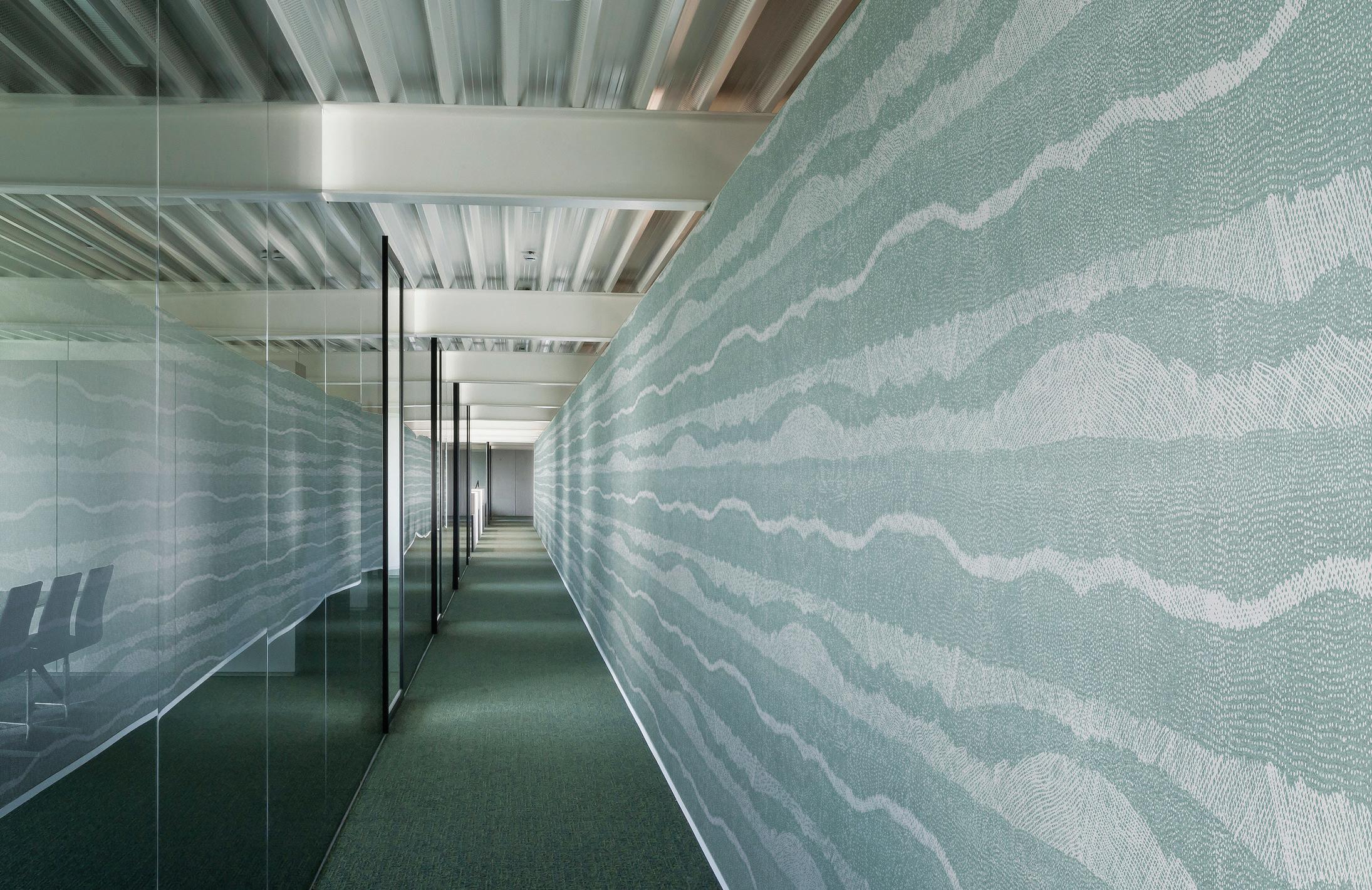
“Willie Weston exists to provide meaningful income for artists. This collaboration enables us to grow the market for these designs, and to build on the financial returns made to the artists we’re so lucky to work with,” says Jessica Booth, co-founder of Willie Weston.
As the first carbon neutral interior acoustics company, Autex Acoustics demonstrates that protecting the future and honouring the past go hand-in hand. This latest collection, filled with designs that are steeped in storytelling, culture and history, provides a platform for the inclusion of the experiences and creative expressions of First Nations artists in our built environments.
Uniting contemporary First Nations design with acoustic functionality, the Autex Acoustics® x Willie Weston collection enables you to incorporate First Nations design into your space and meet your acoustic requirements.
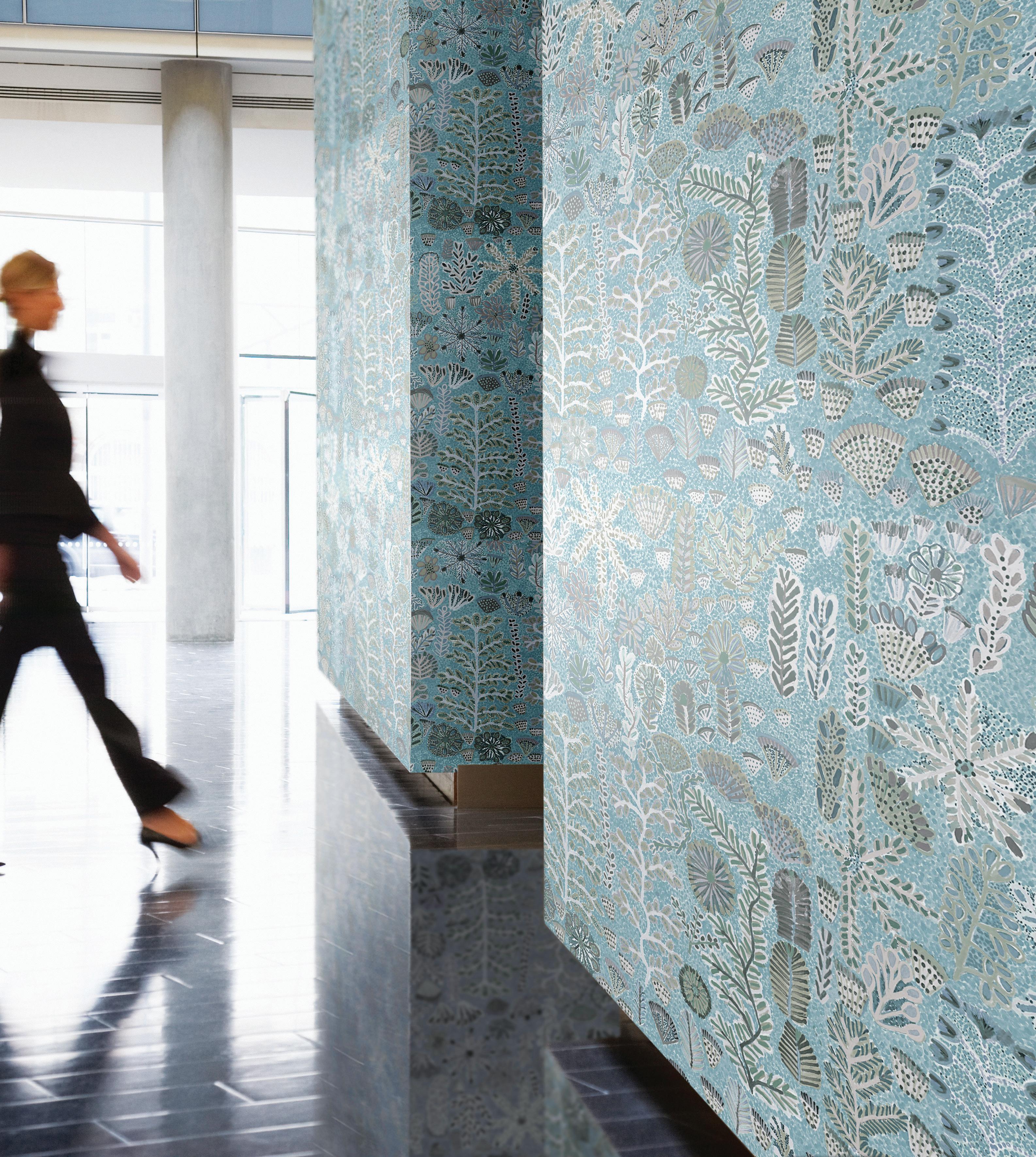
Each design celebrates the culture and traditions of the artists and the communities they come from and contributes to fair and equitable income for First Nations artists.


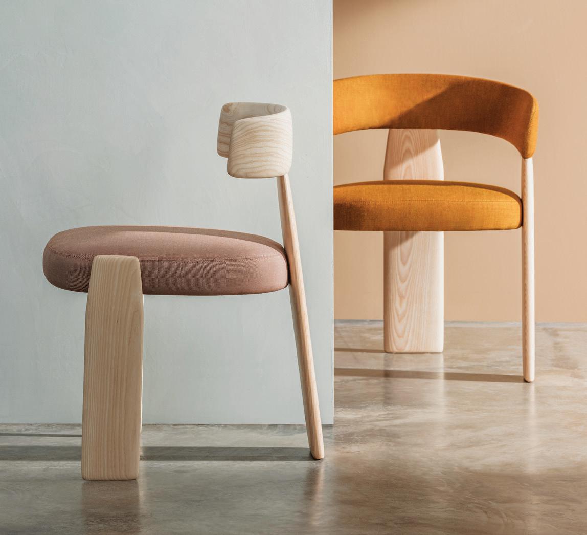
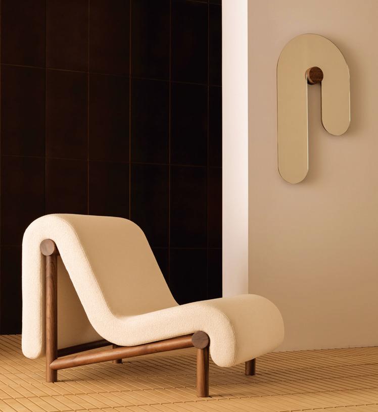
Harnessing a 1970s vibe along with a hint of Japanese minimalism, Oru chair by Patricia Urquiola for Andreu World combines quality craftsmanship and industrial technology. With three oar-shaped legs, one of which extends into the slim backrest, its humble, compact form is nothing short of, well, delightful. The upholstery and internal foam is made of recycled fabric and the collection itself not only comprises chairs and armchairs, but a range of tables too. Available in Australia from KE-ZU.
Indesign Workspace
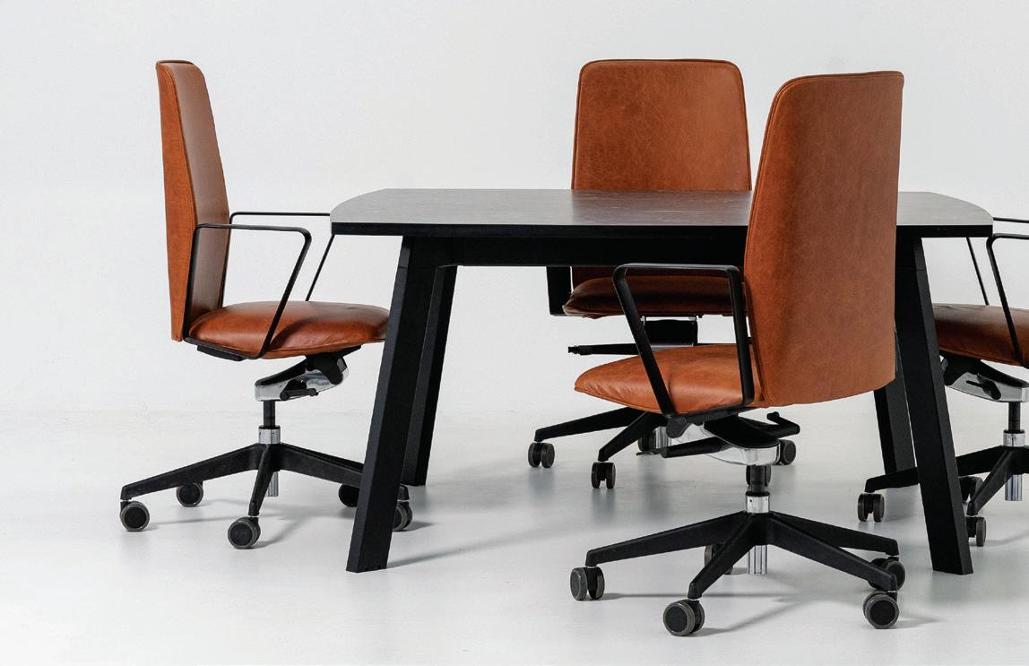
Inspired by objects designed purely by science without too much human intervention, you’ll find the Forza boardroom table strikingly clean and minimalist. “In my research, I came across the aerodynamic shape of aeroplane wings, which is pure physics, and applied it to Forza’s legs,” says Workspace product development coordinator Miheer Fyzee. “The idea of the modular frame came from the bolt-on bolt-off nature of industrial metal structures –simple, functional, intuitive.”
Bower Studios has designed a statement collection with Melt, in which each seemingly melting piece sends even the most jaded design aficionado to go straight into design meltdown. The New York-based practice, while predominantly known for its architectural mirror designs, also creates furniture and accessories, hence the addition of a chair and table to the organic-shaped range. Mirrors are the hero though and their visual play on soft and hard makes them appear animated, like they just might have an interesting story to tell.
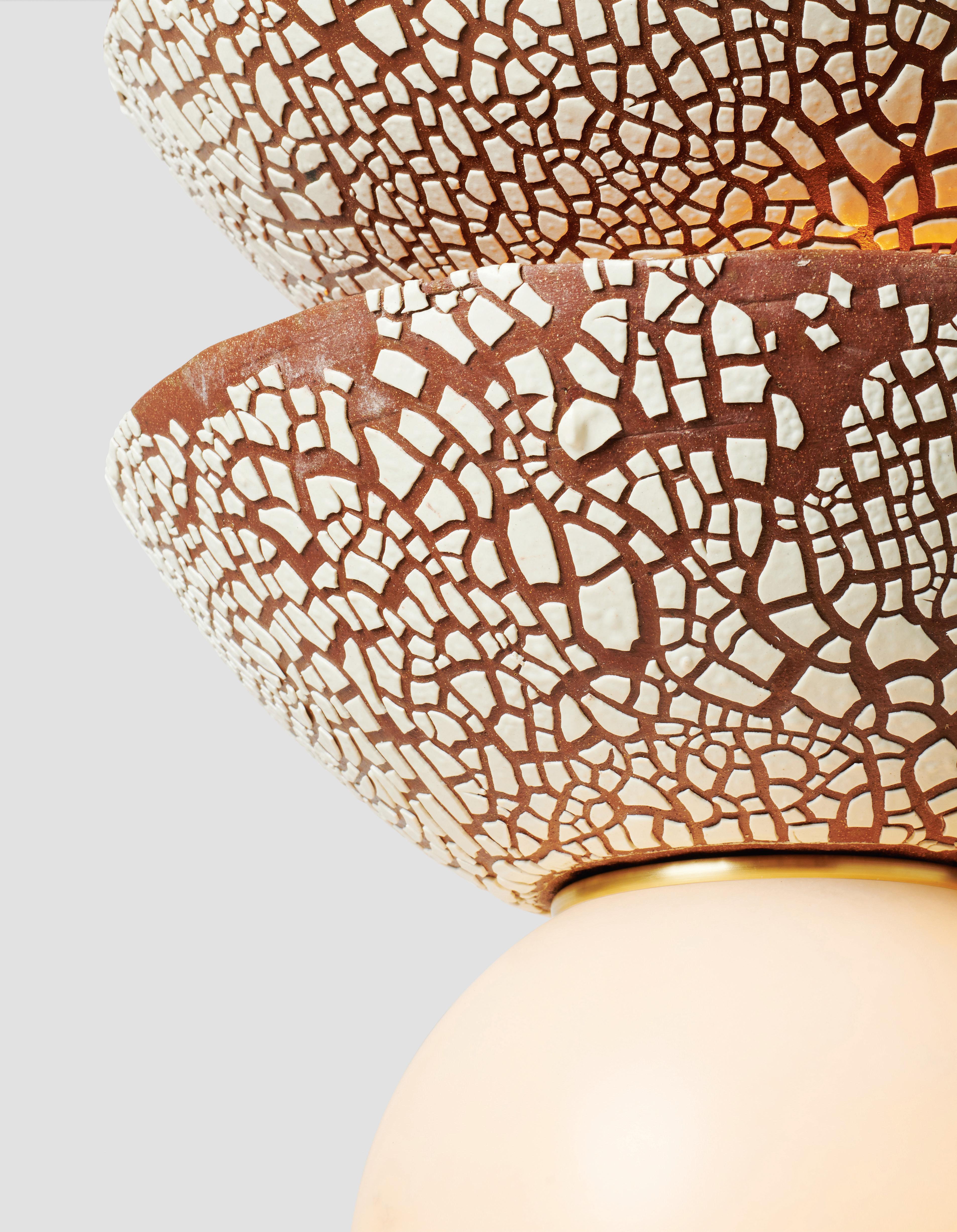
This lighting collection is a collaboration between Rosie Li and Mondays. Pilar is the perfect culmination of what these two New York design studios do best, with the result a range of lovely hand-built ceramic lighting forms with earthen glazes punctuated by solid brass. Inspired by the iconic architectural presence of Romanian sculptor Constantin Brâncuși’s Endless Column. Each piece in the collection is a fascinating study in form, texture and colour.
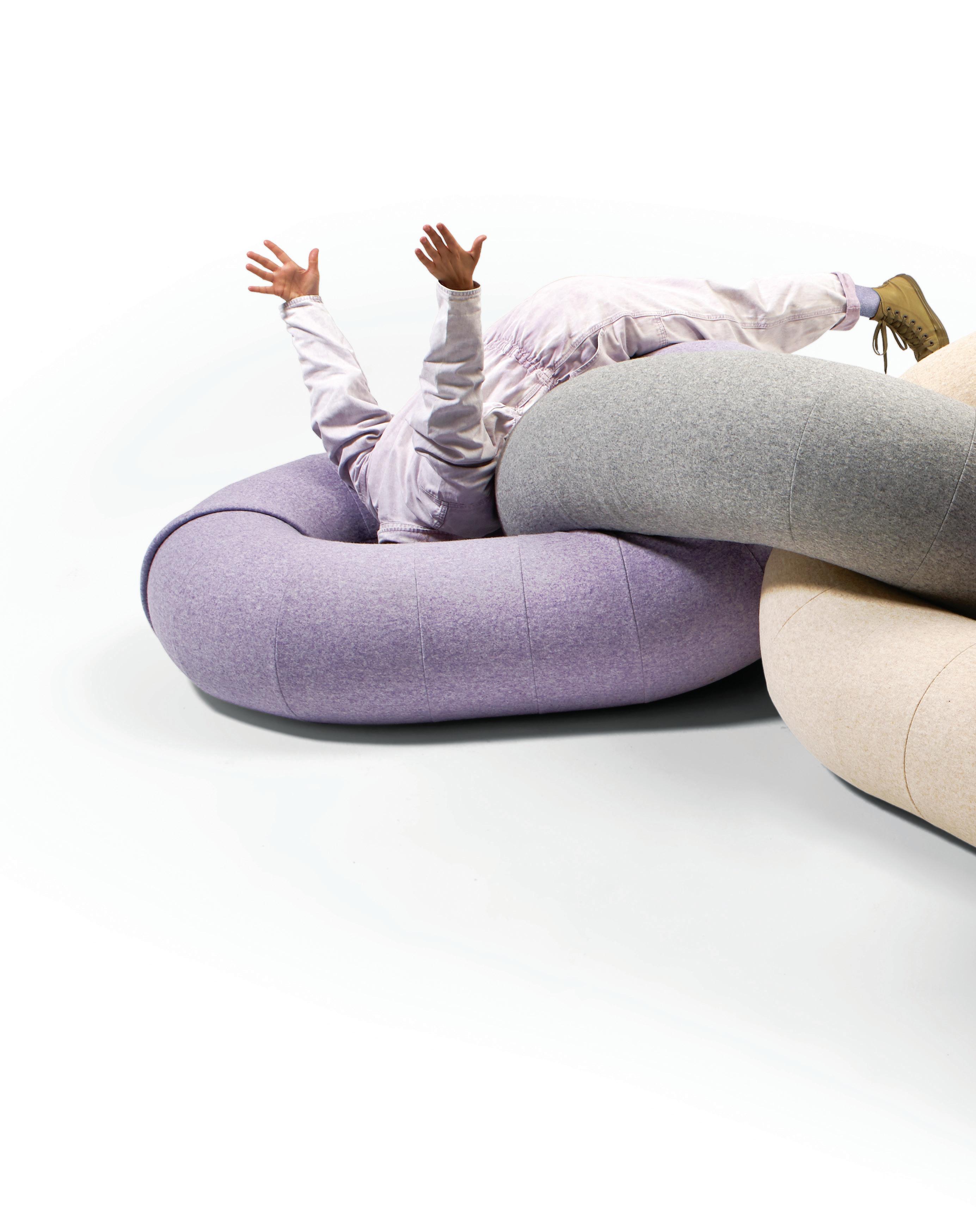
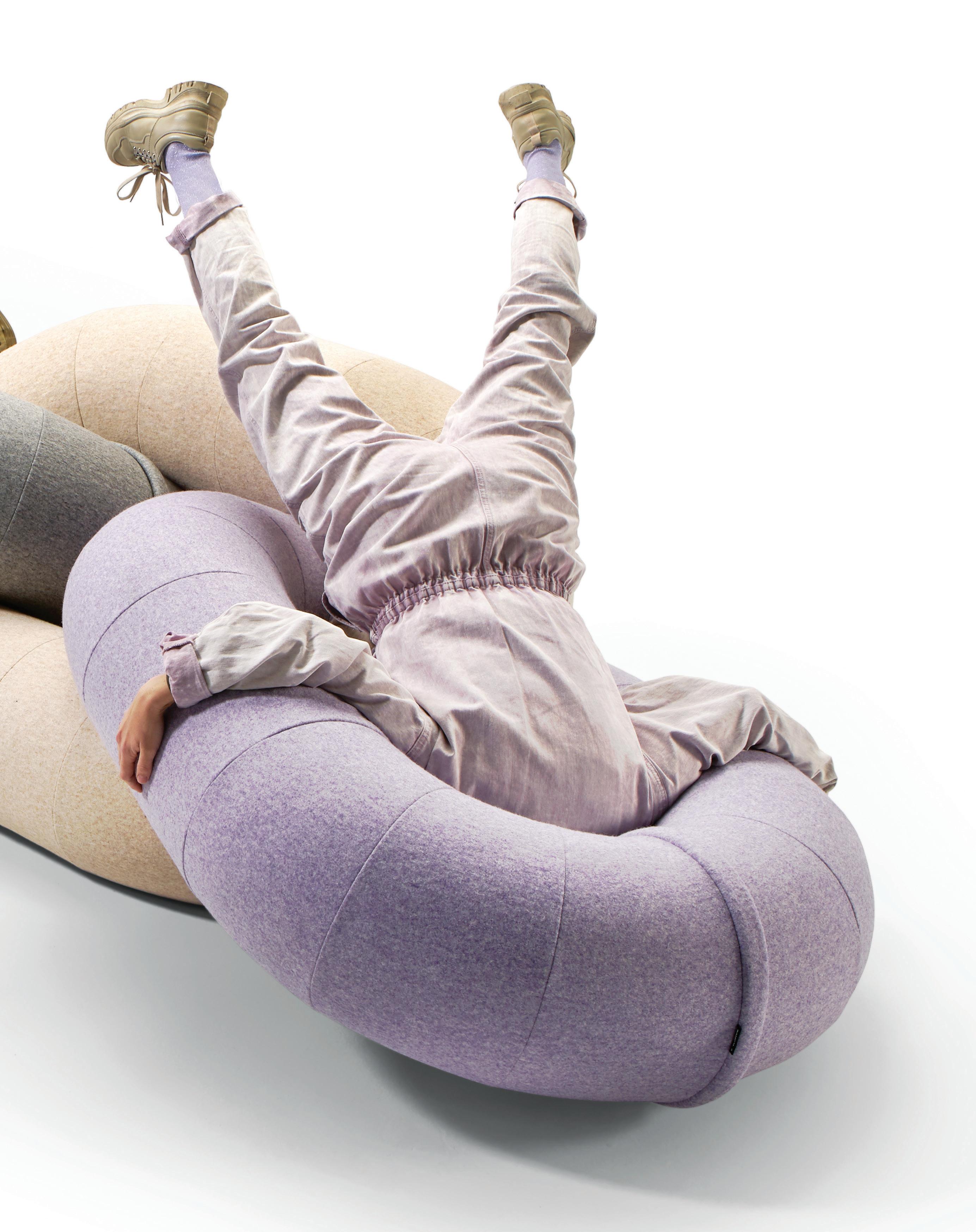
Borne out of the first few days of COVID-19 sweeping Europe, Raw Color approached the design of its Link & Loop sofa collection for Sancal with characteristic optimism. “We developed both products as the pandemic raged, with the conviction that one day we would all sit together once again,” say designers Christoph Brach and Daniela ter Haar. “Indeed, our working title was Party – in honour of that moment when we would celebrate the end of the pandemic.” Link, in particular, is especially playful, with its oversized chain form working as a sculptural piece of art as well as an everyday functional object. To top it all off, the collection comes in a range of delicious colours, from pale lavender to electric blue.


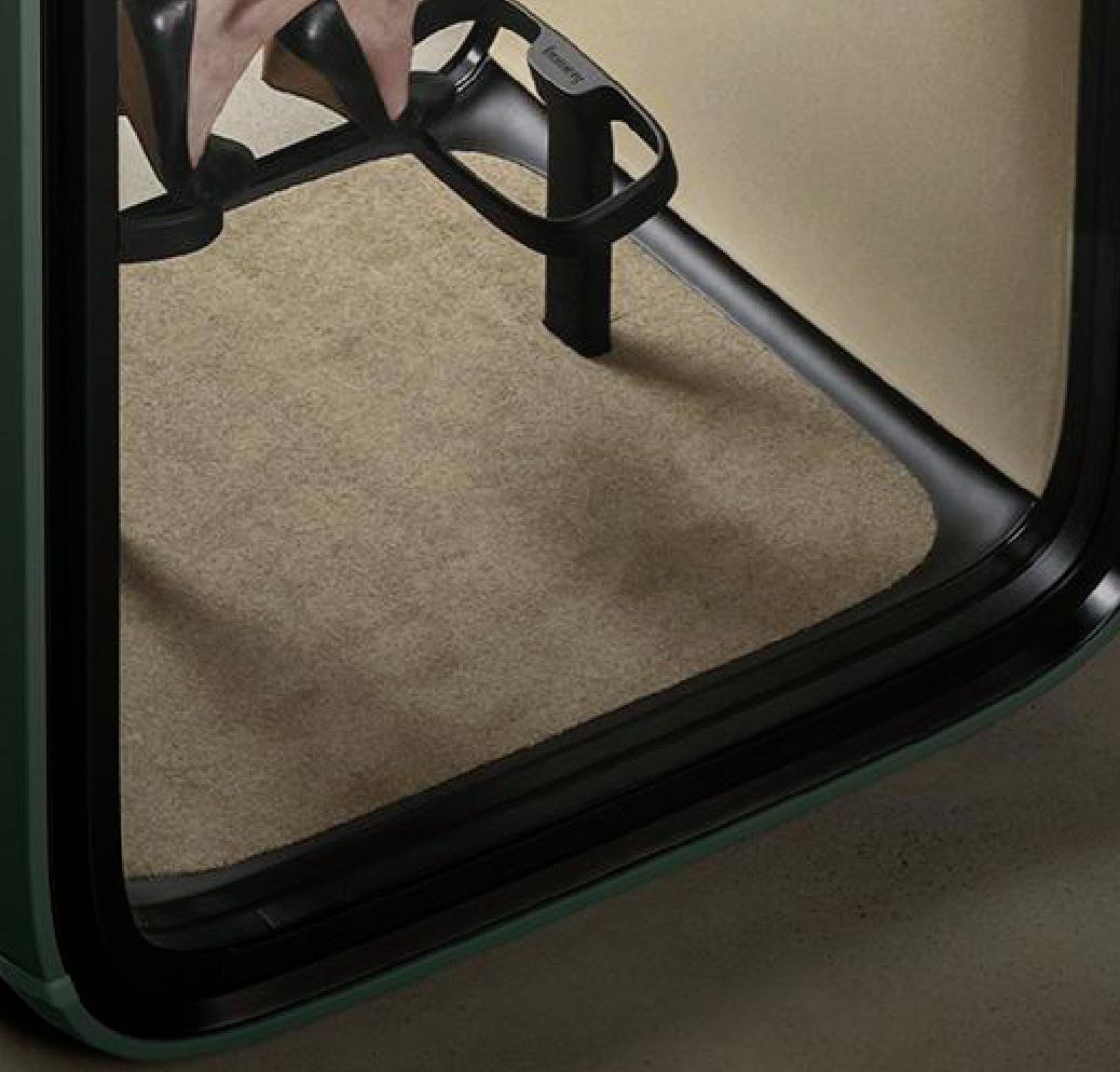
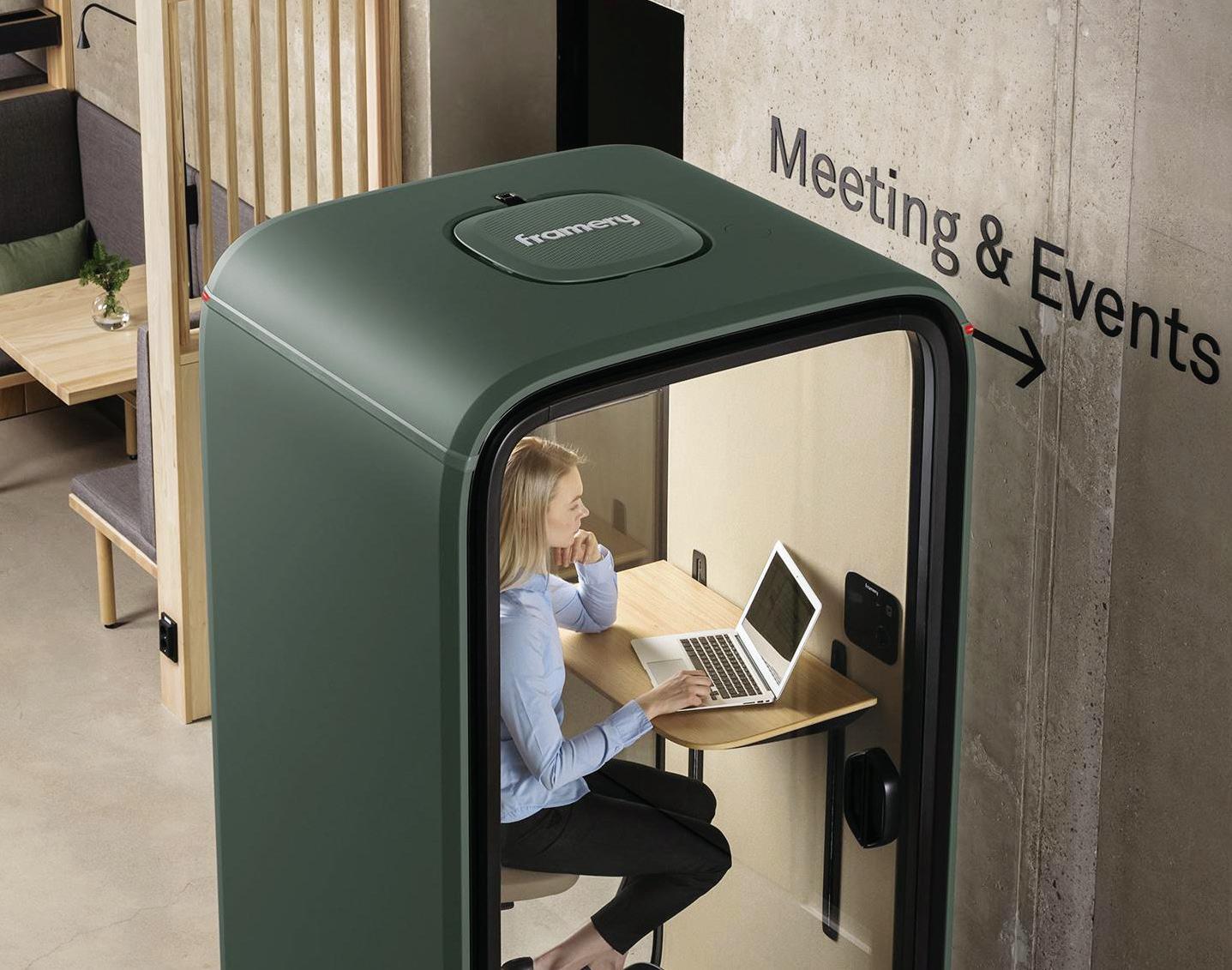
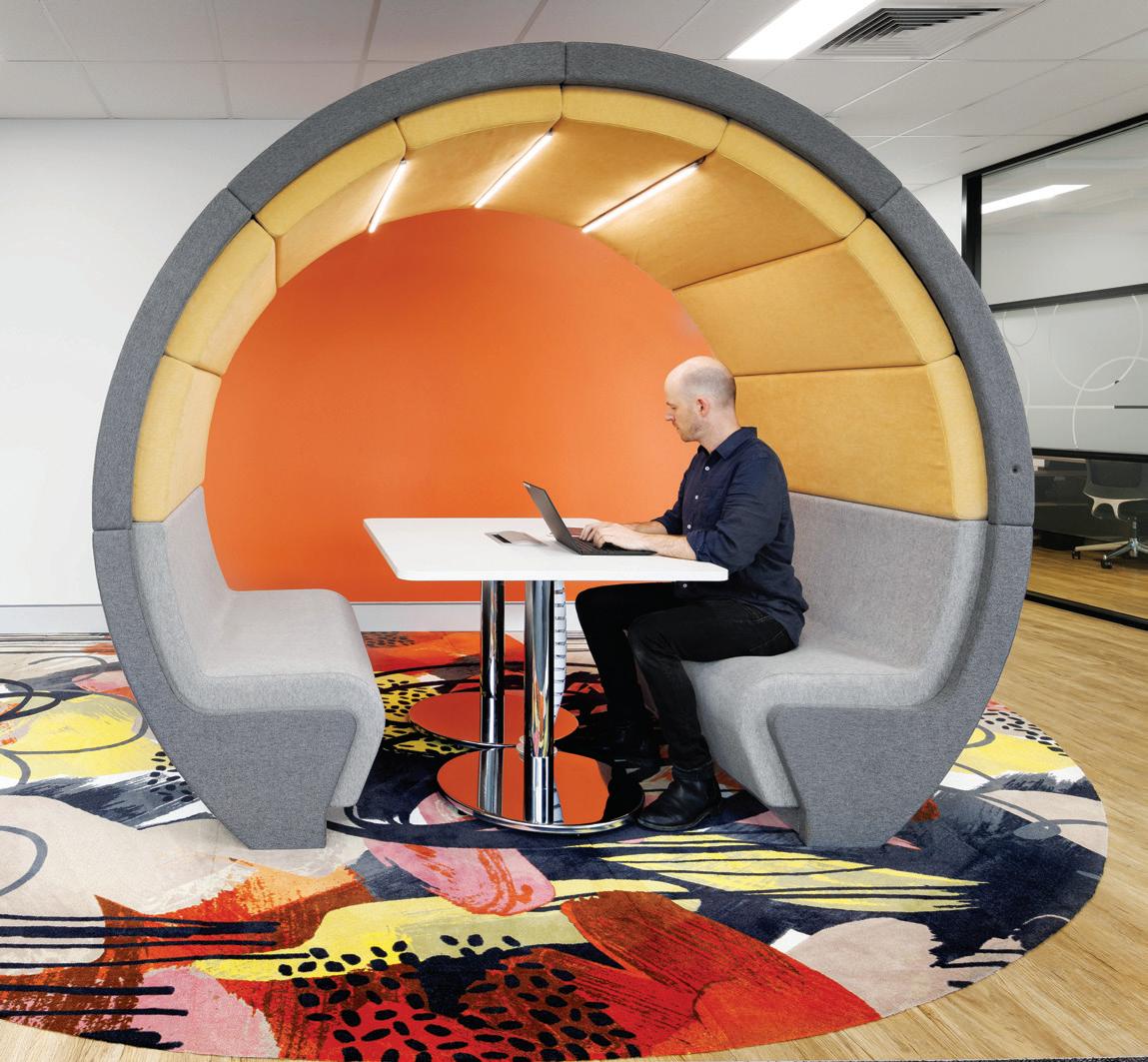
Thanks to hybrid working, the need for video conference solutions in the workplace has increased. Enter Framery One by Framery – the world’s rst connected phone booth. The soundproof pod works a treat in open plan o ces where nding a quiet area to work isn’t always possible. Not only does it look good, it’s also technologically supported, combining 4G technology and a digital ecosystem with superior acoustics.
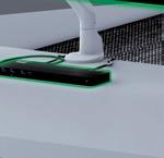
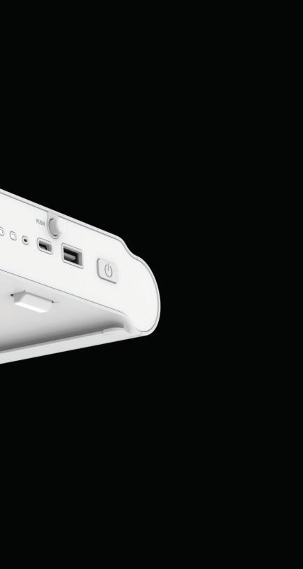
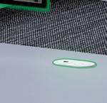
“We recognised the need for a modern and minimal power solution for work and commercial spaces and set out to reimagine the standard desk box power system,” says ZETR founder Garth Elliott in regards to the company’s ZETR 25 power and data system. It can be installed flush in many surfaces and locations and offers single-action, high-output charging and fast data transfer. Featuring ZETR’s signature curved capsule profile, the ZETR 25 is as slick-looking as it is high functioning.

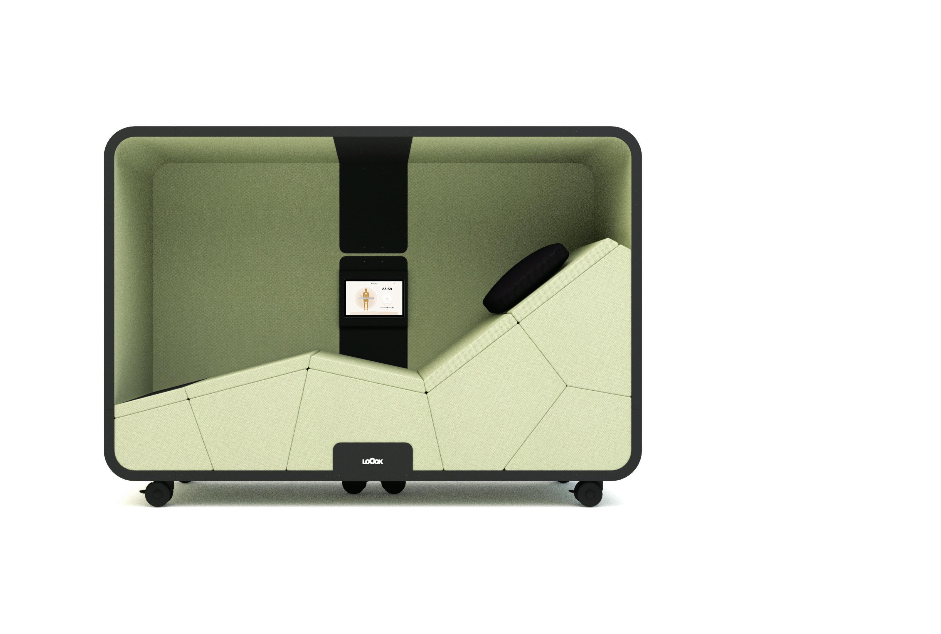
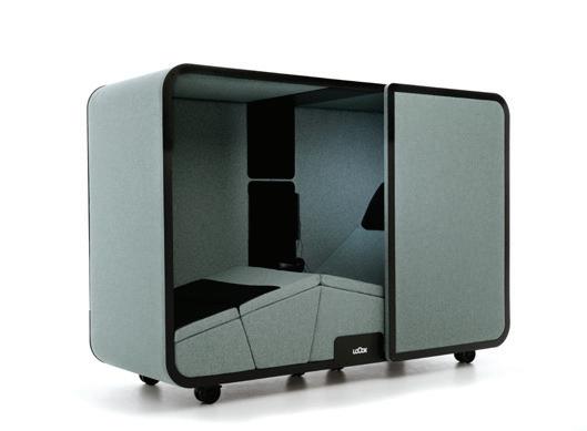
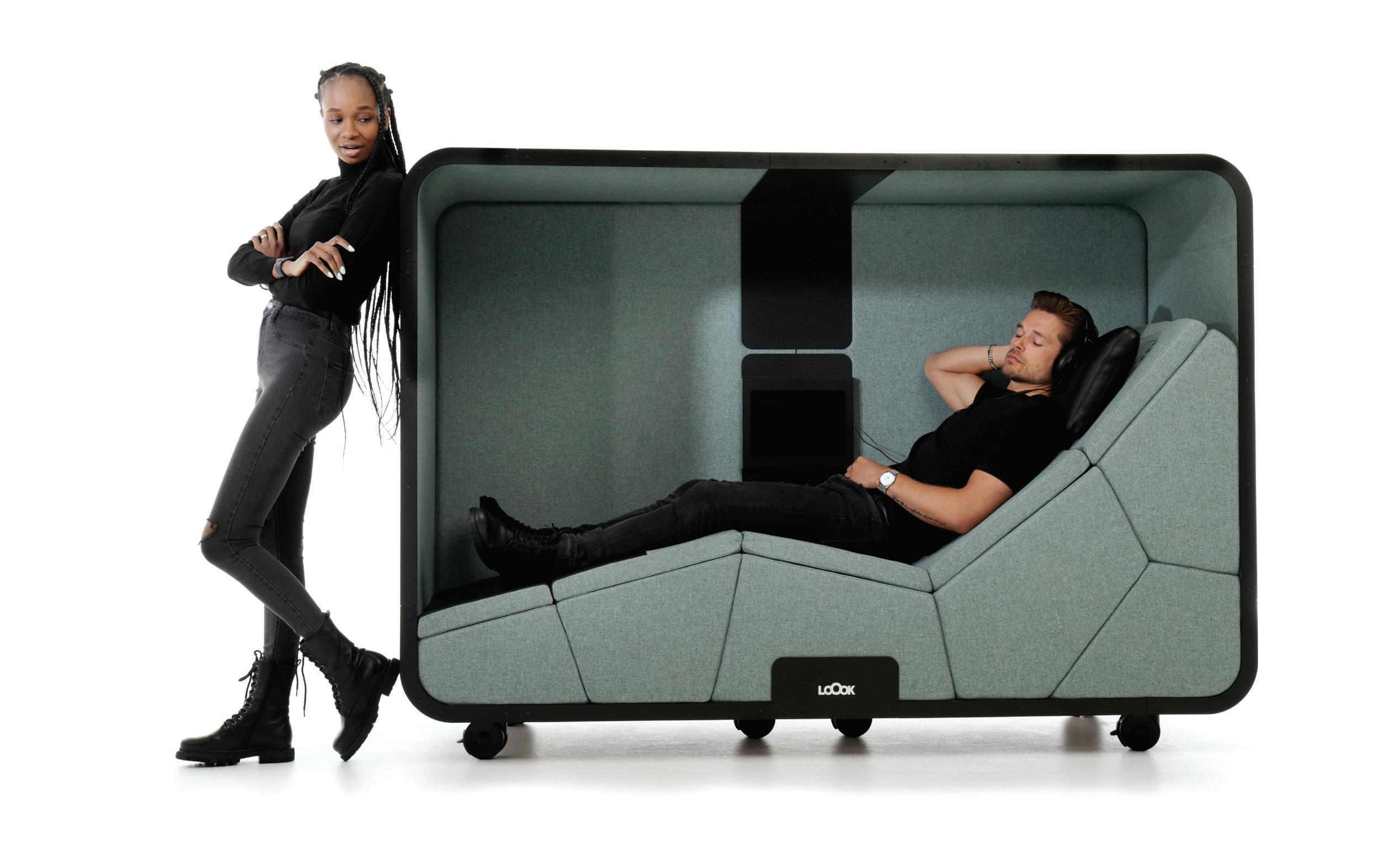
The Neuron Activation Pod by LoOok really is some next level sci-fi stuff that every office needs right here, right now, no questions asked. Championing wellbeing in the workplace and the benefits of a power nap, this sleeping pod can help workers relax and recover depending on the chosen program. The technology is based on sensory tissue stimulation –very low frequency sinusoidal vibration – that’s targeted simultaneously to the whole body. It’s a safe and soothing way to alleviate workplace stress. And having tested it out at the Orgatec 2022 fair with LoOok’s Australian distributor, TCW, we can tell you, it works!
Realised as a fever of colossal stingrays, the sculptural artwork Mermer Waiskeder (Stories of the Moving Tide), will occupy the public space of Exchange Square at Barangaroo, where the rays will flow across the ceiling. The artwork was created by cross-cultural artists group Ghost Net Collective, which works with ghost nets, the discarded fishing nets that continue to harm marine life.
 Pictured, Jimmy John Thaiday with Ray, Erab Island, photo: Lynnette Griffiths.
Indesign Buro Seating
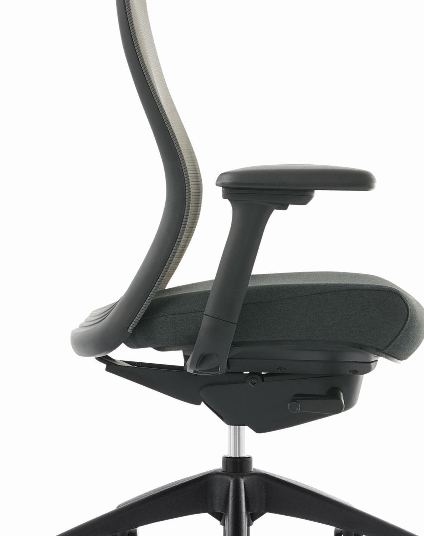
Konfurb Luna, with its slim back and streamlined profile, is enhanced by its breathable mesh back and adjustable lumbar support. Its active seating technology “encourages regular mobility which stretches muscles and joints, and pumps fresh oxygenated blood around the body”, as outlined by ergonomist Andrew Wilson. Manufactured with sustainable practices at product origin and end of life with GREENGUARD Gold, ISO, and AFRDI certifications. Learn more at buroseating.com
Indesign Milliken
It’s what’s hidden inside that counts with Milliken’s cushion-backed WellBAC® carpet tiles. They have been designed and developed to reduce muscle strain by as much as 24 per cent, compared to hardback carpet. Like wearing your comfiest, most supportive sneaker, WellBAC® carpet tiles are incredibly comfortable underfoot, and provide up to 50 per cent improved acoustics for a quieter space. They are also third party verified Red List Free with enhanced indoor air quality (low VOC) for the improved wellbeing of all installers and end users. Pictured here in Ultimate Security’s Sydney office by Inspired Spaces, photo: Sebastian Photography.
Indesign Abey
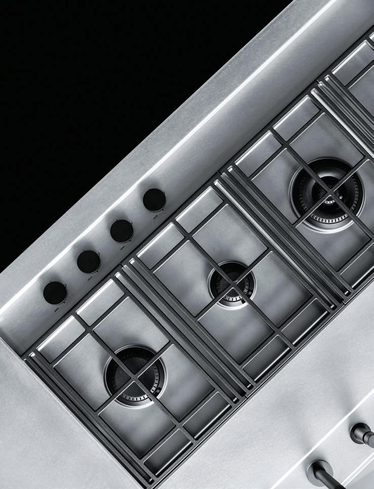
Tools matter and so Barazza’s new Lab Evolution Cooktop Range shouldn’t be overlooked. It features wider depth, Flat Eco-Design burners and pan supports in Soft-Touch cast iron. The minimalist, geometric design is ultra-modern, while the burners’ vertical flame permits greater efficiency, reduced energy consumption, less heat loss and uniform cooking. We dare say Nigella would approve.
Indesign Space Furniture
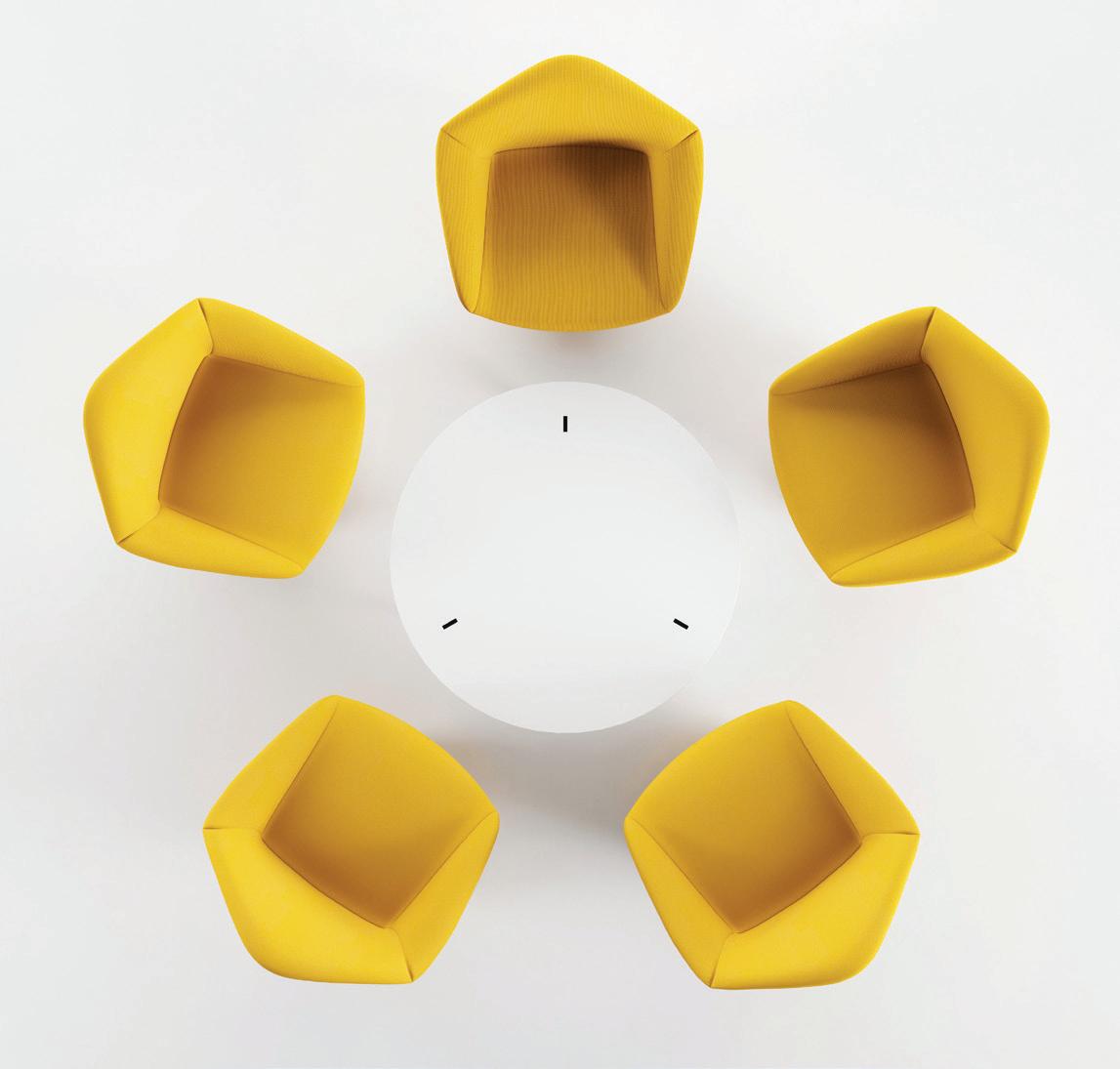
Valencia, located on the edge of the Mediterranean, is home to Spanish furniture manufacturer, Viccarbe. The city’s relaxed way of life influences the colours, details and materials of each Viccarbe collection. Among its newest products is the Penta armchair, designed by Toan Nguyen. It oozes high quality craftsmanship and functionality, being customisable in a variety of fabrics and configurations, with a very nifty hidden swivel base.
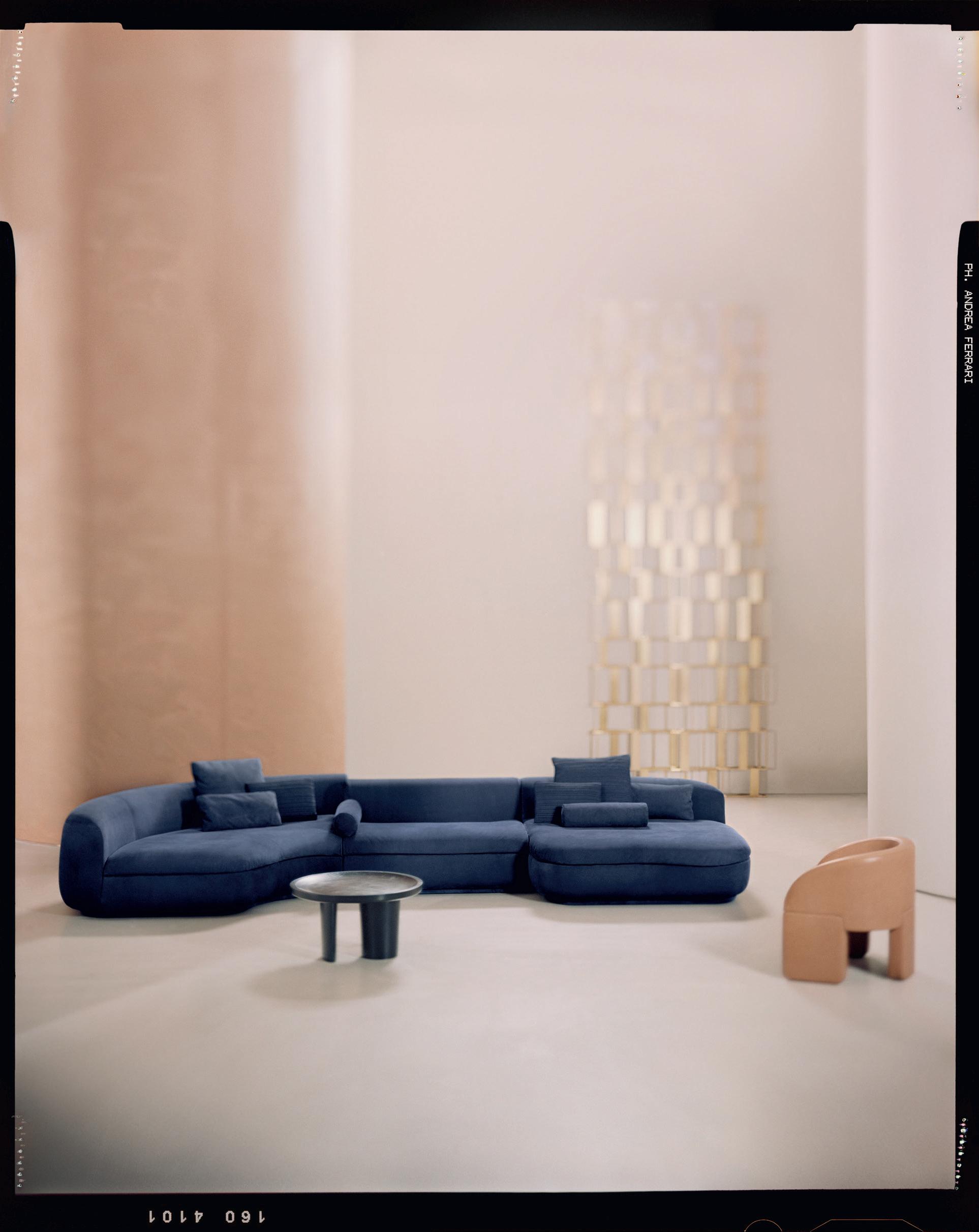
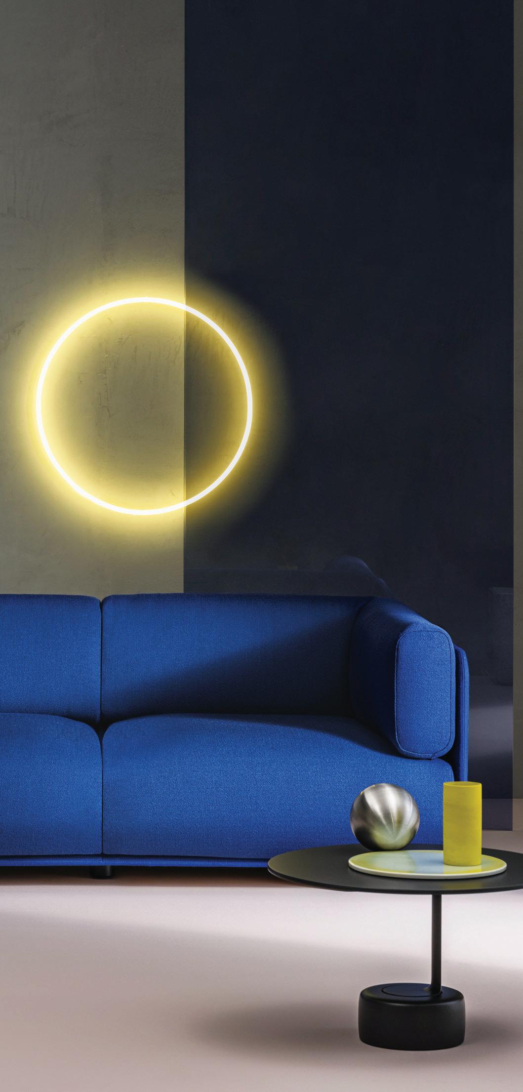
Designed by Doshi Levien for Arper, the shapely Shaal sofa invites tactility and brings warmth to a space. Versatility is at the heart of the modular design with multiple combinations allowing for angular or linear con gurations. It can be upholstered with Arper’s collection of leathers and textiles, using solid block colours or contrasting colours and textures – and it all sits elegantly o the ground. Sumptuously deep cushions are fully removable, meaning easy disassembly for reuse and recycling. The accompanying Oell table by Jean-Marie Massaud makes a formal statement but keeps utility in focus. The table top comes in two di erent heights and nishes. It stands dramatically as a cantilever, balancing on a cylindrical base and asymmetrical column made of die-cast aluminium.

Indesign Stylecra
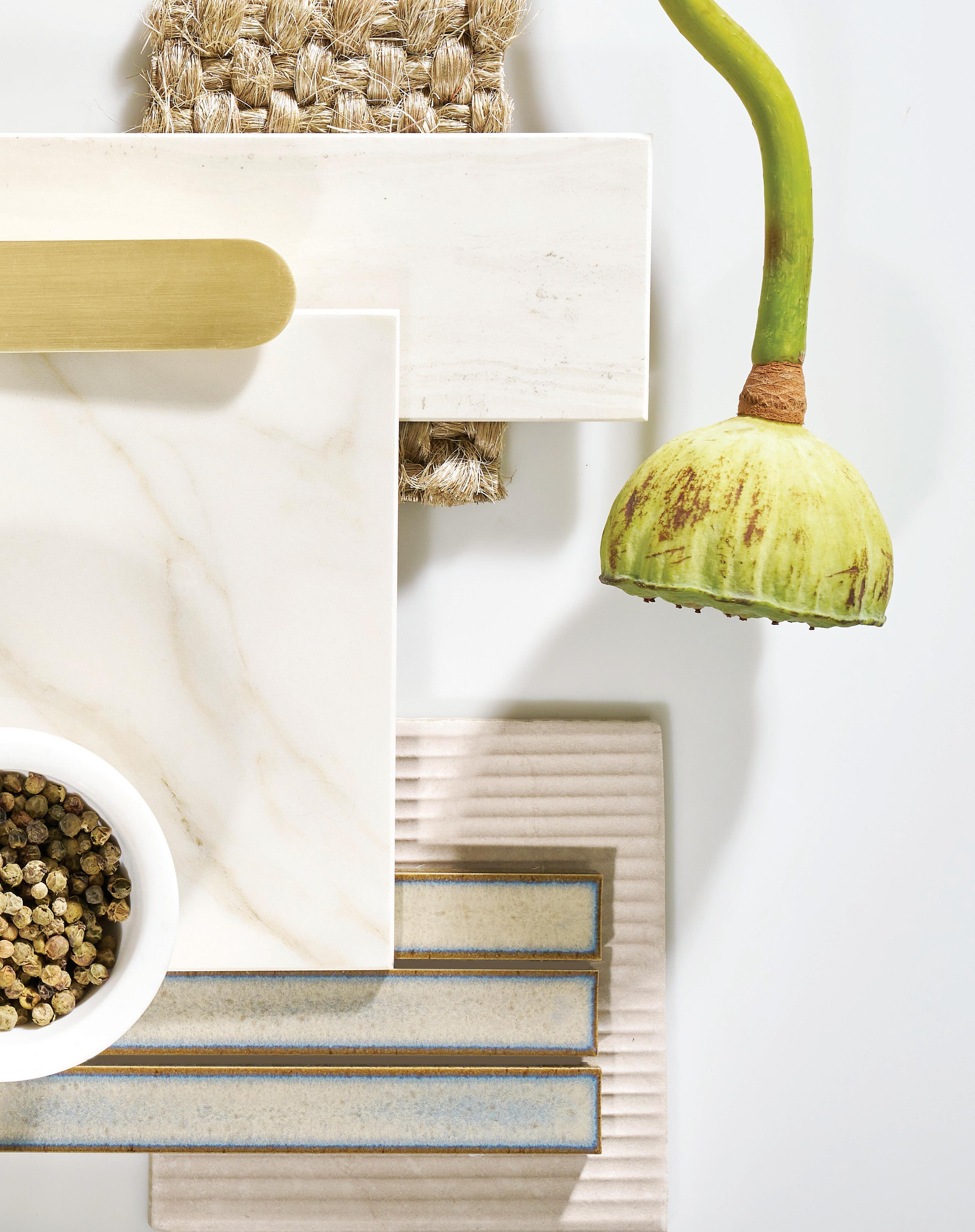
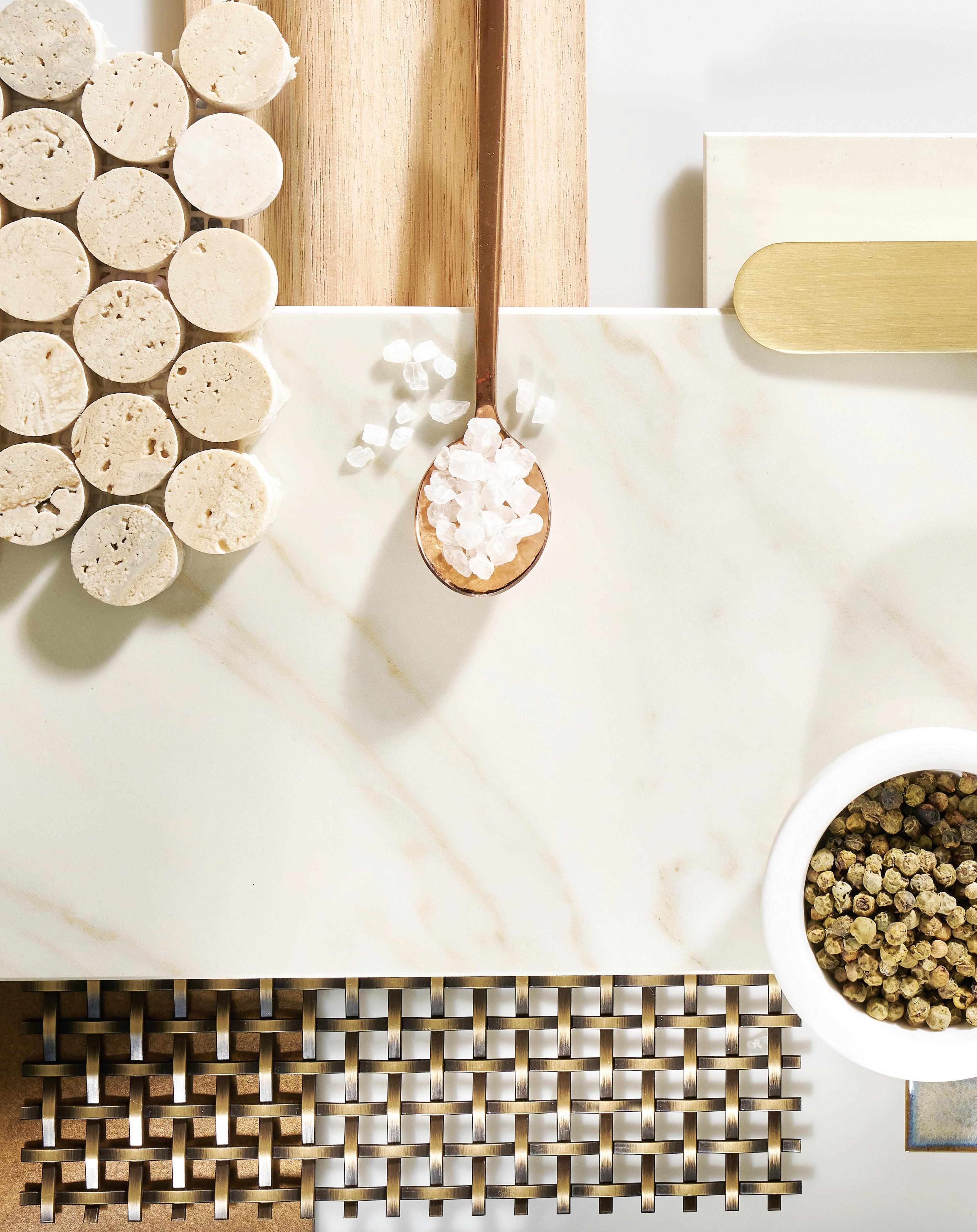 Words Juliet Taylor Photography Tim Robinson Stylist Briellyn Turton
Preservation is a cornerstone of the Neolith identity. From protecting the integrity of natural designs to protecting the physical environment from further pollution, Neolith guardians all things beautiful, functional and essential. Its commitment to the natural world shines through every aspect of its operations – from practice through to design. Ever-inspired by the beauty of nature, Neolith’s designs aim to preserve the integrity of the organic environment and reintroduce a little wildness into homes around the world. Furthering this vision, its products are made from 100 per cent natural materials and are manufactured in carbonneutral conditions.
Enter, the Neolith Classtone Collection
Neolith is proud to introduce The New Classtone Collection: a striking collection of eight new models which adds flair, beauty and breathtaking elegance to its best-selling predecessor collection. The New Classtone Collection was created specifically for Australian clients as a part of Neolith’s ongoing campaign to extend its APAC operations. Each model in the collection has its own distinct pattern and colour, ready to blend perfectly with any
designer’s palette, and each model is embedded with revolutionary NeoEAT technology.
Every design in the collection is ultra-hygienic, lightweight, waterproof, scratch resistant, easy to clean, bend resistant, UV and high traffic resistant, all natural, and 100 per cent recyclable. Above all else, however, it is eternally beautiful. To explore the New Classtone Collection further is to discover what exactly makes it the perfect choice for your next project.
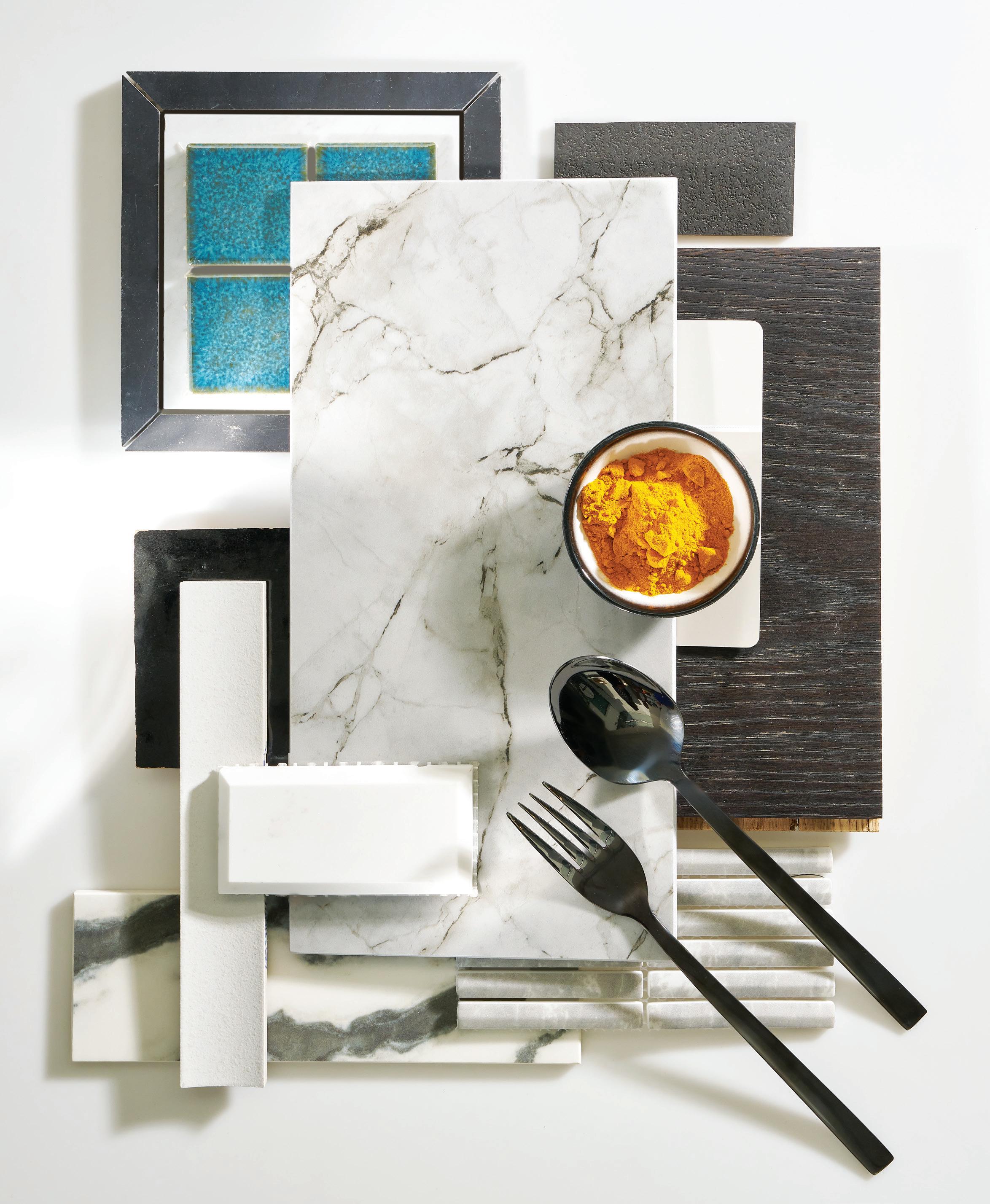
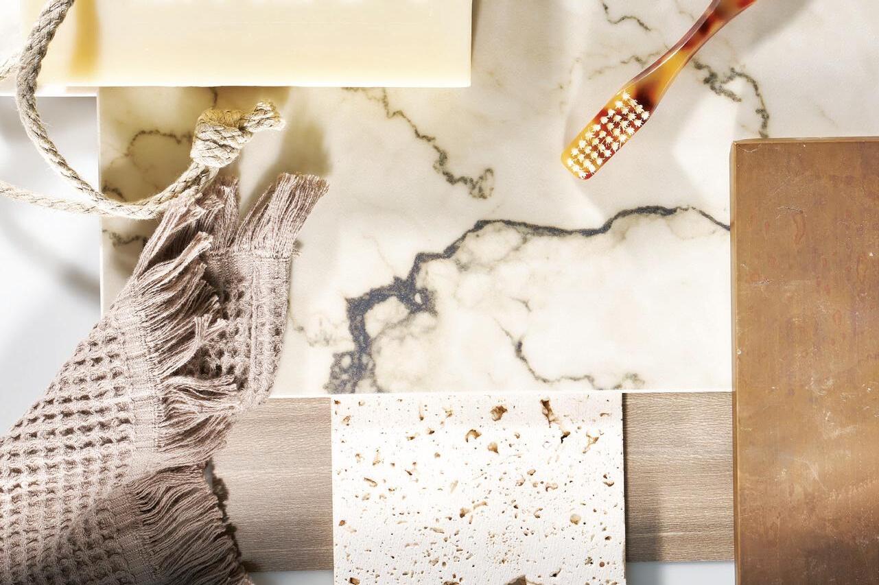
A recent collaboration with Studio Brie saw the interior design studio embrace the flexibility of the Classtone Collection through a series of stunning moodboards that reveal the impressive array of styles and aesthetics that can come together to create surface magic. The resulting collection of moodboards, captured to beautiful effect and featured here in this article, are a source of inspiration, and a functional base, for many incredible kitchen and bathroom schemes.
“The idea was to create schemes that were a mix of styles and concepts that our clients are currently gravitating towards, and also some schemes that were a bit more playful and experimental,” says Briellyn Turton, founder of Studio Brie.
Neolith’s Classtone Collection embodies its commitment to the unique beauty of the natural environment.
With so much depth and beauty to the collection, Turton acknowledges that choosing a favourite moodboard is a hard task. Elegant kitchen schemes using Calista, Arabesque, Alexandra and Calacatta Royale are luxury incarnate, while the moodiness of Colorado Dunes and San Simone in bathroom designs create a sense of mystery and power which is sure to enchant.
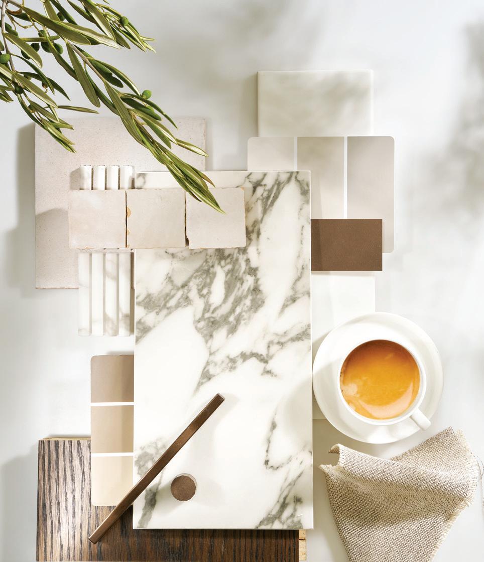
Turton’s own favourite moodboard changed many times throughout the process of working with Neolith, as some of the moodboards “came to life at the shoot”, while others made strong impressions during the planning phase. Turton particularly appreciates the tonal nature of Colorado Dunes, as well as the textures and array of greens within the Calista palette.
“Performance and durability are obviously number one. [Neolith] is absolutely life-proof and when clients are making such a large investment in their home build or renovation it’s great to be able to assure them that their kitchen countertop is going to last the test of time,” says Turton.
“Another huge draw card for me is that Neolith is a carbon neutral product. Our studio is always interested in learning about ways we can design more thoughtfully and it’s becoming increasingly important to our clients as well,” she says.
The Neolith legacy, founded in sintered stone Borne over a decade ago from a passion for artistry and the natural environment, Neolith has quickly become a world leader in the production and development of sintered stone. It is an environmentally friendly alternative to the pollution-heavy extraction process which procures natural stone such as marble and granite. It gives discarded products a second life through the recycling process and, as a result, holds a much stronger composition than natural stone, making it impervious to heat, scratching, staining and absorption.
Sintered stone is built to last. With all of the beauty of natural stone and none of its limitations, Neolith surfaces are backed by cutting-edge technology which can protect indoor and outdoor spaces against water, scratches, stains, heat, impact, and even UV radiation. It is also hard-wearing, non-porous, and highly-resistant – making it the ideal surface for a broad range of applications, from kitchen splashbacks to external façades and more.
The wealth of protections offered by sintered stone allow architects and designers to focus freely on the creative aspects of their work without the pressure to compromise aesthetic value for high performance practicality.
With all of the beauty of natural stone and none of its limitations, Neolith surfaces are backed by cutting-edge technology...

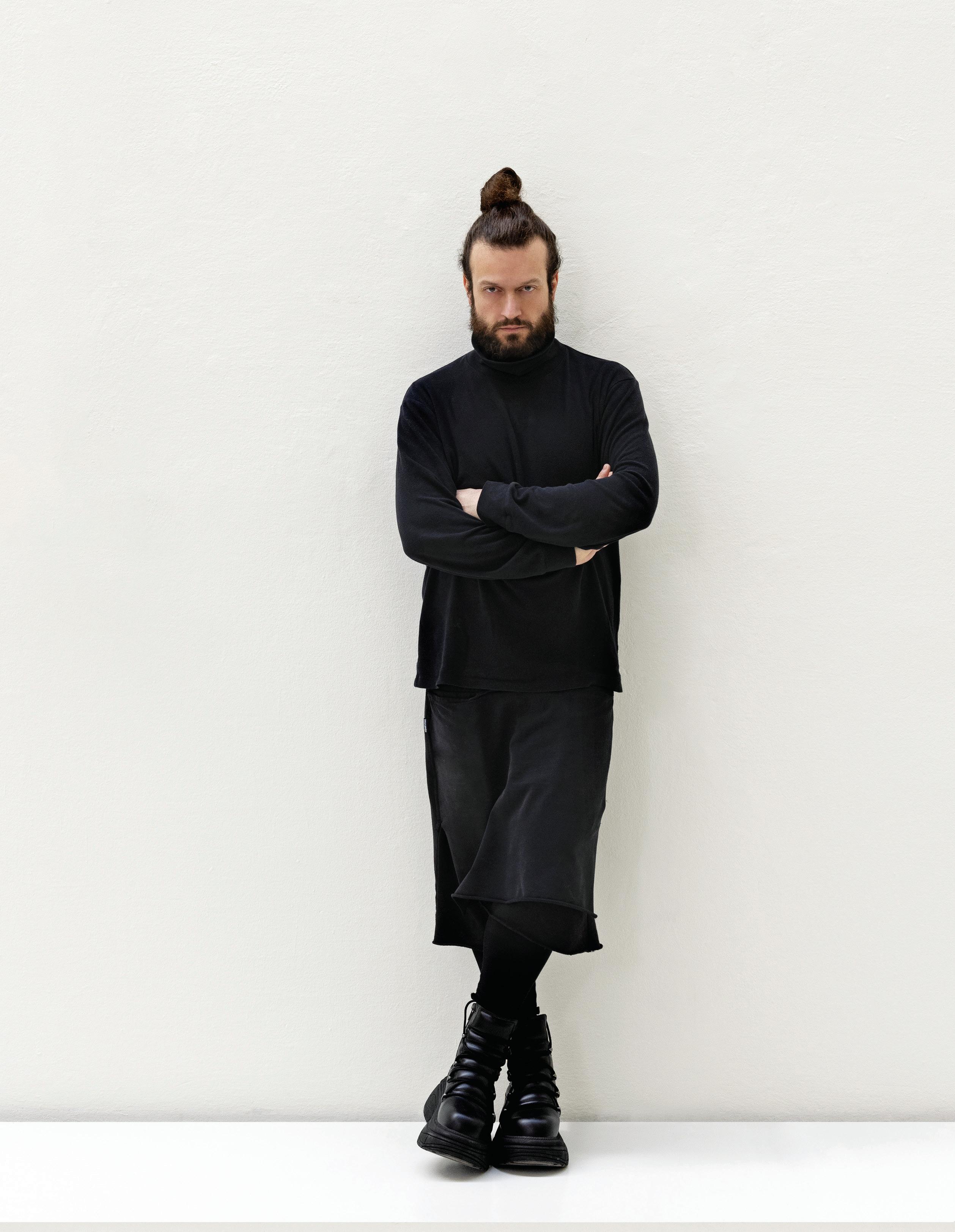
It’s sometimes said that there is no better designer than nature – and, marvelling at the pattern of grain in timber or the hypnotic swirl of the veining in marble, it’s an easy argument to make. This natural beauty is the driver behind the idiosyncratic vision of Milanese artisan, Henry Timi, who has built his practice HENRYTIMI on exploring and celebrating singular natural materials, emphasising their inherent character through geometric purity of form.
“HENRYTIMI is a universe of truth based on the relationship between form and nature, and a real culture of know-how is embedded in our daily work,” explains Timi. “The precious craft techniques – every grain of timber, split in the stone, or metallic reflection – is an education of the mind towards history. It is capturing the rigour of mother nature.”
Timi’s poetic way of expressing his vision offers dynamic contrast with the striking reductionism of his artistic output. In a way, this can be likened to the balance found between the natural vibrancy of the material palette and his minimalist forms.
Perhaps the best way to understand the world of HENRYTIMI, however, is to explore Timi’s own home and gallery in the elegant and creative Brera neighbourhood of Milan. The interior of the early 20 th century former laboratory building has been almost
entirely stripped back and every surface skimmed with a fine layer of clay to create a gallery-like backdrop for the furnishings, all of which are designed by Timi himself.
Every aspect of the home is a study in minimalism and visual reduction: doors are stripped back to their most primitive form; tall archways take the place of walls to create a visually open plan; the kitchen island and bathroom vanities are monolithic sculptures hewn from stone; and even the bookshelves are concealed behind split-face stone panels.
These same qualities define the HENRYTIMI collection. Armchairs are constructed from slabs of raw material that challenge conventional – and visually comfortable – proportions; tables are assemblages of balanced geometric forms that evoke ancient architecture; and cabinets and consoles are a study in sculptural minimalism designed to conceal anything that might interrupt the precision of Timi’s vision.
While these strikingly reduced forms might appear simple, each one draws complex meaning from the material elements of its composition. The HT313 Sfera table, for example, comprises a perfect disc balanced atop a sphere of solid oak. Each part is skilfully crafted from solid timber, with the geometry emphasising the character and grain of the material.
In the hands of Henry Timi, materials ooze with natural charisma and objects conceal clever commodity within precise minimalism. This is the HENRYTIMI universe of truth.
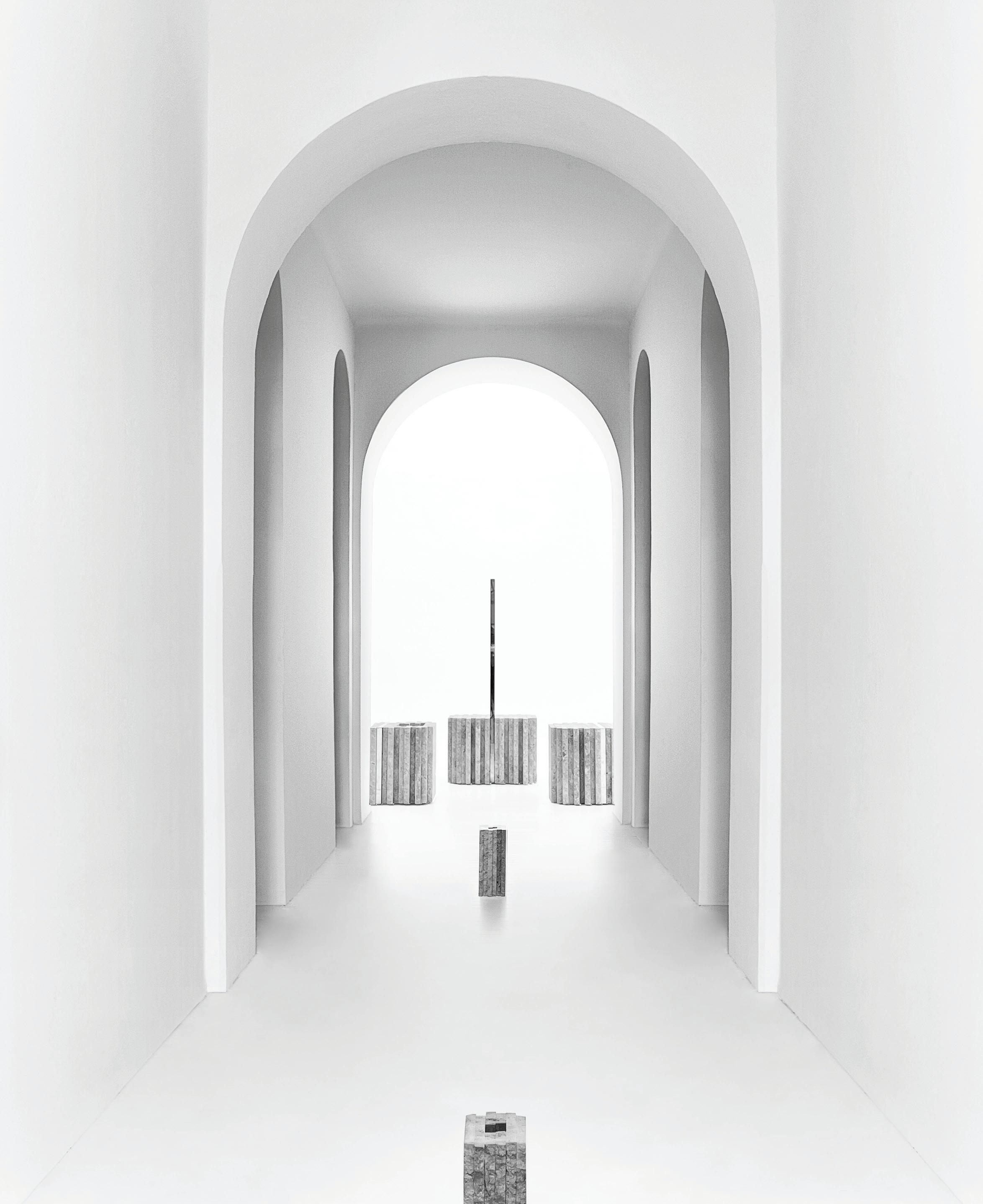
Eloquent Reductionism
The rugged fluted surfaces and precisely staggered table bases of the D UOMO collection echo the silhouette of the Duomo di Milan.
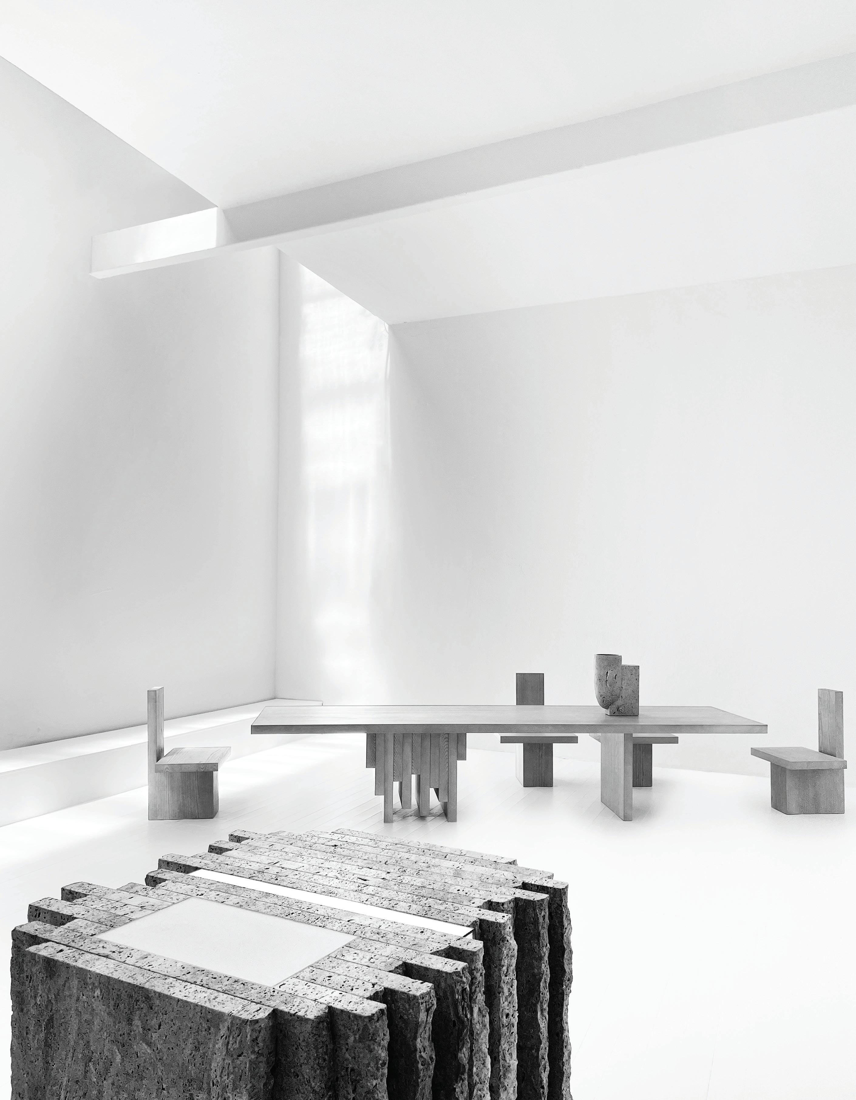
Stone is another of Timi’s favoured materials, one that is celebrated in the HT657 Roccia kitchen collection. Here, what appears to be a solid block of nerofossile stone with contrasting polished and rough-hewn surfaces is actually a kitchen island with concealed storage, defined by nuances of light and shadow. Collections like this, which reimagine the potential of furniture and elevate it above its utilitarian functionality, have cemented Timi’s reputation and won him clients around the world.
Timi also finds inspiration in architectural forms – both ancient and modern. The D UOMO collection that launched at the 2022 edition of Milan’s design week is a case in point, with the rugged fluted surface of the travertine kitchen islands and precisely staggered table bases echoing the dramatic silhouette of the iconic Duomo di Milan.
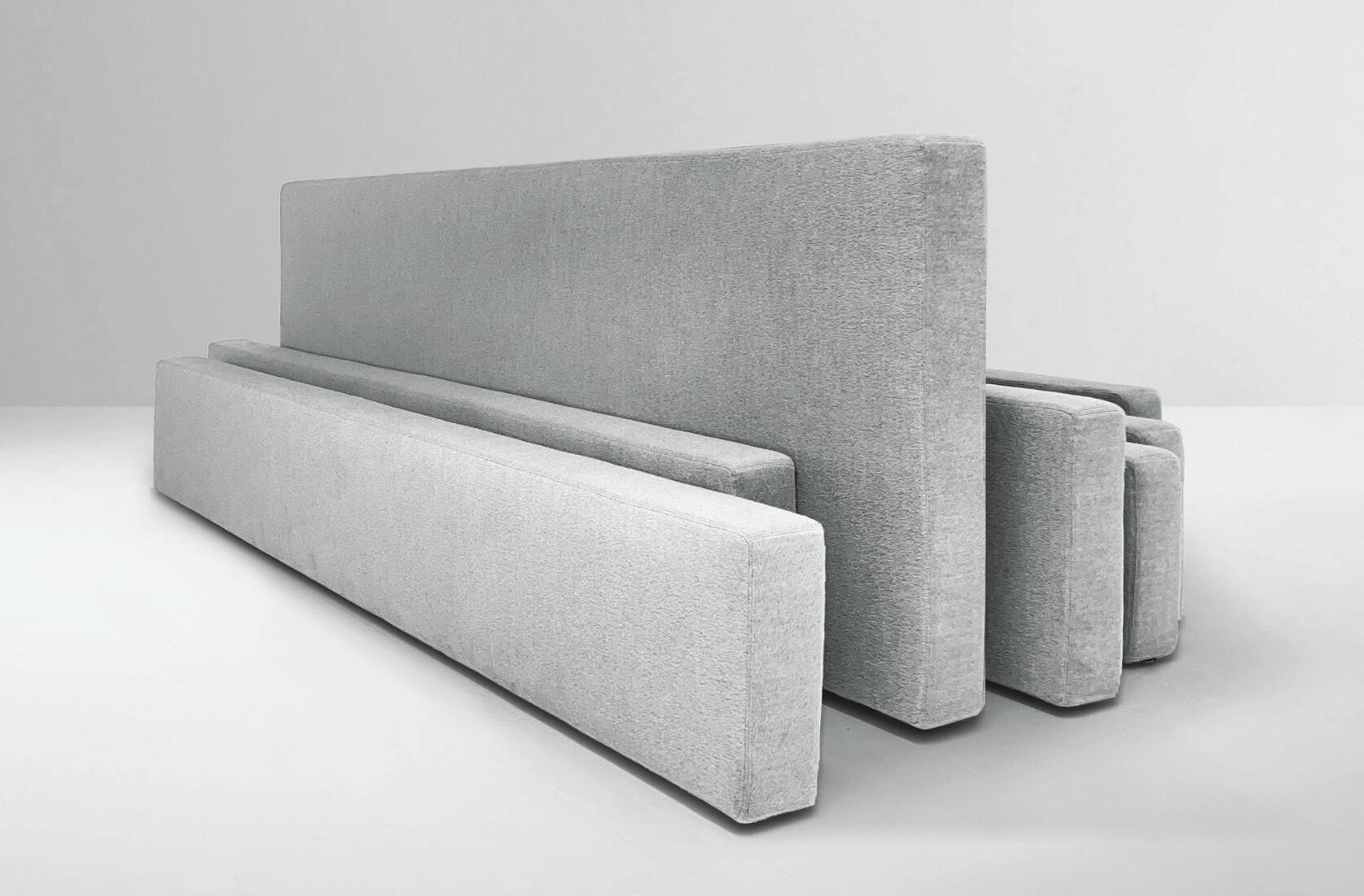
“Each project has a constant awareness or cultural background that ranges from archaeology to monumental architecture – like subdued ancient artefacts in the light of a new gaze,” explains Timi. “The shapes and profiles evoke sculptural and structural details to
create minimal works with a pure beauty in the harmony between history and innovation.”
In order to achieve this fine balance between the raw essence of a material and purity of form, it’s essential that Timi is intimately involved in the production process. HENRYTIMI has its own factory in Corridonia, five hours drive from Milan – a location poetically described by Timi as “the heart of HENRYTIMI in the landscape of Leopardi’s memory” – where the work is produced by the hand of skilled artisans.
“We are focused on production so we can control every detail of the whole project and I work on site with my artisans to realise the artworks,” says Timi. “HENRYTIMI is a brand that celebrates a minimal and methodical philosophy that treats materials with respect. I want to share these values and each collection is a part of my soul.”
henrytimi.com

Patrick Keane dovetails artisanal cra s with digital fabrication to produce sustainable projects at a substantial scale.
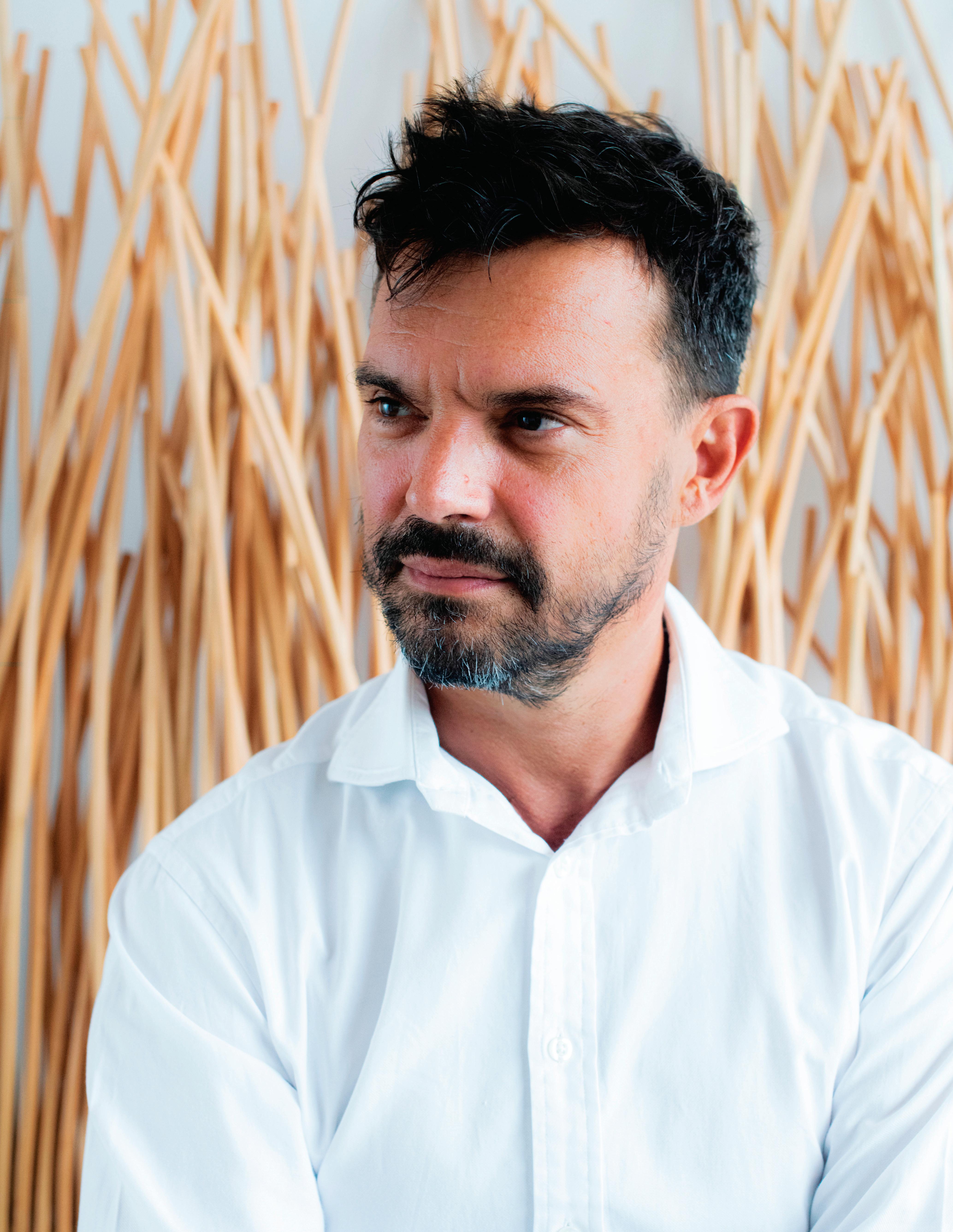
Patrick Keane is anything but traditional, so to hear him admit he has an overtly conservative approach to living life seems curious. This could defi nitely use some clarifying and thankfully he can explain. “I met Frank Gehry once and to this day, I think he’s the most conservative person I’ve ever met, but such conservatism is not to be underrated,” Keane begins, in his characteristically thoughtful, articulate way. “You concentrate so hard on creative endeavours, it seems intelligent when you’re winding down to have a conservative approach to, say, what you eat for dinner. It just helps to switch the brain o .” For someone who has pre y much always worked – and will continue to work – in full-steam-ahead mode, this makes plenty of sense.
Born in Nairobi, Keane studied environmental design at the University of Western Australia before graduating with a Master’s in Architecture from Princeton University. He worked in New York for a couple of fi rms, namely Steven Holl Architects and Eisenman Architects, before returning to Australia, where he founded Enter Projects in 2005. Fast forward to early 2018 and Keane moved to Phuket (where he is currently based) a er securing more work in South East Asia, renaming his practice Enter Projects Asia, which now boasts a 25-strong team across two o ces.
It’s a richly international background that’s contributed to Keane’s informed world view. But it was an experience from high school that fi rst got him thinking about a career in architecture. Every Tuesday, his class would tour buildings of historic interest and it made the teenage Keane reflect on their structure. It also allowed him the opportunity to understand how framing works and how one could translate such knowledge into creative outcomes. This laid the foundation for a practice built on ideas resolved through geometry, melding together digital technologies and natural materials.
Indeed, Enter Projects Asia is widely recognised for dovetailing artisanal arts and cra s with digital fabrication. Keane and his team also build models rather than relying heavily on plans, sections and elevations, and they have developed streamlined processes in order to minimise the time it takes to deliver projects. At the heart of the business is a commitment to sustainability, which Keane has long been passionate about. As he sees it, “architecture is meant to represent shelter or some sort of stability, but I think with the post-COVID era of design, we need to review that. And we especially need to review it from an environmental standpoint, in regards to levels of wastage and material excess, which is essentially what our work is a statement about.”



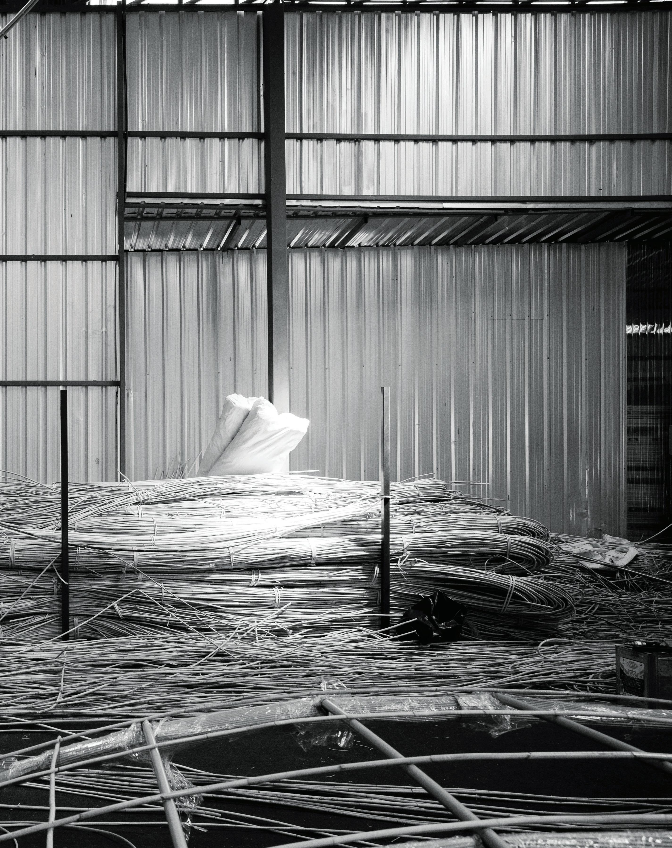
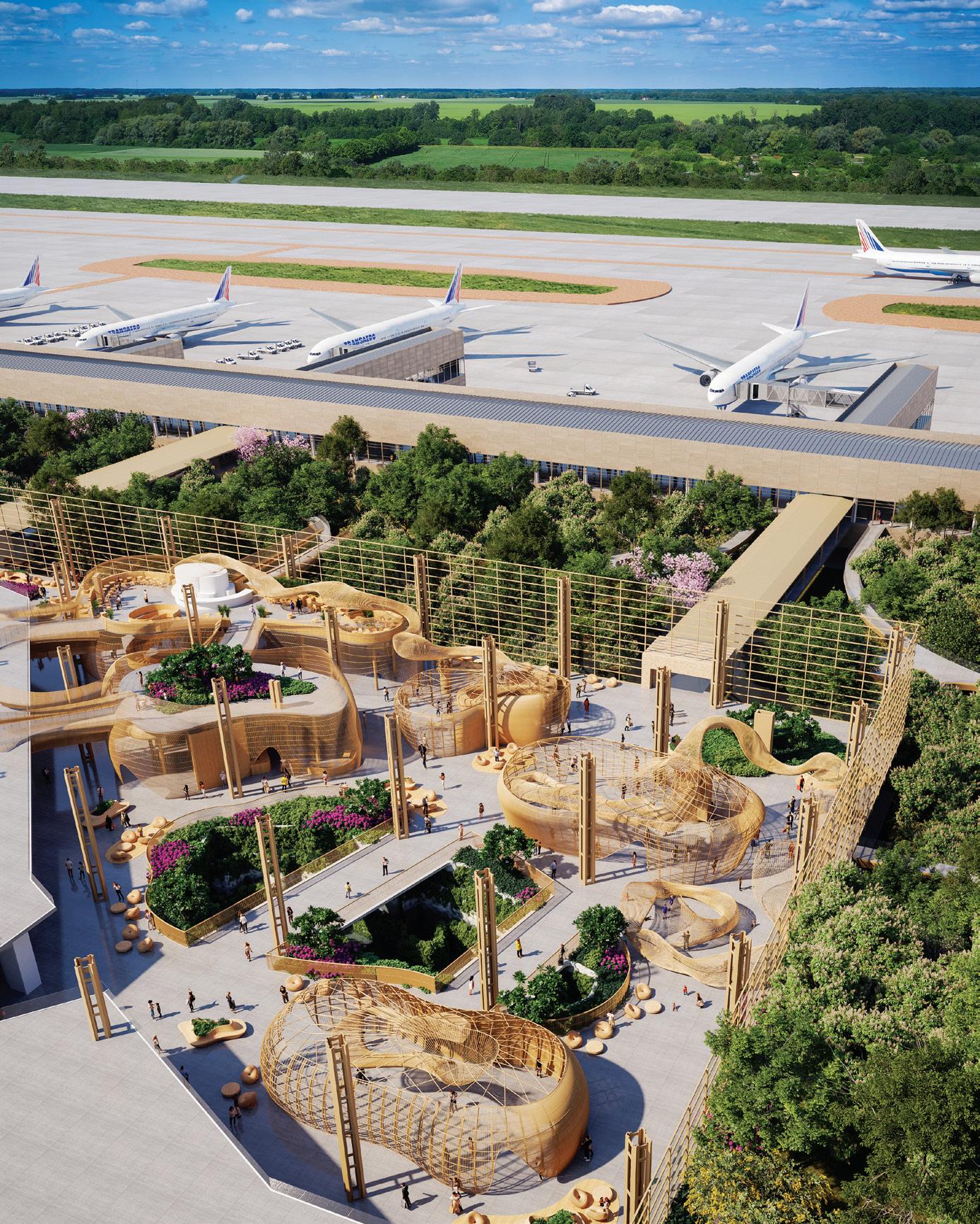
The new Bangkok Factory has been purpose built to facilitate assembly of pods for the new Terminal 2 at Bangalore Airport.

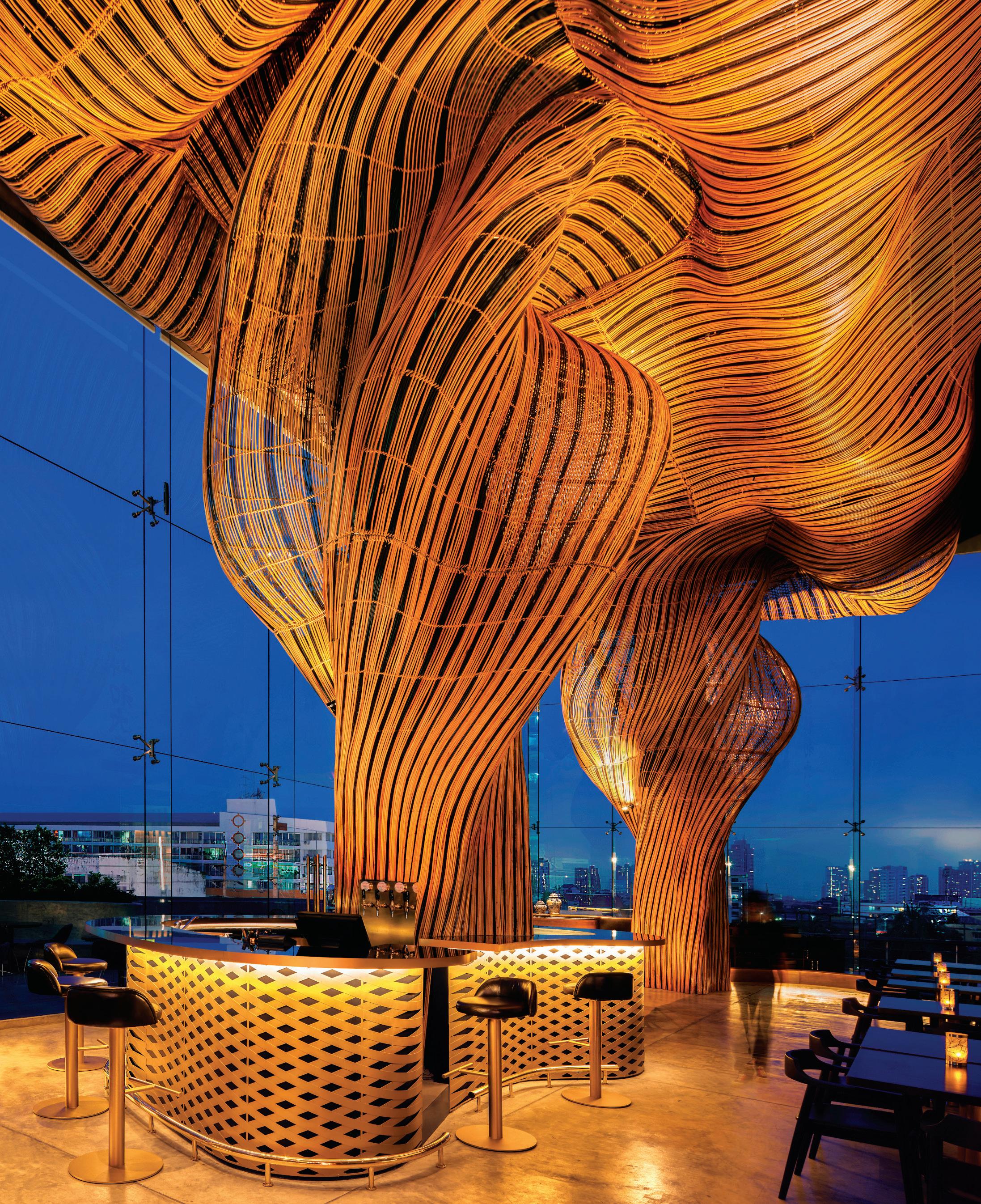
It should come as no surprise then that nature is where Keane draws his inspiration for a body of work that is strongly organic in form. “Our practice is about taking raw materials and turning them into structural solutions for the built environment,” he continues. “It’s also about bringing people closer to the natural environment – that’s our big push – and doing that through structural systems we find in nature, along with raw materials.” Living in Phuket certainly provides ample natural inspiration and it’s been the small things, like the time Keane found a piece of coral washed up on shore, that help to formulate the big-picture creative vision for his projects.
Perhaps the practice’s most well-known project to date is Vikasa, a yoga studio completed in 2019. Keane and his team worked with approximately 40 local craftspeople to fabricate key elements of the design, using traditional techniques sometimes handed down over
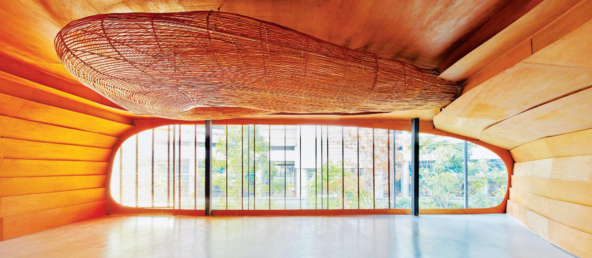
more than five generations. The project itself was awarded Dezeen’s Wellness and Leisure Interior 2020, but it’s also notable for serving as a springboard for a whole new initiative.
Those same craftspeople who collaborated on Vikasa struggled during lockdown, with their livelihoods threatened and traditional skills in danger of becoming extinct. Keane founded Project Rattan to employ these trained artisans, ensuring ongoing work and the longevity of their craft. “Our biggest threat or competition is the importation of inferior plastic products that are catastrophic to the environment,” he says, reflecting on the local market’s current milieu. “So developing our designs and having whole arts and crafts communities come together to fabricate those pieces and elements for us has definitely been one of our greatest achievements as a practice.”
Another achievement is the work Enter Projects Asia is undertaking, in collaboration with Skidmore, Owings & Merrill, on the new airport in Bangalore. Keane and his team is responsible for the design of approximately 10,000 square metres of breakout space, which will take the form of a huge internal garden dotted with a series of domes and pods. The practice is also working with some big-name brands on upcoming projects, including Delta Airlines and Banyan Tree. Keane believes anyone is only as good as their last project and so continues to remain committed to upholding design standards, retaining originality and maintaining relevance in today’s marketplace. This focus on originality is an interesting one as it counts as another of his passions. The practice doesn’t use the internet in its design process, instead beginning everything with a blank piece of paper in trying to produce designs that are as original as possible.
Looking back, is there anything Keane would have done differently? “Oh yes, absolutely,” he smiles. “In hindsight, act a bit faster on things, work with instinct more and don’t be too afraid of losing work or of expressing yourself – that’s important because you only live once.”
Keane’s clear success is in running a grassroots sustainable company that produces outstanding projects at substantial scale, and while this may very well be his legacy, his compassion also resonates. At his core he is a designer who believes in the need for rejuvenation and regeneration and in creating better places for all people to live, work and play in.
enterprojects.net, projectrattan.asia


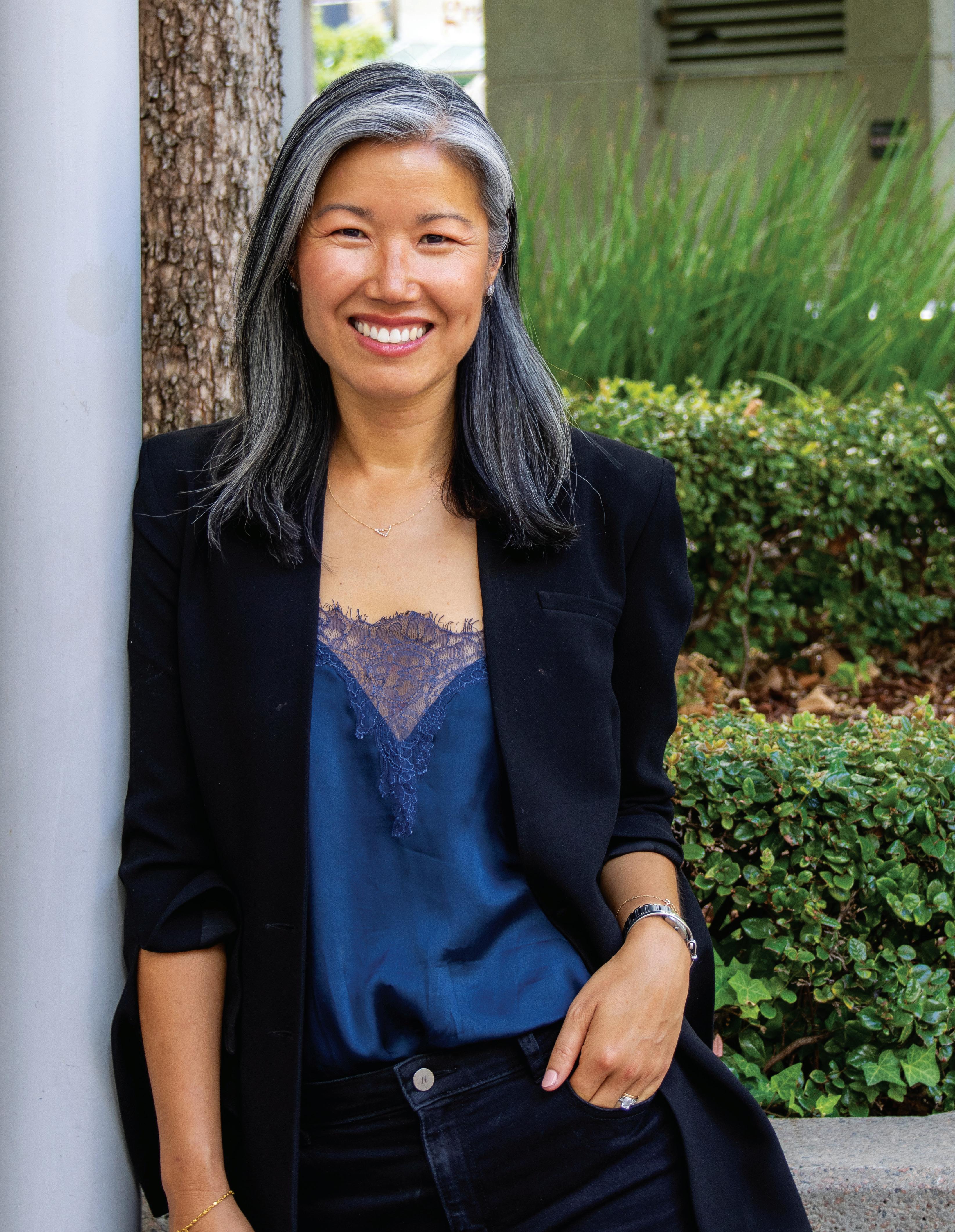 Words Gillian Serisier Portrait Photography Erin Paterson
For Eva Sue, there has never been a five-year plan. Instead she has followed chance encounters and opportunities as they have presented themselves, or, more accurately, where they have offered the solid pairing of suiting both her skillset and passion.
Having switched from landscape architecture to architecture mid-way through her degree, she took two years off to travel around Europe and ended up in London, where she was introduced to Woods Bagot. “It was a chance introduction, but an immediate fit,” says Sue, who worked back and forth between Perth and London Woods Bagot studios throughout her masters degree.
On graduation she joined the London studio where she was thrown into the deep end of resort masterplanning, hotel interiors and residential interiors. One of her first projects was a former sugarcane plantation in Mauritius. “It was really asking, after the farming life, what could this piece of land be? How could we draw on the existing assets and repurpose it into something amazing that will change the way that people could connect with the land and the island for future generations.”
Moreover, it prompted in Sue a deep understanding of how the design narrative informs the surrounding platforms of hospitality.
“It was attractive blue-sky thinking that considered future users and guest demographics, explored the local culture, heritage and vernacular, considered the climate and the natural qualities of the landscape to preserve character, and defined an authentic sense of place,” says Sue.
Returning to Woods Bagot’s Perth studio in 2012, those skills have informed her role in harnessing and translating the client vision into an elevated brand experience that unlocks the value of the site or property. From this premise she is able to extrapolate the community connection or emotional weight that is needed to add value to her clients’ projects. “It is about understanding trends, but also operational fluency, business opportunities and contributing to the broader community. What they’re seeing is a live feed, it’s dynamic, so you need to adopt hospitality innovations as they are happening.”
Sue understands that clients are gathering information on myriad issues from supply chain to shifting business drivers or external factors influencing their business: “You move that intelligence into each project to create spaces that people enjoy spending time in and the social outcome of a restaurant or bar when it works is really special and makes people happy.”
When people feel happy in a space, Woods Bagot principal Eva Sue knows she’s done her job well. Her architecture and interior design expertise makes her a potent force when matched with complex, ambitious hospitality projects.
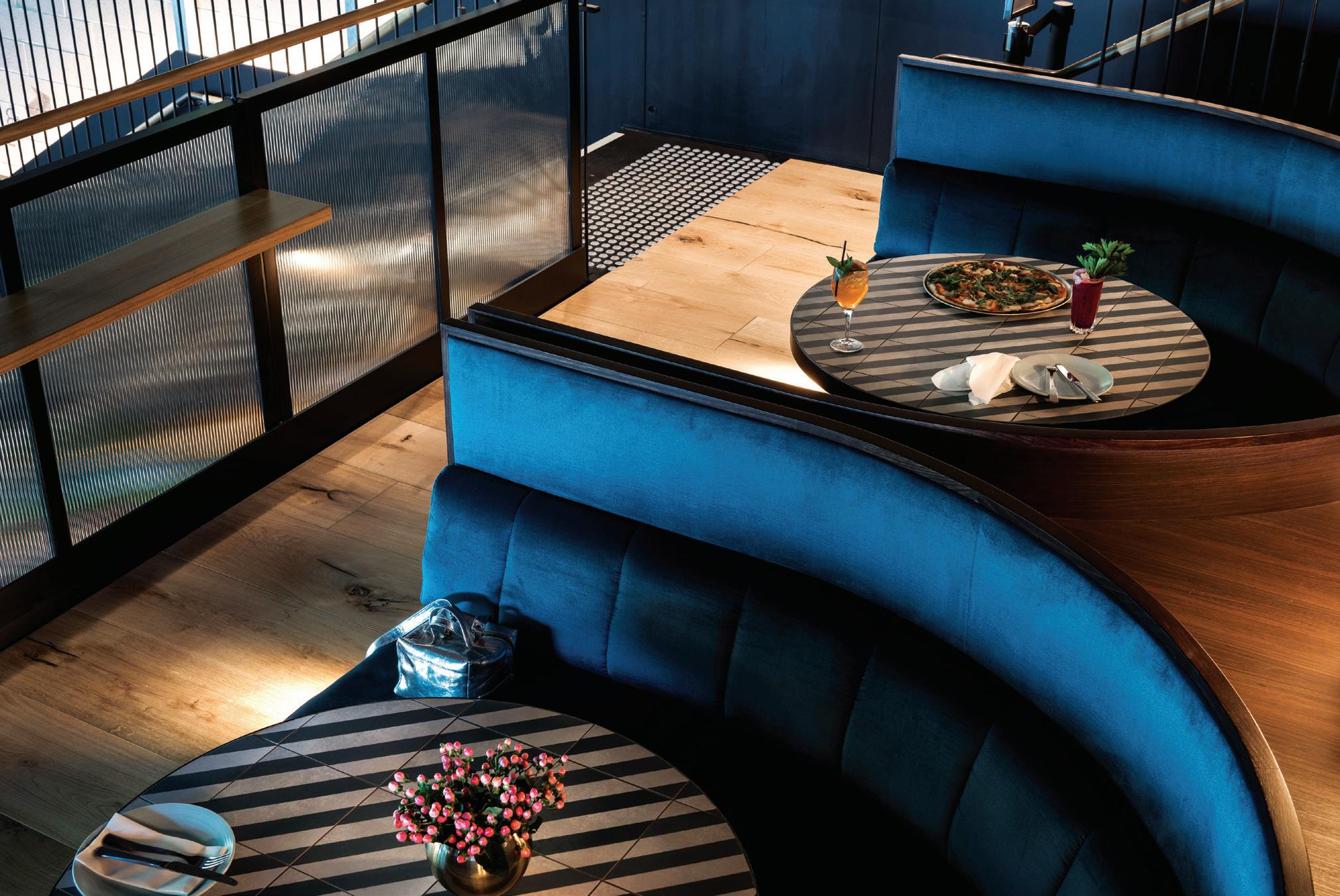
“We saw the value was to really bring back the beautiful bones of the building, rather than designing something to cover it up,” says Eva Sue.


Hospitality, whether at the scale of a resort or café, allows scope for Sue’s particular ability to understand spaces and how they are used. For her, the interior/architecture equation has become increasingly integrated, as it should be. “I’m a registered architect, but I love the layering, texture and intimacy of interiors. When there’s an ability to manipulate the architecture to influence a greater holistic experience, that’s my sweet spot.”
With so much of Australia’s hospitality focused on the outdoor space, Sue’s first love – landscape architecture – may be a future path: “I love landscapes and the outdoors and how it contributes to the complexity and comfort in everything that we do and experience.” She believes that architecture is slowly moving into a new paradigm, enabling people and nature to coexist. “What my experience in landscape architecture taught me is that design
should work to reconnect us to the biosphere, not isolate us from it.”
Following the green lights rather than creating a five-year plan has worked well for Sue: “Every project still feels like a new and exciting challenge. I’m pretty open to see what comes next.”
Sue’s first advice to graduates is to understand that architecture or interiors can be long term careers but you don’t need to achieve everything in your first year, or even your first five years. Rather, she says, “build resilience, have patience, discover the joy of collaboration and be open to where it takes you. I’m lucky to be in that space where I love what I do. The studio culture suits me. And if it doesn’t, I can change it.”
woodsbagot.com























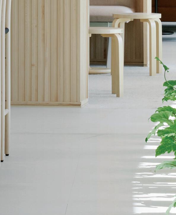

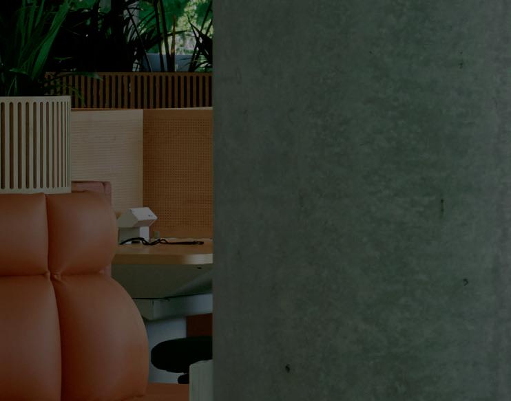
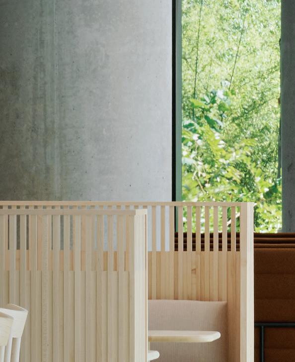


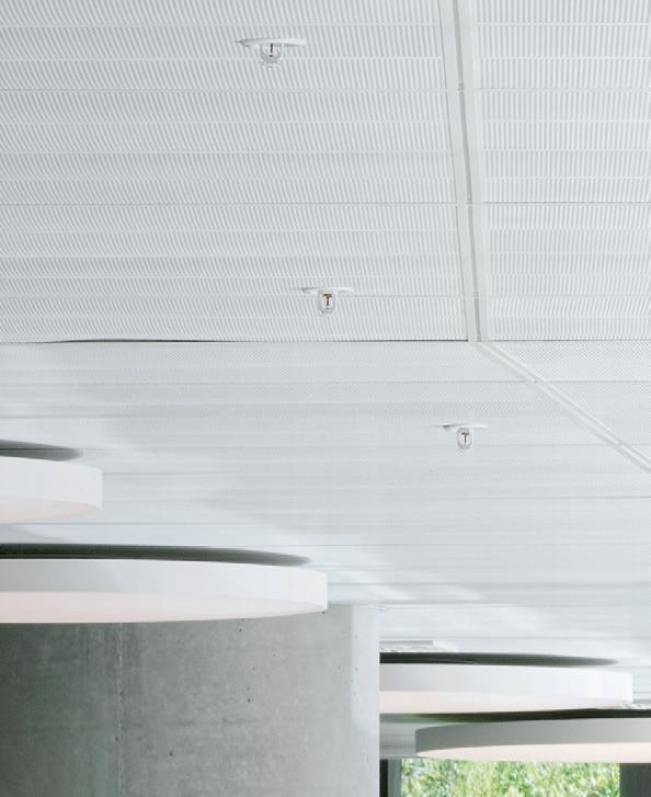


How do you create a magnetic workplace?
Darling Quarter South Building represents the cutting edge of workplace design. It’s collaborative, campus-like and defined by fluid connections.
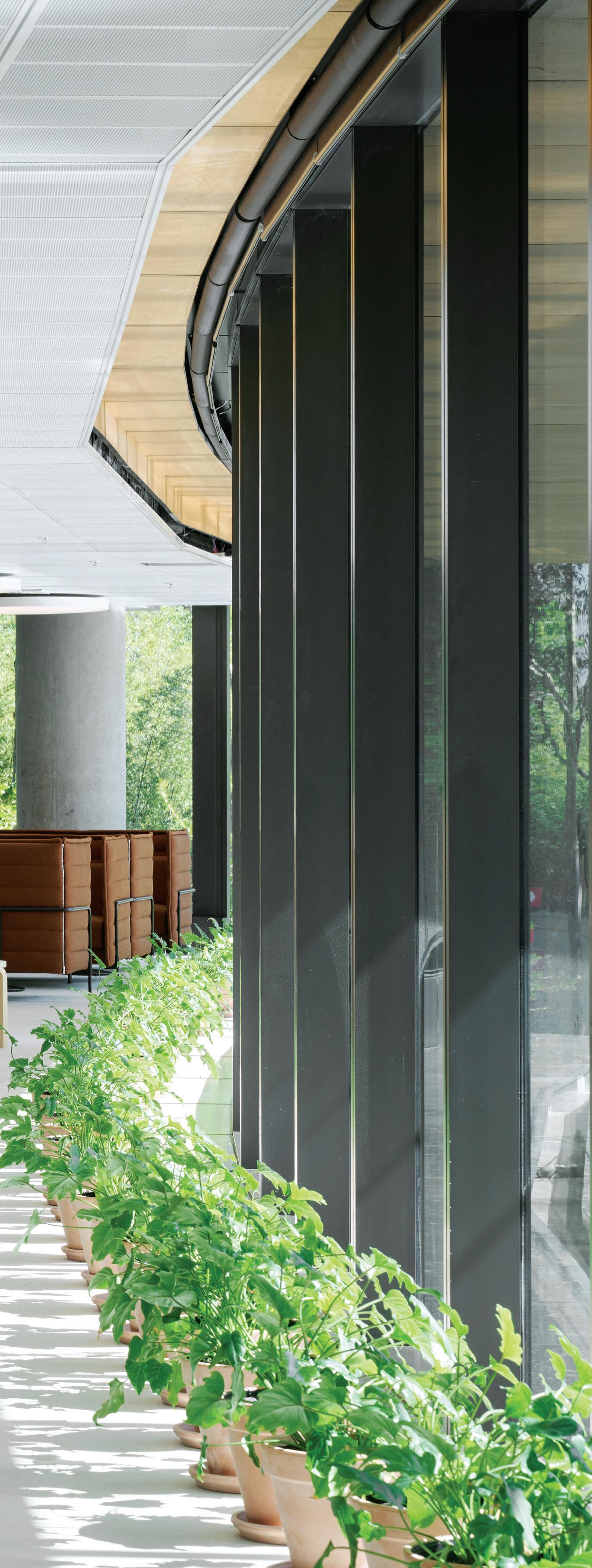
In 2012, fjmt won the office category at the World Architecture Festival for Darling Quarter, Sydney. In the space of just a decade – including, of course, the pandemic years – workplace design has evolved at such a rapid pace that it was time for a new fit-out to extend the architects’ original project of a campus-style, hybrid public place in the city. The spirit of a design that bridges public and private space continues in the form of a fully realised precinct comprising the Commonwealth Bank (CBA) head office alongside retail, dining and leisure facilities.
With hybrid, mixed-use design and extensive collaboration comes complexity. CBA’s Darling Quarter South Building, the primary client-facing office, is the structure in question and Hassell has been responsible for designing the internal workplace fit-out. Meanwhile, Hammond Studio conducted the interior architecture of the lobby area. If that’s momentarily confusing, take solace in the fact that both studios’ project leads, David Whittaker and Todd Hammond, respectively worked together previously – surely not an irrelevant point in light of the frictionless overall design. Finally, Richards Stanisich acted as design consultants with a focus on placemaking and retail spaces. Real estate investment group Lendlease, on behalf of the building owners, tied it all together by bringing these parties into a creative and productive working relationship.
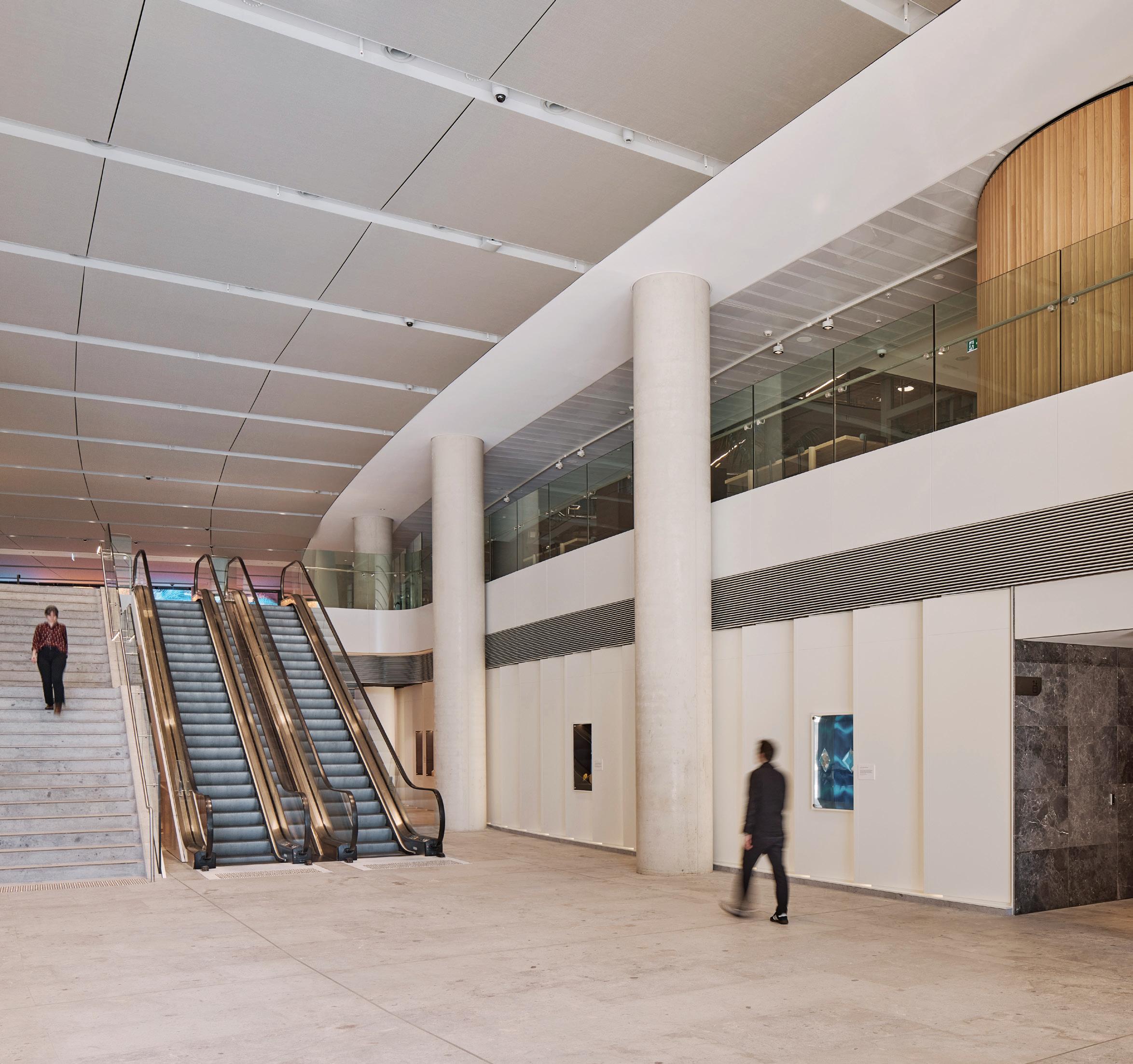
The lobby area is the focal point and the key threshold. As the main entrance, it’s the point where the multiple strands of precinct design meet: public and private, retail and office, CBD and Darling Harbour, road and park. As such, it required a bold yet sophisticated approach and one which connected the workplace with its wider surroundings. Teri Esra, construction and facilities manager at CBA, explains: “We’re very mindful of how this
whole precinct wouldn’t work with just us here. It needs to blend commercial with a huge amount of tourist and retail facilities and it’s important for us to actually be connected with the community at Darling Harbour.”
The crucial design move has been to open up the lobby spatially by removing mass, part of a collaborative approach in which Hammond and Hassell allowed ideas to move back and forth. Instead of the visitor being greeted with a secure line perpendicular to the axis of entrance, a café has been added and the concierge desk has been moved up a level and off to the side. As Hammond notes, it’s about creating “an extension of the public realm”.

Where, previously, the public space very quickly ran into an abrupt dividing line inside, the decisions to open up vertically and move the security line and concierge out of the immediate sightline have created a more fluid, inviting space. Public areas now blend and merge into the working spaces and, as such, the treatment here is emblematic of the whole precinct design ethos. The effect is further compounded through materiality: “Previously there was a strong contrast between inside and outside but now the natural stone floor blurs the line between interior and exterior,” explains Hammond, who was in charge of the lobby design.
The next stage in the visitor’s experience is perhaps the most architecturally striking with the passage up and through the lobby providing visual teasers of the atrium before the grand reveal. As Esra says, “Members of the public can now experience our atrium from the lobby, they can actually see up into our workplace and experience it from the outside.” Hassell’s consciousness of the whole journey – from outside, passing through the lobby and into the office – is an example of how a seamless and consistent spatial experience has been achieved. As Whittaker explains, “the compression point between lobby and atrium works well. You get a connection back to the concierge and the trees without feeling the road.”
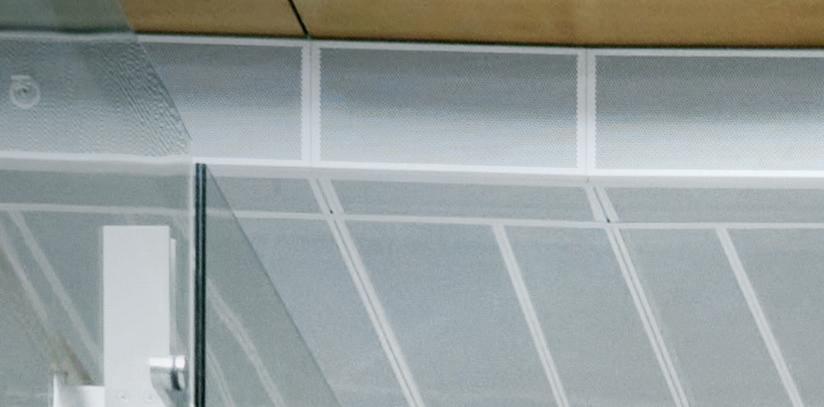
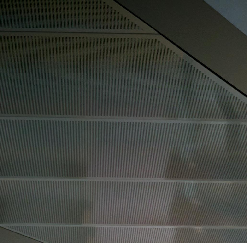
The atrium opens up views into each floor of workspace, while circulation routes around its edges create a sense of vitality and movement.
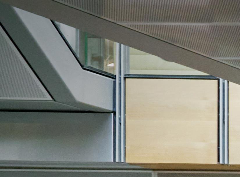
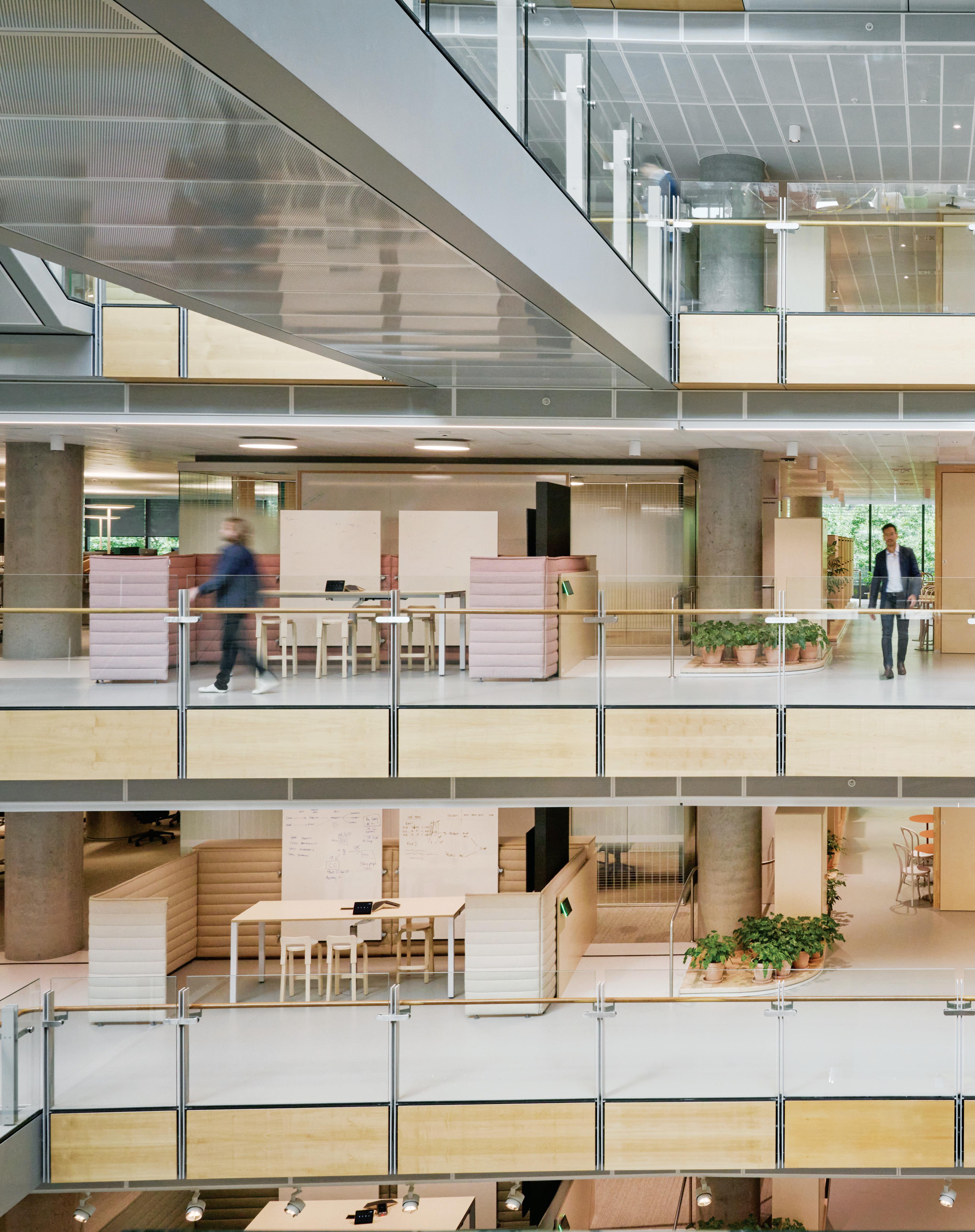
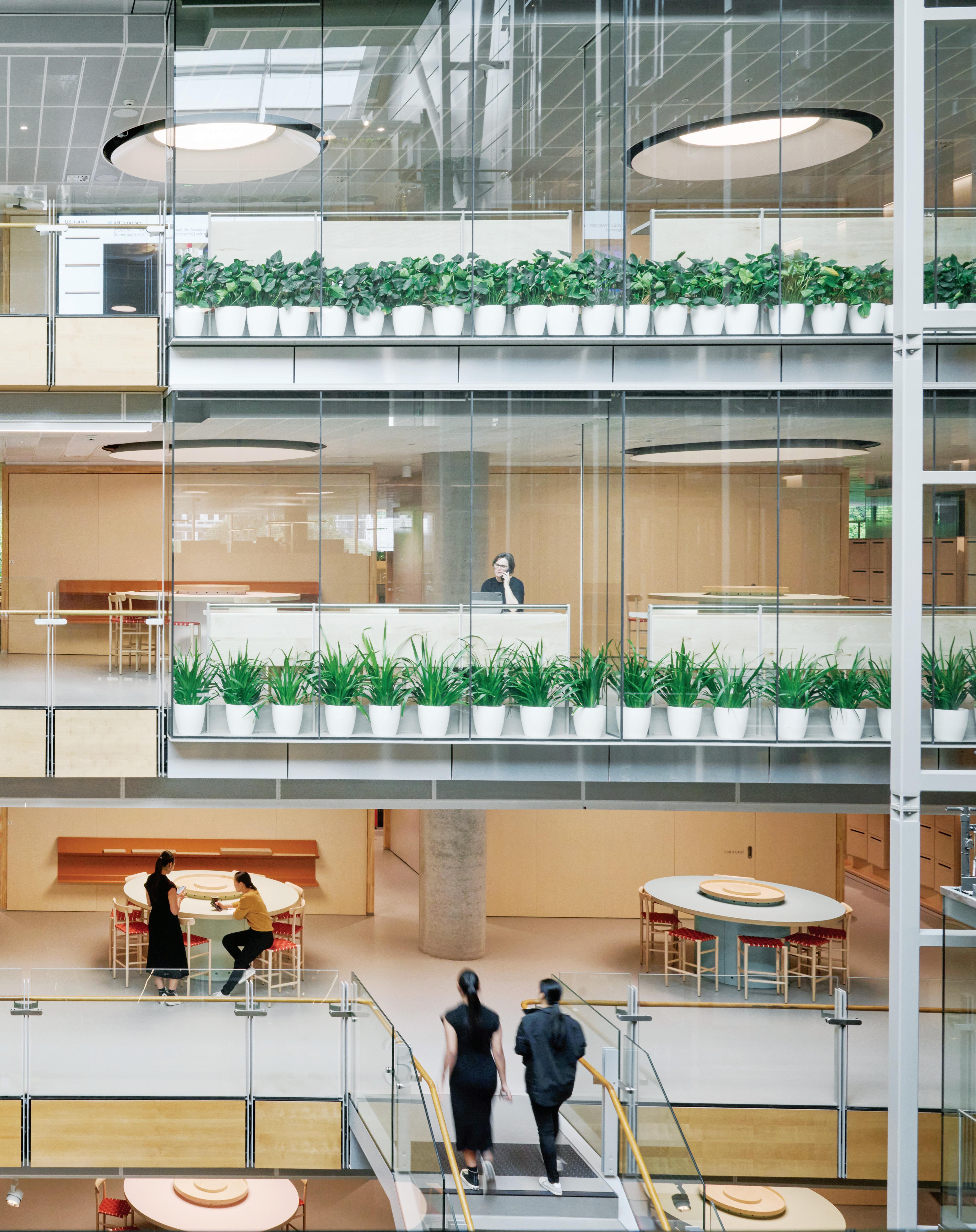

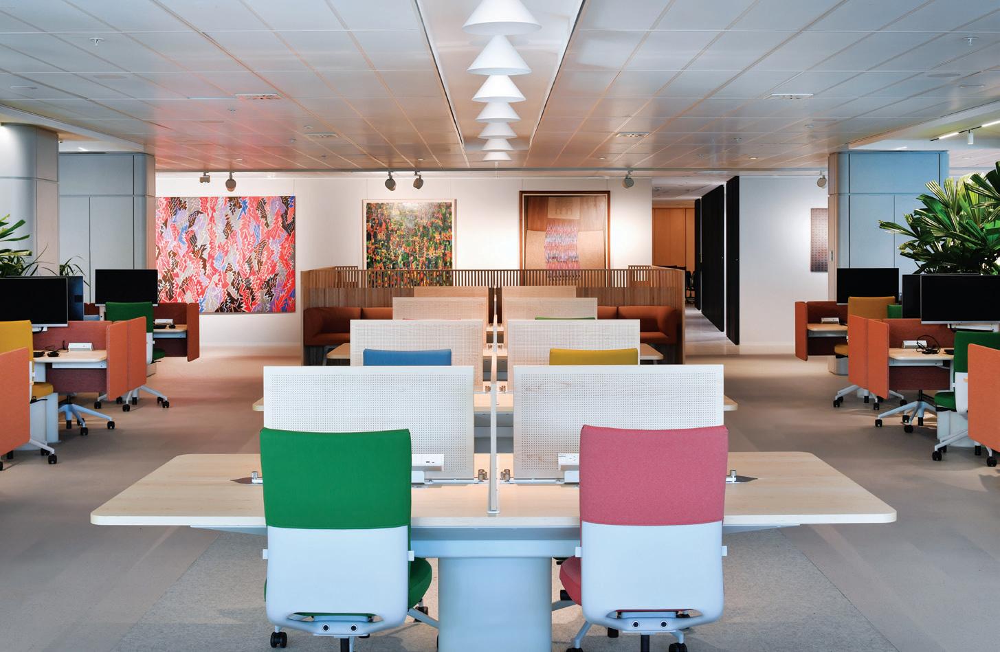
Inside the CBA office proper, the immediate sense is one of variety and movement. It is a hive of activity with people seemingly doing different things in very different spaces: some quiet and alone, others in small semi-private groups, and still more on the go across the wonderfully visible circulation routes wrapping around the atrium and even crossing it via some rather vertiginous bridges. Whittaker speaks of returning to fundamental principles for a space that echoes such traditional buildings as Sydney’s GPO. In fact, the design impetus for a workplace on this scale has evolved to draw more from urban planning principles than a fixed office archetype. “The whole initial concept with the client was really about urban planning. We mentioned Parisian boulevards and how repetition isn’t something to be scared of. We freed the columns and used the curve of the building so that people don’t get lost.”
Moving through the workplace, the lower atrium spaces provide a direct parallel to the ‘village green’. Meanwhile, ‘avenues’ of movement create a sense of dynamism. “Perhaps the most important thing we’ve done is to open circulation along the atrium. Previously, not only did you have to walk further but you would also miss out on seeing people move through the space,” says Whittaker. This is certainly not a static workplace. It is designed for fluidity: a variety of spaces ranging through degrees of privacy and formality, from casual booths adjacent to eating areas to subtly closed off meeting rooms. “The intent was definitely about varying the spaces for the work that you happen to be doing that day,” explains Esra. “Everything on the first level is collaborative and communal. Nothing is assigned to a particular person or team.” Similarly, spaces such as the central kitchen, which has been moved to share the fullwidth views over the park, provide a sense of inclusiveness.
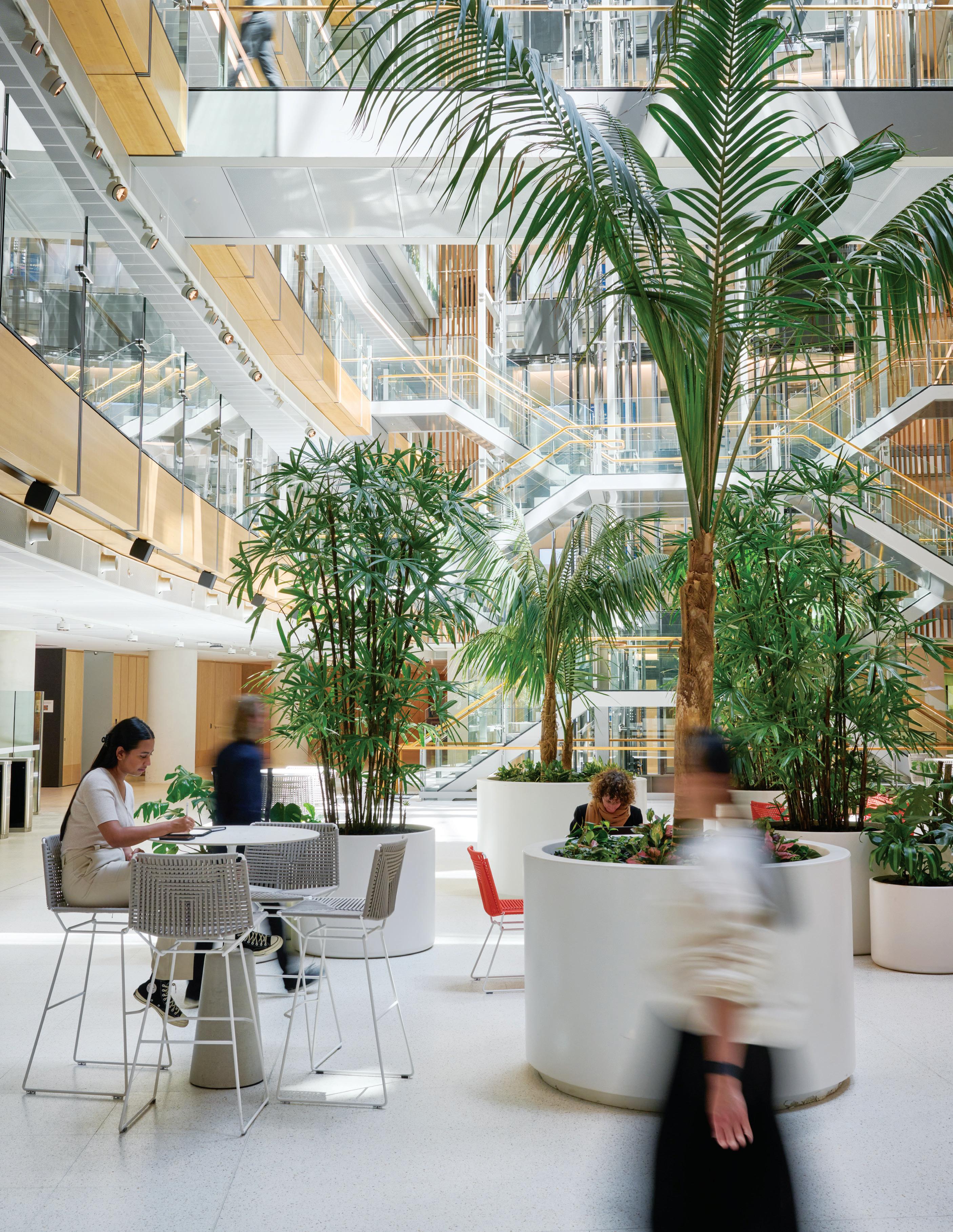
Stepping back outside, the public park and retail spaces are immediate reminders of why this project is more than just an office. As fjmt foresaw, a standard office on the site simply wouldn’t work. The mixed-use connections, drawing workers outside and welcoming visitors inside, are what create a holistic precinct atmosphere. As Kirsten Stanisich of Richards Stanisich, design consultants on the project, says, “Good retail design should always encapsulate urban planning ideas; bad urban planning principles can kill retail and vice versa.”
The South Building turns its back to the busy road on the CBD side and another important compression point is created in the narrowed passage from there into the open, green spaces of Darling Quarter. It’s a spatial narrative that echoes the one inside the office, a journey from busy, condensed space to open views over green parkland.
Flexible outdoor seating and retail spaces again soften the transition from public to private on the park side. “There’s an emphasis on accessibility and it’s about bringing it all together in a precinct; the strength is in its wholeness,” explains Stanisich.

Connections at all levels, adaptability in function, visibility in circulation – across all scales this is a project defined by openness, fluidity and hybridity. It’s about a workplace that allows for variety, but specifically a variety designed to make teams work and communal spaces matter. We don’t know what the cutting edge of workplace design will look like in another 10 years but the architects and designers here will likely shape it.
fjmtstudio.com, hammondstudio.co, hassellstudio.com, richardsstanisich.com.au
Location Sydney Traditional Custodians Gadigal People
Words Gillian Serisier Photography Gavin Green
Inspired by the gritty character of the light industrial area of Marrickville in Sydney’s inner west, Studio Prineas’ design is both robust and playful in its heralding of the client’s brand. As a family-run boutique construction firm, and the builder to realise this project, Sheeth wanted a headquarters to reflect its philosophy of quality craftsmanship. Moreover, it required a space that would instil a sense of joy in the team while conveying the deep seated hospitality of the firm.
To this end, entry into the inner sanctum is orchestrated as a journey from the nondescript industrial façade (with subtle detailing such as the minimal but refined steel insertions), into a voluminous and low-lit reception space. Here, the reflective stainless-steel contrasts with the richness of blue velvet curtains and the raw backdrop of the building shell. The small meeting room that forms part of the reception space, and the beneficiary of the velvet curtains, is a lovely moment. Rather than truncate the room’s height, it has been exaggerated, as a demi-silo shaped room, while
the velvet brings a luscious quality that is wholly unexpected and a moody contrast to the sunbathed courtyard and workspaces beyond. The furniture composition of Fogia sofa and stool (Fred International) in the reception area is startlingly minimalist. This however, has been curated to emphasise both the building’s volume and the industrial nature of the original warehouse shell. There is additionally a sense of fun inherent in the choice of easily moved furnishings: “Practically speaking, it also allows space for the director to park his beloved Harley Davidson motorbike into the reception area, incorporating another eye-catching object into the space,” says Eva-Marie Prineas, principal of Studio Prineas.
Prineas is a designer who understands storage and leading out from the reception the panelled walls are discreetly integrated with cupboards. They also mask the entry to bathrooms, kitchen and prayer room. Sleekly realised, the provision for concealing clutter throughout the project is impressive with floating walls and tables concealing all sorts of storage solutions.
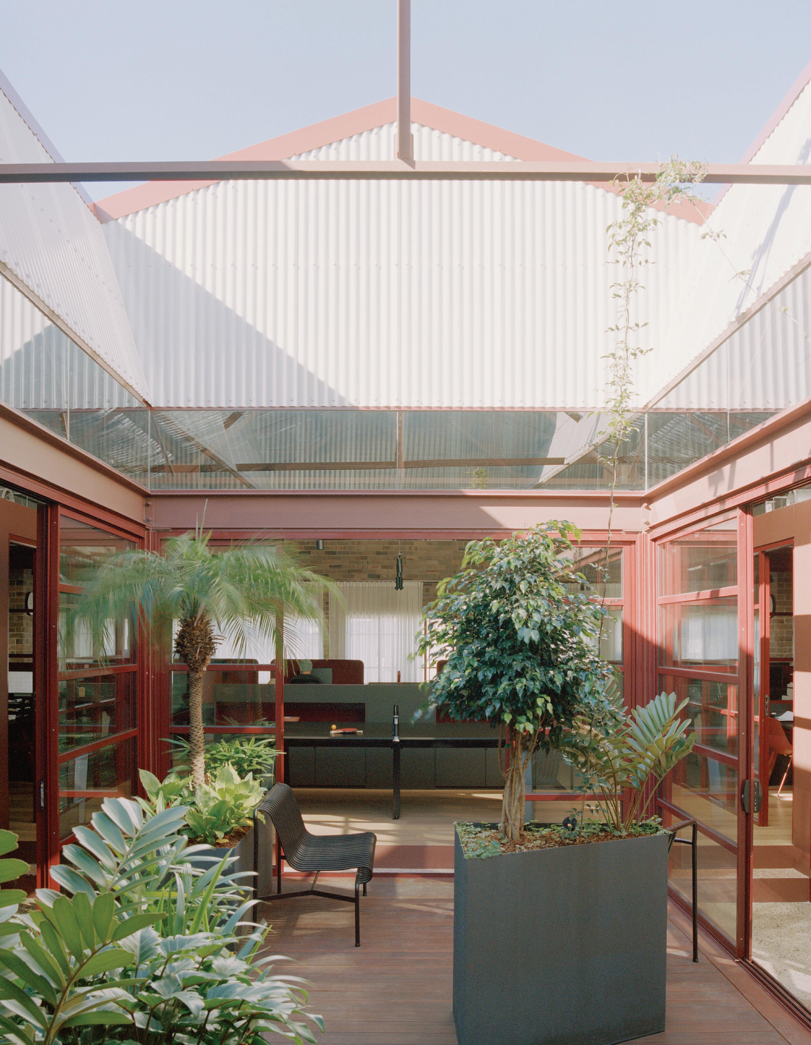
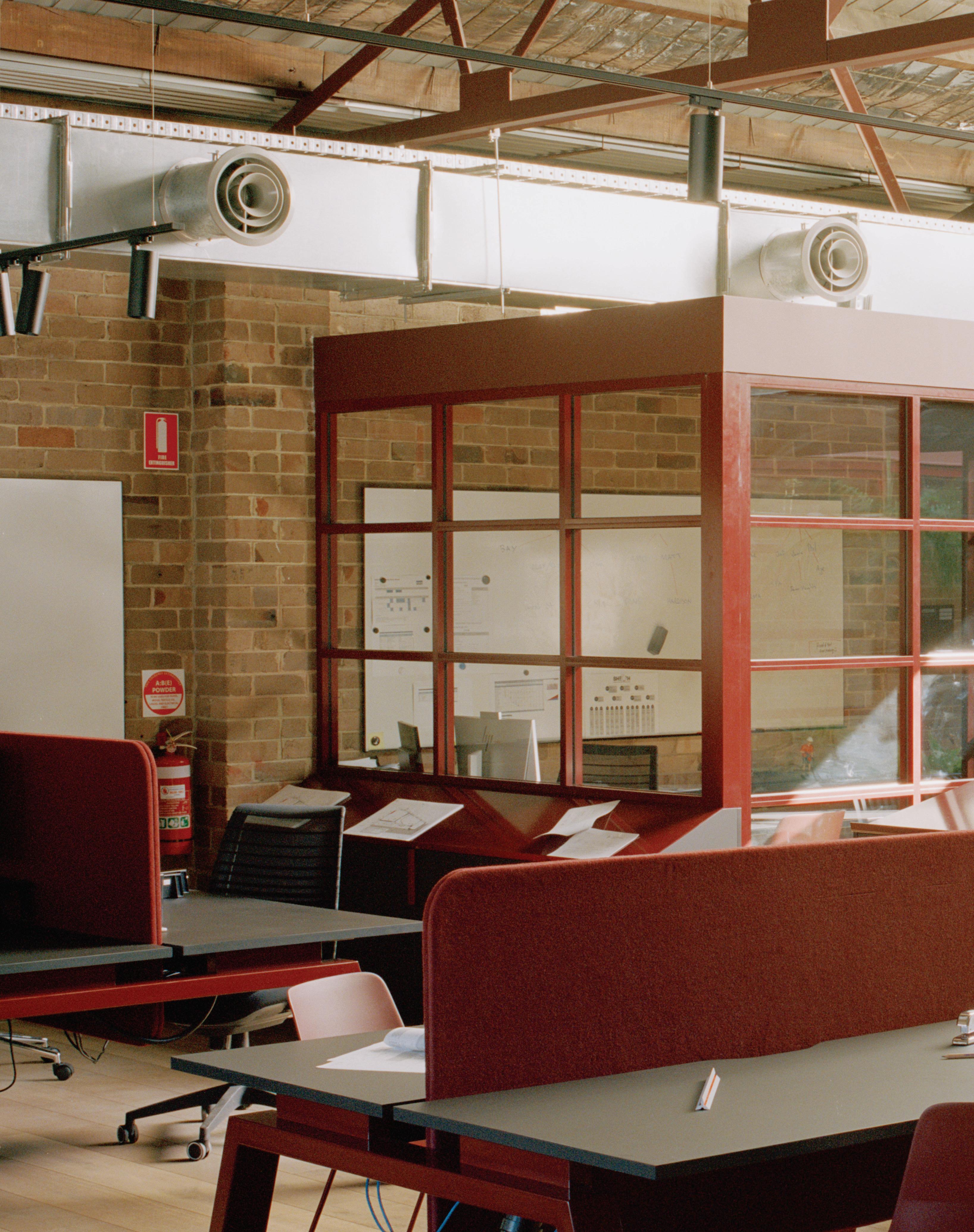
Steel-framed windows and detailing in a striking red accent bind the workplace’s diverse program of spaces.
 Terracotta Toning
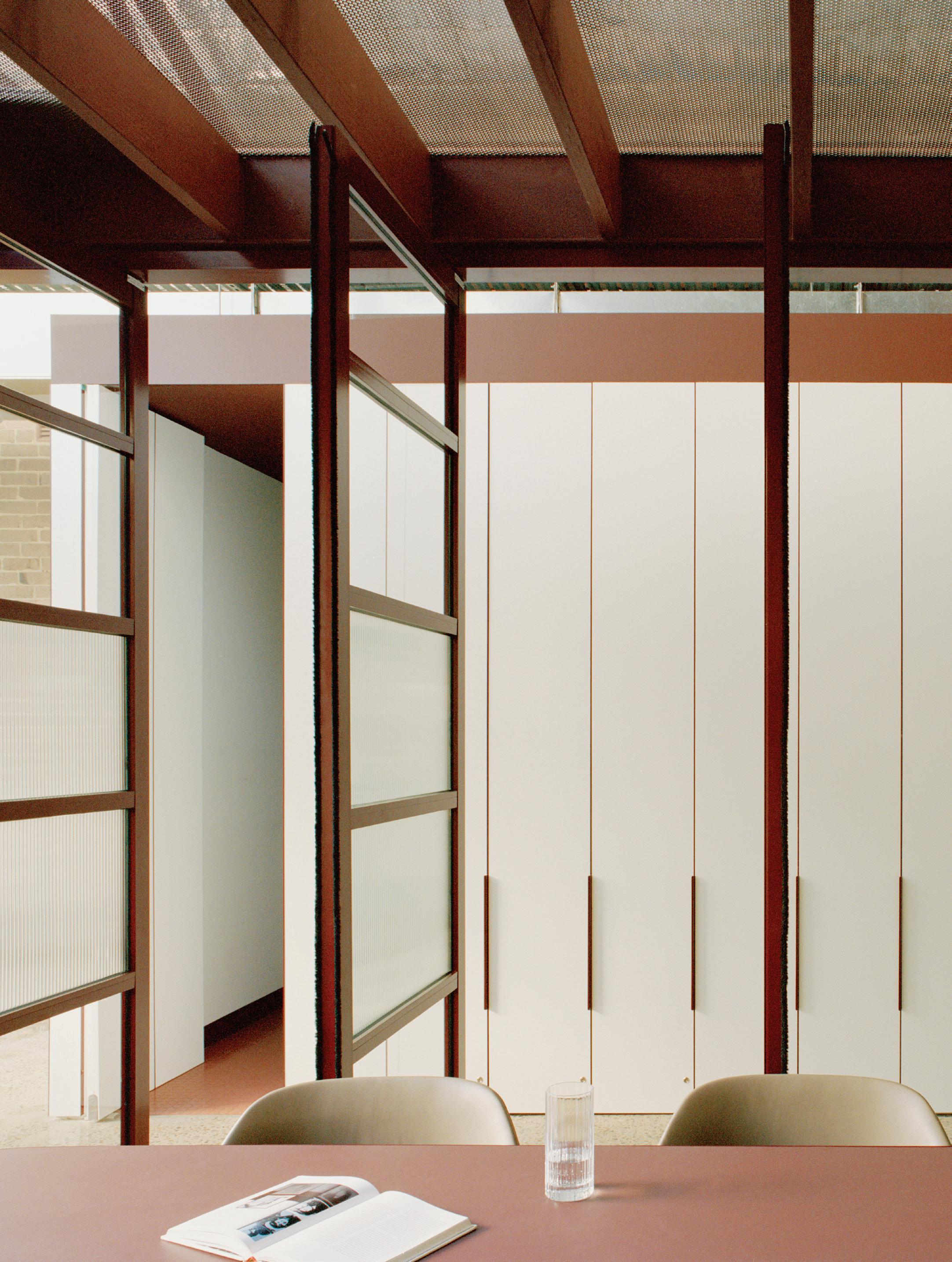
It is the warehouse itself however, that visually dominates as it contains and coddles the whole. Starting with a warehouse shell with no interventions or fit out, the project has been conceptually realised as a celebration of the raw elements of the industrial built form.
“With lofty ceiling heights, exposed steel trusses, concrete floors and red brick walls, the bare bones of the building motivated us to embrace a raw interior expression countered by high quality detailing,” says Prineas. To this end the industrial proportions were managed by creating a horizontal steel datum in line with the base of the original roof trusses. This lends a human scale to the warehouse. “At the heart of our client’s brief was the desire to create a place that their team would love to work in and reinventing this originally nondescript dark warehouse space into a place of joy was the key challenge of the project,” says Prineas.
Foundational to this challenge was the solidity of the external brick walls. Punctuated by small windows and door openings, the apertures provided an opportunity to construct an unexpected light-bathed internal courtyard. Here, “the space connects to a sunlit courtyard, open to the sky and bringing natural light and breezes deep into the workspace, while offering an intuitive gathering space for the team to connect.”
Walls of glazing with claret powder coating to the large aluminium frames makes for a dramatic internally contained outdoor space that is beautifully realised. “The russet tones of the warehouse’s red brick façade and exposed steel trusses inspired a strong and singular colour expression – from glazed partition framing to workstation screens and meeting tables. Complemented by oak flooring, terracotta tones and lush planting, we chose to work with a cohesive palette that binds the workplace’s diverse program of spaces, finding a tonal harmony between old and new,” says Prineas. Effectively Prineas’ design cuts an expansive outdoor space into the centre of the warehouse, from here the spatial planning flows effortlessly outwards.
Like many of Studio Prineas’ projects there is an absolute abundance of detailing at work behind the scenes to create the illusion of simplicity. There is also a real sense of deeply understanding their client with amenity and hospitality writ large in this astounding space.
studioprineas.com.au
“At the heart of our client’s brief was the desire to create a place that their team would love to work in”Page 81: Light and biophilic qualities imbue the whole site, thanks to the central courtyard. Page 82-83: Dappled light offers a constantly shifting engagement with nature. Opposite: Minimalist design disguises the abundance of storage. Page 86: A surprising and sumptuous meeting room.
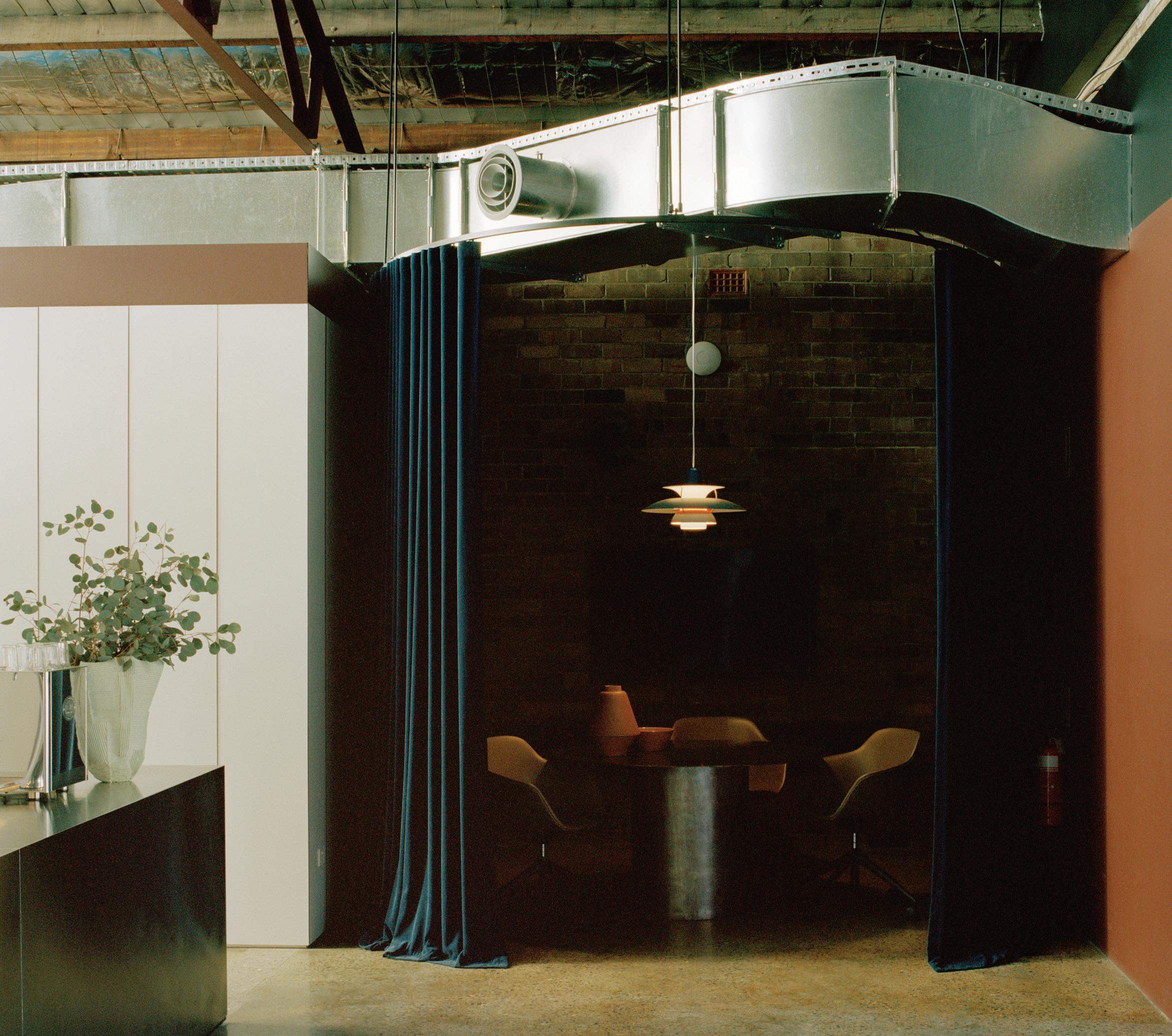
“...Reinventing this originally nondescript dark warehouse space into a place of joy was the key challenge...”













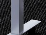



























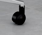



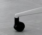

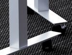
FR210 allows you to design Flexible Furniture to meet the demands for the Future of Work.
















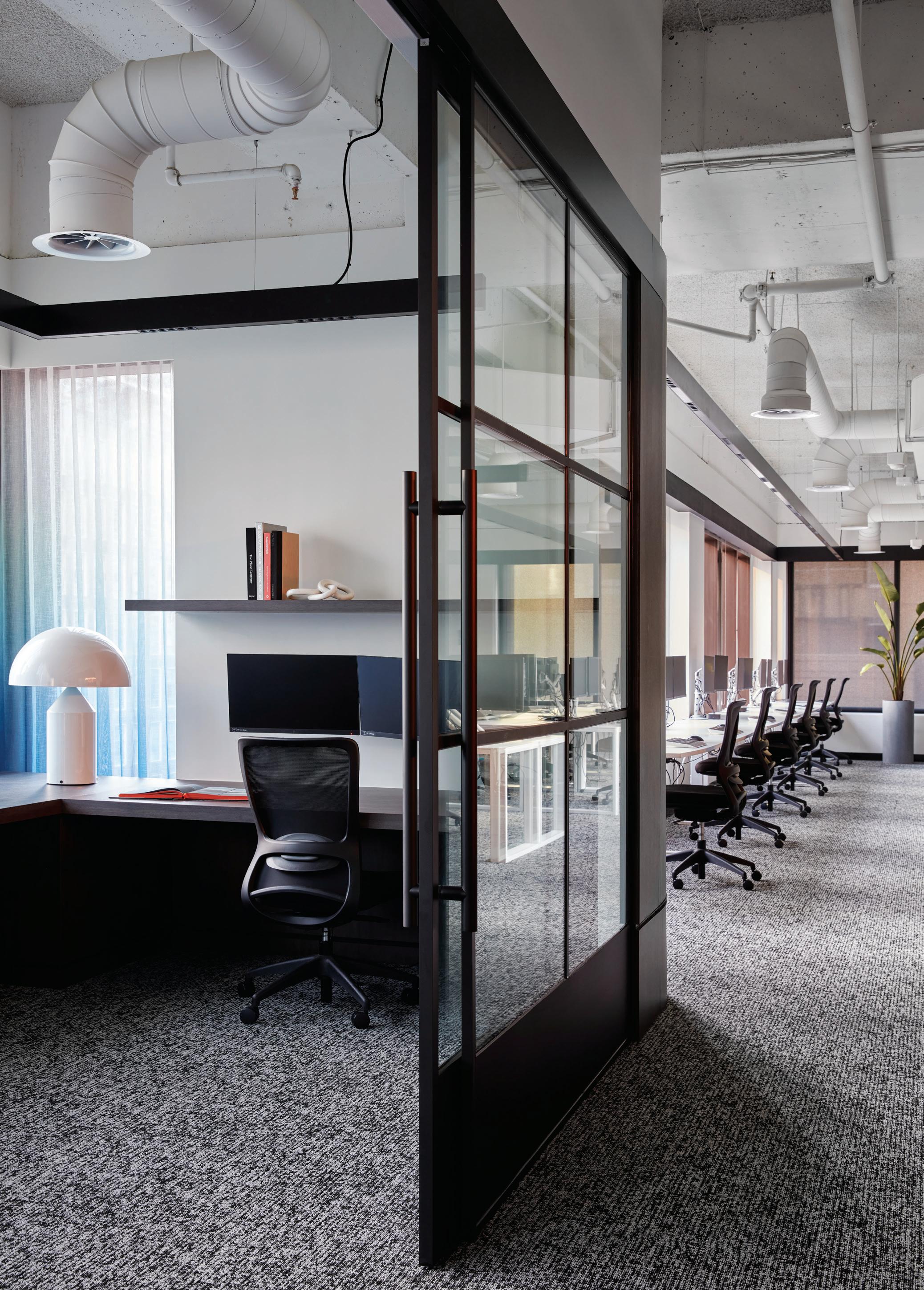
Elenberg Fraser breaks down the boundaries of the territorial workplace with an open, fluid office that meets our shifting expectations.
Slattery by Elenberg Fraser
Location Melbourne Traditional Custodians Wurundjeri Woi-wurrung and Bunurong Boon Wurrung Peoples Words Stephen Crafti Photography Jack Lovel
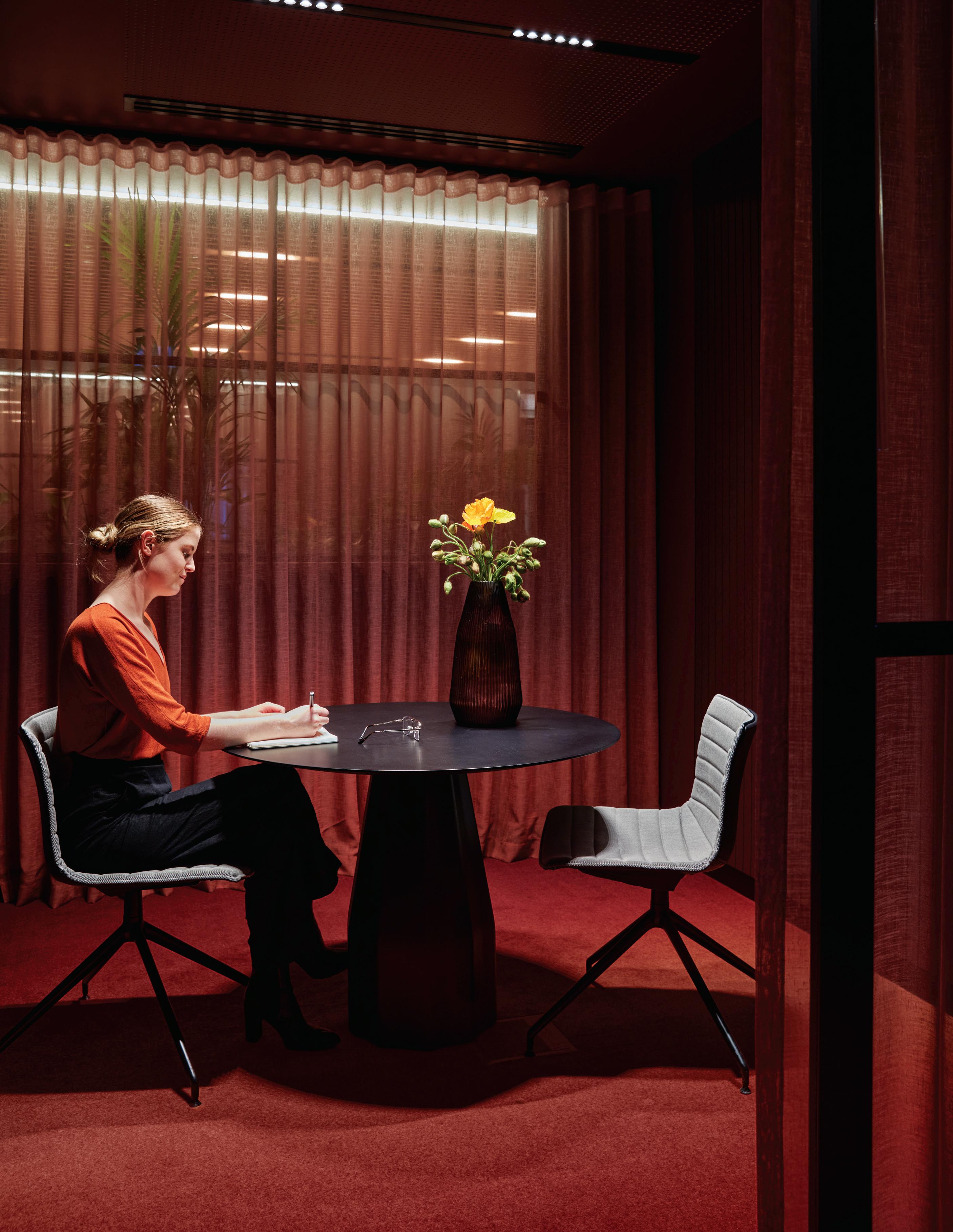
Opposite: Meeting and work spaces are deliberately domestic with colour a primary agent for change. Page 90: Break-out spaces are inserted into the primary work space to facilitate spontaneous shifts in need. Page 91: Light and views are optimised with minimalist workstations. Page 92-93: Sheer curtains demark working spaces rather than walls. Page 94: A magnificent kitchen island sets the tone for relaxed group lunches.
Slattery, a leading quantity surveyor, was formerly operating from a floor in the same building as architects Elenberg Fraser, in Melbourne. Ready for a move (just a block away) and a new way of working, Sarah Slattery, the company’s chief executive officer, commissioned Elenberg Fraser for a less corporate environment than the one they were leaving behind. “Post COVID-19, there’s been a new approach to working, spending a little more time at home and wanting the office to feel more like home,” says Melissa Leung, associate director at Elenberg Fraser.
Located in a 1980s high-rise on the corner of Queen and Collins Streets, the designers were given a shell comprising an entire level to work with. While they couldn’t change the generic façade, Elenberg Fraser has managed to create a magical and considerably warmer and more engaging space that Slattery’s former digs, which had a minimal black and white graphic scheme rather than
the subtle range of hues for Slattery’s new office. These include rust and olive-green velvet-upholstered furniture and banquette seating along with walls with vibrant splashes of blue. Meanwhile, the few white walls are thoughtfully filled with art or sculpture –predominantly by local artists which Slattery is keen to support.
Unlike the former office, with dedicated workstations where every staff member had their own desk, here there’s a variety of spaces, from intimate pods that allow for individual Zoom meetings, to breakout areas that have a lounge-like feel.
To allow for privacy in the larger and curvaceous pods, accommodating up to 10-or-so staff to meet, these spaces are encircled with sheer tactile curtains, creating a sense of domesticity. And rather than have a dedicated reception area, visitors steer towards the sumptuous banquette-style seating at the core, with a mini amphitheatre that’s referred to as the ‘Forum’.

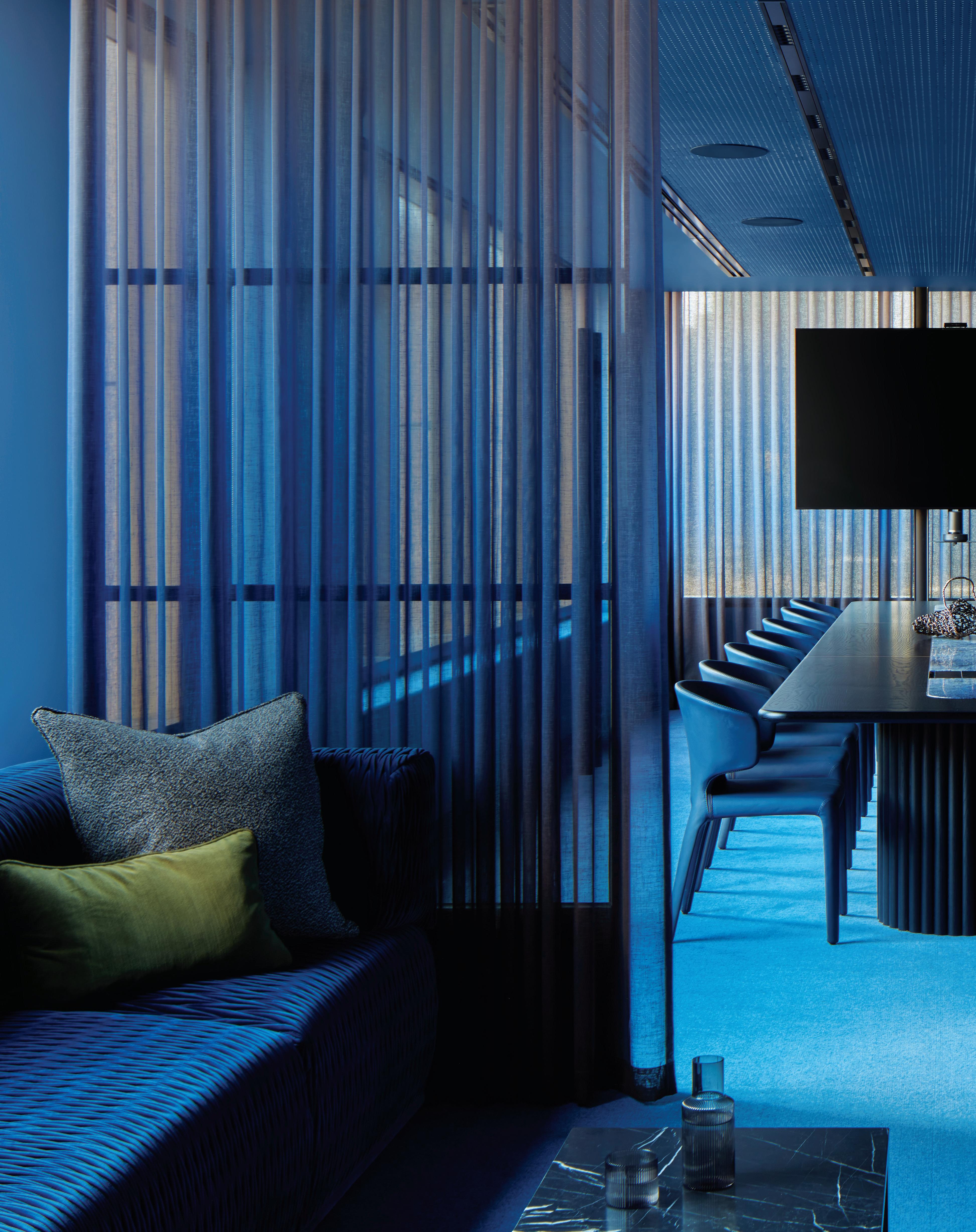
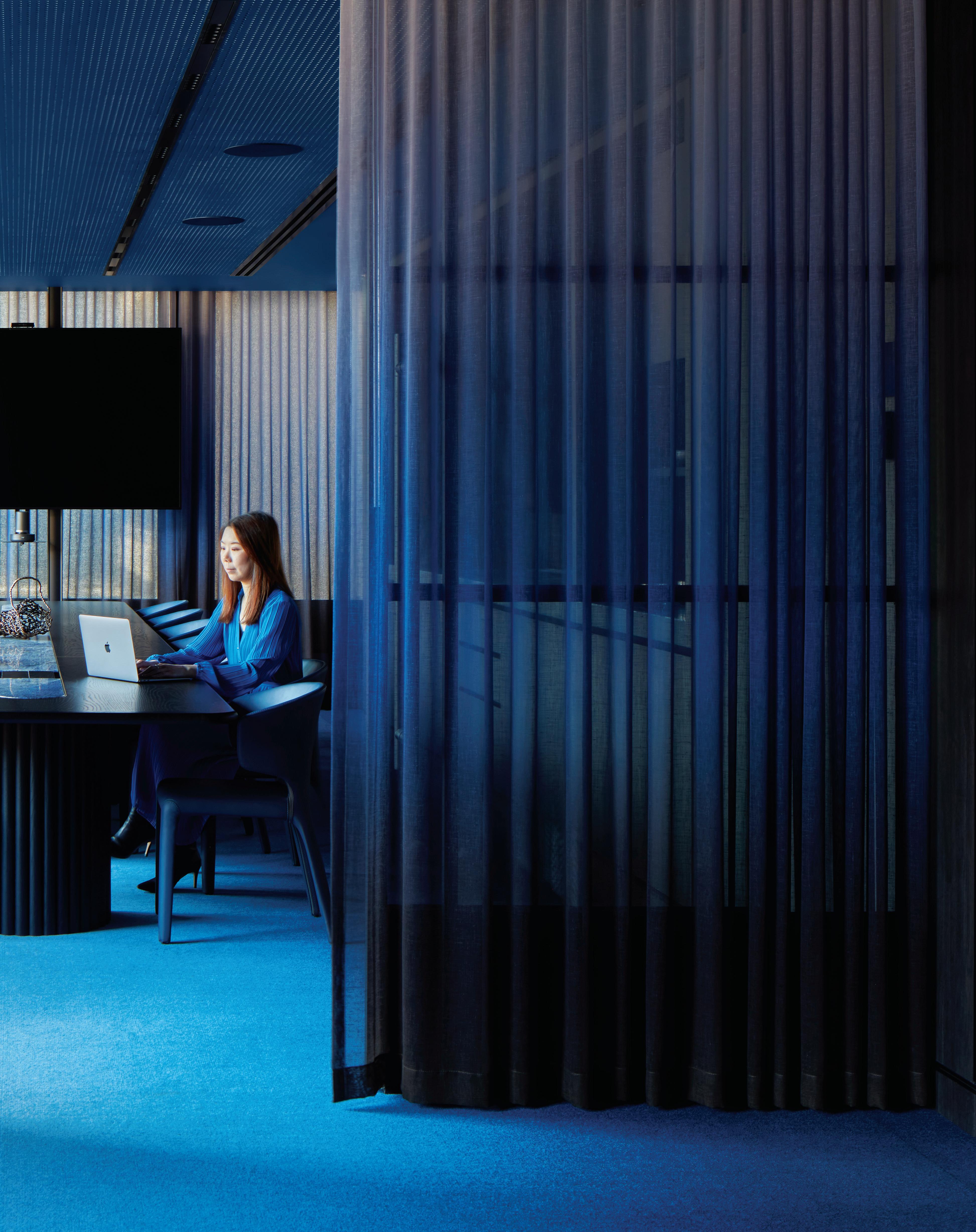
Sheer curtaining and a plush lounge challenge old assumptions, and meet new expectations, of how a boardroom must behave.
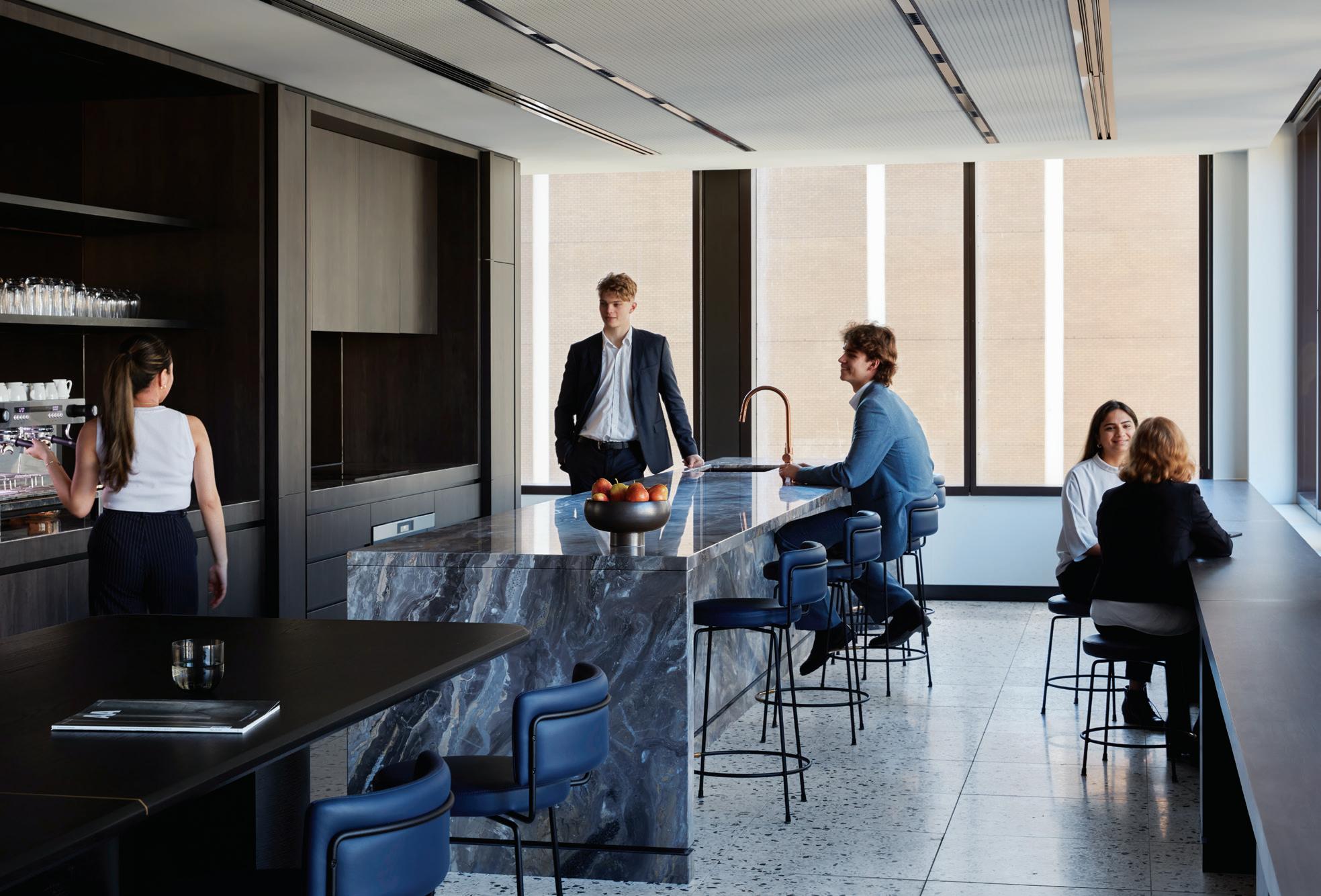
With generous lockers dotted around the office, the open plan working environment can also be free of clutter – with the omission of drawers below benches. This model, more activity-based, allows people to move freely around the space, whether working individually or in groups. “It was important to create a variety of spaces,” says Laura Graham, senior interior designer at Elenberg Fraser. Here she points out several areas including small enclosed sitting areas for quiet time, and the kitchen/dining zone that’s set up for work and social encounters. The latter features a large stone island bench that would take pride of place in a domestic kitchen. Another area of note is the library, which is intended as a quiet space. The library is segmented with thick curvaceous glass walls and a sliding door that allows noise to be contained. And to ensure that there’s a certain quietness, Elenberg Fraser included timber-battened ceilings in strategic areas, working with lighting and audiovisual consultants, ACONS. The main boardroom also follows a similar approach: complete with an adjacent lounge, it is thoughtfully framed by sheer curtains rather than severe office partitions.
Unlike Slattery’s previous office, complete with a separate room for printing, the new space is completely paperless – considerably more sustainable. Keen to support local furniture designers as well as local artists, a number of the pieces found here were designed by Zuster. Art in particular becomes part of the working environment with Corinthian columns used as planters, creating an avenue along the terrazzo paths.
Slattery exemplifies a shift in thinking away from the traditional office where space was territorial and meetings were conducted behind closed doors. Here, there’s literally a space for all work modes, whether it be a communal lounge, a private nook or alternatively, perched on a stool next to the bench in the kitchen area. And rather than having to go out for lunch, there’s a sumptuous blue velvet-covered lounge nearby, perfect for a relaxing break. “This fit-out is reflecting the change in the way people now want to work, with considerably more options and fluidity than ever before,” says Leung.
elenbergfraser.com
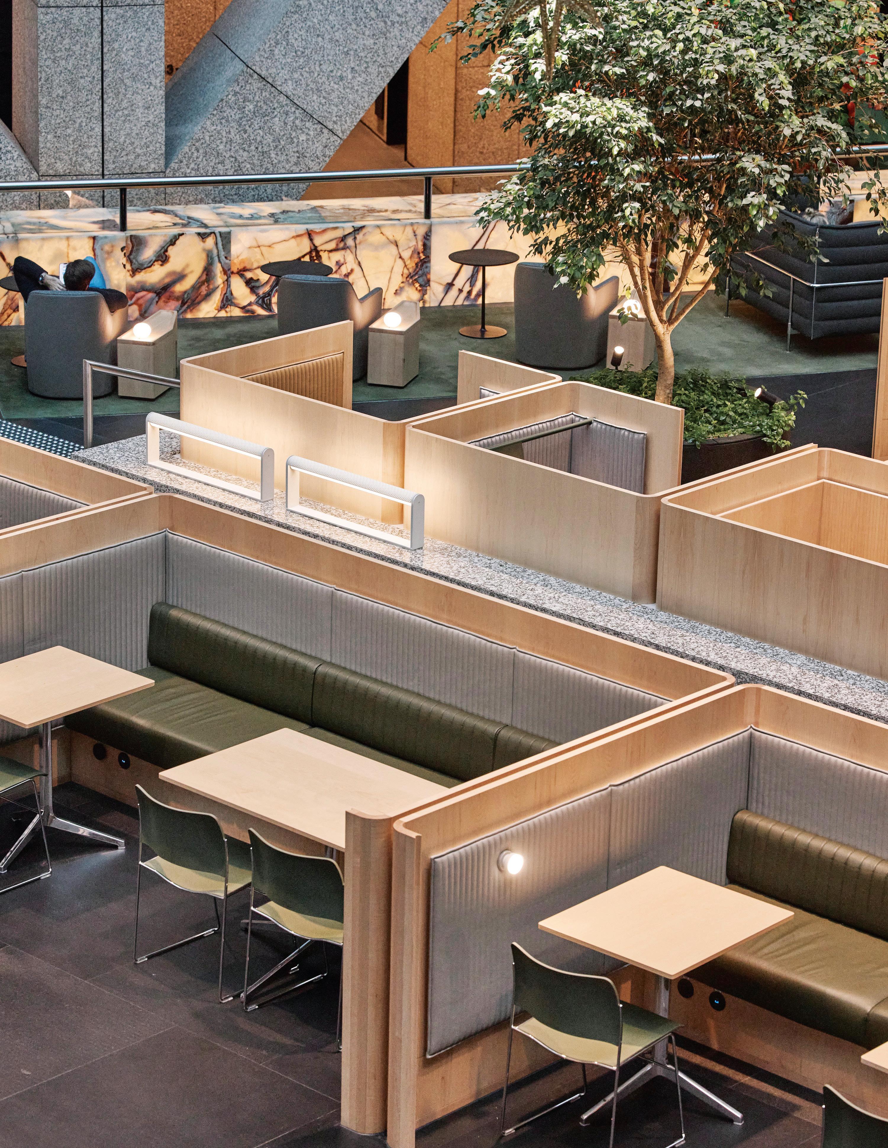
DesignOffice brings this 1980s Harry Seidler icon into modern working mode with ‘third spaces’ that look and feel like a top-end business lounge.
“We want to respect the existing space, the existing fabric and change as little as possible. But we needed to add a human layer...” says Damian Mulvihill, DesignOffice.Grosvenor
 Design Legacy Made Modern Offering a third option for working, the public lounge spaces at Grosvenor Place are akin to luxury hotel lobbies.
DesignOffice’s creation of a new space in the Harry Seidlerdesigned Grosvenor Place building of 1987 in the heart of Sydney, is very much about understanding the nature of an icon and the respect that surrounds that position.
Designed as a response to the shifting way we work, Grosvenor Lounge is ostensibly the third space: “It’s not your workplace, it’s not your home, it’s the other place you work,” explains Damien Mulvihill, DesignOffice joint-creative director. For many, a café fulfils this need, but this option has restraints of time, crowds and privacy. The solution is a semi-private, public space with a range of amenities that Grosvenor Place tenants can book.
While designed for the building’s tenants, the lounge is also open to the public and makes for a very sophisticated inner-city meeting place. “It’s a slightly curious typology between corporate and civic, given it is a publicly accessible workplace that takes its cues from, hotel lobbies and airline lounges,” says Mark Simpson, DesignOffice joint-creative director.
Responding to an exceptional brief, developed by Right Angle Studio, that looked at improving the building as both a commercial asset and built environment, the task clearly articulated what the space should do and how it could work. “We responded to a very smart brief, which was essentially saying this building is amazing. And it’s iconic, but it’s getting on a bit and what if we actually think about it as a future legacy building and how do we add amenity to that building and give it another layer that makes it desirable, knowing that there are newer, smarter office buildings out there?” says Simpson, with Mulvihill adding, “We love the building. We love Harry Seidler, we love his position in Australian heritage and architecture. We want to respect the existing space, the existing fabric and change as little as possible. But we needed to add a human layer and answer the ‘why’ of why people are occupying this very public space.”
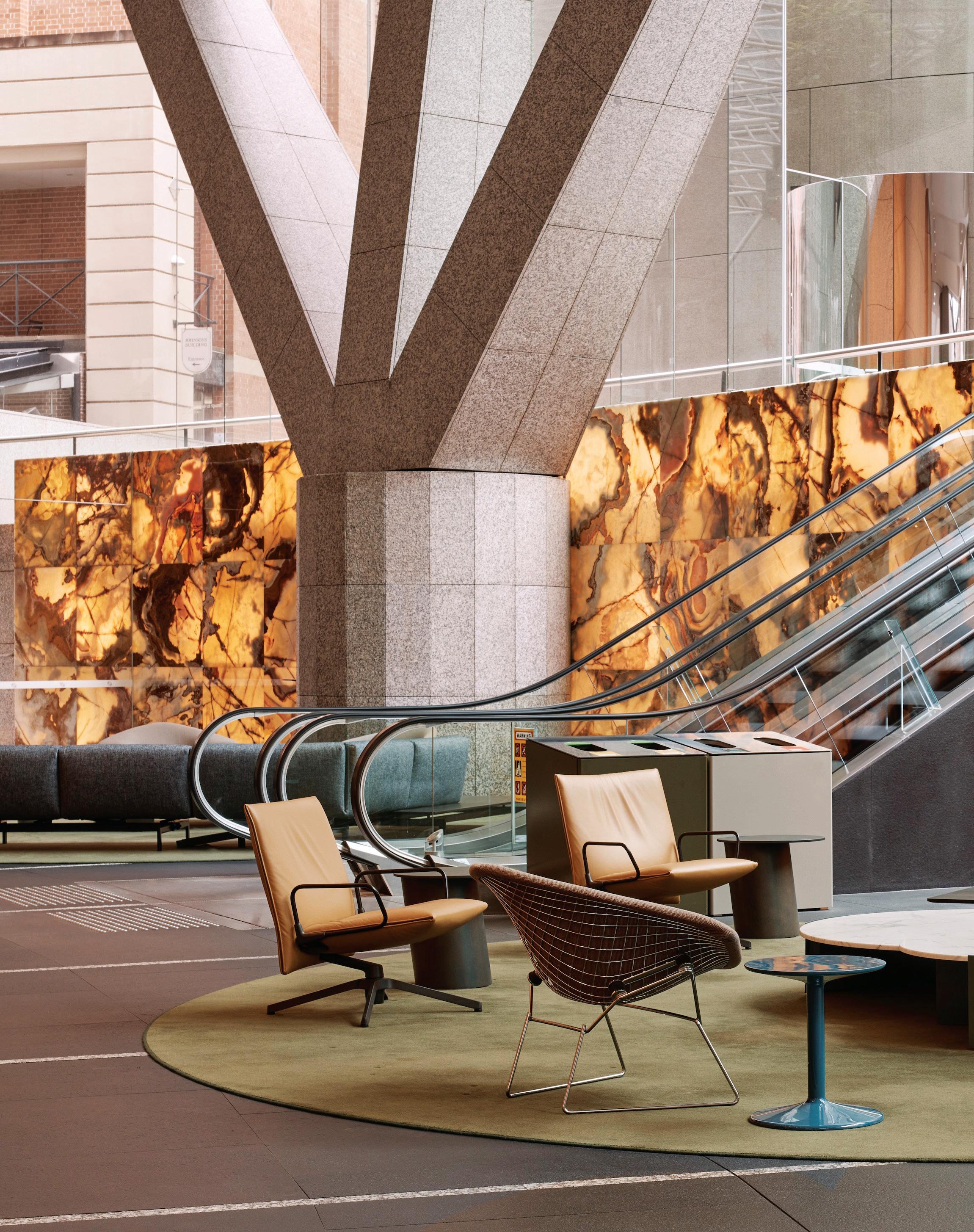
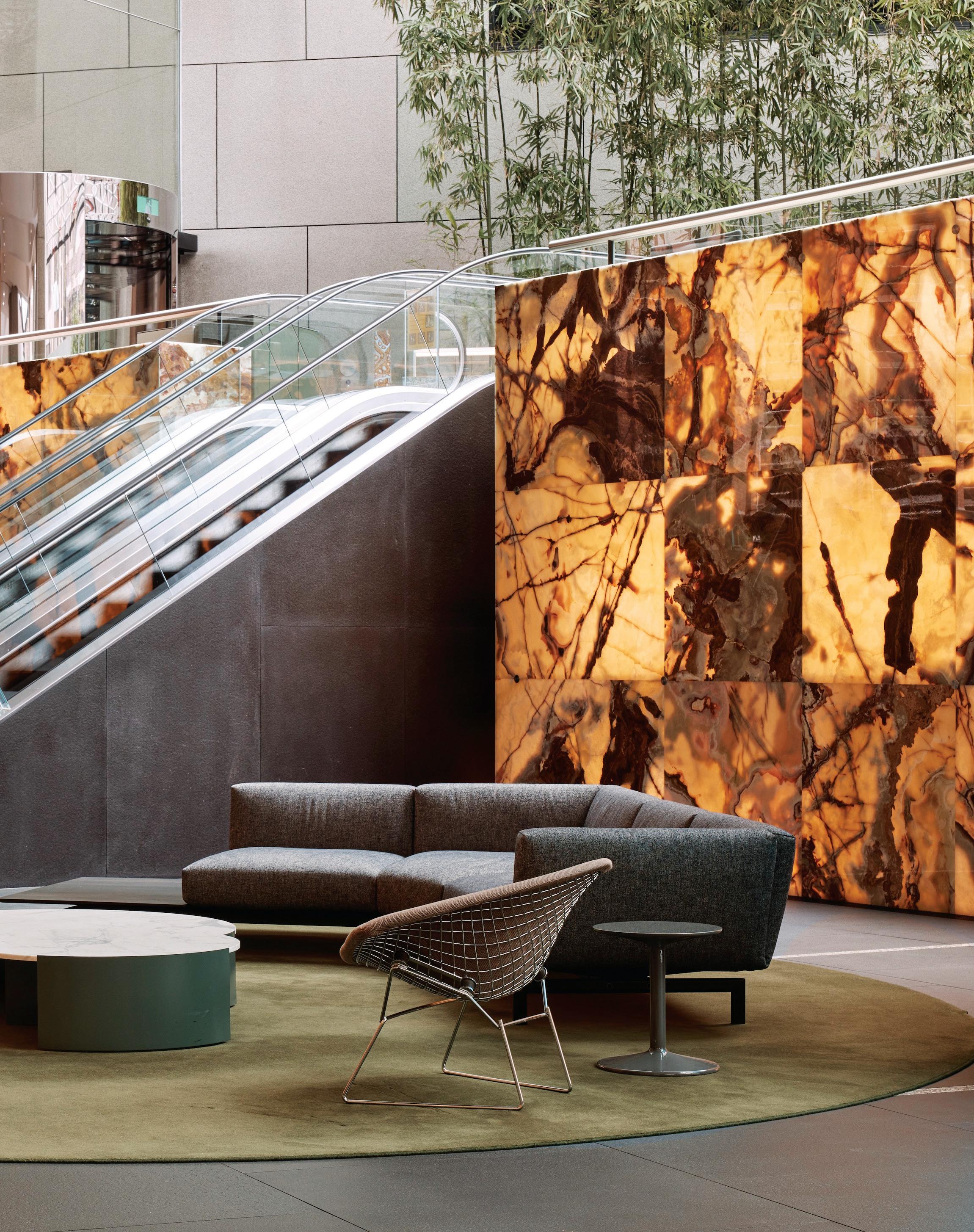
To this end the glass roof and illuminated walls of onyx that were added in 2009 by Harry Seidler & Associates have been retained as an appropriate element of the internal space. Gone however is any trace of the mishmash of food hall offerings that had occupied the space for the last 20 years. Instead, DesignOffice has responded to the tonal shifts of onyx and existing granite stair surrounds with a material and colour palette of subtly finessed elegance.
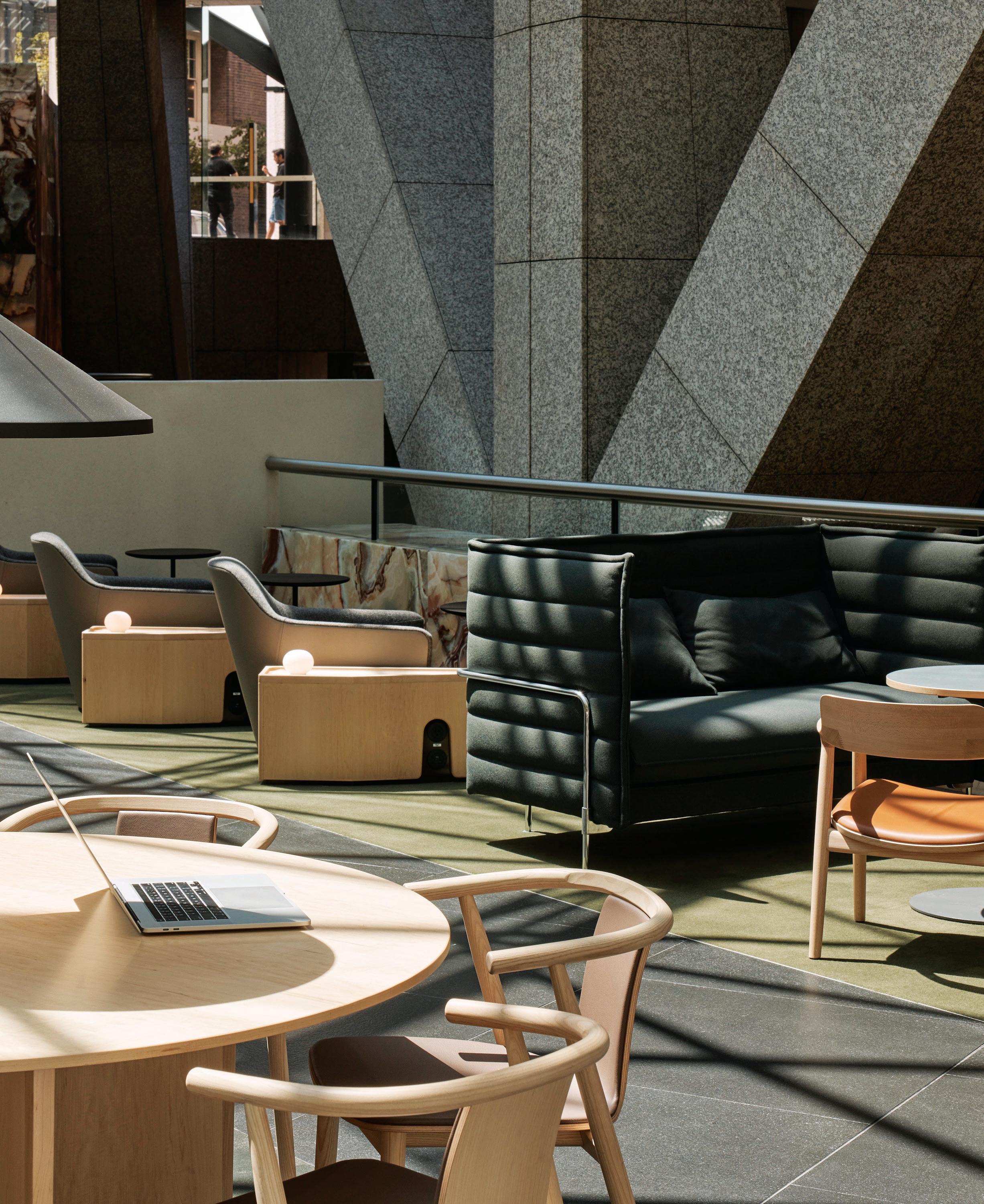
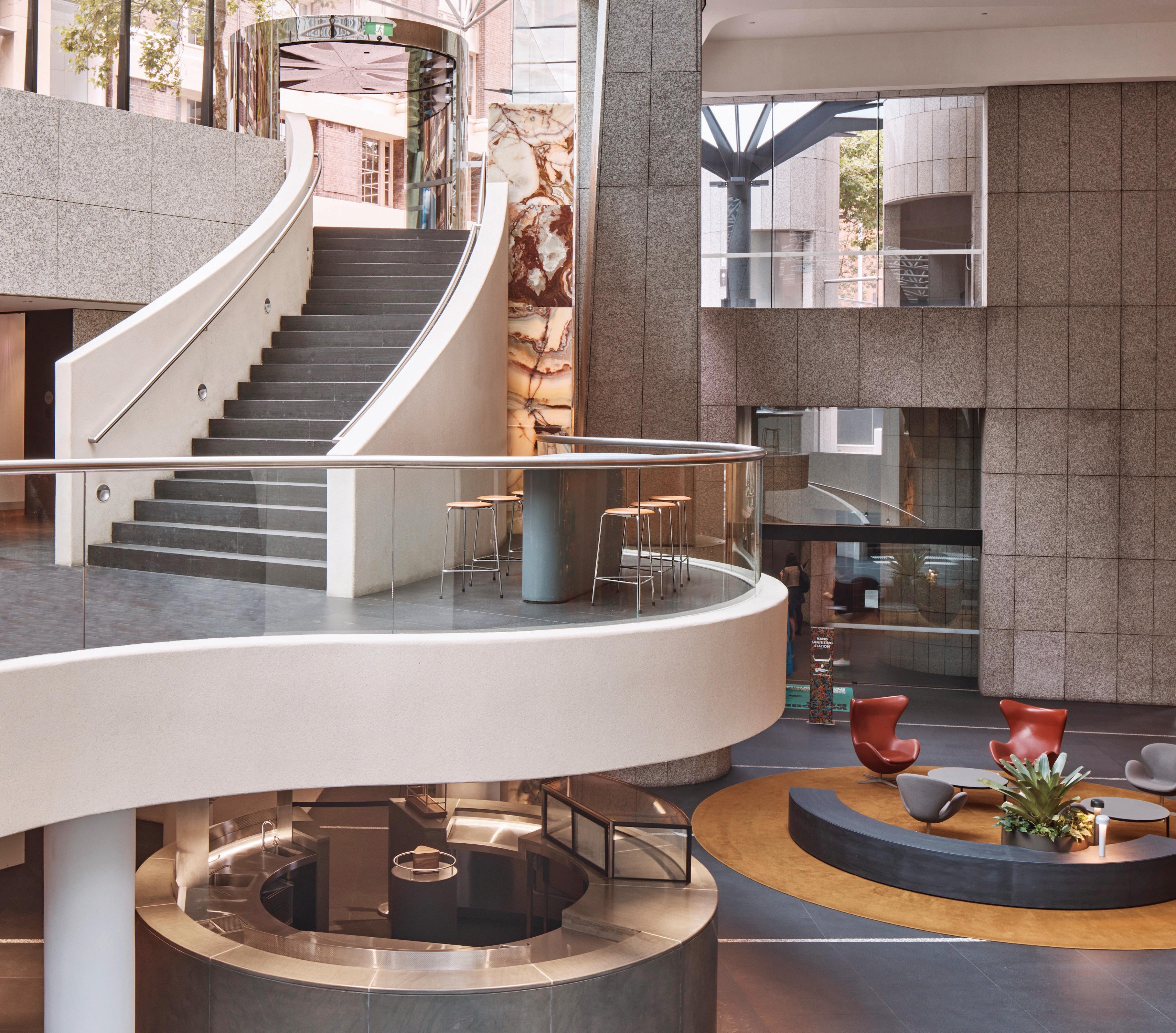
Occupying two floors, the upper level, entered from both Grosvenor and Harrington Streets, takes its cues from the very top end of business lounges, to deliver a range of working spaces
including private meeting rooms and the public options. Here the designers have introduced a low curving granite wall to open the space and direct circulation. It is however, in exactly the same granite used in the building. It is this exceptional level of detailed attention that typifies the meticulous nature of DesignOffice.
It also serves to benchmark the remainder of the fit-out, which is just as scrupulous in its delivery. The three-quarter height walls that form a series of private booths, for example, are designed to be precisely the right height for full privacy when seated and a sense of community when standing. They are also beautiful. Each is a crafted piece of furniture where the shifts in wood grain between the elements is celebrated. Moreover, maple is introduced as a completely new material and architectural layer: “We wanted the maple to deliberately express a new lining within the respectful bounds of the existing materials, but expressed as a next chapter without trying to pretend otherwise,” says Simpson.
The butter-soft anodised leather DesignOffice favours is used for portions of the booth seating, while loose furnishings are arranged to create solo and group zones. Bespoke detailing is found everywhere from the small side tables with charging ports to the exceptional lighting: “Everything was lit with the old-school ‘90s, metal halide cans: very uniform, overblown. We looked at where we could change those and introduce very low-level, human-scale pinpoints of light that just fit people’s faces or lit the surfaces of tables, without lighting the entire space,” says Mulvihill.
On the lower level where the illuminated wall of onyx is found, the mood is more akin to a hotel lobby with furniture that speaks to the iconic identity of the building. Large rugs define the separate spaces within the large volume. These are then defined again by the scale of furniture, which is broad and low in subtle and sumptuous tones drawn from the onyx.
In keeping the furniture low, the architecture is allowed to sing. In particular the large Y-shaped supports are permitted their full sculptural form: “The fact that we love the building is why this has been such an enjoyable project. We’re working with it, not against it,” says Mulvihill.
Indeed, every detail of these spaces is designed to be unique and beautiful, but never to overwhelm the building. Yet, the spaces are fabulous both visually and functionally with DesignOffice delivering on every detail, including the big picture, which is divine.
designoffice.com.au












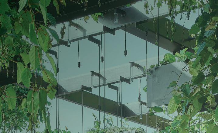










Whare Timu and Jefa Greenaway weave a tri-cultural narrative that speaks to Warren and Mahoney’s vision for the future of design.
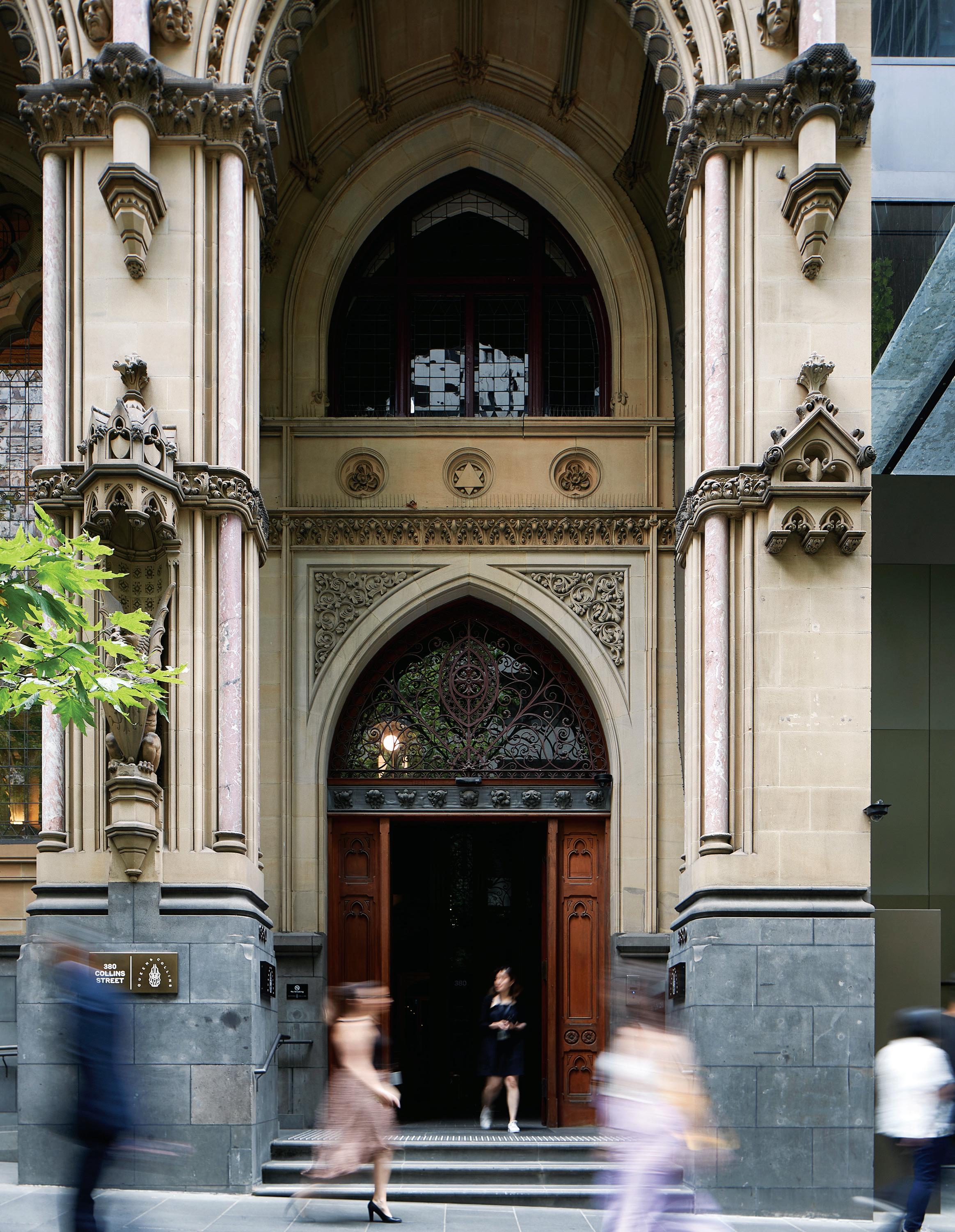
Warren and Mahoney Melbourne Studio by Warren and Mahoney in association with Greenaway Architects Location Melbourne Traditional Custodians Wurundjeri Woi-wurrung and Bunurong Boon Wurrung Peoples Words Leanne Amodeo Photography Shannon McGrath
Patterned And Carved





The pakati elements of traditional Māori carvings, as well as traditional tukutuku pa erns are woven into the design.




Warren and Mahoney’s new Melbourne workplace was always going to be something special and indeed it is. The Pacific Rim architecture practice was founded in Christchurch almost 70 years ago and this, its latest statement studio, was an opportunity to reinforce the business’ brand narrative from the very outset. It’s part of a story that has seen one of the most influential practices in the region grow and expand into a design collective of creators and makers navigating a brave future.
More significantly, this is a project all about experiencing togetherness, punctuated by the coming together of two First Nations cultures. It celebrates Country as much as it acknowledges the practice’s heritage in Aotearoa New Zealand. “We have a process we call creative compression, which is based on the idea of harnessing two very distinct cultures,” says Whare Timu, Wellington-based Warren and Mahoney principal and leader of the practice’s Advanced Indigenous Design Unit. “Convergence and embedding cultural values is important, so it was pertinent for us to understand what the creative focal point would look like and how that could be placed within the fit-out.”
To this end, Warren and Mahoney collaborated with Greenaway Architects, whose founder Wailwan/Kamilaroi man Jefa Greenaway first met Timu while working on Melbourne’s North East Link
project a few years ago. There’s a natural synergy between the two architects, based on intuition, understanding and a high level of cultural intelligence. The whakaute (respect) they have for each other easily informed their collaboration and is palpable in an outcome all the richer for it. So how exactly did they embed a cultural narrative within their design concept?
For Greenaway, it was about creating a journey line through the space in order to choreograph and amplify experience. “This is a way to modulate the different programmatic and pragmatic needs of the office,” he explains. “And so we looked at materiality, motifs, colour and technique in terms of the actual process. All of these combined became the mechanism of cultural expression, where the important stories are essentially encoded in the DNA of the design thinking.”
Starting with an approach that involved proactive listening – or “leaning in with our ears first and our pencils firmly in our back pocket”, as Timu describes it – laid the foundation for a multi-layered scheme. There are in fact many cultural narratives at play, beginning at the arrival, where the Neo-Gothic features of the workplace’s Collins Street building are revealed. These are striking in form and counterposed by a tri-cultural design strategy that acknowledges the Colonial layer as much as it does Māori and First Nations cultures and their respective narratives.
“We have a process we call creative compression, which is based on the idea of harnessing two very distinct cultures”
The plan itself is logically configured and clearly articulated, with the arrival opening into the ‘social’ zone that includes an informal work area, casual desk arrangements and the kitchen. This side of the office represents First Nations culture, which is symbolised via colour and material palettes that very much evoke Country and a sense of place. Deep green colour blocking and a mix of native timbers lend it a raw, earthy atmosphere and these palettes are also extended to the other side of the office, which represents Māori culture. This end is the ‘focus’ zone, with settings, including a focus room and quiet lounge, supporting autonomous and reflective ways of working.
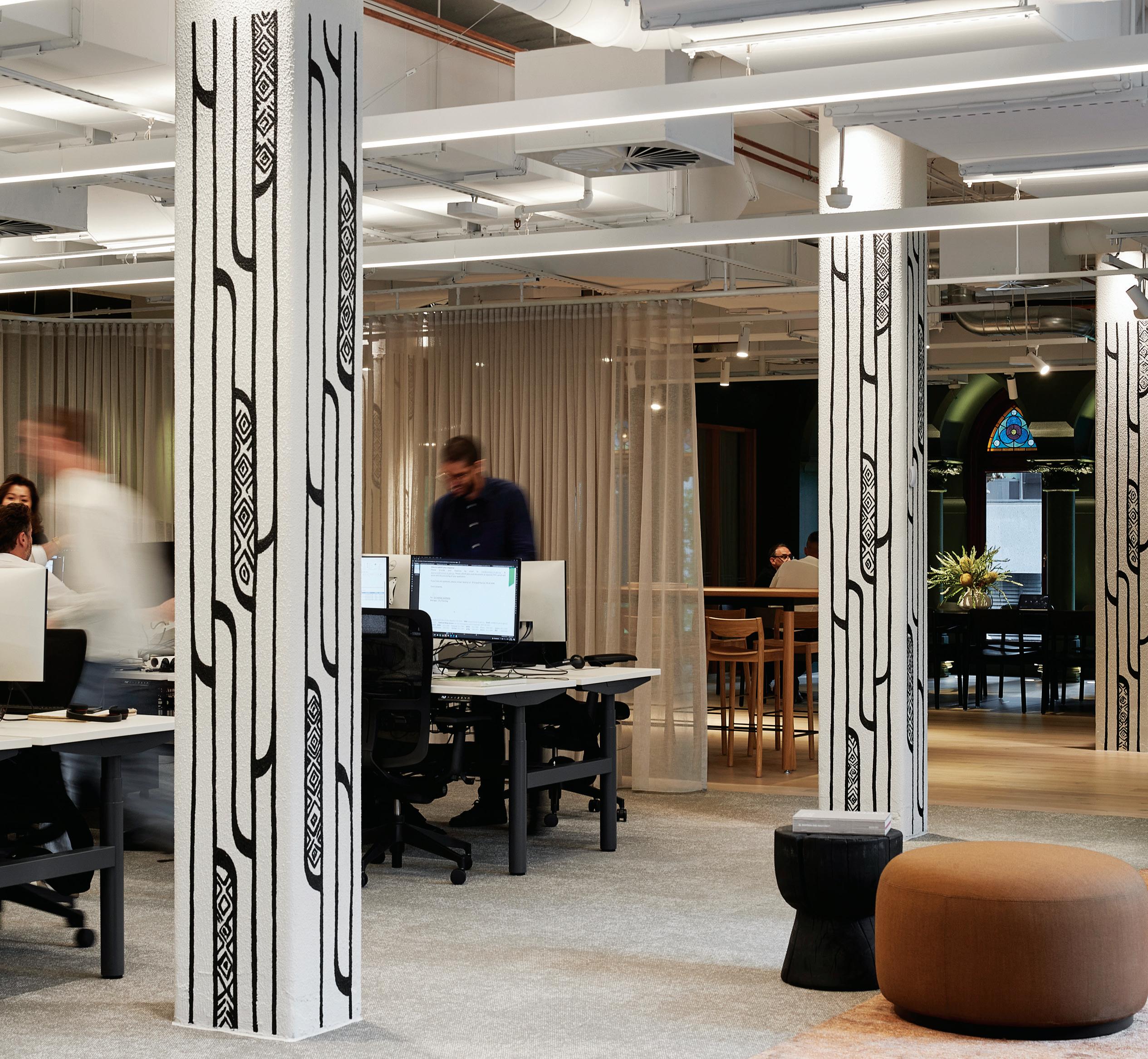
“Overall, it’s quite a stripped back aesthetic approach, with a beautiful subtlety in the way we’ve highlighted different cultural signifiers,” says Marianne Calvelo, senior architect, Warren and Mahoney. “Offsetting the colour blocking are cultural concepts largely in black and white, including hand painted abstract artwork that’s inspired by Country on the columns, which act as mnemonic markers enabling you to sequence your journey through the workplace.”
Both ends of the fit-out feature strong geometric motifs, including pakati, which are the elements in traditional Māori carvings, as well as traditional tukutuku patterns (decorative woven latticework). This idea of weaving, equally important to First Nations people, is also expressed conceptually through the coming together of different materials, such as the chevron timber floorboards and interwoven charred timber batten walls. Then there’s the actual weaving together of two Indigenous cultures,
which is amplified in the central space. This is the scheme’s creative anchor and main point of convergence, functioning as the office’s collaboration zone, distinguished by richly patterned carpet and etched ochre-coloured acoustic wall panelling.
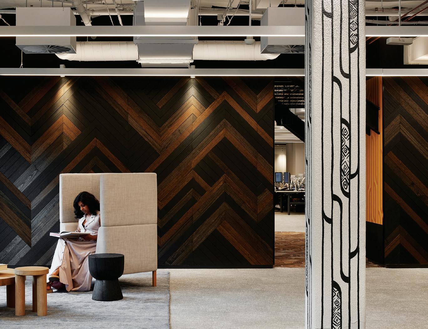
It’s also the fit-out’s grandest statement and the space encoded with the greatest meaning. The etching is the architects’ contemporary interpretation of whakarare, a Māori pattern that speaks of breaking barriers and plays on the idea of dualism. And the two vertical lines symbolise the connection between the two cultures, stretching between the ground plane (Country) and roof plane (in a ceremonial sense, Māori people use the lintel as the threshold between the sacred and ordinary).
For Warren and Mahoney as a practice, the future of design is ingrained in three pillars – culture, sustainability, technology – and their new workplace reflects this. Using the weaving metaphor again, these three strands form the braid (te whiri taura) the practice in turn sees itself navigating. At the heart of it all is people.
“We’re united by a shared belief in the power of collective authorship,” explains Daryl Maguire, Melbourne studio principal, Warren and Mahoney. “And with the return to the office, we wanted to make this one as special a place as possible; to work for us, support everyone’s needs and facilitate a culture of coming together.” This is a workplace of immense beauty that’s sure to inspire, welcome and serve for a long time to come.
greenawayarchitects.com.au, warrenandmahoney.com
Weaving motifs and a highly figured carpet design (Milliken Circular Relationships – Dunes) lend a sense of Country.


Sibling designs a series of hard and soft landscapes to host different work modes, in this pocket-sized Collingwood office.
NUX by Sibling Architecture
Location Melbourne Traditional Custodians Wurundjeri Woi-wurrung and Bunurong Boon Wurrung Peoples
Words Leanne Amodeo Photography Christine Francis
Opposite: The brief called for a variety of spaces for a range of workers. Page 114-115: Colour is used as a device to define spaces. Page 116: ‘Soft’ spaces are used for relaxation and downtime. Page 117: Plan view of the ‘hard’ zone, left, with ‘soft’ zone, right.
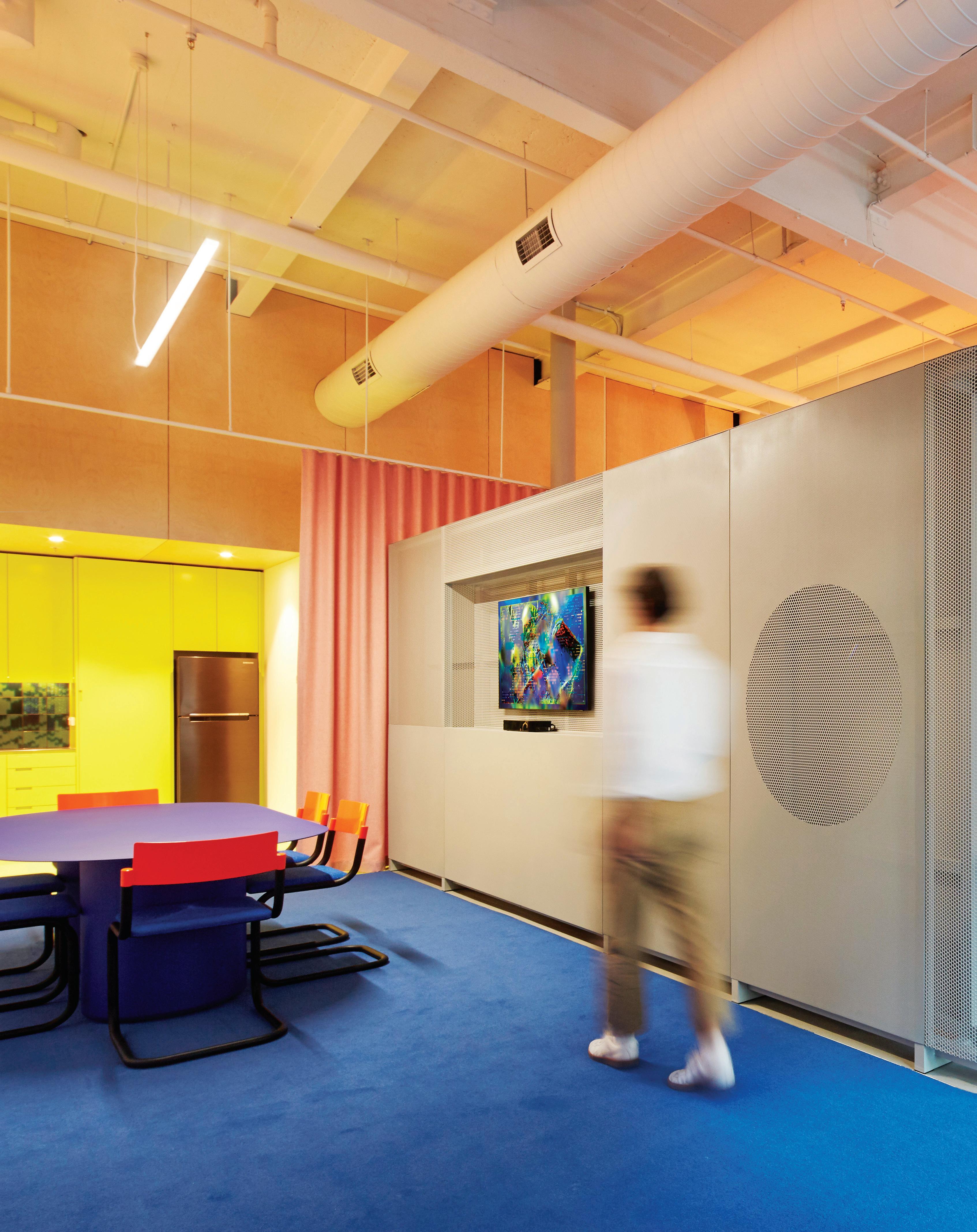
Subtle
Boundaries
Flexibility is achieved through operable curtains and a semi-transparent perforated steel screen separating ‘hard’ and ‘soft’ work zones.
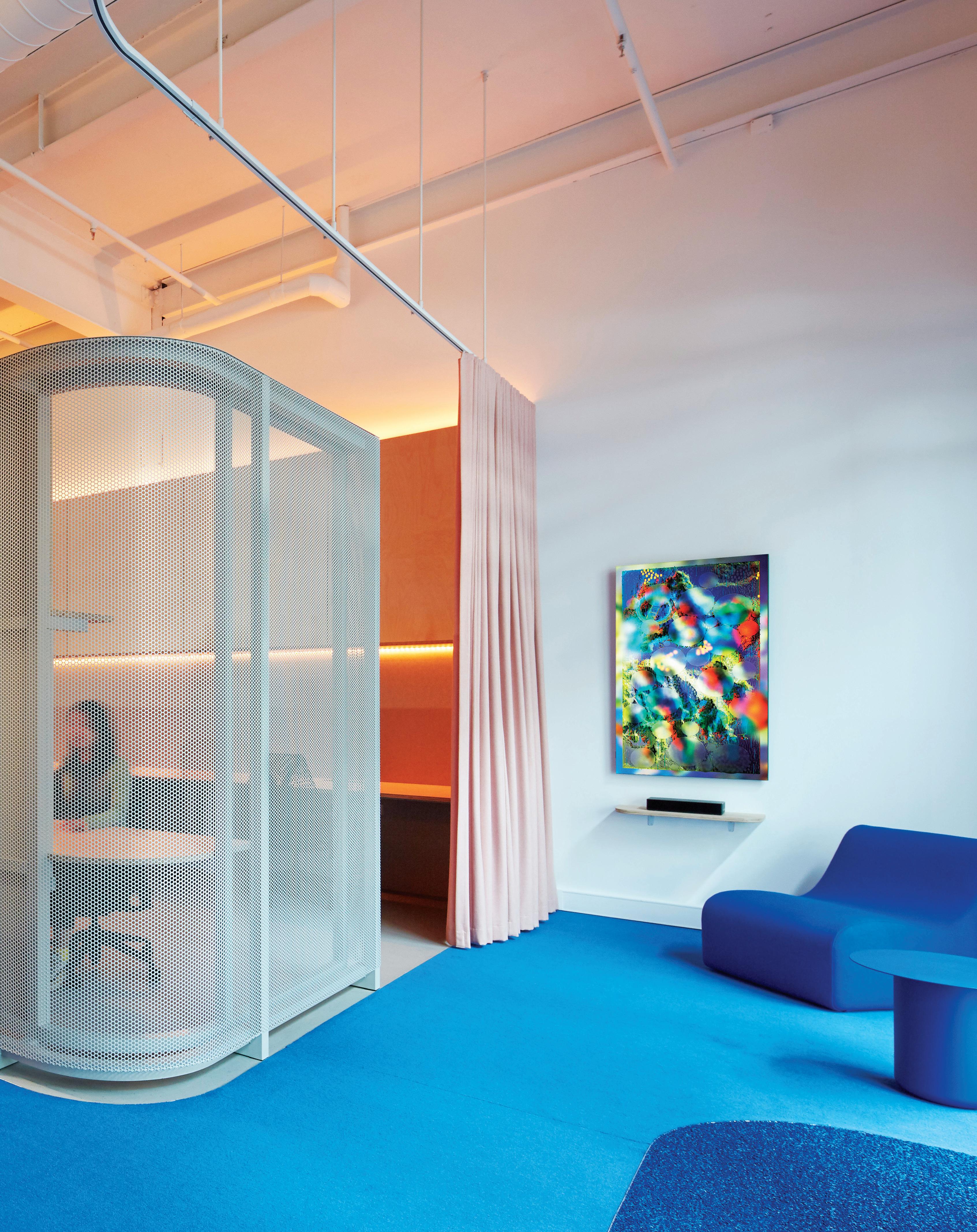
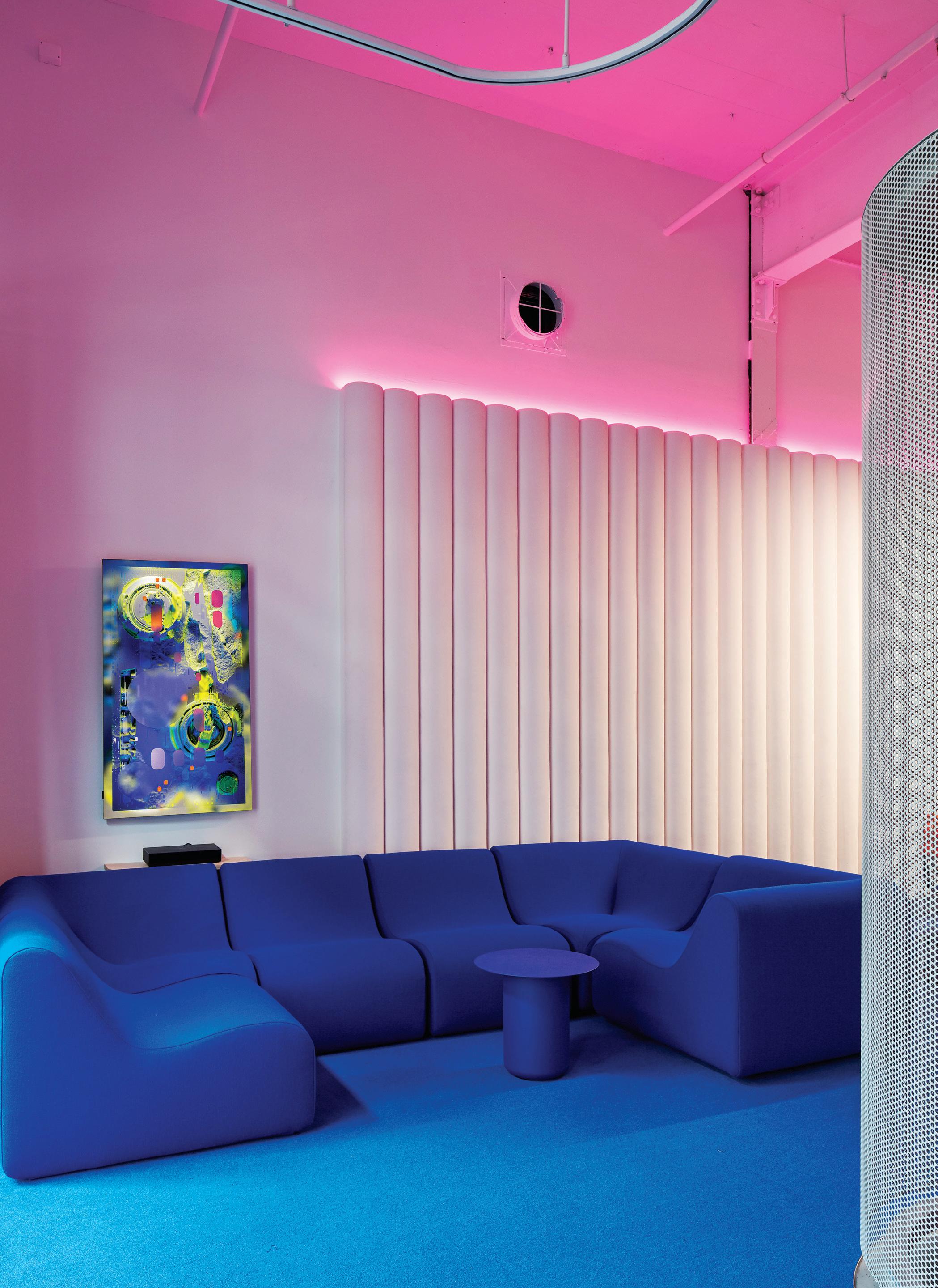
Sibling is responsible for some of the most exciting small scale projects to come out of Australia in recent years. The architecture practice is recognised for an edgy design sensibility that’s underscored by a strong understanding of form and colour. It’s difficult to overlook their work, which is always informed by rigorous thinking and a methodology that values theory as much as it does aesthetics.
Their portfolio comprises civic, commercial, residential and education projects. And in their recent fit-out for NUX digital design studio and co-working space, those distinct Sibling palettes and a nuanced approach to planning are very much on show. This compact 100 square metre space is housed within a ground floor tenancy in a red brick warehouse building located in Melbourne’s inner-city suburb of Collingwood. Responding to a straightforward brief that called for a variety of spaces for a range of workers, Sibling co-director Amelia Borg and her team have delivered a group of different contemporary settings suitable for varied modes of working.
To make the interior feel bigger, they firstly demolished the false ceiling, stripping the space back to its raw volume and embracing its incredible height, creating plenty of room in which to play. “Our over arching concept was to explore the different landscapes that work occurs in, so we created a series of what we call ‘hard’ and ‘soft’ work landscapes,” Borg says. “The hard spaces are the more traditional workstations and the soft spaces offer couches and other soft furnishings for downtime and relaxation. Given how compact the space is, we also put a lot of thought into how to provide flexibility and how to facilitate the ability to separate different zones.”
This flexibility is achieved through operable curtains and the semi-transparent perforated steel screen, which divides the two zones. Vibrant material and colour palettes also figure prominently, with the hard landscape characterised by walls clad in plywood
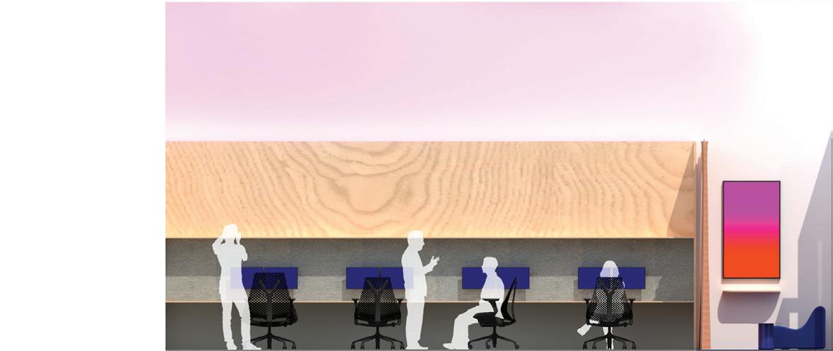
and a floor finished in marmoleum. Conversely, the soft landscape’s walls are finished with cushioned upholstery and the floor lined with plush carpet.
It’s a dynamic combination of materials yet Borg’s selection of colours is even better. As she explains, “We used colour as a device to define the zones within the space, in particular, giving definition to the kitchen, where the bright colours are complemented by a custom printed wall tile splashback.” Further, an electric blue tabletop, couch and carpet are punctuated by pops of bright orange, while the pale pink curtains contrast nicely with the lime-yellow kitchen joinery.
While there’s a definite playfulness to this mix of poppy hues, the scheme steers well clear of being either gimmicky or kitsch – a good thing, because it could have gone either way. It’s testament to Sibling’s intelligent handling of modern interiors and its confidence in knowing how to curate a space so that each design decision, no matter how bold, is both restrained and timeless.
Certainly, the material and colour palettes suit the creatively focused work that goes on in NUX, but it’s the lighting that elevates the project from being just another trendy run-of-the-mill co-working space. Choosing to limit visible fixtures and instead focus on integrating soft ambient lighting, Borg and the team has successfully utilised this devise to transform the different zones. The ability to change the tones and colours of the lighting means the space can look different from hour to hour, day to day. Lighting built into the workstations oscillates between bright white, blue and pale amber, while a lolly pink glow above the couch creates a lively backdrop without causing distraction. The mood ring-effect is both elegantly executed and fun, making this interior a visual delight.

Alba Thermal Springs and Spa is all fire and ice: essential yet monumental, discreet yet indulgent. The wellness journey is yours for the taking.
Alba Thermal Springs and Spa by Hayball
Location Mornington Peninsula, Victoria Traditional Custodians Boon Wurrung/Bunurong People
Words Jan Henderson Photography Chris McConville
Opposite and pages 126-127: Set amongst 50,000 native plants that have been added to the landscape, the 31 pools each offer a unique experience. Page 120-121: Separating the public and private realms of the spa, an infinity edged pool is darkly reflective and calm. Page 122: The circular motif used throughout is explored as large sculptural seating booths in the spa waiting lounge. Page 123: In Thyme, the spa’s restaurant, the pairing of caramel leather and timber is complemented by the stone bar. Page 124: A concise palette of greys and charcoals is met with a robust natural materiality.
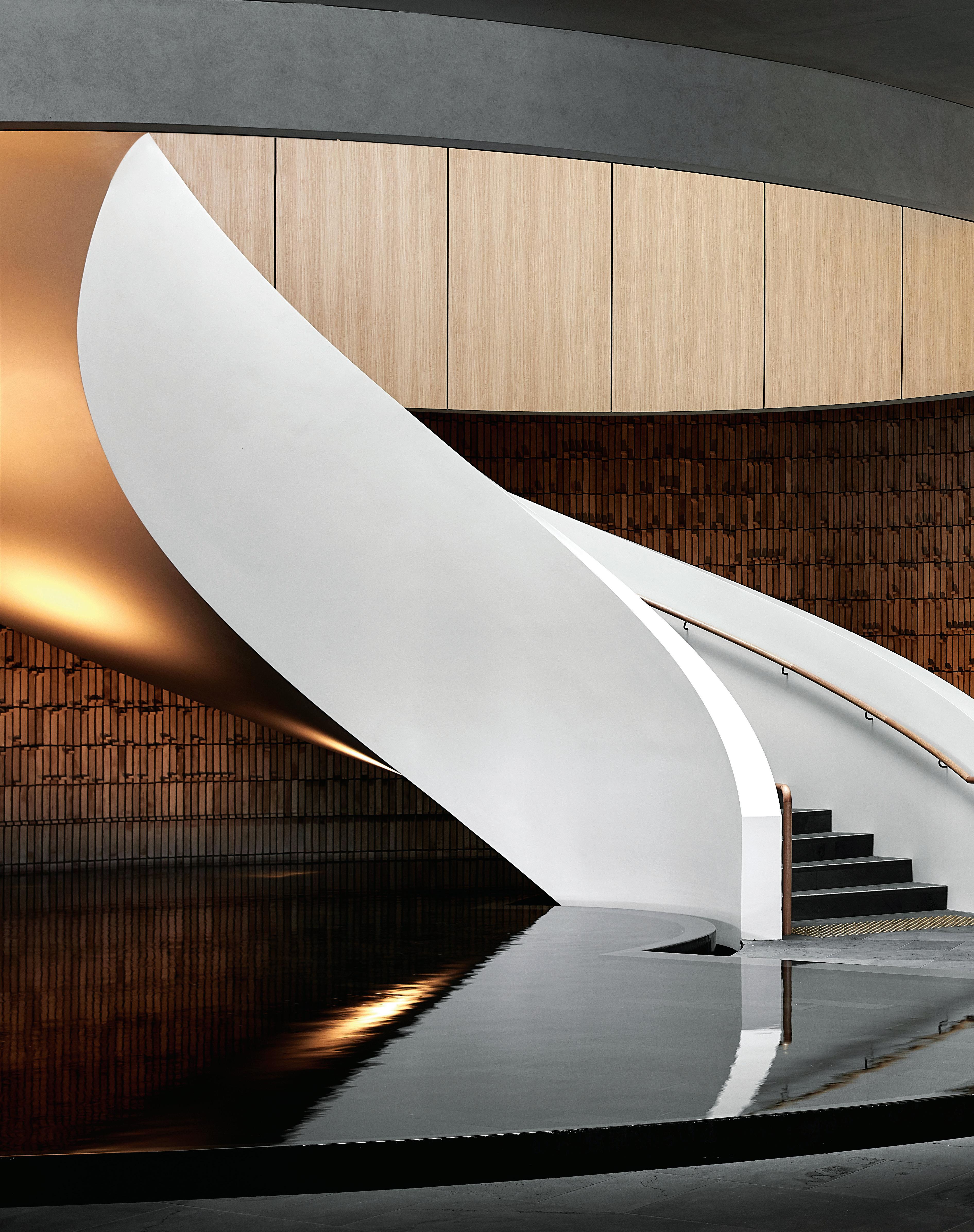
Hard/Soft Surfaces
Reverse Spanish brick provides a textural shift from the smooth lines of the stair and adjacent raked wall.
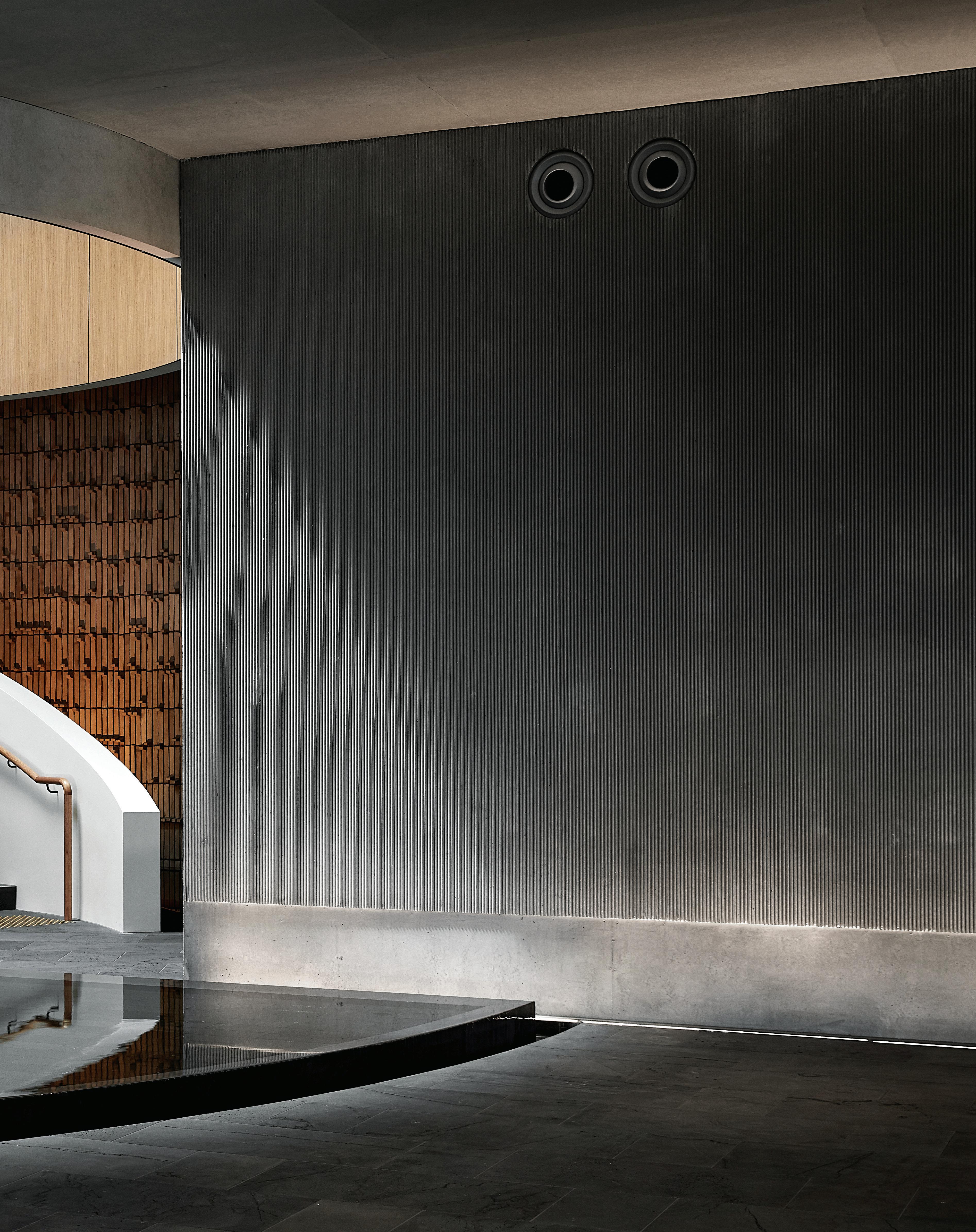

As a destination to feed the soul and renew the spirit, there is none better than Alba Thermal Springs and Spa. This beautifully crafted health and wellness retreat nestled into the landscape of Fingal on Victoria’s Mornington Peninsula, is not just a place of respite, but a monumental design achievement that is both sensitive to landscape and more than requisite to facility.
Constructed throughout the pandemic, the project was completed in October 2022. Designed by Hayball, with project lead Robert Mosca and his team, Alba is a faultless celebration of style that exceeds both the brief and client expectations. Collaborating with Hayball, Campbell Morris (managing director of Mala Landscape Architecture and Urban Design) brought a vision for the surrounding landscape that has helped transform this project from spectacular to extraordinary.
Alba is situated on 15-hectares of undulating landscape that envelopes the building and showcases its monumental scale and, on arrival, the structure’s majestic, clean concrete lines dominate. Signage is discreet, sitting aside a glazed sliding doorway into an enormous reception hall. Here guests can choose either the public or private journey for their wellness experience.
For the public, entry is through a full-height pivot door, past a circular installation with overhead round skylight that serves as a reflection and transition space. Further along are change rooms that feature centrally-placed circular gardens under skylights and hundreds of light-timber clad lockers line the walls.
Throughout, the circular motif has been employed and extrapolated with curved walls, rounded windows, and a spectacular spiral stair rises from an indoor pool with waterfall edges that demark the public and private spaces. The surrounding pool wall is clad in handmade Spanish reverse brick tiles with the water reflecting the light and changing shadows.
For private clients there are over 35 bookable spa wellness and bathing treatments and the experience begins through a discreet opening, just off the reception, and up the circular stair to the next level where Thyme restaurant and the treatment rooms are located.
Open to all guests, Thyme comprises an intimate dining area and an expansive casual space with floor-to-ceiling windows and views to the surrounding landscape. Within are timber tables, tan leather chairs and a wall-hugging leather banquette to complement the stone bar with dark timber shelving.
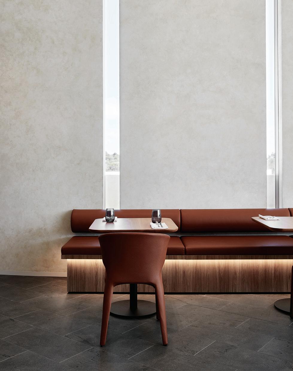
Beside Thyme is the private treatment area. A concealed timber pivot door opens to a waiting area with lounges and banquette seating in circular booths with overhead suspended pods surrounded by round concrete forms. Behind this space is the manicure and pedicure room with sumptuous soft blue leather chairs and timber tables.
Another pivot door leads to the treatment rooms that are accessed from dark, winding, corridors and the atmosphere is seductive. Designed for singles and couples, the rooms are equally as dramatic, yet restful, with curved ceilings, transparent curtaining and recessed lighting.
At the rear of the building are the pools and springs – all 31 of them – that include geothermal and herbal-infused botanical pools. Set amongst the abundant vegetation, the various-sized pools are accessed by winding pathways. The Rapids, a curving water feature, traverses the landscape from top to bo om. It is calm in parts and fast in others and includes a section of man-made rapids induced by handmade bluestone tiles laid to introduce ‘bumps’ to the flowing water.
Morris elaborates, “One of our key driving aspirations right from the start was to regenerate, so there are 50,000 plants on this site all from local seed. We haven’t tried to rewild the site, the gardens are very much curated, using endemic plants.”
While pools are designed for a group or individuals, there is something for everyone, including a rainwater pool surrounded by a wall of cascading water. Speciality treatment/plunge pools are to the right along with the steam and sauna rooms and there is even an outside cold plunge pool for the total fi re and ice experience.
On the roof of the building are three thermal and three salt bath rooms with oculus and private shower areas. It is at this place on the site that the scope of Alba can be fully appreciated, as the building rises and disappears into the terrain and, incredibly, there is ground access to and from every level of the building.
The colour pale e of Alba is concise. Greys to charcoal, contrast with natural warm hues, however the organic materiality is a key connector between the interior and exterior. Handmade tiles, honey timber slim batons on ceilings, bluestone tiles underfoot, granite and timber decking pathways, and brass nickel fi ings and fi xtures outside and in. Lighting is understated, recessed under architraves, where floors meet walls and LED spotlights inset in ceilings shine down and, under water, radiate up. However, it is the use of natural lighting that is truly impressive. Windows provide full or di used light and contain glimpses or expansive views, while skylights abound and cast light and shadow.

Mosca says, “This project is all about the experience. It’s about the user. It’s not about pu ing a big building on top of the hill, for us it was about pu ing it in the hill, making the landscape the hero and ensuring a memorable and restorative guest experience.”
The property can cater for some 400 guests and, while large, Hayball and Mala’s design, provides intimacy and privacy at every opportunity. Alba is a world-class luxury wellness destination that is already forging a place on the design, wellbeing and natural landscapes. Simply put, the experience of Alba is exceptional.
hayball.com.au, mala.net.au
The facilities include 31 pools and springs, including geothermal and herbal-infused botanical pools.
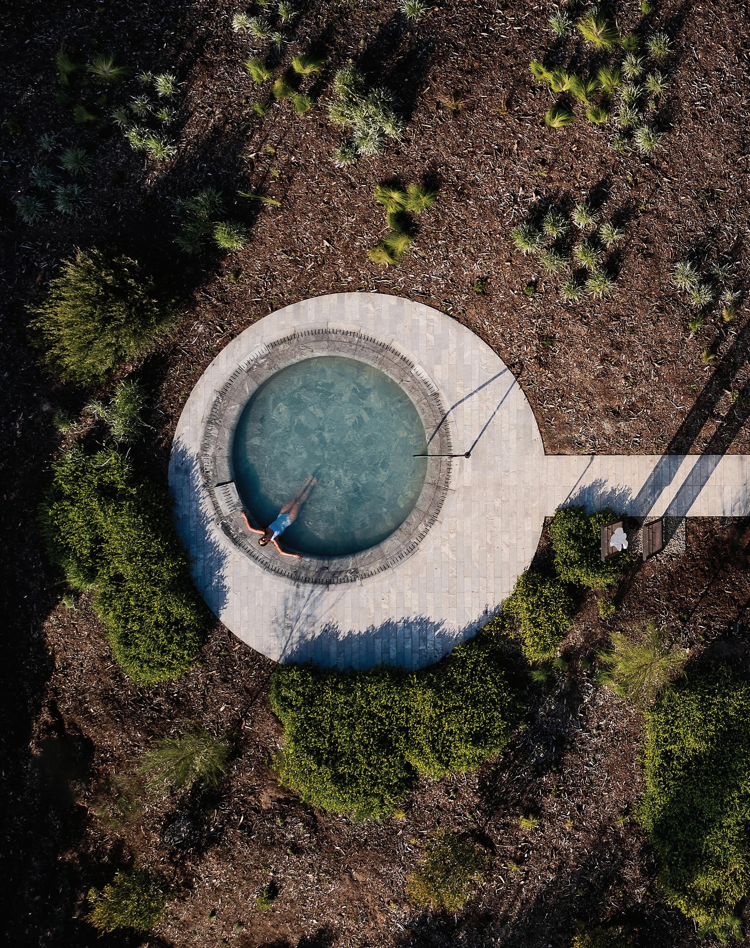
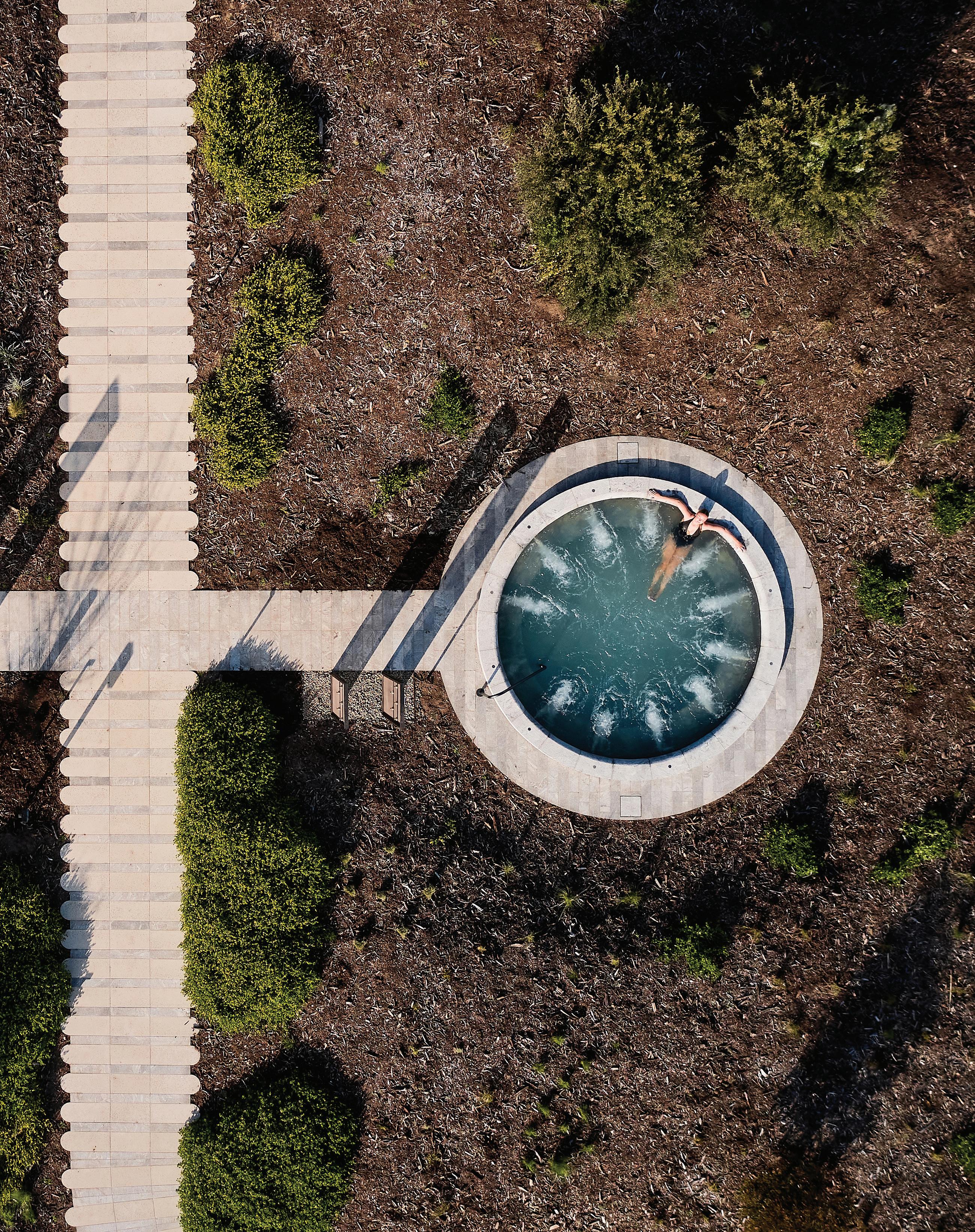
Wellbeing within the mining industry is a serious business. Consideration for safety, health and happiness is critical and flows through to touch almost every aspect of an organisation – from the aspirational, like company values, through to day-to-day decisionmaking. In the case of MinRes, specialising in the delivery of mining services and with a growing commodities portfolio, the health and happiness of its people was the focus in the design of its new headquarters: a wellbeing centre that subtly incorporates workplace into its design.
This much discussed destination, located in Osborne Park, Perth, is known among locals for its family-friendly, community-embracing culture and its provision of premium-quality, Platinum WELL-rated amenities that have been designed exclusively for MinRes’ people and their families.
In executing the interior architecture for the multi-storey headquarters Milieu Creative embarked on a “greater conversation” around how architecture and spatial environments can enable people to feel happier at work, says Davina Bester, project lead
and managing director of Milieu Creative. “This was an opportunity for MinRes to have their building represent who they are and what they want for the future, which really is all about their people,” says Bester. It led Bester and her team to really, seriously consider the “creature comforts” that make people happy when working from home and understand what they need from their place of work. It would ultimately inspire a workplace proposition that would strongly compel people to want to be a part of the MinRes community.
Given Bester’s background in high-end residential and commercial design, she saw this as an opportunity to bring the two realms together in a workplace setting that was to represent both longevity and sustainability, while also giving individuals a distinct sense of ‘feeling good’. “The brief really sat around, ‘How do we ensure we’re returning our employees home at the end of the day happier than when they arrived?’” says Bester. “I thought it was quite an interesting project statement for what we were trying to do, as architects and designers.”
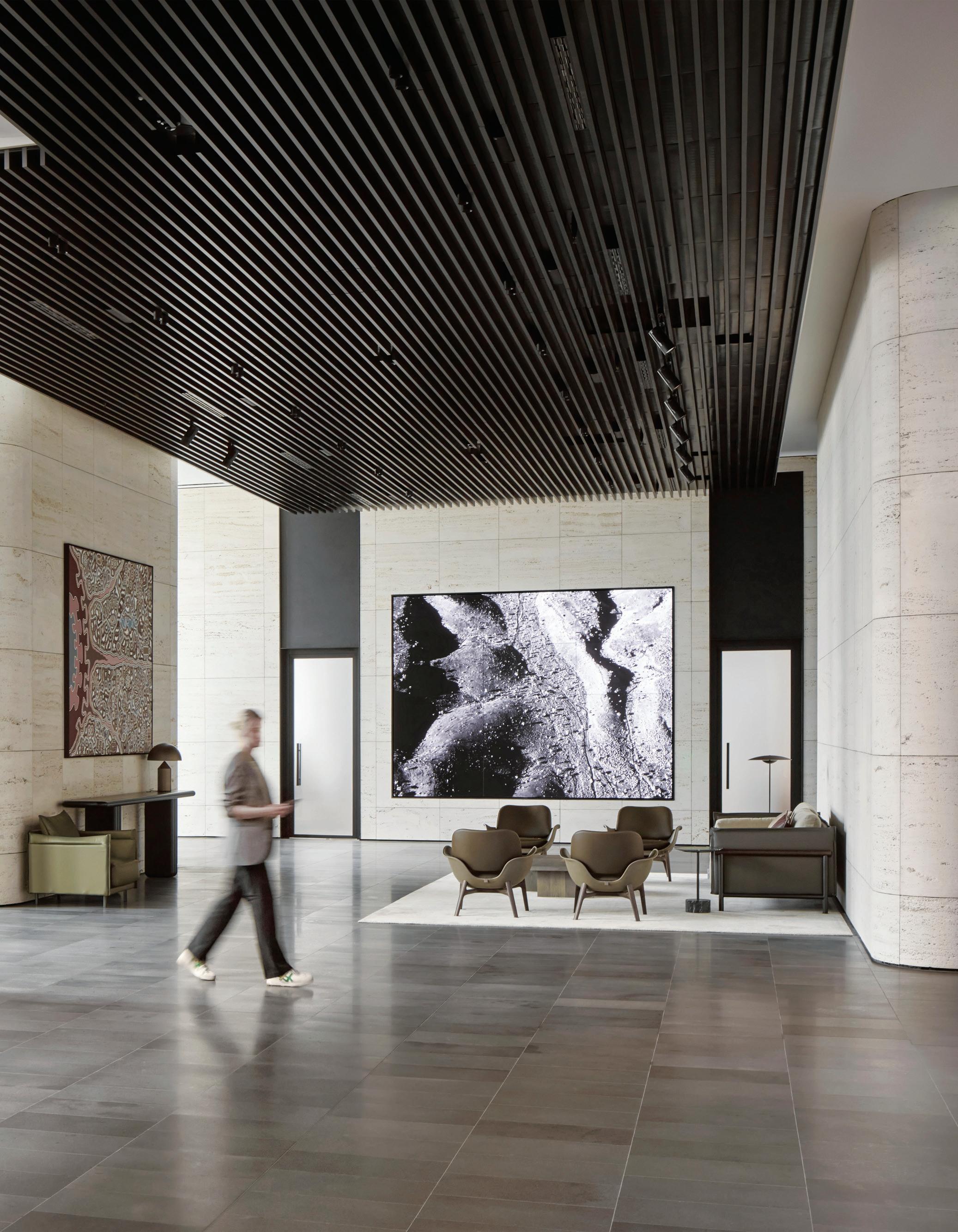
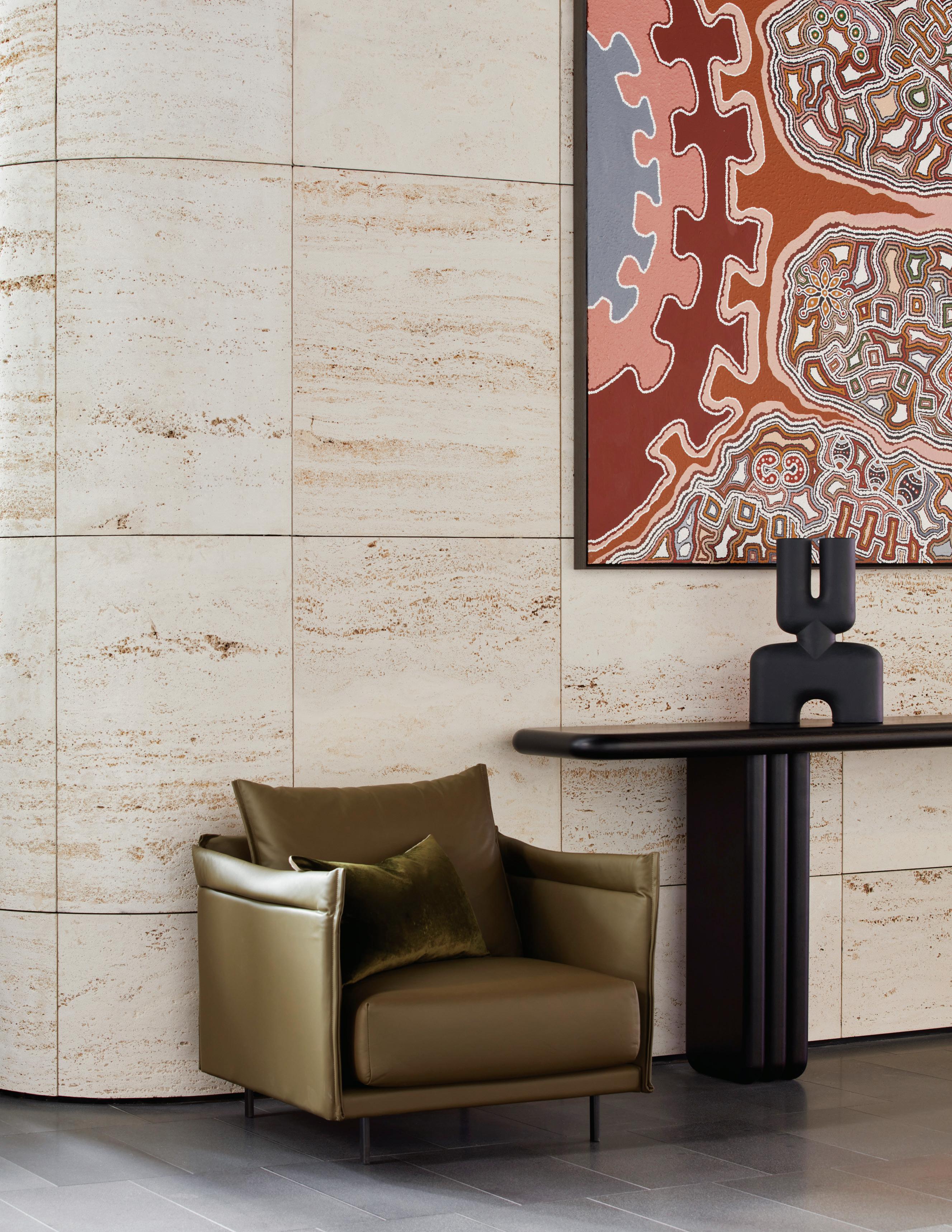
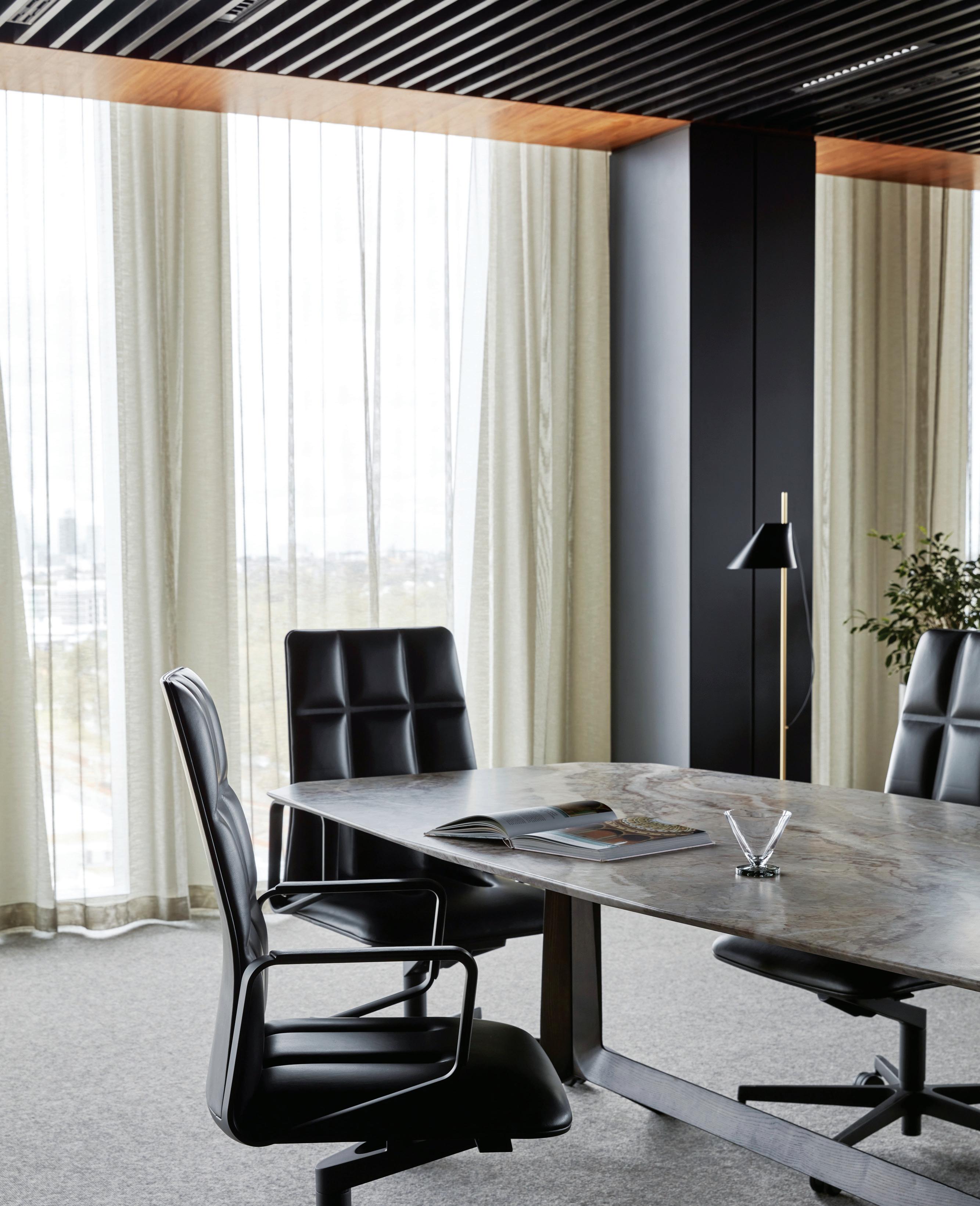
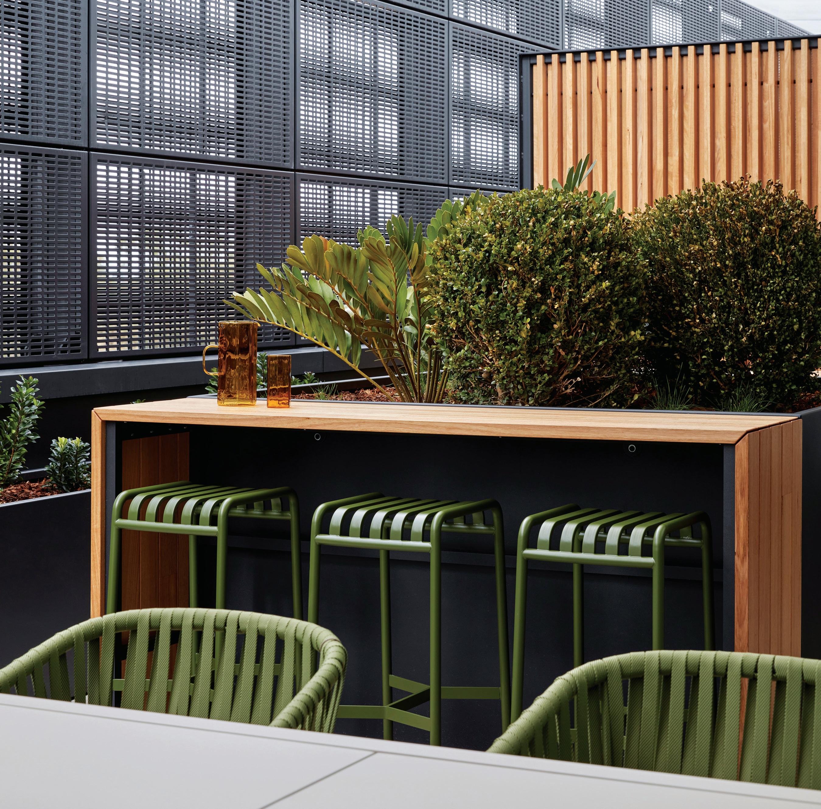
Bester saw access to natural light and a strong sense of community as being imperative to achieving MinRes’ workplace wellness and happiness goals. The first is addressed through design elements that see natural light maximised at every opportunity; natural stone, veneers and textured leathers used throughout; and fine details that might usually be more at home in, well, your home.
The second, while more complex to tackle, has been achieved by effectively treating employees as family members, and giving them every opportunity to bring their own families into work. Bester points to the impressive array of amenities integrated throughout the building. A “phenomenal” restaurant, café, gymnasium, yoga decks, and crèche; open to employees and their families.
The jewel of this building is level 12 where visitors step out of the lifts into hotel-like surrounds, distinctive for its five-and-a-half metre-high ceilings and travertine-clad walls. Level 12 is also home to the premium hotel style restaurant with multiple food stations and views overlooking the surrounding wetlands. Perhaps most impressive is that the restaurant is privately reserved for MinRes employees. “Every detail of the design of the food is supported by the considered design of the restaurant,” says Bester.
Levels six through to 12 house the work spaces, connected by a central staircase rendered in glass and Corian. Here, a central skylight and floor-to-ceiling glazed windows have been engineered to maximise optimum thermal performance and ensure every employee has access to natural light and views. Bringing the
rhythms of nature indoors is an abundance of natural planting woven around the workstations, and statuesque trees that sit in the voids reaching between floors: a series of sheltered ‘sky gardens’ for solitary moments.
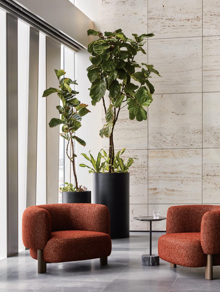
Bringing the wellbeing journey full circle is the integration and design of a health clinic on the ground floor, along with a fully specified medical clinic. Features include fitness equipment, audio testing, medical equipment, and access to health professionals and psychologists.
“The MinRes executive team drove a lot of these aspirations for the project,” says Bester. And, to their credit, they did not compromise on their original vision. “The designs we proposed at the very beginning really are what we delivered at the end, which was quite exceptional. There was no compromise in terms of specification or finish, or on the amount of amenities.”
The results ring true to Bester’s original aspirations for the design, which surely must be the greatest outcome a designer can experience. “It is phenomenal to see people coming in, to meet their spouses for lunch in the restaurant and café, and pick up the kids from the crèche,” says Bester. “All these functions within the greater organisation are running at a success rate.”
It just goes to show, she says, that “architecture really can have a profound impact on people when done right”.
milieucreative.com
As we look to the future of workplaces, it’s clear that there is an accelerated shi towards more exible and hybrid work arrangements. While some continue to work from home, many will return or work in hub and spoke models, or other remote locations: there will still be a need for physical o ce spaces. However, these spaces will likely look and operate di erently with a greater emphasis on collaboration, exibility, and employee wellbeing.
In this new era of work, furniture requirements for o ce spaces will need to evolve. For example, ergonomic chairs and sit-to-stand desks will become even more important as workers spend longer periods of time sitting in front of their computers. Collaborative spaces will also be a key feature of modern o ces, with furniture designed to facilitate brainstorming, problem solving, and teamwork.
Another important consideration will be the need for privacy and con dentiality in open plan o ce layouts. Furniture solutions such as privacy screens and sound-absorbing panels can help create a more comfortable and secure workspace. Additionally, as remote work continues to gain popularity, there will be a need for hybrid workspaces that allow for in-person and virtual collaboration.
Workspace Commercial Furniture’s expert team is dedicated to providing innovative furniture solutions that support the evolving needs of modern o ces. With a wide range of products and services, we can help businesses create spaces that are both functional and inspiring for their employees. Because being at the forefront of the evolving workplace and meeting those shi ing needs is both our speciality and our passion.
As we look to the future of workplaces, it’s clear that there is an accelerated shift towards more flexible and hybrid work arrangements. While some continue to work from home, many will return or work in hub and spoke models, or other remote locations, there will still be a need for physical office spaces. However, these spaces will likely look different than they did in the past, with a greater emphasis on collaboration, flexibility, and employee well-being.
In this new era of work, furniture requirements for office spaces
create a more comfortable and secure workspace. Additionally, as remote work continues to gain popularity, there need for hybrid workspaces that allow for both in-person virtual collaboration.
At Workspace Commercial Furniture, we are committed staying at the forefront of these changes in the workplace. Our team of experts is dedicated to providing innovative furniture solutions that support the evolving needs of offices. With a wide range of products and services,

 Words Nick Jumara and Yen Dao Artwork Claire Moon
When Judy Singer coined the term neurodiversity in the ‘90s she was looking for “a suggestion for the name of a political and civil rights movement for neurological outsiders… simply naming an indisputable fact about our planet, that no two human minds are exactly alike, and using it to name a paradigm for social change.” Across all parts of our society, as that social change gathers pace, there are clear opportunities to improve the experience of the workplace for everyone.
The lived experiences of every neurodiverse person are varied and many and, for some, an onslaught of environmental and cultural difficulties at the office isn’t just irritating – it can often be disabling. Eman Ezekiel Aboobakuru, Melbourne-based designer, and Claire Moon, Regional Victoria-based artist, both identify with neurodiversity and find workplaces less than fit. Aboobakuru puts it this way: “For me, the external factors that I can’t control are what make my disabilities difficult to navigate, as opposed to the disability itself.”
Beyond the buzzwords of human-centred design and an inclusive workplace, what does it mean to truly design for the diversity of perspectives and experiences in the workplace? Aboobakuru and Moon’s insights on office environment and culture shows how conversation, comfort, choice and community can go a long way to delivering a better workplace for everyone.
Conversation
Progress begins with conversation. The culture and construct of
work, all the little things that are easy to take for granted or may go unnoticed by neurotypical people, can aggregate into socially exclusive environments. As Moon says, “Social inclusion is a big part of work and we have been excluded in conversations about the workplace.”
For Aboobakuru, the workplace includes everything about the experience from the interview forward. “Hiring is a complicated process. From applications, to paperwork, to interviews, and the effort that goes into shaping how you look, and talking a certain way, it is a lot as a neurodivergent person. A typical recruitment interview might not be the environment where I express myself best,” he says.
Fostering a neurodiverse workforce requires increasing understanding and awareness across the experience of work. “First, we need to have more conversations like this. We need to have them as students, to learn about each other,” says Aboobakuru.
Key considerations:
• Productivity may look different and requires more education and understanding but the benefits are long term.
• Burnout syndrome due to prolonged stressors is a common biological response due to disabling environments. It is systemic and requires attention.
• Awareness starts with conversations not unlike the ones we’re having here.
do neurodiverse people experience
and culture? Nick Jumara and Yen Dao interview two neurodivergent individuals to better understand what’s at play.
Comfort has broader implications when uncomfortable might be experienced as disabling. For neurotypical workplaces, comfort is often a one-size-fits-all approach to sensory experiences, which can create disabling environments for those with neurodivergent conditions like ASD or ADHD.
For Aboobakuru and Moon, comfort is a sensory experience that varies from day to day. At work, Aboobakuru is specifically detail-oriented and attuned to be socially cognitive. He finds environments disabling when he is unable to adjust to physical and social energy levels.
Moon works creatively, is sensitive to change and often finds intimate environments with smaller social interactions more enabling. Designing for comfort means self-adjustment and choice.
Key considerations:
• Reduce visual disturbance in workspaces such as glare, clutter or people constantly coming and going.
• Intuitive navigation with visual cues that provide clarity in wayfinding.
• Non-stimulating colours with calm natural elements in areas of high stimulation.
Speaking of choice, agency in the workplace is where equity and integration come to life. As social environments with simple purposes, workplaces don’t lend themselves to individual needs. Designing in choice is enabling. It allows individuals to self-manage and adjust to their own needs with dignity and autonomy.
Moon finds that having options to personalise and organise their space gives people choice and predictability. Unpredictability equals a lack of control in an office experience, but choice does the opposite. This is because choice builds adaptability. Aboobakuru often finds choice in a variety of micro-environments. “I’m attuned to social energy and environmental predictability and so I like to move through a variety of spaces.” Choice is a good place to start on the road to agency.
Key considerations:
• Workspace micro-environments with a diverse kit of parts ranging from private, semi-private to social spaces where people can prevent sensory overload.
• Personalisation or individual adjustment of the environment to determine comfort levels.
• Creative expression that provides the tools for different ways of communicating with dignity.
“Moon finds that having options to personalise and organise their space gives people choice and predictability”
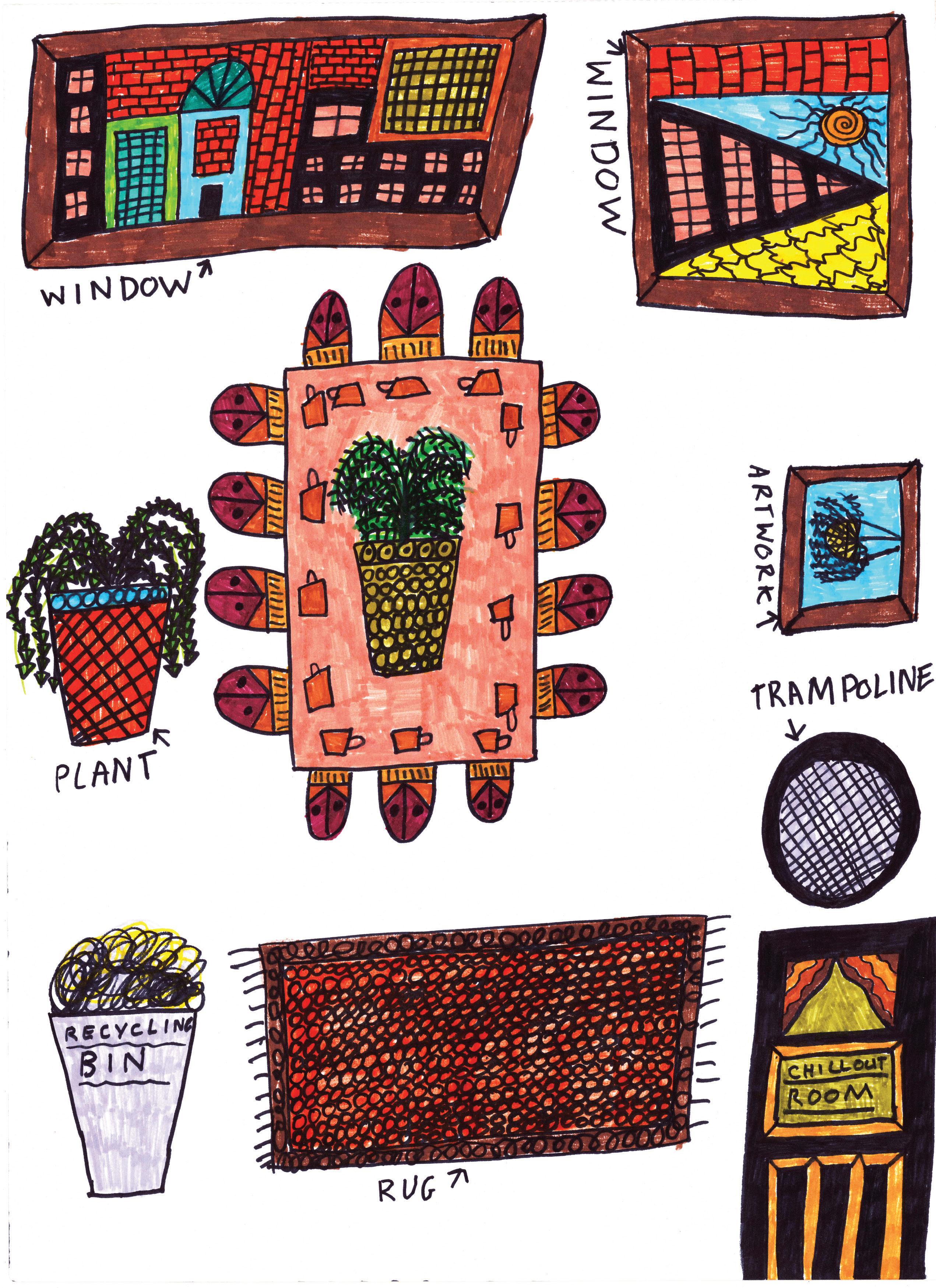
Workplace communities that embrace diversity support people who think differently, solve problems laterally and share knowledge in creative ways – the many strengths of neurodivergent people.
Moon notes that “neurotypicals find it confronting to hang out with us. They underestimate our intelligence and our capacities to achieve stuff.” Why is that? As a whole community of practice, Aboobakuru states: “I love what’s happening. That we are broadening design towards a more holistic view of the world and the people in it. What I love hearing [in workplace design] is that different disciplines are seeing intersections of life and applying it.”
Key considerations:
• Social settings that don’t force collaboration where people can choose to participate.
• Equity within spaces and systems that encourage more varied participation.

• Cultural cognisance of how amenities, third spaces and hybrid working provides an extension of workplace choice.
As designers it’s all too easy to jump into solution mode but, like most good endeavours, there’s a moment before that where we can simply interrogate what it means to be human in a workplace – both the environment and the construct. If we can broaden how we define the diversity of human experience, can’t we also broaden how a contemporary workplace fits into that?
After all, it isn’t neurodiversity, disability or non-normative experience of life that’s the problem; it’s the environment and culture unfit for it.
“I love what’s happening. That we are broadening design towards a more holistic view of the world...”





At Carr, to better understand designing for social sustainability, we have been interrogating how the population experiences the workplace and what it means for a space to be inclusive.
Through conversations with our clients, the large impact of seemingly small nuances of an environment’s design are being understood across aural, visual and physical experiences. These impacts can hinder and, in worst cases, become a
barrier to an individual’s ability to be part of a workplace or activity.
How can we be more cognisant of designs that impact senses and create more inclusive environments to support broader demographics? How can we design equitable spaces with purpose and sensitivity?
An acoustically designed space can have the ability to create energy and promote activity; conversely, it can allow for hyperfocus and retreat. In the case of spaces for activity, the experience of increased sound reverberation by employees and clients can be overwhelming, making situations and a space difficult to participate in.
One example came from a client during a networking event: a visually impaired participant attended who relied upon their aural senses to communicate and navigate space. The acoustics of the venue created spatial noise that interfered with their interactions, while sound reverberation induced disorientation.
Greater consideration for sensitive acoustics and the associated activities enables a better outcome and experience for all. In complex spaces, we often seek support from acoustic engineers to ensure an audibly inclusive experience is achieved.
In any environment, increased noise, interruptions and multiple sources of sound without the ability to escape creates anxiety and mental barriers. To combat these issues, clients are increasingly supportive of implementing retreat spaces in their workplace – spaces not assigned to first aid or parent rooms, but purely for retreat and sensory deprivation; dimly lit and quietly isolated spaces that are discreet and offer people a place to regain cognitive balance.
In many discussions with consultants and users alike regarding accessibility, sound can paint a picture of the environment and aid navigation. In this case, an
“How can we be more cognisant of designs that impact senses and create more inclusive environments to support broader demographics?”
individual uses sound as aid to determine space. Something as simple as the sound of footsteps from one floor finish to the next can signify a change in environment, encouraging a change in behaviour or an anticipation of the next one. Examples of this can vary from a small scale, such as moving from a corridor to the base of a stair void. On a larger scale, it can identify the transition from a public space to a private space.
Meeting spaces that enable amplified sound require a hearing loop connectivity to allow individuals with assisted hearing, such as hearing aids, to connect directly with the content.

One of our clients uses an app via Bluetooth to ‘tune in’, reducing the need for a lanyard device or pen. This creates an integrated and dignified approach to hearing augmentation.
An article recently published on the rise of closed captions suggests that with the complexity of recorded sound, a wide range of individuals are supplementing aural with visual communication. This leads us to think that perhaps hearing augmentation and live captioning are not reserved only for those with hearing impairments, but as a more thorough way of communication for all. Tuning into an online presentation with a personal device becomes a silent disco of sorts, removing background distractions and normalising the experiences for all.
Neurodiversity and the relationship with light is often cited by our clients as the greatest impact to lack of focus and induced anxiety.
Historically, lighting in the workplace has typically been measured in lux, where achieving 300lux as a baseline in an open work environment with no user adjustment is considered the norm. However, as we move to a more inclusive environment, and target reduced energy usage and greater individual choice, we are looking to reduce the overall general lighting and introduce task lighting, creating comfort and freedom to an environment.
In addition to brightness, colour temperature can also trigger anxiety for those who have a cross-sense relationship
with colour, known as synaesthesia. RGBW lamps – a type of LED light that can produce different colours and shades – enable colour temperature control variation to change how warm or cool the light appears.
Navigating space Luminance contrast refers to the amount of light reflected from one surface compared to the amount of light reflected from another surface to assist in contrast and definition of an object.
While luminance contrast is a requirement of the Building Code of Australia, there is a growing need to be more mindful of visual impairments and perceived contrasts when designing environments, from wayfinding to spatial planning and specified materials.
In recent discussions with a client, they explained that while locating a door handle is relatively easy, they have difficulty navigating glazed rooms. This raises the question of how we can better consider an environment’s planning orientation, transparency, vistas and wayfinding to carefully aid the experience.
Likewise, when discussing flexible versus permanent furniture for those who are visually impaired, challenges arise in settings with flexible furniture. Permanent settings afford those who are visually impaired to remember a space and navigate around it. Similarly, to those who are hearing impaired, a mental picture of the space is created. Flexible settings often disrupt an individual’s picture, creating disorientation, bumping and anxiety. A balance of spaces, some that flex versus others that are permanent, create predictability, clear communication and understanding in the workplace.
As interior designers, we have a responsibility to design equitable workplace and hospitality environments that sensitively consider the sensory experience of a cognitive and physically diverse population. Knowledge, technology and an appreciation of user experience are affording us the opportunity to create spaces that encourage inclusive participation and engagement – and that’s a design worth investing in.
carr.net.au
Words Gillian Serisier Photography Various
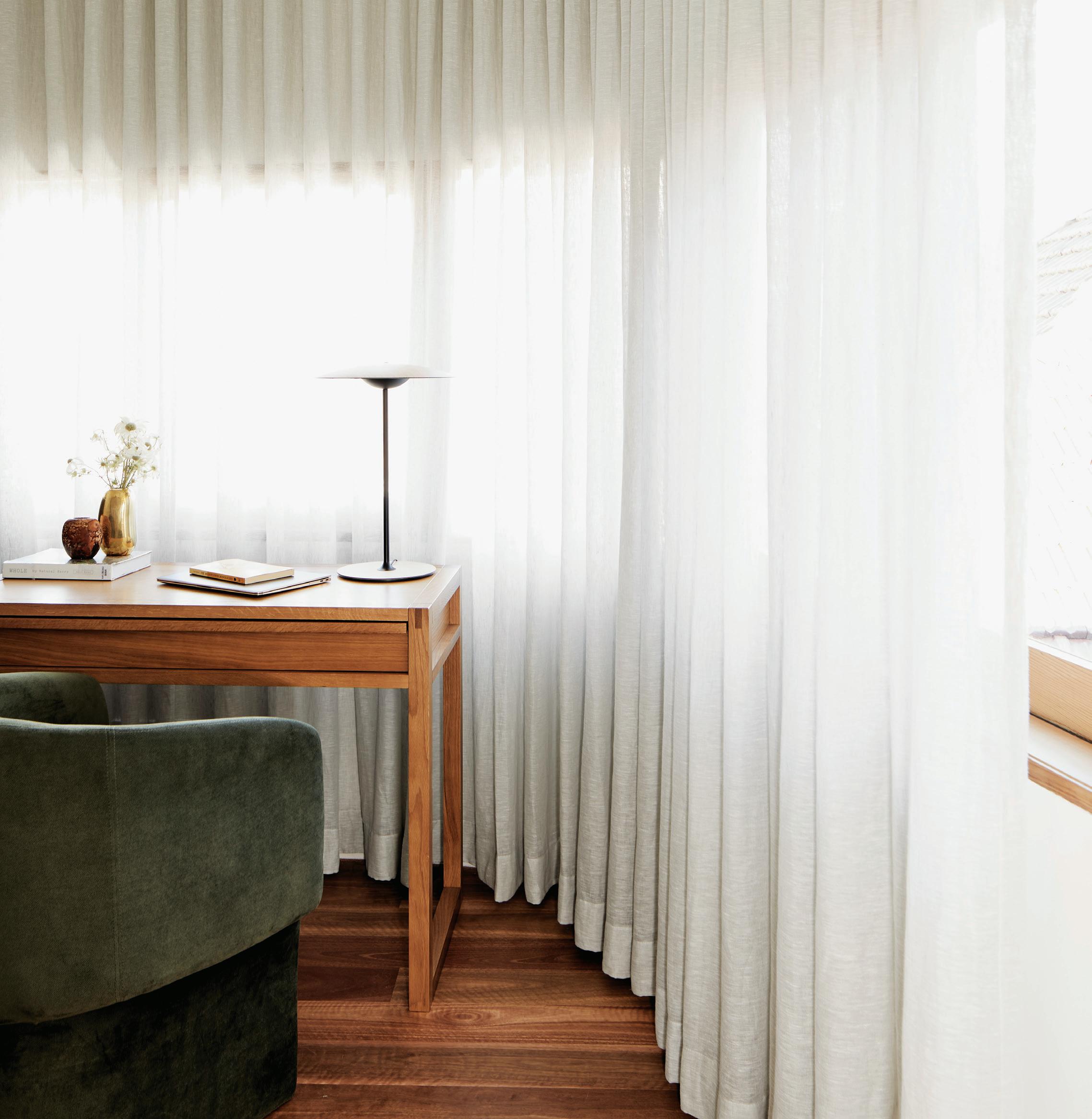
Where once the trend was for the younger workforce to marginally prefer home over office, the difference is now stark. A whopping third say they would quit their jobs if forced to return to the office.1
Navigating myriad iterations, the workification of home has significantly shifted both position and relevance. Once the dining room or corner nook, the home office is now intentionally occupying space in our homes as a bespoke inclusion. That said, finding the balance between ergonomics, acoustics and aesthetics remains paramount for an integrated design to work well.
New residential architecture, for example, is now commonly including a home office as Simon Addinall, co-founder and director of Those Architects, affirms. “We’re definitely designing studies or offices into all of our projects,” says Addinall, whose firm has included offices both small and large, as well as multi-purpose iterations doubling as spare bedrooms, in every project of the last year.
In multi-residential architecture a new typology shaping the flex room 2 is seeing considered offices included in initial plans. “People’s demands change as the market changes. What was once two bed-two bath is now two bed-two bath-one flex, where the flex in this new brief is a home office,” says Stefania Reynolds, project director and head of interiors at Studio Johnston. That said, an office or study space has been included in most of Studio Bright’s
projects since well before the pandemic: “We’ve always been making these flexible spaces. What we saw [during COVID-19] is how incredibly useful they are. Where previously we would have gone with a desk in a little nook as acceptable, the issue of soundproofing is a much more important factor now,” says Mel Bright, director of Studio Bright.
Lofts and spare bedrooms are also being transformed to be purposefully occupied, with designers and architects creating custom interiors that are site and purpose specific. Reynolds has seen a pandemic-fuelled increase in clients briefing Studio Johnston for renovations and changes rather than new homes: “We were hearing a lot of, ‘I’m not travelling overseas, I’m going to sink my money into making my home work for me, because that’s the only place in front of me right now,’ ” says Reynolds. Moreover, their requests are specific in terms of office needs, with acoustics, airflow, light and view highly prized.
No longer are unusable or dark spaces seen as fit for an office. Rather, rooftops and other premium spaces with potential for a good view and disconnect from the family home are being chosen. “One of the homes we currently have in construction, places the office in a premier spot in the house that looks out over a big, nice garden. Whereas the bedrooms are tucked centrally on the site,” says Addinall.
With an estimated 40 per cent of the Australian workforce currently working from home, the push for functional home work spaces mirrors international shifts and is not about to turn around.
Similarly, the office spaces in Studio Bright’s 8 Yard House, are divided into two camps. The ones within the light timbered house are each facing outwards with operable windows for view, light and ventilation, while the bedrooms opposite are each aligned to these amenities as an extension of their private space. In another part of the house a garage has been remade as an office with a dark timber interior and access from the lane. “I like that it is separate from the house. You can imagine walking outside to a studio/office space to get that little bit of separation that you can’t get from a bedroom. Also, you can have a meeting without having to walk someone through your house,” says Bright.
Indeed, one of the key elements to a successful office within a home is the creation of a physical and mental boundary. “Having a dedicated work area away from the hubbub of the home’s shared zones is essential for my clients – they’re after a feeling of quietude and a space that’s appealing to spend time in,” says Greg Natale, principal of Greg Natale Design. That said, Natale does not approach an office as a departure from his client’s character towards a corporate response. Rather, he sees it as a way to express another aspect of the home or owner. “These sequestered spaces can be a chance to conjure something really evocative and expressive, channelling the moody grandeur of heritage studies or reflecting the client’s creative pursuits,” says Natale.
Acoustics in particular are being addressed with the most germane being a closable door. “It’s not always a very big space. But it is very important. It’s a small and powerful space. And if there’s a door to shut it off, you feel private. Say the kids come home at 3pm and make noise, you can still get on with your work and your Zooms,” says Reynolds.
For Studio Bright’s Autumn House, the study has been placed on the far side of the internal courtyard with a closable glass door creating a barrier, while allowing a sight line to the living area and the courtyard itself. “There’s a lovely idea that you could be there and look across and see the kids playing, but do you really want to hear that screaming while you’re in the middle of a meeting? Probably not. Getting that fine line of connection and separation is something that’s a really important balance,” says Bright.
Functionality has also shifted. Where once expansive cabinetry for storage was needed, this is now largely reduced in line with the ‘paper free office’. The office in Natale’s Ashfield Home, for example, uses two low built-in cabinets for all utility, while the remainder of the pink space is given over to art, including the Memphis-style spotted desk. “Art can be a foundation for a home office, something that really speaks to the person whose space it is. This is a room for one, rather than the family, so there is scope for more precise individual elements,” says Natale.
“Having a dedicated work area away from the hubbub of the home’s shared zones is essential for my clients”
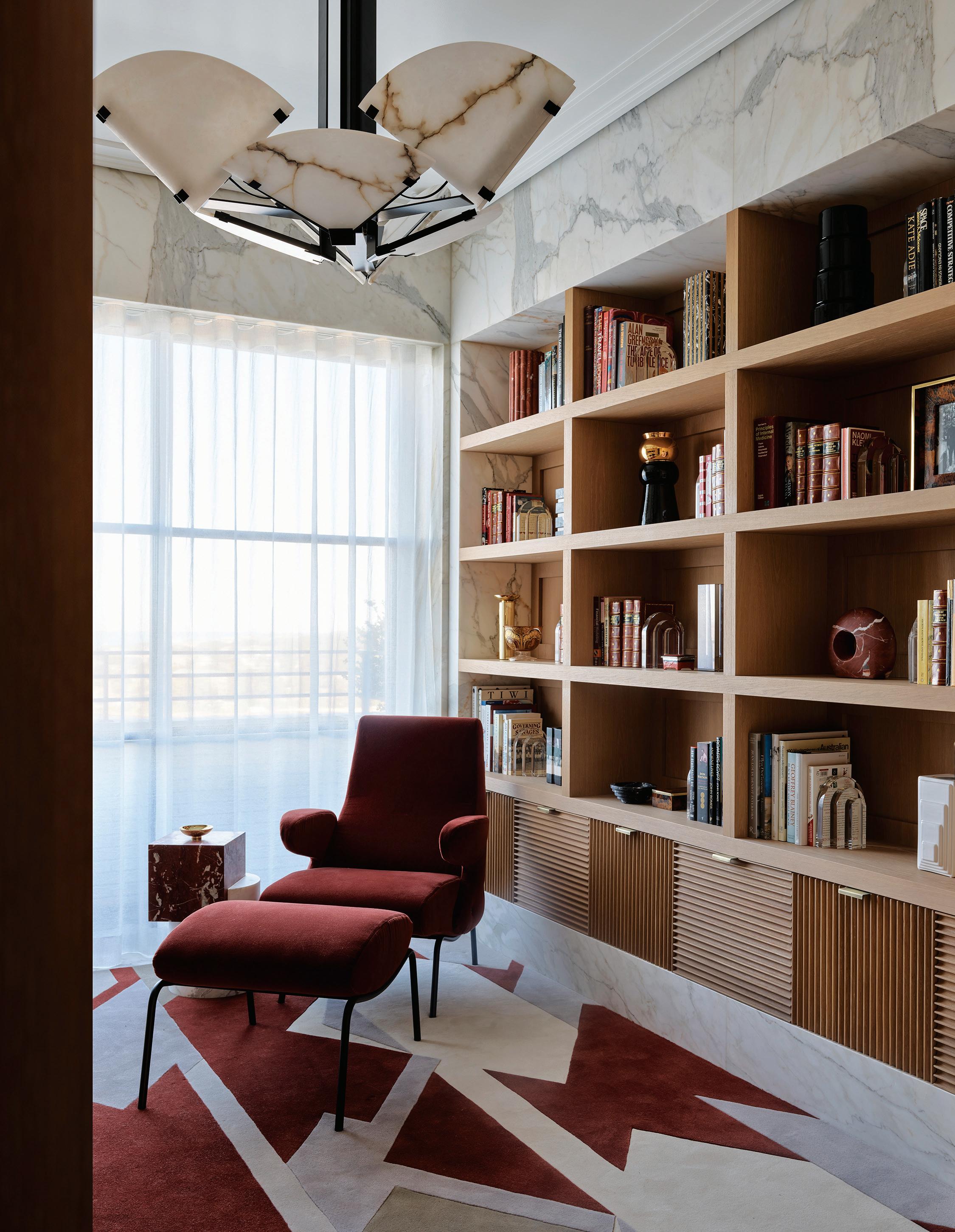
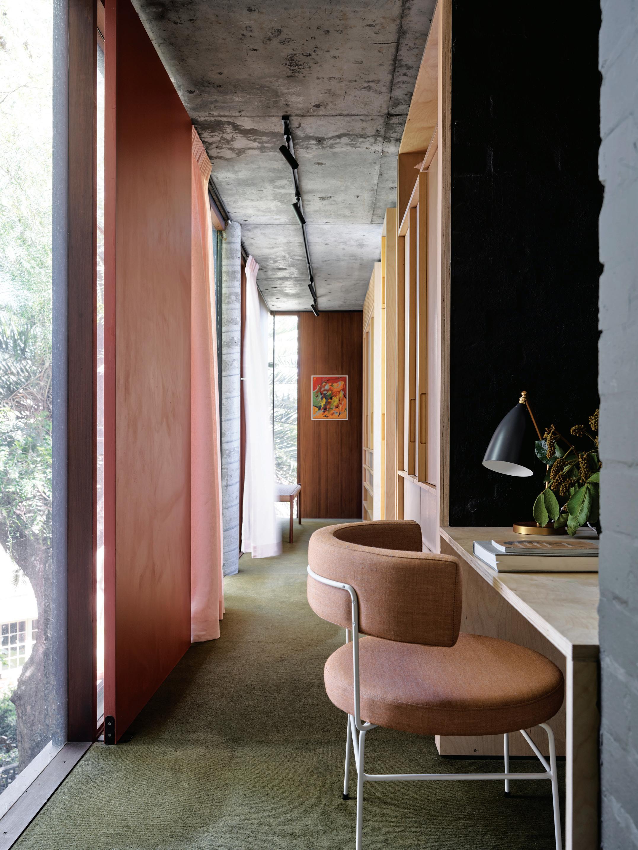
For Reynolds, the functional home office requirements are always going to be individual based. She has a client, for example, who does most of their work on the phone while walking. As such, the roof-top office is small, but the terrace for walking is large. More generally she finds there needs to be natural ventilation, natural light and desk space for two computers for each person. Addinall concurs, with the lack of paper meaning an office can be as simple as a built-in desk and chair, but that individual priorities will prevail. “I have a client who won’t be tolerating even a really nice ergonomic chair if it doesn’t go with the aesthetics of the rest of the house,” he says.
View, light, ventilation, acoustics and aesthetics are arguably the key components of the successful workification of home. That said, there is huge scope for exploring and addressing individual needs and wants that a corporate interior can never emulate. Art, for example, is entirely subjective and what is good to even the best art curator may not be to the individual taste. So, while you may be
proud of the company’s collection, your art at home may be quite different. It is the pairing of these idiosyncrasies of aesthetic with practical solutions that make the workification of home a unique and changing prospect.
gregnatale.com, studiobright.com.au, studiojohnston.com.au, thosearchitects.com.au

References
1 With Millennials and Gen X sitting squarely in the middle, statistics for Gen Z saw 71 per cent opting for hybrid, 20.4 per cent fully remote and 8.6 per cent in the office. At the other end, Baby Boomers were 68.3 per cent in favour of hybrid, 20.5 per cent fully remote and 11.2 per cent in the office. (Statista Distribution of office employees by their preferred working arrangements worldwide in 2022, by generation, statista.com).
2 Ostensibly a room smaller than three metres, but including a window, the flex is the perfect vehicle for a home office.
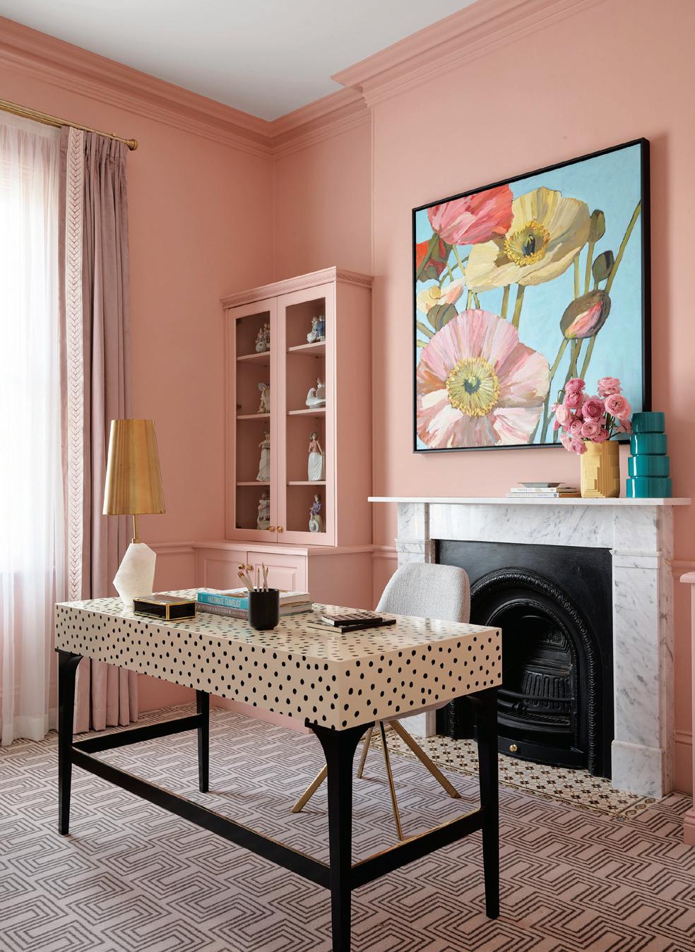

“Getting that fine line of connection and separation is something that’s a really important balance” – Mel Bright
species – European
Oak, European Walnut, American

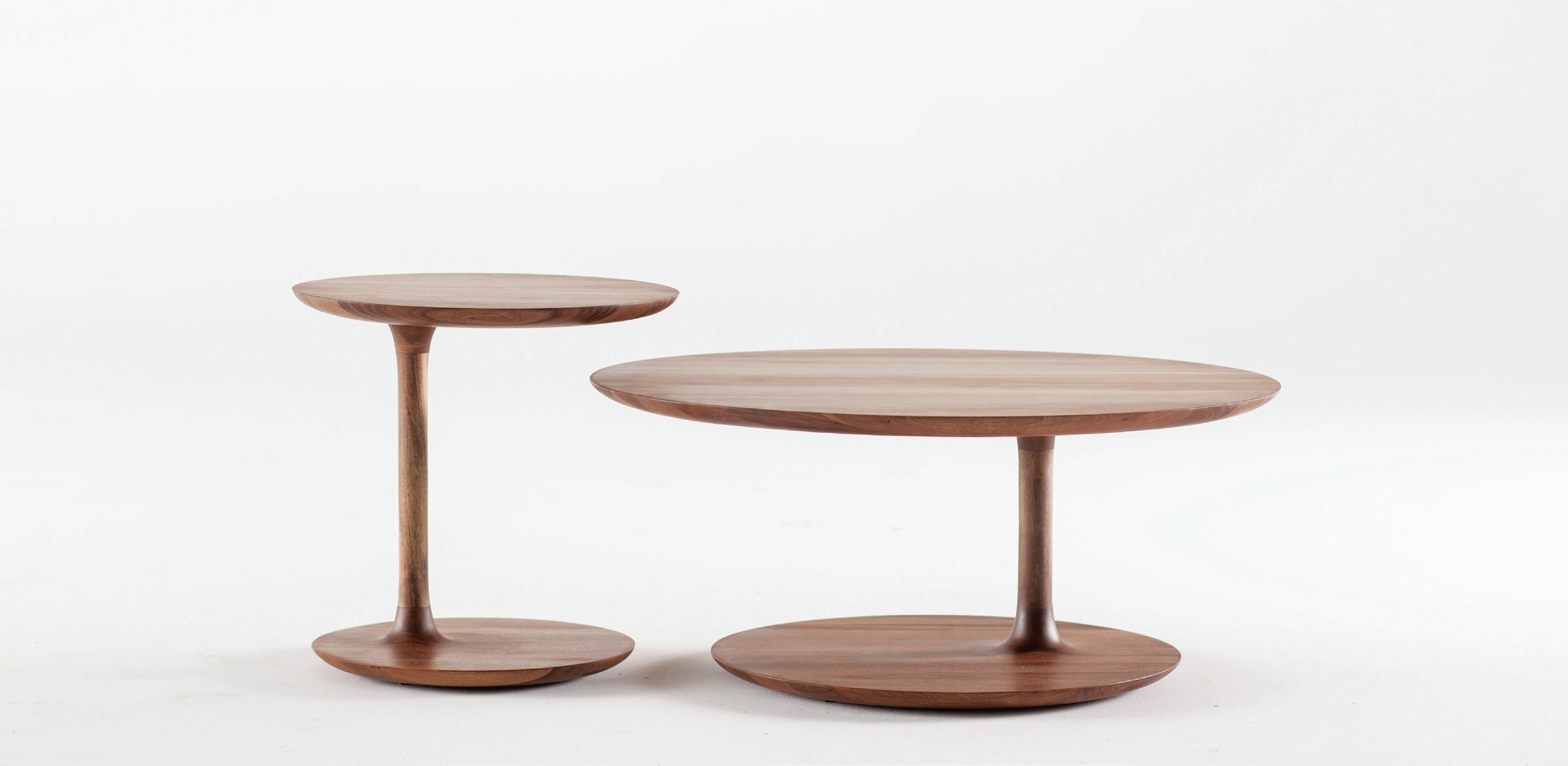
AUSTRALIA INTERNATIONAL (AUD$) 12 ISSUES 8 ISSUES 4 ISSUES 12 ISSUES 8 ISSUES 4 ISSUES INDESIGN $155 $105 $55 $240 $200 $110 HABITUS $160 $115 $60 $252 $188 $94

Phone
EASY TO ORDER
PLEASE SELECT BELOW: ONLINE: indesignlive.com/subscribe PHONE: (61 2) 9368 0150 MAIL TO:
EMAIL: subscriptions@indesign.com.au Indesign Media Asia Pacific 98 Holdsworth Street, Woollahra NSW


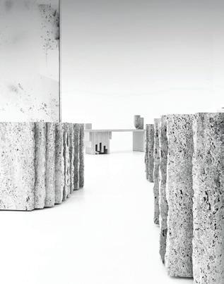


2025
To enter the Competition, each entrant must, during the Competition Period: Subscribe to INDESIGN Magazine and weekly indesignlive.com eNewsletter and complete the online competition form answering ‘what's your favourite design style and why?' in 20 words or less. Fill in your response to the right, or subscribe securely online at indesignlive.com/subscribe.
We’ve been talking about ‘earning the commute’ for a good 12 months now. But it’s begun to occur to me that the conversation around earning the commute with workers is much wider than simply providing a state-of-the art workplace destination filled with premium quality amenity.
Because what I’m beginning to hear is that it’s not necessarily getting traction with people. Many would still opt to work from home a majority of their time. Why?
As Amanda Stanaway, principal and global leader in workplace interiors at Woods Bagot, says, it’s a case of culture eats strategy for breakfast. In the wake of the pandemic, as people move permanently into flexible working mode, Stanaway has observed a sense of culture diminishing within organisations. There’s less ‘stickiness’ between people. Depth of relationships, knowledge exchange and togetherness is delivered in ‘hard version’ rather ‘soft version’. And something is being lost in the transition. So, what makes a healthy workplace culture?
Two of the most important ingredients are belonging and common focus, traditionally delivered as an almost intangible quality soaked up through osmosis and being together in the same place at the same time. But, with a large proportion of people working from home (rising from eight per cent in 2019, to 40 per cent in 2020, and 38 per cent by 2021)1 , these two qualities are no longer fed primarily by in-person engagement.
Add to this the potential long-term impacts of working from home, which include career prospects affected due to (actual or perceived) job effectiveness, reduced opportunities for collaboration, networking, learning and training, and reduced face-to-face interaction with managers,1 it changes the way culture is delivered and experienced, leaving leaders grappling with how to cultivate culture through a computer screen.
Nat Cagilaba is the managing director of We Are Unity, a consulting agency that specialises in sustainable business performance with a focus on leveraging purpose, defining vision, embedding strategy, building brands and unlocking performance culture. “What are the components of culture?” poses Cagilaba.
“If we break down what culture is, it’s a sense of belonging.” Belonging, he says, is about feeling valued in what you do and connected by a common focus (whether that be purpose, strategy or vision).
“To belong and feel connected gives us a common focus. It drives business performance and differentiates from others, supporting in attraction and engagement of team members.
“In the absence of ‘let’s be together all the time’ everything has changed. We need to be intentional in how and why we bring people together.”
As Cagilaba suggests, we have entered the age of “the art of storytelling” where “we don’t have body language or the pre- or post-meeting chats” to lean on. Organisations and their leaders must build emotional attachment and connection. Every interaction must demonstrate purpose-led decision making, and valuesdriven interactions must be consistent with the stories that are told.
Cagilaba supports many organisations in moving towards a purpose-led, valuesdriven approach – foundations that weren’t necessarily articulated in the pre-pandemic years. Now, they must be articulated and brought to the fore. “Strategies to harness culture are becoming much more emotive. To create connection and build a common language between people to reinforce the sense of belonging.”
This puts a new emphasis on the role of leaders and managers as they engage in a more empathetic leadership style, reading between the lines of people’s behaviour onscreen, understanding who is thriving and who is surviving.
“Strategies to harness culture are becoming much more emotive.”
And what does it mean, to thrive at work in 2023? Dr Amantha Imber, an organisational psychologist and founder of behavioural science consultancy Inventium, says: “We know from research that the more autonomy – that is, choice and flexibility – you can give employees, the more motivated and engaged they will feel.”

The key to happy, motivated, productive people is to give them “as much choice as possible in terms of when and where they work from”. She also states that leaders who set a compelling vision and mission and are purpose driven will always deliver effective leadership. And connection is king: “I do think leaders that prioritise connection are incredibly important… This is a lot more important than pre-pandemic where that connection happened naturally and automatically.”
Dr Imber is the co-creator of the AFR BOSS Best Places To Work competition, which is adjudicated on key drivers that contribute to creating a great workplace. These include how much autonomy people have; how, when and where they do their work; flexibility in how they work; opportunities for learning and development; connectedness and a sense of belonging; and is the organisation purpose driven?
“Earning the commute is an interesting phrase,” she says. “I understand the need for businesses to have employees use the office, but ultimately, from my point of
view as an organisational psychologist, autonomy wins. Choice and freedom is a huge motivator.” In Dr Imber’s view, using the physical office environment to build connection among employees is one of the most important things leaders can do to earn the commute.
As brand, culture, vision and strategy enter a new emotional state, the role of the office is the existential question we are all facing, says Cagilaba. He believes it is about bringing people together in an energised way, to connect and collaborate in the process of building ‘that thing’ –a culture focused on delivering a business’ central focus.
Stanaway, too, feels strongly that the workplace is now more dynamic and changeable than ever before. “You cannot think of the workplace as set and forget,” she says. “It must be curated and recreated every day,” she says. “Leaders are critical to the success of the workplace. While certain design elements can help people work a certain way, leaders must help to orchestrate and build on it.”
Because when it comes to compelling people to commit their whole selves to a company, and make it into the office as well, culture is the glue: emotional connection, a greater sense of purpose, and belonging to that purpose, too.
amantha.com, weareunity.com, woodsbagot.com
Reference 1 Australian Government Productivity Commission, Working From Home Research Paper, September 2021: https://www.pc.gov.au/ research/completed/ working-from-home/ working-from-home.pdf
As we enter the age of storytelling and empathetic leadership, Alice Blackwood asks, what are the intangibles that feed a workplace’s culture?Alice Blackwood is editor of Indesign magazine and Indesignlive.com
Words Nick Jumara and Yen Dao Photography Various
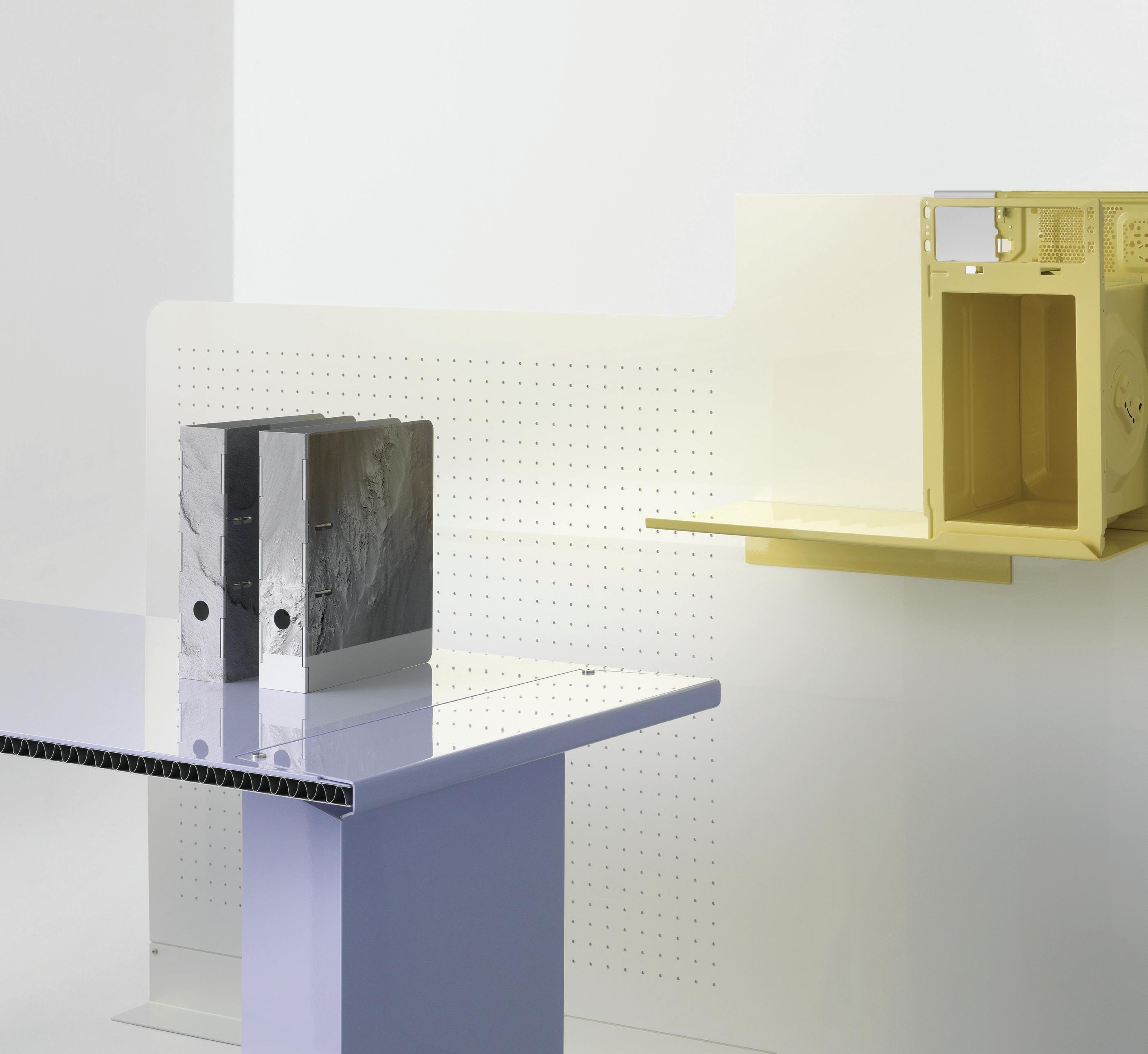
In 1942, seminal and pioneering food writer M.F.K. Fisher published How to Cook a Wolf. As much practical guide as philosophical treatise in response to limited wartime resources, the book encouraged a deep mainstay of sustainability – to do the best with what we have. It’s not the biggest leap from foodstuff as limited resource to furniture as waste-laden product rivalled only by fast fashion.
Fisher alluded to the wolf at the door and now we’re beginning to see fresh ways to tackle another WOLF – Whole Of Lifecycle Furniture. By considering the entire lifecycle of the product through the lens of responsible production and consumption, technological advances and personal responsibility are combining to deliver new solutions to the wicked problem of furniture waste. In Australia alone, 6.4 per cent of all waste generated comes from furniture and furnishings. And 2.5 million tonnes of furniture and furnishing waste goes into landfill – that’s 6.4 per cent of total waste generated.
For a Whole Of Lifecycle approach to have impact, it’s important to understand how a variety of players throughout the furniture
ecosystem can overcome the barriers to designing, manufacturing and purchasing products in a way that promotes longevity, repair and reuse while defining fundamental shifts in how we ascribe value in a world bent on flipping cheap fit-outs.
It’s easy to be overwhelmed with the pressure to design products that fit our ever-bending, never-breaking capitalist growth model. Designing for disassembly has begun an important paradigm shift that positions the designer to circumvent the economic hegemony while delivering to consumer needs and sustainable best practice. But for the non-Luddites among us, there’s more.
With biodegradable carbon-negative polymers like mushroom mycelium crumbling the tyranny of traditional plastics, material innovation provides a fruitful foundation for sustainable exploration. The Kuskoa Bi chair from Alki (Design Nation) and Ore Streams from Formafantasma use bio-based materials like recycled PE, plant-based materials and citrus waste to find new solutions.
In Australia alone, 6.4 per cent of all waste generated comes from furniture and furnishings.
In this article, we review today’s most impactful Whole Of Lifecycle Furniture (WOLF) practices.
Mass production has now met the world of mass customisation. Before building out, advances in prototyping and production have led IKEA to its IKEA Place app employing digital tools and augmented reality to gather customer feedback on how modular furniture transforms in their space while providing digital enhancements on performance.
Smart furniture is the logical progression, with companies such as Knoll, Wilkhahn, Vitra and Kokuyo all offering furniture that adapts to the user’s needs. Embedded IoT tech that monitors usage while adjusting resource consumption through lighting and temperature control is increasing satisfaction and reducing redundancy and returns. We can see how furniture is standing less on its own, instead fitting into an interconnected solution that increases sustainability by reducing resource hungry energy consumption.
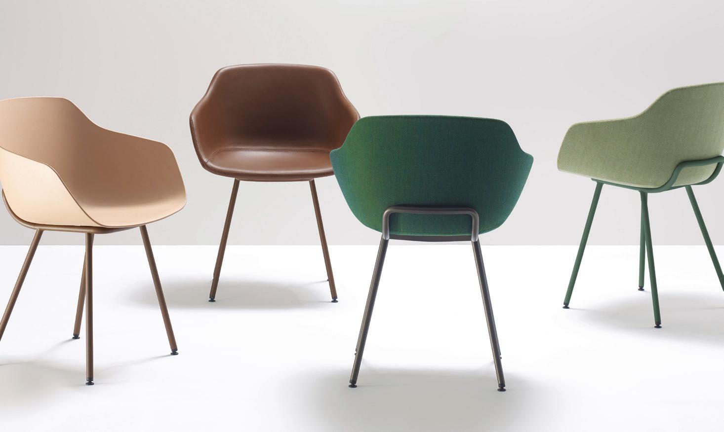
Stepping back from individual pieces of furniture, applying a Whole Of Lifecycle approach to furniture manufacturing means fundamentally rethinking the business model. From zero-waste production to carbon negative businesses, manufacturers are ensuring all materials and by-products generate no waste while employing renewable carbon capture tech to produce more energy than they consume.
Combined with community-based business collectives that foster collaboration and knowledge sharing at a neighbourhood level, the monster that is furniture manufacturing can be tamed by shedding light on opportunities for environmental, economic and social betterment. This has enormous implications as the shift from extraction and profit to collaboration and sustainability touches everyone on the supply chain.
“Applying a Whole Of Lifecycle approach to furniture manufacturing means fundamentally rethinking the business model”
Herman Miller’s Aeron Chair is composed of more than 50 per cent recycled material including oceanbound plastic.
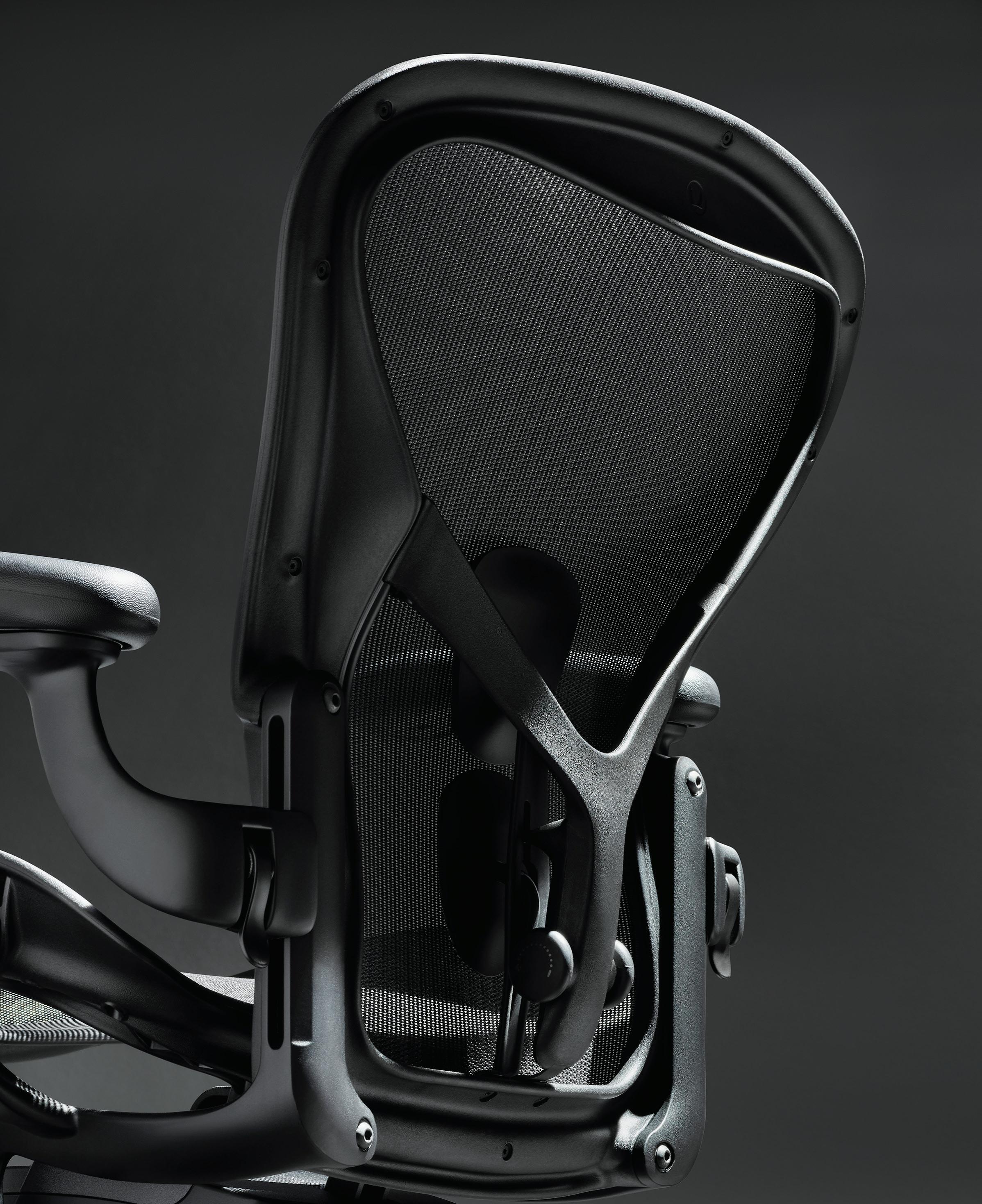
Ore Streams


Cabinet


Ore Streams’ objects explore ‘above ground mining’ and the role design plays in transforming natural resources into desirable products.


Much like sustainability in other industries, the answer combines both systemic rejuvenation and personal responsibility. Ensuring existing fit-outs are designed for longevity while prioritising refurbishment and repair over replacement is a good place to start from a consumer perspective.
If it’s daunting to find where else to start, companies such as Muuto and Vitra offer sustainability programs alongside product warranty and replaceable parts. Look for programs such as Living Edge’s LivingOn that ensures carbon neutrality and sustainability and wellbeing criteria. Since 2020 they’ve helped to service and redeploy over 12,500 Herman Miller tasks chairs, diverting 234 tonnes of furniture from landfill.
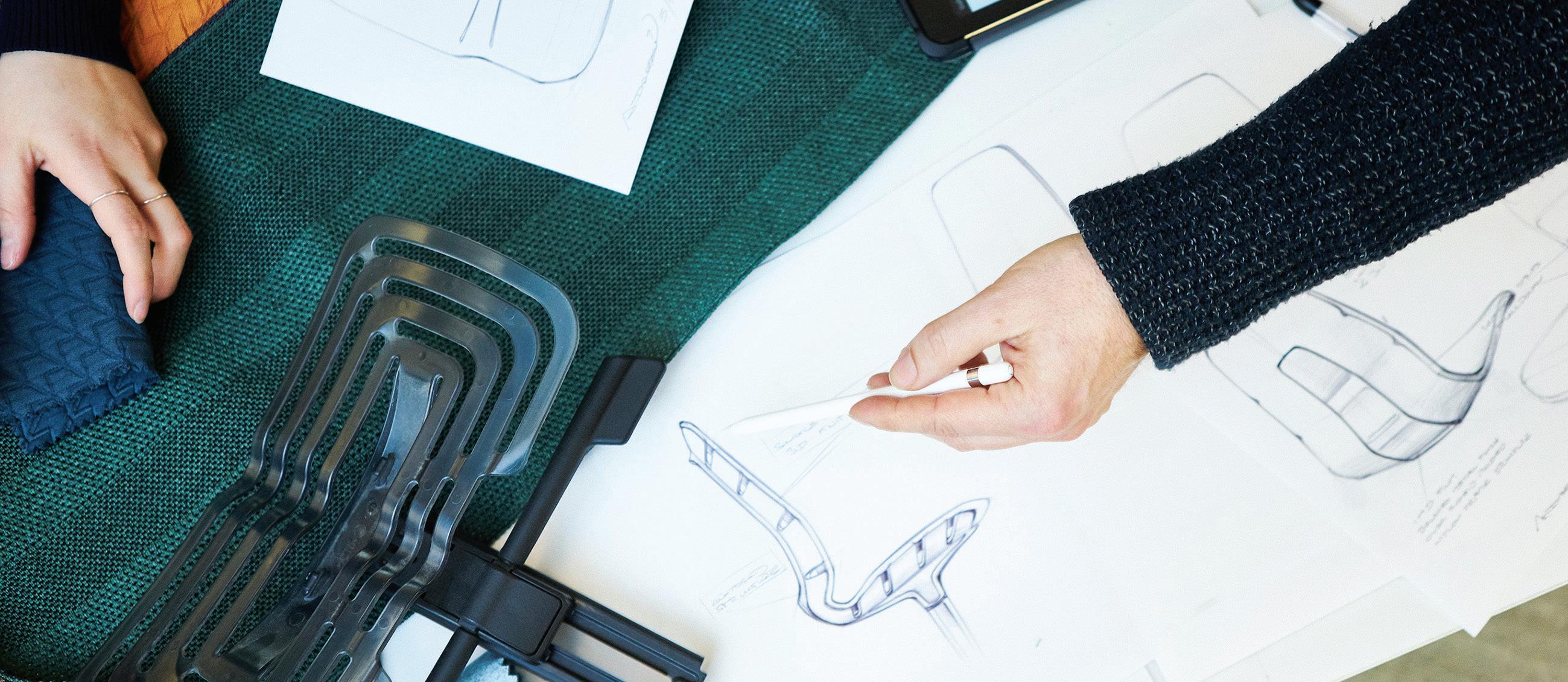
If you don’t have to own it, furniture-as-a-service provides a subscription model with controls for high-quality reuse and refurbishment that extend the lifespan of each product. As part of its commitment to circular design practices, Haworth has been implementing pilots with product rental and lease projects in partnership with customers. Haworth also offers service agreements for its products’ continued use and end of life.
On an industry level, product stewardship through take-back programs, donation planes and recycling parts will help share responsibility between our communities of practice, ensuring everyone takes responsibility for the interconnected impacts of our furniture. Herman Miller’s Earthright 10 year strategy addresses the whole lifecycle of their products aiming to create zero waste and reduce resource use while taking back 125,000 tonnes of product annually.
We shouldn’t leave the fundamental questions about how our furniture performs. Furniture, much like food for Fisher, needs to be pleasing while meeting needs. It may be more that we can redefine how we assess performance. While cost will always be part of the equation, we can’t continue to hide from the impacts of our human industry – furniture or otherwise. Whole Of Lifecycle Furniture may well be the one wolf we want to open the door for.
alki.fr, designnation.com.au, formafantasma.com, haworth.com, hermanmiller.com, ikea.com, knoll.com, kokuyo.com, livingedge.com.au, muuto.com, wilkhahn.com, vitra.com
We have grown accustomed to the idea that the workplace is changing. Architects, of course, concern themselves with creating the spaces in which work takes place, fully cognisant of contemporary demands for flexibility, hybridity and collaboration.
They are taught that the built environment shapes behaviour. What, then, of the structures underlying the work of the designers themselves? If the tangible office is changing, shouldn’t we also ask what the corollary might be for designing the organisational infrastructure of a creative practice?
For those listening closely, there are tremors afoot that might just herald a new wave of experimentation – namely, the concept of employee ownership. Already in the UK, more than one in five of the largest architecture practices is operating with some form of employee ownership model, while other international precedents include Zaha Hadid Architects.
In Australia, meanwhile, the trend is very much in its early stages. At the cutting edge of the debate is Make, an architecture firm with studios in London and Sydney and which, uniquely, has been employeeowned since its inception. Asia Pacific director, Simon Lincoln, poses the question fundamentally: “How do we get businesses thinking about business differently?”
So, what exactly is employee ownership? There are many different models ranging from owning company shares to employee
ownership trusts in which the trust becomes the sole or majority shareholder, while governmental regulations and tax incentives vary. Meld Studios recently became the first Australian-headquartered business to transition. Janna DeVylder, cofounder, principal and director, explains: “You don’t become employee-owned overnight. The cultural work can start now whilst the technical, legal and financial infrastructure can be managed over time.” With the focus on culture, the question turns to why employee ownership might be beneficial, for both employees and employers. The first point to be made is simply about care: “One of things it means to me is ownership, on many levels – it instils an attitude of ownership in which you have far more invested. You feel valued and part of something,” says Lincoln. By having a direct stake in the work, an employee will be more incentivised to buy in and commit. “People want meaning in their work – I think they are no longer willing to be in places where they feel like cogs in a wheel. We’ve almost industrialised knowledge work to the point of thinking people are just machines –but we’re not; we’re humans,” says DeVylder. Meaningful work means higher levels of staff retention. The traditional owner, meanwhile, is invited to consider a different concept of legacy, one which places longevity and custodianship above ego. The life of a practice is no longer reliant on an individual – crucially, that is also likely to
“People want meaning in their work – I think they are no longer willing to be in places where they feel like cogs in a wheel. We’ve almost industrialised knowledge work to the point of thinking people are just machines –but we’re not; we’re humans.”
make succession planning significantly less troublesome for small and medium sized practices. As Lincoln points out, it creates stability and a culture of caring for the practice over time: “You don’t buy in and you don’t get paid out when you leave so, by virtue of being employed, you are a partner.”
Staff buy-in, meaningful work, stability: these would appeal to almost any business, but what should be especially interesting to architects and designers are the advantages specific to the creative workplace.

The nature of design work is such that collaboration, social responsibility and staff empowerment are inherently desirable dynamics. “If we’re allowed to do our jobs as designers – empowered to think and have ideas through ownership, inclusivity and collaboration – then we’re going to do great architecture with great clients and we’re going to make money,” says Lincoln. “What’s the value of employing a graduate if you don’t think their ideas are any good?”
DeVylder makes a similar point: “It’s not actually scary to let people have a say. It’s about unlocking their potential. Just imagine the creativity and innovation we could get in architecture and design if we took some of the fear out of work.”
At the core of employee ownership in architecture and design are some decidedly uncontroversial assumptions: creative work is more successful when truly collaborative; fear inhibits innovative thinking; motivated people are better workers. Instead of a
zero-sum game of competition between individuals in a workplace, wouldn’t designers benefit from a structure that provides mutual incentives to help each other and succeed as a team? In fact, isn’t this just the organisational equivalent of the mixed, collaborative and open office space advocated by today’s leading designers? Perhaps the more architects walk the walk, the better they’ll talk.
Finally, a word of reassurance and realism. There is no rulebook on how fast or deep the change needs to be, nor is all hierarchy abolished. At Make, for instance, a project still has someone who reports to the client and redistribution of profits is done on a percentage basis. Perhaps counter-intuitively, this absence of individualised bonuses can actually create a stronger force for driving performance: “Ownership is about accountability as well. If someone in the team isn’t pulling their weight, the wider team won’t accept it,” notes Lincoln.
As the repercussions of COVID-19 continue to play out in workplace design, spare a thought for how we might (re-)design the workplaces of those who design the workplace. A spectre is haunting those very workplaces – the spectre of employee ownership.
makearchitects.com, meldstudios.com.au
Hygiene has become a top priority in the wake of the pandemic and, as Caroma Senior Brand Manager, James Cocking, states, people are looking for solutions that will maximise their hygiene –particularly in the bathroom. Contextualising with the example of Caroma’s comprehensive range of bidet toilet seat options, he says, “Bidet toilet seats offer a hygienic and sustainable washing solution to meet that need.”
With its range of bidet seat and suite options taking the Australian market by storm, Caroma is actively augmenting the bathroom wellness experience through its use of cutting edge technology and seamless aesthetics.
As Cocking notes, the hygienic benefits of a bidet are unmatched. It helps to limit the spread of germs, decrease bacteria and provide thorough cleaning. Bidets are also more inclusive for elderly users and those with disabilities. And it offers a sustainable alternative to toilet paper.
The Caroma LiveWell Electronic Bidet Seat, for example, has been engineered for hygiene, comfort and style. It can be retrofitted across a range of existing Caroma toilet suites, and its
electronic bidet seat is water efficient and intuitive. The addition of a remote control allows the user to enable multiple washing and drying features. Cocking also highlights its Caroma GermGard antimicrobial protection and self-cleaning nozzle. Features that ensure it delivers superior hygiene at every level.
Caroma’s expanded offering also encompasses the Caroma Urbane II Bidet Toilet Suites, considered to be its most effective and hygienic toilet. They utilise the latest Caroma CleanFlush technology and feature cutting-edge rimless technology – making them water efficient and easier to clean. With virtually limitless options – including gender specific washes and drying functions –the patented design includes experience-elevating features such as LED nightlights and ambient lighting, auto-open and -close seats, as well as heating.
It’s a tailored toilet experience that puts wellness in the individual’s control and ensures an inclusive and optimal bathroom experience. As Cocking says, “Bidet seats offer a hygienic and sustainable washing solution to maximise hygiene in the bathroom.” A pressing need, met with an innovative blend of function and beauty.
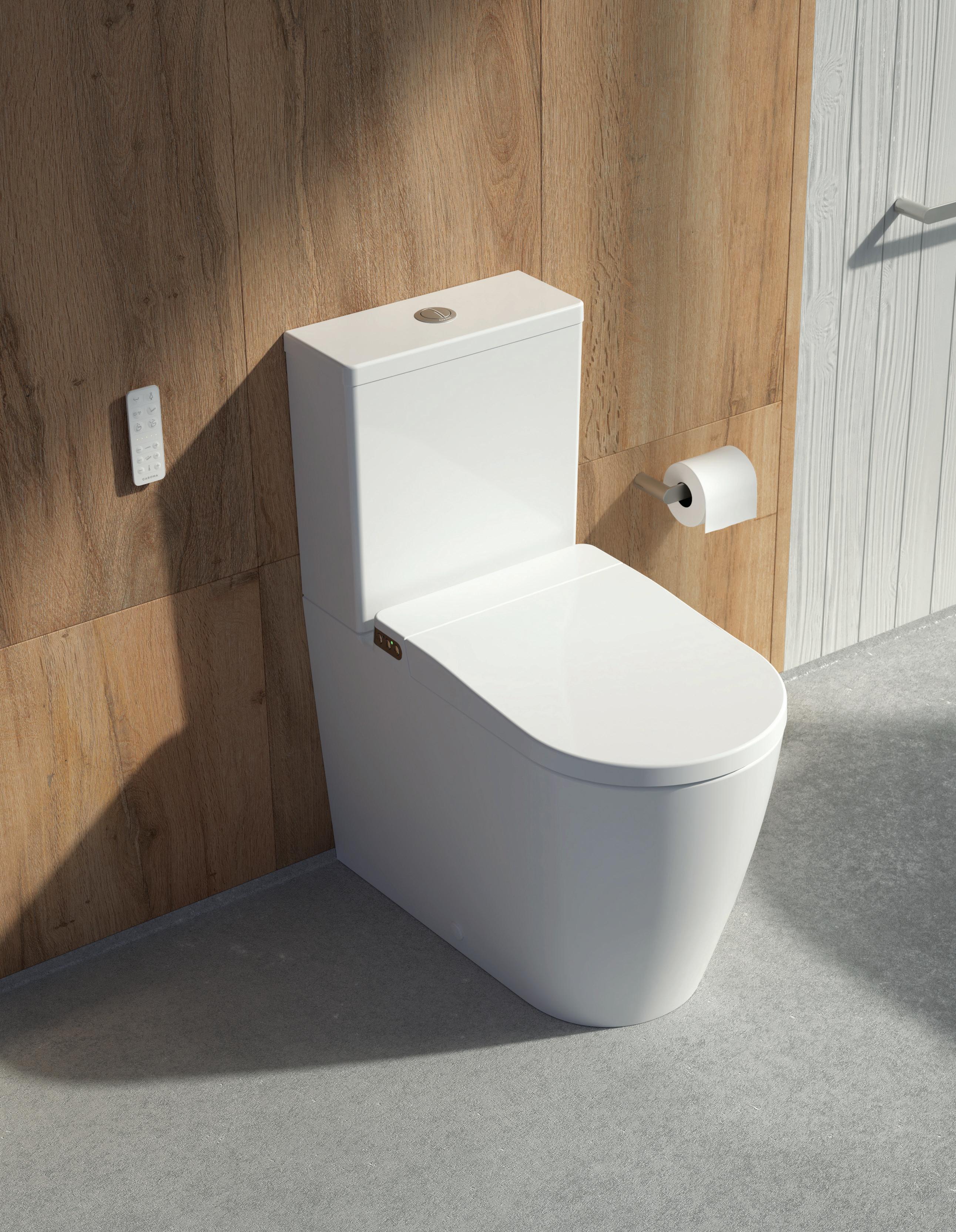
Darling Quarter South Building Lobby and Café Page 70 –
Architect and Interior Design
Hammond Studio
Project Manager Lendlease
Construction/Builder Lendlease Building
Mechanical and Structural Engineer Arup
Fire and Hydraulic Engineer
Warren Smith & Partners
Electrical, Comms and Security
Norman Disney & Young
Acoustic Engineer
Wood&Grieve, Stantec
Special Lighting LLight
Hammond Studio hammondstudio.co –
Furniture ‘EOOS’ Crosshatch Stools in walnut timber, Living Edge.
Finishes
Stone floor finishes, Worldstone. Blush quartz stone, Worldstone. Timber battens, Sculptform. Soft ceiling panels, Kvadrat.

Lighting Blade lights, iGuzzini.
CBA Head Office, Darling Quarter South Building
Page 70 –
Architect and Interior Design Hassell
Project Team
Existing base building fjmtstudio, base build upgrades interior designer Hammond Studio
Project Manager Turner & Townsend
Builder SHAPE
Acoustic Engineer Stantec
Electrical Engineer Integrated Group Service
Hydraulic Engineer Warren Smith & Partners
Mechanical Engineer and Lighting Consultant Arup
Landscape Designer 360 Degrees
Security Jacobs
Audio-Visual Innova-Tech ESD Stantec
Signage & Graphics Consultant Studio Ongarato
Digital Content Collider
Duration
South Building: 2018-2022
North Building: Estimated time of deliver – 2024
Hassell hassellstudio.com
Furniture
Teamer System workstations, Easy Mood Table and Flipper Table, UniFor. ‘Herman Miller’ Aeron chairs, Eames Aluminium Group Chair, ‘Vitra’ Eames Plastic Side Chair and ‘Skupa’ Breadstick Table, Living Edge. ‘Fritz Hansen’ Series 7 Chair, Dot Stool, Swan Chair and Grand Prix Chair, Cult Design. ‘Maruni’ Lightwood Chair and Mid Stool, Seeho Su. ID Soft task chair, Meda Chair, Physix Chair, Softwork Lounge, Work It Table, Alcove Work Lounge and Alcove Plus Cabin and Dancing Wall whiteboards, Vitra. ‘Artek’ 401 Armchair, E60 Stool and K65 stool, Anibou. ‘MDF
Italia’ Neil Twist Chair, Neil Twist Bar Stool and Rock Dining & Bar Table and ‘Moroso’ Bloomy Conference Chair, Hub Furniture. No. 18 Chair, Thonet. ‘Arper’ Kiik Modular Lounge, Zinta Eating Bench, Pix Table and Stylus Duo Lite
Table, Stylecraft. Slatted bench, custom log table, Screw Table, Round Picnic Table and Curved Bench and Trestle Table, Elan. ‘Matiazzi’ Solo Table, District. ‘Swedese’ Flower Table, Fred International. Timetable Flip Top Tables, Wilkhahn. ‘Punt’ Stockholm Credenzas, Design Nation. Kase Wall System, Schiavello.
Finishes
Zem Emboss Panels, Woven
Image. Woodwall Wallpaper, Elton Group. Cork wall coverings in White-Washed and Smoked Cork, Portugal
Cork. Acoustic Pulp Panel, Baux. ‘Maharam’ Tek-Wall wallcovering, ‘Kvadrat
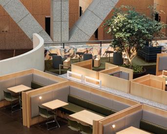
Maharam’ Kinnasand sheer curtain, Divina Melange
3 curtain and Daybreak
2 sheer curtain, Kvadrat

Maharam. ‘Vescom’
Onari wallcovering, Kube
Contract. Whiterock Satins
heavy duty wallcovering, Altro. World Woven WW860 and WW865 Carpet Tiles, Norament Stair tread 926 and 825, Interface. ‘Bentzon’ Bizon broadloom carpet, RC+D. ‘Tretford’ Carpet Tiles, Gibbon Group.
Autumn Hues Terrazo slab, Covet . Travertine Lait tile, ‘INAX’ Gamon and Chorus mosaic wall tiles and ‘INAX’ Yohan Border tiles, Artedomus. Bintang
Tuff Stone Tile, World
Stone. Act Three Terrazo
Slab, Fibonacci . Concrete benchtops, Corian. Maple Engineered Floorboards Havwoods. European Birch veneer FSC certified, Briggs
Veneers. Various laminates, Laminex Group. Magnetic whiteboard laminate, HVG.
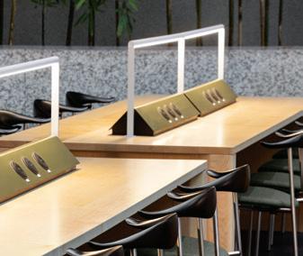
Furniture Linoleum Desktop and Sphera Evolution, Forbo. Anodised metals, Universal Anodisers. Wall paint, ceiling paint, Duralloy and Duratec Powdercoats, Dulux. AB Pure Round and AB Pure Hammered flooring, Geo Flooring.
‘Comcork’ Stronghold 30 Safety flooring, Safety Flooring. Individual Ecotac and stainless steel tactiles, DTAC. Rebated natural anodised step nosing, Classic Arch . D-Tile standard and special tiles, Mondo Piero. Rock Maple FSC
Certified, Britton Timbers. White Birch Plywood FSC
Certified, Eco-Core. Round turned timber handrails, Hammersmith.
Lighting
‘ELS’ DL Flex Gen1 downlight, Endo can light, Wall Wash 135, ‘ERCO’ Iku downlight, Parscan floodlight and Minirail track, Jade Cross. Laserblade and Laser, iGuzzini. DIAMO R68 and Optos, Zumtobel. ‘RZB
Lighting’ Sidelite ECO, 3S
Lighting. ‘Wastberg’ W132 Nendo Lamp and w151 extra large pendant, Euroluce.
‘Bright Light’ Neon Edge White LED Flex and ‘Light Culture’ Covert Charlie, Light Culture. Momentum
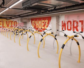
1, Pierlite. Argonaut LED
Weat, Clevertronics. Baso 40, XAL. Tana SP, KKDC.
‘Ducre’ Miles 2.0 Round, ‘XAL’ Task 1500, Vela Evo 600/900/1200 and Move It, Batwing and Ary track and pendant system, Est Lighting.
Fixed and Fitted
HydroTap and Classic Mixer, Zip Water. Undermount stainless steel sink, Abey. Various internal joinery fittings, Häfele. Door furniture latchset and lockset, Lockwood. Various D-Pull handles, Madinoz.
Sheeth Headquarters Page 80
Architect and Interior Design
Studio Prineas
Construction/Builder
Sheeth
Studio Prineas studioprineas.com.au
Furniture
Keywork, custom workstations, Krost. Jac Chair, Zenith. Custommade boardroom table in powdercoat Claret V142A, Interpon. Zepel Allusion (sheer) curtains ‘Pearl’ and ‘Velvet’ is Luxo in Ink, Lovelight. ‘Fogia’ Niche Sofa, Norm for ‘Fogia’ stool, Fred International.
Finishes
Top Cer Ranger 100x100 tiles, Classic Ceramics. Engineered Europena flooring, Preference Flooring. Absolute matte white walls, Laminex. Powdercoat, Claret V142A Aluminium glazing, Criterion. Courtyard glazing powdercoat, claret V142A aluminium, Darley Aluminium. Perforated ceiling stainless steel, SSWM.
Lighting
Mini Glo Ball C/W wall lights, Euroluce. MC Tube Track Spots task lights, Est Lighting. ‘Louis Poulsen’ PH5 pendant lights, Cult Design.
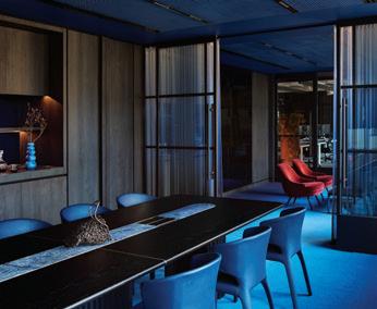
Fixed and Fitted
Bathroom Taps, Celine 11255 White basin, Sink 101611, Abi Interiors. HydroTap Elite, Zip Water. MDZ-01 custom lengths joinery handles, Madinoz.
Slattery Page 88
Architect and Interior Design
Elenberg Fraser
Project Manager
GenX Group
Construction/Builder MPA
Landscape Designer, Indoor Plants
The Frenchams Group
Lighting Consultant
Atmosphere Design
Stylist (photo shoot)
Rowena Cuschieri
Elenberg Fraser elenbergfraser.com
Furniture
Boardroom Table, Zuster. High Stools, Grazia & Co. Boardroom sofa, ottomans, Zuster. ‘Viccarbe’ Burin Tables, Steelcase . ‘Ross Gardam’ Adapt Lounge, Stylecraft. ‘AEG’ dishwasher. ‘Viccarbe’ workstations. ‘AEG’ underbench oven. Lockers, Interloc.
Finishes
Carpet and carpet tiles, GH Commercial. Stone, Signorino, G-Lux. Timber laminate, Polytec . Acoustic panels, Autex. Paint, Dulux.
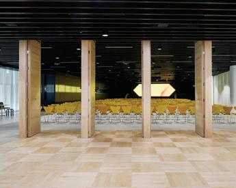
Lighting Atmosphere Design.
Fixed and Fitted
Sheer curtains, Materialised.
Grosvenor Lounge at Grosvenor Place
Page 96
Architect and Interior Design DesignOffice
Project Manager Cerno Group
Construction/Builder
Renascent
Structural Engineer Arup
Fire Engineer Harris Page & Associates
Acoustic Engineer Acoustic Logic
Electrical and Mechanical Engineer VOS Group
Hydraulic Engineer Harris Page & Associates
Landscape Designer Arcadia Landscape Architecture
Joiner Karisma
F&B Consultant Brain and Poulter
Lighting Consultant Firefly Point of View
Budget $1.2 million
DesignOffice designoffice.com.au
Furniture
‘Fritz Hansen’, ‘Carl Hansen’, ‘Cappellini’, ‘Nau’, Cult Design. ‘Fritz Hansen’, Cultivated. ‘Knoll’, de de ce. ‘Conde House’, Apato. ‘Vitra’, UniFor. ‘SP01’, ‘B&B Italia’, Space Furniture. ‘Pedrali’, District. Didier. ‘Walter Knoll’, ‘Howe’, Living Edge. ‘Maruni’, Seeho Su. ‘Crassevig’, Own World. ‘Plank’, Design Nation.
Finishes
Powdercoat, Oxytech. Interpon Textura, Interpon. Bentley Mills Carpet, Whitecliffe Imports. Vlam Hush Glass, Viridian. Upholstery, Kvadrat. Leathers, Contemporary Leathers. Curtain fabrics, Svenska KJ Fabrics. Window Films, Tint Design, Window Energy Solutions. Furniture Linoleum, Forbo. Paints, Dulux. Render, Bishop Décor. Laminate, Laminex. Bedonia Marble, Artedomus. Timber, Brittons Timber. Timber Staining, Rubio Monocoat.
Lighting Assorted lighting including ‘Unonovesette’, ‘B.Lux’, ‘Vode’, Light Project. ‘Regianni’, ‘Flos’, Euroluce. ‘Pradina’, Inlite. ‘DGA’, Est Lighting. ‘Atelier Oï’, ‘Neil Poulton’, Artemide. ‘Vibia’, Koda Lighting. ‘Vuelite’, Lite Source.
Fixed and Fitted HydroTap, Zip Water. Curtain rail, Silent Gliss. One Blind System, Vertilux. Clipsal. Schmick, Bar Fridges Australia. Pip, OE Elsafe.
Warren and Mahoney Melbourne Studio Page 104
Architect and Interior Design Warren and Mahoney in association with Greenaway Architects
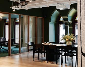
Construction/Builder Urban Core
Acoustic Engineer Resonate
Electrical Engineer, Hydraulic Engineer, Mechanical Engineer Aston Consulting
Lighting Consultant
FPOV
Warren and Mahoney warrenandmahoney.com
Greenaway Architects greenawayarchitects. com.au
Furniture
HAT workstations, Zody task chair, Haworth. ‘Thinking Works’ Blade meeting tables, ‘Ross Gardam’ Breeze Side Table, ‘LEN’ Bauhaus seating system ottoman, ‘Keith Melbourne’ ottoman, Stylecraft. ‘Simon James’ Underline Bar Leaner Table, Tangerine Stool, District. Gathering table, Jasny armchair, bar stool, Nomi. W Collection Rugs, Whitecliffe.
Finishes
Cube, Custom Etch, Lanes Peak wall coverings, Autex Acoustics. Prefinished timber lining boards –Paulownia Board, Australian Timber Ceilings. Acrylic Wash & Wear paint, Dulux. Circular Relationships –Dunes in Golden Bay feature carpet, Milliken. Oak Botany V Collection in Natural Oak flooring, Havwoods. Prefinished Veneer, Lignapal Nero, George Fethers. Melamine Botanic Smooth, Polytec. Metalworks Mesh ceilings, Armstrong. Granex Bead Blast Stainless Steel kitchen bench and splashback, RIMEX.
Lighting
‘Wever & Ducré’ Darf, Est Lighting. Track Spotlights, Inlite.
Fixed and Fitted HydroTap G5, Zip Water. Dishwashers, Fridges, Microwaves, Fisher & Paykel. Sink, Oliveri.
NUX Page 112 –
Architect Sibling Architecture
Project Team
Amelia Borg, Hannah Lim
Construction/Builder MIC Projects
Shopfitters Champion Displays Shopfitters
Sibling Architecture siblingarchitecture.com
Furniture
‘Herman Miller’ Sayl Chair seating, Living Edge. ‘Derlot’ Mochi Ottoman seating, Living Edge. Monde modular couch seating, Monde. Bounce Chair seating, Daniel-Emma. ‘Coco Flip’
Sequence Table/Oval Dining
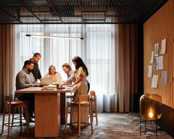
Table, Coco Flip. REPO pedestal drawers, Zenith. Augustus Colour Blush curtains, Warwick Fabrics.
Finishes Blue Clean Loop Mat (Unbacked) floor, Mattek.
EGE Carpets Highline 9105220 in BC10 floor, Supertuft. Sphera Energetic 50214 (lime) kitchen floor, Forbo. Sphera Energetic 50214 (colour 50202 concrete), Forbo. Locker Perforated Metal Round Holes (metal with powdercoat, pattern R12749) partition, Locker Group. Lime Fizz P19H8 paint, Dulux.
Lighting UNIOS LX S62/B62 suspended light, Unios. Neon Flex LED in rigid casing light, Light Project.
Alba Thermal Springs and Spa
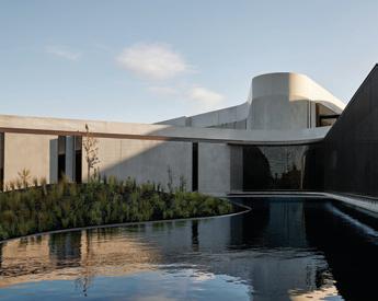
Page 118 –
Architect and Interior Design Hayball
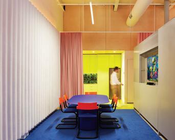
Project Manager Spark Projects
Construction/Builder Minicon Construction (main building), GDP Group (The Springs Pavilion), Paul McQuilan
Structural, Electrical, Hydraulic and Mechanical Engineer Stantec
Acoustic Engineer and Lighting Designer Arup
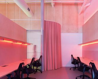
Landscape Designer MALA Studio
Signage MASS
Native Plant Propagation Peninsula Plants
Budget $35 Million
Duration 20 months Hayball hayball.com.au
Furniture
Blackbutt Inluxe Veneer seating, Atkar. AbsoluteMatte Black panels, Laminex. High performance vinyl cushions, InStyle. Nevada Jersey cushions, Pelle Leathers. Custom built furniture in Thyme Restaurant and Mani/ Pedi Treatment Rooms, Zuster. Loose seating pods, retail pods, L1 reception desk, relaxation fixed joinery, ceiling pods and treatment room joinery, designed by Hayball and supplied by Schiavello.
Finishes
Antline Bluestone Sawn Tile, SAI Sandstone. Element Dark flooring, METZ Tiles, Vinyl in Birch and Coal, Bolon Cloudburst concrete in Black Tempal, Caesarstone. Upholstery and textured joinery doors, Maharam. Windows, skylights and steel window shrouds, Taranto Windows. L2 salt baths façade, Sculptform. Main entry tensioned mesh screen in bronze, Locker Group. External powdercoat on façade and windows, Dulux . Internal paint, Porter’s Paints. Timber walls and ceiling battens, Mortlock Timber. Mosaic Tiles, Academy Tiles. ‘LAS LOSAS’ Reverse Brick Tiles, Creative Bricks. Navurban cladding, New Age Veneers. Villaboard, James Hardie. Mirrors, Viridian. Sauna, Modinex Group – Cedar Sales. Restaurant benchtop in Grey Natural Stone, Signorino. Auchen flower prefinished smooth matte, Navurban. Texture black laminate, Laminex.
Lighting
Lighting throughout, Altitude Lighting, Euroluce, LiteSource, Light Project, Lucian Light.
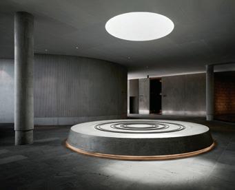
Fixed and Fitted Baths and concrete basins, Concrete Collective. Custommade change room basins, Dekton Stone. Sanitary fixtures and door hardware, Novas. Door security locking systems, Salto. Auto door hardware, Tormax. Lockers, Intraspace.

MinRes Headquarters Page 128
Architect and Interior Design
Milieu Creative
Construction/Builder
CDI Group
Structural and Acoustic Engineer
Stantec
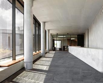
Electrical, Mechanical and Hydraulic Engineer
Norman Disney & Young
Landscape Designer
Tim Davies Landscaping
Lighting Consultant
LCI Consultants
Milieu Creative milieucreative.com
Furniture
Custom workstations, Meet Pods, Underline Café Chair, ‘Resident’ Kashmir Chair and Isabella chair, ‘Simon James’ Fragment coffee tables, ‘Cameron Foggo’ Herring Sofa, District. ‘Herman
Miller’ Aeron Chairs, ‘Walter Knoll’ Lead Chair Living Edge. Pep Swivel Chair, Wilkhahn. Longwave Armchair, ‘Poltrona Frau’ Othello Table, Let it be Sofa, Get Back Sofa, Archibald Large Armchair, Martha Chairs and Fiorile Coffee


Table, ‘ Patricia Urquiola’ Clarissa Armchair, ‘Cassina’ 194 Side Tables, 053 Capitol Complex Armchair and Piero Lissoni 9 Dining Table, ‘INOX’ Table, ‘Moroso’ Mathilda Armchair, Redondo small armchair, Gogan Sofa 2 seater, ‘INCLASS’ CP Dunas XS bar stool, ‘PUNT’ Stockholm Console and Núcleo Table, ‘Fritz Hansen’ Planner Rectangular Coffee Table and Circular Coffee
Table, ‘JOQUER’ Silence Sofa and Senso Chair, ‘Bitta’ 2 seater sofa Bela Rope, Club Armchair Bela Rope, ‘Kettal’ Vieques coffee table, Mesh coffee table, Landscape table and Bitta Chair, Mobilia. Molloy Chair, Loom 2.5 seater sofa, Beetle dining chair, ‘&Tradition’ Loafer SC24, ‘Hay’ Palissade bar stool, Cult Design. Custom boardroom coffee table and custom lobby console, Nathan Day Design. Indigo chair, Leeroy chair, Otis coffee tables, Cooper high table, Ace Table, Jardan.
Finishes Graduation carpet, Shaw Contract. Carpet Broadloom, Tretford. Basalt stone floor tile, Bernini . Travertine natural stone tile and natural stone wall lining, Marble & Cement. Ergon porcelain tile, Myaree Ceramics. Technifirma porcelain tile, Eco Outdoor. Nextone Tile, European Ceramics. ‘Millboard’ enhanced grain timber decking in Golden Oak, and Deco Timber Veneers, World Wide Timber Traders. ‘Godfrey Hirst’ timber flooring in Oak Elegance and ‘Woodpecker’ timber flooring in Signature, Floorwise. Custom wall finish, Polished Plaster Custom Soft Cells acoustic panels, Kvadrat Maharam. Nature stone wall lining, D’Amelio Stone. Mosaic wall tile, Artedomus.
Lighting
‘Ross Gardam’ Ora desk lamp, Ceto wall CW1, Nebulae wall sconce, Ceto horizontal CH24L, Ceto vertical CV3 Stylecraft. Reverse table lamp, Menu Space. Yuh floor lamp, AJ table lamp, 1953 table lamp, Cult Design. Flute wall light, Moare M pendant, Buds 3 table lamp, Tip of the Tongue table lamp, Buds 2 table lamp, Somewhere in the Middle table lamp, Buds 1 table lamp, Ginger floor lamp, Ginger A wall lamp (hardwired) Ihana 3x100 chandelier, Mobilia. Astro Versaille wall light 370, Enlightened Living. Anton wall light, Volker Haug. NJP table lamp, Modular Partners. Atollo table lamp, Euroluce. Ceto wall light (double) CLW2, Criteria.


The ‘City Futures’ Issue Indesign captures the voices, views and projects of our local and international leaders as they weigh in on topics of sustainable cities, reconciliation by design, new approaches to place-making, and community-led architecture. Issue #90 marks a celebration and a turning point. The future is what we make it.














It’s thanks to the support of our valued advertisers that we are 89 issues strong.











We like to symbolise our through the magazine and online, to acknowledge the wonderful partners with whom we work closely, every day. We thank you for your support and sharing in our passion for architecture and design in the Indo-Pacific region.




Choosing lower-carbon aluminium in your next project can reduce the embodied energy of your aluminium products by up to 75%* LocAl® Green (8kg CO2e/1kg AL) and LocAl® SuperGreen (4kg CO2e/1kg AL) are the responsible choice for a locally extruded, lower-carbon option in your next project.
FOR MORE INFORMATION VISIT: lowcarbonaluminium.com.au
When compared with global average CO2e for primary aluminium production,
POWERED BY
