
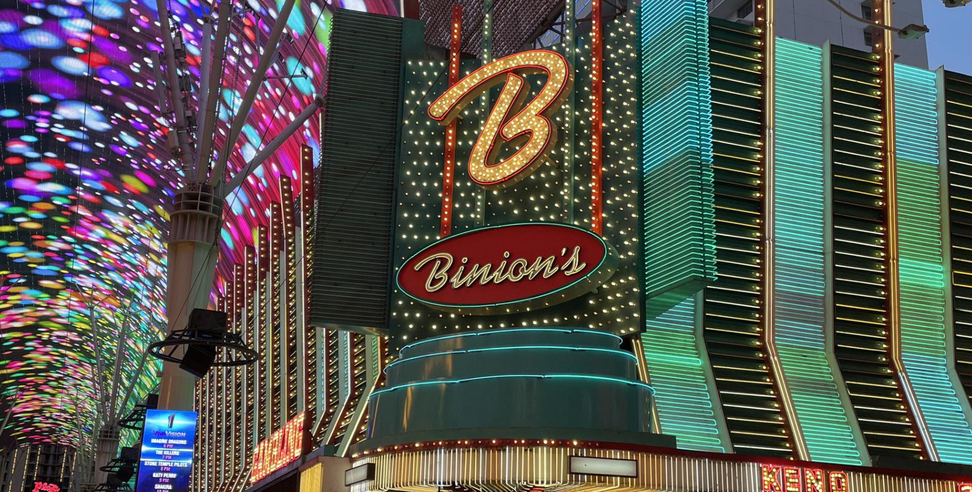
UW spring 2024
UW spring 2024
This magazine is a summation of the work created by Izzi John in Advanced Typography in spring of 2024 at UW Madison. The goal of the course were to develop a greater understanding of typographic form through arrangement and creation of type. 3D printing was emphasized to aid in the experimentation of three dimensional applications of typographical forms. This magazine contains process documentation from start to finish, as well as a photographic survey and informational essay about neon typography.
The purpose of this project was to become familiar with the 3D printing process. We were introduced to the 3D modeling program Rhinoceros 3D, as well as the Prusa 3D printer to use for our prints. We were welcome to print any small object that included a typeface in the design. Many created bookmarks, keychains, et cetra. I went through many different iterations before I came to my final idea.
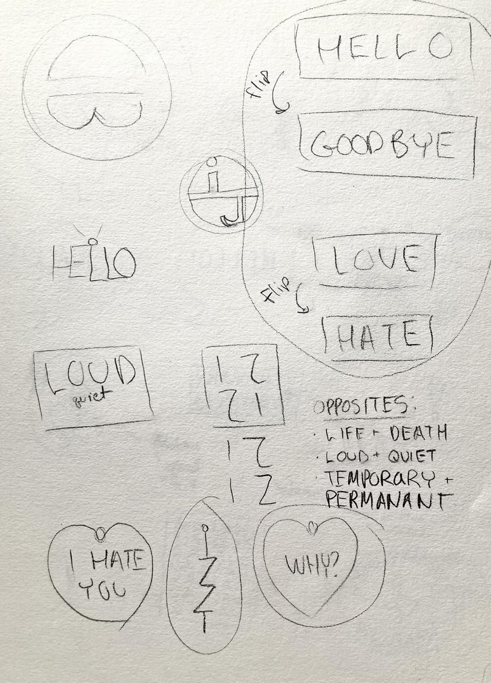
I began by sketching out possible designs. I struggled to come up with an idea that I was happy with. I typically use imagery as the main focus in my works so it was difficult to come up with something where words and typography are involved. I played with juxtaposition, arrangement of type, and combining type with imagery. I came up with designs for keychains, jewlery,
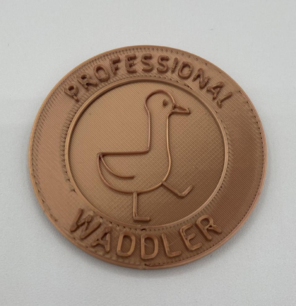
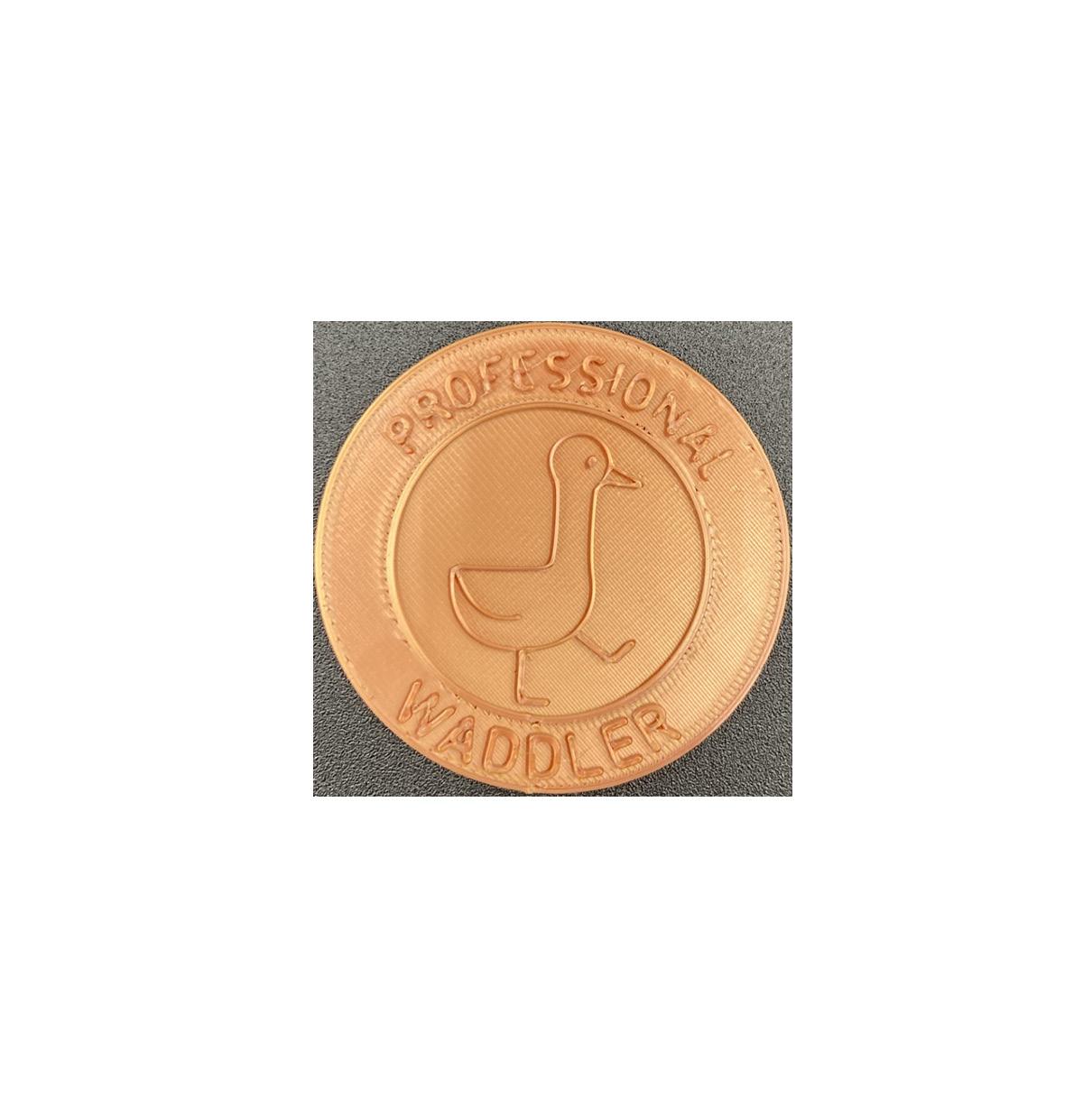
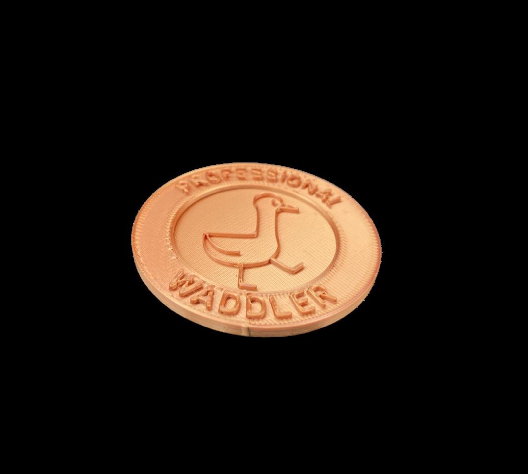
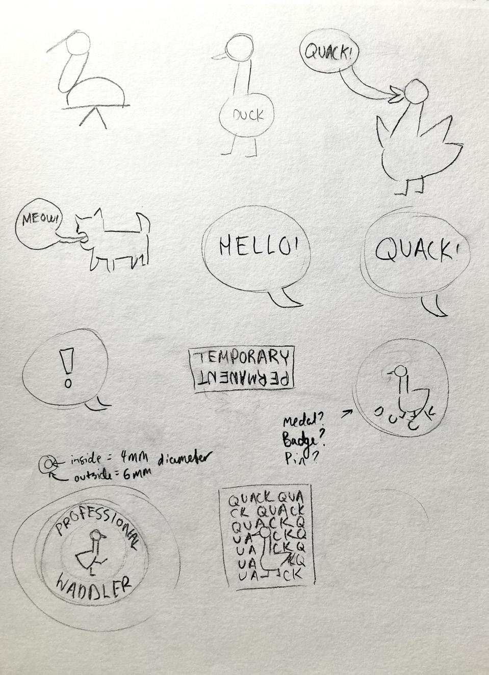
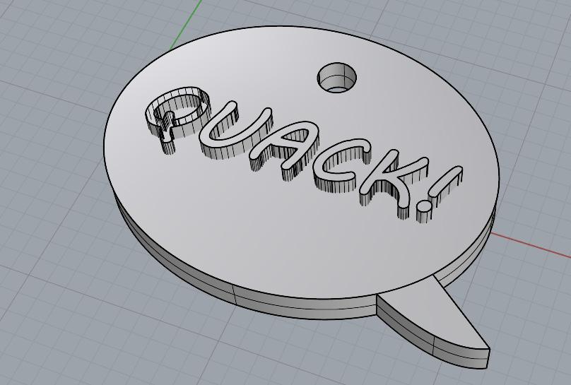
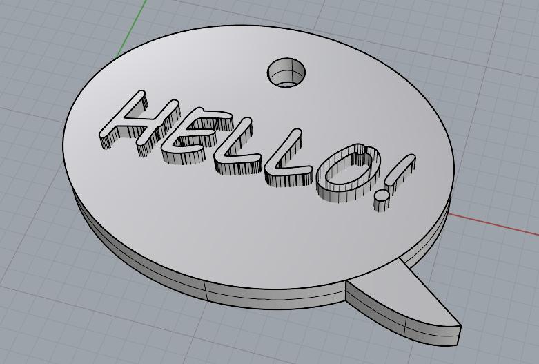
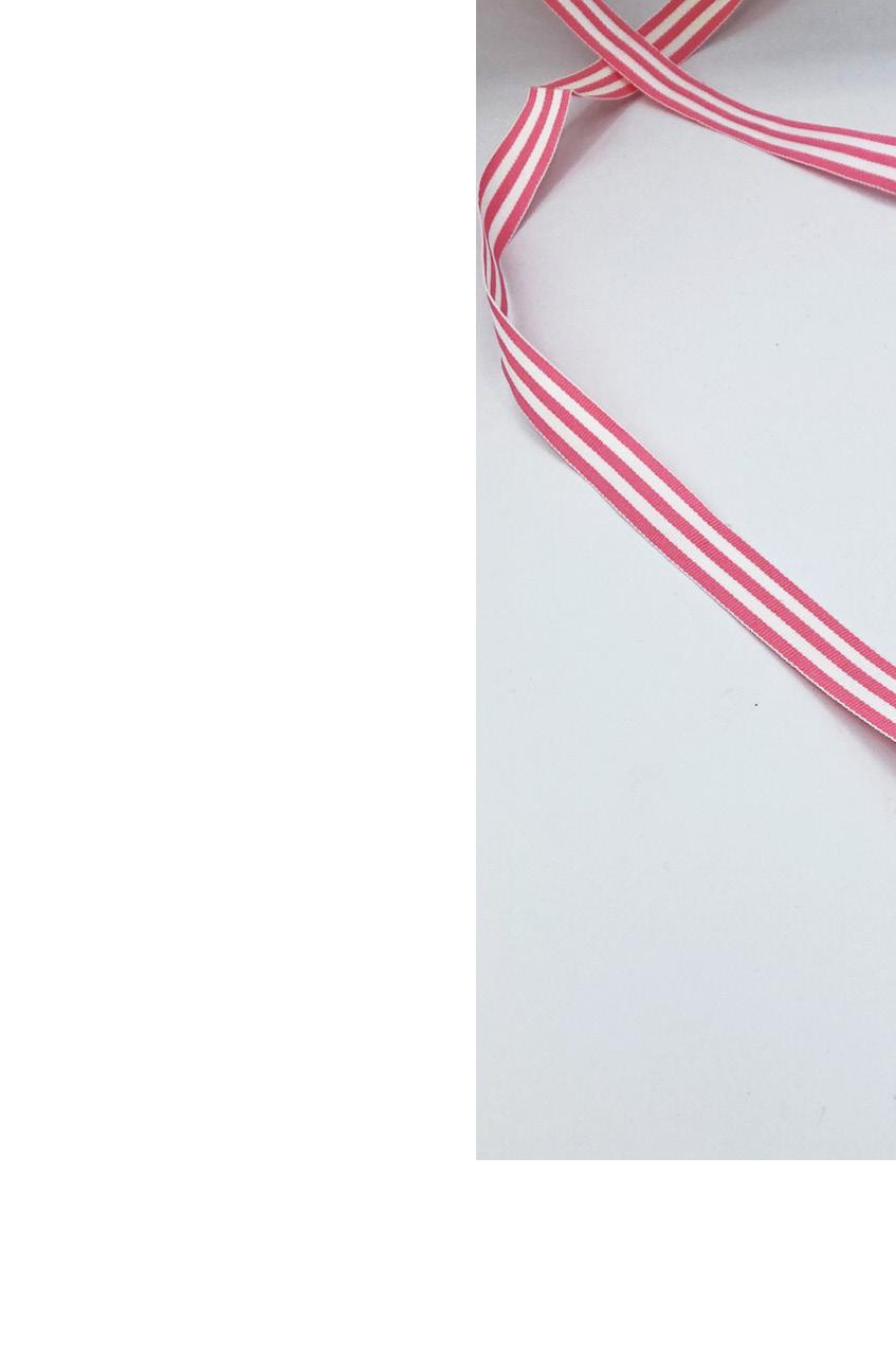
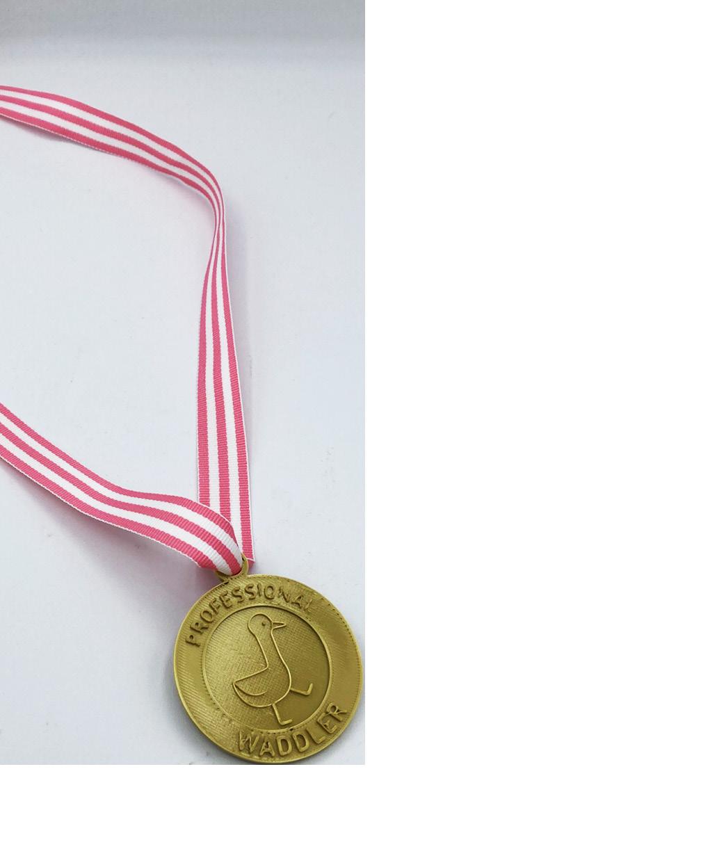
bookmarks, and more. I enjoyed the speech bubble design and the hello/goodbye design. However, the idea I was most drawn to was a medal. The concept was a medal that would be given to a duck as an award. What would the award be for? What would the medal look like? My portfolio contains many pieces involving ducks, so I felt this would fit right in.
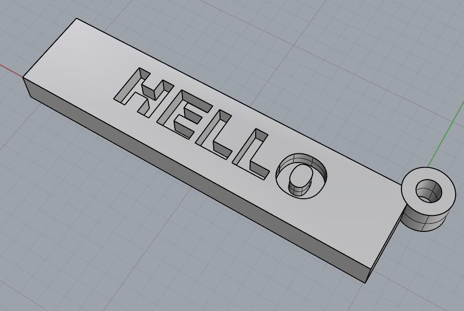
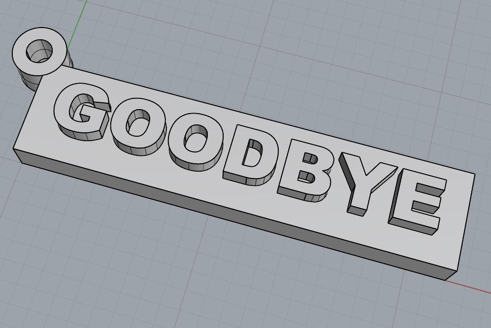
For the keychain designs, I used Rhino’s built in text object feature to create the text. I typed out the letters and then extruded them over the shape. For the goodbye side of the keychain, I extruded the text and then used a boolean difference to create an indent so the keychain could be printed on both sides. For
the hello/goodbye design, I used a generic looking text, whereas with the speech bubbles I used a typeface that looked more playful, like it would belong in a comic book. This font did not work well with the program, however. It left odd artifacts which lead me to believe it would not print properly.

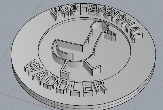
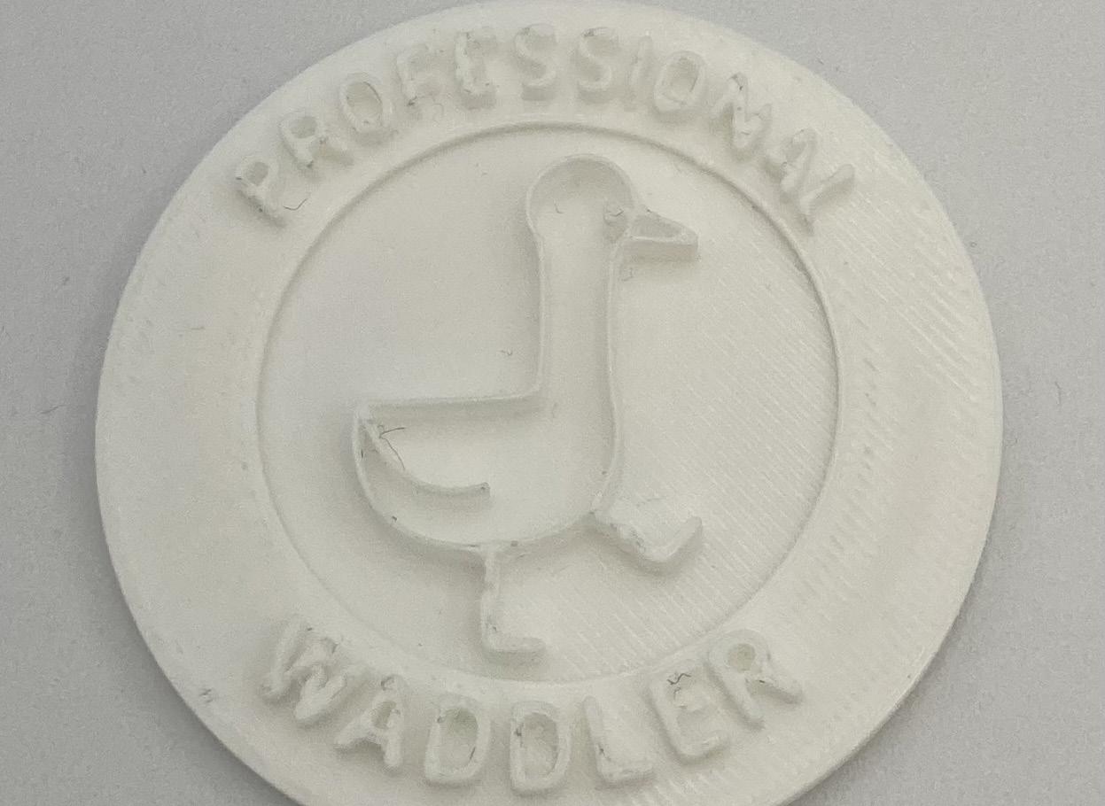
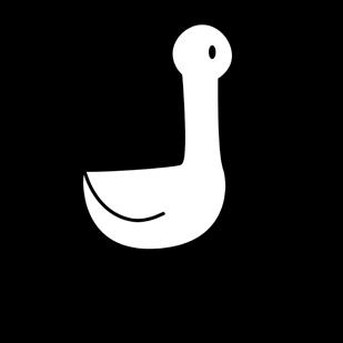
The duck was definitely the most time consuming design. I drew the duck in Illustrator, and it was difficult to figure out how to arrange the lines in Illustrator in order for them to be extruded in Rhino. I eventually figured out how to convert the lines to outlines and have them all be connected into one piece. Seeing all the designs together, and after all
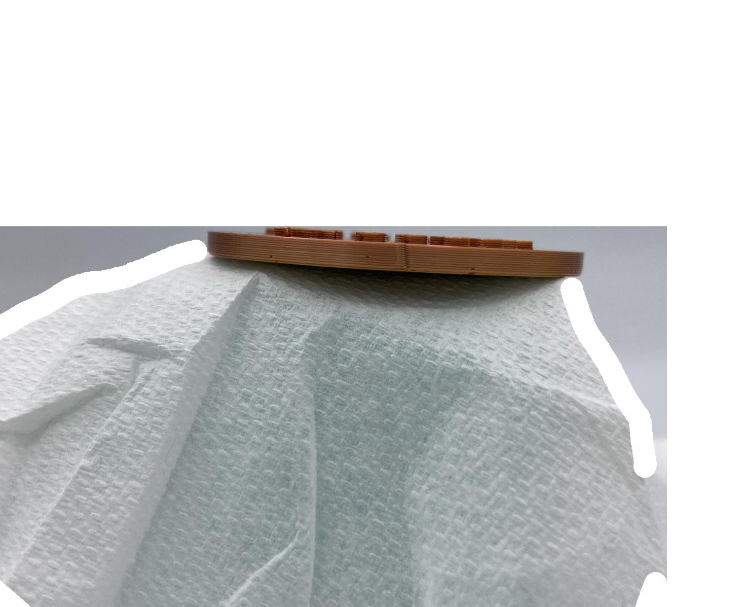
the time I had spent on each design, I decided to go with the duck. It was the design that excited me the most. The first print I used as a test run because I did not know how to insert the multi colored filament, so I printed with a color that was already loaded. I realized the outlines were too tall, and that indenting certain elements may be better.
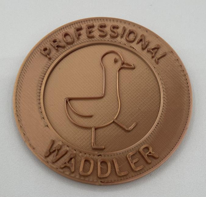
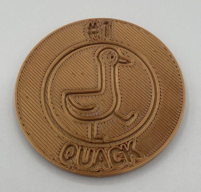
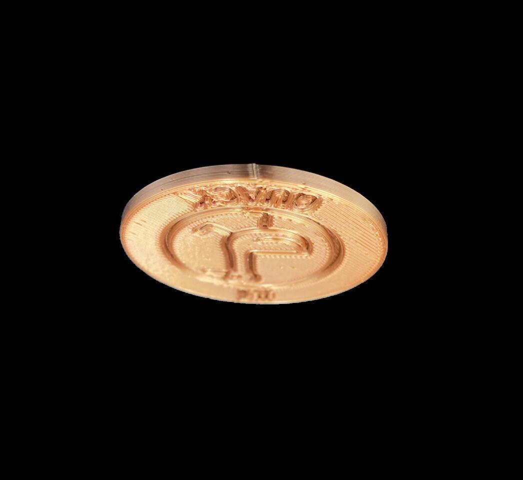
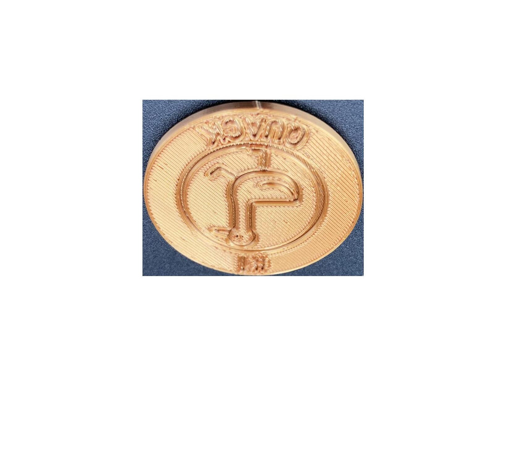
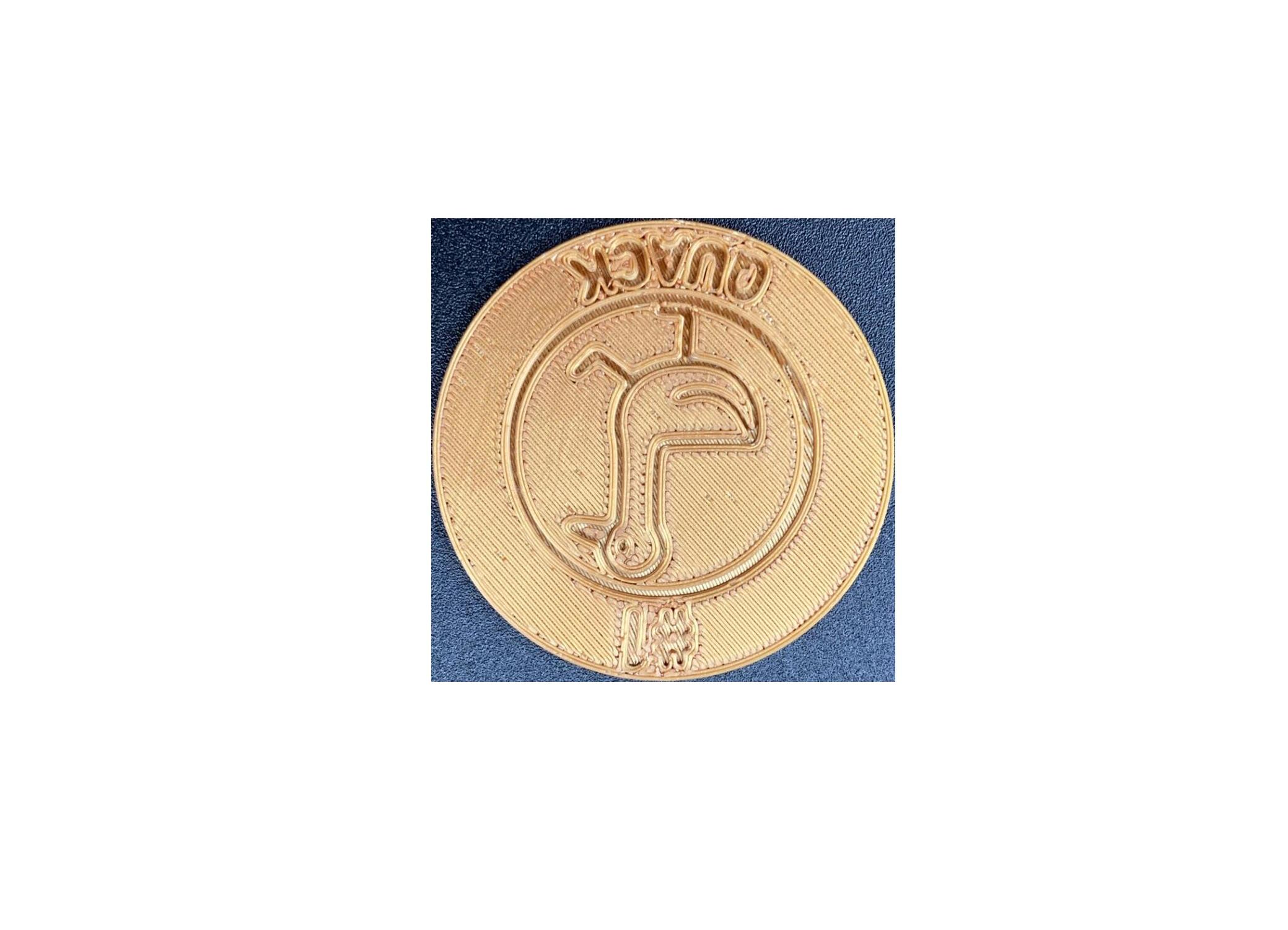
I tested out indenting the font, and professor Taekyeom commented that it may be easier to read raised. I ended up printing this run twice because the first time I accidentally stopped the print before it was finished. Despite this, they are incredibly similar. From this run, I realized that the design looked a lot like a coin, and that I could make
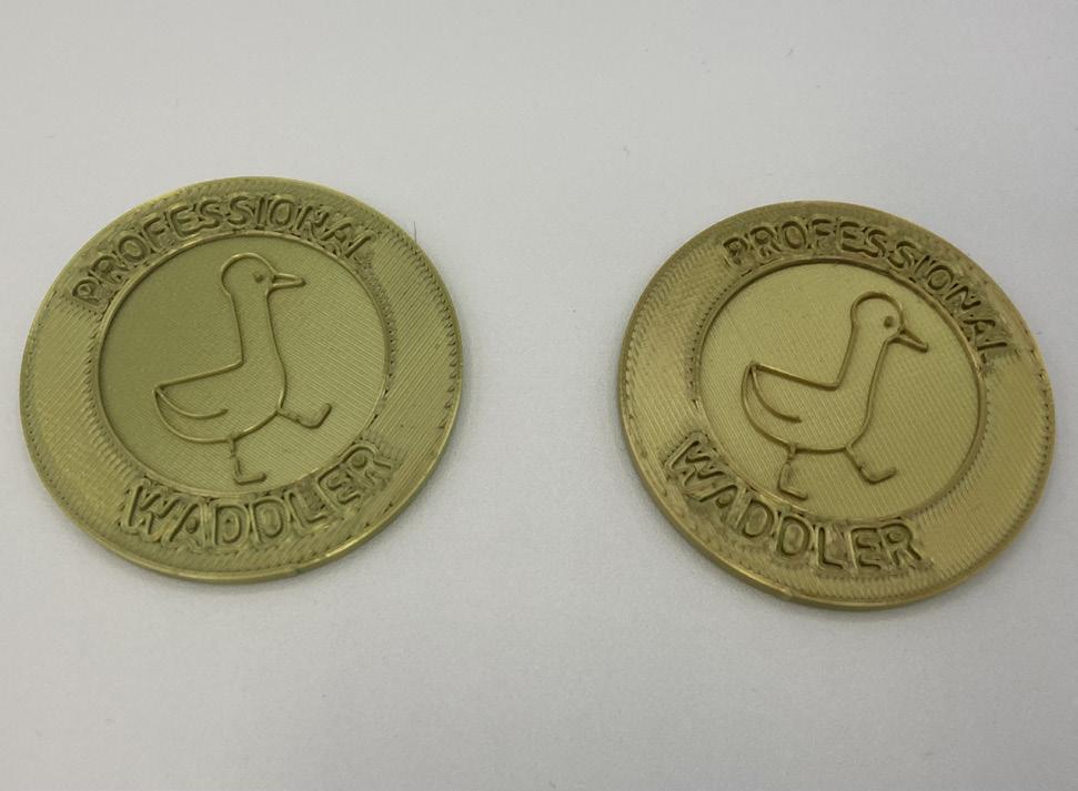
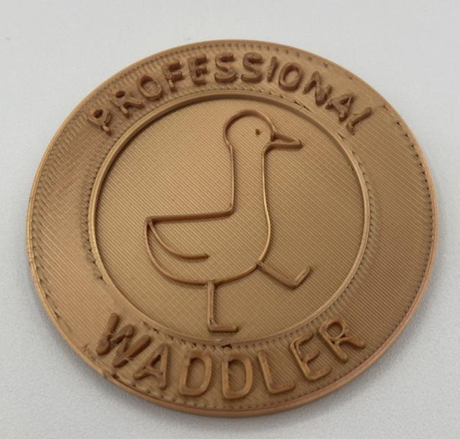
the design double sided, with one side indented and the other raised.I tried out the double sided design with the raised area lower than the original design, which worked well. I made the eye a bit too small and readjusted.
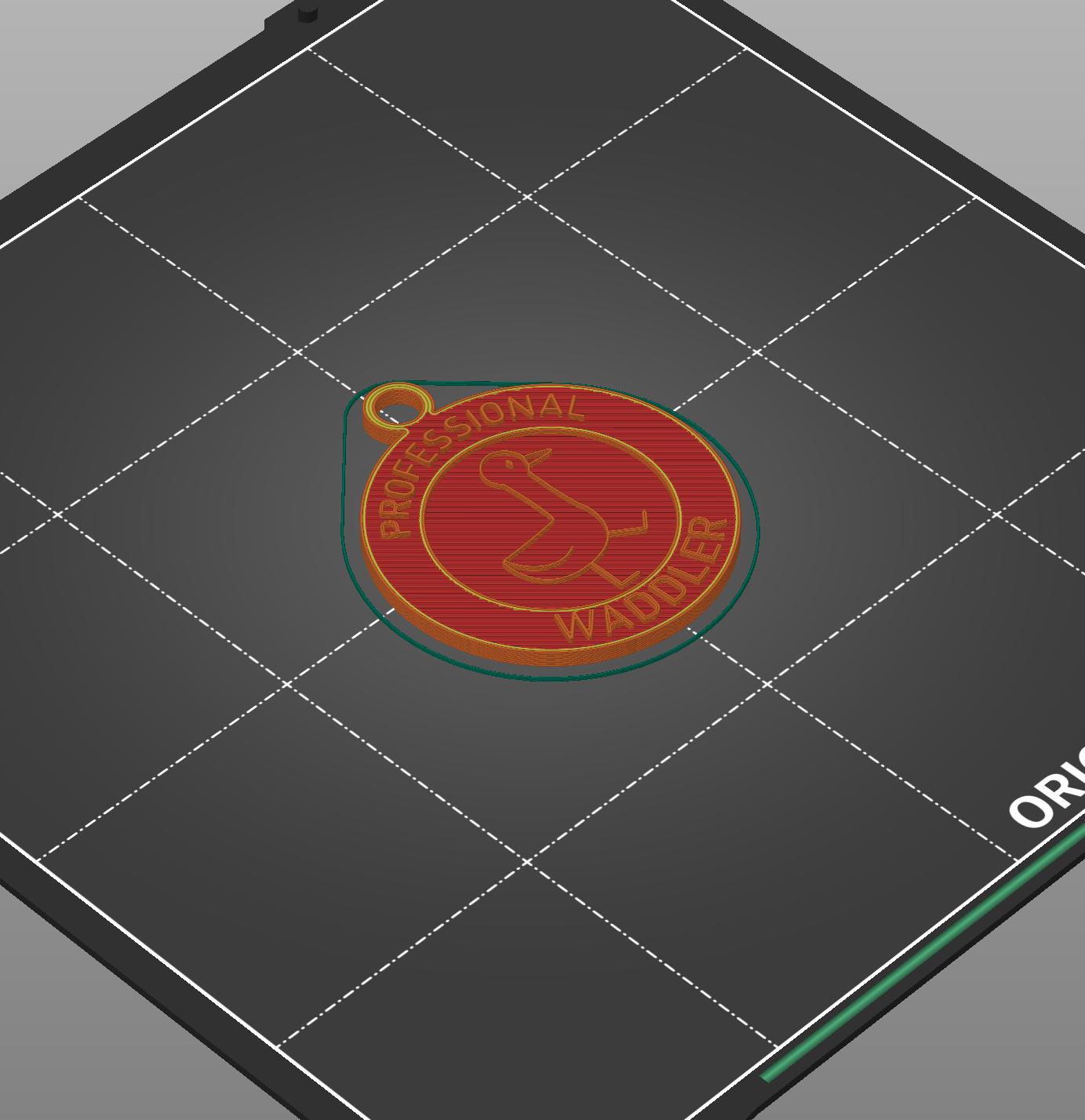
Later, I decided to make a variation with a hole for a necklace, so that it could be worn as a medal. Shown is the Prusa file for the design.
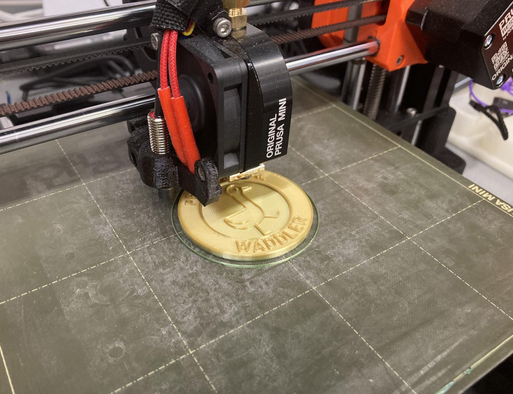
I printed it out a few times in order to get to the gold filament. There were no major issues while printing.


I had learned a lot through this project. The biggest example of this progress is my ability to use Rhino. Rhino is a program I have completely avoided in the past, I was assigned to 3D model for Art 107 and was encouraged to use Rhino, but I chose to use Blender instead because Rhino confused me so much. Now I feel much more confident in the program.
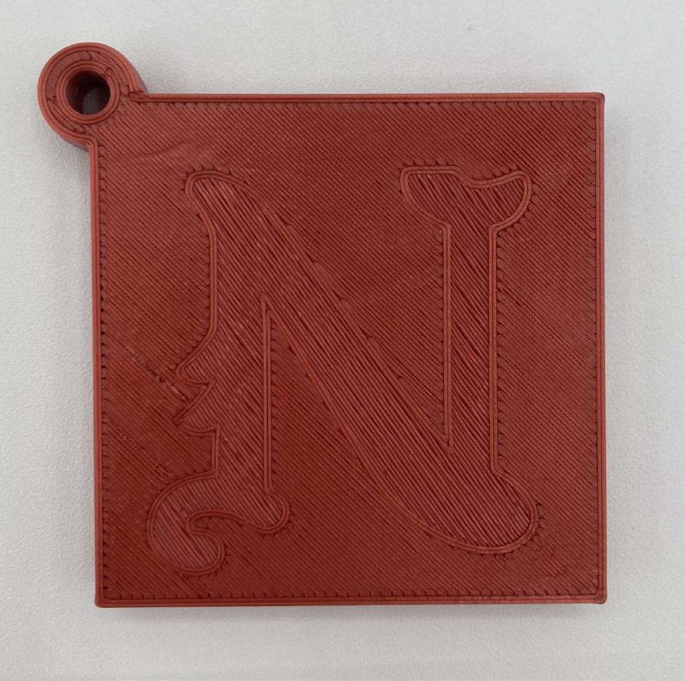
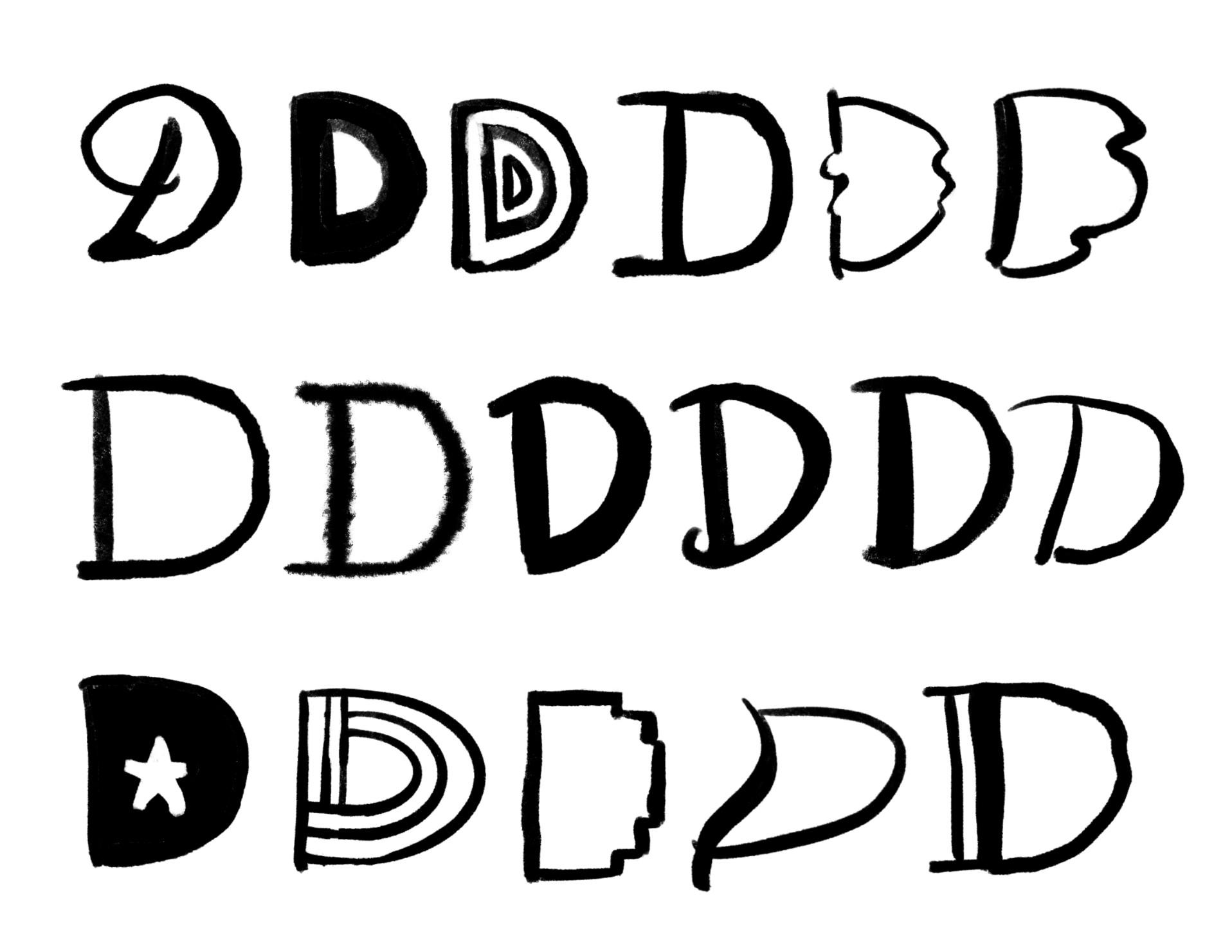
This was the first project in which we were assigned to create our own custom character. The character would then be used for an embosser, a device which creates an indent on paper in the shape of the character. For this project, I considered the purpose of the embosser to generate ideas.
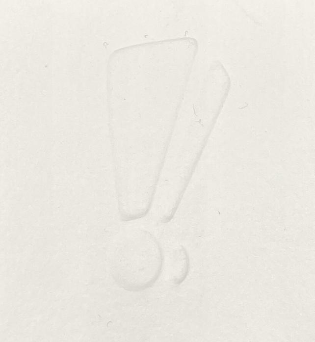
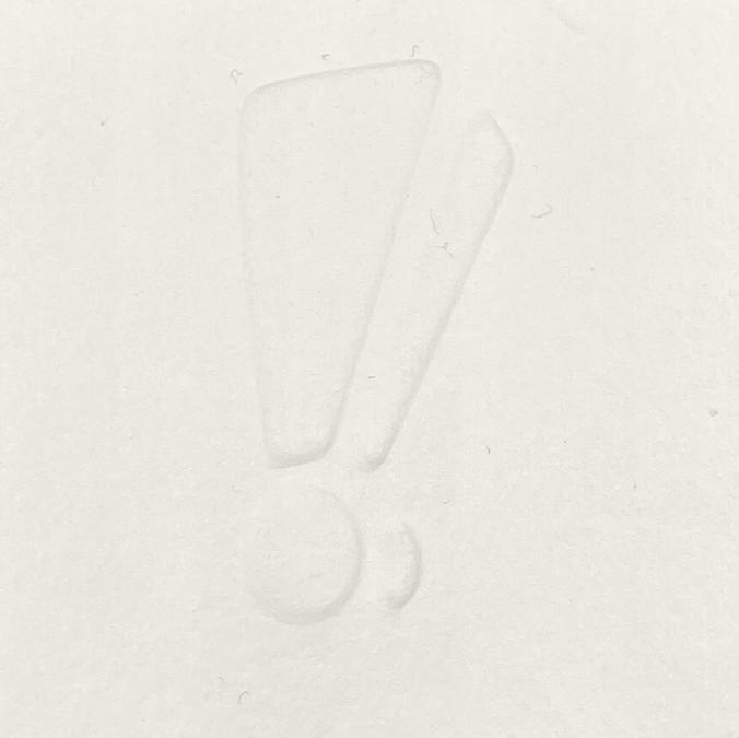
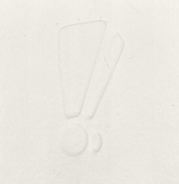
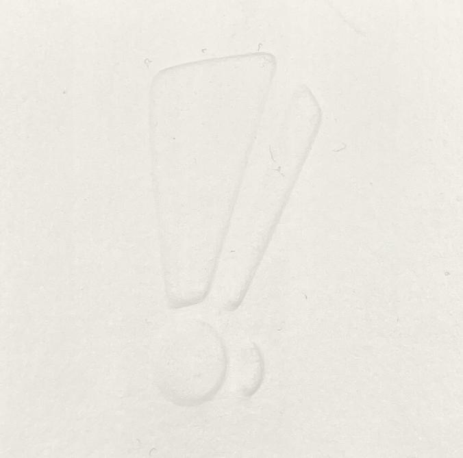
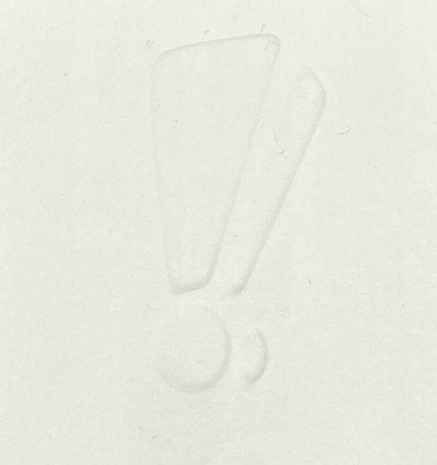
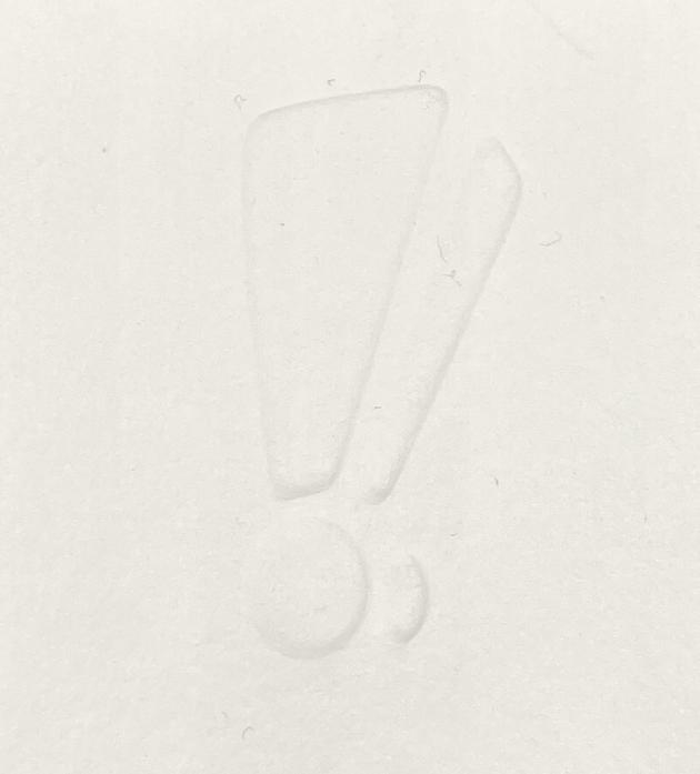
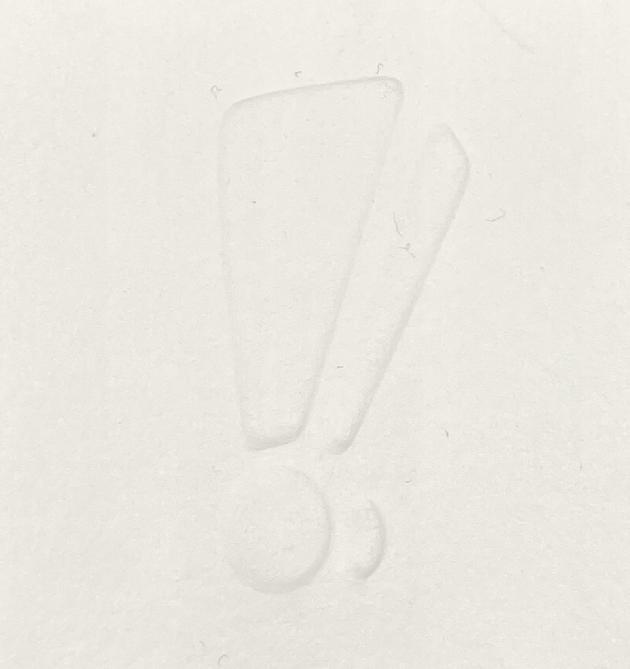
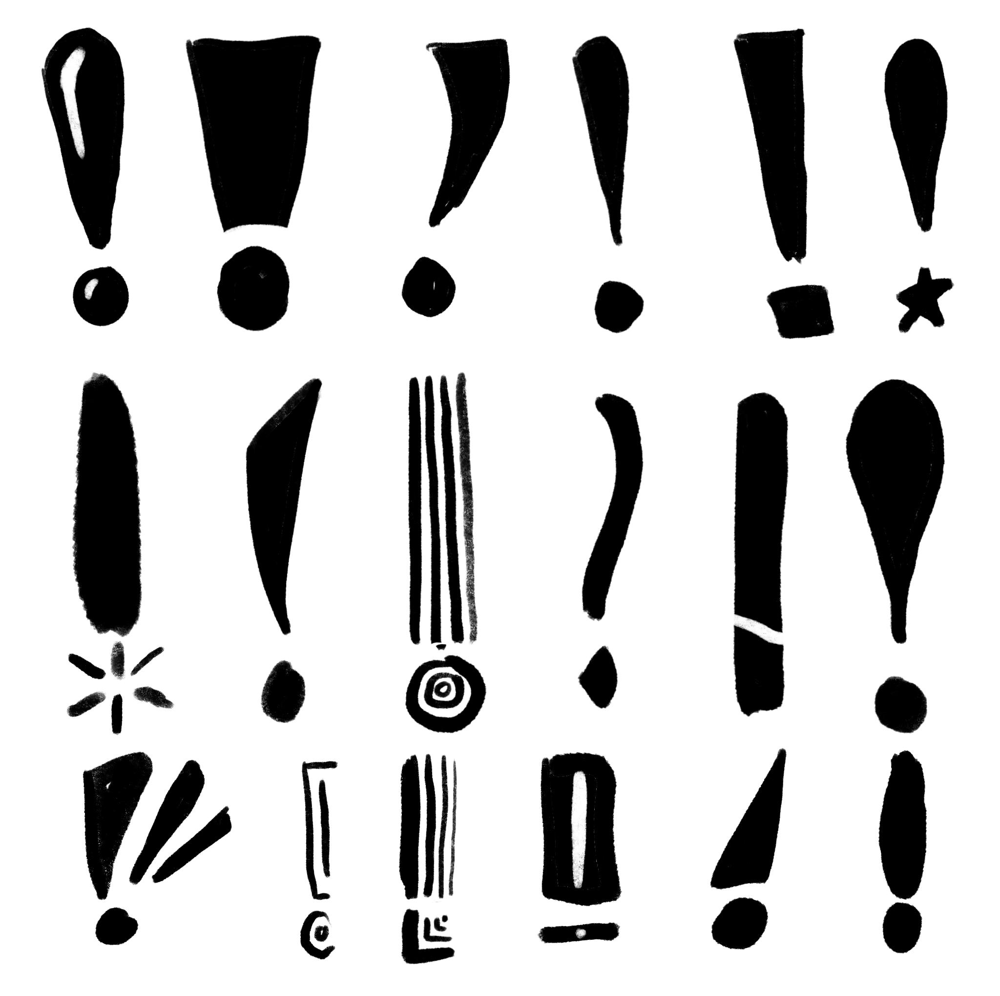
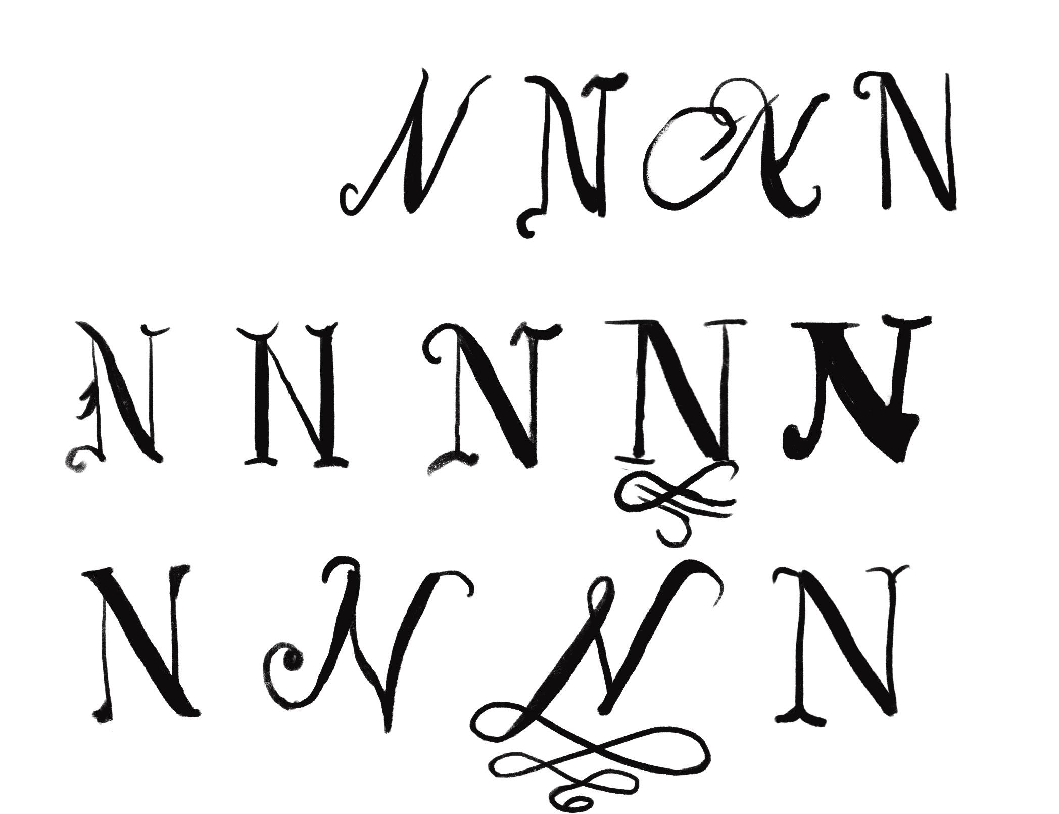
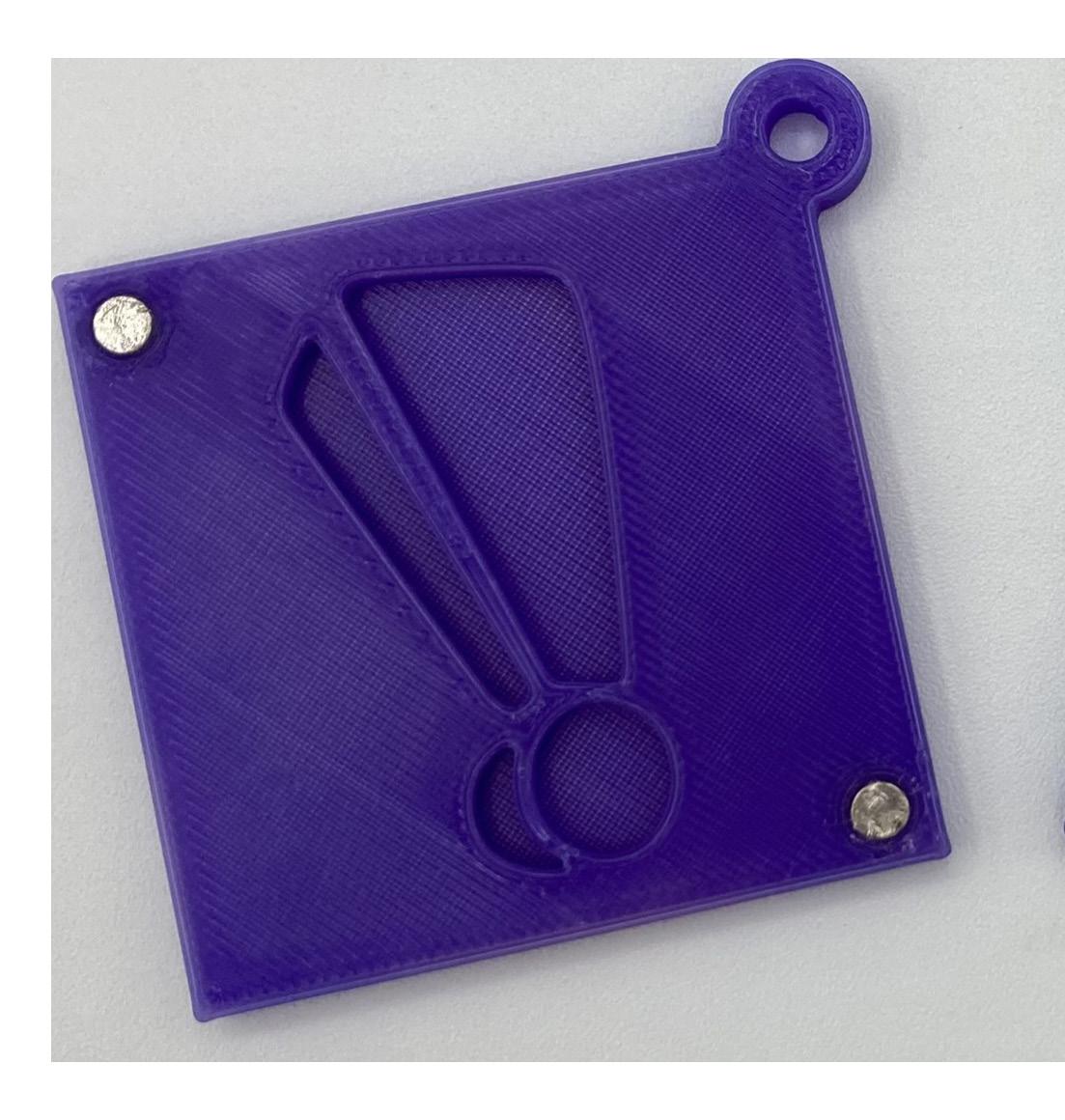
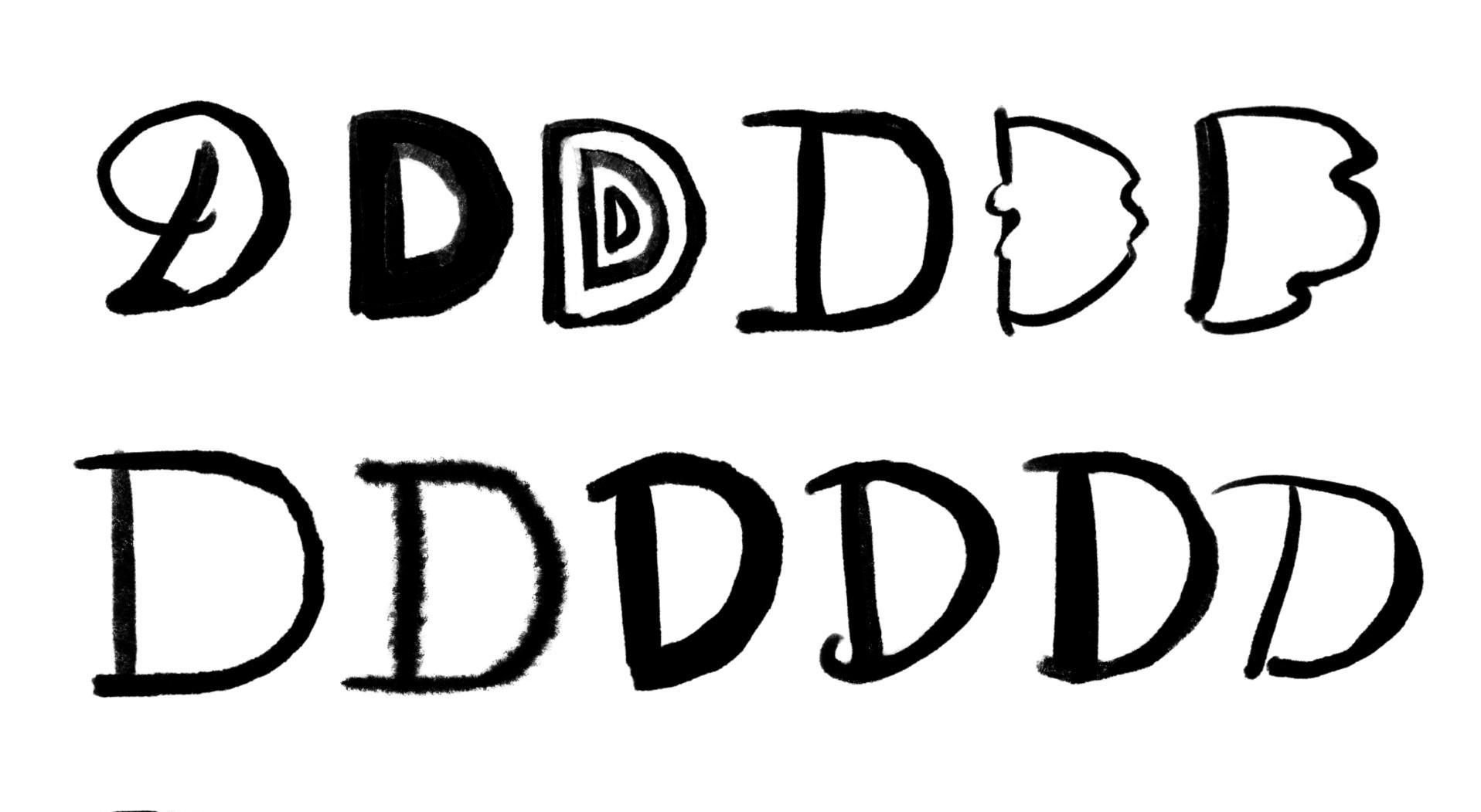
I began the process by considering what an embosser could be used for. Why would I want to emboss a single character on paper? From there, I began sketching out letterforms. I began with an exclamation point, because I wanted to mark the paper with a character that meant something with only one character. Exclamation marks are expressive, they indicate emotion without having to form an entire word. They can represent urgency, anger, surprise, celebration, or shock. I got ideas for different shapes by searching for different fonts using those as inspiration.
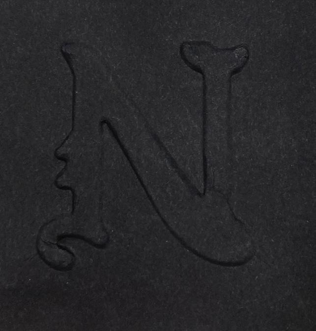
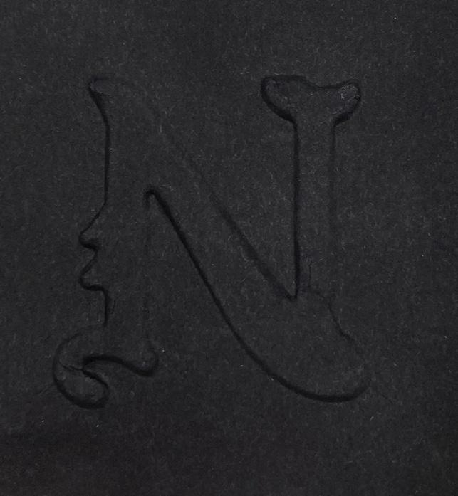
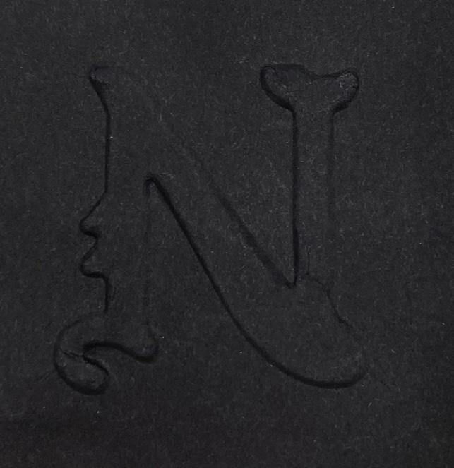
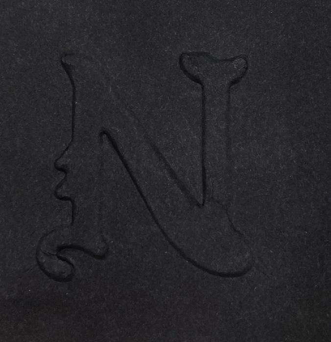
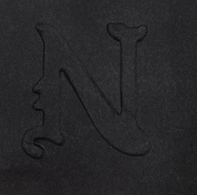
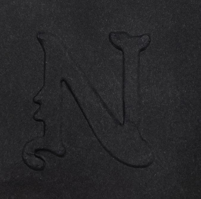
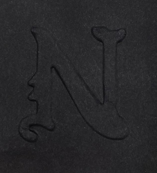
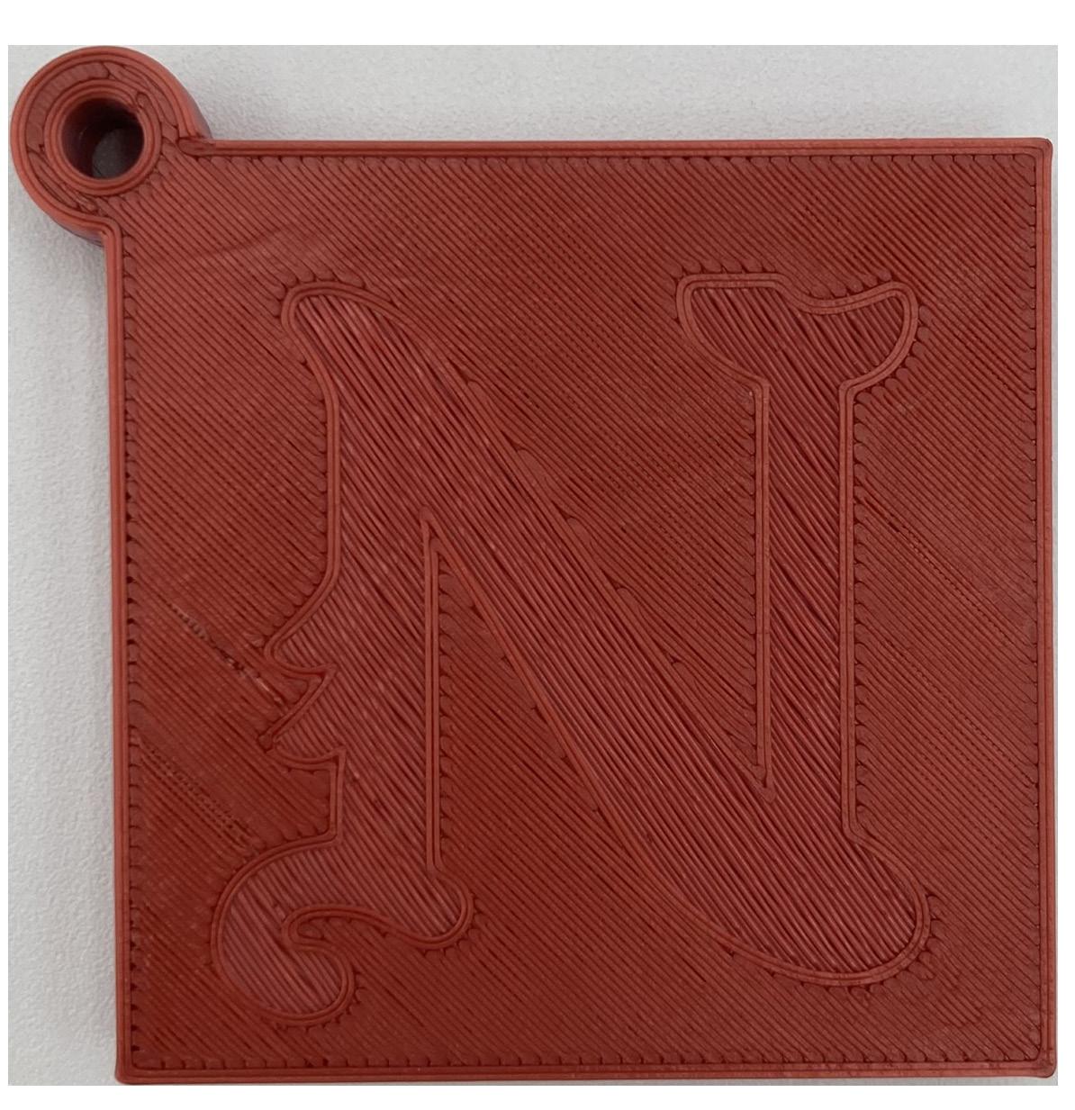
Later, I also sketched out designs for the letter N. I designed this for my friend who is going to law school, as I wanted to give this to him as a gift if he wanted to officiate paperwork by using his last initial, or add it to letters he sends. He likes intricate and elaborate designs, so I tried out different caligraphic and blackletter designs. His two favorites were the bottom caligraphic N second to the right, and the blackletter N first in the middle row. I went with the blackletter design, because I was not sure if the caligraphic one would translate well to an embosser with all the small details.
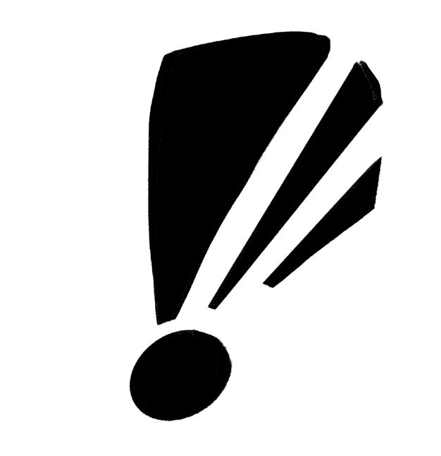
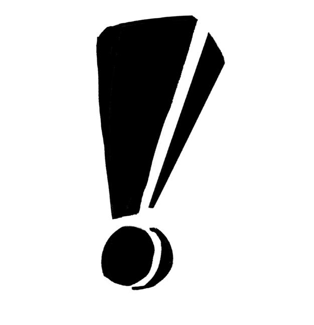
The N went well when converting it into an Illustrator file, however, I had difficulty with the exclamation point. I had chosen the three lined exclamation point, as I felt that it emphasized the feeling of an exclamation. It did not translate well as a vector design. I went back to sketching, and I still was not content, until I realized that one of the designs looked like a three dimensional exclamation point. I liked this idea quite a bit, it also emphasized how the process of embossing itself is three dimensional when the font itself is 3D. In the end, I am glad that I did more iteration. I am more happy with the concept of a 3D exclamation point than a three pointed one.
From
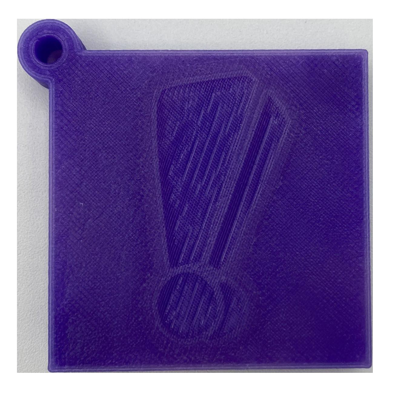
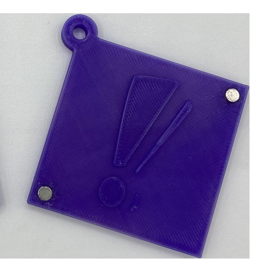
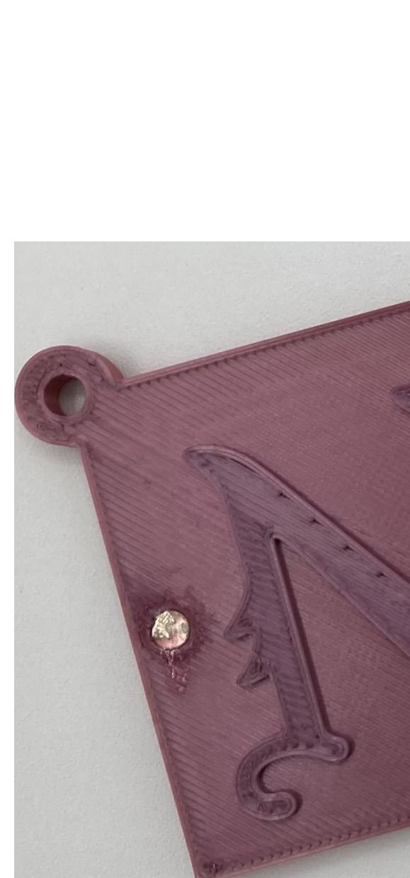
After designing font, I modeled the embosser in Rhino, and printed it. The first time I printed the exclamation point, I realized the circle around the punctuation mark of the exclamation point was too small. When I tried embossing it broke the paper. I printed it again, but the type of filament I used caused the embosser to print unevenly. I printed again, using the color changing filament. This worked well, and I was satisfied with the result. The N embosser had no issues printing.
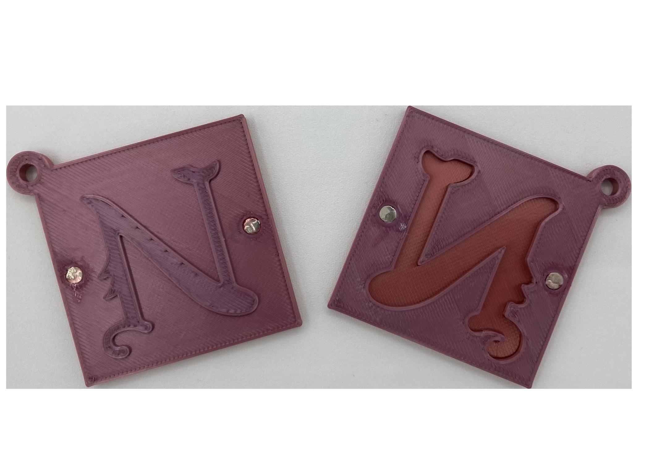
I struggled a bit with placing the magnets. The indent was the appropriate size, but I struggled to make sure the magnets were facing the right direction, and I ended up getting superglue on my fingers. Despite the superglue marks, I am quite happy with the end result.
Neon is a unique material that requires much more effort than may be apparent at first glance. It is created a hollow glass rod that is heated evenly on both sides of a small section only about an inch wide, using a flame to get the glass to a high enough temperature that it begins to deform and become plyable. Once it gets to this point, it can then be bent to fit the form of the iconography it is trying to achieve. It is a delicate process, the glass must be blown to ensure that the bend does not get too small or become closed off. In addition, it is typically made using one continuous rod, or multiple rods that are welded together. This requires a bit of problem solving, since the glass must be evenly heated while avoiding touching the open flame.
Another problem is that one must figure out how to make their imagery using one continuous line. This problem is particularly apparent
when creating typography, as individual letters must differentiate themselves from one another. This can be solved by creating each letter individually, but that is not always an option. Typically, this problem is solved by going back behind the imagery, leaving the imagery raised while the connection between the letters is wrapped behind them. The unraised area is then used with a special black paint called blockout paint, which makes it so that those areas are not lit and are less visible in comparison to the area of light.
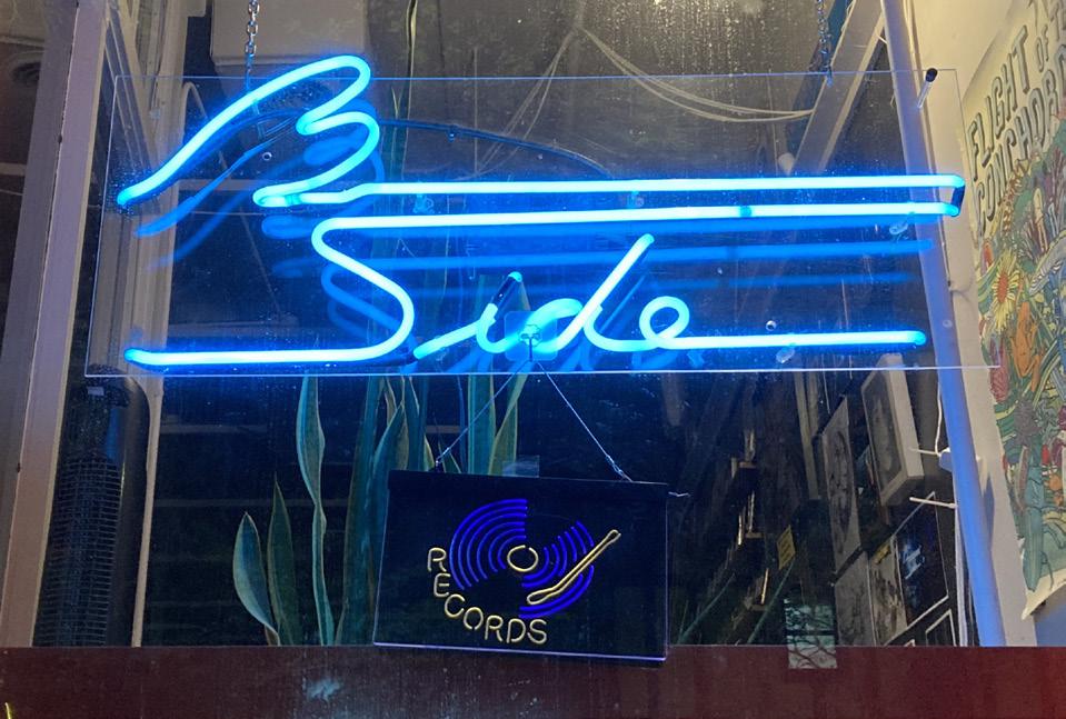
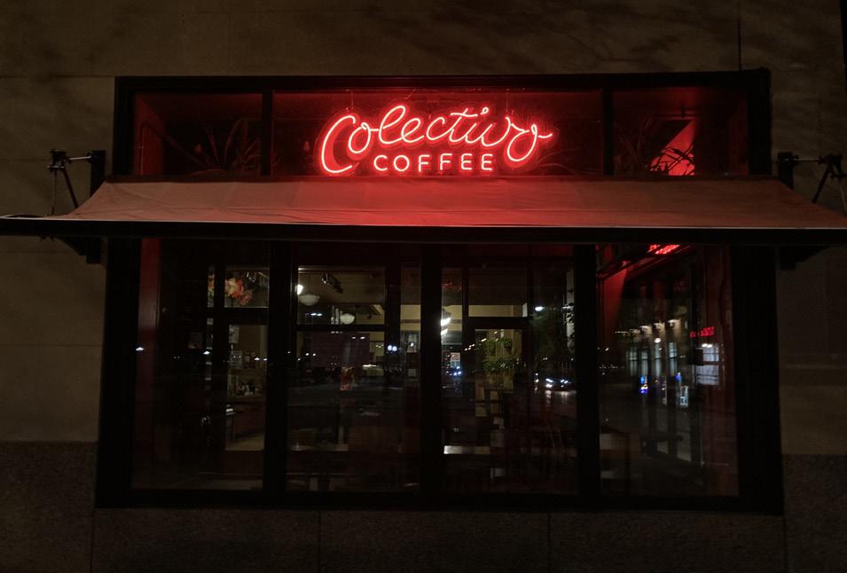
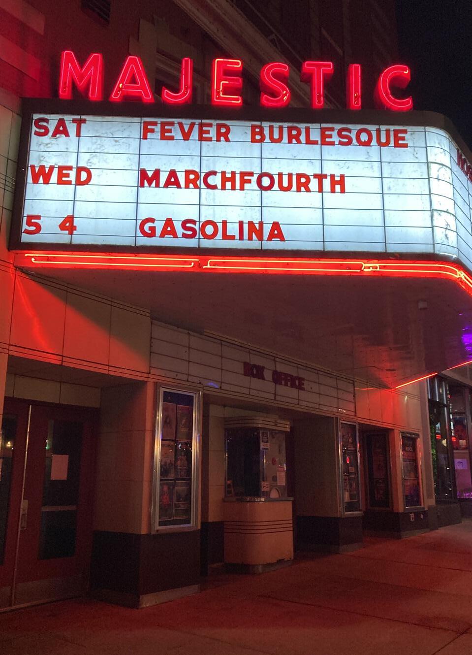
Due to the complexity of creating neon imagery, typography is especially impressive, especially those that achieve a unique type. Typography is especially common as well, as neon is a popular form of advertisement due to the attention grabbing nature of the colored light. Here we will explore neon imagery. What makes a good design and a bad one.
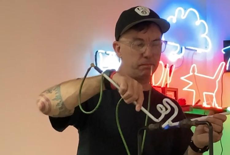
UW Madison’s neon teacher, Tom Zickuhr, doing a live demonstration of neon typography by creating an E. He is lighting the glass with a torch, spinning it to distribute the heat evenly. In his mouth is a blow hose, used to ensure that the glass does not collapse while it is heated.
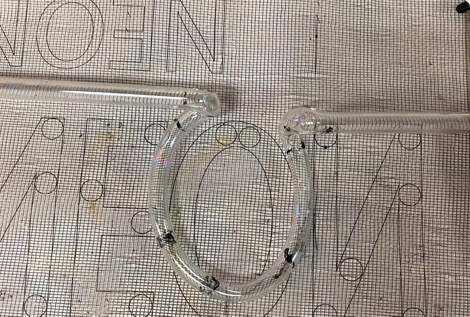
Matching the glass tube to the shape of the letter form. A screen is used to prevent the paper from burning after coming in contact with the molten glass. The circles on the diagram are areas where the tube would be raised so that it could connect to the next letter. The letters are backward since that is the raised area in the final piece. The marks are the area that was heated in order to bend.
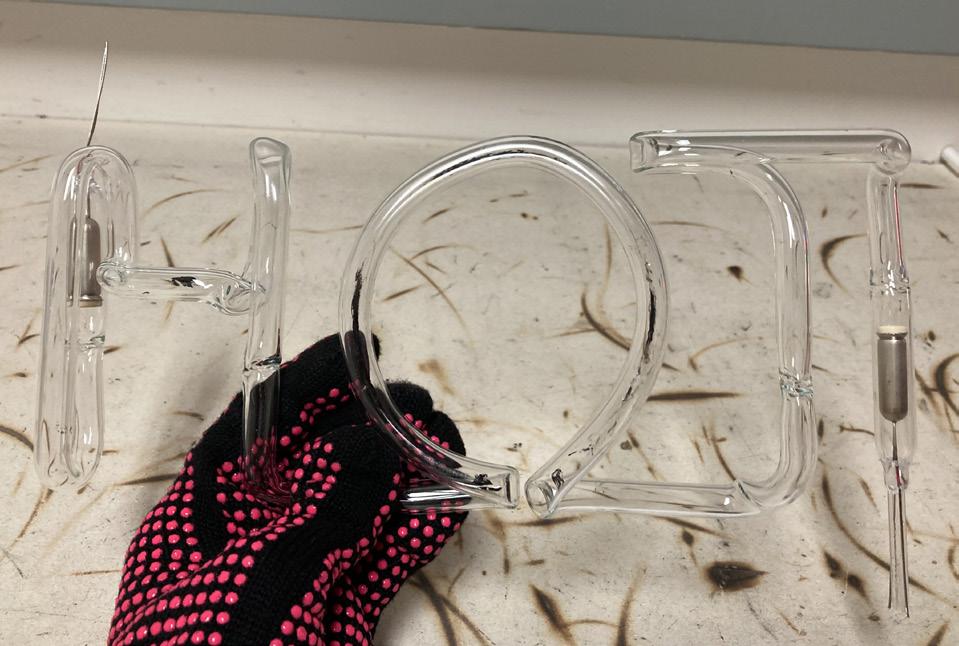
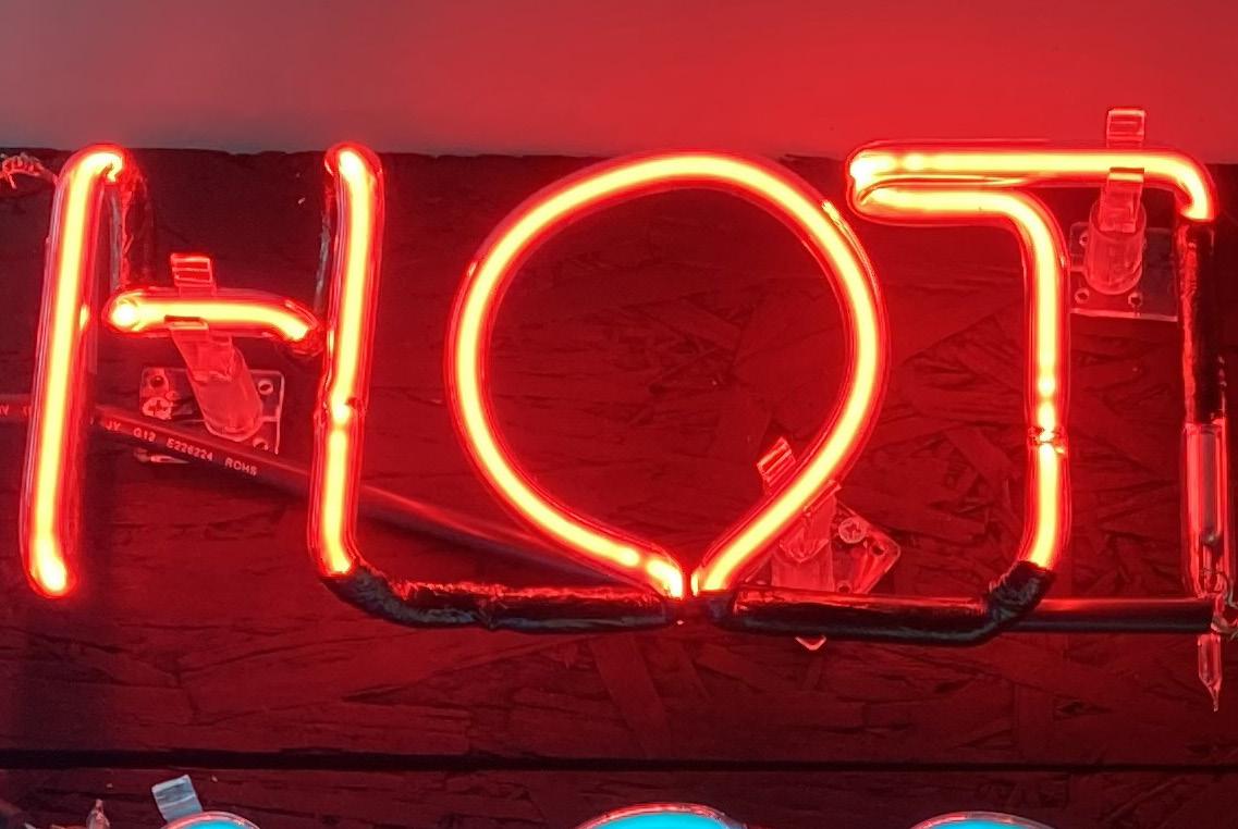
The completed letterform after being bombarded but before the blockout paint is applied. The spots of distortion in the H and the T are where two glass rods were welded together. The end caps are where wires are attached to connect it to a power supply.
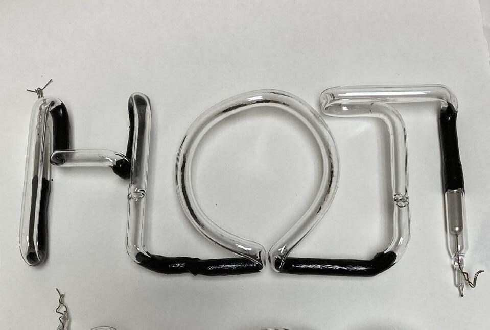
The piece after the blockout paint was applied. The paint was applied to the unraised area. This helps legibility immensely since all areas are evenly lit.
The lit final piece. Prongs are used to hold up the piece since it cannot be laid flat. It is also clear to see how the welds affected the visual quality of the neon, as well as the bends. It is easiest to see these on red neon.
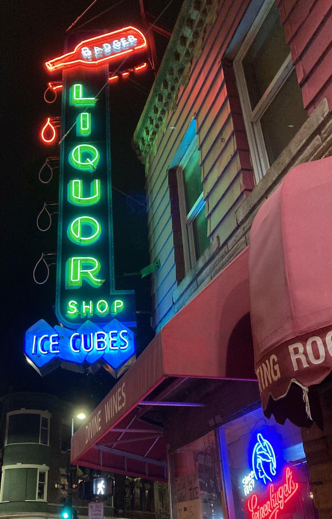
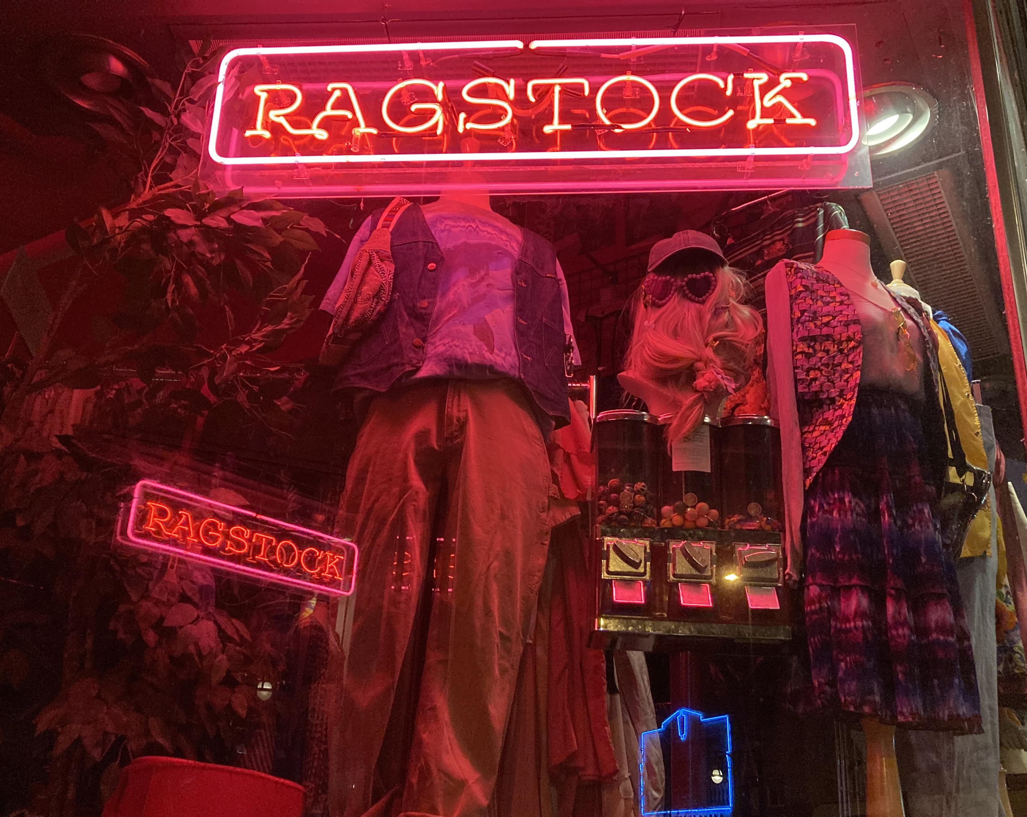
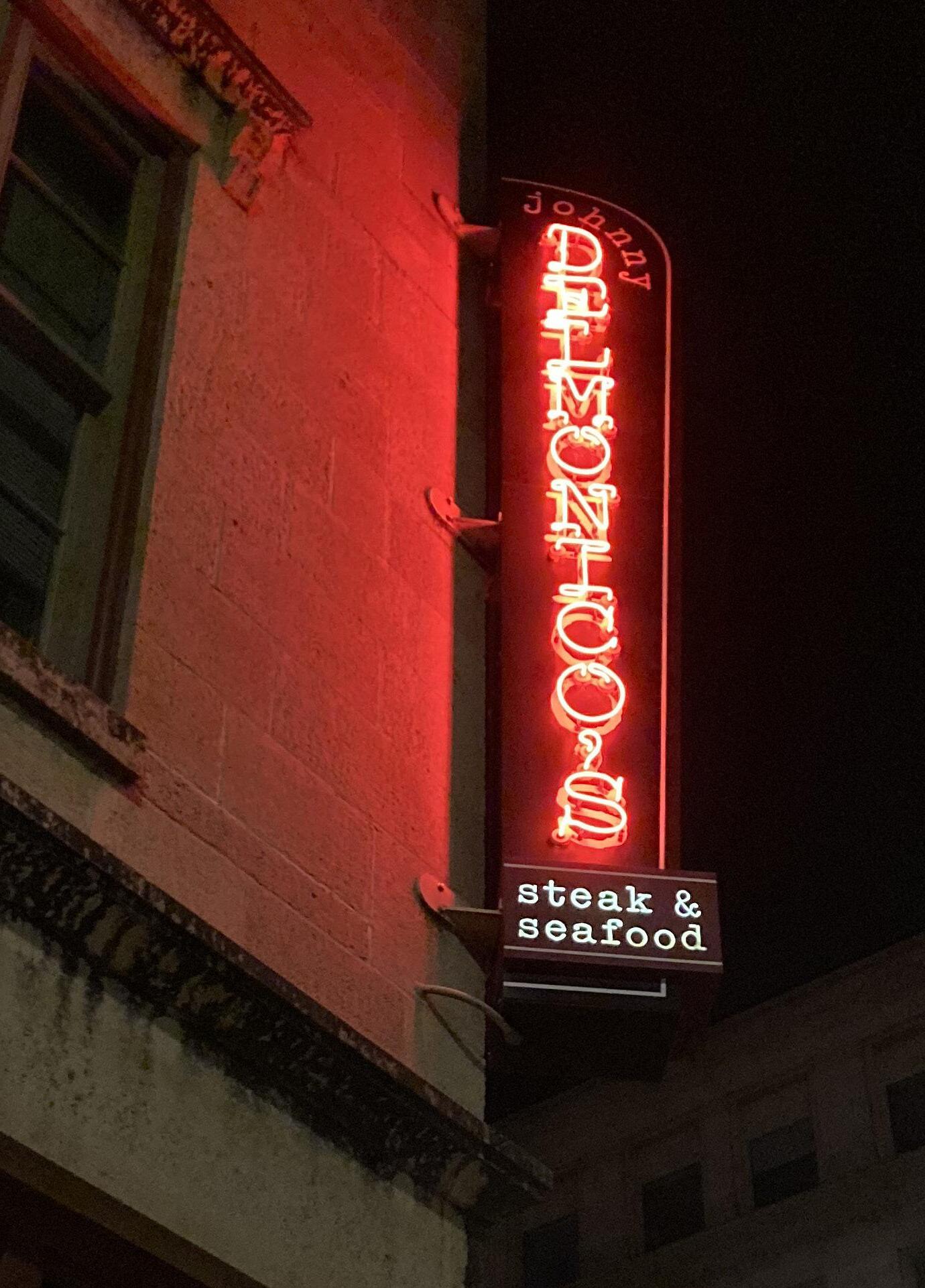
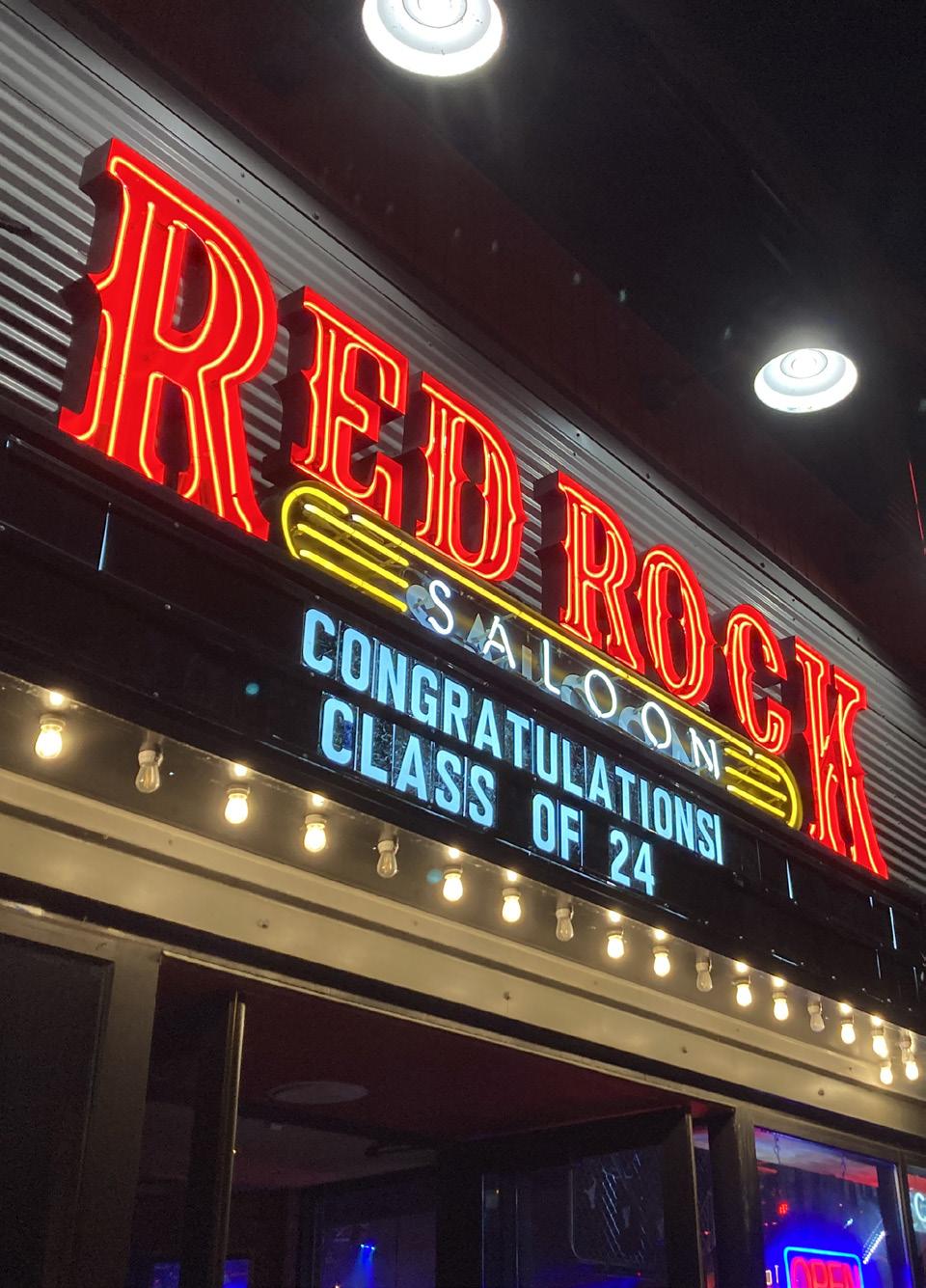
How can you tell if neon is designed well or not? Here is an example, one good and one bad. One the left is Johnny Delmonico’s Steak and Seafood. Although the font is interesting, the serifs make it difficult to read, especially considering the angle it is meant to be read at. In addition, areas are not blocked out, adding to the legibility issue. On the right, however, Red Rock Saloon’s neon is incredibly easy to read. The letters are properly separated by blockout paint, which can be seen clearly on the “saloon” part.
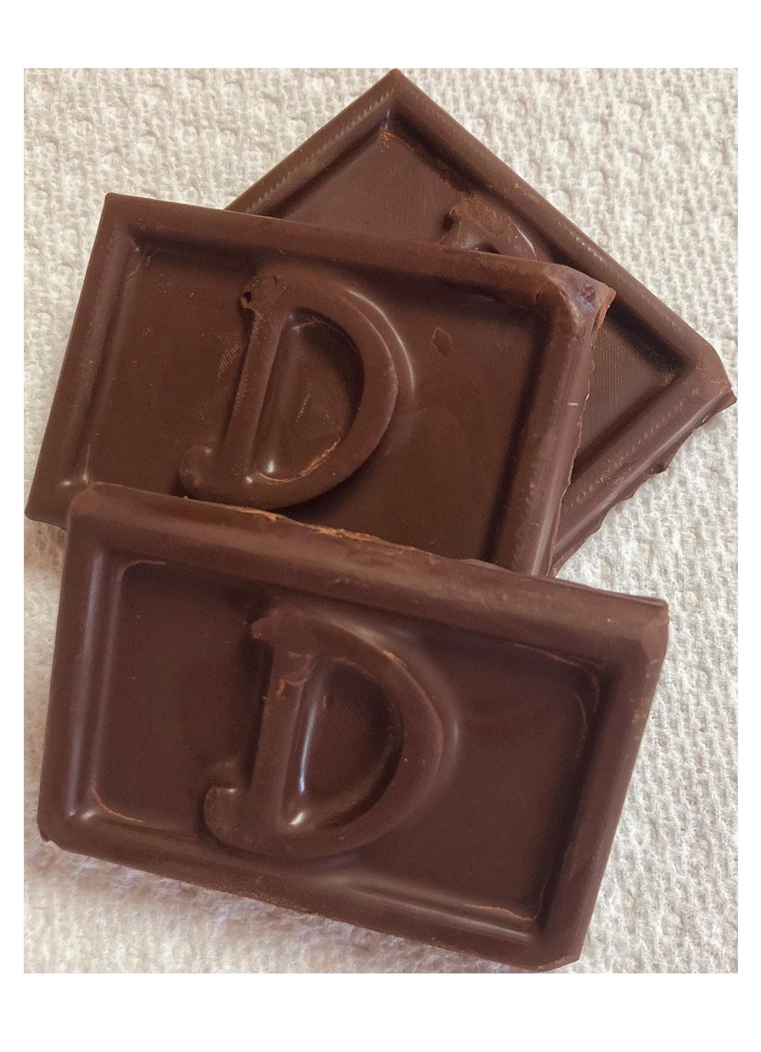
In this project, we were assigned to create edible food using typeface as the central design element. We would 3D print a design, shrink wrap a food safe mold around it, and then use the mold to pour food into.
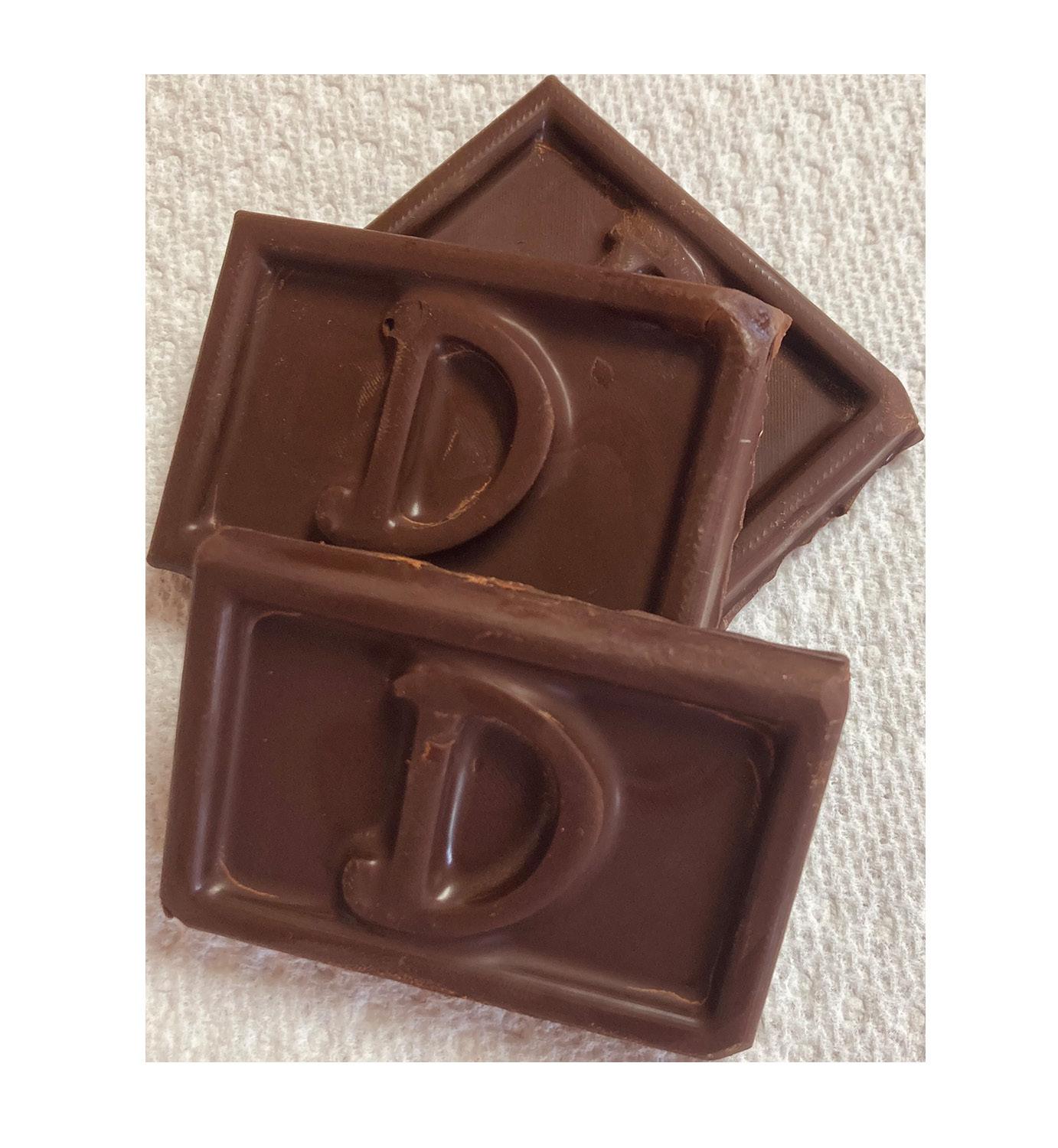
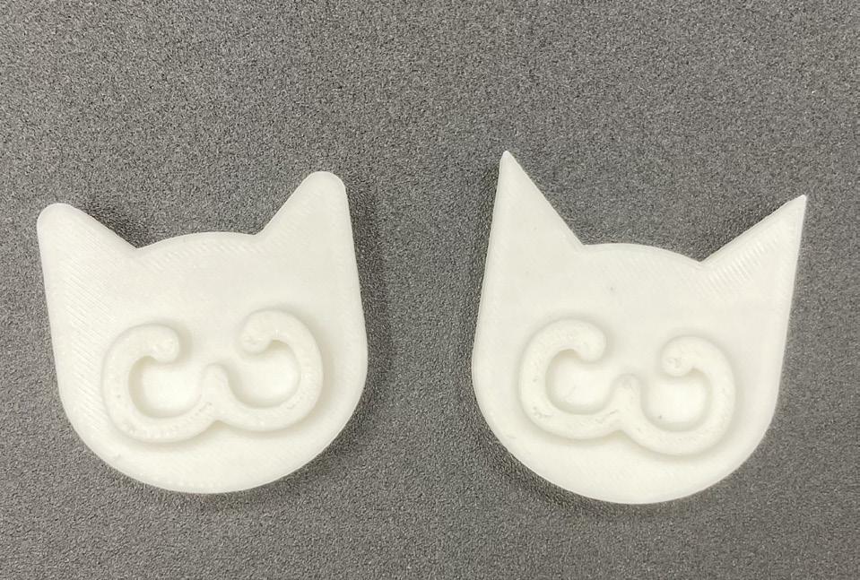
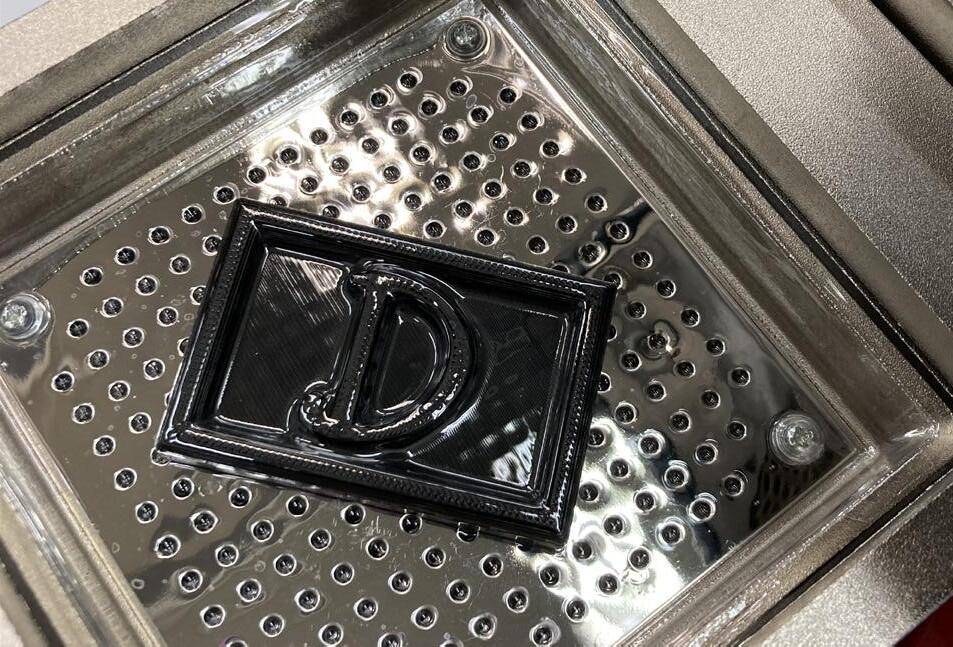
I began this project with two designs in mind: one for a cat treat, and the other as custom chocolate bar for my friend with a gluten allergy. I used a 3 in the cat design because it imitated the muzzle of a cat, and a D for the chocolate design because that is the first initial of my friend’s name. When I printed the ears for the first one, they came out too pointy, so I softened the points and made a new one.
Despite the effort that went into the cat design, I decided to go with the chocolate bar instead since my friend never gets food related gifts due to his allergy. Shown is the process of shrink wrapping the mold around the 3D printed design. The shrink wrap is food safe.
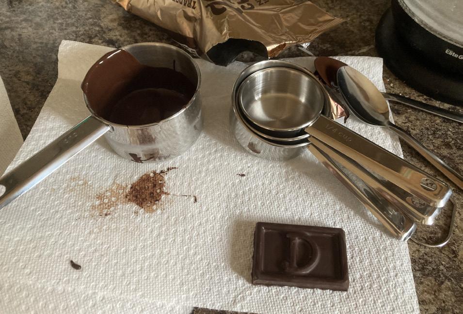
In preparation for this project, I purchased brand new cooking supplies in order to ensure they were not contaminated with gluten. When cooking, I placed paper towels on the counter to make sure it did not touch the surface in case it had recently been in contact with gluten.
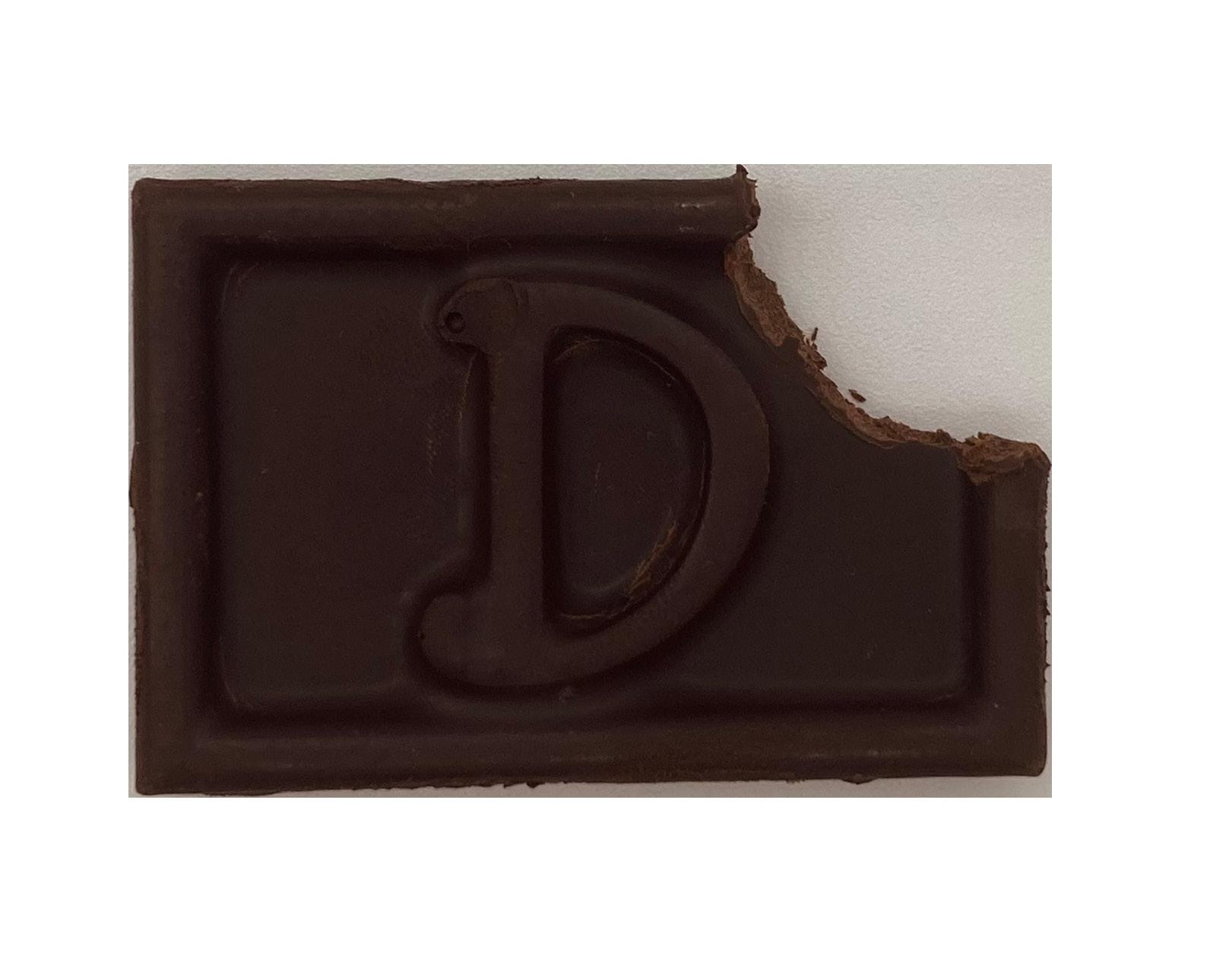
In the end, I made three separate chocolate bars using gluten free chocolate. I took care in storing them, wrapping them in paper towel before putting them in a cleaned Tupperware. My friend tried them and really enjoyed it. He said they were a nice snack size, as it was not so large that he would get sick of the sweet flavor. There were some areas I could have improved my design. For example, there was not enough space between the serifs of the D, so they overlapped slightly. If I were to expand on this concept, I would possibly design a chocolate that had the letters GF to signify the lack of gluten, and perhaps create a brand around the concept.
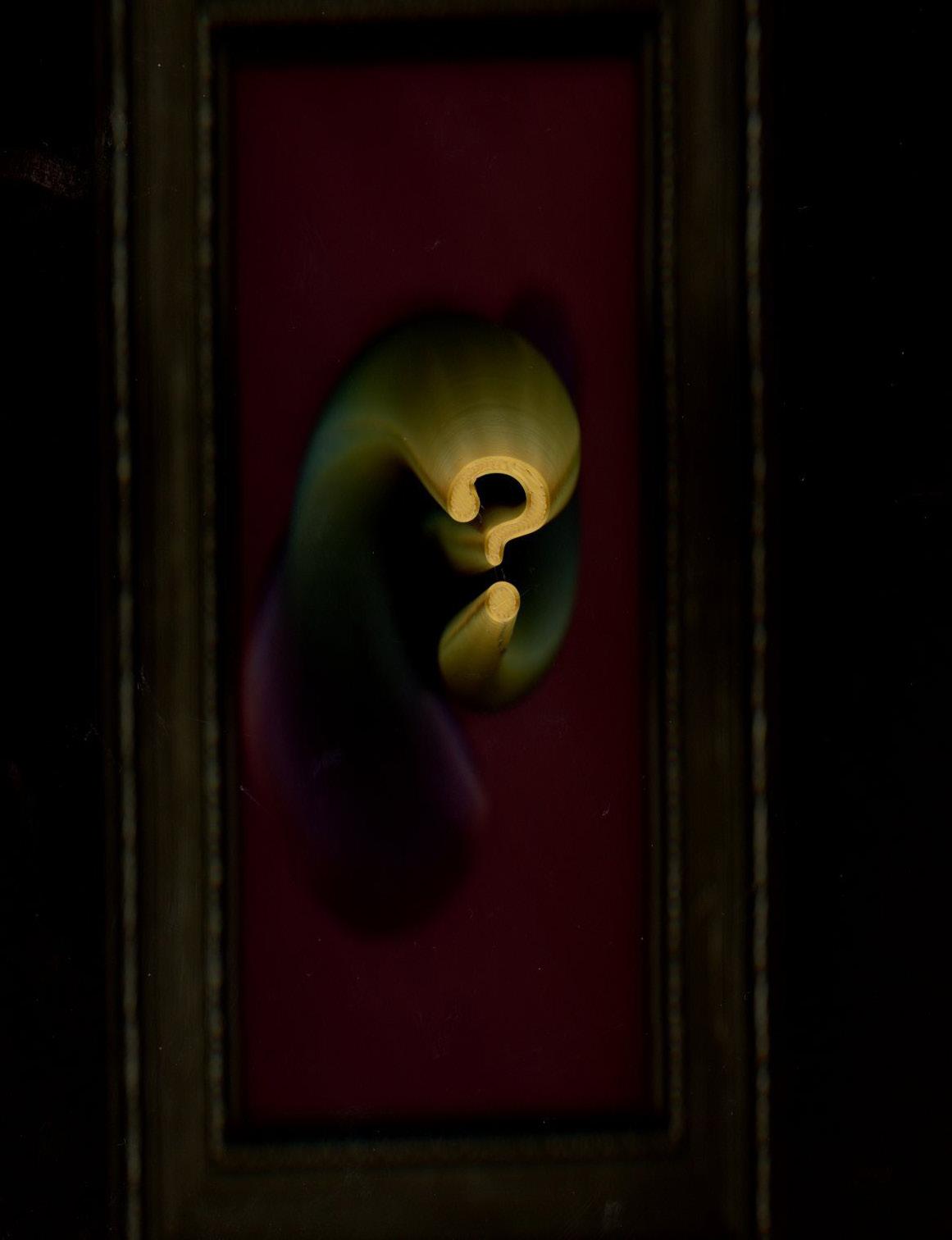
For this project, we experimented using the Grasshopper extension for Rhino to create parametric designs that we could use to print three dimensional type. The result of this project is my favorite by far.
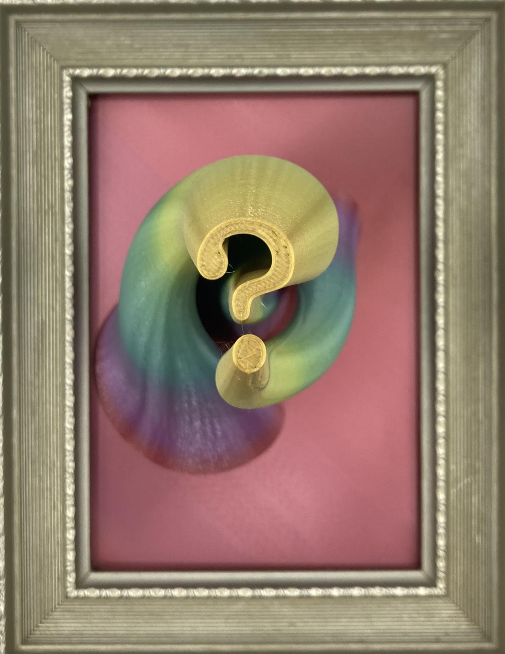
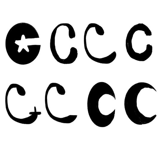
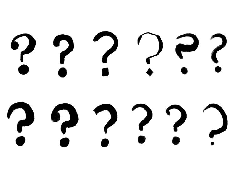
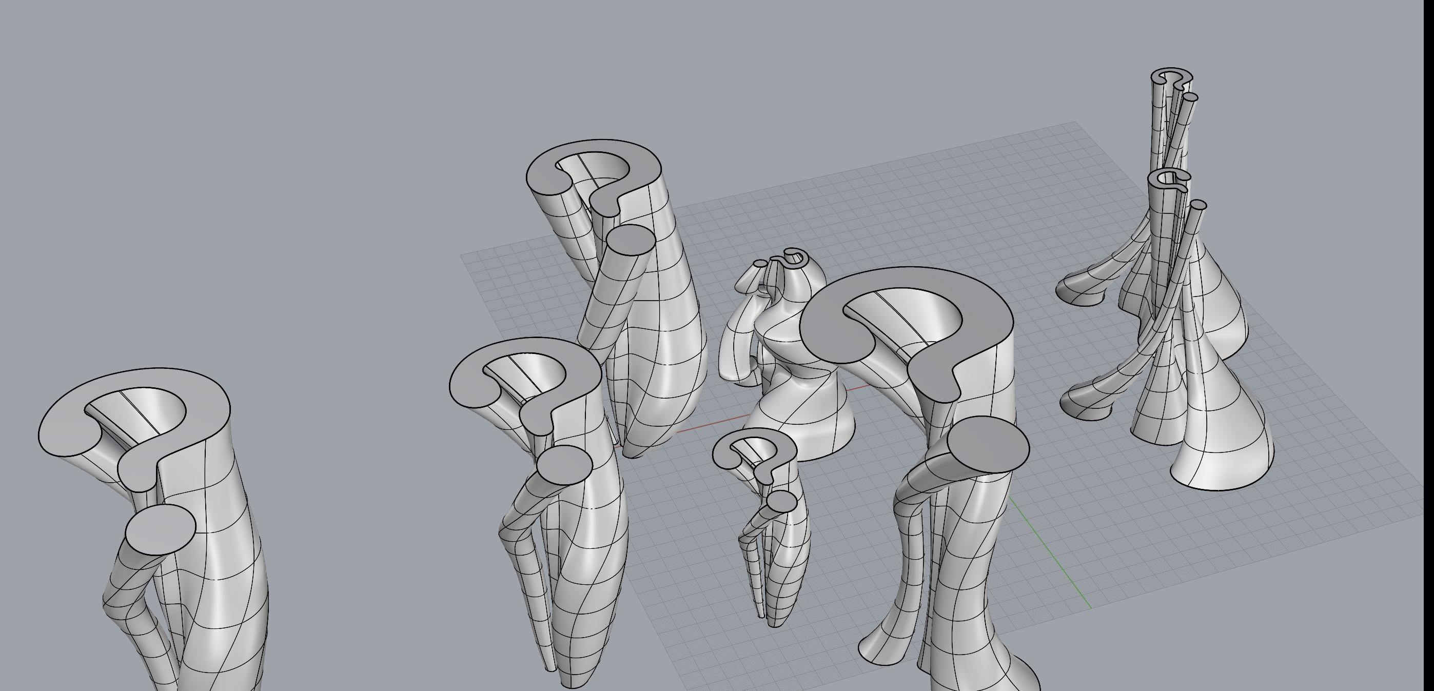
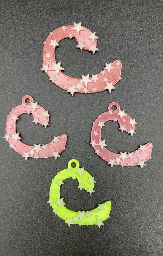
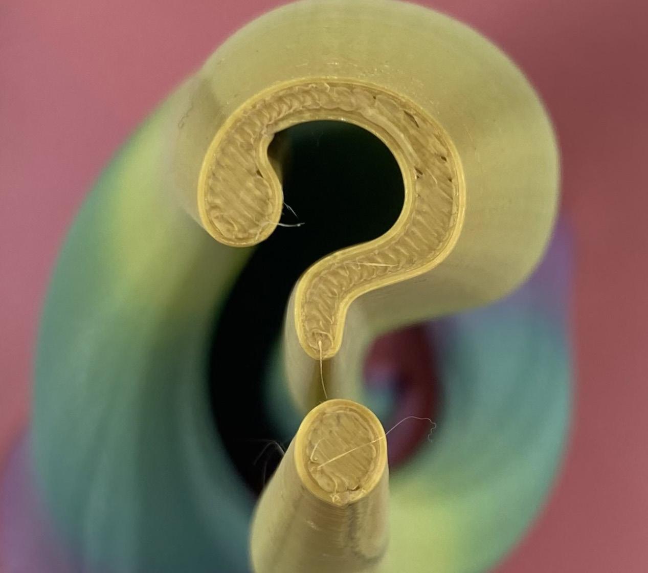
I did a lot of ideation for this project because I was unsure of what I wanted to do for it. I began with sketches for the letter C because I have a character I created whose name starts with C, so I began making letters inspired by his character. Although I liked these, I was not attached to the idea for a final project. I thought about the functionality of a 3D piece of typography. What could I do with it afterward? How could I create a piece that I would enjoy to keep? How could I display it? This lead me to the idea of gluing the piece of typography to a frame, having the symbol reach out to the viewer. That lead me to another question, using that concept, what symbol or letters could I use to portray meaning with the limited space I have? This lead me to two ideas: one was a question mark, containing meaning through the one symbol, and I would not have to worry about the
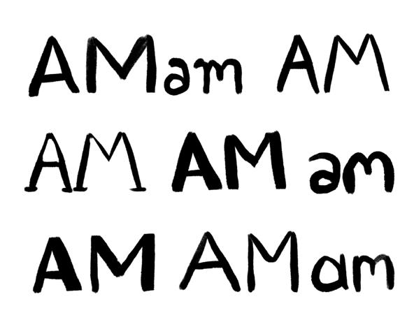
disconnect between the symbol and the punctuation; the other was the word “am”, as in “I am”, a state of being, reminiscent of the statement “I think therefore I am”.
Once I moved to illustrator to finalize the designs, I was not a fan of any of the “am”s that I had created. I did not like the fonts, I did not feel as if they portrayed the meaning that I wanted them to portray. I liked the question marks, particularly the ones with thicker lines. I later made a variation that connected the top part with the circle, but later decided against it. For the C, I made sure to make the lines thick so that I could add pop geometry to it.
I then moved onto Rhino. Originally, I wanted the question mark to be small and expand, but it would be more stable the other way around. I experimented with designs that I
liked that would be stable enough to print. In addition, I liked how the punctuation mark wrapped around the top part.
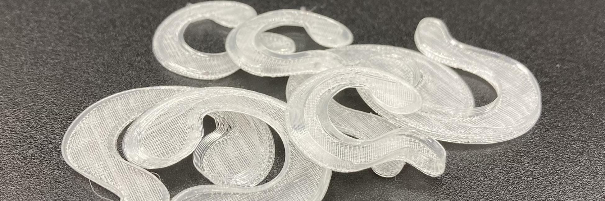
Next was printing. I began with trying to make a spiral vase with a perimeter of 1. The filament kept printing in the wrong place. I edited the speed of the nozzle, which helped a bit, but it did not fix the problem. After speaking with Taekyeom, I used two layers for the parameter. It was still faster than printing it as a solid. I wanted to use clear plastic so it would match the transparency of the glass I would glue it to, but realized that made it difficult to read. One would have to look close to realize it was a question mark. So, I printed with black filament for the large piece. With the large piece, I began to get the error even with two layers, probably because it was a larger piece. At that point, 3 layers would take longer
than printing it solid, so I gave up on that idea.
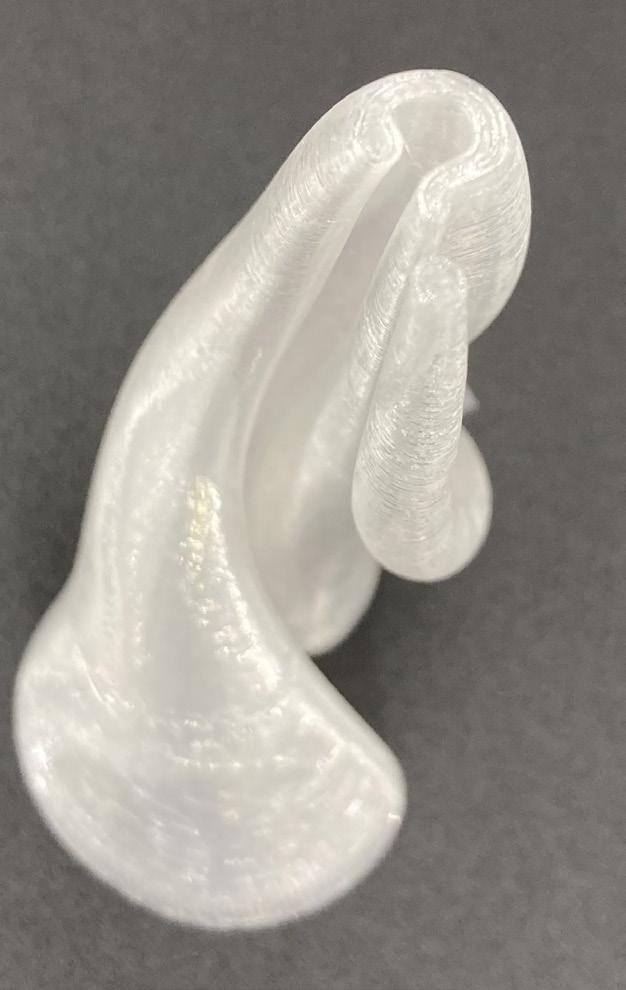
I started with printing a large black vase, and as that was printing, I experimented with using the rainbow filament. I hypothesized that it would be more readable since the base would be a different color than the tip. After the top parts finished printing, my hypothesis was proven true, the rainbow one was more visible than the black one. I continued with that one by printing the circle. I was lost for what to do with
the color within the frame, before I realize that the filament would be the best match as it was slightly metallic. I measured out the glass of the smallest frame that I bought to test out the print.
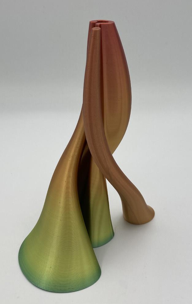
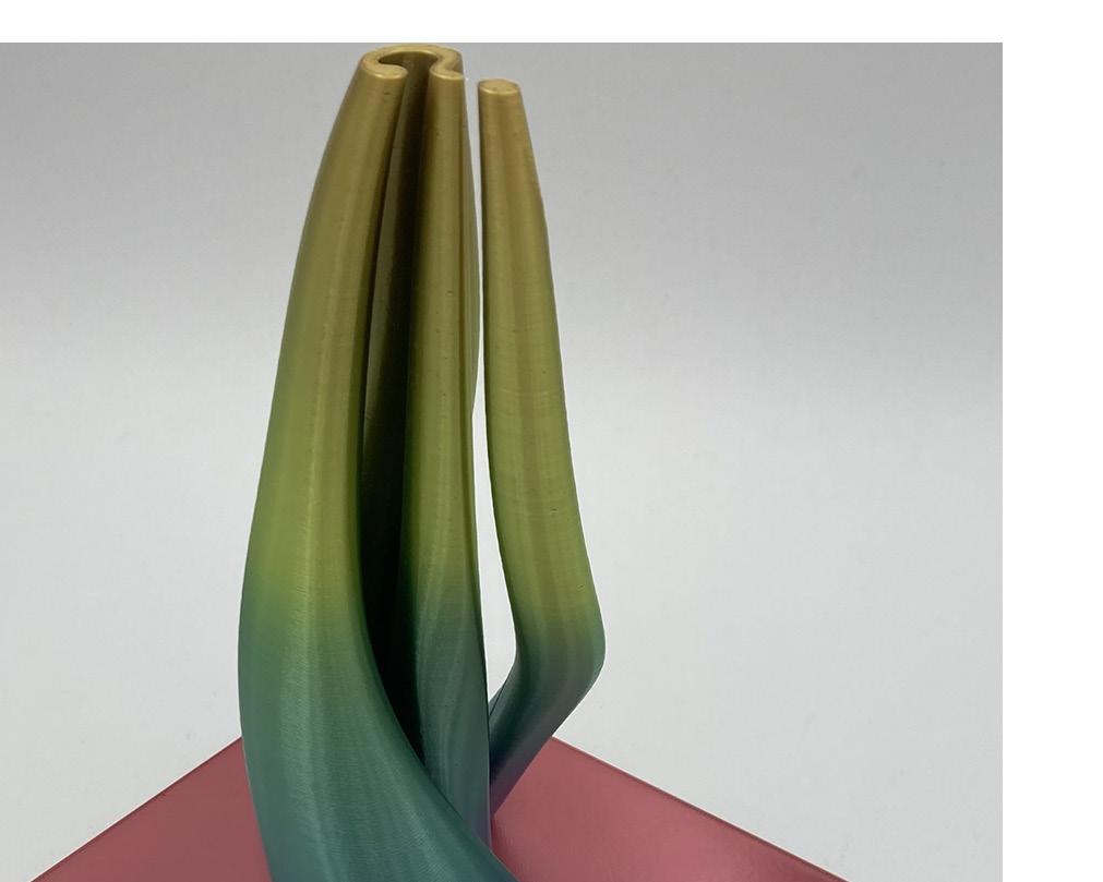
After I had printed the last print, I realized that I could print the entire vase in one piece. This way, I would not have to glue anything, and the filament would match vertically as it printed. I roughly set up the separate pieces I had to figure out which frame I liked the most, then
I measured the glass of that frame and added it to the design. The printing went well. It took over 12 hours. There were no major errors.
For the pop geometry, I had switched the filament from the base color to a glow in the dark color for the stars. I had small printing errors, with one of the keychains the smallest star had excess filament that I had to cut, but other than that they went well.
Despite the struggles it took to get to this point, I am incredibly happy with the result. I ended up with a piece I am excited to have. I also learned some interesting things, such as when a filament changes color, it would have to have all pieces printed at the same time in order to have the progression of color changes be consistent.
What did you learn from taking this class, and how does it influence your design process?
I learned a lot while taking this class. The most influential being knowledge of 3D modeling and exposure to 3D printing. Before this class, I had little experience with 3D modeling. I disliked using it because I struggled so much. I am used to working with physical materials and manipulating them by hand, so there was a large disconnect for me in manipulating three dimensional object in a two dimensional program. This course helped me bridge that gap, since we 3D printed the objects, giving them a physical presence that was easier for me to comprehend. I am more open to working with 3D modeling because of this, and will try it more in the future.
What went well with this class? What did not go well?
I enjoyed the end product of all of my assignments. I worked hard to come up with a concept I would be proud to own or share, and put enough work into it to have an end result I am happy with. I struggled to come up with ideas for some of them, however. It took me a while to get started on some of the assignments because of this, and I fell behind toward the end of the course.
What was your favorite assignment, and briefly explain why?
I enjoyed the parametric design the most. It was the project I was most excited about the concept for, and the one I am the most happy with the result of. It has more of a fine art feel than my other ones. It is similar to art I would make outside of this course, and has an interesting concept behind it. It prompts the viewer to question the piece: what does this mean? Why is it a question mark? Why is it
spring 2024
three dimensional? It is not as direct as the other projects where the meaning is immediate, it feels much more artistic.
What would you do differently if you could take this class again?
I would try to manage my time better. I struggled this semester with managing my time, especially due to outside circumstances, so I feel that if I retook the course I would do a much better job keeping on top of my work. I would also love to explore designs that have more complex shapes. Now that I have more experience with 3D modeling, I feel that I am more comfortable exploring more complex ideas.
What helped you learn in this class? Who do you want to thank in the class?
The small group critiques were quite helpful. There was more of a dialogue between students where we could get feedback on our work and ask questions about problems we were having. I would like to thank Taekyeom for his help in this course, especially with the magazine. I struggled a lot with it and would not have been able to get it to the higher level of quality it is now without his help.
What changes are needed in this course to improve learning? What makes learning difficult? Is it personal, or systematic?
I would like for all of the critiques to be with smaller groups, I found them very helpful. I would also prefer days with no demos or lectures whatsoever, days that are purely work days. Interruption in my work process can make it difficult for me to focus on it. Most of the problems I had were personal, there were many outside circumstances which made this semester difficult.