


Connect Creatives
Anker
Anker Express
Anker Zolo
Nifty
Nifty Festival
Nifty Social Media
Undergraduate Thesis
Fan Banner
Art Markets
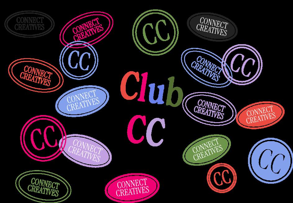
The Connect Creatives logo in Connect Pink
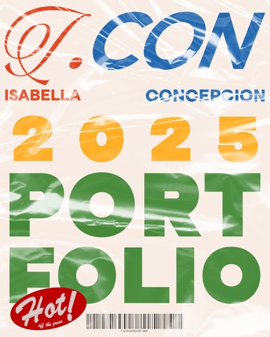
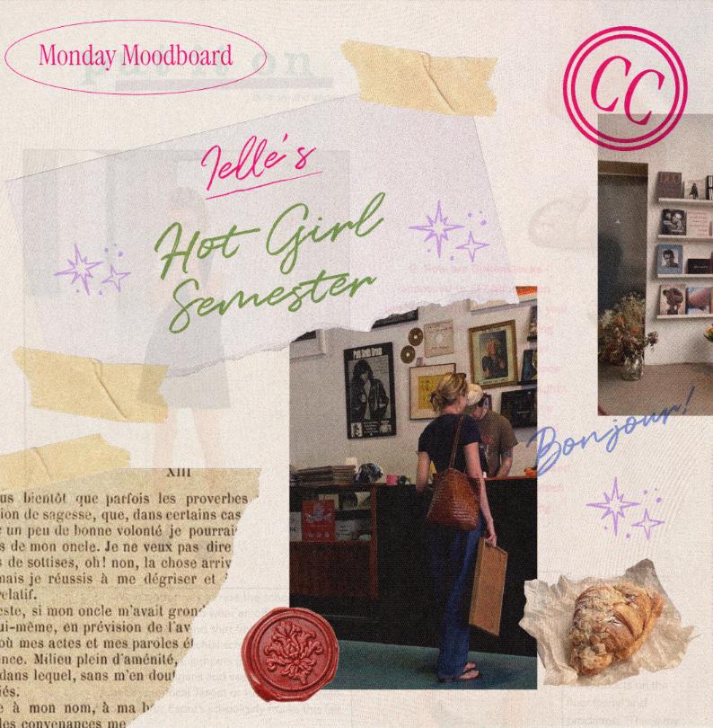
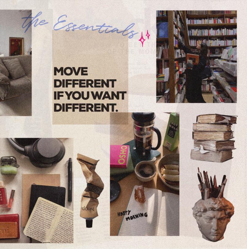
Connect Creatives was a short but sweet stint where I had the pleasure of being the one to do their brand refresh and their social media. The head of Connect wanted Parisian Chic mixed with the human DIY aesthetic of a scrapbook. As such, i came up with the current look of the agency as it stands currently at the time of writing.

Using stamp motifs and signage inspired imagery I was able to create the current look and visual identity of the brand: simple yet chic,



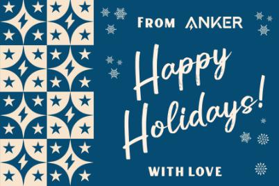
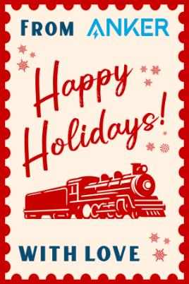
I was asked to design the key visual for the theme of Anker's Christmas campaign which was Anker Express. As such, since it is Christmas, it is made to feel nostalgic and have an old-timey feel with the visuals of the steam-powered locomotives and a vintage almost art deco-like font.


I was given the opportunity to be the lead designer for Anker's newest release at the time, which was for the release of Zolo, which was made to cater to a younger audience. Since they wanted to cater to Gen Z they decided that the design follow suit. They recognized I was good at making designs for a Gen Z audience, as my previous work for my previous brand Nifty was that to a T.
It's actually a first for Anker to have such a colorful item be the focus of the product line, deviating from the usual grays and whites.
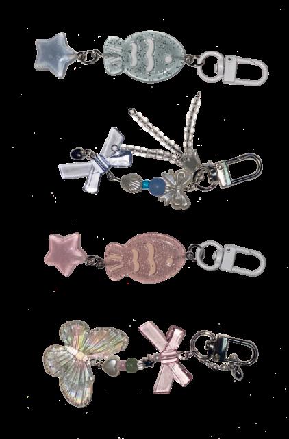
Charms I pitched for the giveaway that were eventually used
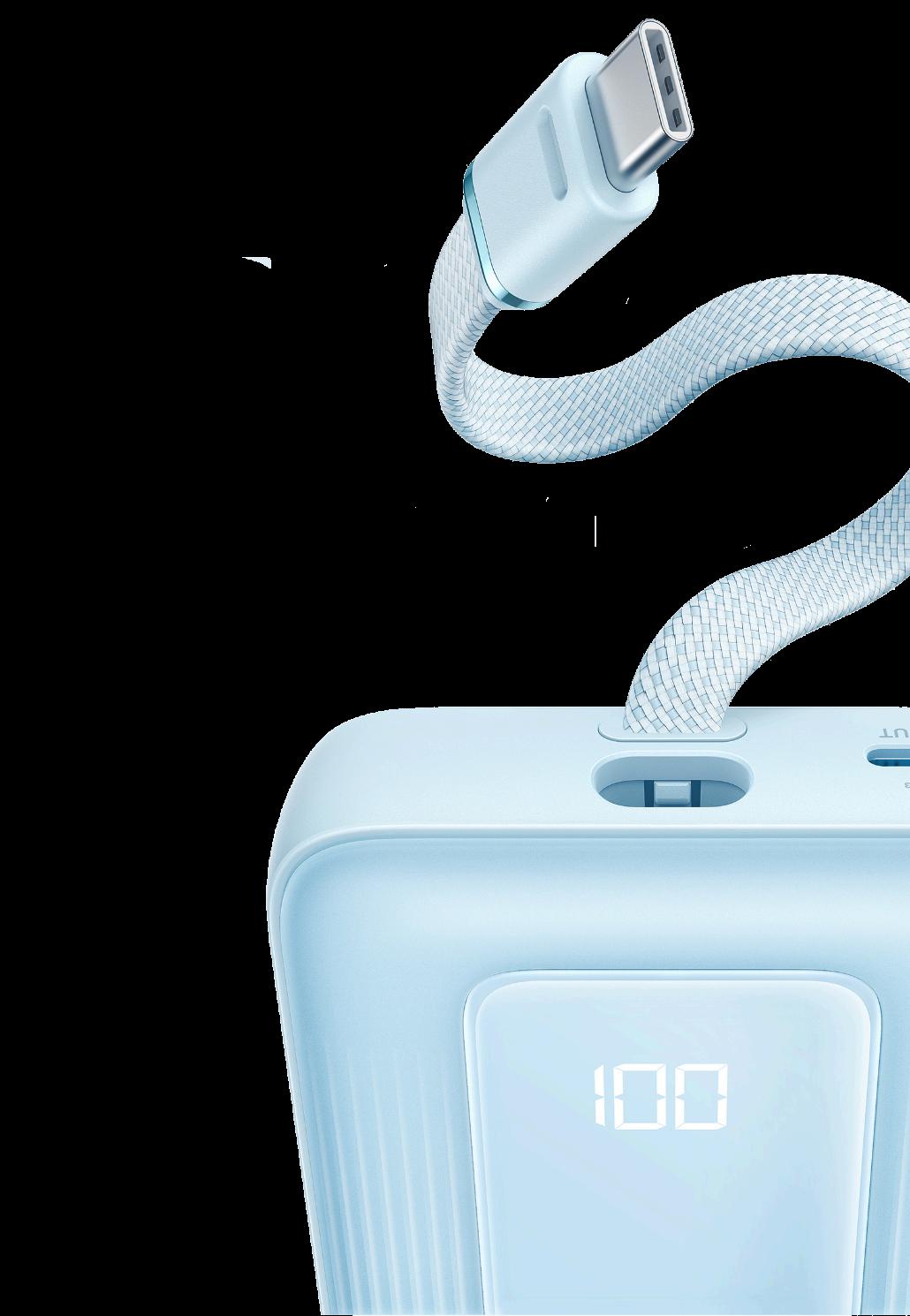


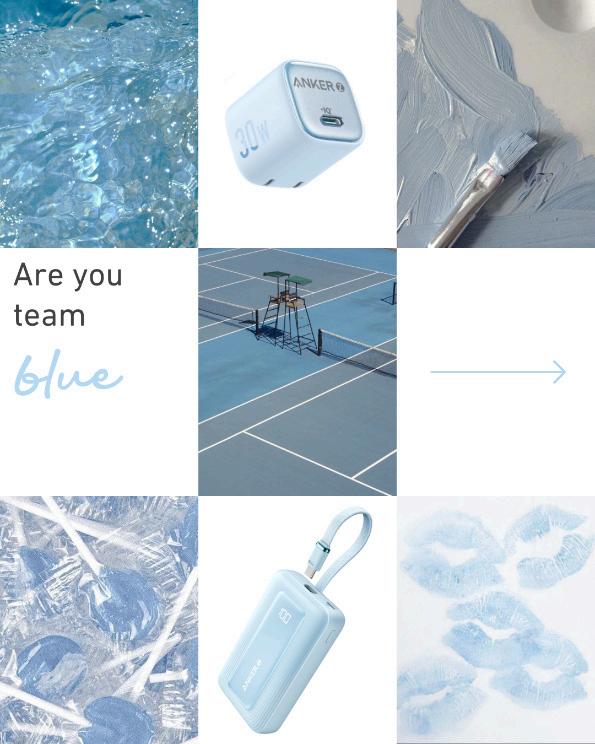


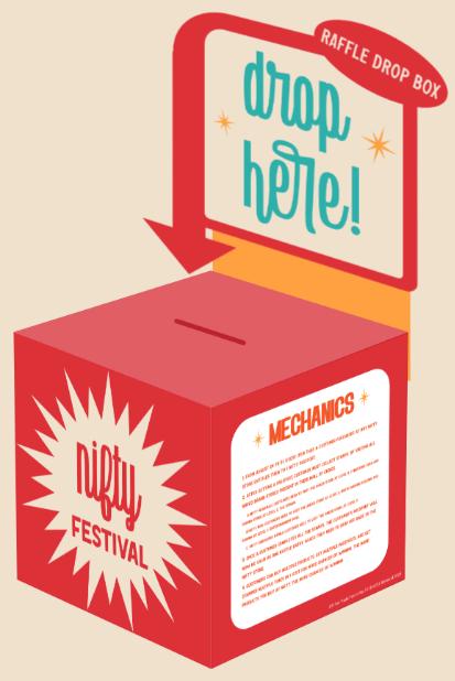
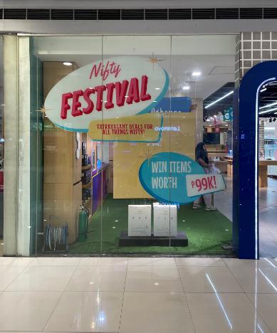
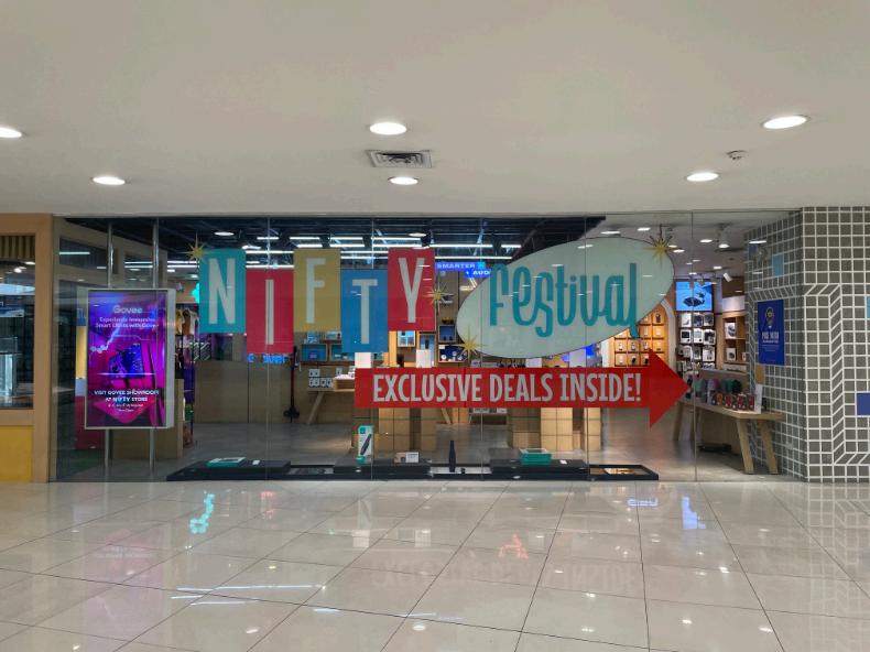
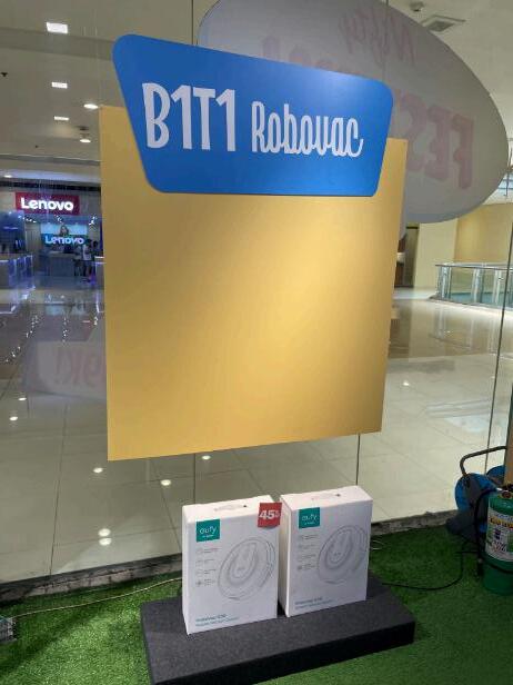
Nifty Fest was the biggest sale event for Nifty and as such it came with its own visuals theme. I was in charge of coming up with everything from the concept down to how it would look in-store and online.
Conceptually, I went in the direction of music festivals, both visually and in the language used. I also pulled inspiration from 50s mid-century graphic design and vintage music posters.
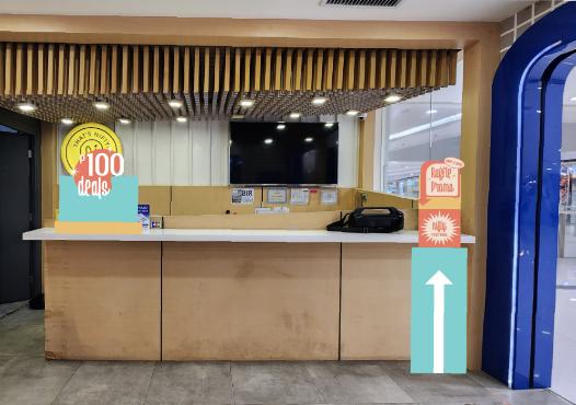
These are the mockups made to be able to visualize how they'd look in stores.
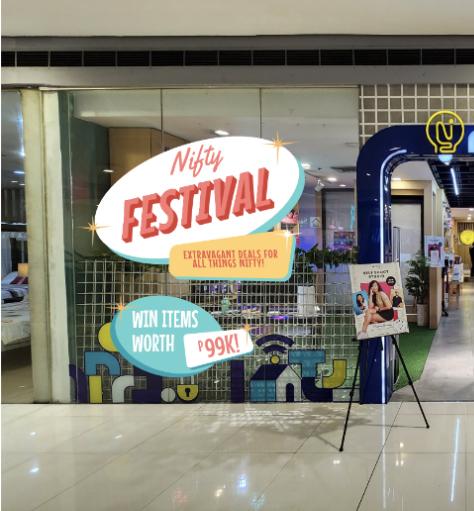

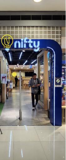
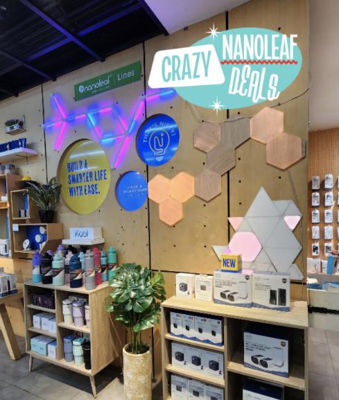
For our Megamall and MOA branches
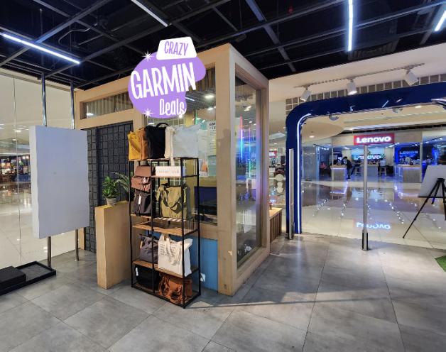
Working closely with the Spatial Planning Department, we were able to execute the chosen look with the needed collaterals within a short amount of time.




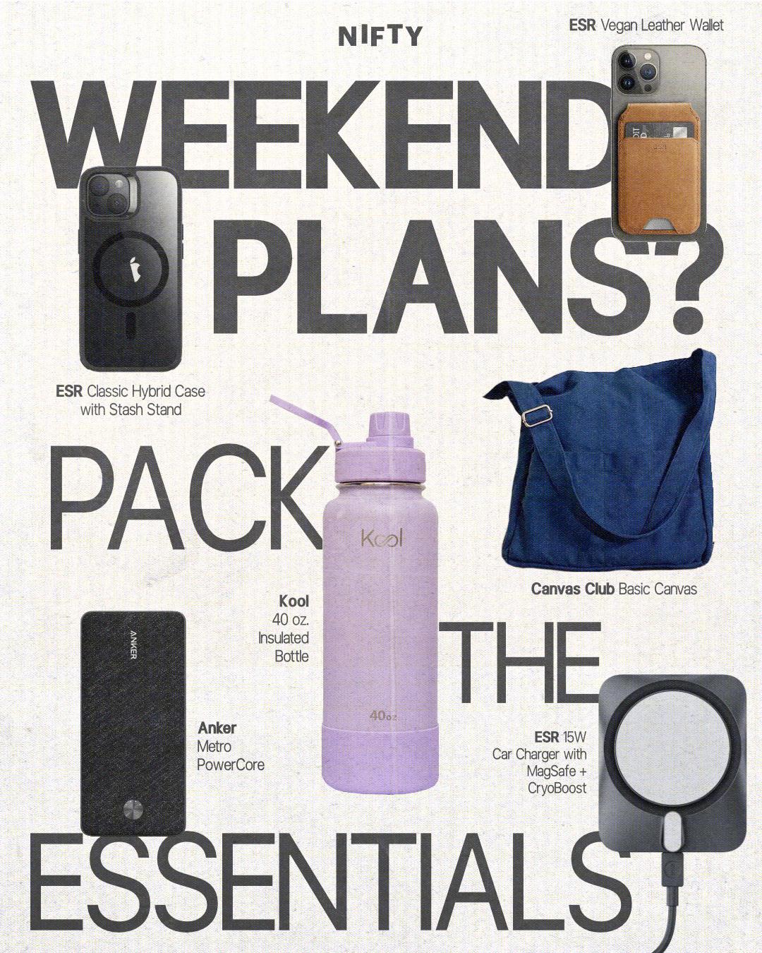
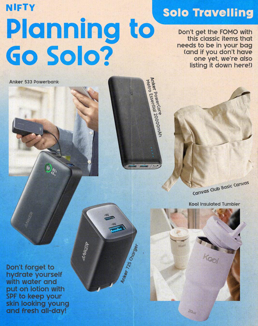

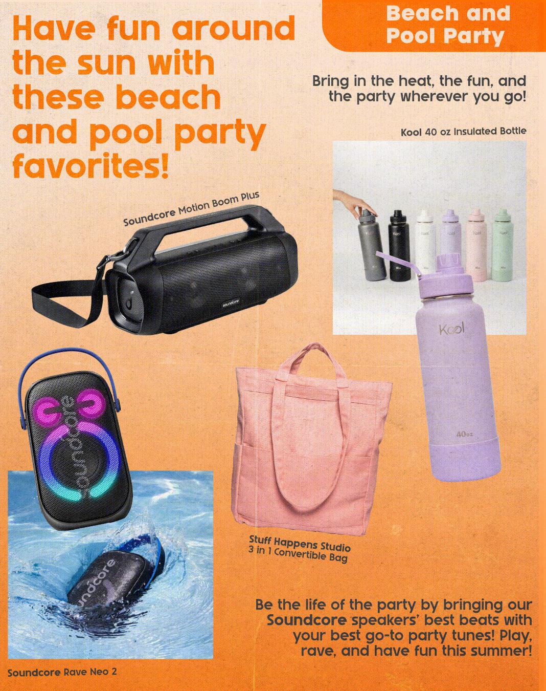

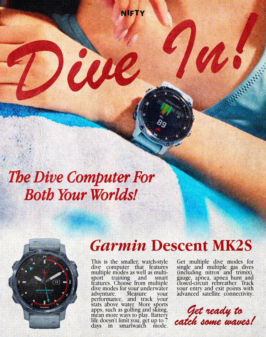

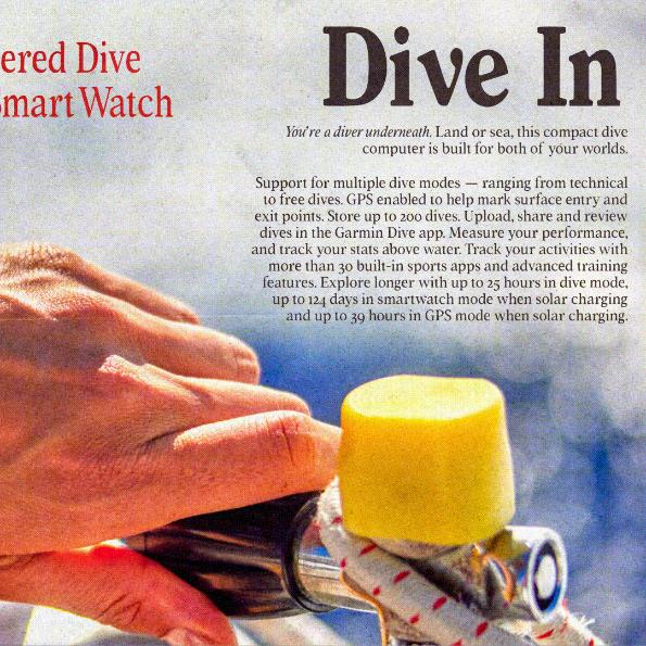
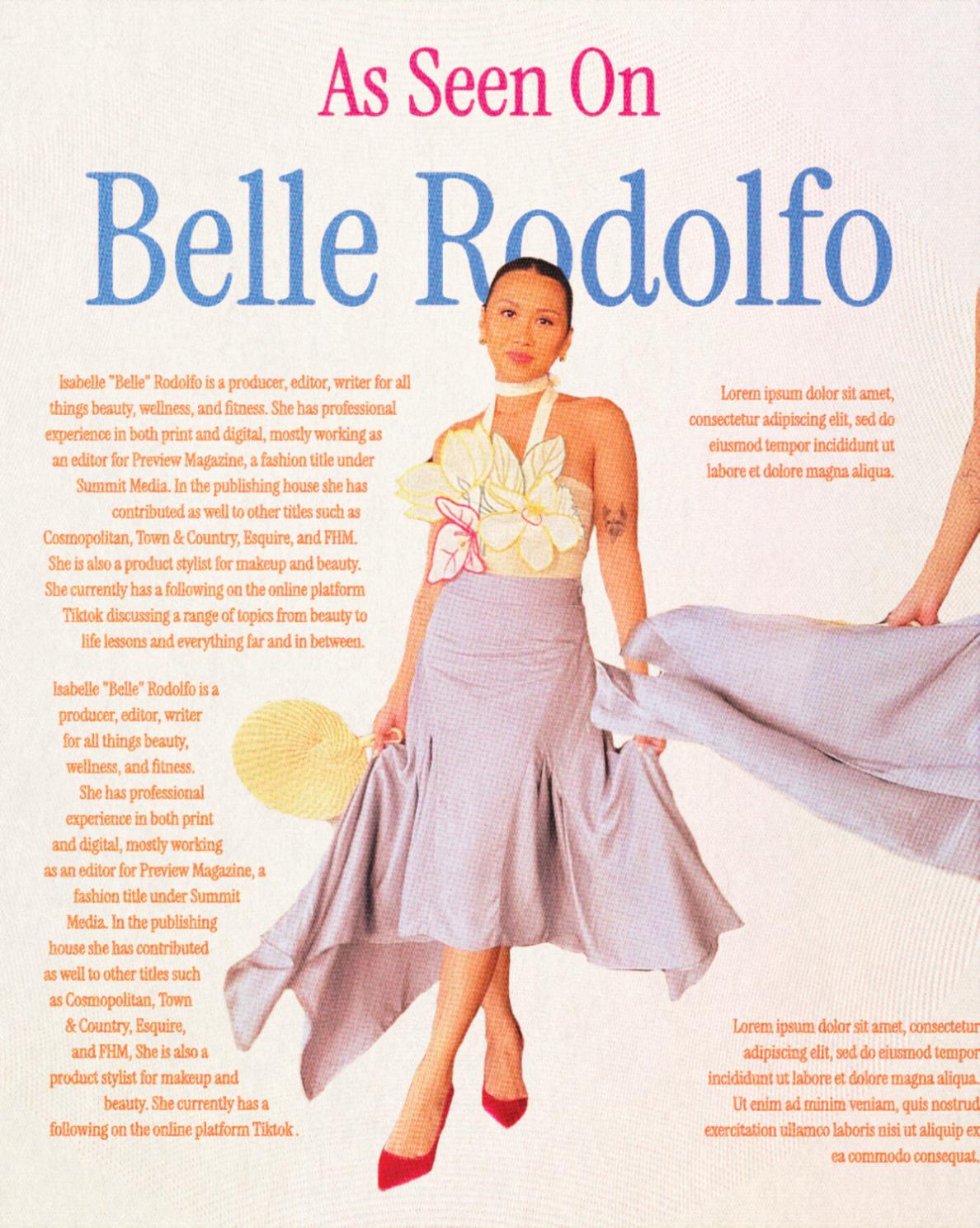
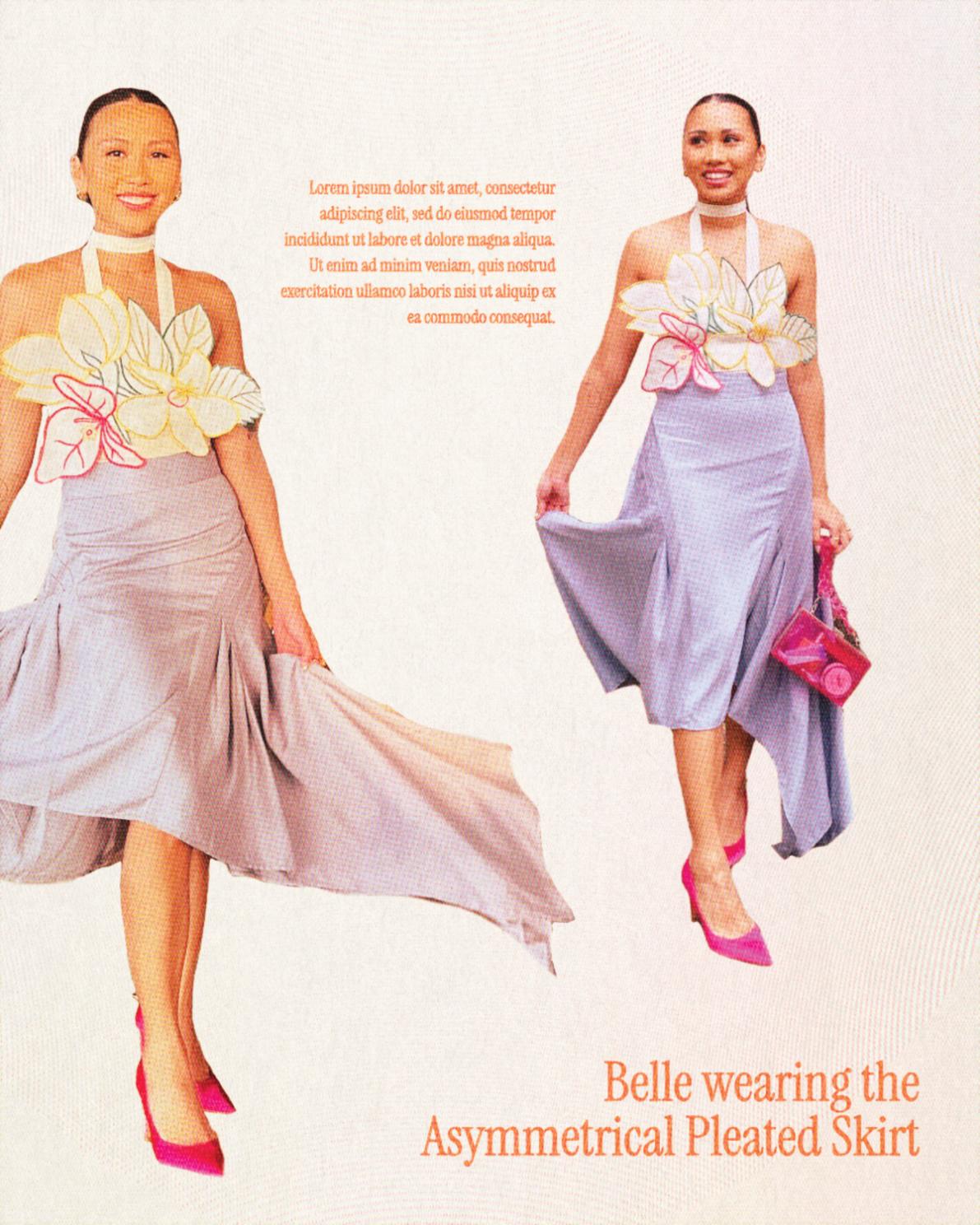
Nifty social media was where I got to play around the most, working closely with social media managers who had the same vision as I did. But ultimately I really wanted Nifty to feel like an online magazine since being curated was part of the brand identity. I pulled a lot of inspiration from print ads from the 90s to early 2000s.


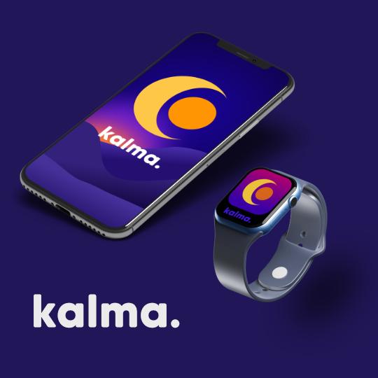
a proposed mobile application and campaign to help teens develop better sleeping habits and promote better mental health
As I was a graduating student during the pandemic, I was incredibly aware that what were living though at the time was definitely going to have lasting effects on everyone who was there to live through it. I myself was feeling the effects of the pandemic mentally, emotionally, physically.

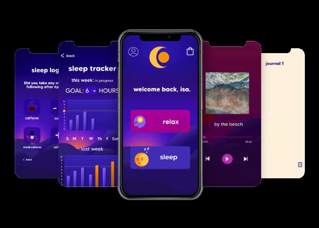
For the app portion of the thesis, I designed wire frames of how the app was supposed to look like, leaning more into UI/UX design sesnsibilities. I wanted the app to look inviting and calm, no frills and straightforward. It features
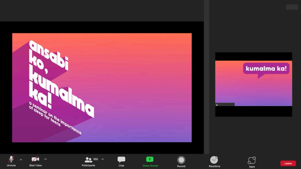
a proposed mobile application and campaign to help teens develop better sleeping habits and promote better mental health
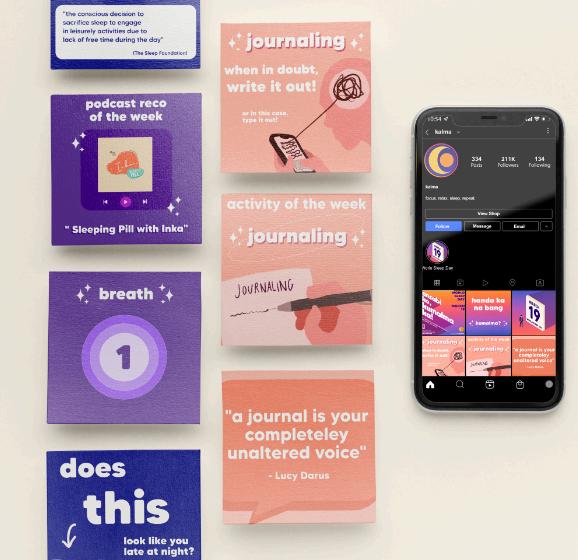
As such, an app can only do so much. Providing an easily accessible companion that provides not just ways for someone to get the most use out of the app but how they can actively practice good mental health habits in their everyday lives I felt was a needed addition to my thesis.
Additionally.
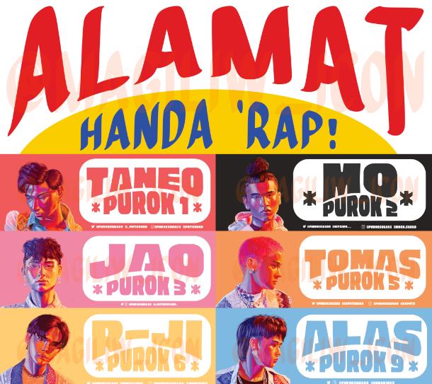
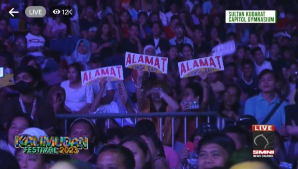
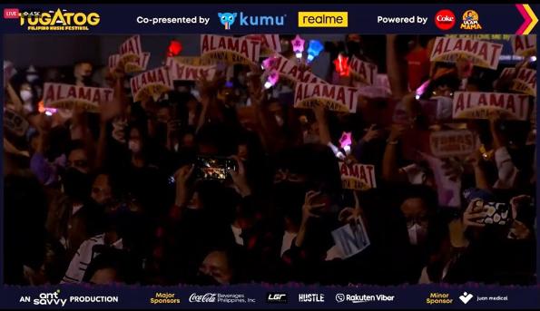
As the "unofficial offical" fan banner of P-pop group ALAMAT, these banners were inspired by jeepney signage as the whole concept and advocacy of this PPop group is centered around championing Philippine culture and so it was only right that what we as fans should be holding up something that they are proud to have and to have something to show their support for them reflects that same belief and vigor. And, as with jeepney signs in real life, they are also meant to be highly visible day or night due to it's high contrast and bright coloring which helps a lot in a concert setting making it both visually striking and functional.
Additionally, the portraits that come with these are ones I personally illustrated as management, at the time, only allowed fanart to be used on banners and other fanmade merchandise which posed an interesting design challenge.
You will always find a fan who either has one or wants one.


In my free time as well when I can, I like participating in art markets where I can experiment and make designs and products I don't usually get to create at work. It's also added experience of being able to find suppliers and interact with customers.
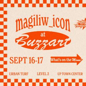
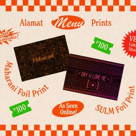

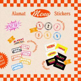
fig.1 social media carousel for the goods I was going to offer for my first art market

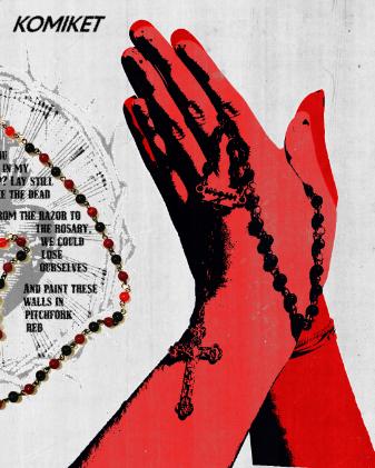
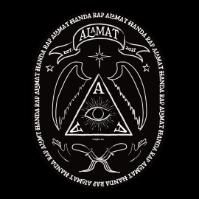
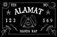


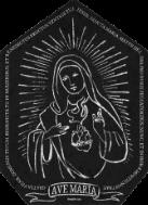
fig.2
social media carousel for the beaded rosary, the Razor Rosary as I've decided to name it, I created inspired by the song lyrics and imagery of My Chemical Romance's 'It's Not A Fashion Statement, It's a Death Wish' which I debuted when I tabled at Komiket.
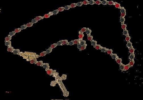
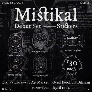
fig.3 Anting-anting inspired sticker set
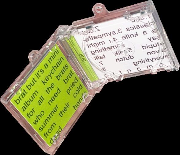
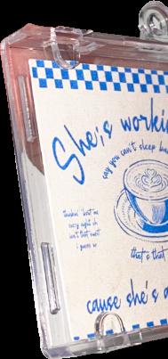
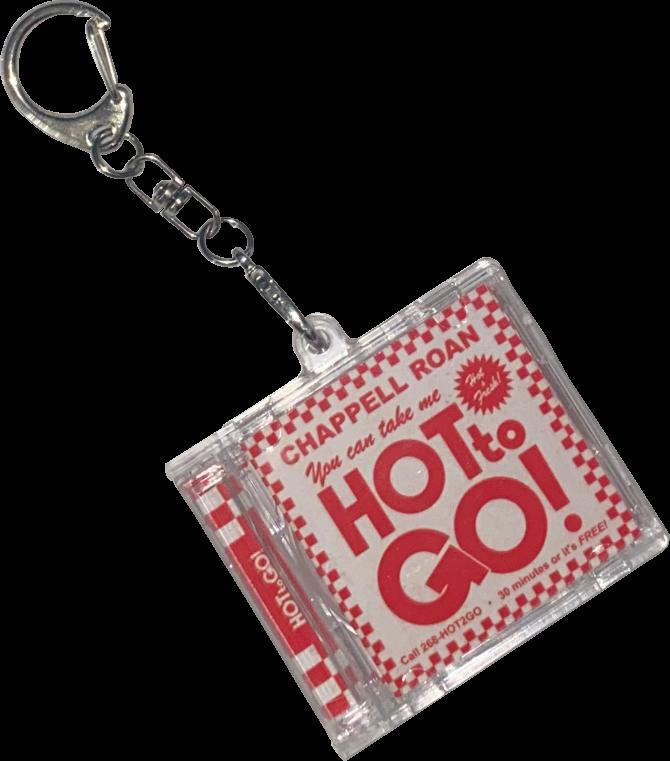
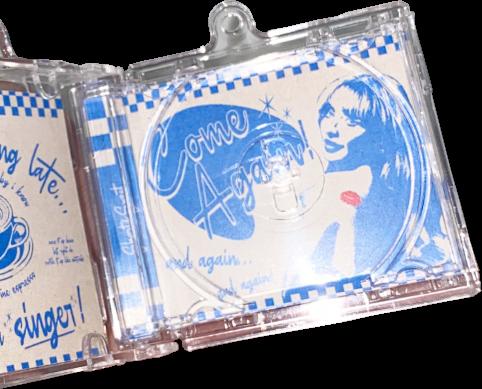
This was definitely something I got inspired by when I saw these empty CD keychains online. I've always wanted to design for something more musical in nature since lyrics and an artist's persona and personal brand always lends itself to really interesting and exciting graphic design and where it can be applied. I chose these three since they're all different design wise so it was fun to play around with and see if I could make a design that was my own but still followed their respective brands,








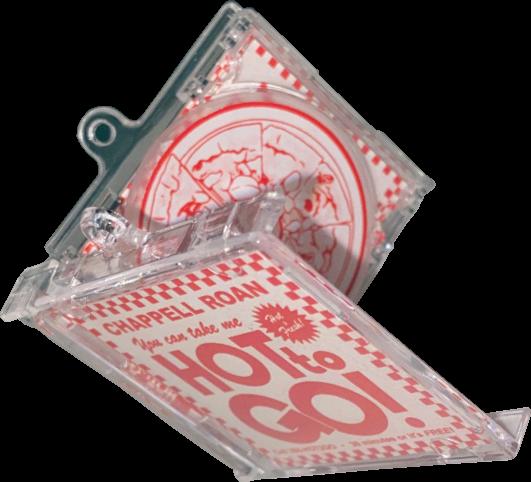
you can take it hot to go!