TREND REPORT
2016 PANTONE COLORS OF THE YEAR
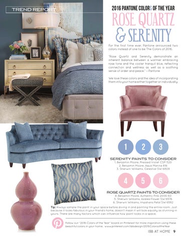
ROSE QUARTZ &SERENITY
For the first time ever, Pantone announced two colors instead of one to be The Colors of 2016. “Rose Quartz and Serenity demonstrate an inherent balance between a warmer embracing rose tone and the cooler tranquil blue, reflecting connection and wellness as well as a soothing sense of order and peace.” – Pantone We love these colors and the idea of incorporating them into your home either together or individually.
1
2
3
SERENITY PAINTS TO CONSIDER 1. Benjamin Moore, Pressed Violet CSP-520 2. Benjamin Moore, Aqua Marina 816 3. Sherwin Williams, Celestial SW 6808
4
5
6
ROSE QUARTZ PAINTS TO CONSIDER 4. Benjamin Moore, Authentic Pink 2006-60 5. Sherwin Williams, Azalea Flower SW 6576 6. Sherwin Williams, Impatiens Petal SW 6582
Tip: Always sample the paint in your space before diving in and painting the entire room. Just because it looks fabulous in your friend’s home, doesn’t mean it will look equally as stunning in yours. There are many factors which can influence how paint looks in a space. Follow our “2016 Colors of the Year” board on Pinterest for more inspiration using these beautiful colors in your home. www.pinterest.com/ibbdesign/2016ColorsoftheYear
IBB AT HOME 9