MAKE IT SIMPLE, BUT SIGNIFICANT. IASMINE M. LEAL | 2023 - 2025
PORT FOLIO
GRAPHIC DESIGN
CONTENT BRANDING
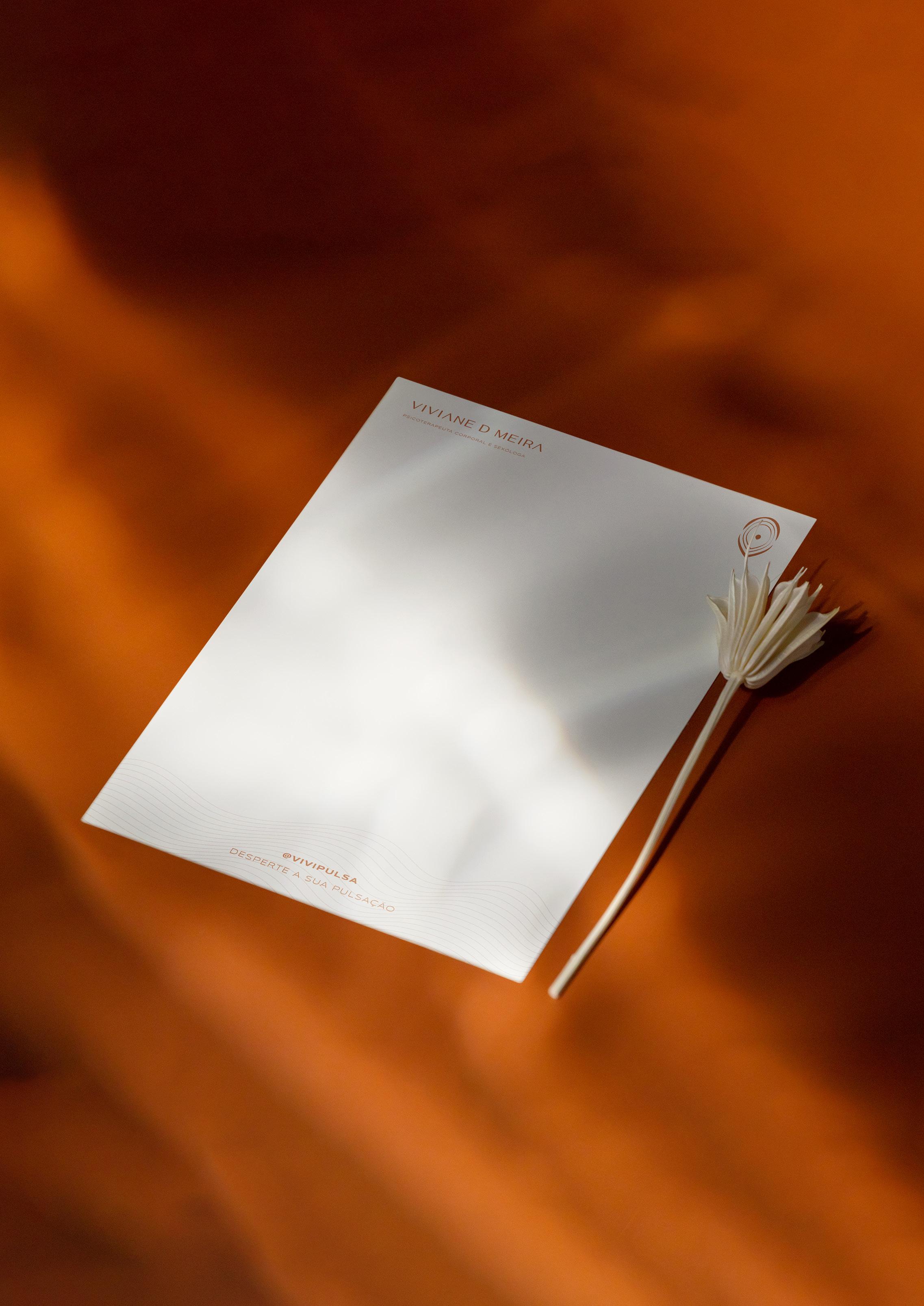
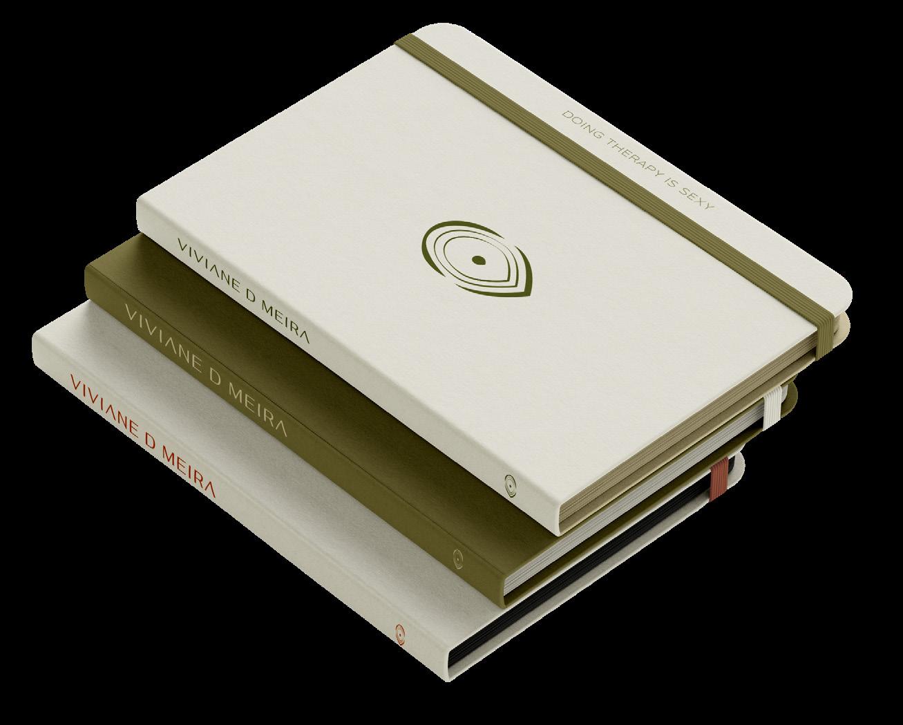
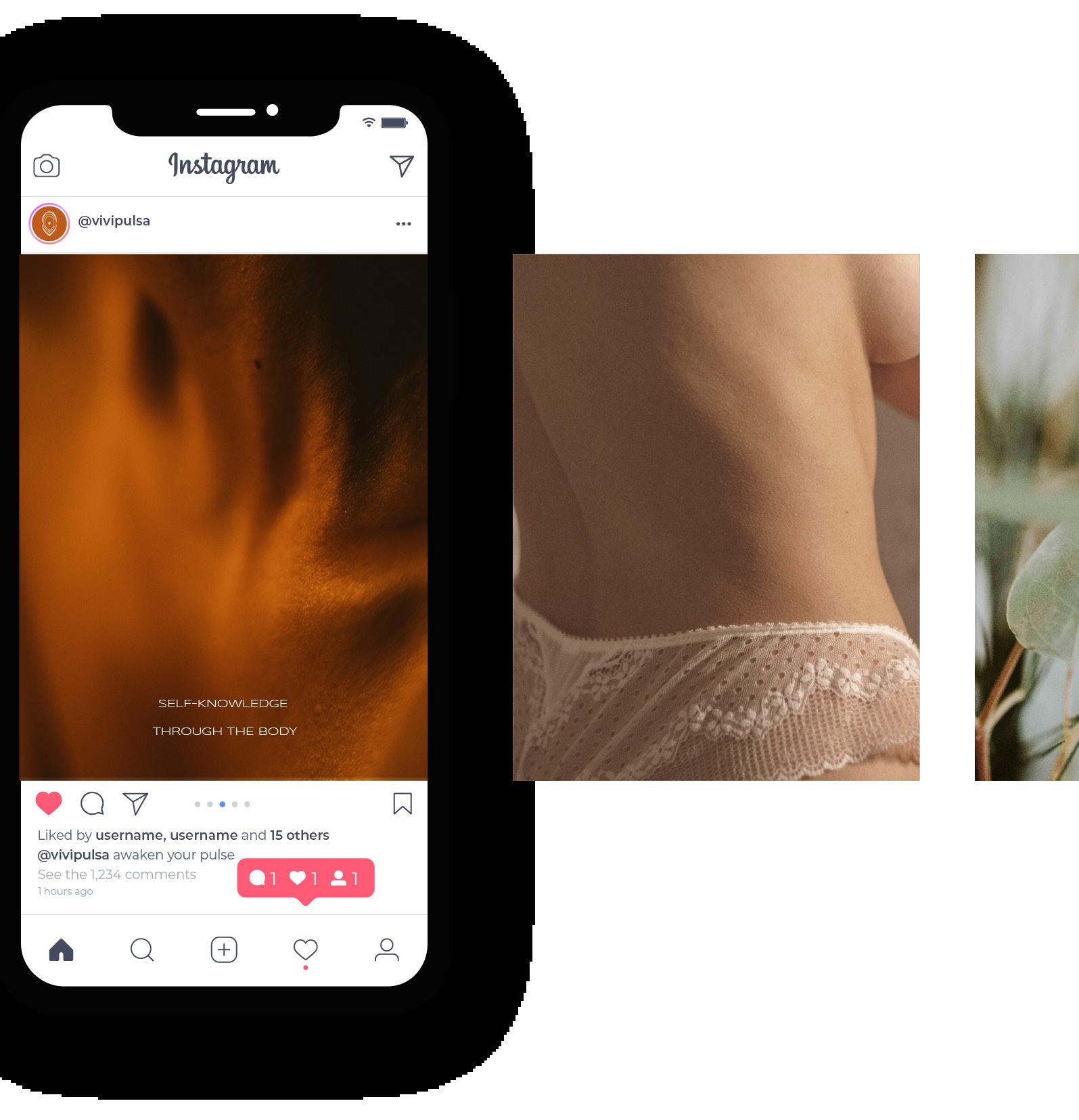
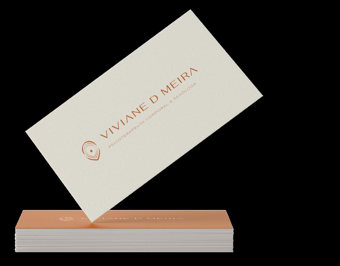
VIVIANE D MEIRA
Sexual psychotherapist and sexologist
NALINI GUEDES
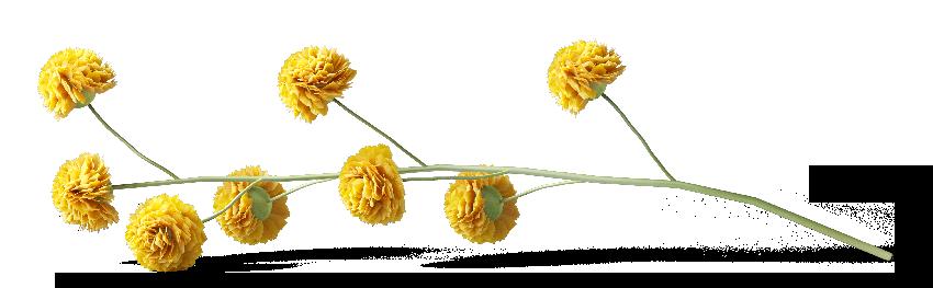
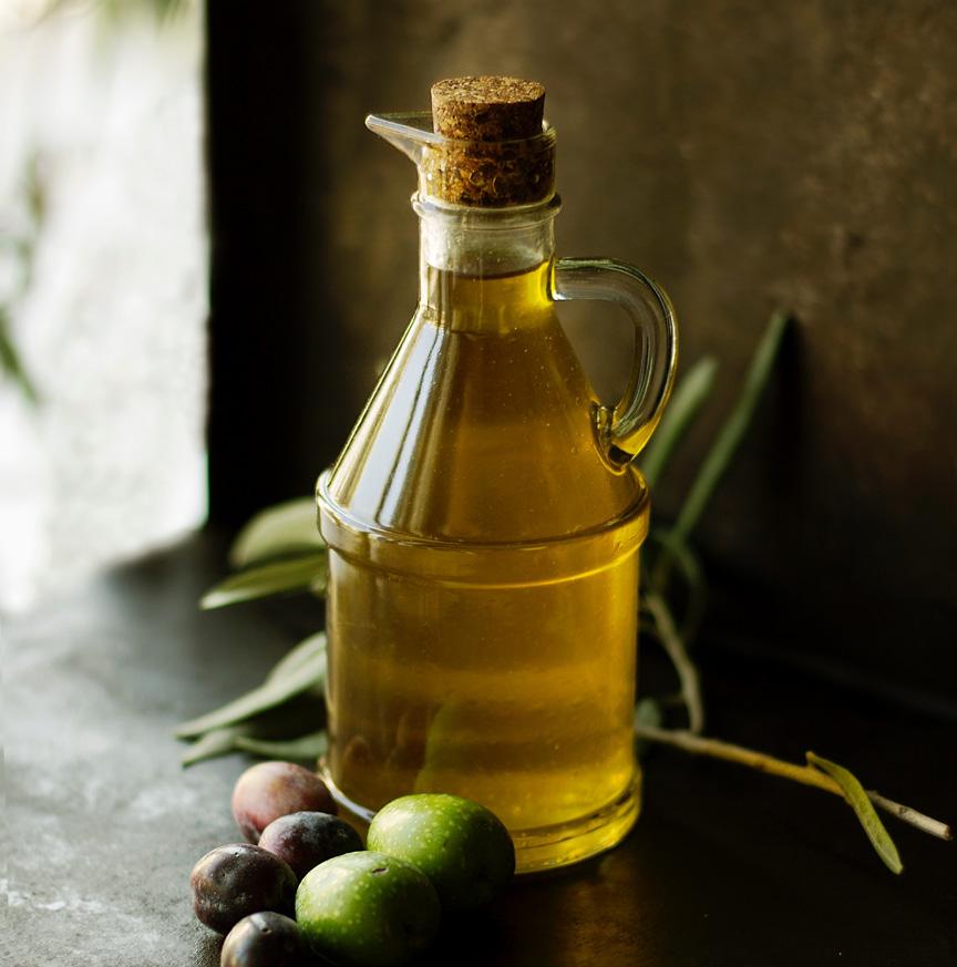
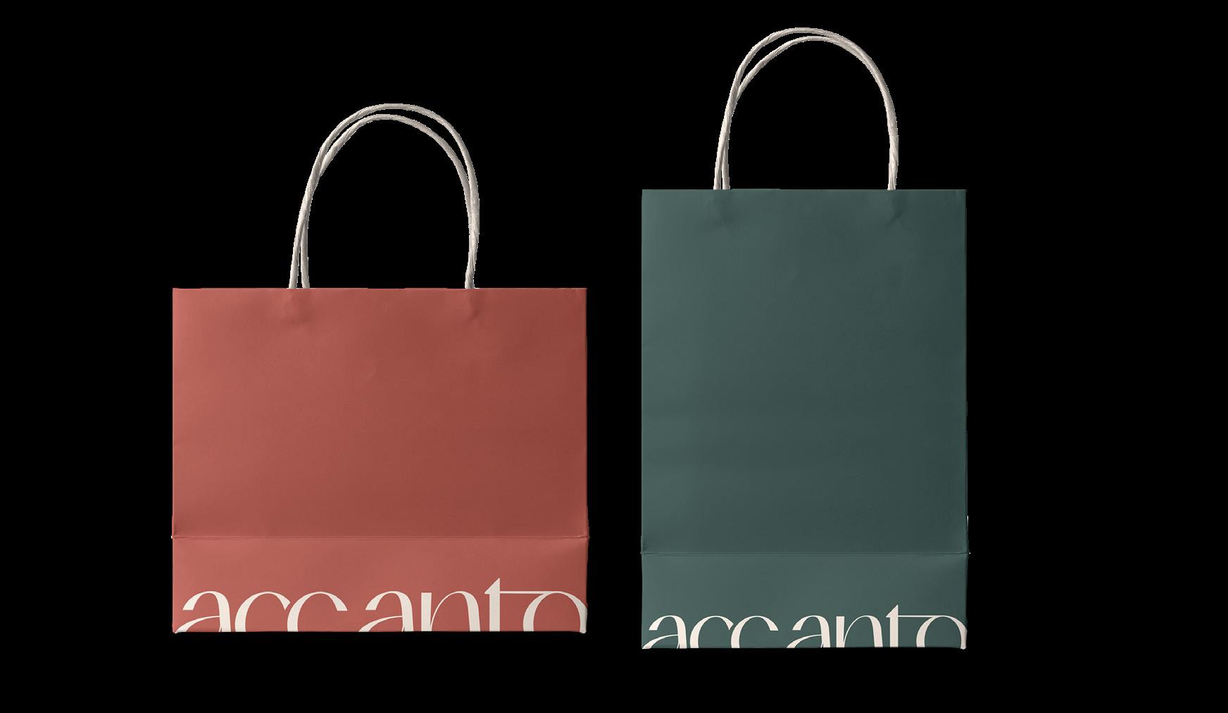
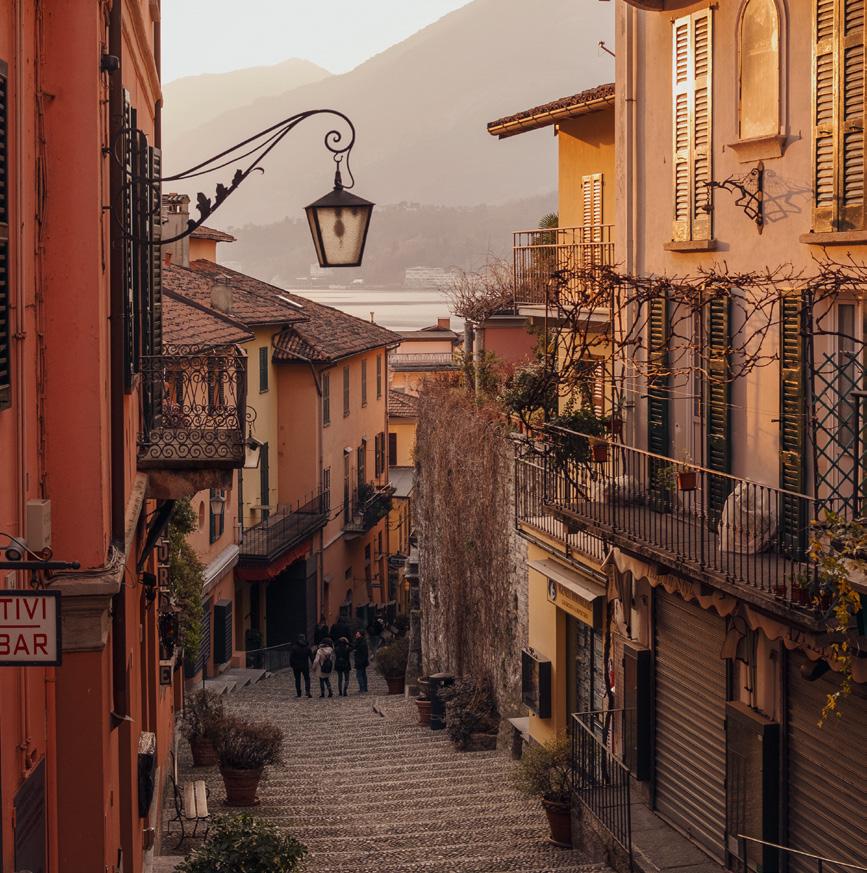
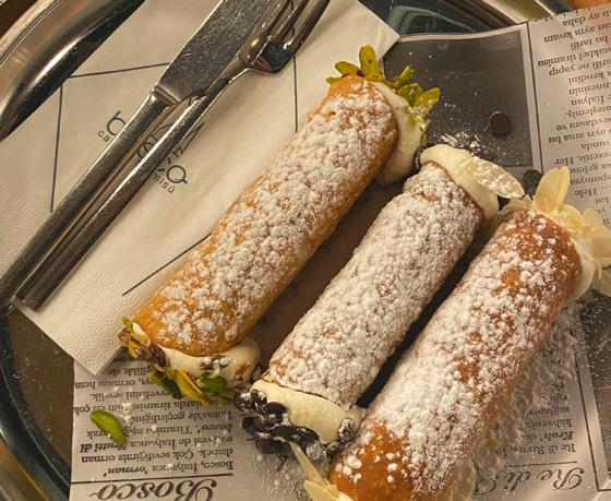
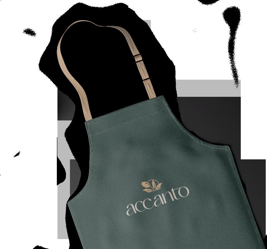
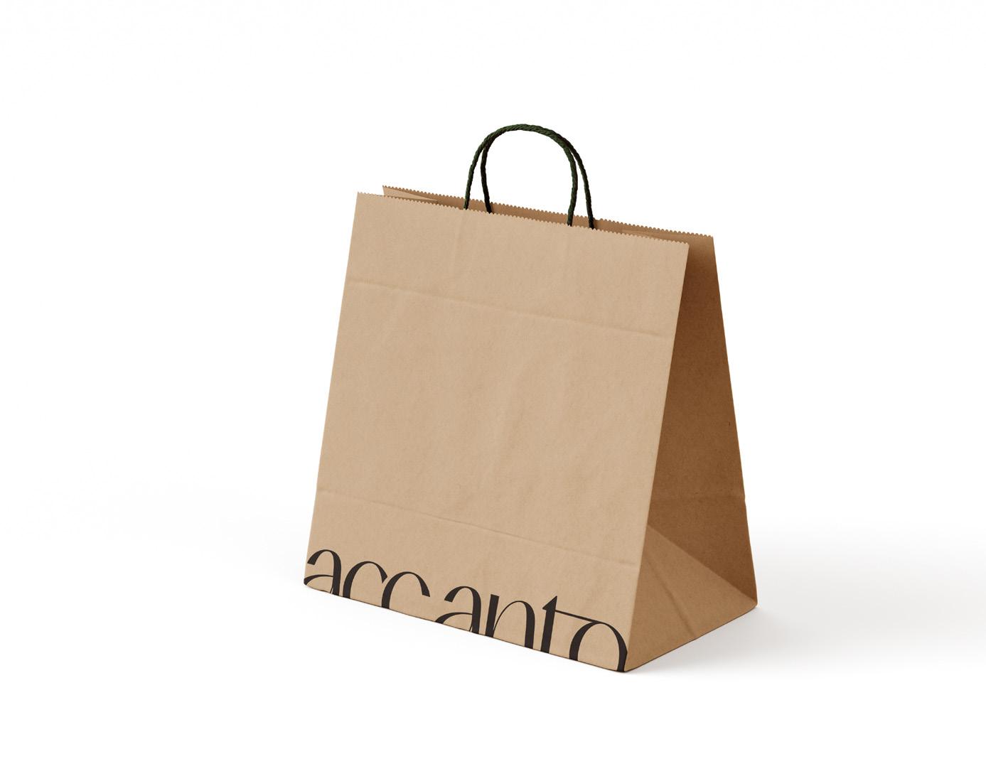
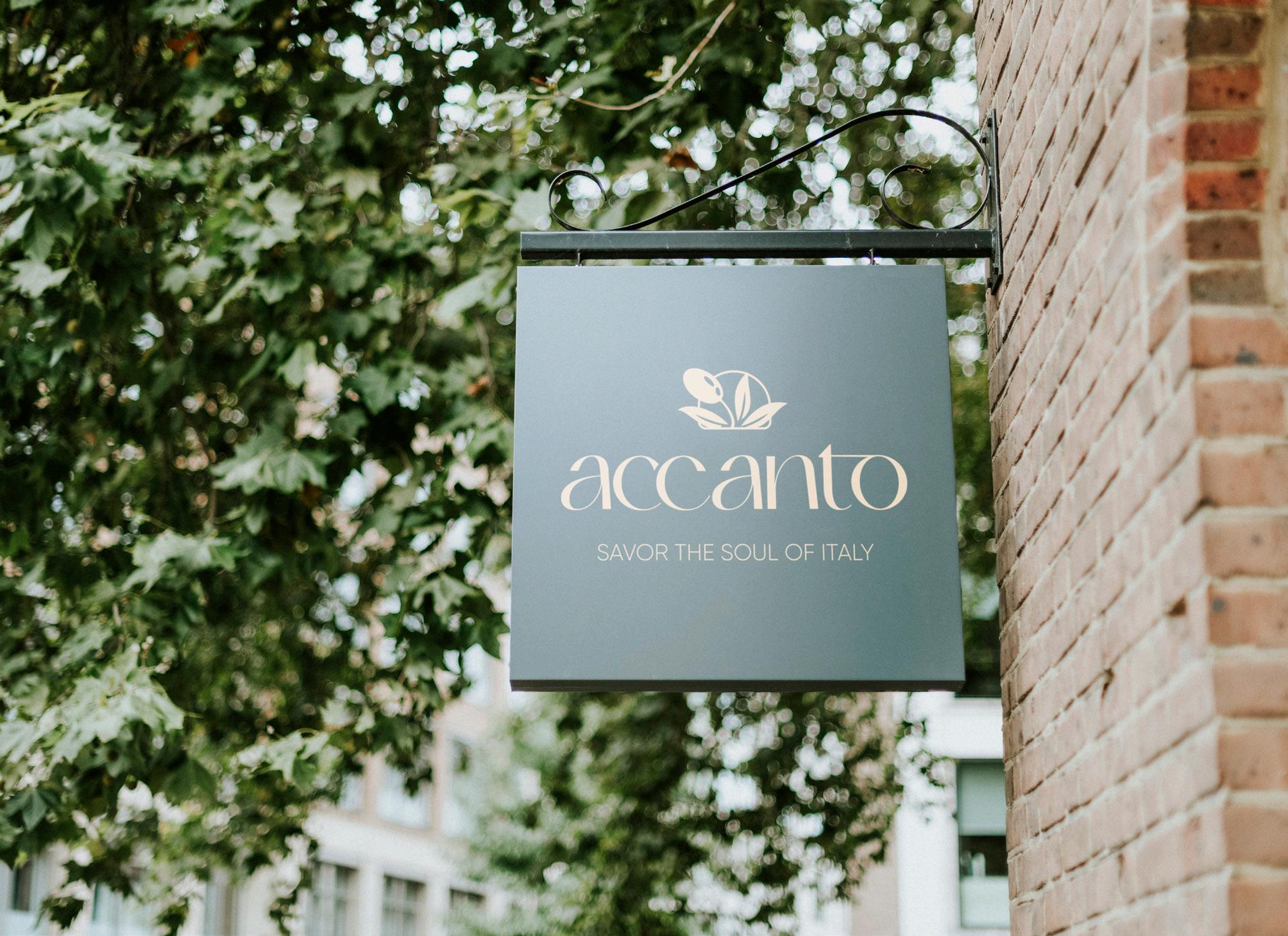
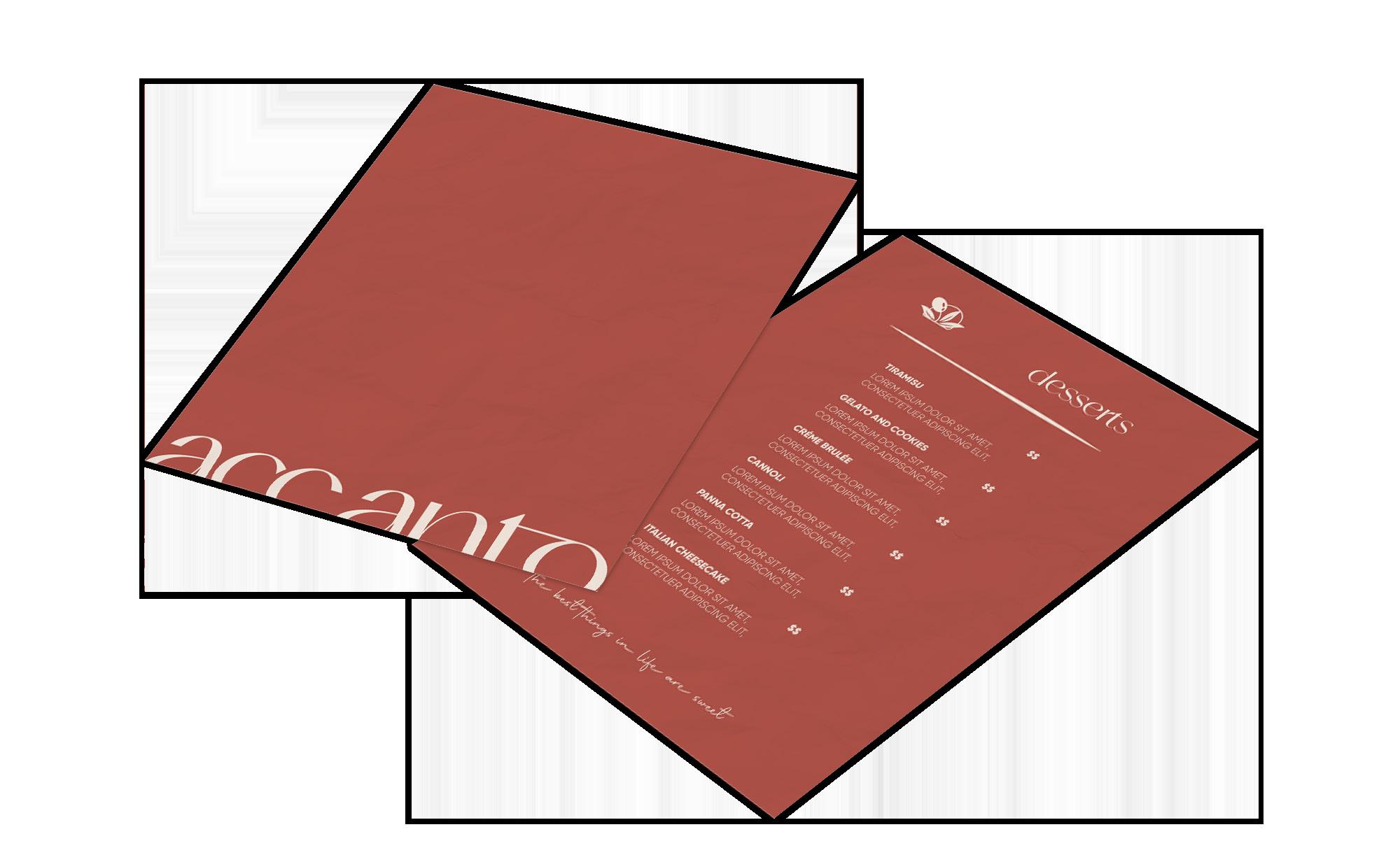
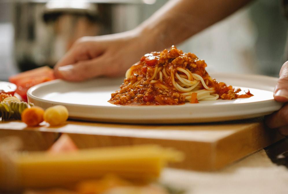
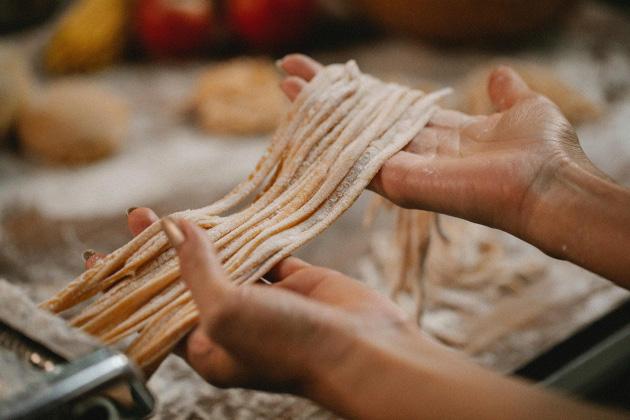
ACCANTO
LOGOS & STATIONARY
LOGOS
Studio Arthé, CL Desing, Seaweed, Maria Mineira
THE SOCIAL SIP
Studio Coffee Shop DL Flyer
GRADUATE DESIGN EXHIBITION
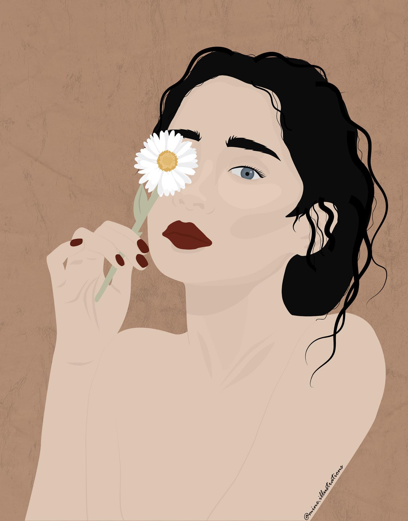
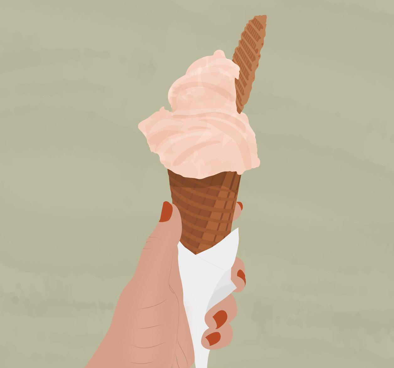
ILLUSTRATIONS
Carpentry
BRAN DING
Informations
Sexual psychotherapist and sexologist
Year: 2024
Client work
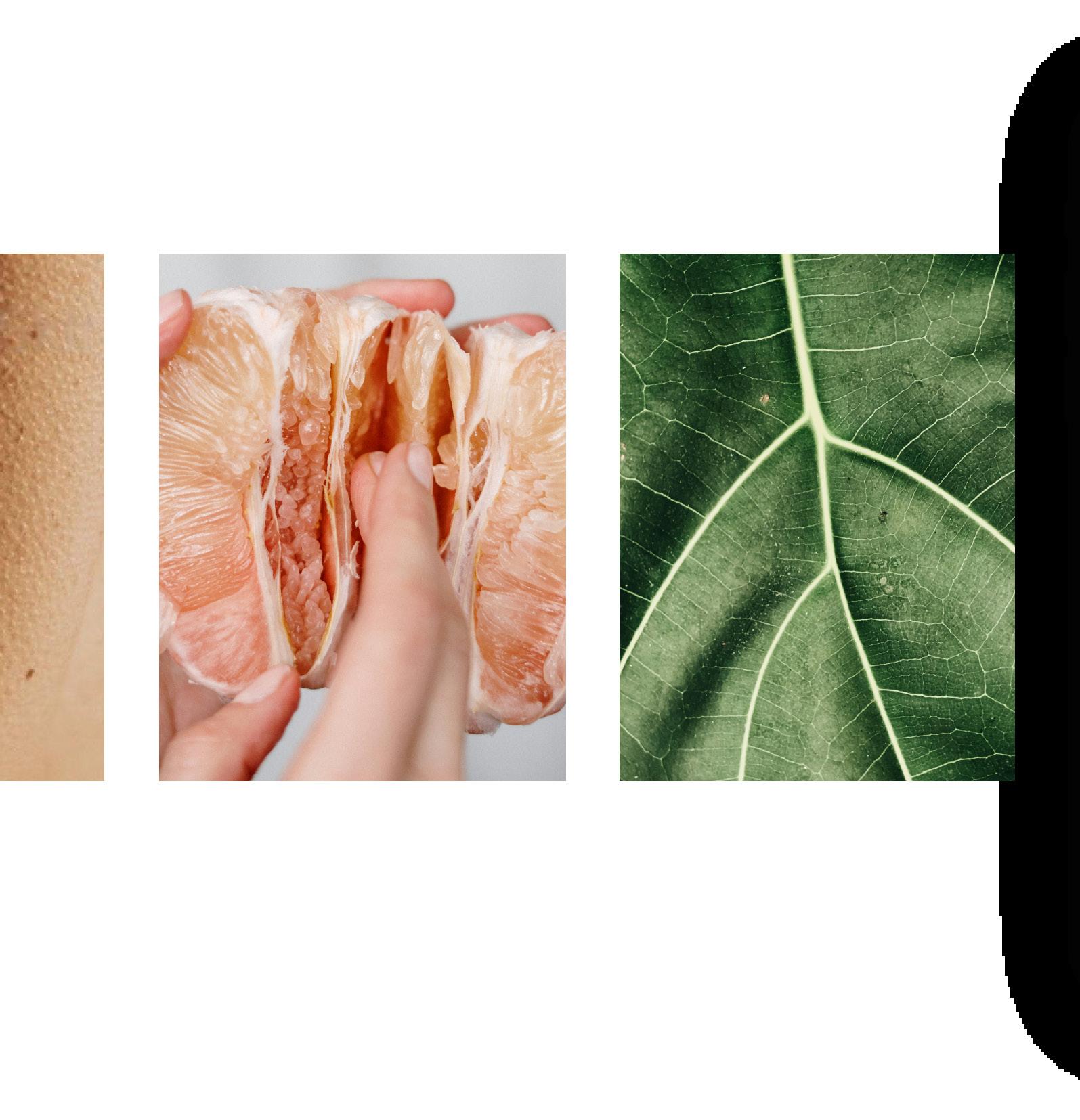
About the project works in a transdisciplinary way, being a health professional who values integrity, ethics, poetry, respect and voluptuousness to ensure that more and more women achieve their emotional, sexual and financial autonomy. She serves women who seek autonomy and seek help to break away from oppressive conditioning registered in their bodies. ViviAne D Meira stands out for being authentic and delivering profound work, promoting pleasure in the small beauties of simplicity.
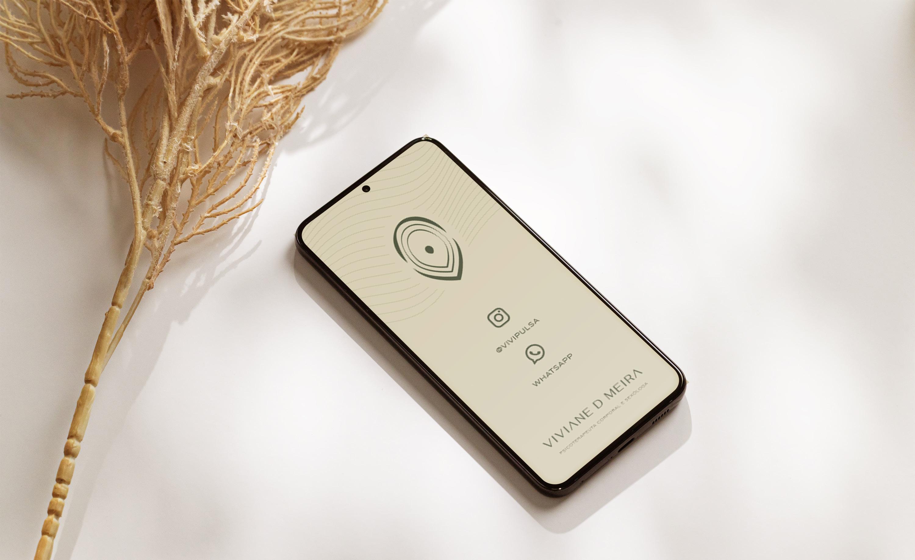

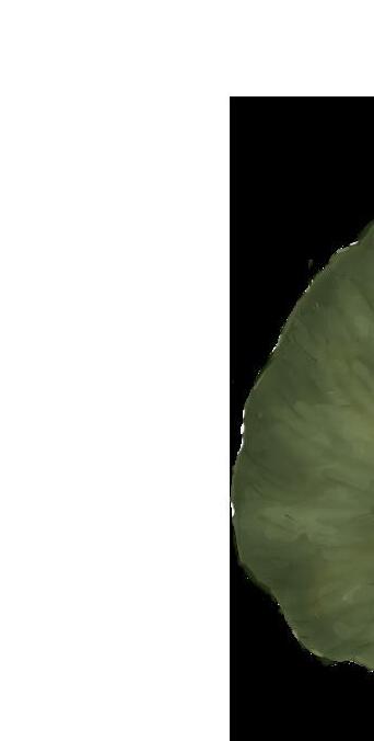
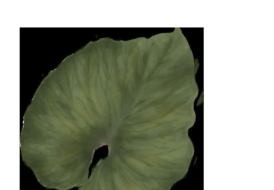
PORTAL; INITIALS “V” AND “A”; LEAF, VULVA
REVERBERATION; PULSATION; DEPTH
FOCAL POINT
The icon of the brand is an invitation to the path that works for women's freedom and fulfillment. It refers to the initials “V” and “A”, which can also be interpreted as a portal, vulva and leaf in nature. Internally, the reverberations created were designed to mimic the heartbeat and create a feeling of depth within the portalwhich we cross to reach this life. Inside, a focal point, being the center of this powerful symbol.

Titles and highlights General texts
Informations
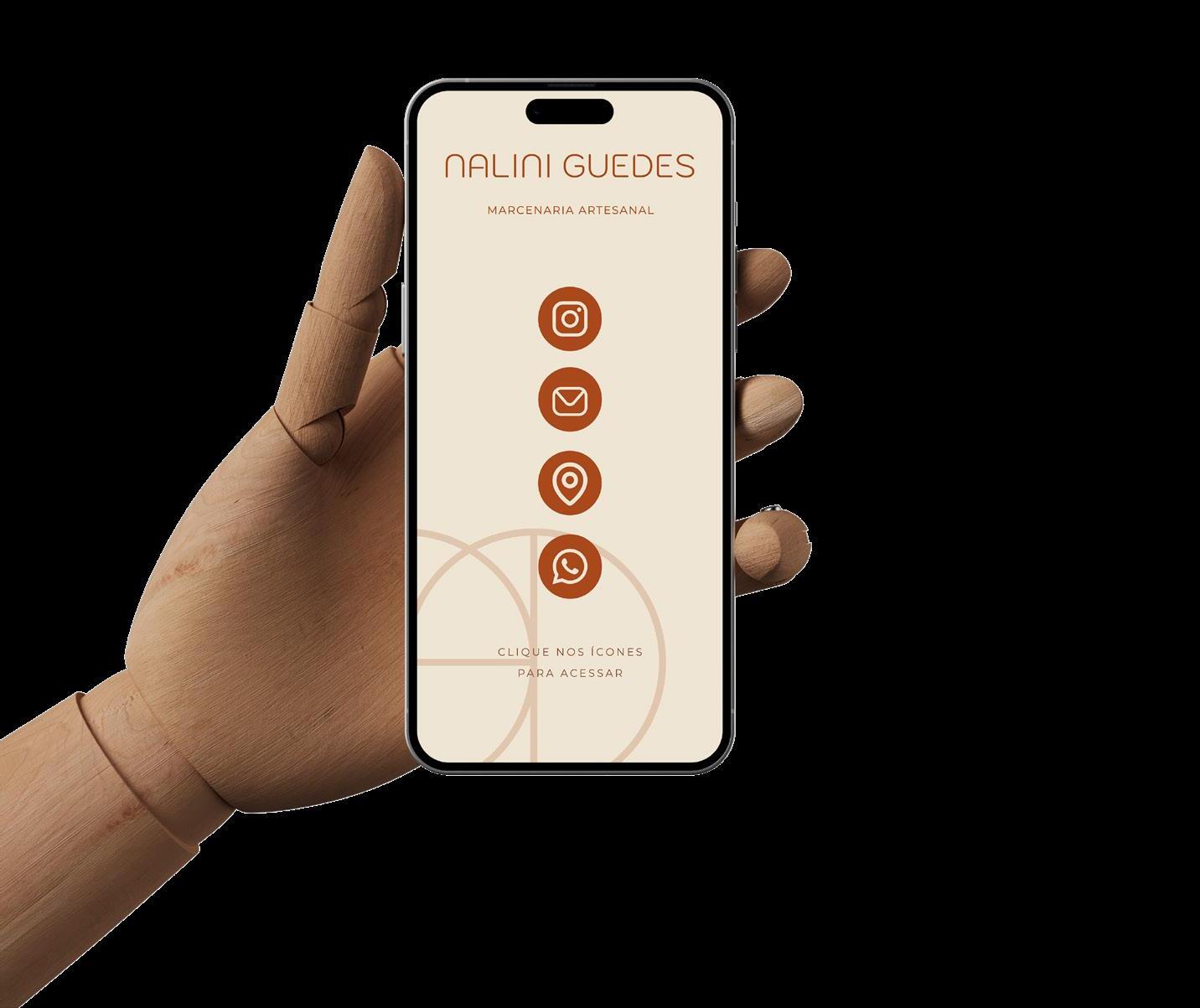
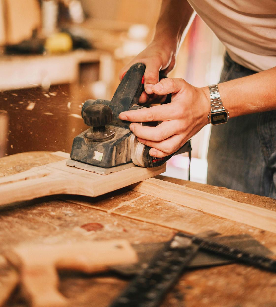
Carpentry Studio
Year: 2024
About the project
Client work designs and manufactures furniture and objects in solid wood and naval plywood. Carpentry has always been something she has had an affinity for, and since 2021, she has been receiving orders and developing her own product line. With honesty, creativity, quality, and innovation, Nalini proves every day that women can do carpentry. It stands out for being a more humane company, with personalized service, which seeks to understand the real need and creates something unique for each client. Its products are handmade, with impeccable finish and great durability.
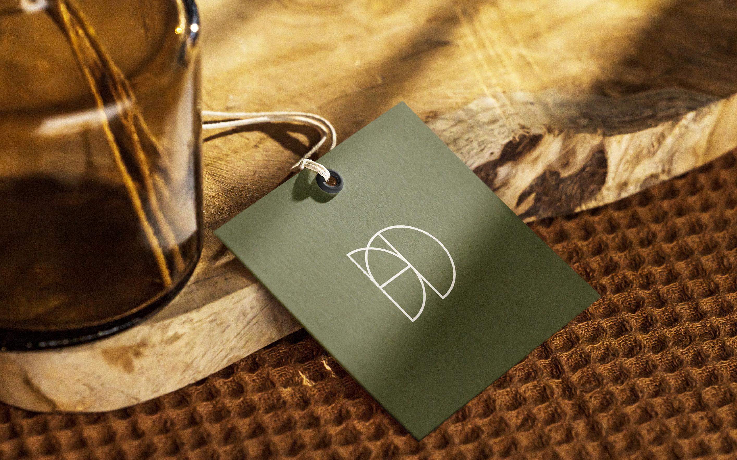
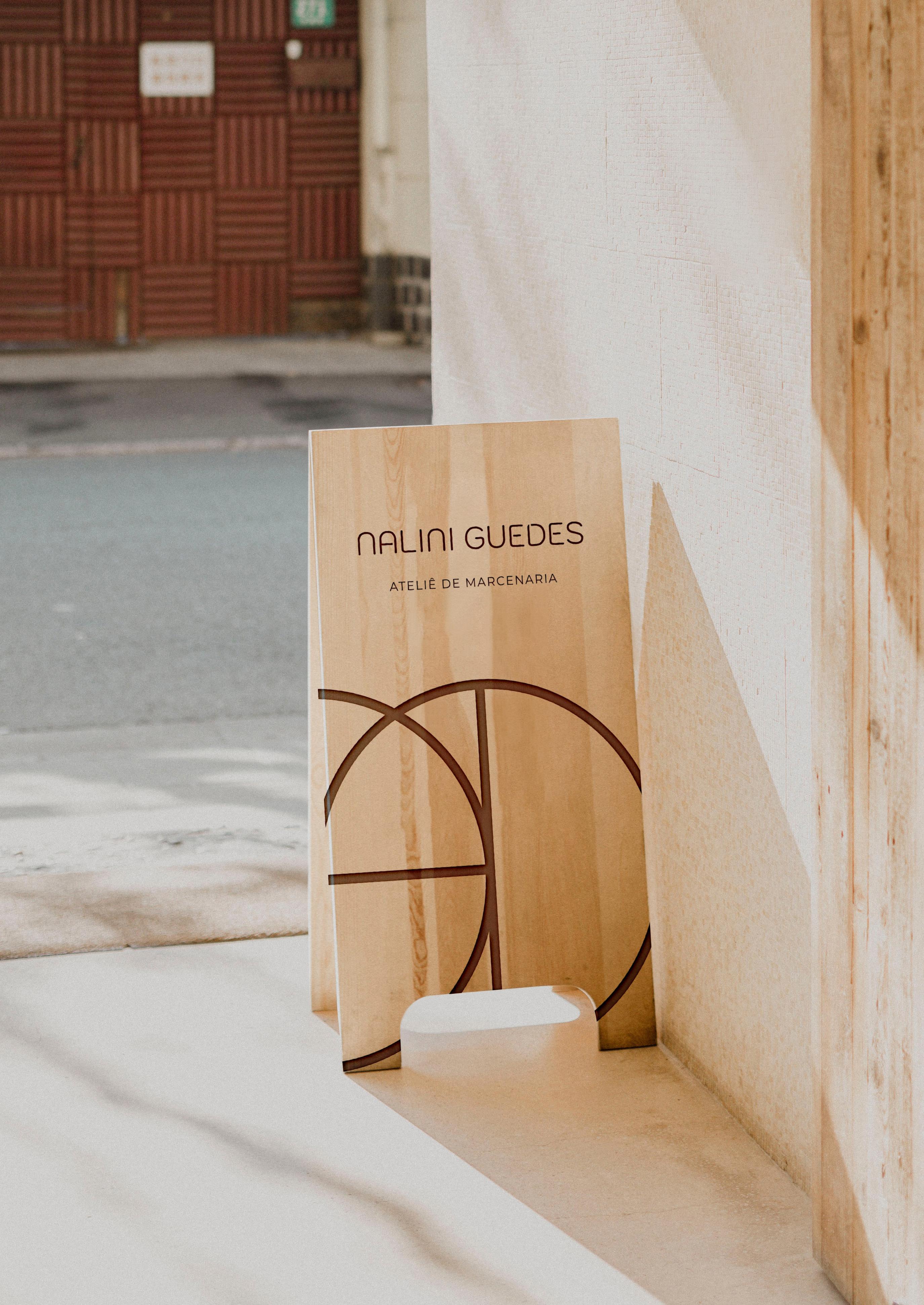
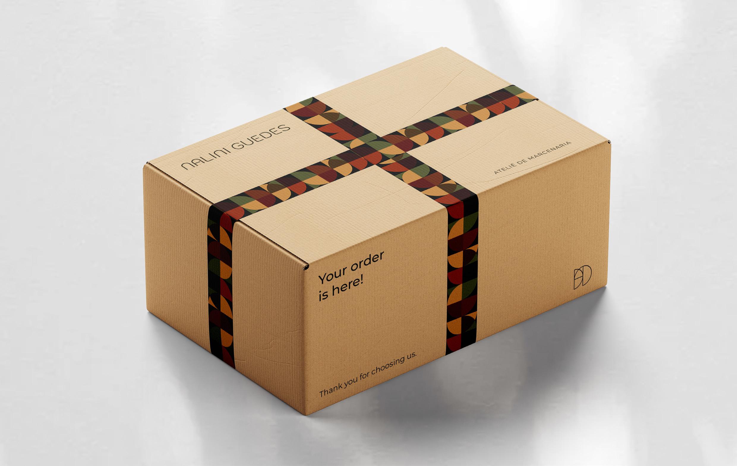
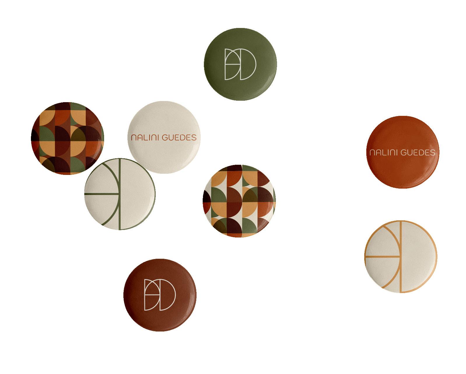
The symbol was designed to transform the “N” in a non-obvious way. To achieve this, semicircles and straight lines that meet curved lines were mainly used. Other than that, on the same icon it is possible to observe the presence of several N’s, referring to the different stages of the process and work that pass through Nalini’s hands.


Informations
Italian restaurant
Year: 2023
Personal project brings the warmth and authenticity of Italian cuisine to guests, creating a memorable experience that transports them to the heart of Italy. It stands out for its commitment to using the best imported ingredients and traditional recipes passed down from generation to generation. The restaurant’s goal is for diners to feel as if they have entered a traditional Italian trattoria, where they are treated like family.
About the project your favorite


Titles and highlights


LOGOS & STATIONARY
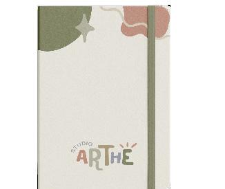
The Studio Arthé symbol reflects a brand that is consistent and strong with its message. The accent used in the letter E was brought to the icon as a crown shape in the brand’s initial letter.

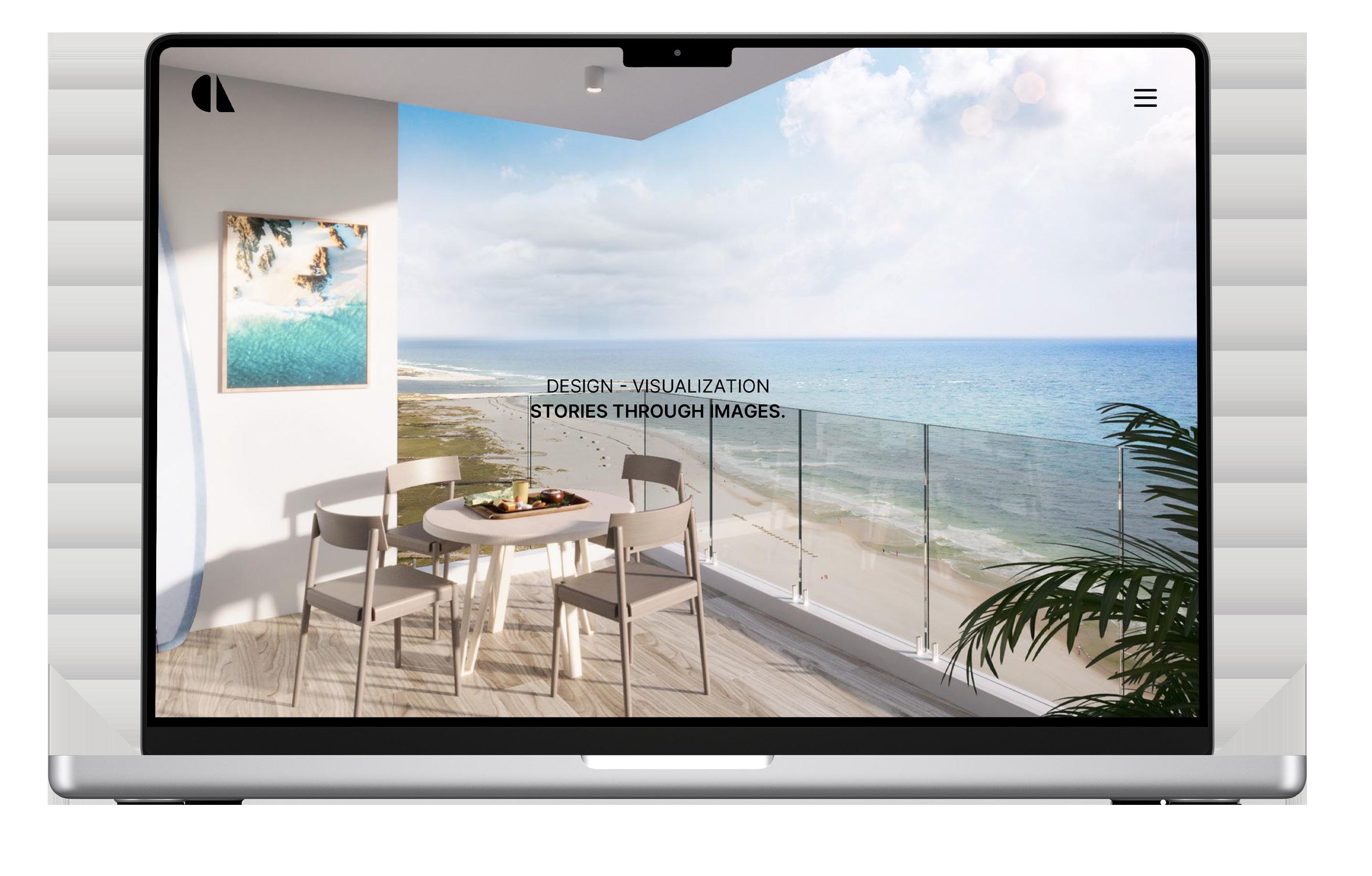
Caique Lessa Design offers architecture visualization to its clients, through realistic renderings that materialize their ideas, with high-end architecture offices and construction companies. CL Design tells stories through images.
The company’s purpose is to create jewelry that connects women with the beauty and power of the sea, helping them recognize their own. The icon features seaweed as its main element, the company’s name, designed in a unique and authentic way, just like its jewelry.

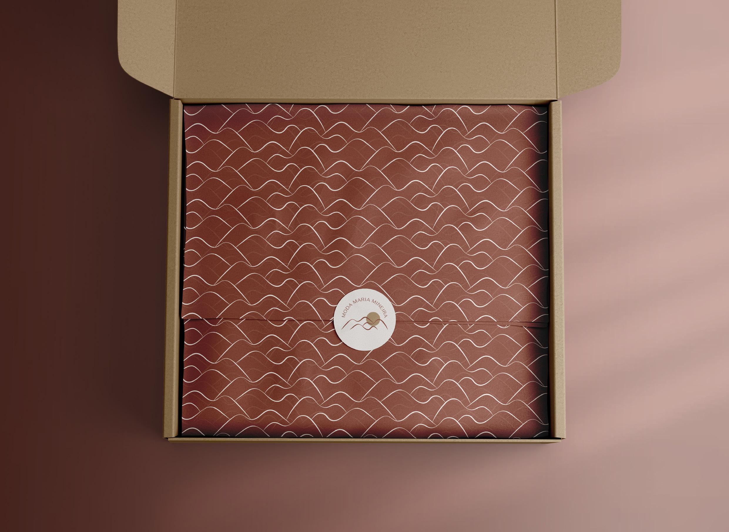
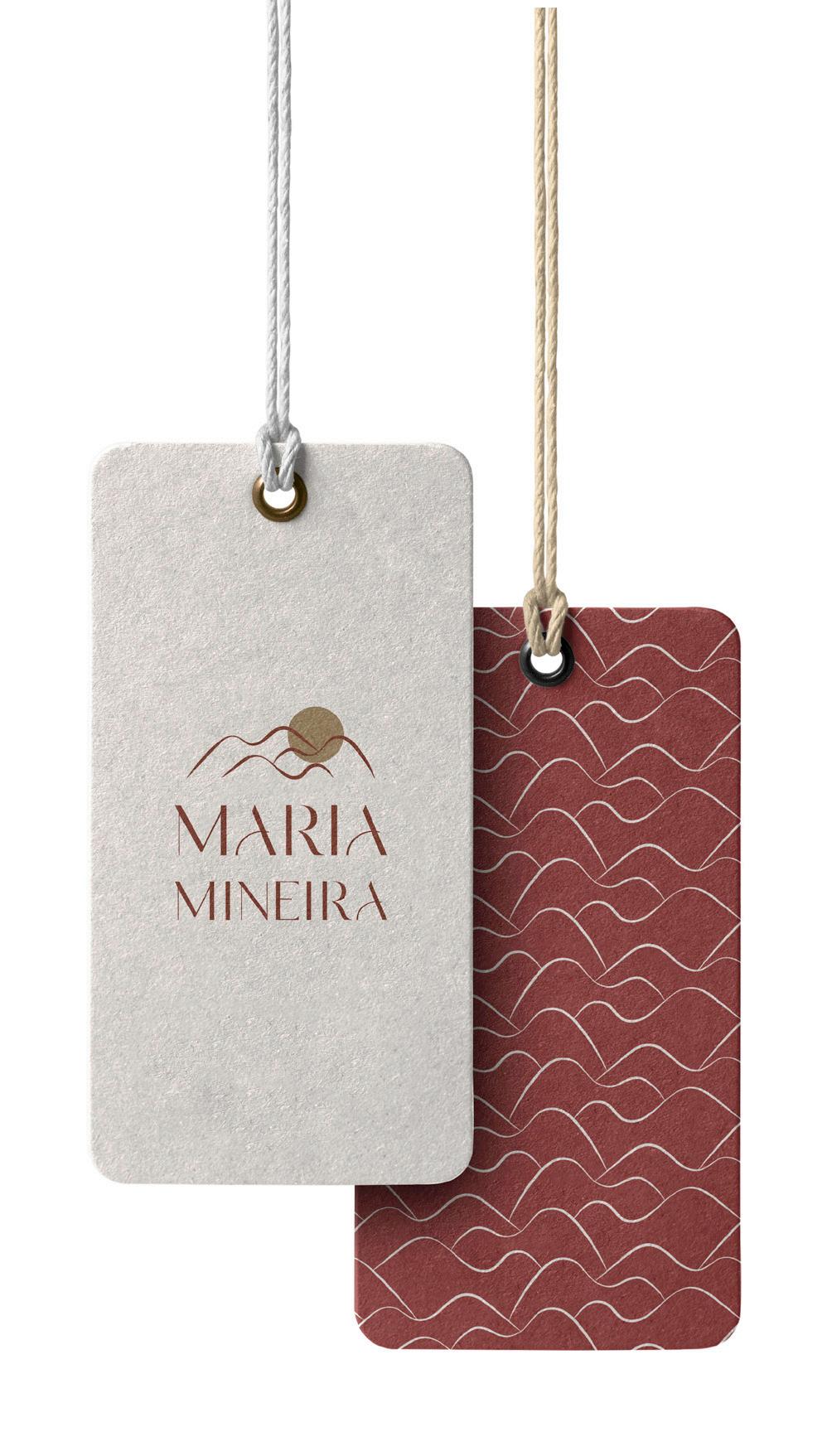
Moda Maria Mineira is a women’s clothing store that was founded 9 years ago with the purpose of showing the power of women and the versatility with which customers can dress and feel unique. It is a strong brand that works with versatility, looking at women in a different way and thinking about the individuality of each customer.
The
Social Sip - Coffee Shop
Creation of the DL Flyer, which involved the creation of a simple logo for the brand, using typography only and all brand assets and illustrations necessary, editing the photo in Photoshop to match the overall branding and adding the text: to promote the grand opening.

COFFEE SHOP | ONE SIP AT A TIME
The
Graduate Design Exhibition
Creation of the A3 poster in order to promote the Graduate Design Exhibition, that is a week long annual event which showcases the skills and talents of the top design graduates in Australia. The event gives new graduates an opportunity to showcase their work and network with creatives to jump-start their careers in their chosen design field.


ILLUSTR ATIONS
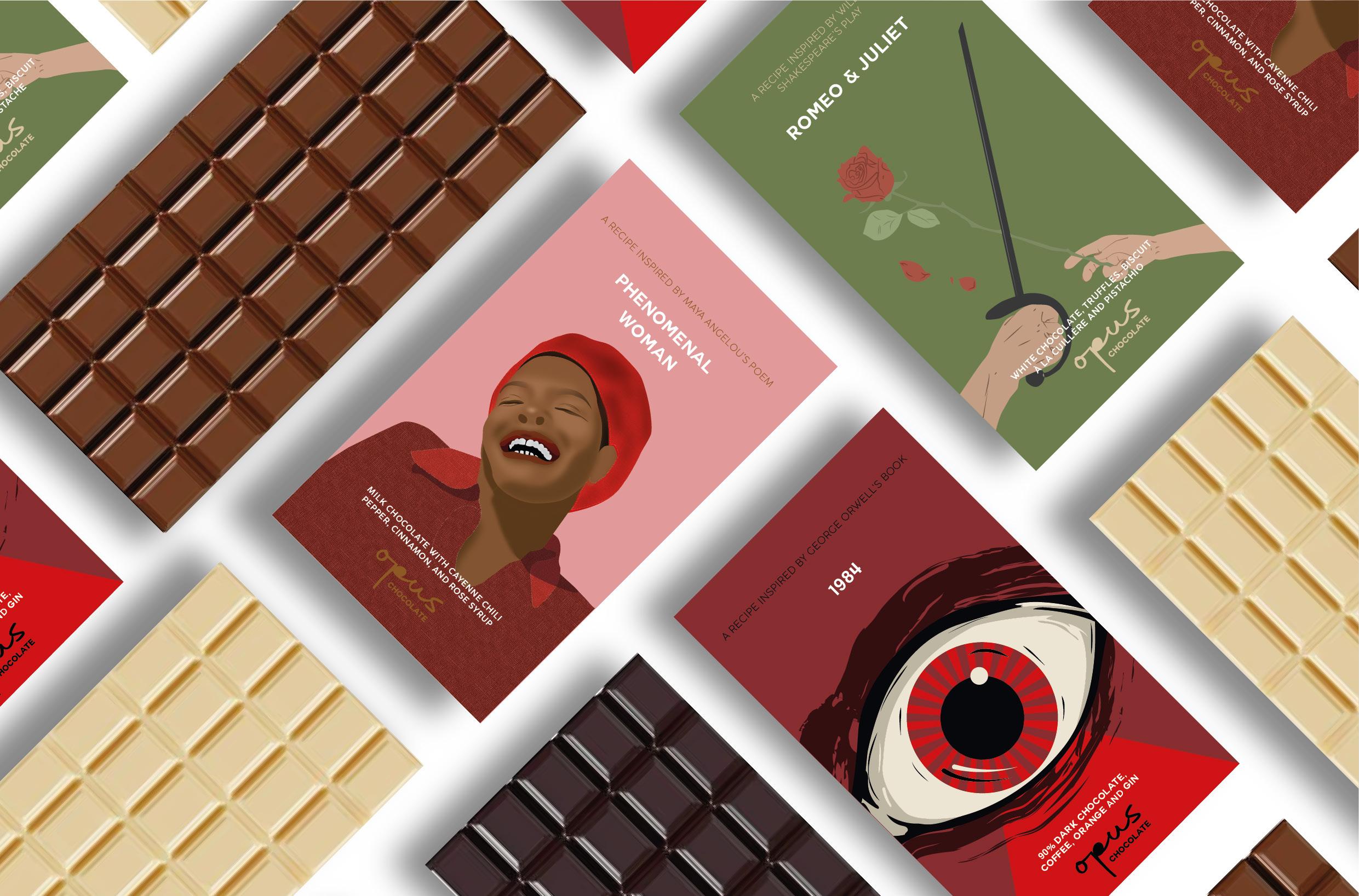
is a brand of creative chocolate bars inspired by some of the greatest works of literature. The use of literature implies the quality, originality and creativity of the recipes, as if the chocolates were themselves masterpieces.
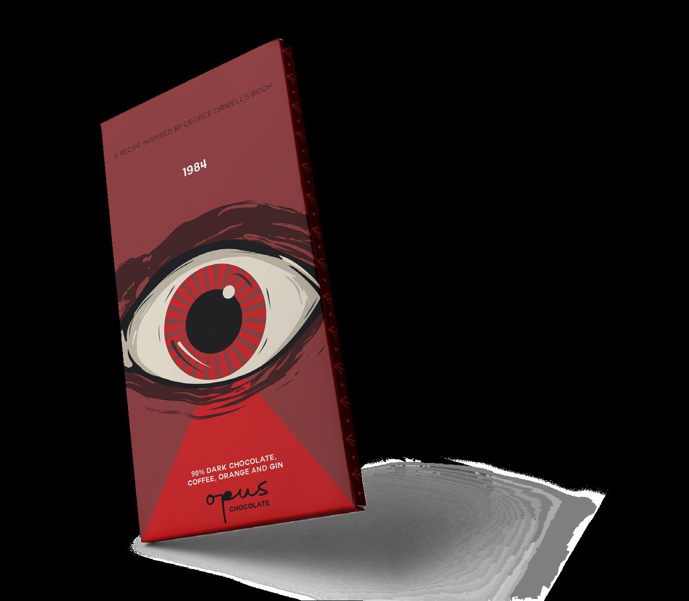
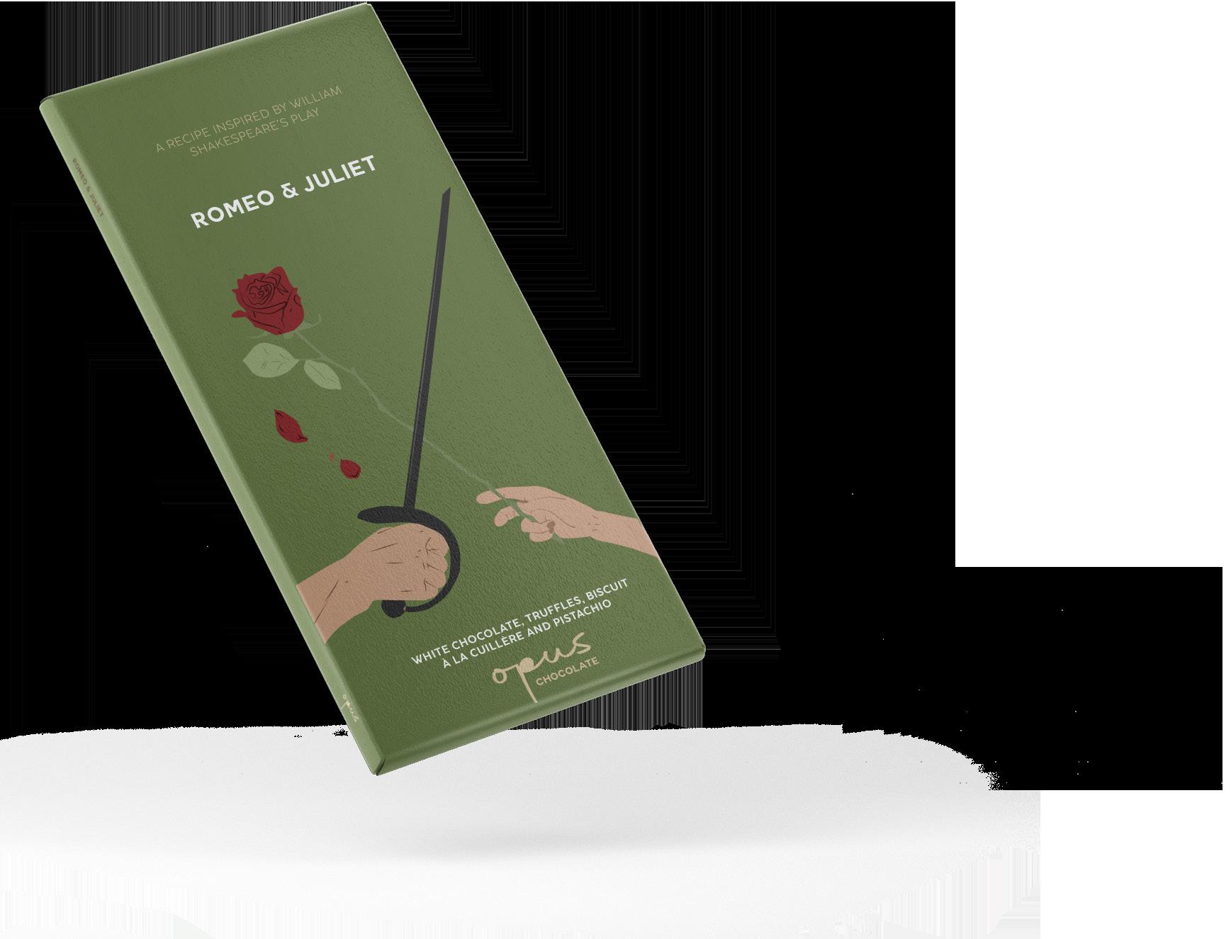
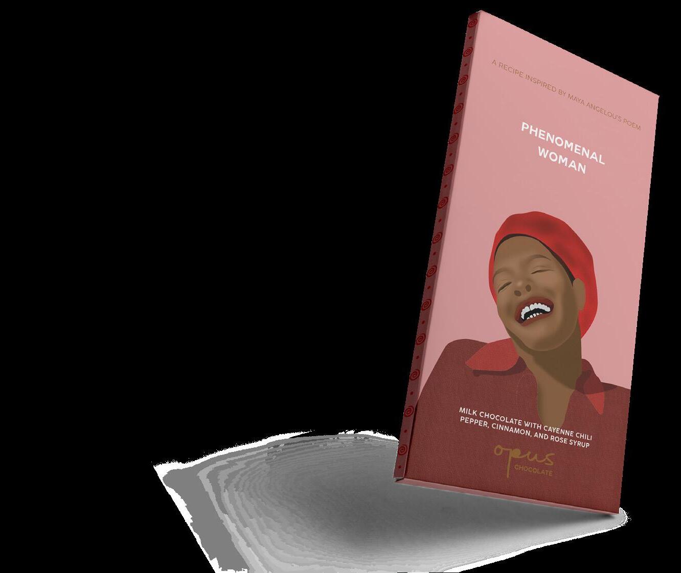
The aim of the packaging is to have the feeling of opening a book, where each one translates the vibe of the work and the ingredients, while also having a graphic identity system that is recognizable as being part of the same brand.
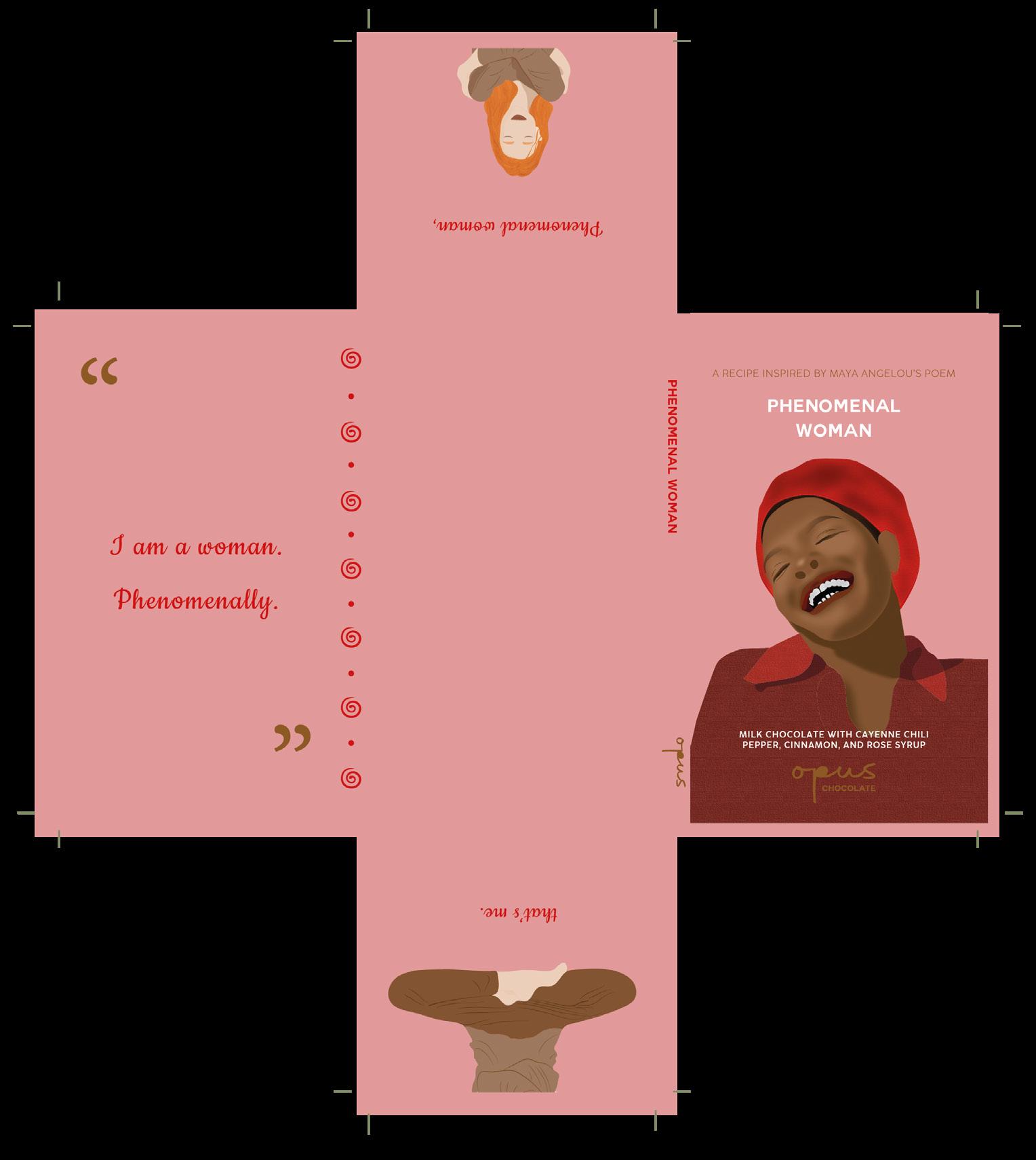
THE INSIDE OF THE PACKAGE