In 2026, home is more than a place. It is a living canvas, a reflection of identity, memory, and imagination. The walls that surround us are no longer just backdrops to daily life. They shape how we feel, how we gather, and how we experience every moment within.
Colour takes centre stage as a personal narrative. Each shade carries a thread of history, echoing the past while being reimagined for the present. Vintage-inspired pigments, reminiscent of palettes once chosen by master painters, recall the artistry of those who understood the transformative power of hue and light. Their timeless brushstrokes resonate in today’s interiors, proving that colour is never fleeting. It is enduring, reinterpreted for each generation.
These tones move beyond fleeting trends. They invite us to bring emotion, intention, and meaning into every space. Like the artists who redefined light and shadow, we are called to create surroundings
with purpose and depth. Each chosen hue becomes an act of selfexpression, every room a curated reflection of style and sensibility.
Softened by time yet vibrant with significance, these colours balance mystery with revelation. They are subtle and layered, offering resonance and contemplation. They carry stories within them, ready to be woven into the fabric of everyday life.
In 2026, colour is a language that speaks of who we are and who we aspire to be. With authenticity and intention, we are empowered to craft our surroundings with sophistication and meaning, painting not just walls but the very essence of home.


The 2026 palette is inspired by the artistry of the past, where every pigment was chosen to capture light, shadow, and emotion. These shades bridge heritage and contemporary vision, offering depth, nuance, and the quiet power of colour to transform a space.


BeautiTone has found its inspiration in the play of art and light. Brushstrokes that capture shadow, colour that shifts with illumination, and tones that echo the mastery of the studio. Rich, layered, and purposeful, the colours invite interiors that are personal, expressive, and enduring.


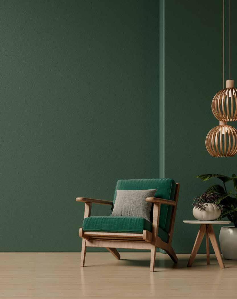
A deep, moody green, steeped in the artistry of the classic painters, providing darkness with earthy depth, a place where mystery and light converge. This shade anchors spaces with introspective elegance, a tone that grounds and deepens the world around it.
Muse


Dress your home in luxury, with the extraordinary quality of Designer Paint. This exceptional paint creates colours that are richer, more sumptuous. Formulated with Dura-Link technology making it resilient to all of life’s little mishaps.


We used Chilled Out DR136-4 as the base colour and Contentment DR 133-1 for the herringbone. Take a rectangular piece of cardboard and cut each side of the top at 45-degree angles, this will be your guide. Take a small brush and do one stroke on each side to create your authentic herringbone pattern.


Creating calming and peaceful spaces that invite relaxation and a clear mindset is what we all desire right now.
This curated collection of trending whites makes it easy to pick the perfect shade for any room or project.


The Essential Whites Collection offers a palette inspired by fresh sea air, rays of sunlight and vast sandy beaches. Along with cool and warm whites, the collection also includes deeper hues that can bring depth and atmosphere to any room.
Don’t Tell A Soul is a versatile vogue colour that works wonders with any style of décor, while Ashen offers a neutral combination of grey and beige that can be used interchangeably with both cool and warm colours. The showstopper, however, may be Whipped a bright, crisp and honest white that is simply just right.

DISCOVER YOUR ROOTS
Design Roots is an unparalleled collection that makes transforming your space breathtakingly simple. Composed of two exclusive palettes, Authentic Colours and Organic Neutrals.

DESIGN ROOTS
BeautiTone has taken tremendous care in crafting this paint palette of 80 Authentic Colours and 64 Organic Neutrals. Each hue is personified in a colour chip that identifies its undertones, energy and colour companions, exclusively from BeautiTone at Home Hardware stores. Together, we are the source of extraordinary colours for your home.

HAPPILY EVER AFTER / DR143-4
Inspires a state of utopia / cool - soothing
EXHALE / DR111-4
A space for fresh energy / cool – tranquil


DAWN / DR140-4
Anticipating the break of day / cool - dramatic


CARIBOU LICHEN
High in the sweeping expanse of Glacier National Park, where the wind carries the scent of pine and the mountains stand timeless against the sky, lives a green unlike any other. Caribou Lichen takes its name from the delicate mosses and lichens that thrive across rocky slopes and alpine meadows, nourished by glacier-fed streams and cool, clean air.
This beautiful green is kissed by the land itself, softened by mist, brightened by sun, and deepened by shadow. It is the colour of endurance, of life holding fast to stone, of quiet beauty in the most rugged places. Caribou Lichen speaks of resilience and harmony, a shade that bridges the wild spirit of nature with the stillness it inspires.
In the home, it brings the same sense of grounding calm, echoing the serenity of mountain landscapes and the strength found in nature’s most unassuming details. Whether paired with natural woods or crisp whites, Caribou Lichen carries the timeless grace of the land it was born from.


At the edge of Lake Erie, Point Pelee becomes a stage for one of nature’s most extraordinary journeys. Each autumn, thousands of monarch butterflies gather in a breathtaking display of movement and colour. From this fleeting spectacle comes Pelee Monarch, a radiant orange alive with warmth and depth.
Both vibrant and enduring, it carries the brilliance of the monarch’s wings while grounding itself in the richness of the landscape. In interiors, Pelee Monarch is a statement of vitality: luminous against soft neutrals, striking when paired with deep natural greens.
A colour of resilience and beauty, Pelee Monarch brings the wonder of migration home, timeless, transformative, unforgettable. Part of the Parks Canada Colour Card, it joins a curated collection of shades inspired by Canada’s most iconic landscapes, each hue a story, each story a place, each place a piece of home.


Our magnificent national parks are a source of pride for Canadians and an integral part of our identity. Seeking inspiration from mountains to plains, lakes to glaciers, and coast to coast, we encountered an endless source of breathtaking, natural beauty that became a collection of colours perfect for the home.

PURE


Imagine stepping into a room where every surface speaks the same language of colour. A space that wraps you in warmth, depth, and personality from floor to ceiling. This is the power of colour drenching, a fresh and exciting trend in interior design that is quickly making its way into homes everywhere. If you have been searching for a way to transform your space into something truly memorable and personal, colour drenching might be precisely what you need.
Colour drenching means choosing one colour and fully committing to it throughout the room. Not just the walls, but the trim, the doors, furniture, and even the ceiling. Instead of breaking the space up with multiple hues or accents, you immerse the entire room in a single colour story. This creates a seamless and immersive environment that feels dramatic and sophisticated, yet comforting and balanced.
While this approach might feel new to many, colour drenching builds on timeless principles of colour and space that have influenced design for centuries. Think back to classical interiors, where monochromatic palettes were used to create harmony and balance, allowing architectural details and textures to shine without distraction. In traditional Japanese and Scandinavian design, a limited colour palette often creates a sense of calm and cohesion, inviting mindfulness and simplicity.
Throughout history, painters and designers have long understood the emotional and spatial impact of colour enveloping a room. The Victorian era, for example, embraced rich, deep tones across walls and ceilings to evoke drama and intimacy. In mid-century modern design, bold single-colour walls set the stage for furniture and art to take centre stage, showcasing confidence in restraint.
What makes colour drenching stand out now is how contemporary designers are taking these foundations and pushing boundaries even further. They are applying colour boldly and fearlessly to every surface, including ceilings and trims, creating spaces that do more than look beautiful; they transform the very experience of being in them. This modern embrace of total colour immersion turns rooms into environments that feel immersive, emotional, and profoundly personal.
The resurgence of colour-drenching also reflects today’s desire for spaces that go beyond function, where interiors express identity,
mood, and well-being. It taps into a broader movement toward immersive design, where every element contributes to creating a sanctuary or statement, engaging all the senses.
So, although colour drenching is fresh and exciting today, it carries a rich legacy that connects the past with the present, inspiring designers and homeowners alike to rethink how colour can shape the way we live.
This trend is far from being just a fancy editorial idea. It works wonderfully in all types of spaces, from a small powder room that needs a punch of personality to a cozy home office where focus and calm matter, even in large living rooms and bedrooms where you want to make a statement. The key to success lies in paying close attention to the finishes and how each element interacts with light and space. When done right, colour drenching feels intentional, luxurious, and timeless.

WHY YOU CANNOT SKIP THE CEILING
The ceiling is often overlooked in traditional decorating, but for true colour drenching, it is essential to include it. Leaving the ceiling white or a different colour breaks the visual flow and stops the immersive effect from taking hold. Painting the ceiling in the same colour as the walls creates a continuous, enveloping experience that expands the room and gives it a sense of cohesion.
For the ceiling finish, a flat paint is always the best choice. Flat finishes absorb light, which softens the space and hides any imperfections on the surface. This keeps the ceiling feeling smooth and understated, allowing the colour to shine without glare or distraction.
CHOOSING THE RIGHT WALL FINISH
Walls are the foundation of the colour-drenching look, and choosing the right finish is crucial. Flat finishes are a favourite among designers for their velvety, soft appearance that adds depth and richness to the colour. They work particularly well in rooms with gentle use, such as bedrooms or dining areas.
For busier areas like hallways, kitchens, or living rooms, it makes sense to choose a finish that offers durability while maintaining the elegance of the colour. Eggshell or Velvet finishes offer this balance beautifully. They provide some resistance to wear and cleaning without sacrificing the soft look that makes colour drenching so inviting.
TRIM AND DOORS DESERVE ATTENTION
Trim and doors are the details that pull the whole look together. They should not blend into the walls and ceiling with the same flat finish. Instead, a subtle contrast in sheen adds dimension and polish to the space. Pearl or Semi-Gloss finishes are perfect here.
These finishes highlight the architectural features of the room while making doors and trim easier to clean. Our specially formulated Trim and Door Paint delivers a smooth, durable finish that catches just the right amount of light to elevate the entire space. This little difference in texture makes the colour drench feel considered and complete.

COLOUR AND FEELING
Colour drenching isn’t just a decorating trick! It’s a way to make your home feel more personal, more intentional, and more inspiring. By choosing the right finishes for walls, ceilings, trim, and doors, you can ensure the look feels elevated and timeless.
So, grab your brush and embrace the power of a single colour. Once you experience the transformative effect of colour drenching, you may never look at paint or your home the same way again.
BeautiTone’s Artistic Choice: Uncovering the Inspiration and Vision Behind the Colour of 2026

You know that feeling when something pops into your life at exactly the right time? That’s what discovering the Colour of the Year is like, except it’s not about luck. Oh no, there’s nothing random about it. Behind the scenes, we’re part detective, part designer, and part future-forecaster (without the crystal ball, but with a lot of coffee).
We start by gathering clues from everywhere, fashion runways, the latest in-home décor, shifts in culture, technology breakthroughs, and even the collective mood of the world. We connect with our global colour partners, swap ideas, and sift through inspiration until we can see where design is headed. Then we ask ourselves the big question: How will this colour live in our homes and shape how we want to feel in the year ahead?
Somewhere in the mix, one colour always steps forward. It’s the hue that grabs our attention, tells the richest story, and makes us feel something. It’s the shade you’ll see splashed across social feeds, pinned on inspiration boards, and whispered about by design lovers. Whether you bring it into your home in small, subtle ways or go bold from floor to ceiling, the Colour of the Year has a way of making everything feel fresh and inspired.
This year, we added an extra voice to the process: the people who know our customers best. Our BeautiTone paint experts across the country, thefriendly faces talking colour dreams and project plans with you every day, shared their insight. Their feedback guided us toward a choice that feels both timeless and on the pulse.
So here it is. For 2026, the crown belongs to a deep, moody green. Think the mystery of a shaded forest floor, the earthy soul of weathered patina, and the quiet shimmer where shadow meets light. It’s a colour that grounds you yet invites your imagination to wander.
In 2026, this green is your invitation to slow down, breathe deeply, and create spaces that are as rich in meaning as they are in style.
Every Colour of the Year is a reflection of the moment we’re in. Right now, many of us are looking for:
• Calm: Spaces that feel restful and restorative.
• Depth: A sense of richness and connection to history.
• Nature: A reminder that even in a digital world, we crave the organic and the real.
This green gives you all of that and more. It’s moody without being gloomy. Elegant without being cold. Bold, but surprisingly easy to live with.
Here’s the thing about a deep green: it’s far more versatile than people think. Whether you want to dip your toe in or dive headfirst, here are some ideas:
1. Go All In: Paint all four walls in a dining room or bedroom. Pair it with warm wood tones, brass accents, and rich textures like velvet or wool. You’ll create a cocoon-like space that feels timeless and luxurious.
2. Statement Wall: If you love the idea but want a lighter touch, try a single feature wall. In a living room, it’s the perfect backdrop for artwork or a gallery wall. In a home office, it adds focus and sophistication.
3. Cabinetry & Doors: Kitchen islands, bathroom vanities, or interior doors in this green feel fresh yet classic. Pair with marble, butcher block, or matte black hardware for a look that lasts.
4. Accent Pieces: Not ready for paint? Bring in this colour with textiles, think throw pillows, rugs, or bedding or in a dramatic piece of furniture like an armchair.


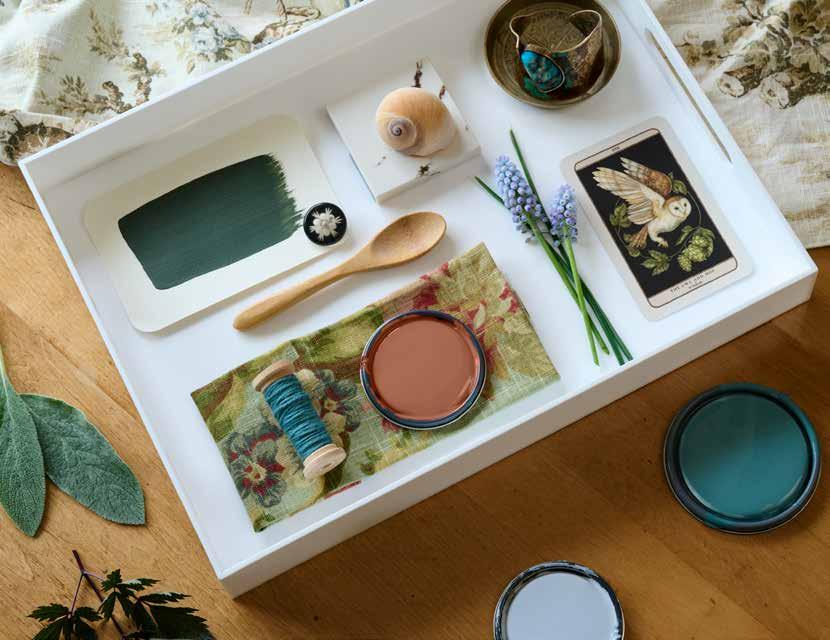
Laurel is a hushed, graceful green touched by warmth and age. Like leaves pressed between the pages of a forgotten book, it holds a sense of memory and stillness. Softly muted yet undeniably rich, it brings an effortless elegance, whispering of heritage, craft, and quiet beauty. “
Green is key this year, so we’re featuring two shades. Both have yellow undertones.


A soft whispered blue that emerges like the first breath of daylight. This serene hue provides a moment of calm and a gentle clarity, a colour that does not demand attention, but lingers in memory.


a
and warm, refined yet inviting, transforming any room into a serene and inspiring environment.
TR26-2-3

Dusted Terra Cotta
TR26-2-3

This colour captures a harmony of timeless and modern. Inspired by the essence of clay and softened with a smooth touch, it holds the radiance of sun-warmed earth while remaining soft and inviting. This shade flows effortlessly between heritage and today’s design. It recalls crafted pottery, and the character of adobe, yet feels natural in contemporary spaces.
Bringing Dusted Terra Cotta into interiors adds depth and authenticity. It complements woven textures, warm woods, and organic elements, creating rooms that feel relaxed, welcoming, and refined. Its understated presence ensures it never dominates. Instead, it surrounds a space with warmth, delivering versatility and lasting charm.


Decadent is more than a colour! It’s an atmosphere. This deep, sumptuous red instantly elevates a space, wrapping it in warmth, drama, and confidence. Its berry undertones add richness without overwhelming, making it versatile for both statement walls and luxurious accents. Whether paired with velvet textures, golden metals, or moody lighting, Decadent infuses interiors with timeless elegance and unapologetic boldness. This is a design choice that lingers like the glow of candlelight.


TR26-5-4

A darkened muted teal, the colour of ancient pigments, evoking the stillness of deep waters beneath a moonlight horizon. Steeped in history yet effortlessly modern, this shade is a bridge between past and present, as timeless as the masterworks it evokes.
Designers are drawn to Aged Patina because it carries a rare balance of depth and serenity. It has the power to anchor a room, grounding it with quiet strength, while still offering a sense of calm that makes spaces feel inviting rather than imposing. Its muted teal undertone makes it versatile, rich enough for statement walls or cabinetry, yet soft enough to work in layered palettes with woods, creams, and metallics.
In many ways, Aged Patina tells a story of endurance: colours that have stood the test of time, surfaces worn yet beautiful, and art that continues to inspire. Choosing this shade is not about following a fleeting trend. It’s about creating a space that feels curated, soulful, and lasting.


This softened shade, brushed with gentle violet and a whisper of grey, evokes the moment just before twilight settles. It is serene, contemplative, and timeless. Like the last glow on a distant skyline, it invites stillness and reflection, offering a sense of quiet beauty that lingers long after the light has faded.
Designers are embracing Hushed Horizon because it’s a colour that transcends trends. Its muted, ethereal quality makes it versatile for any space. Whether you put it on walls, cabinetry, or even small accents. Hushed Horizon bringings a soft, enveloping calm to both modern and traditional interiors. Beyond its visual appeal, this hue has staying power; it’s not a fleeting statement but a shade that continues to feel relevant and sophisticated year after year.
Hushed Horizon is the perfect choice for creating rooms that encourage pause and presence. Paired with soft neutrals, natural woods, or even deep, moody accents, it balances comfort with elegance. This is a colour designed to endure, offering timeless appeal and a subtle sophistication that makes every space feel thoughtfully composed to a space. It pairs beautifully with natural textures like linen, rattan, and warm woods, creating an environment that feels grounded, welcoming, and effortlessly stylish. Its muted quality means it never overwhelms. It simply wraps a room in warmth, making it so versatile.

A greyed white, like the surface of an ancient sculpture kissed by centuries of dust and light. Subtle and serene, it offers a timeless foundation.


A rich, earthy brown grounded in depth and tradition. This brown evokes the underpainted layers of a painting. With the quiet strength of aged wood and the texture of timeworn canvas, it adds a sense of shadowed elegance and enduring artistry.

A soft, sun-warmed neutral with a golden undertone, Dust of Light feels like aged pigment kissed by time. Gentle and glowing, it brings warmth and quiet elegance to any space.
A near-black blue that evokes the depth of oil-painted shadows and the stillness of moonlit skies. Mysterious, elegant, and quietly intense, it carries a sense of nostalgia, reminding us why blue has long held a cherished place in our homes. This near-black hue transforms spaces into intimate, reflective retreats while honouring the timeless importance of blue in interior design.

BUY 8 GET 1 FREE - The BeautiTone Rewards program is the best way to get more, while doing what you love to do. Paint!
Just pick up your card and have it stamped each time you buy a gallon of BeautiTone paint. Get yours today and start painting!


Experience the ultimate in paint. Signature is known for its unparalleled quality and value. Consistently rated as one of the highest performing paints.

Designing with dark and white creates a dramatic visual expression. Painting a simple graphic transforms a plain wall into a stunning contemporary feature. Yoga-na Love it! DR132-3 | Whipped WB048-1


