Select Projects | 2024


Select Projects | 2024

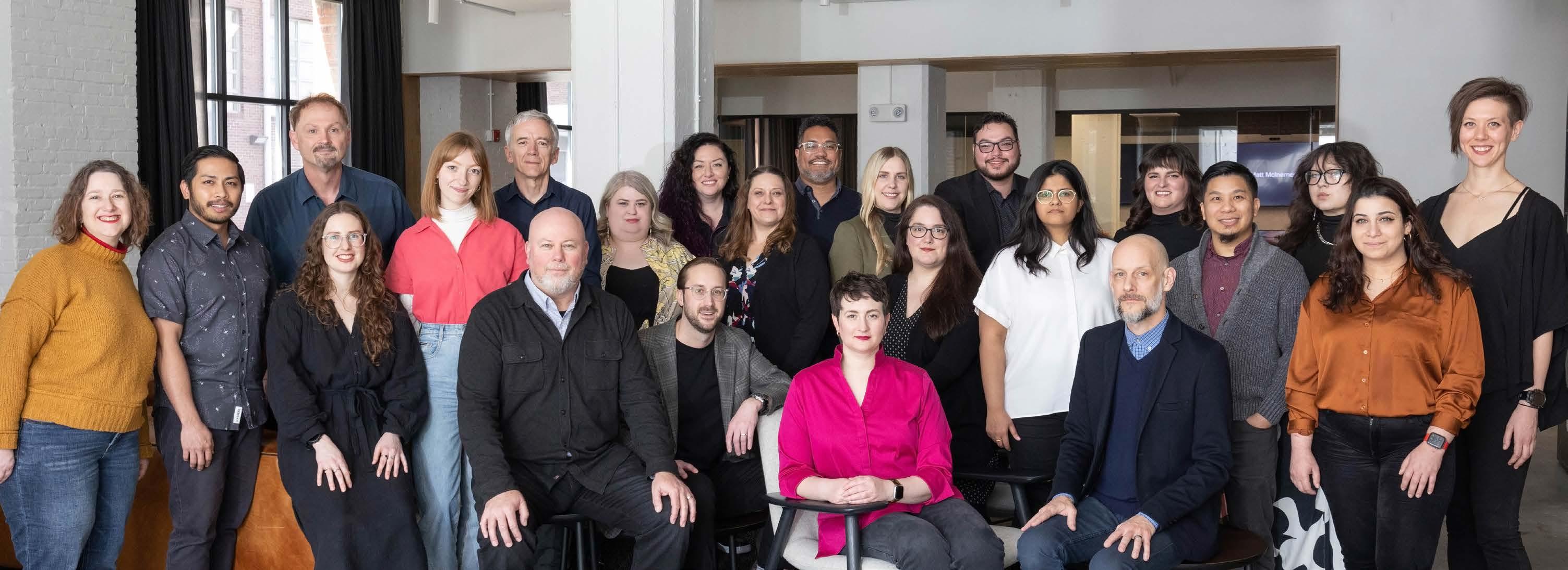
We are a custom art and experiential graphic design studio within HOK. We bring decades of experience working in the built environment to craft moments that are unique and memorable.
Together with our clients and project partners, we map out the journey and leverage brand strategy, so everyone can visualize your unique personality. And we recommend a variety of artwork and messaging intentionally selected for the most effective engagement, flow and impact.
About Experience Design
Select Projects 1 2
We
are designers, wayfinders, makers, gardeners, visualizers, artists & so much more.
Naming and Positioning
Identity and Logo Design
Brand Applications
Media Integration
Brand Standards
Design Standards
Assessments
ADA and Life Safety
Master Plan Strategies
Naming and Numbering
Interactive Immersive
Content Design
VR and AR
Visualization
Experiential Graphics
Storytelling Displays
Donor Recognition
Exhibit Design
Art Installations
Toronto
LOCATION
Toronto, Ontario
COMPLETION
2022
SERVICES
Naming & Identity Creation, Brand Guidelines, Experiential Graphics, Signage & Wayfinding
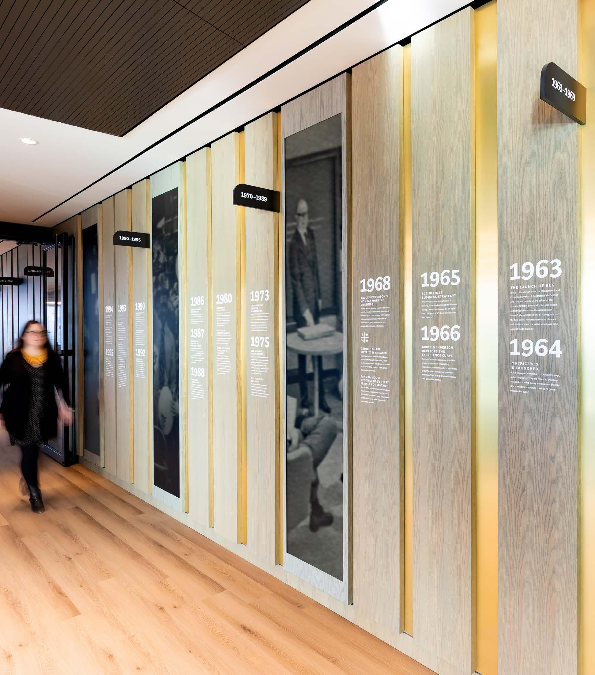
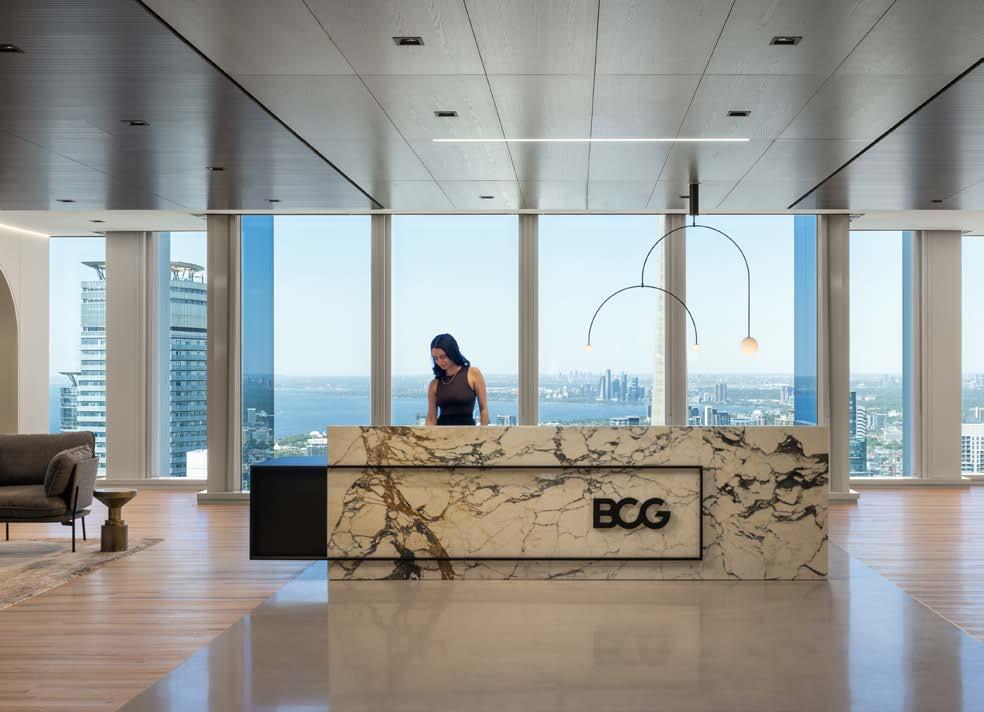
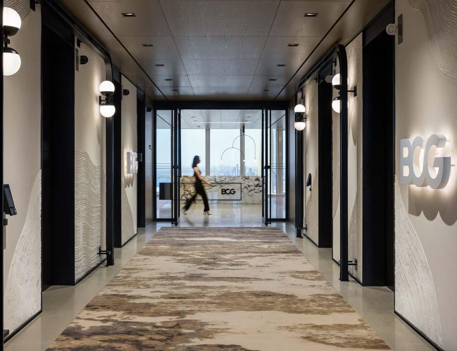
The new BCG office in Toronto contributes to the company’s mission to make Canada a better place to live, work and run a business. With the post-pandemic workforce in mind, the design team focused on enhancing the space into a truly transformational workplace that promotes well-being, purpose and equity and reflects their strong company culture through supportive and beautiful amenities and meaningful installations that celebrate the people at BCG Canada.
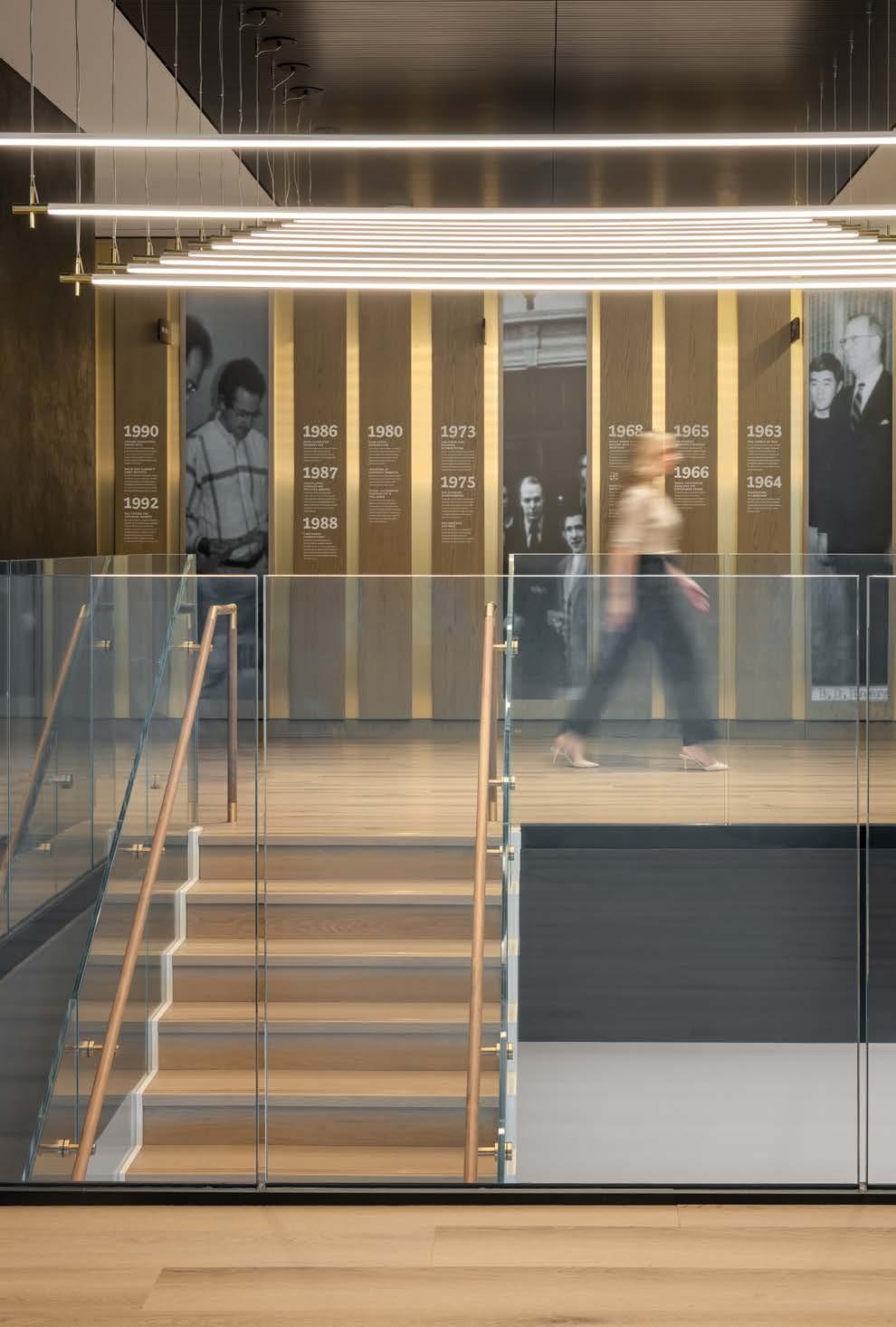
Spaces like the Signature Hall showcase the names of alumni through dimensional signatures that can easily be added to over time, conference room names that reflect local train stations and founding leadership, a custom graphic Land Acknowledgment, and a history wall showcasing watershed moments in the company’s history are all meant to encourage a sense of belonging and aspiration among BCG local and visiting staff inspired by the company expression, “Once a BCGer, always a BCGer.”
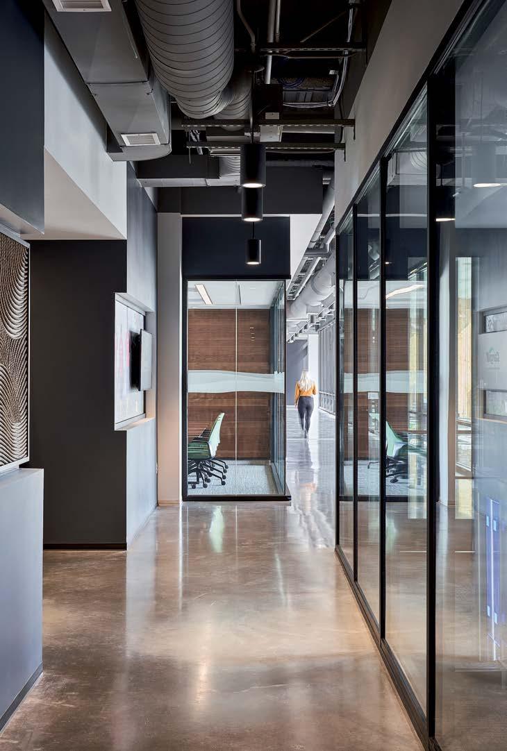

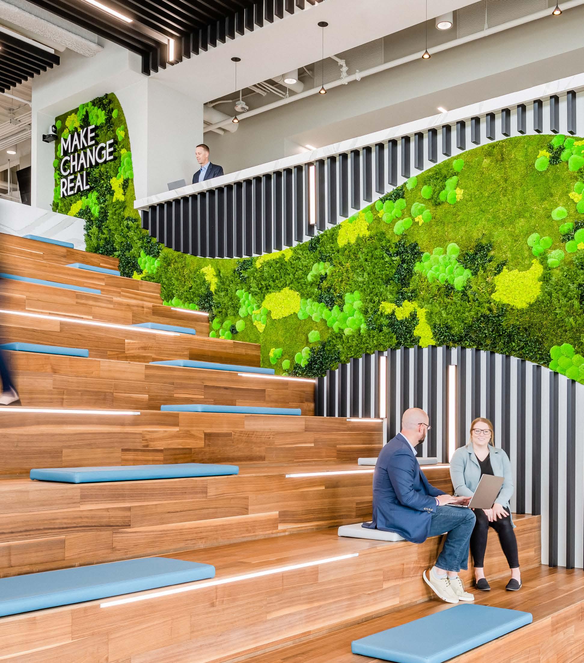
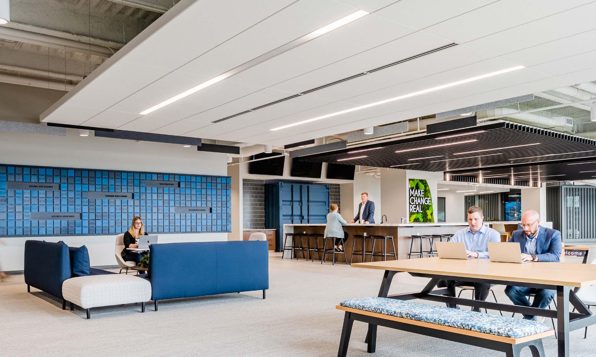
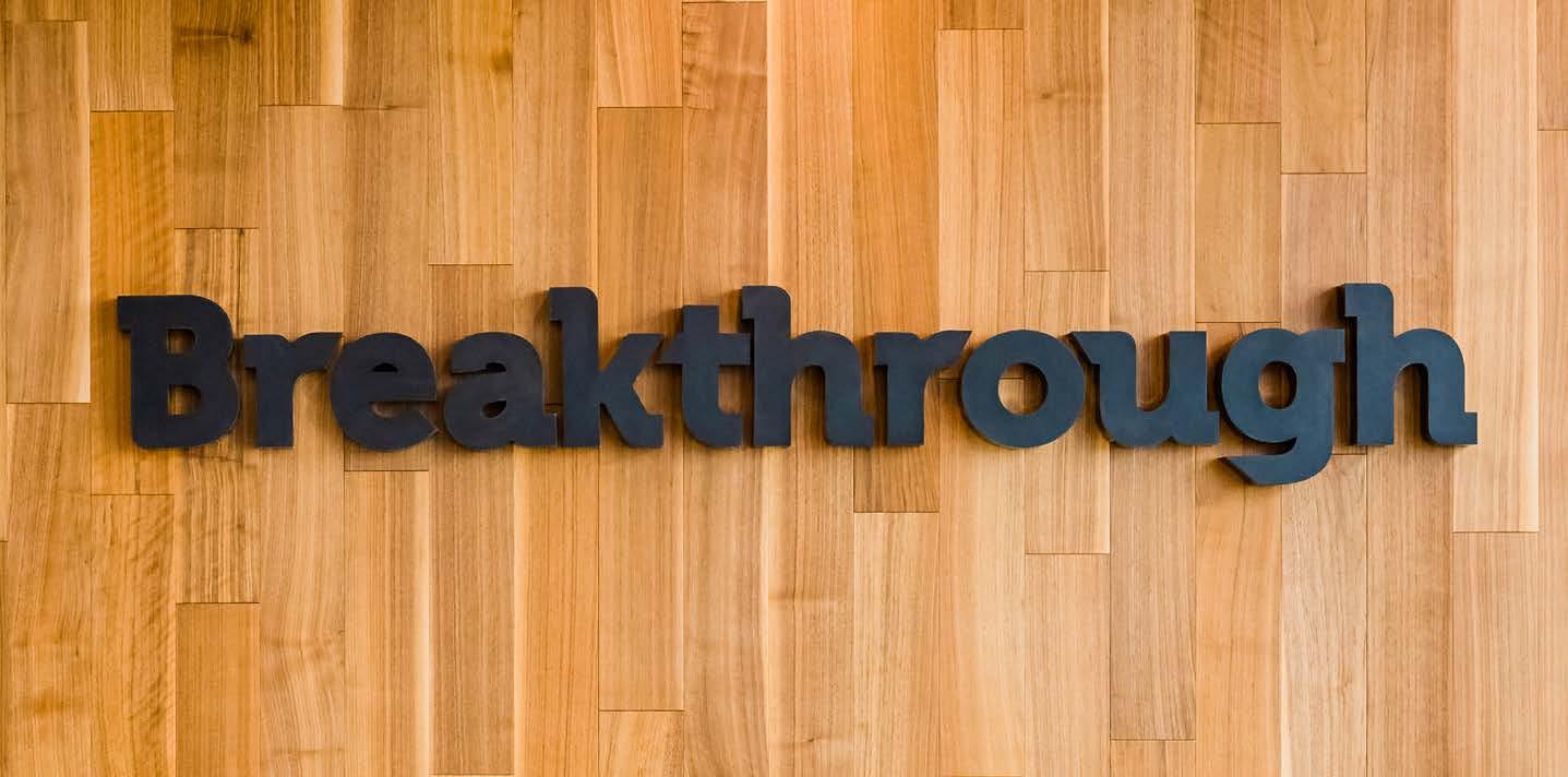
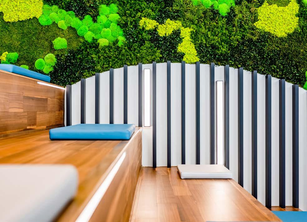
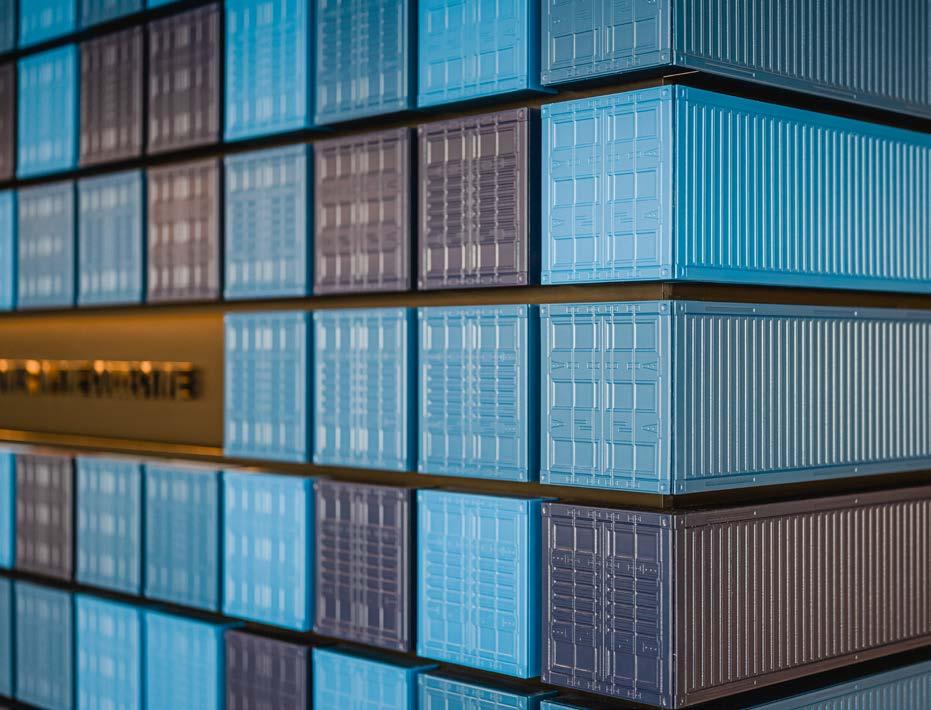
As part of a new 41,500 sq ft headquarters for Breakthrough, a transportation management and technology provider, EXD created branding and environmental graphics reflecting the company values, history, and culture. A custom wall made up of shipping containers reflects company culture in employees’ own words, while a green wall creates a healthy, inspring environment. Finally, a custom logo wall made up of glass bricks spotlights clients, and will be updated as Breakthrough adds clients to their pool. The new headquarters, termed the Breakthrough Collaboration Hub, will provide a flexible work environment for Breakthrough’s highly innovative and collaborative team, numbering more than 100.
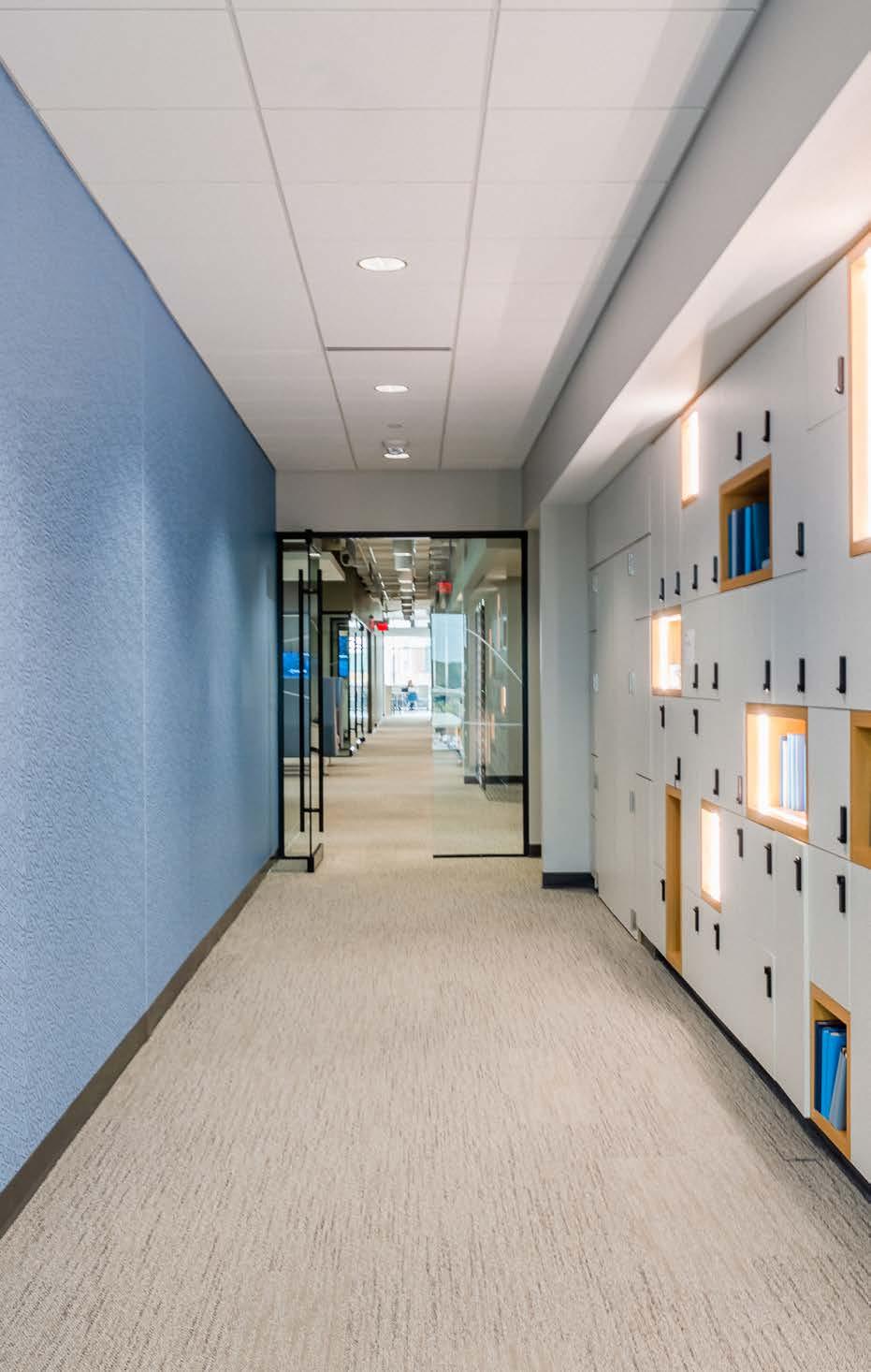
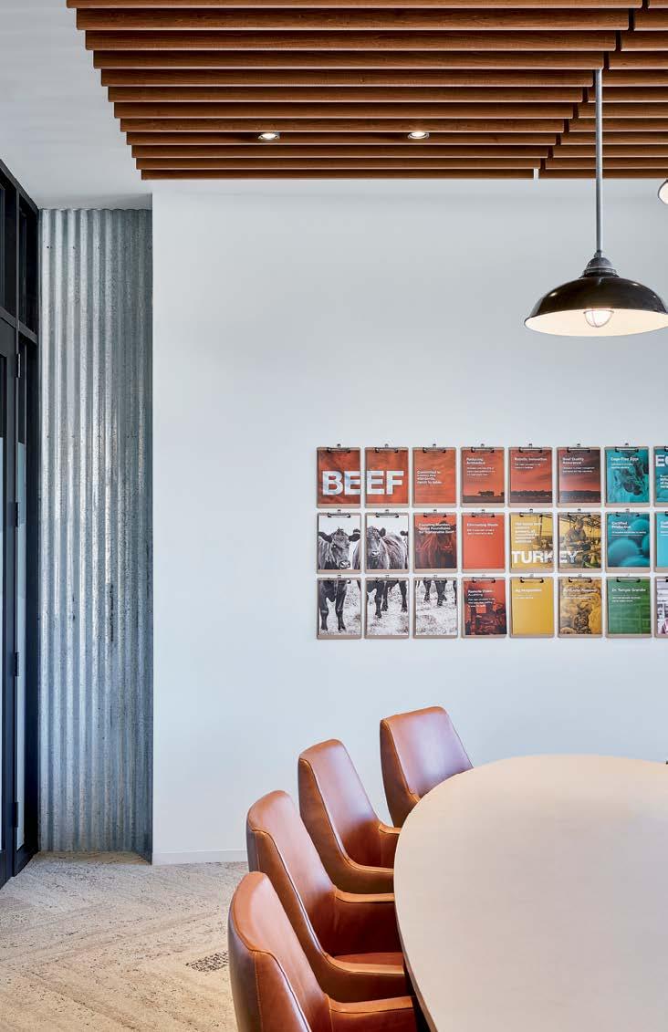
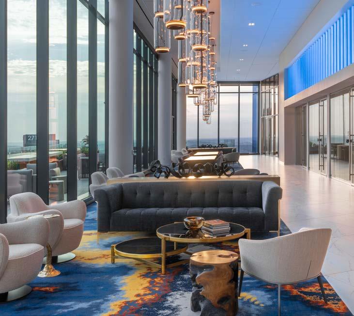
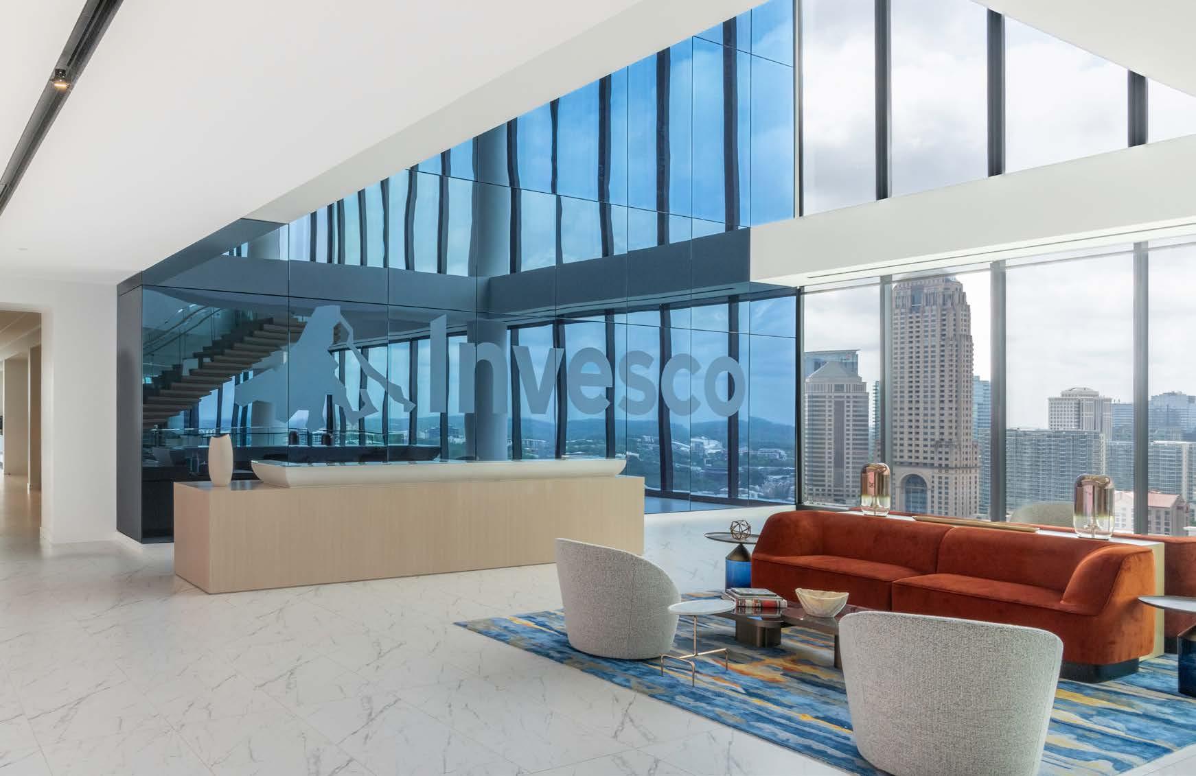
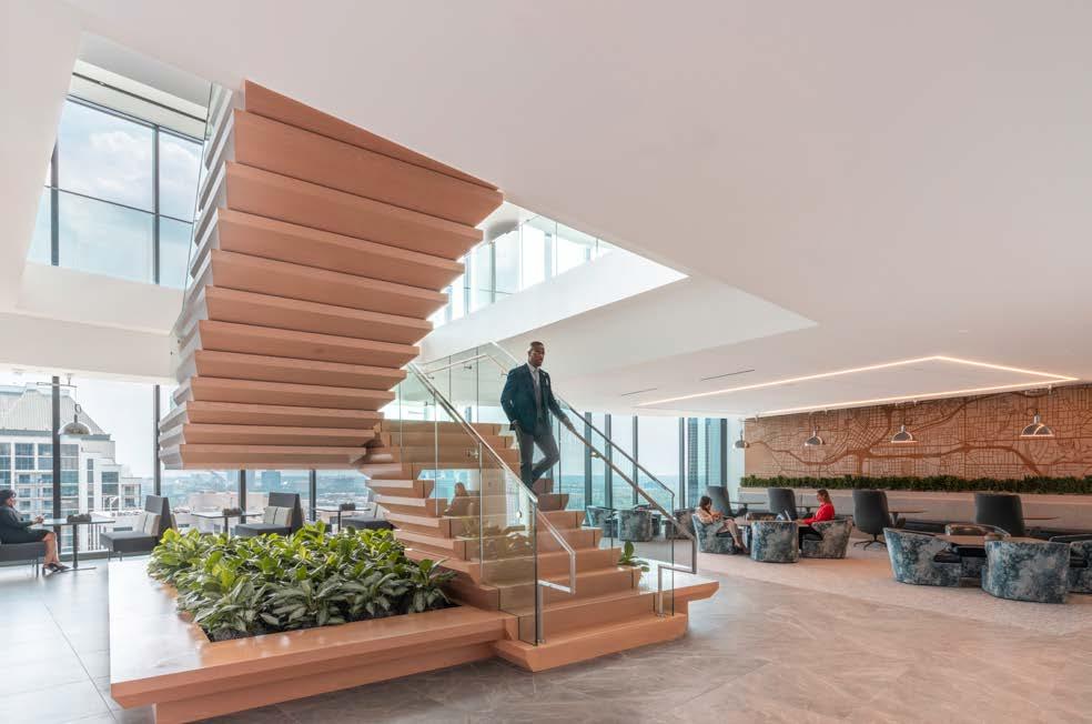
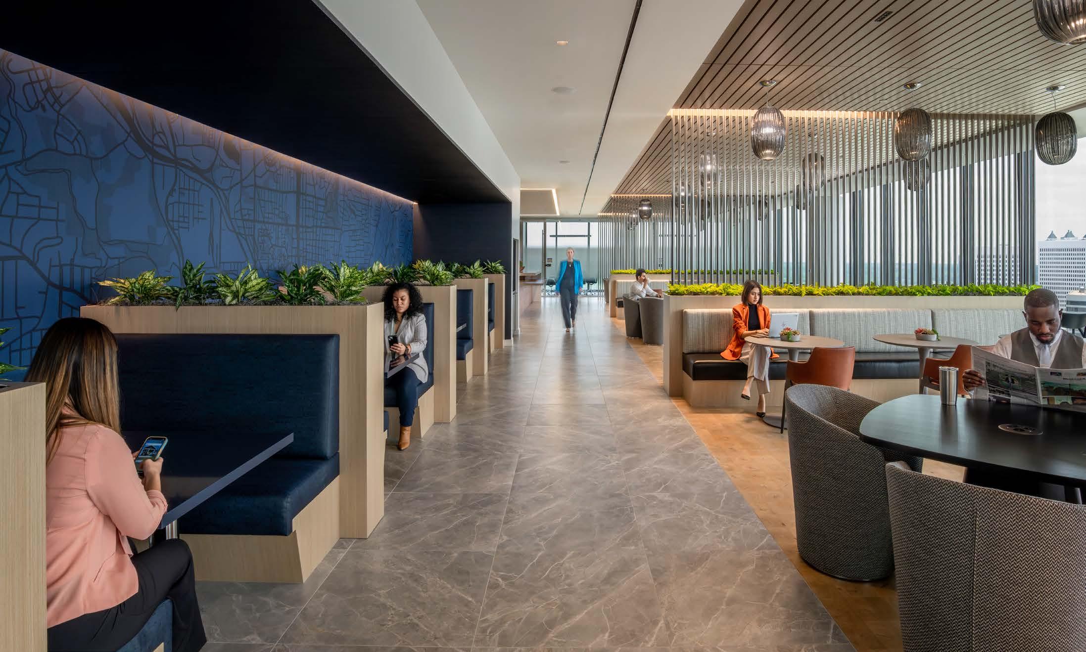
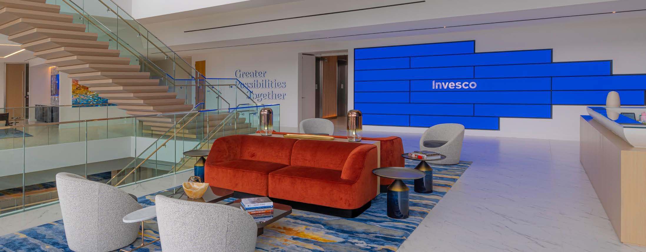
HOK worked with Invesco, an investment management firm, on the build out of their Global Headquarters in Atlanta, Georgia. The midtown building spans six levels and combines reception, conferencing space, heads-down space, lounges and an employee cafe. Recognizing that Invesco’s brand identity is designed to be ‘digital first,’ Experience Design crafted solutions that kept the design resilient and flexible far into the future while artfully communicating the company’s core values.
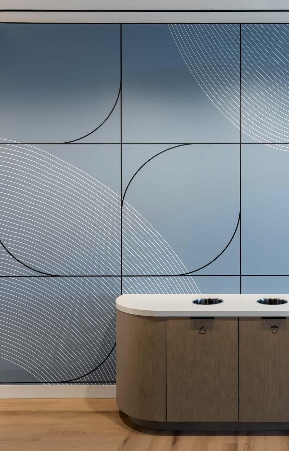
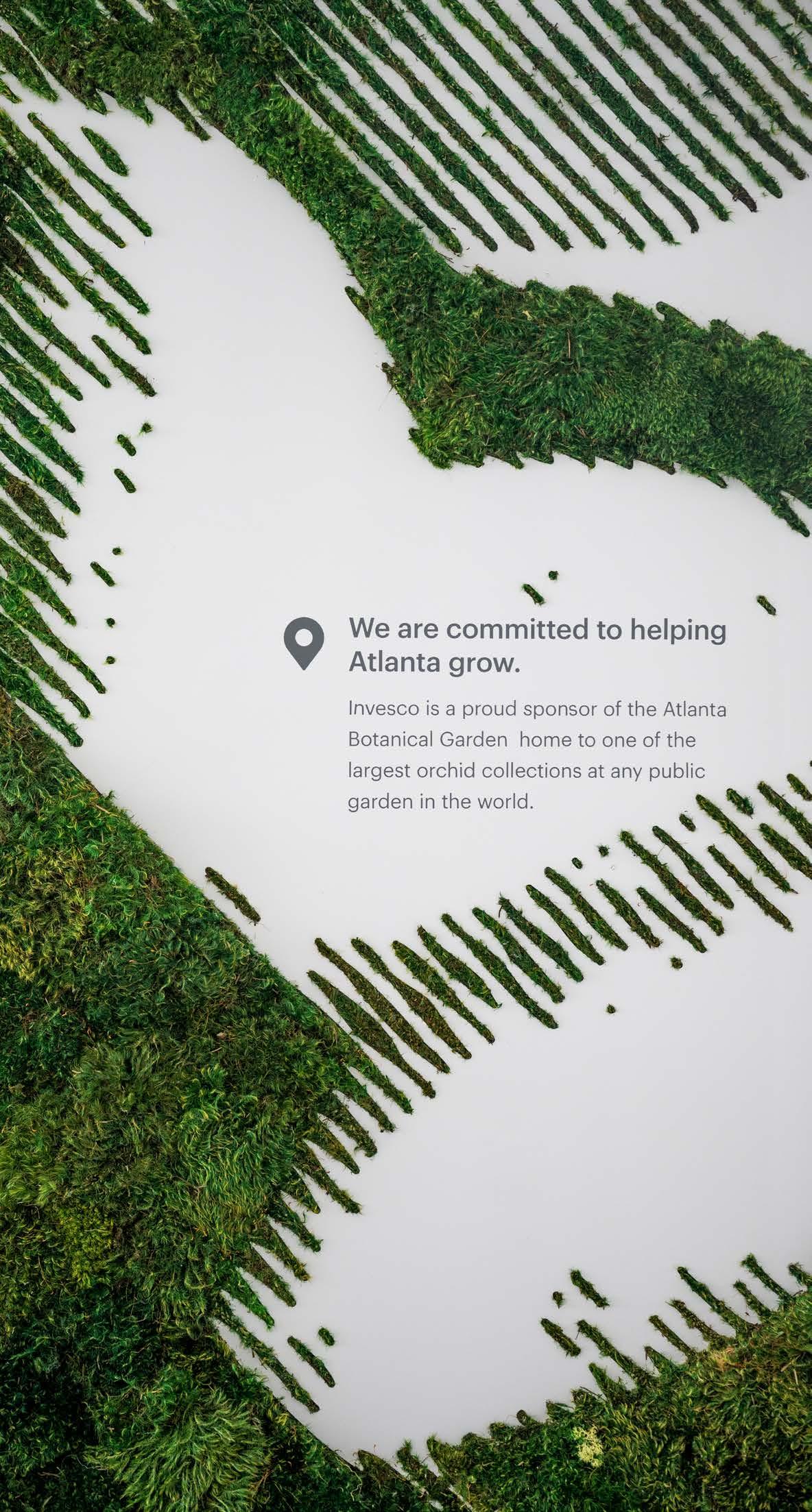
Light instillations and a large custom blue glass wall grab attention as clients and customers enter the space, and connect back to the brand principles of being innovative, adaptable and fast-moving. And to embody another of Invesco’s core values of investment in the local community, the design team found an opportunity to create a biophilic wall installation in a main reception space on the top floor of the building to highlight that ethos for visitors, clients and Invesco employees. Invesco is a proud sponsor of the Atlanta Botanical Garden, and a moss wall depicting dimensional orchids pays homage to that support and the Botanical Garden’s signature orchid collection.


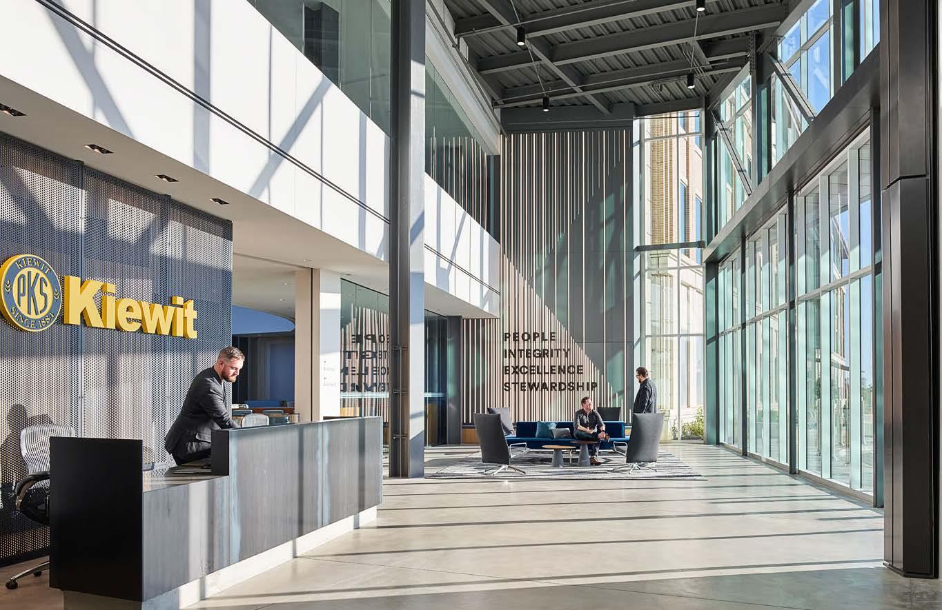
As the focus for the power plant company is shifting to sustainable power delivery, they wanted a way to tell this story. The designs, including a History Wall, are located at the client facing areas and offer timeless solutions with |little maintenance.
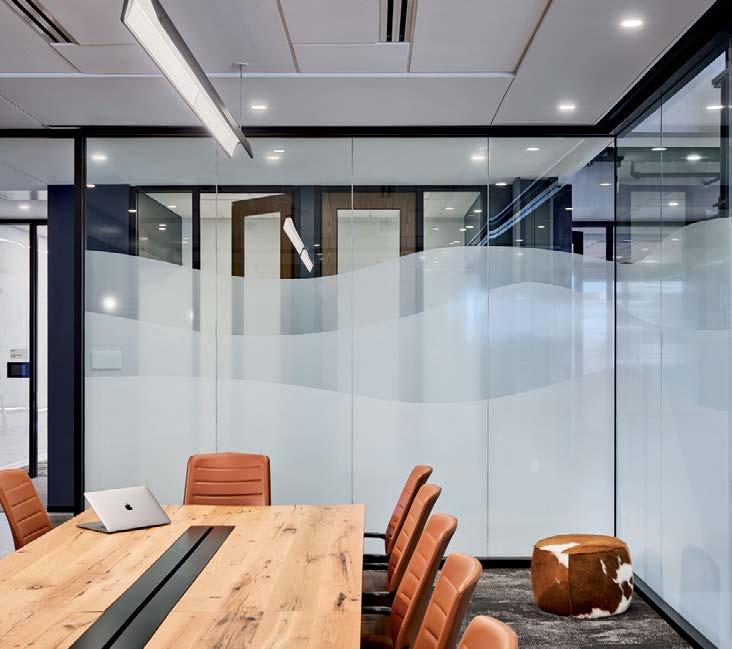
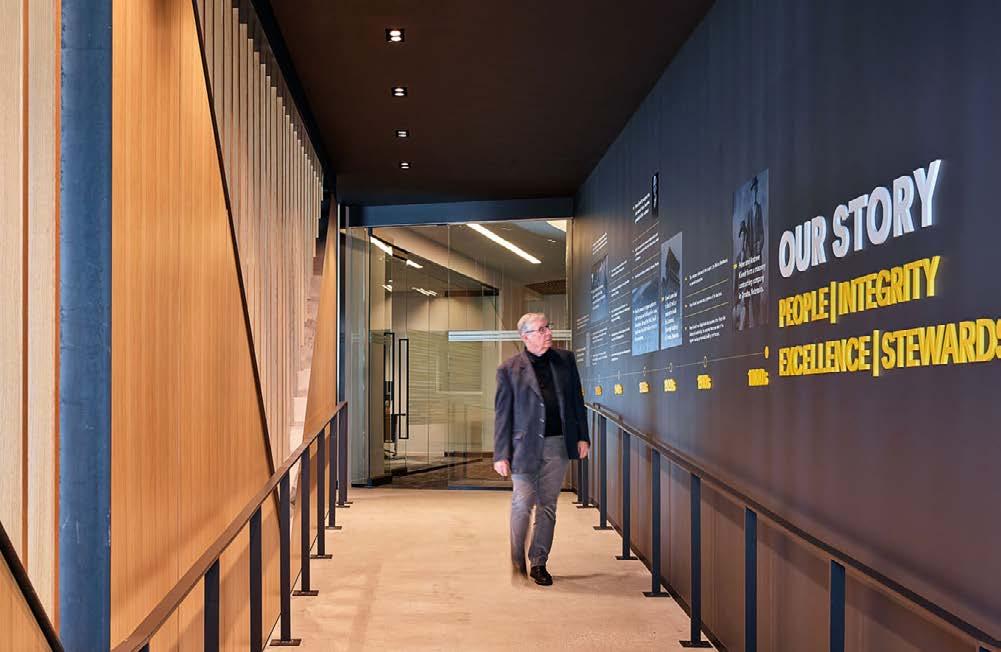
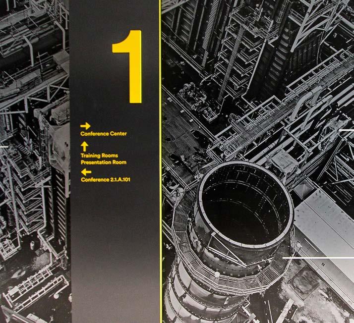
Powerful leadership quotes atop diagrammatic wall coverings depict company vision and capabilities, which have become part of new graphics and signage standards rolling out to other locations. The palette, tone on tone with highlights of yellow, uses materials plant workers would find on site, and linear elements emphasize energy usage.
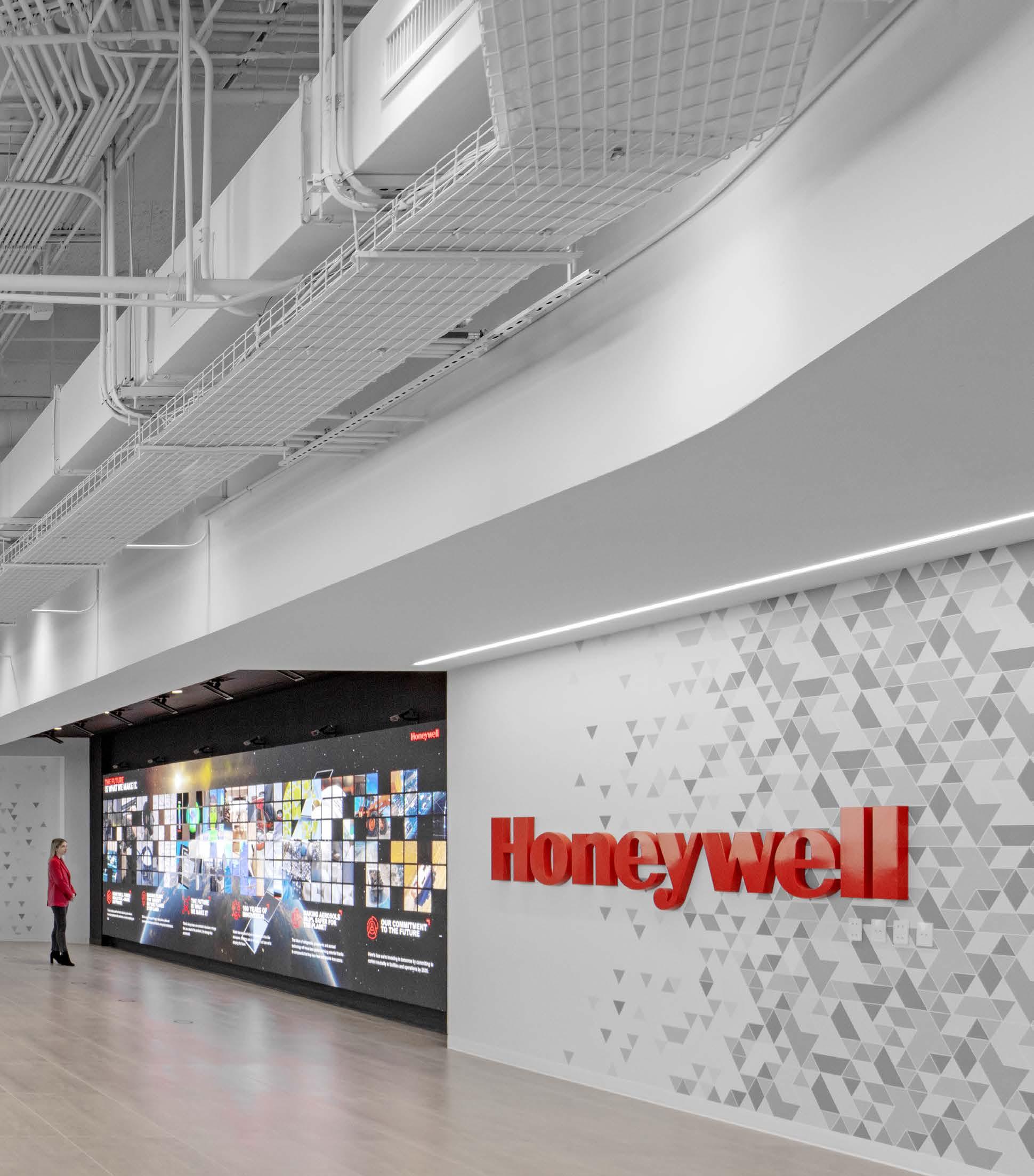
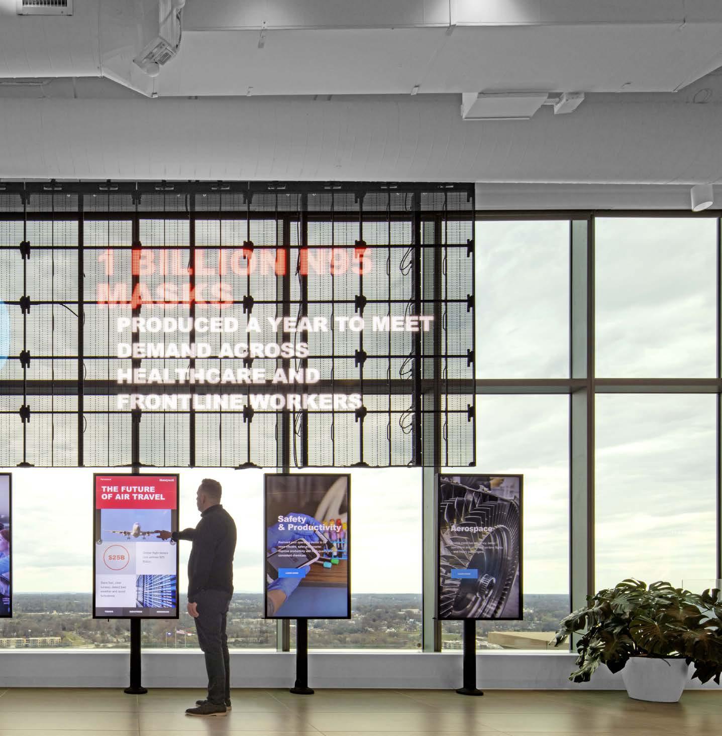
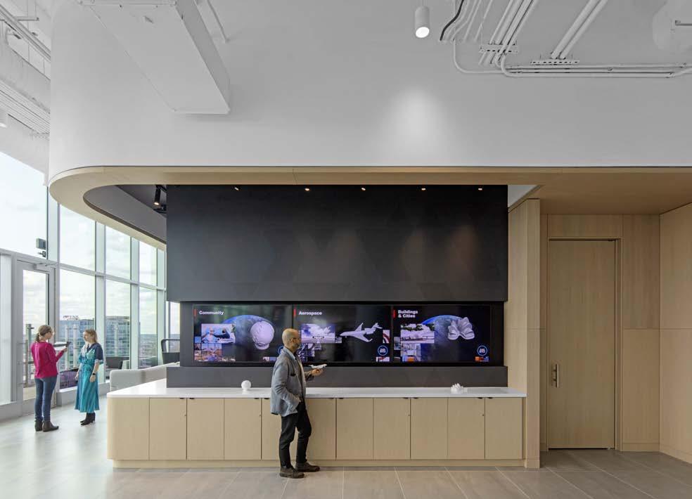
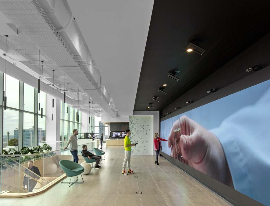
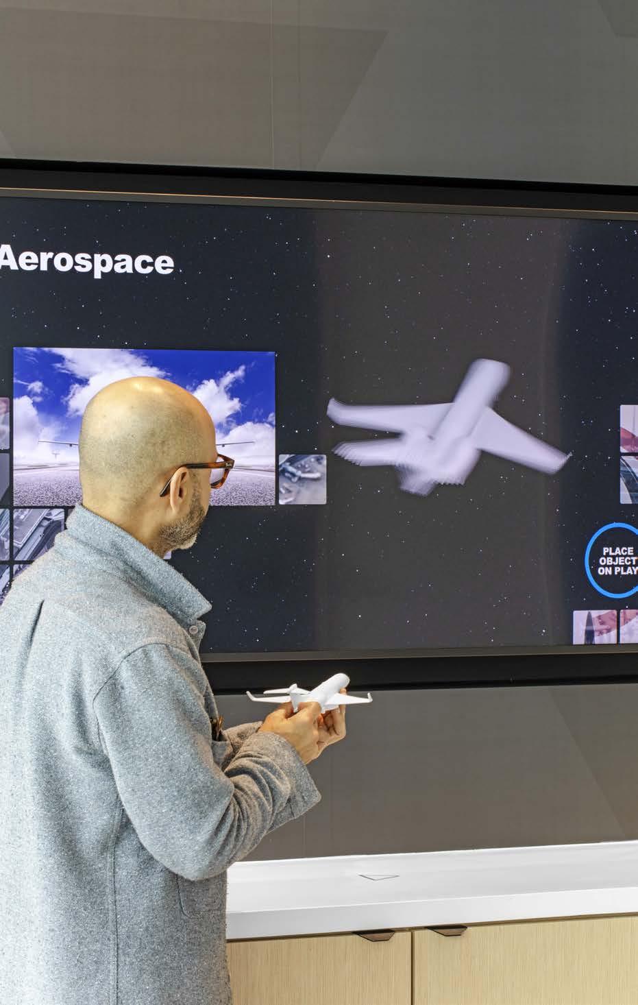
For their brand new Global Workplace HQ, Honeywell aspired to go next level with brand implementation and immersive digital integration. The client focus on emphasizing a user experience meant to capture the breath of the entire Honeywell Global Brand and its impact on the modern world in a fully immersive space. Experience design leveraged the Honeywell brand standard to offer solutions for shared design elements throughout the space. Lobby graphics, wayfinding, logos, wallcoverings, film on glass, artwork, storytelling, object curation, custom illustration all helped define an optimal a client-facing experience that is authentically Honeywell.
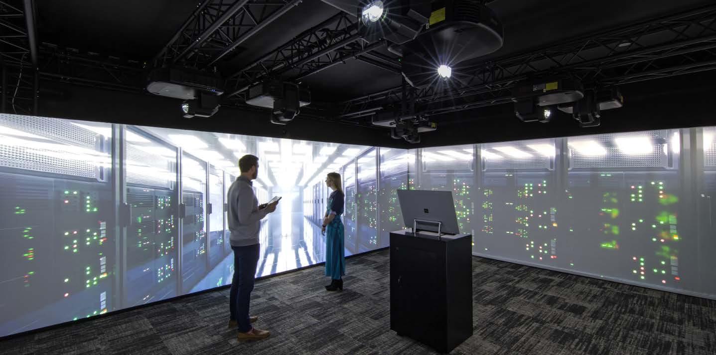
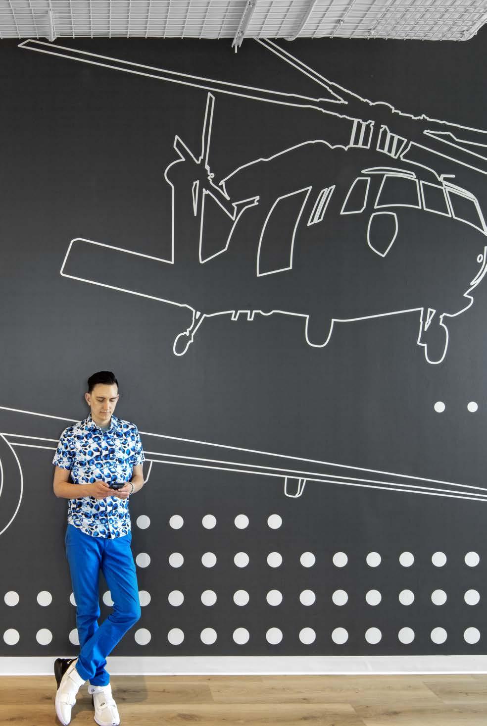

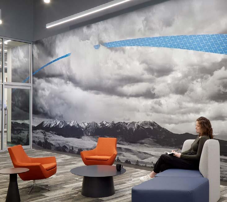

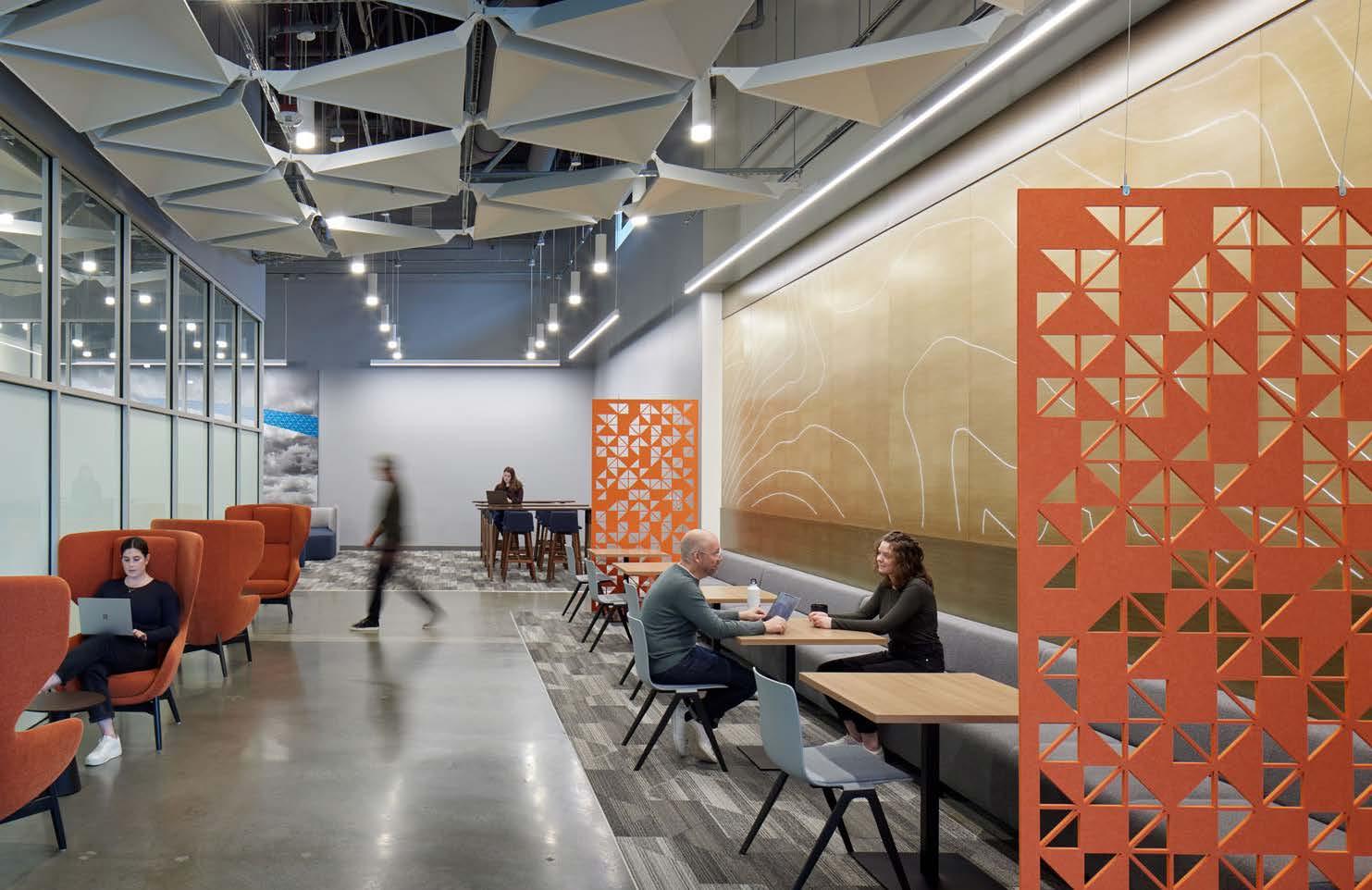
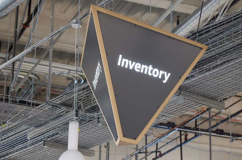
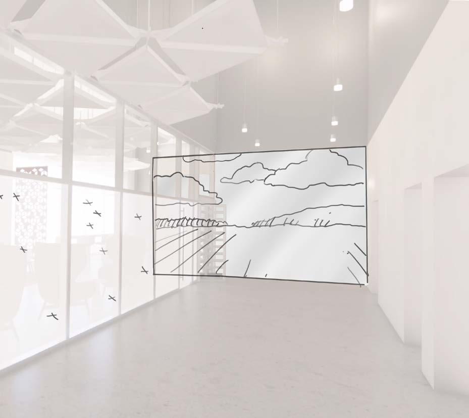
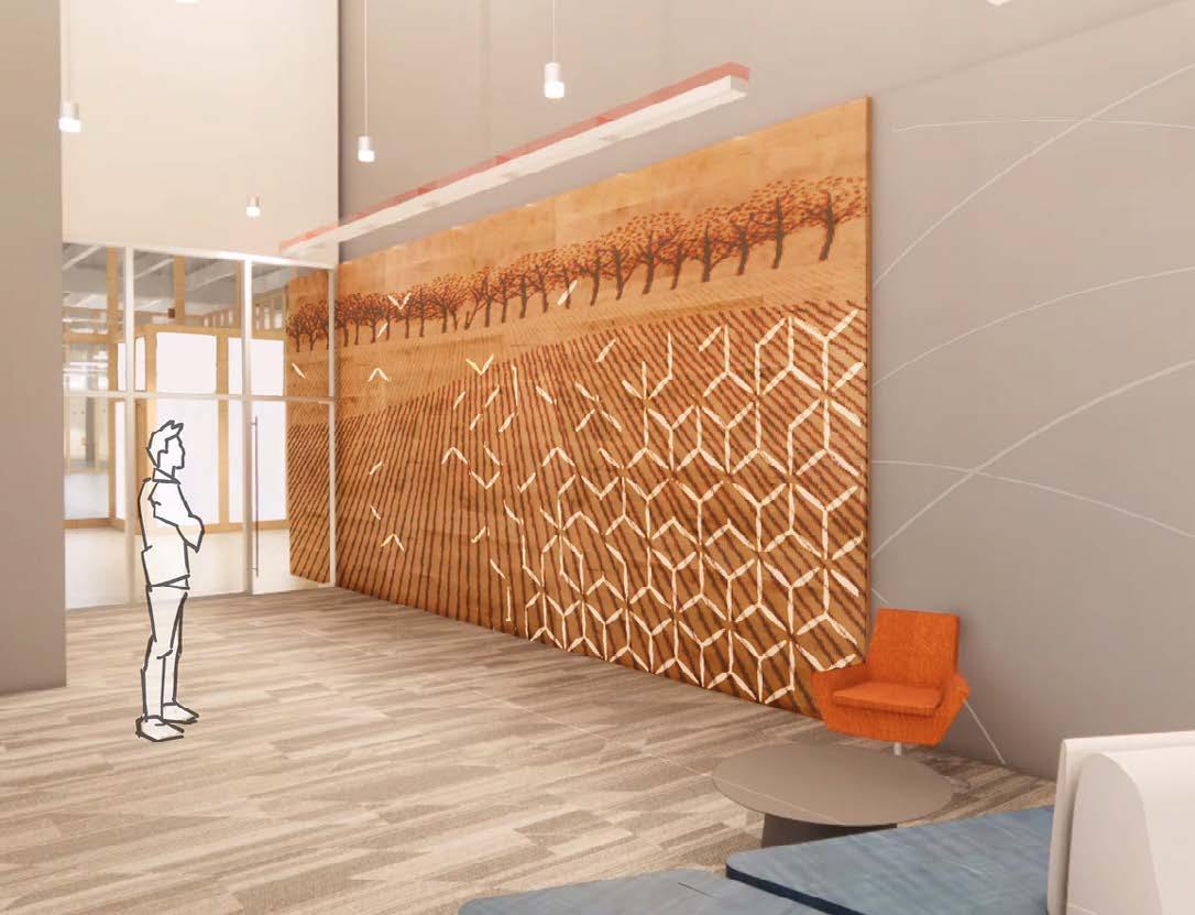
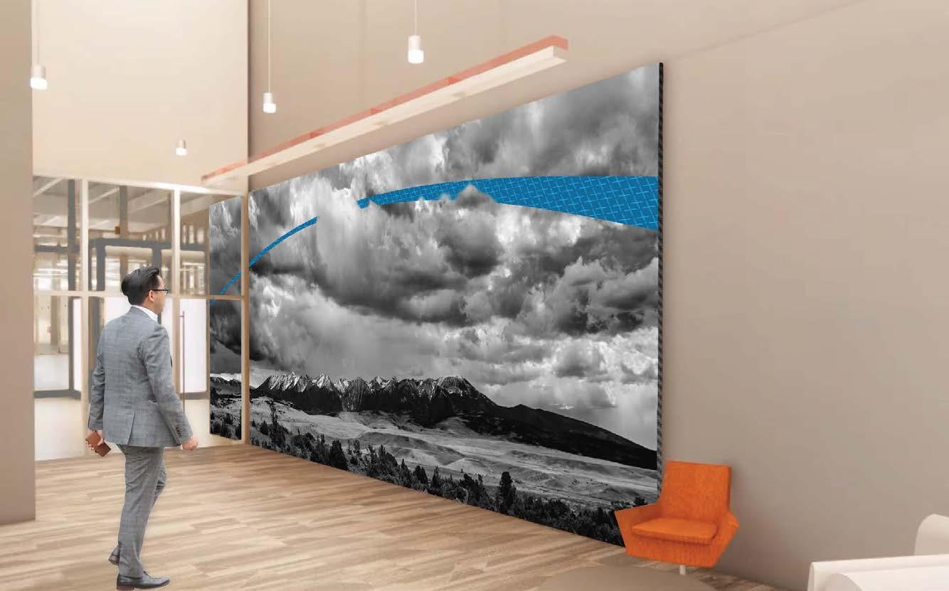
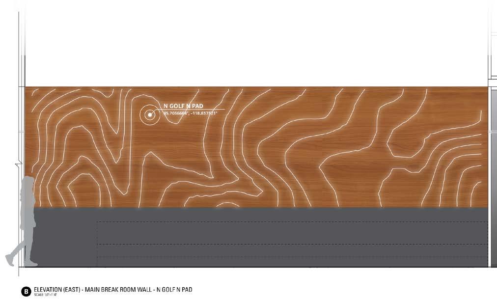
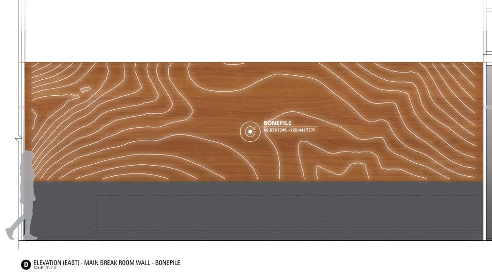
HOK worked with a confidential technology company to design this development and testing facility outside of Seattle, Washington. The interior graphics and wayfinding speak to the work being done at the facility while maintaining confidentiality in spaces that might be seen by the public. Graphics incorporate sky and landscape photography from a local photographer, alluding to the work being done. A testing space is surrounded by glass film incorporating a pattern of QR codes used by the developers, maintaining privacy, and another glass film design separates public from private space.



Kansas City, MS
Signage,
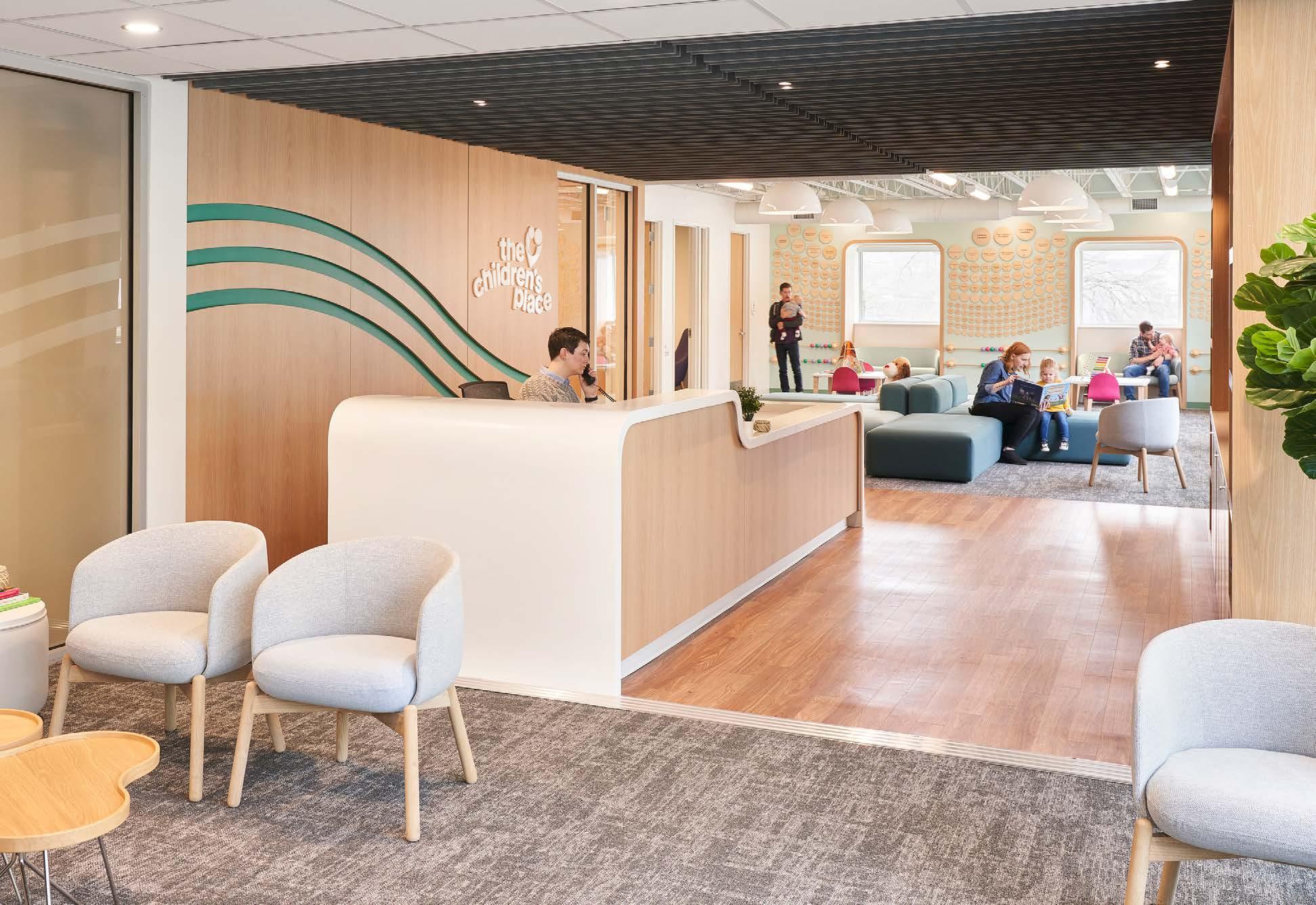
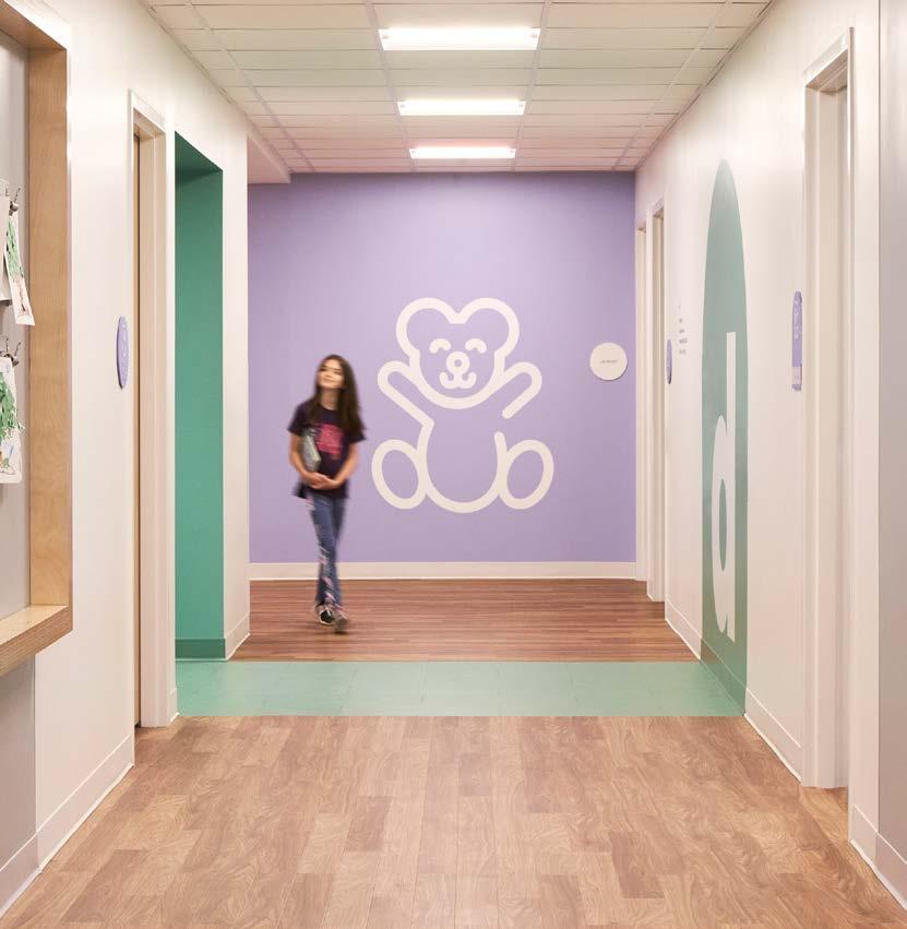
Using the highest levels of evidence-based treatment and four decades of experience, The Children’s Place needed a space that could fulfill a range of services from early childhood education classrooms and clinical counseling to motor rooms and an outdoor playground.
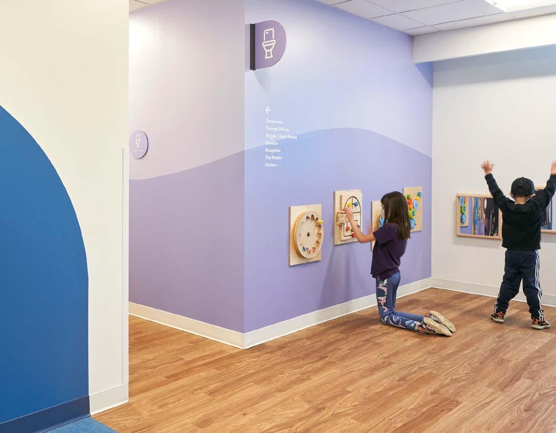
The use of bright brand colors and cheerful graphics were a cost-effective method of creating a fun and meaningful environment for young children. Color coded wayfinding and recognizable icons line the long corridors to create visual interest and aid in spatial orientation within the large, two-level building. The team considered each type of visitor (day treatment, specialized clinic patients, families, staff and volunteers) and how each would move through the building in order to create meaningful touchpoints along their journey from parking lot to destination.
LOCATION
COMPLETION DATE
2022
SERVICES
Brand & Identity Design, Brand Applications, Experiential Graphics, Wayfinding Signage
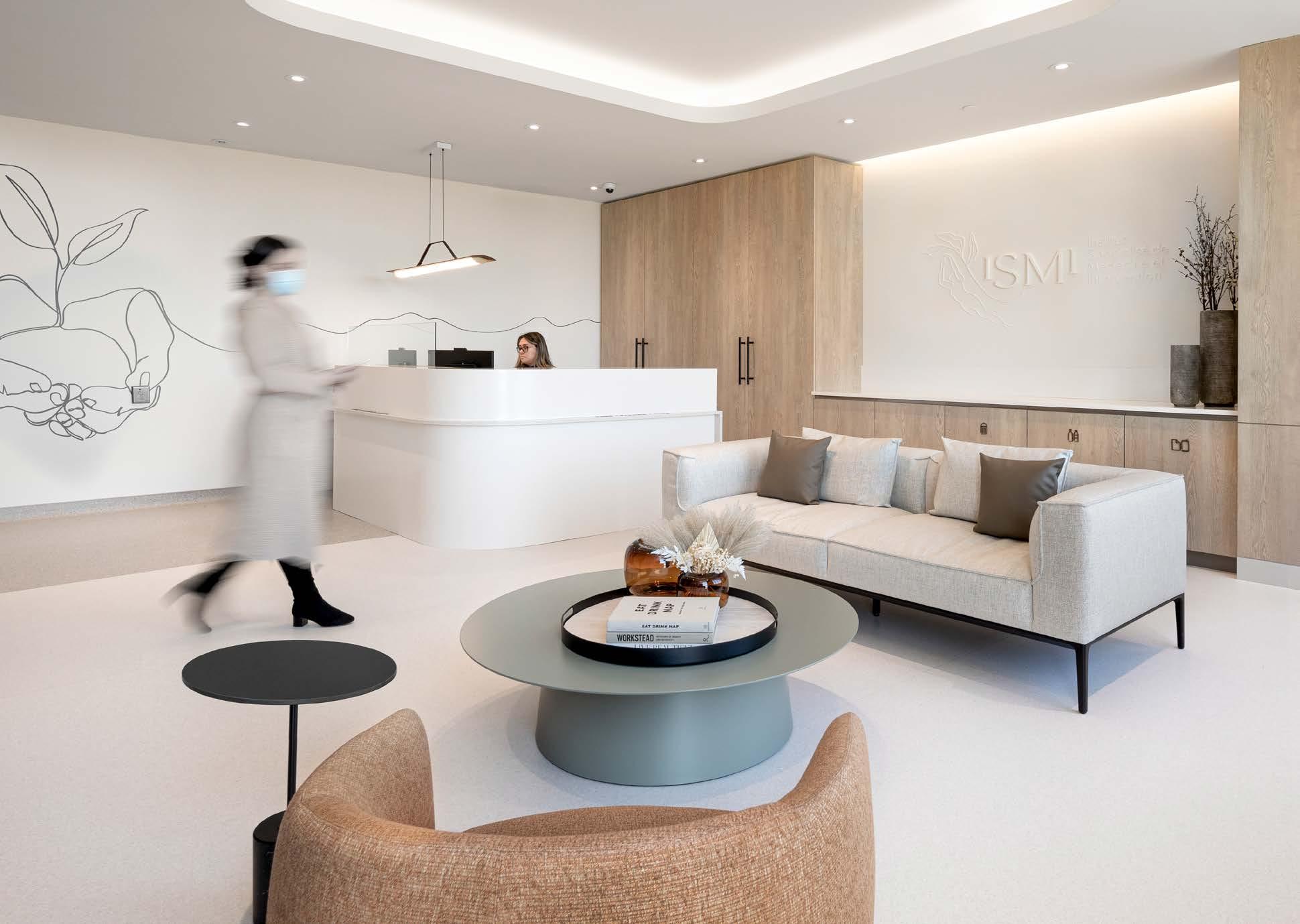
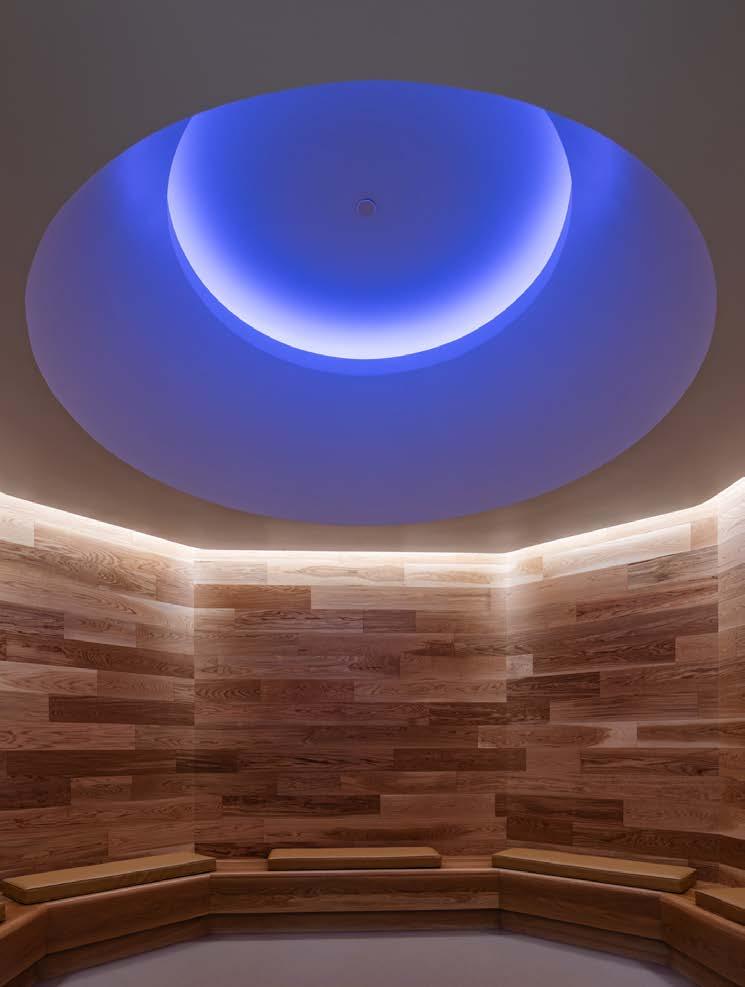
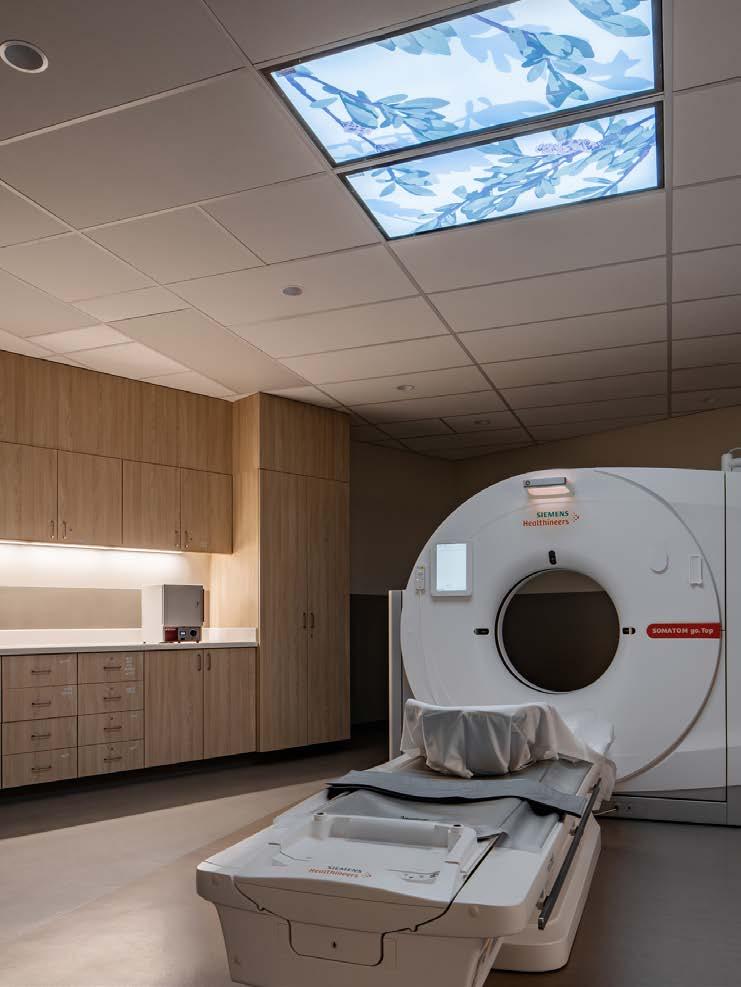
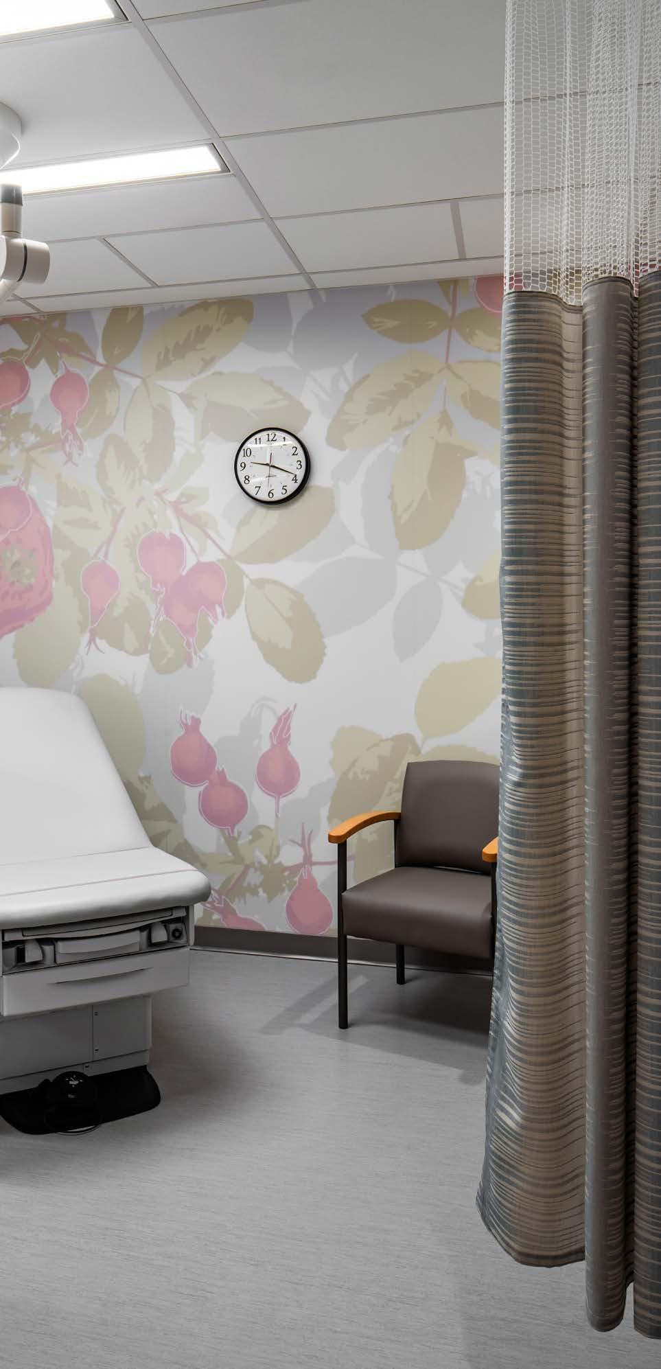
Institute for Specialized Medicine and Intervention is a radiology clinic with a focus on breast health for those who are underserved in the medical community – women, trans and pediatric patients. Due to the invasive and emotional nature of certain procedures the clinic was designed to provide a calming, spa-like environment. The approach to holistic healing provides an experience that sets ISMI apart from other clinics.
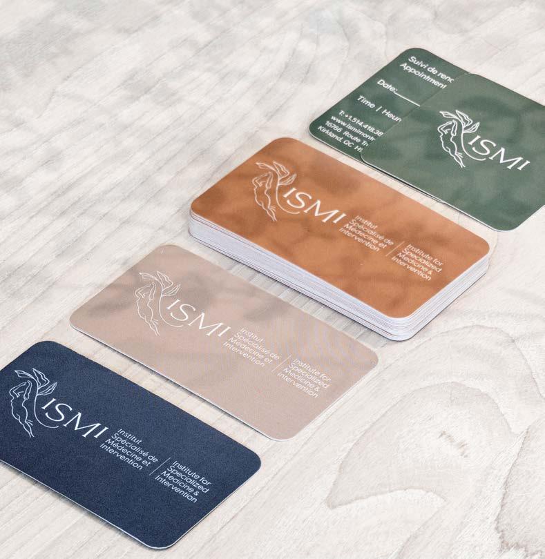
The logo features organic quality with thick and thin linework to create a natural, hand-drawn feel. The silhouette visualizes a confident, positive, but ambiguous body position, while the stem of sage leaves overhead serves as a symbol of healing and hope. This linework is extended through the brand elements as a library of gestures that speak to the intimate nature of treatment offered at ISMI.

LOCATION
COMPLETION DATE
SERVICES
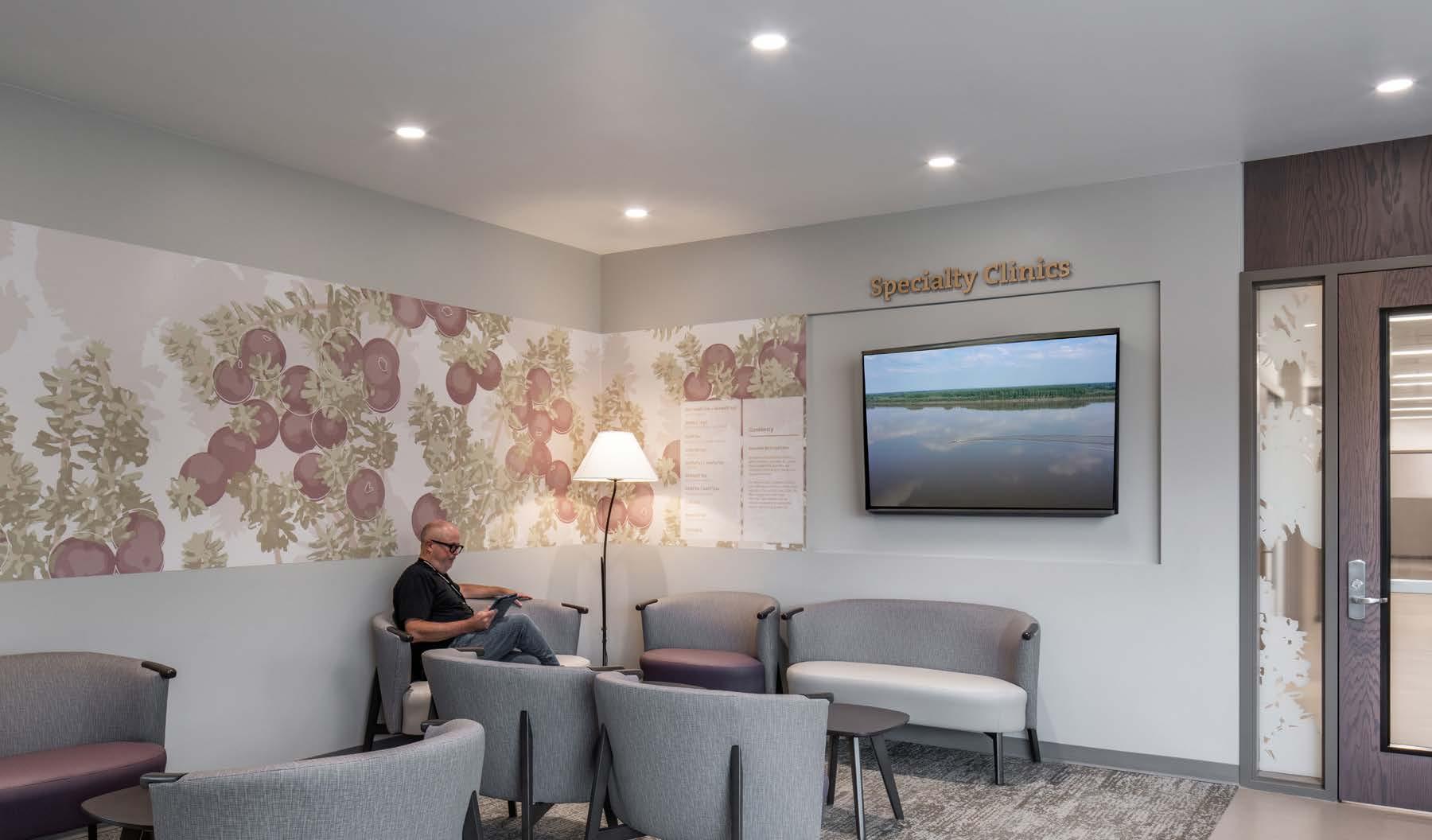
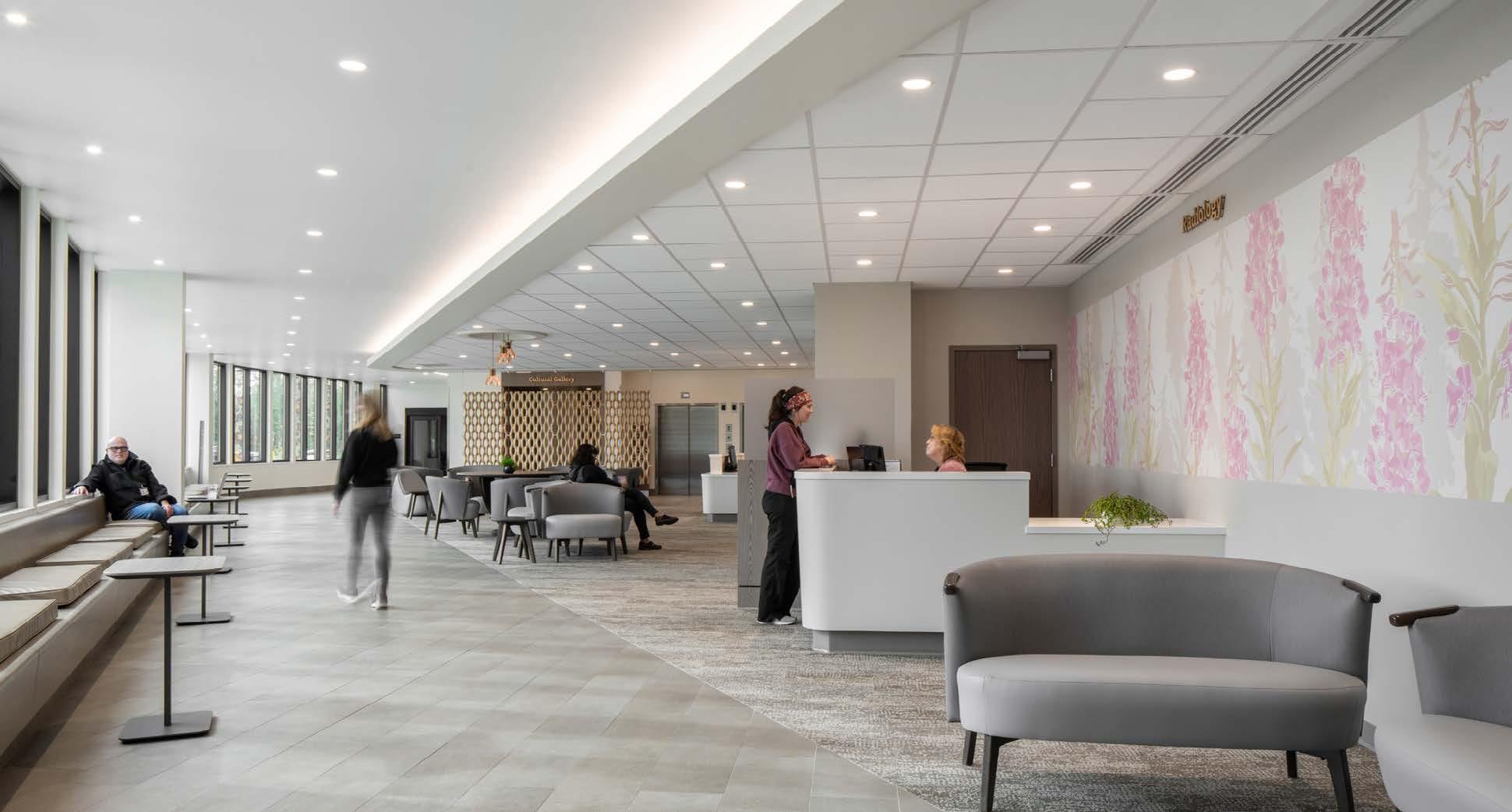
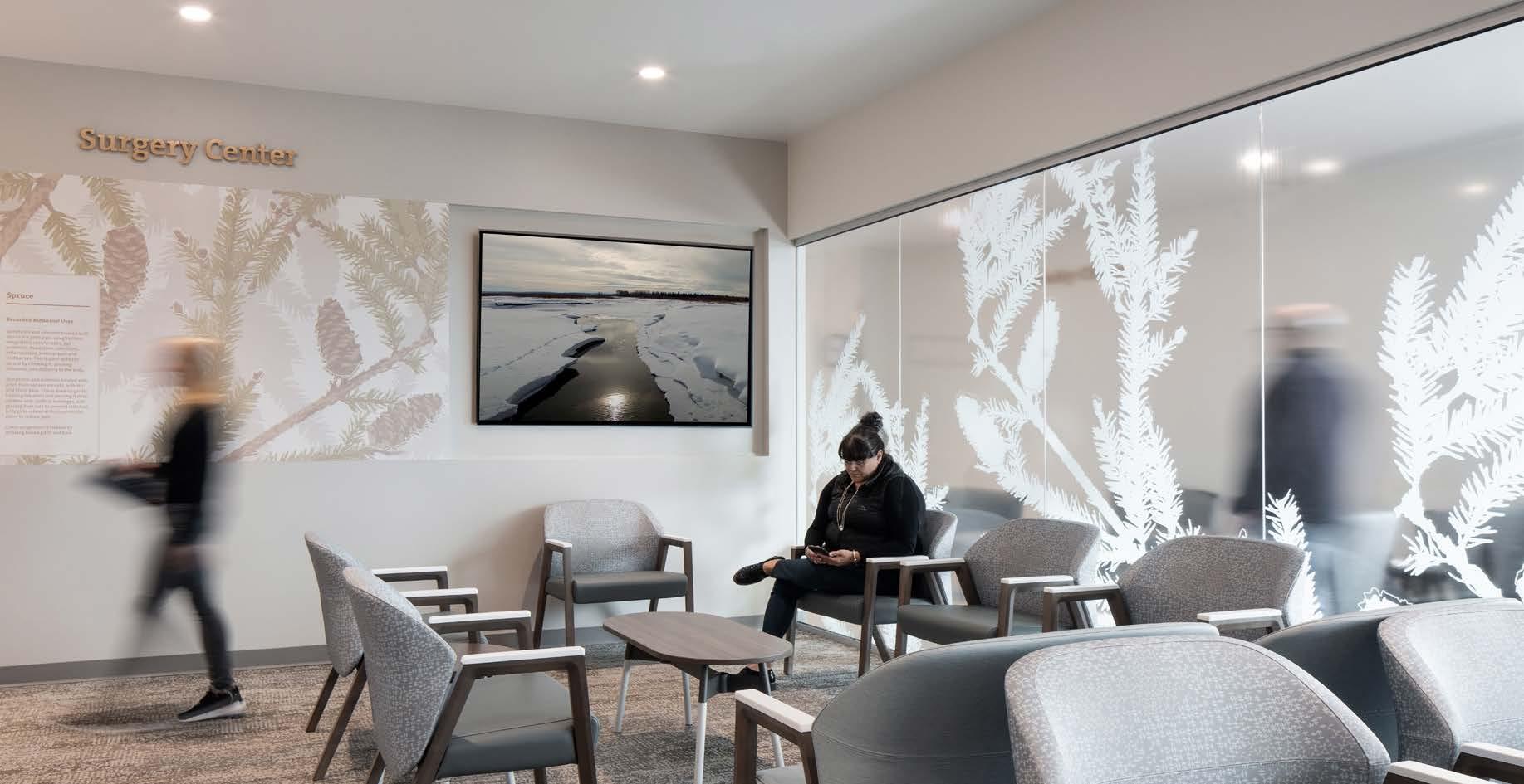
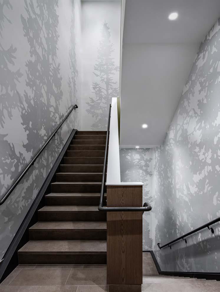
The Tanana Chiefs Conference (TCC), a group of tribal Chiefs in the Interior Alaska regions, sought to bring additional cultural engagement with unique graphics displayed throughout an expansion building that would offer oncology and urgent care.
Working along side the TCC Cultural Committee, we developed a design concept that would highlight their community’s traditions of healing with medicinal plants. EXD worked with the interiors team and referenced botanical research provided by the TCC to create a series of beautiful hand-crafted graphics with a different medicinal plant representing each department.
Using the current sign standards to maintain a cohesive wayfinding solution between both buildings, department plant icons and a new “blueberry blue” accent color were added on all interior signage in the expansion building.
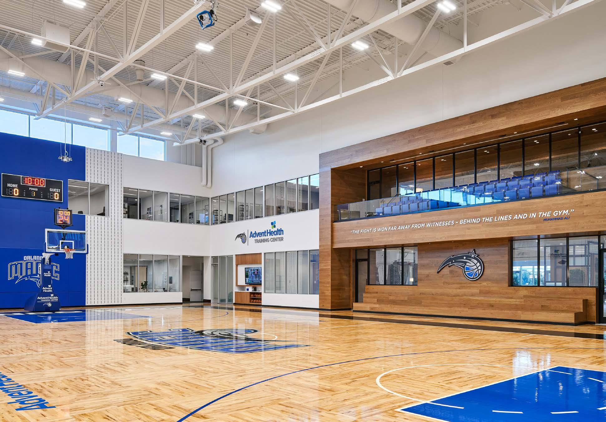
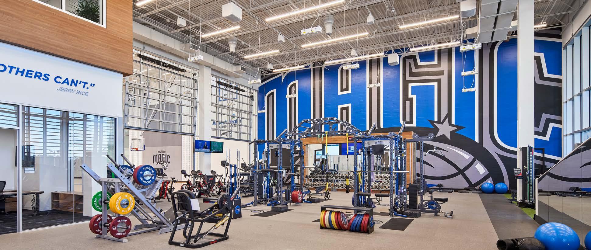
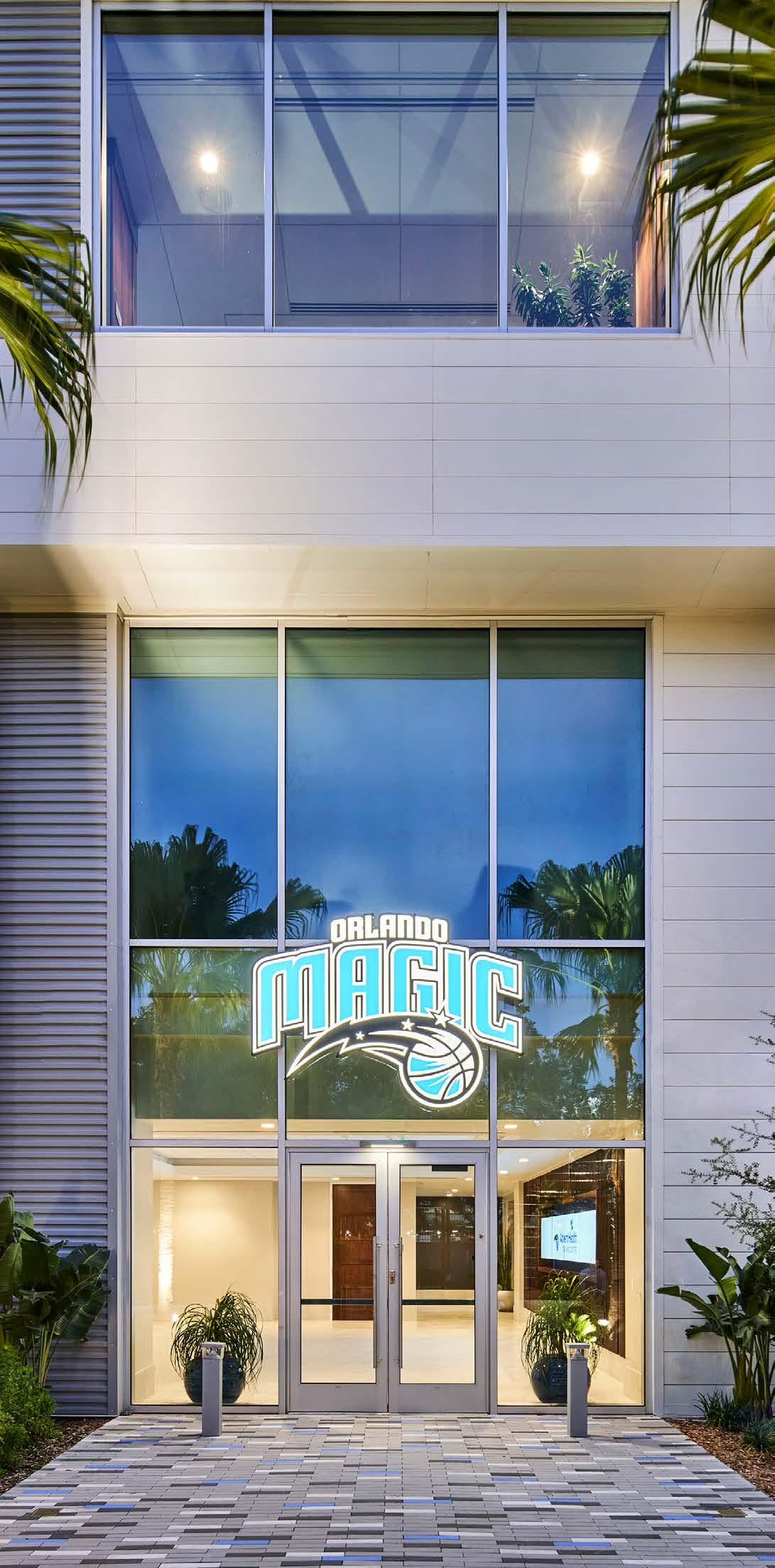
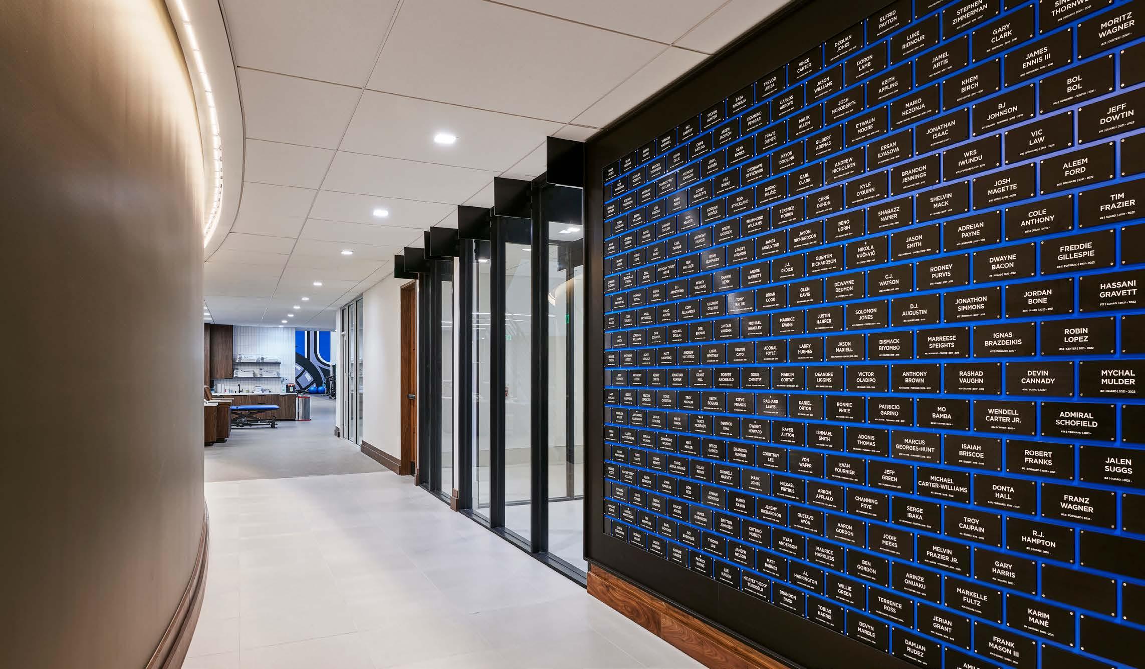
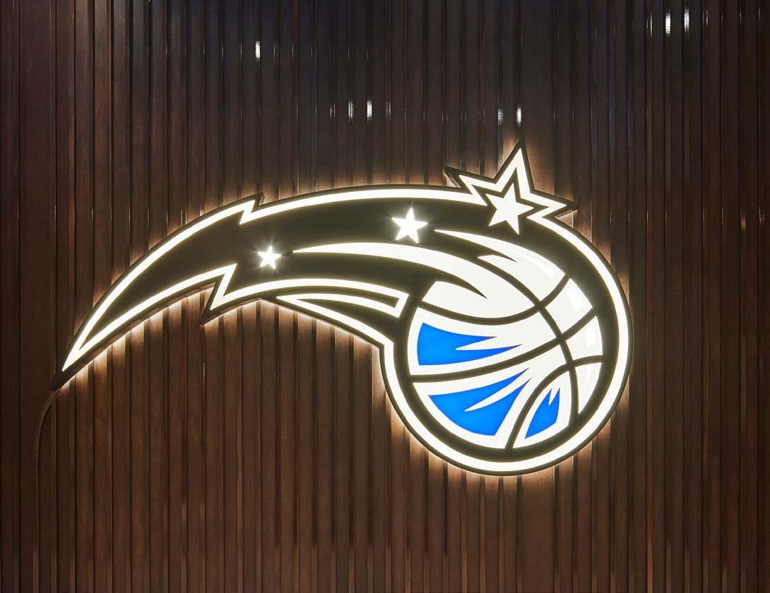
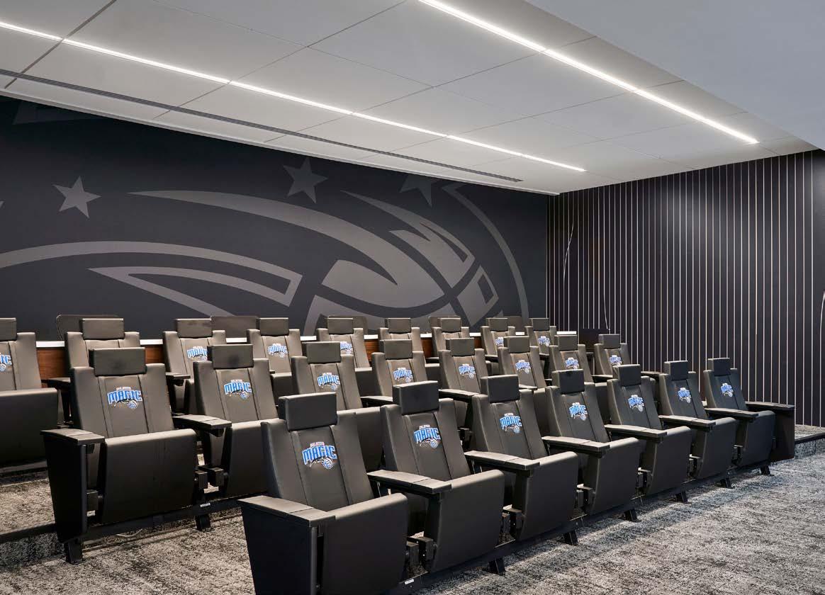
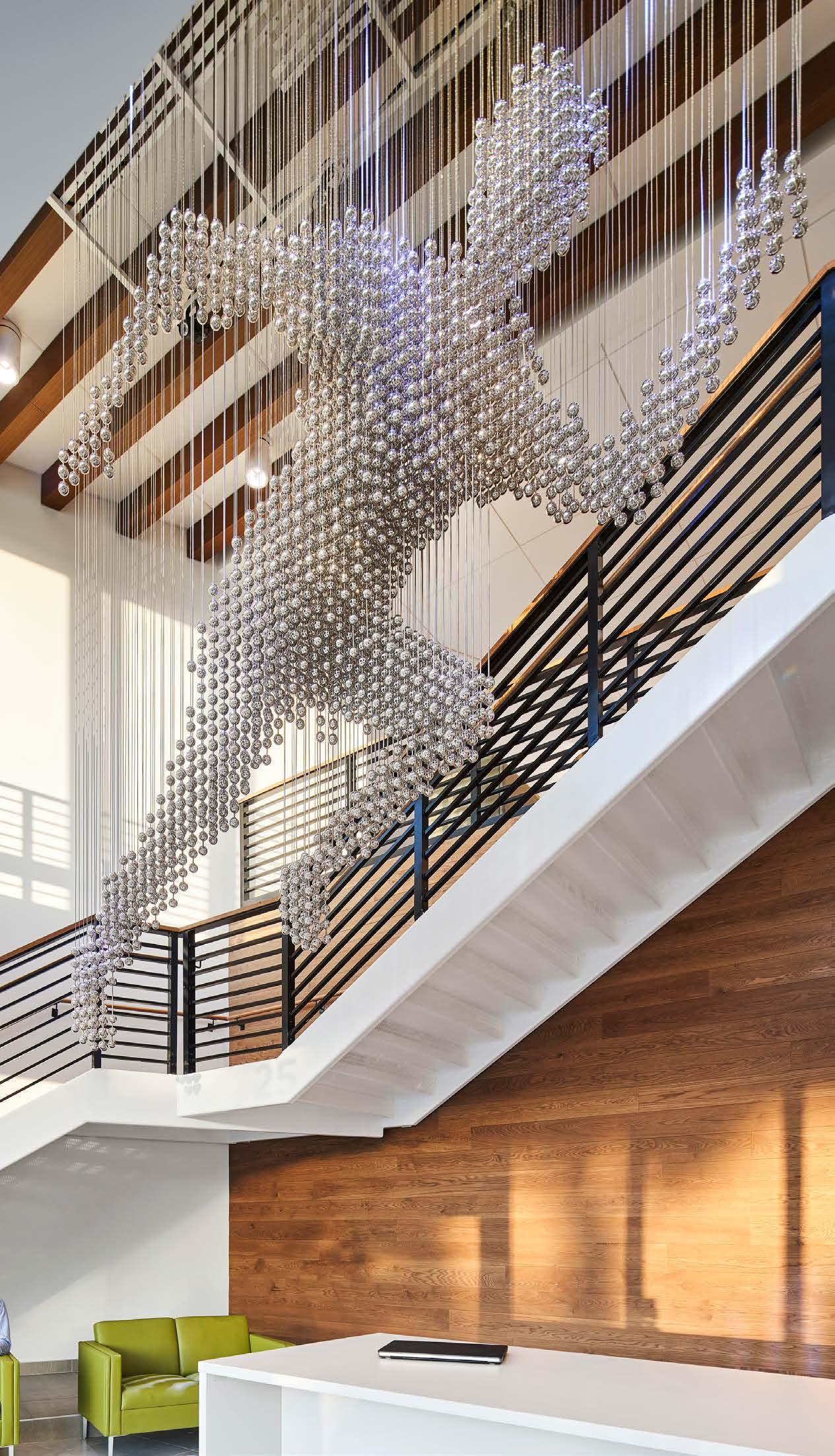
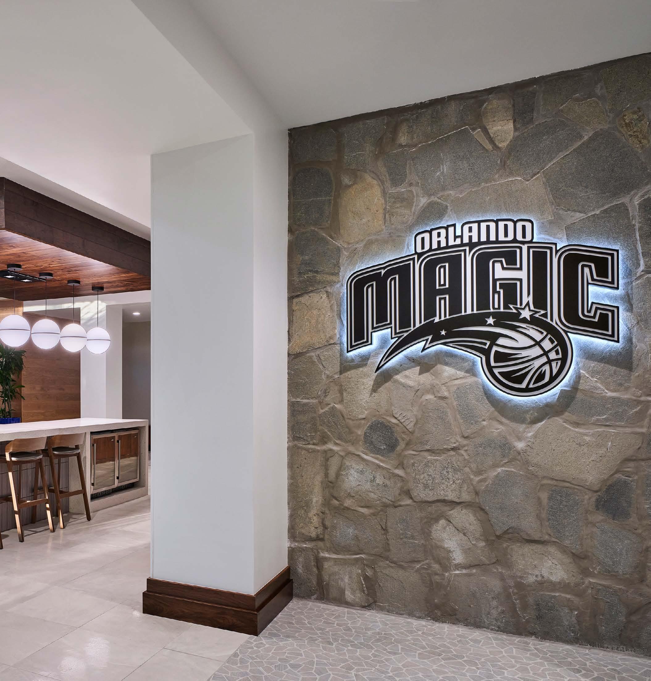
This practice facility for the NBA’s Orlando Magic combines world-class athletic training and treatment with workplace spaces. In addition, the center was intended to be a special place for family to gather, making both comfort and inspiration paramount. EXD’s charge was to express the Magic brand and franchise in an original and upscale manner while staying true to the character of the new building. Typical approaches to sports facilities were set aside for more unique opportunities to speak to the brand, the history and the culture of the Orlando Magic. Whenever possible, flat graphics were exchanged for dimensional elements and small moments of interaction were combined with larger than life expressions. Team history was communicated in a way that was harmonious with the established look and feel.
LOCATION
Lake Forest, IL
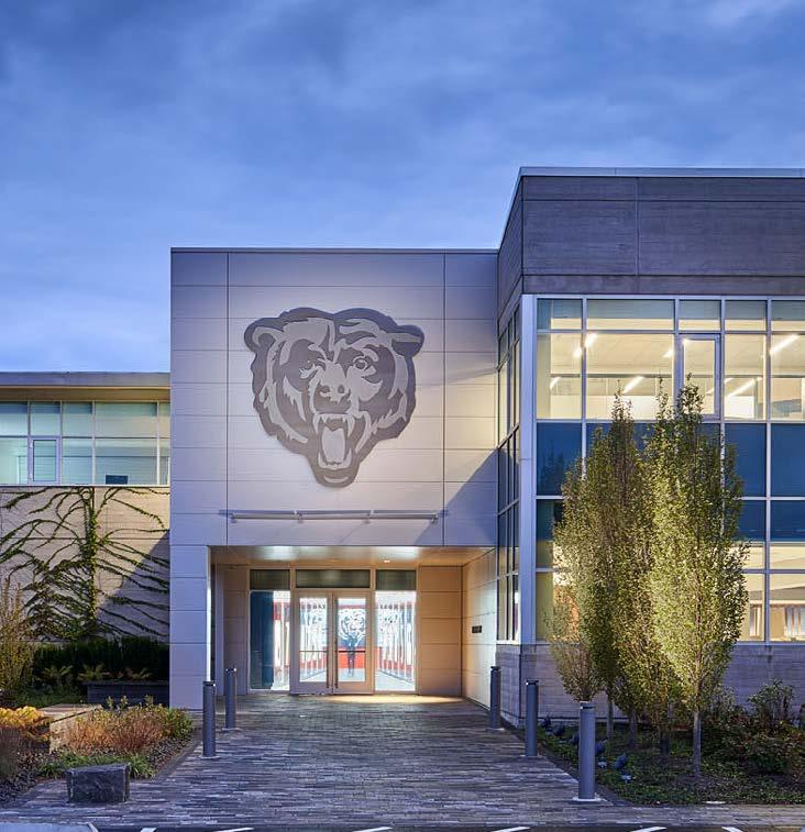
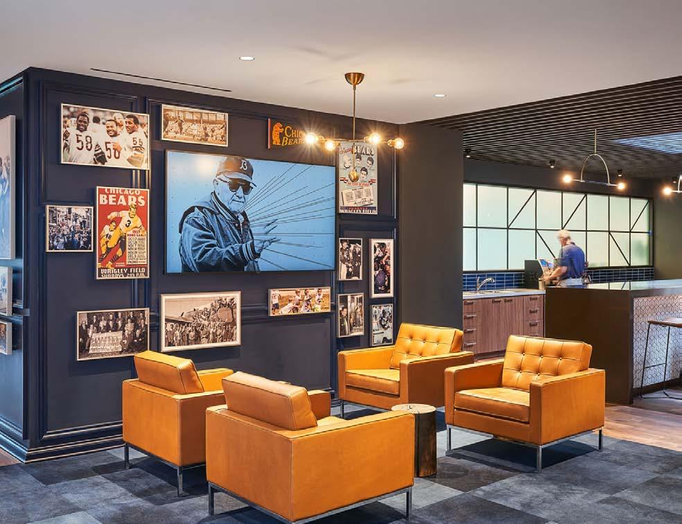
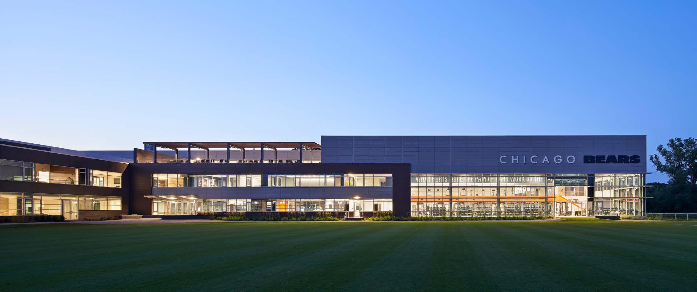
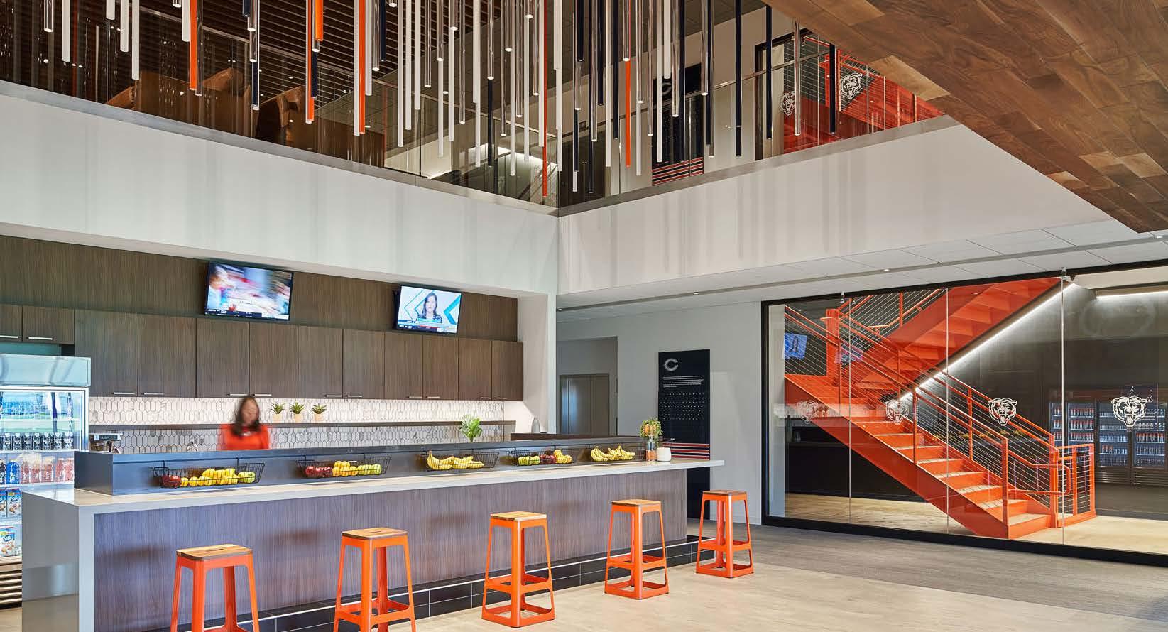
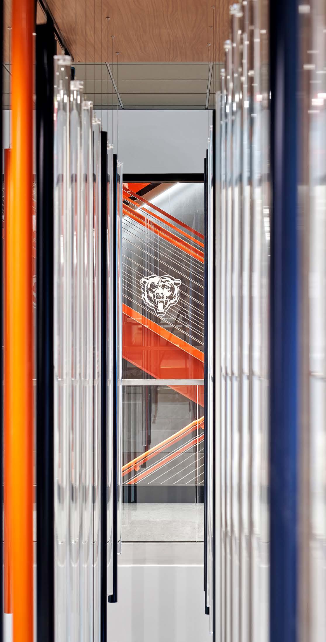
Halas Hall, which serves as the Chicago Bears’ headquarters and training facility, is all about winning games. From the way the team trains, recovers and educates players, each step of the journey connects them to the Bears legacy and the goal of every season: the Superbowl trophy.
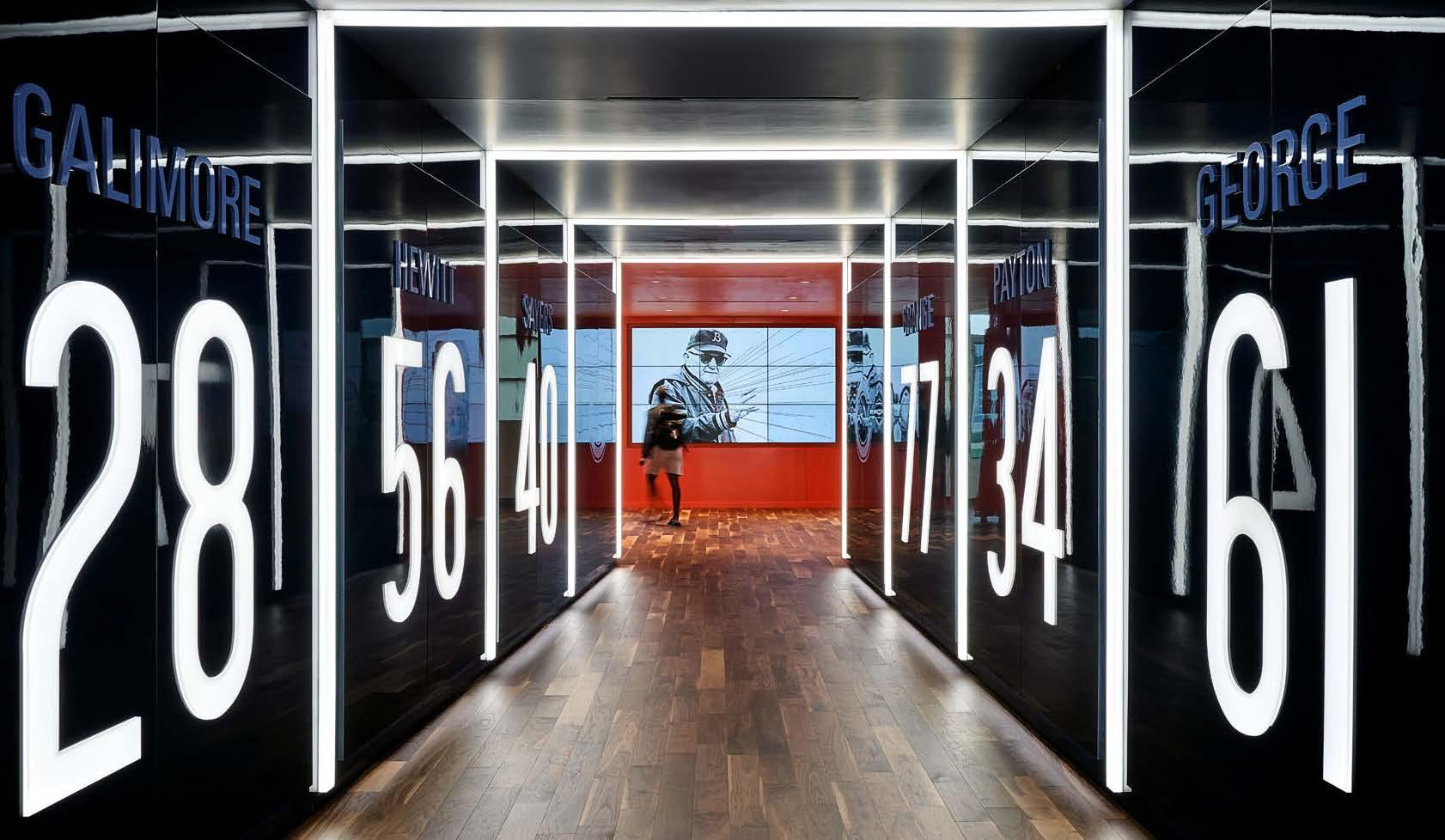
At the players’ entrance, retired numbers are incorporated with motion sensors, light, sound and video to invigorate players as they enter. A large-scale installation commemorates 100 years of Bears football with suspended acrylic rods that represent different seasons—regular, post or Superbowl. And we worked closely with the team’s archivists to carefully display and reinterpret historic memorabilia.
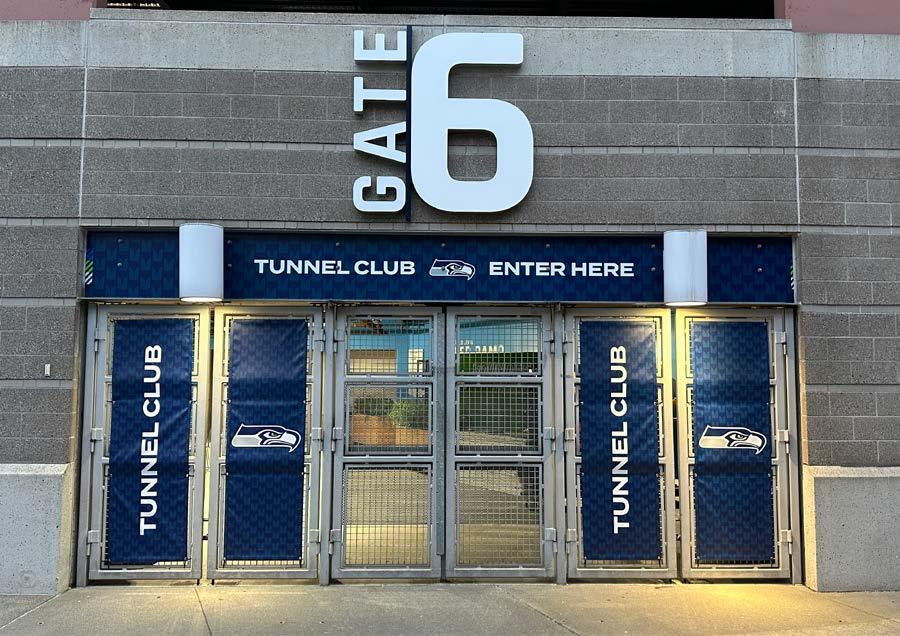
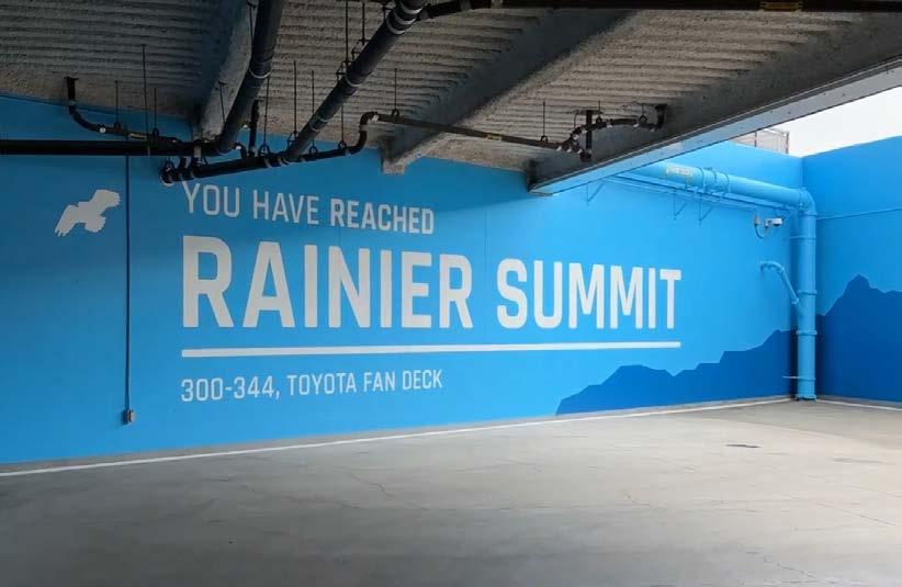
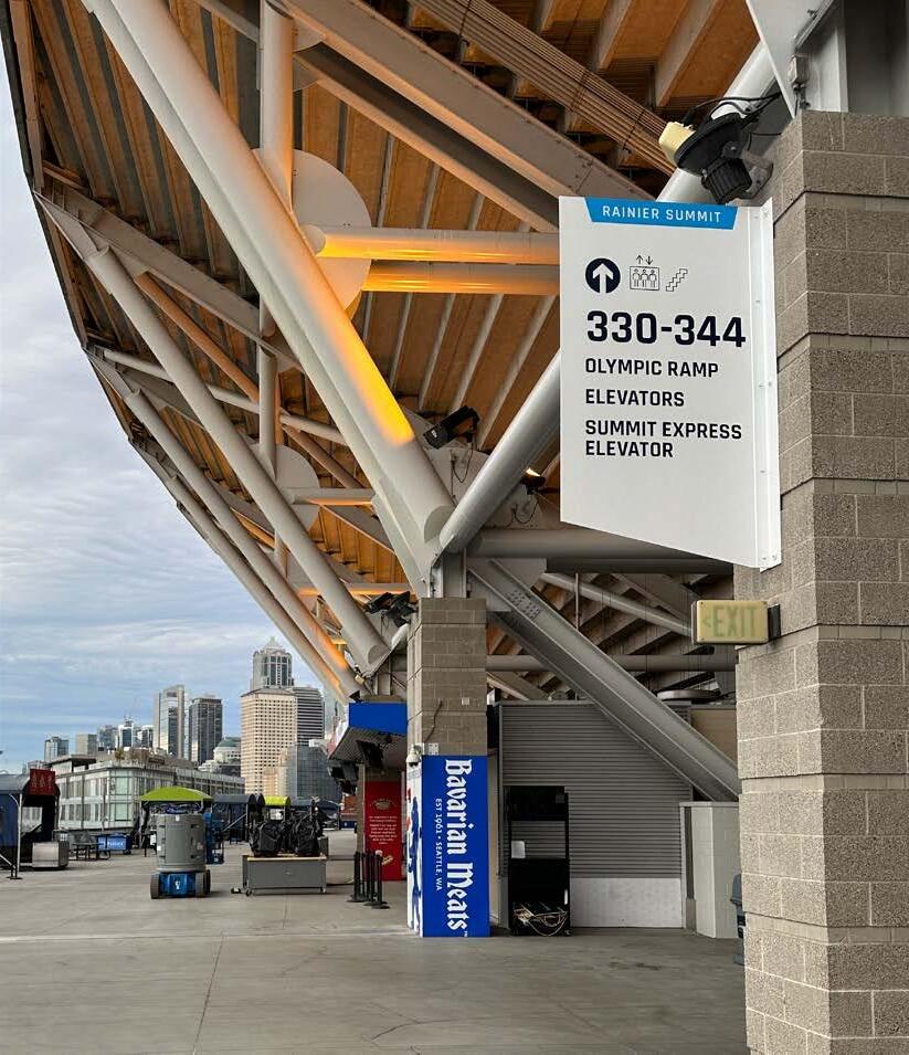
HOK was engaged for fan improvements at Lumen Field, home of several Seattle pro-sports teams as well as an event venue and conference space. The stadium was first built in 2002 and in need of significant improvements to the overall flow, aesthetic and accessiblity of wayfinding. To understand pain points, the team engaged in extensive workshops with key stakeholders at the outset of the project, as well as 3-D mapping the entire stadium to visualize how fans and event goers currently moved through the space.
The design team worked extensively with stakeholders to devise a more intuitve wayfinding system. Taking cues from Seattle’s geography, the stadium is now comprised of the Cityside, Rainier, Cascade, and Olympic neighborhoods, with each neighborhood differentiated by its own pallette and aesthetic. Designers also created a flexible pallete of colors to celebrate the various teams that play at Lumen, and created a new set of signage standards for improved accessibility and a more contemporary aesthetic.
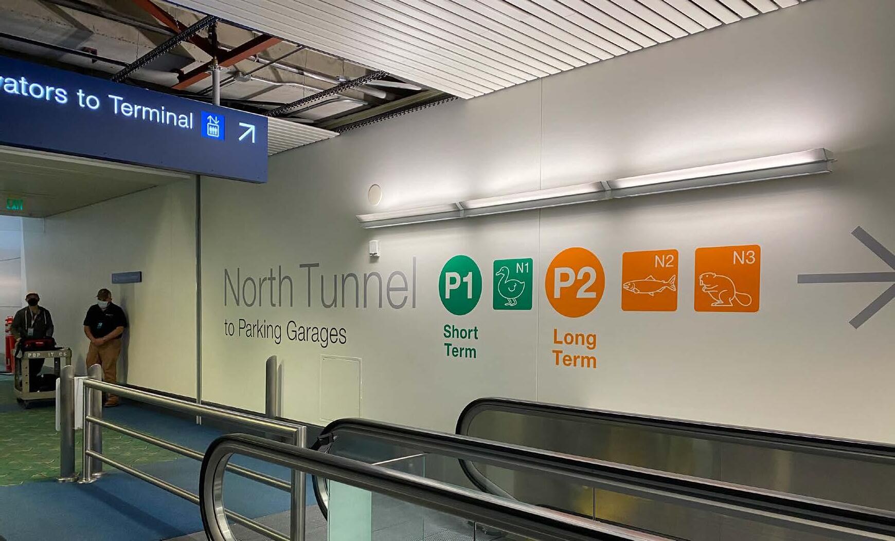
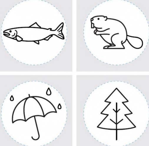
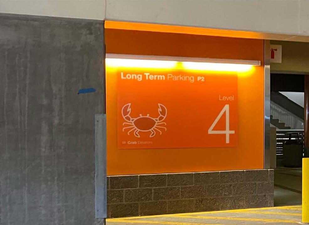
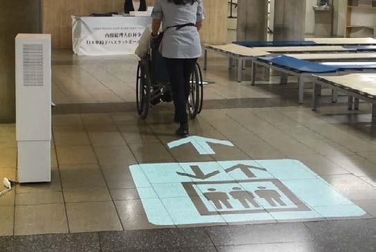
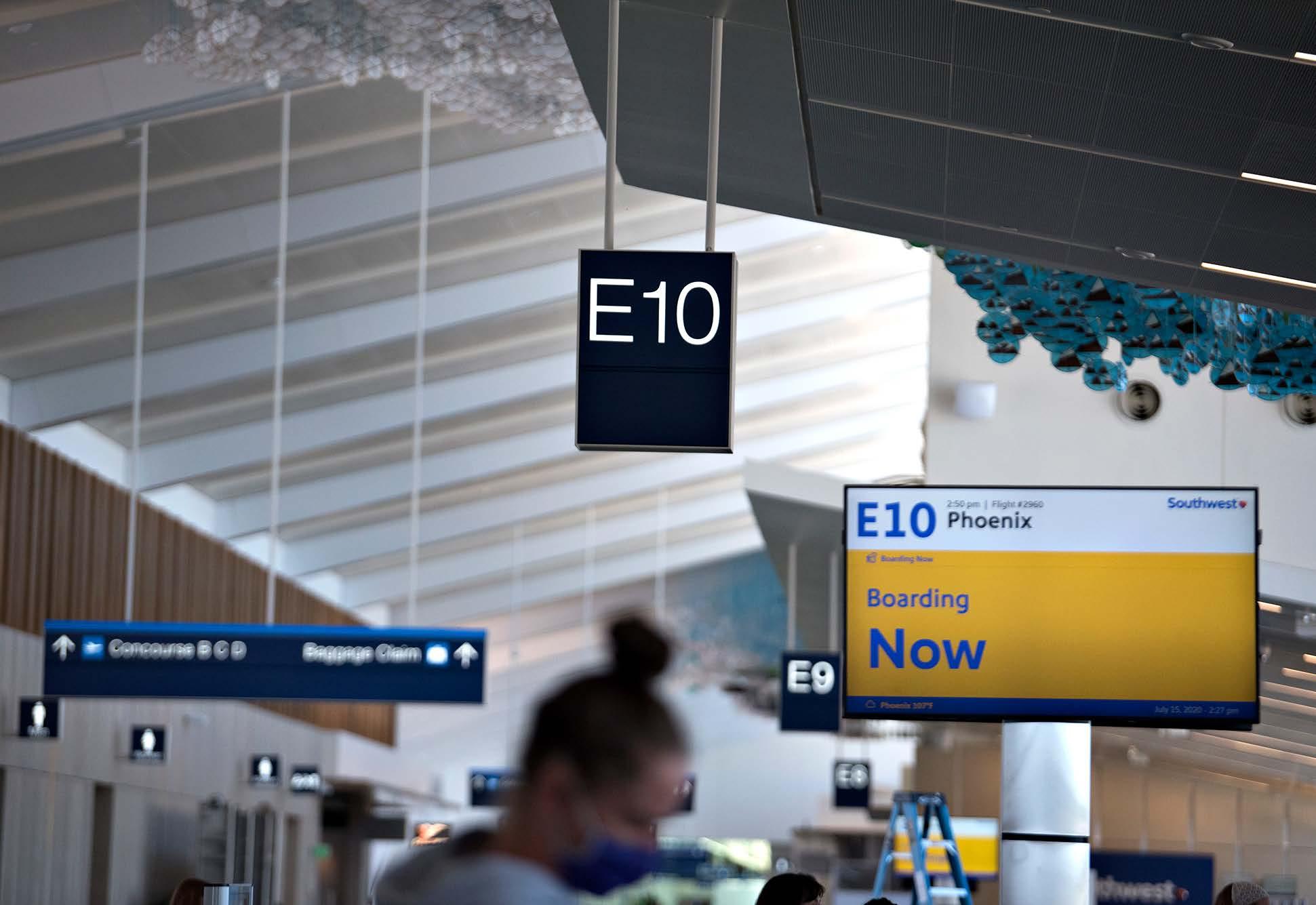
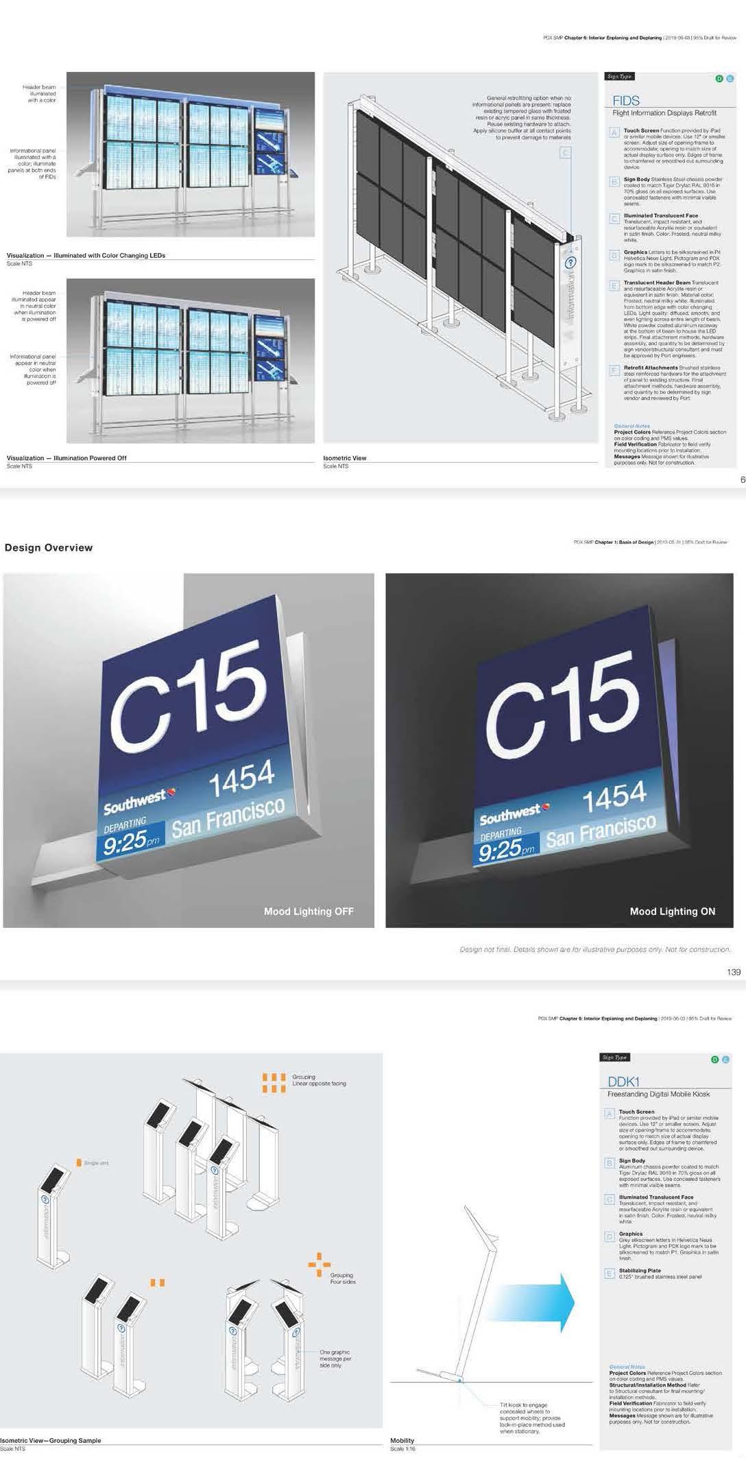
As the design of several large capital airport projects is underway, PDX’s Signage Design Standards outlines a long-term wayfinding strategy for removing, relocating, and adding new and temporary signage. The standards consider interactivity, flexibility, modularity, and the latest and projected future technology. They also address the needs of an aging population and offer inclusive accessibility requirements. The standards provide the right mix of technologies that impacts the passenger experience and the lasting impression of the City of Portland and its region.
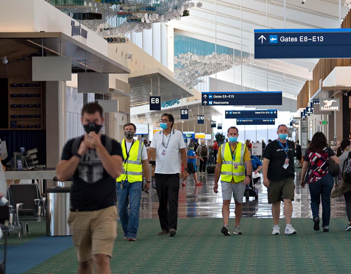

A key component to Portland International Airport (PDX) award-winning success is the newfound ease in which passengers can navigate the facilities. Throughout the years, as PDX has expanded, terminal signage has had many slight modifications resulting in inconsistent signage throughout the facility.
As the design of several large airport capital projects is underway, PDX’s Signage Master Plan sets standards for high quality wayfinding both during construction and for a unified system upon completion. The Master Plan encompasses all aspects of the airport’s interior and exterior signage system. Terminal balancing and renovation, as well as a new concourse, were key aspects of the project. The wayfinding and system standards are documented in 13 design chapters, which will be used as new projects come online.

We shared our story, now let’s share yours!

JEFF LANCASTER
Creative Director | Experience Design
t +1 424 298 4633 jeff.lancaster@hok.com

EMILY PAYNE
Director | Experience Design
t +1 816 472 3219 emily.payne@hok.com

STEVE WILLIAMS
Director of Operations | Experience Design
+1 713 407 7879
steve.williams@hok.com