
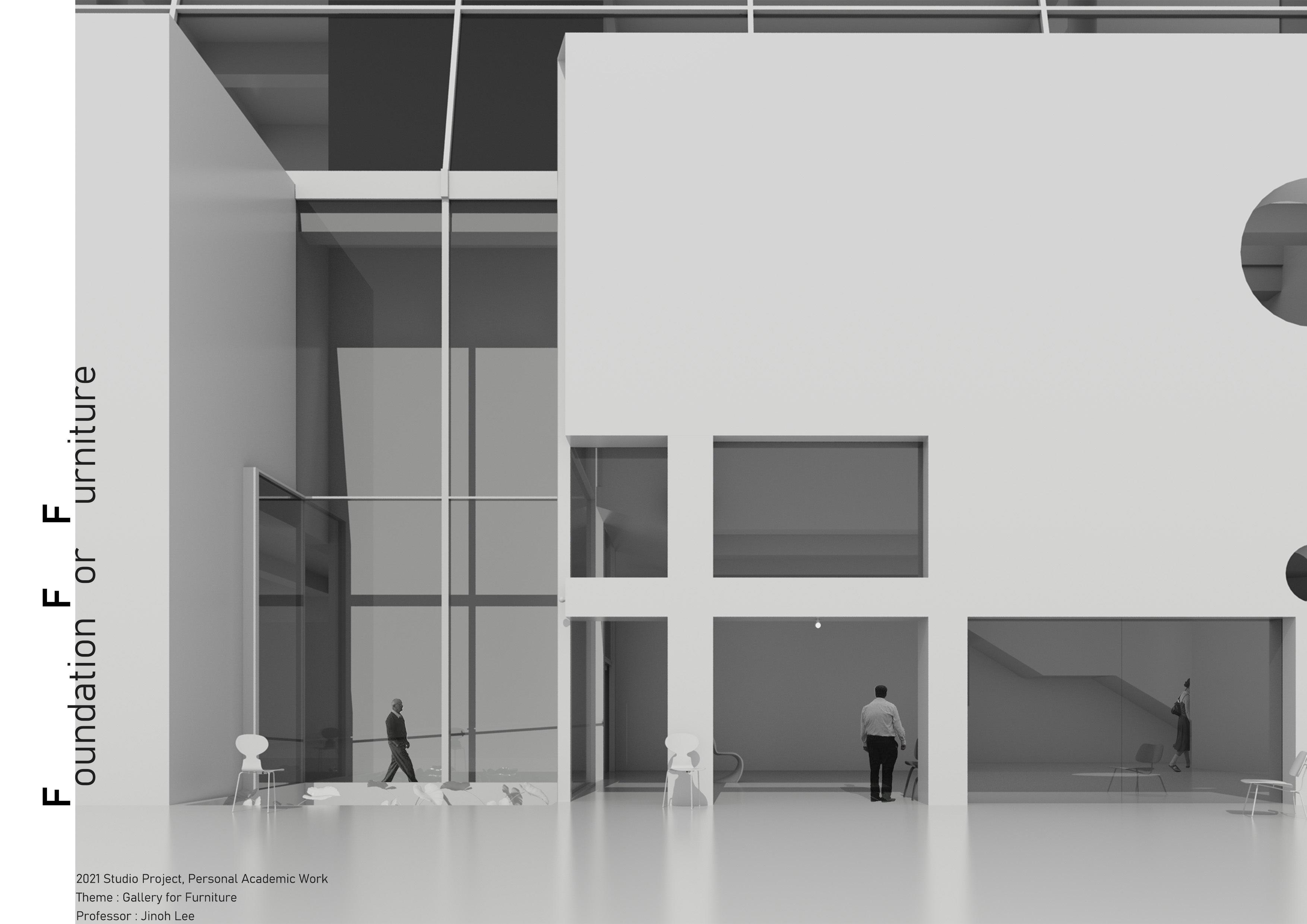
Imagining banal form just like a furniture
The site, Yeonhui-dong has a reputation for being a wealthy residential district. How do I bring domestic atmosphere to gallery building? It's physical presence should result from the primitive surrounding conditions rather than a flamboyant form. As the sketch above shows, banality of the section derived from inclined site and northern light condition has a potential to blend well into a larger context of Yeonhui-dong. Circulation and structural system strengthens the overall banal expression, making the architecture somewhat immune to program types. Which I think is critical for an era where gallery space acts almost as a 'social space'.
Then why gallery for 'Furniture'? Often, the space itself is not fully appreciated due to concentration on artworks. Furniture are scaled to human dimensions, therefore has an ability to amplify the physical quality and atmosphere of space and vice versa. Reference above shows that with or without human-scale, we can roughly read the space.
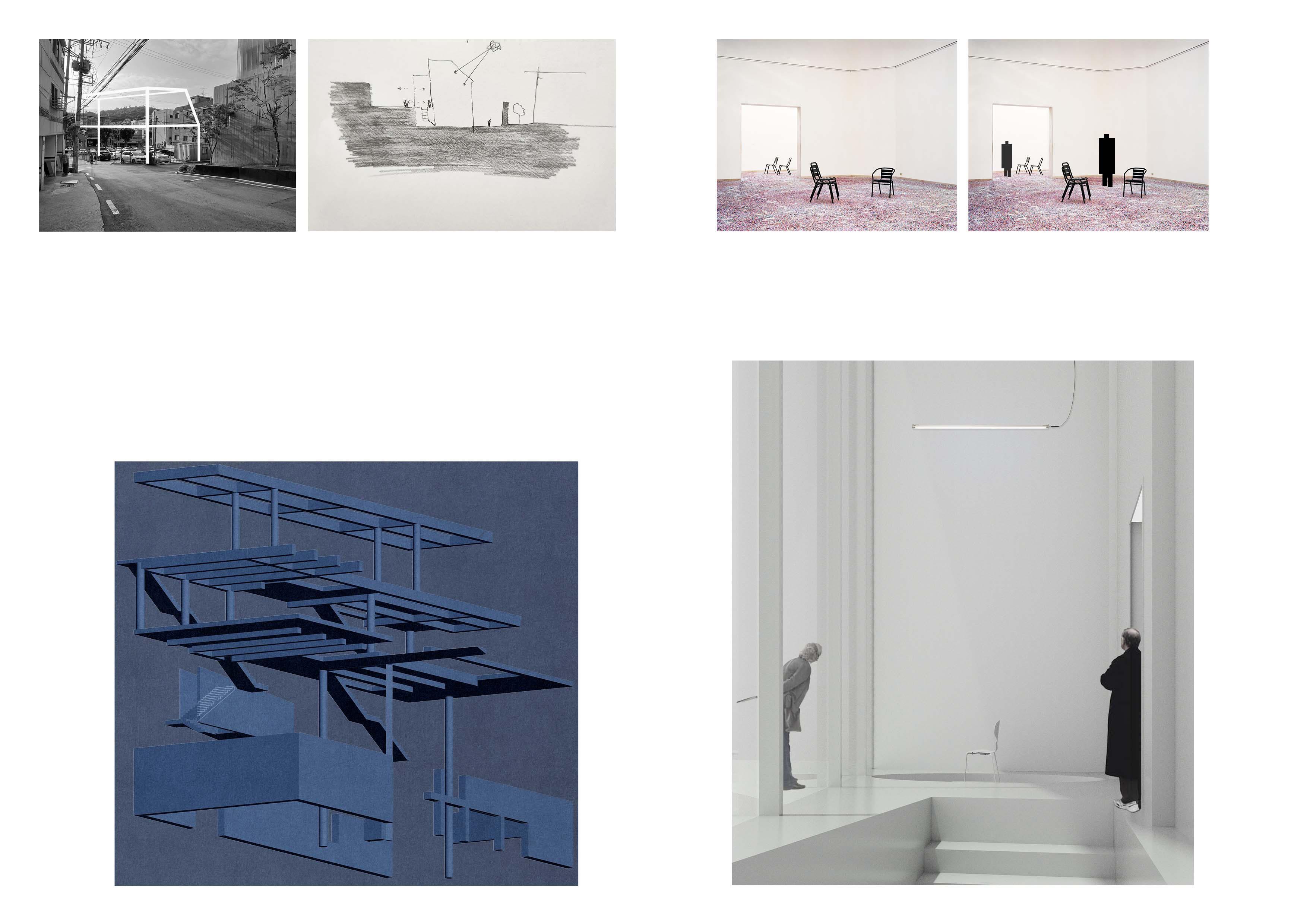
Since the site was inclined, I decided to bury the mass underground. So on the slope, you will feel like volume rising above ground. The stairs from G.L lead you up to +4200 Lv where the experience starts. The sectional circulation is seperated yet part of the gallery since it penetrates spaces gradually. Thus, walking around the circulation path not only provides movement from one floor to another, but its part of the sequential experience itself.
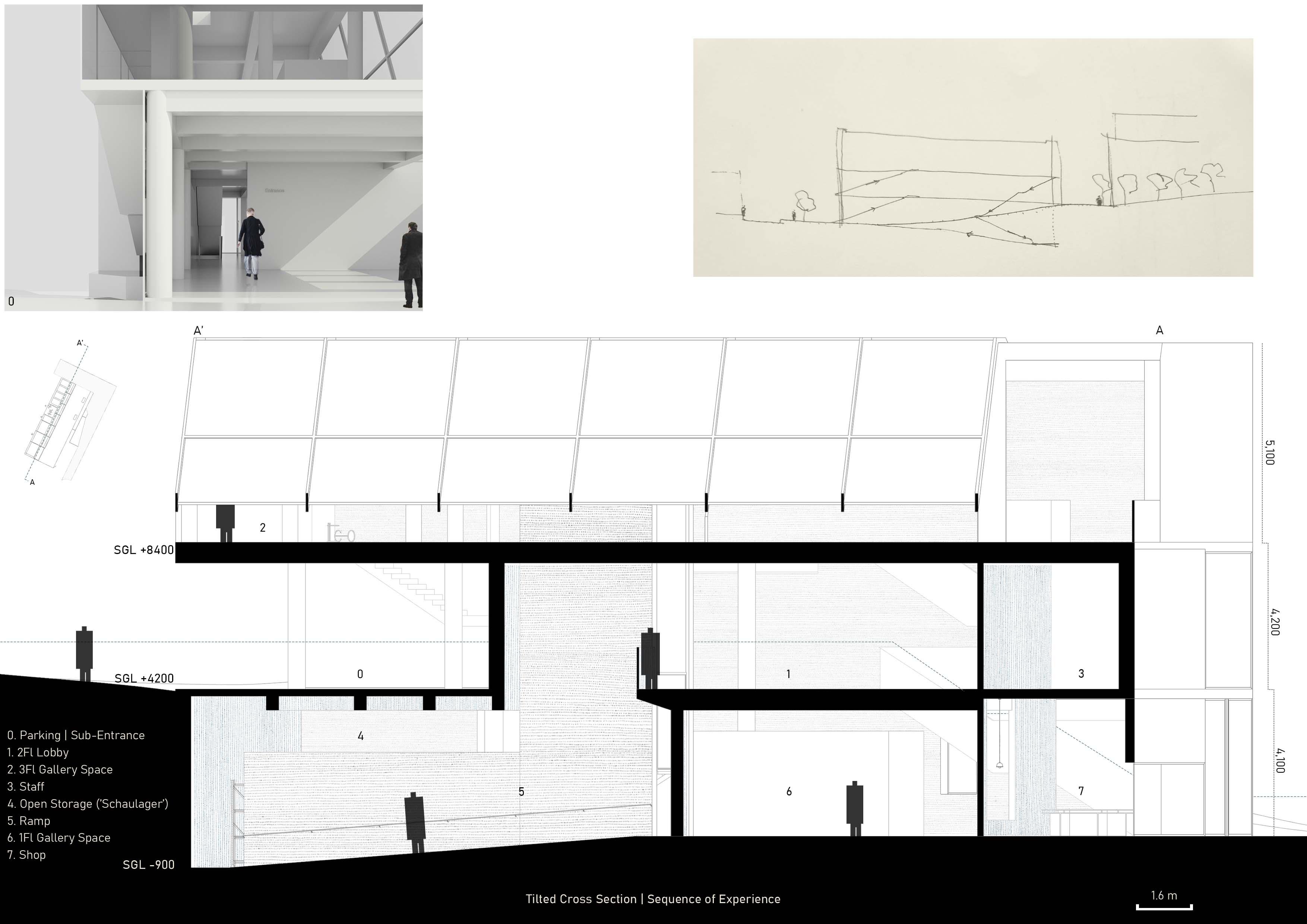 Sectional Circulation(E-W) adapts to the surrounding slope (View toward Sub-Entrance located +4200 above G.L)
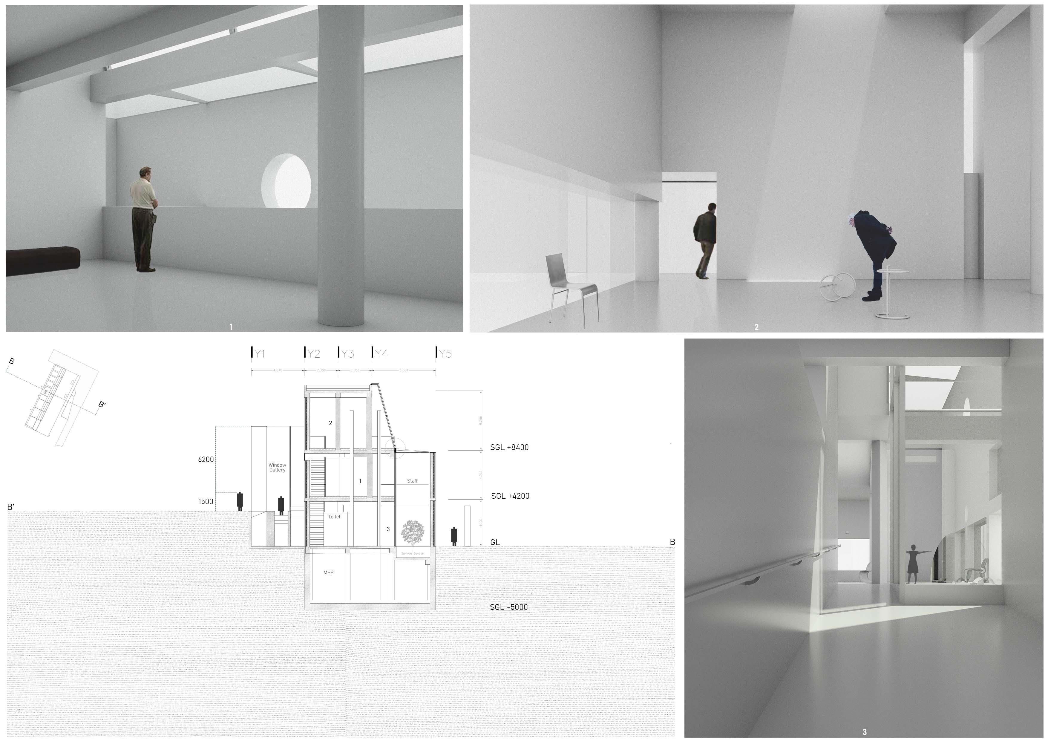
As you walk through the gallery, you'll find yourself naturally fitting in the spatial setting. Furniture, Space and People are 3 fundamental elements that build up the physical environments of our daily lives. So the gallery is a space for exhibition but more importantly a background for visitors to interact with space and furniture. Also these interaction create a scene where 3 elements come together and becomes an art-form itself.
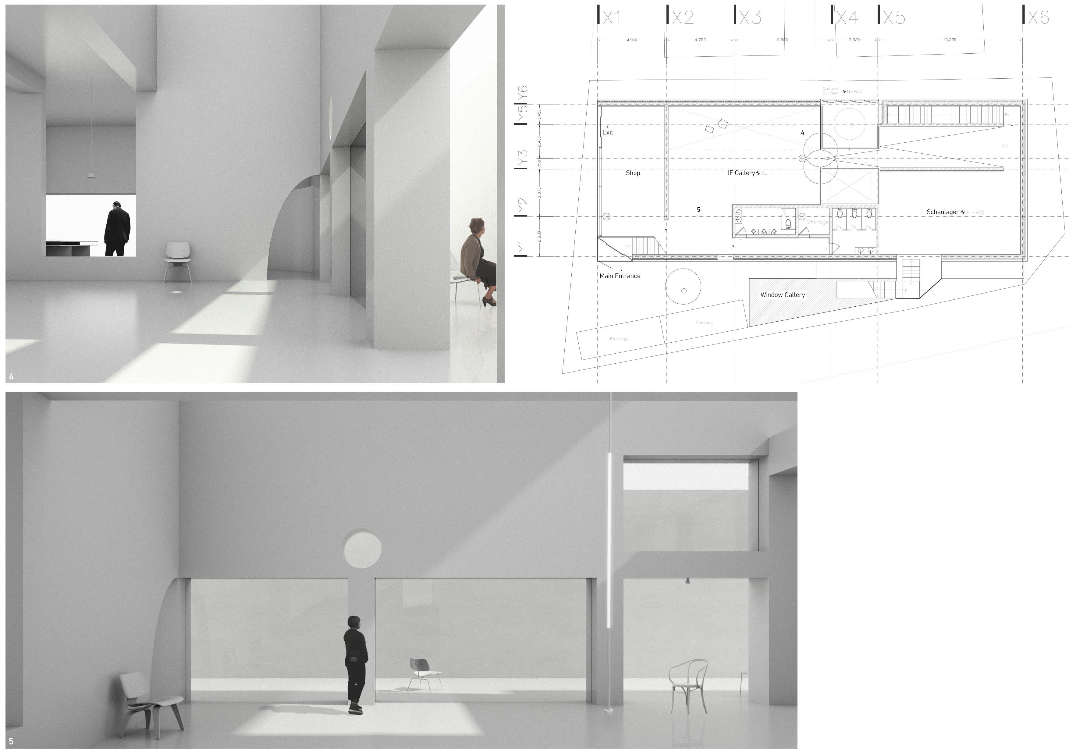
 Exterior view from upper side of the slope | Window Gallery generates a sequence of transparency that opens up toward the urban context.
2022 Studio Project, Personal Academic Work
Theme : Re-interpreting conventional office space
Professor : Sanghoon Youm
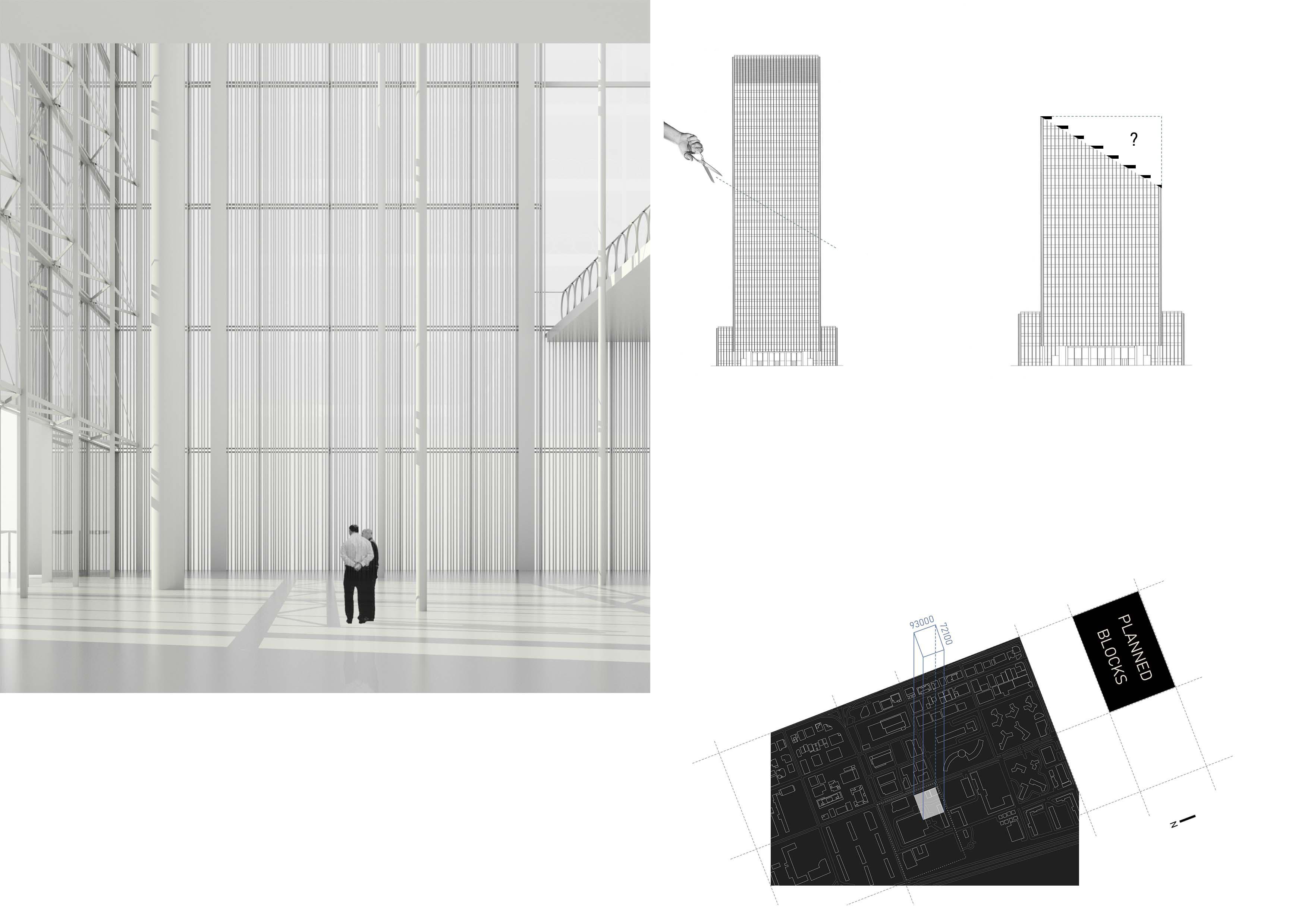
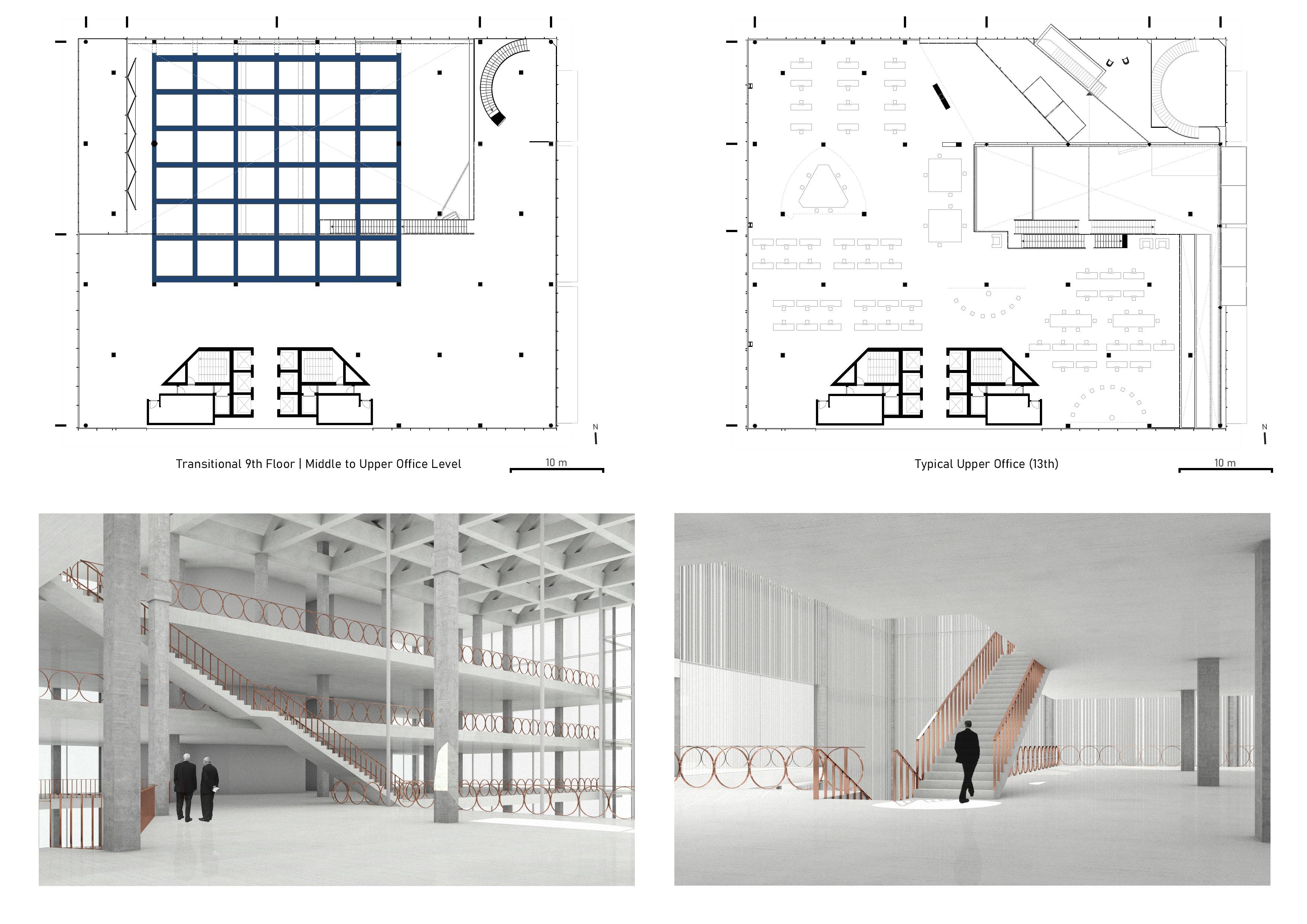
Work space occupy large portion of our daily life, yet has a highly stereotypical building typology. Can we simply 'stack' slabs and call it an office? No. I thought only through a radical deformation in terms of form and attribution can we truly expect a meaningful transition from conventional to the new. Today Office space is becoming generally personalized. No more open space, just more personal working space with screens all over. But initially, Office is a public space where the 'generosity of space' should be shared. The site is located in Gangnam district(Seoul) where size of the block is pre-planned. My motive was to inject 'natural' architecture into highly artificial urban environment.
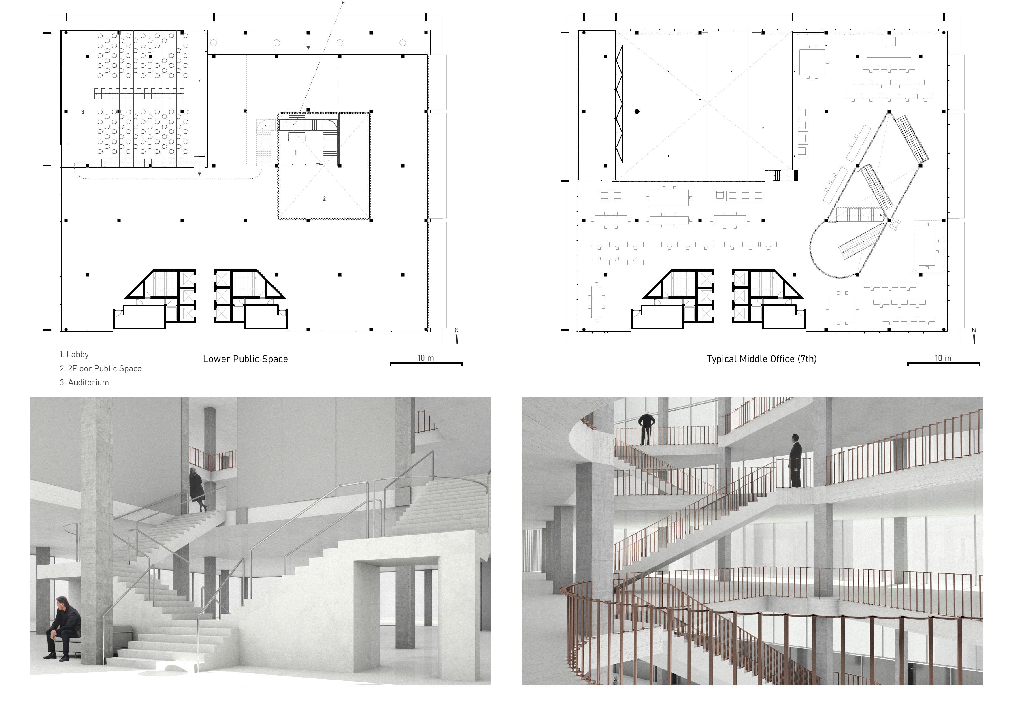
Section Perspective(E-W) shows how the void penetrates office space in non-perpendicular way. Middle Office floors(4F-9F) are indoor while Upper Office(10F-15F) has outside terrace. Lower part consists of Lobby, Auditorium and space for public programs. In between, there is an 'urban gallery' which opens up toward the urban surrounding with its generous height and openings.
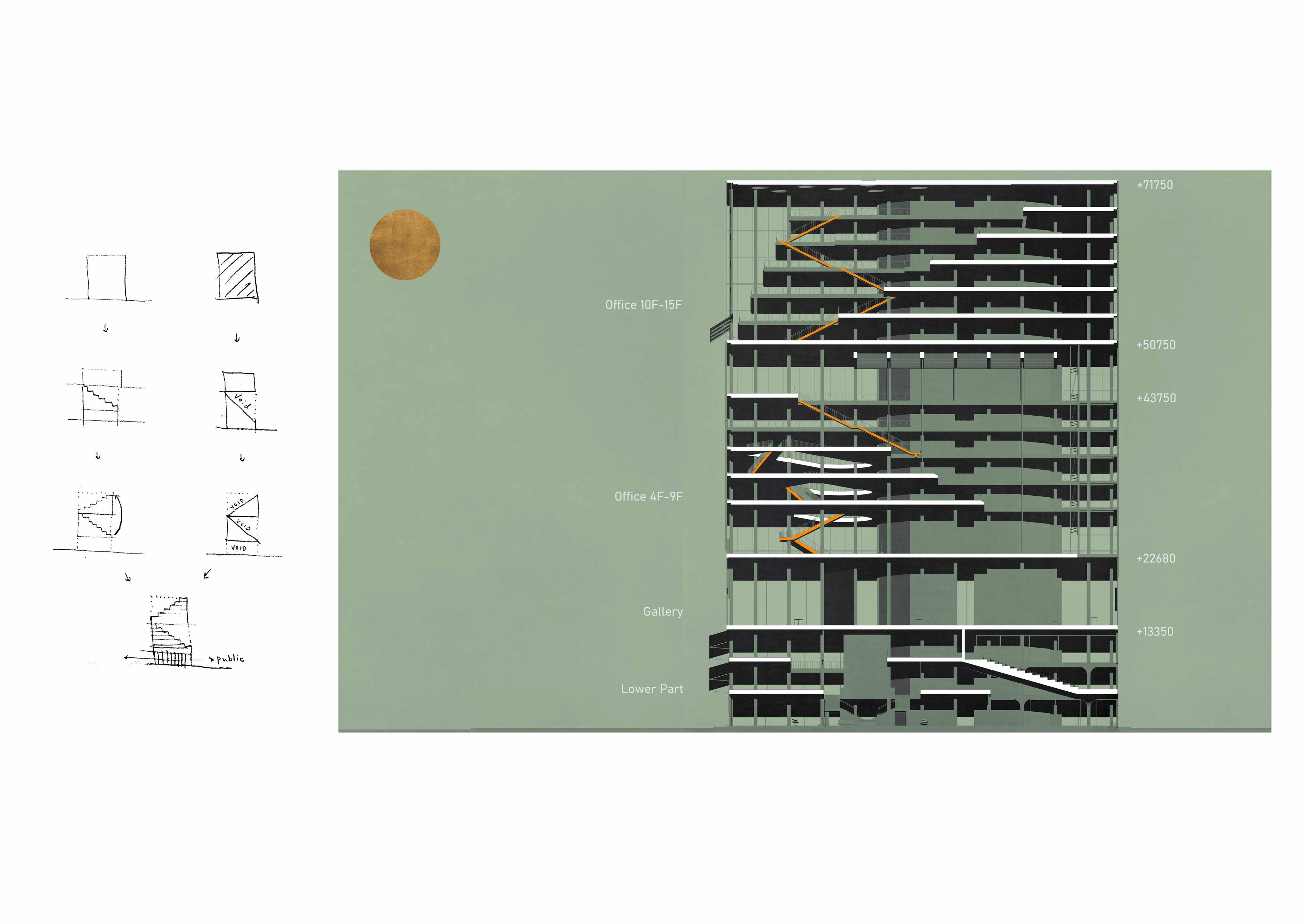
I wanted to make an Office space with columns and 'a roof'. You can say "isn't it obvious to make a building with columns and slabs?" But if a single roof slab is supported by many columns and office floors positioned in between, the void becomes not only an empty space but 'invisible piazza'. This openess creates a sense of unity among users that can be turned off individually if they stay in between the floors like traditional office. Rather than a closed 'floor-ceiling' single height relationship, the dynamic 'landscape' of column, floor and roof shape a 'villiage-like' atmosphere that is untypical for an office typology especially in Seoul.
THE ROOF OF AN OFFICE IS SHARED BY ALL FLOORS, THUS CREATING A SPATIALLY MUTUAL RELATIONSHIP AS TO STRUCTURE, PEOPLE, ATMOSPHERE.
Idea on 'Section of an Office'
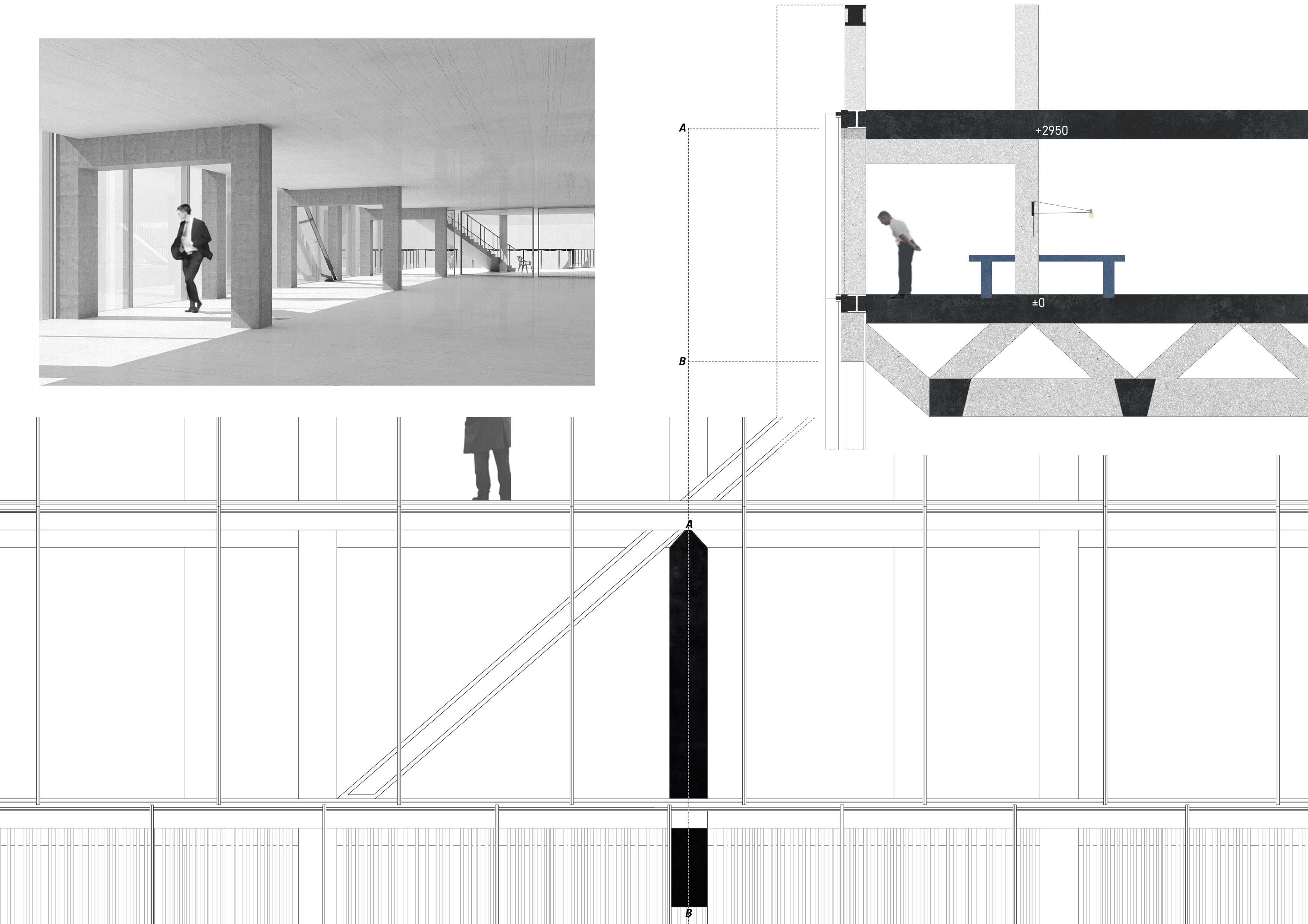
2 mountains in the collage resembles the primitive section of this office. While the floors follow natural hill, the space between roof and floors becomes a forest. And we hike up on stairs. These corresponding relationships between the natural environment and architectonic elements is critical when we are distant from nature more than ever.
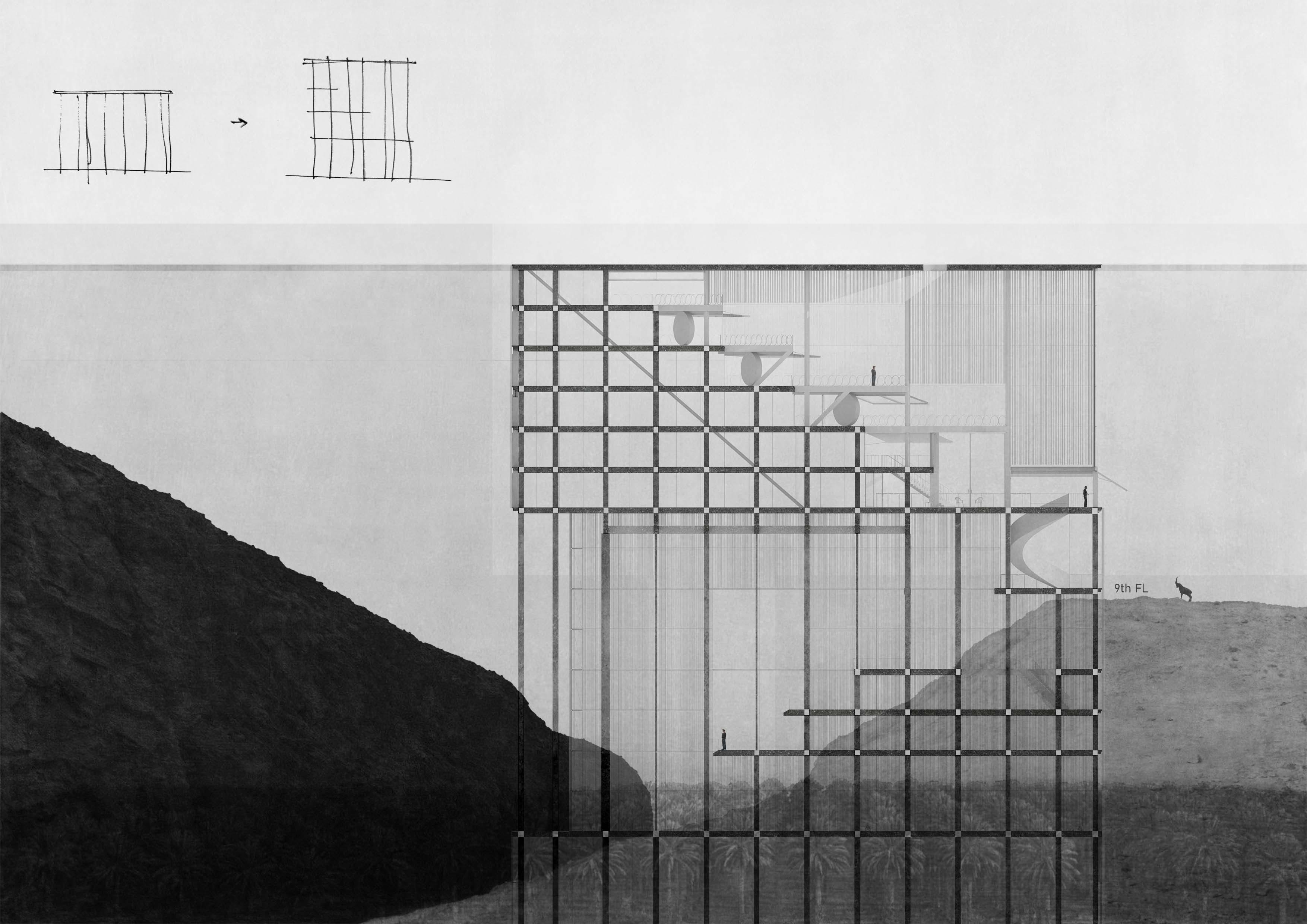
Sectional Detail and Facade(below) show how 'house-shaped column' and 'diagonal bracing' doesn't interfere each other.
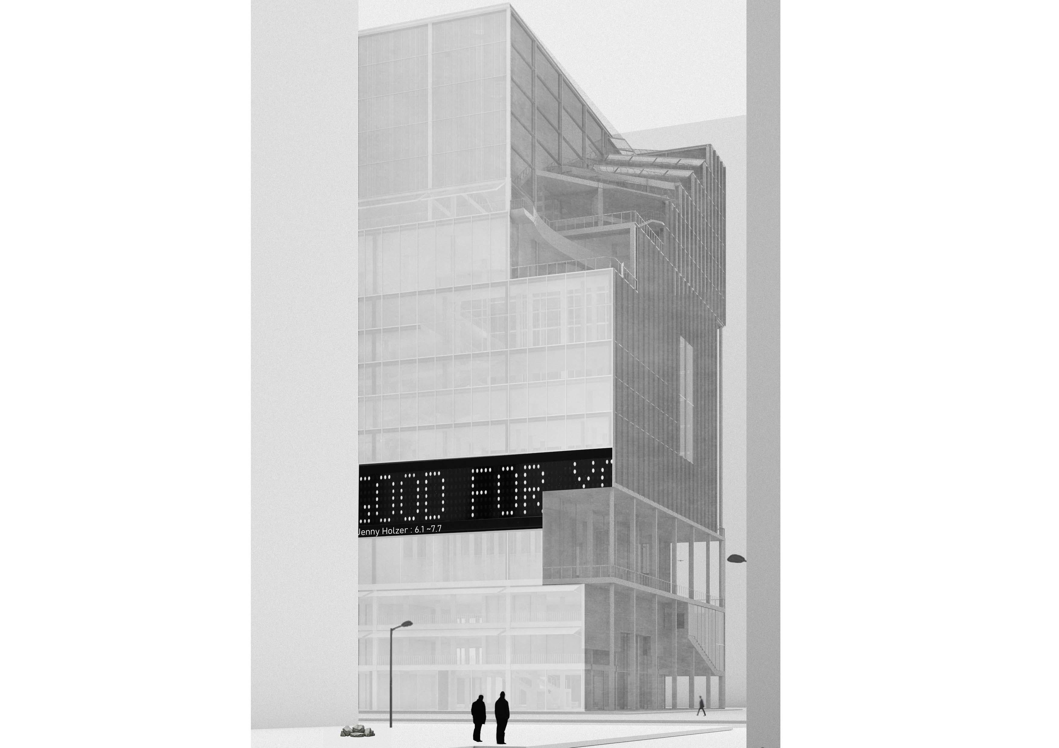
'Urban Silhouette'
Silhouette is a physical outline of an object. Its presence differentiates from other office buildings resulting from 'AntiStacking' process. The Silhouette actively interacts with pedestrians by means of strange looking volume resulting from a rather rational void-strategy. Thus 'cut-outs' continously arouse curiosity among citizens, imprinting itself as memorable image', an Urban Silhouette'.
Some can say "Making a huge void can't be a solution to conventional office type"
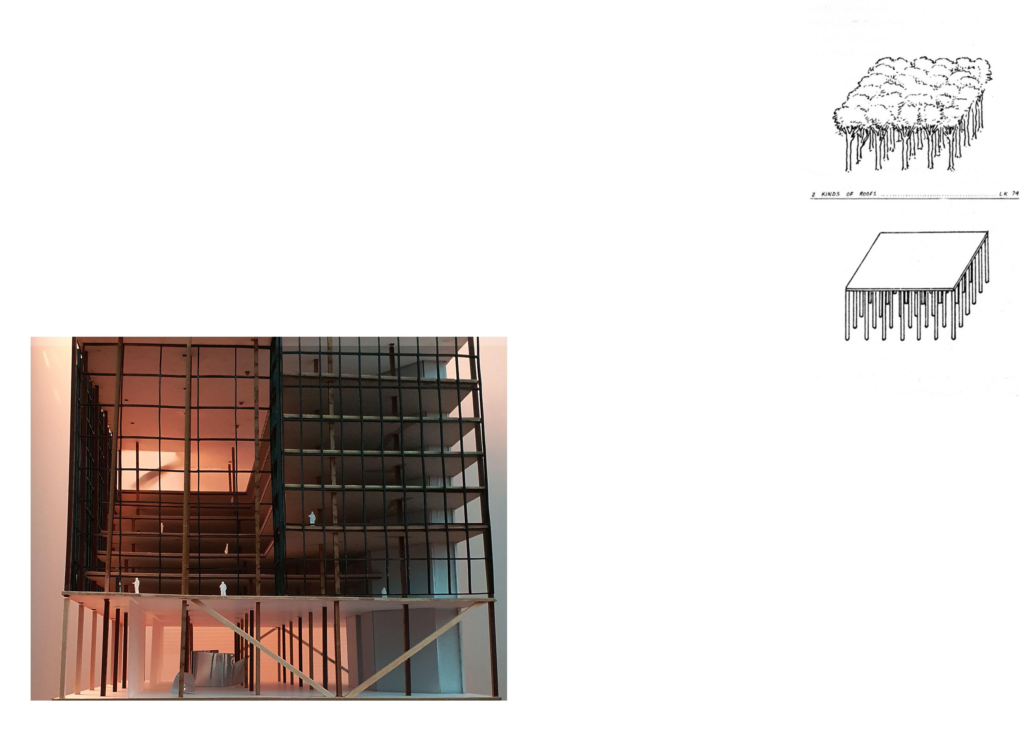
I agree. But the ultimate objective for this project was "How can I achieve an office that resembles a Forest?"
Forest has no roof, but has many layers that filters the atmosphere. 'Anti-Stacking' is not just about unconditionally denying the typical office building that praises identical floor plans. But really about layering each floors and appreciating each floor space as an independent part of the office that constitutes a unique atmosphere that unites users. You cannot definitely regulate Forest as an indoor or outside space. The boundary is vague.
This ambiguity applies same for the office. The model(left) shows a flow of space that blurs the 'fixed idea' on inner office space. Drawing above is a sketch by Léon Krier describing '2 Kinds of Roofs'. Maybe the bottom one might explain physical configuration of the office better but top drawing is what I tried to achieve with the help of architectural elements.
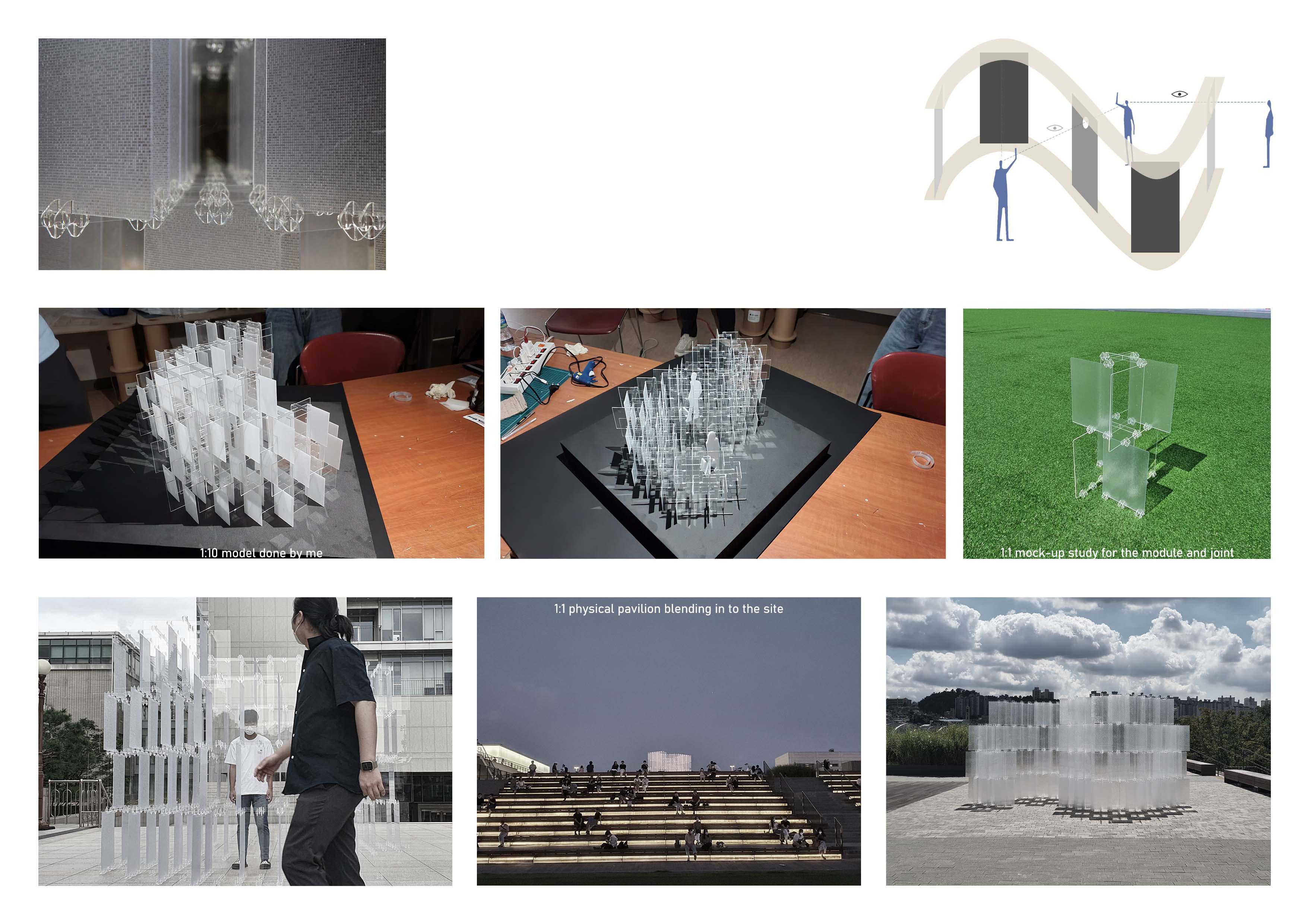
What will happen to the acrylic screen in the store after COVID-19 ends? It is a prolonged COVID-19 situation, but We need to think about the end of COVID-19 someday. Goods made due to high demand during disasters are lost or neglected after the disaster. Facing between the transparent and translucent acrylic shields placed perpendicularly, we experience a relationship that is together but separated, and distant but connected just like in the Corona era. The Scailing of physical models' from 1:10 model and mock-up to 1:1 real pavilion was crucial part of the project. We tried to focus on the actual movement and experience by studying models and materiality.
 2021 Pavilion Project, Extracurricular Work Theme : Re-using Acrylic screen in Post-Covid era Professor : Sangyoon Lee