Brand Book 2022


01 02 03 03 04 THE BRAND BRAND IDENTITY TYPOGRAPHY COLOR PALATTE APPLICATION

01
 COZY CAFE
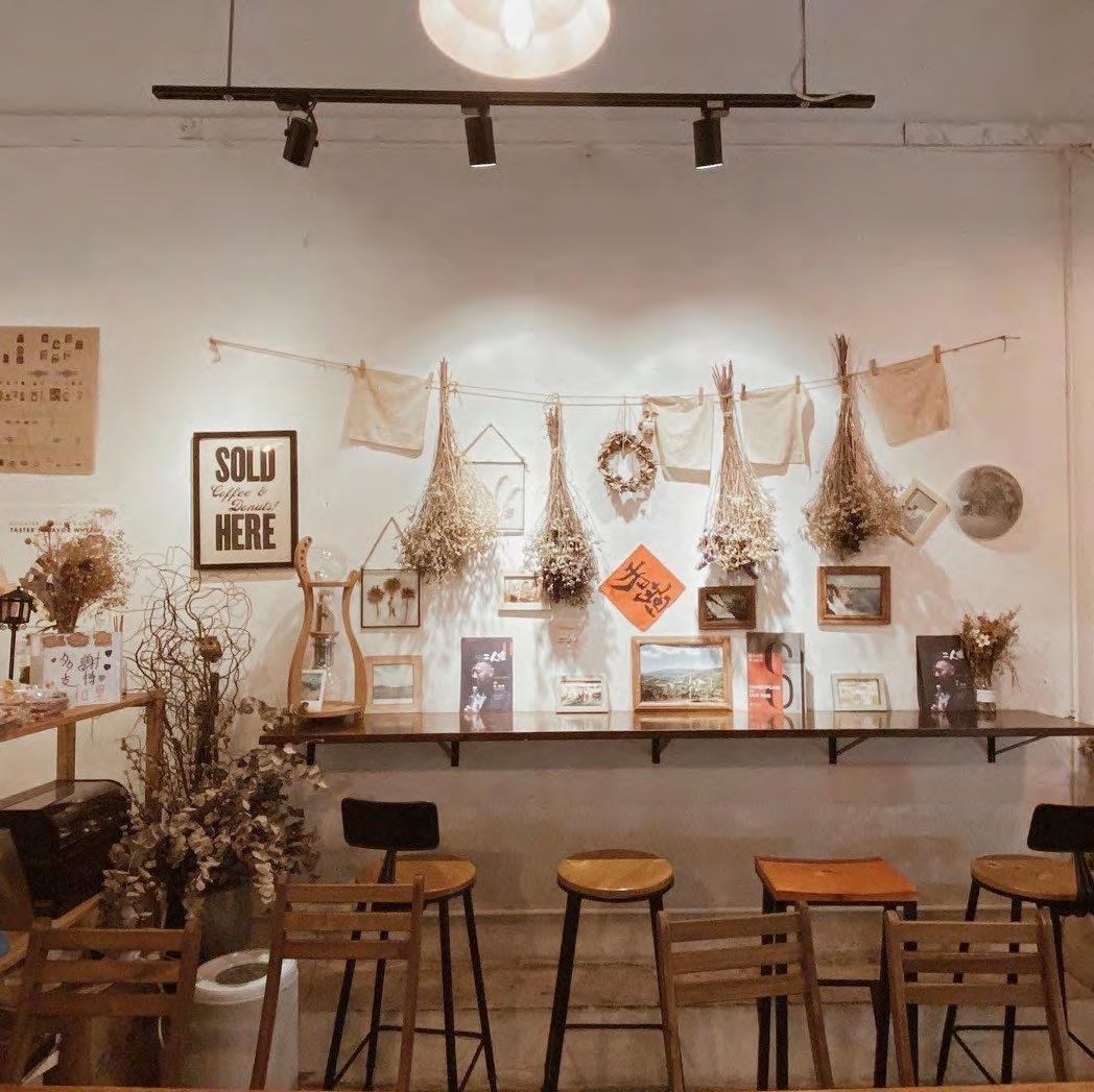
A rare Japanese cafe in the Kwai Chung District with fresh and comfortable decorations, offering a variety of pasta, snacks, and coffee.

6

THE BRAND MOODBOARD COZY CAFE 8
COZY RELAX WARM
MOOD BOARD
Cozy Cofe was inspired by the energetic yet laidback atmosphere of enjoying coffee in a cafe. Although it is simple and humanistic, the handdrawn pattern keeps it from feeling cold or formal.
Because young girls make up the target market, the lettering style fits the cosy mood logo trend.
Since the definition of "cozy" is "comfortable, pleasant, and inviting," the brand's overall tone should promote a relaxed atmosphere where people can mingle, hang out, and create.
THE BRAND MOODBOARD
COZY CAFE 9

02

PRIMARY LOGO DESIGN
COZY CAFE's primary logo is a wordmark. The main lettering style has a casual, relax logo vibe, and the hand-drawn style helps emphasize the hand-made and relax values of the brand. This trademark helps audiences easily identify Cozy Cafe's product, web presence, ads, and other materials, and enhances the comfortable element of the brand. It is essential to the success of the brand that the logo always be applied with care and respect in every application according to these guidelines.

COZY CAFE 12
BRAND IDENTITY PRIMARY LOGO
COZY CAFE
BRAND IDENTITY
SECONDARY LOGO
SECONDARY LOGO DESIGN
Cozy Cafe's secondary logo can be used in replace of the primary logo. The secondary logo is a condensed version of the main logo. To improve readability in small sizes, this design may remove some text or rearrange the elements. Secondary logos are intended for use online or when resizing your logo to small formats.


 HORIZONTAL LOGO CENTERED LOGO SECONDARY LOGO
13


1
BRAND
CLEAR
SIZE COZY
14
inch
IDENTITY
SPACE & MINIMUM
CAFE
CLEAR SPACE
Maintain a minimum clear space around the logo at all times to ensure its legibility. This space separates the mark from any competing graphical elements, such as other logos or body copy, that could conflate, crowd, and diminish the mark's impact.
MINIMUM SIZE
1 inch is the absolute minimum height at which the logo should be represented.


BRAND IDENTITY
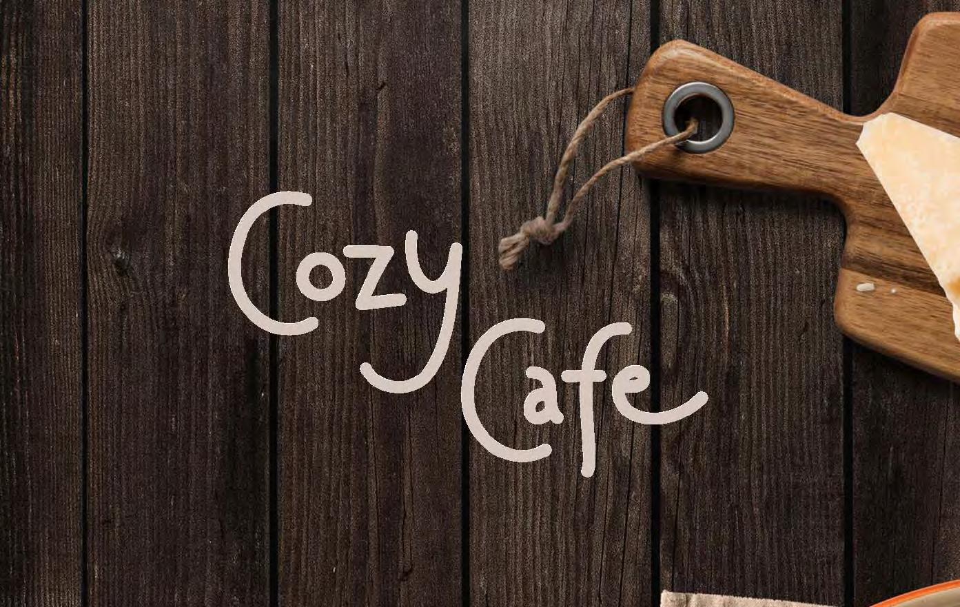
PHOTO BACKGROUND
16
COZY CAFE
COZY CAFE

PHOTO BACKGROUND

There are a few different ways the logo can be utilized on photographic backgrounds; however, each option should be exercised with caution, ensuring that the logo and type are not obscured by the image in any way.

1. The most effective photos have shallow depths of field.
2. Avoid images with a lot of busy details.
3. The text can be made easier to read by adding a darker transparent overlay to an image.
BRAND
IDENTITY PHOTO BACKGROUND
17


BRAND
COZY
18
IDENTITY UNACCEPTABLE UASGE
CAFE
COZY CAFE
BRAND IDENTITY
UNACCEPTABLE UASGE
UNACCEPTABLE USAGE
In order to protect the reputation of the brand, there are a few ground rules that must be followed. Rotating and skewing the logo should be avoided because it could ruin its overall appearance. or modifying in any way, including adding decorations to the text that are unnecessary, unattractive, and otherwise inappropriate. Here are a few illustrations of some applications of the logo that you should under no circumstances ever consider using it.
1. Do not distort any portion of the logotype or signature.
2. Do not make any part of the logotype any color other than the acceptable color options.
3. Do not tilt or rotate the logotype to any degree.
4. Do not rearrange any elements of the logotype.
19
03
TYPOGRAPHY & COLOR
COZY CAFE
SEPIA CMYK: 54, 71, 100, 21 RGB: 122, 79, 33 HEX: #7A4F21
BROWN SUGAR CMYK: 40, 74, 81, 3 RGB: 171, 92, 61 HEX: #AB5C3D
MAXIMUM YELLOW RED CMYK: 15, 34, 73, 0 RGB: 229, 181, 32 HEX: #E5B552
PALE SILVER CMYK: 20, 23, 23, 0 RGB: 212, 199, 191 HEX: #D4C7BF
COLOR PALATTE
The use of colour is essential to the development of a brand's identity. The use of the colour palette in a consistent manner not only helps to reinforce the cohesiveness of the brand, but colour also serves a psychological purpose by communicating a certain feeling to your audience. Using the colour palette in a consistent manner also helps to reinforce the cohesion of the brand.
The warm tone colour is frequently used to emphasise the significance of feeling comfortable, as well as to establish warm and relaxing. The shade of orange and yellow color is energetic and welcoming, it conveys happiness.
TYPOGRAPHY
COLOR COLOR
&
PALATTE
22
TYPOGRAPHY & COLOR COLOR USAGE COZY CAFE


23
COZY CAFE
palmer lake use for headline