
Full chapter download at: https://testbankbell.com/product/test-bank-for-elementary-statistics-a-step-by-step-approach-8th-edition-by-blu man/
Exam
Name___________________________________
MULTIPLE CHOICE. Choose the one alternative that best completes the statement or answers the question.
1) Which of the following does not need to be done when constructing a frequency distribution?
A) select the number of classes desired
B) make the class width an even number
C) find the range
D) use classes that are mutually exclusive
2) The lower class limit represents the smallest data value that can be included in the class.
A) False B) True
SHORT ANSWER. Write the word or phrase that best completes each statement or answers the question.
3) When data are collected in original form, they are called .
4) The of a specific class is the number of data values contained in it.
5) If a frequency distribution had class boundaries of , what would be the class width?
1) _______
2) _______
3) _____________
4) _____________
5) _____________
MULTIPLE CHOICE. Choose the one alternative that best completes the statement or answers the question.
6) The following frequency distribution presents the weights in pounds (lb) of a sample of to a health clinic.
6) _______ A) 80
11
10
7) _______
8) What are the boundaries of the class 11-18?
and 18.5 B) 7
9) In an ungrouped frequency distribution of the average age of high school graduates, what would be the boundaries for the class of graduates who were reported to be 18 years old?
10) What is the midpoint of the class 6-10?
11) Greg wants to construct a frequency distribution for the political affiliation of the employees at Owen's Hardware Store. What type of distribution would be best?
12) What is the lower class limit of the class 13–17?
13) What is the midpoint of the class 17
20?
14) What is the upper class boundary of the class 23-35 ?
15) If the limits for a class were , the boundaries would be
True
SHORT ANSWER. Write the word or phrase that best completes each statement or answers the question.
16) For grouped frequency distributions, the is obtained by adding the lower and upper limits and dividing by 2.
MULTIPLE CHOICE. Choose the one alternative that best completes the statement or answers the question.
17) What is the lower class limit in the class 8-12?
8.5 B) 8
10
18) Which of the following pairs of class limits would be appropriate for grouping the numbers 11, 14, 9, and 16?
9-11 and 14-16
9-11 and 12-16 C) 9-12 and 13-16
8-12 and 12-16
19) Thirty students recorded the colors of their eyes, choosing from the colors brown, blue, green, hazel, and black. This data can be appropriately summarized in a(n) .
A) upper boundary B) categorical frequency distribution
C) grouped frequency distribution
20) What are the boundaries of the class 1.87-3.43?
1.865-3.435 B) 1.87-3.43
open-ended distribution
21) For the class 16.3-23.8, the width is 8.5.
A) False B) True
SHORT ANSWER. Write the word or phrase that best completes each statement or answers the question. 22) When the range is large, and classes that are several units in width are needed, a frequency distribution is used.
21) ______
22) _____________
MULTIPLE CHOICE. Choose the one alternative that best completes the statement or answers the question. 23) The cumulative frequency for a class is the sum of the frequencies of the classes less than and equal to the upper boundary of the specific class.
A) False B) True
24) A recent statistics exam yielded the following 25 scores. Construct a grouped frequency distribution with the class limits shown below.


23) ______
24) ______
A) B)
C) D)
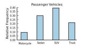
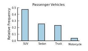
25) The following frequency distribution presents the frequency of passenger vehicles that pass through a certain intersection from 8:00 AM to 9:00 AM on a particular day.
SUV 80 Truck 39
___
What is the relative frequenc y of the Motorcy le category ?
26) The following frequency distribution presents the frequency of passenger vehicles that pass through a certain intersection from 8:00 AM to 9:00 AM on a particular day.
Construct a relative frequency distribution for the data.
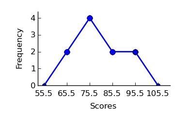
SHORT ANSWER. Write the word or phrase that best completes each statement or answers the question. 27) Construct a frequency polygon from the following frequency distribution. 27) _____________
MULTIPLE CHOICE. Choose the one alternative that best completes the statement or answers the question. 28) A recent statistics exam yielded the following 10 scores. Construct a frequency polygon distribution using the class limits shown below.


80, 99, 77, 67, 93, 71, 76, 86, 79, 71

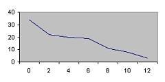
31) One hundred students are shown an eight-digit number on a piece of cardboard for three seconds and are asked to then recite the number from memory. The process is repeated until student accurately recites the entire number from memory. The following histogram presents the number of trials it took each student to memorize the number.


ents memori zed the number in three trials or less?
32) An ogive is also called a cumulative frequency graph. 32) ______
A) True B) False
SHORT ANSWER. Write the word or phrase that best completes each statement or answers the question.
33) The three most commonly used graphs in research are the histogram, the , and the cumulative frequency graph (ogive). 33)
MULTIPLE CHOICE. Choose the one alternative that best completes the statement or answers the question.
34) Which of the following could be a cumulative frequency graph?


 35) Which of the following could be an ogive?


 36) Which of the following is a histogram? 36) ______
37) The frequency polygon and the histogram are two different ways to represent the same data set.
A) False B) True
______
38) For a given data set, the ogive and the frequency polygon will have the same overall shape. 38) ______
A) False B) True
39) Using the ogive shown below, what is the cumulative frequency of data values less than or equal to 16 ? 39) ______
A) 66
B) 30 C) 20
D) 60
40) Graphs that show distributions using proportions instead of raw data as frequencies are called
A) frequency polygons.
C) ogive graphs.
______
B) relative frequency graphs.
D) histograms.
41) Which type of graph represents the data by using vertical bars of various heights to indicate frequencies? 41) ______
A) cumulative frequency
C) histogram
B) ogive
D) frequency polygon
42) The frequency polygon is a graph that displays the data by using lines that connect points plotted for the frequencies at the midpoints of the classes.
A) False B) True
43) A histogram is a graph that represents the cumulative frequencies for the classes in a frequency distribution.

A) False B) True
44) Which of the following is a frequency polygon?
______
______
______ A)
45) How many values are in the data set whose histogram is shown below ?


 B)
C)
D)
B)
C)
D)
A) 72
6
46) Given the following frequency distribution, how many pieces of data were less than 28.5? 46) ______

A) 25 B) 12 C) 44 D) 13
SHORT ANSWER. Write the word or phrase that best completes each statement or answers the question.
47) If the graph of a frequency distribution has a peak and the data tapers off more slowly to the right and more quickly to the left, the distribution is said to be
MULTIPLE CHOICE. Choose the one alternative that best completes the statement or answers the question.
48) Classify the histogram as skewed to the left, skewed to the right, or approximately symmetric. 48) ______


A) approximately symmetric
B) skewed to the right
C) skewed to the left
49) Classify the histogram as unimodal or bimodal. 49) ______
A) bimodal B) unimodal
50) The following frequency distribution presents the weights in pounds (lb) of a sample of to a health clinic.


Construct a frequency histogram.
The following frequency distribution presents the weights in pounds (lb) of a sample of to a health clinic.


Construct a relative frequency histogram.
52) The following table presents the purchase totals (in dollars) of a random sample of gasoline purchases at a convenience store.


Construct a frequency distribution using a class width of 10, and using 0 as the lower class limit for the first class.

 D)
D)
Construct a relative frequency distribution using a class width of 10, and using 0 as the lower class limit for the first class.


54) The following table presents the purchase totals (in dollars) of a random sample of gasoline purchases at a convenience store.


Construct a frequency histogram using a class width of 10, and using 0 as the lower class the first class.
______
55) The following table presents the purchase totals (in dollars) of a random sample of gasoline purchases at a convenience store.


Construct a relative frequency histogram using a class width of 10, and using 0 as the lower class limit for the first class.


57) Thirty households were surveyed for the number of televisions in each home. Following are the results.


______
Construct a relative frequency histogram.


59) A sample of 200 high school students were asked how many hours per week they spend watching television.The following frequency distribution presents the results.


Construct a relative frequency polygon for the frequency distribution.

60) A sample of 200 high school students were asked how many hours per week they spend watching television.The following frequency distribution presents the results.


______
Construct a frequency ogive for the frequency distribution.


62) ______
Vehicle Type Frequency
Motorcycle 5
Sedan 95
SUV 65
Truck 30
Construct a frequency bar graph for the data.


63) The following bar graph presents the average amount a certain family spent, in dollars, on various food categories in a recent year.

On which food category was the most money spent?
A) Dairy products
C) Meat poultry, fish, eggs
B) Cereals and baked goods
D) Fruits and vegetables
64) The following frequency distribution presents the frequency of passenger vehicles that pass through a certain intersection from 8:00 AM to 9:00 AM on a particular day.

______
Construct a relative frequency bar graph for the data.
65) The following frequency distribution presents the frequency of passenger vehicles that pass through a certain intersection from 8:00 AM to 9:00 AM on a particular day.


______

66) The following pie chart presents the percentages of fish caught in each of four ratings categories.
Match this pie chart with its corresponding Parato chart.

SHORT ANSWER. Write the word or phrase that best completes each statement or answers the question.

67) Construct a Pareto chart for the following distribution: 67) _____________
68) Construct a Pareto chart for the following distribution: 68) _____________

MULTIPLE CHOICE. Choose the one alternative that best completes the statement or answers the question. 69) The following frequency distribution presents the frequency of passenger vehicles that pass through a certain intersection from 8:00 AM to 9:00 AM on a particular day. Vehicle Type Motorcycle Sedan
SUV Truck

Constru ct a relative frequenc y Parato chart for the data.


SHORT ANSWER. Write the word or phrase that best completes each statement or answers the question. 70) A local fundraiser wants to graphically display the contributions he has received over the past five years. Construct a time series graph for the following data. 70) _____________

MULTIPLE CHOICE. Choose the one alternative that best completes the statement or answers the question.
71) The following pie chart presents the percentages of fish caught in each of four ratings categories.


Match this pie chart with its corresponding bar graph.

72) Following is a pie chart that presents the percentages spent by a certain household on its five largest annual expenditures. What percentage of the money spent was spent on food, housing, and utilities?
A) 47% B) 65.4%
C) 52.5%
ESSAY. Write your answer in the space provided or on a separate sheet of paper.
72) ______
D) 60.4%
73) The following information shows the colors of cars preferred by customers. Draw a pie graph and indicate how many degrees that black represents in a pie graph?
SHORT ANSWER. Write the word or phrase that best completes each statement or answers the question.
74) Construct a pie chart for the following distribution:
74) _____________
75) Construct a pie chart for the following distribution:


75) _____________
MULTIPLE CHOICE. Choose the one alternative that best completes the statement or answers the question.
76) Karen is constructing a pie graph to represent the number of hours her classmates do homework each day. She found that 8 of 24 classmates did homework for three hours each day. In her pie graph, this would represent how many degrees?
A) 240° B) 45° C) 135° D) 120°
SHORT ANSWER. Write the word or phrase that best completes each statement or answers the question.
______
77) Construct a pie graph using the following data from a local bakery. 77) _____________
MULTIPLE CHOICE. Choose the one alternative that best completes the statement or answers the question.
78) A weatherman records the amount of rain that fell in Portland, Oregon each day for a year. What type of graph should he use to show how rainfall changes during the year? 78) ______
A) Pareto chart
C) pie graph
B) time series graph
D) pictograph
79) A time series graph represents data that occur over a specific time period. 79) ______
A) False B) True
80) A Pareto chart does not have which of the following properties? 80) _____
A) frequencies arranged from highest to lowest
B) quantitative variable on the horizontal axis
C) classes of data are categorical
D) frequencies displayed by the heights of vertical bars
81) A pie graph is not useful in showing which of the following characteristics of a data set? 81) ______
A) frequency changes over time
B) relative frequencies for each category in the distribution
C) categories that make up the smallest proportions of the total

D) categories that make up the largest proportions of the total
82) A time series graph is useful for which of the following purposes? 82) ______
A) representing the frequencies of the data, sorted from largest to smallest
B) representing the changing frequencies of a data category over a period time
C) representing the cumulative frequencies of the data at a specific time
D) representing relative frequencies of categories at a specific time
83) A time series graph is useful for detecting trends that occur over the period of time. 83) ______
A) False B) True
84) Which graph should be used to represent the frequencies with which certain courses are taken at Highlands Middle School? 84) ______
A) time series graph
C) pie graph
B) Pareto chart
D) pictograph
85) A pie graph would best represent the number of inches of rain that has fallen in Ohio each day for the past 2 months. 85) ______
SHORT ANSWER. Write the word or phrase that best completes each statement or answers the question. 86) The percentages of white, wheat, and rye bread sold at a supermarket each week is best shown using a graph.
87) A graph would most appropriately represent the number of students that were enrolled in Statistics for each of the past ten years.
88) The scores on a recent statistics exam are shown below. Construct a stem and leaf plot for the data.


98, 73, 64, 69, 86, 89, 77, 86, 91, 73
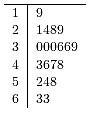
89) Given the following two sets of data, draw a stem and leaf plot.
A - 12, 22, 22, 24, 34, 31, 26, 35, 27, 39, 49, 10
B - 45, 36, 23, 16, 37, 28, 18, 13, 10, 23, 30, 31
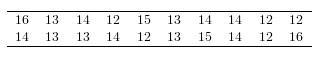
MULTIPLE CHOICE. Choose the one alternative that best completes the statement or answers the question. 90) Construct a stem-and-leaf plot for the following data.
91) Construct a stem-and-leaf plot for the following data, in which the leaf represents the tenths place.


93) Construct a dotplot for the following data. 93) ______


94) Following are the numbers of Dean's List students in a random sample of 20 university courses. Construct a dotplot for these data. 94) ______

95) Which of the following is a Pareto chart? 95) ____


96) A stem and leaf plot has the advantage over a grouped frequency distribution of retaining the actual data while still showing them in graphical form.
A) False B) True
97) An automobile dealer wants to construct a pie graph to represent types of cars sold in July. He sold 72 cars, 16 of which were convertibles. How many degrees should be used for the convertibles section ?
A) 80° B) 60° C) 50° D) 100°
98) If a data set showing types of pizza ordered at a particular restaurant indicates 24 out of 72 orders were for pepperoni pizza, how many degrees would be needed to represent pepperoni pizza in a pie chart?
A) 150° B) 90° C) 120° D) 60°
99) A Pareto chart is useful for showing percentages of the total at different times.

A) True B) False
100) What type of graph is the figure below?

A) pictograph B) Pareto chart C) pie graph D) ogive
101) Graphs give a visual representation that may enable readers to analyze and interpret data more easily than simply looking at tables of numbers.
A) False B) True
102) When making Pareto charts, data should be arranged according to frequency.
A) from smallest to largest B) from largest to smallest
C) clockwise D) with increasing time
103) A Pareto chart arranges data from largest to smallest according to frequencies.
A) False B) True
96) ______
97) ______
98) ______
99) ______
100) _____
101) _____
102) _____
103) _____
104) When two sets of data collected over specific periods of time are compared on the same graph using two lines, it is called a compound time series graph.
A) True B) False
105) The following table presents the rate of population growth of a suburb of Atlanta, Georgia for each of the years 1990 through 2009. Construct a time-series plot of the growth rate.


A) about 1.4 percentage points
C) about 2.9 percentage points
B) about 3.0 percentage points
D) about 2.1 percentage points


