Eclectic VISION
 HEATHER JOY PALMER // MA PORTFOLIO

 HEATHER JOY PALMER // MA PORTFOLIO
Dedicated to everyone who believes in me.
[ eclectic vision ]
There are many moments in life, in which we can create new direc tions to embark upon. The experiences in my life have helped me to gain a unique perspective and have been influential to the person I am, and aspire to be. Eclectic Vision was chosen for the title of this collection of selected works because the projects were inspired by the unique experiences that I have had in life.

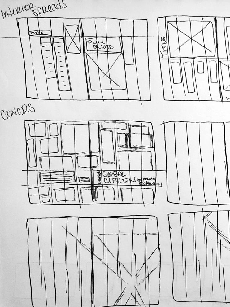
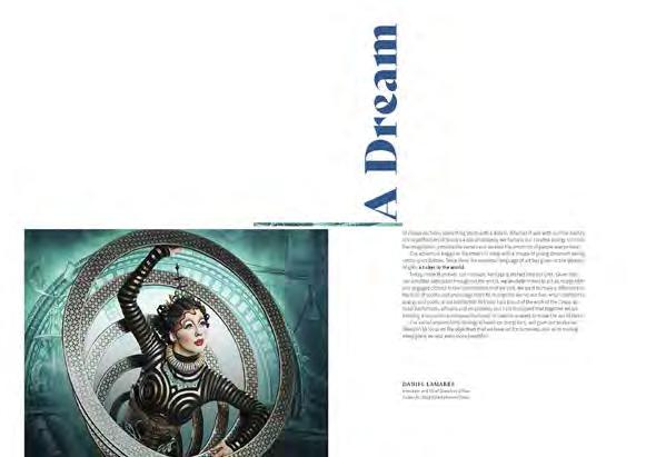
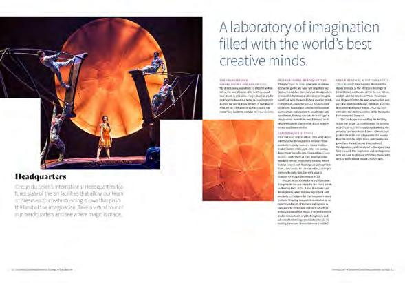
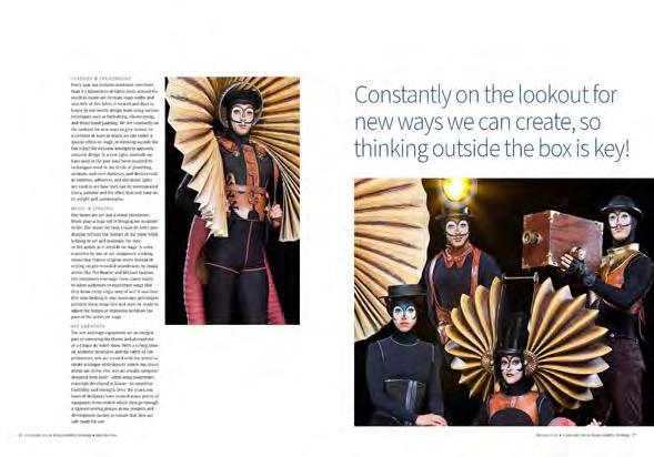
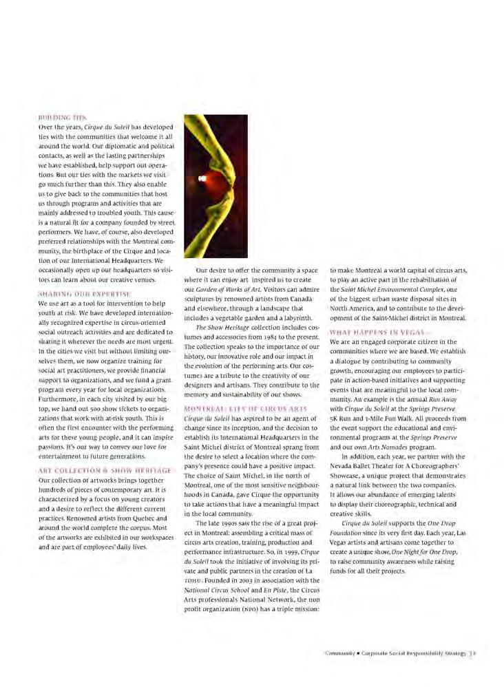
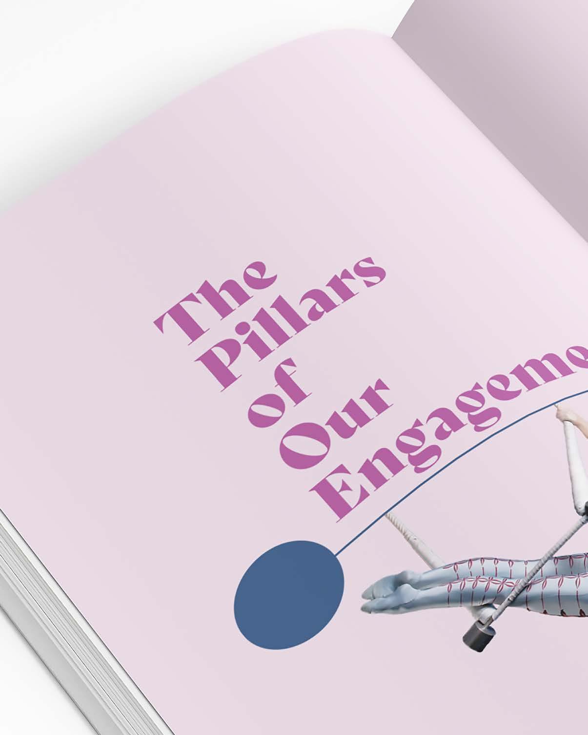
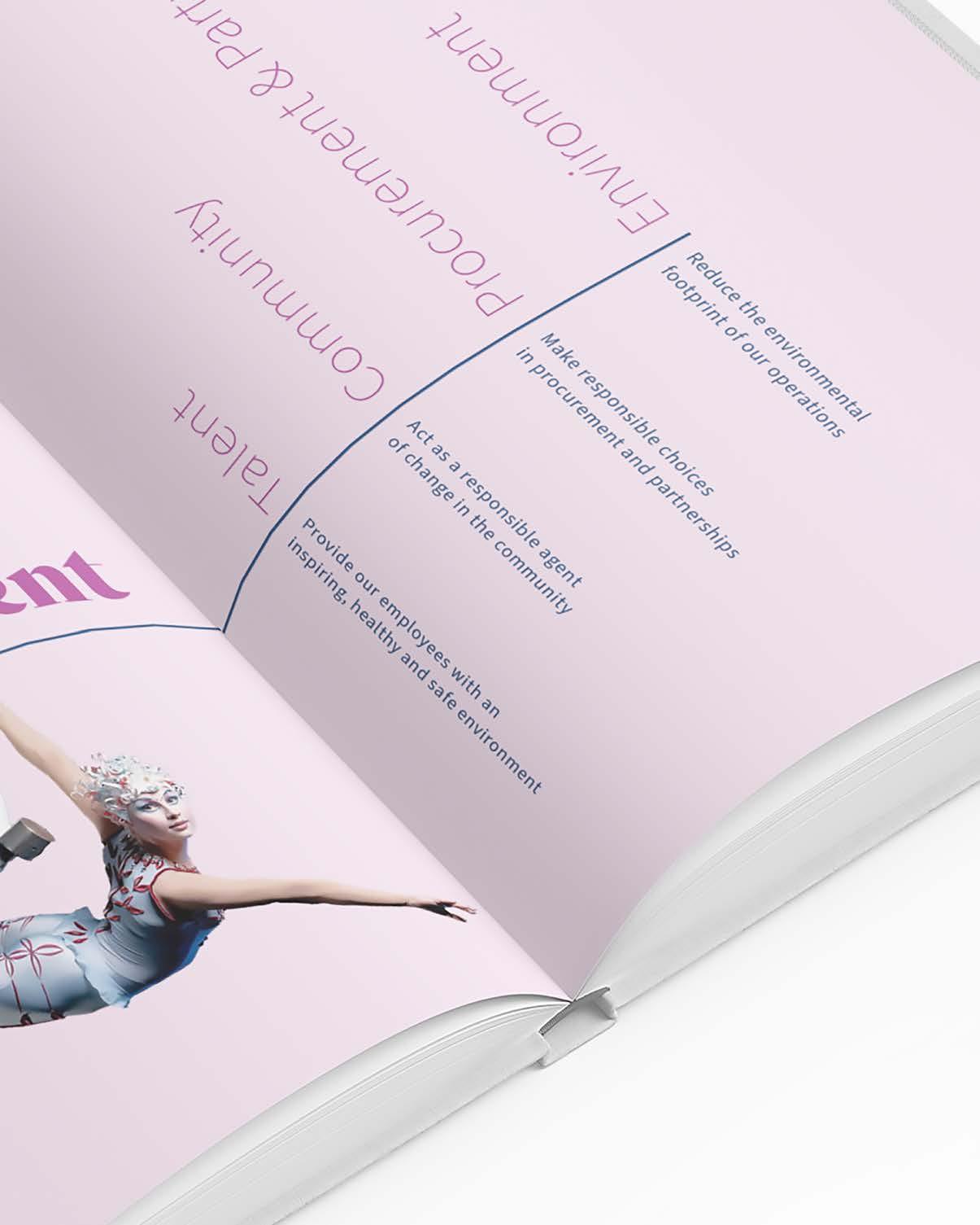
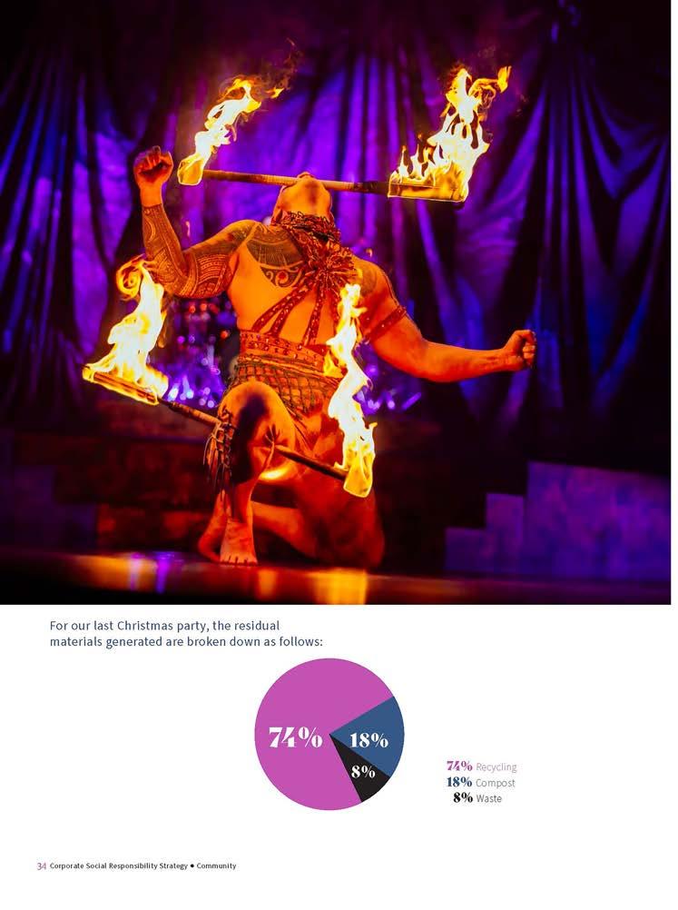
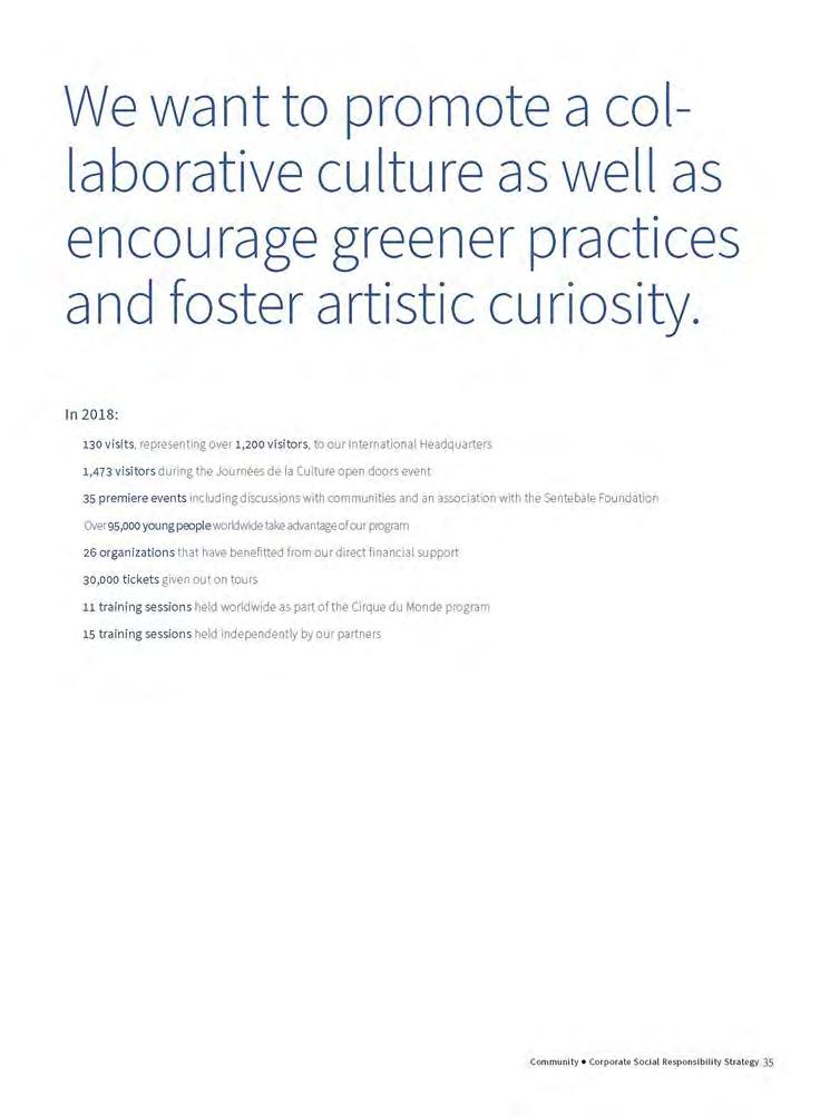
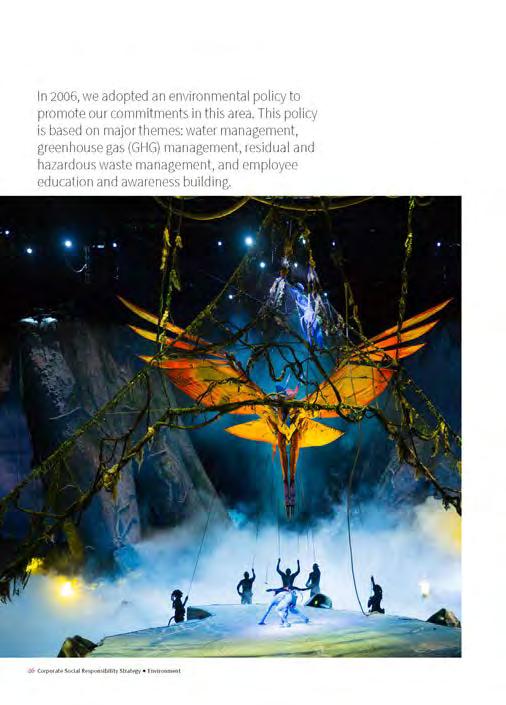
Identify a company with a Corporate Social Responsibility Report (CSR) that could use a redesign. Incorporate the feeling and overall personality of the company into the new design system. [ solution ]
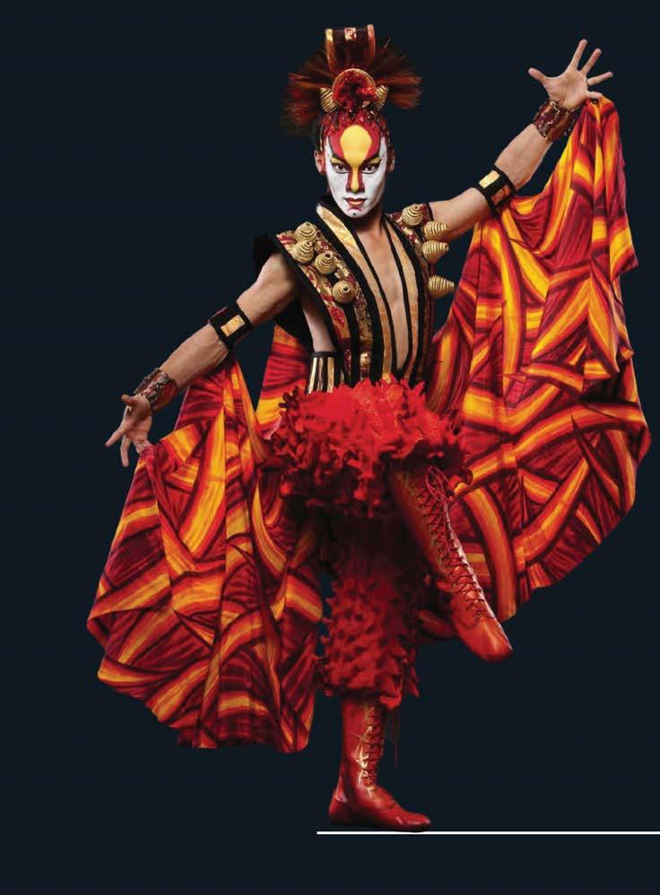
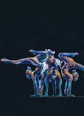
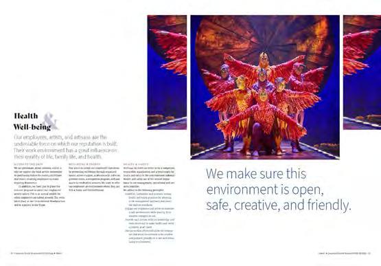
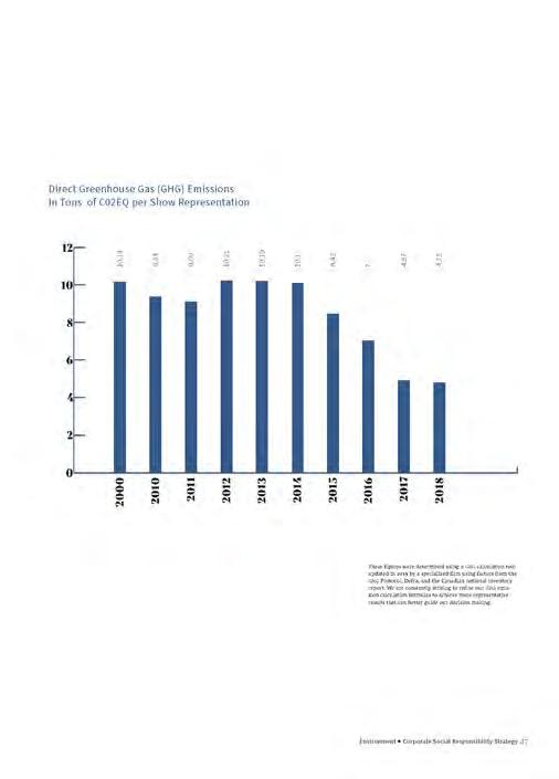
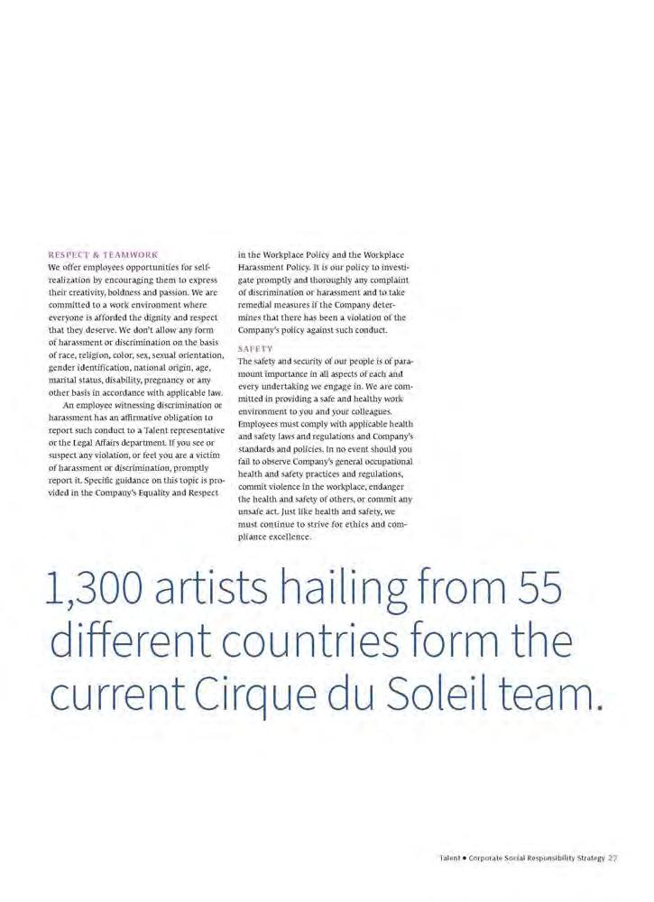
Cirque du Soleil was selected because it is are all about movement, experiences, and excitement. The new design system incorporated these aspects to create a customized and unique feeling.



































[ objective ]
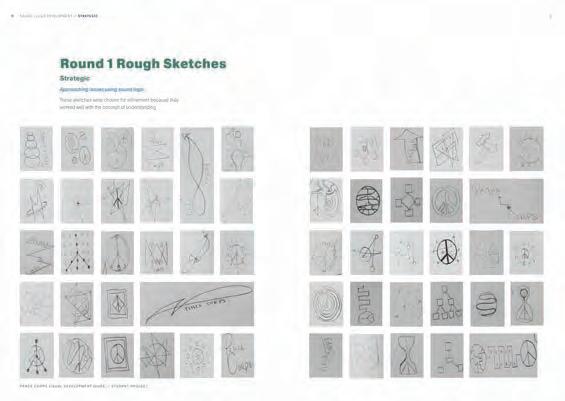
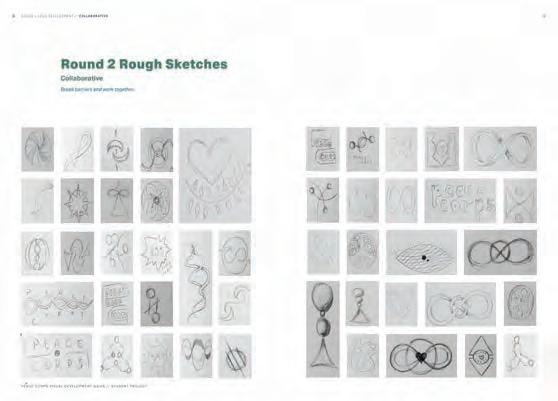
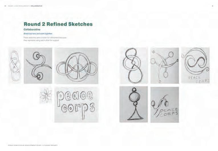
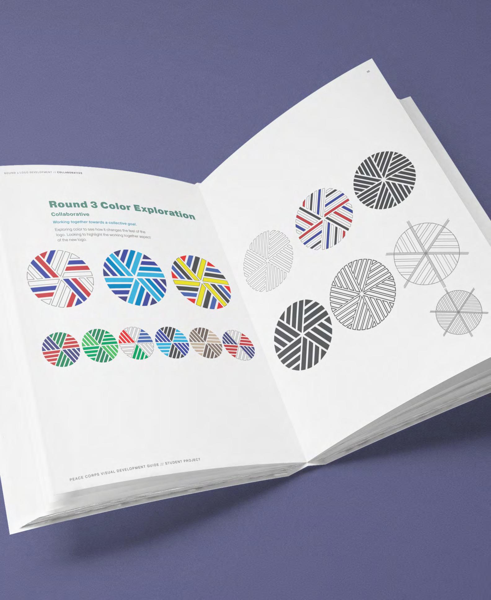
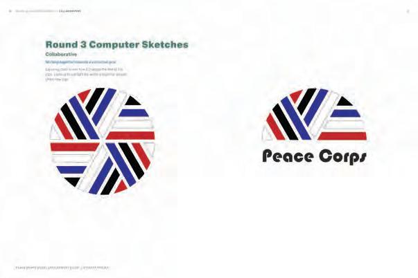
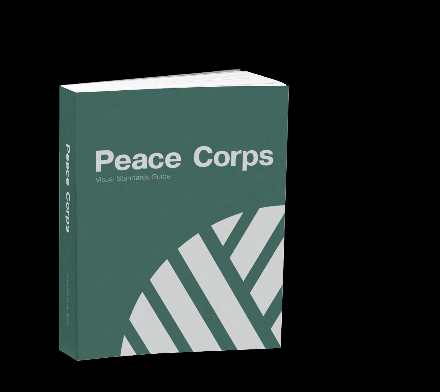
Identify a brand that was dead, dying, or defunct and develop a re-branding strategy for it. The re-branding strategy will include a new logo and word mark, new visual standards, and new direc tion ideas to extend the brand.
[ solution ]
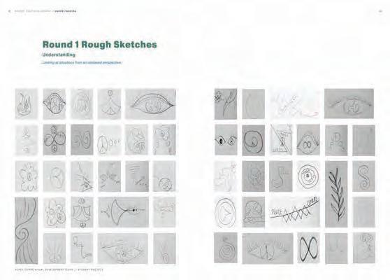
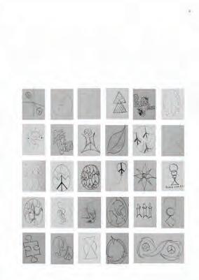
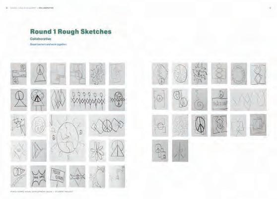
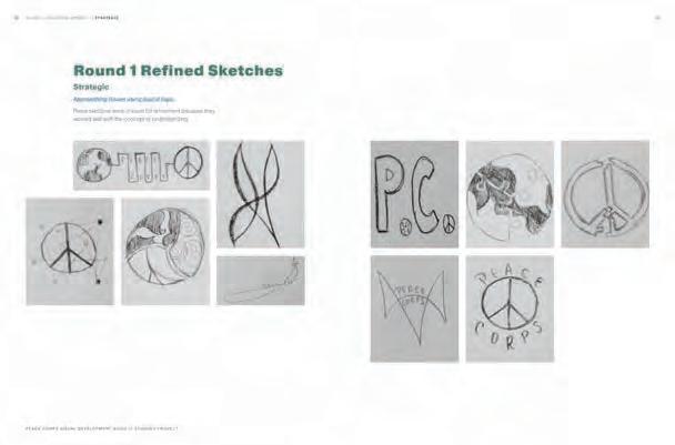
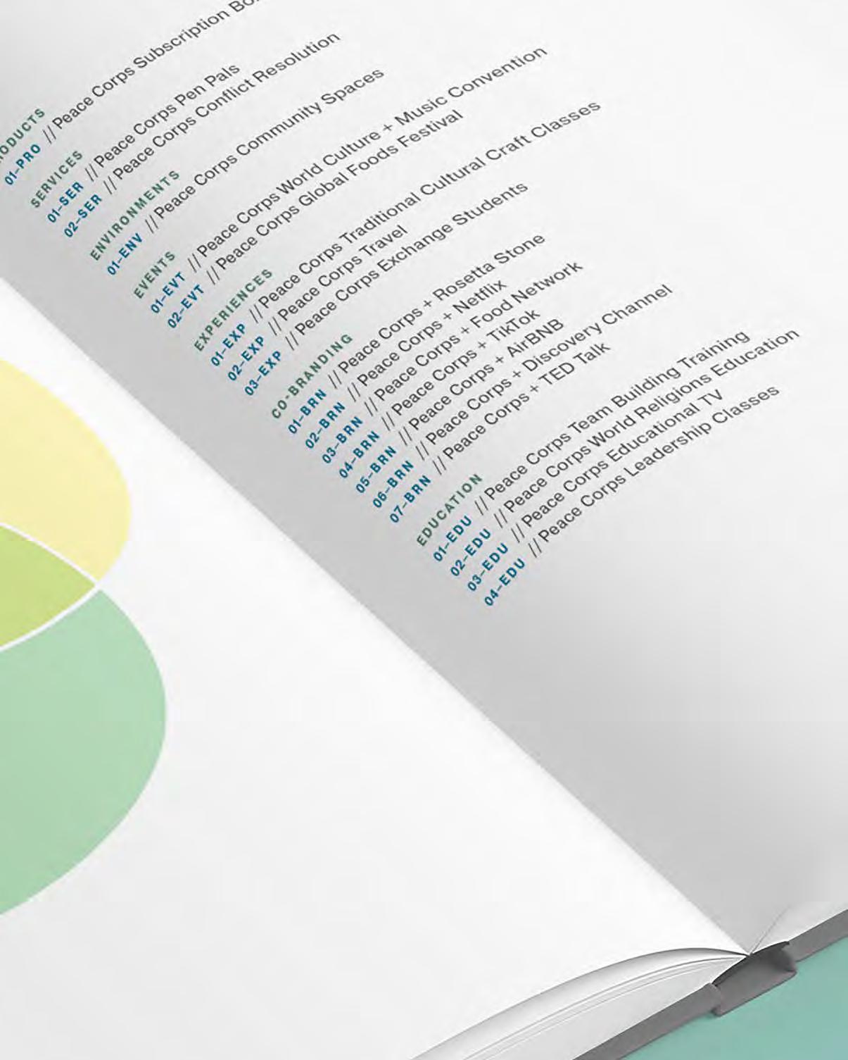
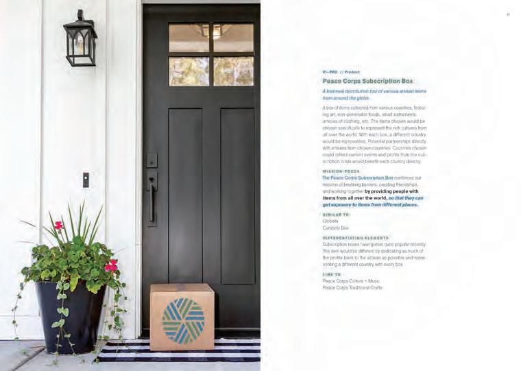
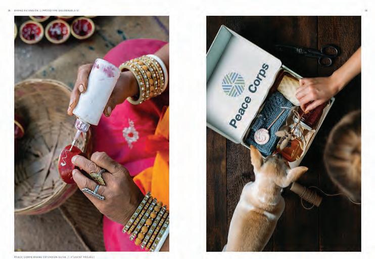
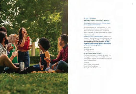
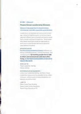
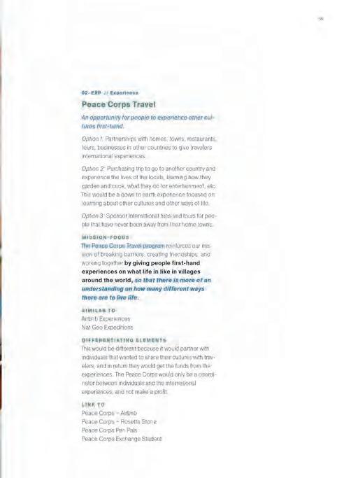
With the goal of embracing friendships and world peace, the Peace Corps was an ideal candidate for re-branding. While their current goals are significant and impactful, there are many new directions they could expand into, to fulfill the mission of breaking barriers, creating friendships, and working together. Project extends to breakbarrierscreatefriendships.com.
















































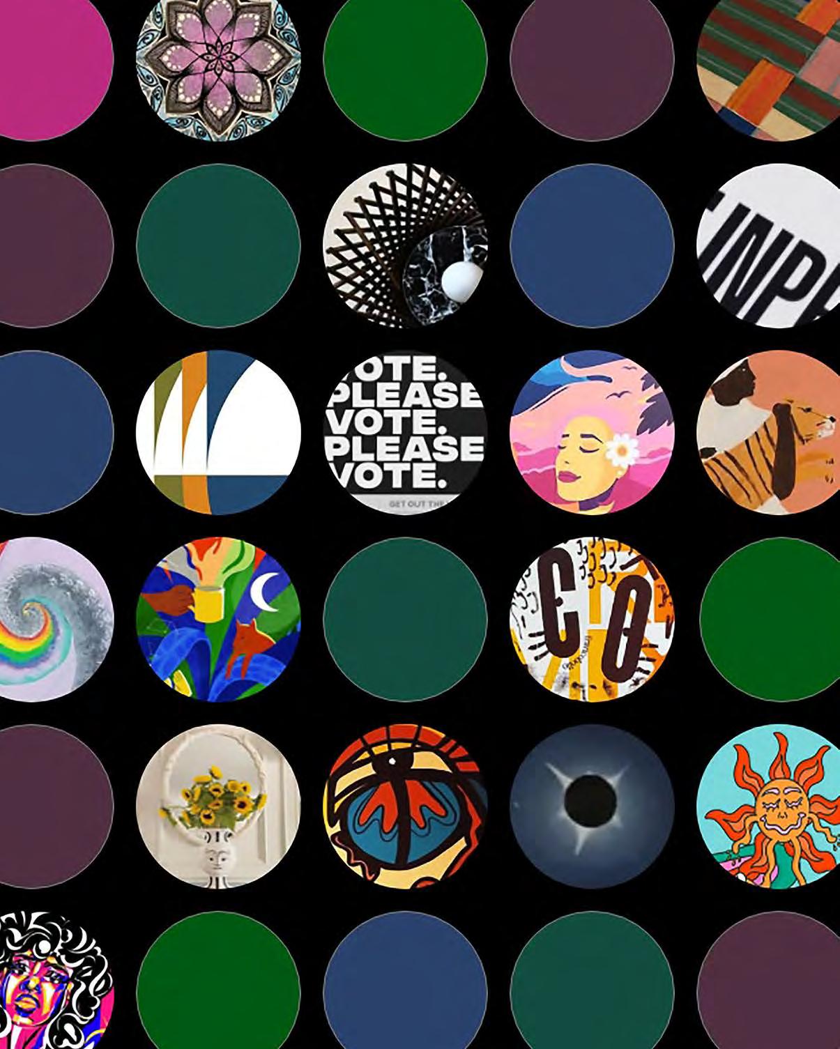
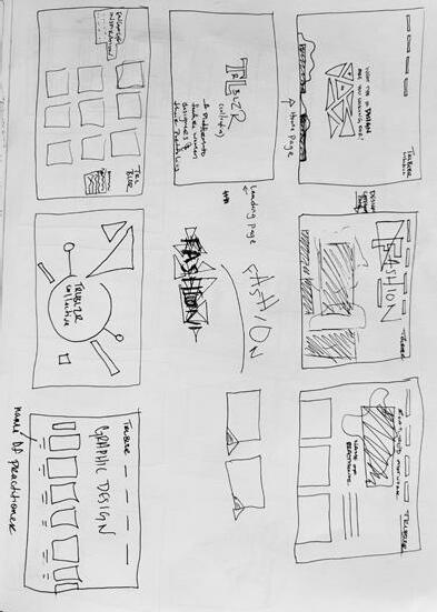
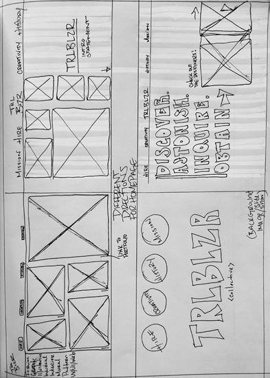
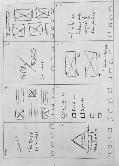
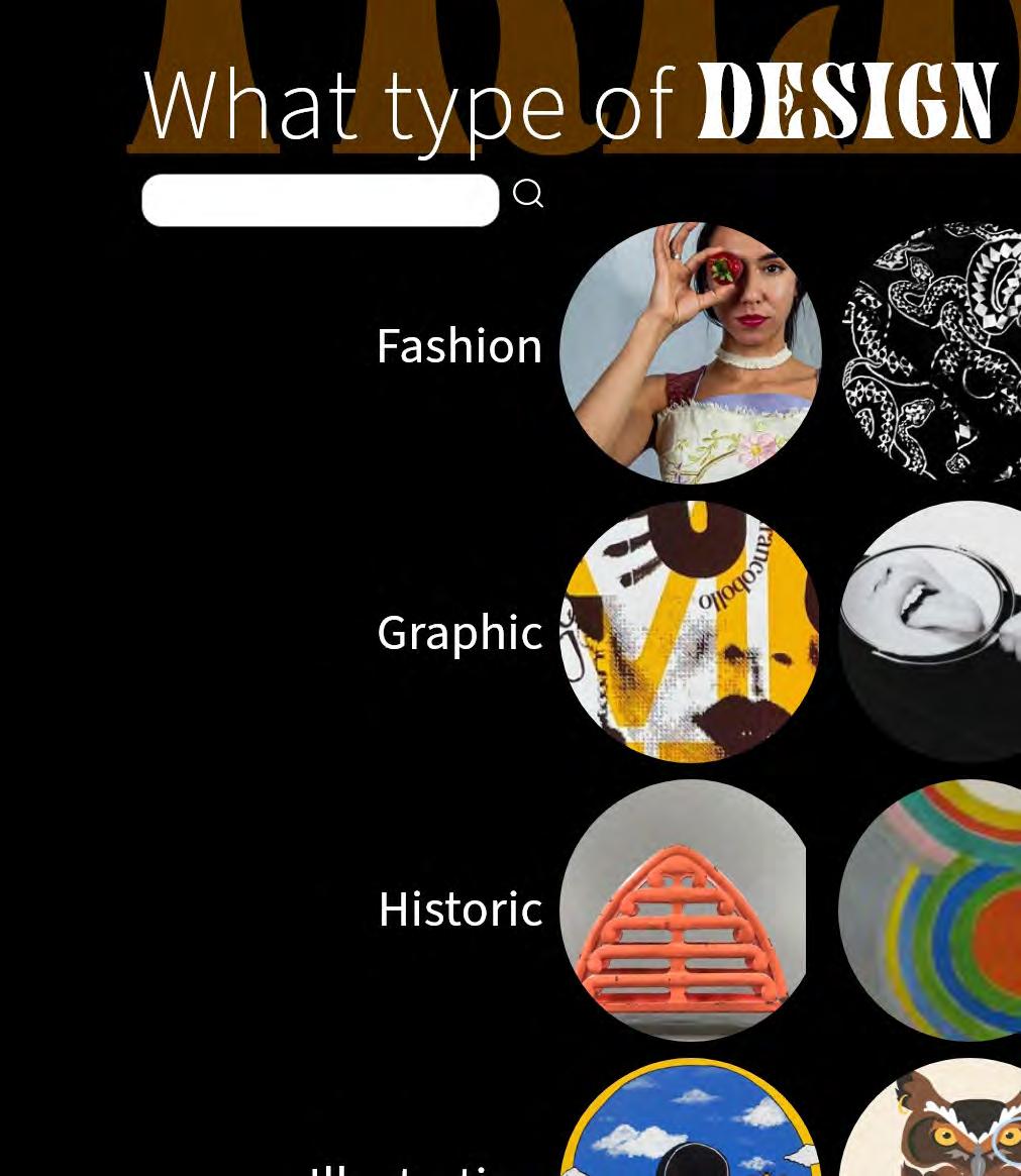
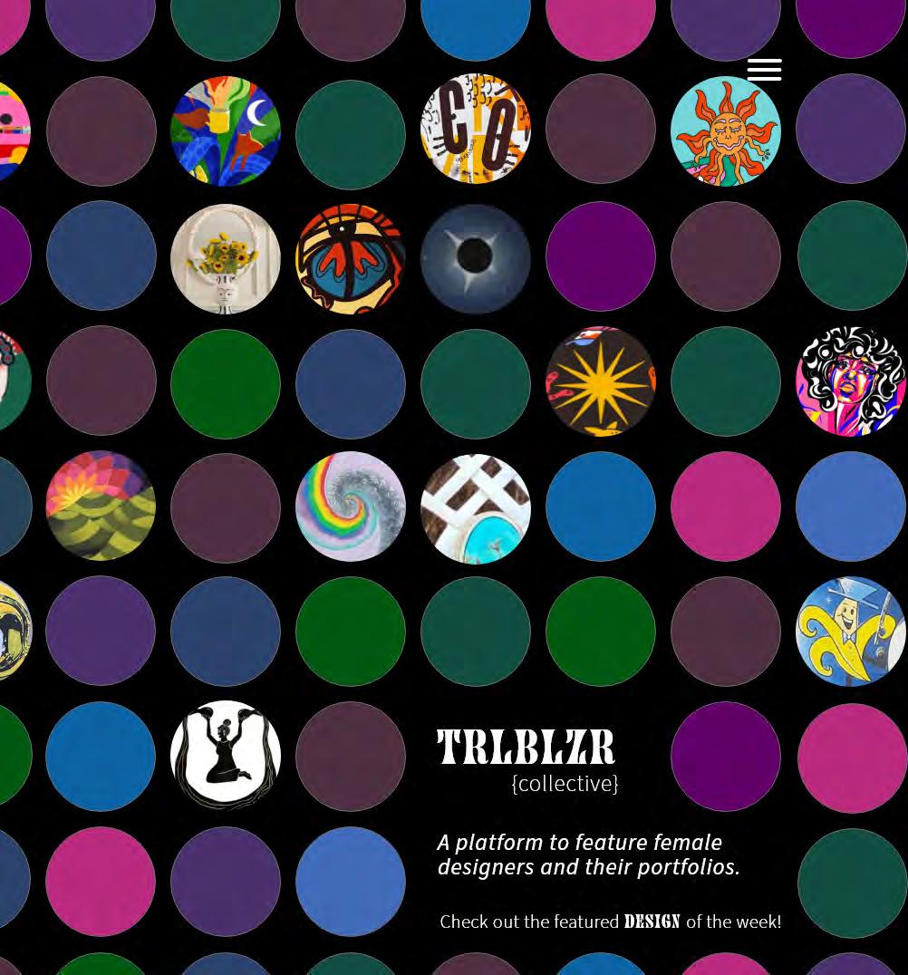
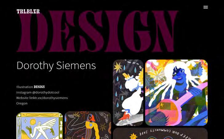
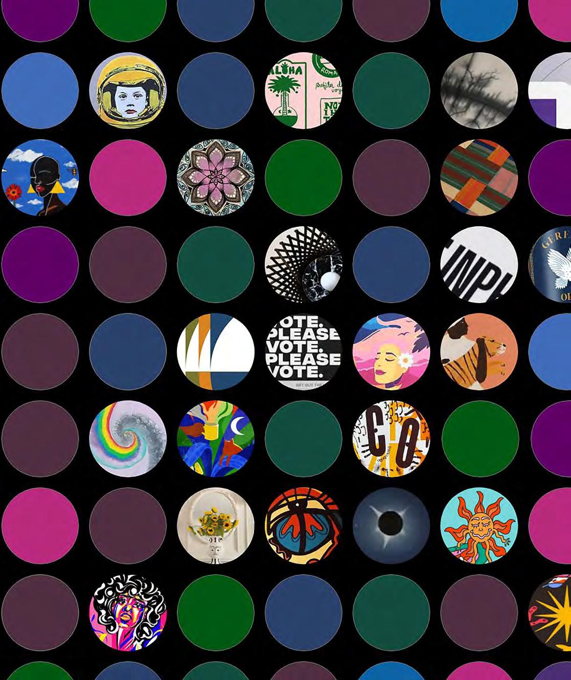
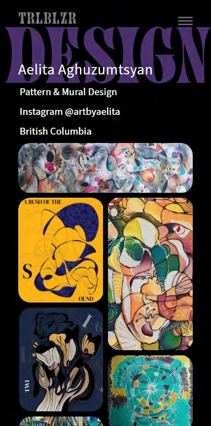
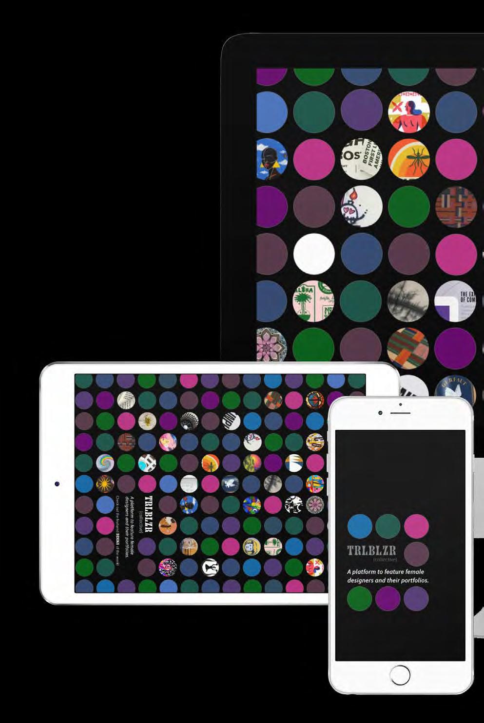
[ objective ] Identify a community of design practitioners and create a platform to show their work. [ solution ] To bring more attention to female designers and their work. The goal was to ensure that many types of design styles were featured in the work of the designers.











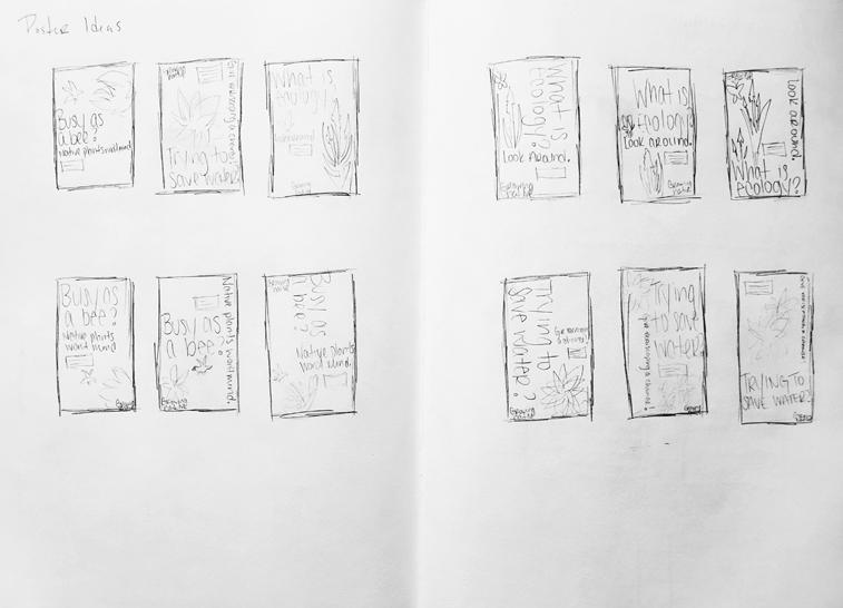
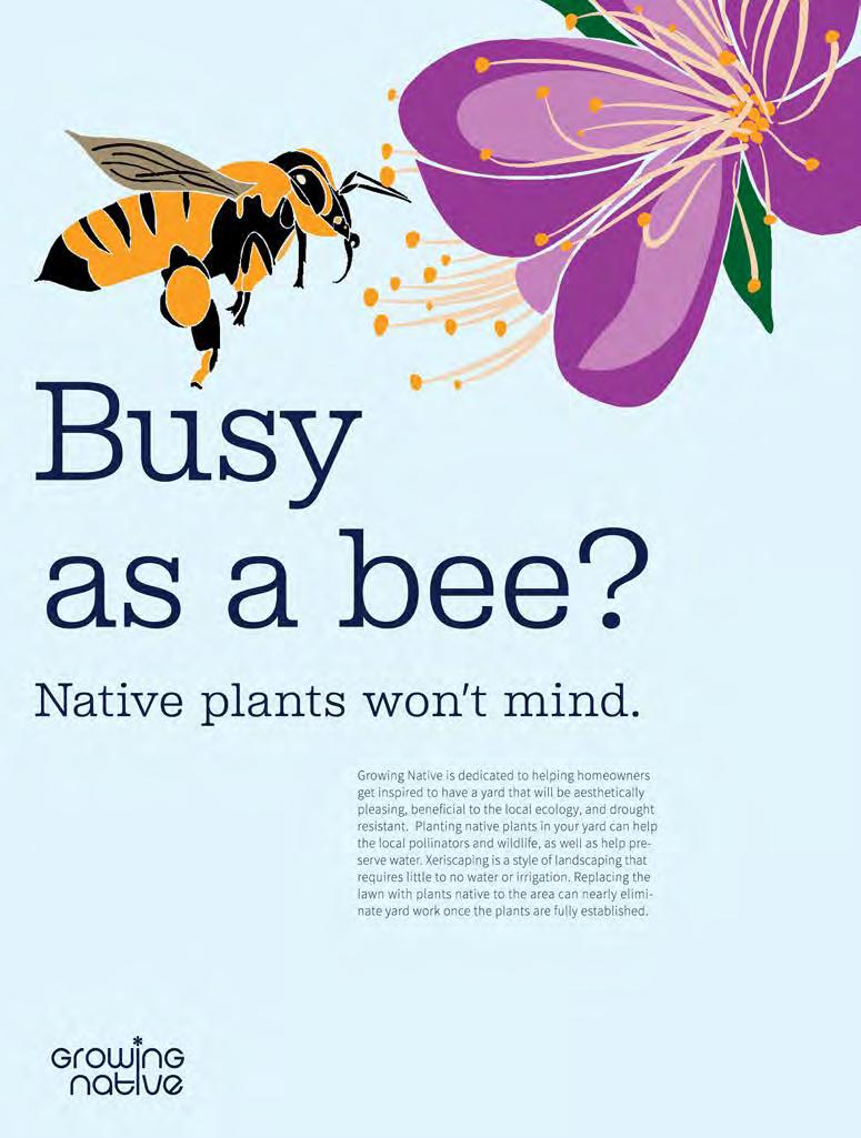
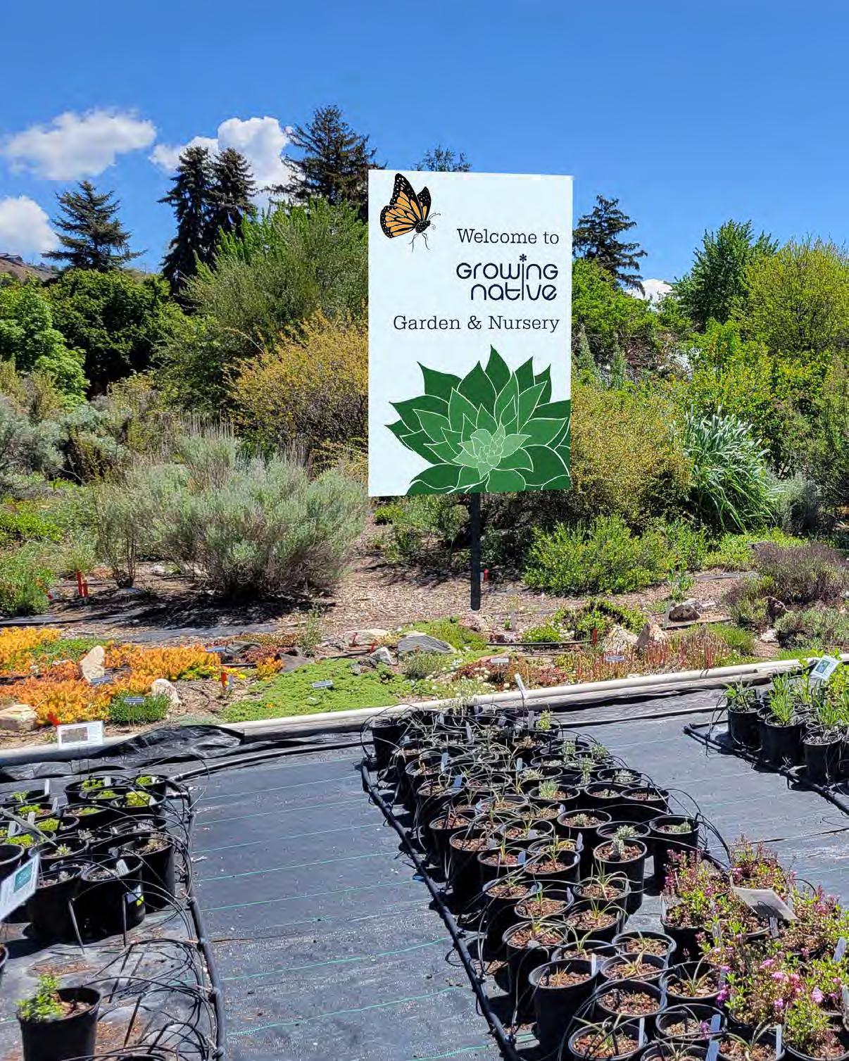
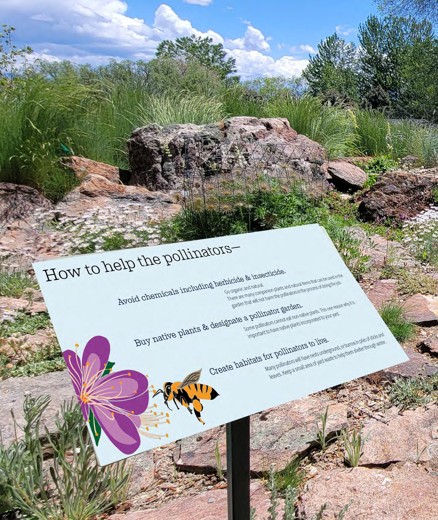
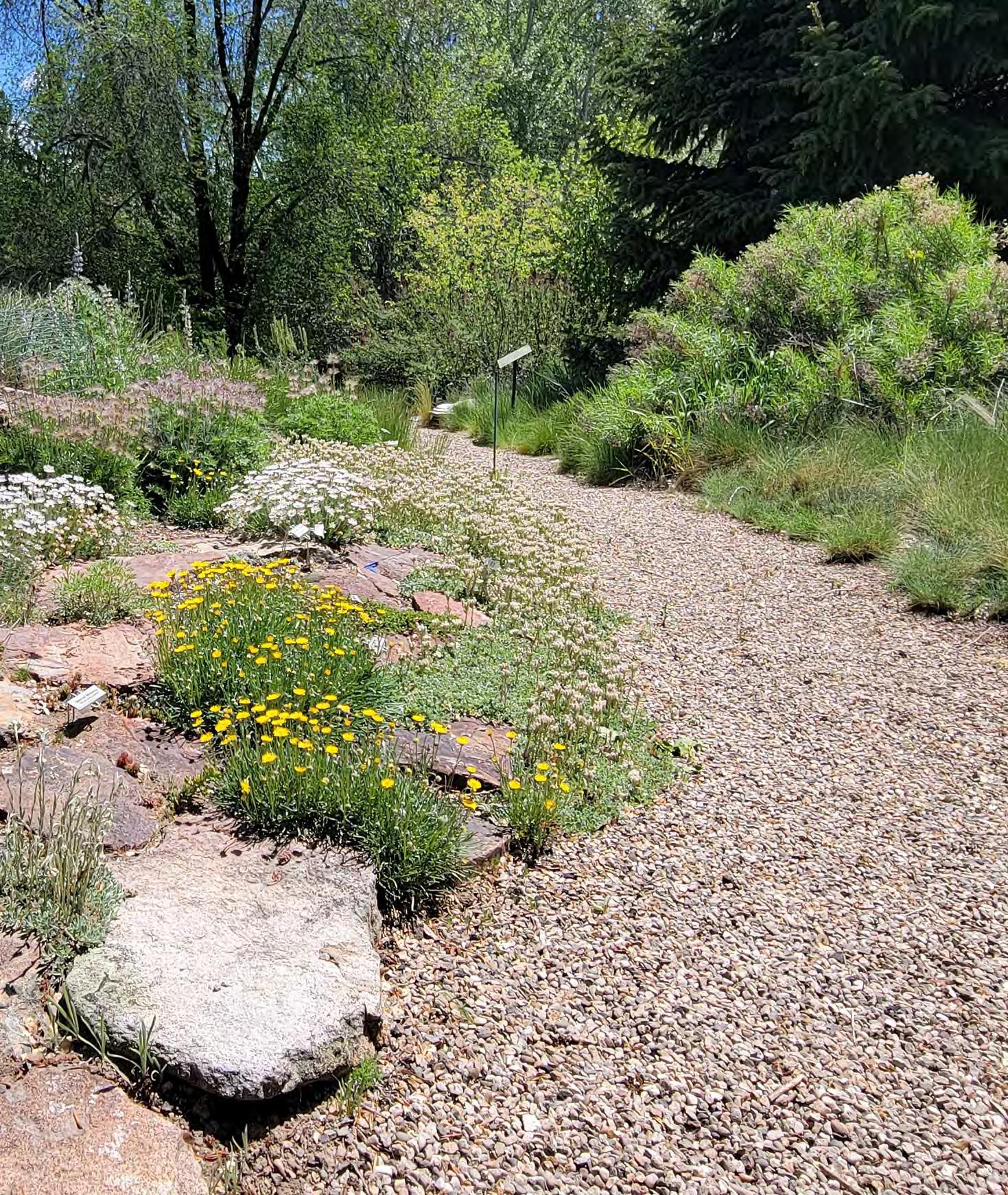
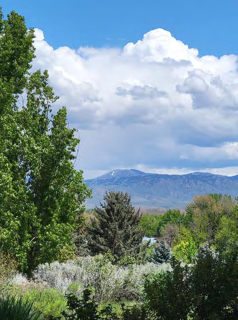
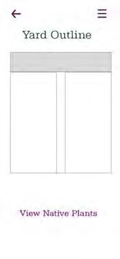
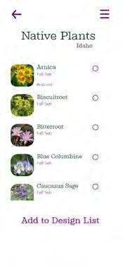
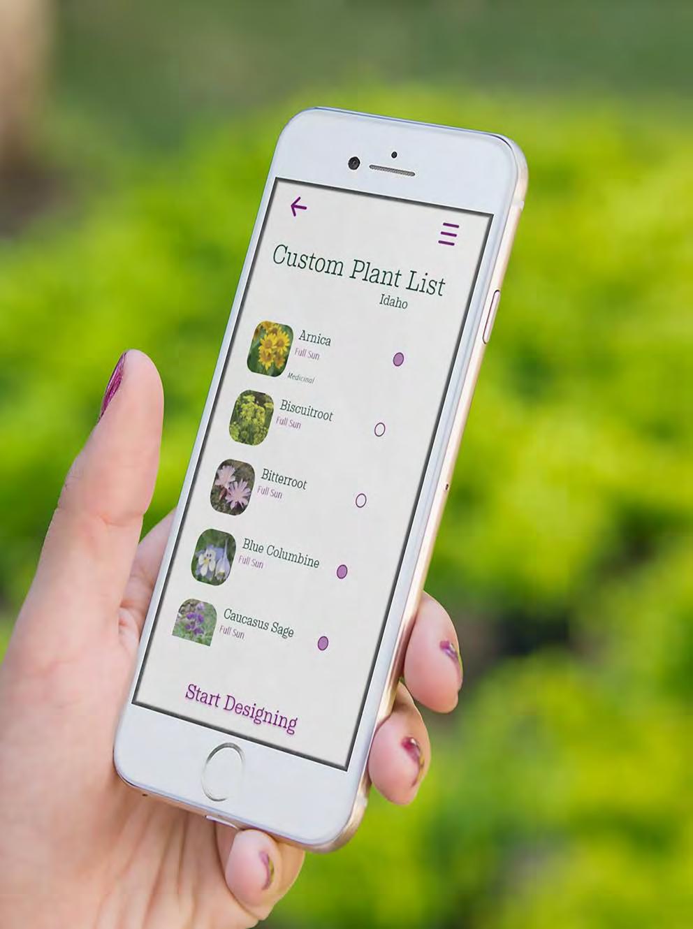
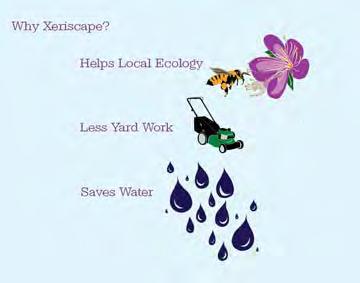
Identify a problem within the world and create a brand to solve it. The problem that was identified is the societal norm to grow and maintain when most of the United States is experiencing droughts. Most grasses are not native to the land on which they are grown, which significantly reduces ecological diversity. [ solution ]
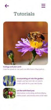
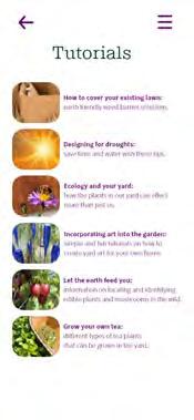
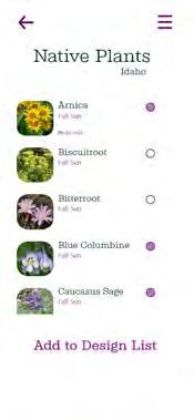
Develop a brand with a catchy name and colorful aesthetic, while also spreading an important message to a broad audience. The deliverables were designed to include information and instructions for every phase of turning a yard into a beautiful and water efficient landscape full of native plants and pollinators.





























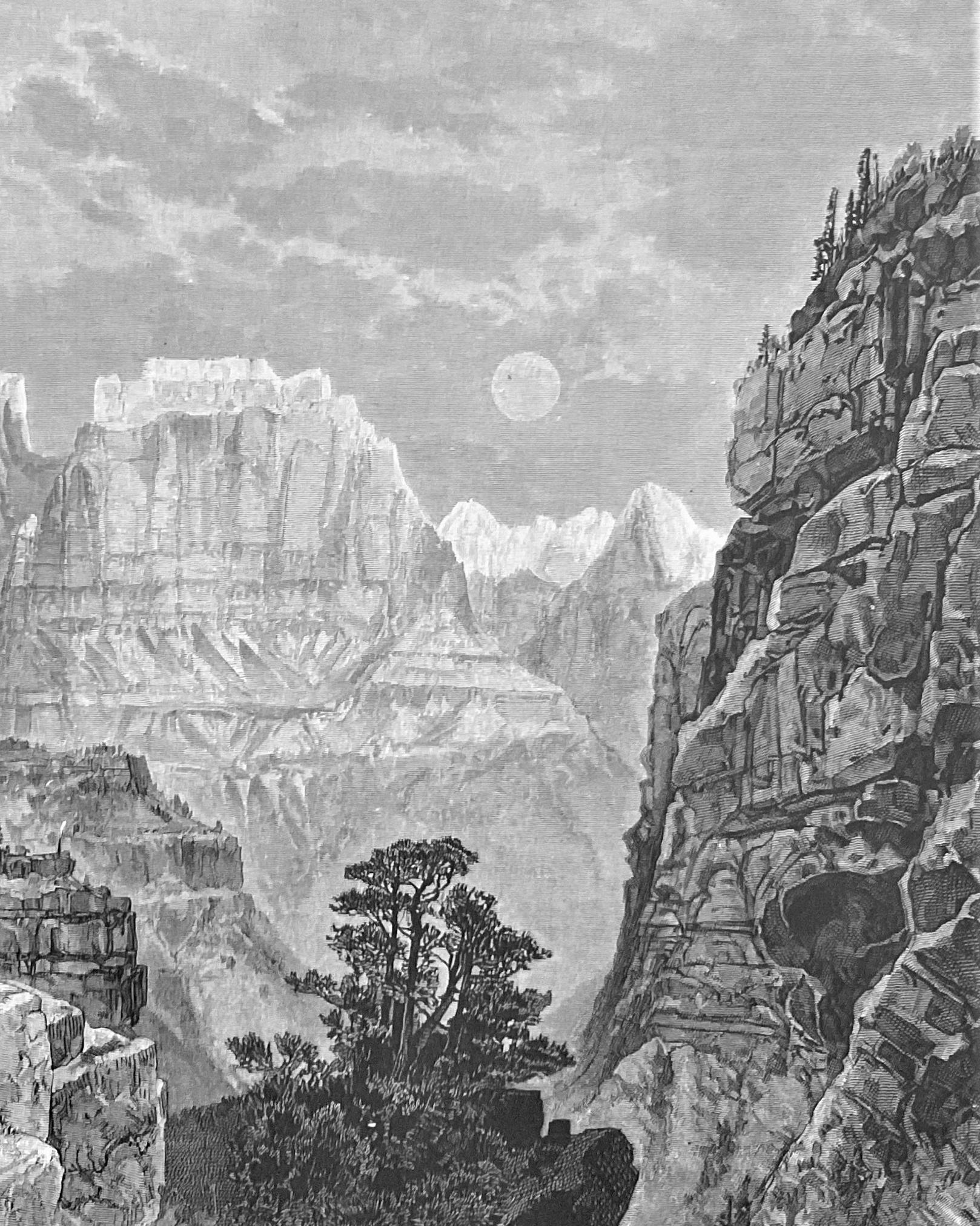
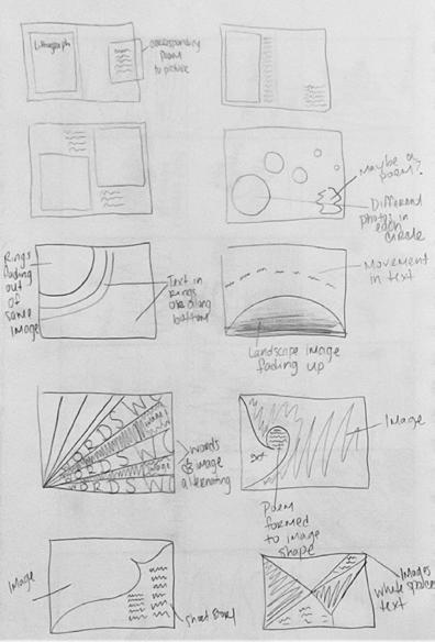
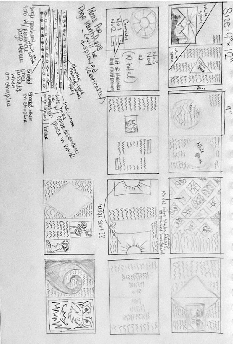
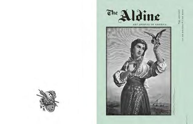
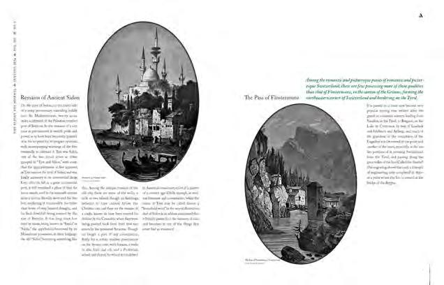
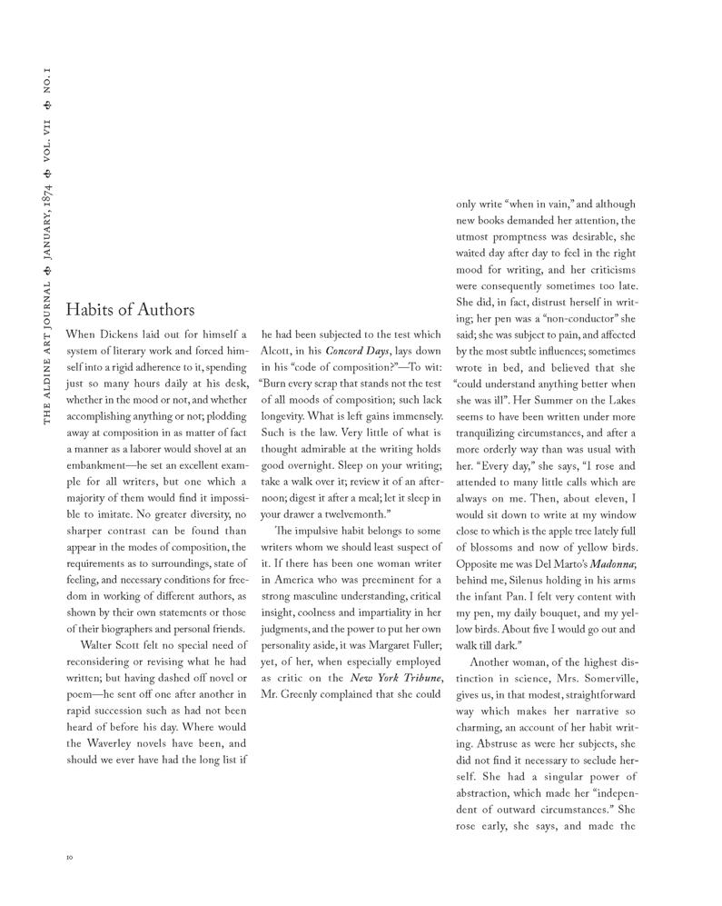
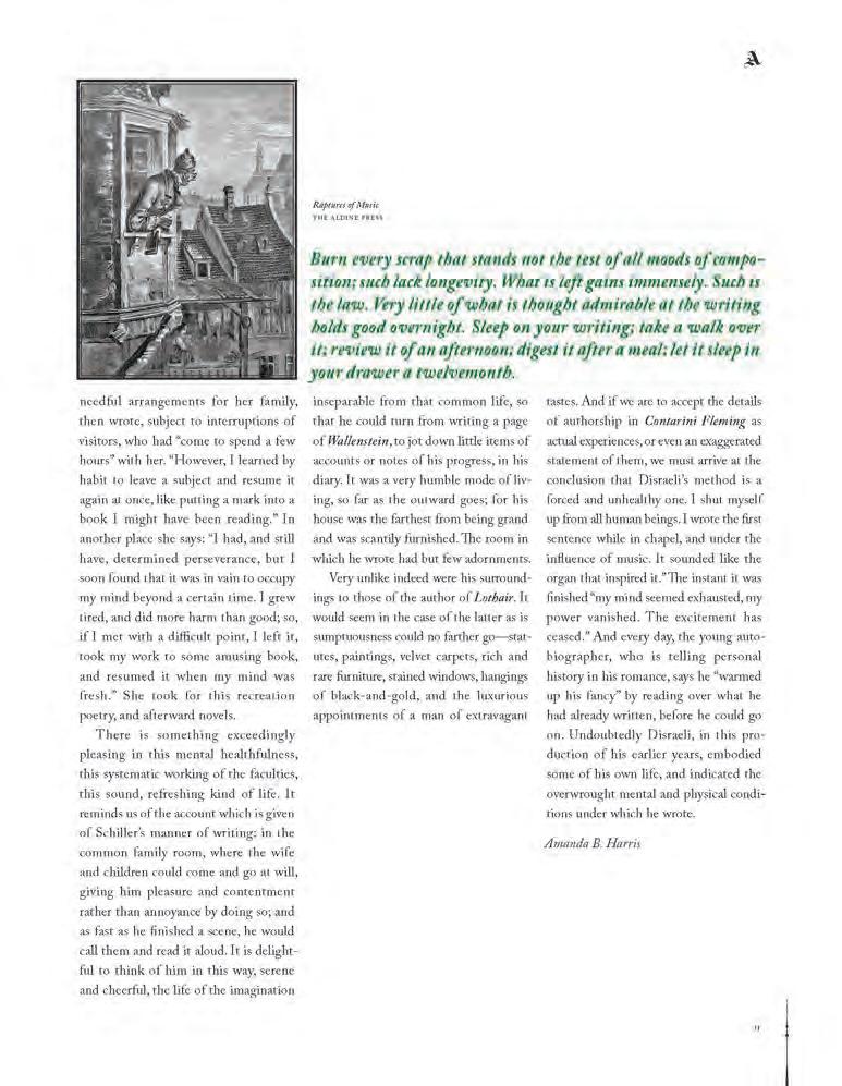
Identify a book that could use a good redesign. Must be some thing uninteresting, too condensed, outdated, or badly designed. [ solution ]
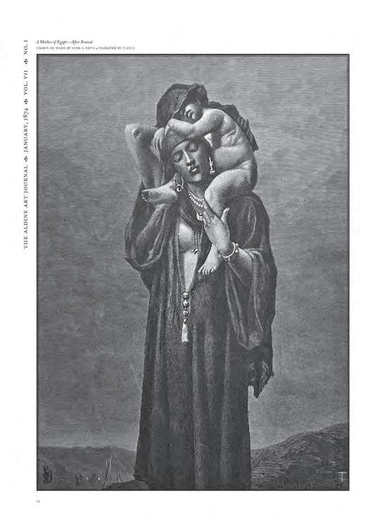
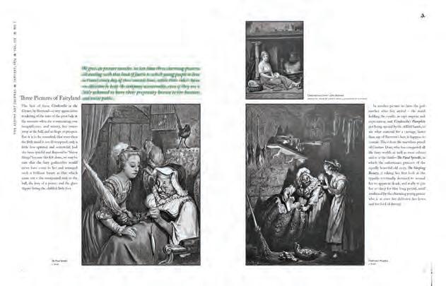
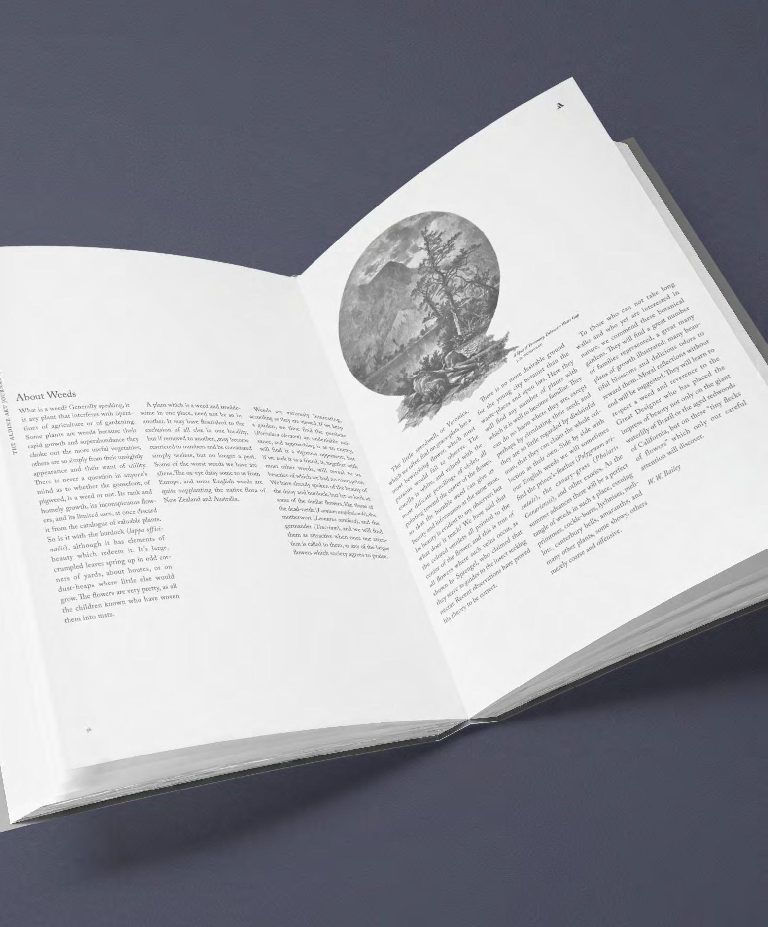
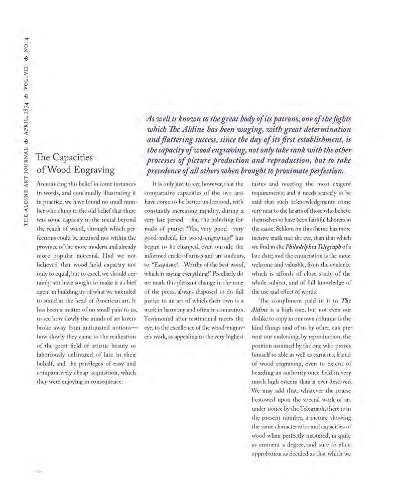
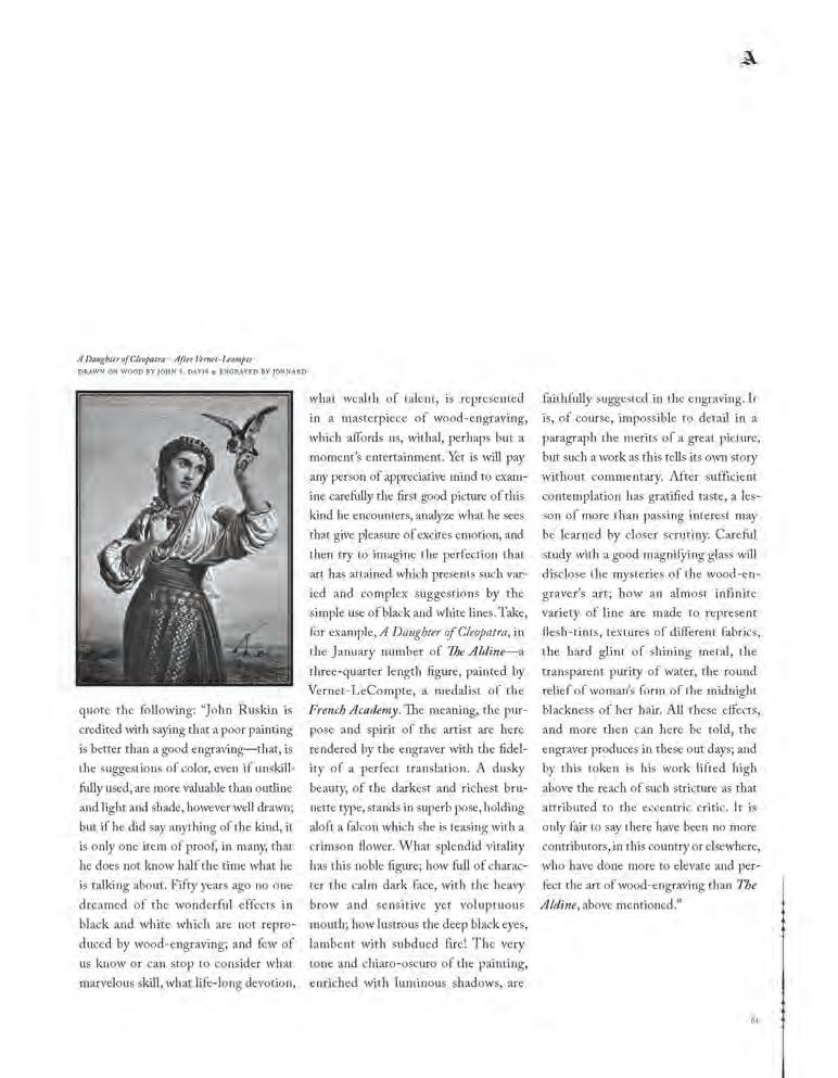
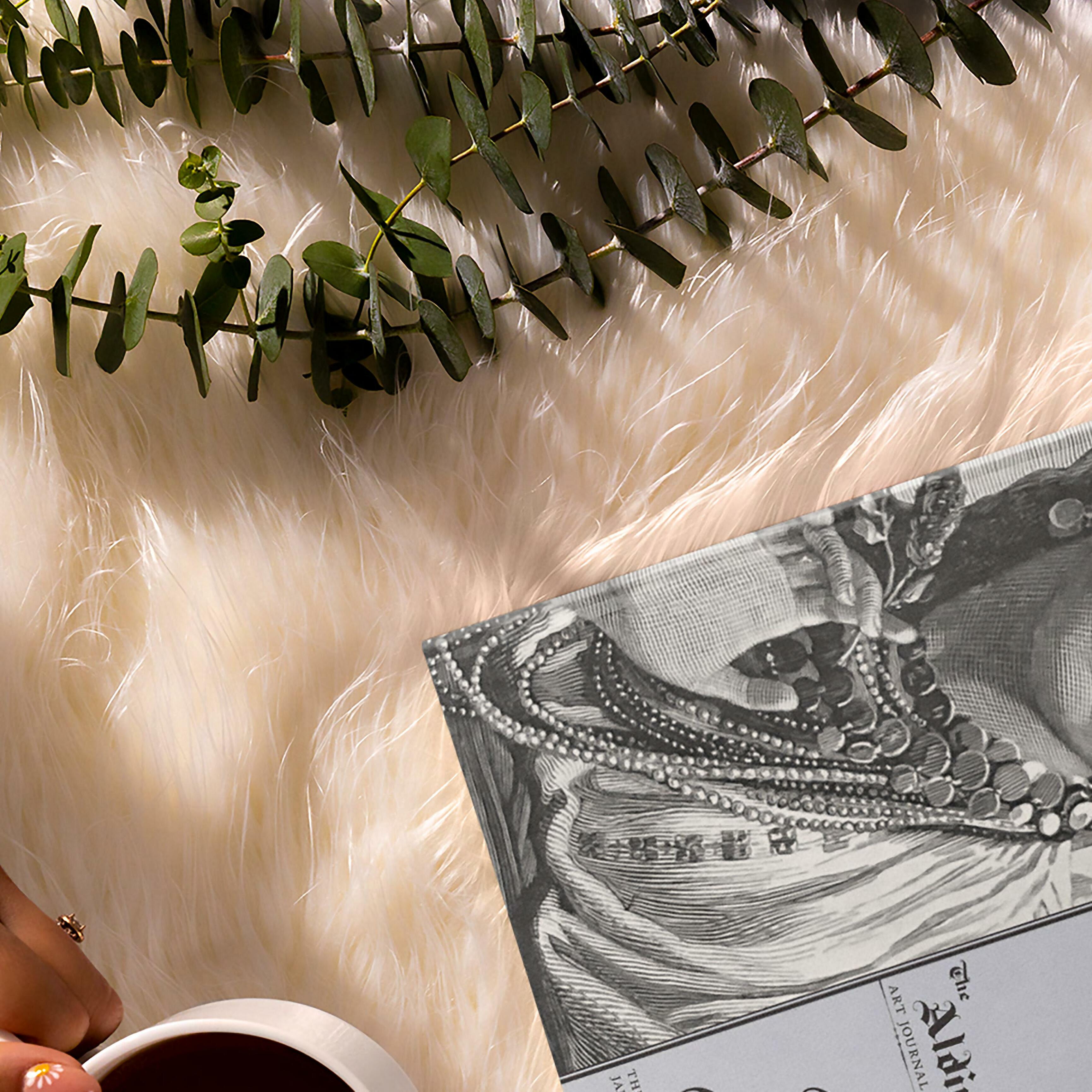
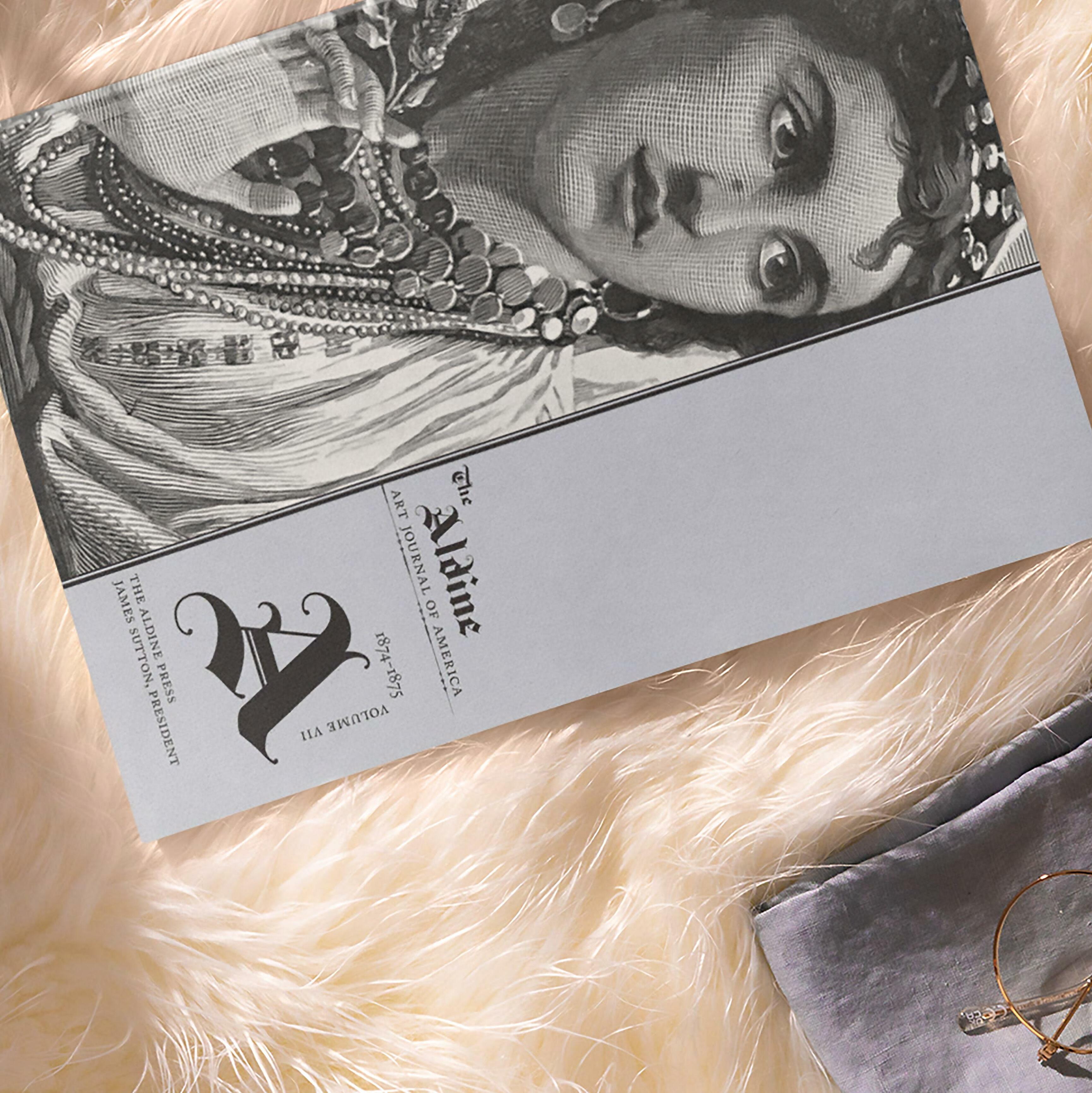
The Aldine Typographic Art Journal was chosen because it was published in the 1nineteenth century (1868–1879). The origi nal design was very condensed in order to make the most of each page that would be run through the printing press. The redesigned version features a more open design concept.

























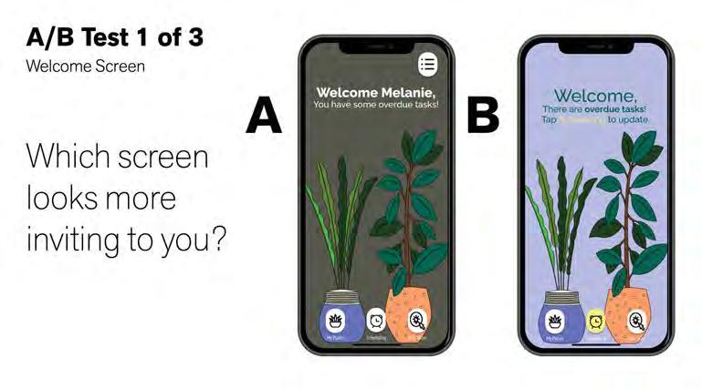
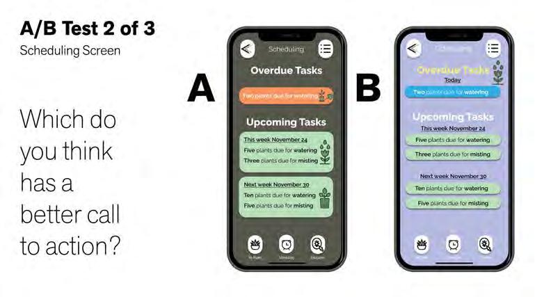
Identify an app that could use a redesign. Perform user testing and document the entire redesign process. [ solution ]
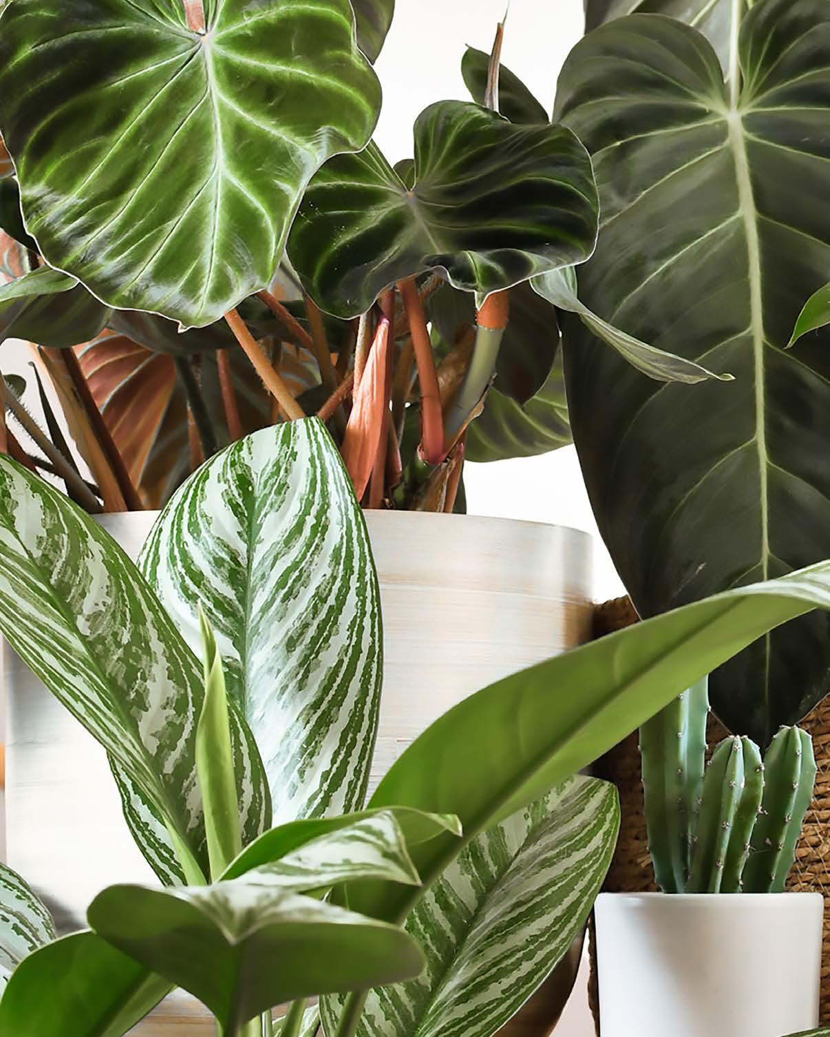
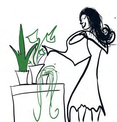
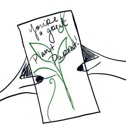
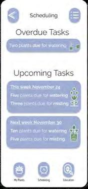
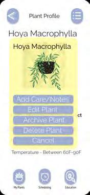
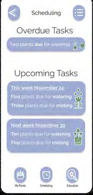
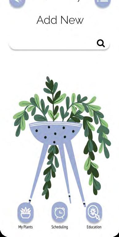
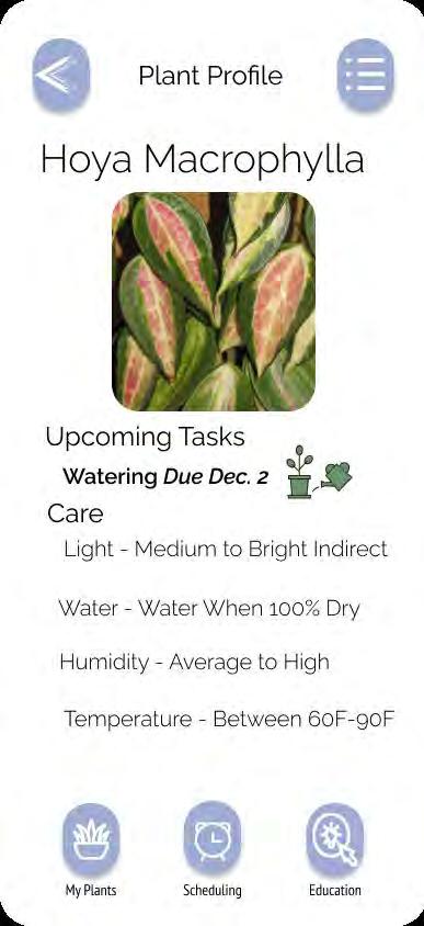
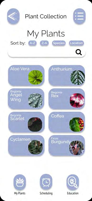
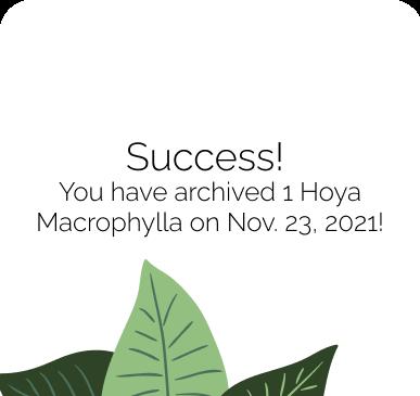
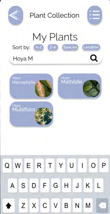
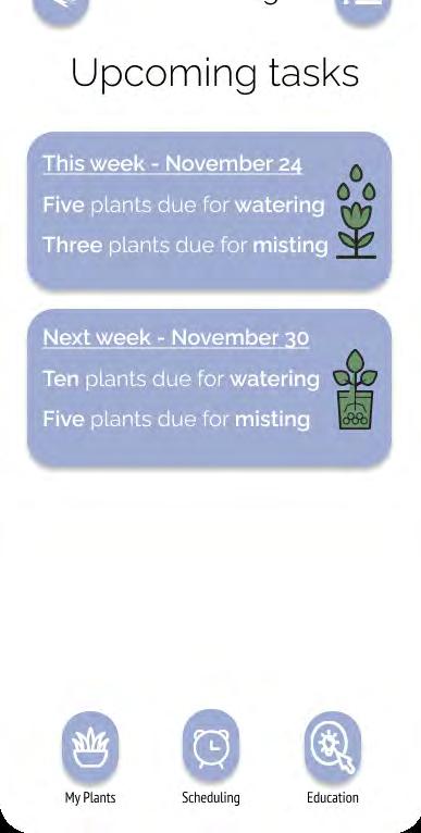
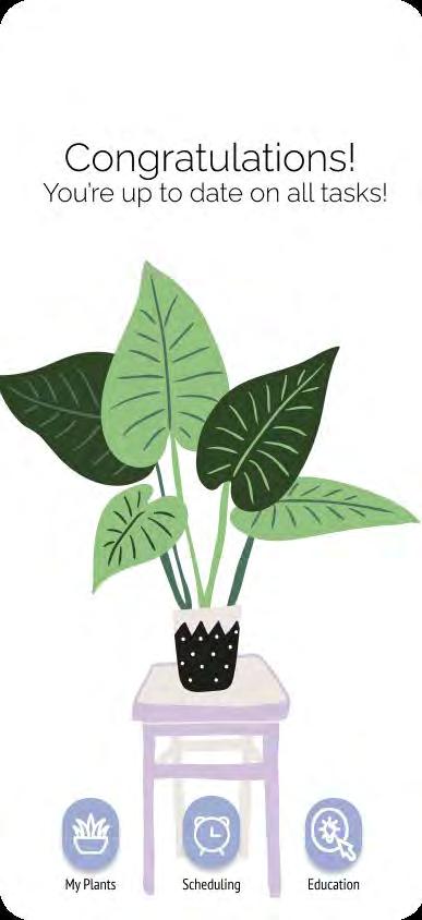
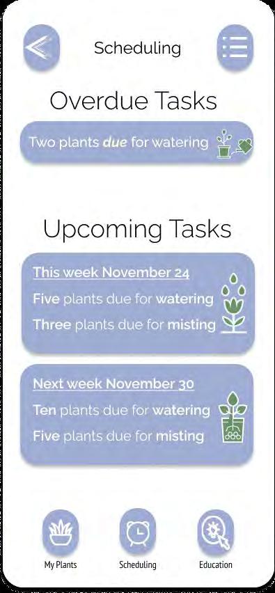
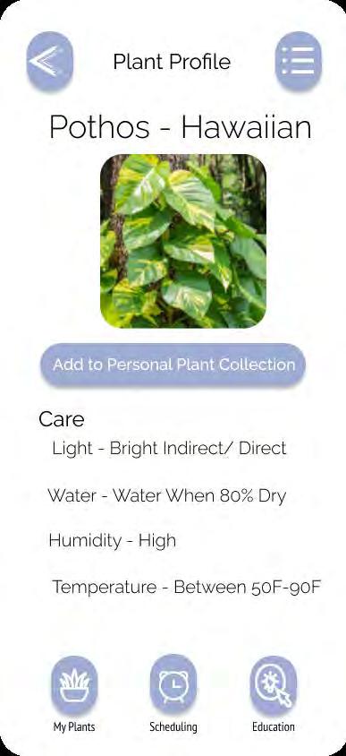
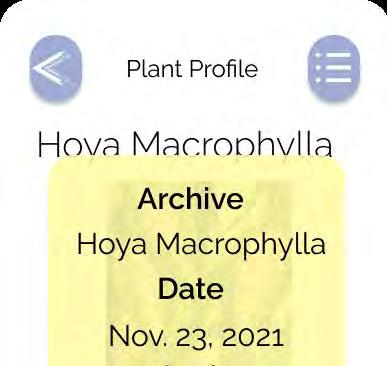
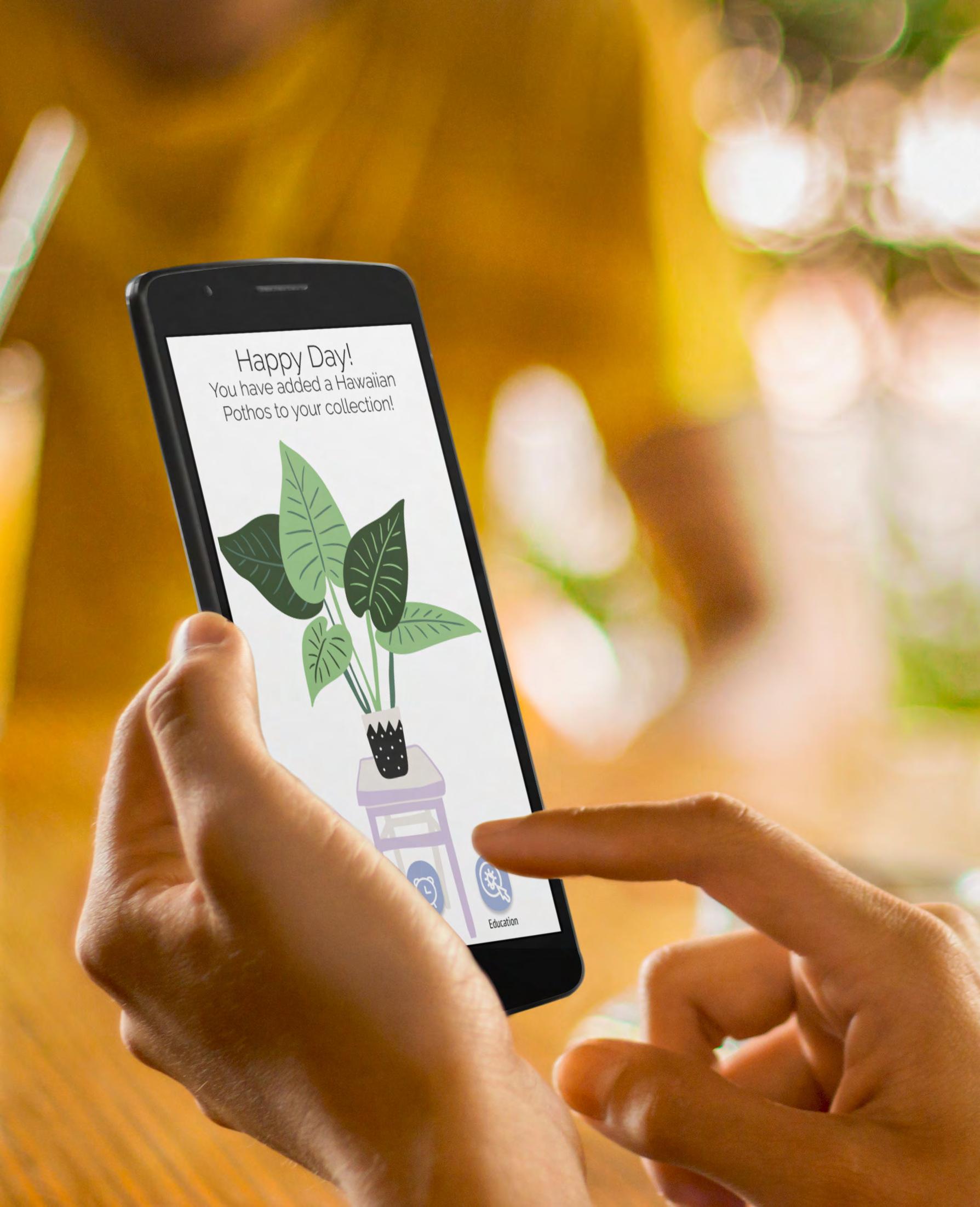
The app that was chosen to redesign is called Vera by Bloomscape. This plant care management app helps users monitor the care of their houseplants using reminders, care tips, and a journal. The current app featured a lot of tedious tasks, and the design screens were not clear. My solution was to simplify the user flows and cre ate a more seamless user experience.


















[ persona 1 ]
Melanie, 24 Student Wants to track the care of new plants.
“As a student and new plant collector, I sometimes forget to water my plants with so much homework. I want to make sure I can take care of my new plants and provide them with the proper care, so I can watch them thrive.”
[ user story ]
Thursday afternoon // 4:00 pm
Sits down after a week of classes Opens Vera app
Taps plant icon to view plant collection Searches for “Peace Lily”
Taps “Peace Lily” from collection Arrives at plant profile page
Taps on “Common Care Tips” Arrives at plant specific information
Reads that her plant needs more water Goes to water plant
Taps “Add Care or Notes”
Taps “Water Plant”
Taps “Save Activity”
Task complete
[ persona 2 ]
Michael, 39 Business Owner Wants to keep track of inventory.
“As an entrepreneur, I want the ability to keep track of my store’s plant inventory, so that I can make sure they are getting the proper care while they are in my store.”
Monday evening // 7:00 pm
Sits down after a day at his store
Opens Vera app
Taps plant icon to view inventory Scrolls to find plants that sold that day
Taps “Aloe Vera” from inventory Arrives at plant profile page
Taps ellipses menu Arrives at menu screen
Taps “Delete Plant” Confirms action to delete Task complete






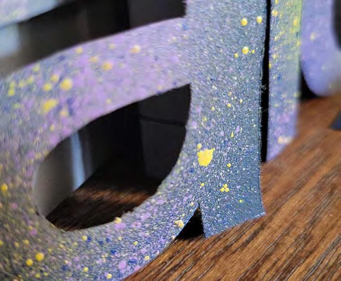
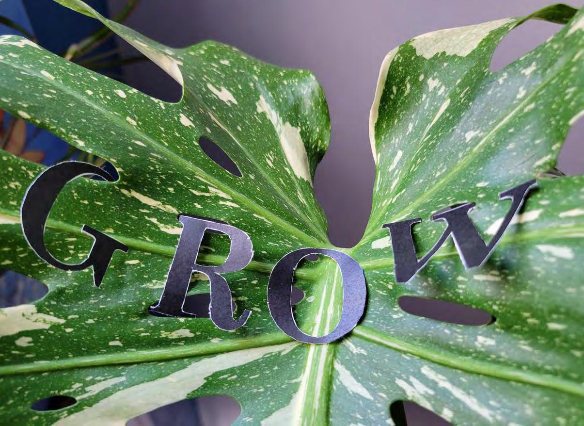
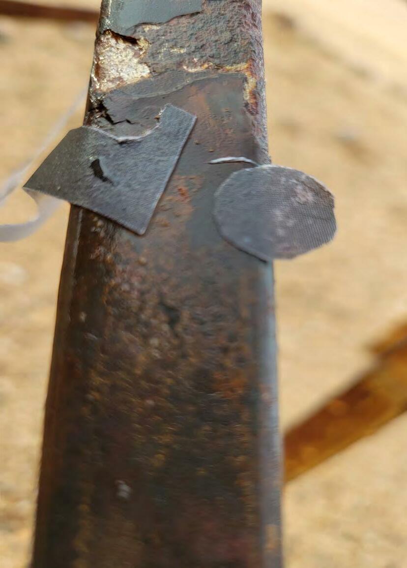
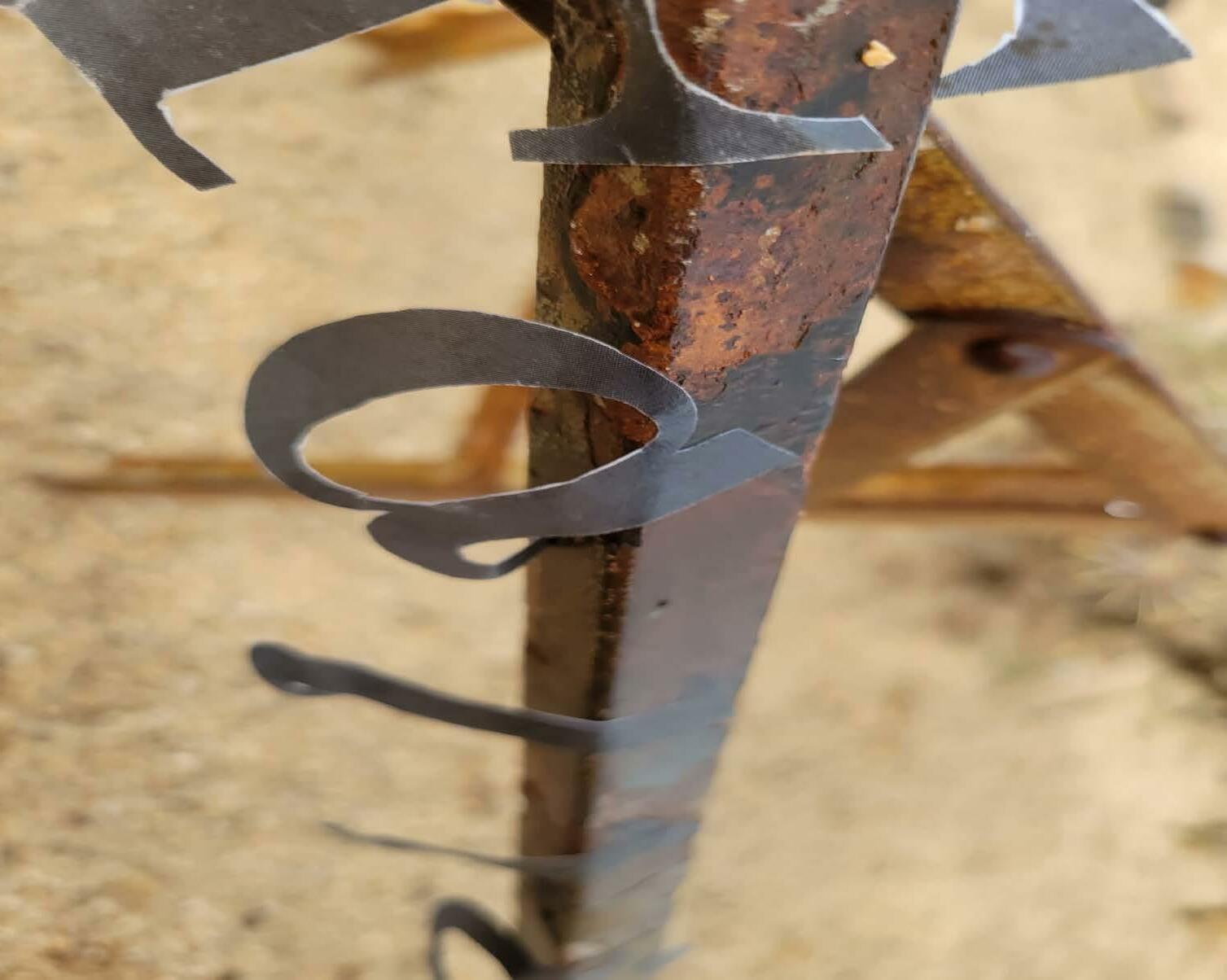
[ course ] GR 613 Type Experiments [ instructor ] David Hake [ project ] Typographic Dream State [ semester ] Fall 2022 [ categories ] Typography Innovation [ keywords ] Contrast Experimental Reflection
[ objective ]
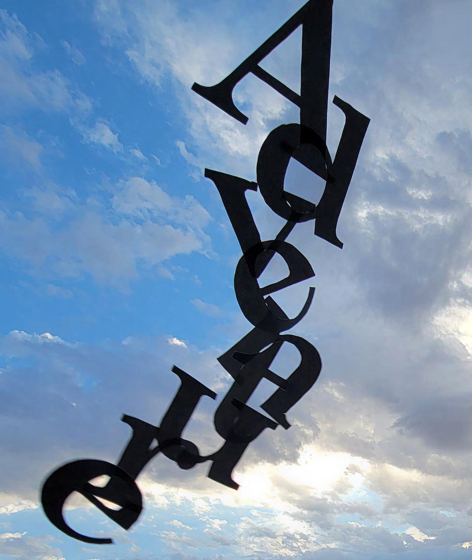
Imagine different typographic strategies based on the dream state and one’s creative impulses.
[ solution ]
Working with light, shadows, reflections, and various props, the type experiments were formed. This project highlights various possibilities of incorporating type into design.










Mary Scott —Thank you for your dedication to our success and patience with helping me through the process of creating this portfolio. I am grateful for the opportunity to have worked with you and proud of the portfolio that you helped me build.
Phil Hamlett —Thank you for being so influential to me in this educational journey and always having great metaphors for the design process. I enjoyed the class I had with you and am grateful for the guidance you provide.
Hunter Wimmer —Thank you for being an all-around great teacher. You push students to do their best, yet are understanding about the circumstances life may throw at us. I feel like I learned so much from you, not just with class material but also life wisdom.
John Nettleton —Thank you for teaching me about typography and how to use it eloquently. I really enjoyed your classes because you helped train my eye to see certain things in design and with type. You are passionate about typography and have helped me understand the importance of divergence.
David Hake —Your experimental type class was thoroughly enjoyable and I will miss having you as a teacher. You helped me to see the fun and abstract side of typography and to think of type in a different way than I ever have before.
Sandra Isla —Thank you for teaching me how to develop a well-rounded brand and for your patience to help me succeed.
Ryan Medeiros —I learned so much from the app redesign process and was grateful to have a teacher from a different department, so I could get a broader perspective on the world of graphic design and importance of group work.
Erin Canoy —Thank you for your help when I was very new to the world of graphic design.
Anthony Palmer —Thank you for working with me during my very first semester and teaching me the basics of typography.
Jeremy Stout —Thank you for helping me with learn ing some of the fundamentals of design.
Jim O'Hara —Thank you for being so helpful with language and phrasing.
[ to my family ]
Mom —Thank you for your consistent love, support, and positivity.
Dad —Thank you for your guidance and input throughout the various circumstances that I have encountered. You have a great perspective and have helped me make good decisions in life.
Joseph Connelly —Thank you for being my emotional support and helping me every day to become a better version of myself. Also, thank you for coding my website and being a wonderful human!
Donna Faoro —Thank you for your enthusiasm about my journey in life and for always being so supportive and proud of my accomplishments.
Raeanne Petersen —Thank you for teaching me what it means to be disciplined and to have a good routine. I have looked up to you for a long time and want to acknowledge the positive impact that you made in my life.
Isaac Palmer —Thank you for your encouragement and influence throughout life.
Amanda Haufmann —Thank you for always rooting for me!
[ to my friends ]
Thank you for supporting and inspiring me in my artistic journey. I have learned so much from all of you and am continually inspired by the amount of thoughtful and creative humans that I get to call friends. Specifically, I would like to thank Hannah Austin, Kevin Shumard, Coralee Sharp, Athena Newman, Alexandra de Anda, Michael Stear, Kristina Boatwright, Jade Richardson, Evan Cawley, Jesse Cordtz , in addition to many more. I love you all!
[ contact ] Heather Palmer heatherjoypalmer.com
[ school ] Academy of Art University [ degree ] Master of Arts School of Graphic Design and Digital Media
[ instructor ] Mary Scott
[ book title ] Eclectic Vision
[ typefaces ] Asther Akzidenz-Grotesk
[ photography ] Heather Palmer Cirque du Soleil Adobe Stock Envato Elements Place-It peacecorps.gov
[ book binding ] Blurb
[ paper stock ] Mohawk Superfine Eggshell 100# Text