

The Hear Again America brand is a mark of excellence in hearing health care. It represents a commitment to our patients to provide them with the highest quality services and support. By following the guidelines set forth in this document, you can help us to maintain and strengthen the Hear Again America brand.


The Hear Again America logo is our most iconic brand asset. It sets us apart from our competitors and visually embodies our brand identity, including our expertise, values, people, and offerings. The colors that make up the logo are HAA green (for “Hear” + “America” + the tittle above the “i” in “Again”) & black (for “Again” + the tagline). The icon is made up of a green gradient.


The primary logo/signature has a ratio of 1:2.9 and is a combination of our name, icon and tag line.
Applications where the logo’s length is less than 2 inches/5.08cm (or digital, less than 150 pixels) the tagline may be dropped to preserve legibility.
However, any applications where the logo exceeds 2 inches/5.08cm (or digital, more than 150 pixels) in length must utilize the standard signature.

1 : 2.9 ratio


For Print < 2in/5.08cm
For Digital < 150 pixels long Remove Tagline
Left: In this application, the logo is less than 2in in length. As a result the no tagline signature has been used to preserve integrity and readability.


851 Broken Sound Parkway NW, #120, Boca Raton, FL 33487 P. (561) 367-1623
Onet ut latas dolenie ndaestrum, sequi beati in exerovite net aute velloratur, antem. Catur si delent qui antus quatem que nisint id maximuscia natia eatam, vit voluptur, qui volorum dolupta testinctiur re imi, vit aut et event prorumq uiduci occus doluptibea veni reres sed mosaped ullam, ventios apicia porionestrum sectus rescilique modi aut fugiae laborernam, simporibus si officiur, ut dolorerfere niscia vendia sandi non porehen imustia tquiate idi untur rest omni cupta voles magnam, volorep erumqui si tem fugitatusa qui omnimus vendam etur, cum, quo tem evenima sit volorep erspid molor aut ea quiassi tatibus ma cuptasp editio. Apiendu cipideres nescipidiam volor molorer emporroriam, il et ma voluptat.
Fugit et eicianimus pla net velent optas eum sus solo modi iumquibus, sit atibus unt. Fictota porendion nectur aliquos et, ut ini sandellitia sed que laborum doluptate ommo dolorate quatinum sitati ut mi, quo temodis es quias autet facearum quost undis sae qui dio. Fuga. Ur? Quis aut eium fugit quiae nihillestrum con por magnihicium fugitam, quiamus. Igent as excea quam iunt untionsenda iunt peribeation cum quatia vellabo rendit omnihilis experch icilit acescid qui conet, solut dendi dero cor arumquo dolupta tentia ni te porestis autate in praturit aliam est, iminihi cipsande pla idunt volupture dolut et hilitem perrovide laboremqui a voluptur aut accatis peribus et mo et quaturem non et fugit lanitis eatur re endis explant eati as dioreptas dit, inctam fuga. Faciatur sim doluptur?
Ugit fugitaqui ut et quid mo magnit atem volorion prae quuntor iandell ignatio offic tendis accus doluptur adisci quid maximus.

Below: In this application, the logo is 2in or more in length. As a result, the standard signature must be used.
www.HearAgainAmerica.com


The minimum clear space around the signature is equal to one-third the height (x) of the Hear Again America logo, measured from the top of the icon to the bottom.
Do not allow photos, typography, or other graphic elements to enter the minimum clear space area.


The primary color scheme must be used for most applications.
In situations where the background color may interfere with the logo’s visibility or readability, the color variations to the right are approved for use.
A. Main Color Scheme
B. For dark backgrounds
C. For some green or cool backgrounds
D. For some complimentary or warm backgrounds


The logotype may be used without the icon when size constraints are an issue.
All the same guidelines for the main signature applies to this version as well.
There are three color variations to accommodate the same background color issues and preserve readability.


The icon must never be used without the rest of the signature.
Always maintain a ratio of 1:2.9. Do not stretch or shear the elements of the signature.
Do not vary the green or change it to a different hue.


The alternate version of the main logo is a great way to maintain brand recognition in situations where the main signature will not fit correctly due to lack of horizontal space or an excess of vertical space.
Limit its use to when branding space is limited to circular or square spaces.
This alternate version is not a substitute for the main signature and should be used in very specific situations such as the ones stated above.


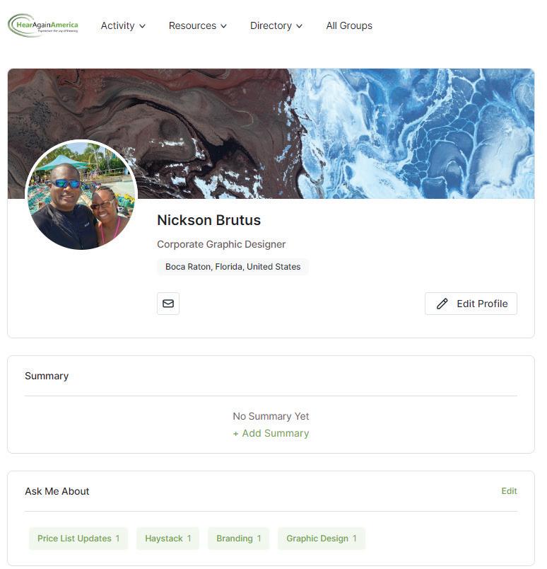
Below: Compact logo used as a profile image on the Hear Again America portal.


The Hear Again America Green is the brand’s dominant color and signifies our commitment to improving the hearing health of our patients.
Midland Blue and HAA Gray comprise the other two important colors and are used to create a strong contrast when used in combination with HAA green.
The Secondary colors compliment the Primary colors and add flexibility to the branding as a whole.
PMS: 7737 C
CMYK: 64-15-100-1
RGB: 107-165-67
HEX: 6ba543
PMS: 2767 C
CMYK: 99-88-39-36
RGB: 25-42-81
HEX: 192a51
PMS: 656 C
CMYK: 4-2-2-0
RGB: 240-243-244
HEX: f0f3f4
CMYK: 91-100-29-21
RGB: 59-30-97 HEX: 3b1e61
CMYK: 73-100-22-16
RGB: 93-36-107 HEX: 5d246b
CMYK: 0-27-8-0
RGB: 250-198-205 HEX: fac6cd
CMYK: 0-2-12-0
RGB: 255-246-224 HEX: fff6e0
CMYK: 0-30-99-0
RGB: 253-185-23 HEX: fdb917
CMYK: 24-27-100-0
RGB: 200-173-42 HEX: c8ad2a
CMYK: 52-10-100-0
RGB: 138-181-63 HEX: 8ab53f
CMYK: 77-58-63-55
RGB: 42-57-55 HEX: 2a3937
CMYK: 5-5-0-0
RGB: 238-238-255 HEX: eeeeff
CMYK: 100-91-7-0
RGB: 34-60-145 HEX: 223c91
High legibility even in small sizes. Perfect for digital & print.
ABCDEFGHIJ123456789
ABCDEFGHIJ123456789 ABCDEFGHIJ123456789
ABCDEFGHIJ123456789
ABCDEFGHIJ123456789 ABCDEFGHIJ123456789
Images should be energetic & colorful but are not restricted to a particular hue or chroma. Use red sparingly.
Try to restrict images to mature, silver haired men or women. Images of groups should include people from this category.
Even though the models in our marketing are older, they should nonetheless convey an active & social lifestyle. A result of improved hearing and restored confidence.
To ensure brand consistency and legal compliance, all marketing visuals must be licensed and approved by corporate before use.


