HERITAGE
A family of colours inspired by Australia’s rich architectural history.

The Haymes Heritage Range draws inspiration from Australia’s rich architectural history, offering a carefully curated palette that celebrates the distinctive character of five significant design periods. Each collection within this range has been thoughtfully developed to capture the authentic colours and mood of its era, allowing homeowners to bring historical accuracy and timeless elegance to their restoration projects, or create contemporary spaces with a nod to the past.
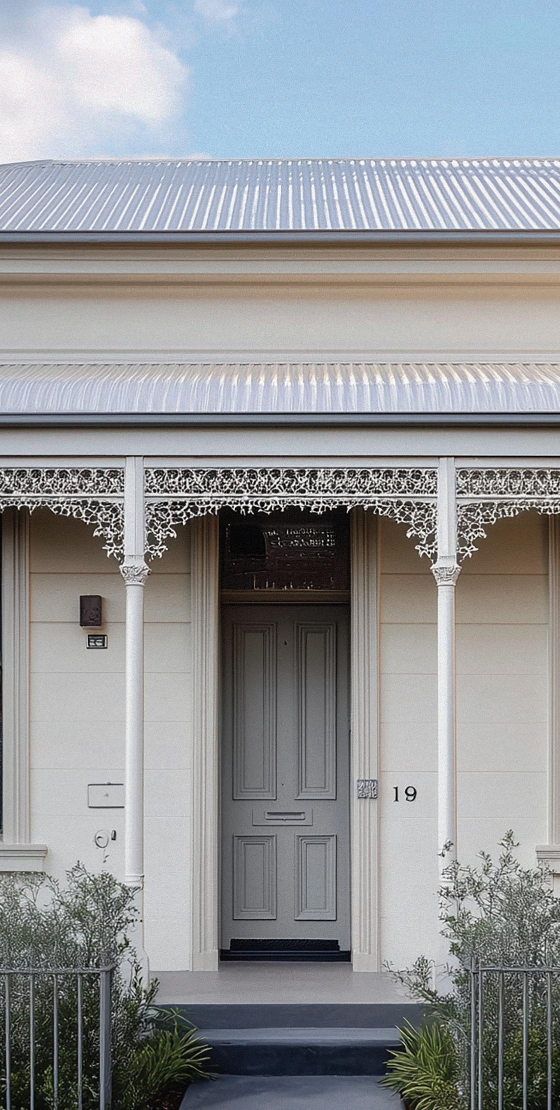
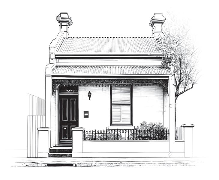
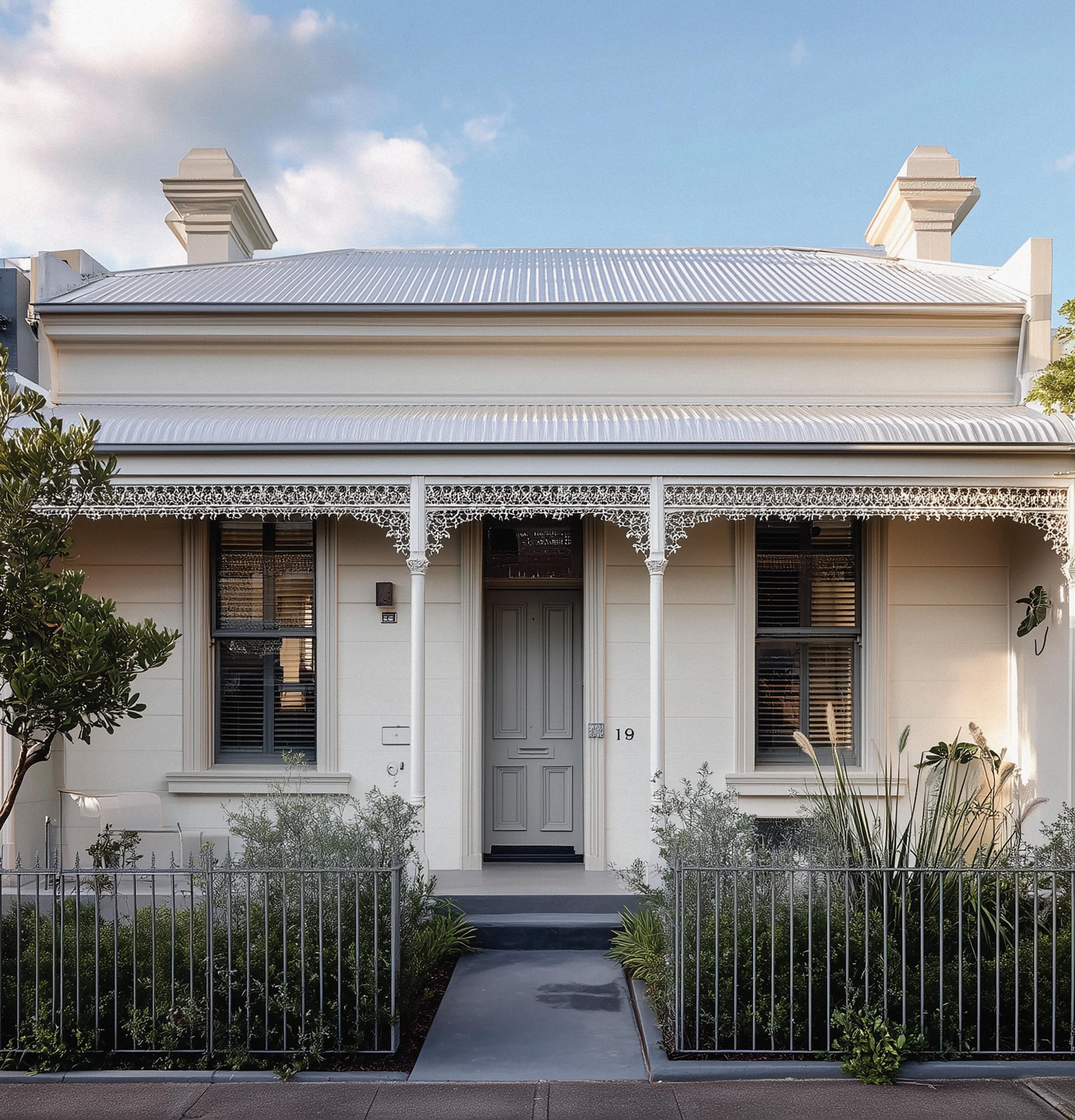
Victorian homes in Australia were built during a period of prosperity and expansion, marked by ornate detailing and a fondness for grandeur. Influenced by Gothic Revival, Italianate, and Boom Style design, these houses often featured intricate cast-iron lacework, tall windows, and decorative verandahs. Colour was used to emphasise detail, giving richness and depth to both exteriors and interiors.
Exterior Colour Palette
Victorian exteriors generally combined natural wall tones with contrasting trims and highlights. Main body colours included warm neutrals such as Light Stone and Vellum, reflecting masonry and render finishes. Timberwork and trims were typically picked out in deeper tones like Olive Drab and Deep Brunswick Green, while finer details—balustrades, brackets, and iron lace—were often emphasised with richer shades such as Indian Red or Rich Red. This polychromatic approach celebrated the ornate craftsmanship of the era while grounding homes in earthy, robust tones.
Interior Colour Palette
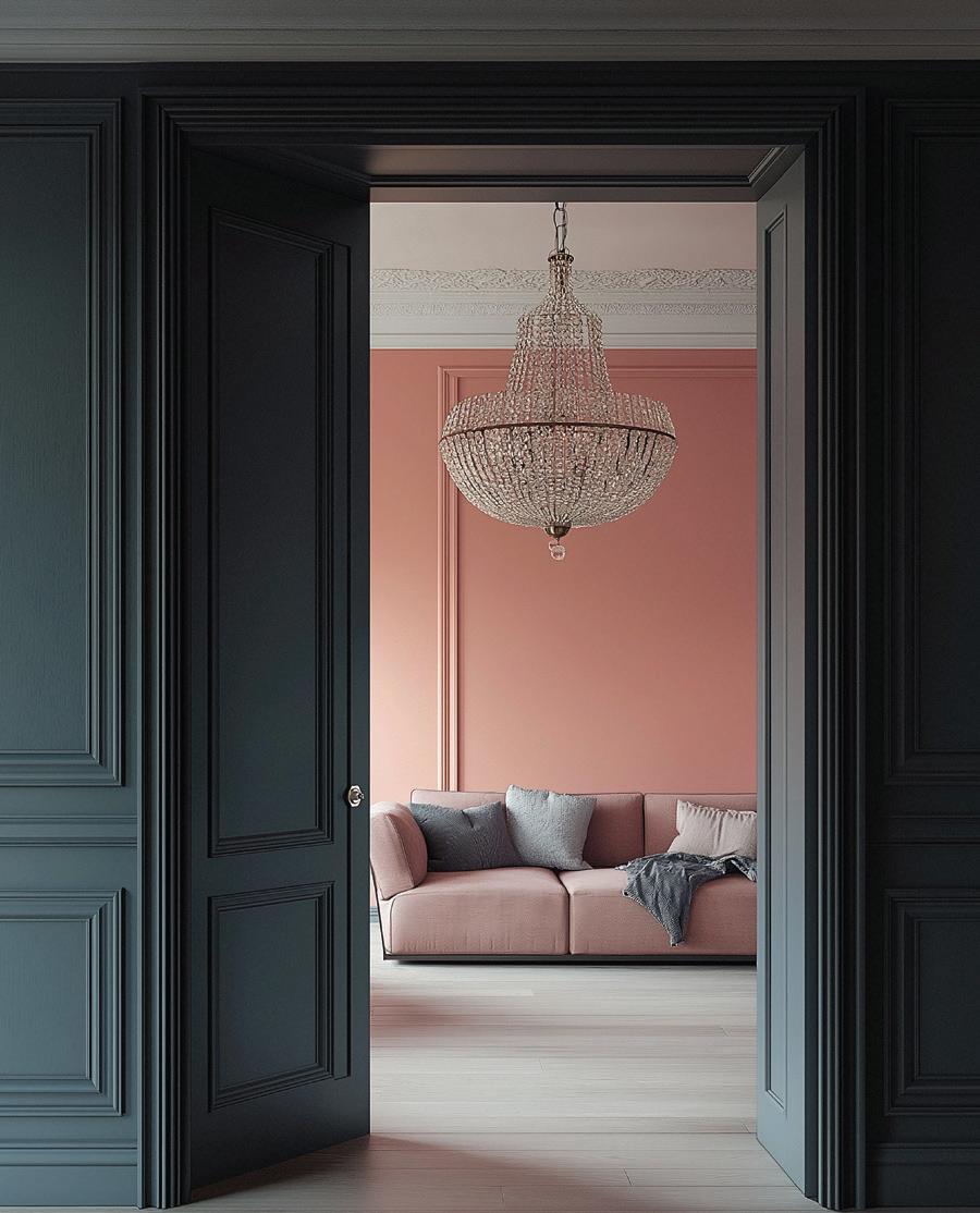
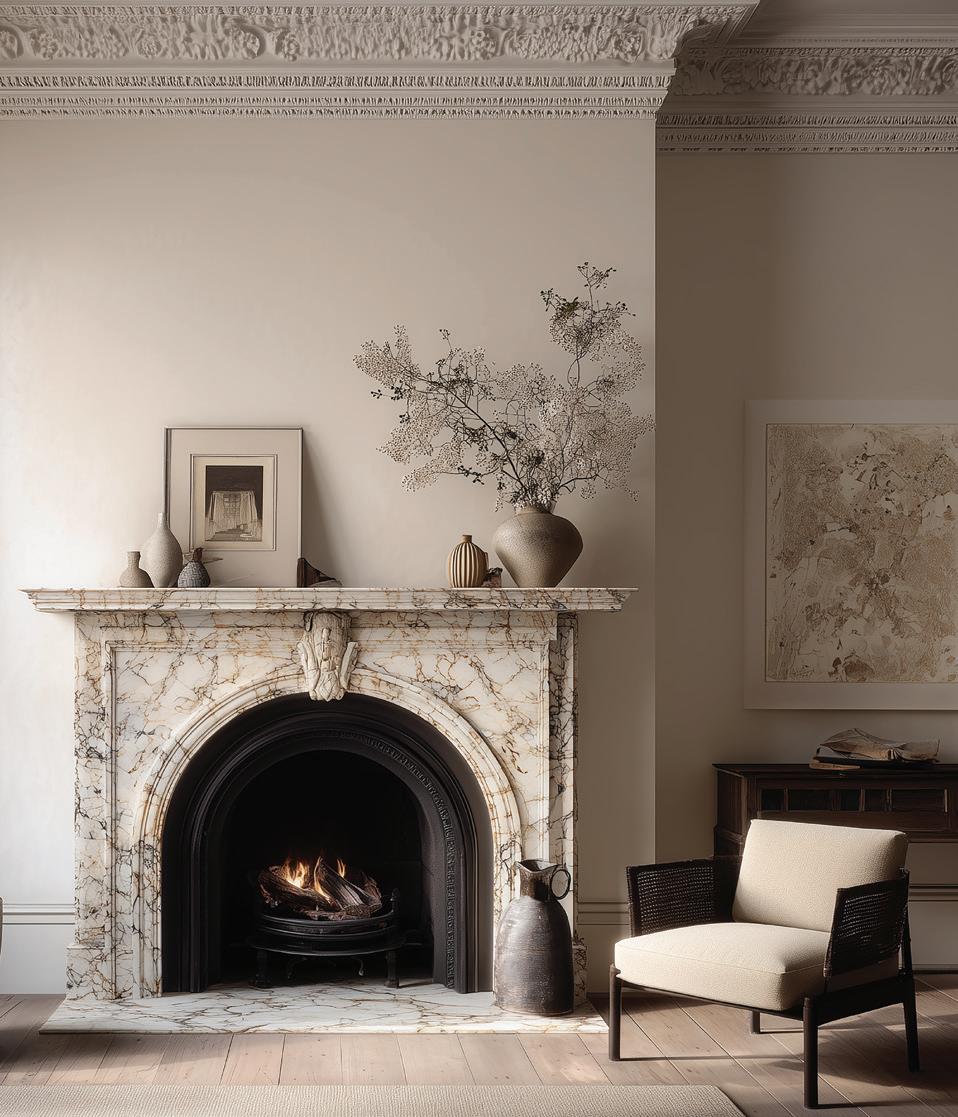
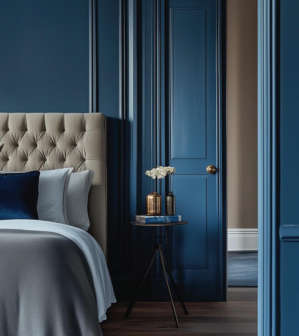
Victorian interiors were richly layered, favouring earthy reds, pinks, blues, and stone tones, often paired with stencilled decoration or patterned wallpapers. Painted walls were commonly finished in warm shades such as Terracotta Rose or stoneinspired neutrals like Hornbeam, accented by richly coloured soft furnishings. Decorative schemes often introduced Blue Bird on walls to evoke the sky, a fashionable choice in parlours and dining rooms. Later Victorian (Boom Style) interiors leaned towards deeper, moodier tones, where softer hues like Wisteria Grey, with its mauve undertone, added atmosphere and refinement.
Paint Application Notes
— Exterior walls typically used warm neutral bases with darker trims for contrast
— Cast-iron lacework, corbels, and brackets were highlighted with richer accent colours
— Interiors were layered: painted walls, wallpapers, and stencilling combined for decorative effect
— Stronger shades were often reserved for entry halls, dining rooms, and formal spaces
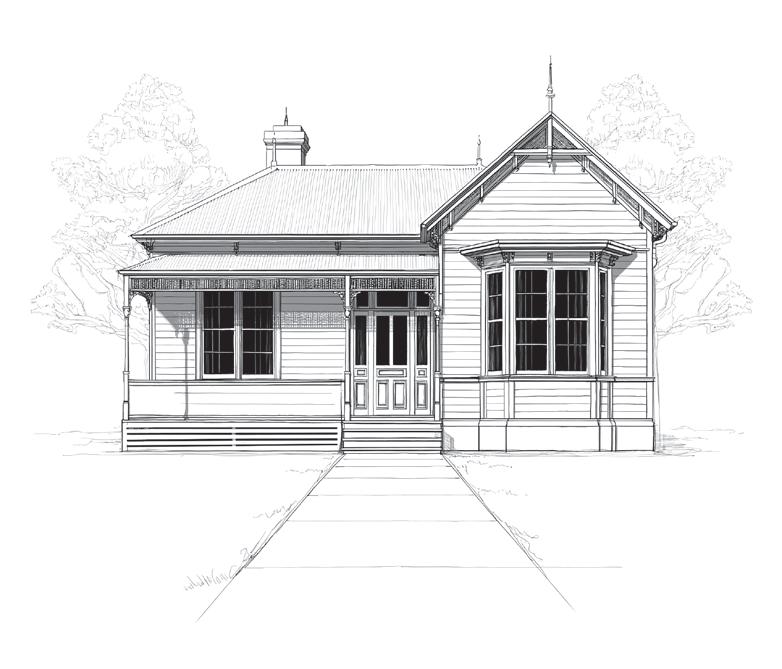
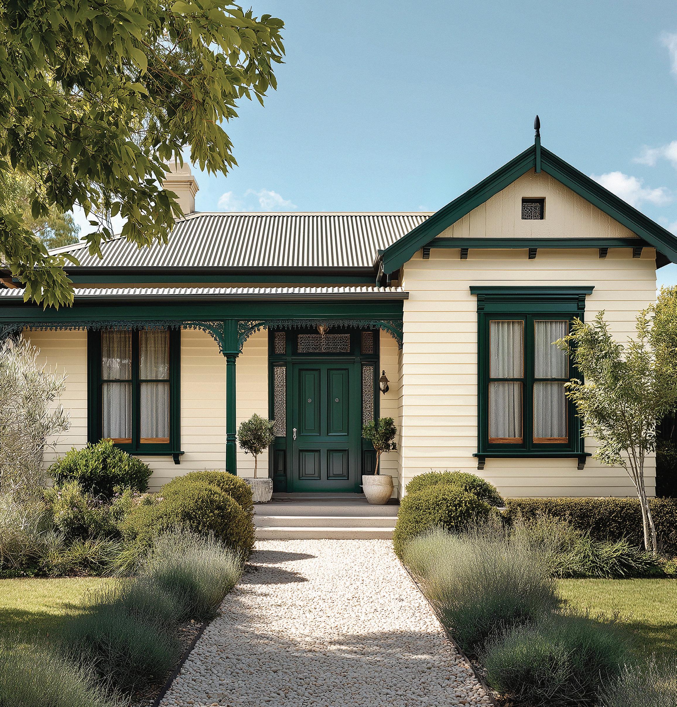
Federation architecture marked a shift towards informality and an Australian identity. Influenced by Queen Anne, Edwardian, and the Arts and Crafts movement, homes featured timber fretwork, terracotta roofs, and decorative leadlight.
The Federation palette leaned into the Australian environment, using colours inspired by the bush, natural materials, and earth tones, which aligned with the movement toward Australian identity and nationalism.
Exterior Palette
Weatherboard and rendered walls were often painted in soft neutrals such as Siltstone, Silk Thread, and Stoneware. Timber fretwork and verandah posts were emphasised with strong accent hues like Rich Red, Dark Crimson, or greens including Aircraft Grey Green and Mid Brunswick Green. While Federation homes were dominated by earthy reds, greens, and warm neutrals, muted tones like Loch Ard Blue appeared as trim or accent colours, often on verandah details, doors, or ironwork. Lighter tones such as Hornbeam or Pebble White provided balance.
Interior Palette
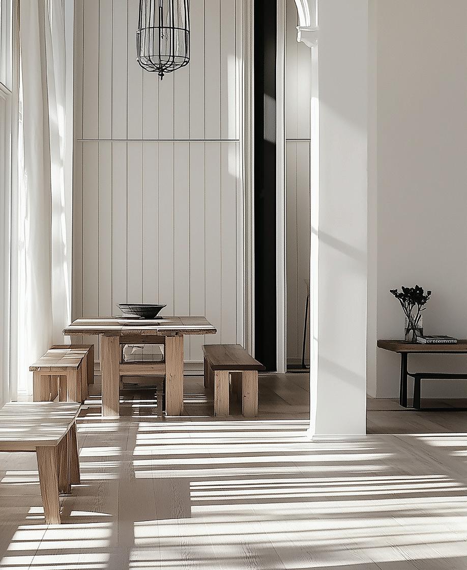
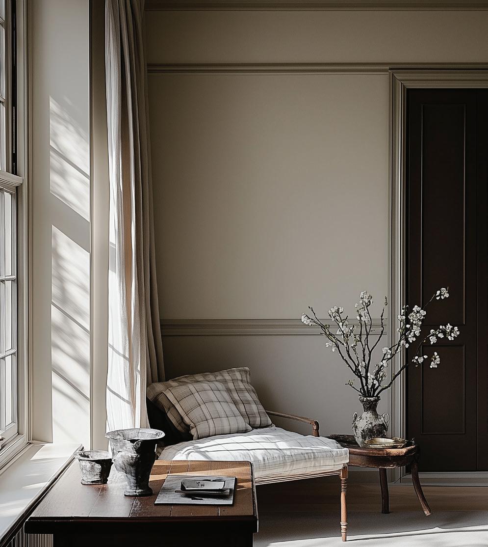
Interior walls often used warm neutrals such as Manuscript or Warm Linen. Accents included heritage reds like Claret Red and natural greens such as Deep Brunswick Green. Leadlight windows and timber detailing added further depth to these schemes.
Paint Application Notes
— Soft wall colours paired with strong trims and fretwork
— Gables and verandah posts highlighted in deeper hues
— Front doors often painted in bold reds or greens
— Interiors layered neutrals with confident accents for contrast
Inter-war
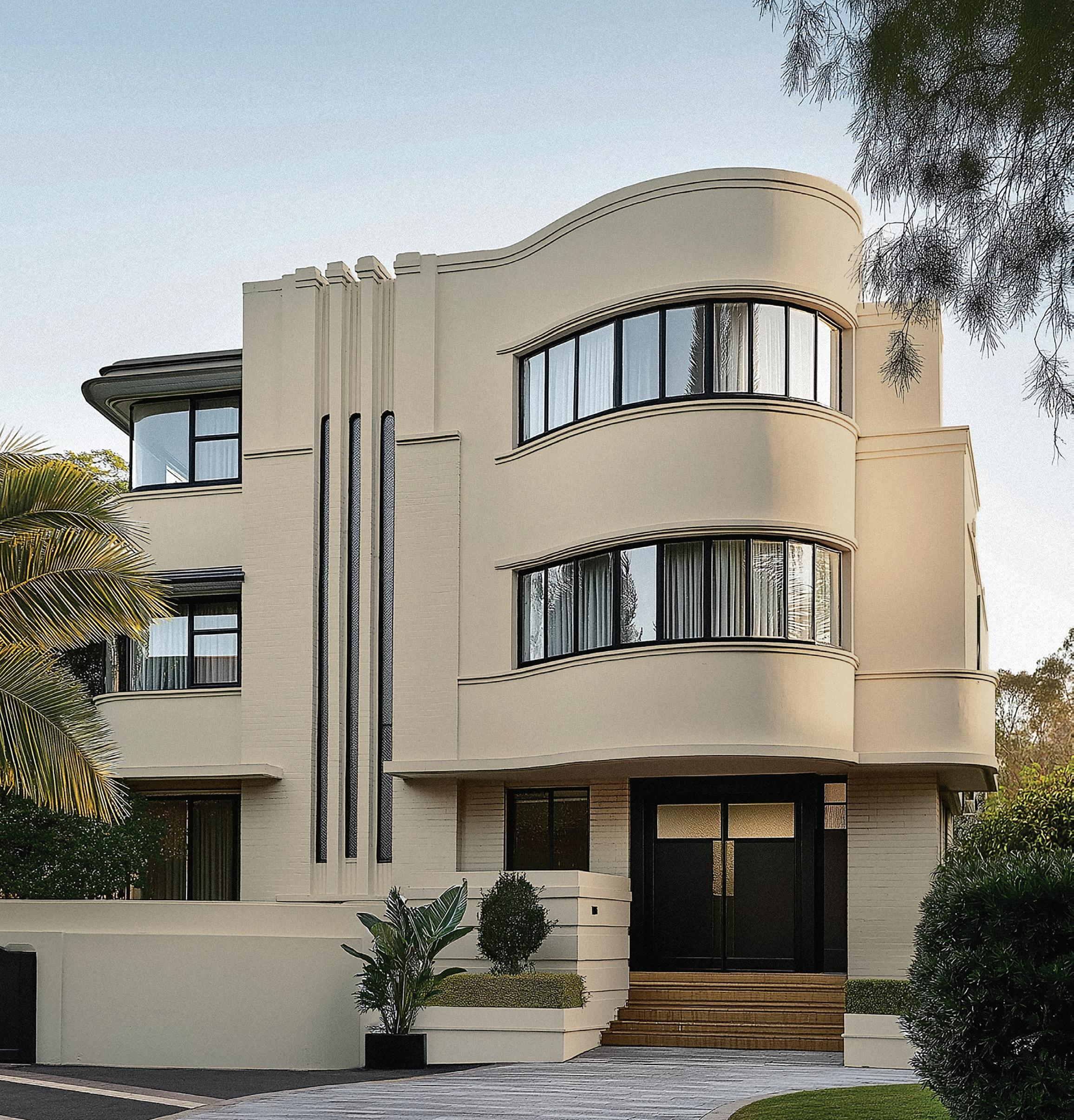
The muted palette in Art Deco design was heavily influenced by the desire for modernity and elegance after World War I. The soft tones represented a freshness and lightness that contrasted with the heavier, more ornate Victorian and Edwardian styles that preceded them.
Pastel colours also allowed for a modern, hygienic aesthetic, particularly in bathrooms and kitchens, which were becoming more functional and streamlined.
The influence of streamlined modernity, seen in both technology and transportation (think aeroplanes and ocean liners), also fed into the use of soft, clean pastel shades. These colours, often used with chrome or mirrored accents, reflected the light and created a sense of space and modern luxury.
Exterior Palette
Walls were typically painted in pale or pastel tones such as Cider Press or Satinwood. Greys like Light Admiralty Grey or Spruce offered cooler contrast, while bolder shades like Gatsby Blue or Regency highlighted detailing. Warm neutrals such as Cumberland Stone gave solidity to the base palette.

Interior Palette
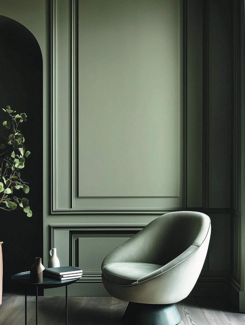
Interiors embraced softer accents like Cherub or warmer neutrals such as Satinwood. Decorative plaster and timber features were sometimes picked out in contrasting tones. Feature walls or panels might use bolder hues such as Regency for dramatic effect.
Paint Application
— Smooth rendered walls suited soft pastels and neutrals
— Geometric panels and mouldings highlighted in deeper hues
— Entry doors or decorative ironwork provided bold accent opportunities
— Interiors balanced pale walls with occasional strong colour features
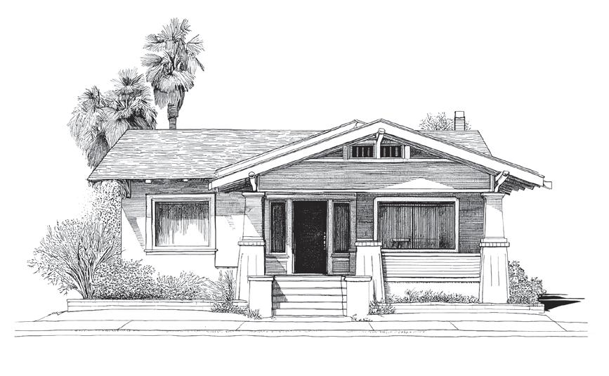
Circa 1915–1939
The California bungalow is a residential architectural style that originated in the United States, particularly California, which is how it got its name. Though it became popular across the US, variations of the style appeared internationally. In Australia, the California bungalow became especially prominent in suburban areas between World War I and World War II, appealing to those who favoured an informal yet modern home design.
Typically, a California bungalow is a single-story house featuring a front porch, sloping roof, veranda pylons, and a straightforward layout. The style emerged in Southern California in the early 1890s, credited to architect Page Brown.
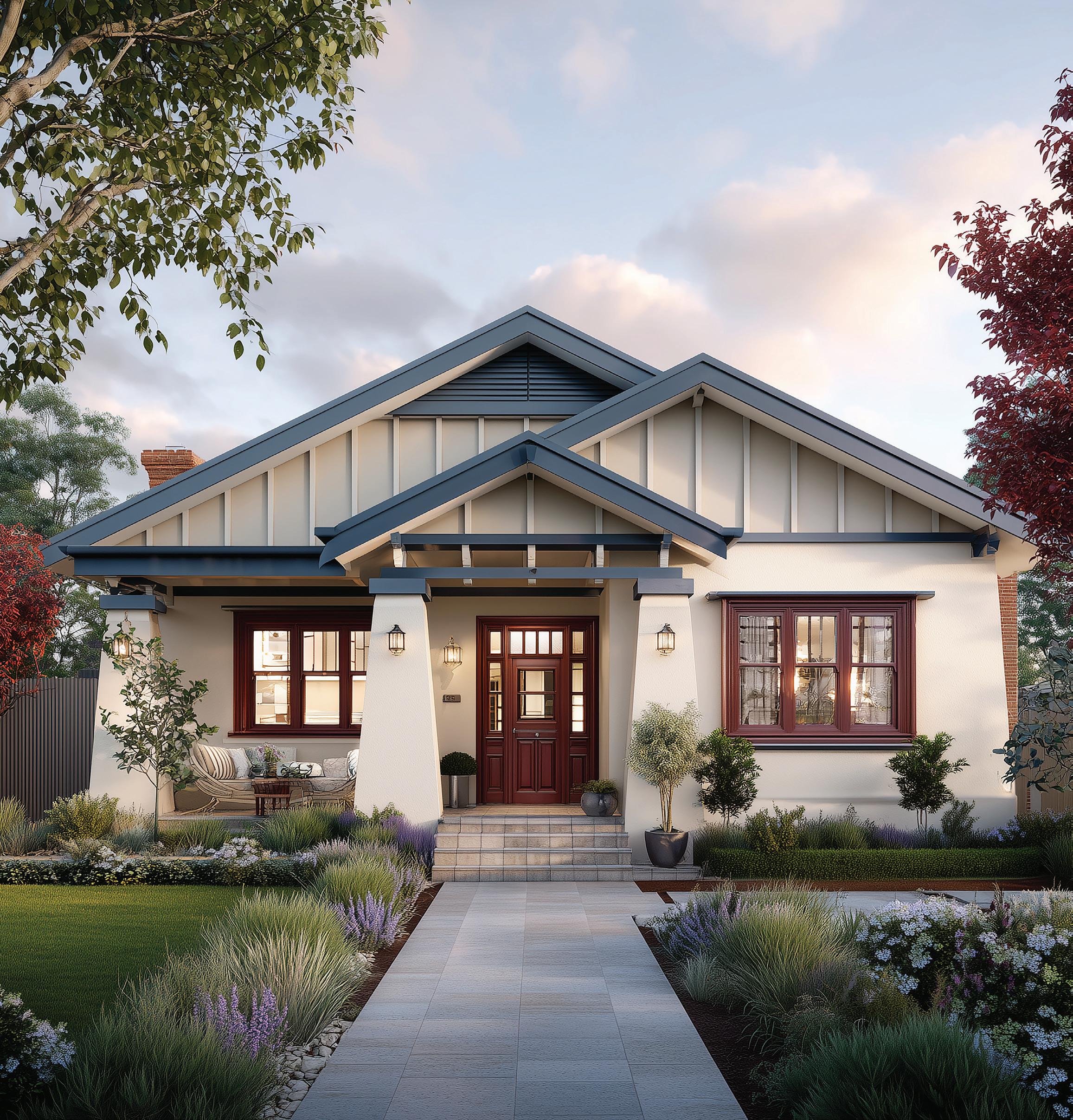
Walls often appeared in warm earth tones such as Wheat Sheaf or Golden Sandstone, paired with natural stone shades like Riverstone. Trims and timber details were emphasised with darker tones including Plumwood, Inkstone, and Evergreen Shadow. Doors and detailing could take on accents like Mahogany Rose or slate-inspired hues such as Slate Bay.
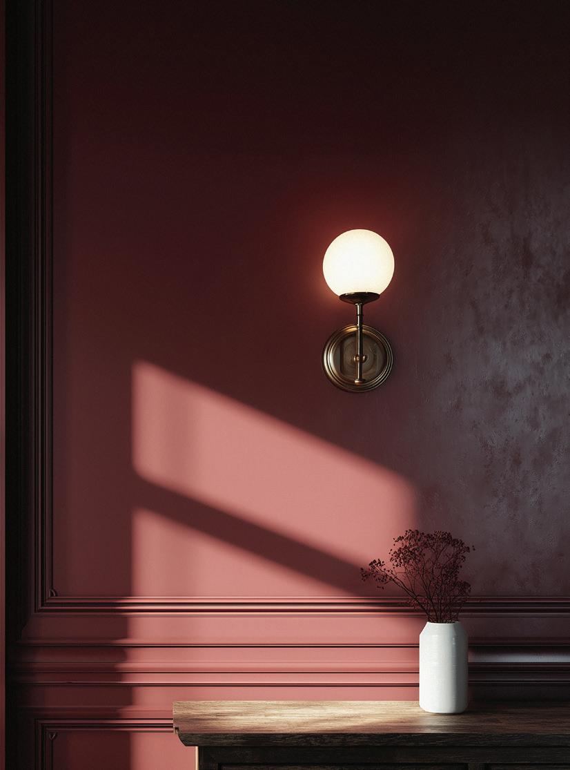
Interior colours were restrained and tonal. Walls featured soft neutrals like Warm Linen or Manuscript, with trims in darker natural shades. Subdued greens and blues, such as Evergreen Shadow or Slate Bay, were sometimes introduced in kitchens and bathrooms.
Paint Application Notes
— Rendered or roughcast walls often left in warm, earthy tones
— Timber rafters, gables, and verandah posts highlighted in darker hues
— Tonal schemes avoided strong contrast, favouring natural balance
— Interiors kept simple, with muted neutrals and occasional accents
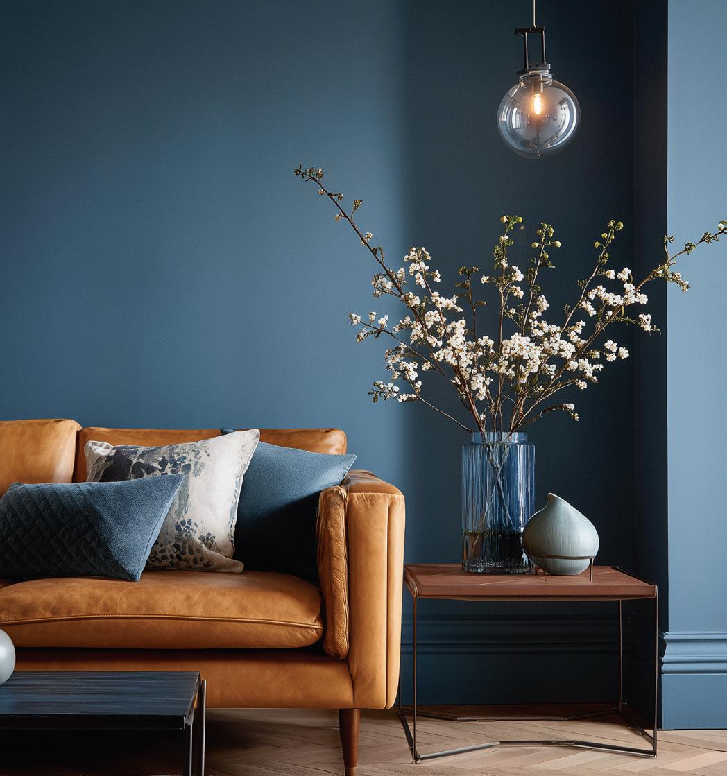
Mid-Century
1940–1970
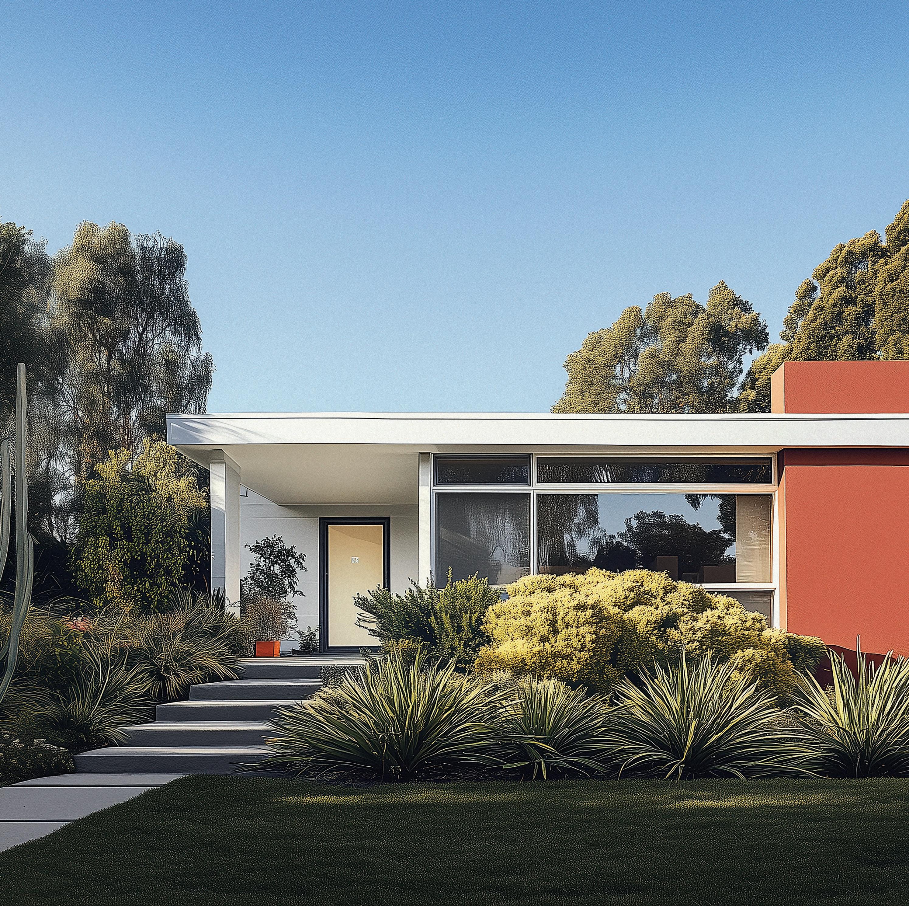
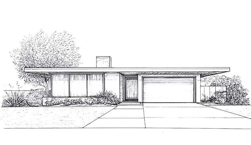
The Mid-Century Modern period in Australia was characterized by a post-war shift in architecture and design. The era embraced simplicity, functionality, and a connection to the natural environment, reflecting the economic and cultural changes following World War II. Mid-Century Modern architecture emphasised clean lines, minimal ornamentation, and integration with outdoor spaces, using innovative materials and technologies that were developed during and after the war.
Early Mid-Century Modern (c. 1940s–1950s)
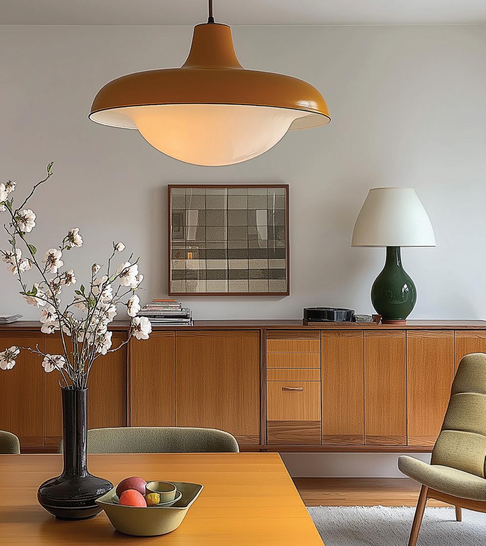
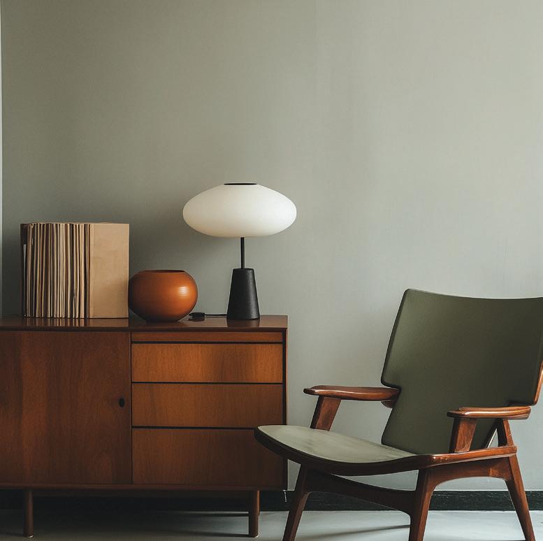
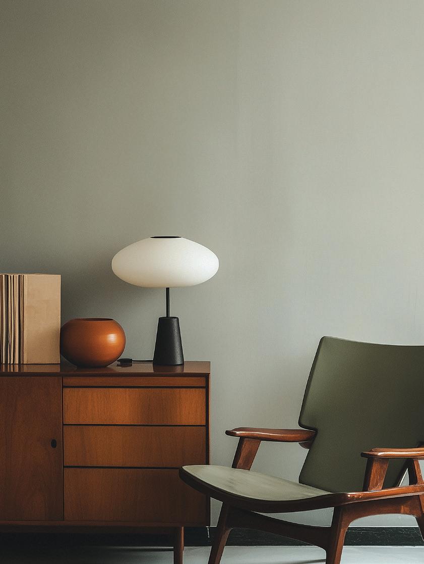
Early Mid-Century Modern design reflected postwar optimism tempered by simplicity. Interiors were calm and functional, with walls most often in soft neutrals such as Palm Leaf White, Raw Hemp, or Dune White.
Colour accents came through warm, earthy browns like Burnt Umber and Terre Rouge, muted greens such as Imbue and Florish, and gentle blues like Foreshore and Cloudline. The overall effect was restrained and liveable, with colour supporting natural materials such as timber, brick, and stone.
Exteriors carried a similar balance: light walls offset by darker trims such as Foundry or Cinder Grey.
Occasional accents in muted greens or blues provided subtle character without overwhelming the architectural form.
Late Mid-Century Modern (c. 1960s–1970s)
By the 1960s and 70s, Mid-Century Modern style embraced bolder, more graphic use of colour, reflecting cultural confidence and innovation in materials. Interiors and exteriors alike began to feature vibrant hues alongside neutral backdrops.
Whites such as Mid-Century White and Ronchamp remained popular for walls, but were paired with striking accent colours: Cut the Mustard and Barragan, vivid orange-reds like Haywire and Wright Orange, and bold blues such as Case Study 8 and Cerulean Blue. Greens like Unite and Farnsworth grounded the palette, while deep tones like Imminent, Pavilion, and Oxblood added dramatic contrast.
This palette marked a departure from the subdued naturalism of the early postwar years — embracing a confident, expressive modernity that still resonates today.
