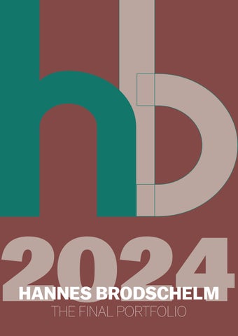
ABOUT ME PASSION
HI!
My name is Hannes. I am 24 years old and I study digital media & print at Hochschule München. I like the interplay between technology, business and design in this degree program. This semester in particular, I have a few courses that deal with design and typography, which I‘m very interested in.
In the course ‚Typography and InDesign‘ I worked on three different design projects. In this portfolio I want to show them!
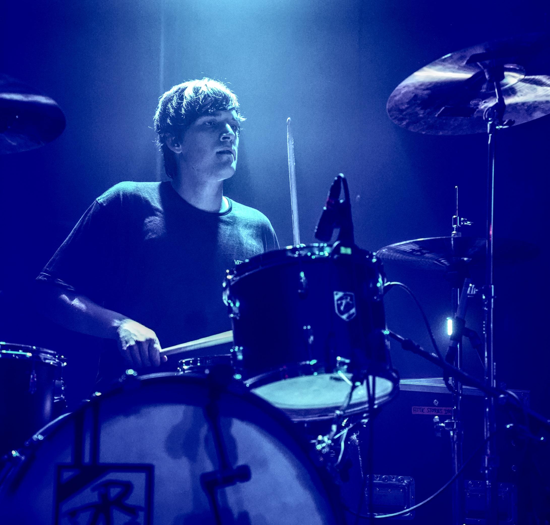
With the photo on the left side I wanted to show where my passion for getting creative mostly comes from: It‘s music!
The Topic
PROJECT 1 ABOUT
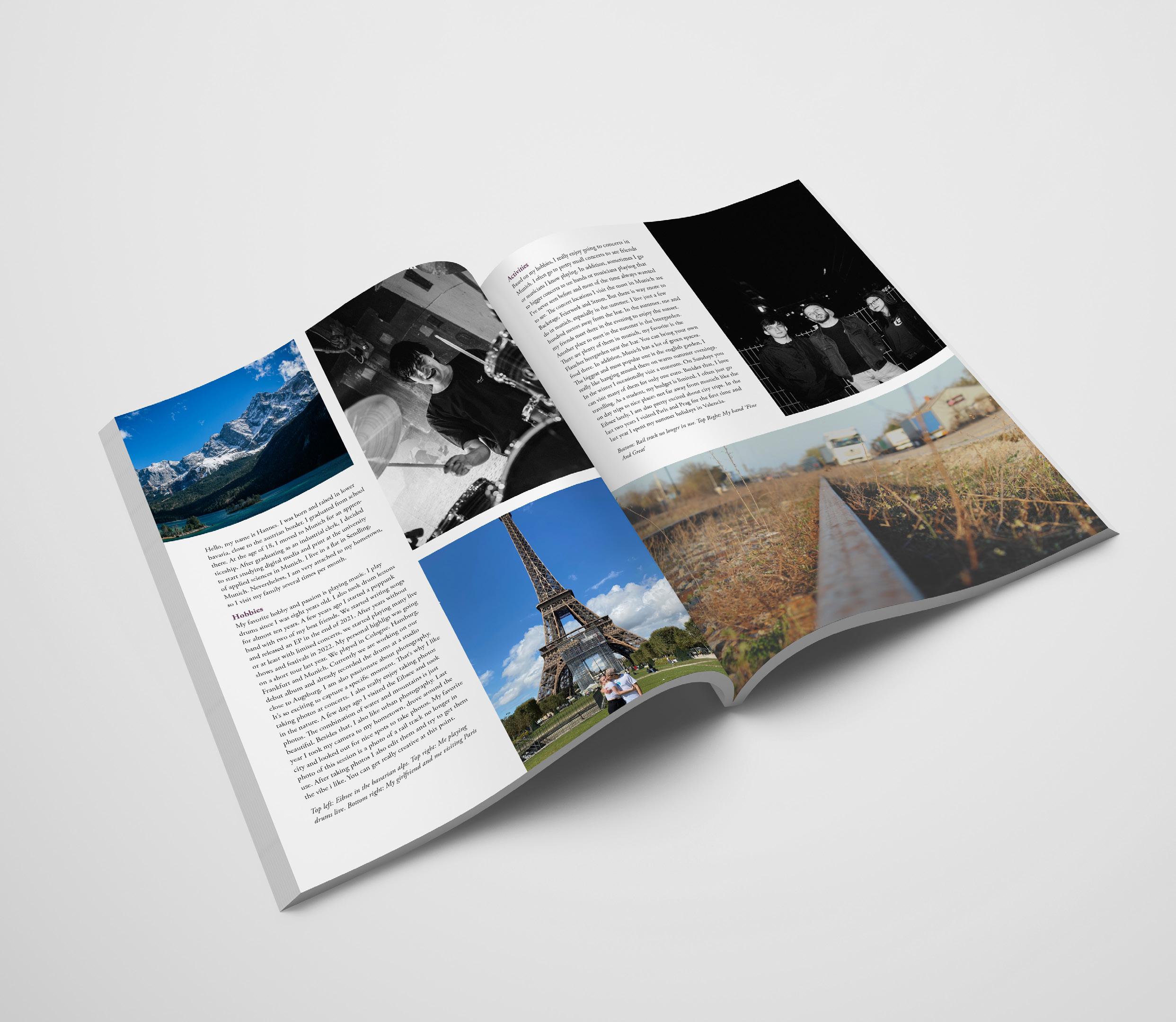
The first project was to create two pages with information about ourself so we can get to know each other better. After a short introduction aboout my-
The first project was the bio page. Our task was to start working with InDesign and the aim of this project was to unterstand how to work with text and graphics using InDesign. Another aim was to get to know each other better as everyone who attended the course introduced themself in the bio page with a short introduction and a lot of words about Hobbies and Activities they do.
ELEMENTS
Besides the text I wrote, I added photos. Some of them are taken by myself with my canon camera. The most stunning one is the photo of the beautiful Eibsee on the top of the first page. I really love going out in the nature and wanted to show the beauty of it. Another photo taken with my camera is the one on the bottom of the second page, capturing a no longer used railway. I love to focus on little details like the gras growing on the sides of the railway. I also added a photo of my band, playing live and from vacation in Paris with my girlfriend.
BIO PAGE
A4
Heigtht: 297 mm
Width: 210 mm
MARGINS
Left: 18 mm
Right: 18 mm
Top: 18 mm
Bottom: 30
PARAGRAPH STYLES
Garamond
10/14
Garamond
COLOR SPECIFICATIONS DOCUMENT
Adobe
Pro Bold
Adobe
Pro
#6e4362 Header
HEADER
12/14 BODY TEXT
Regular
Garamond
Adobe Garamond Pro Italic 10/14
GRID
FONT Adobe Garamond Pro STYLES TEXT
Colums: 4 Spacing: 7 mm
CAPTIONS
PROJECT 2 TYPE STUDY ABOUT
The second project was the type study booklet. I felt really challenged at that one but I am pretty happy with the result. We had to design an 8-page-booklet about a typeface we could choose. I choose the typeface Neue Kabel, which is a beautiful typeface.
It was really interesting to research the history of the typeface and to create a concept how to show this. I also loved to show how the different weights work.
There were different tasks for each pages I want to show in the next few pages. The aim of the booklet was to give an overview of the typeface and also to get creative and generate a nice artwork.
By designing the booklet I learned a lot about the anatomy of the page and how to work with elements and whitespace. I also created a color concept for the booklet which I am very happy with.
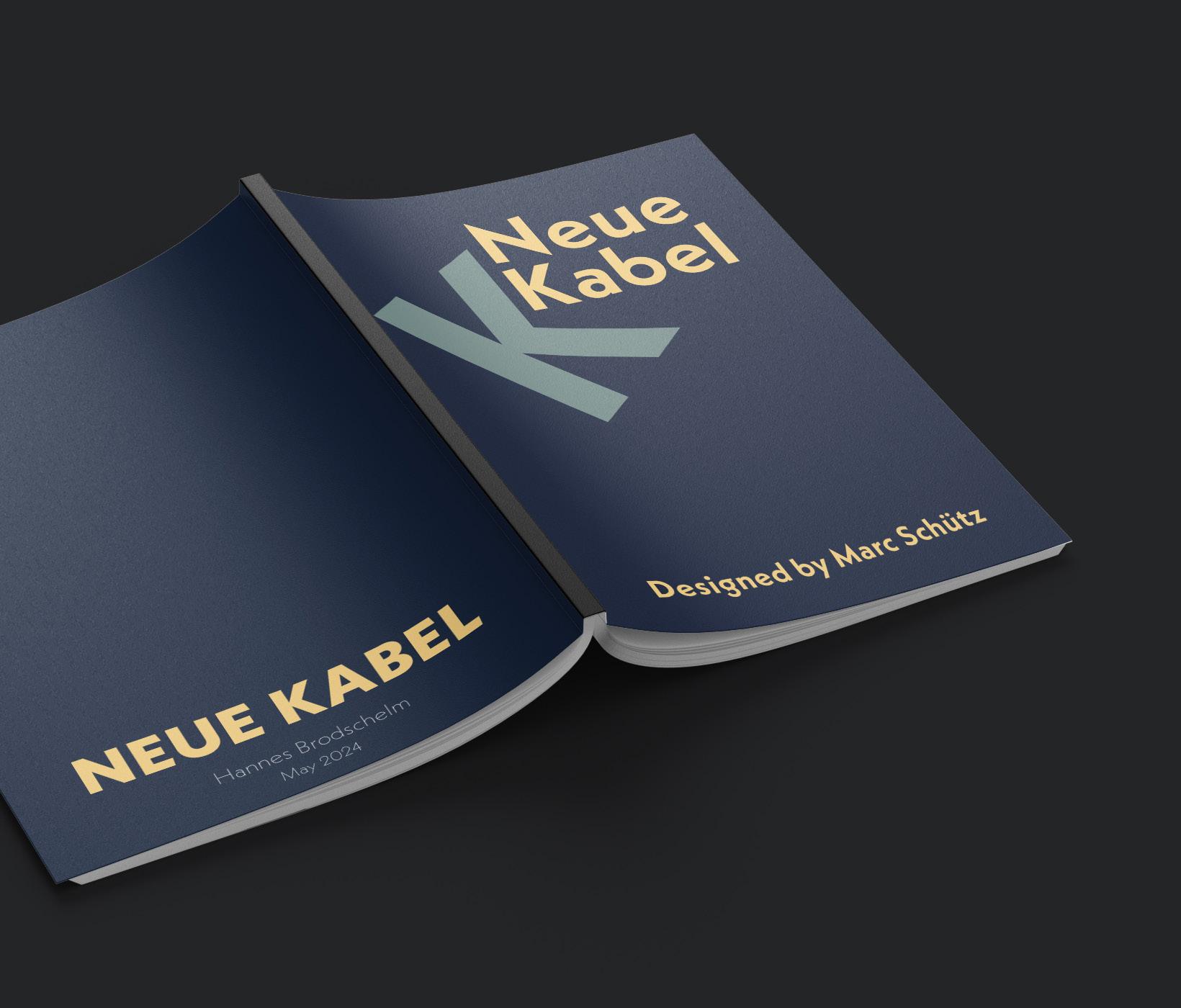
STUDY BOOKLET THE COVER
For the cover page the aim was to give information which typeface this booklet is about. It was also necessary to include the name of the typeface designer. I wanted to keep it simple and only added a bold ‚K‘, close to the headline with an appropriate angle that it looks good. I already used all three colors of my color concept.
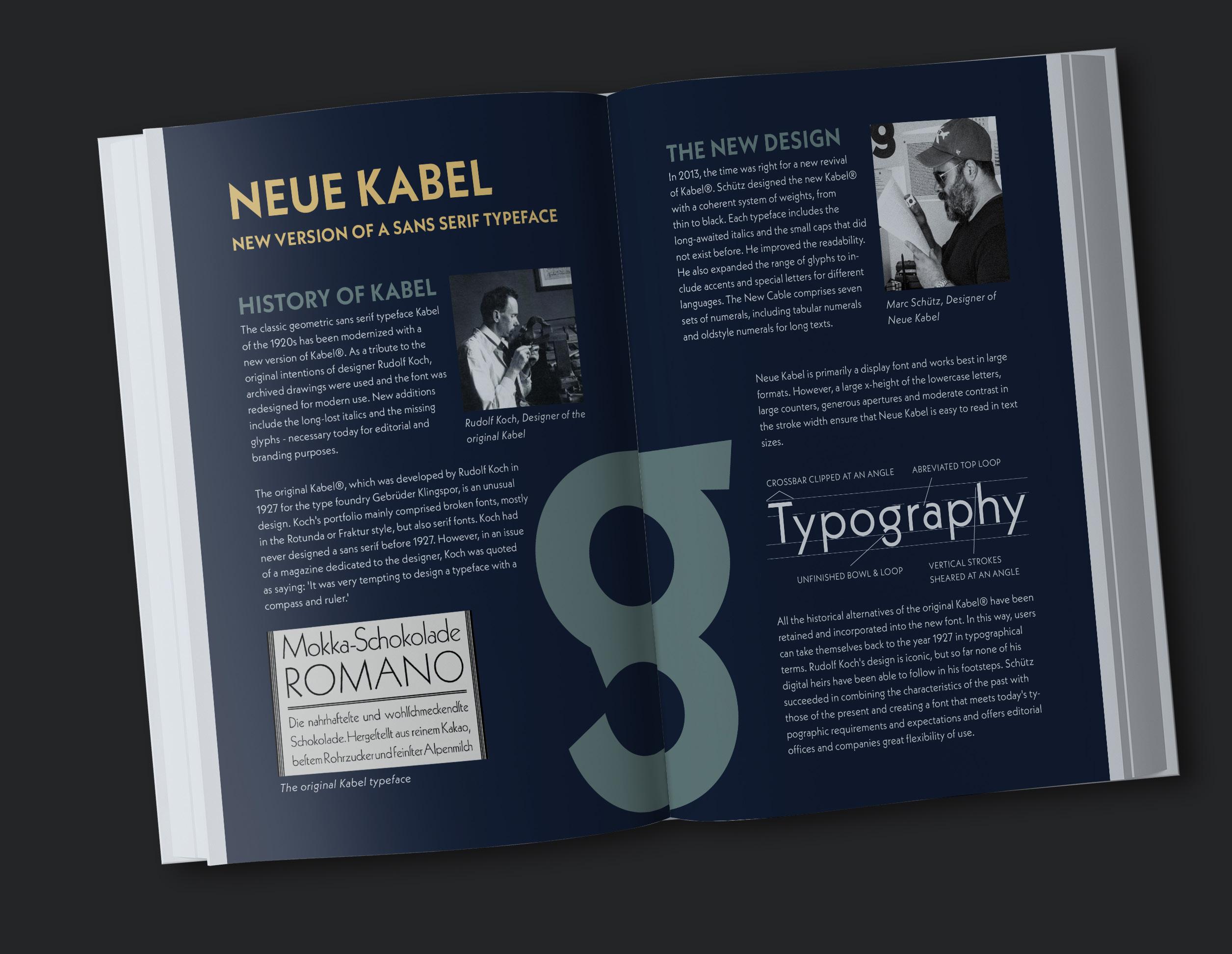
THE TYPEFACE
For page 2 and 3 the task was to include facts such as who designed the typeface, when it was designed and where. The two pages are an overview that there had been created an original Kabel Typeface and the Typeface I showed is based on it.
On the first page I showed the history of the original Kabel. I added information about the specifications and the aim of the designer. On the second page the Neue Kabel is illustrated. I wrote about the story of Marc Schütz, the designer of the new version. I also displayed the specifications of the new typeface with the word ‚typography‘.
Furthermore, I added elements to make the design complete. I added a photo of the two designers and an example of the old Kabel typeface. With the ‚g‘ I wanted to demonstrate the beauty of the Neue Kabel Typeface.
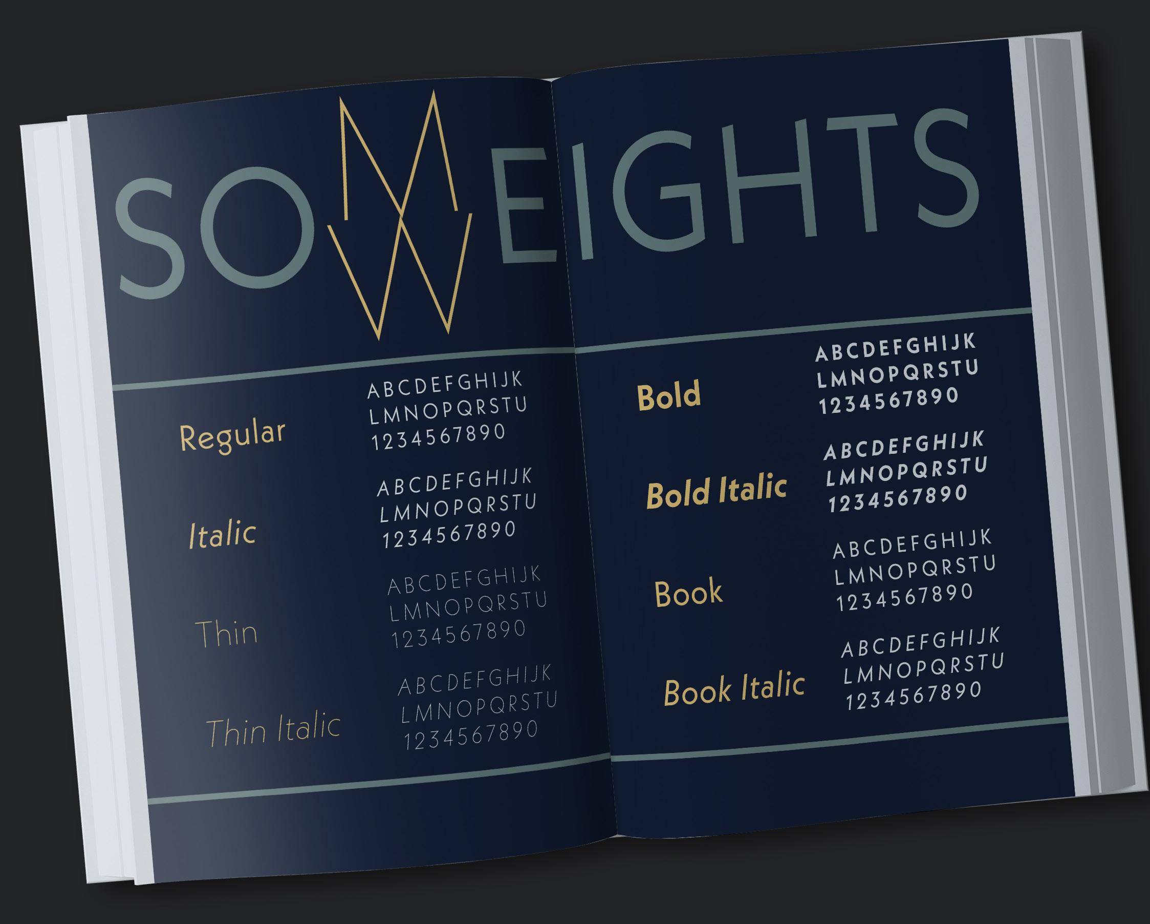
THE WEIGHTS
The task for pages 4 and 5 was to show the various weights and styles of the typeface family. Neue Kabel has 9 weights and all of them also in italic, so designing these pages was real fun.
I already played with the weights by designing the headline and placed the light ‚M‘ and ‚W‘ opposite. I think it‘s a great contrast to the bold letters on the sides of it.
After that, I chose four weights and the italic version of them using the alphabet and numbers to show them. Furthermore, I used spationing so that the reader can spot the design of the weight and the difference to others.
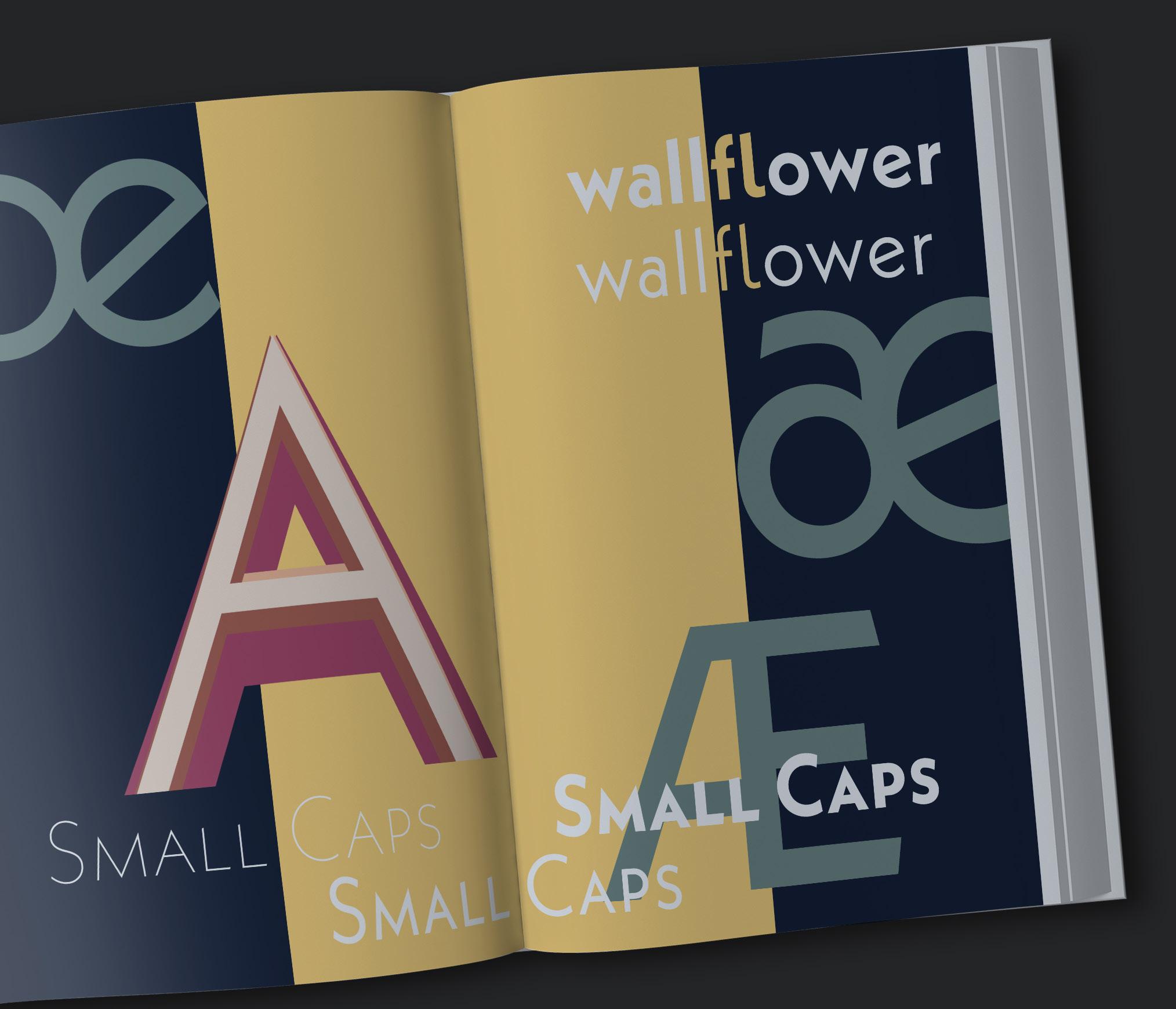
LET‘S GET CREATIVE!
The design of the pages 6 and 7 was up to myself. The main goal was to show the beauty of the typeface. For this, I focused on some ligatures, made them bold, really big and added them. As you can see in ‚wallflower‘, I also added a ligature built into a word.
In addition I wanted to show how small caps work by writing them in three different weights. At last, I created a big artwork with different overlapping weights of the letter ‚A.‘. Again, I used all three colors of my color concept. As I wanted these pages to look a little bit different to the whole design concept, I added a second color to the background.
8 pages GRID Page 1, 4, 5, 8
4 Columns Page 6, 7 2 Colums
SPECIFICATIONS DOCUMENT
Page 2,3
5 Colums
HEADER
Neue Kabel
Bold 21/27 BODY
Neue Kabel Regular 10/14 CAPTIONS
Neue Italic 10/14
PARAGRAPH
KABEL
STYLES
TEXT
COLORS #18223b #728c89 #fbd582
CAPTIONS
Neue Kabel
KABEL NEUE
STYLES
Italic 10/14
PROJECT 3 PERSONAL ABOUT
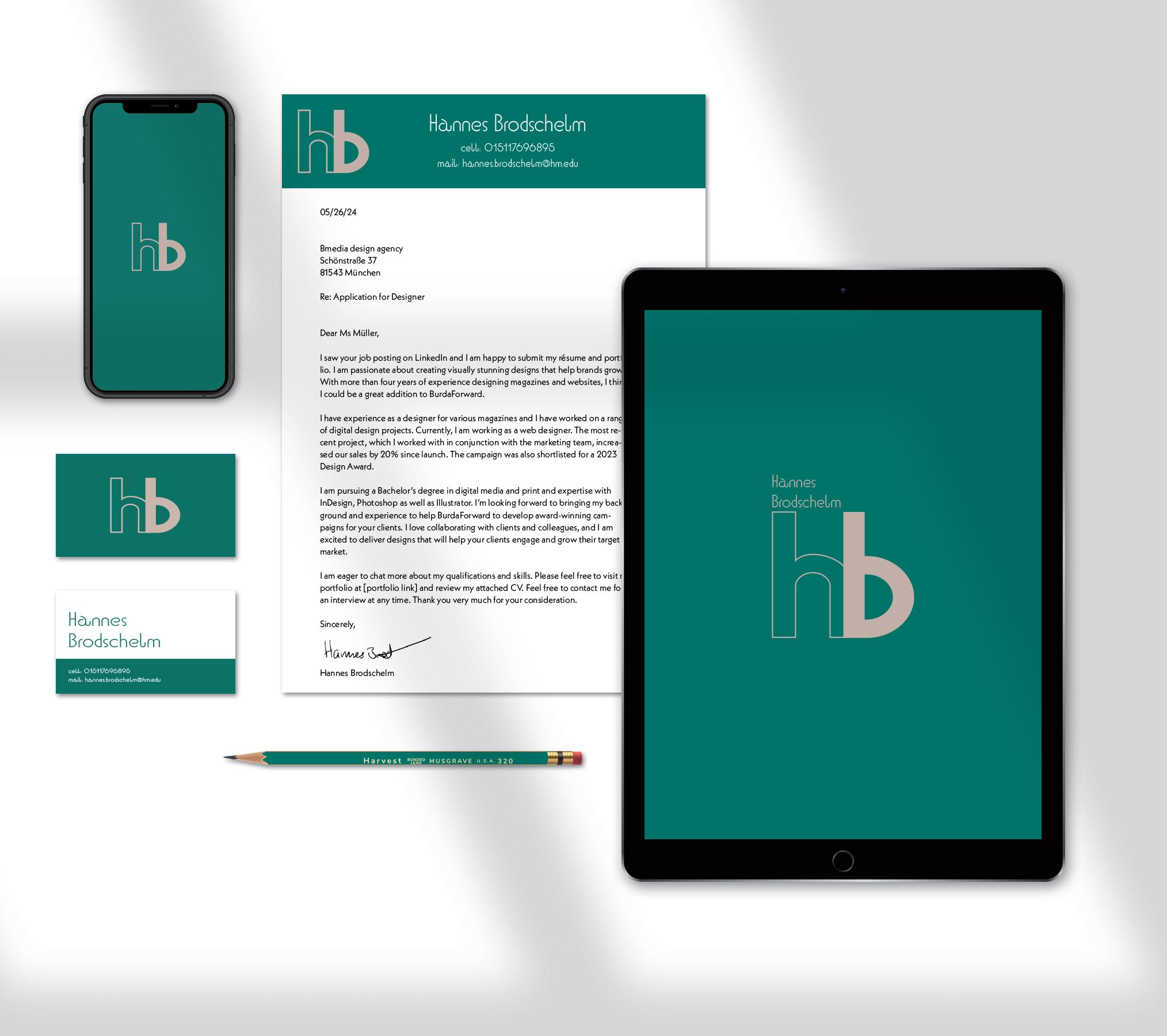
The task for the third project was to create a personal brand with type. How to do this? We had to create a logo out of our Initials, so I had the letters H and B to make a logo. I made three ideas that I will show on the next pages. Out of these ideas the I built the logo.
Once I thought my logo is finalized, I created the mockup you can see on the right side. I started with the business card and placed my logo on the front side. On the back side is my full name and further information as phone number and mail adress.
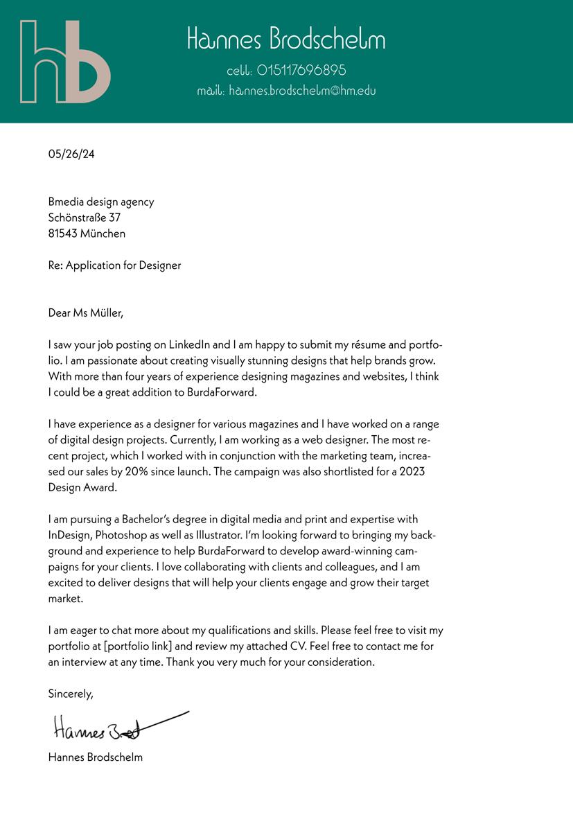
The second task was to design a letterhead. I kept this simple and placed the logo also with the green background on the top of the page. I also added my full name and phone number also as the mail adress.
At last, I also made designs for an app on the iPhone or an iPad. I also kept this one simple and only added my full name on the iPad app. To complete the mockup, I colored the pencil appropriate.
PERSONAL BRAND
THE PROCESS
By creating a design for the personal brand I worked out a few different ideas. I want to show you two ideas. One of them is the base for my design.
IDEA 1
HB
Brodschelm Hannes
That was my first design. Basically I like it. It looks serious, could be the logo of a law office. I had ideas to work with it. There is one problem: I live in Munich and this design is really close to ‚Hofbräuhaus‘.
IDEA 2
Hannes
Brodschelm
This is the base of my design! As you may see, this comes really close to the design of my full name on the business card. By trying further things with this font, I explored that the mijuscles are really nice, so I decided to design my logo with this font in small letters. The font is BD Orange VF.
THE FINAL DESIGN
Hannes Brodschelm
cell: 015117696895
mail: hannes.brodschelm@hm.edu
That is the business card. On the front side is the logo. I like that the letters are interlinked. At this point I was also sure which colors to use. The full name on the second side is based on the Idea number 2.
For the letterhead and the iPad logo I used the elements of the business card to have a repititive and consinstent design. On the iPad Mockup the full name is in the same color as the logo.
Hannes Brodschelmt Hannes Brodschelm cell: 015117696895 mail: hannes.brodschelm@hm.edu