Brand Guidelines
Portsmouth Hospitals University NHS Trust 2023
This guide is for everyone at PHU who may use the Trust brand, internally and externally.
By using these guidelines successfully, you will help us to maintain the strong PHU and NHS brand and positively represent ourselves consistently across everything we do.
Who we are and what we do Our vision and values Our brand Logo Colours Department and Division Identities Font Writing style Accessibility Photos Video Campaigns Templates Patient Information FAQs Contents 1 2 3 4 5 6 7 8 9 10 11 12 13 14
Who we are and what we do
Portsmouth Hospitals University NHS Trust is a large secondary acute hospital, supporting a catchment area of around 675,000 residents across South East Hampshire, Portsmouth and the Isle of Wight.
We provide a range of diagnostic and treatment options to patients across a range of sites including:
St Mary’s Hospital – midwifery, dermatology and enablement services
Gosport War Memorial Hospital – a range of services including Blake Maternity Unit, Urgent Treatment Centre and diagnostics
Petersfield Community Hospital – The Grange Maternity Unit
We also offer a range of specialist services to the region including the Wessex Cancer Centre, the Wessex Kidney Service, the Southern Endometriosis Centre and we are a leading centre for robotic surgery.
We are also proud to host the country’s largest Ministry of Defence Hospital Unit, Joint Hospitals Group South, treating current and former members of the armed forces and their families and training clinicians.
#ProudToBePHU
Our vision and values


Our vision:
Our five-year strategy, “Working Together”, was launched on the 70th anniversary of the creation of the NHS. It sets out our ambitious vision for our Trust.
Our values:
Our five-year strategy, “Working Together”, was launched on the 70th anniversary of the creation of the NHS. It sets out our ambitious vision for our Trust.
Our brand
The Portsmouth University NHS Trust (PHU) brand establishes a clear identity that is recognisable to our patients, our staff and our community. It includes our name, how we talk to people, how we behave, what we do and who we are.
It sits under the wider NHS brand, which is a registered trademark, which research has shown inspires public confidence and has universal recognition.
We must ensure that there is high recognition of PHU as an NHS brand.
What is brand?
Our vision, values, brand principles and personality are at the centre of who we are.
They form the building blocks of our Brand System that together form our visual identity.
Our brand principles are the standards that we hold our materials to.
This ensures quality and a consistent voice and style.
Vision Strategy Core Identity Brand Elements NHS Logo Vision Logo Colours Values Photos Font Tone Shapes Illustration Using the brand Social media Website Email Posters Leaflets Presentations Reports Estate Recruitment Uniform Advertising Video
Brand consistency
Brand identity is important to ensure clear recognition of PHU services and trust within our services for our patients, our staff and our community. It means that all physical and digital materials have:
PHU logo in the correct place
Values
Consistent tone and language in line with the brand guidelines
Contact information
No brand consistency can lead to confusion for patients, lack of trust, misrepresentation of services and not being accessible to all our community.
Audience
All communications should be tailored to the group you are speaking to.
Key audience groups are listed below and you should always consider the audience you are talking to when preparing communications. These can be split down into more detail (e.g cancer patients).
Patients
Staff
Volunteers
Community
External healthcare partners (GP’s /ICS)
Organisations and charities
Guideline use
Internally: These guidelines should be followed by everyone within the Trust. By using our brand in a consistent way, you help to ensure that we communicate a clear and strong message to our patients, carers and families.
Externally: If you are employing an external designer to create a document or assets, designers should follow these guidelines. Partner organisations, NHS Trusts and suppliers should also use these guidelines.
Our Trust brand is managed by the Communications and Engagement Team.
If you have any questions about our Brand, how to use it or for an approved list of suppliers who can be used for design work, please email communications@porthosp.nhs.uk
Our logo
The PHU logo meets NHS national branding guidelines and is authorised to use the trademarked NHS logo by the Department of Health and Social Care, who retains the copyright.
The logo should ideally be used on a white background.
The right aligned version of the logo should be used for all print and digital communications.
The left aligned version is for use on the Trust public website.
This is the only logo permitted to be used externally by employees of Portsmouth Hospitals University NHS Trust
Our logo
For main use on print and digital assets
For use on NHS Blue and other NHS colours in line with accessibility


Only for use on patient letters printed in black and white
Using our logo
Please ensure the PHU logo has the minimum clearance from the edge. Use the NHS lozenge as guidance. No other parts of a design should enter that exclusion zone.
Logo standards
A2 (420 x 594mm) Margin 20mm. NHS logo height 18mm.
A3 (297 x 420mm) Margin 15mm. NHS logo height 13mm.

A4 (210 x 297mm) Margin 10mm. NHS logo height 9mm.
A5 (148 x 210mm) Margin 8mm. NHS logo height 7mm.
A6 (105 x 148mm) Margin 8mm. NHS logo height 7mm.

DL (99 x 210mm) Margin 8mm. NHS logo height 7mm.
DL Envelope (110 x 220mm) Margin 8mm. NHS logo height
7mm.
Business Card (55 x 90mm) Margin 6mm. NHS logo height
6mm
Our logo in practice


Logo don'ts
Do not stretch the logo
Do not position it at an angle
Do not add drop shadows to the logo
Do not change the colour of the logo
Do not use the old Portsmouth Hospitals logo.
This is no longer our correct legal NHS name.

The current PHU logo is available in the PHU Trust Brand Centre.

Using our logo with partners
The PHU Trust logo should always be positioned on the top right corner of all communications where the Trust is the lead partner.
If more than two NHS Trusts are involved within the communication, the NHS lozenge should be used in the top right corner and the names of Trusts added to the bottom left-hand corner.
If partner organisations are leading on the design and distribution of communications, please get in touch with the Communications Team who can support.

Our vision
The vision strapline should be placed in the bottom left corner of all printed materials.


It can also be used on digital assets.
Please ensure it has the minimum clearance from the edge. Use the NHS lozenge as guidance.
No other parts of a design should enter that exclusion zone.
Our vision in practice
Nay convinced on the below but we do it on socials currently

with just midwife day
Update
printed material
Primary colour palette
Colour
NHS Blue and white are the dominant colours in the NHS colour palette. They help signpost people to NHS organisations and services, by ensuring that materials are instantly recognisable as originating from the NHS.
The Trust has 4 main secondary colours that should be used for brand elements, illustrations and highlight colours. Colour is also used to represent each of the five Trust divisions.
NHS Light Blue
Pantone: 298
CMYK: 67/2/0/0
RGB: 65/182/230
#41B6E6
NHS Blue
Pantone: 300
CMYK: 99/50/0/0
RGB: 0/94/184
#005EB8
RAL: 5017
NHS White
CMYK: 0/0/0/0
RGB: 255/255/255
#FFFFFF
Secondary colour palette
NHS Warm Yellow
Pantone: 1235
CMYK: 0/31/98/0
RGB: 255/184/28
#FFB81C
A full colour guide can be found in the Trust Brand Centre.
NHS Pink
Pantone: 675
CMYK: 18/100/0/8
RGB: 174/37/115
#AE2573
NHS Light Green
Pantone: 368
CMYK: 65/0/100/0
RGB: 120/190/32
#78BE20
Divsion Colour
Colour is also used to represent each of the five Trust divisions.
NHS Light Blue
Pantone: 298
CMYK: 67/2/0/0
RGB: 65/182/230
#41B6E6
NHS Warm Yellow
Pantone: 1235
CMYK: 0/31/98/0
RGB: 255/184/28
#FFB81C
Medicine and Urgent Care Networked Services
NHS Pink
Pantone: 675
CMYK: 18/100/0/8
RGB: 174/37/115
#AE2573
NHS Light Green
Pantone: 368
CMYK: 65/0/100/0
RGB: 120/190/32
#78BE20
NHS Blue Pantone: 300
CMYK: 99/50/0/0
RGB: 0/94/184
#005EB8
RAL: 5017
Clinical Delivery Surgery and Outpatients Corporate Services
Colour tints
It is acceptable to use tints of the value is accepted as long as it is visible, accessible.
The top bar in each case shows the solid of the colour and the bars below show values from 80% to 20%.
However, the below factors need to when using tints:
Type and NHS logos should always in 100% solid colour, never in a tint
The NHS logo should never be reversed tint, only out of 100% solid NHS Blue
100% solid NHS Blue should always be the dominant colour over any tints tints should never endanger the legibility or accessibility of any communication

Font
Frutiger Bold - Headings
The core NHS font is Frutiger.
This font should be used first and foremost and, on any design, or promotional materials.
1234567890
The consistent use of permitted fonts achieves the unified and uniform approach that our patients and public want from the NHS.
Frutiger Regular - Body copy
The only exception is foreign language fonts
AaBbCcDdEeFfGgHhIiJjKkLlMmNnOoPpQqRrSsTtUuVvWwXxYyZz
1234567890
The secondary font is Arial. This font can be used when Frutiger is not available and within internal communications, including Word and Powerpoint, and for emails.
Arial Bold - Headings
If Frutiger is not available to you, please use Arial.
Arial - Body copy
AaBbCcDdEeFfGgHhIiJjKkLlMmNn OoPpQqRrSsTtUuVvWwXxYyZz
Writing style
This style guide is for anyone creating online or printed content for the NHS, to help make things clear and consistent across all of our services.
General rules
Always use Portsmouth Hospitals University NHS Trust (PHU) first within a document or communication and then abbreviate to PHU. Do not use PHUT or PHT.
A full writing style guide can be found in the Trust Brand Centre.
Always use Frutiger font for external materials and internal where possible. Arial font should be used if Frutiger is not available. Ensure you proofread and spell check all documents.
All external communications need to be signed off by the Communications and Engagement team.
Writing style
Consistency of spelling and grammar
Please use Plain English. You can find a Plain English guide here.
Always use British English versions of spelling (organise not organize)
Use consistent spellings of words throughout documents.
The abbrievated versions of ‘for example’ (e.g), ‘that is’ (i.e) and ‘etcetera’ (etc) should not be used as they are not accessible to all groups.
Ampersands (&) should not be used, unless they appear as part of a proper name, for example M&S.
An apostrophe ‘s’ should not be used for plurals; for example, doctors not doctor’s. Apostrophes are used to denote possession – the patient’s address (singular), the patients’ addresses (plural).
Apostrophes can also be used to signal missing letters where words have been abbreviated – haven’t (have not); don’t (do not).
Writing style
Acronyms
Do not use full stops in acronyms, for example, use NHS not N.H.S., and C.C.G not C.C.G.
When you first use the word or phrase you want to reference as an acronym, it needs to be written in full and the acronym in brackets afterwards, for example: Portsmouth Hospitals University NHS Trust (PHU).
An acronym is not needed if it isn’t being used elsewhere in the document.
It is not necessary to spell out well-known acronyms, such as EU, UN, BBC and HIV.
Portsmouth Hospitals University
NHS Trust (PHU)
Portsmouth Hospitals University NHS Trust (PHUT) (PHT)
NHS N.H.S
Writing style
Numbers
When writing numbers in text, spell out the numbers one to ten but use numbers for 11 and above.
You should, however, use numerals when referring to page or paragraph numbers, for example, see paragraph 8 or page 5.
In tables it is often clearer to use numerals instead of words.
Numbers One, two, three 1, 2, 3
Page or paragraph numbers
Paragraph 8
Paragraph eight
When writing thousands, millions and billions, these should appear as follows; 1,000, 2 million or 3 billion.
This also applies when referring to money, such as £2,462.00, £4.5 million and £9.7 million.
Tables 1.2, 5.7
One point two, five point seven
Big numbers 1,000, 2 million, 3 billion one thousand, 2m, three bn
Money £2,462.000, £4.5million and £9.7million four point five million, 9.7bn
Writing style
Dates, years and time
The correct format for typing dates is Monday 28 November 2022 or 28 November. Do not use th or nd.
Months should be written in full and not shortened.
Overlapping years should be typed as, for example, 2014/15 and not 2014-15.
However, for a group of years the format 2014-2018 should be used.
Overlapping years 2014/15
When writing the time, the 12-hour format with am and pm should be used with a single dot, for example, 8am and 1.30pm.
Grouped years 2014 - 2018 2014/18
Time 8am, 1.30pm 8:00am, 13:30pm, 1300hrs
Date Monday 28 November 2022 Monday 28th November 28th Monday Month January, February, March Jan, Feb, Mar
2014-15
Writing style
Group nouns
Use the singular verb for all group nouns, such as ‘the council has introduced’… not ‘the council have introduced’.
Capital letters
Capital letters should be used for proper nouns only. For example, people’s names, places and a specific post or title all require capital letters. However, do not use capital letters for general terms, for example;
The Chief Executive of the Trust
A conference of chief executives
Do not use capital letters in general writing as it is CONSIDERED TO BE SHOUTING.
Paragraphs
Line after line of text can be difficult to read. Use regular paragraphs to break up the writing.
Paragraphs make the page look readable before a word is even read and can make it easier to follow ideas.
Keep paragraphs short – you should aim for no longer than five or six sentences. This will help keep your readers’ attention and help put across points and ideas in a logical way.
Accessibility
As our visual identity is based on the NHS national identity, it ensures that we are upholding the accessibility standards expected of NHS organisations.
Choices we made as part of our brand toolkit, such as colours and fonts, were not simply aesthetic decisions; they’re important to usability.
NHS fonts Frutiger and Arial were chosen as they are sans serif fonts (without the decorative lines) which are preferred as they are clean and less distracting to readers.
The colours in the NHS colour palette all offer at least an AA accessibility rating, with many offering the maximum AAA rating when used with sufficient contrasts on appropriate backgrounds
A full accessibility guide can be found in the Trust Brand Centre.
Accessibility in practice
Use high contrast colours
Use darker text on coloured background
Use images
Keep layouts simple and consistent
Don’t underline or use italics in texts
Use approved fonts (Frutiger and Arial)
Choose larger fonts where possible
Use space – areas around design, photos and text is important to allow the reader to focus on the key information and improves readability and comprehension.
If you need to produce an Easy Read document, please contact EDI Team.
If you need to produce a translated version of a document, please contact Interpreting Services.
The Home Office has simple guides to designing for range of disabilities
https://ukhomeoffice.github.io/accessibility-posters
Photos
Photography and illustrations are powerful and emotive tools through which to express our NHS principles and values.
Images that are used for communications by or relating to Portsmouth Hospitals University NHS Trust must:

Be reflective of our patients, staff and community and relevant to the content
Use real patients, staff, community members and service users where possible. Consent must be obtained and recorded.
Be able to be used in align with copyright laws. (If you wish to use stock photography you must check if it is available for use).
Be of a high quality (more than 1MB)
Photos in practice
You can find a library of photos available for use in the Trust Brand Centre.


Please ensure the photo is approriate for the context it is being used in.
If you require different photos, please contact the Medical Photography team.

Video
Videos are an effective communication tool and used correctly can have great impact.
The Medical Photography and Illustration team can help with producing videos. Any external provider helping to create videos must use this document.
Videos should mainly be shot landscape
Portrait mode filming should only be used for social media channels (like Instagram).
The outro of the video should include the Trust logo and any relevant content information (e.g web address). Templates for these are available in the PHU Brand Centre. All videos should have subtitles. These should be in Frutiger or Arial font. As part of accessibility you may consider adding a shaded background behind the subtitles.
All videos must be signed off by the Communications and Engagement Team.

Campaigns
Campaigns are a planned series of activities over a time period to achieve a set of objectives.
Campaigns should stay true to the core message and values of the brand but there is more room to play with design and visuals.
All campaigns need to be requested through the Communications Team.
The team will work with you to establish if a separate campaign is required and support with messaging and design.

Public advertising campaigns may use other design-led fonts for headlines as an engagement tool.
Corporate templates
All corporate templates are available to download in the PHU Brand Centre. If you require any further templates or information, please email the Communications and Engagement Team.
Powerpoint presentations
All Powerpoint presentations, for both internal and external use, should be created using the master slide deck available.
There is a master slide deck version available for presentations that require printing and one for presentations that will only be shown via screen.
As in line with our Green Plan, please consider whether Powerpoints need to be printed.
A full powerpoint user guide can be found in the Trust Brand Centre.
Digital example
Print example
Posters
Posters can be used internally and externally for several reasons, including providing service information and advertising events.
All external posters need to be approved by the Communications and Engagement Team.
The PHU logo should always be in the top right
Colours should use the Trust colour palette
All posters should meet Accessibility guidelines
A poster guide can be found in the Trust Brand Centre.
Pull up banners
Pull up banners are an effective tool for providing information at internal and external events.
To make it easier for people to access more information, you may wish to include a QR code on these.
Please speak to the Communications and Engagement team for more information about using QR codes.
For help with designing a pull up banner, please email the Communications and Engagement team.
Better example?

Letters
All letters sent by the Trust should be uniform to ensure that recipients have confidence.
Feature the PHU logo in the top right hand corner. If the letter is to be printed in black and white, then the monochrome PHU logo may be used.
Include the correct address for the Trust in the xx hand corner. Feature the Working Together vision strapline in the bottom left corner.
Include information on how to contact the Patient Advice and Liasion Service (PALS) and Complaints.
The correct website address and social media handles should also be included.
Reports
Reports should be designed in with strong PHU branding and accessibility in mind. This includes the use of images, diagrams, and infographics.
For help with designing a report, please email the Communications and Engagement team.

More examples
Potential for guide in relation to brand components
Email signatures
Email signatures are an important communication tool.
Ensuring the format is clear and includes all the relevant information is important for ensuring you can be communicated with.
Having a uniform email signature is important for professionalism and accessibility.
All email signatures should follow the below pattern:
First Name Surname
Job Title
Telephone: Mobile:
Website: www.porthosp.nhs.uk | Facebook: PortHosp | Instagram @portsmouth_hospitals | Twitter: @PHU _ NHS
You may include your own social media handles below this if they are professional accounts.
Email signatures
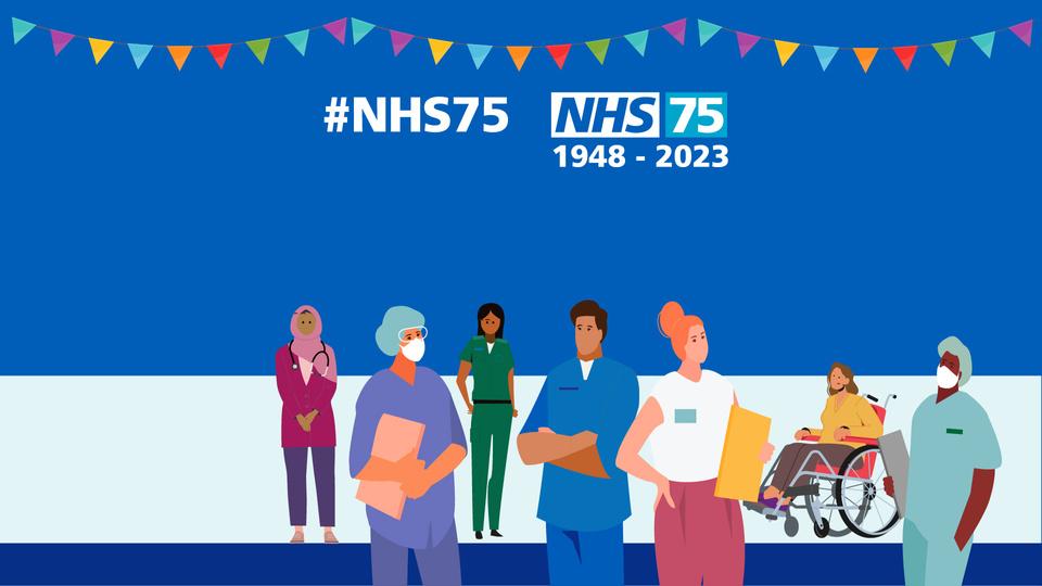
A variety of general email banners can be downloaded from the Trust Brand Centre for general use. Special banners may also be available on the Trust Brand Centre as part of events, celebrations and campaigns. For example, the NHS 75 birthday and National Staff Survey. This will be communicated via internal channels.

 Alex Morgan Staff Nurse
02392 286000 ext 1234 Mobile: 1234 5678
Website: www.porthosp.nhs.uk Facebook: PortHosp | Twitter: @PHU_NHS | Instagram @portsmouth_hospitals
You can find a guide on how to insert an email signature in the Trust Brand Centre

Teams Background
In a digital world, we know many of our staff communicate internally and externally via Teams (and other video calling software).
Please find a selection of PHU Teams background for use within the PHU Brand Centre.
New Teams backgrounds may be released for upcoming events or campaigns. This will be communicated through internal channels.
Business card
We know many colleagues may wish to have a business card to share.
Approved designs for businesses cards can be downloaded from the PHU Brand Centre. The Trust is not responsible for printing business cards.
YIf you leave the Trust, you must stop using any PHU business cards.
Division and Department identity
We know that our staff are proud to be part of the divisions and departments that they work in.
Medicine and Urgent Care

Divisions can use their colour as part of their identity within the Trust. This includes internal presentations and reports.
Networked Services
Clinical Delivery
We have worked with departments to create identities to ensure staff can feel a part of their team. These can only be used internally.
Surgery and Outpatients
Corporate Services
You can download the Division identities from the Trust Brand Centre.
FAQS
How do I design a poster
Can an external designer help with designing?
What template can I use?
How do I change a template?
Can you create an MS teams background for me?
Can you check if this asset is following brand guidelines
Why do we have brand guidelines?
Do you have the PHU logo?
How do I edit a downloadable template?
How do I install Frutiger?
Can you update this leaflet for me?
Do you have a picture of?
How do I take a photo?
How do I send a photo?
Where can I find the PHU colours?
For further questions or support, please contact the Communications and Engagement Team.
