HLR
LUTHERVILLE MUSIC SCHOOL
Location: Lutherville, MD
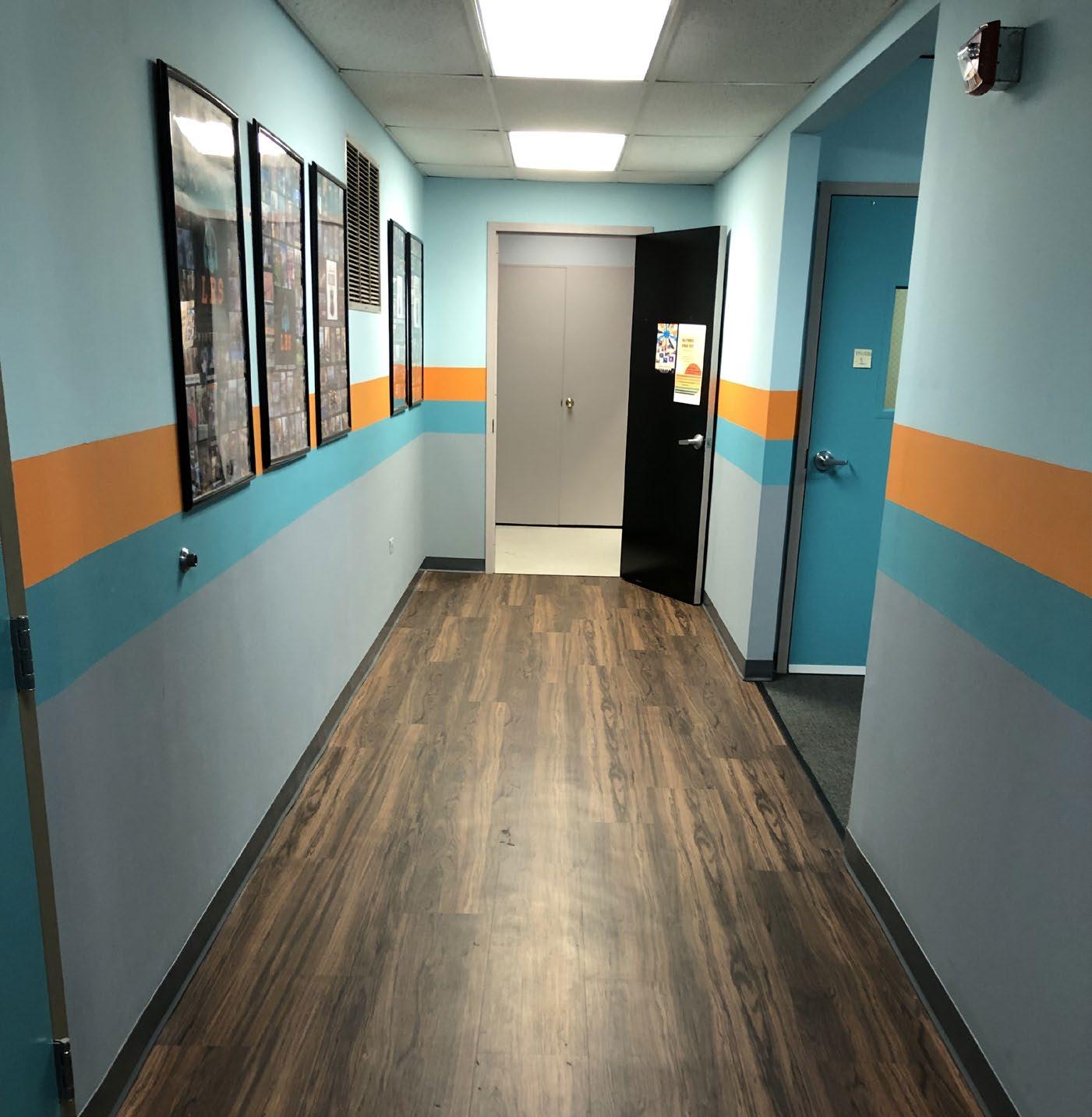


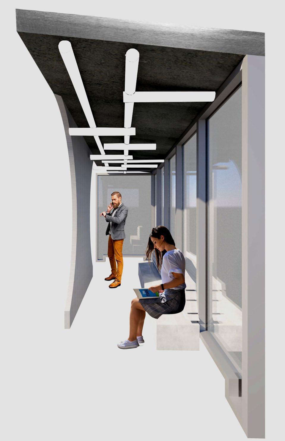
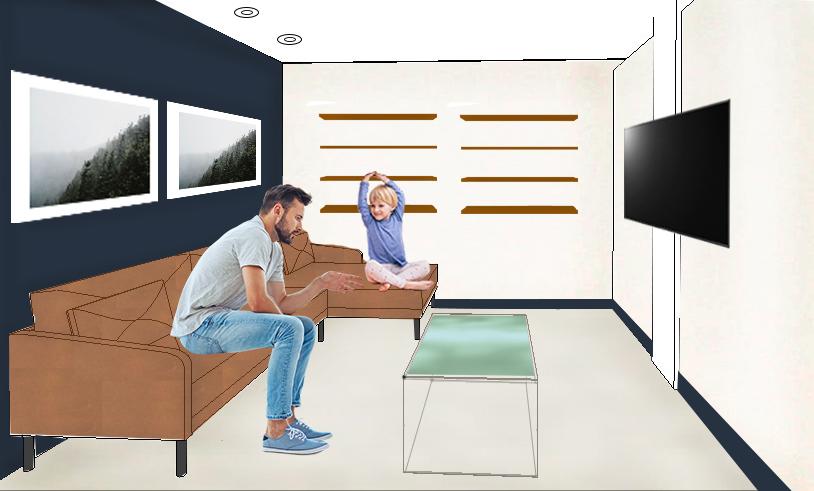
I consulted on renovations being completed at a local music school. They had already completed the phase I of construction in their space and wanted guidance on phase II of construction. The main goal behind this project was to help create a space that was welcoming and that their clients would want to spend time in.
Their clients often spend at least an hour or more in the music school and often their clients are young students with a parent/guardian that hangs around to wait for the completion of the lesson. This showed the importance of making changes to the space that would lighten the space and bring a sense of interest.
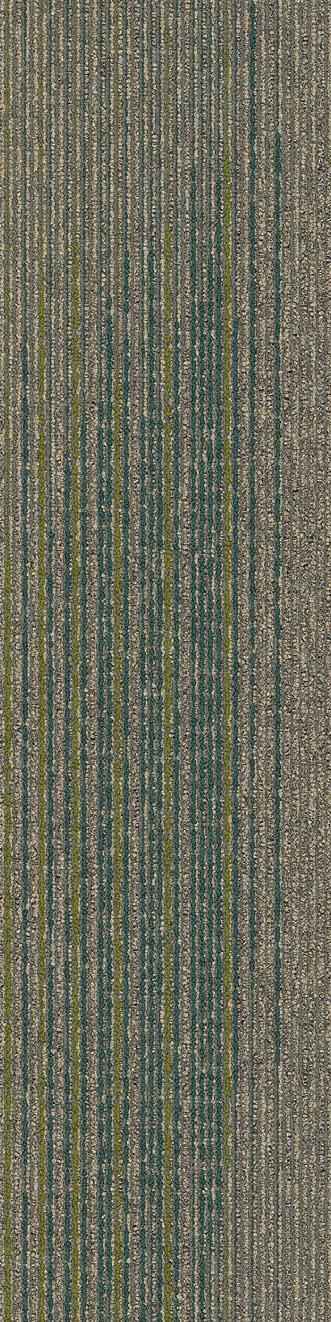
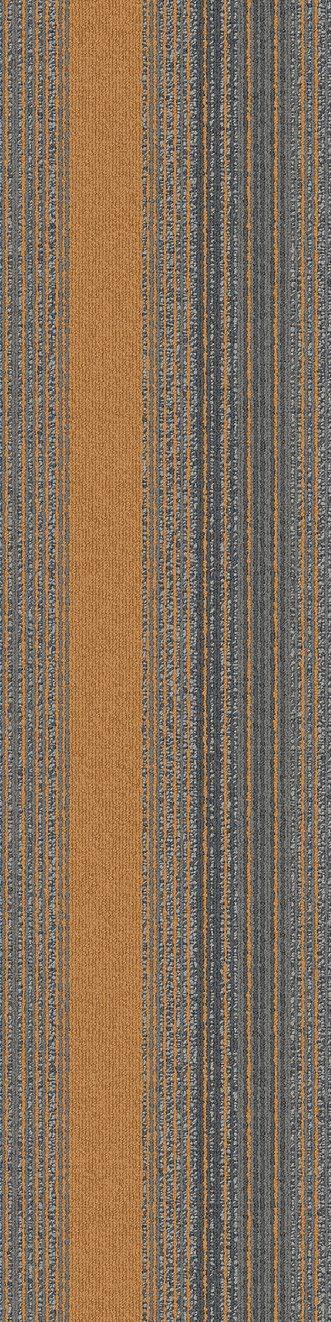
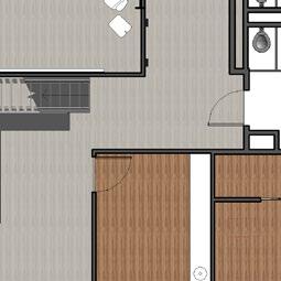
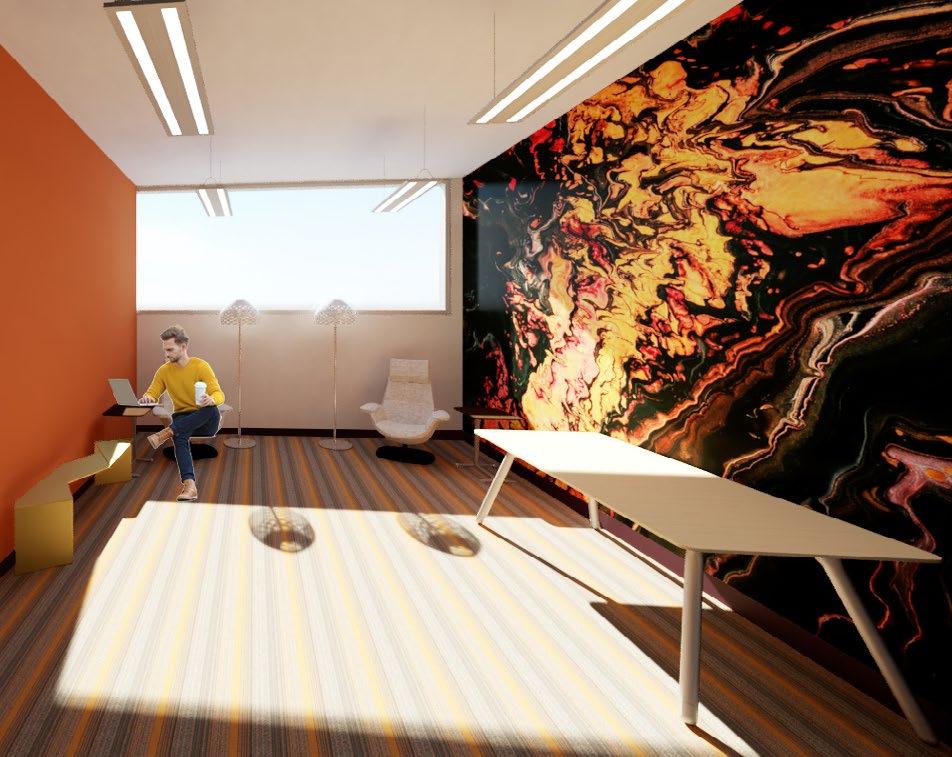
Originally, when I first got involved with this project they were considering some VCT flooring options for this main corridor. My clients expressed they weren’t happy with the VCT options available. We started looking at LVT samples instead and in the end moved forward with implementing LVT flooring in the main corridor.
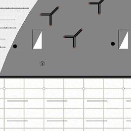
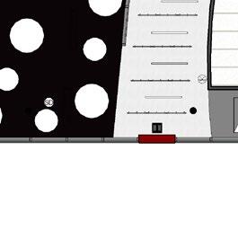
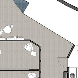
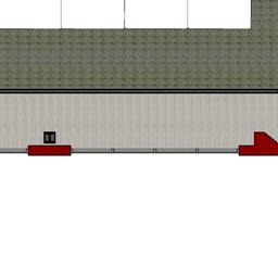
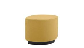
The colors used were important to my clients as they wanted to incorporate the school colors boldly into the new design, especially since this was their Rock School space. We tried to stay away from this boldness in the classical school’s space on the third floor, due to the goal for that space to feel more refined.


For the finishes, we introduced some neutral tones into the space to offset the school colors being used as more of an accent.
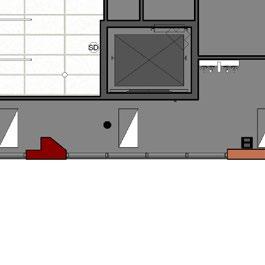
For the ceilings in the the music school, we worked through some potential options. The one that the clients were leaning towards is cleaning and repairing the existing ACT and grid.
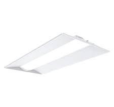
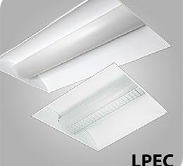
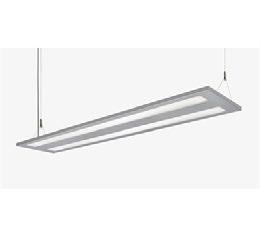
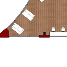
The lighting in the space was not ideal for the use of the space. I suggested a few lighting fixtures that would use the same footprint as the previous fixtures as that was a request from the clients. In addition, to continue with the rock school theme, the ceiling tiles in certain lesson rooms were covered with a black felt.


PHOTO OF A LESSON ROOM
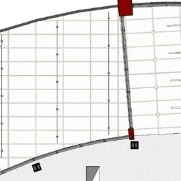
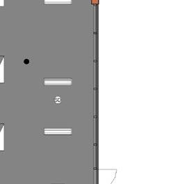
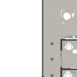
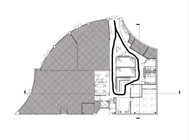
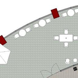
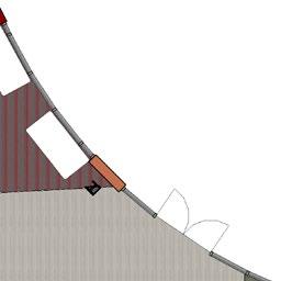
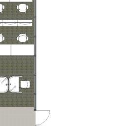
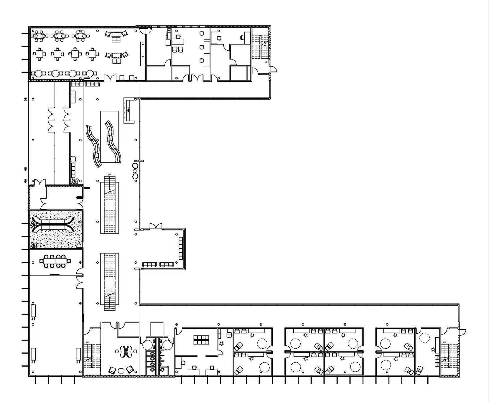
THIRD LEVEL FLOOR PLAN
SCALE: 1/8”=1’-0”
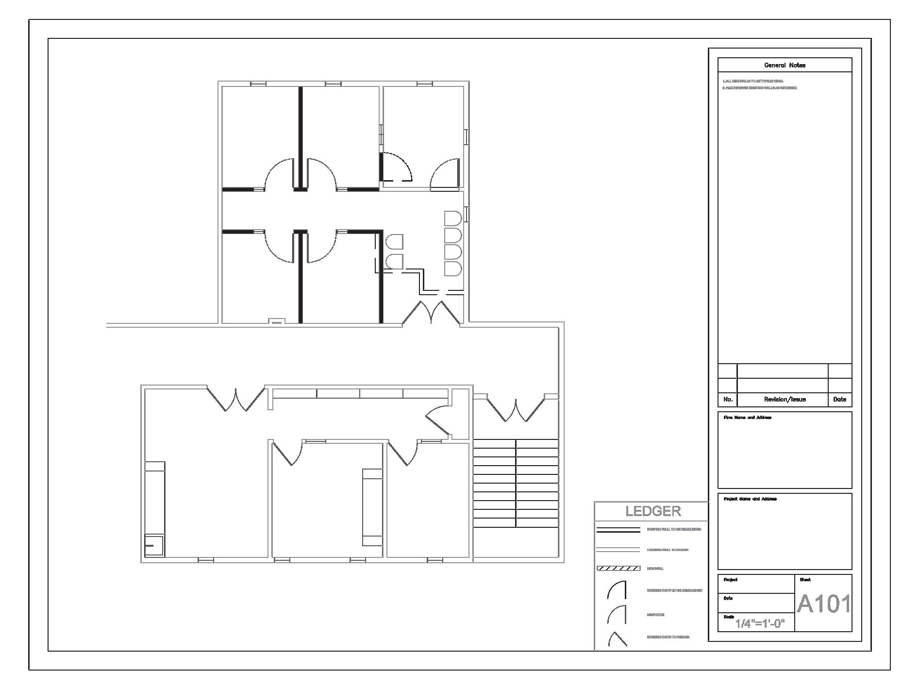
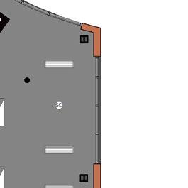
THIRD LEVEL REFLECTED CEILING PLAN
SCALE: 1/8”=1’-0”

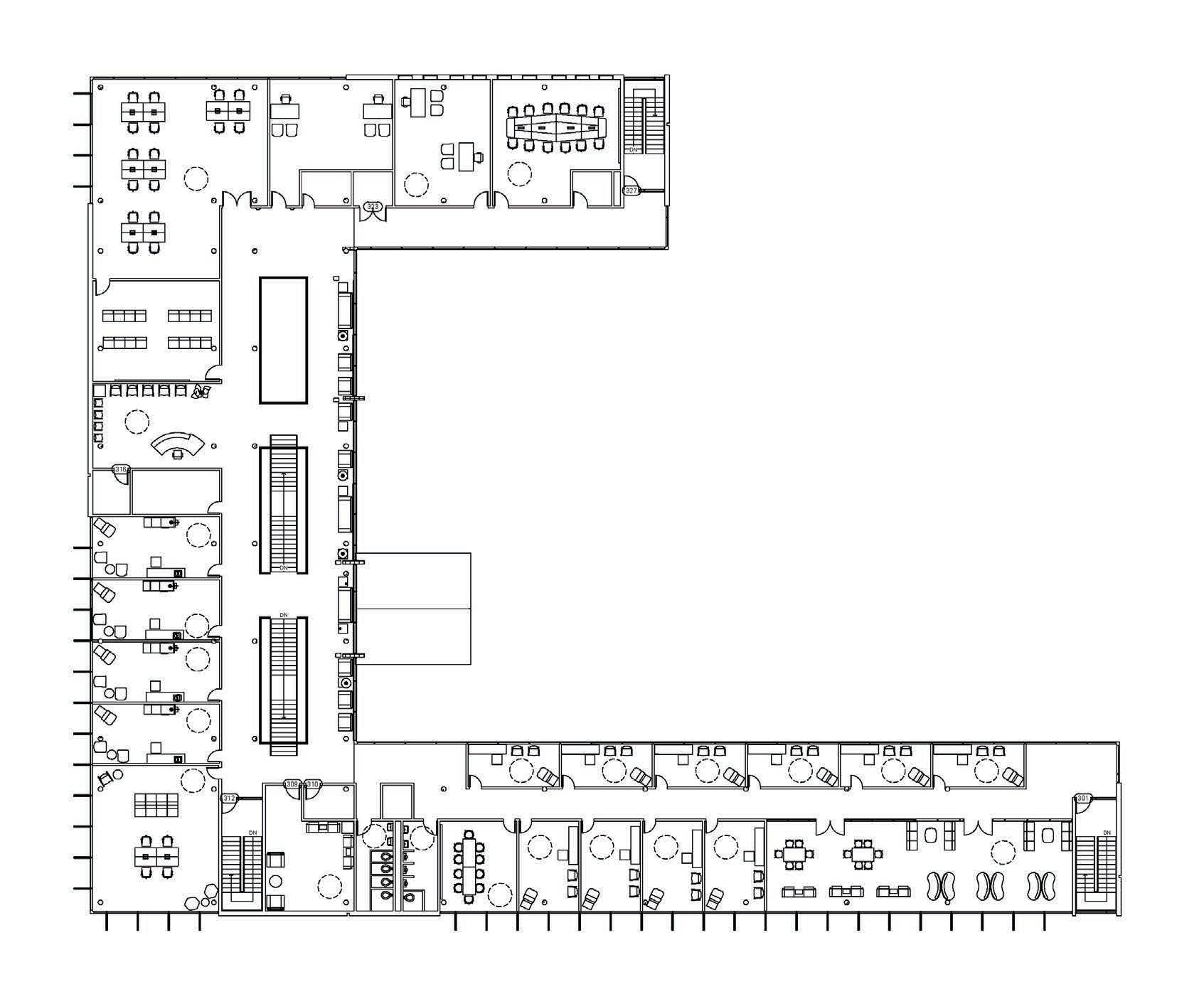
One part of this project was figuring out how on the third floor they could utilize some wasted space. They have a need for more lesson rooms so did some planning to figure out how we could incorporate more lesson rooms into their space by making some changes. Due to how often these students are younger, there were sidelights incorporated to allow a sightline into the lesson rooms from outside.
NEXT SATELLITE OFFICE
Location: Atlanta, GA

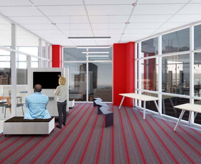
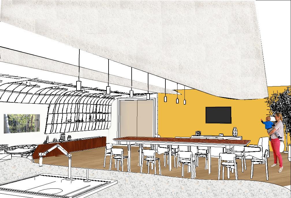
The concept for NEXT was to promote diversity by encouraging connection and engagement among those of different ages, perspectives, ethnicities, and beliefs; with a learning mentality in the employees, and growth of their talent and skill set in the workplace. Inspiring the employees to be open to learning about each other’s different backgrounds to have a more cohesive learning environment in the workplace with successful collaboration. This satellite office is designed with the understanding of the value every employee has and the importance of each of their different views and perspectives in the success of the company.


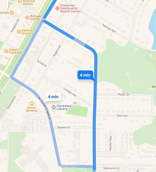
For NEXT’s new satellite office in Atlanta, Georgia, the local area that was chosen for the office was Clarkston, which is in the Atlanta metropolitan area. Something truly unique about this area is it is considered the most diverse square mile in the United States.
The large number of different cultures and ethnicities located within Clarkston’s limits make it a truly special, diverse place. With so many different cultures represented its no surprise that there is also a large variety of different faiths practiced. Because of this, there are a large number of different religious buildings in close proximity to each other, such as an Buddhist Temple, Islamic Mosque, Jewish Temple, International Church, Baptist Church, etc.
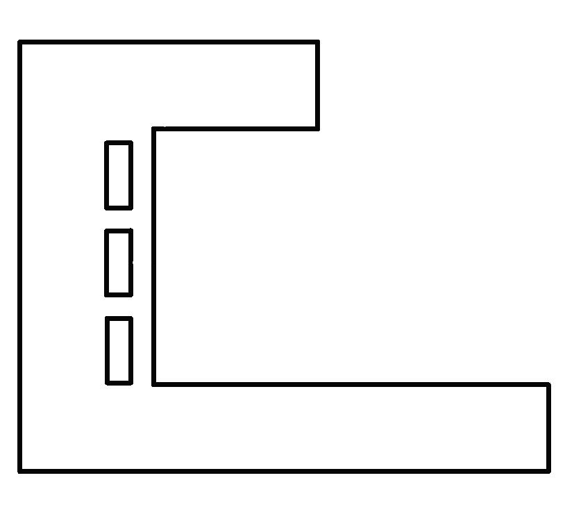
This parti is showcasing the concept of the street corners and each of the different cultural areas that are present in Clarkston. When walking down the street you are greeted with each of these very different from the next cultural experiences. Each one often has a religious building, meat market, and shops that are unique to each individual culture.

In this design, these cultural areas are implemented by having clear designated spots for different tasks and activities that provide a different and unique feeling from the other spaces in the office, while still feeling like an overall important part of the office. This parti diagram is representing the continuous aspect of the street with these vastly different cultural areas branching off of it. This street is intended as a central element and everything else revolves around it or is connected to it in some form.
PARTI DIAGRAM
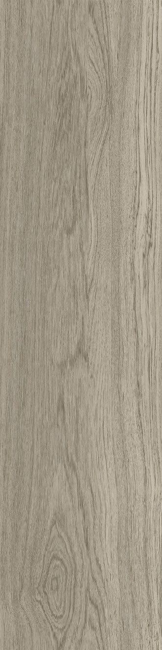

FLOORING: FURNITURE:

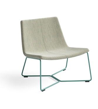


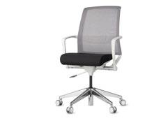
West Elm Work Slope Lounge Chair
Cooper Swivel Chair
Coalesse Last Minute Stool
Orangebox Sully
Turnstone Campfire Table
Montara650 Table
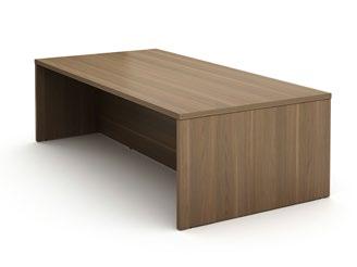
PERSPECTIVE OF RECEPTION DESK
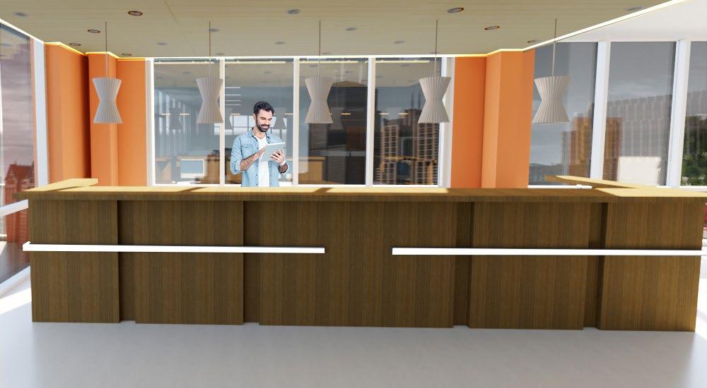
It was important to have a clear designated area for a reception area near the main entrance to provide an area for assistance or guidance through the space, especially for those coming in to show off their new products or to use the inspiration zone for a display of products for employees to have the chance to interact with or learn more about. Since the concept for this project, along with the employer’s wish, is for the employees to constantly be provided the opportunity to learn, this was an important factor to further that vision .


The lighting is designed with the intent to further emphasize the consistent loop around the space, while still providing appropriate lighting for task work and collaboration spaces. Including in the design good acoustical control in the space, which is needed especially with the mix of louder collaborative spaces and quieter individual work spaces.
REFLECTED CEILING PLAN
SCALE: 1/8”=1’-0”


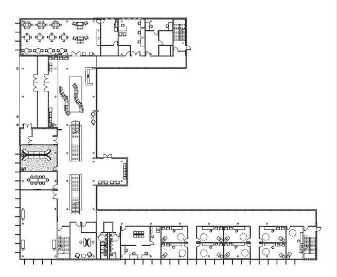
In the first level, the design of the space along with the layout is formated with the idea of this continuous loop through the space where the areas off of that loop represent these cultural corners or areas. These areas are the more bright and energetic areas in the space, but are also vastly different than each of the other cultural areas to represent the cultural corners that exist in Clarkston.


FLOORPLAN LEVEL 1
SCALE: 1/8”=1’-0”


This continuous loop idea with the cultural corners off of it is also implemented in the second level. This second level has the more flexible, interactive spaces around the outer rim of the loop, with the more structured, heads down spaces on the inside of the loop, while also offering some small areas that provide some different ways to work.


SCALE: 1/8”=1’-0”

FLOORPLAN LEVEL 2


PERSPECTIVE OF TEAM SPACE
In these perspectives, they show the emphasis that was put on having a balance between the regular circulation spaces, the spaces that needed to be more calmer, and the areas that needed to have higher energy and be more of a vibrant space
INSPIRATION ZONE
For this NEXT satellite office, the in-between spaces were really taken into consideration as areas that not only provided a different type of working space for employees, but also as areas that allow for a break from work.

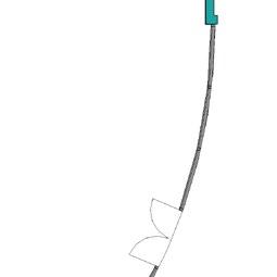
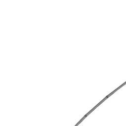
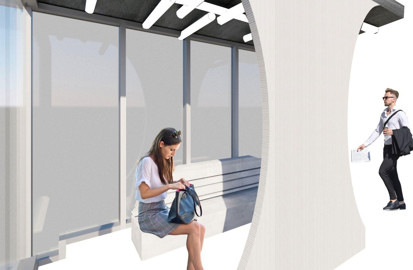
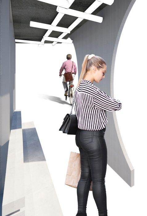
“BRIDGING LIGHT” -Bus Shelter Lighting Design
Location: Richmond, VA
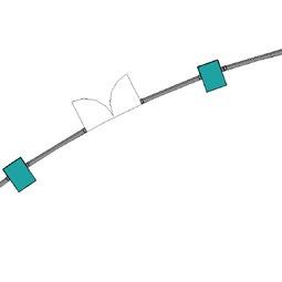
PARTI DIAGRAM

During the research phase of this project, an interest into a bridge that is located in Richmond, VA was sprung. This bridge separates two main parts of the city of Richmond. The inspiration of the contrast that this bridge presents, not only between the landscape itself, but among the light and shadows, drove this project.
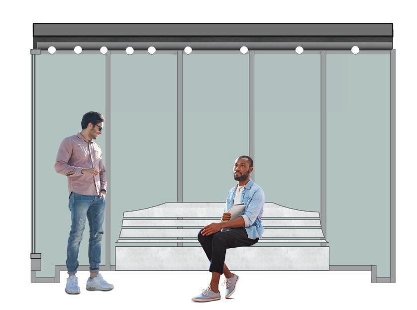
The prompt for this project was to design a light fixture for a string of new bus shelters, with the ability to adapt in length and size as the bus shelters will be placed in different sizes. An extra emphasis was put on safety and security, as these shelters will be placed in both urban and suburban areas.
The concept behind the design is the contrast of light and shadow and how it can be formed and used to evoke an emotion. The power of light and shadow can encourage a feeling of safety and security or the opposite. That is why this shelter aims to offer the user a little more control when using this bus shelter to help evoke the feeling of safety, while also offering some shelter and relief from the fast pace of the streets outside.
Manchester Bridge in Richmond, VA
Photograph By: Will Weaver
Just like with the Manchester Bridge, where there is a play with light and shadow, this idea was incorporated into the light fixture and bus shelter design by having different levels of light in the bus shelter. Having an area that offers shade but still receives some light from the fixture, along with other areas that receive more or less light respectively.

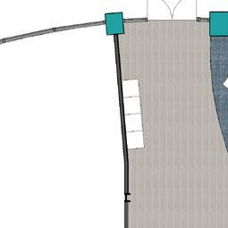
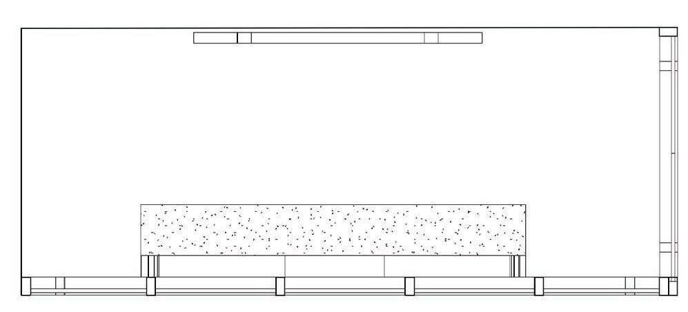
SECTION
SCALE: 1/2”=1’-0”
By using the light fixture and design of the shelter to focus the light in a purposeful way. The light fixture and shelter were designed to meld together so that as you enter the bus shelter from either side you are drawn in and encouraged to further explore the experience that the light fixture and the shelter provide. Becuase the shelter would be open 24/7, there was a need for a tamper-proof light fixture that couldn’t easy be damage.
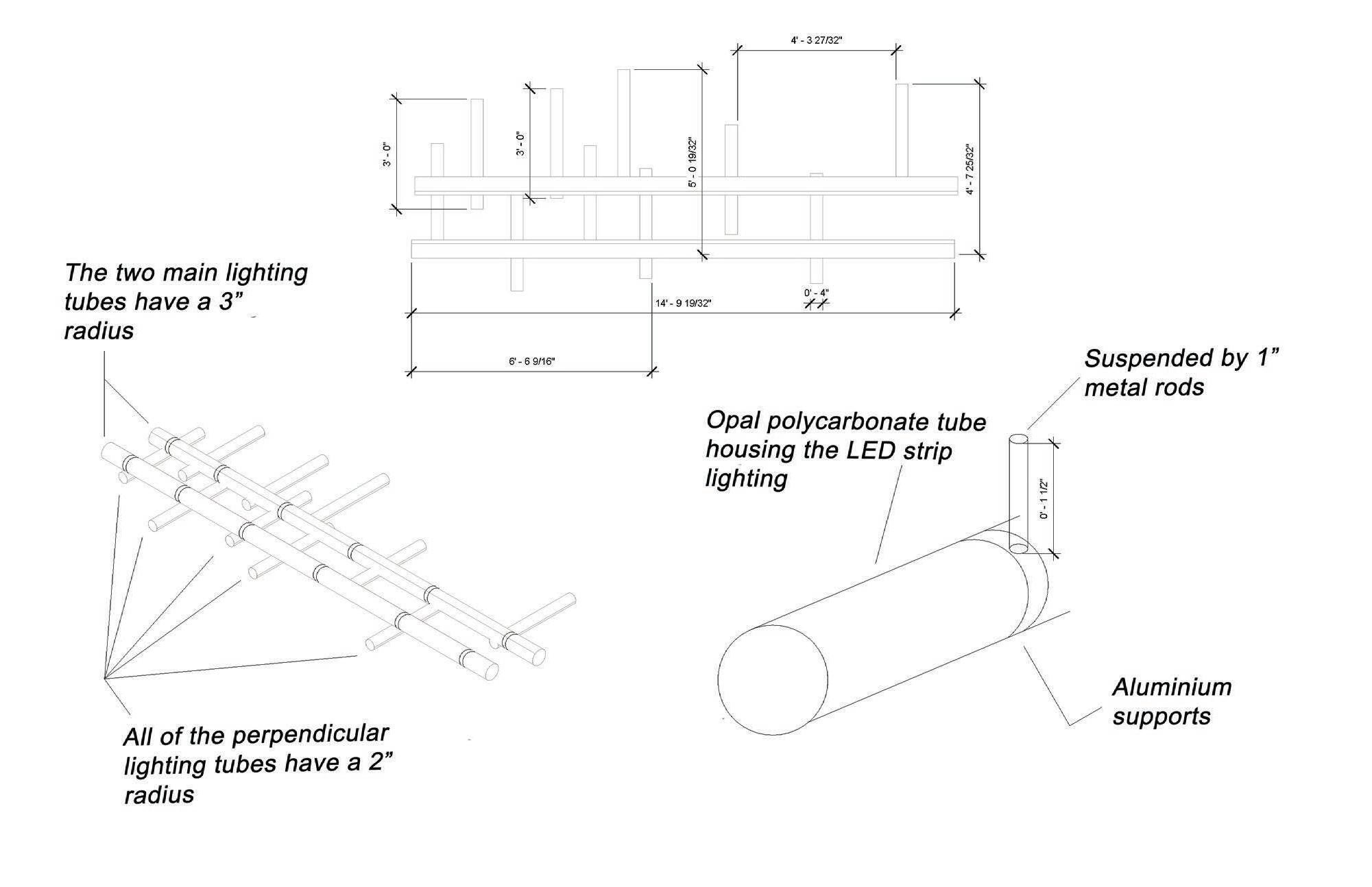
The light fixture was designed with the intent to draw the user into the space. Having the most open part of the structure offer the less light and then as the occupant moves into the more enclosed part of the bus shelter, they encounter more light.
The shape of the bus shelter was thought out from everything to using the curve structure of the front of the bus shelter to offer some shelter from the sun for the occupant, while still allowing visual sight lines through the shelter and to the outside to still see people and buses approaching the bus shelter.

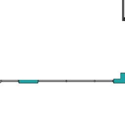
FLOORPLAN
SCALE: 1/2”=1’-0”
Incorporating a place to sit in the structure of the bus shelter, while also allowing enough space for multiple people to stand to cater to the large variety of user types, was a design solution that had to be solved well in this project.
Temperature was also considered as an important factor, with the probability of these shelters being located in different areas around the country. There is some shelter from the sun, but also areas where the sun enters the shelter. This was designed around the sun angles in Richmond, VA; which is this specific bus shelter’s location.
“REACHING CONNECTIONS”
-Virginia Tech LLC Faculty Apartment
Location: Blacksburg, VA


Connection between the Appalachian Mountains and New River
Connection between the faculty and students
Connection between the faculty and their family
The concept for the LLC Apartment derives from the idea of the reaching connections between the outside world of the Appalachian mountains, the students and faculty, and the family. This concept informs the floor plan through the private living spaces, the bedrooms and family room, and the public living spaces, the gallery, the living space and the kitchen.
Myself and two other designers worked on this project together. As part of our team, we each had a particular focus area for the design of the faculty apartment. My focus area was sustainability and how we could sustainable source local materials and finishes that would help to limit the impact on the environment and the health of the users of the space.
FINISHES SELECTIONS:
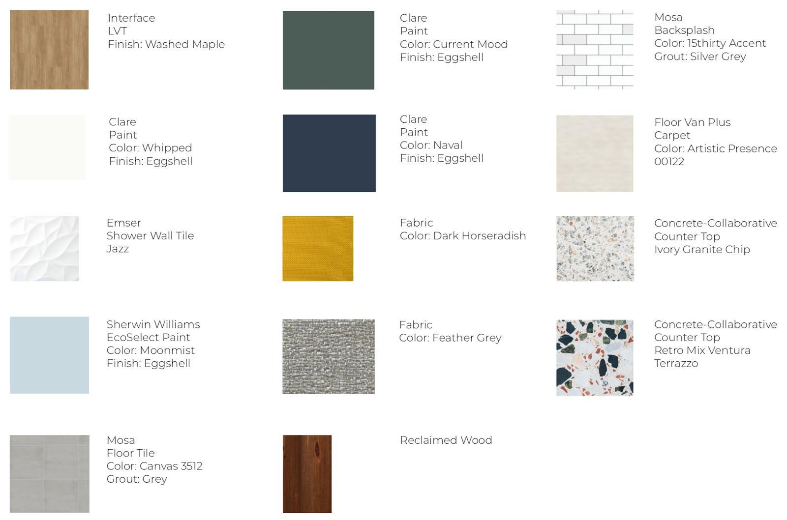

Sustainable materials such as reclaimed wood, and low-VOC paints draw on our concept of reaching connections with the priority of a healthy living environment for the family and as well as limiting the impact on the surrounding environment.

FAMILY ROOM:
BEDROOM 1 & 2:


The original proposed design that we were given had mostly neutral tones in the space. Myself, along with my teammates, really love a variety of color and wanted to incorporate some color accents in the space by the paint, finishes, and material choices, while still having a base of neutral tones present in the space.
OPEN LIVING SPACE:


For this project, the rest of the dorm had a strong focus on sustainability and the impact that the built environment has on the health of the users, along with the impact on the environment itself. So we chose to use a lot of low/ no VOCs paint, sustainable sourced materials, and so forth to limit our affect with our material and finishes selections.
MASTER BEDROOM:


It was challenging to figure out how to attach the different elements being designed, while also taking into consideration how they all came together and were unified in the space. For example, the mycelium ceiling element attaching to the ceiling or the clay feature wall in the main area attaching to the wall.
One of my favorite parts of this design are the feature pieces that were made by several faculty members at Virginia Tech. We had the honor of being able to give suggestions towards the form and incorporation of the feature pieces in the space.
REFLECTED CEILING PLAN
As you enter the space you encounter the more public spaces and then when you start to move further through the space there is a level of privacy added. Per our research, this front, more public space, would be where the most connections would happen with the family and students, while still having an area for just the family itself, where not everyone visiting would spend time.

FLOORPLAN
SCALE: 1/8”=1’-0”
In the section of the main living space, you can see the four elements that were designed by faculty. The mycelium ceiling, kitchen island, clay feature wall, and the dinning room table. The dining room table is actually another piece being designed and built by a Virginia Tech faculty member, who is sourcing the materials locally and is even building the table legs out of old trees from around the local area.
PERSPECTIVE

SECTION
SHOWING MASTER BEDROOM

There are many windows in the space, which are great for daylighting, but presented some privacy and overheating issues as this dorm is right off of a main street, which these windows face. So to prevent curious onlookers trying to see into the space, we added some shades to offer privacy and temperature control.
PERSPECTIVE FROM MAIN ENTRY
The main living spaces are open concept and we were told to expect a lot of student visitors in the space, not just the family, because this apartment is in a dorm on a college campus. So, the furniture used in the space was contract-grade and needed to be more durable to withstand a lot of use.
PERSPECTIVE OF LIVING ROOM
“RESTORATION PEDIATRIC CENTER”
Location: Berlin, Germany
Berlin, Germany


3 Levels
54,000 Square Feet

RESTORATION
PEDIATRIC CENTER
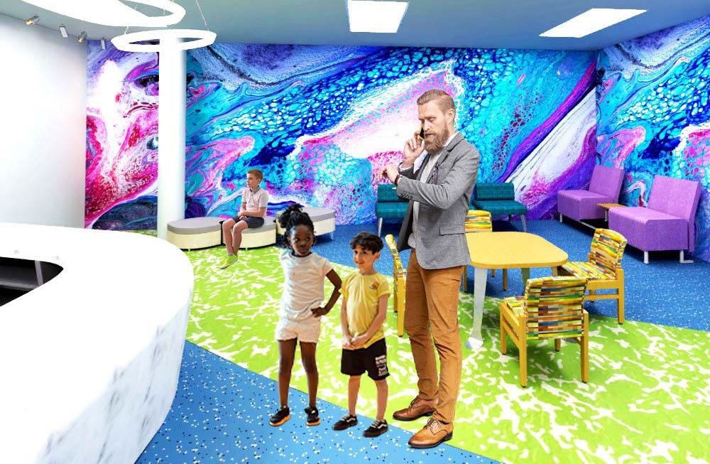
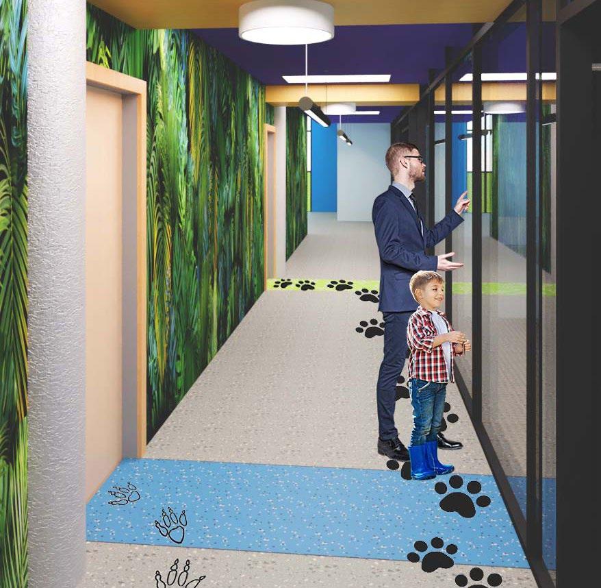
For my thesis project, I designed a healthcare space in Berlin, Germany. Berlin has struggled with providing good healthcare for those in at-risk categories such as a lower socioeconomic status, high poverty rates, and an average life expectancy that is five plus years lower than the average. The amount of children living in poverty in Berlin is roughly 23%. Taking these statistics into consideration, my client for this healthcare space is a nonprofit organization that wants to bridge the gap between those of higher and lower incomes, in the healthcare system currently provided in Germany.

To achieve this goal, I designed a pediatric center for children from low socioeconomic status population. According to my research, medical care for this population is hard to access in Germany. Incorporated in the design of this pediatric center is a focus on wellness, by designing for proper privacy and fulfilling the lighting needs for the users of the center. By providing options to adjust lighting to personal preference and allowing more or less privacy adjustments, the users of the facility feel more at ease and in control in what can often be a stressful and fear-inducing environment.
This healthcare facility aims to fulfill a basic human need of medical care to the low income communities in Berlin, while also taking into consideration how their overall wellness is impacted by the healthcare environment.
My inspiration for this project was drawn from Tiergarten Park which is located in Berlin, Germany and lies almost in the middle of what use to be East and West Berlin, when they were separated by the Berlin Wall. This park has lots of areas for people to come together and enjoy, along with a zoo that offers the chance to see some animals up close.


For the parti, inspiration was drawn from the Victory Column located in Tiergarten Park and the way that it represents this central element, with everything flowing around it. This started to inform the parti by the importance of having a central space or hub in such a large space as a pediatric center.
Because this is a pediatric center, the concept is restoration. Often the patients that enter this pediatric center are lacking in some sort of health or wellness aspect in their life so they need restoration. This pediatric center is designed to incorporate a natural movement through the space to help provide a restorative process and experience for the patients and their family and friends. Because this pediatric center’s intent is to meet the needs of physical or mental health and wellness, the design draws the patients into the space and the areas of the center where their health can begin to be restored, by having a hub or central point in the reception area that greets them when they first enter the space.

PARTI INSPIRATION

PARTI DIAGRAM

The design of the patient exam rooms were geared towards my thesis focus of privacy needs. It was important to offer as much privacy as possible for both the patient and their support system.
Some of the steps that were taken towards privacy was the control of views into the space from outside, along with acoustical privacy from one exam room to another.
An important aspect of this room was meeting both user types of adult and children. Because it is a pediatric center it needs to cater mostly to children but also having elements that helped the adults to be as comfortable as possible in the space.
PATIENT EXAM ROOM


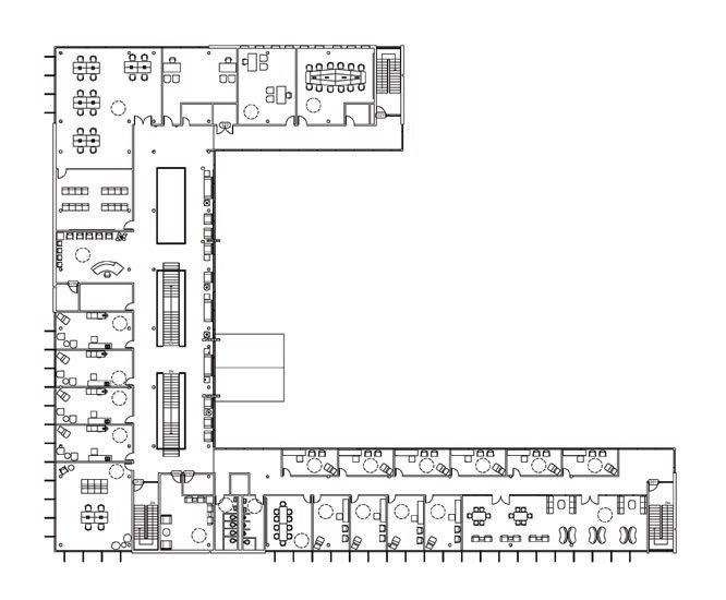
8. Quiet Room
9. Lobby
10. Cafe
11.Kitchen
12. Offices 1. Patient Exam Rooms
2. Lab 3. Restrooms
4. Library
5. Physical Therapy Room
6. Conference Room
7. Waiting Room
This reception desk in the lobby is more of a general touch base for questions, concerns, and directions. This was very clearly placed so it is directly in front of the main entry doors, to prevent unnecessary confusion or stress in trying to find it
Access to daylight was something that was brought up multiple times in the survey responses as being important in the healing process and the impact it can have on mental health. So making sure that the lobby space had plenty of daylight access was top on the list of priorities.
With the lobby being one of the first spaces that the patients will encounter, the aim for the space was to make it as comfortable and welcoming as possible. One way this was done was with bright and fun furniture pieces.
The layout of the furniture encourages a gradual movement towards the stairs. These stairs are visible from the entry and help to begin to guide people through the space with a clear path to get to the other levels.
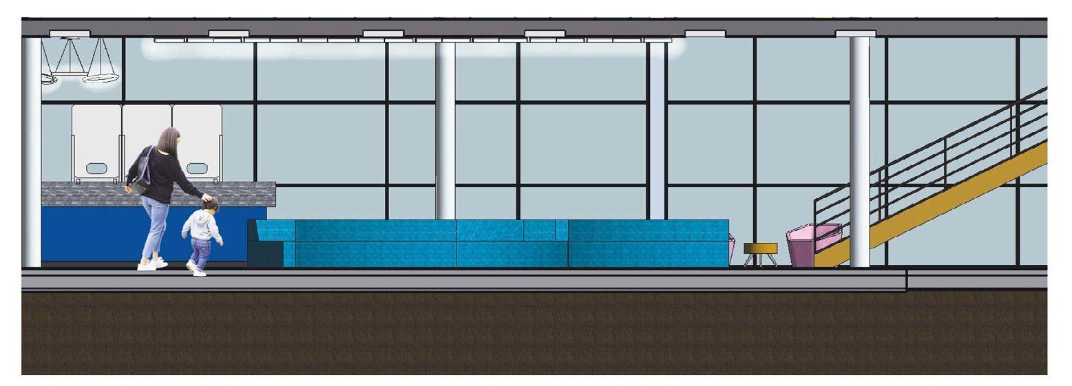
SECTION OF RECEPTION AREA


1. Patient Exam Rooms
2. Conference Room
3. Restrooms
4. Library
5. Training Room
6. Outpatient Therapy Rooms
7. Waiting Room
8. Nurse’s Station 9. Open Benching 10. Office 11. Employee Restrooms 12. Employee Kitchen 13. Offices
Due to how intimidating a healthcare space can often be, especially for kids, the goal was to give as much control and independence as possible in the space to the kids who entered this pediatric center. Wayfinding in this pediatric center played a big role in allowing the kids to have a sense of independence. Animal prints on the floor was used to give the kids some control in finding their way through the space, by following a certain animal print which would then lead them to the room they needed to be in.
Tiergarten Park in Berlin is shown with the nature inspired jungle print protective wall covering. This Targa wall protection is perfect for a healthcare setting like this because they are stain resistant, impact resistant, can withstand scratches, and are easy to clean.

REFLECTED CEILING PLAN NTS


1. Employee Break Room
2. Patient Exam Rooms
3. Conference Room
4. Restrooms
5. Hangout Space
6. Research Library
7. Outpatient Therapy Rooms
8. Waiting Room
9. Media Room
10. Open Benching
11. Shared Office
12. Meeting Room
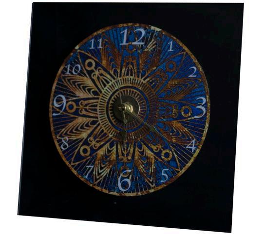
INDUSTRIAL DESIGN
Location: Blacksburg, VA

The idea behind this clock is that the transparent material allows this connection to the rest of the space. So when it’s hung on a wall, you are still given this sight line all the way through to the wall or space behind.
I designed the graphic part of the clock and then added the transparent part along with the actual clock mechanics needed. I wanted this clock to be something that would speak to more of a modern style of design.

This two point perspective hand drawing was inspired from a prompt to draw space in different forms. The space had to use and interact with the boundary frame around the outside of the hand drawing.
PICTURE OF HAND BUILT CLOCK
PICTURE OF HAND BUILT CLOCK
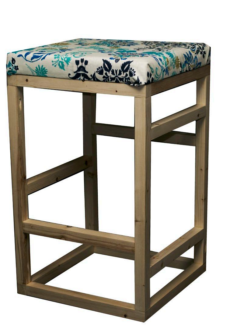
This stool was made in my summer studio for my Industrial Design minor. The prompt was to design and then construct a human scaled piece of furniture that was crafted well while also being functional.
I had several different ideas at the start of the project of what I wanted to design, but then settled on this stool. I considered how was best to construction the stool and ended up building my own jig to help with putting the stool together with the large amount of pieces it had.
One of the most important things that was considered during this design process was not just the constructing of the stool and making sure it would hold someone, but also how it interacted with the human body.
I designed this stool to cater to the dimensions of the human body as much as possible. Everything down to the having different levels of foot bars for the user to the bigger than average size of the stool seat with extra thick padding.

PICTURE OF STOOL THAT IS HUMAN-SCALE
PICTURE OF HAND BUILT STOOL
HLR
Hannah L. Richards
LEED Green
Associate, Allied ASID