
 HANNAH CRUTCHFIELD
Masters of Interior Design, First Professional University of Texas at Austin
HANNAH CRUTCHFIELD
Masters of Interior Design, First Professional University of Texas at Austin
01
The StoreHouse| pages 4-9
public house
Design Excellence Winner 2021-2022
02
Anni Paul Part I | pages 10-13
brand development
03
Anni Paul Part II| pages 14-17
milan furniture fair pavilion
04
Anni Paul Part III| pages 18-21
brand installation at palazzo isimbardi
05
Fragment | pages 22-23
fabric design
06
Recondite | pages 24-31
nightclub design
Design Excellence Nomination 2021-2022
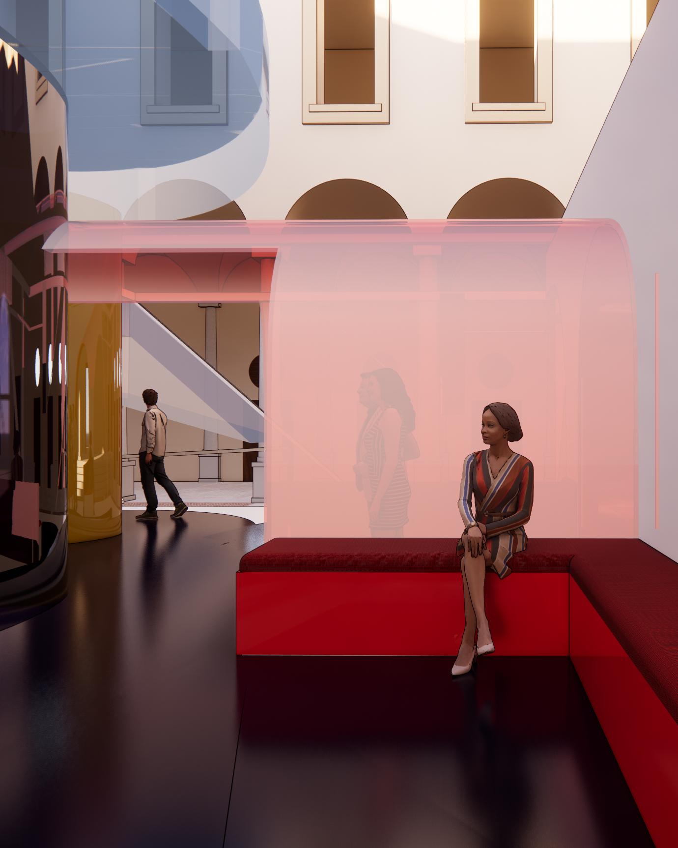
01
Public House
Design Excellence Winner 2021-2022
Tasked with creating a public house, this technical studio explored how concept and technical components come together to create a cohesive space. Based in Boston, Massachusetts, the name, ‘The StoreHouse’ was inspired by Boston’s historical maritime commerce and Patrizio Martinelli’s analysis of domestic interiors as ‘store-houses’ - “places where we collect, represent, and stage our theater of memories through the spatial arrangement and furnishing of interiors.”
Throughout the project, the design employed the use of a grid, or window motif, inspired by Boston’s domestic architecture and a distinctive color story in each space to give guests the opportunity for strong sensorial associations.

Conceptual Collage
The project used locality, ornamentation and domesticity to inform its design. Understanding the StoreHouse’s relationship to the Beacon Hill neighborhood and the surrounding elements, such as the Boston Common, Boston Public Garden and the Boston Harbor, was important in developing the color story for the space.


02 | Part I Brand Development
Researching the works of both Paul Klee and Anni Albers, this brand development project was inspired by two different generations of modernist artists.
In 1922, Anni Albers attended the Bauhaus where she was taught by renowned artist, Paul Klee. Klee, a pioneer of abstraction and modernism, arguably inspired Albers to take the ancient craft of weaving and turn it into a bold and spatial art form.
This brand development sought to see Klee in the eyes of Albers, bringing in playful and imaginative sensibilities, while also paying tribute to Albers’ tactile, functional and abstracted rationales.
This schematic development was the first of three projects conducted over the spring that encapsulated the branded project, Anni Paul.

The project began with color theory research and modeling in the form of weaving. These weavings inspired by Klee and Albers formed textile patterns that would later influence lighting, furniture and architectural design.

textile patterns and furniture + lighting


03 | Part II Milan Furniture Fair Pavilion
This was a branded pavilion project for the Milan Furniture Fair, otherwise known as the Salone del Mobile Milano.
Driving the concept for the branded pavilion were words spoken by Albers and Klee that captured the impact of Klee as a teacher, as well as Albers’ determination to reform weaving.
Albers was quoted saying, “I heard Klee speak and he said take a line for a walk,” and I thought, “I will take thread everywhere I can.”
This quote drove the design of a wayfinding system that not only thread people through each space, but also interacted directly with the structure. Instead of holding this line hostage to the floor plane, it went everywhere — drawing visitor’s eyes to key exhibition spaces by allowing that line to climb up a wall and playing on curiosity of where that line would end up.


Paul Klee’s playful geometries inspired the pavilion. Starting with more rigid, geometric structures, the form ultimately took shape in a more organic and connected way, much like a weaving. This meant blurring the lines of those geometric shapes and melting them into each other.
04 | Part III
Brand Installation at Palazzo Insimbardi
To supplement the Milan Furniture Fair, this project also included a pop-up installation at the Palazzo Isimbardi located in Milan’s city center. The installation was inspired by Toyo Ito’s Serpentine Pavilion and served as an artistic extension of the Anni Paul brand.
Noting that the installation would run in conjunction with the pavilion at the fair, this design focused on an experience that spatially represented the brand and paid homage to the artists that inspired it.
Paul Klee and Anni Albers are masters of abstraction in their respective crafts, and to replicate that in a three-dimensional way, the design of the pavilion played on translucency and plasticity. Employing a lattice system, similar to Ito’s pavilion, the structure features colorful shapes inspired by Klee’s Red Bridge to create the sense of an occupiable painting or weaving.
In order to incorporate a weaving component, the ramp was designed using Albers’ net knot as inspiration.


05
Fabric Design
Voted to be Printed
This textile design drew inspiration from one of the mixed media spreads of Feng Guo’s book, Block Island. The design utilized organic and asymmetrical elements of the composition to inspire a calculated, fixed pattern.
The textile design was voted to be printed with WOVNS by fellow classmates.


06
Nightclub Design
Design Excellence
Nomination 2021-2022
Interiors act to contain, define, conceal and frame spaces, and social spaces, such as nightclubs, act to challenge the boundaries of what makes an interior. Extending beyond the traditional conventions and boundaries of hospitality design, nightlife design provides an opportunity for richness in behavioral examination — asking important questions about why people participate in nighttime rituals and considering how designers can shape these experiences.
Using the historic Seaholm Intake Building in Austin, Texas as the site, this studio engaged innovative construction, as well as research, to design an imaginative, post-pandemic nightclub.

Known for its graffitied, worn facade, the Seaholm Intake Building was an iconic waterfront site in downtown Austin, yet its history and purpose remained a mystery to most. Giving the building new life, the club served to invite discovery yet aimed to keep the building’s mystery alive. Rather than embodying what the building once was, the club sought transformation. This design renewal was inspired by both nightlife research findings, as well as the more hands-on process of atmospheric and tactile modeling conducted throughout the semester.


From the beginning, materiality and tactility were at the forefront of the exploration. Building a sensory map using a wide mix of materials, all cloaked in black, mitigated some visual senses and enhanced the investigation of touch and feel. Through this process of making, the club’s aesthetic sensibility was developed.


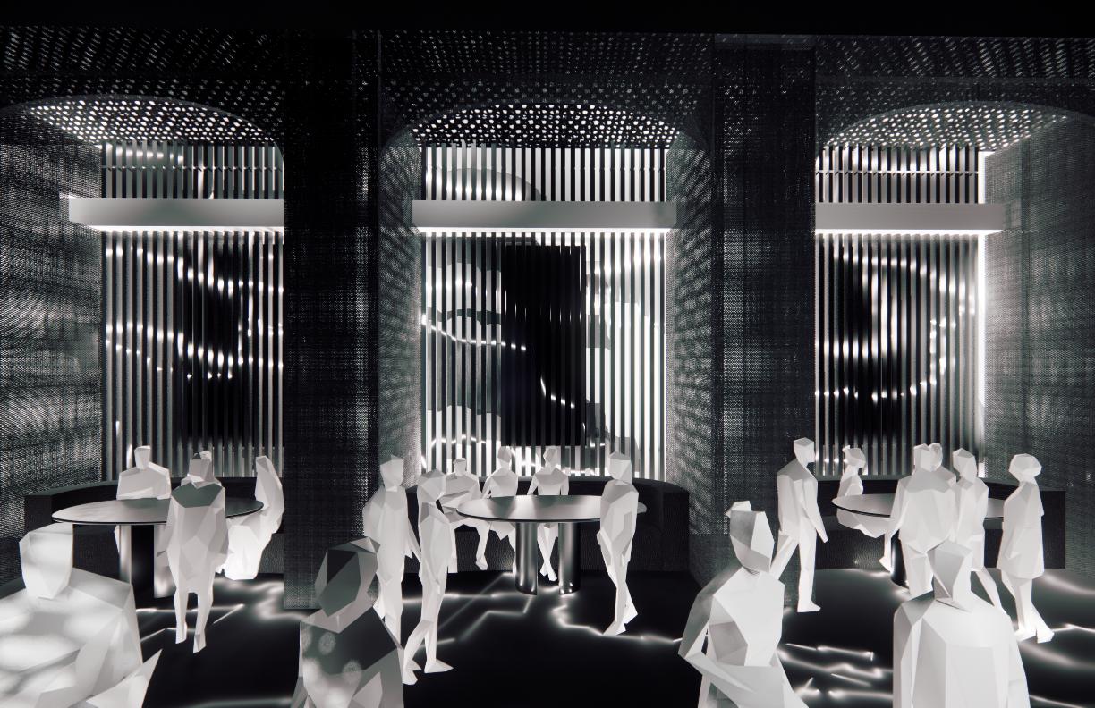

sectional model showcasing relationship between light and material

The interior utilized light and material as a means to conceal or reveal the geometries of the building. Projected white light played a key role in revealing certain qualities of the project, while the use of dark materiality was crucial to concealing the building forms.

