Goal & Purpose
Everything you need to know about our brand from mission to look and feel is within the next several pages. The ProMind brand was created with care and detail and have included all the guidelines necessary for continuing our brand.
Understanding the brand guidelines and implementing these on a daily basis will ensure a consistent and meaningful experience who utilize ProMind. This will also ensure ProMind ’s mission is seen through all we do.
About Us
At ProMind, we believe that athletic excellence is built on both physical strength and mental resilience. Our mission is to drive a stronger culture of physical and mental wellness in sports through awareness, education, and community.
We are committed to pushing the conversation forward—breaking the stigma around mental health in collegiate athletics and equipping athletes, coaches, and staff with the resources they need to thrive. By fostering a positive and supportive community, we empower individuals to perform at their best—both on and off the field.
ProMind isn’t just a brand—it’s a movement. We are here to reshape the way mental wellness is integrated into sports, ensuring that every athlete has the tools to succeed, not just in competition, but in life.
Vision
Our vision is to keep pushing the conversation forward & to create a positive & supportive community within the world of collegiate sports.
Our Values
Wellness First::
Prioritizing mental and physical wellness as essential components of athletic success
Authentic Advocacy:
Leading with integrity and a genuine commitment to reducing stigma around mental health
Community Engagement:
Fostering a supportive network of athletes, staff, and mental health
Empowerment Through Education:
Equipping athletes and staff with the tools and knowledge to advocate for mental health & promote a positive wellness culture in their own programs
Forward Momentum:
Embracing innovation and proactive approaches that push to build a healthier athletic culture NOW
Brand Voice
Primary: Vertical Logo Identity
The primary logo is a key aspect of the ProMind brand. This logo represents the mission and values that ProMind was established with, combining our main typeface and our lettermark. It is important to have an understanding of the logo and what it represents in order to properly continue the ProMind brand.
Our vision is to keep a positive conversation surrounding mental health in athletics going forward and growing. Our logo represents that conversation and forward movement. We can only accomplish this through careful and sincere conversation, shown in our logo’s soft and rounded edges.
Logo Identity
Vertical Clearspace & Sizing
Along with the meaning behind our logo, it is important to ensure that the logo is clear and legible by utilizing these clearspace and sizing guidelines.
The height of the letter M as seen in the logo typeface is used to define clearspace around the vertical logo. The minimun scaling for the vertical logo is 1.25 in. or 120 px wide.
Minimum Sizing: 1.25 in/120 px
Horizontal Logo Identity
The horizontal logo is a key aspect of the ProMind brand. This logo represents the mission and values that ProMind was established with, combining our main typeface and our lettermark. The horizontal logo more closely integrates the primary display typeface used in ProMind ’s branding. It is important to have an understanding of the logo and what it represents in order to properly continue the ProMind brand.
Our vision is to keep a positive conversation surrounding mental health in athletics going forward and growing. Our logo represents that conversation and forward movement. We can only accomplish this through careful and sincere conversation, shown in our logo’s soft and rounded edges.
Lettermark Logo Identity
The lettermark logo is a key aspect of the ProMind brand. This logo represents the mission and values that ProMind was established with. The logo combines our goal of continuing the conversation about mental health and moving forward toward a stronger future. It is important to have an understanding of the logo and what it represents in order to properly continue the ProMind brand.
Our vision is to keep a positive conversation surrounding mental health in athletics going forward and growing. Our lettermark logo represents that conversation and forward movement. We can only accomplish this through careful and sincere conversation, shown in our logo’s soft and rounded edges.
Logo Identity
Lettermark Clearspace & Sizing
Along with the meaning behind our logo, it is important to ensure that the logo is clear and legible by utilizing these clearspace and sizing guidelines.
The height of the letter M as seen in the logo typeface is used to define clearspace around the vertical logo. The minimun scaling for the horizontal logo is 1.25 in. or 120 px wide.
Logo Identity
Lettermark Breakdown
• Highlighting continuing the conversation & connection
• Representing “ P ” in ProMind
Italicized M/Arrow:
• Representing mission of moving forward
• Representing “ M ” in Pro Mind
Logo Misuse Logo Identity
Time and purposeful effort wen tin to creating the ProMind logo as it stands today, representing the movement that ProMind creates and all of our values. It is important to be aware of it’s purpose as well as how NOT to use the logo. Under no circumstand should any of the following examples or any other manipulation outside the approved logo colors be done.
Don’t change the colors
Don’t use a gradient
Don’t change alignment
Don’t change space between Icon and

Don’t use drop shadow

Brand Colors 03
Primary Colors
Bright Stride
HEX: #FFFFFF
R:255 G:255 B:255
C:0 M:0 Y:0 K:0
• Momentum Navy – A blend of steady progress and deep resilience
• Aqua Flow – Ties into both movement and a clear mindset
• Bright Stride – Represents forward motion and positivity.
• Endure Ember – Strength through the fire
Momentum Navy
HEX: #18344A
R:24 G:52 B:74
C:93 M:74 Y:47 K:43
Aqua Flow
HEX: #9BD7D3
R:155 G:215 B:211
C:38 M:0 Y:19 K:0
Endure Ember
HEX: #F15F22
R:241 G:95 B:34
C:0 M:78 Y:100 K:0
Typography 04
Typography Introduction
Fairweather Roboto
There are two typefaces used in the ProMind brand. Fairweather and Roboto. Fairweather should mainly be used for headings and promotional material such as social media, posters, banners, and more. Roboto is generally used as body text for ProMind. Fairweather is the main Display typeface for headers and promotional material
This is an IMPORTANT sentence.
This is a Subheader
This is body copy. Lorem ipsum dolor sit amet, consectetur adipiscing elit, sed do eiusmod tempor incididunt ut labore et dolore magna aliqua. Ut enim ad minim veniam, quis nostrud exercitation ullamco laboris nisi ut aliquip ex ea commodo.
Typography
In App
In the ProMind app only Roboto is used, excluding instances where the logo is present. Roboto should be the only typeface active in Heading 1 through 4 as well as body copy. Roboto makes the app accessible and clean.
Heading 1
Roboto Black 38/40
Heading 2
Roboto Black 4/28
Heading 3
Roboto Semibold 20/24
Heading 4
Roboto Bold 16/18
Body
Roboto Regular 16/18
Visual Guidelines 05
Visual Guidelines
Photography
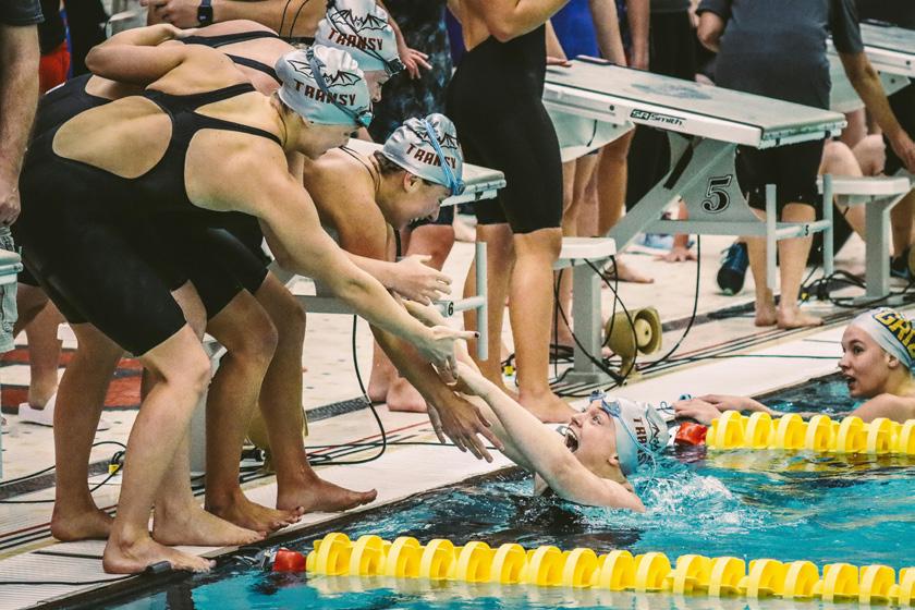
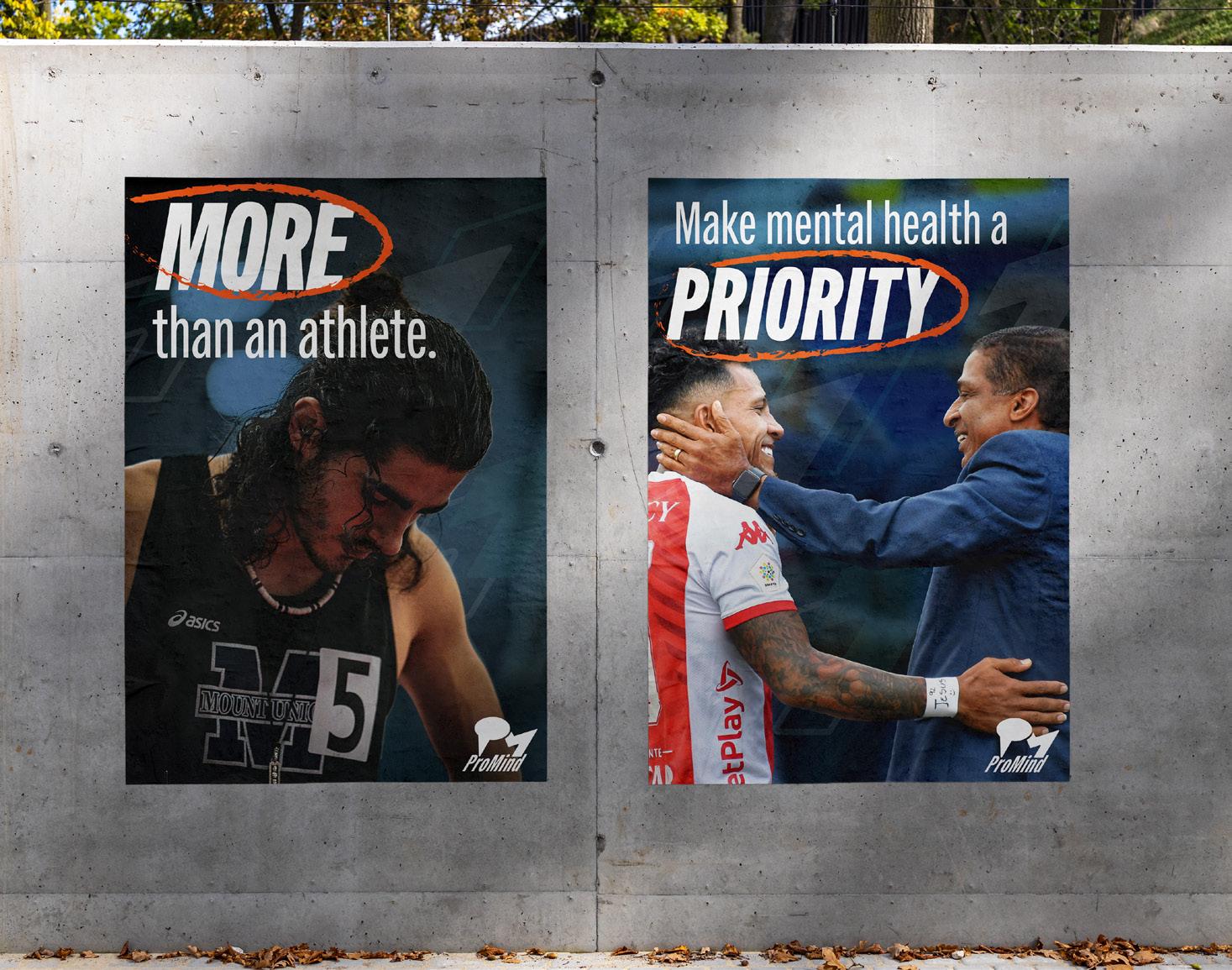
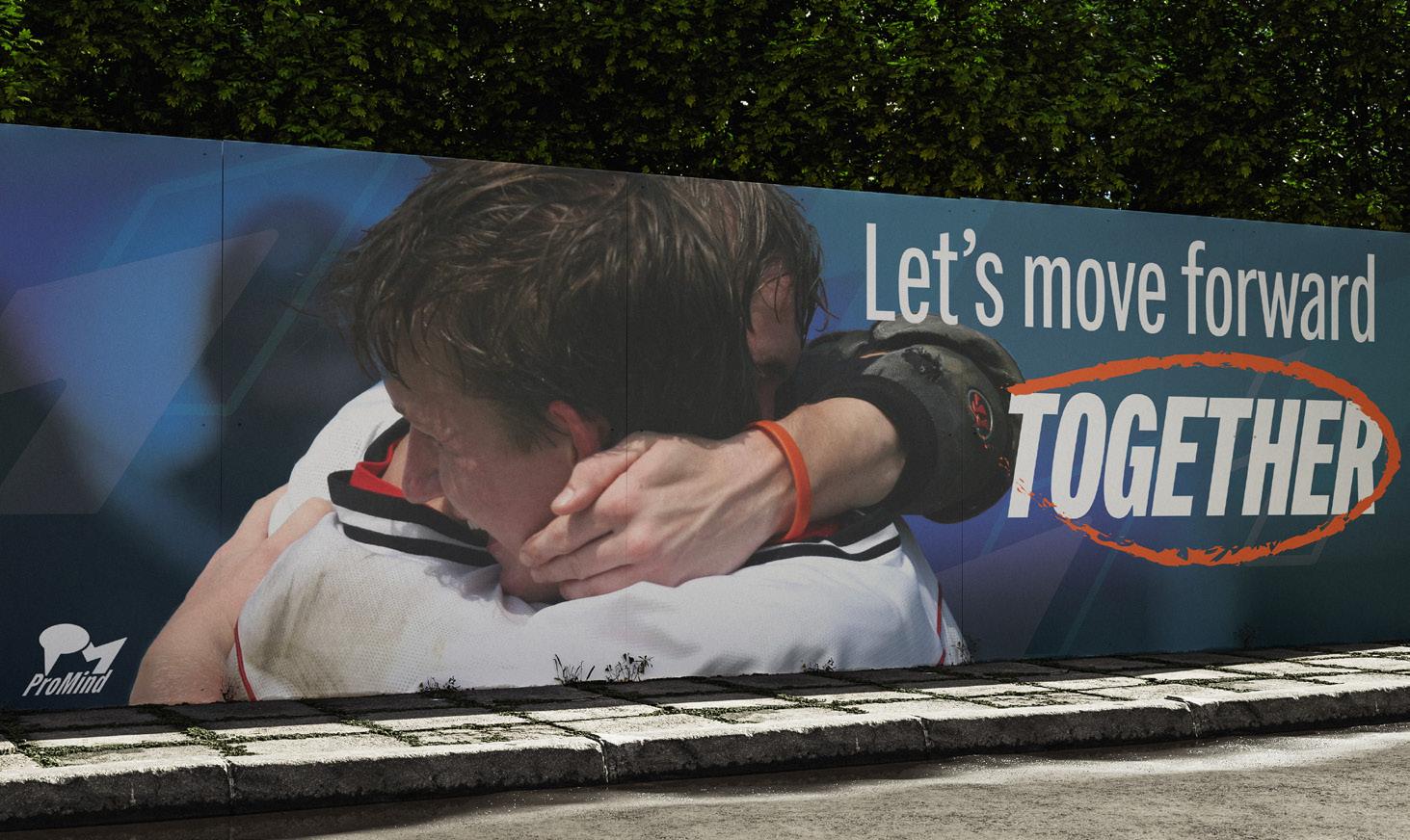
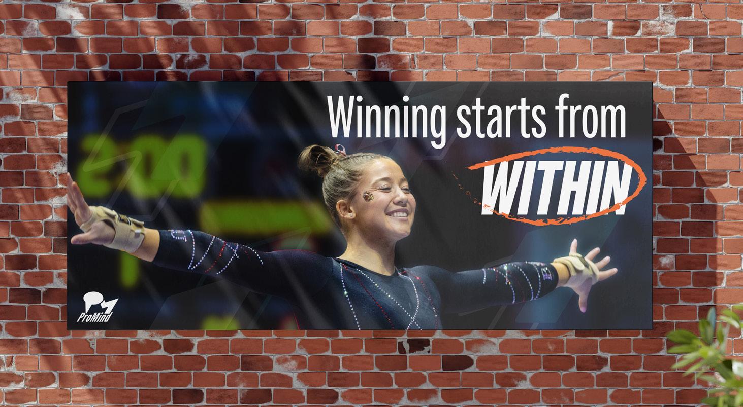
Photography is a large part of ProMind ’s brand, it is what makes ProMind stand out and get recognized.
Imagery is one of the most important aspects of the ProMind brand. ProMind imagery mood focuses on the Raw, Relateable, and Real aspects of college athletics. This highlights the true emotions of the ups and downs and everything in between.


Visual Guidelines
Overlays
Photography is a large part of ProMind ’s brand, it is what makes ProMind stand out and get recognized.
We utilize overlays to create depth and continue our brand into our imagery. Our main overlay is Momentum Navy on Hard Light blending mode and can be used anywhere between 80% and 95% opacity.


Visual Guidelines
Logo on Photography Don’ts
Incorporating the logo into imagery is a key factor in promoting awareness of ProMind. Being aware of what NOT to do is even more important
When placing the logo on images:
• Do not place full color logo over areas where it will get lost or where similar colors are in the background
• Do not place white logo over light areas/white areas in photos
• Do not place logo over focal point/subjects



Brand in Use 06
Brand in Use
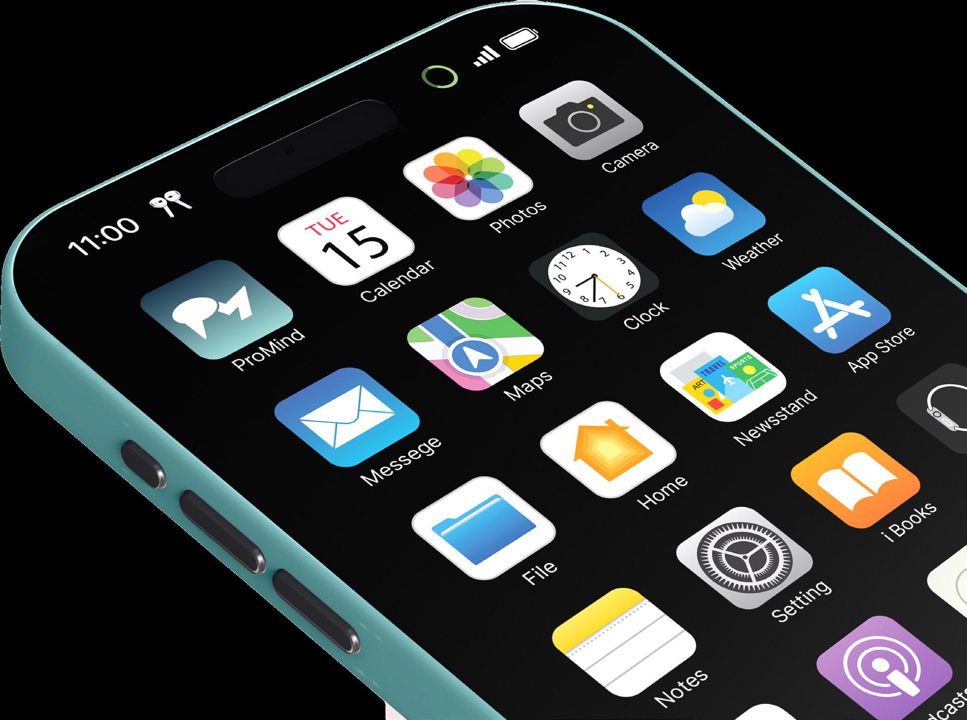
ProMind App
Incorporating the logo into imagery is a key factor in promoting awareness of ProMind. When placing the logo on images:
• Chose a clear area of the image
• Only utilize white over darker backgrounds/clear spaces
• Only utilize full color & over lighter backgrounds/ clear spaces
Brand in Use
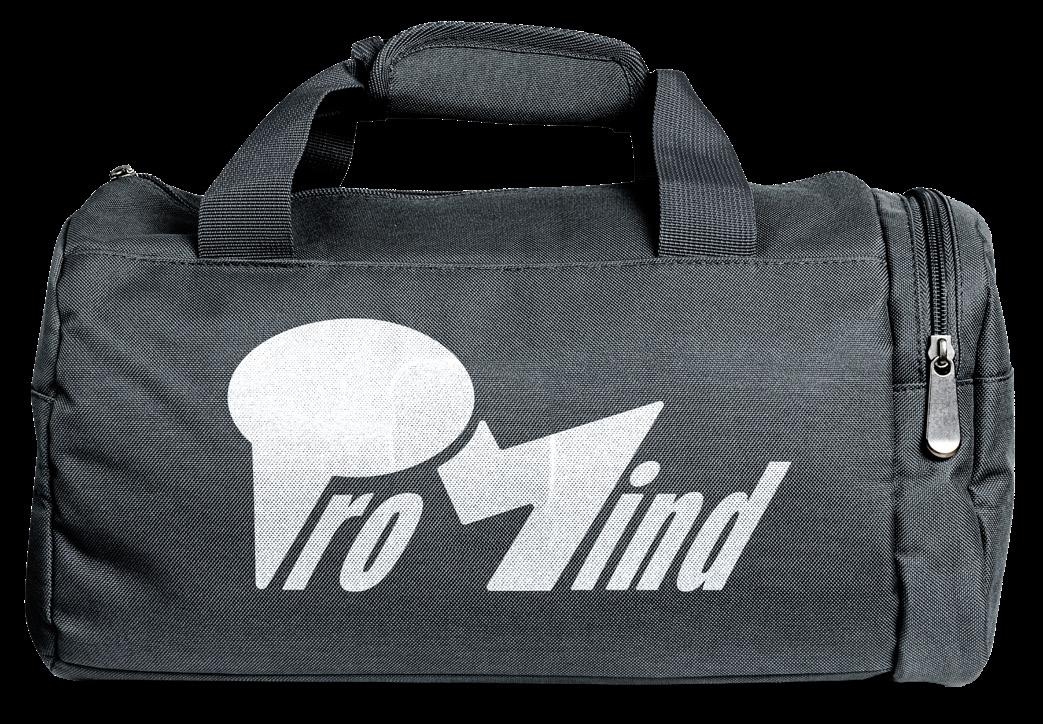
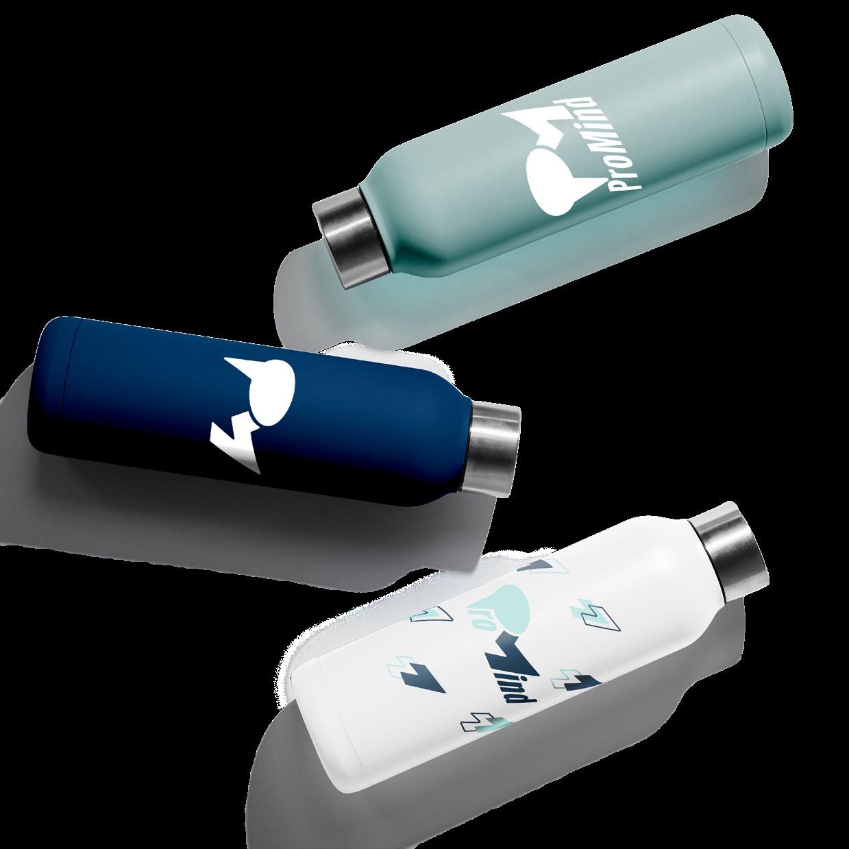
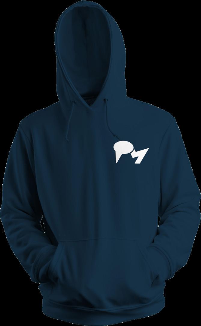
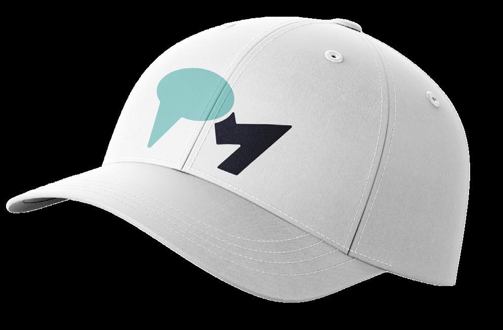
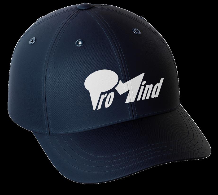
Merchandise

Brand in Use
Posters & Murals
Brand in Use
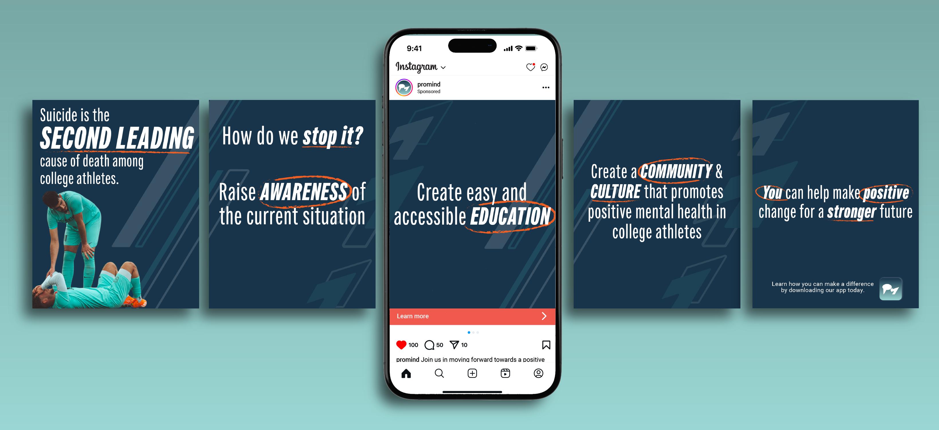
Social Media
