
VOLUME TWO
guyhepner.com guyhepnereditions.com +1 (212) 226 8680 info@guyhepner.com @guyhepner @guyhepnereditions
Cover: Damien Hirst (p. 1-7)
521 W 26th Street Fourth and Fifth Floor New York, NY 10001
Open to the public 10am - 5pm Monday through Friday Saturday by appointment
CONTACT US
DAMIEN HIRST
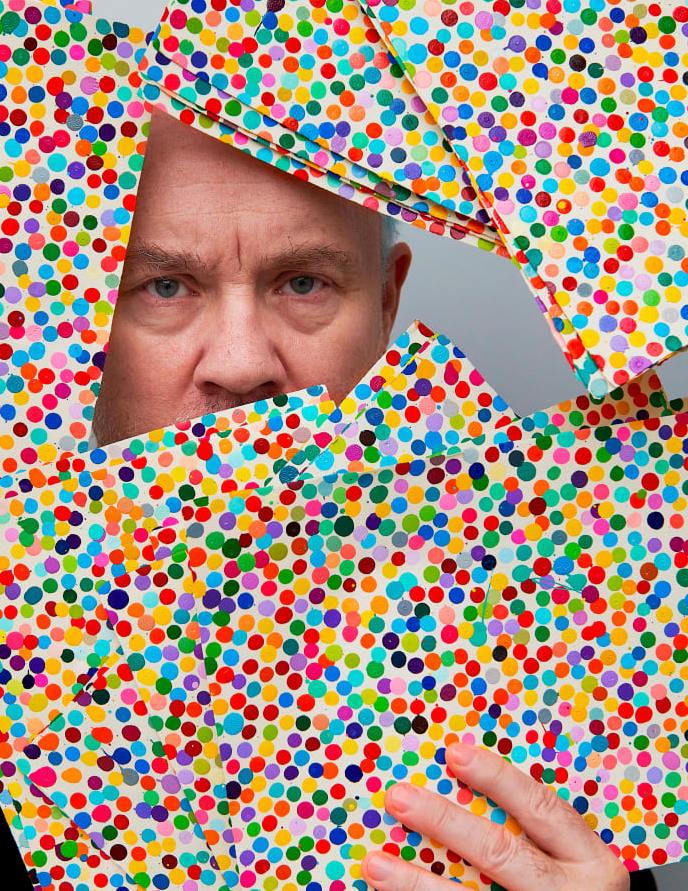
Damien Hirst is a British artist whose name has become synonymous with contemporary art. Since his generative work as a student at Goldsmiths School of Art, Hirst’s production has been boundary-redefining in nature. Working primarily in installation, painting, sculpture and drawing, Hirst explores the complex relationships between art, beauty, religion, science, life and death. He constantly returns to his foundational interests and themes, which he reworks to develop an innovative visual language. Hirst consequently produces works which extract wide-ranging visceral reactions from
viewers, triggering fears of mortality, leaving them awe-struck by beauty and inciting childlike joy.
Colorful spots, animals seemingly frozen in time, anatomical models of pregnant women, glorious butterfly wings and a skull with 8,601 pavé-set diamonds are some of the defining features of Damien Hirst’s boundary redefining career. Across installation, sculpture, painting and drawing, Hirst explores the complex relationships between art, beauty, religion, science, life and death.
© 2022 The Andy Warhol Foundation for the Visual Arts, Inc. / Licensed by Artists Rights Society (ARS), New York
1
THE JOY OF COLOR
BY DAMIEN HIRST
Damien Hirst explores the relationship between colors and their effect on the eye. Butterflies and hand-painted shapes are used to transform the natural into perfect compositions. Through these
patterns, Hirst describes himself “pinning down the joy of color.” In his work, Hirst frequently explores contemporary belief systems; religion, love, art and medicine.
 Courtesy of Daniel Kreiger ©
2
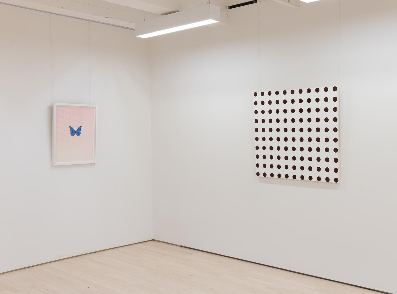
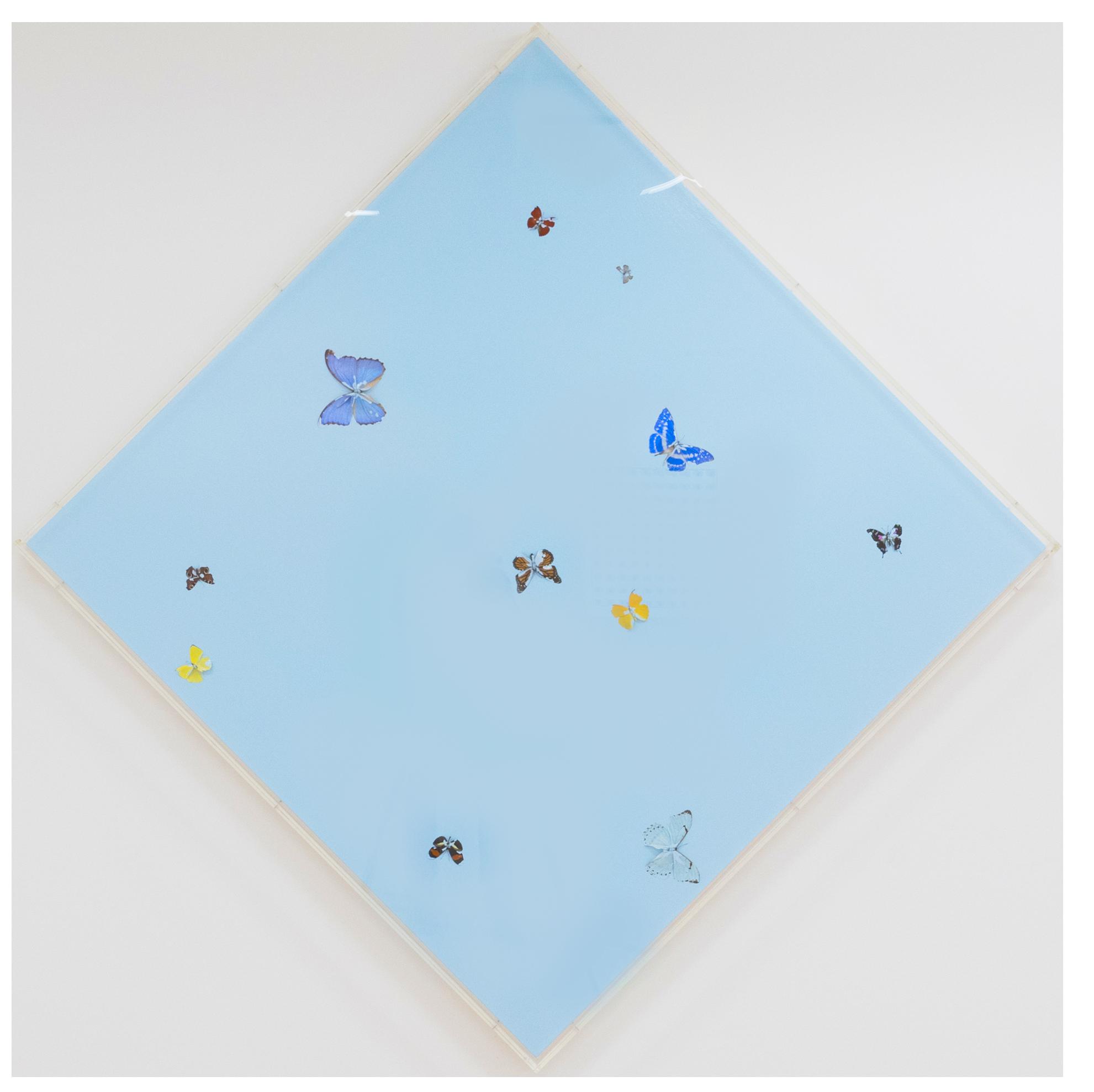
His butterfly series is meant to encompass the aesthetic of life. Even when butterflies are dead, their vibrancy makes them feel alive. Each butterfly is also born with a completely unique pattern, mimicking the individuality of each human.
Hirst’s “Spot” series pertains to modern medicine and the strive for human perfection. The arrangement of colors are intentional and satisfying, making one feel at ease. In these collections, Hirst demonstrates how colors are contained and organized affect one’s reaction to them.
The death of an insect that still has this really optimistic beauty is a wonderful thing’, said Damien Hirst of his awe-inspiring butterfly works. From his
generative exhibition in 1991, ‘In and Out of Love’, to his 2020 ‘Rainbow Editions’, Hirst continues to manipulate the beauty of the butterfly in new and captivating ways.
Death and mortality remain consistent themes across Hirst’s oeuvre, admitting ‘I’ve got an obsession with death…But I think it’s like a celebration of life rather than something morbid’. Hirst celebrates life through death using butterflies, insects that represent freedom and hope. Remarkably, butterflies remain just as gloriously beautiful in death as they are in life, as proven by the captivating colours and patterns of the wings that define Hirst’s works. As such, Hirst’s butterflies have come to exist as uplifting and radiant symbols of mortality.
3
Courtesy of Daniel Kreiger ©

Courtesy of Daniel Kreiger © Forgotten Thoughts, 2008 4
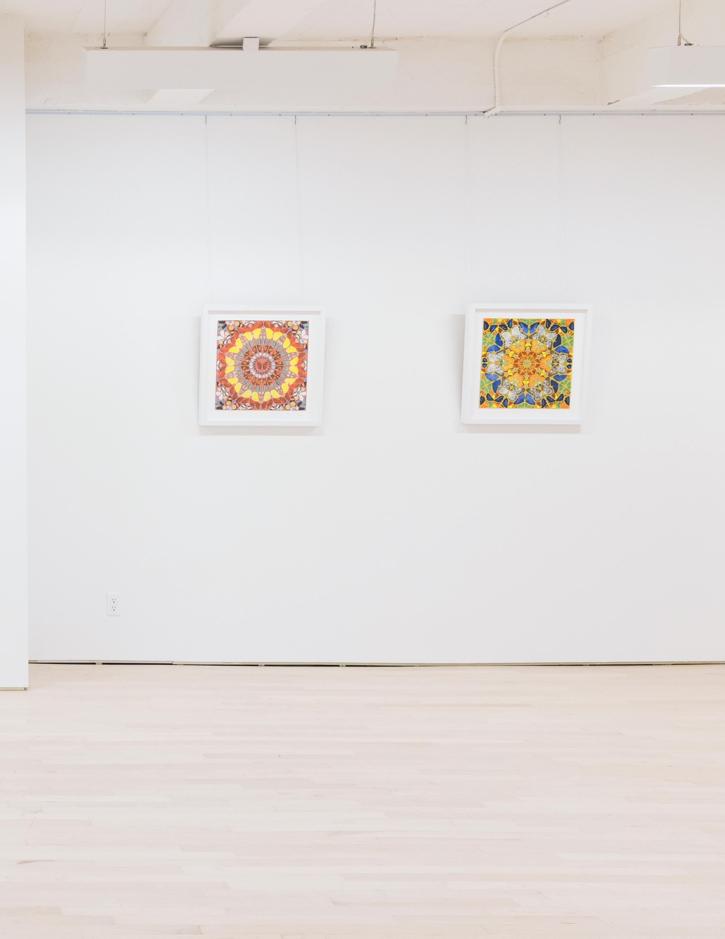
Psalm: Judica Domine, 2015
Psalm: Beatus Qui Intelligit, 2016
5
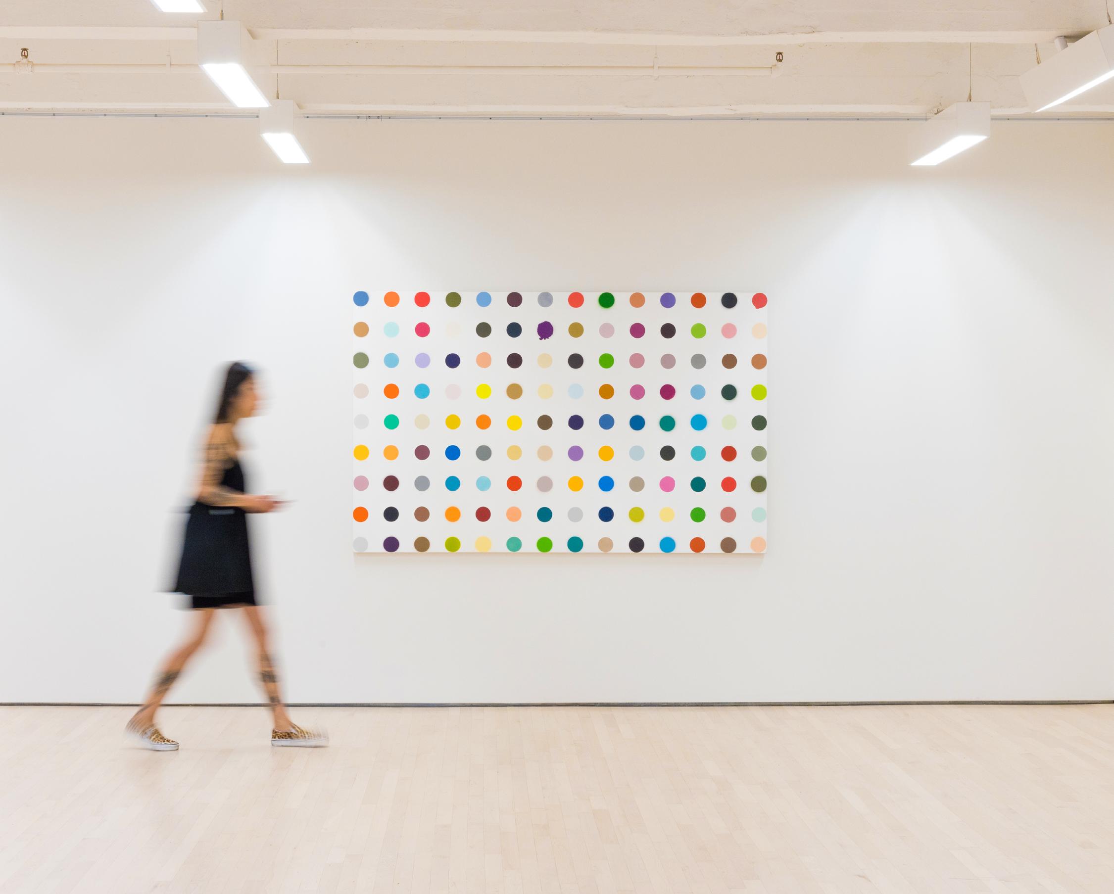
Synonymous with Damien Hirst are his ‘Spots’ paintings, a series of systematically arranged coloured spots. Since 1986, Hirst has produced variously sized spots on diversely sized and shaped canvases, from large and rectangular to small parallelograms to wall murals. Nonetheless, within each work, the spots remain exactly consistent in size, each distinguishing itself from the next through colour. The result is what Hirst calls ‘an assault on your senses. They grab hold of you and give you a good shaking’.
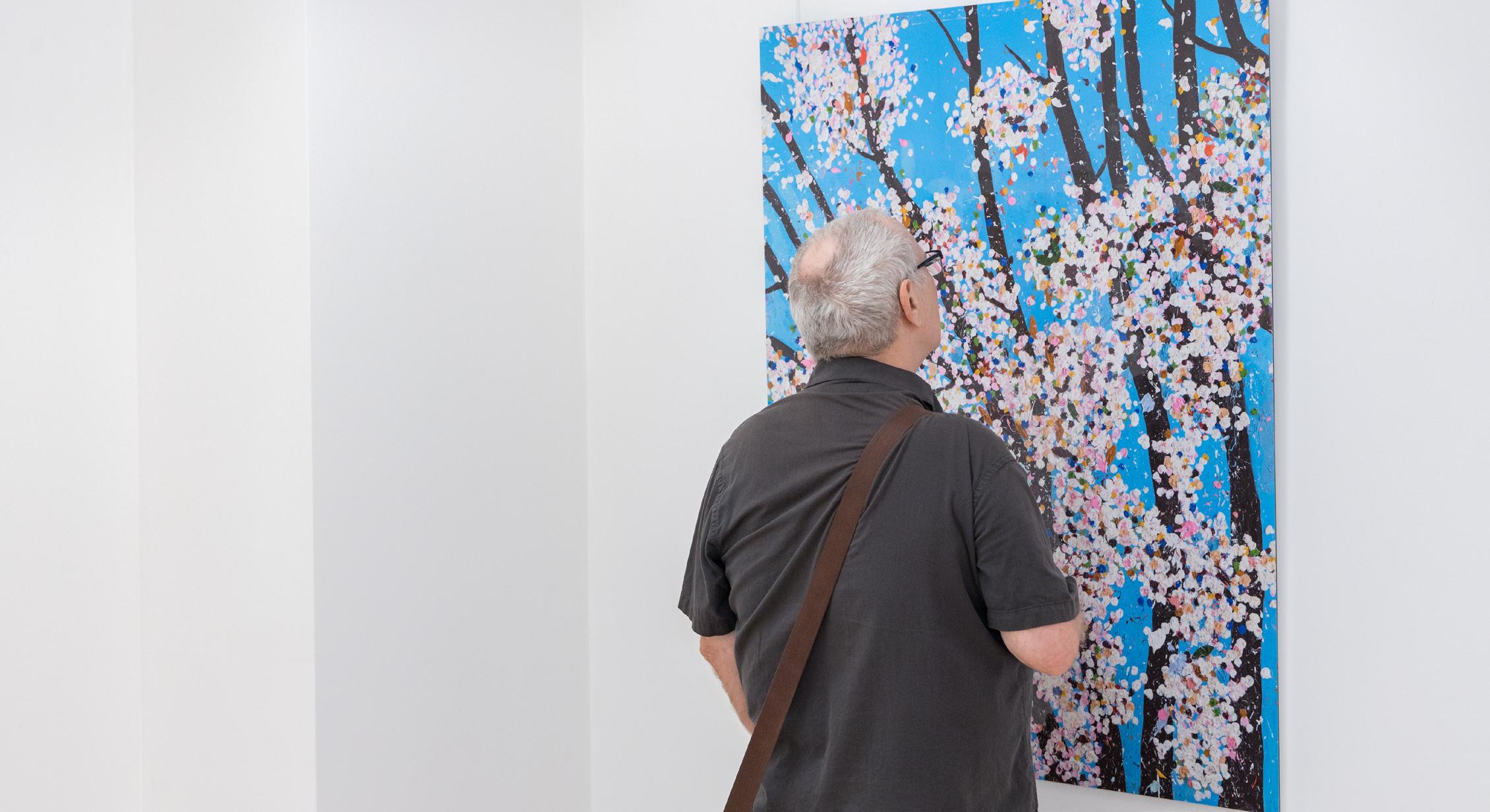
Hirst’s ‘Spots’ are seemingly mechanical in nature, each a pristine, perfect circle. Yet, they are all hand painted or, as Hirst says, painted ‘by a person trying to paint like a machine’. The spots are evenly spaced across the canvases, with no spots touching, in grid formations recollective of Hirst’s ‘Pill Cabinets’.
Too, the arrangement of coloured spots recalls the logic of household paint charts, each colour slightly different from the previous. Within each ‘Spots’
work, no two colours are repeated, though some are exceptionally similar. The colours themselves and the assignment of the colour relations are decided intuitively, by an aesthetically focused process.
Despite the orderly, seemingly mechanical nature of ‘Spots’, the series is nonetheless underpinned by a sense of chaos. Upon closer study the differences in colours are revealed, destroying any notion of harmony. Speaking of this effect, Hirst stated ‘in every painting there is subliminal sense of unease; yet the colours project so much joy it’s hard to feel it, but it’s there’.
‘Spots’ are an endless series of carefully cultivated works that explore Hirst’s perennial fascination with the potentials of colour relations. ‘To create that structure, to do those colours, and do nothing. I suddenly got what I wanted. It was just a way of pinning down the joy of colour’.
Courtesy of
© 6
Daniel Kreiger
Forgotten Thoughts, 2008 Butterflies and household gloss on canvas 68 x 68 in 172.7 x 172.7 cm
7

8
Courtesy of Tyler Shields ©
Tyler Shields is an American photographer, screenwriter, director and former professional inline skater who has been labeled by some as “Hollywood’s favorite photographer”. He is best known for his unparalleled, controversial, shock evoking photographs of Hollywood Celebrities.
Born in 1982 in Jacksonville, FL, Shields began his career as a professional inline skater, and competed in the X Games in ‘99 and 2000, in addition to touring with Tony Hawk in 2003. Shields became interested in photography and began posting a few of his photographs online. At the age of 18, he decided to move to LA in order to pursue photography and the arts. Shields’ work employs many themes such as eroticism, torture, and
TYLER SHIELDS
decadence among many more. His work has an obscure aspect which invites the spectator to inject their own identity and experience into the artworks. In addition to his Fine Art Photographs, Shields has shot campaigns for brands such as Nike, Adidas, Playboy, Harley Davidson, and many others. His mediums and outputs vary from books of his works, such as “The Dirty Side of Glamour” (2011) and “Provocateur” (2017), in addition to solo exhibitions, as well as completing his first feature-length thriller film “Final Girl” in 2015.
Early in his career, Shields achieved recognition by posting his photographs on websites like MySpace. “I took a picture of a closet that became really famous on the internet back in the days when
9
Phone Booth Silhouette, 2022
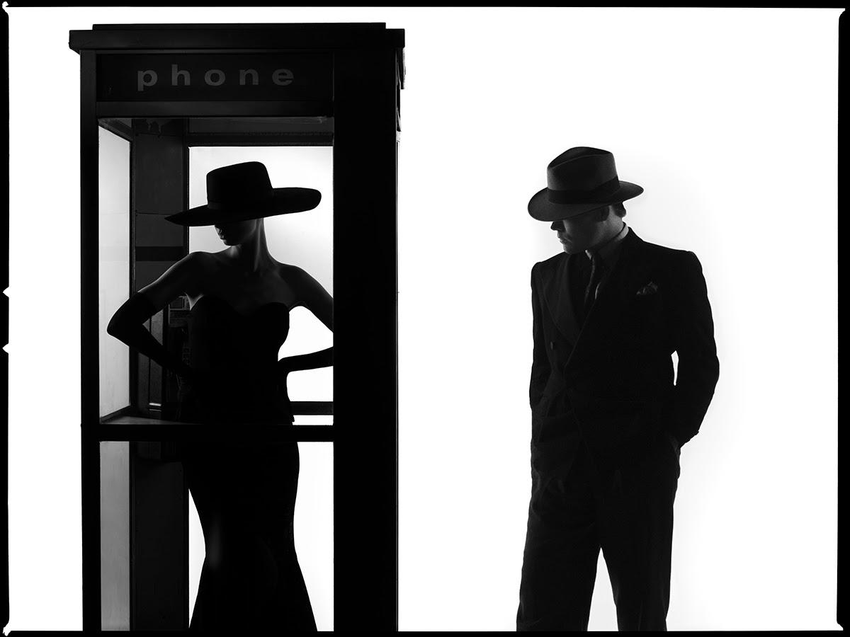
Digital C print
22.5 x 30 inches, 30 x 40 inches, 45 x 60 inches
Edition of 3
MySpace first started. A girlfriend cheated on me, so I took all her shit and I threw it out,” says Shields. An unknown advertising agency saw this picture, purchased it and went on to commission him to shoot an ad campaign. Being in Hollywood, having recently moved to LA, Shields was beginning to understand the power of social media and the concept of celebrity. Not only were his photos being bought, but people began to want to be featured in Shield’s photographs, “...then the people who I was shooting weren’t famous but became famous. And famous people started wanting to shoot.” His photographs capture the
over-the-top, brutal aspects of contemporary celebrity culture whilst playing with the notions of the role of the gaze, hyper-realism and power structures.
Shields’ talent goes beyond shock. His unique, sinister and daring lens through which he composes and creates his work enables him to push boundaries and experiment with tweaking the Hollywood mystique. The mystery behind his relationships and habits captivate the media, not unlike the art world’s bestknown friend of the famous, Andy Warhol.
10
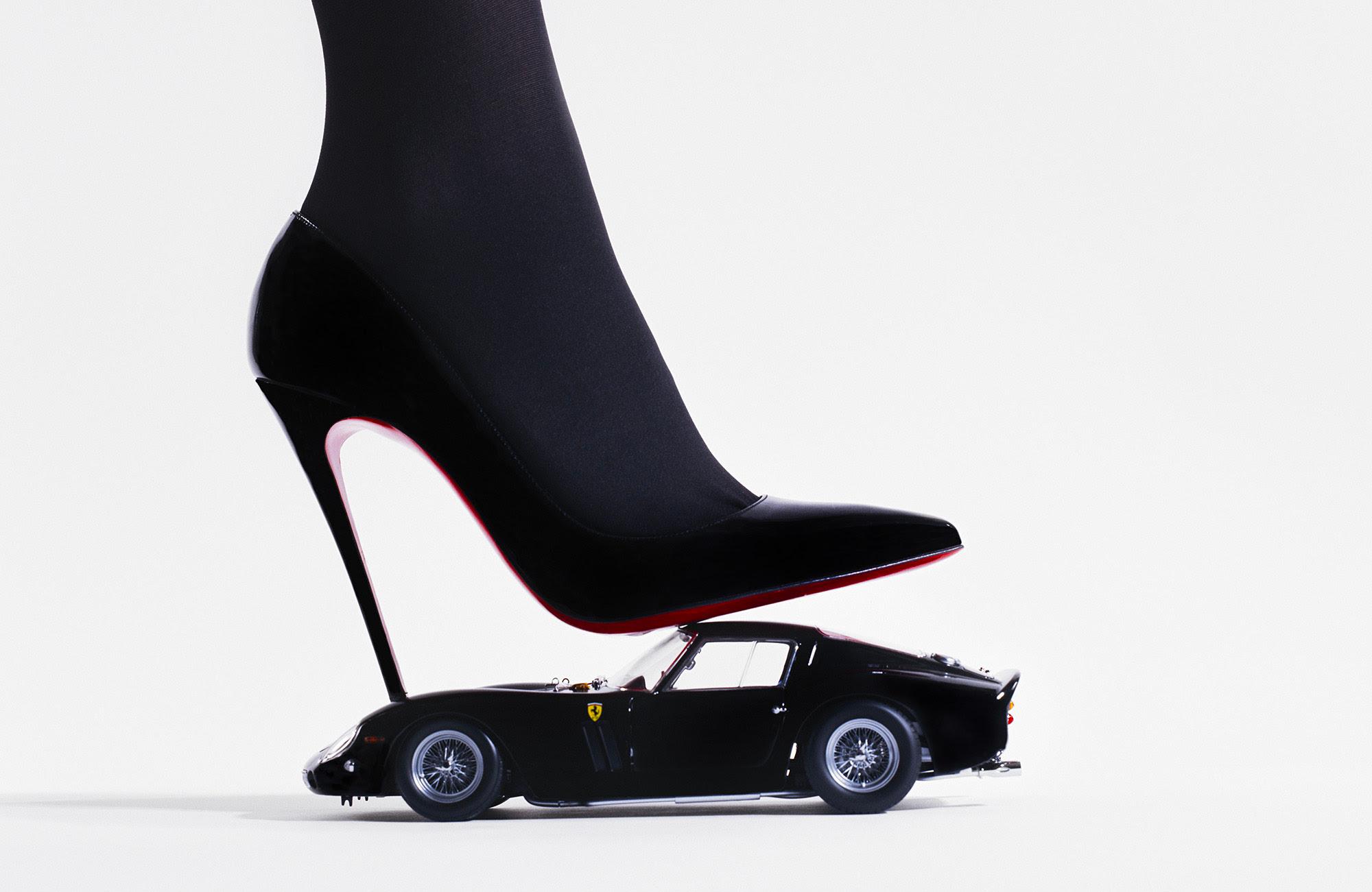
, 2022
Ferrari High Heel
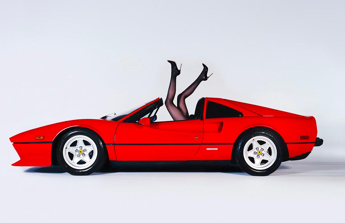
11
Ferrari Legs, 2022
DUALITY
BY TYLER SHIELDS
Contrast is a reoccurring theme in many of his collections, including Provocateur, The Dirty Side of Glamour, and now, Duality
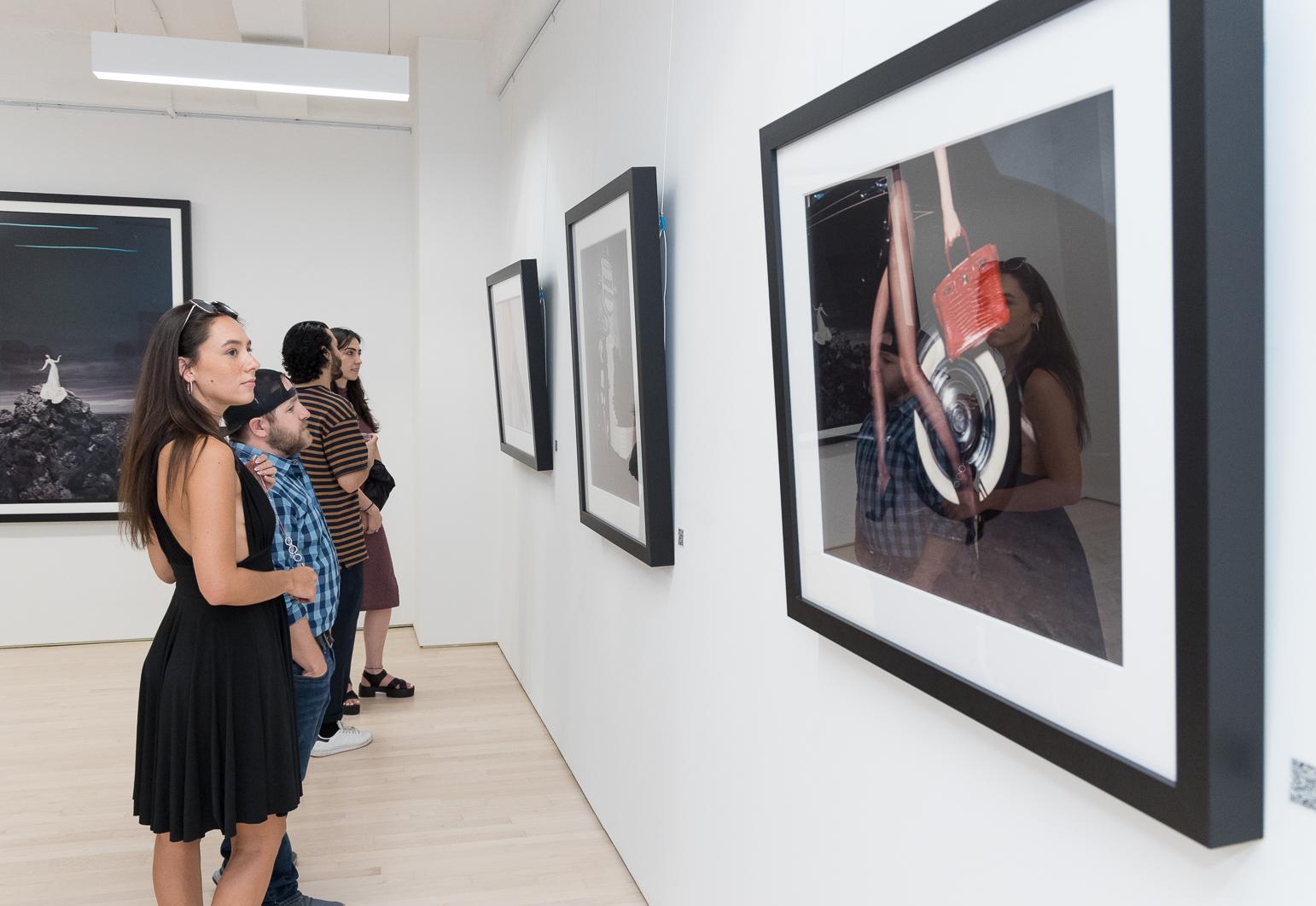
.
12
Courtesy of Daniel Kreiger ©
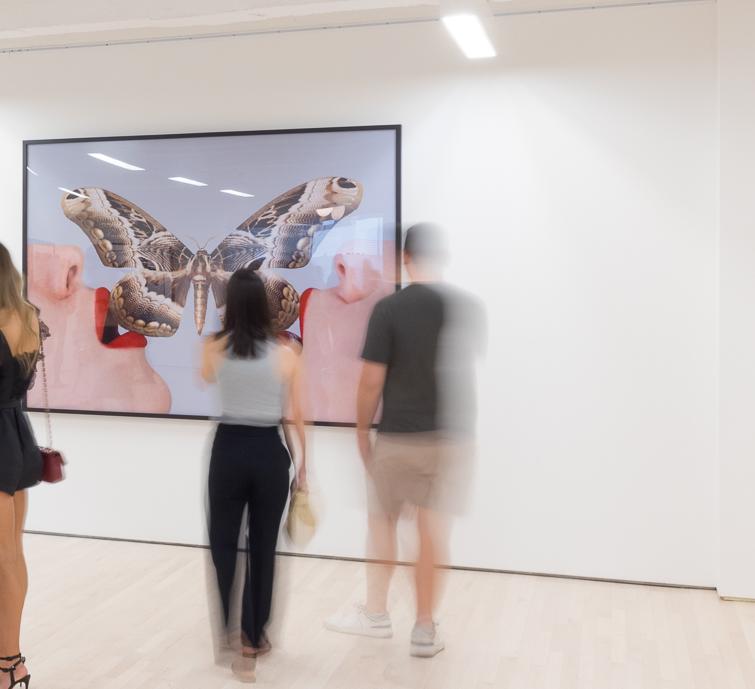
In one of his most famous pieces, Gator Birkin III, Shields captures a tug of war between a model and a crocodile over a Birkin. Shields uses the notorious price tag on Birkin bags as a symbol of absurd opulence. Animals, especially predators, frequent
his photographs. In The Lion Queen, a model is posed in a full-length gown feeding a lion like a common house cat. Shields excels at blurring the line between luxury and savagery.
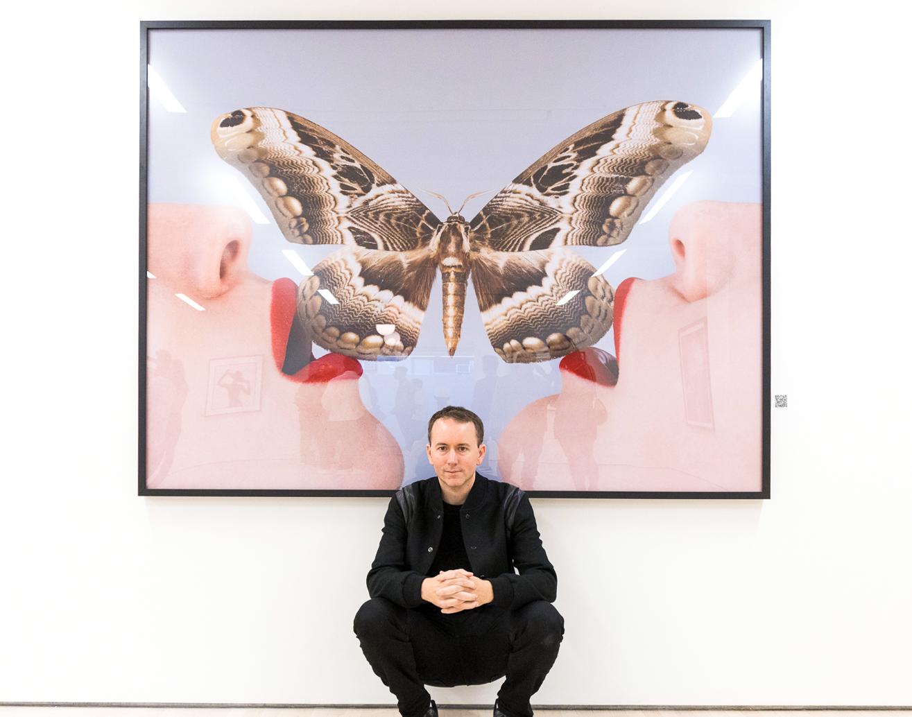
Butterfly, 2018 Digital C print 84 x 63 inches Edition of 3
© 13
Courtesy of Daniel Kreiger

14
15
Courtesy of Daniel Kreiger ©

Flower Girl, 2021 Digital C print 45 x 45 inches Edition of 3
© 16
Courtesy
of Daniel Kreiger
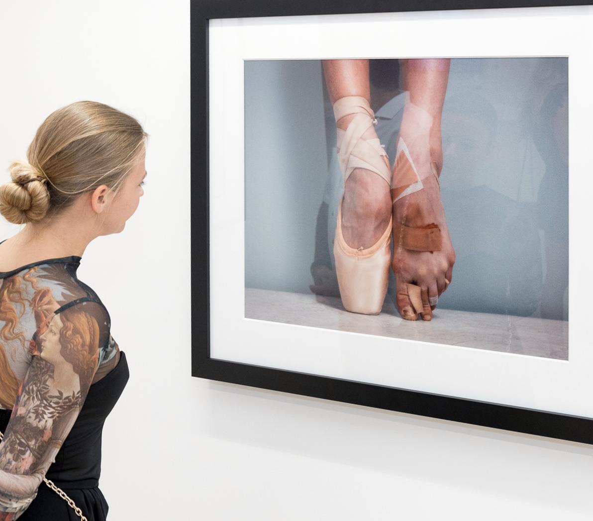
On a more subtle note, Pointe shows the slipper-clad foot of a ballerina next to the battered and bruised tissue that gets hidden underneath. The silk shoe the dancer wears invokes the classic image of a neat and elegant ballerina. With the bare foot, Shields shows
the visceral image of the ballerina’s wounds and the unnatural contortion the foot must be in for pointe technique. Pointe encapsulates the opposing nature of ballet – its graceful, feminine image and the brute athleticism it takes to achieve it.
17
Courtesy of Daniel Kreiger ©

18
Courtesy of the Estate of Jean-Michel Basquiat ©
JEAN-MICHEL BASQUIAT
Jean-Michel Basquiat was a prominent Brooklynborn painter of Puerto Rican and Haitian descent. He is best known for his primitive style, his collaboration with pop artist Andy Warhol, and his part in SAMO (an informal graffiti duo based in the Lower East Side of Manhattan in the late 1970s).
With a Haitian-American father and a Puerto Rican mother, Basquiat’s diverse cultural heritage was one of his many sources of inspiration, and he was acutely aware of his marginalized place in the world. As a self-taught artist, Basquiat had begun drawing at an early age. His mediums ranged from poetry, drawing, and painting, often including text, abstraction, figuration and historical information into his art.
Basquiat first began working with a close friend, they tagged subway trains and Manhattan buildings with cryptic aphorisms. In 1977, Basquiat quit high school and went on to sell sweatshirts and postcards featuring his artwork on the streets of New York. In 1980, his work was featured in a group show and he received critical acclaim for his ability to distill the world around him through his unparalleled fusion of words, stick figures, and animals. His paintings came to be adored by the public.
The expressive style of his work not only associated him with the street art of Keith Haring but also the Neo-Expressionists. His rise to fame corresponded with the emergence of a new art movement, Neo-
Expressionism, which ushered in a wave of fresh, young and experimental artists. Basquiat’s art focused on suggestive dichotomies such as wealth versus poverty, integration versus segregation and inner versus outer experience. He used social commentary in his paintings as a springboard to deeper truths about the individual, as well as attacks on power structures, and systems of racism. Furthermore, he brought the issues of colonization, racial inequality, and representation into his artwork. The ‘object’ and assemblage also became increasingly important in his work. Basquiat began to alter and remodel everyday objects, such as windows and doors and incorporated them into his art. He exhibited around the country and the world.
As his popularity skyrocketed, so did Basquiat’s personal problems. By the mid-1980s, his friends became concerned by his excessive drug use. He became paranoid and isolated himself from the world around him for long stretches. Desperate to kick a heroin addiction, he left New York for Hawaii in 1988, returning a few months later and claiming to be sober. Sadly, a few months later, Basquiat died of a drug overdose on August 12, 1988, in New York City. He was 27 years old.
Although his art career was brief, Jean-Michel Basquiat has been credited with bringing the African-American and Latino experience in the elite art world.
19
FLASH IN NAPLES
BY JEAN-MICHEL BASQUIAT
The Flash In Naples portfolio is a re-release of four of Basquiat’s notable pieces featuring superheros.
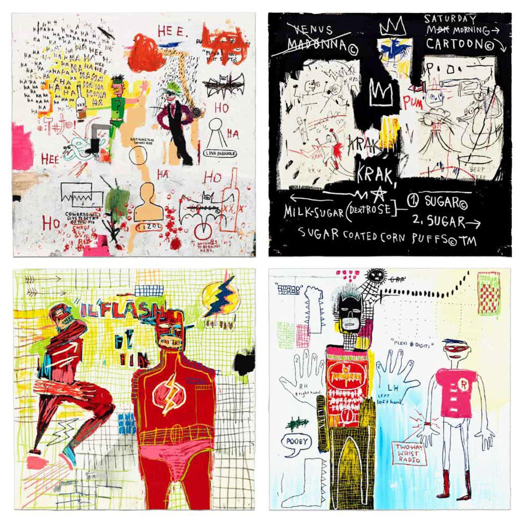
In June of 2022, The Estate of Jean-Michel Basquiat announced the release of a new portfolio of four hand-pulled screenprints, Riddle Me This, A Panel of Experts, Piano Lesson, and Flash In Naples
Originally created between 1982-87, the prints are a compilation of Basquiat’s prominent works featuring a variety of American superheroes.
20
Flash In Naples, 2022 Hand-pulled Screenprint
40 x 40 inches Edition of 85
Flash In Naples paints superhero, the Flash, in two larger-than-life figures. Originally made in 1983, the piece is celebrated for its vibrant color pallette and intensely painted surface. Basquiat frequently observed and exaggerated the human body in much of his work. The gridded background and varying scale of the portraits pushes the figures to the forefront. In the upper-righthand corner, one
can see the word “emblem” has been scrawled and scratched over. This is an intentional device used by Basquiat. He explains, “I cross out words so you will see them more: the fact that they are obscured makes you want to read them.” Flash In Naples shows the dynamic mix of chaos and composition signature to the artist.

21
22

23
PIANO LESSON
BY JEAN-MICHEL BASQUIAT
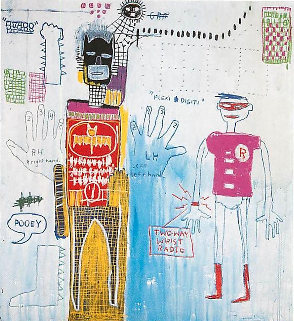
Piano Lesson (for Chiara) was originally painted by Basquiat in 1983. Batman and Robin are drafted into one of the artist’s sketches amidst a number of anatomical drawings. Basquiat frequently integrated the symbols of childhood and juvenile popular culture with his own real and imagined experiences. Piano Lesson is a perfect portrayal of the complexity that made up Basquiat’s style. Batman’s suit is marked in a grid of acrylic and oil-stick lattice – a pattern that repeats across the canvas. By mixing simple illustrations with symbols of popular Western culture, he creates subtle moments of more artistic decisions and mark-making.
Piano Lesson, 2022 Hand-pulled Screenprint 40 x 40 inches Edition of 85
24
RIDDLE ME THIS
BY JEAN-MICHEL BASQUIAT
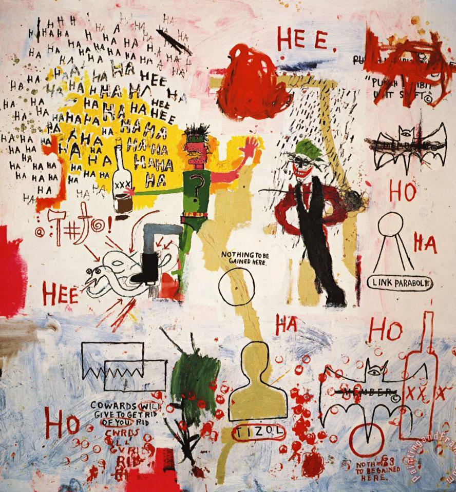
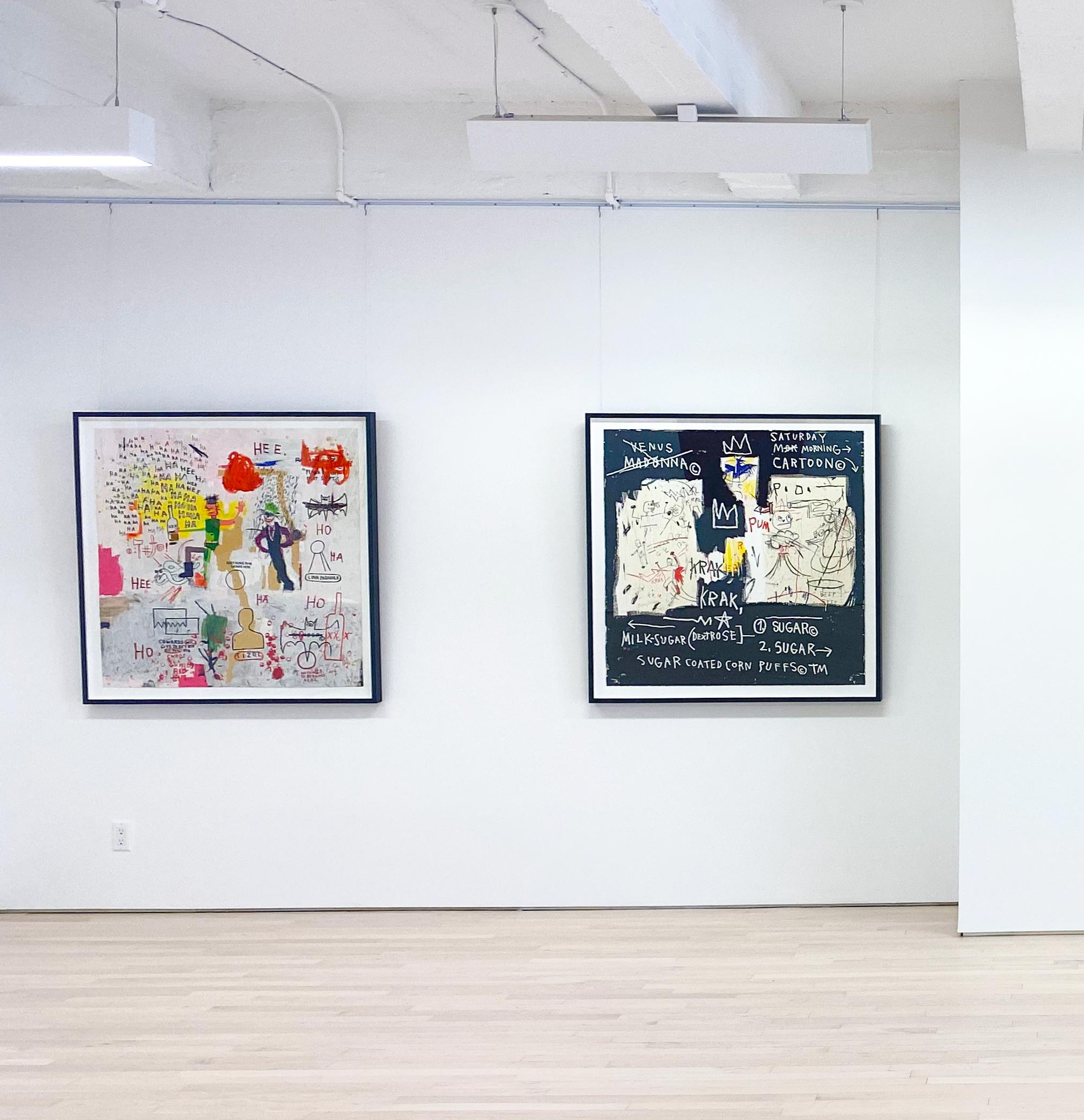
Basquiat created Riddle Me This, Batman in 1987 – a year before his death. The piece embodies the chaotic nature of the artist’s later years. Batman faces The Riddler and The Joker, scattered with cryptic words and symbols. As in the original material, the supervillains possess a twisted sense of humor. In the comics, The Riddler often poses riddles to Batman, at one point asking, “riddle me this, riddle me that, who’s afraid of the big black bat?” Basquiat takes the idea of the “big black
Riddle Me This, 2022
Hand-pulled Screenprint 40 x 40 inches Edition of 85
bat” and creates one-eyed depictions of the Bat Signal. The Riddler can be seen clutching a bottle of alcohol, possibly alluding to Basquiat’s worsening dependence. The Joker looms to the right, surrounded by maniacal laughter. In ways, this piece can be seen as autobiographical. Basquiat offered a breath of fresh air in the art world at the time. Like Batman, he became a cultural icon, but his rise to status did not come without loss.
25
A PANEL OF EXPERTS
BY JEAN-MICHEL BASQUIAT
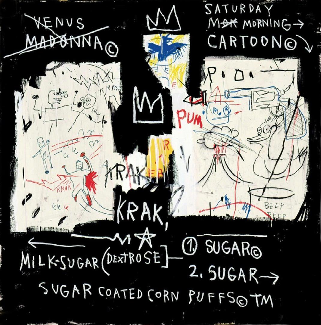
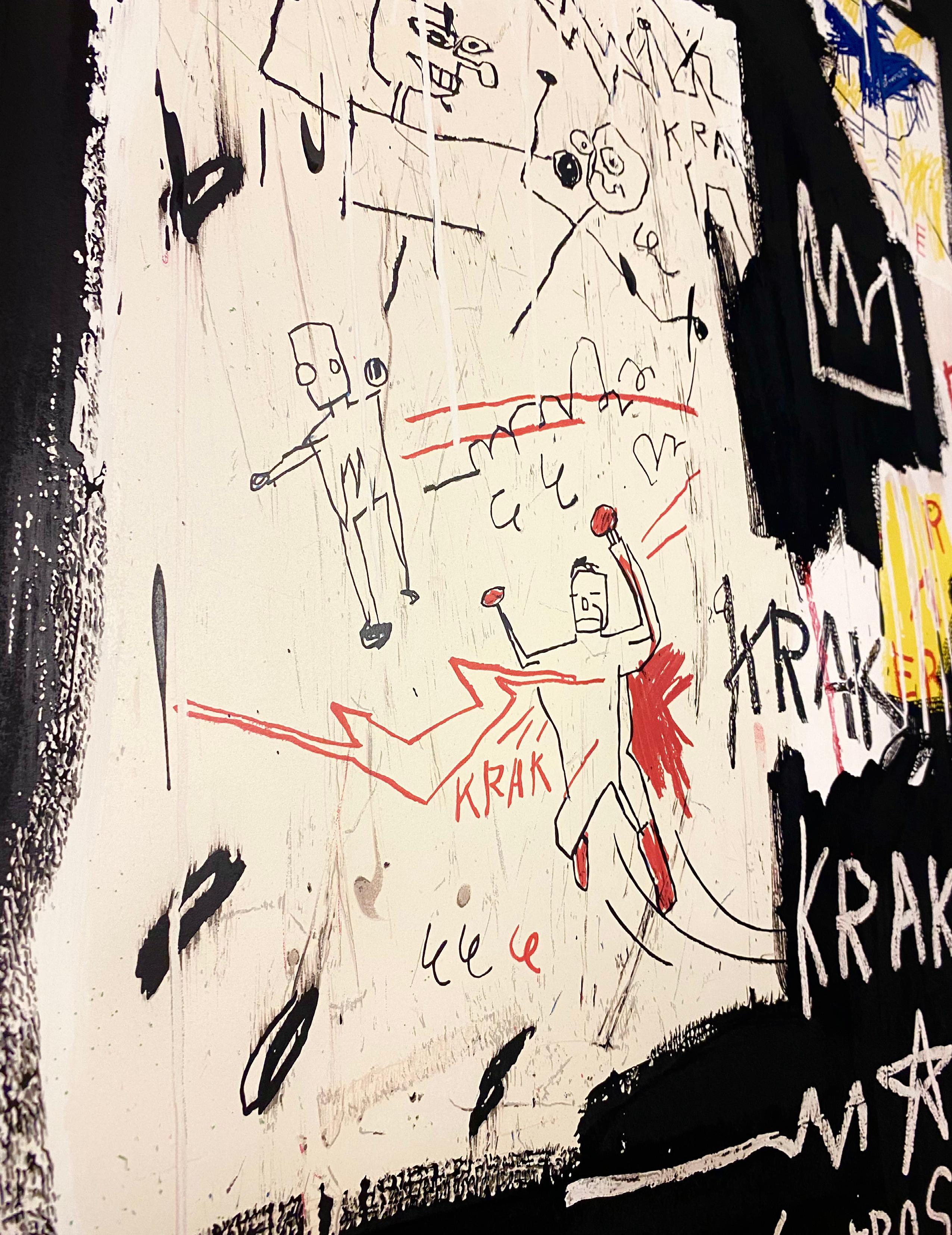
Like many of his other works, A Panel of Experts shows a glimpse into Basquiat’s personal life and psyche. On the importance of this piece, the MMFA writes, “it embodies many of Basquiat’s characteristic subjects and techniques, and also refers to a specific event in the artist’s personal life. The fistfight at the top of the left rectangle is a
A Panel of Experts, , 2022 Hand-pulled Screenprint 40 x 40 inches Edition of 85
stick-figure representation of an actual encounter between two women in a New York nightclub: Basquiat’s girlfriend Suzanne Mallouk (nicknamed Venus) and his lover the singer Madonna, who, despite the copyright symbol beside her name, was not yet a celebrity.” True to his private nature, it also appears much of the scene has been redacted.
27
KEITH HARING
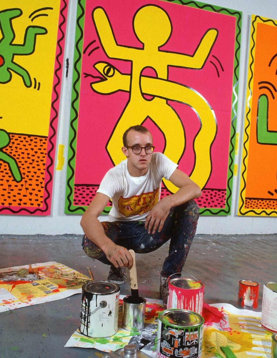
Keith Haring was born on May 4, 1958 in Reading, Pennsylvania. He developed a love for drawing at a very early age, learning basic cartooning skills from his father and from the popular culture around him, such as Dr. Seuss and Walt Disney.
Haring moved to New York City and enrolled in the School of Visual Arts (SVA). In New York, Haring found a thriving alternative art community that was developing outside the gallery and museum system, in the downtown streets, the subways and spaces in clubs and former dance halls. Here he became friends with fellow artists Kenny Scharf and Jean-Michel Basquiat, as well as the musicians, performance artists and graffiti writers that comprised the burgeoning art community. Haring was swept up in the energy and spirit of this scene and began to organize and participate in exhibitions and performances at Club 57 and other alternative venues.
Between 1980 and 1989, Haring achieved international recognition and participated in numerous group and solo exhibitions. Haring completed numerous public projects in the first half of the 80’s as well, ranging from an animation for the Spectacolor billboard in Times Square, designing sets and backdrops for theaters and clubs, developing watch designs for Swatch and an advertising campaign for Absolut vodka; and creating murals worldwide.
In April 1986, Haring opened the Pop Shop, a retail store in Soho selling T-shirts, toys, posters, buttons and magnets bearing his images. Haring considered the shop to be an extension of his work and painted the entire interior of the store in an abstract black on white mural, creating a striking and unique retail environment. The shop was intended to allow people greater access to his work, which was now readily available on products at a low cost. The shop received criticism from many in the art world, however Haring remained committed to his desire to make his artwork available to as wide an audience as possible, and received strong support for his project from friends, fans and mentors including Andy Warhol.
During a brief but intense career that spanned the 1980s, Haring’s work was featured in over 100 solo and group exhibitions. In 1986 alone, he was the subject of more than 40 newspaper and magazine articles. He was highly sought after to participate in collaborative projects ,and worked with artists and performers as diverse as Madonna, Grace Jones, Bill T. Jones, William Burroughs, Timothy Leary, Jenny Holzer, Yoko Ono and Andy Warhol. By expressing universal concepts of birth, death, love, sex and war, using a primacy of line and directness of message, Haring was able to attract a wide audience and assure the accessibility and staying power of his imagery, which has become a universally recognized visual language of the 20th century.
28
29
Courtesy of the Estate of Keith Haring ©
SUBWAY DRAWINGS
BY KEITH HARING
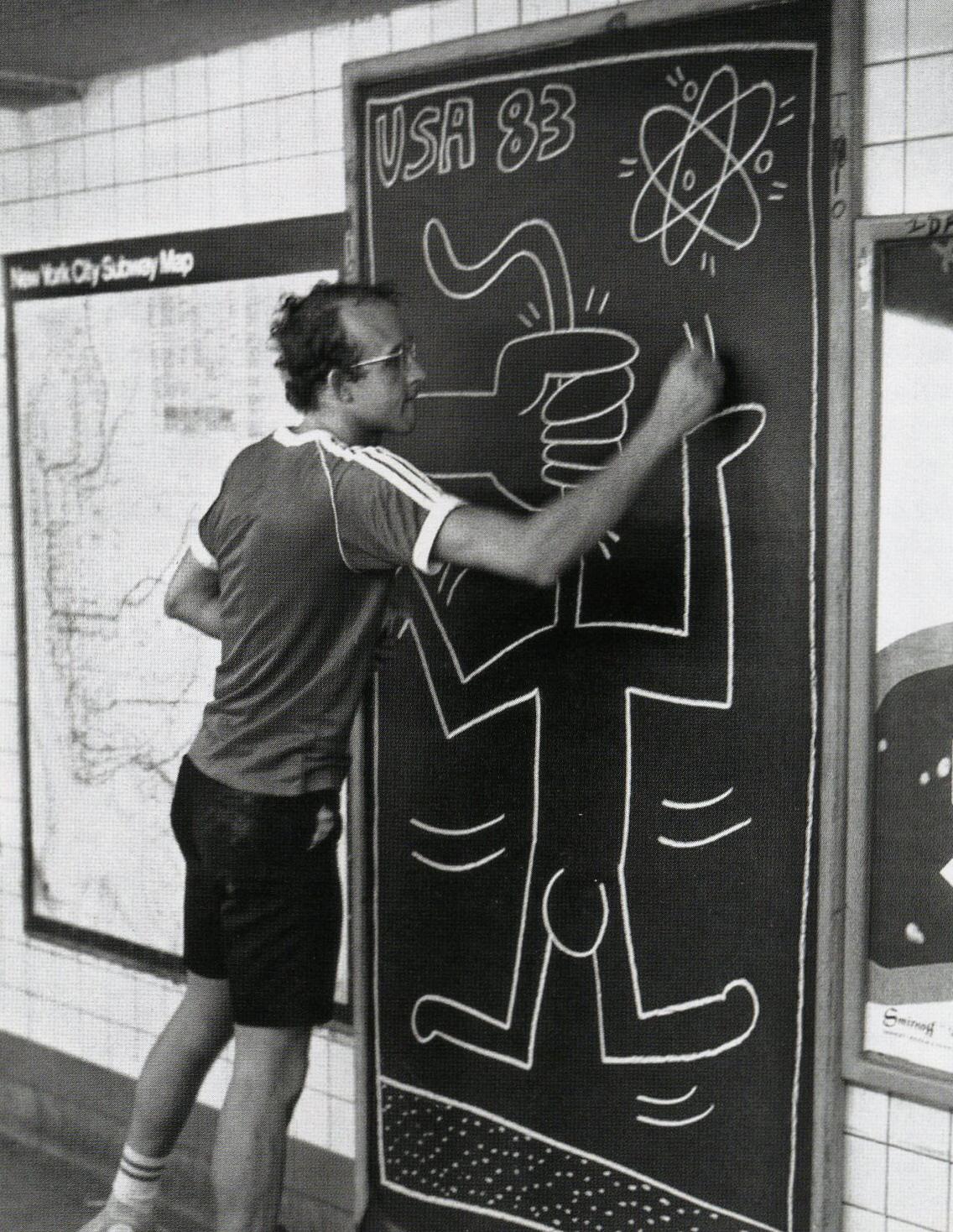
The subway stops in New York City became a safe haven and stomping grounds of Haring’s art.
30
Courtesy of the Estate of Keith Haring ©
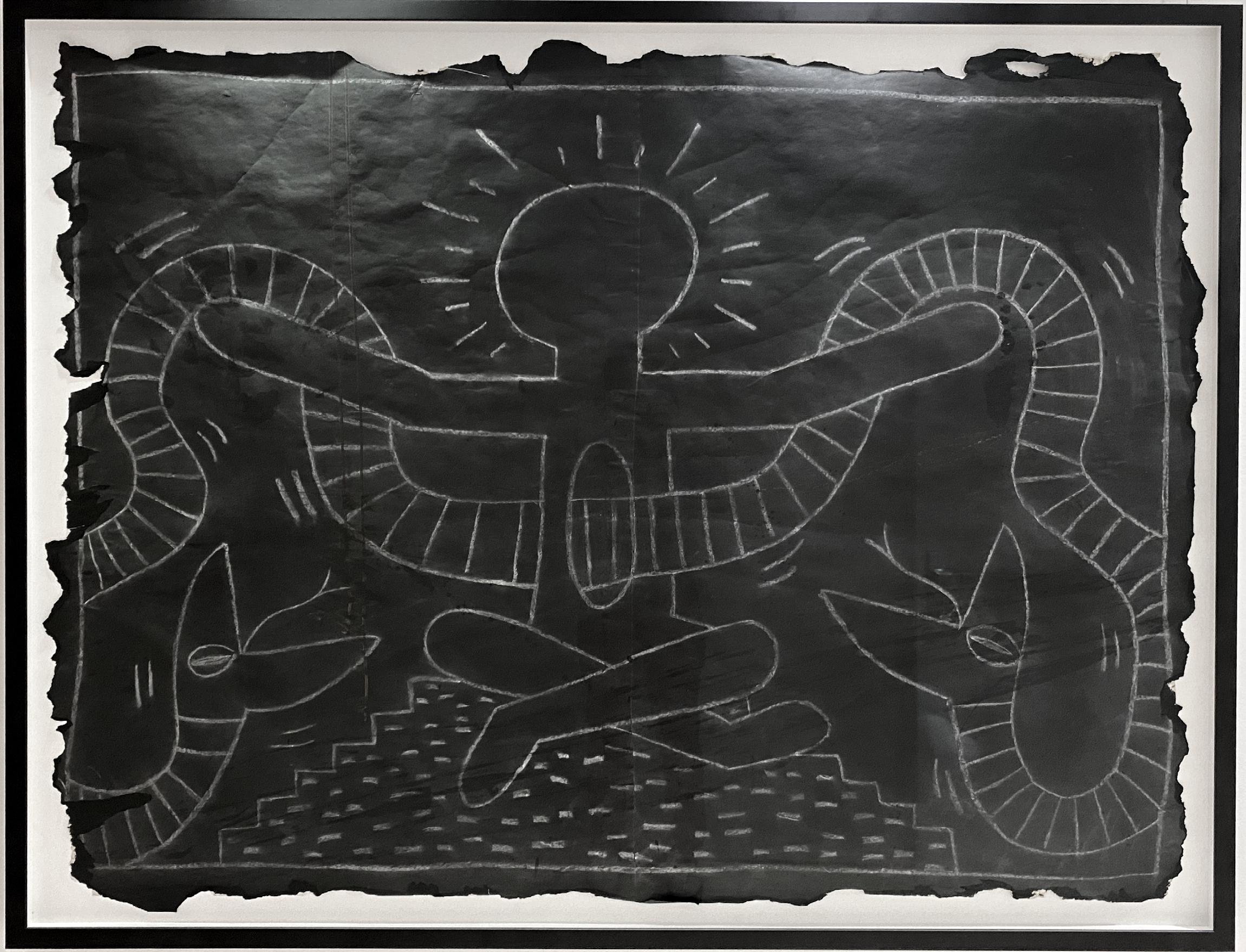
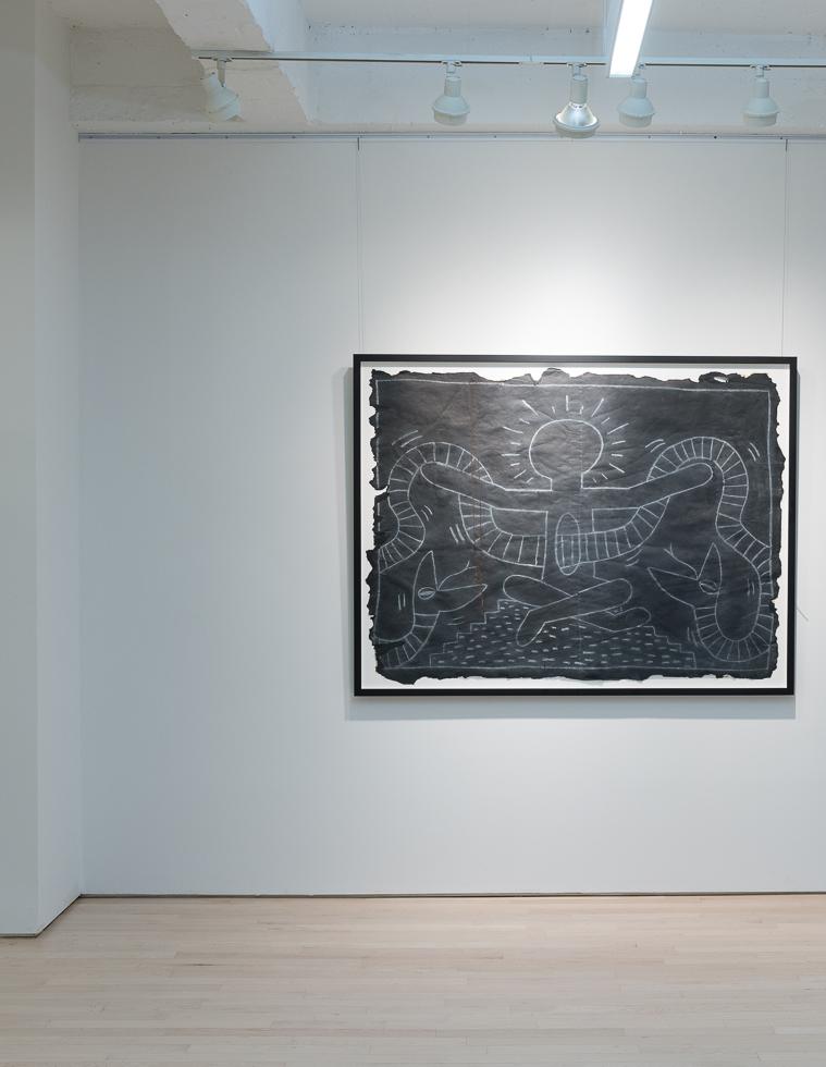
Untitled Subway Drawing (Snake Charmer), 1983
31
White chalk on black paper 49.25 x 66.13 inches Unique
 Courtesy of Daniel Kreiger ©
In 1980, Haring found a highly effective medium that allowed him to communicate with the wider audience he desired, when he noticed the unused advertising panels covered with matte black paper in a subway station. He began to create drawings in white chalk upon these blank paper panels throughout the subway system. Between 1980 and 1985, Haring produced hundreds of these public drawings in rapid rhythmic lines, sometimes creating as many as forty “subway drawings” in one day. This seamless flow of images became familiar to New York commuters, who often would stop to engage the artist when they encountered him at work. The subway became, as Haring said, a “laboratory” for working out his ideas and experimenting with his simple lines. Haring’s New York subway drawings emphasized a sense of urgency to the issues that were touched upon in each of the tags. The subway drawings created a large following and eventually led Haring to become well known in both the art world as well as the rest of the world.
These subway drawings were a crucial turning point of Haring’s life as an artist. Despite using new materials later on in his career, Haring never fully strayed from his beginnings and continued to use the same figures in each of his pieces, such as the radiant baby, barking dog, and human figure, becoming a signature of his work.

33


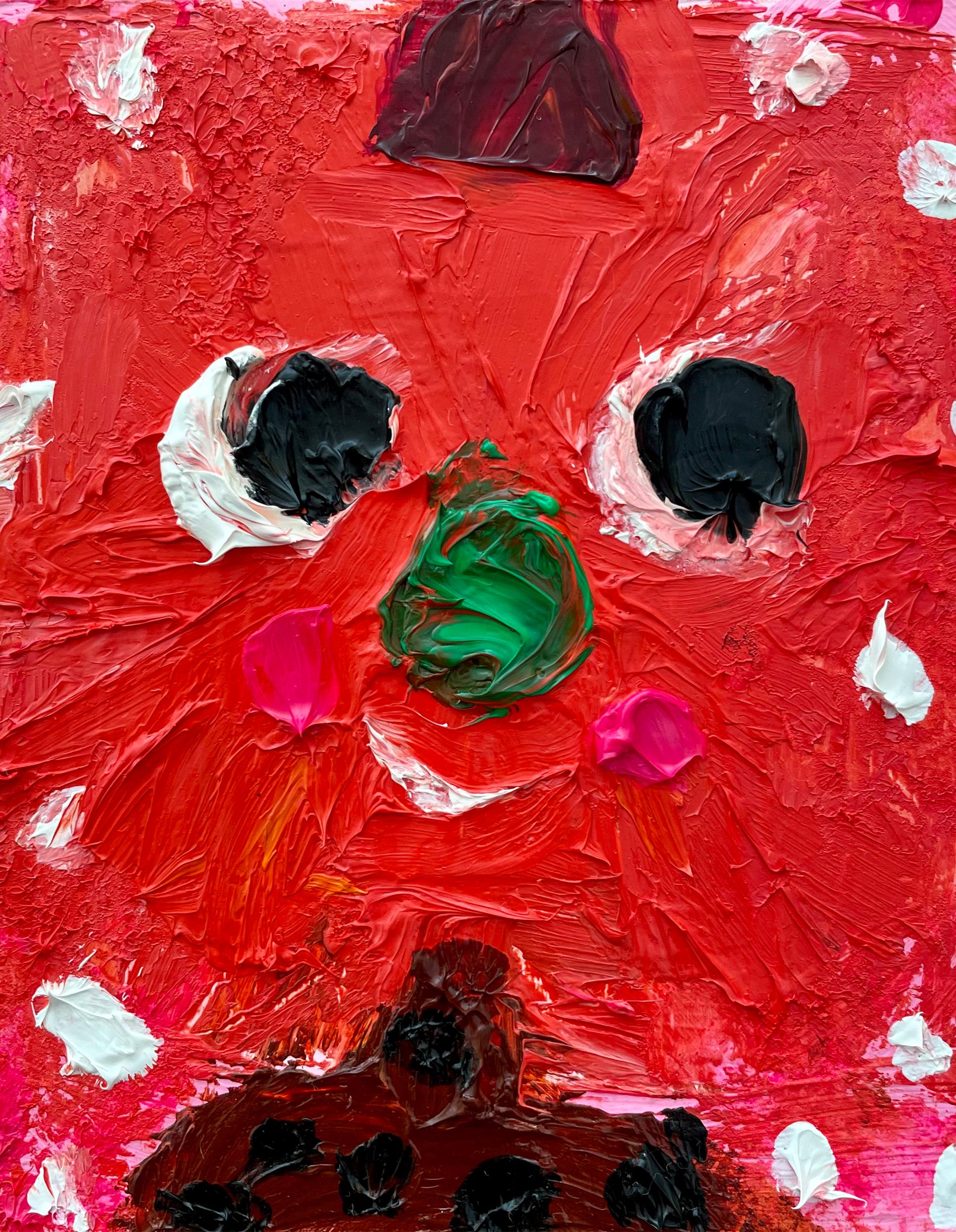

VOLUME TWO 1
guyhepner.com guyhepnereditions.com +1 (212) 226 8680 info@guyhepner.com

@guyhepner @guyhepnereditions
Cover: Fanny Brodar (p. 5-13)
521 W 26th Street
Fourth and Fifth Floor New York, NY 10001
Open to the public 10am - 5pm Monday through Friday Saturday by appointment
All images copyright of the artists
CONTACT US
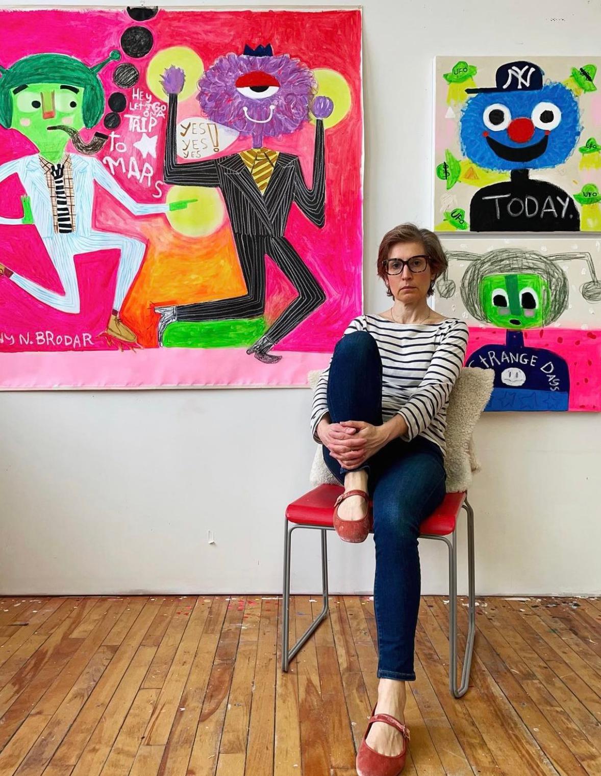 Courtesy of Fanny Brodar ©
FANNY BRODAR
Fanny studied illustration and has a BFA from The Art Institute of Boston. Her background as an illustrator shows in her work. She is influenced by the playful works of Japanese art, as well as the works of artists like Rose Wylie. She was born in 1971 in Oslo, Norway, grew up in New York, and currently lives and works in Maine.
Fanny’s art is influenced by the playful curiosity of childhood and the simplistic yet expressive characters of artists like Philip Guston. She loves improvisational theatre, and the way she paints is similar; spontaneously from a thought rather than pre-sketching. This allows the viewer to see hints of her process through exposed pencil marks, paint drips, and deliberate unpainted areas. Fanny starts her paintings by working flat on the floor, layering paint, and then drawing and doodling directly on the canvas turning it upright on stretcher bars or the wall. This also allows her to use her whole body when making the initial gestures.
“I’m a beekeeper, and often include flowers and little monsters in my work. Yoga and meditation are my daily practice. Weaving all of these things together, my paintings become like this euphoric tapestry — an otherworldly, and magical place that I dream of being in. I take care of nature in a very Buddhist-like way; I especially love the tiniest creatures.”
5
PARTY TOWN
A SOLO EXHIBITION
BY FANNY BRODAR
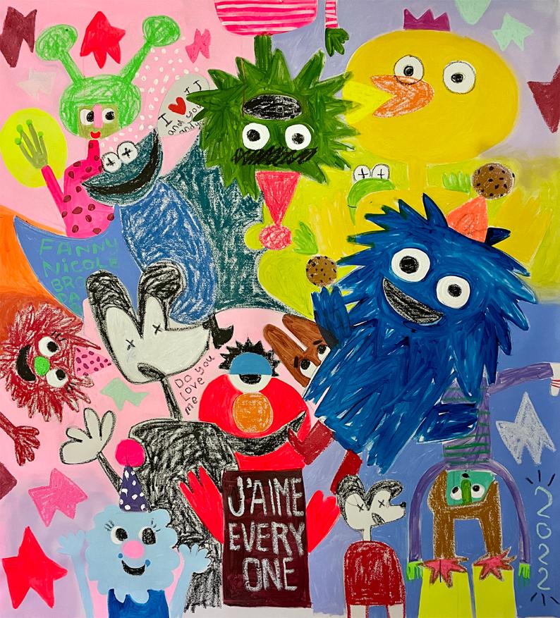
Where to is Party Town, a collision of the 1970s and the 2000s. It is an animated tapestry of memories from childhood, present day pop culture, and the future. Bright colors, child-like marks, and scribbled words invite the viewer to delve deeper into their own nostalgia while also questioning what is real and what is make believe.
Brodar’s muppet-like characters evolved from an escape from a traumatic childhood and represent the many emotions of a child. The artist’s faux naïf paintings lure the viewer into her made-up and magical world, like her childhood bedroom that became whatever she wanted simply by thinking it up. Further, she builds on the nostalgic associations of the audience, presenting monsters that resemble familiar characters from childhood, fashion trends, and pop culture.

“Where to Mac?”
6
This was the first line of Oscar the Grouch, a reoccuring character in Fanny’s work.
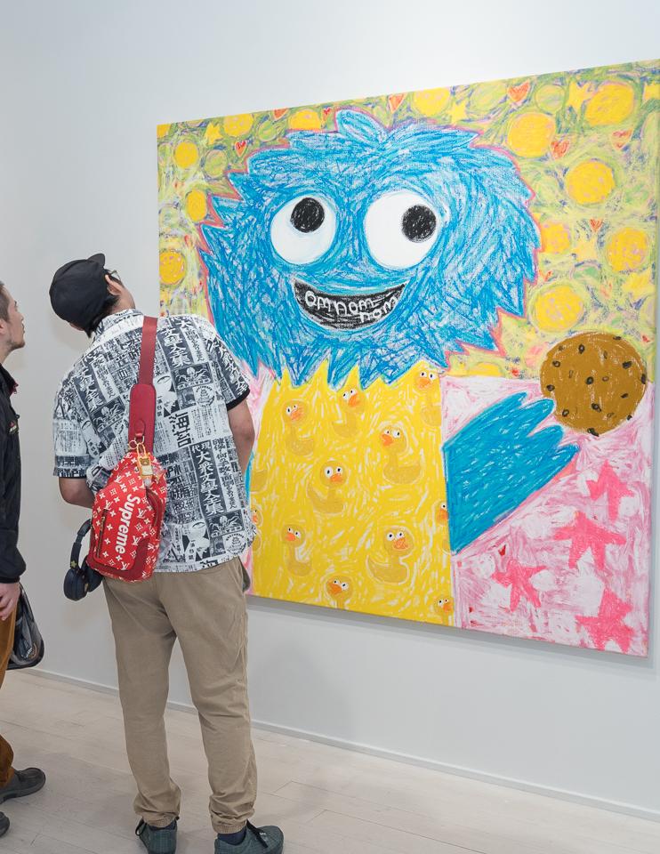 Courtesy of Daniel Kreiger ©
“I’m a beekeeper, and often include flowers and little monsters in my work. Yoga and meditation are my daily practice. Weaving all of these things together, my paintings become like this euphoric
tapestry — an otherworldly, and magical place that I dream of being in. I take care of nature in a very Buddhist-like way; I especially love the tiniest creatures.”
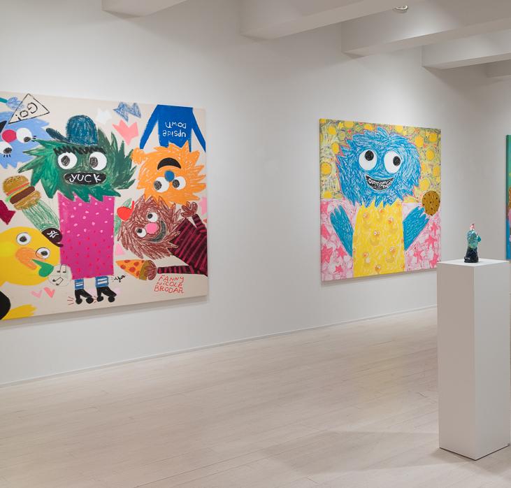
4
8
Courtesy of Daniel Kreiger ©
She loves improvisational theater, and the way she paints is similar; spontaneously from a thought rather than pre-sketching. This allows the viewer to see hints of her process through exposed pencil marks, paint drips, and deliberate unpainted areas.
Fanny starts her paintings by working flat on the floor, layering paint, and then drawing and doodling directly on the canvas, turning it upright on stretcher bars or the wall. This also allows her to use her whole body when making the initial gestures.
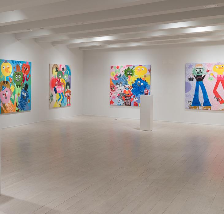
9
My Stuff, 2022
Acrylic, oil stick, and spray paint on canvas
61 x 64 inches
J’aime Everyone, 2022
Acrylic, oil stick, and spray paint on canvas
61 x 64 inches
Mars Roller Derby, 2022
Acrylic, oil stick, and spray paint on canvas
61 x 64 inches


10
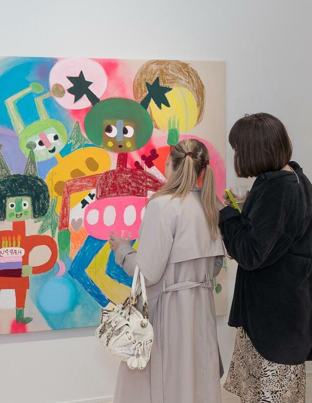 Courtesy of Daniel Kreiger ©
Framed in a 1 inch white from with a ¾ inch float 20 x 14 inches (framed)
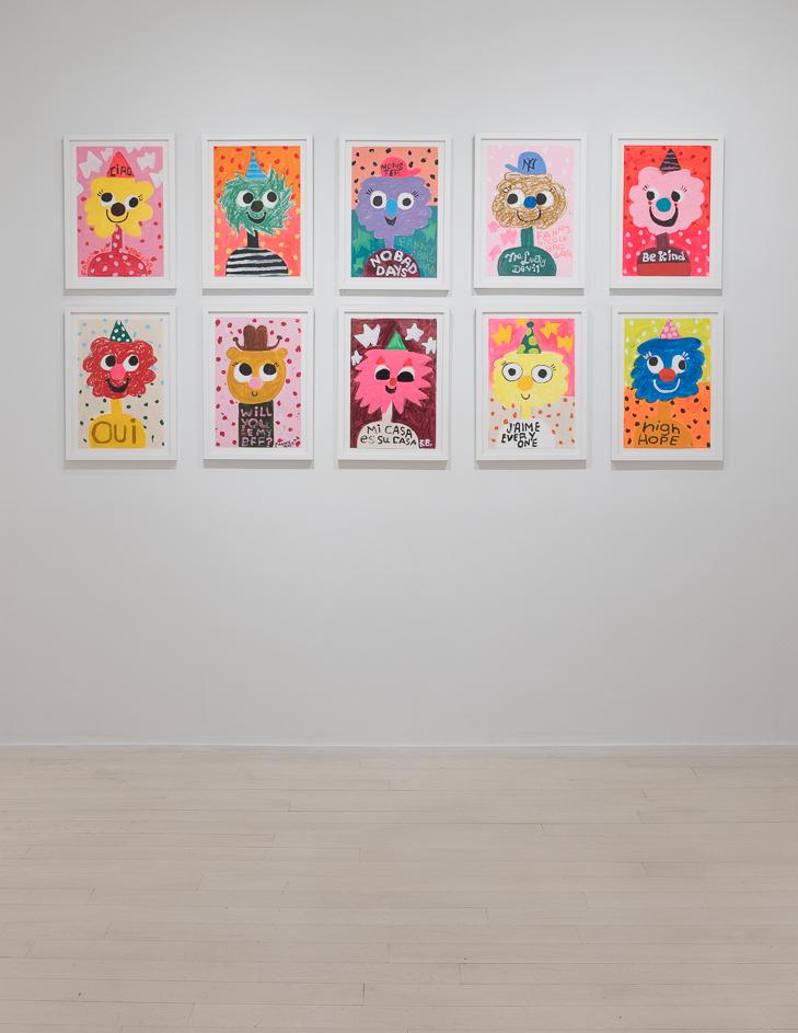
WORKS ON PAPER
Acrylic and oil stick on heavyweight paper
Courtesy of Daniel Kreiger ©
Don’t Worry Be Happy, 2022

Acrylic and oil stick on canvas
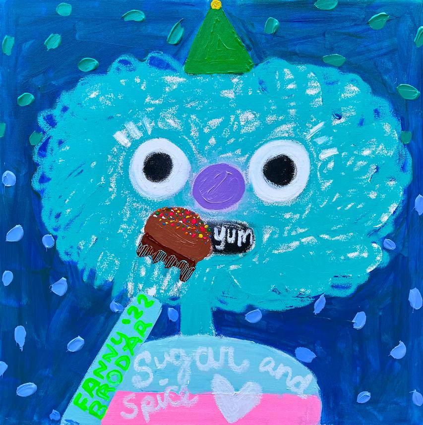
24 x 24 inches
I Love You, 2022
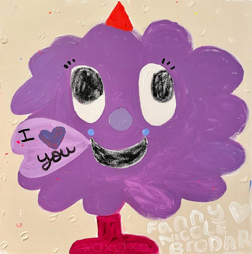

Acrylic and oil stick on canvas 24 x 24 inches
Optimist, 2022
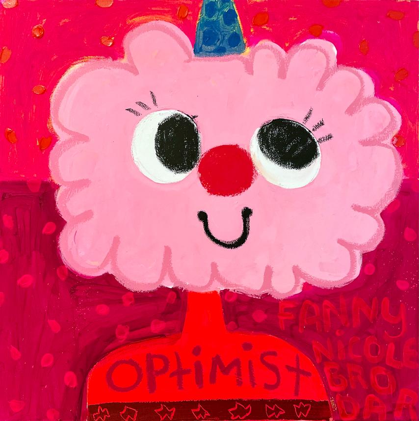
Acrylic and oil stick on canvas 24 x 24 inches
Sugar And Spice, 2022
Acrylic and oil stick on canvas 24 x 24 inches
13
DESIGN STORE
Guy Hepner is pleased to present a premium marketplace for art and design collectibles. The Design Store will offer a curated selection of exclusive artist collaborations ranging from functional homeware to aesthetic enhancements designed with the highest quality materials and artistic integrity.

14
A
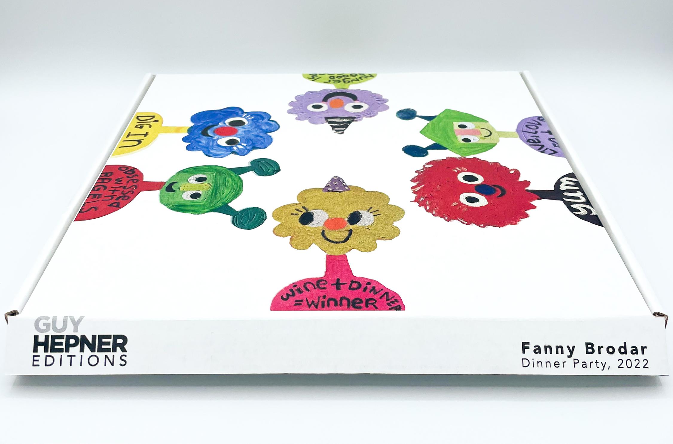
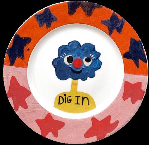
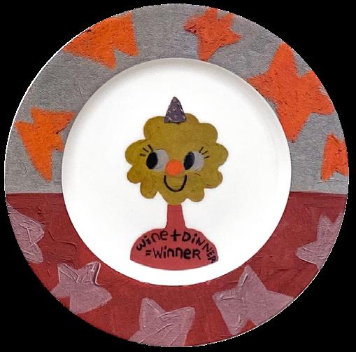
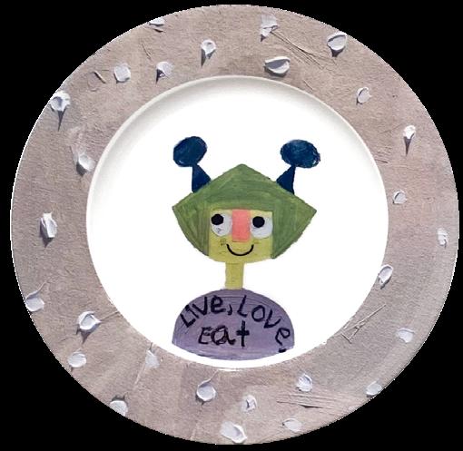
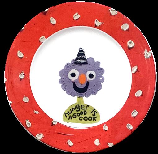
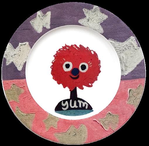
An exclusive collection of limited edition porcelain plates based off of the artist’s “Dinner Party” Series. Consisting of six unique plates (measuring 10.5 inches) - each is adorned with distinctive text and Brodar’s signature characters.

PARTY
DINNER
SPECIAL COLLABORATION WITH
FANNY BRODAR
Hunger Is A Good Cook, 2022 Yum, 2022 Obsessed With Bagels, 2022 Live, Love, Eat, 2022 Dig In, 2022 Wine + Dinner = Winner, 2022
10.5
Dinner Plate Edition of 50 INDIVIDUAL: $190 SET OF FOUR: $740 FULL SET: $1,100 15
Porcelain
inch
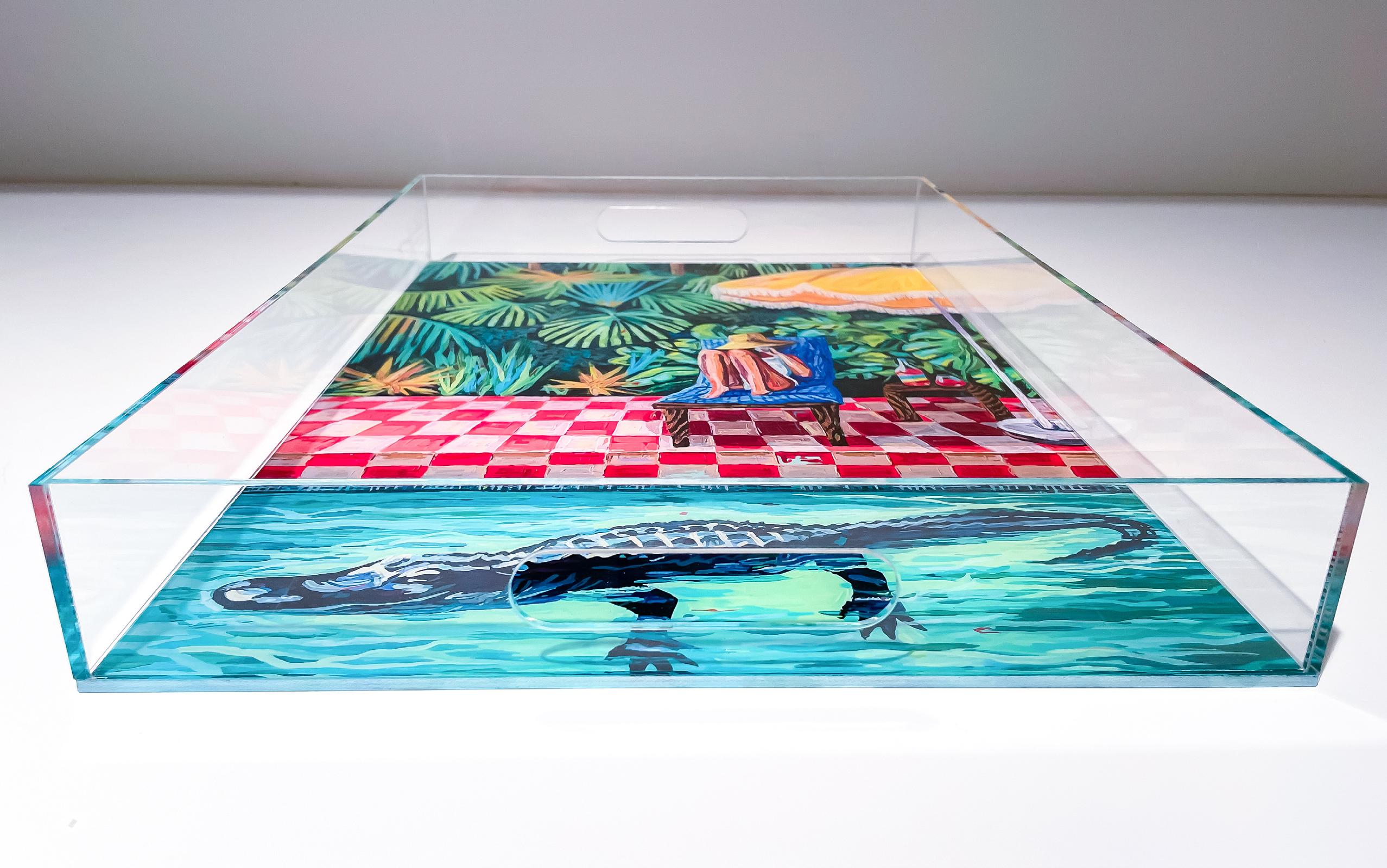
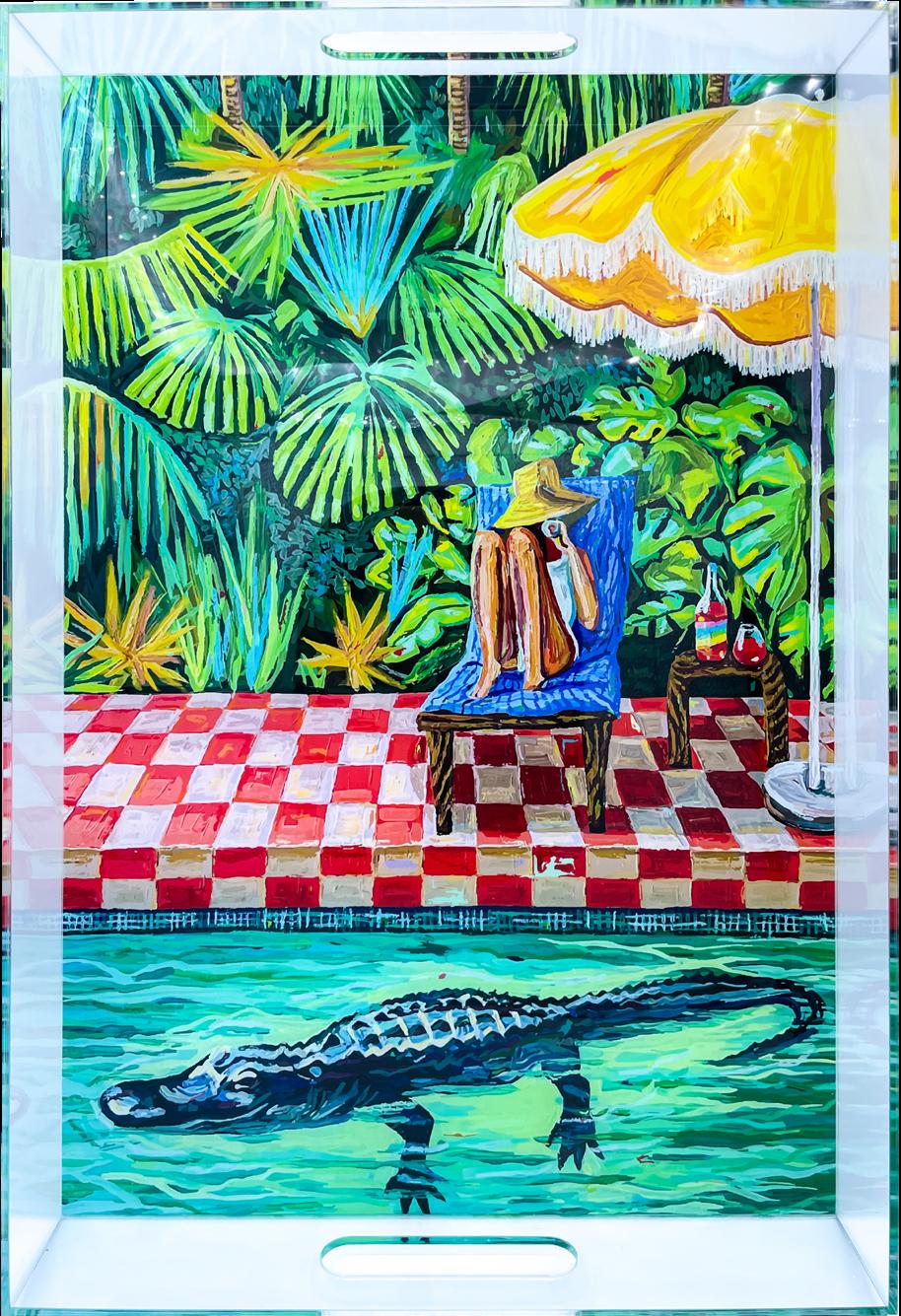
SUPER BLOOM ALLIGATOR EXCLUSIVE COLLABORATION W ITH BRITTANY FANN ING Acrylic serving tray 19 x 13 x 2.25 inches Edition of 25 Engraved signature $225 16
REFLECTION SERIES
BY DANIELE FORTUNA
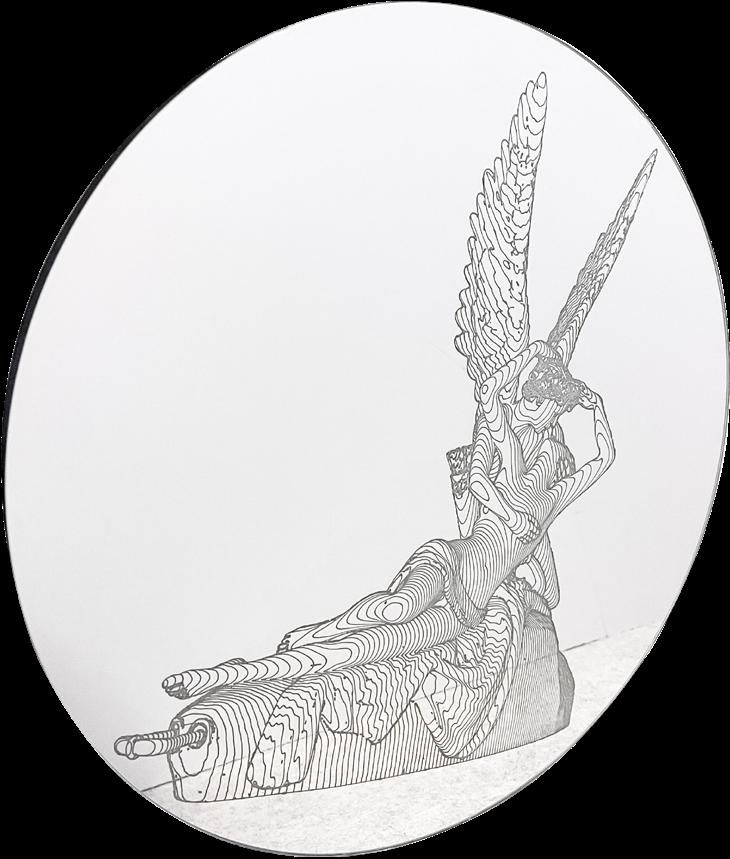
Glass mirror with wall hook Signed and numbered on verso
16.5 inch diameter (Edition of 7) - $700 23 inch diameter (Edition of 5) - $1,200 31 inch diameter (Edition of 3) - $1,700

“For me the mirror represents a world that is constantly in flux and changing. Never seeing the same reflection twice, within it we will always find something different which in and of itself renders the object unique. Etching it with figures from our past allows us to remember where we came from but at the same time our own reflection brings us back to the present, and in the future it will reflect that which still does not exist.”
Daniele Fortuna
 David, 2022 Ninpha, 2022
Amore e Psiche, 2022
17
Courtesy of Ben Evans © 18
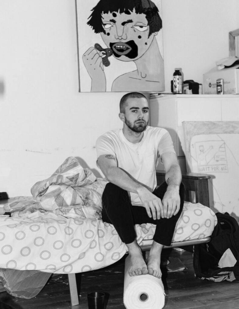
BEN EVANS
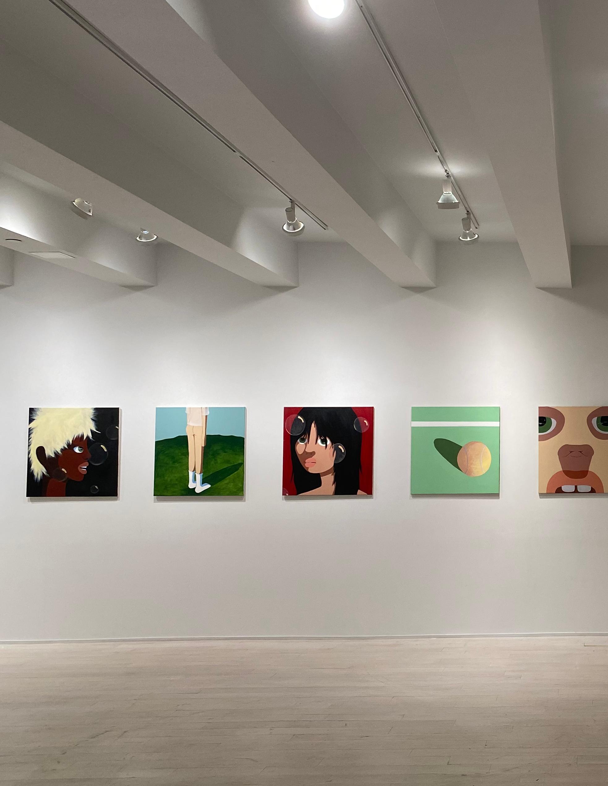
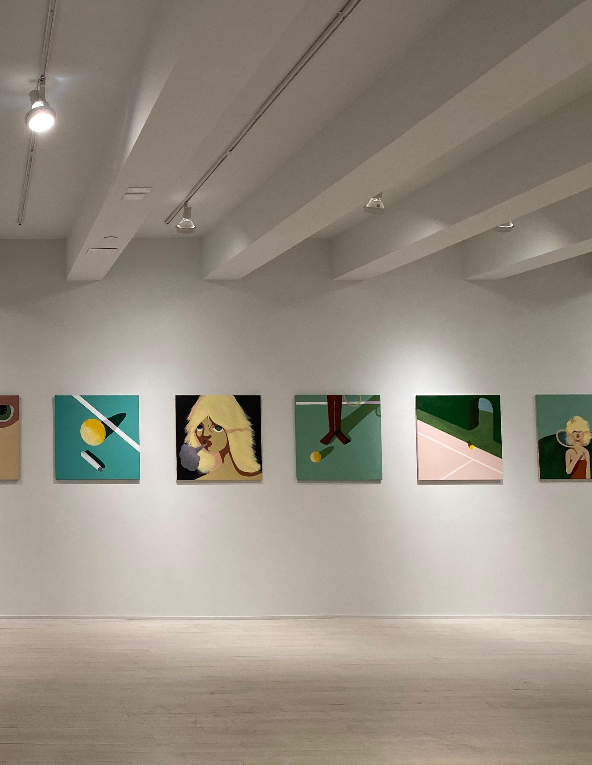
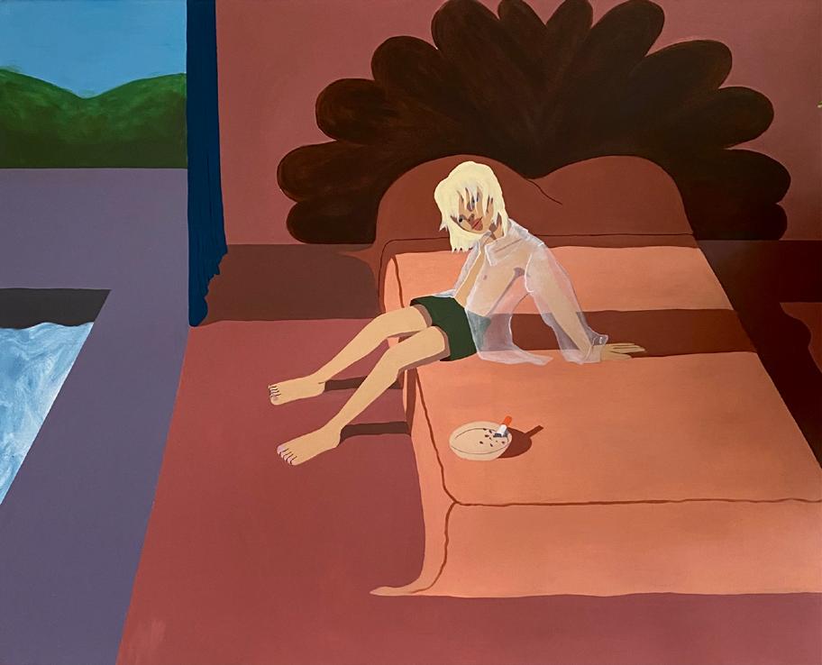
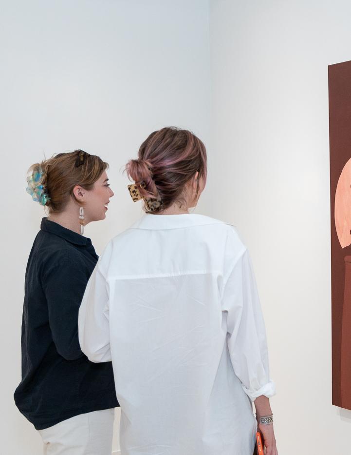
Ben Evans’ neo-noir, campy, Los Angeles house paintings reflect the artists’ output of visual stimulation he’s gathered from a rolodex of iconography that is meaningful to him. Whether it be Shelley Duvall, Slim Aarons’ pool photographs, or moms from his hometown “leasing their white Mercedes” the rolodex of imagery creates a visual language in the works unlike anyone else.
The flat colors and oftentimes extreme lighting in the works add to the drama and bluntness of the large-scale paintings. “All the figures I paint are of friends and people who mean so much to me. But I also think that a lot of it is the divine femininity within myself.” Be it religious emblems or glamorous isolation, Evans considers himself a “conductor of imagery.”
19
ASTRAL DRIVE
A SOLO EXHIBITION BY BEN EVANS
20
Astral Drive features characters and scenes from the isloated world of Los Angeles
 Courtesy of Daniel Kreiger ©

22
Courtesy of Daniel Kreiger
©
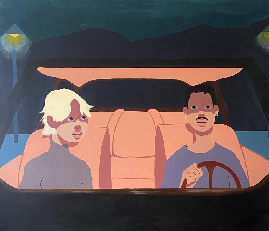
Astral Drive is a street with a vantage point of all of Los Angeles. You can get to it off of Mulholland Drive and it dead ends on a long winding road to a street sign that reads “end”. I first ended up here when I got lost in LA at 3am. I sat on the hood of my car and smoked a cigarette alone looking at the light pollution on the smog covering West Hollywood.
Since I was young I’ve always had a visceral relationship with places. That night, this locale felt unreal and sad. Maybe it was me romanticizing something stupid, but it felt surreal and unlike anywhere l’d ever been. I’ve only been back once since that night but its stuck with me for years as a place that I couldn’t put my finger on. The works in this show exist in that realm – specific, but distant. Real, but superficial. Light on the surface, but with dark baggage threaded into the isolationistic atmosphere. I thought a lot of Hopper and Hockney while making these works. I hope for them to exist within the lexicon of Los Angeles as a promised land for artists.
- Ben Evans


24
Boy In Archway, 2022 Acrylic on canvas 56 x 70 inches
Front Seat, 2022
Acrylic on canvas
60 x 52 inches
January in LA, 2022
Acrylic on canvas
60 x 52 inches
25
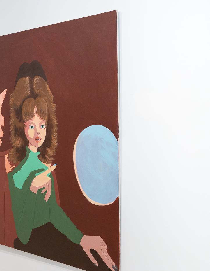
Plane Window #1, 2022 Acrylic on canvas 56 x 70 inches
Courtesy of Daniel Kreiger ©
DYLAN MARTINEZ
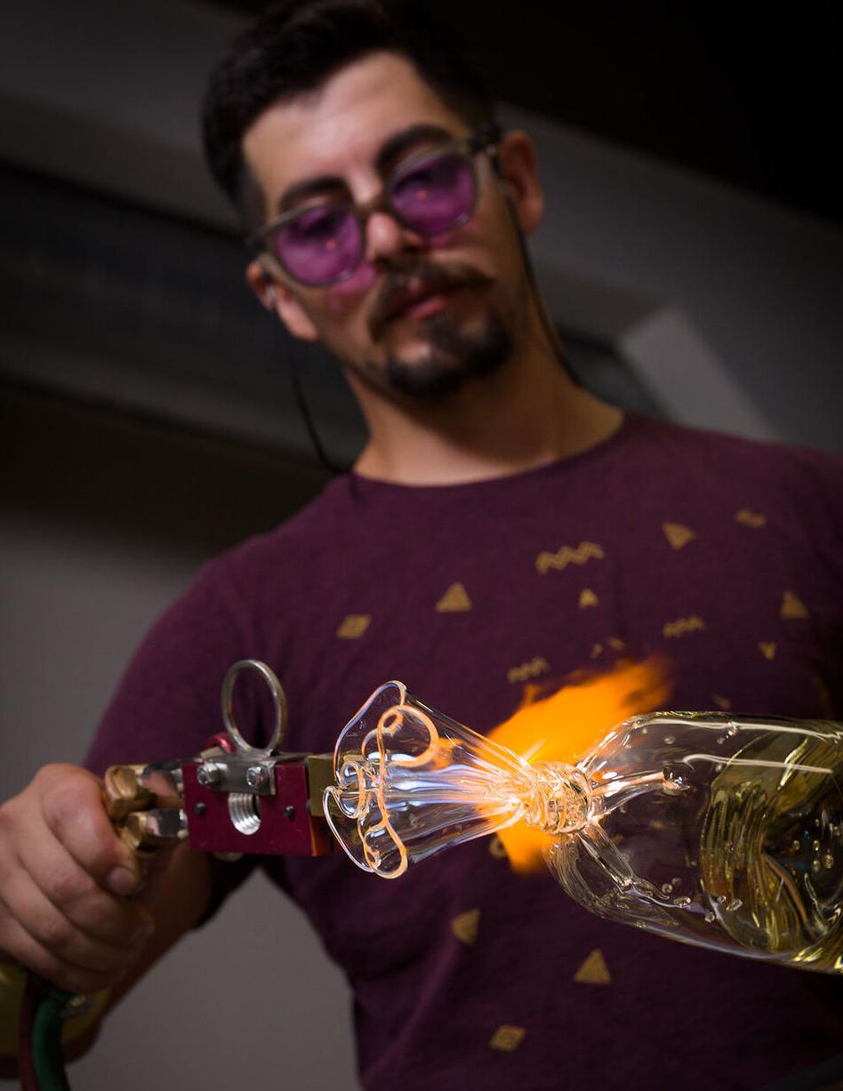
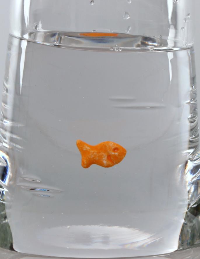
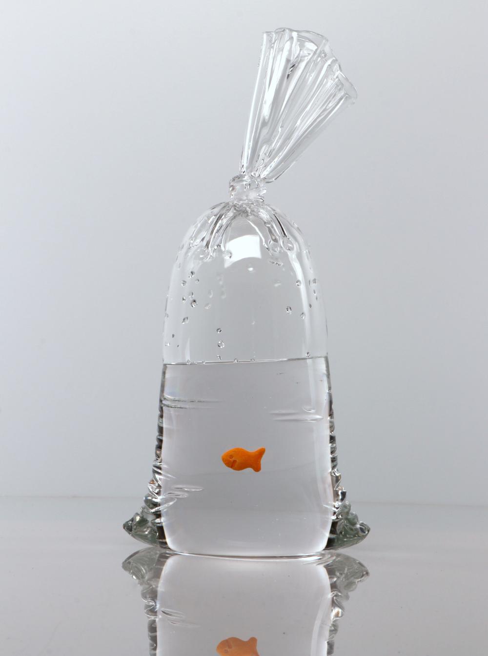
Dylan’s artwork explores the boundaries of human perception through the manipulation of light, space, and the physical properties of glass. Understanding just how to control molten glass became a major focus for several years of his practice. Martinez’s latest body of work explores techniques in which the viewer is presented with objects which trick the eye, Trompe L’oeil, or use the reflective and refractive properties of glass in configurations which fracture light in dynamic styles, allowing the viewer a moment of playful exploration.
His sculptures are sought after internationally with exhibitions in America, Italy, France, Switzerland, The Netherlands, Taiwan, and Singapore. His artwork has been featured in several publications such as Life UK, Elle Decoration UK, American Craft Magazine, Interior Design Magazine, Office Magazine, and Aesthetica Magazine.
28
 Courtesy of Dylan Martinez ©
(LEFT TO RIGHT)
B113, 2022
Hand blown glass sculpture
15 x 6.25 x 4.75 inches
B108, 2022
Hand blown glass sculpture
10.25 x 5.75 x 4 inches
B112, 2022
Hand blown glass sculpture
13.75 x 6.25 x 4 inches


32
GF 46, 2022
Hand blown glass sculpture and hand made ceramic fish
12.5 x 6.5 x 4.25 inches
33
GEOFFREY BOUILLOT

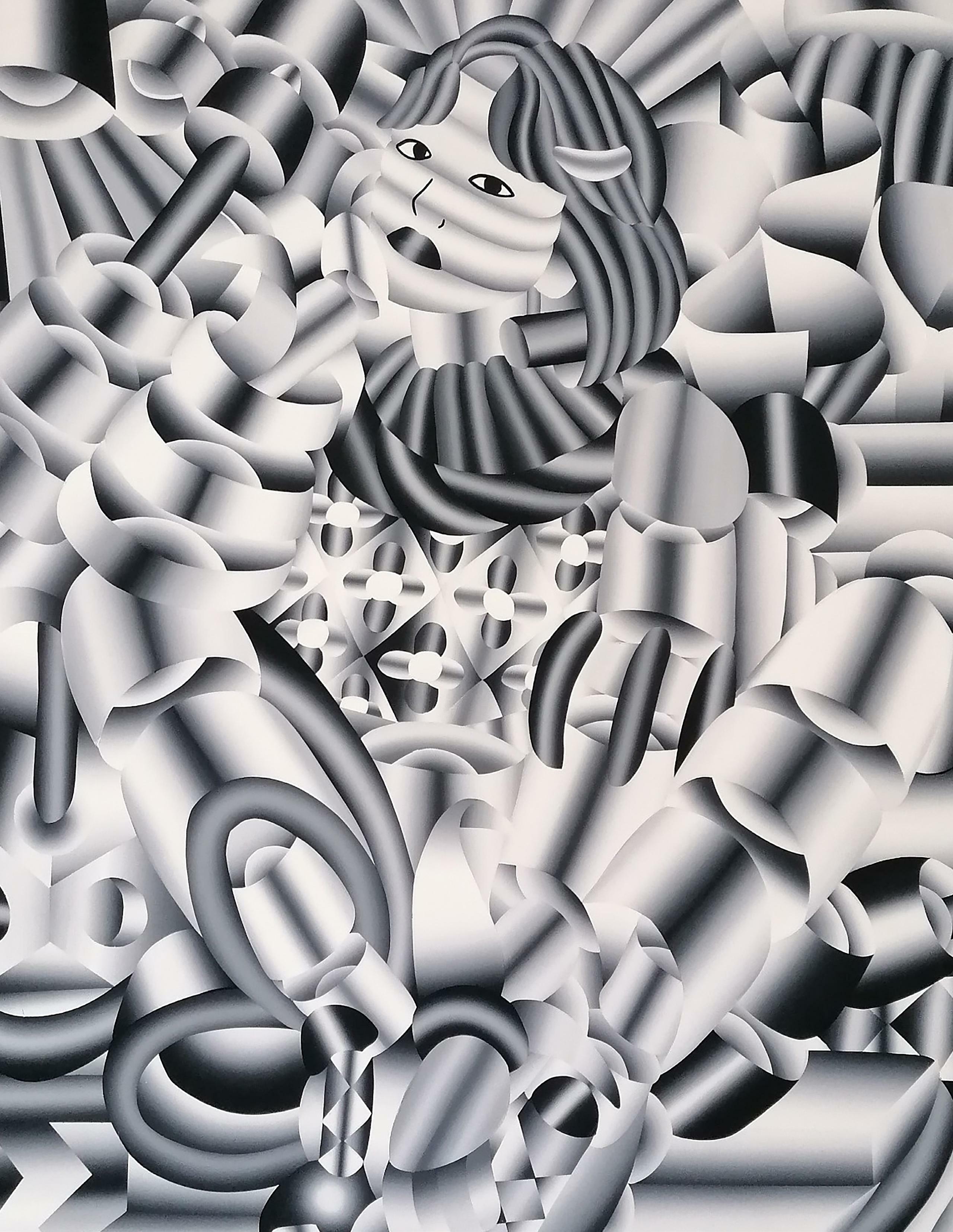
French born artist in Chalon-sur-Saône, Geoffrey Bouillot, currently lives and works in Japan.
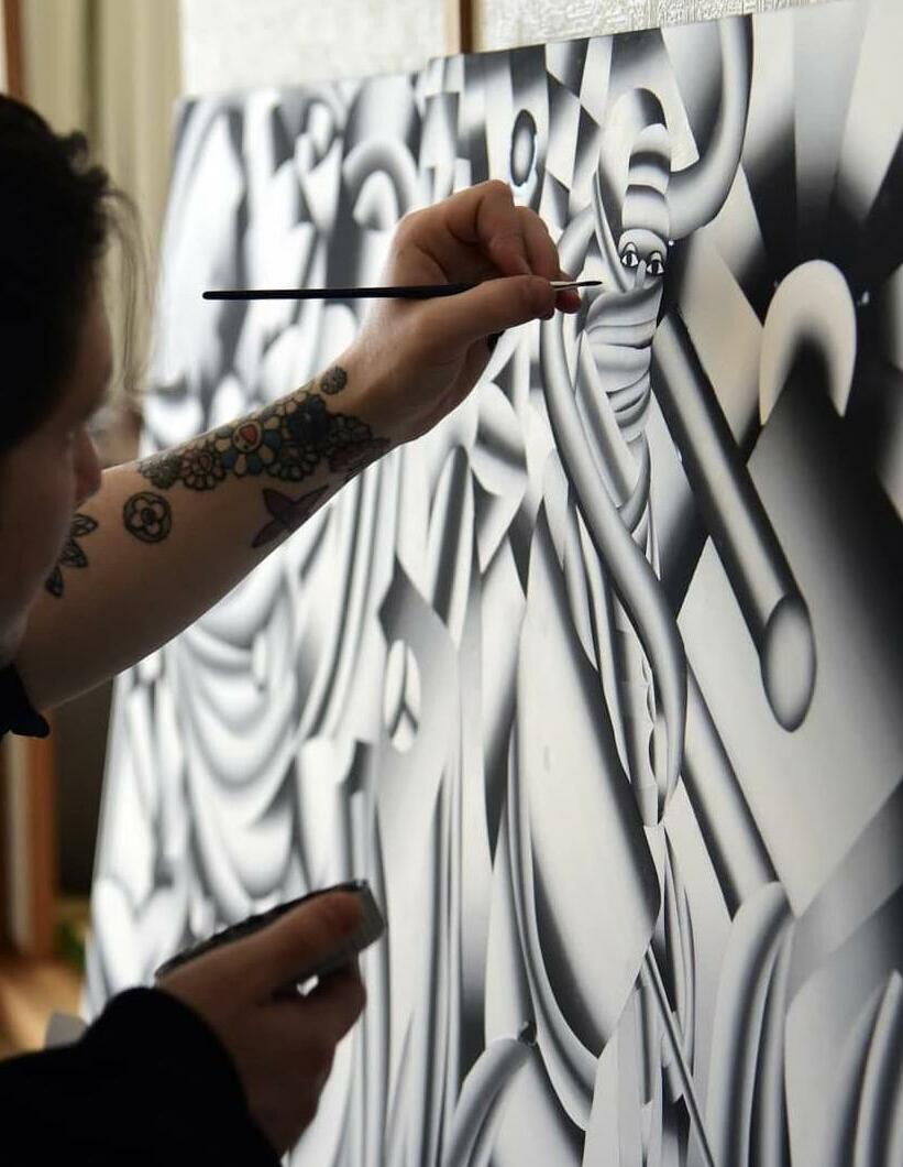
His work is evidently informed by these two cultures, and examines a unique dynamic of pop art, cubism, and Italian futurism.
Bouillot is adept at portraiture, still life and interiors.
Bouillot’s work typifies contemporary art culture. It is clean, fresh and chic.
His monochromatic designs burgeon an eclectic blend of minimalism and the ethereal.
The cultural influences include remnants of Manga, with subjects and composition meticulously separated with clean lines and play on light, achieving harmony and balance between the artists other influential styles; cubism and pop art.
34
35
Courtesy of Geoffrey Buillot ©
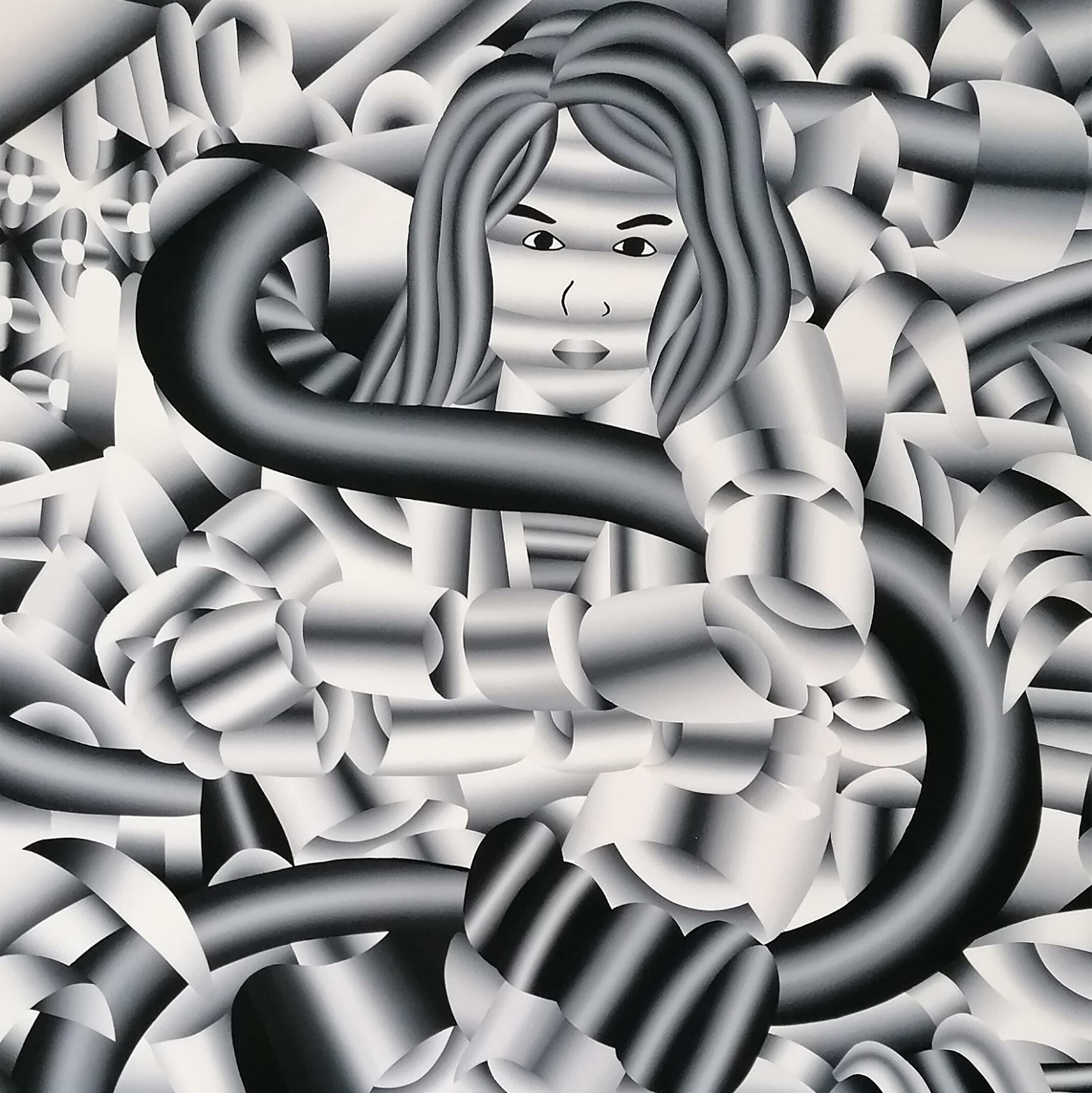
ABOVE: Portrait de Orphnée, 2022
RIGHT: Portrait of Calypso, 2022
The mastery in conjoining such diverse genres is an accomplishment, particularly considering this is achieved using only monochrome hues. It has been said of his work,
“Composed of metallic-like stacking cylindrical and spherical forms, each character morphs nostalgic cartoons into unfamiliar forms, speaking to a collision of culture – from the ancient to the deep future.”
36
37
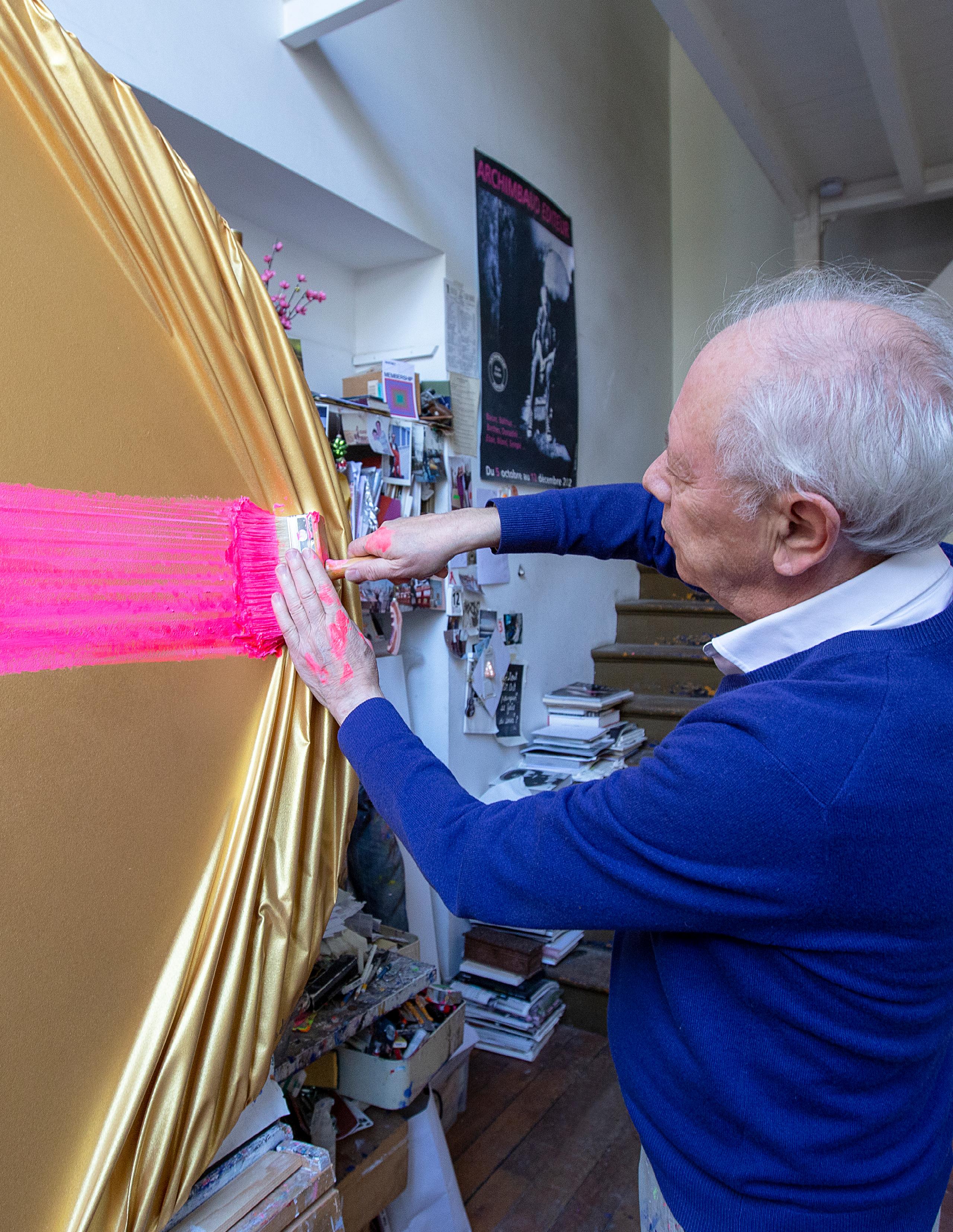
 Courtesy of Jean-Paul Donadini ©
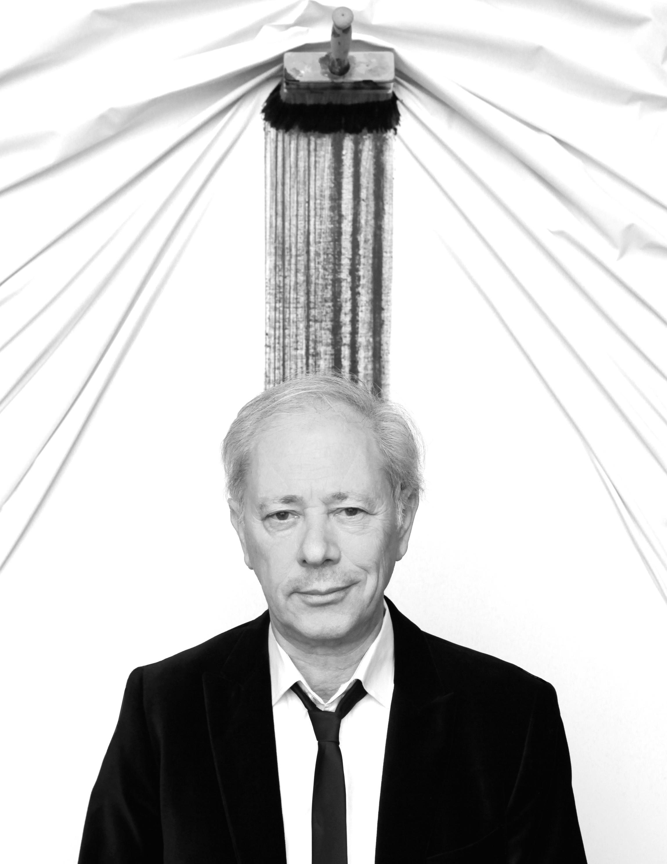
JEAN-PAUL DONADINI
Jean Paul Donadini is a french painter who was born in Troyes, France, in 1951. He graduated from the Beaux Arts of Nancy in 1973 and the Beaux arts of Paris in 1976. Currently he works and lives in Paris, and has exhibited extensively in Paris, London, New York, Miami, Chicago, Istanbul, Dubai, Seoul, Singapore and Hong-Kong.
“The painter by definition has a means of expression which is not speech, it is a large dumb man who expresses himself by colored gestures” – Jean-Paul Donadini
39
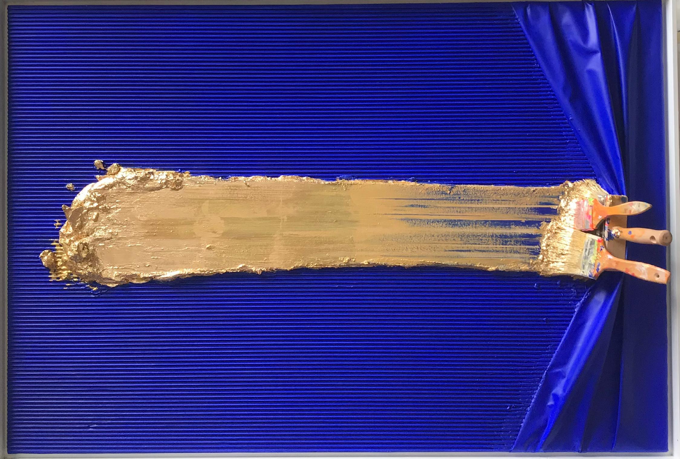
“I like the idea of a flat surface that becomes dynamic”
Brosse Arrêtée Blue and Gold, 2022
Acrylic and mixed media on canvas 51.13 x 35.13 inches
40

41
BROSSE ARRÊTÉE
BY JEAN-PAUL DONADINI
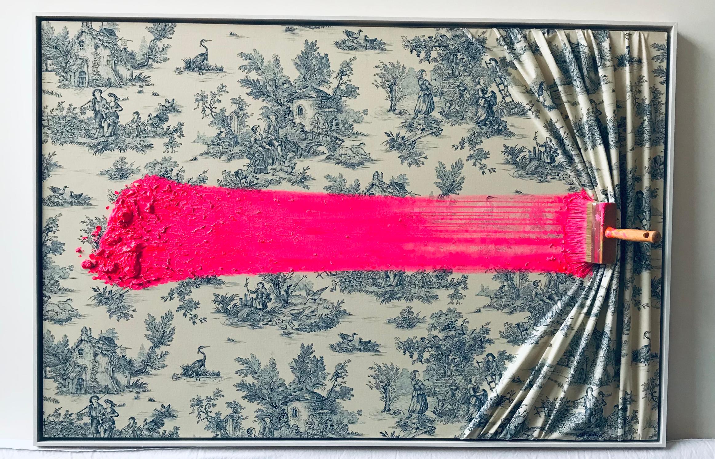
Brosse Arrêtée Pink Sur Toile De Jouy, 2021
Acrylic and mixed media on canvas 57.5 x 38.25 inches
42
Donadini combines the intentional simplicity of Rothko and Mondrian with the abstract elements of more contemporary artists like Koons and Hirst. The viewer is able to experience the familiarity of renowned artists in a new sculptural light.
Interest builds gradually until the viewer reaches its peak – the standard painting brush grafted onto the top stroke. This organized pigmenting is reminiscent of Hirst’s spot paintings, but Donadini’s work separates itself with the introduction of a sculptural element.
Much like Rothko’s pieces, beauty can be found in the stroke itself and the singular combination of colors. In many of Donadini’s Brossee Arrêtée pieces, excess paint piles around the tools frozen on the canvas. This gives spotlight to the depth of the painting and the rich layers that lie beneath.
Donadini is classically and versatilely trained. In his extensive career, he’s experimented in surrealism like in the favored print Voyage intime, and Glam’art with his lipstick on canvas piece, Lipstick Marilyn. No matter the medium, Donadini’s pieces are guaranteed to attract and awe anyone who wanders close.
 Courtesy of Jean-Paul Donadini ©
44
Courtesy of Jean-Paul Donadini ©
Brosse Arrêtée Dégradée Pink, 2022
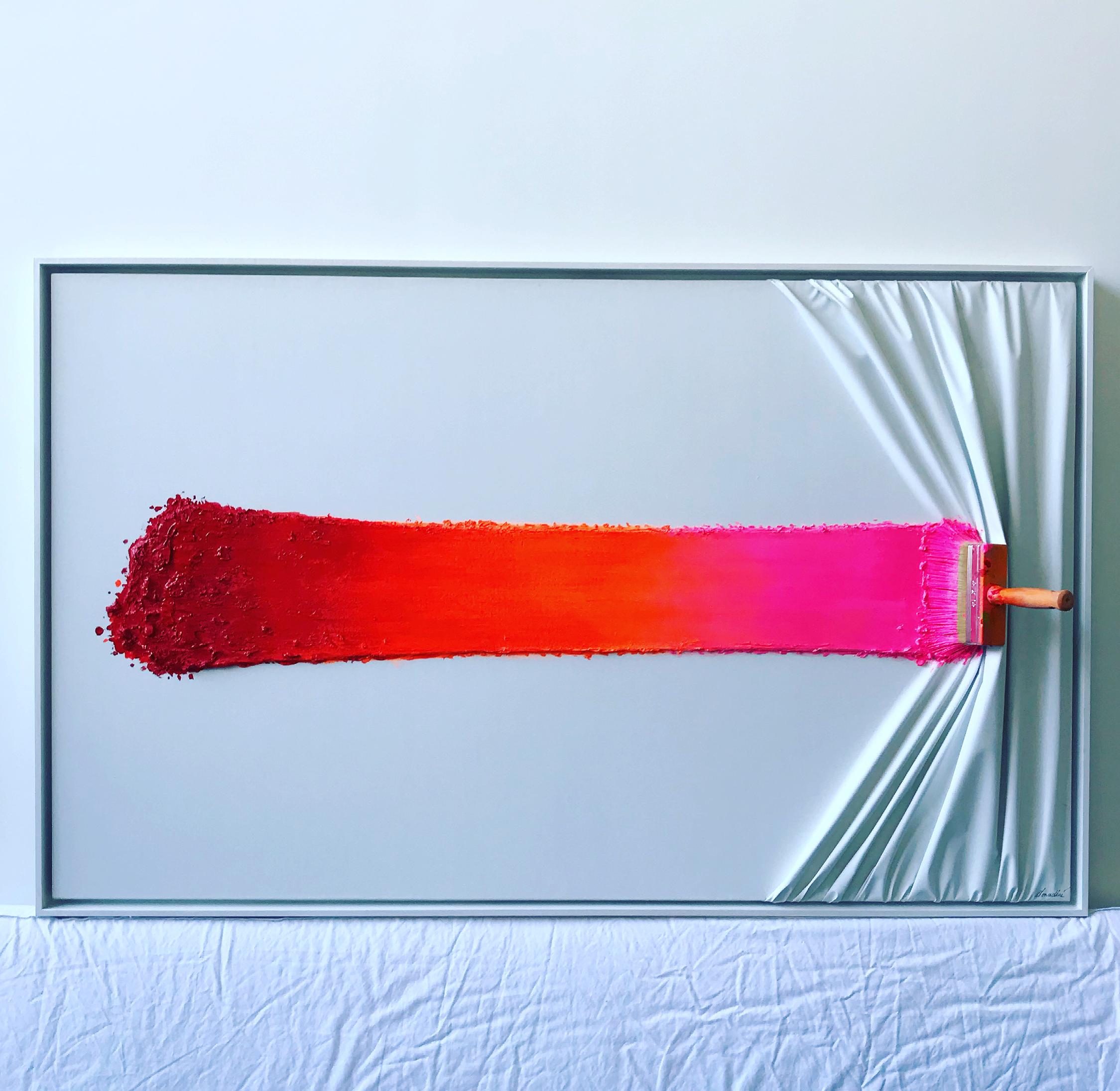
Acrylic and mixed media on canvas
57.5 x 35.13 inches
45
ARTIST ROSTER

WHO WHERE WHY HOW WHEN WHO 2.0
I am a Portuguese Chinese based in Tokyo
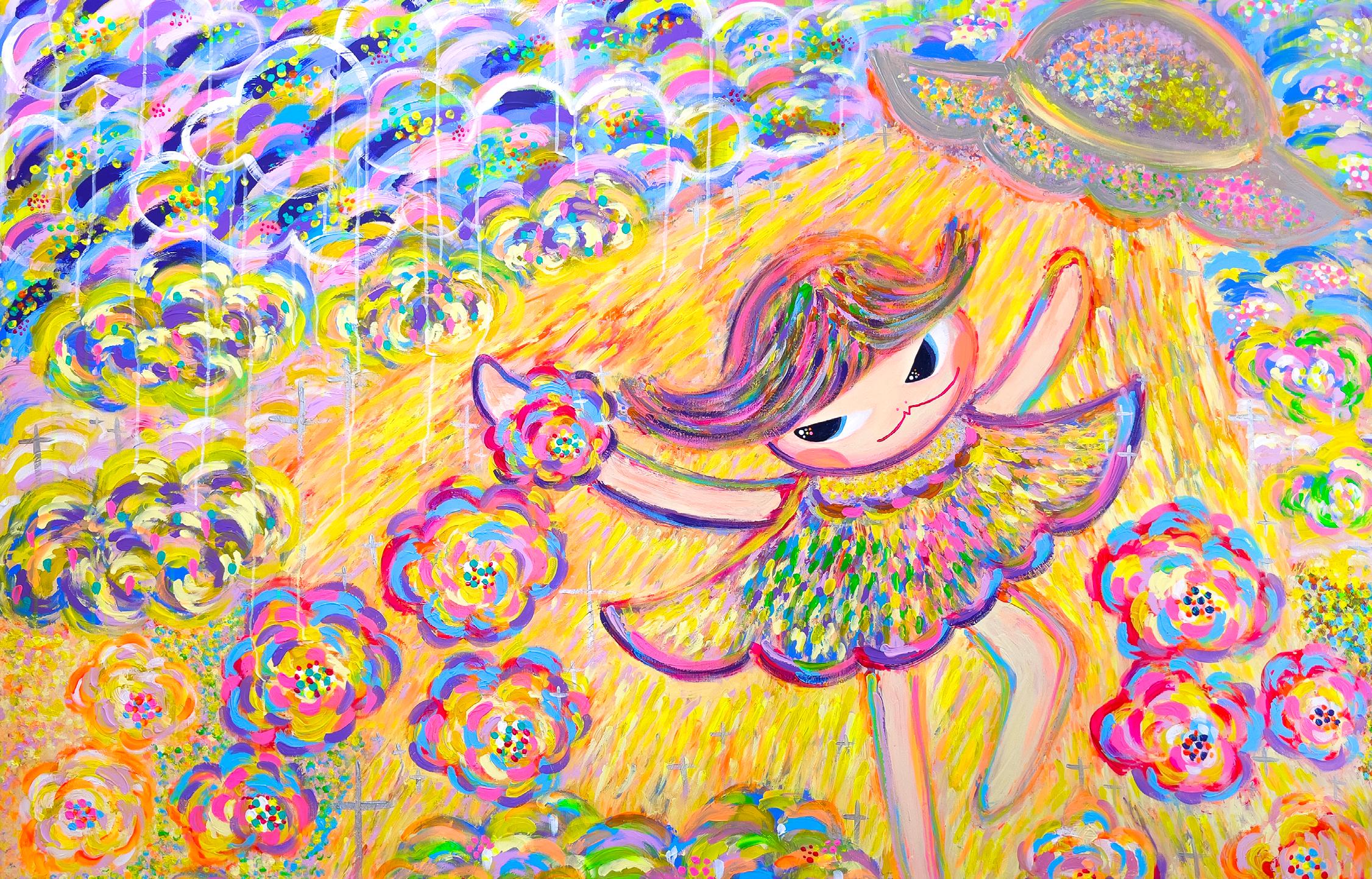
I get my inspiration from my 5-year-old daughter and my inner child. I imagine this little girl connecting to her fantastical world with bravery and happiness. I also always relate my daughter and myself being inside my painting and taking this mischievous adventure with my little girl character.
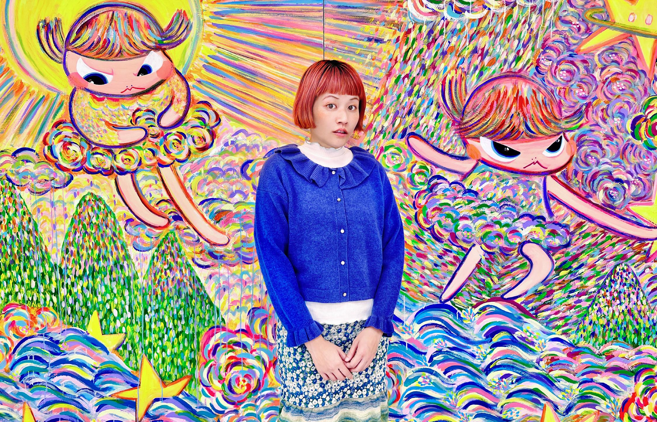
I paint like a child, brave and free. So I directly paint on canvas without a planned sketch. I lay out bunches of paints in front of me. I feel colors having these energies dancing around me, allowing my intuitions to get the best of me, then I use my fingers, hands, and brushes to finish every work.
My favorite art moment is when Guy Hepner invited me back in February 2022 for my first collaboration to showcase my works in NYC. That was when I just painted a series in that I felt the most freedom. And caring less about what people want or like. I was just being who I am. Guy Hepner NYC was the first gallery from the west to invite me for the opportunity, which has opened many doors for me in the future. I was very grateful, humbled, and happy being who I am can be loved by many out there.
Van Gogh
Bibi Lei

WHO WHERE WHY
Blake Jones Chicago
I think its hard to pinpoint down exact inspirations as a tangible thing. For myself it can be anything from a color palette I see that I think I can experiment with and create a story or mood with, to a random song I hear that just almost instinctively makes me get up and start drawing.

Where Im at with my work now I try not to limit myself to just using this material or this material, I used to be very neurotic about my whole process like OK this is all watercolor or this is all acrylic on canvas, they all have to be the same brand paint, brush, paper, etc but as I’ve been letting myself experiment more and more I’m doing everything from graphite, acrylic, oil pastel, chalk, spray paint, whatever I think gets the job done in the moment that I can look at and be happy with.

My best moments are when I just let my expectations melt away, a lot of artist will alway say a piece is never finished or stress themselves out and be there on harshest critics and sometimes you just have to let it go.
“ I do everything by hand... Even if I’m doing really big letters and I spend a lot of time going over the line and over the line and trying to make it straight, I’ll never be able to make it straight. From a distance it might look straight, but when you get close up, you can always see the line waver. And I think that’s where the beauty is.” - Maragret
Kilgallen
Barry Mcgee will always have to be my number one, picking even just a top 20 would be difficult but his work was the first art I saw as a younger teen that really resonated with me. I saw it and instantly wanted to sit down and just start drawing on anything and everything.

2.0
HOW WHEN WHO
WHO WHERE
WHY HOW WHEN W HO 2.0
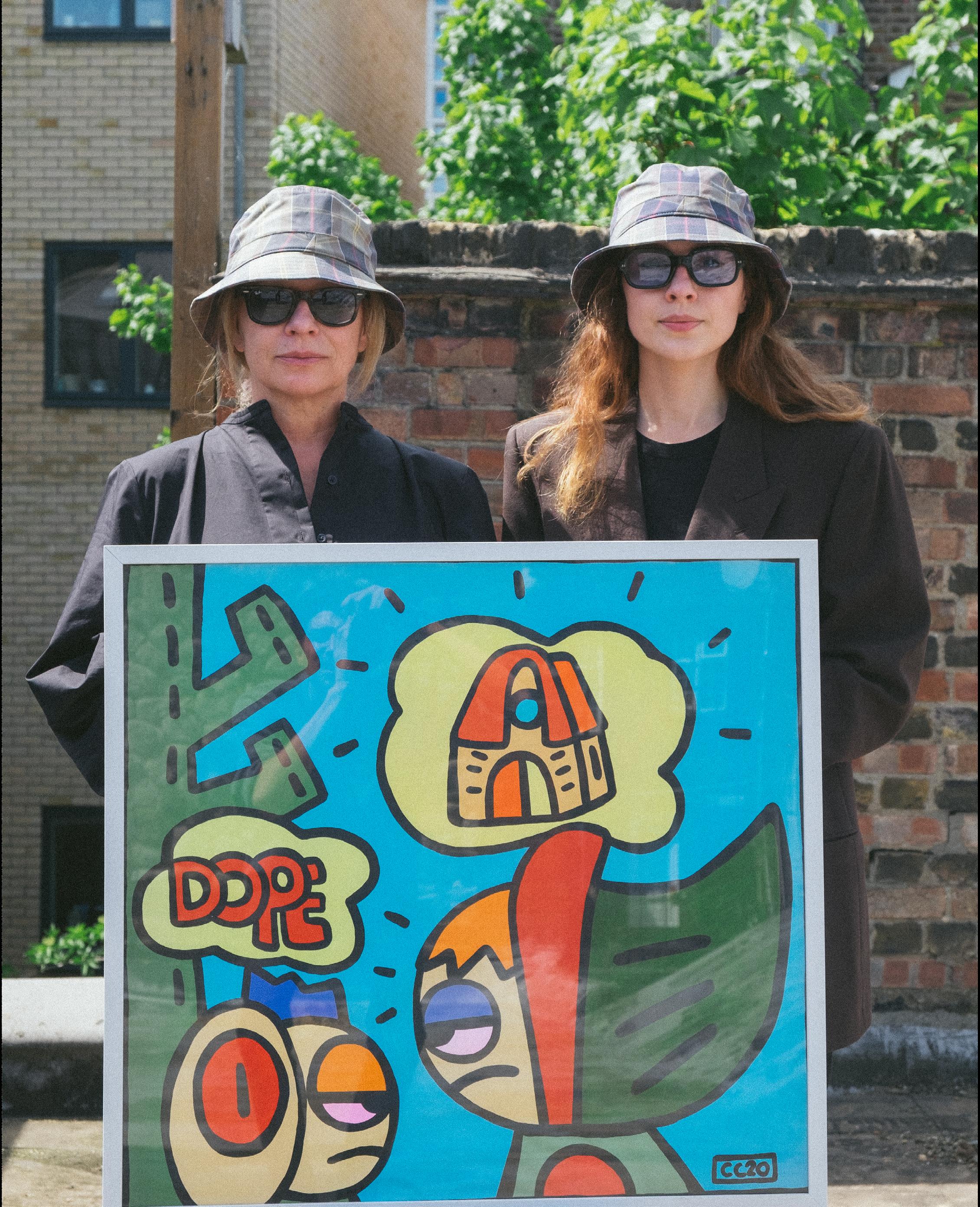
Most of our inspiration comes from cartoons, comic books, and street art –things that relate to reality but are never limited by it. The CC20 characters are a manifestation of that. Cowboy Vincent is inspired by our favourite Australian cowboy whilst Fearless Girl and Little Red Riding Hood are the female heroines we wish we’d had grown up with. They reflect on human emotions, from being fearless, bored or heartbroken. The characters are colourful versions of reality and represent CC20’s true identity.
Through simple drawings and rough sketching, we create detailed painting and line drawings that embody movement on canvas. Shapes and characters are filled with bright, saturated colors – always outlined in black.
One morning we woke up to a message from someone who passed our ‘Hello’ painting at the Takeuchi gallery in Kyoto. He had been a fan of our work so for him to unexpectedly stumble upon Cosmic Cowboy halfway across the world was incredibly special.
Keith Haring. The way his art feels as fresh and relevant today as it did back then never ceases to amaze us.
 Cosmic Cowboy London
WHO WHERE WHY HOW WHEN WHO 2.0
Emilie Liu Brooklyn, NY
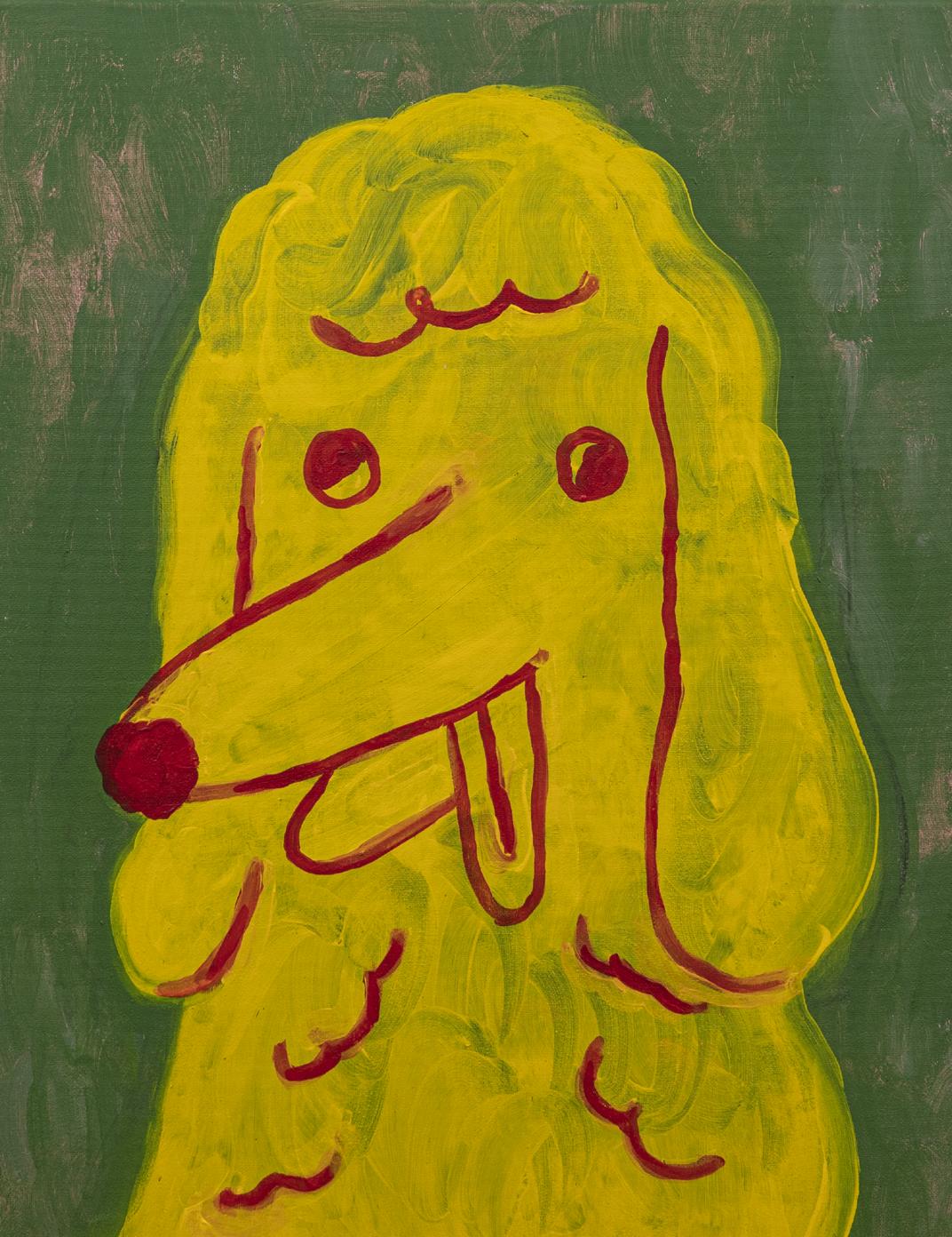
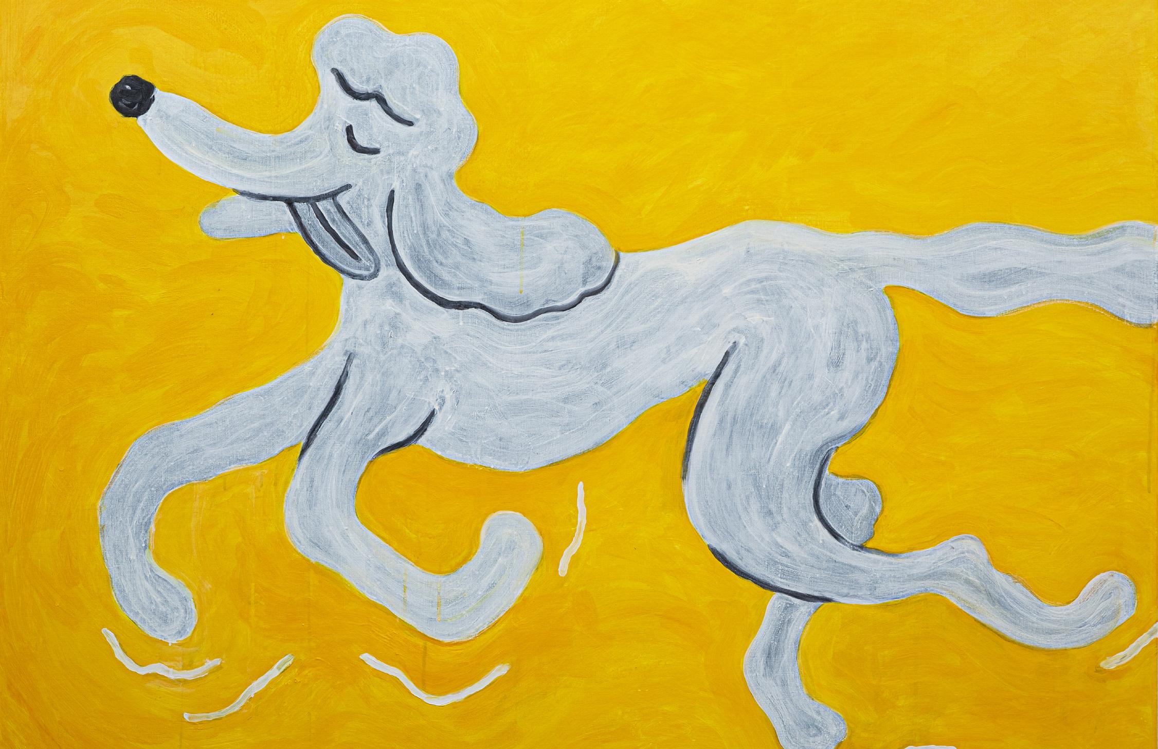
My dog Jupiter, encounters of the fun things in the city, the nature Abstract with Acrylic, Oil Pastel, and Oil Paintings.
Whenever I’m painting on canvas, nothing beats the feeling of creating texture with a paint brush.
Misaki Kawai


WHO WHERE WHY HOW WHEN
Gregory Thielker
Geneva, Switzerland and New York City
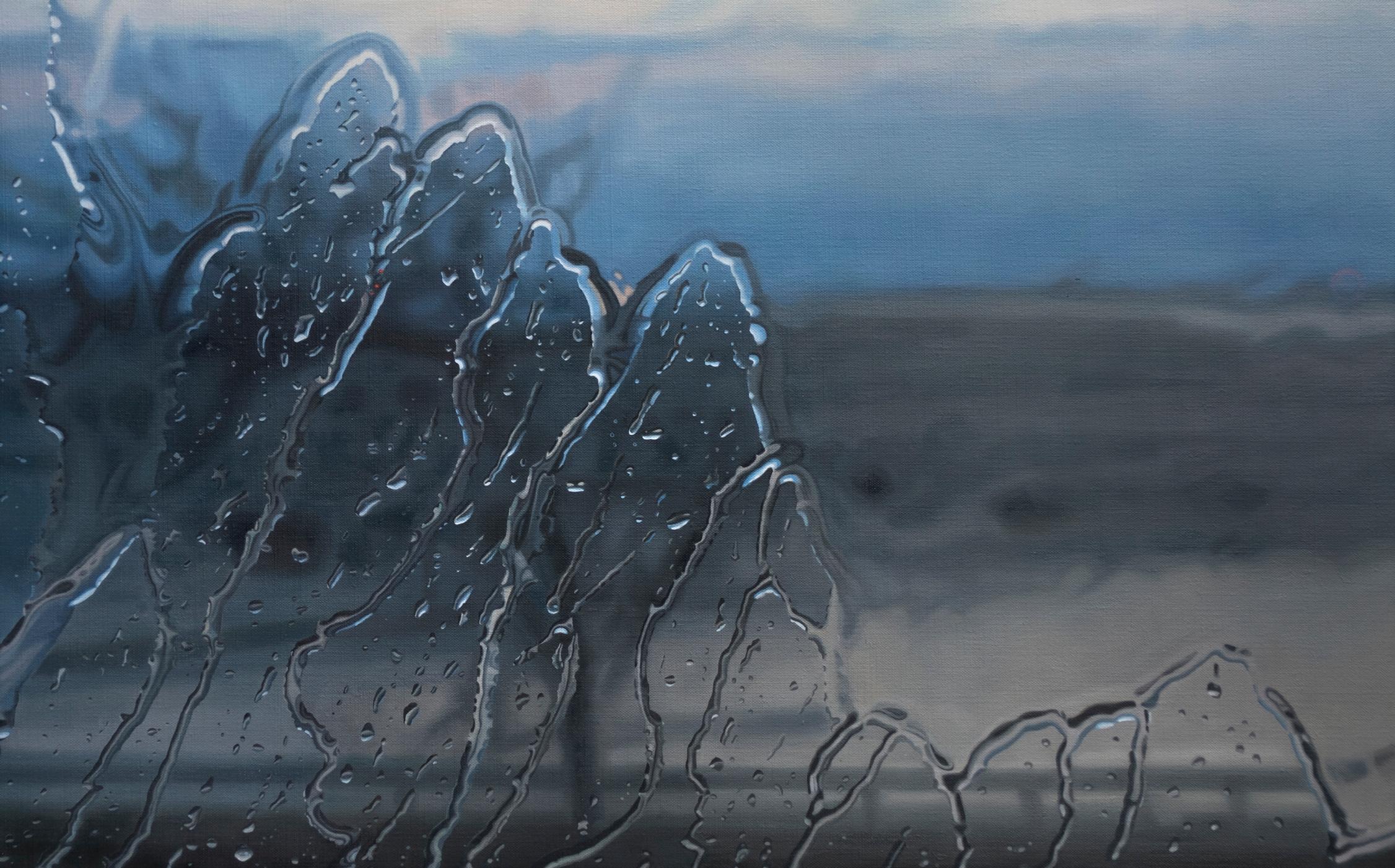
My paintings are a meditation on what we see while driving in the rain. Water on the windshield distorts what’s outside into shapes and colors, yet the feeling of the pounding rain seen from the car is unmistakable. Each moment is different, yet the feelings are familiar.

The paintings are oil on linen and done through a series of slow, translucent layers of paint. Each canvas can take several months to complete.
I am amazed that the photographs that I take while driving hold a kind of secret into the experience I had while driving. Each one seems entirely its own, even though they represent moments so close in time. The water moves in ways that I cannot anticipate and so each time I paint water, it is a new experience.
Gerhard Richter
WHO 2.0


WHO WHERE WHY HOW WHEN WHO 2.0
Johan Deckmann
Copenhagen, Denmark
Everywhere I encounter human behavior.


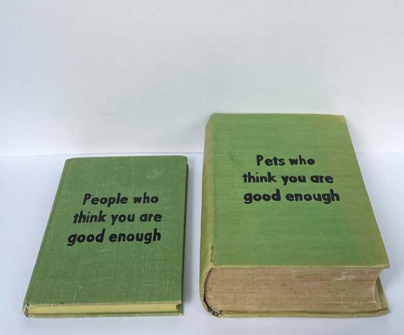
I write and illustrate on canvases, books and different objects using a brush or a tusch.
For me Yves Klein’s photograph “Leap Into The Void” beautifully illustrates the faith that is required when creating something honest and showing it to the world.
Claes Oldenburg
WHO WHERE WHY
Odibo Odiabhehor Joseph
Lagos , Nigeria
I get my inspiration from my environment capturing people (mostly people of African descent), their thoughts and emotions. I assume art is sort of a unique universe of its own. Hence, the portraits of my works give the viewer a sense of stare or look-back, even from different angles. It also gives the viewer a sense of looking back at themselves, imagining that we too are works of art or possibly in a simulation.

I would not categorically place my works under any method or style, except I paint according to my mood... And I use my art as a channel to express myself. I use mostly charcoals and acrylics.
Whenever I realize that my art has positive effect on people, and sometimes when they show their appreciation
Kehinde Wiley
HOW WHEN WHO 2.0


 Courtesy of Daniel Kreiger ©


 Courtesy of Daniel Kreiger ©


 Courtesy of Fanny Brodar ©

 Courtesy of Daniel Kreiger ©


 Courtesy of Daniel Kreiger ©


 David, 2022 Ninpha, 2022
Amore e Psiche, 2022


 Courtesy of Daniel Kreiger ©


 Courtesy of Dylan Martinez ©


 Courtesy of Jean-Paul Donadini ©


 Courtesy of Jean-Paul Donadini ©


 Cosmic Cowboy London


