
VOLUME ONE
guyhepner.com guyhepnereditions.com +1 (212) 226 8680 info@guyhepner.com @guyhepner @guyhepnereditions
521 W 26th Street Fifth Floor New York, NY 10001

Open to the public 10am - 5pm Monday through Friday Saturday by appointment CONTACT US
 © 2022 The Andy Warhol Foundation for the Visual Arts, Inc. / Licensed by Artists Rights Society (ARS), New York
ANDY WARHOL
More than twenty years after his death, Andy Warhol remains one of the most influential figures in contemporary art and culture. Warhol’s life and work inspire creative thinkers worldwide thanks to his enduring imagery, his artfully cultivated celebrity, and the ongoing research of dedicated scholars. His impact as an artist is far deeper and greater than his one prescient observation that “everyone will be world-famous for fifteen minutes.”
His omnivorous curiosity resulted in an enormous body of work that spanned every available medium and most importantly contributed to the collapse of boundaries between high and low culture.
A skilled social networker, Warhol parlayed his fame, one connection at a time, to the status of a globally recognized brand. Decades before widespread reliance on portable media devices, he documented his daily activities and interactions on his traveling audio tape recorder and beloved Minox 35EL camera. Predating the hyperpersonal outlets now provided online, Warhol captured life’s every minute detail in all its messy, ordinary glamour and broadcast it through his work to a wide and receptive audience.
2
DEATH & DISASTER
BY ANDY WARHOL
Andy Warhol was a product of the very American art he produced. He was part of everything great, as well as societal woes across race, riots, death, drugs and suicide. Having an attitude against American life placed Warhol above it because he was all-knowing, yet simultaneously, he was
able to enjoy the life he made for himself. Because his life was so much of an open secret, he was able to operate underneath a mask and reflect exactly who he wanted to present to the world, constantly transforming and perfecting his image.
3
© 2022 The Andy Warhol Foundation for the Visual Arts, Inc. / Licensed by Artists Rights Society (ARS), New York
Through his art, he was able to formulate his fantasies, fears and shame, exploring the dark corners of life that he did not as yet have the courage to explore himself. In a way, we can all identify on some level with this dynamic. His art pushed pushed the culture forward at the same time that it was being created.
Focusing less on Warhol’s graphic reproduction of Campbell’s Soup Cans, the exhibition of Death and Disaster works suggests a more spiritual sentiment. In this scenario, the act of painting and screen printing worked as a meditation on life and the afterlife. The impact of Andrew Warhola’s private life included the influence of his mother, Julia Warhola, who was obsessed with death, misfortune, and being shot. This would eventually shape the vast career of Andy Warhol the artist.
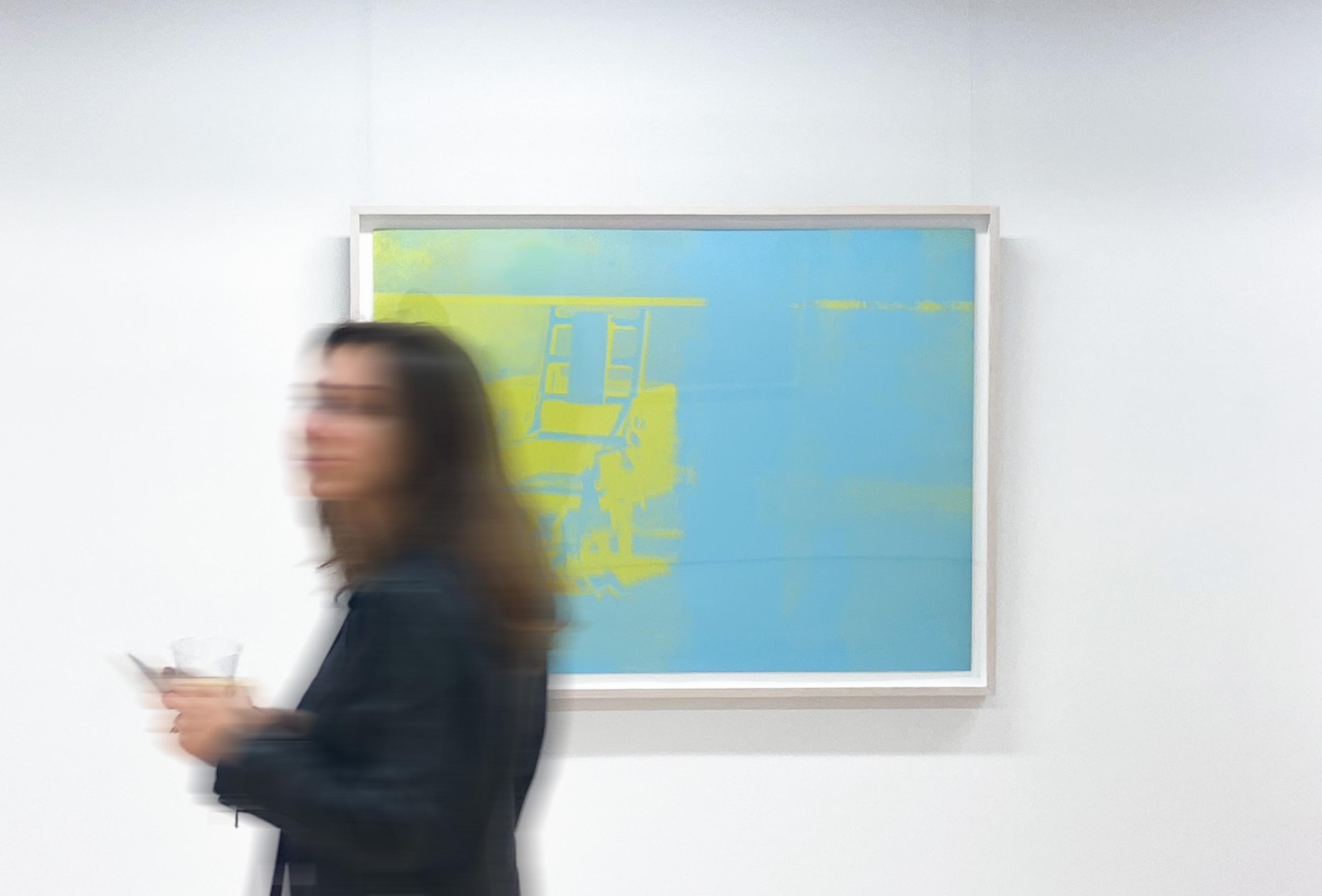
Memento mori, or images preoccupied with concepts of death, appeared throughout Warhol’s body of work. From his Death and Disaster period, he produced the Electric Chair for a show in 1970, along with numerous images taken from magazines showing suicides, car crashes, and other tragedies. The idea that mass media dramatized and popularized tragedy was of great interest to Warhol. While his most famous works, such as his Campbell’s Soup Cans and celebrity portraits of Marilyn and Jackie, betray a fascination with the glorification of American pop culture objects, death would be of increasing concern to Warhol. His premonition almost came true in 1968 when Warhol was shot three times and nearly killed by Factory follower Valarie Solanas, who accused Warhol of stealing ideas from a script she had presented to

4
New York
© 2022 The Andy Warhol Foundation for the Visual Arts, Inc. / Licensed by Artists Rights Society (ARS),


him. Initially declared dead, paramedics were able to revive Warhol, who then began a long and slow recovery.
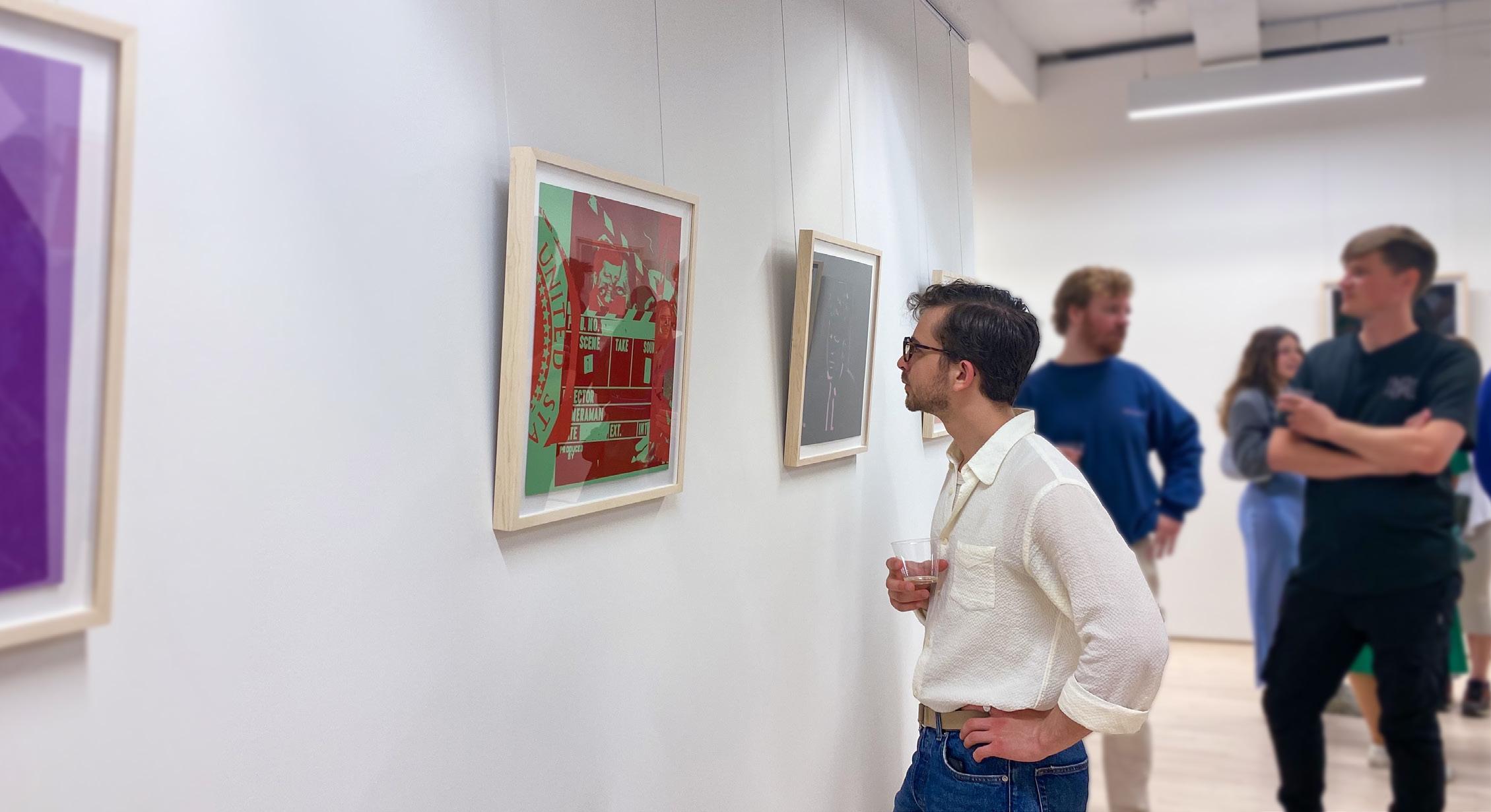
Warhol created The Flash Portfolio in 1968 to depict the continuing media spectacle surrounding President John F. Kennedy’s assassination in 1963. The portfolio contains eleven screen prints based on campaign posters, mass media photographs and advertisements. The cover reproduces the front page of the New York World Telegram from the day of Kennedy’s assassination. Each screen print is accompanied by Teletype reports selected by Phillip Greer that provide a direct media narrative for Warhol’s images. The sequence of the portfolio and its relation to the Teletype text is unknown;
it is truly a meditation on the passage of time and death. Warhol’s use of text underlines the notion that our collective understanding of the images is a result of a media construction and not our own personal emotional response.
Full of mystery and contradiction, Warhol’s life may appear as a riddle. Capable of great tenderness and kindness, it is said that he could also be unspeakably and manipulative. Wracked with self loathing and insecurity, he simultaneously possessed extraordinary determination and quiet confidence in his own abilities. During his storied career, Andy Warhol was labeled a zealot, genius, fraud, visionary, voyeur, cultural vampire and the voice of a generation. An honest
10
© 2022 The Andy Warhol Foundation for the Visual Arts, Inc. / Licensed by Artists Rights Society (ARS), New York
appraisal of his life would offer evidence to support any or all of these assertions. Regardless of one’s own personal opinion of the man and his work, his impact on the world and more specifically on art itself, is undeniable. The passion he was able to elicit from detractors and fans alike is unlike anything the art world has seen before or since. Warhol’s audacious approach utterly defied convention and tradition. Through his choice of subject matter, use of repetition, and methods of mass production, he was able to remove all preciousness and self-seriousness from his work. In doing so, he single handedly reframed the existing paradigm of what constituted art. But it was his innate ability to recognize the right idea at the right time that was perhaps Warhol’s greatest gift. It was this gift that made him a conceptual artist without peer.
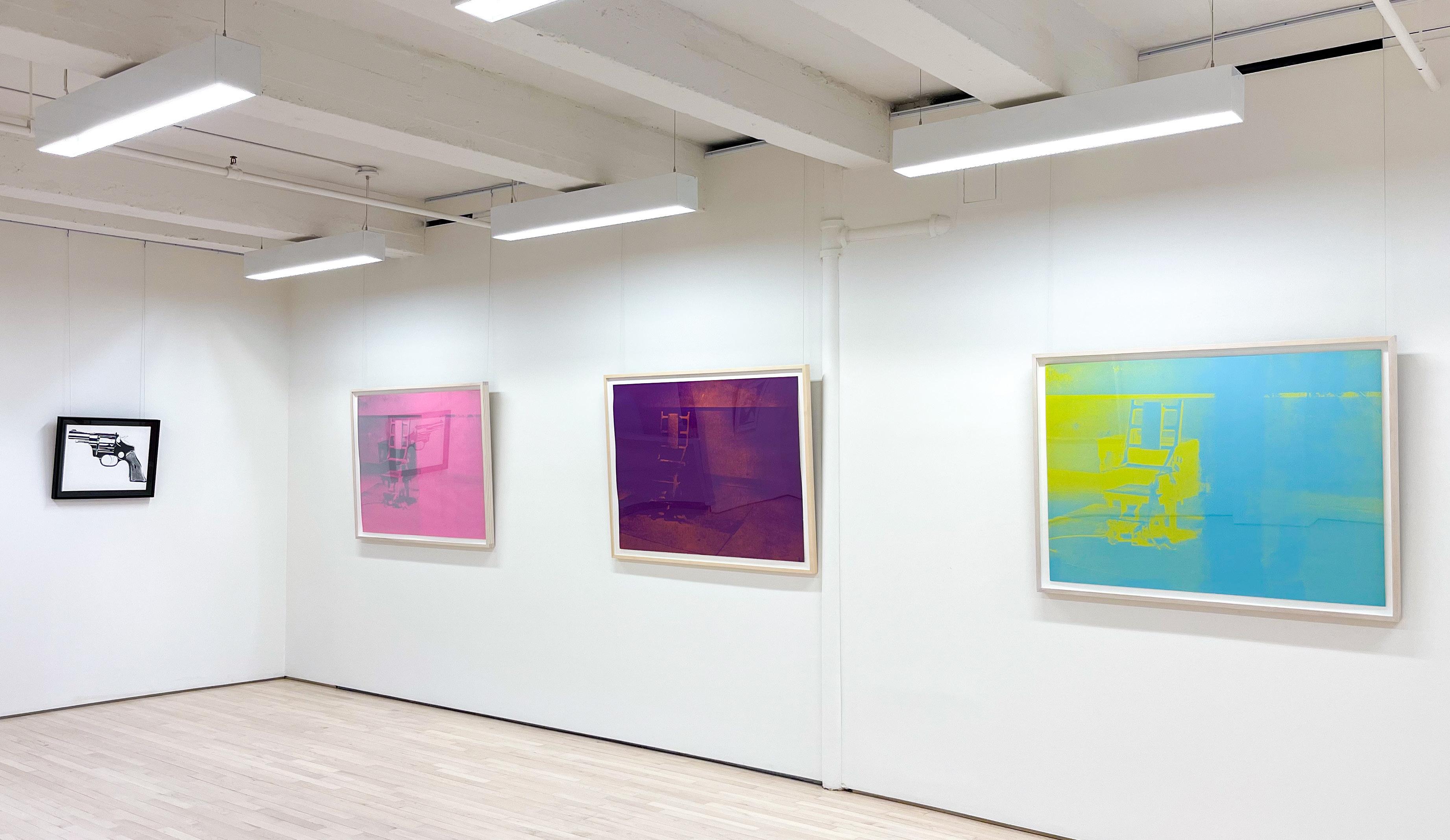
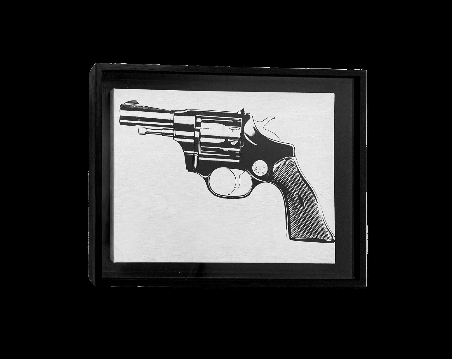
11 Gun, 1982-83 Screenprint on canvas 36 x 23 inches Unique
the Visual Arts, Inc. / Licensed by Artists Rights Society (ARS), New York
© 2022 The Andy Warhol Foundation for the Visual Arts, Inc. / Licensed by Artists Rights Society (ARS), New York ©
2022 The Andy Warhol Foundation for
SOUP CANS
BY ANDY WARHOL
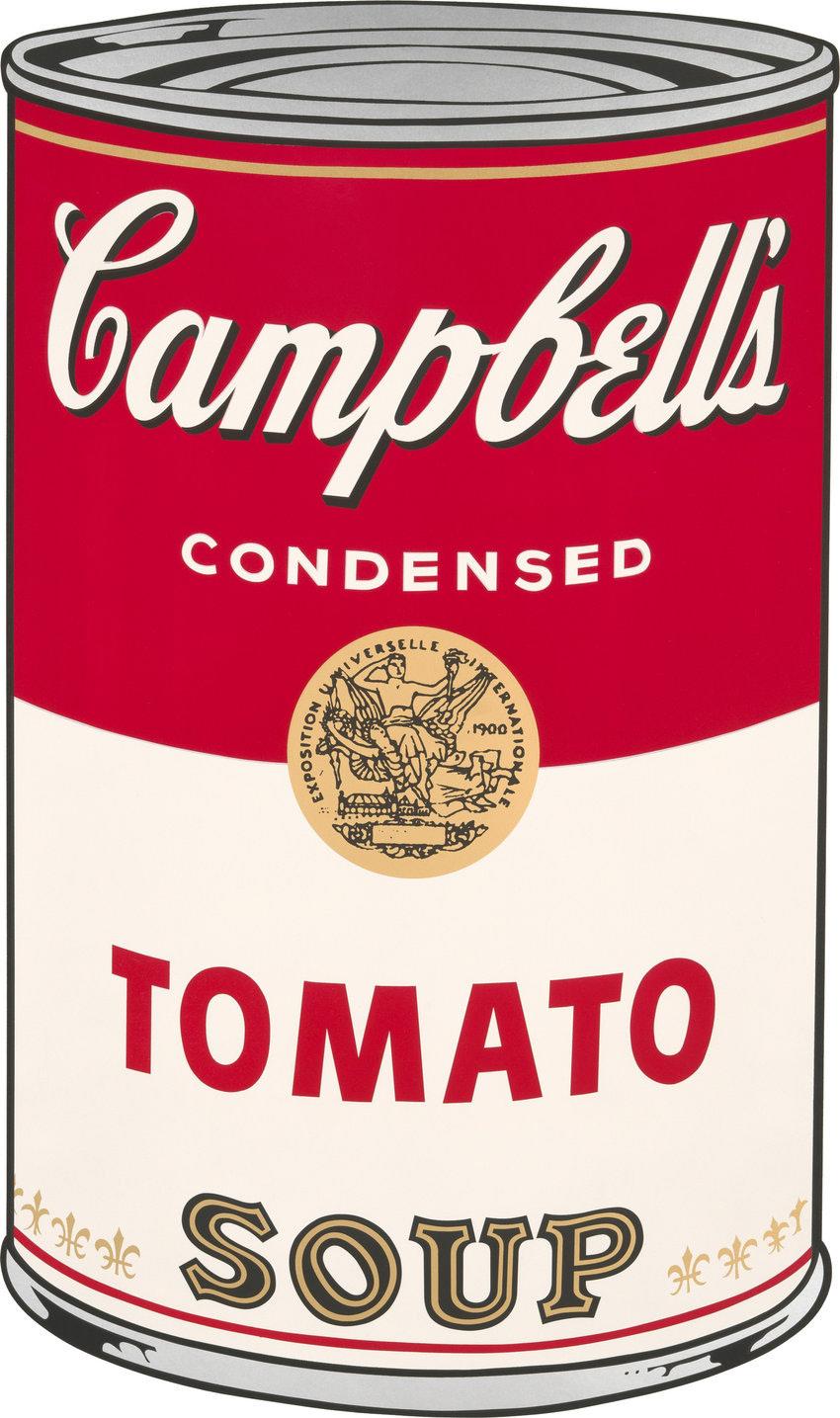
Warhol’s Soup Can Series I and II blurs the distinction between art and utilitarian objects.
12
© 2022 The Andy Warhol Foundation for the Visual Arts, Inc. / Licensed by Artists Rights Society (ARS), New York
Andy Warhol’s career often focused on the hype within culture of a celebrity or item. While the Campbell’s Soup Can creations seem to drift completely from his typical imagery; to Warhol it symbolized the same commentary on society’s obsessions. Warhol remembers eating the same Campbell’s soup for years – with the only difference being the flavor. He said, “I used to drink it. I used to have the same lunch every day, for 20 years, I guess, the same thing over and over again.”
He took this mundane action, and reproduced the image of the soup can many times, painting them exactly identical, except for the flavor. He shared a message beyond recreating one of his most eaten foods – he was showing how society is so used to making the same messages, advertisements, and products, but creating each new one with only slight variation.
When asked about the impulse to paint Campbell’s soup cans, Warhol replied,
“I wanted to paint nothing. I was looking for something that was the essence of nothing, and that was it.” Warhol had the magic of taking something meaningless and transforming it into something highly coveted.
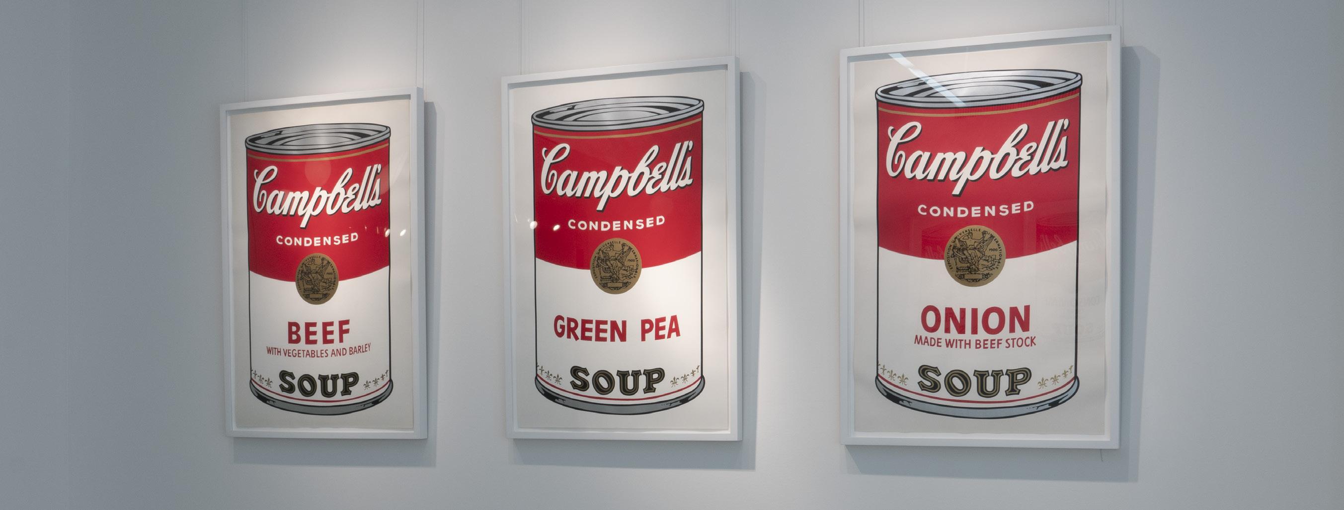
When he first released the Soup Can collection, he placed them in long horizontal rows, mimicking the displays of supermarkets. An ongoing theme throughout this collection is uniformity and simplicity. Warhol wanted to mirror the streamlined efficiency to which America was adapting at that time.
Throughout Warhol’s career, he always found his way back to the soup cans, taking his first creation of rows and readapting it into multiple forms. While he mostly depicted the cans in pristine condition, from time to time he would create a torn or tarnished can. Campbell’s Soup even created a special edition of colorful soup cans to commemorate the 50th anniversary of the influential artwork.
13
© 2022 The Andy Warhol Foundation for the Visual Arts, Inc. / Licensed by Artists Rights Society (ARS), New York

© 2022 The Andy Warhol Foundation for the Visual Arts, Inc. / Licensed by Artists Rights Society (ARS), New York

Cheddar Cheese F.S. II 63, 1968 Screenprint 36 x 23 inches Edition of 250, plus 26 lettered AP 15 © 2022 The Andy Warhol Foundation for the Visual Arts, Inc. / Licensed by Artists Rights Society (ARS), New York
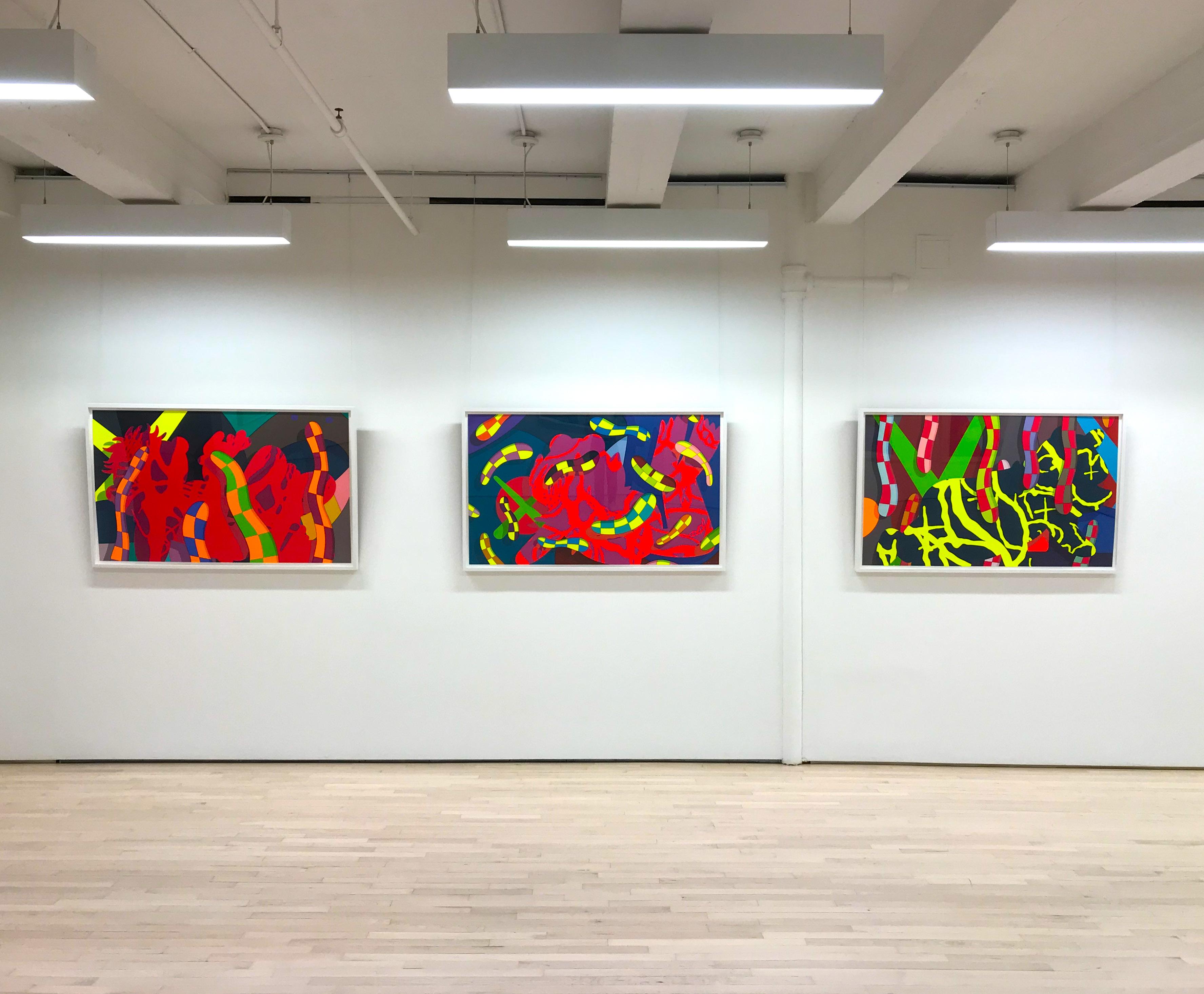
KAWS
Brian Donnelly, best known as KAWS, is a New York-based artist who has made a name for himself designing limited edition toys and clothing. He is now a world-renowned artist who exhibits in museums and galleries internationally. His art straddles the line between fine art and global commerce. KAWS moved beyond the sphere of the exclusive art market to occupy a more complex, global one.
Brian Donnelly was born in 1974 in Jersey City, New Jersey. He graduated from the School of Visual Arts in New York where he obtained a Bachelor of Fine Arts in illustration. After graduating from college in 1996, Brian Donnelly worked for Disney as a freelance animator. At Disney, Brian Donnelly had the opportunity to paint backgrounds and contributed to films such as 101 Dalmatians, Daria, and Doug.
While living in Jersey City, KAWS began his career as a graffiti artist. By the early 1990s, he had moved to New York City and was making a name for himself by
subverting the images on bus shelters, phone booth advertisements, and billboards across the city. His popularity reached unexpected heights never seen before and these ads became increasingly sought after by the public.
In the late 1990s, KAWS had an opportunity to design and produce limited edition vinyl toys. These toys instantly became a hit with the global art toycollecting community. KAWS’ toys were a major hit, especially in Japan, where this genre of toys became well-respected and widespread.
Most recently KAWS designed toys and clothing for well-known companies such as Original Fake, A Bathing Ape, Undercover, Kung Faux, Nike, Vans, and Comme des Garcons . In the early 2000s, he also reworked many familiar television and cartoon icons such as characters from The Simpsons, Mickey Mouse, the Michelin Man, the Smurfs, and even SpongeBob SquarePants.
16
He has also been highly praised for his work on acrylic paintings and large sculptures. One of the more popular KAWS sculpture is a gray scale figure based on Mickey Mouse, whose face is obscured by both his hands. This image was incorporated into a balloon for the 2012 Macy’s Thanksgiving Day Parade. In 2013, KAWS’s company redesigned MTV’s moon man statue for their 2013 MTV Video Music Awards.
KAWS’ museum exhibitions include solo shows at the Pennsylvania Academy of Fine Arts, High Museum of Art, Modern Art Museum, and the Aldrich Contemporary Art Museum. Other international galleries include Galerie Perrotin and Honor Fraser Gallery. His work has been seen in Paris, London, Berlin, and Tokyo.
KAWS currently lives and works in Brooklyn, New York.
17
MAN’S BEST FRIEND
BY KAWS
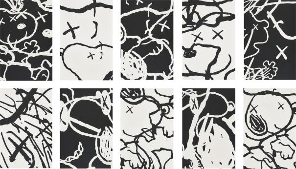
Man’s Best Friend is a ten-panel series featuring characters from the Peanuts comic.
KAWS references popular media in many of his works. Past cartoons to appear include Sesame Street, Mickey Mouse, and the Simpsons. One recurring character is Snoopy – the beloved dog from the Peanuts comic. His love for this cartoon spurred multiple collaborations with the series.
18
Beyond the nostalgic aspect, KAWS describes his affinity for the Peanuts as an artistic one. He explains, “I’m into Schulz as an artist, a company, and an icon; I got into his stuff just because I liked the looseness of the line work, and I thought that it was just sort of a nice thing to bring into my paintings, even if it’s abstract and unidentifiable.” He expresses appreciation for the loose line work in Schulz’s style as a contrast to his own meticulous and slow approach.
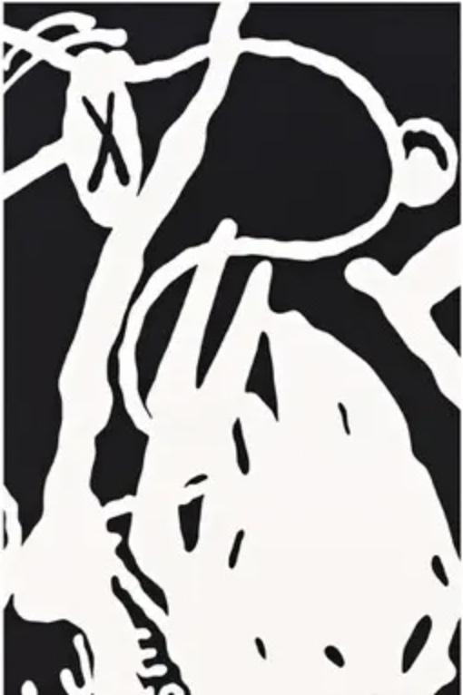
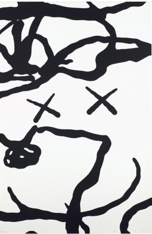
Man’s Best Friend is a nod to the Abstract Expressionism of the 1950s that prominently features the beloved cartoon dog. Snoopy, adorned with KAWS’ “X” eyes, is deconstructed across 10 panels. Each one offers a suggestion of Snoopy’s face or body that is then cloned and distorted. Looking closely, one can see a glimpse of Charlie Brown and Woodstock peaking through the chaos.
19
Man’s Best Friend 4, 2016
Man’s Best Friend 9, 2016
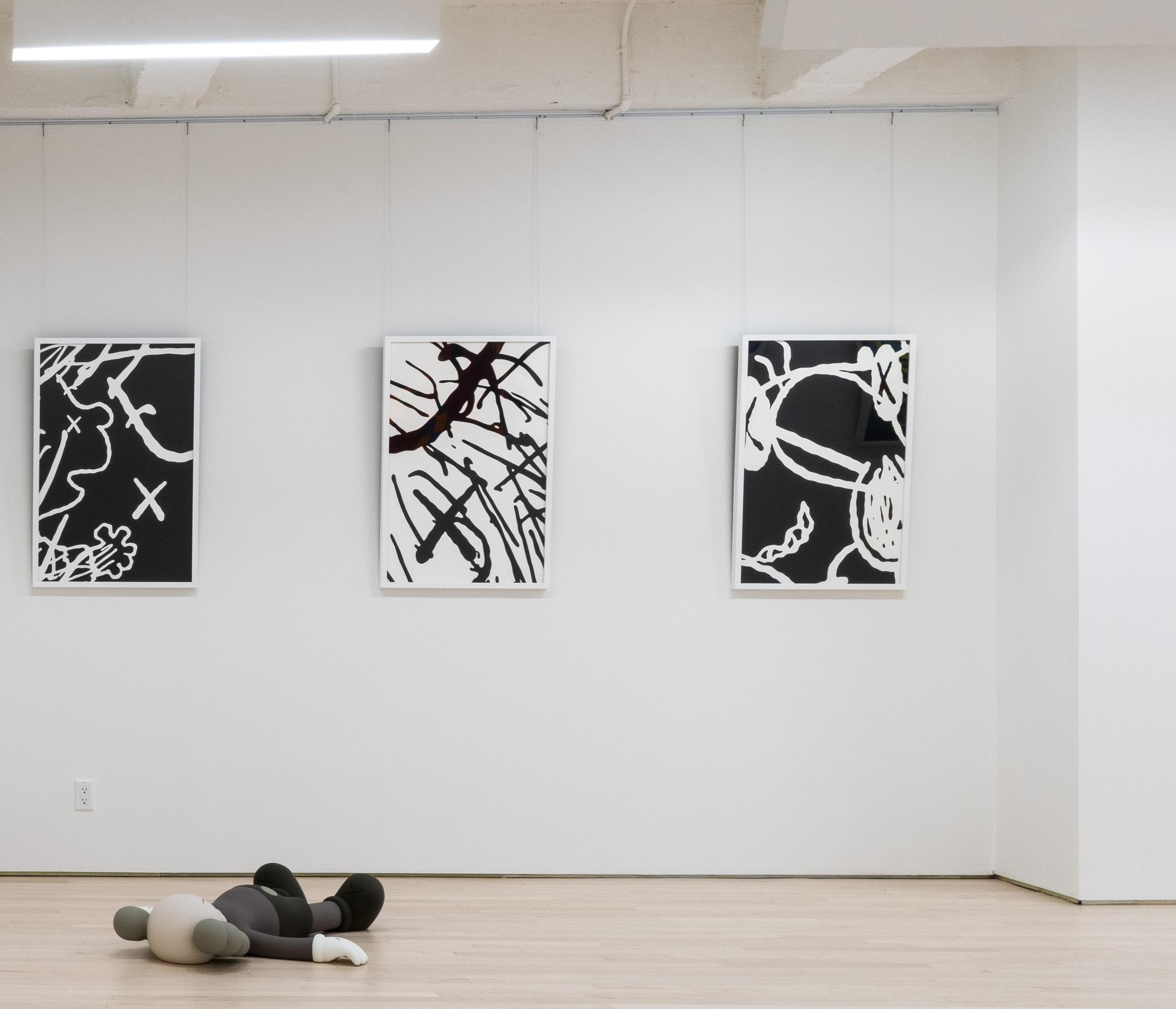
Best Friend 5-10
2016 Holiday 1, 2020
Man’s
,
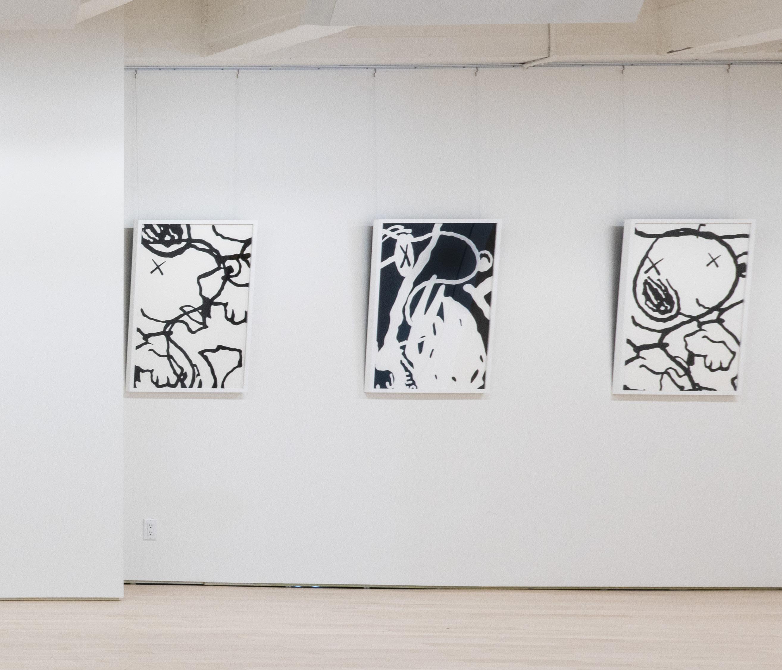
HOLIDAY
BY KAWS
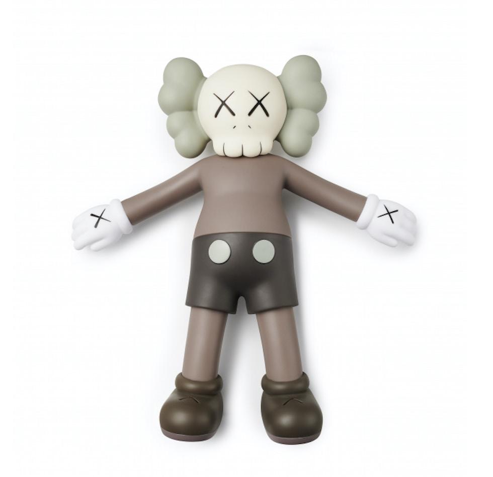
Holiday, 2020
Aluminum, paint and ceramic 7.5 x 36.3 x 33.9 inches Edition of 10 + 2 APs
22
Holiday is a series of sculptures featuring KAWS’ companion and notable “X” eye motif

KAWS’ Holiday is a series of four porcelain sculptures featuring the artists’ signature “companion” character in a variety of poses. Each sculpture measures approximately three feet and features KAWS’ companion in a variety of poses. In Holiday 1, we see the figure lying
directly on its back with its arms and legs outstretched.
KAWS also transformed the Holiday figures into a moving exhibition around the world from 2019 - 2021. The companions traveled as 40-foot hot-air sculptures to exotic destinations such as campgrounds, harbors, and even outerspace. The Holiday tour aimed to bring the pieces to different populations and give the public an opportunity to get a first-hand art experience, particularly during a time when travel was limited.
23
BANKSY
Arguably the most controversial street artist in the world, vandal and political activist, Banksy has advanced an entire art subculture devoted to his works. His identity remains unknown and anonymous, even after over 20 years of being involved with the graffiti scene. Banksy’s satirical artwork consists of several influential and often controversial images brimming with dark humor, executed with his distinctive stenciling technique. Banksy’s artwork has been displayed and conceived all over the world on streets, walls, and bridges in countries such as Australia, England, the United States, Israel, Jamaica, and even Canada. Recently, he spent an entire month glamorizing New York City with his street art, which captured the attention of thousands every day. Some of his most famous works include “Rage the Flower Thrower”(2005) and “Kissing Coppers” (2004).
Banksy’s work grew out of the Bristol underground scene as he played a part in the Bristol graffiti crew named DryBreadZ. Soon after, he began to partner with Inkie, another notable Graffiti street artist. By the age of 18, he began to develop stencils
after nearly being caught by the police. He discovered that stencils were a faster and more efficient tool for street art. His stencils illustrate humorous and striking images that are occasionally combined with slogans or catchphrases in order to convey a particular message. The concepts behind his artworks are frequently political, relating to messages of anti-war, anticapitalism and anti-establishment, with the subjects often being rats, policemen, soldiers, children, and the elderly. The most common form of Banksy street art, prints, and paintings that are for sale are the stencils. These are often in the form of multi-layered stencils and/or combined with other media sources, such as spraypaint.
The notion of the “Banksy Effect” has been developed as a result of Banksy’s artistic innovation, and it alludes to the artist’s ability to turn outsider art into the cultural mainstream. Due to the fact that graffiti still remains illegal, his work continues to raise critical questions in the social sphere about the lines and boundaries between public art and vandalism.
25
Girl With Balloon (Unsigned), 2004 Screenprint
27.5 x 19.75 inches

26
GIRL WITH BALLOON
BY BANKSY
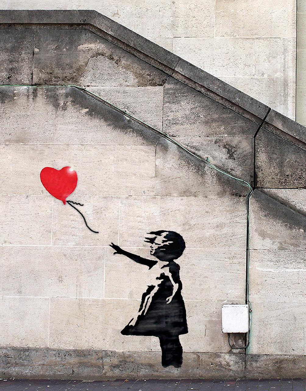
One of Banksy’s best-known works, Girl With Balloon has become a popular symbol of innocence and hope
Banksy’s Girl With A Balloon is one of his most recognizable works. With two simple shapes, one burst of red, and a short faded statement, “There is always hope.” Banksy is able to leave an impressionable mark on viewers of this artwork.
The little girl is painted in black and white, with little detail, making her a universal subject matter. Her heart shaped balloon pops brightly, signifying hope. Here, Banksy creates a metaphor that can resonate with almost anyone who is struggling or has struggled. When everything appears to be black and white, there is always a glimmer of hope pushing you through. Children have a sense of excitement that often fades with time, but here Banksy reminds everyone to hold onto that innocence that can often lead to imagination.
This imagery was first spotted in 2002, in London’s West Bank, stenciled atop a washed up wall that many pedestrians passed by daily. What makes this particular graffiti so eye catching and memorable
is its ability to speak a message in mere seconds. Even without reading the words that are faintly painted to the side of the image, there is a clear motif of hope.
Although this image is simple, Banksy does leave a fair amount up to interpretation. The girl can be viewed as either losing the balloon or reaching for it. In the interpretation that she has lost grasp of the balloon, the loss would symbolize that the girl is losing her innocence. In the opposite interpretation, one could recognize that children always think bigeven if it means grasping onto something that is out of reach. Likely, Banksy created this dual interpretation intentionally to evoke the viewer’s personal view on hope.
While all of Banksy’s creations share a bold message, this one in particular has left such an impression on society because of how universal it is. He captures a feeling that everyone has experienced at some point, and reminds people that there is always hope.
27
CHOOSE YOUR WEAPON
BY BANKSY
In Choose Your Weapon, Banksy uses Keith Haring’s “Barking Dog” icon to speak to the political power of art

28
Banksy’s Choose Your Weapon first appeared in London’s Southwark District. The artwork is known as one of his more mysterious works. The dog in this piece pays tribute to Keith Haring’s iconic “Barking Dog,” appearing in an all white silhouette. The dog’s walker wears a hooded sweatshirt with a bandana disguise, possibly representing disgruntled youth which features prominently in British pop culture.
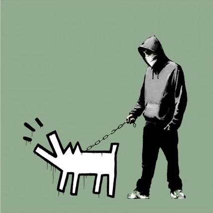
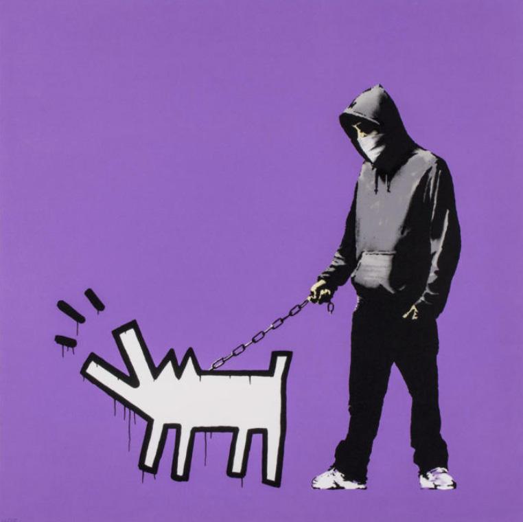
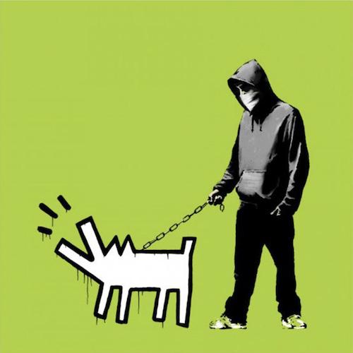
The stark contrast between the man and his dog is the most striking contradiction in this art piece. The dog is held by a chain, becoming the young man’s weapon. Rather than a weapon such as a knife or firearm, this young man’s weapon is “man’s best friend”, which is portrayed minimally and in dramatic disparity to the painting technique used on the young man. For Banksy, his weapon is his street art.
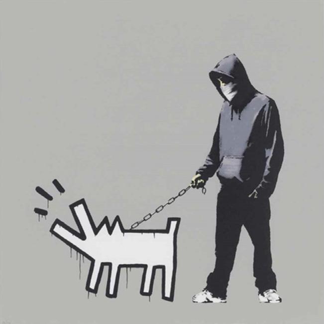
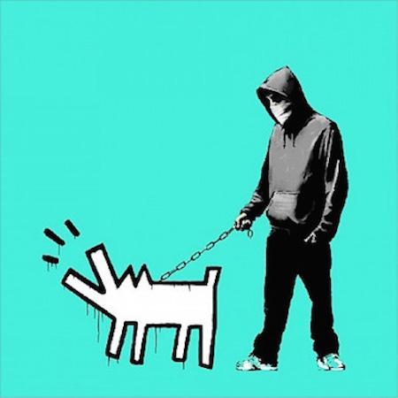
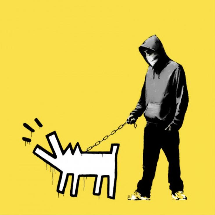


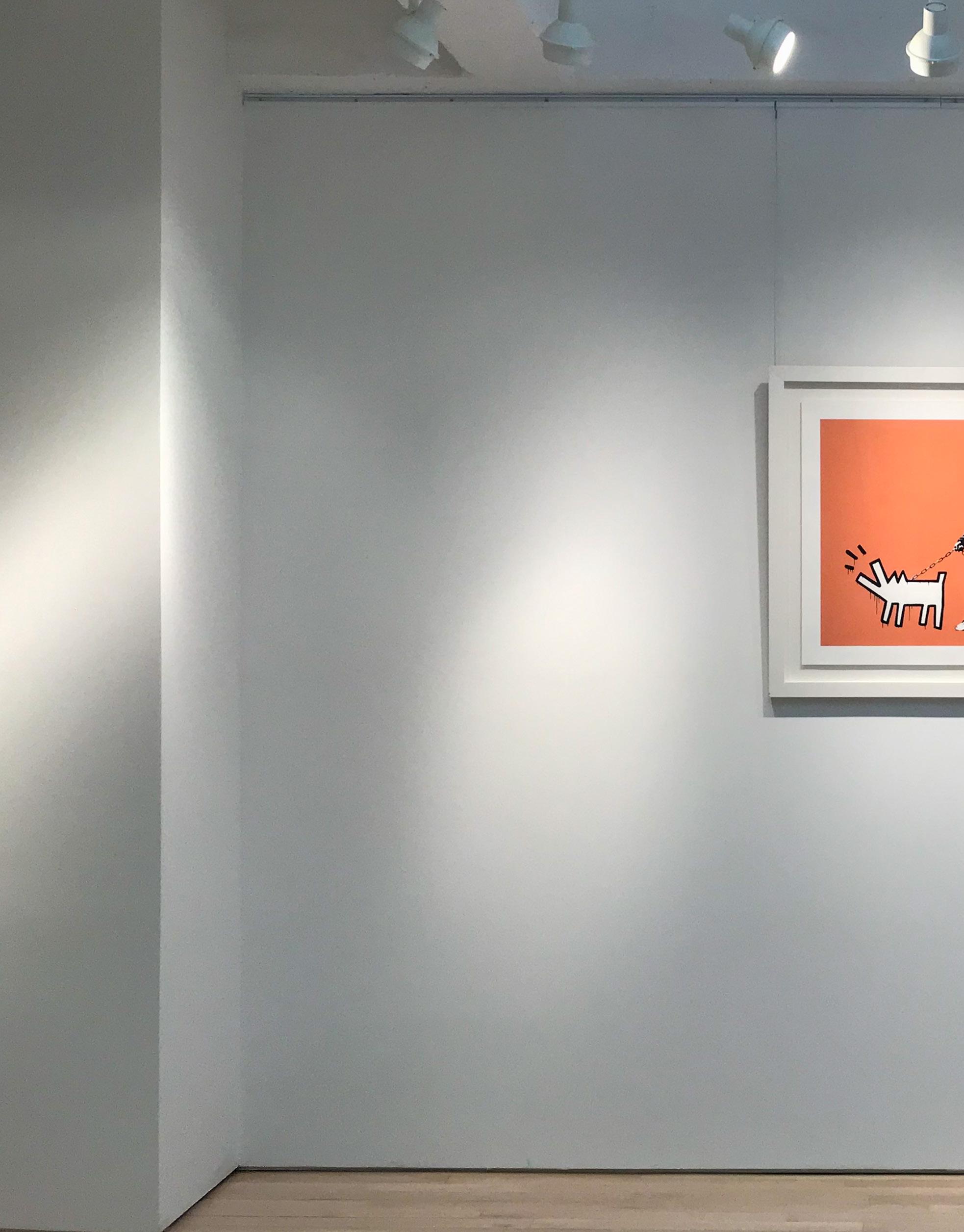
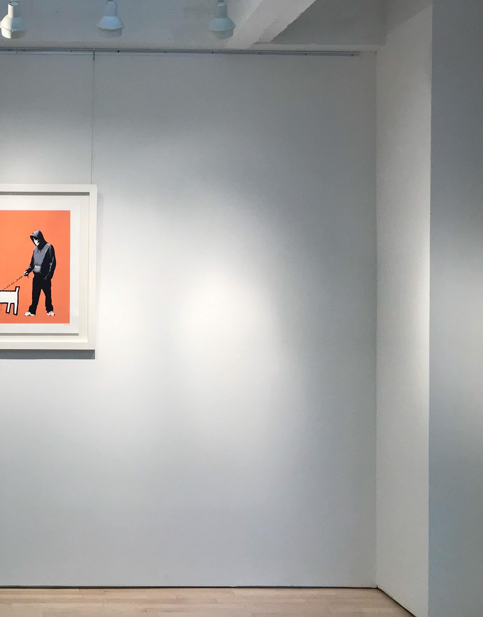
Choose Your Weapon (Dark Orange), 2010 Screenprint 27.5 x 27.5 inches Edition of 25

32
22
Stop and Search, 2007 Screenprint 30 x
inches Edition of 500
STOP AND SEARCH
BY BANKSY
An officer in uniform appears to be conducting a search through Dorothy’s basket and appears to have found something. Toto, her loyal companion, looks up in confusion. The image is done in Banksy’s typical black stenciling, however he adds a pop of blue with the officer’s latex gloves.
Banksy chose Dorothy to be stopped for inspection for a specific reason. In the story of The Wizard of Oz, all her character is trying to do is get home. Played by Judy Garland in the 1939 film, Dorothy is known for her wholesome nature and naivety. Her catchphrase, “There’s no place like home.” only furthers her childlike innocence.
The stop and search policy itself warrants an officer to conduct a search of any individual without prior cause or proof of misconduct. The “sus” law (as in suspected person) was introduced originally in the UK in 1824 as part of the Vagrancy Act. Since then, stop and search policies have become some of the most controversial practices by law enforcement, leading to higher numbers of profiling and growing concerns of a rising police state. Since Banksy first released Stop and Search in 2007, stop and search policies have begun to be reduced and revoked around the globe.
33
In “Stop and Search,” an officer stops Dorothy on her way home for an impromptu inspection
BY BANKSY
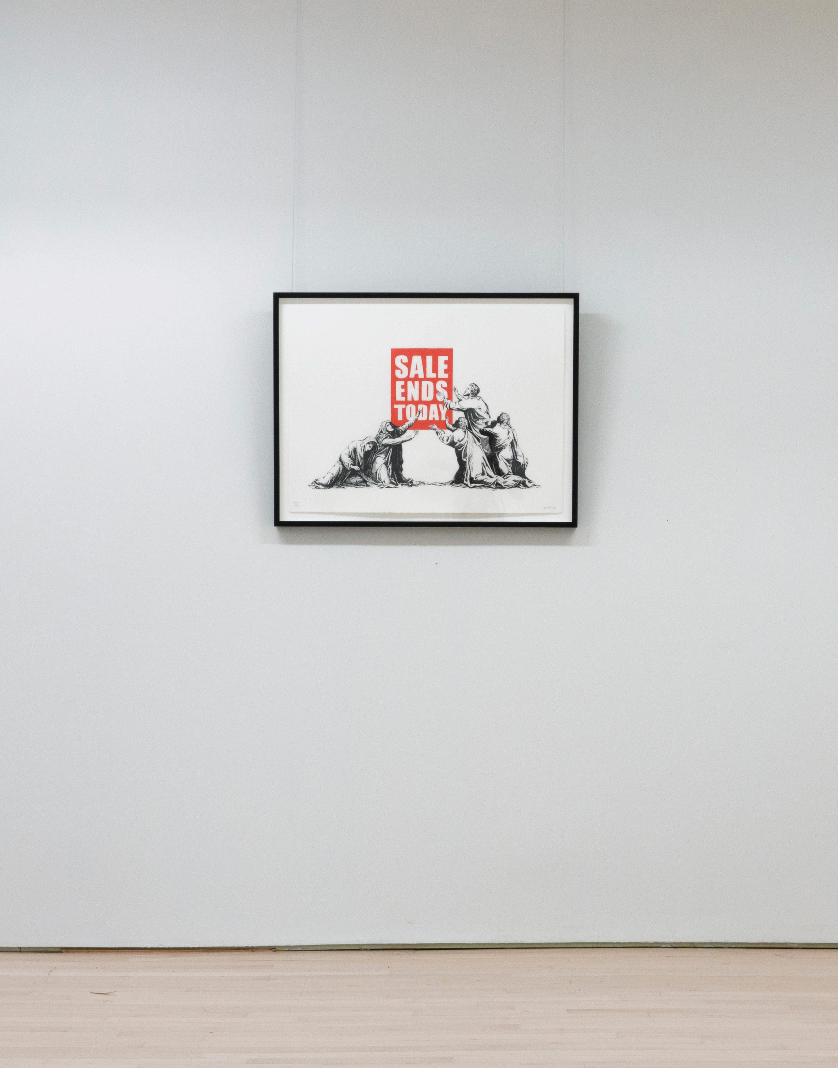
SALE ENDS TODAY
34 Sale Ends Today, 2007 Screenprint 22 x 30 inches Edition of 500
Banksy is known to critique consumerism and capitalist culture. In Sale Ends Today, he does so in his classic irreverent humor. The piece compares religious devotion to the new culture of consumption that he suggests has taken its place.
Created in 2006, Banksy portrays devout followers in Old Masterly style. The men and women resemble Catholic or Christian subjects as they have been portrayed throughout history, complete with veils and robes. However, where Christ would usually be getting worshiped, a retail advertisement sits instead. Banksy cleverly places urgency in salvation with the sign that reads, “Sales Ends Today”. A sale closing raises comparison to Jesus’ crucifixion, from the lamenting followers
kneeling on the ground to their extended arms in worship
In Friedrich Nietzsche’s famed quote, he states, “God is dead…And we have killed him.” He continues, asking, “What sacred games shall we have to invent?” Banksy’s composition provides an answer to the question. Material and luxury gains have become a source of passion, conflict, and hope for modern society. In this way, Banksy suggests that religion and systems of belief have not been lost, but rather replaced. Products have taken on the role of answering prayers and changing lives. At the same time, this has come at the cost of many people’s lives and well-being.
In typical Banksy fashion, the print itself was released during Picture On Wall’s closing sale in 2017 after announcing they were being taken over by “venture anticapitalists.” A select few of the remaining print editions were released, as well as 400 prints of Sale Ends which were a reworking of the original 2006 version.

Sale
Today
Released once in 2006 and again in 2017, Sale Ends Today replaces divine imagery with a retail sign
Ends
, 2006


VOLUME ONE


to the public 10am
5pm Monday through Friday Saturday by appointment
images copyright of the artists guyhepner.com guyhepnereditons.com +1
8680 info@guyhepner.com @guyhepner @guyhepnereditions
Kristin
28-35) CONTACT US
521 W 26th Street Fifth Floor New York, NY 10001 Open
-
All
(212) 226
Cover:
Moore (p.
1
ADAM HANDLER
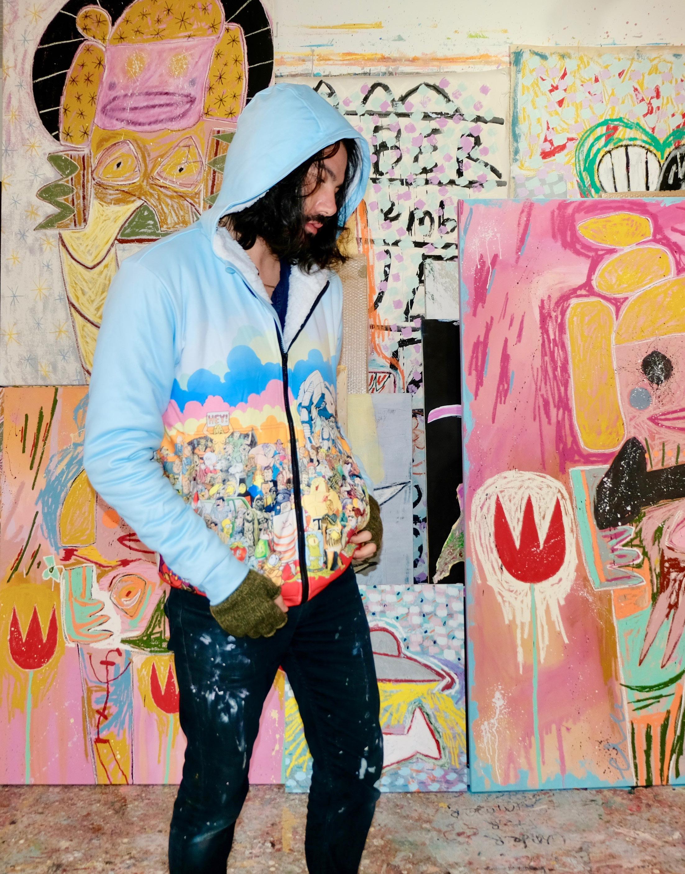
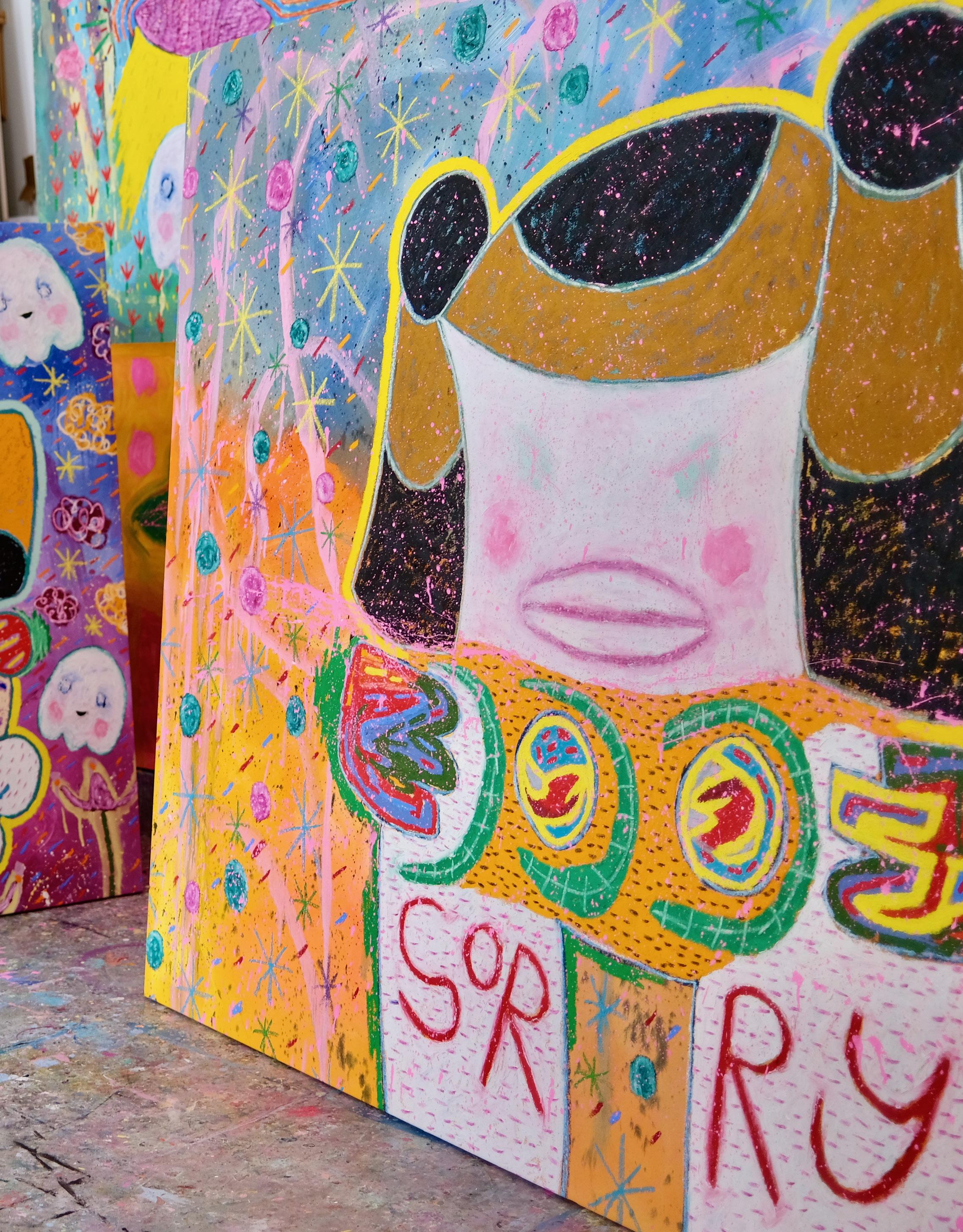
Adam Handler was born in Queens, NY and grew up on Long Island. As a young child and adolescent, he spent countless hours at his grandparents’ framing factory in New York City. There, his passion for the arts grew and it became inevitable that he too would discover the many possibilities of art.
Using acrylic paint, oil stick, pencil, and markers, Handler’s child-like and passionate drawing technique produces distinctive outlined characters which almost appear flat, with little to no depth of field. The backgrounds of his works are highly detailed, but rough, vigorously drawn with scratches and markings that appear to spill over the edge of the canvas, conveying a hurried and improvised feeling. Willem De Kooning’s works provided Handler with an “ah-ha” moment: a figure does not have to look like a figure, but can rather reflect the qualities of one. Handler’s large-scale imaginative figures connect viewers to a feeling of warm nostalgia, or even a sensememory from days long ago.

3
GHOST POEMS
A SOLO EXHIBITION BY ADAM HANDLER
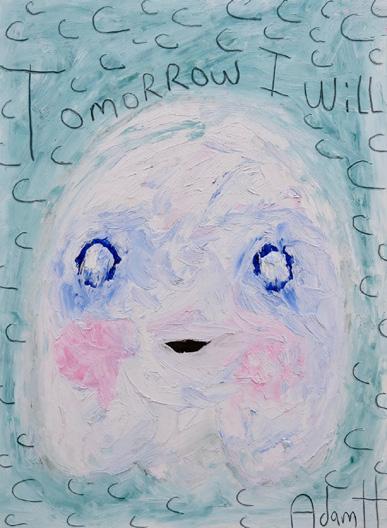
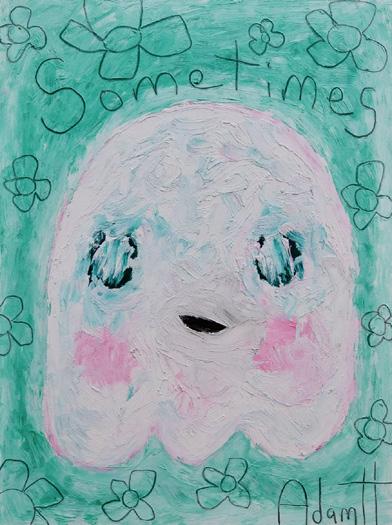
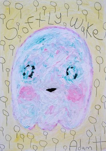
Ghost Poems features Handler’s usual characters with the introduction of new text and storylines
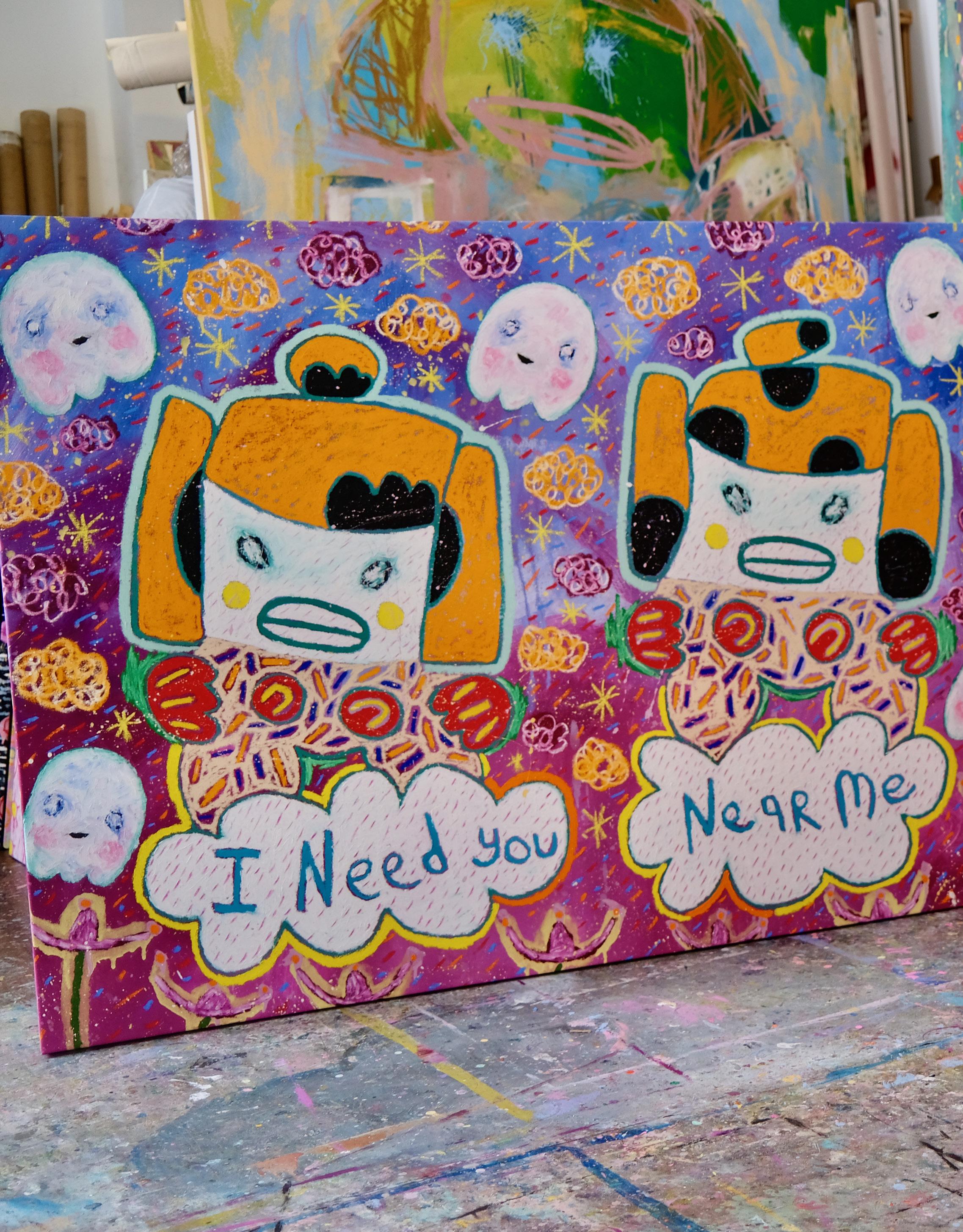
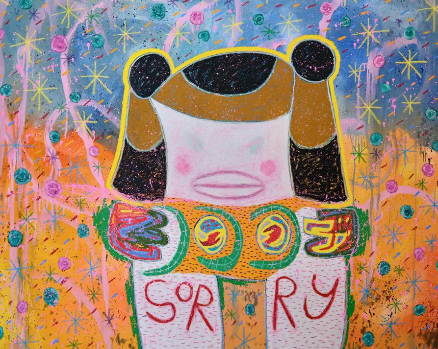
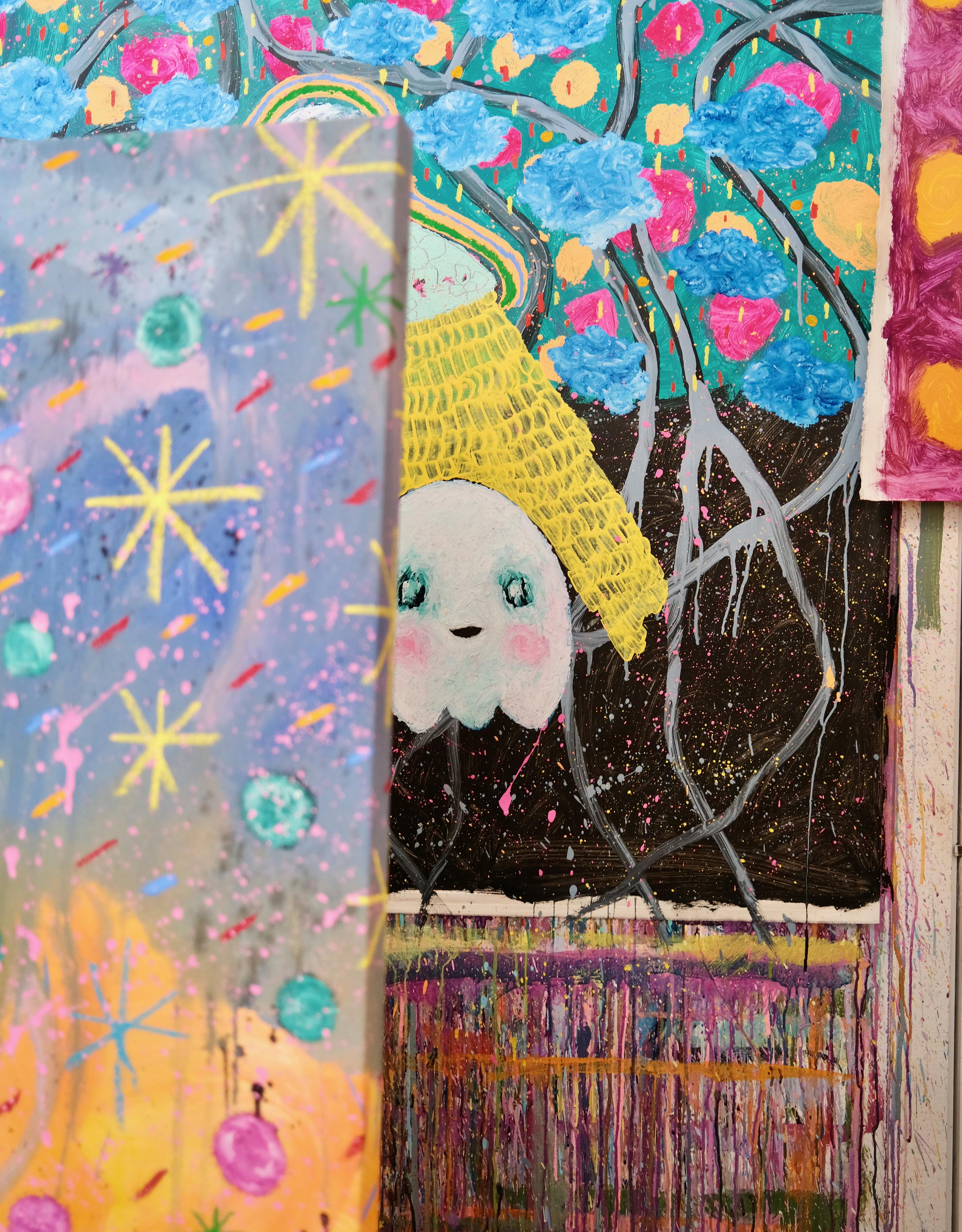
Adam Handler’s paintings are primitive by design. He cites one of his main motivators is to paint something his son admires and would be proud of. The playful scenes and rudimentary style make each painting feel approachable and nostalgic of childhood. The ghosts themselves are suggestive of characters from retro video games such as Pacman or Super Mario. Handler explains, “I want people to feel happy, to feel comforted, to put a smile on their face.”
The 15 works on canvas serve as an introduction into Hander’s world, with UFO abductions, monster takedowns, and apologetic aliens. Handler keeps the scenes optimistic with vivid colors and the comforting presence of his ghosts. While everyone may be familiar with
ghost stories, Ghost Poems shows the apparitions in a different light. His ghost paintings and 40 works on paper gives each character their own unique backdrop and endearing message. With the use of text, Handler creates an intimate experience for the viewer and allows them to form their own relationship with the pieces. Ghosts become more human and Handler’s cosmic universe feels that much closer to Earth.
WORKS
5
P. 7
SELECT
ON PAPER UNIQUE PAINTINGS
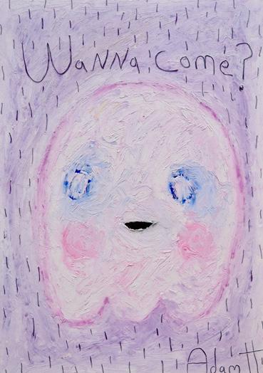
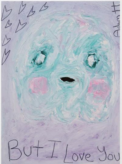

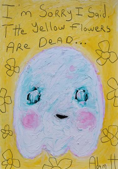

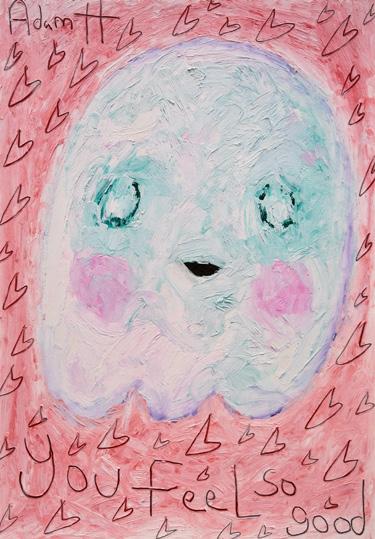
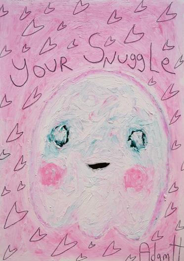


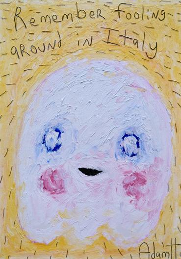
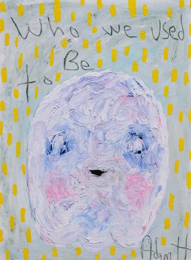

6
Sorry Angel, 2021
Oil stick & acrylic on canvas 776 x 60 inches
I Need You Near Me, 2021
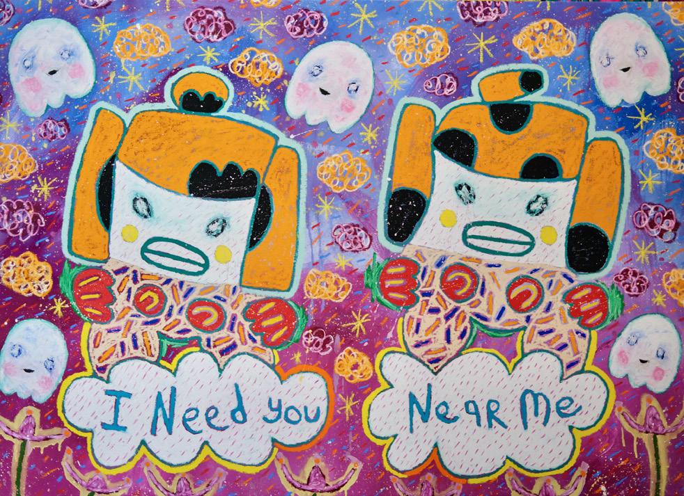
Oil stick & acrylic on canvas 72 x 52 inches
Big Beaming Hug Abduction, 2021
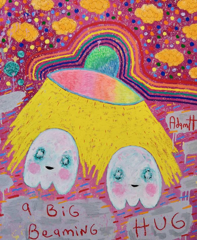
Oil stick & acrylic on canvas 42 x 52 inches
7
DAN ALVA
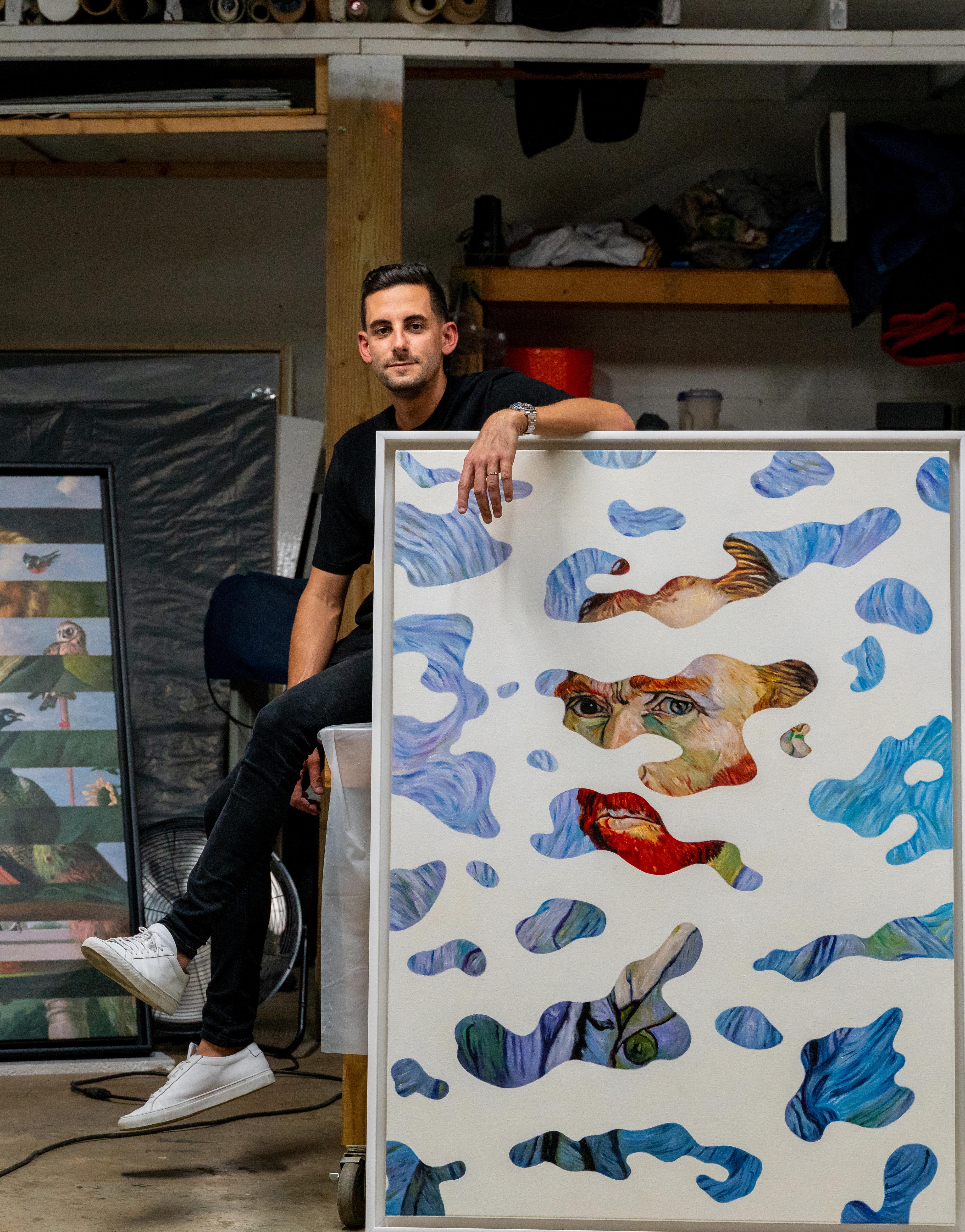
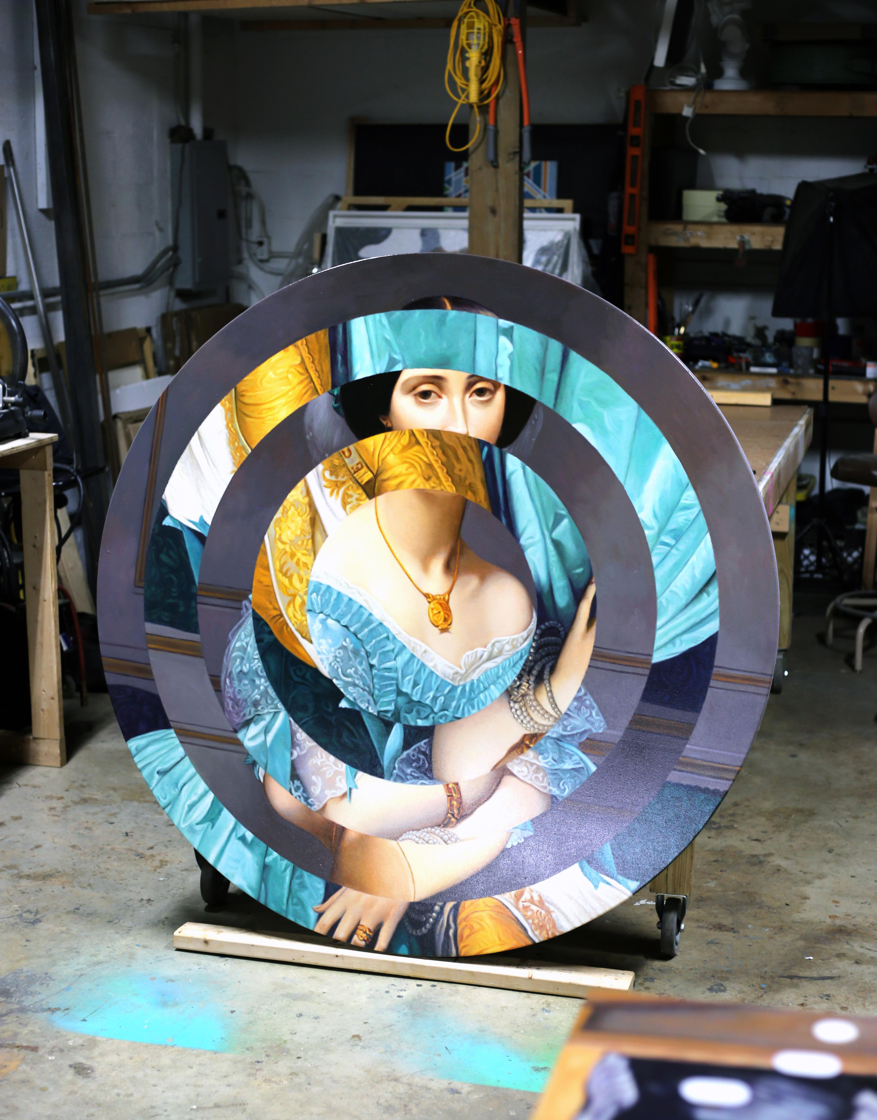
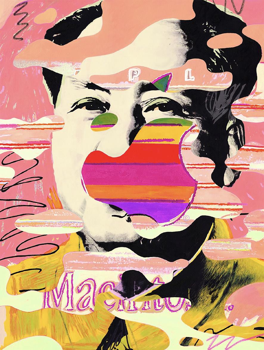
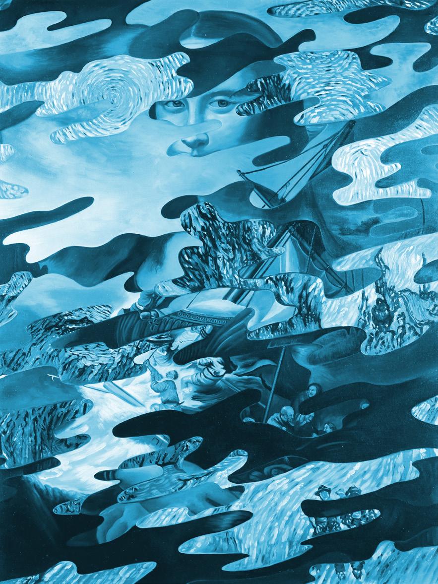
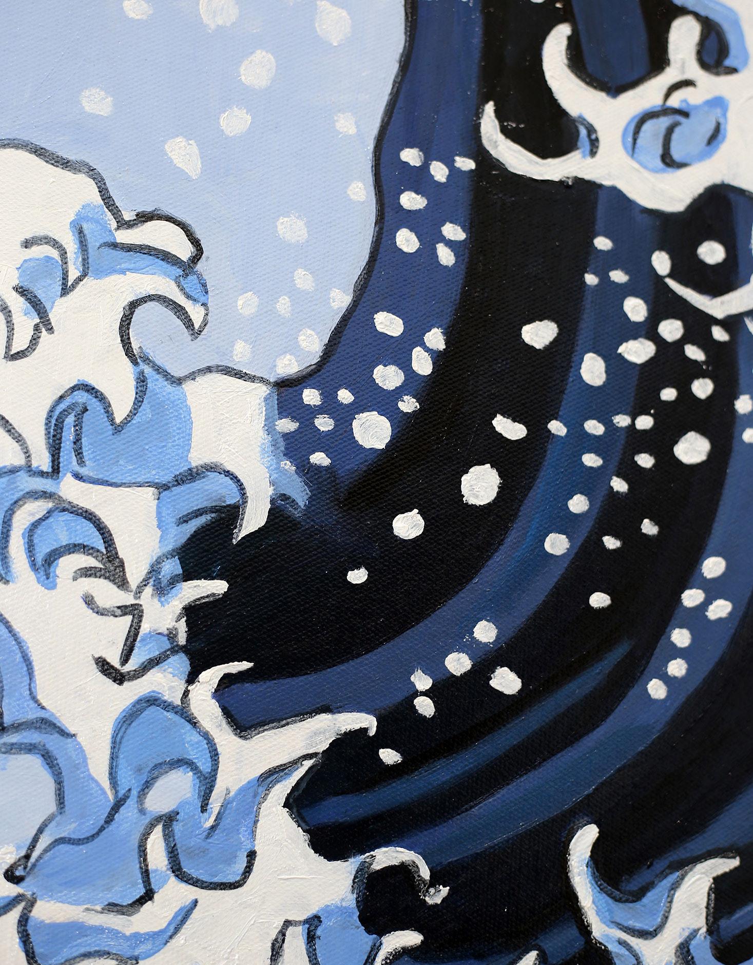
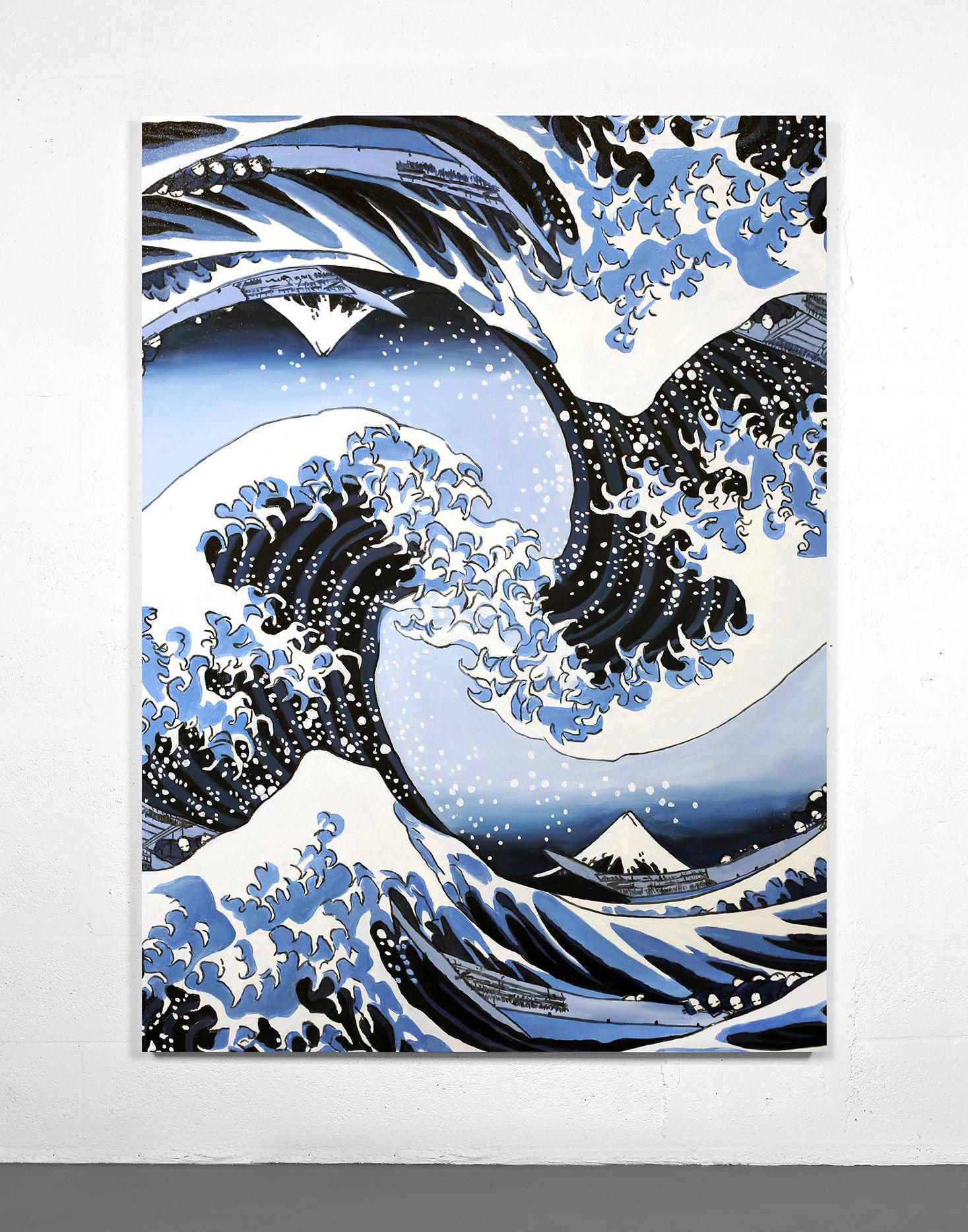
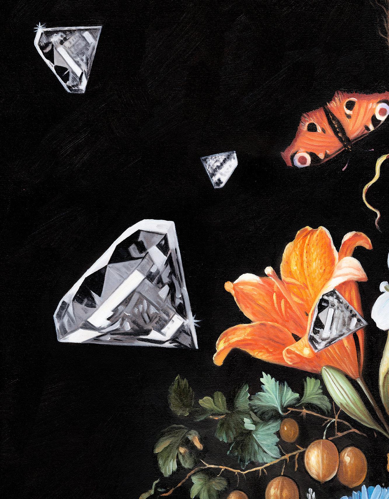
Born in 1984, American contemporary artist Dan Alva comes from a Spanish background of fine artists. He spent his childhood working alongside his father in the family garage and largely credits his craft to him. Based in Miami, Alva takes the classics and reinvents them for a modern-day audience. He re-masters the masters and creates undoubtedly alluring work.
His bold and unapologetic pieces are incredibly intricate, as he combines his figurative visual language with bursts of camouflage, stripes, and other patterns. Alva has worked as a creative in Advertising for the last 15 years and has work in the MoMA’s permanent film collection.
8
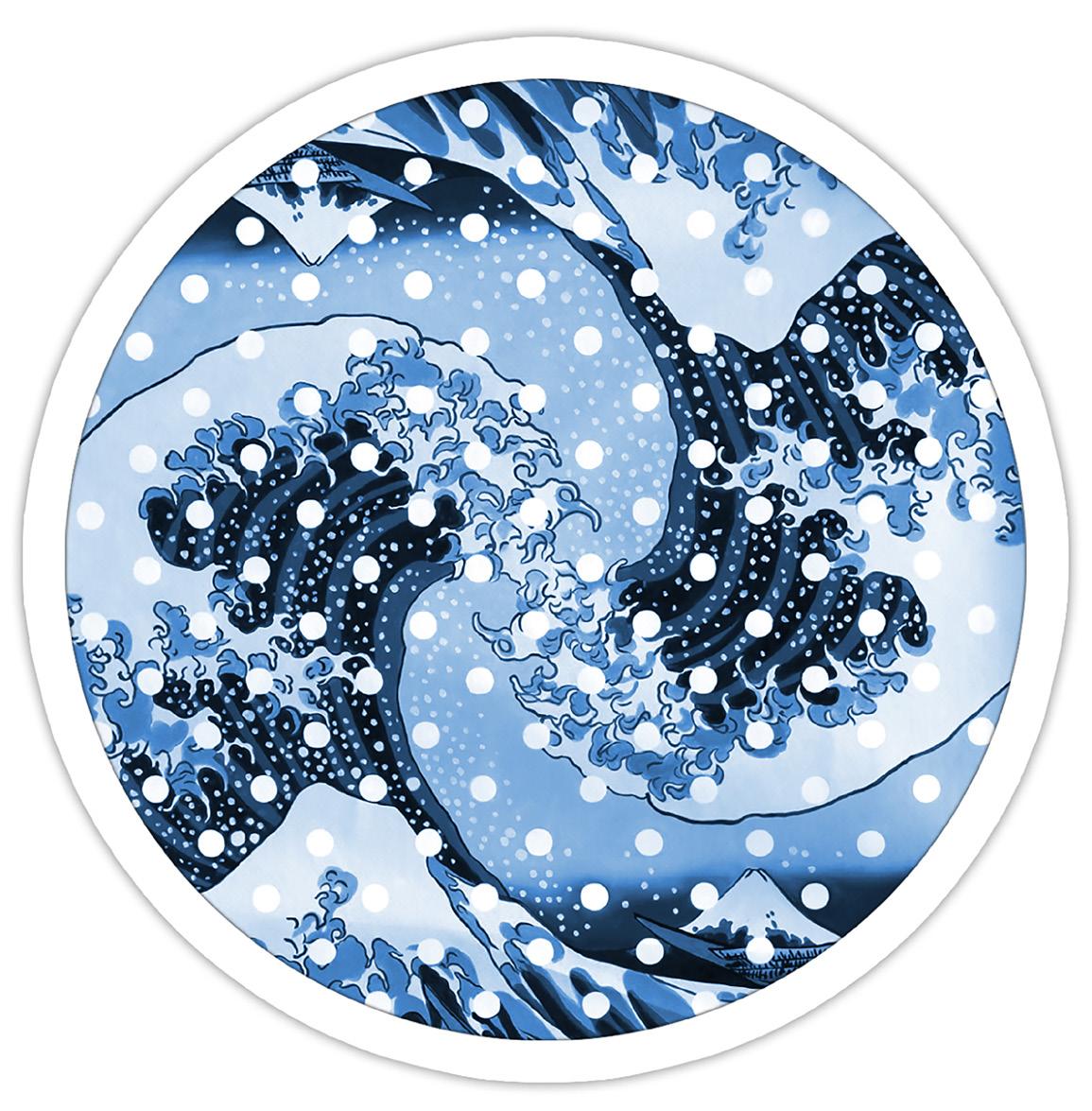
Waves (Blue), 2022
9
10
Mao (Peach), 2022 Oil on canvas 40 x 55 inches
Make It Till You Fake It (Blue), 2022 Oil on canvas 40 x 55 inches
11
12 184 Dead Men Tell No Tales, 2022 Oil on canvas 40 x 55 inches
13
184
14
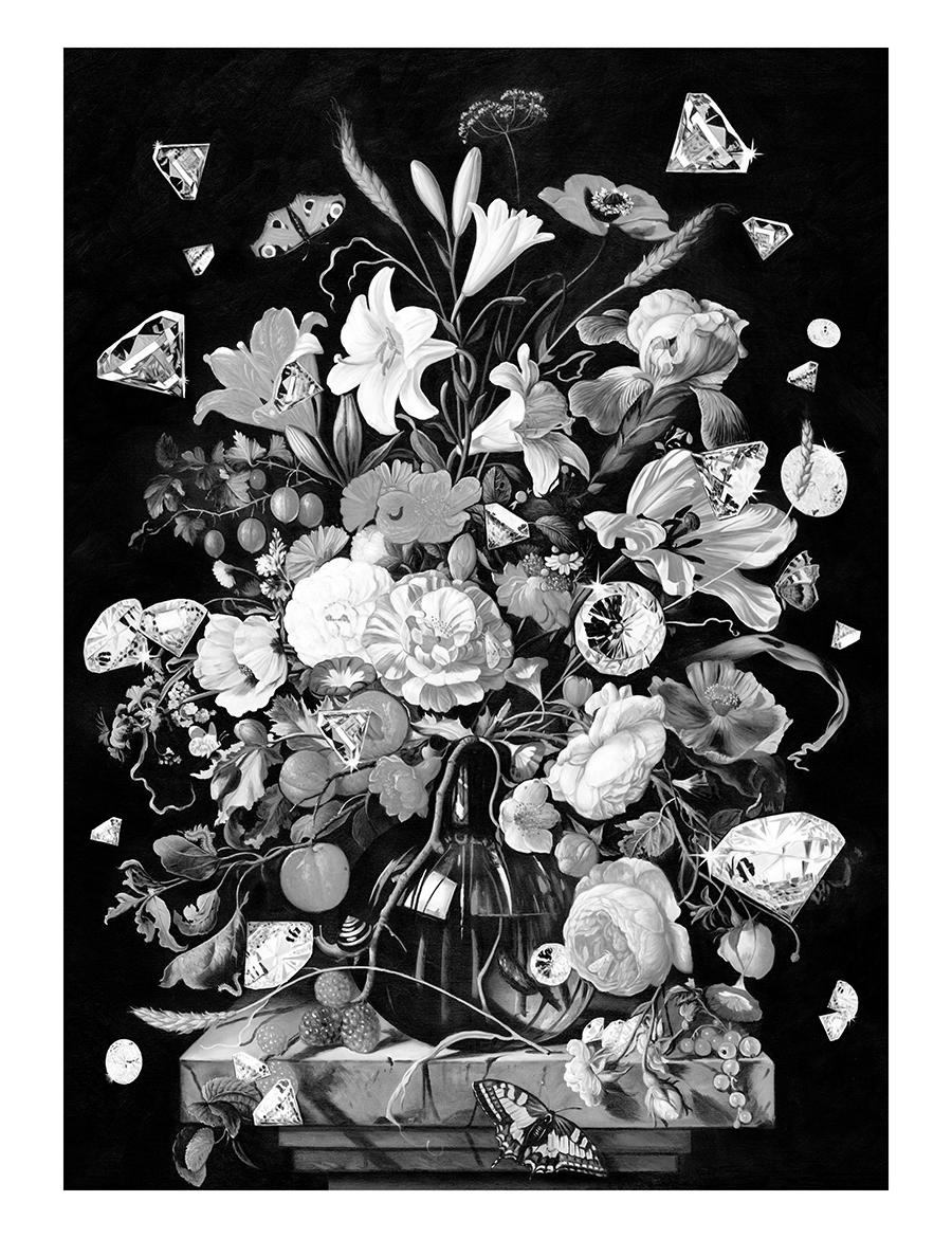
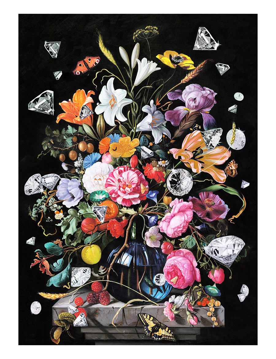
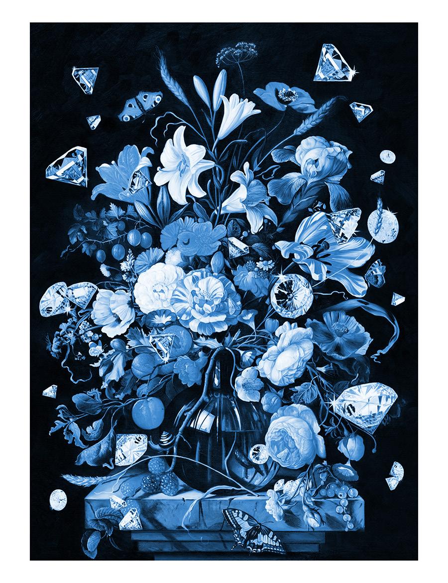
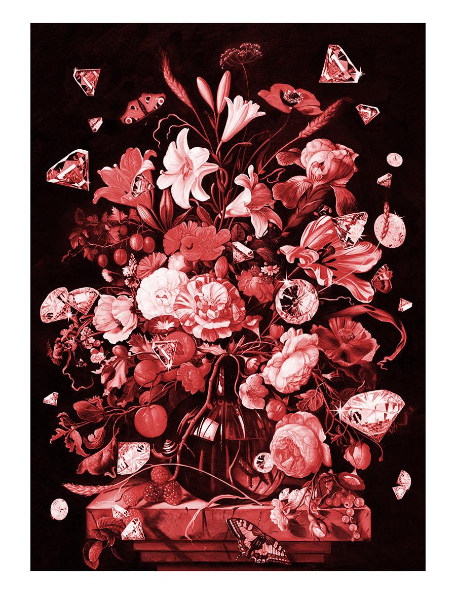
CAPO DEI CAPI, 2022 Unique hand-embellished prints with acrylic paint 30 x 40 inches
15
Dei Capi
Dei Capi
Capo Dei Capi (Black & White) Capo Dei Capi (Yellow) Capo
(Blue) Capo
(Red)
DAN LAM
Dan Lam is an American sculptor of Vietnamese ancestry, best known for her “drippy” sculptures and use of vibrant color. Using non-traditional materials of polyurethane foam, acrylic paint, and epoxy resin, her finished work often dangles over shelf ledges, contrasting emotions of desire and disgust.
Dan Lam was born in Manila, Philippines at a refugee camp – a stop in her family’s long journey from Vietnam to the US. She was raised in Texas where she received her Bachelors in Fine Arts from the University of North Texas in 2010. She received her Masters in Fine Arts in 2014 from Arizona State University.
As her work progresses, Lam continues to explore the dichotomy between ugliness
and beauty, pressing the boundary of perception where beauty seems to become too much – suddenly flipping to the grotesque.
Lam plays with themes of organic vs. inanimate, seriousness vs. playfulness, soft and hard. Lam attempts to find a balance between and among these contradictory concepts to evoke emotions and thoughtful consideration of shifting lines and perception. This exploration of the boundary between the beautiful and the ugly creates different responses among those who view her art.
The artist’s work is collected by many, including Miley Cyrus, Lily Aldridge, Gigi Hadid, and the Tisch family. Lam lives and works in Dallas, Texas.
16

17 17
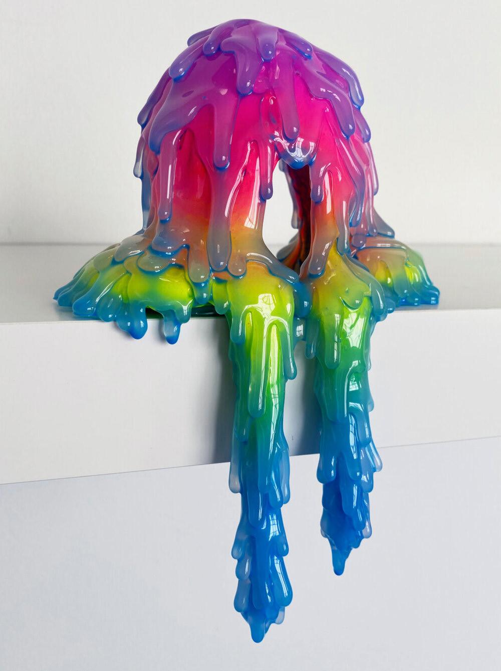
Polyurethane foam, acrylic, glue and resin 8.5 x 6 x 4 inches
Main Squeeze, 2021
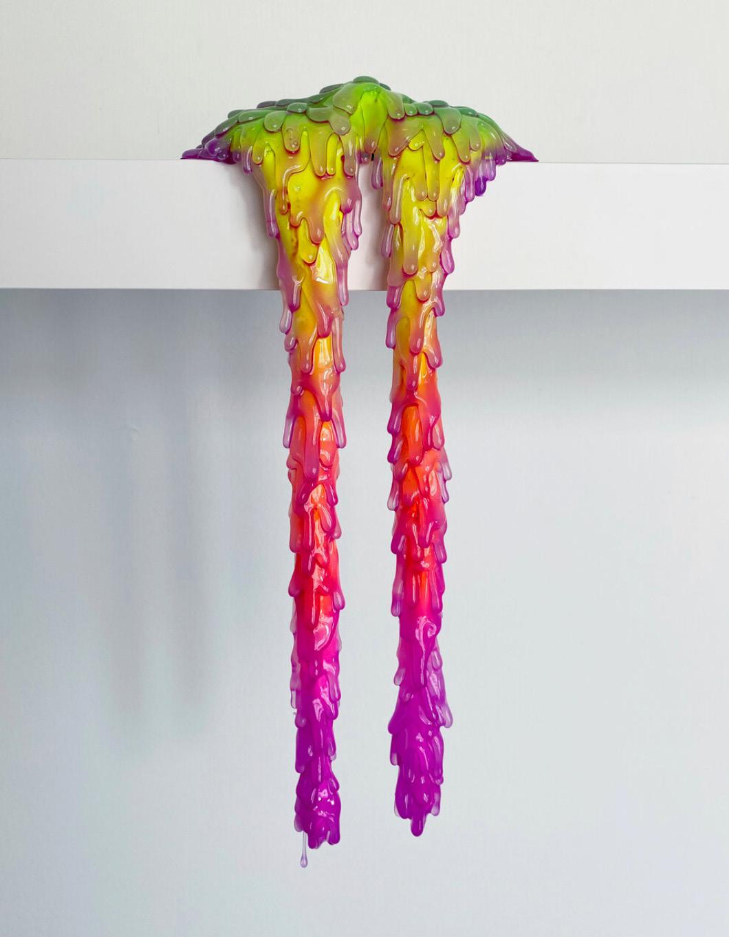
Wiry, 2021 Polyurethane foam, acrylic, glue and resin 14 x 6 x 4.5 inches
Dope, 2021
Polyurethane foam, acrylic, glue, resin 10.5 x 12.5 x 5 inches


BROCK DEBOER
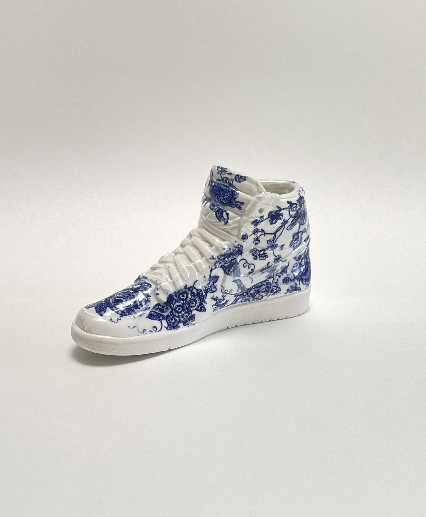
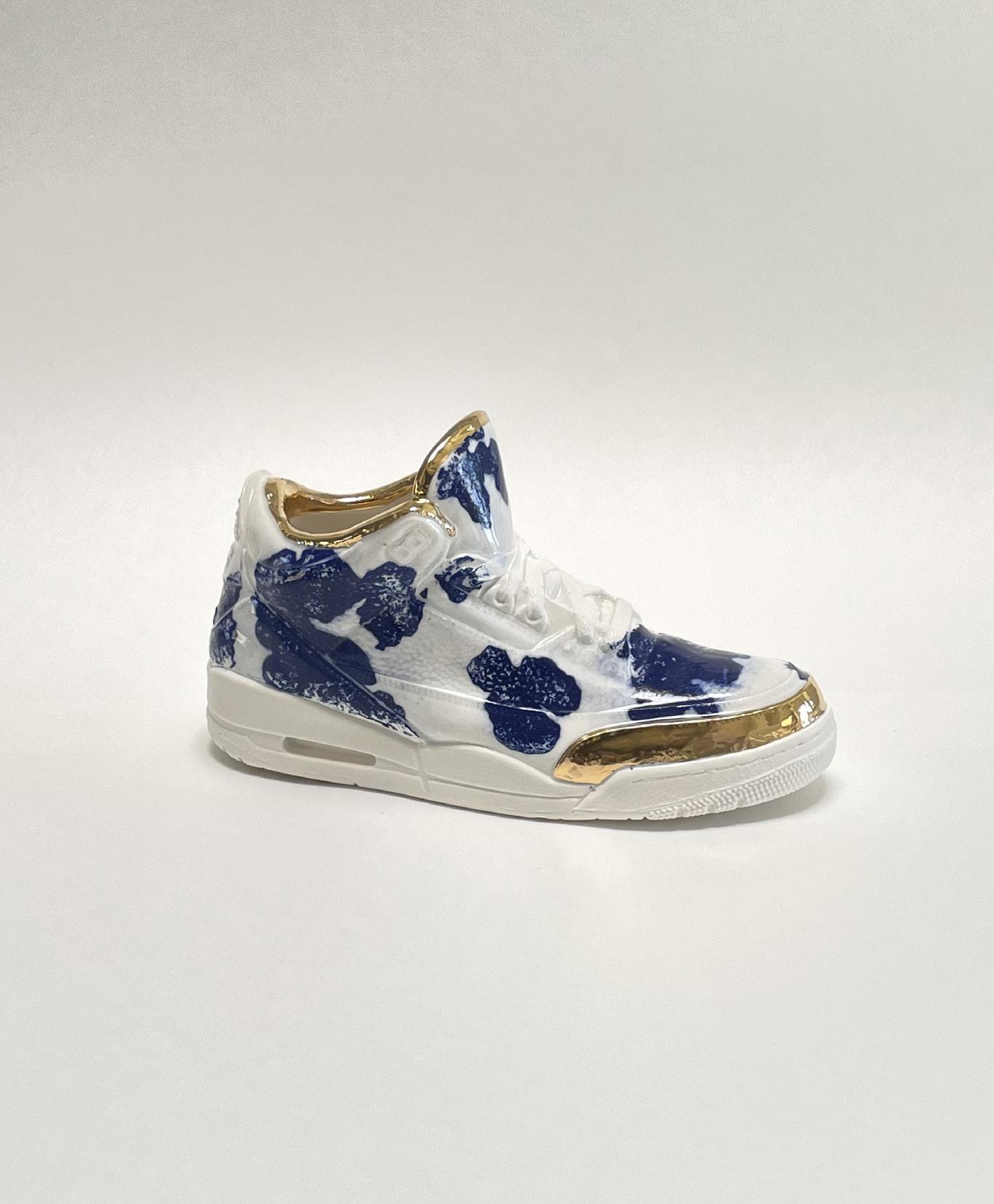
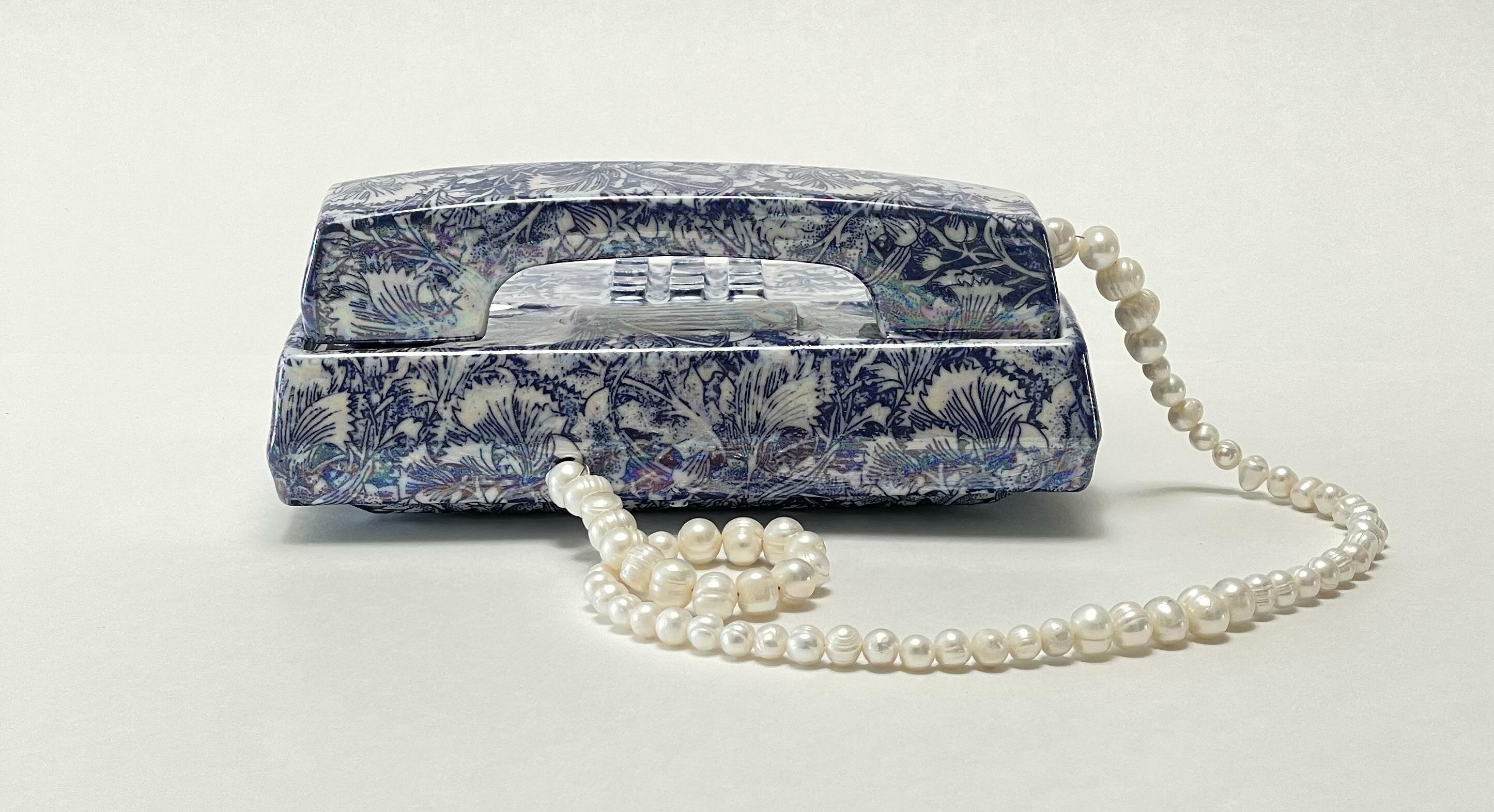
Brock DeBoer’s artistic process as a ceramic sculptor utilizes porcelain, historical motifs, and surface treatments to recontextualize everyday objects, items from his past, and objects of popular culture. Many are highly nostalgic to his generation and beyond, touching on many facets of everyday life.
DeBoer sees these sculptures and still lifes as self-portraits while questioning the value of these everyday objects. DeBoer draws influence from his midwestern upbringing combined with the everchanging and vastly diverse landscape of Los Angeles and the rural landscape of Joshua Tree.
Using his extensive knowledge of ceramic materials and processes, DeBoer brings his sculptures a new life, becoming heirlooms of the 21st century. By using classical motifs of cobalt patterns and true
to life finishes, DeBoer’s casts become suspended somewhere in the past and disguised in the present.
Brock DeBoer, born in South Dakota in 1985, currently lives and works in Los Angeles and Joshua Tree, CA. Recent exhibitions include “Gossamer” a limited collection of sculptures with Guy Hepner Editions, New York, NY, as well as “what we’ve got here is a failure to communicate” with Torrance Art Museum, Torrance, CA, and “Archival Nostalgia” with Haw Contemporary, Kansas City, MO.
JORDAN SCULPTURES
TELEPHONES P. 24-27
22
Toile Jordan 1 (2022)


Cow Print Jordan 3 (2022)
23
24
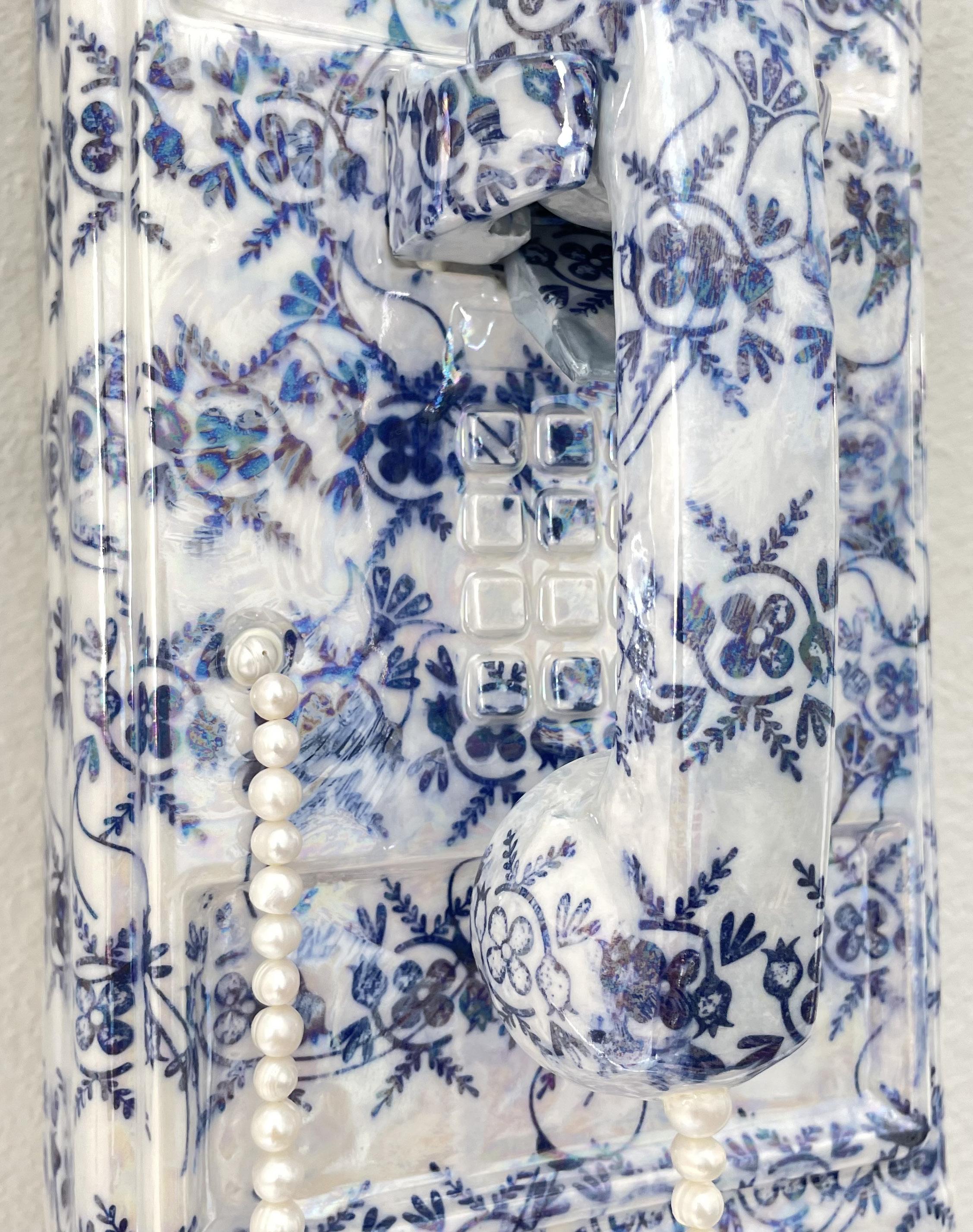
Tulip Wallpaper Payphone No. 1, 2022
17.5 x 5.25 x 6.5 inches
Porcelain, cobalt oxide, mother of pearl

25
PERSONAL LINE SERIES
Editioned porcelain sculptures and unique works
Brush Personal Line, 2022 3 x 7.5 x 5 inches
Porcelain, cobalt oxide, mother of pearl, pearl bead
Limited Edition of 7 + 1 AP
26
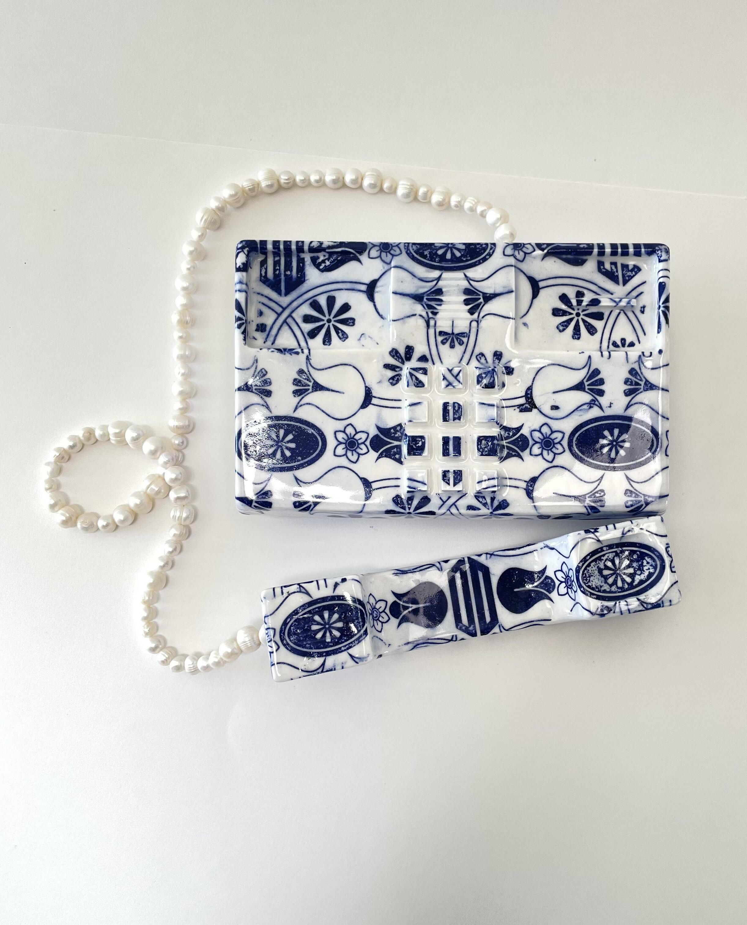
27 Toile Personal Line, 2022 3 x 7.5 x 5 inches Porcelain, cobalt oxide, pearl bead Limited Edition of 7 + 1 AP
KRISTIN MOORE
Kristin Moore, a born and raised Texan, completed her MFA at Otis College of Art & Design in Los Angeles in 2016. She was named one of Saatchi Art’s “20 Artists To Watch in 2020.” Kristin’s paintings can be found in collections across the globe. Her work has been featured in group exhibitions with Jonathan Ferrara Gallery in New Orleans, House of Novogratz in Los Angeles, and Talon Gallery in Portland, among others. She has had solo exhibitions with The Bolsky Gallery in Los Angeles, St. Edward’s University in Austin, and Commerce Gallery in Lockhart. Kristin currently lives and works in Dallas, TX.
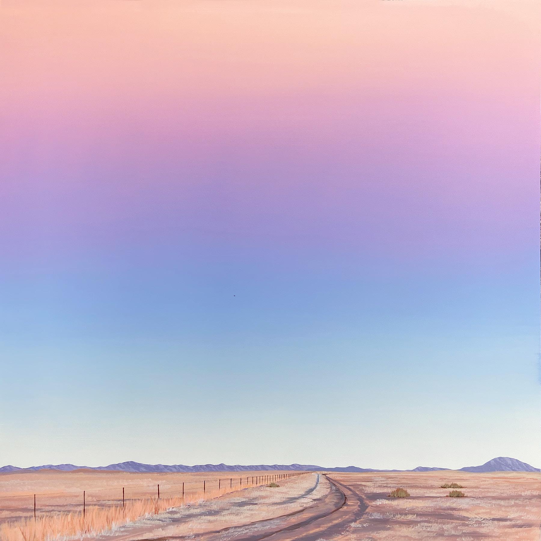
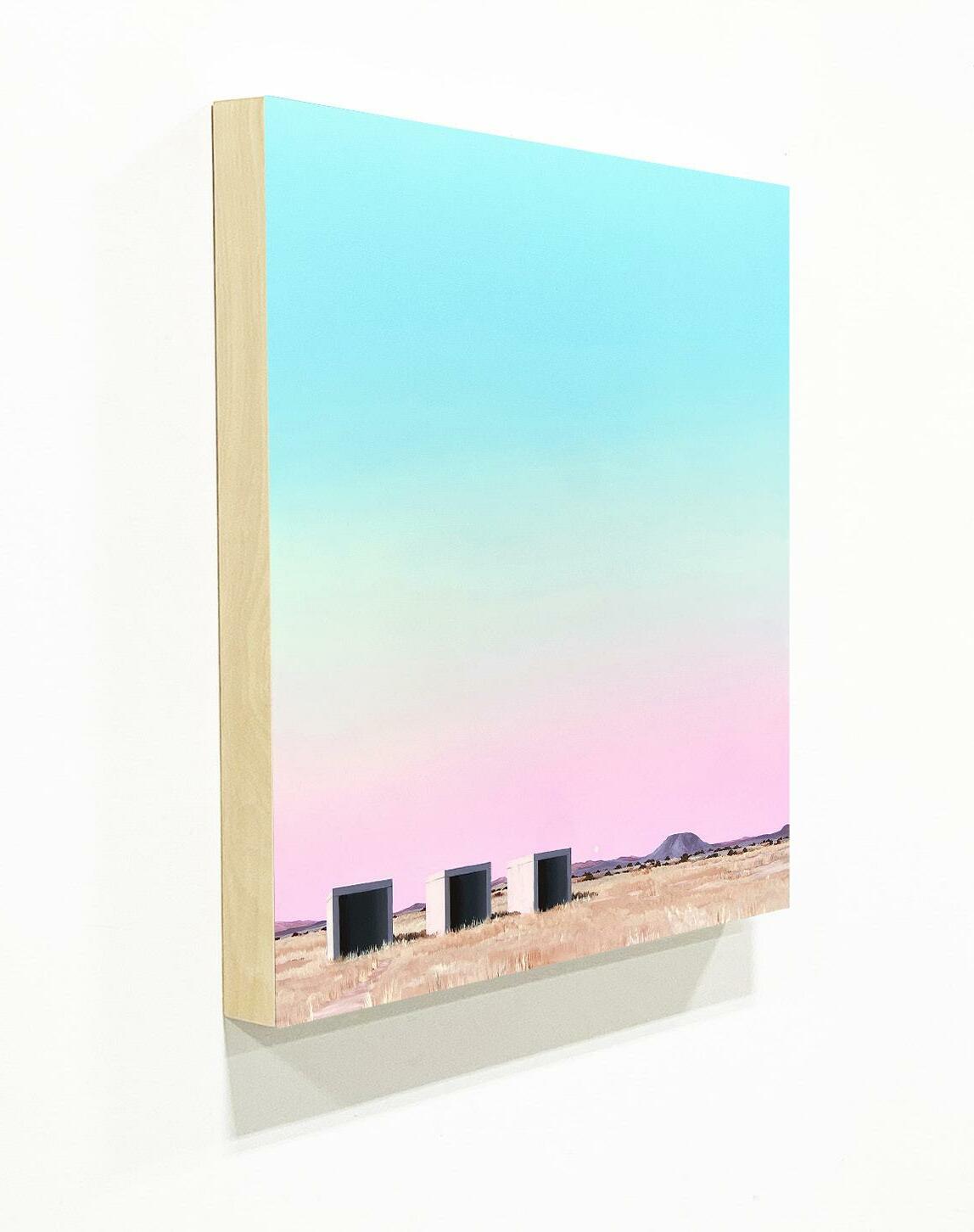
Kristin looks at the cinematic nature of landscape through the lens of painting. Her background in Art History has always been a foundation for her work. Her visionary approach is also rooted in influences from pop culture. She is inspired by artists Ed Ruscha, Gerhard Richter, and Agnes Martin as well as film directors Stanley Kubrick, Sofia Coppola, Wes Anderson, and Ridley Scott. The Western US is her subject, and the American experience is a continued theme throughout her paintings. Travel is also a resource for Kristin’s work. It’s important to revisit the places that she depicts in her paintings in order to continue developing a relationship with her subject matter.
28

West Texas Morning, 2022
Acrylic on wood panel 30 x 30 x 2 inches
30
Los Angeles Overlook (Sunset), 2022
Acrylic on wood panel 30 x 30 x 2 inches

31
Marfa, Texas, 2021 Acrylic on wood panel 24 x 24 inches
32
A CONVERSATION WITH KRISTIN MOORE
You got your start in the local art scene in Austin. What was that like and how did it help shape you as an artist?
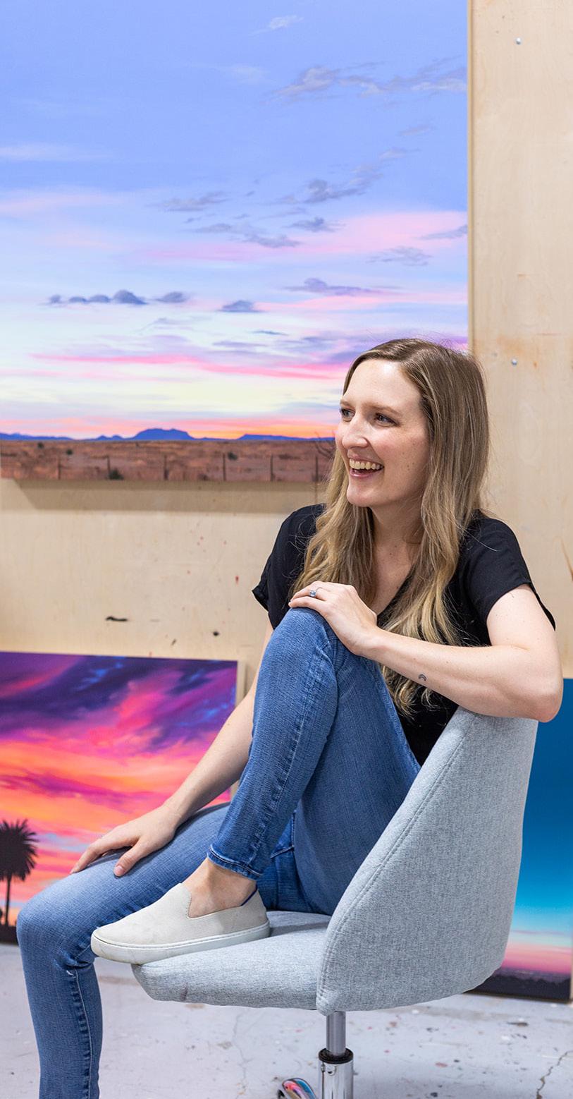
I graduated from undergrad in 2013 and knew that I wanted to go to art school and dive into the art world and my practice more. I went out to California to go to graduate school at Otis. I came back when I graduated around 2016. Instagram was still new-ish and it was hard for an artist to make a full-time career out of what they do. I worked in a gallery for a bit, but I kept seeing other artists have these awesome shows and I was like, I really want to give it a chance – I’m young, why not? So I left the gallery and started working in restaurants and doing pop-up art exhibitions. It was a lot of hustling, networking, getting to know people, and getting into the community –which was super easy after working at that gallery for a little bit. Basically, just carrying a wagon of artwork around, propping up the tables and popping up pop-up walls.
What’s the most helpful thing that
learned in art school?
I would say the most helpful thing I learned in art school was theory and critique. It’s funny that I’m saying that now because when I was in art school, I hated those two things. The way I describe grad school for me is that it was like being broken into a million different pieces, learning a million different things, and then figuring out how to build myself back up again and hone in on what was useful for me. It led me to who I am as an artist now.
you
“I find inspiration in road trips, my travels, and through watching films. I am always seeking a sense of wanderlust in my work.”
33
Photo: Breezy Ritter
What are some of your influences?
I actually love horror films. I love seeing Kubrick – The Shining is probably one of my favorite movies – and I will say it’s mostly because of the way he shot that film. I love going to watch movies and with my paintings, I hope to encapsulate that. For my viewers, when they look at my paintings, I want them to feel something the way that film can make you feel something. I’m always going through that tug and pull trying to figure out how to encapsulate that in painting.
Your paintings feel uniquely American. Are you ever curious about how people outside the U.S. would view your work?
A part of what really keeps me going is the conversations I get to have with my collectors and the experiences that they share with me. I’ve been surprised by international collectors because a lot of them love that nostalgic American landscape look. A lot of American culture does permeate other countries, especially in film. There’s something about Americanized culture – even with fast food – it’s inspirational to them. People love it, and it reminds them of the movies they enjoy. It’s like this overall Americana nostalgia vibe. Globally, it’s been influential and that’s pretty cool.
You capture a moment in time in your paintings. Because it feels so normal or mundane, also makes them super nostalgic. Do you feel more drawn to the visuals of these spaces or the feeling of nostalgia?
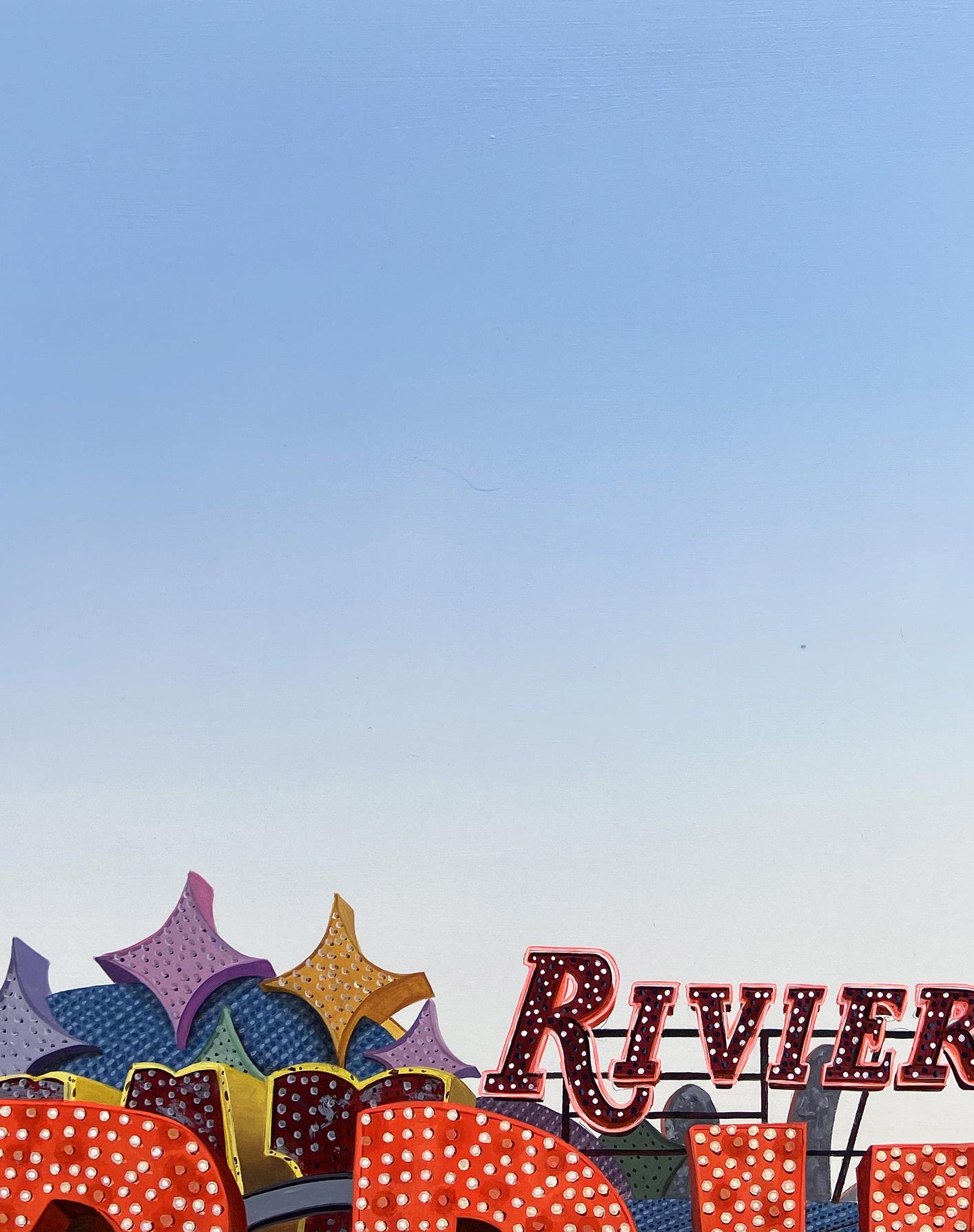
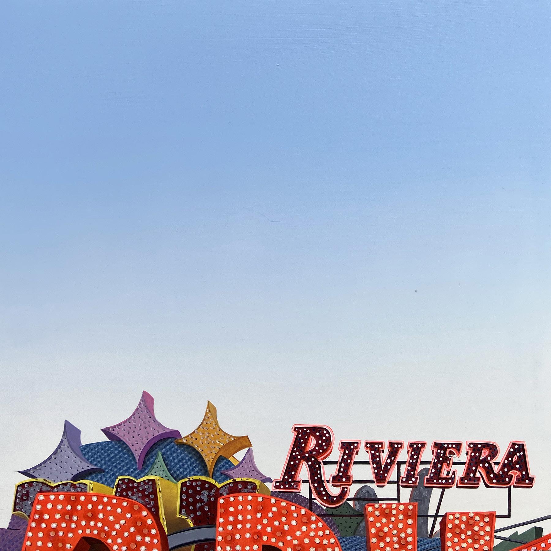
I would say it’s both. I think all my work is personal. There’s a small element of each that’s personal and that permeates through why I choose the reference images I choose to paint from. A lot of them are my personal travels and honestly, me with my iPhone snapping pics while I’m on a road trip. It’s really about a personal connection and how I framed them. I’m sure you’ve noticed – they’re all squares. I framed them that way because it creates this huge void in the sky and it places the viewer in the space that I was also in while taking that reference photo. That’s important to me – for my viewers to be sucked into the painting and feel that energy from it.

34
Photo: Breezy Ritter
Neon Museum (Riviera), 2022
Acrylic on wood panel 18 x 18 x 2 inches
35
36
JAMES JOYCE
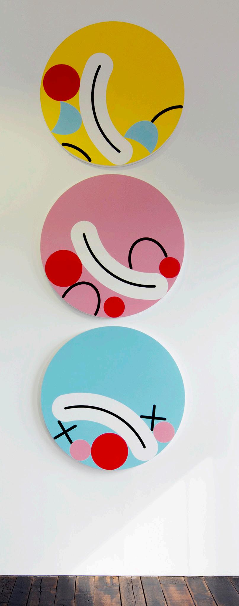
James Joyce works in a variety of media including painting, installation, drawing and screen printing.

His work has been exhibited in various shows internationally, including at Saatchi Gallery (London, UK), Colette (Paris, France), Spring Projects (London, UK), and LaMaMa Galleria (New York, USA). Most recently, one of James’s clown paintings was exhibited at the Royal Academy, London as part of the 2018 Summer Show.
In 2015, Joyce exhibited a video installation at Banksy’s ‘Dismaland’ exhibition in Weston-Super-Mare alongside other international artists including Damien Hirst and Jenny Holzer.
Born in Wolverhampton, England, Joyce studied at Walsall College of Art and Kingston University.

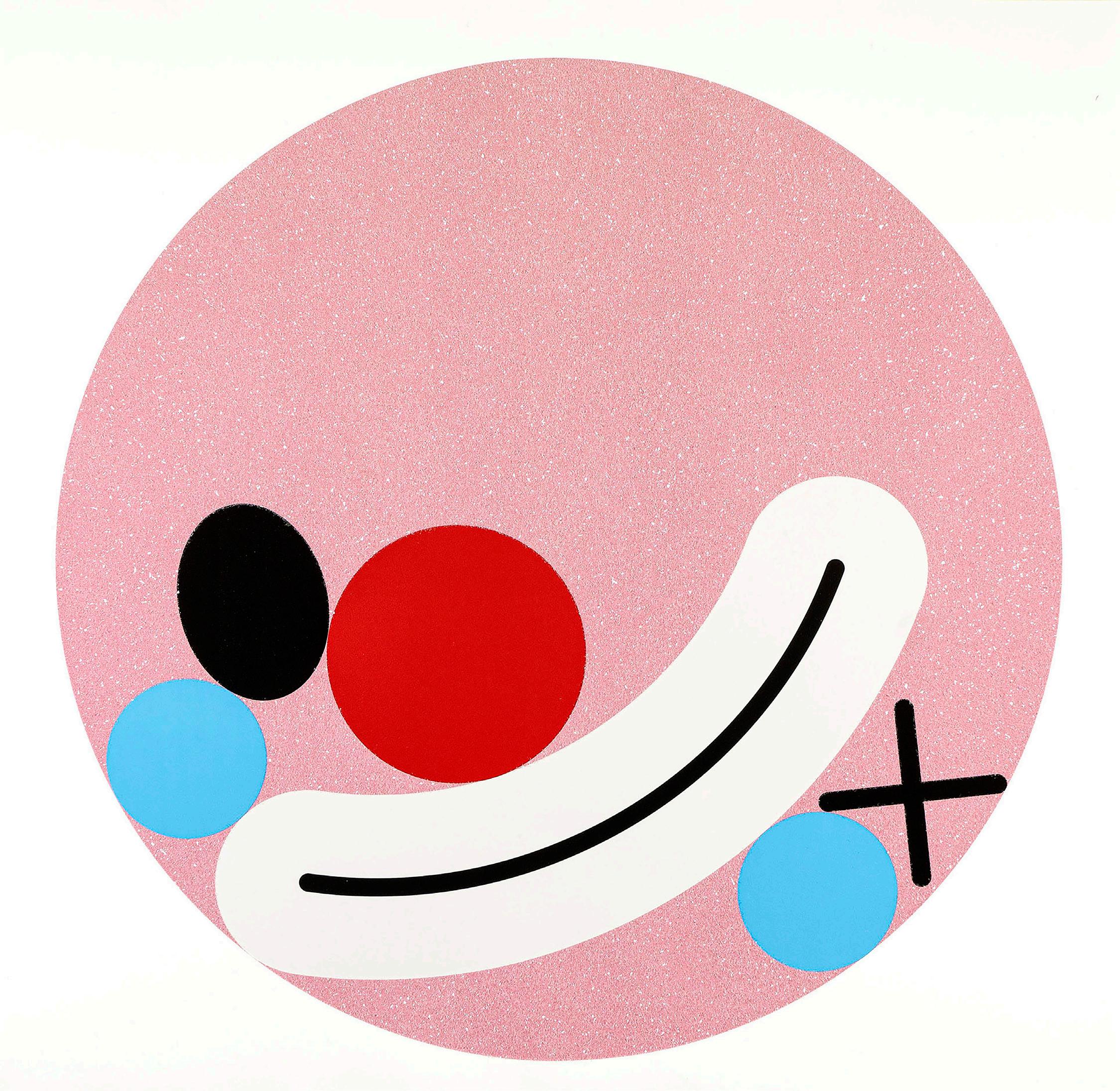
You Couldn’t Make It Up, 2022
Four color screen print on Somerset satin white 410gsm paper hand finished with diamond dust with varnish detail 29.5 x 29.5 inches Edition of 30
39
I Knew What Was Coming Next, 2022
Four color screen print on Somerset satin white 410gsm paper hand finished with .2mm gold glitter with varnish detail 29.5 x 29.5 inches Edition of 30

40

A CONVERSATION WITH JAMES JOYCE
A lot of your work involves subverting familiar visual icons in popular culture and twisting them to evoke a different response. What goes into that decision making process for the imagery and phrases that you choose to work with?
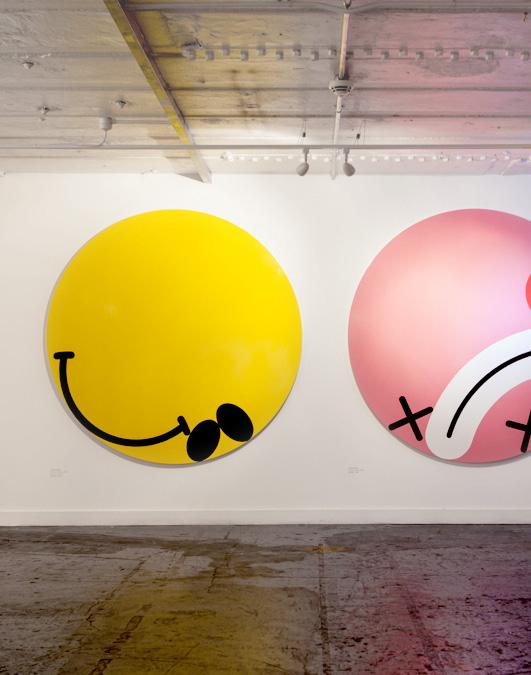
I’m not sure it’s intentional I’m just picking up on the noise that surrounds me. It’s interesting that you can tweak something slightly and give that thing an entirely new meaning or feel about it. The yellow face icon that Harvey Ball designed in the 1950s – how can I play with something as iconic as that and make it my own so that it becomes something else? It has an entirely different meaning than in its
original state, yet you still recognize what it once was.
Can you talk a bit about physical execution of your paintings? What inspired the graphic element that’s prevalent in your pieces?
The first 10 years of my career I was a graphic designer and Art Director which I guess has informed the art work to a point, but even going back to when I was at art college in the early 90’s it was pop art that really got my interest. I’ve always liked to break images or ideas down to there simplest form only leaving in what’s necessary. The execution of these ideas

looks precise and neat, almost machine made, but when you get up close – you can see that they’re hand painted. The collapsed face paintings are painted with household gloss paint on wood panels and the Like paintings are acrylic on canvas.
What attracts you to specific phrases that you later implement into you work?
I think the title of a work can give it an extra layer, it can imply something that might not be apparent when looking at the work; it can add humour. I’m always writing stuff down that I overhear or read, phrases that might make a good title or be the catalyst for a new piece. I always like sentences that seem odd when you think about them or contradict themselves somehow.
Repetition seems to be an important vehicle for you. What makes specific images or text ones that you explore through multiples pieces?
I don’t think I set out to create ideas that can be multiplied and repeated, but I suppose I do like the idea of creating an ongoing body of work. The collapsed face pieces work individually but I can make many iterations of them for as long as I’m interested. It’s powerful when you have a large number of them grouped together. Conceptually the Like paintings rely on repetition in their various number groupings. There is a strange kind of freedom in setting rules for yourself.
44
SEBASTIAN MAGNANI
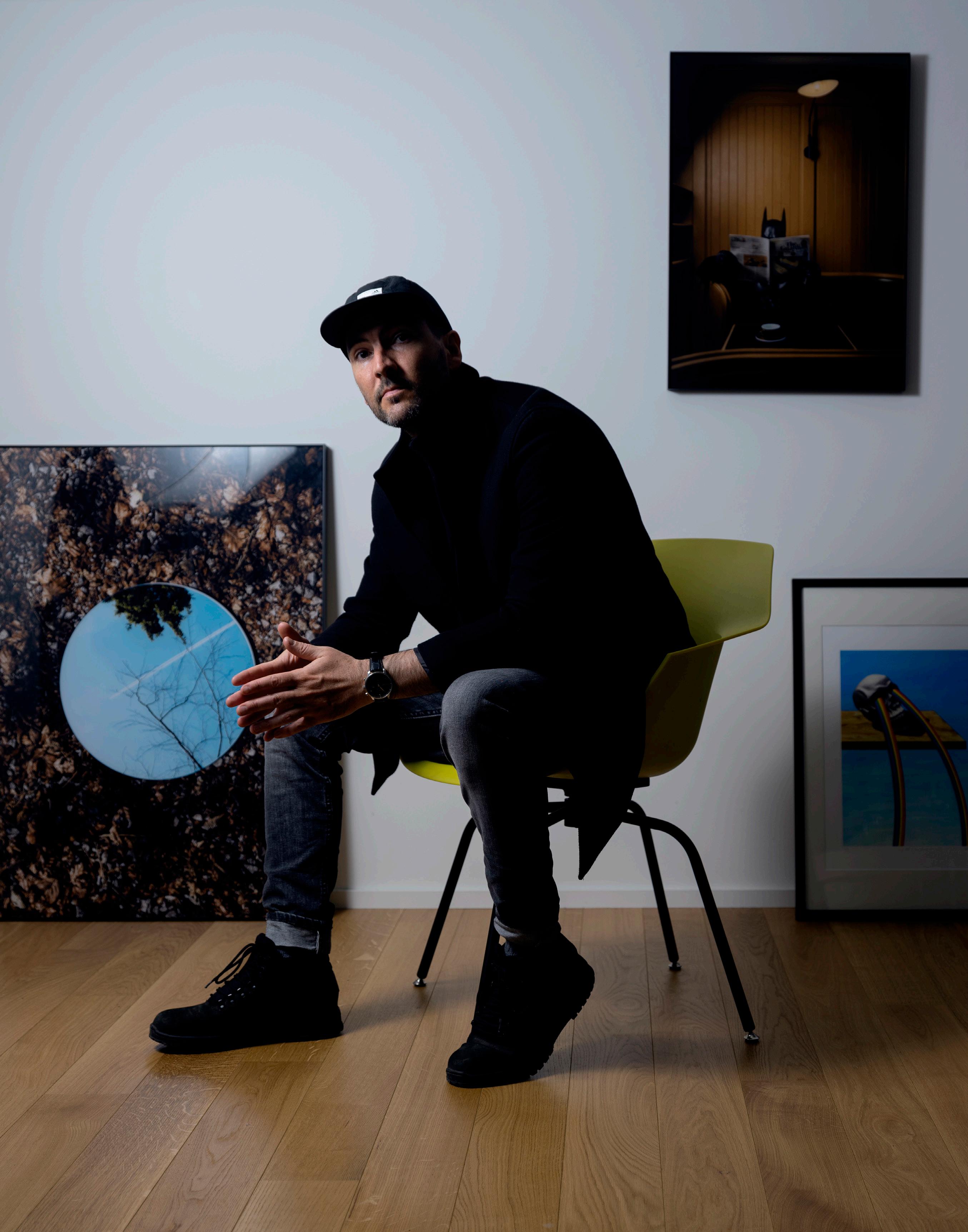
Conceptual photographer Sebastian Magnani, born 1985 in a small village surrounded by mountains in Canton Valais/Switzerland, met photography in 2006. However, it was in 2011 that he decided to leave a traditional job at an advertising agency to follow his dream. Now he is based in Zurich/Switzerland.
Since then he has worked as a photographer based in Zurich and has implemented various artistic projects. His series Daily Bat skillfully captures the aura of the cultural icon Batman, and places him within the context of our normal, everyday reality. The figure
Batman becomes a person with whom we can identify, seeming to sympathize through a shared sense of isolation.
Sebastian developed an interest in photography while completing an apprenticeship in media design. In 2011, after 5 years of creative work at an advertising agency, he decided to turn his passion into his profession. Since then, he has worked as a photographer in Zurich and has implemented various artistic projects and winning multiple international photography awards.
45
DAILY BAT
BY SEBASTIAN MAGNANI
Daily Bat humanizes Batman by placing him in everyday life scenarios

46
Sebastian Magnani’s ongoing series, Daily Bat, focuses on the softer side of one of the most mysterious superheroes. Batman is conceptualized in everyday society, becoming less of a legend and more of a man. The hero becomes a person with whom we can identify and sympathize.
Most of Magnani’s photographs consist of sharp contrasts of color and dramatic lighting. Batman settles into his surroundings, usually interrupted by the two points of bat ears to complete his iconic silhouette. Contrast in shape and composition is important in Magnani’s work. The artist states, “Life consists of contrasts as does my art.”
Sebastian Magnani’s ongoing series, Bat the most mysterious superheroes. Batman is conceptualized in everyday society, becoming less of a legend and more of a man. The hero becomes a person with whom we can identify and sympathize with.
Most of Magnani’s photographs consist of sharp contrasts of color and dramatic lighting. Batman settles into his surroundings, usually interrupted by the two points of bat ears to complete his iconic silhouette. Contrast in shape and composition is important in Magnani’s work. The artist states, “Life consists of contrasts as does my art.”
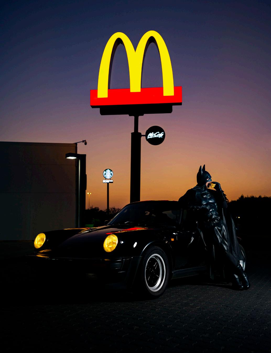
LEFT: Daily Bat - Spaghetti Al Pomodoro, 2022
TOP: Daily Bat - McBat, 2022
Daily Bat shows the recreational activities Batman may enjoy on his time off. The hero shows a softer side without violence, aggression, or interference. In many ways, he enjoys the safety he fights for. Magnani states, “Batman isn’t a machine, he has a complex background, his own story, with a lot of struggle and emotions. By showing him doing everyday things, I give him space to escape the limelight for a while and live a normal life.” Since Batman is the only superhero without innate powers, he is the perfect subject for a series showing a more human side.
The series seems far from complete. When asked where Magnani wants to take Batman next, he replies, “Everywhere around the world, especially where I haven’t gotten permission yet, like the Louvre Museum in Paris.”
BOTTOM: Daily Bat - Test Drive 2022

Inkjet Canson Rag Photographique 310g
30 x 38.6 inches, 43 x 56 inches, 56 x 73 inches
Daily Bat - Bat

30 x 38.6 inches, 43 x 56
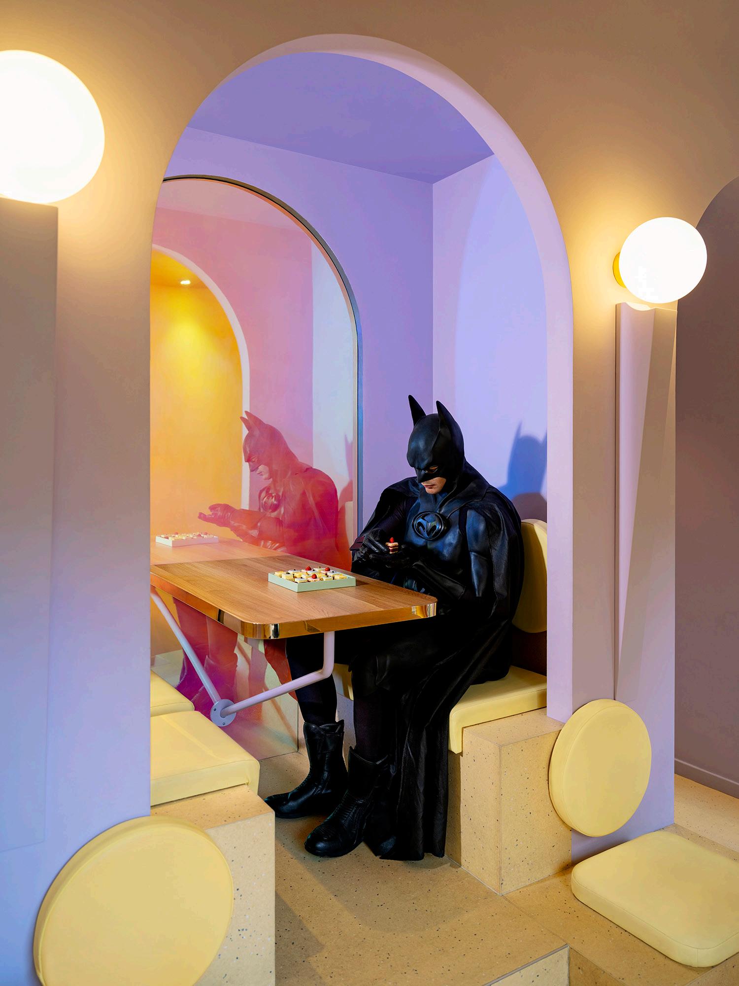
Daily Bat - Appreciation, 2022
50
Inkjet Canson Rag Photographique


51
Rag
Bat Signal, 2022 Photographique 310g 56 inches, 56 x 73 inches Daily Bat - Bitter Sweet, 2022 Inkjet Canson
Photographique 310g 30 x 38.6 inches, 43 x 56 inches, 56 x 73 inches
Back To The Future, 2022
Inkjet Canson Rag Photographique 310g 38.6 x 30 inches, 56 x 43 inches, 73 x 56 inches

48

49 Daily Bat - Morning Swish, 2022 Inkjet Canson Rag Photographique 310g 38.6 x 30 inches, 56 x 43 inches, 73 x 56 inches
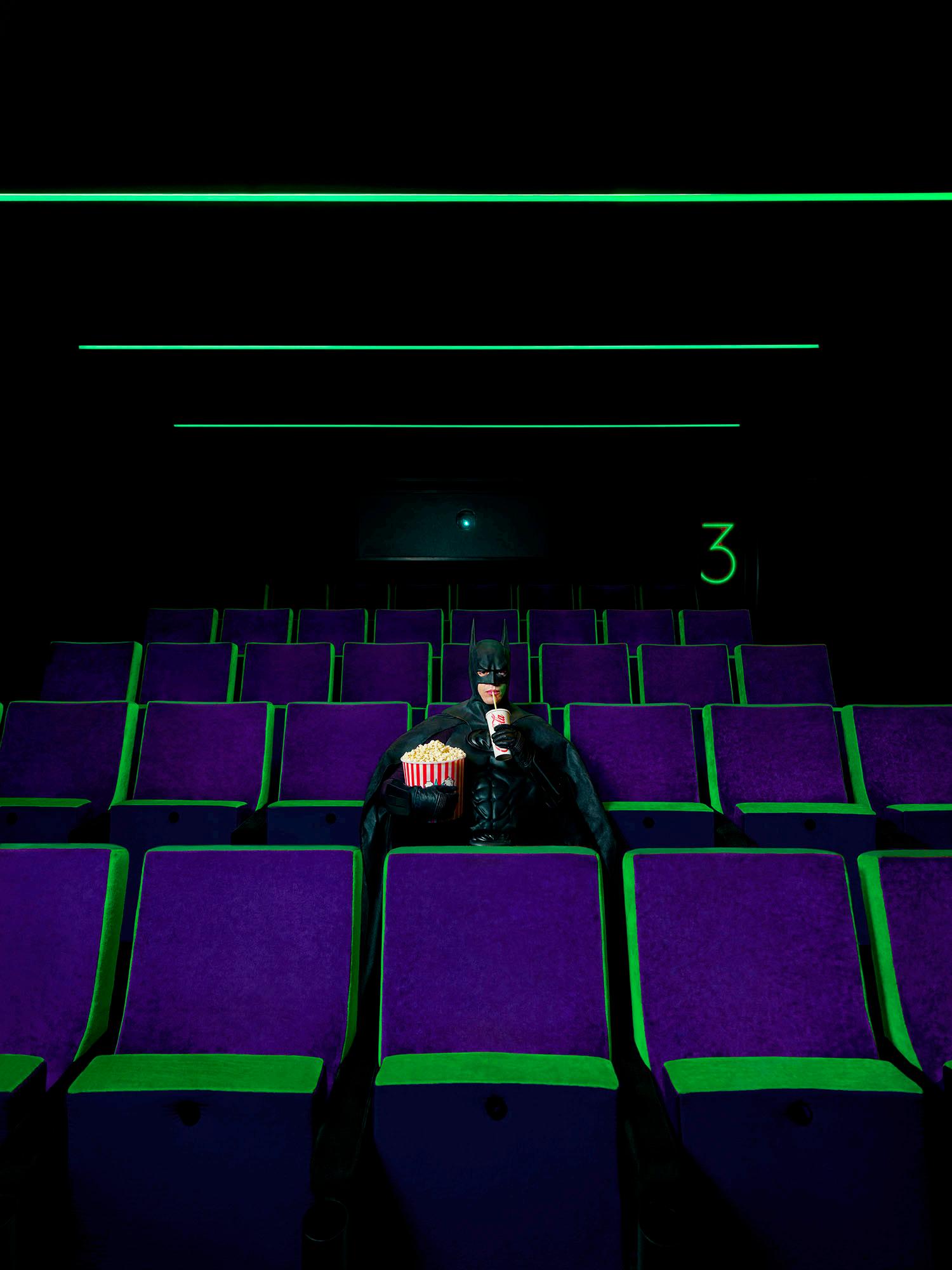

ONCE UPON
TIME, 2021 50 Once Upon A
Once Upon A Time (Green) Digital C-Print 23.6 x 31.4 inches 35.4 x 47.2 inches Edition of 25 + 5 APs
A
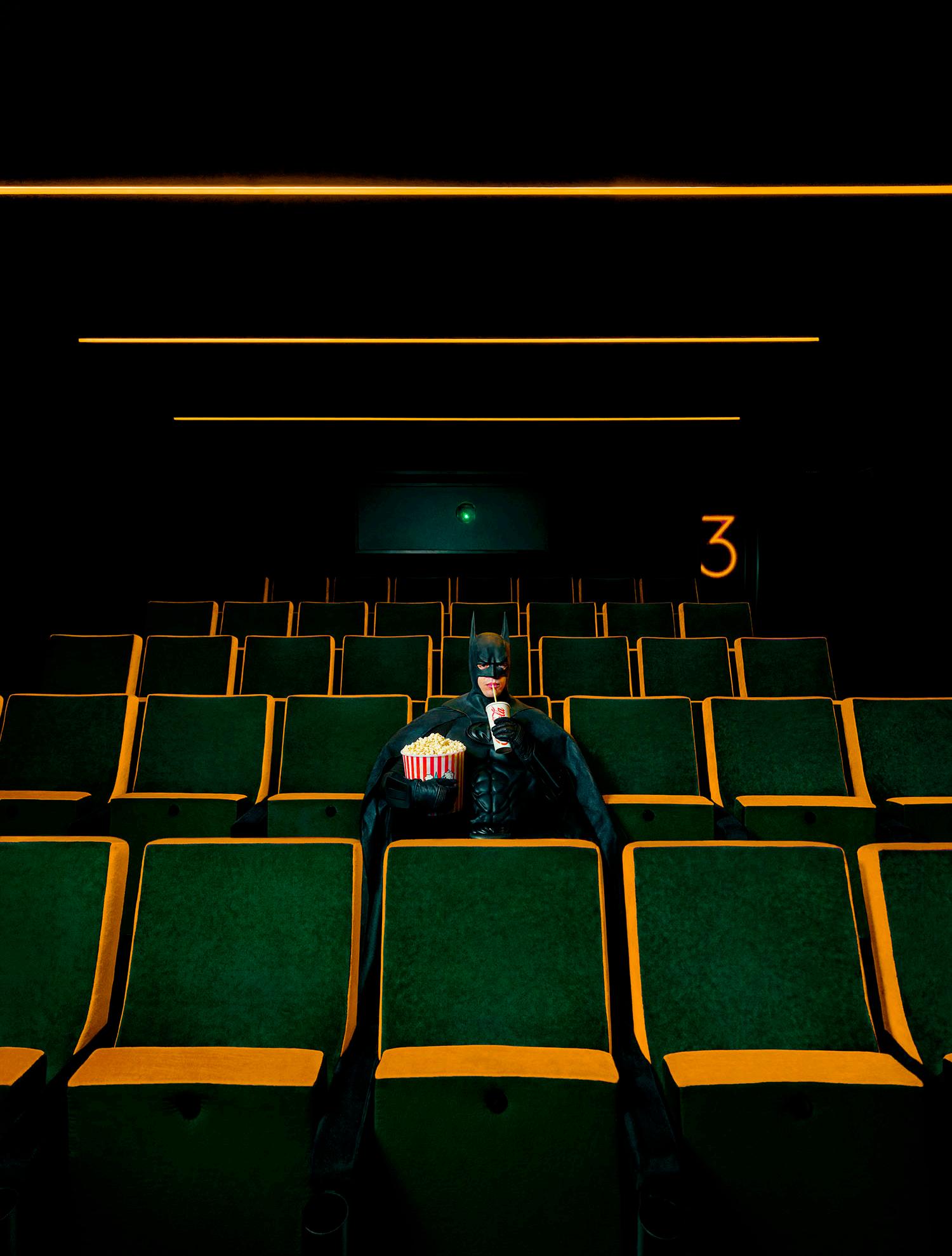

A
(Red) Once Upon A Time (Yellow) 51
Time
ARTIST

ARTIST ROSTER
WHO WHERE WHY
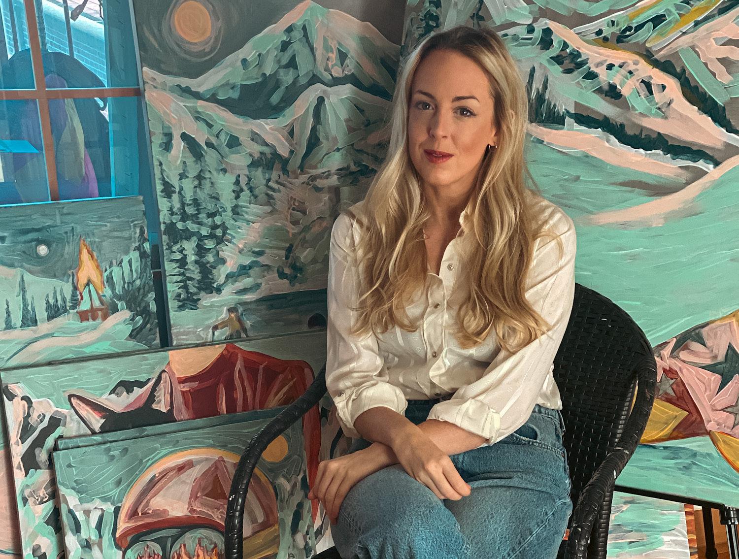
Everyday life, childhood memories, my garden, the Muppets
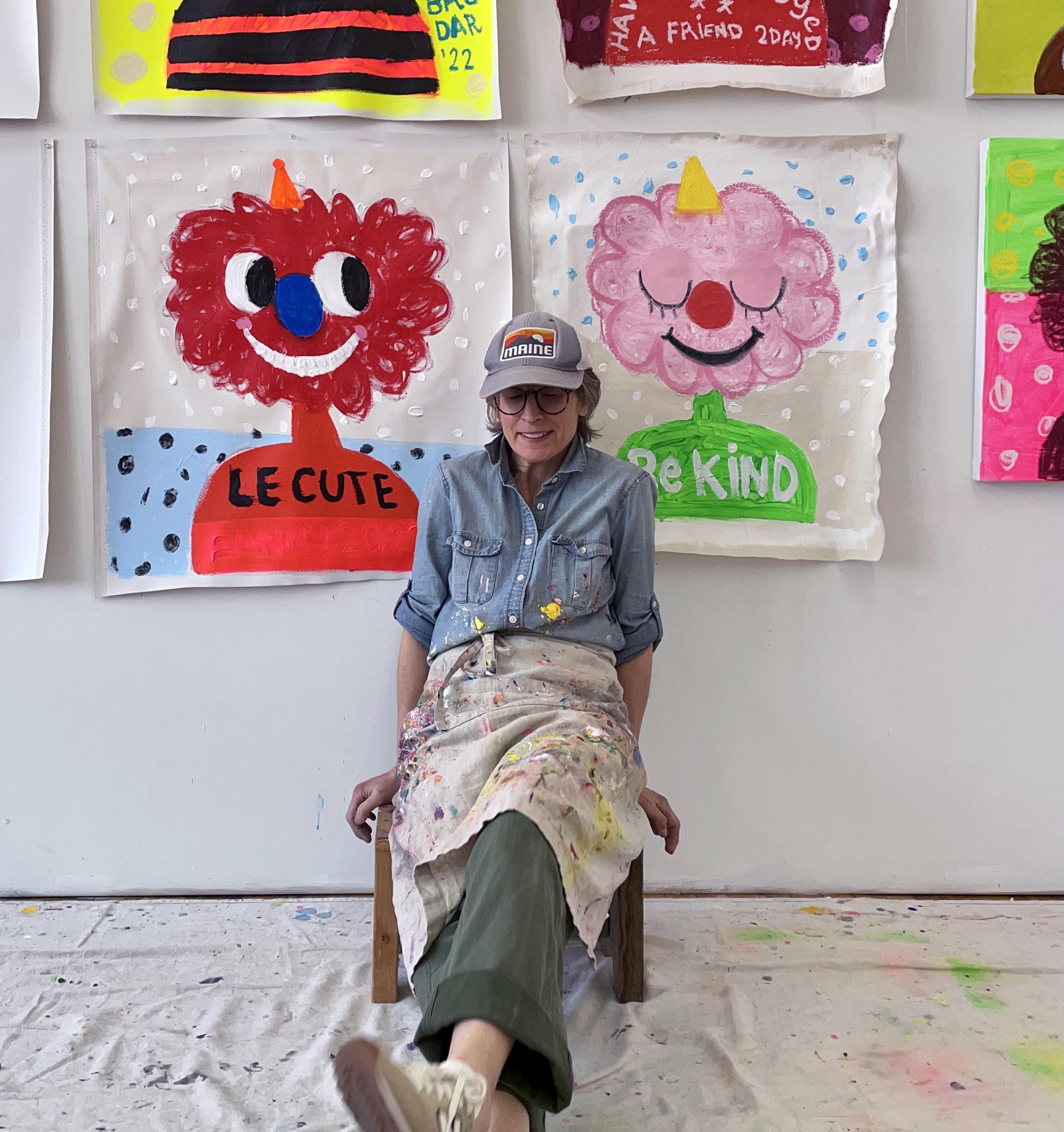 Fanny Nicole Brodar Maine
17
Rose Wylie

HOW
WHO 2.0
WHEN
Contemporary Faux Naïf, acrylic, oil stick, and mixed media Definitely when my first ever solo show sold out!
WHO WHERE WHY HOW
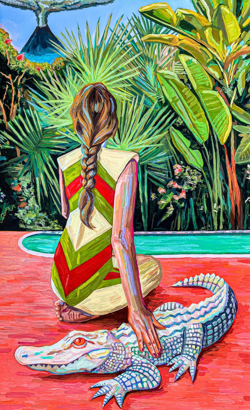
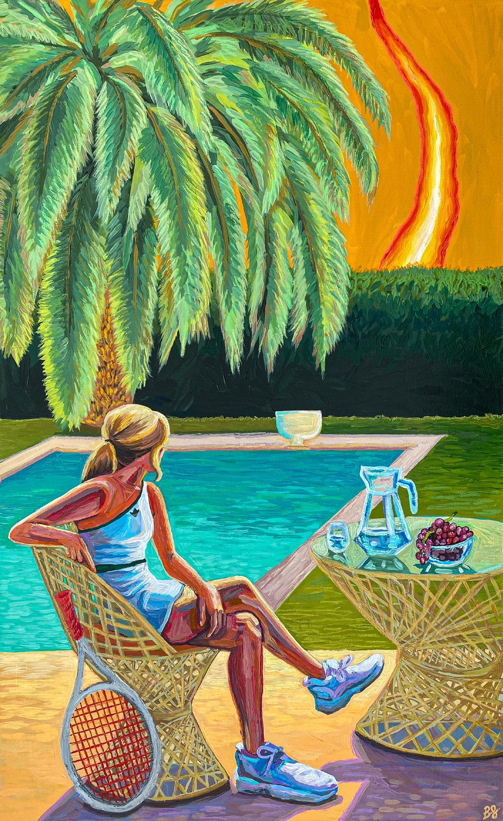
Brittany
Fanning
Los Angeles
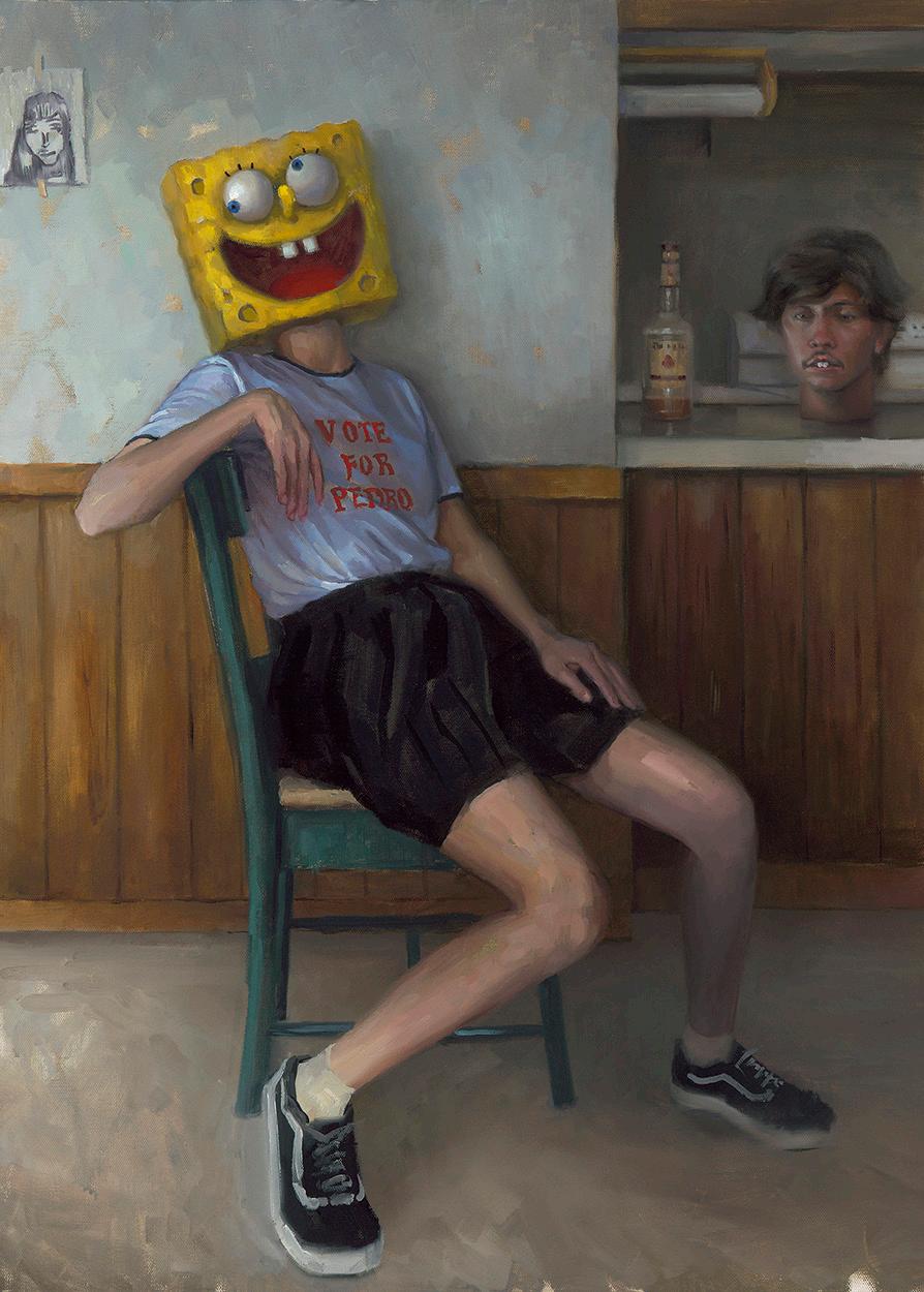
I’m inspired by warm weather, natural disasters, wild animals, luxury fashion, and dark comedy.
I take a lot of photos and collage them together, sometimes mixing them with drawings. I paint, with acrylic, from these images. I like to add extra materials to the final painting; a cherry on top. It can be embroidery or drawing with oil pastel. Sometimes I’ll work with several at once, so they’re unified. Sometimes just one at a time.

WHEN WHO 2.0
In 2021, I visited the Picasso museum in Barcelona, Spain. A large part of the museum was dedicated to his work based on “Las Meninas” by Velazquez. Picasso completed dozens of paintings based on just this one. He used different colors, styles, sizes. He focussed on several parts of the original work. At that moment, I realized that not every painting

I create needs to have some unique concept or story; I can build on ideas I’ve already come up with- or even someone else’s ideas. It really changed the way I thought about building my own collections.
I’m inspired by comedians oddly enough: Doug Stanhope, Tim Dillon, Tom Segura. I also really love Slim Aaron’s photography and Quentin Tarantino films.


WHY
Born in Argentina, Buenos Aires. Based in Madrid, Spain
My inspiration comes from my childhood, especially the days and moments I spent with my grandfather. Also, I always site my toys and games of those days.


HOW WHEN WHO
I think in colors. Before I start a work, I know perfectly what colors I am going to use. I start doing the background and then draw with a trowel and gesso. For colors, I usually use acrylic, oil stick, spray and marks.
I always say that the best part of working with a child-style is feeling like a child when you work. (So I feel young and happy every day ☺)
2.0
This is a very difficult question! OK, I will take the risk! CY TWOMBLY.
WHO WHERE
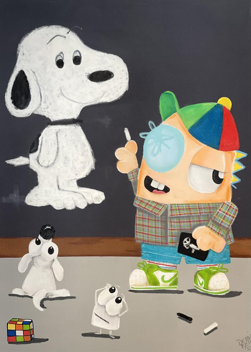
Debbie Reda
WHO WHERE WHY
Dylan Martinez
Bingen, WA
I am most inspired by the wonders of nature and science. The patterns, phenomena, and the immense beauty it displays and evokes.
I like to bring those ideas and experiences into my work through a sense of play and wonder.

HOW WHEN
The opportunities with glass are endless; there are so many ways to use the material. Most often I am blowing and sculpting glass, but
I also enjoy working with cold glass, assembling new pieces and exploring the optics.


I created a large installation piece called Cumulonimbus for my thesis show in grad school. It was made up of many fluorescent tubes suspended in the air by monofilament, hanging in all in different directions, none of them touching each other. In the center hangs a tesla coil and when turned on, it makes quite a loud noise and seemingly magically lights all the fluorescent tubes. It was really rewarding to see so many visitors experience the thrill and wonder of this piece.
Olafur Eliasson
WHO 2.0

WHO WHERE WHY
Eric Haacht Plymouth, UK
All around me. I paint portraits but I’m inspired by the landscapes I find myself surrounded by. I see the inner person as an ever changing landscape.

I paint in oils and acrylic. I work fast and try to paint as subconscious as possible. That I get to make art every day. That I have the time to explore and push my work on a daily basis. So many, but currently I have gone back to looking at Van Gogh.

HOW WHEN WHO 2.0
WHO WHERE WHY
Leegan Koo

Bellingham, Washington USA
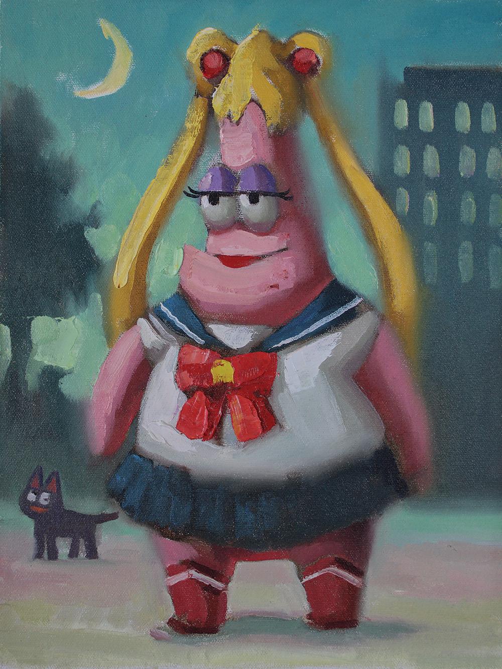
I draw inspiration from the places I have been to and also from the iconic pop culture characters.
HOW WHEN WHO 2.0
I paint more instinctively and imperfectly nowadays. I used to be obsessed with details and making everything look perfect and complete. But now I’m trying to capture the emotions and impressions that flow in my mind and transfer them onto canvas as quickly as possible so that I don’t lose those feelings before the painting is finished. Also, I’ve recently gained more confidence in painting without reference images. It has helped me develop my own painting style. I still have a long way to go but think I’m slowly getting there.


During a visit to Seattle, I accidentally came upon Andrew Wyeth’s Retrospect exhibition at Seattle Art Museum. The exhibition was truly amazing, and it deeply influenced my artistic direction ever since.
Andrew Wyeth

WHO
WHERE WHY HOW WHEN WHO 2.0
Shawn Huckins Peterborough, NH
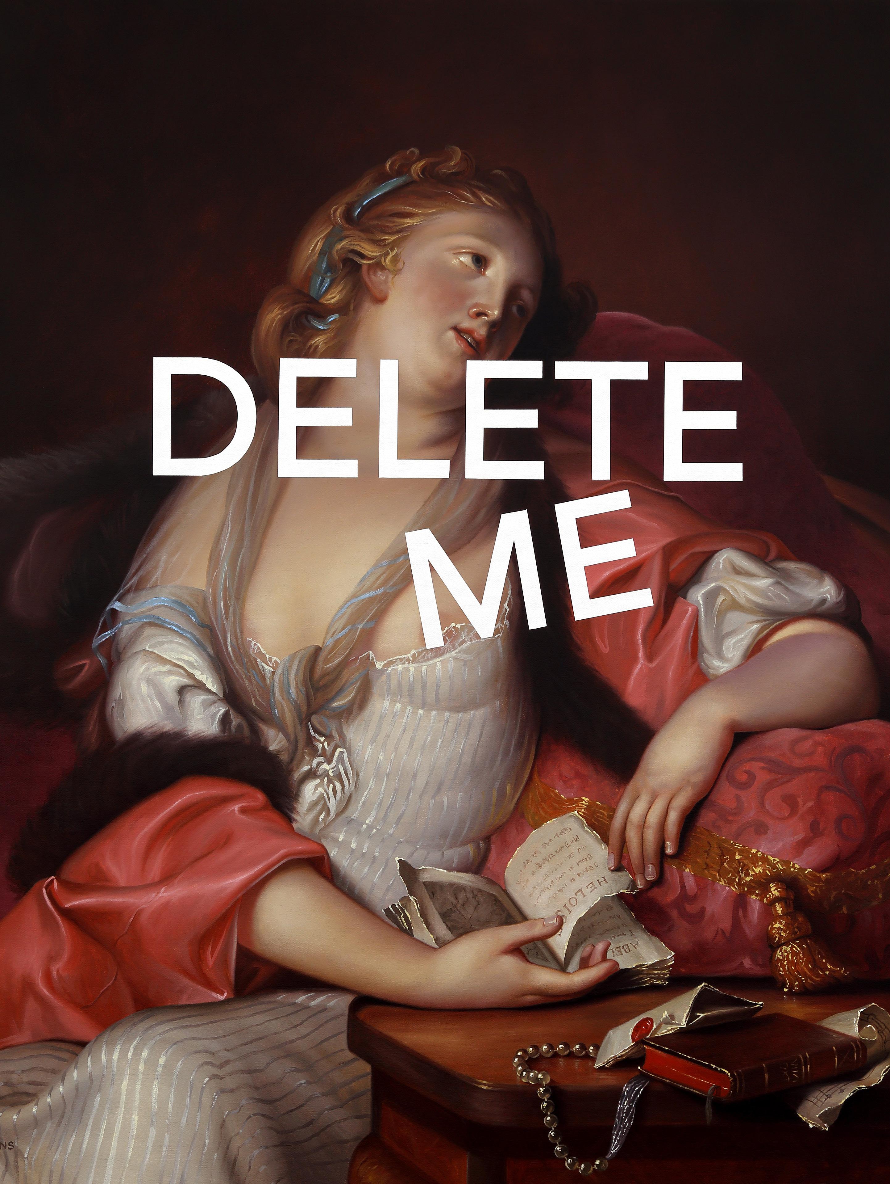
Inspiration is all around; from historic to contemporary painters; but I also find inspiration in unusual places, such as in the garden, on a hike, or in the shower.
I paint in a representational style, recreating historic portraits followed by the layering of contemporary texts overtop. My preliminary stage begins on the computer to ’sketch’ several compositions to experiment with various phrases. Once I have finalized the digital concept, I will draw the entire image on canvas, mask off the text, and employ traditional methods of painting. I will complete an underpainting followed by subsequent layers of finalized paint and glazing. Lastly, the tape will be removed to reveal the bright white text.
My last year of college (2006), the senior art students had an exhibition at the campus’s art gallery. I had two paintings and some ceramic pieces in my section of the gallery. I came to class one morning and my professor said all my pieces had sold and she said to ‘keep on going.’ I’m assuming she meant keep creating art. I worked a full time day job and painted at nights and on weekends. After working a day job for four years, I quit and pursued my art career full time. The senior show gave me the confidence that I might just make it in the art world.
Who 2.0 Erik Olson
WHO WHERE
Tania Marmolejo New York, NY

WHY
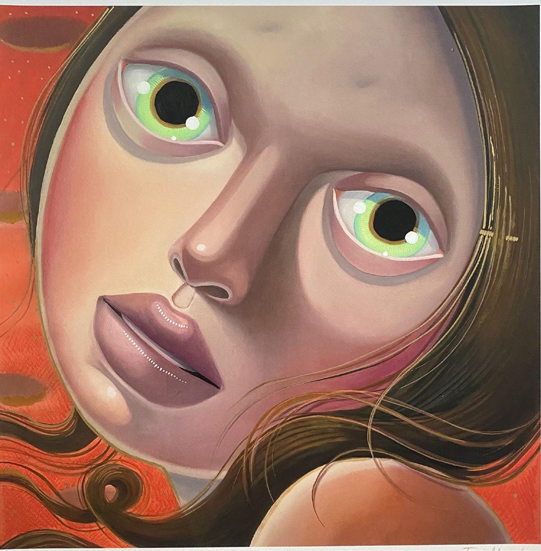
I feel the need to express women’s feelings and experiences, created by a woman, as a reaction to not having seen enough art by women growing up. It was usually a man’s interpretation of a woman’s feelings. That, and the need to put my own experiences into pictures, created my work.
HOW WHEN
I create large-scale oil paintings of women›s faces, (characters), with the purpose of giving little room to escape from their gaze. My work is completely expressionistic; I create in the moment without sketching first, and many times the painting changes mood as I create.


I grew up idolizing my Swedish maternal grandmother, who died before I was born. She was an amazing, frustrated artist who never got to exhibit her work. As a child I would try to copy her doodles and drawings from her sketchbook, (my favorite possession), making her the biggest influence in my art. Next year things will come full circle in an exhibition in Stockholm dedicated to her. If she only knew.
Edvard Munch, Artemisia Gentileschi.
WHO 2.0
WHO WHERE WHY
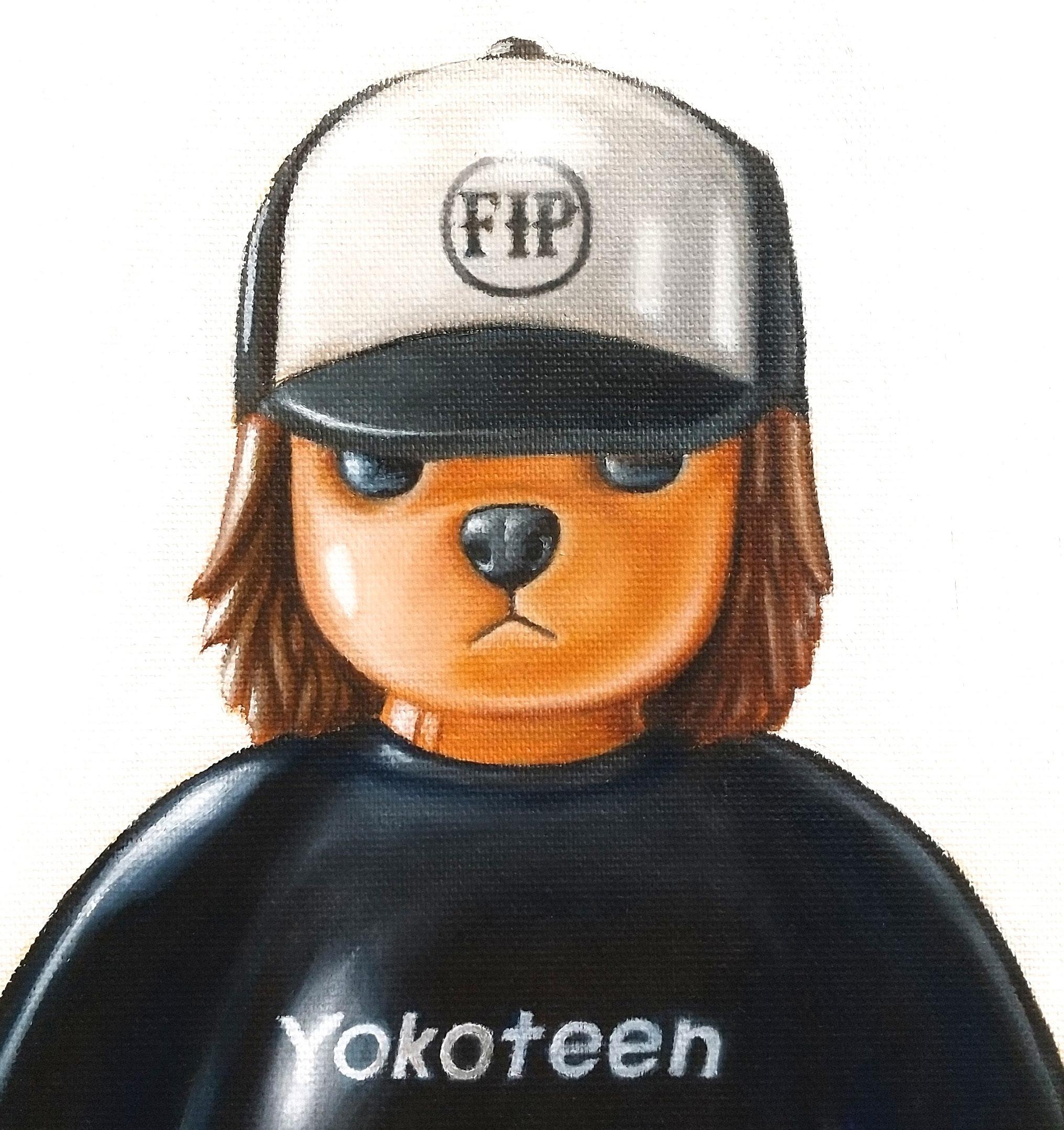
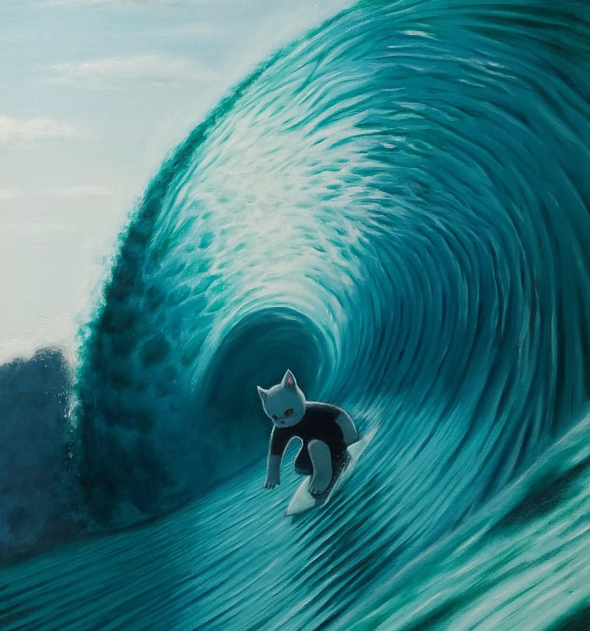
Yokoteen Tokyo Sea, music

HOW WHEN WHO 2.0
Oil painting on canvas.
I like the Hakone Open Air Museum because I can enjoy nature and art. Van Minnen, Jerk Face, Matsuura Hiroyuki, Imon Boy, Tide…and more!


 © 2022 The Andy Warhol Foundation for the Visual Arts, Inc. / Licensed by Artists Rights Society (ARS), New York


 Fanny Nicole Brodar Maine

