
GRAPHIC AND PRODUCT DESIGN PORTFOLIO

EMOTION FEAR -
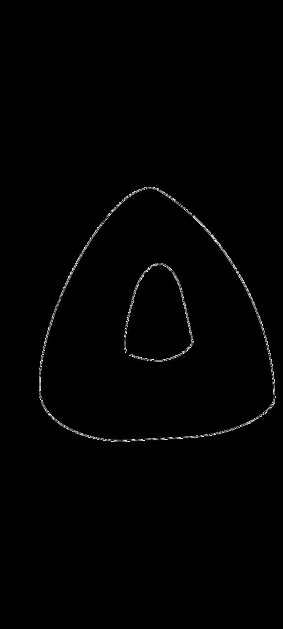
KEYWODS
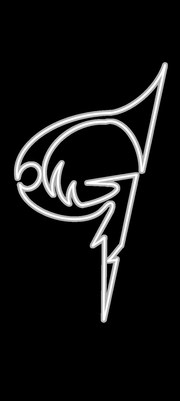
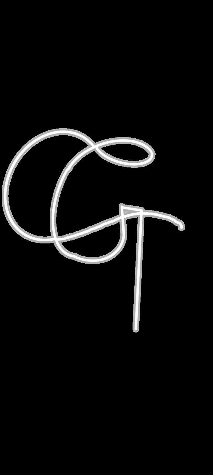
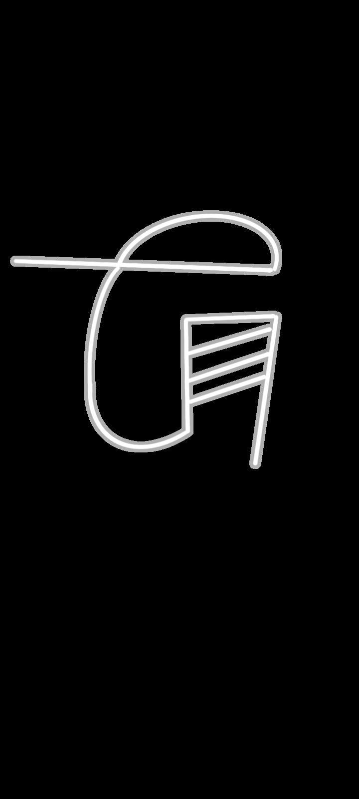
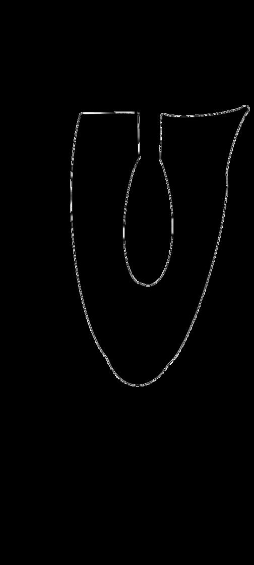
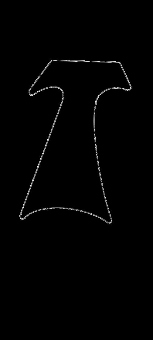
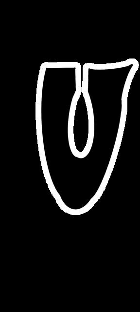
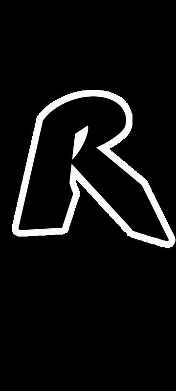
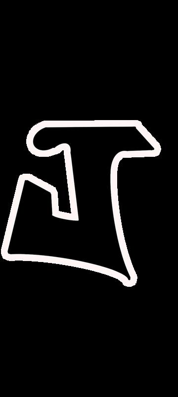
THIS LETER CARRIES THE SIZE OF 3x3inch AND INSPIRED BY THE EMOTION “FEAR” WHICH HAS KEY WORDS SUCH AS UNSTABEL, DARK, SHARP, DEPTH, HOLLOW.
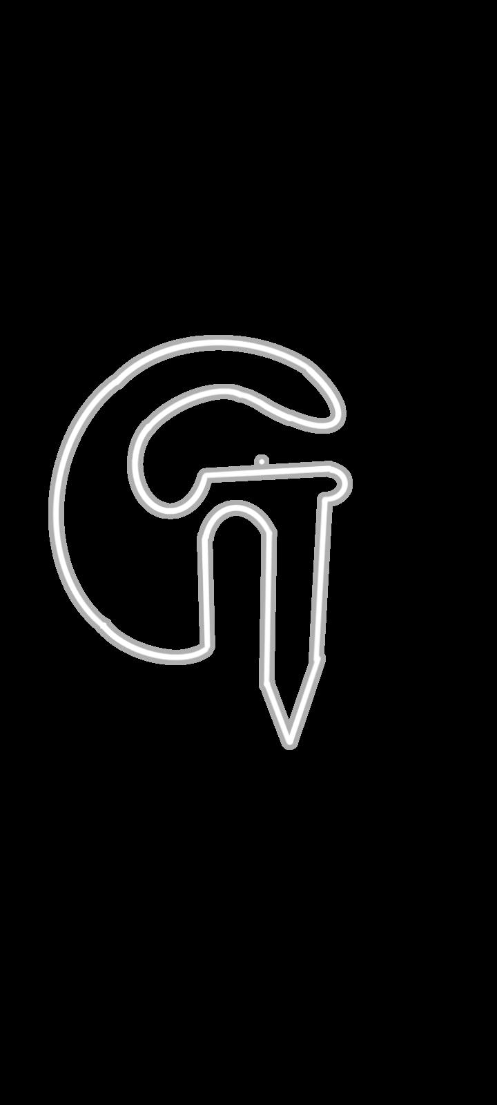


DARK UNSTABLE DEPTH SHARP HOLLOW


ON
DARK UNSTABLE SHA
KEY ALBHABET WHICH BECAME THE BASE REPRESENTATION OF THE THEME DEPICTING THE EMOTION “FEAR” BY USING THE KEYWORS WHICH HELPS REGUL MT
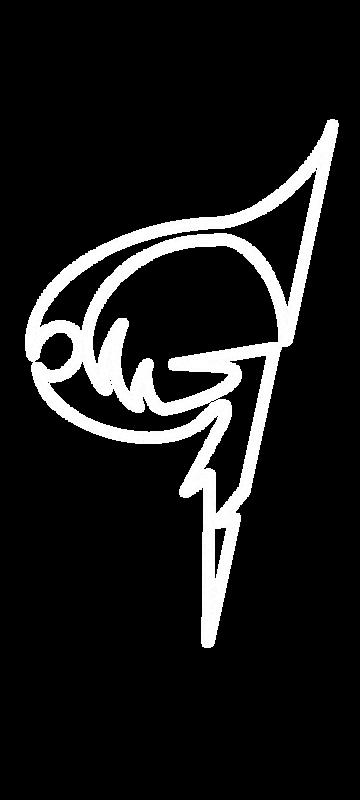

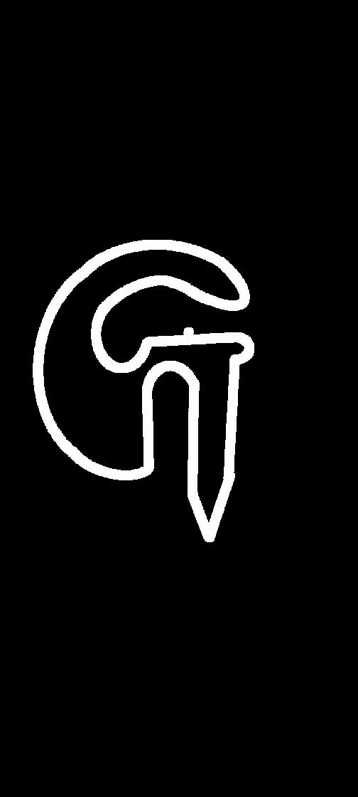


TH E SO IN E THEME AS T “G’ INFLICTING THE EMOTI “FEAR”. THE SHARP EDGES, THE VISUAL INSTBILITY OR BALANCE OF THE LETTER WHICH ALSO DEPICTING THE DEPTH OR HEIGHT.


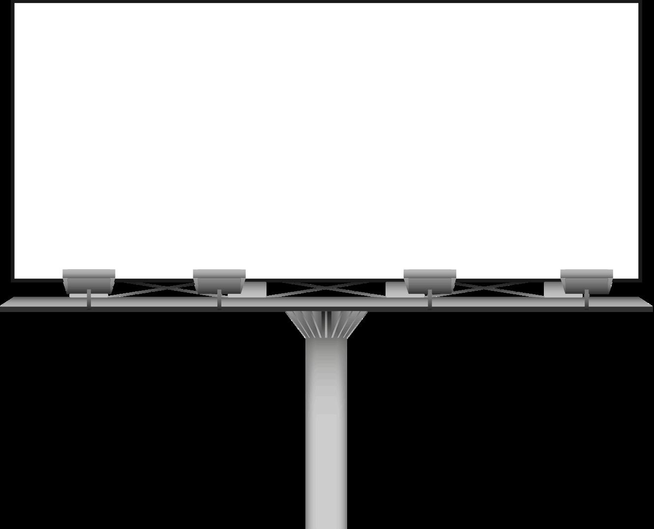
RATIO : 1:200
DISPLAY BOARD SIZE VISIBILITY HEIGHT OF TEXT
1.2 M 220M (MAIN TEXT)
5 M 8M
0.5 M (CAPTION) 30M
This text height and visibility may varry from person to person but, these are standarized for all.
GRANDOPENINGON10THMAY,2025


AD ANALYSIS
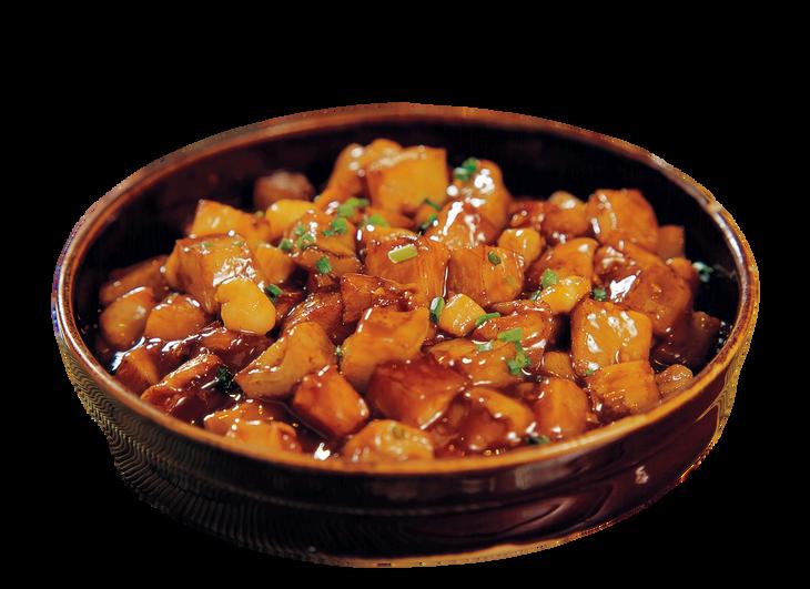
The primary goal of this advertisement is to promote a cooking competition titled "Battle of the Home Chefs". It invites home cooks across Andhra Pradesh to showcase their culinary skills and compete for cash prizes. Additionally, the advertisement aims to: Increase brand visibility for Aashirvaad Masala Karam and associated sponsors. Engage local communities and food enthusiasts
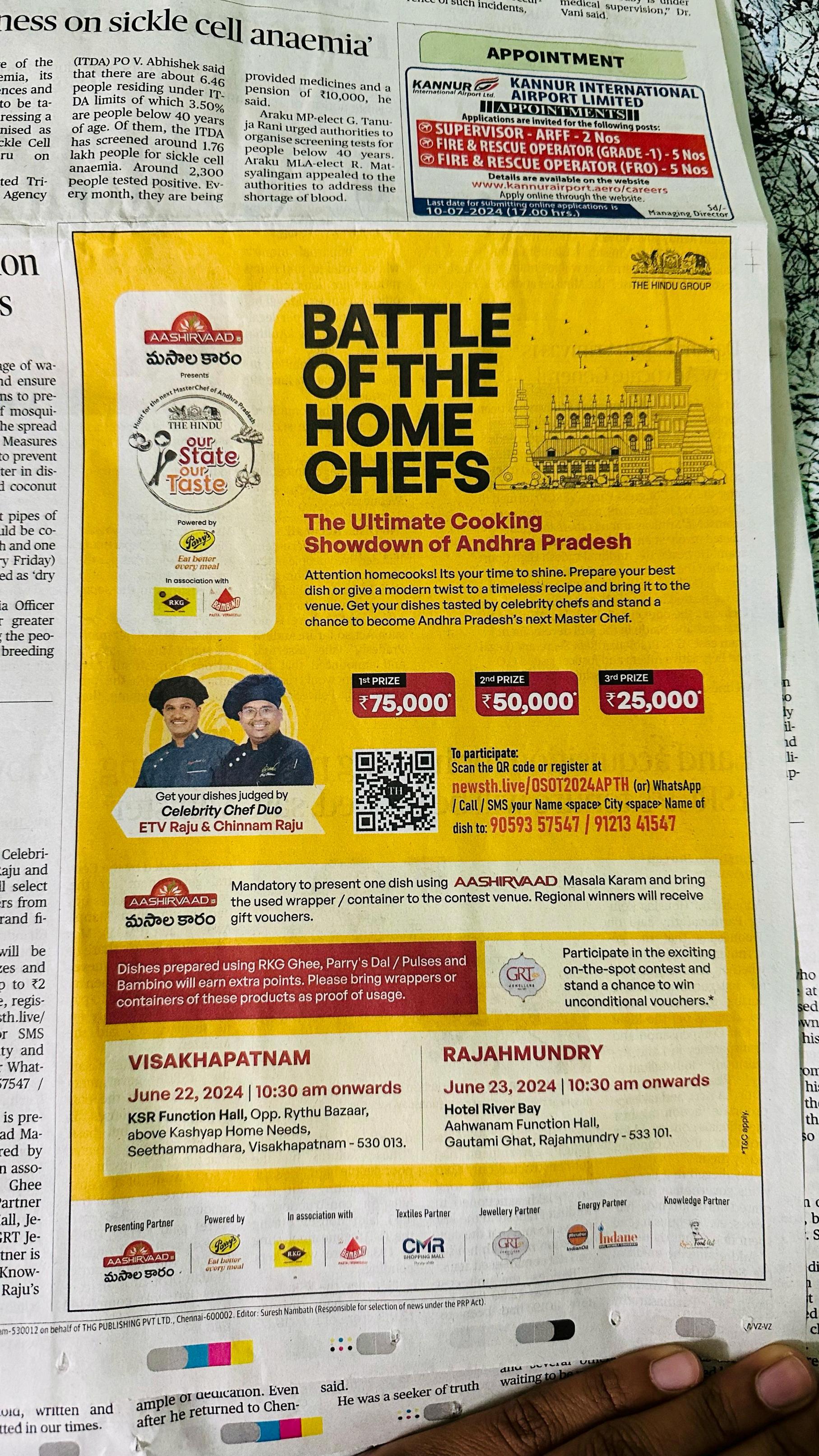
Two-Column Structure:
Left side: Images (Celebrity Chefs, Prize Money) & Branding
Right side: Text Information (Event Details, Registration, Sponsors) Horizontal Segmentation: Header (Branding & Title) – Logos, bold title, cultural illustration.
Main Body (Event Details & Prizes) – Focal points: chefs' image & cash rewards
Call to Action (Registration & Sponsors) – QR code, contact details, and brand reinforcement.
2 5 C M
16CM
Color Scheme & Design
Effective Alignment: Key elements are leftaligned for readability, with central elements (title, QR code, prizes) attracting attention. Effective Alignment: Key elements are leftaligned for readability, with central elements (title, QR code, prizes) attracting attention.
Yellow Background: Bright, eyecatching, and energetic.
Black & Red Text: High contrast, making key details stand out. Bold
Typography: Used for the title and prize money to create emphasis.
MAKE A CHANGE

NURTURE A BETTER FUTURE, EVERY DAY