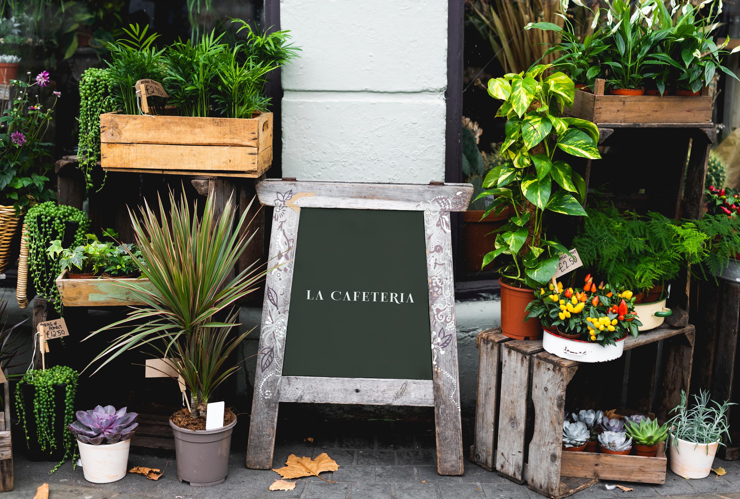
L A C A F E T E R I A
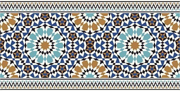
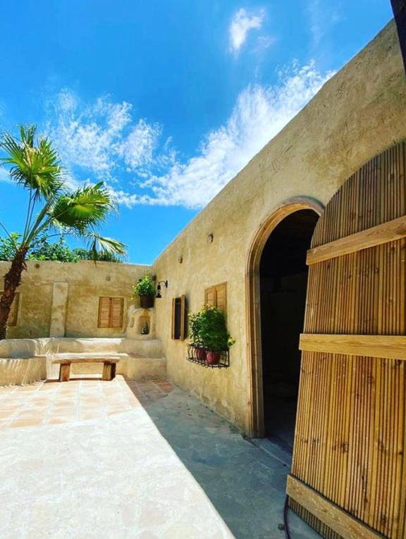
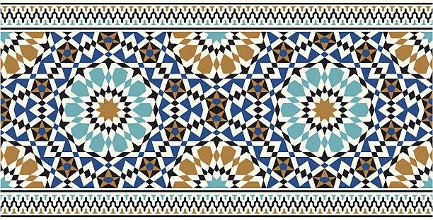
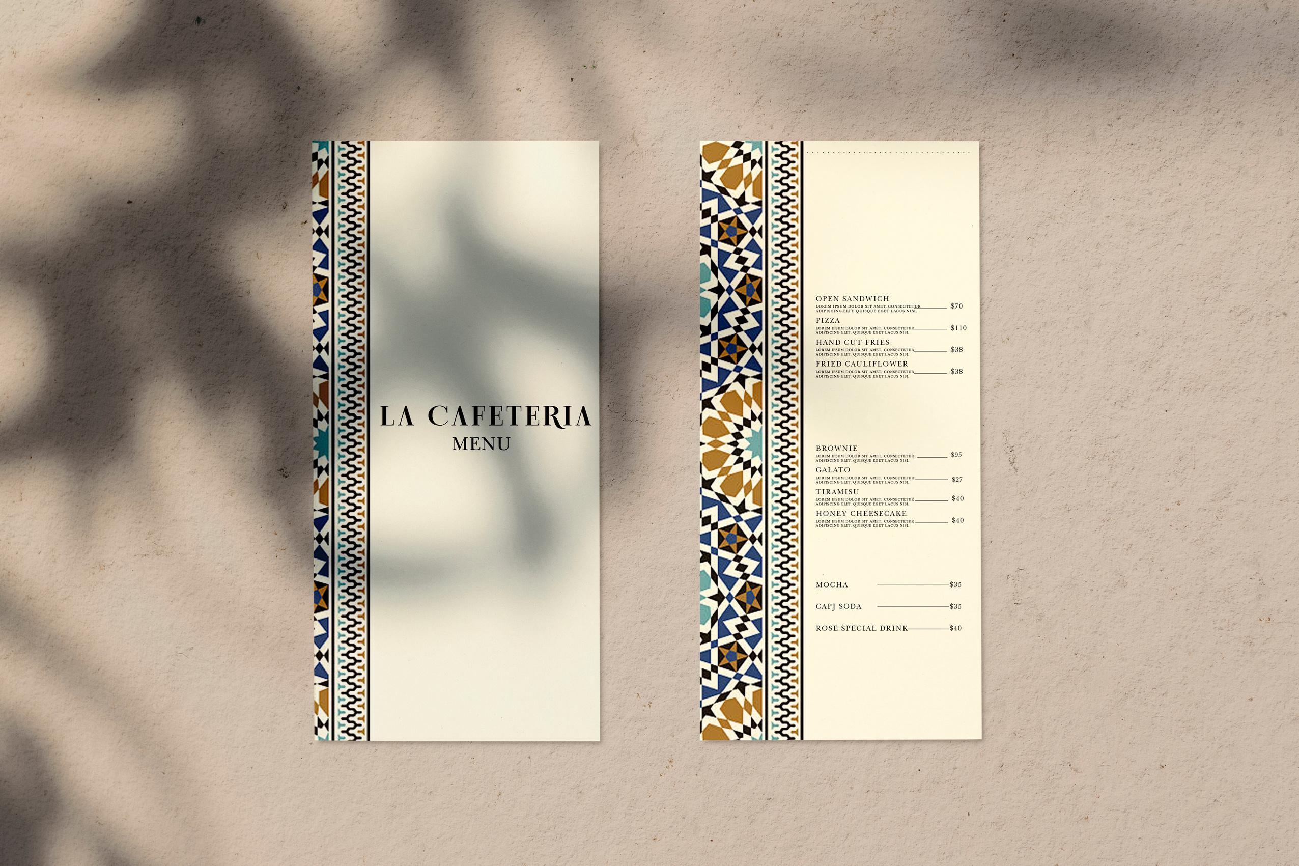
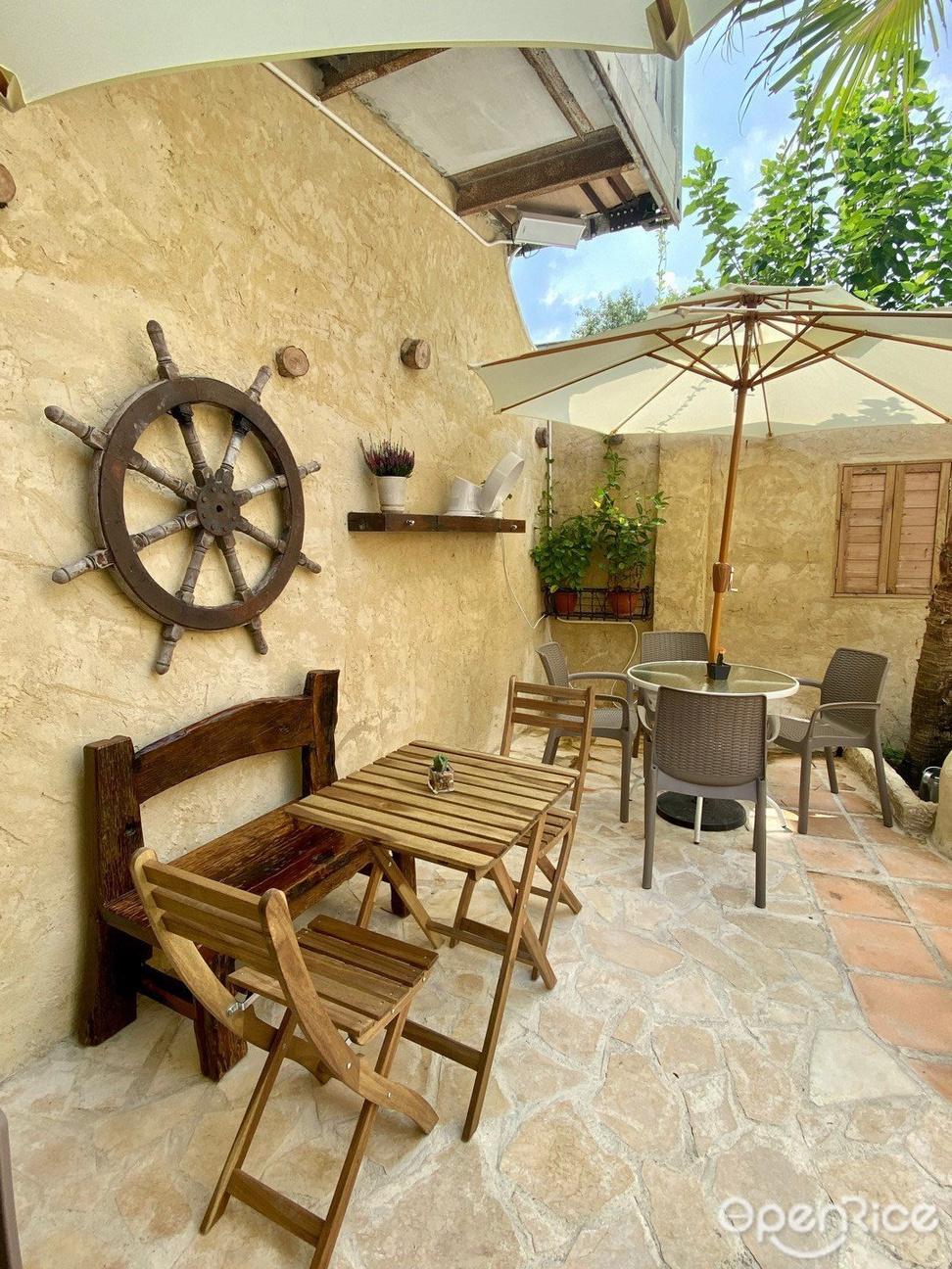
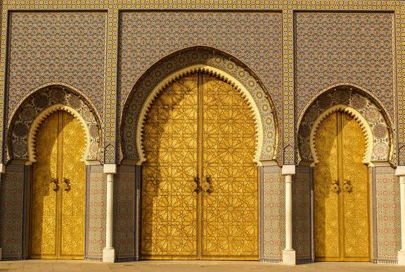
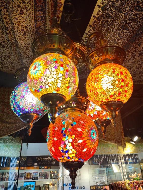
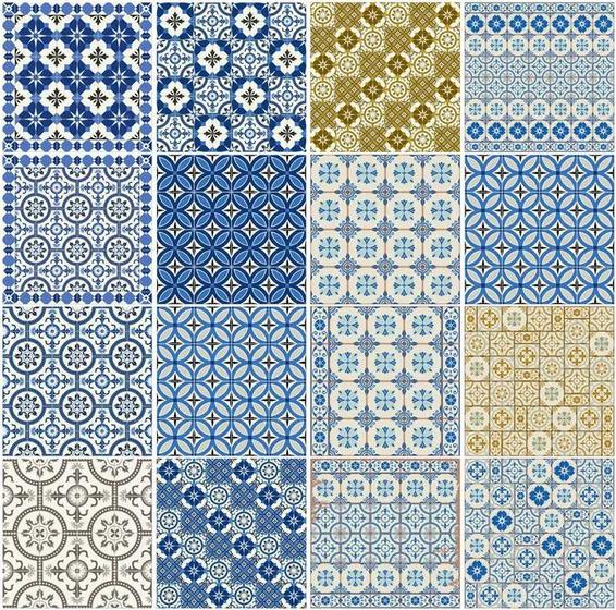
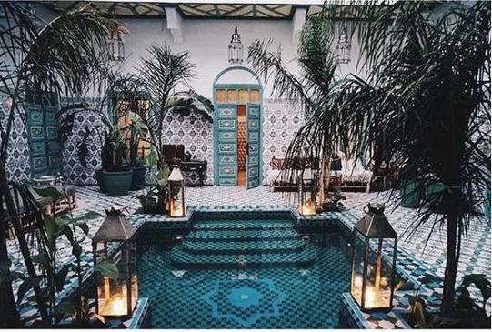
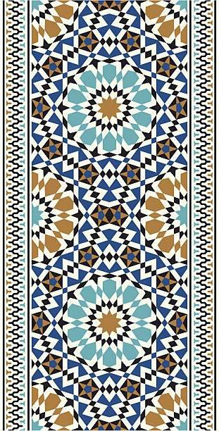
La Cafeteria is located in a red brick house in Kam Tin, Yuen Long. It is full of Moroccan style. The outdoor area not only has mud yellow brick walls and round arched wooden doors but is also decorated with rustic wooden tables and chairs, oil lamps and other decorations. Café is also a pet friendly restaurant, you can bring your pets to enjoy the sun and food in the outdoor area. La Cafeteria has a limited selection of food, mainly serving Western-style light food, such as Pizza, fried food, sandwiches, etc.; for desserts, there are brownies with ice cream; for drinks, there are coffee, soda, hot tea and other choices.
What’s wrong with the current business branding?
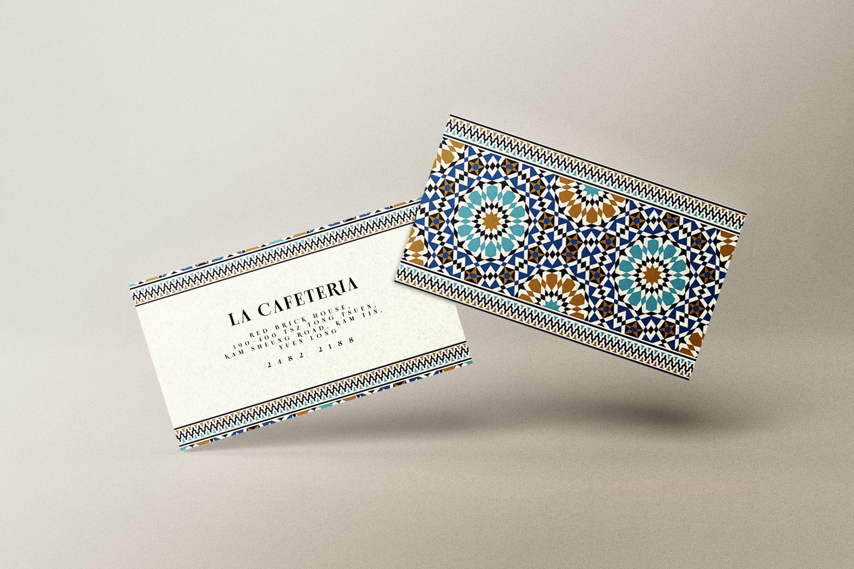
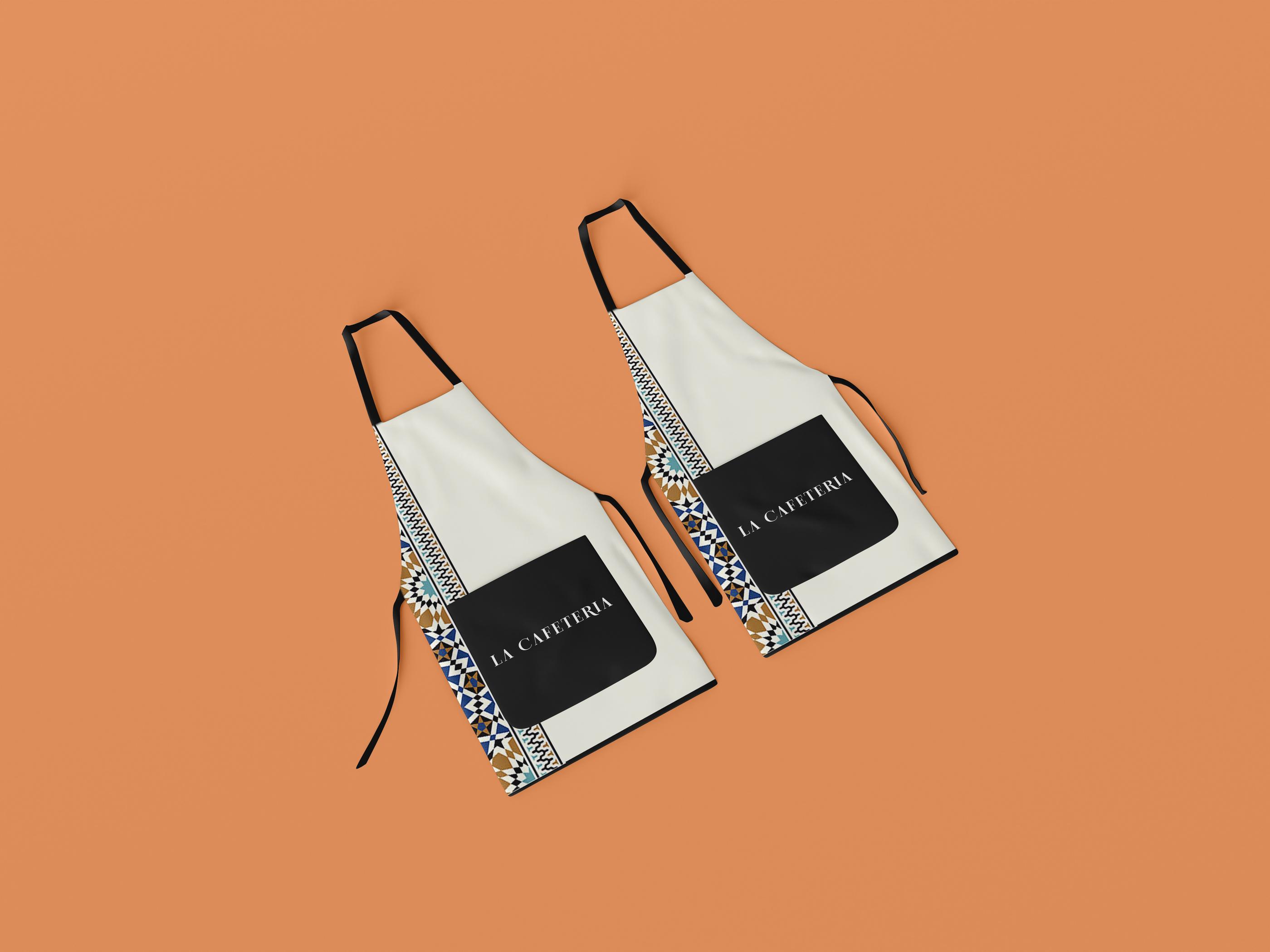
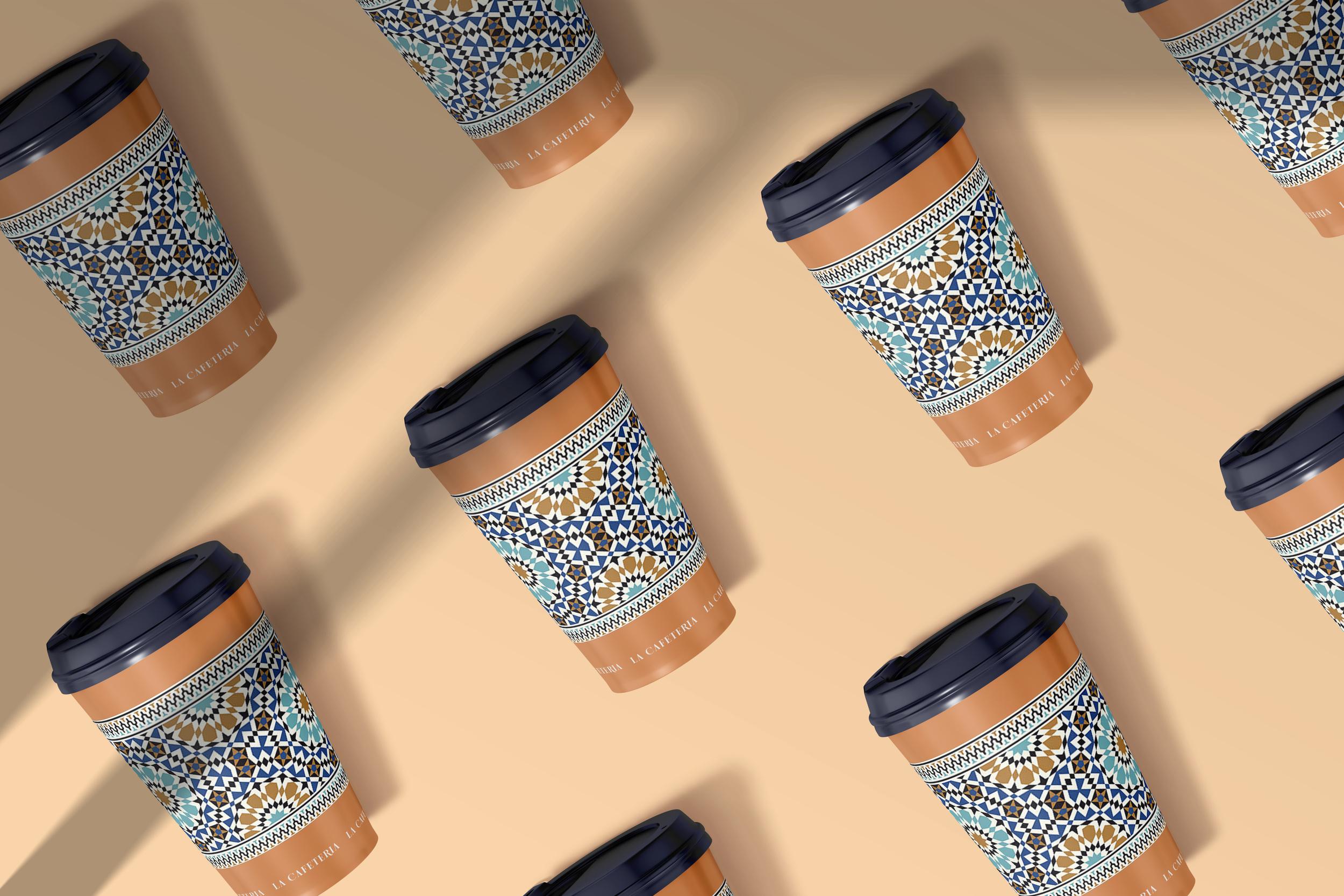
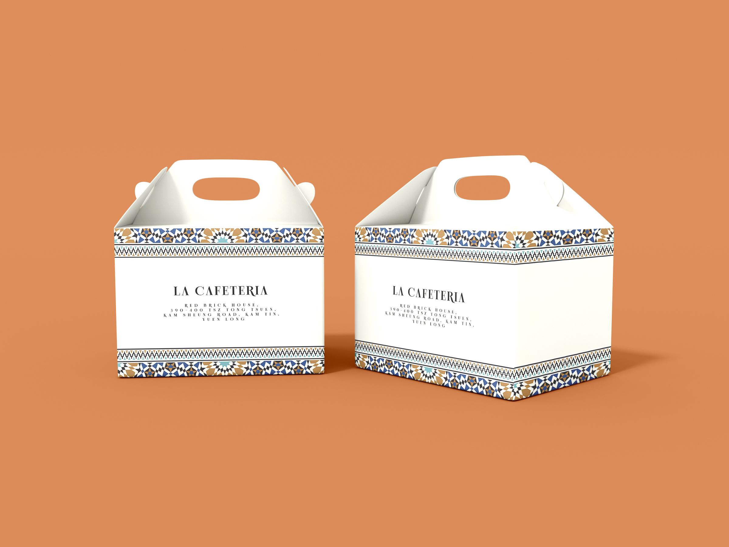
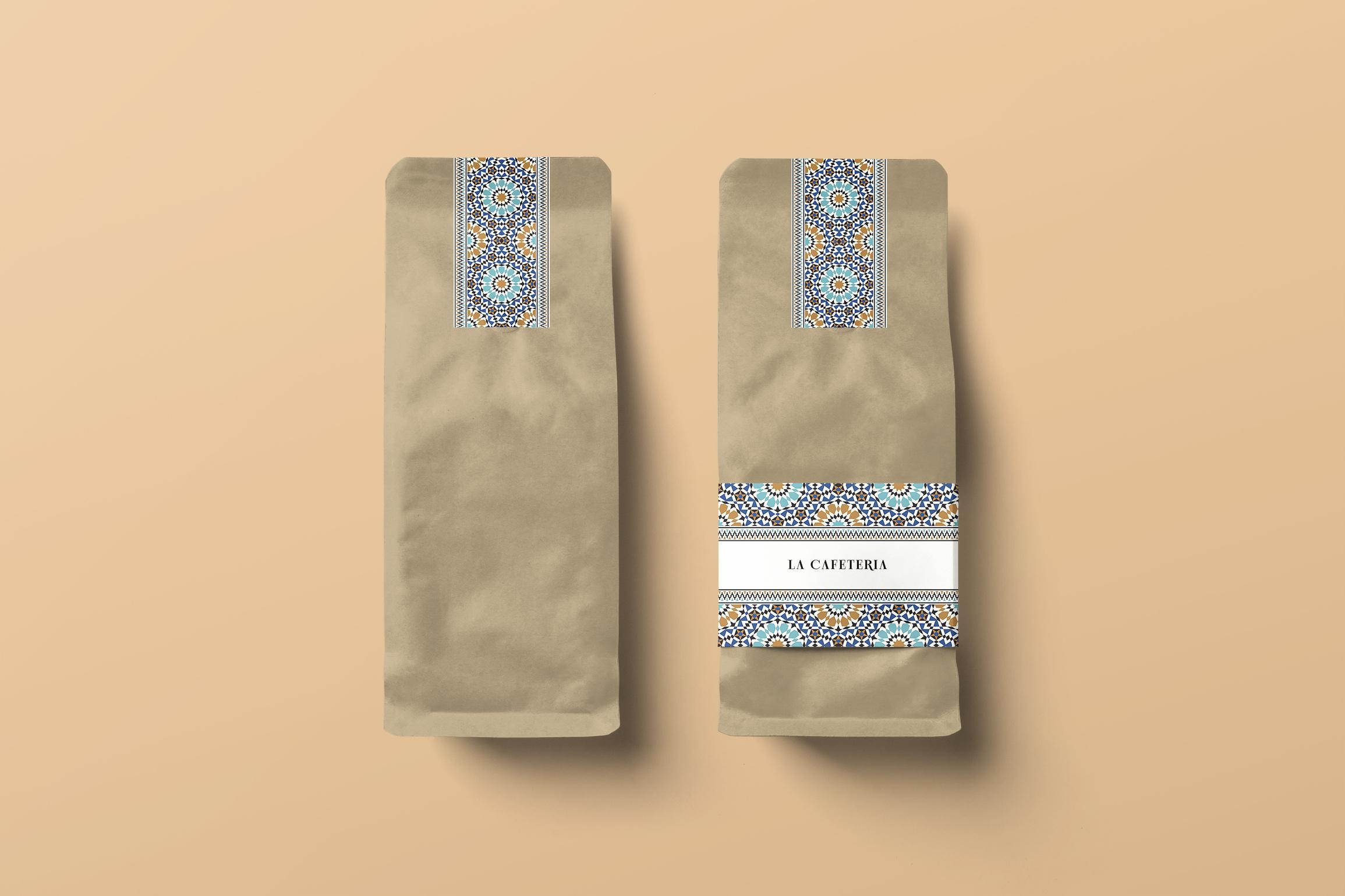
The logo and menu are like the facade of a restaurant. A menu with a unique design and beautiful pictures can instantly attract consumers' attention and make them choose your restaurant, but La Cafeteria lacks these designs. La Cafeteria needs a new brand identity (LOGO, menu), the ideal result is that the brand identity of the restaurant can cooperate with the environment of the restaurant, bringing out the feeling of Moroccan style.
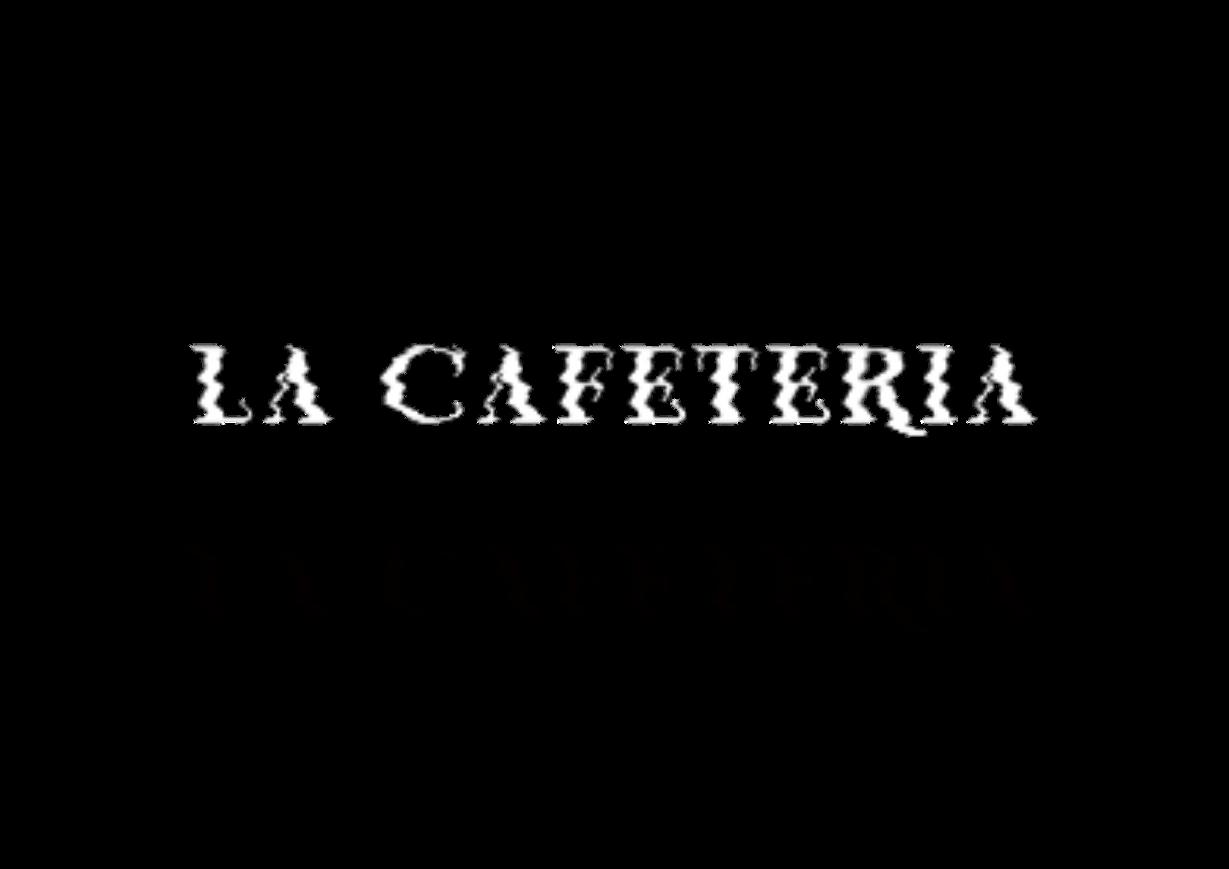
The bend of the logo makes these letters look very elegant. The letters look like they are dancing. Coupled with the small bend, the logo looks very lively, like the beating notes on the music score. Even if the tail of the letter is extended, it doesn't feel artificial, but gives people a very neat feeling.
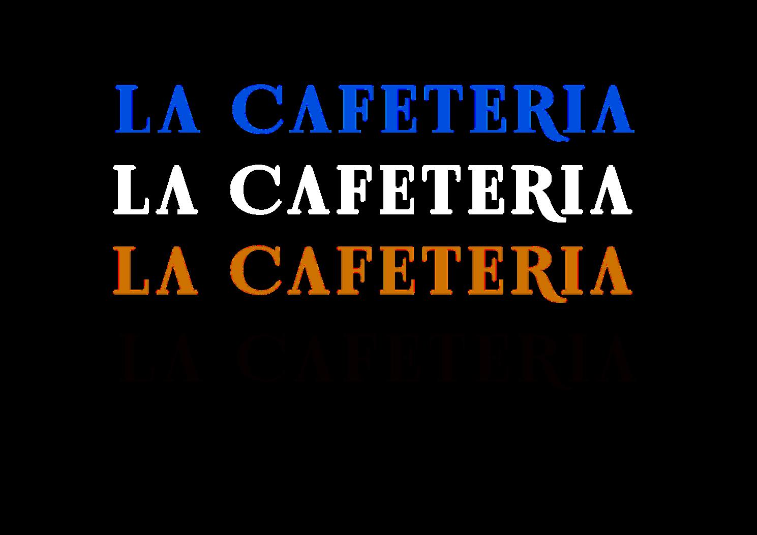
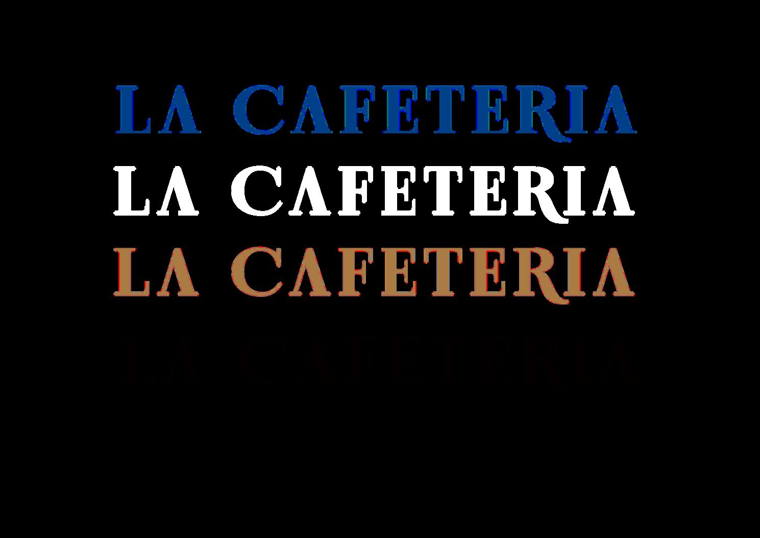
The lines of this logo are thin, so it is not suitable to be placed on a complex pattern background. Relatively, it is more suitable to be placed on a solid colour background, which will produce a simple and powerful effect.

CMYK
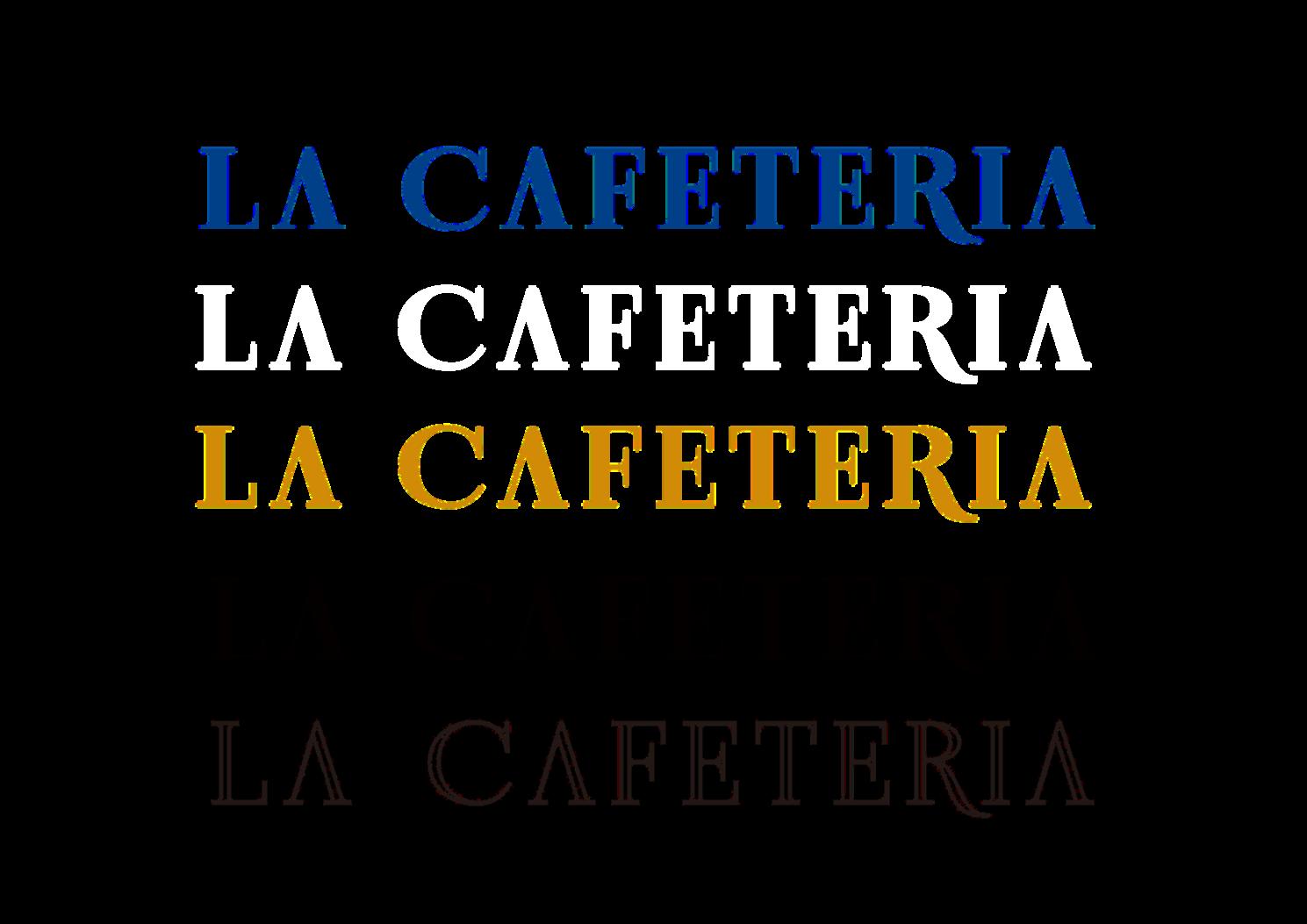
#EAEDD9 CMYK #004088 CMYK #FF914D
1. 2. 3. 4. 5. 6. 7. 8. 9.
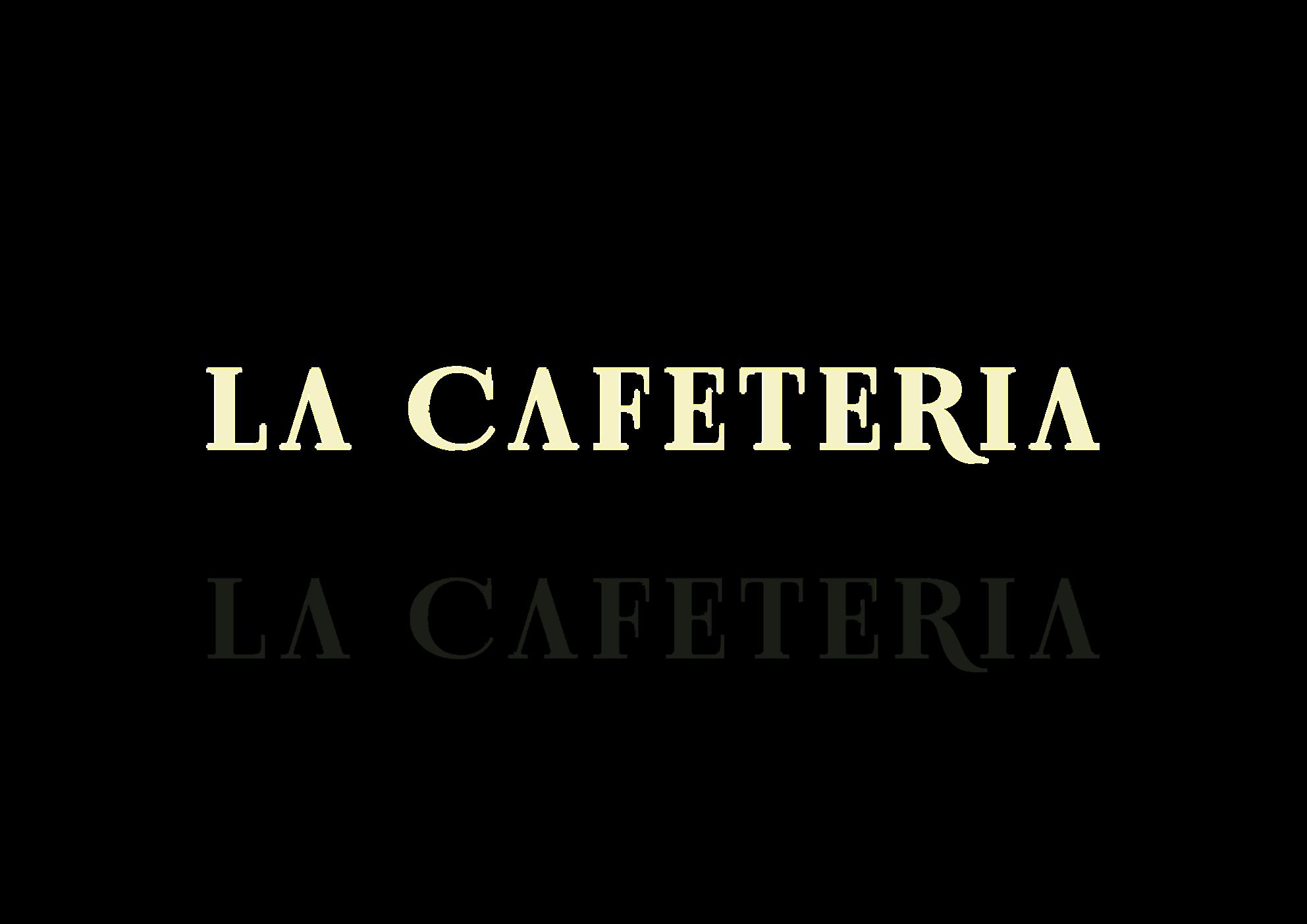
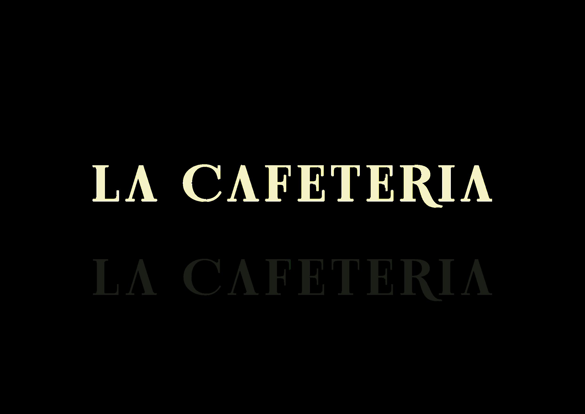
Do not use the old stacked version of the logo.
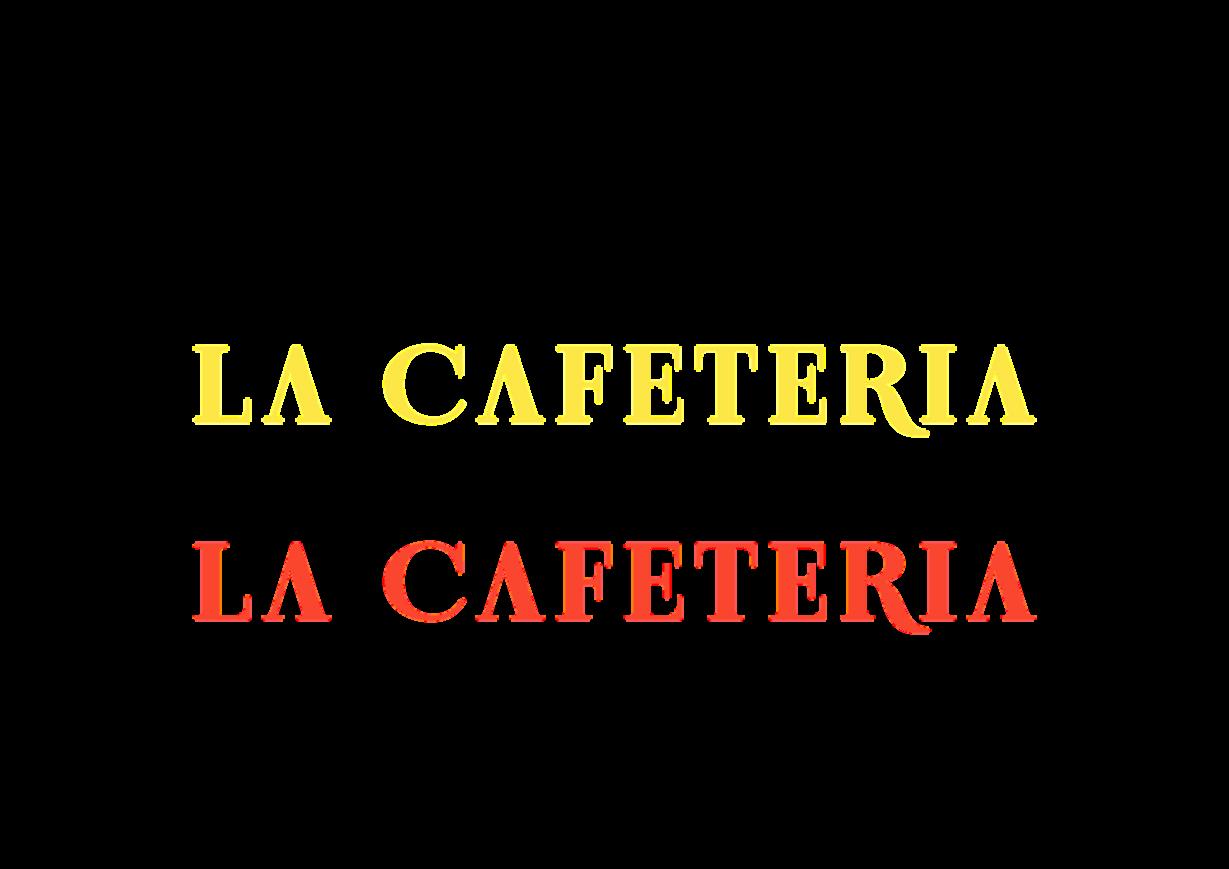
Do not apply a gradient to the logo.
Do not rotate the logo.
Do not crop the logo.
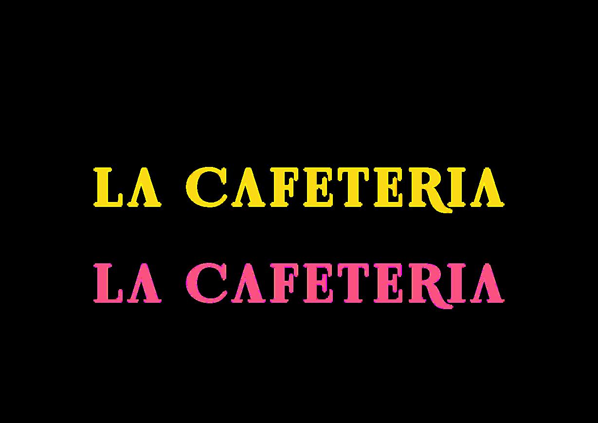
Do not change the logo colour or tone outside of the colour palette.
Do not resolve the logo in two different colours. Do not distort or warp the logo in any way. Do not outline or create a keyline around the logo. Do not change the typeface nor recreate or manipulate the wordmark

1 4 7
It’s important that the appearance of the logo remains consistent. The logo should not be misinterpreted, modified, or added to. Its orientation, colour, and composition should remain as indicated in this document there are no exceptions.

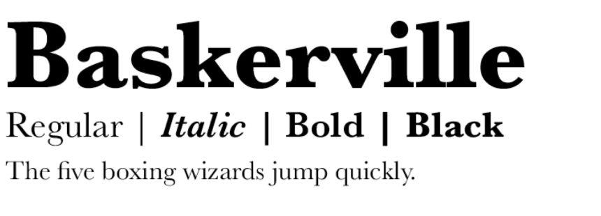
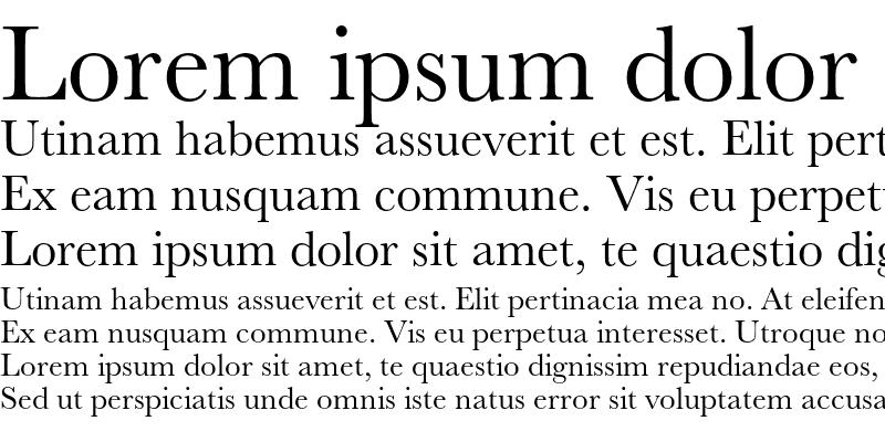
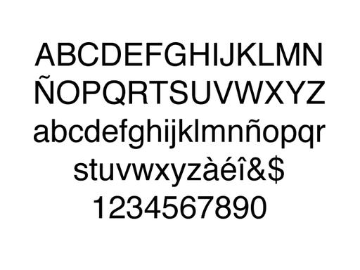
As noted, typeface shapes a company’s personality. Therefore, it is vital to consider what typeface will be at the forefront of forming this image primary font. To add variation, La cafeteria will have a secondary typeface which is limited for distinct purposes or recipients.
BASKERVILLE BOLD
ABCDEFGHIJKLMNOPQRSTUVWXYZ abcdefghijklmnopqrstuvwxyz 0123456789
BASKERVILLE REGULAR
ABCDEFGHIJKLMNOPQRSTUVWXYZ abcdefghijklmnopqrstuvwxyz 0123456789
BASKERVILLE ITALIC
ABCDEFGHIJKLMNOPQRSTUVWXYZ abcdefghijklmnopqrstuvwxyz 0123456789
Primary: the most recognizable and frequently used font
Secondary: a supplementary font to the primary font Web safe default: a backup font that displays when a digital device doesn’t support the specified font. This is because the font is not installed on the device or originates from an unfriendly source.