INTERIOR DESIGN PORTFOLIO GRAYSON AVRIETT


Hotel Location– Covent Garden, London
Style – Victorian elegance meets modern luxury
Hotel Type – Boutique design hotel
Inspiration – Crystal Palace & Victorian-era innovation
Target Guests – Business professionals, young adults, travelers
Experience – High-end yet inviting with curated amenities
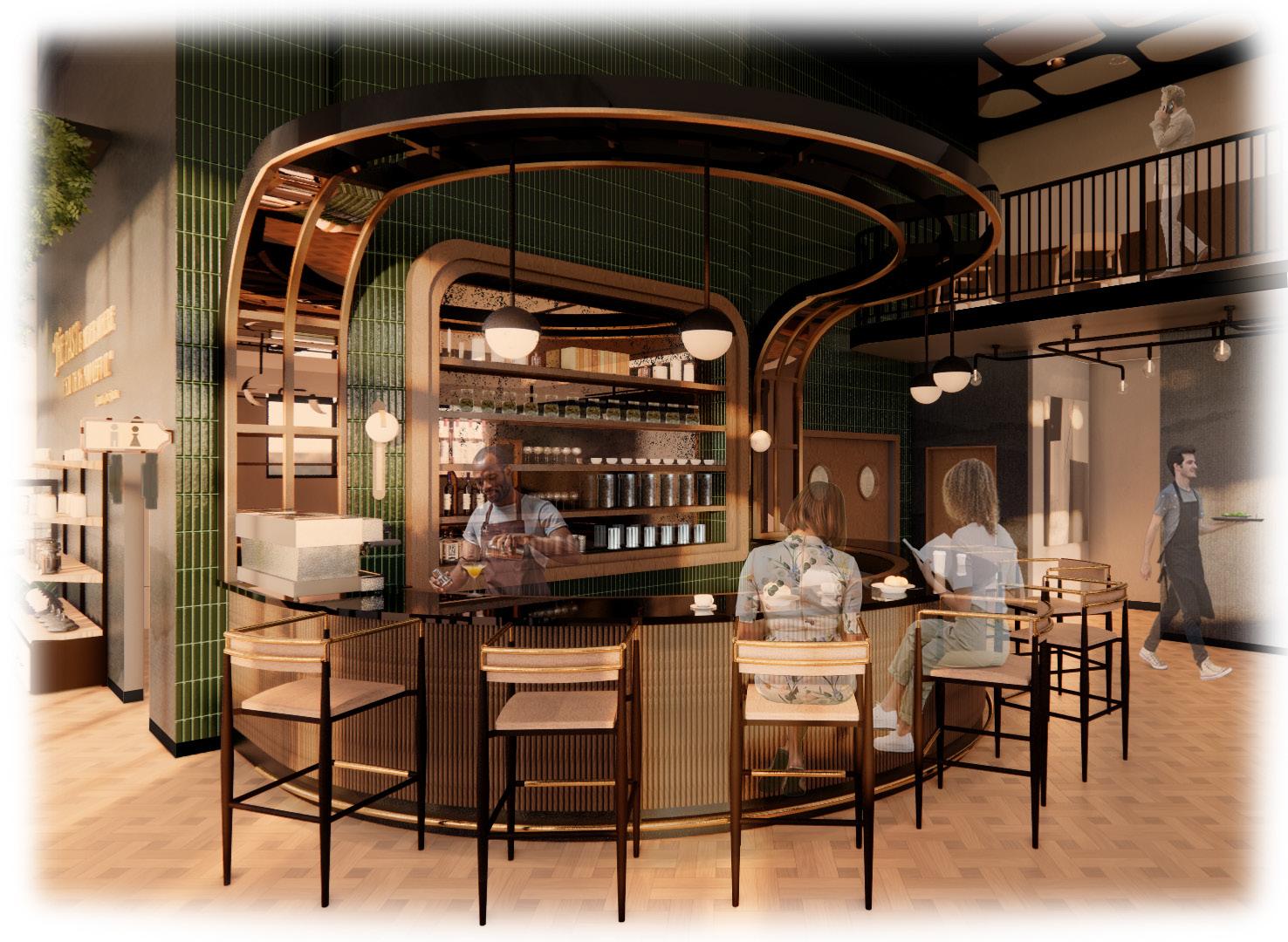
The Paxton is a design-focused hotel that merges Victorian architecture with modern functionality. The lobby features an open layout with a monumental staircase leading to The Elysian restaurant and a two-story bar and lounge with a cigar lounge. The first floor includes a high tea café and additional lounge spaces. Suites offer panoramic city views with contemporary amenities. Thoughtfully designed for comfort and efficiency, The Paxton provides a seamless guest experience.


Located in the heart of Covent Garden, London, The Paxton offers guests direct access to the district’s renowned theaters, markets, and shopping. Surrounded by a mix of historic landmarks and modern attractions, the hotel provides a prime location with easy access to public transportation, making it an ideal stay for both business and leisure travelers.


The Victorian Elegance concept, subtly influenced by the infamous Crystal Palace, seamlessly blends historical excellence with contemporary innovation. Drawing inspiration from the Victorian era’s advancements and incorporating discreet but meaningful accents, the design captures the essence of progress in technology, art, and industry. This narrative invites visitors on a journey of wonder, harmoniously integrating the past with modern innovations for a unique and captivating experience.
The carefully curated color palette reflects Victorian opulence and modern sophistication, creating a light and airy ambiance. Subtle details, like rustic finishes and transparent materials, add a touch of uniqueness, ensuring the hotel offers a contemporary yet whimsical atmosphere for its guests.


ENGLAND


The first-floor exterior extends the bar’s atmosphere with seamless indooroutdoor flow, offering bar seating and a welcoming space for socializing.


Named after the Chance brothers, who crafted the Crystal Palace’s glass, Brother’s Bar and Lounge spans two levels with sleek metal finishes, bar seating below, and intimate lounge seating above, creating a lively setting for signature cocktails.


The lobby welcomes guests with a grand entrance, featuring a sweeping staircase, ornate columns, abundant seating, and a prominent reception desk. These design elements come together to create an atmosphere of luxury and hospitality from the moment guests arrive.


The monumental staircase at The Paxton blends artistry and functionality, connecting the hotel’s levels while serving as an architectural highlight.
The Elysian Dining Room, adorned with light and airy décor, intricate ceiling details, and elegant chandeliers, creates a refined yet inviting ambiance. This thoughtfully designed space enhances every dining experience, offering a charming setting where guests can enjoy exquisite cuisine in a warm and sophisticated environment.


The Level 2 lobby offers a welcoming space with soft lighting and comfortable seating, inviting guests to relax. The bar is to the left, and the restaurant to the right, easily accessible from the bridge entrances. These design elements come together to create an atmosphere of luxury and hospitality from the moment guests arrive.


Plush lounge seating, sweeping panoramic views, and thoughtfully designed ambient lighting come together to create a refined and inviting atmosphere. This carefully curated setting provides the perfect space for guests to relax, unwind, and engage in meaningful conversations, whether enjoying a quiet moment alone or socializing with others.

The speak-easy style cigar lounge, Ember’s, welcomes guests with a touch of luxury. Complete with a coat closet for convenience, it sets the stage for an exclusive experience. The interior of the lounge features plush seating, fine cigars, and a stylish pool table, adding a relaxed, social element to the refined atmosphere.


The sleeping floors prioritize comfort and luxury, featuring carefully selected materials and cozy furnishings. Guests step off the elevators into a corridor with dark wood paneling and contrasting wallcovering, leading to 8 typical suites and 4 king suites designed for restful stays.


In the bedroom, a lavish kingsize bed, adorned with plush, high-thread-count linens, invites guests into a world of comfort and relaxation. Thoughtfully curated serene décor, soothing color palettes, and carefully placed lighting enhance the tranquil ambiance, creating a peaceful retreat where guests can unwind, recharge, and enjoy a truly luxurious and rejuvenating stay.
The living room of each King Suite carries the warmth of wood accents from the corridor, complemented by plush furnishings and a stylish dining area. Thoughtfully designed, the space balances elegance and comfort, providing a sophisticated setting for both relaxation and socializing.

Many hostels in the United States no longer meet the needs of modern travelers who seek immersive experiences, cultural engagement, and a balance of socialization and privacy. Traditional designs often lack adaptable spaces and community-focused amenities, limiting meaningful interactions.
This project reimagines hostels with flexible layouts for communal dining, cultural workshops, and local experiences, along with private rooms and modern amenities for comfort. Natural elements like green spaces and lighting enhance the experience while reflecting each location’s identity. This redesign aims to keep hostels relevant and appealing to future travelers.

The “Force of Nature” concept is inspired by the elemental forces—wind, water, and geological movements—that shape national park landscapes. This design uses natural materials, organic forms, and dynamic layouts to immerse guests in the power and beauty of nature. Each hostel location will reflect the unique natural forces of its surroundings, offering guests an authentic experience that connects them to both the environment and the park’s landscape.
FLEXIBLE DESIGN
Design flexible, modular spaces inspired by the natural beauty of each park, adaptable for various locations and activities.
Develop a cohesive brand identity for the hostel, showcasing its design foundation while highlighting each national park’s unique features.
LOCAL VERNACULAR
Use design elements that reflect the local style, connecting each location to the region’s natural and cultural heritage.
PRIVACY BALANCE
Provide private and shared spaces to suit guests’ needs for socializing or solitude, ensuring comfort.
SAFETY & SECURITY
Design spaces with security in mind to ensure guest comfort and privacy.
SUSTAINABLE DESIGN
Use eco-friendly materials and energy-efficient solutions that align with nature-focused travelers and help preserve the surrounding environment.


Age Range: 18–50 years
Uses: Engage in cultural events, use social spaces like the café or outdoor terrace, connect with fellow travelers, and enjoy outdoor activities like hiking, biking, and skiing.

Age Range: 18–40 years
Uses: Stay in an accommodation based on preference, engage in outdoor activities, participate in local tours or excursions, and connect with other guests through shared experiences and social spaces.

Age Range: 21–50 years
Uses: Handle bookings, check-ins, and guest inquiries, recommend local attractions, assist with itineraries, manage schedules for events and activities, and maintain the hostel’s facilities.
The objective is to craft a holistic brand for a new Tallahassee cafe, with a focus on breakfast and lunch services. The clients, proud locals, aspire to create a positive impact in their community by establishing a welcoming “third place.” The cafe will provide table service and prioritize acoustics to enhance conversations. The project involves creating a brand that reflects local values, including a restaurant name and design that appeals to both weekday business patrons and weekend gatherings of families and friends.
Upon entering the space, customers are greeted by the host stand and welcomed into the café. The warm color scheme and nostalgic mood aid in creating an opulent atmosphere that acts as the perfect place to host client meetings or luxurious lunch breaks for the tenants of the surroundings businesses. The large wall in the main dining space is adorned with images from the 1920s in gilded frames to tie the concept into the design.

The design of The 18th is inspired by the concept of contemporary

The predesign elements demonstrate the initial space planning within Suite 113. Proxemics play an important role within the design as the café must be easy to navigate and universally accessible to all users. Specific


The level one floor plan features a retail store, takeout area, two ADA restrooms, a full kitchen, and various seating options. Guests are greeted by a host and guided to their seats, exiting through the retail space to encourage purchases. As the dining room fills, the mezzanine on level two offers additional seating.


LEVEL ONE RCP
NOT TO SCALE
11’-0”
11’-0”
11’-0”
11’-8”
14’-8”
LEVEL TWO FLOOR PLAN NOT TO SCALE

LEVEL TWO RCP NOT TO SCALE
The bar serves as the café’s striking focal point, drawing guests in with its elegant curvilinear form. A floorto-ceiling tiled wall, adorned with a built-in shelving unit and an antique mirrored backing, enhances the ambiance, reflecting the café’s nostalgic charm. This inviting space encourages customers to linger, unwind, and fully immerse themselves in the timeless design.


Customers are directed through the distinct retail space when leaving the café. The space has merchandise related to the branding of The 18th, including shirts and hats with the café logo, coffee mugs, coffee grounds, tea tins, and more that customers can purchase. This space will also act as host for take out and to-go orders with a window connected to the kitchen to create easy and effective access for employees.
The goal is to design a pediatric primary care facility set in Baltimore, Maryland. This clinic will offer extensive primary care services for children from birth to eighteen years old, with specialized provisions for addressing behavioral health concerns. The clinic’s design encompasses various spaces, including examination rooms, public areas, administrative and physician workspaces, a manager’s office, nurse’s station, staff lounge, medical room, soil room, family and staff restrooms, a patient education area, and an outdoor space.
Charm City Pediatric Clinic is designed around the concept of “A Refuge for Tranquility,” offering a soothing atmosphere in a typically stressful setting. The space promotes relaxation through a blend of calming colors, soft textures, and gentle sounds, creating a multi-sensory experience. Natural light and natureinspired elements enhance the sense of serenity, while interactive displays engage young patients, making their visit more enjoyable. By combining holistic design with a touch of childlike imagination, the clinic fosters both physical and emotional well-being for all.

The reception and waiting room at Charm City Pediatric Clinic are designed to be visually appealing and welcoming. The use of color and an inviting layout embodies the concept of abundant tranquility, providing users with a comfortable and pleasant experience as they enter the space.

Initial space planning defines the floor plan, optimizing ingress, egress, and south-facing views. This results in two main egress paths. The facility includes eight exam rooms, a patient education area, and a vitals space. Staff areas ensure efficiency, while reception and waiting areas create an inviting atmosphere.


Clinic zoning strategically organizes spaces to balance patient, caregiver, and public needs. This improves patient satisfaction, streamlines staff workflows, and enhances overall functionality while ensuring compliance with healthcare regulations.

KEY:
A: RECEPTION
B: WAITING ROOM
C: VITALS
D: RESTROOM
E: MEDICAL STORAGE
F: EXAM ROOM
G: PATIENT EDUCATION
H: NURSE STATION
I: SOILED SUPPLY
J: STAFF WORKROOM
K: STAFF LOUNGE
L: ADMINISTRATIVE
OFFICE
M: STAFF RESTROOM
N: ADMINISTRATIVE
WORKROOM
O: HEALING GARDEN
FINISH FLOOR PLAN
SCALE: 1/8” - 1’ - 0”

Johnsonite’s resilient rubber flooring hammered speckled Snowcap


Johnsonite’s resilient rubber
flooring hammered speckled Puget Sound


Interface Dot-o-mine Carpet Tile in Sunset and Cane Eco-Terr slab

The design of the exam room corridor reflects careful consideration, incorporating thoughtful wayfinding elements to elevate navigation within the space. Well-positioned and prominently displayed room numbers, along with strategically placed wall signage, contribute to a seamless experience. This design ensures effortless orientation for both staff and patients as they traverse the corridor.

Recessed ceiling design, characterized by a captivating round aura of illumination, serves as a focal point within the exam room, adding both style and functionality to the space.
Upper and lower cabinetry to house medical supplies and medical waste, out of reach to patients.
Feature wallpaper to provide visual distraction.
Wall-mounted diagnostic equipment.
bench


The custom-built seating on the east wall of the waiting room not only provides a playful space for children but also offers additional seating options for adults and older youths. The incorporation of curvilinear lines and wall-mounted activities serves as a positive distraction for individuals who may initially feel nervous or anxious in the clinic, contributing to a more comfortable and engaging environment.

The staff lounge is thoughtfully designed to offer comfort and functionality, featuring a variety of seating options that cater to different needs. A well-equipped kitchenette provides a convenient space for providers to recharge during breaks, while the lounge’s layout fosters both relaxation and productivity, making it an ideal setting for work-related tasks and collaboration.


The healing garden offers an open and airy sanctuary for both patients and providers at the clinic. Abundant seating, including comfortable lounge options and benching, provides flexibility. The flooring initially mirrors that of the reception and waiting room before transitioning into AstroTurf, creating a harmonious connection with nature while continuing to remaining durable.
The goal of the project is to design a 10,000 square foot corporate workplace for Purple Goat Agency that utilizes a collaborative culture and creates a cohesive environment for employees. Purple Goat Agency is driven by inclusivity which will reflect the design of the space. The staff have multiple abilities that will require ADA compliancy such as adjustable tables and chairs, maneuverable materials, and wide doorways.
The Reception space acts as a resource area for employees and users upon entering the work place. The custom reception desk has two separate surface heights, granting accessibility for all users. The reception and waiting area are designed with curvilinear lines and a warm color palette to welcome users in as they walk in the front door, creating an inviting and pleasant mood.

The design of Purple Goat Agency‘s workspace will be centered around the concept of Progress over Perfection, an idea that encourages focus toward smaller, more present achievements, rather than becoming blinded by the end goal. Workplace trends are shifting, creating a culture that is focused on personal growth and awareness without the pressure of perfection. This concept is reshaping the workplace to create a balanced and motivating dynamic. This will be expressed within the design through strategic space planning and unified movement that will create a haven for the agency and its employees. The core of this concept will be alluded to within the open concept, rhythmic layout, and subtle contrast within color and pattern that unify the company values and culture.


LEVEL ONE FLOOR PLAN NOT TO SCALE
A - Reception and Waiting Area
B - Monumental Staircase
C - Work Café
D - Agile Workstations
E - Small Conference Room
F - Human Resources
G
CFO
H - Meeting Room

1 2 3 4 2 3
The direct view of the reception desk and monumental staircase welcomes users into the space, encouraging them to move throughout.
The open concept workstations allow for collaboration, adapting to the organizational structure of Purple Goat Agency and the hybrid workplace.
The collaborative space, visible as users enter the second level, enhances the flatarchy organizational structure that Purple Goat Agency follows. There are offices for the executive positions while still encouraging group work in common areas.
The large workstation contains multiple departments that follow the recommended adjacencies, allowing multiple departments in one shared space with incorporated agile workstations supports the hybrid workplace trend.
LEVEL TWO FLOOR PLAN NOT TO SCALE
A - Monumental Staircase
B - Soft Seating
C - CEO
D - Meeting Room
E - Short Term Enclave
F - Agile Workstation
G - Coffee/Tea Bar
H - Small Conference Room
- Long Term Enclave
- Marketing
- Legal and Regulatory
- IT/ Server Room
- Regional Council
- Large Conference Room
The workplace has three different zones that separate the traffic and privacy of each space. The social zone includes the reception and waiting, work café, monumental stairs, level two landing and collaborative space, and the coffee/ tea bar. The working zones include all offices and work station bundles. The personal zones make up the short and long term enclaves. The enclaves are only occupied by one person and have multiple different uses which is why they are labeled personal zones.
The Work Café provides a comfortable, functional space for employees to step away from work, offering varied seating options that support territoriality and choice. Its layout features wide pathways and open spaces, ensuring accessibility for all at Purple Goat Agency. Inspired by the idea that “progress is impossible without change,” the design embraces movement and evolution, shaping a dynamic workplace for employees and clients alike.


The work café detail shows the two alcoves that are built into the side of the monumental staircase. This graphic highlights the message that Purple Goat Agency strives to embody.


At the top of the stairs, an open collaborative space features varied seating, private alcoves, and a whiteboard, reflecting the firm’s values. The north wall on level two showcases an employee quote as an environmental graphic, reinforcing the agency’s mission and resonating with clients as they navigate the space.


The workstations reflect the firm’s collaborative culture, with an accent ceiling and flooring defining the open workspace for the Legal and Regulatory, Marketing, and IT departments. It includes four agile workstations, a long-term enclave, private offices, and a six-person conference room, fostering teamwork through proximity.
The goal of the project is to design an anti- violence shelter for women, ages 16 to 24, that is a refuge for survivors of domestic abuse. This shelter will allow women the resources and support they need to seek counseling, financial aid, career planning, and permanent housing solutions. The spatial layout and interior design reflects trauma-informed design, recognizing privacy and security needs to create a haven for women to grow and heal physically and emotionally.
The concept of this design is inspired by the idea of self-actualization as a means to support female residents in their journey toward building confidence, security, and purpose. The design creates a calming environment where the residents can focus on themselves with minimal distractions as soft colors and natural light fill the space. Flexibility was necessary when designing the space to support the needs of each resident through the use of movable furniture and various seating options for individual privacy and social needs.


LEVEL ONE FLOOR PLAN
NOT TO SCALE


LEVEL TWO FLOOR PLAN
NOT TO SCALE
The design of the guest bedrooms acknowledges the need for comfort, community, and choice for the design of the space by promoting trauma-informed design. The canopy beds include curtains so the guests can control their sense of privacy in this space. Security, privacy, and personal space is highlighted throughout this space as a main component of trauma-informed design.

The living room, the first space encountered upon entry, is designed for both comfort and openness. Thoughtfully arranged seating options prevent overcrowding while maintaining clear sightlines, fostering a welcoming and relaxed atmosphere. While the front facade invites curiosity, it subtly conceals the space’s purpose, allowing the living room to serve as an inviting yet intriguing introduction.
OCCUPANCY GROUP CLASSIFICATION

BASED ON USE AND OCCUPANCY CLASSIFICATION, CHAPTER 3, FBC
2020
USE GROUP: B
FIRST FLOOR: SINGLE TENANT
SECOND FLOOR: SINGLE TENANT, SEPARATE FROM FIRST FLOOR TENANT
TYPE OF CONSTRUCTION CLASSIFICATION
TYPE II, SPRINKLERED
BUILDING AREA
FIRST FLOOR: 9,290 SQ. FT.
SECOND FLOOR: 7,754 SQ. FT. TENANT SPACE
TOTAL AREA: 17,044 SQ. FT.
FIRE PROTECTION
PROVIDE CERTIFIED 2A10BC PORTABLE FIRE EXTINGUISHERS WITHIN THE MAXIMUM TRAVEL DISTANCE NOT TO EXCEED 50’ FROM ANYWHERE IN THE BUILDING. SEE FLOOR PLANS FOR LOCATION OF FIRE EXTINGUISHERS.
AREA OF RESCUE ASSISTANCE
INTERIOR WALL AND CEILING
A METHOD OF TWO-WAY COMMUNICATION WITH BOTH VISIBLE AND AUDIBLE SIGNALS TO BE PROVIDED.
EXIT AND EXIT ACCESS TO HAVE CLASS A INTERIOR FINISHES AT EXITS AND EXITS ACCESS (FLAME SPREAD 0-25, SMOKE DEVELOPED 0-450) AND ALL OTHER SPACES TO HAVE MINIMUM OF CLASS B INTERIOR FINISHES (FLAME SPREAD 26-75, SMOKE DEVELOPED 0-450)
INTERIOR FLOOR FINISH
INTERIOR FLOOR FINISH TO BE CLASS A OR CLASS B.
MAXIMUM TRAVEL DISTANCE TO EXIT OR STAIRWELL
200 FEET
THIS DOCUMENT IS NOT AN ARCHITECTURAL OR ENGINEERING STUDY, DRAWING, SPECIFICATION, OR DESIGN AND IS NOT TO BE USED FOR CONSTRUCTION OF ANY LOAD-BEARING COLUMNS, LOAD BEARING FRAMING OR WALLS OF STRUCTURES, OR ISSUANCE OF ANY BUILDING PERMIT, EXCEPT AS OTHERWISE PROVIDED BY LAW.
Design a two-floor office building using Revit that includes eight personal offices, one CEO office, a bull-pin, kitchen, large conference space, intern space, a lobby, two restrooms, meeting rooms, and a lounge.
1. THE CONTRACTOR SHALL VISIT THE CONTRACT SITE TO OBSERVE EXISTING CONDITIONS. ANY DISCREPANCIES BETWEEN THE SITE CONDITIONS AND THE CONSTRUCTION DOCUMENTS SHALL BE REPORTED TO THE INTERIOR DESIGNER FOR CLARIFICATION AND CORRECTION.
2. THE CONTRACTOR SHALL VERIFY ALL DIMENSIONS TO CARRY OUT THE WORK AS INDICATED IN THE DOCUMENT.
The completed construction document included floor plans, ceiling plans, elevations, and perspectives of varying spaces.
3. THE GENERAL CONTRACTOR ASSUMES ALL RESPONSIBILITY FOR THE MATERIALS AND METHODS OF CONSTRUCTION USED FOR THIS PROJECT.
4. ANY DEVIATION FROM THE CONSTRUCTION DOCUMENTS SHALL BE APPROVED BY THE INTERIOR DESIGNER PRIOR TO CONSTRUCTION.
5. ALL MATERIALS, SYSTEMS AND CONSTRUCTION COMPONENTS ARE TO BE INSTALLED AS PER MANUFACTURER’S SPECIFICATIONS.
6. ALL WORK IS TO BE IN STRICT COMPLIANCE WITH ALL STATE AND LOCAL LAWS AND CODES WHICH APPLY TO THIS USE AND TO GENERALY ACCEPTED CONSTRUCTION TRADE PRACTICES.
7. THE CONTRACTOR SHALL REMOVE FROM THE SITE AND DISPOSE OF ALL TRASH, DEBRIS AND CONSTRUCTION MATERIALS DUE TO CONSTRUCTION PRIOR TO COMPLETION OF THE WORK. THE CONTRACTOR SHALL LEAVE THE SITE IN A CONDITION EQUAL TO OR BETTER THAT IT WAS BEFORE COMMENCEMENT OF WORK ON THIS CONTRACT. THE CONTRACTOR SHALL ALSO INSURE THAT TRASH AND DEBRIS ARE NOT BLOWN OR SPREAD ON OR OFF SITE DURING PERFORMANCE OF THE WORK.


The second floor design includes two ADA bathrooms and open tenant space that is not yet occupied.
The first floor design includes a majority of the necessary elements that were requested in this space. That is, the offices, conference room, and gathering spaces. The spatial layout allows for easy movement through the space.

The first floor ceiling design reflects various elements that make up the ceiling spatial plan. This includes lighting, sprinklers, diffusers, etc.

Ornamental motifs adorn the doorway, reflecting the building’s history and enhancing its uniquely detailed facade.
The Williams Building was constructed in 1927 and named after the first chairman of the history department, Arthur Williams. This building includes both Gothic and Jacobean features throughout the doorway. The Gothic Arch is among one of the main features of this building that contributes to the historical style that is present throughout Florida State’s architecture. There are multiple decorative aspects as well that include motifs and ornamental details that go up the front of the doorway and reflect on the history of the building. The elements add to create an ornate sense of decoration on the front of the building that is unique to its facade. There is also an English bond pattern in the bricks that is consistent in the doorway and the remainder of the structure. All these architectural features work together to bring out the Gothic and Jacobean style that is historical throughout the campus.
“History is a pageant not a philosophy,” a quote by Augustine Birrell. The polyline tool was used to create the curvilinear letters in Auto CAD.
The Gothic Arch is among one of the main features of this building that contributes to the historical style that is present throughout Florida State’s architecture.
