
BRAND STYLE GUIDE 2023
WHO WE ARE
We are a community driven impact investment firm championing innovative ideas to advance planetary health and social well-being.
Our mission is to grow a diverse and committed community of investors leveraging their intellectual, social, and financial capital to empower entrepreneurs creating enduring, equitable impact.
Manifesto
Index Logo 04 Typography 07 Colors 10 Imagery 12 Brand In Use 16 Sub-brand 19

Logo 4 Brand Style Guide — 2023

Logo 5 Brand Style Guide — 2023


Logomark 6 Brand Style Guide — 2023
Typography
Formale Grotesque
FONT: FORMAL GROTESQUE
The Formal Grotesque is in the typographic tradition of sans serif typefaces, which find their origin in the late 19th century. With a low stroke weight contrast, it takes a fresh approach in mixing geometrically constructed and dynamic forms. It feels modern and friendly as well as structured and trustworthy.
USAGE
This font is versatile and is used in most of Gratitude documents: Logo, Headlines, sub headers, paragraphs, buttons (capitalized), and footnotes.
AaBbCcDdEeFfGgHhIiJjKk LlMmNnOoPpQqRrSsTtUu VvWwXxYyZz 012345679 7 Brand Style Guide — 2023
Teodor Regular
FONT: TEODOR
Teodor is a serif typeface with a classicist appearance. It seems both formal and ‘human’ with its slightly calligraphic ends and very rounded “i”s and “j’s.
USAGE
This font is used for big statements such as website intro, manifesto, index, or quotes.
8 Brand Style Guide — 2023
AaBbCcDdEeFfGgHhIiJjKk LlMmNnOoPpQqRrSsTtUu VvWwXxYyZz 012345679
Type Usage 9 Brand Style Guide — 2023
Primary Colors
Our hero color is Ignition Orange and Light Orange.
IGNITION ORANGE
#FF5C00
R255 G92 B0
C0 M53 Y89 K0
LIGHT ORANGE
#F9F2EB
R249 G242 B235
C0 M5 Y9 K0
BLACK INK
#FF5C00
R255 G92 B0
C0 M53 Y89 K0
PAPER WHITE
#F9F2EB
R249 G242 B235
C0 M5 Y9 K0
10 Brand Style Guide — 2023
Secondary Colors
A range of secondary colors gives dimension and energy to the brand’s visual language. Secondary colors may be used to support our primary colors but are used sparingly to bring a pop of color when required. They may be used in data visualization or to aid navigation in multi-page communications. The appropriate use of secondary colors will depend on the tone, photography, etc. of the asset being created. Examples are shown throughout the brand guide.
#6D783F R109 G120 B63 PANTONE 2263 U C 43 M 00 Y 52 K28 #7D8F9B R125 G143 B155 PANTONE 535 U C 48 M 26 Y 11 K1 #B85800 R184 G88 B0 PANTONE 148 U C 3 M 48 Y 94 K0 #F0FF48 R240 G255 B72 PANTONE 3935 U C 2 M 0 Y 52 K0 #BA833A R186 G131 B58 PANTONE 7509 U C 5 M 34 Y 68 K9 #BCDCD1 R188 G220 B209 PANTONE 552 U C 25 M 2 Y 7 K0 OLIVE
AQUA CLAY OCHRE 11 Brand Style Guide — 2023
GREY BLUE ACID YELLOW
Color Distribution
Colors should be used in the proportions shown in the chart below. This is a general overview applicable to brand collateral. Light Orange and Ignition Orange should be dominant in our communications.
12 Brand Style Guide — 2023
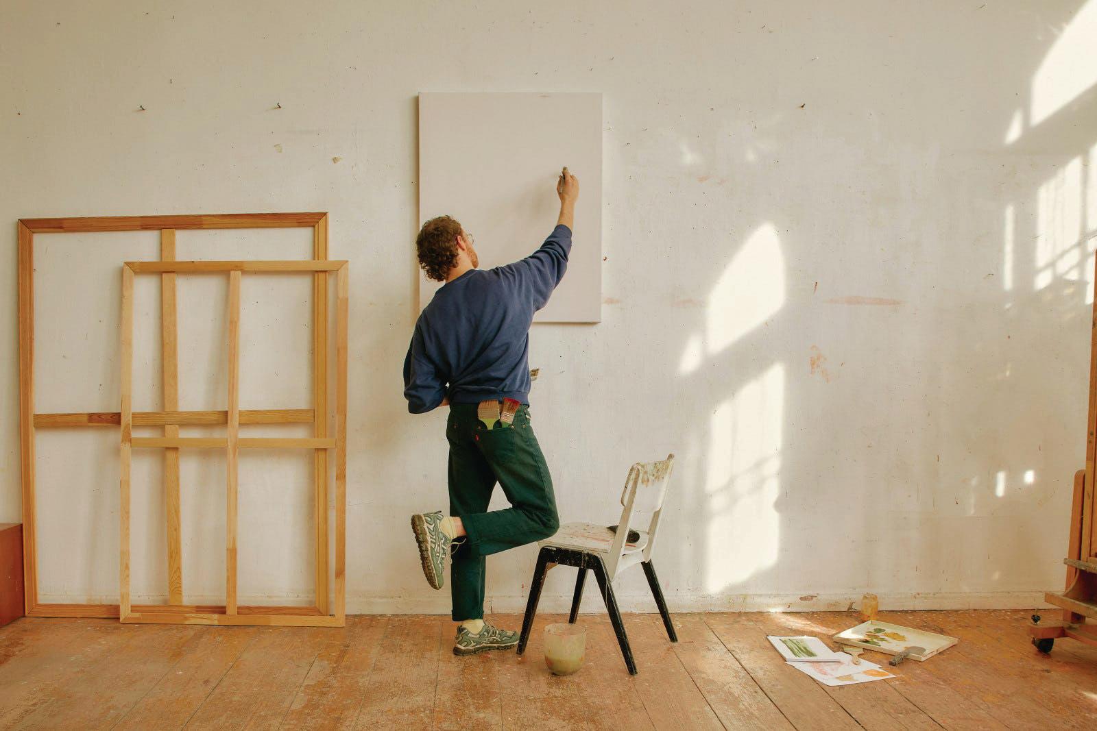
Imagery
DESCRIPTION
Gratitude’s imagery is nature and people-centered whenever. The photography feels human, warm, and inhabited (...even when abstract). Since our color palette is bold and energetic, we want to combine it with inviting imagery that is

What we’re looking for:
- Warmer tones (beiges, browns, earthy greens, warm grays, rays of light)

- Interesting angles
- Various crops (ex. you can mix portraits, super-close closeups and wider landscapes on the same page)

- Earnest editorial point of view
- Added details to feel beyond ‘stock imagery’

What we’re staying from:
- Pictures of landscapes from above

- Forced poses that look ‘frozen in time’
- Overly stark and detailed photographic style
 Photo © Caroline Tompkins for Vogue
Photo © Cody James for The New York Times Magazine
Photo © Daniel Faró on Death to Stock
Photo © Daniel Faró on Death to Stock
Source Unknown
Photo © Caroline Tompkins for Vogue
Photo © Cody James for The New York Times Magazine
Photo © Daniel Faró on Death to Stock
Photo © Daniel Faró on Death to Stock
Source Unknown
13 Brand Style Guide — 2023
Photo © Folch Studio for Lacoste
Content Pillars
Nature & Ideas


Community Building
Contemplation

Expressive Fauna

A-ha moments
Mesmerizing World
Interesting Angles
Current Innovations
OUR CONTENT PILLARS
Here’s a series of playful themes to brainstorm imagery. In order to make sure our imagery reflects the wide diversity of our partners - and stand out from our peers - we want to select images that tell a story beyond simple “themes”.
Things in Motion


Organic Energy

Brand Guidelines Images for example only
14 Brand Style Guide — 2023
Imagery Examples


REF INDEX
These Gratitude-themed stock images are available to purchase royalty-free. The references are listed below for easy access:
1. Getty # 1295852543
2. Getty # 1373383798
3. Getty # 1382487458
4. Getty # 1306713348


5. Getty # 1143746816
6. Getty # 163073485
7. Getty # 88306416
8. Getty # 1338877653
9. Adobe Stock # 1168788472


10. Getty # 1181301829
11. Getty #1298129896
12. Getty # 1297764135


13. Getty # 1290172543
14. Getty # 97559639
15. Getty # 1207562156
16. Getty # 1415387744
17. Getty # 643306836
18. DTS #Dinner_Party_032

19. Getty # 531269579
20. DTS #Daytripping_53


21. Getty #1328659820
22. DTS#Faro_Paint_12
1 12 6 17 7 18 2 8 19 20 21 22 9 10 13 14 15 11 3 4 5 16 15 Brand Style Guide — 2023
Framing
In order to add a layer of storytelling to the images, or ‘enhance’ images, we can use color and/or illustration to frame photos with a Gratitude spirit.


Here are some examples of framing variations mixing and matching effects.
You can:
- Round corners


- Add a solid background color
- Reframe image in a colorful square

- Overlay illustrations on photos
- Use the multi-color “stack” effect

16 Brand Style Guide — 2023
Brand In Use

These are a few examples of how to combine type, color and imagery on communication materials.

A Community Built for Action


We invest in technologies that improve educational outcomes.


Our Portfolio
We trailblaze the path not yet followed.

17 Brand Style Guide — 2023


In
LETTERHEAD & BUSINESS CARD 18 Brand Style Guide — 2023
Brand
Use


Brand In Use DECKS 19 Brand Style Guide — 2023
Inclusive Capital Fund
SUB BRAND
The Inclusive Capital Fund lives within the Gratitude Railroad visual identity, but sets itself apart with it’s primary use of Ignition Orange. This color is used more prominently with its tints for a monochromatic, yet energizing look. We use Aqua as the only accent color to intoduce contrast.
Inclusive Capital Fund
The Inclusive Capital Fund is a new $25M fund of funds strategy catalyzing capital to the top emerging impact funds led by women and women of color in venture and private equity.

We take an intersectional approach to analyzing the impact fund managers and founders have in leading mission-driven firms to advance social wellbeing and planetary health.


80% TINT #FF9D66 IGNITION ORANGE 60% TINT #FFBE99 40% TINT #FFCEB3 20% TINT #FFDECC LIGHT ORANGE A Diversified Portfolio of Early-Stage Private Fund Managers 1 2 3 Access to Co-investment Opportunities Outsized Financial & Impact Returns 20 Brand Style Guide — 2023
Championing innovative businesses


Thank You WITH
GRATITUDE
