







The cosmetics industry fuels ageism by pushing consumers to hide aging features (sunspots, wrinkles, gray hair, etc.) through product purchases and advertising, which makes youth the beauty standard in America. As a result, few products are available that address the actual discomforts that aged skin faces (fatigue, irritation, cracks, etc.) instead of those that target wrinkles.


That is when TRU comes in. We are a skincare brand that focuses on mature skin issues that are often neglected by the skincare industry. TRU is meant to cater to 55-year-olds and up who are experiencing irritation, excessive oil, and fatigued skin. We highlight individuality and authenticity in everything we do. Through our customizable products, through TRU Stories, and the representation that the brand gives to everyday people.
To provide resources that are available to heal common mature skin issues, rather than focusing on anti-aging the individual’s skin.


To change perspectives on what individuals could do for their mature skin.
TRU is...

Kind Inviting Casual Zealous Fun

TRU is not...
Angry Discrimitory
Serious Accusatory Boring
The TRU logo represents the brand’s core values and what we do. It is important to understand the foundations of the logo and its role in the brand.
The actual name, TRU, is from the four-letter word, True. Initially, True became True for You, to emphasize individuality. True became the three letter with the emphasized U instead, so it’s catchier. The U is emphasized by being hand-drawn to tie into naturalness. Like the brand, the TRU logo highlights individuality and humaness through the name and the U.
TRU has three lockups; the primary logo, the badge logo, and the TRU Stories Logo. The first two will be used the same ways in deliverables, while the TRU Stories will be reserved for the TRU Stories section of the website.




Clearspace and minimum sizing requirement ensure that the logo will be legible and clear. The height of the clearspace is used from the bar of the T. The minimum size is 0.5” wide on print and 36 px wide on screen.

Minimum Sizes:
Screen: 36 px | Paper: 0.5 in

Screen: 85 px | Paper: 1.05 in

Screen: 384 px | Paper: 4 in

Do not outline logo

Do not color individual letters in logo

Do not stretch logo

Do not add a blurry drop shadow on logo

Do not change typeface

Do not tilt logo

Do not use colors outside of TRU’s color palette

Do not put a stroke on logo

Do not stack or disassemble logo
This is TRU’s color palette. Vibrant colors are used to keep the brand and our mission feel more alive. Each color has its own purpose, as well as reason to be on the offical palette.
RED
Hex: #e44643
RGB: 228/70/67
CYMK: 5/88/77/0
Primary color for Irritant Pump Product
YELLOW
Hex: #fdb844
RGB: 253/184/68
CYMK: 0/31/83/0
BLUE
Hex: #5b8790
RGB: 91/135/144
CYMK: 68/36/38/4
Primary color for Hydrating Base Product WHITE
Hex: #fff7f2
RGB: 255/247/242
CYMK: 0/2/3/0
ORANGE
Hex: #d16b3d
RGB: 209/107/61
CYMK: 14/69/85/2
Primary color for Excessive Oil Pump Product
PINK
Hex: #d68aa6
RGB: 214/138/166
CYMK: 14/55/15/0
Primary color for Oil-Control Base Product
GREEN
Hex: #245945
RGB: 36/89/69
CYMK: 83/42/75/35
Secondary BLACK
Hex: #0f030f
RGB: 15/3/15
CYMK: 73/72/61/83
Primary color for Hydrating Base Product
Primary color for Oil-Control Base Product
Secondary
Example:
Even though it is encouraged to use all of the colors, there are pairings that clash together. Do not use any other combinations other than what is shown here.
In order for colors to go well together, the contrast ratio has to be at least 4:5:1 in WCAG standards.
Red can go with:
TRU’s primary typeface is Gopher. It is primarily used for the brand’s slogan, headers, and folios.
TRU’s secondary typeface is Soleil. It is primarily used as Header 3, body copy and captions.

Typeface: Gopher Bold
Leading: 120%
Kerning: Optical
Tracking: -8
Size: 90-100%
H2
Typeface: Gopher Regular
Leading: 120%
Kerning: Optical
Tracking: -8
Size: 60-80%
H3
Typeface: Soleil Bold
Leading: 120%
Kerning: Optical
Tracking: -8
Size: 30-50%
Typeface: Soleil Book
Leading: 120%
Kerning: Optical
Tracking: 0
Size: 20-30%
Typeface: Soleil Light/SemiBold
Leading: 120%
Kerning: Optical
Tracking: 0
Size: 5-10%
And this is Header 3.
This is the body copy, of course. The brand will implement body copy on TRU’s packaging, website, social media promo, ads, print advertisement, etc. The typeface will always be Soleil Book.
The Caption: Also Soleil, but light.
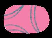


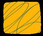


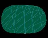

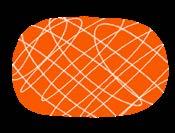

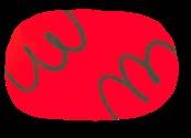
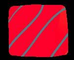
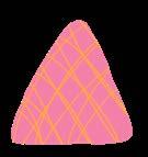
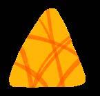


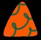
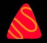



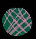






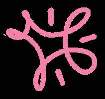
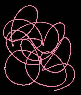






TRU’s visuals are split up between base shapes and flourishes. The base shapes are associated with the Base products, while the flourishes are associated with the Pump products.
The reason behind this is because the basic shapes are solid and foundational, as how the Base products are the foundation to the TRU’s skincare routine. The flourishes are the extra flair, tying to how the pumps are the differentiating factor between TRU and other skincare brands.
The imagery on the right is an example of how TRU’s products work with the shapes as well as actual function.





TRU’s visuals are a strong player in the packaging. Although the visuals are encouraged to use in non-packaging mediums (website, posters, ads, etc.), it is important not to use the shapes that would contradict the packaging system.



Do not add shapes that have low contrast or clash with the photo




Do not mix colors on photos



Do not mix flourishes/shapes of the same color


Do not put basic shapes on photos that have real people


What seperates TRU from other skincare brands is the representation we give older individuals and their individuality. So picking a photo is important.
When choosing a photo, it must:
• Show people older than 55
• Have the people show positive emotion
• Have the person be in their environment
• Have a non-complex background
Examples:



The purpose of a filter is to not only keep the photos consistent, but to create a poloroid look, like TRU took a “snapshot” of the person’s life. This filter is to be completed in photoshop.


Steps
1. Add Noise: 4 with Gaussian Distribution
2. Adjust Curves to a Slight ‘S’
3. Add a Photo Filter: 9% Magenta
4. Add a Gradient Map: Select the gradient that is purple, green, & orange (20% opacity)
5. Adjust Vibrancy
The majority of photos used by TRU will have flourish visuals. This is is for the photos to stay connected to the brand visually. The criteria shown on this page must be followed.
The photo and flourish must:
• Pass the WCAG standards of contrast
• Allign with TRU’s color pairings
• Cannot cover the subject
Acceptable

Passed the WCAG standards of contrast
Alligned with TRU’s color pairings (yellow on green)
Doesn’t cover the subject
Not Acceptable

Doesn’t pass the WCAG standards of contrast
Not alligned with TRU’s color pairings (green on green)
Covers the subject