GORILA BRANDINGS
Creative and Inspirational Guide


Creative and Inspirational Guide

Lorem ipsum dolor sit amet, consectetuer adipiscing elit, sed diam nonummy nibh euismod tincidunt ut laoreet dolore magna aliquam erat volutpat. Ut wisi enim ad min-
Lorem ipsum dolor sit amet, consectetuer adipiscing elit, sed diam nonummy nibh euismod tincidunt ut laoreet
dolore magna aliquam erat volutpat. Ut wisi enim ad minim veniam, quis nostrud exerci tation ullamcorper suscipit
lobortis nisl ut aliquip ex ea commodo consequat. Duis autem vel eum iriure dolor in hendrerit in vulputate velit esse molestie consequat, vel illum dolore eu feugiat nulla facilisis at vero eros et accumsan et iusto odio dignissim qui blandit praesent luptatum zzril delenit augue duis dolore te feugait nulla facilisi.
Lorem ipsum dolor sit amet, cons ectetuer adipiscing elit, sed diam nonummy nibh euismod tincidunt ut laoreet
dolore magna aliquam erat volutpat. Ut wisi enim ad minim veniam, quis nostrud exerci tation ullamcorper suscipit lobortis nisl ut aliquip ex ea commodo consequat.
Lorem ipsum dolor sit amet, consectetuer adipiscing elit, sed diam nonummy nibh euismod tincidunt ut laoreet
dolore magna aliquam erat volutpat. Ut wisi enim ad minim veniam, quis nostrud exerci tation ullamcorper suscipit
lobortis nisl ut aliquip ex ea commodo consequat. Duis autem vel eum iriure dolor in hendrerit in vulputate velit esse molestie consequat, vel illum dolore eu feugiat nulla facilisis at vero eros et accumsan et iusto odio dignissim qui blandit praesent luptatum zzril delenit augue duis dolore te feugait nulla facilisi.
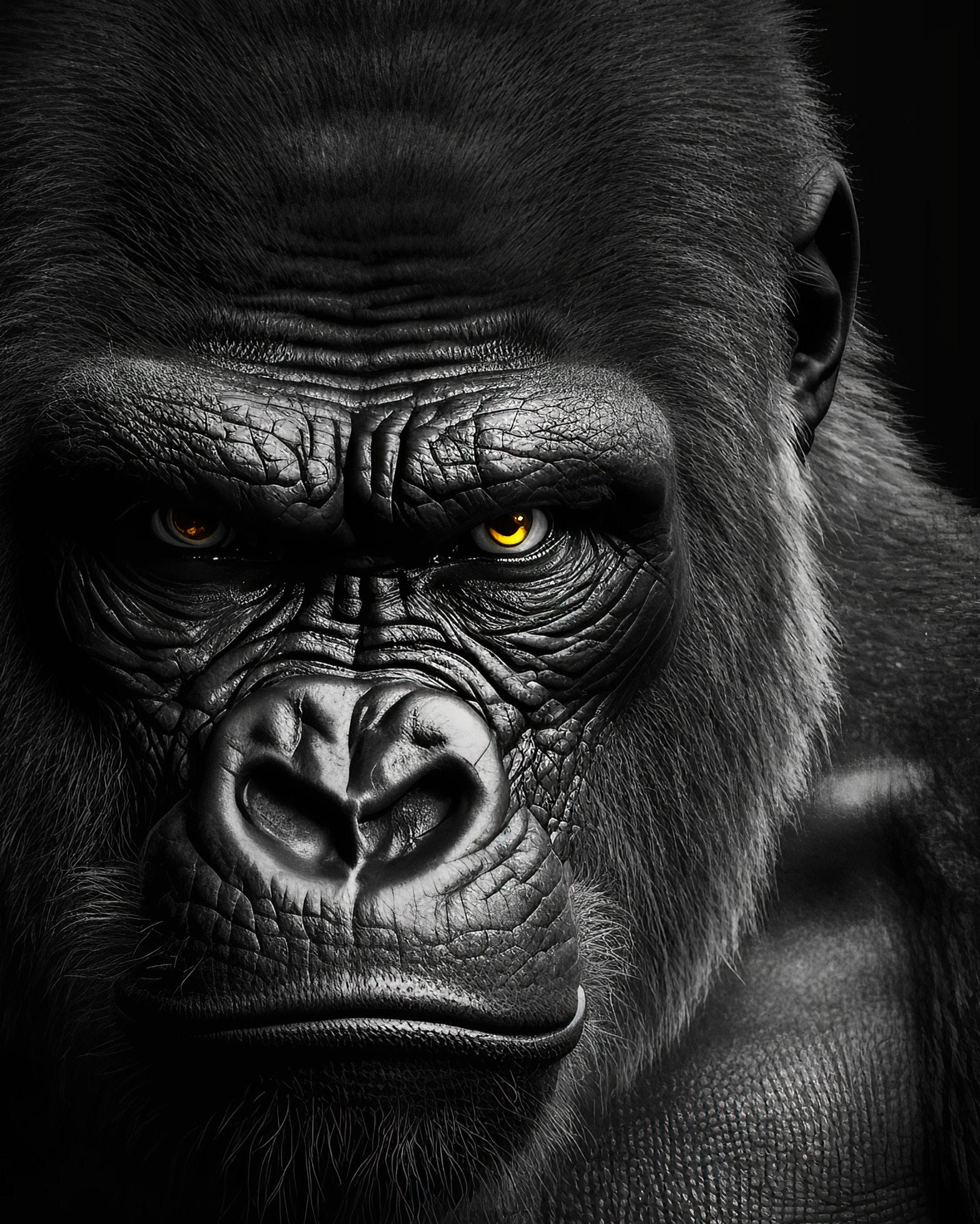
The logo of Cervejaria Nordhaus is a masterful blend of cultural symbolism and modern design, embodying the essence of the brand’s heritage and geographical roots. The prominent “N” and “H” letters are interwoven, symbolizing the unity and strength of the Nordhaus brand. This design is inspired by the iconic São Francisco River bridge, a vital connection that stands as a testament to resilience and progress, perfectly mirrored in the brand’s philosophy.
The logo also incorporates visual elements of the São Francisco River, with wave-like lines representing the river’s flow, further tying the brand to its regional identity. The sun, subtly embedded within the design, symbolizes the warmth and vibrancy of the region, infusing the logo with a sense of vitality and life. The use of Nordic-inspired typography adds a touch of tradition, aligning with Nordhaus’s commitment to time-honored brewing methods. This carefully crafted logo not only pays homage to the cultural and natural elements of its origin but also positions Nordhaus as a brand of quality and authenticity in the world of craft beer.
@cervejarianordhaus

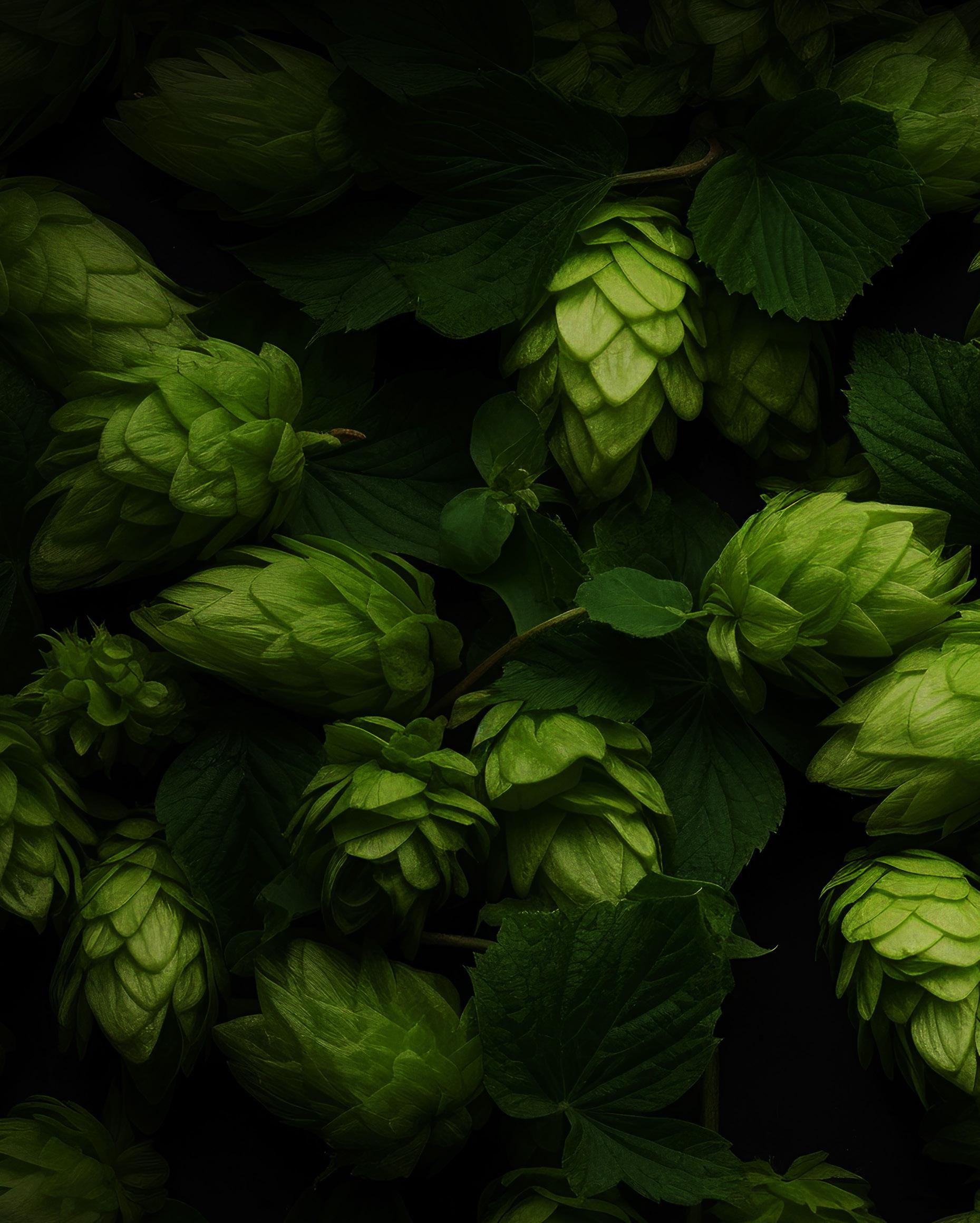
The logo of Huerto Tequila masterfully captures the essence of tradition and craftsmanship inherent in premium tequila production. Featuring a stylized agave plant at its center, the logo pays homage to the heart of tequila-making, symbolizing both heritage and authenticity. The use of bold, yet elegant typography complements the iconic imagery, creating a visual balance that conveys strength and sophistication.
The choice of colors—earthy tones combined with deep greens—evokes the fertile fields where the agave is grown, further reinforcing the brand’s connection to nature and the rich history of Mexican tequila. This logo not only stands as a mark of quality but also invites customers to experience the rich, vibrant culture that Huerto Tequila embodies.
@huertotequila