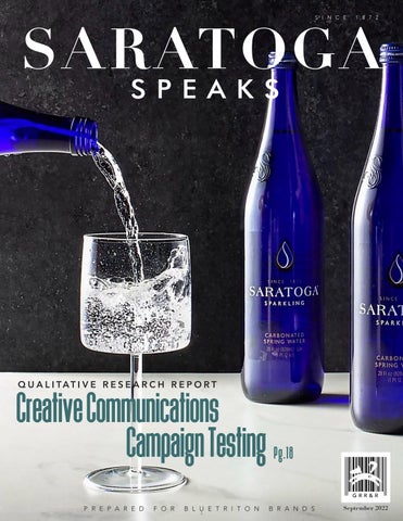


SARATOGA GRR&R September 2022 Creative Communications Campaign Testing Pg.18 SINCE 1872 QUALITATIVE RESEARCH REPORT PREPARED FOR BLUETRITON BRANDS1

[1989] 2
CONTENTS 3 04 Background & Objectives 05 Methodology & Recruiting 06 Quick Sips EXECUTIVE SUMMARY 08 Perspectives on Premium Spring Water 12 Across the Board A-HAs CONCEPT REVIEW 18 The Deets CONCEPT SPECIFIC FINDINGS 19 “HISTORY” 22 “LINES” 25 “MUSEUM” 28 “BRUSHES” 30 Celebrity Endorsement Review
BACKGROUND & OBJECTIVES

To explore the degree to which each concept delivered on the communication objectives, and to optimize the leading concepts for subsequent quantitative research, the team commissioned Good Run Research & Recreation (GRRR) to conduct qualitative research among premium water drinkers. In addition to concept evaluation, the team wanted to explore potential partnerships with celebrities and influencers to explore opportunities to generate interest and intrigue via well fitting partnerships
The following outlines findings from this research and considerations ahead. As with all qualitative research, these findings should be considered directional and are intended to guide and refine next steps in the creative process.
BlueTriton Brands is looking to make a big splash with their Saratoga spring water brand via a new campaign that celebrates the brand’s history in the premium water space. The team developed four concepts, each intended to communicate the following about Saratoga: Premium spring water
History/heritage (150 years)
Pursuing the art of water since 1872
SARATOGA
4
METHODOLOGY & RECRUITING
September 7 and 8, 2022, seating up to 7 respondents for each session. All sessions were professionally moderated by GRRR’s Stacy Thomas and conducted at The Rec Room, GRRR’s state of the art research facility in Richmond, VA.
All respondents were recruited to the following specs:
• Ages 30–60
• HHI of $75,000+
• Mix of genders, ethnicities, and household statuses
• Must have purchased premium brand(s) of still or sparkling water within the past 3 months and must drink at least 2–3 times a week
• Non rejectors of the Saratoga brand
NOTE: These focus groups were Phase 1 of a 2 phased methodology. Findings from this phase revealed two top performing concepts as well as some opportunities to optimize each, and those details are included in this report. Quantitative research (Phase 2) is scheduled to field in late September and will evaluate the top two concepts, optimized based on these findings. Phase 2 findings will be covered in a separate report.
SPOTTING OUR DOG
When you see this icon along with “GRRR Says” throughout this report, that’s your signal that the thought, comment, or idea that you’re about to read comes from us, and not directly from the respondents
Accurately reporting findings from respondents is our commitment as researchers, but as strategic thinkers, we feel it’s also our job to push beyond “just the facts” reporting These “GRRR Says” buttons are one of our signatures and are intended to provoke ideas, push thinking, and help consider things from another perspective.
SARATOGA
5
Quick Sips
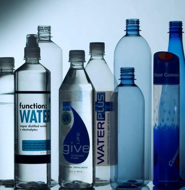
Bottle water selection varies by occasion. Bottled water drinkers described several favorite brands in their lineup, each of which was a “fit” for a specific occasion, based on bottle material, price point, and type (still v. sparkling, etc.).
Saratoga’s brand longevity and blue bottle pop as key differentiators. These two elements of Saratoga’s identity appealed to respondents as signifiers of quality: The brand’s history suggests quality through consistency, and the bottle suggests quality through attention to detail.
“History” best conveys the sense of brand history. This concept best positioned Saratoga as a heritage brand. However, the reference to “American history” was inflammatory to some, and some scene details were considered historically inaccurate.
“Lines” best positions Saratoga as premium. “Lines” elevated Saratoga to a premium water fitting for a special occasion and cashed in on the equity of the unique blue bottle. Some were turned off by the image likening the bottle’s curve to a woman’s body, wishing for a less "objectifying" comparison.
EXECUTIVE SUMMARY
6
“Museum” conveys history, but not necessarily Saratoga’s. Respondents understood “Museum” to be about bridging past and present, but they failed to take away a clear message about Saratoga. Some of the concept’s details struck respondents as silly, undermining the idea of Saratoga as a premium brand.
Padma Lakshmi is seen as the best fit for potential influencer, while Johnny Depp is considered a no go. Of the potential spokespeople shown, Padma Lakshmi was considered the most natural fit for Saratoga, for her sophistication and status as a trusted food authority. Johnny Depp, on the other hand, was considered a poor fit: his persona was considered ill suited to the water category in general, and recent scandals have tarnished his appeal.

“Brushes” isn’t considered a tonal brand fit. This concept’s high energy vibe was appealing, but respondents didn’t think that it was aligned with the brand’s sense of elegance, timelessness, and luxury.
7
Perspectives Premiumon


Spring Water 8
H2Know?
Premium perspectives and preferences vary.
While our respondents were all engaged in the premium water category, their knowledge about specific types ranged from basic awareness (there’s a difference between tap and bottled) to detailed understanding of nuances and benefits associated with each type of water.
“We typically drink alkaline water because my wife enjoys the health benefits.”
“Purified water could be from anywhere, think like city water, but it’s purified. Spring water is from a spring.”
Just as knowledge varied, so did drivers of their preference. Some were motivated by brand as a cue for quality or clout. Others were influenced by the package, including size, shape, material, and aesthetic. And others noted perceived benefits of their preferred type (taste, nutrition, quality) as decision drivers.
“The bottle that you’re holding gives off your vibe as a person.”
9
Faves Are Not One-Sip-Fits-All
Regardless of decision drivers, most respondents named several favorites. Rather than one go to, respondents select among favorites based on circumstance and what suits the occasion. Key considerations for bottled water “fit” included:

Packaging
Plastic was the durable choice for drinking on the go (in the car, stashed in a bag), while glass was (only) a fit for seated occasions.
“Glass is not transportable, so I wouldn’t necessarily carry it around or take it to the gym. But [I’d choose] a decorative glass bottle if I had a tablescape.”
Type

Still water was considered a fit across occasions, and used functionally (hydration, thirst) while sparkling was a more emotional play (enjoyment, something different) and described as a match for upscale occasions like fine dining.
“If it’s a party setting I might buy something that looks nicer appearance wise. You’re putting it out to mark it’s a special occasion, similar to the difference between still water and fizzy water.”

Price Point
Lower price point options were seen as an acceptable fit for everyday and functional consumption (grab and go, have on hand, workouts) but respondents said that special occasions justify a higher spend on a premium choice.
“There are moments in my life when I want a luxury brand…not every day, but there are moments for sure.”
“If I have a dinner party or something like that, [premium water] would definitely be on my list to purchase. Something on the higher end, not your everyday.”
Respondents matchmake occasions for perfect pairings.
10
11
Concept Review
12
13
14
Saratoga was a new (or vaguely familiar) brand for respondents, a few of whom recognized the bottle but not the name. Upon viewing the concepts, the most appealing (and differentiating) brand assets were:
Longevity as part of the brand’s story. Saratoga’s 150 year history appealed as a rare feat among brands that come and go. The brand's longevity also served as “proof” of a consistent, high quality product, increasing brand perception and trust.
“Businesses don’t stay around typically for 150 years, so they must be doing something right.”
“I’m wary of newer companies nowadays sometimes. I don’t want junk put in my water…and with an established brand, I’d think it’s good.”
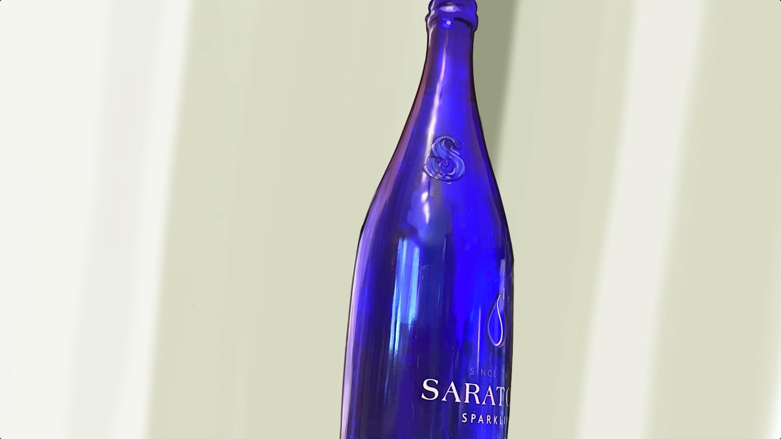
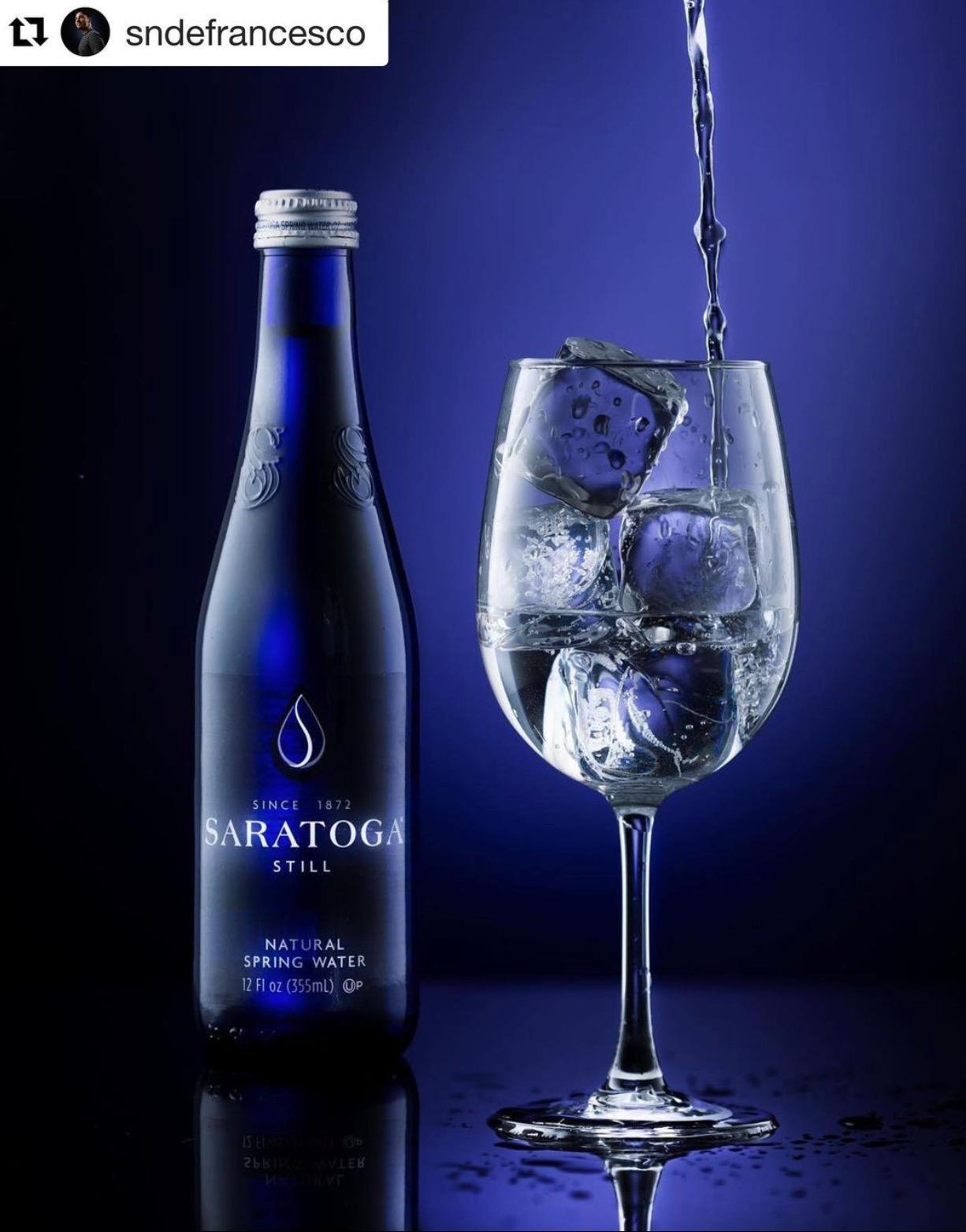
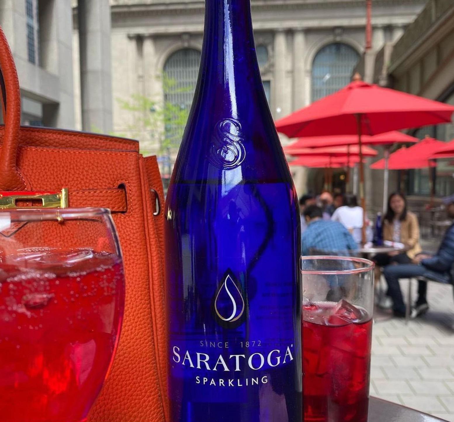
Go blue or go home. The bottle’s cobalt blue hue pulled double distinction duty: it stood out as visually unique from other brands in the category, and the glass format signified premium water.
“The bottle is elegant to me. It’s about elevating an experience.” “Glass makes it feel more expensive.”
Across all concepts, Saratoga’s cobalt blue bottle and brand longevity pop as key differentiators.
15
Across all concepts, the following lines of copy distracted, confused, or rang hollow for respondents:
“Pushing the boundaries of culture and experience”: This felt like an overstated claim for the brand to make. Respondents said that few brands have risen to the level of pushing cultural boundaries, and they’d need more proof before believing it to be true of Saratoga.
“If it’s true, how?” “How are you culturally significant water?”
“That seems like a bold claim for a water company to make. I don’t know what they’ve done.”
“Where the old rules don’t apply”: Respondents consistently flagged this line as confusing or ambiguous. They weren’t sure which “rules” were being referenced by the concepts: the water category’s rules? Rules about health and wellness? Societal norms? Additionally, the line felt contradictory to the concepts’ messages about history, heritage, and consistency. (This line was removed from the concepts after Day 1 due to persistent confusion.)
“What are the old rules? And why are they bad?”
“It’s a 150 year old story, but the old rules don’t apply? Both of those things can be good, but if you’re saying them so close together, they’re conflicting.”
“Beyond luxury”: In addition to confusing some, this line suggested an unattainable price point or an irrelevant lifestyle. Respondents described luxury items as an important piece of a special occasion, but “beyond” luxury felt outside of even what they’d consider for a splurge.
“What is beyond luxury?”
GRRR Says: From our POV, these are a classic case of show, don’t tell These words may have confused respondents, but we think that their key messages can be conveyed by other means: the visuals of these ads, the “luxurious” blue bottle, and beyond Saratoga has the potential to live these claims in a way that can resonate more authentically than words alone
Lofty copy moments consistently confuse more than entice.
16
While brand history and premium came through clearly, many missed the spring water message.
hen asked what key brand qualities the concepts conveyed; respondents played back:
150 year history
Premium/high-end
Timeless
Luxurious
Crafted American
Missing from their list? The description of Saratoga as spring water. While a few mentioned that they noticed that Saratoga is spring water, this came through largely from the bottle and not from concept driven communication.
GRRR Says: Since premium water drinkers put spring water in a separate and elevated category of water (that’s worth springing for!), boosting the spring water message a can’t miss strikes us as a high priority upgrade.
Concept Specific Findings
18
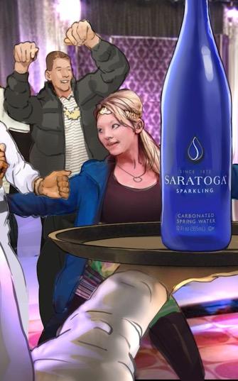
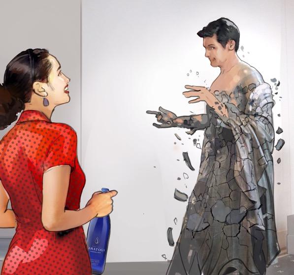
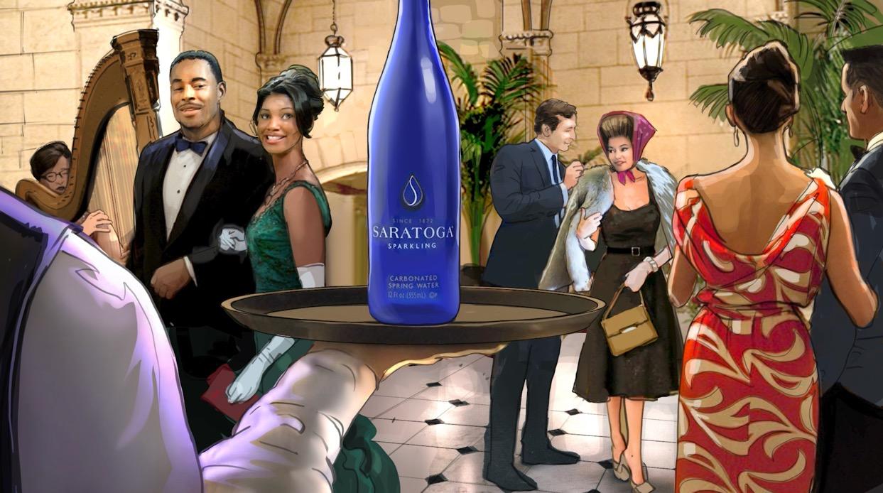
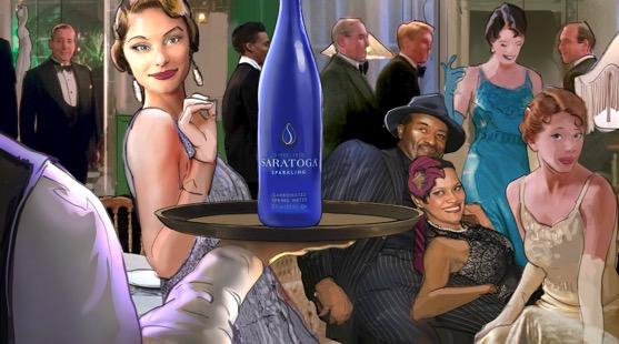
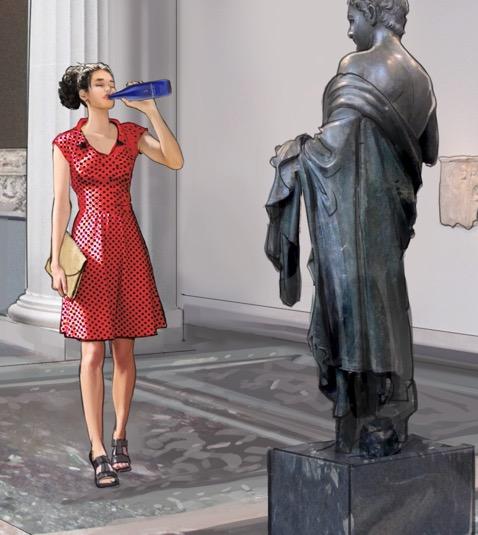
Where It Sparkles “History”
More than the other concepts, respondents cited Saratoga’s longevity as the key takeaway of this concept. They interpreted the concept’s emphasis on brand history to mean that Saratoga is a high quality product that “must be doing something right” to have stood the test of time. The result? Saratoga was described as a “classic” brand, even among those who weren’t familiar with it.
“It makes Saratoga feel classic, even though [I’ve] never heard of it.”
This concept also best conveyed that Saratoga is an American premium water brand, which they found unique among a sea of European premium waters.
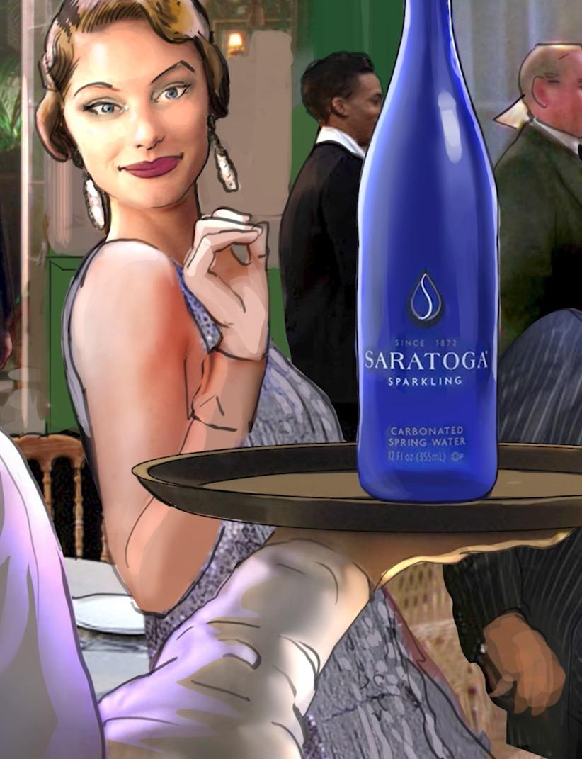
“I usually drink premium water that’s European. This makes me aware that I can drink American sparkling premium water, and that makes me feel good.”
“[This concept] increased my interest because I’ve seen Saratoga, but I didn’t realize it was from the U.S… so that was really good.”
Due to this perceived brand longevity, the line “where the old rules don’t apply” felt especially disjointed in this concept. Respondents felt tension between the image of a heritage, legacy brand and a message of norm breaking. “Carefully crafted for over 150 years” felt closer to the intended message, but was still seen as conflicting with the concept’s suggestion that Saratoga has remained consistent for 150 years.
“History” lends the strongest cred to Saratoga’s brand history and longevity.
19
Where It FIZZLES “History”
While viewers saw the brand’s long history as a strong card to play, references to “American history” were divisive. Respondents felt that the line “150 years of our history is 150 years of American history” tied Saratoga to negative aspects of America’s past and present. Furthermore, the “American history” reference felt especially inflammatory coupled with images of diverse people in scenes/roles that aren’t consistent with American history and the “old rules don’t apply” line. These details were seen as “pandering” at best, and outright misrepresentation of history at worst.
“American history is on fire right now, and not in a good way. It’s interesting that they want to bring that up, because it could turn people on either side away.”
“It feels a little bit like it’s pandering. You’ve got these very specific references to Black culture and Black history, and then you have a white woman in the end card taking the drink. That felt really jarring.”

The “premium” message got lost in this concept. Though it conveyed a sense of quality and consistency, it didn’t necessary suggest premium water to viewers. Instead, they perceived the scenes to mean that Saratoga is accessible to all, suitable across occasions from casual to fancy.
Concerns about historical context overshadow the “premium” message.
20
GRRR SAYS:
“History”
We see potential for “History” to raise Saratoga’s profile
as a unique choice in the premium water category, because it illustrates the brand’s longevity and teases a rich story. To take it from tease to page turner, consider the following polish points:
CONSIDERATIONS FOR OPTIMIZATION
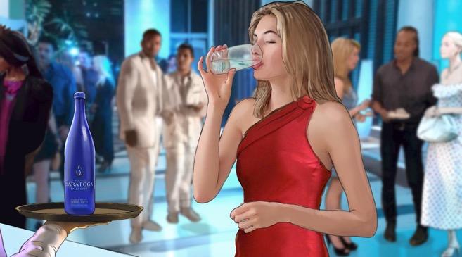
Remove explicit references to “American history”: This tension laden phrase triggers a negative narrative that distracts from the brand’s history.
Change up the ‘90s scene: Revise the 1990’s party scene to reflect broader 1990’s culture beyond hip hop, that more directly telegraphs “premium."
Reconsider the final image: Swap out the last image of the white woman in the red dress in favor of more diversity.
Revise “crafted over 150 years”: Consider changing this line to reflect consistency over time, rather than evolution over time.
21
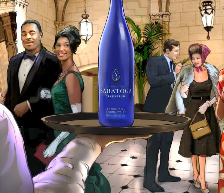
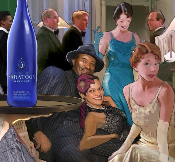
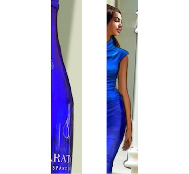
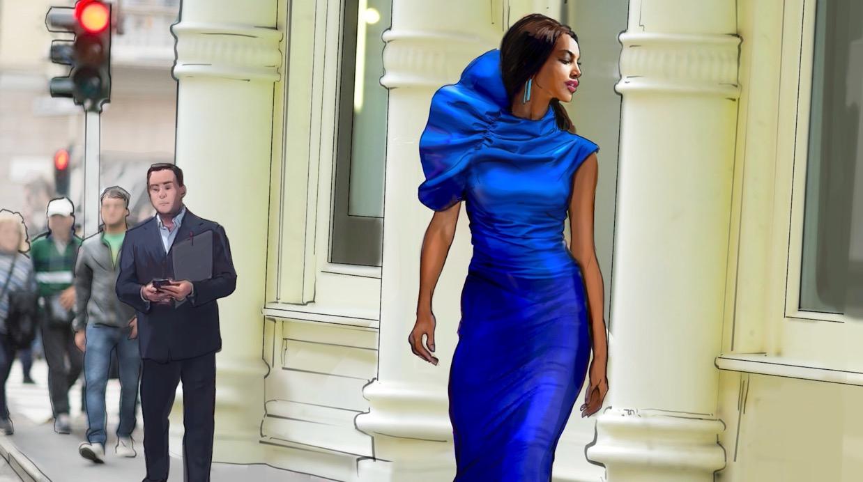
Where It Sparkles “Lines”
This concept best positioned Saratoga as a premium water. Respondents understood this concept to say that Saratoga is a special treat for special moments, not everyday consumption. The restaurant scene in particular signified to respondents that Saratoga is a fit for meals and occasions in which they’d want to impress or treat themselves and others, in line with a nice bottle of wine.
“[This is a fit for] any special occasion, celebrating a birthday, celebrating an anniversary. Really, any reason to get folks together.”
“I could imagine myself serving it to someone instead of wine.”
Respondents liked that the bottle one of Saratoga’s unique qualities was the star of the show here. The close up emphases on the bottle drove home the premium message by conveying a sense of “attention to detail” that respondents connected to luxury goods.
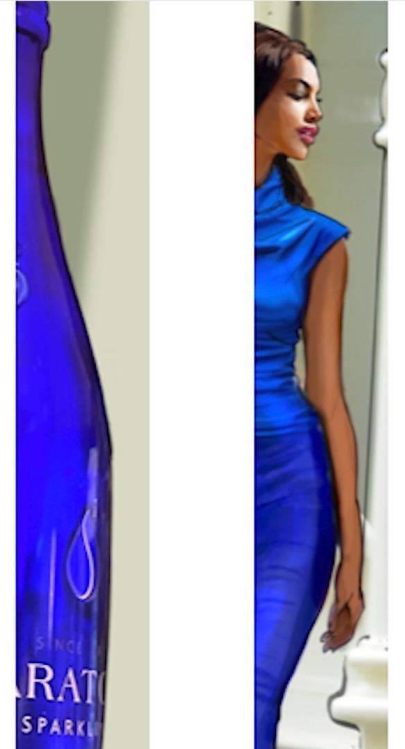
“It made me notice the details of the bottle. Makes me think they want to say that no one has taken that much time to craft the details of the bottle” “conveys that it’s top of the line water”
“I’m not a drinker, but it looks like a bottle of liquor, it’s part of the party and the atmosphere. It makes me feel like I fit in.”
“I’m a foodie. I love going out to nice dinners like that. So seeing the curve of the bottle relate to that is awesome.”
“Lines” best conveys premium and gives the unique bottle its due shine.
22
Where It FIZZLES “Lines”
While the woman in the blue dress conveyed a sense of “elegance” and high fashion, some respondents bristled at the shot likening the curve of the bottle to the curve of her hip. For some, this comparison felt objectifying and sexualized, and it immediately turned them off from the rest of the concept.
“Even though the woman was beautiful and the dress was beautiful, I’m tired of society oversexualizing women.”
“Why are you comparing women to a bottle?”
“It’s kind of a tired idea. The idea of a woman and her body looking like a bottle is so old fashioned.”
Though this particular scene was a miss, respondents generally understood the intent of the concept, and they could imagine it working with different imagery and comparisons. They wondered if, instead of the curve of a body, the bottle could be likened to another inanimate (but still stylish or fashionable) object alongside the plate.
“You could have, say, someone wearing a curved hat, or if there’s a chandelier…. you could focus on something like that.”
For some, “Lines” speaks to an irrelevant lifestyle.
To some, the imagery of “Lines” felt so high end that it was unattainable or unrelatable to them. Although all said that they appreciate a nice meal and luxurious touches, the imagery made some consider Saratoga to be completely outside their budget, even on a special occasion, and therefore not for them.
“If you're going to go out for the 7 course meal, thats the water you're going to have. It feels inaccessible.”
Even those who weren’t put off by the ultra premium scene wished for a depiction of how Saratoga might fit into their lives more often than just the occasional fine dining experience, when they’re unlikely to request a brand by name anyway. They wished for a more casual (but still elevated) setting a nice, at home meal, for example to help illustrate that Saratoga is a fit for more circumstances than just 5 star dining.
“It’s something I’d definitely serve at a dinner party”
“You can be luxurious at home on your porch, with a nice glass to pour you water into”
“If I'm going over somebody's house for dinner I could bring this to elevate the dinner.”
The woman’s dress comparison strikes respondents as an outdated trope.
23
“Lines” has potential to differentiate Saratoga in the category
by telling its premium story through its defining feature: the distinct bottle. We recommend the following optimizations to take “Lines” from good to great:
GRRR SAYS:
CONSIDERATIONS FOR OPTIMIZATION
Change the dress scene: Swap the comparison to a woman’s body with a comparison to another luxury clothing detail. A hat, button, or purse could have the same payoff as the original.
Match the plate to the bottle more closely: So that viewers can’t miss the comparison in the quick time they’ll need to comprehend it, make sure that the dinner plate closely resembles the bottle’s curve and cobalt blue hue.
Consider an at-home scene: Consider an at home scene to boost relevance, complete with details that still signal a special occasion.
“Lines”
24
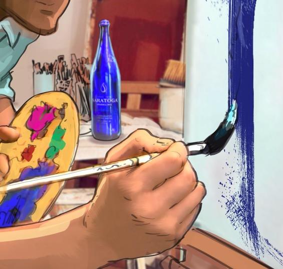
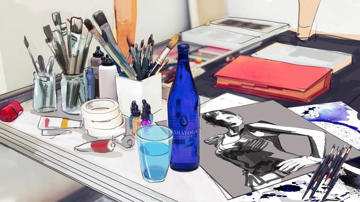
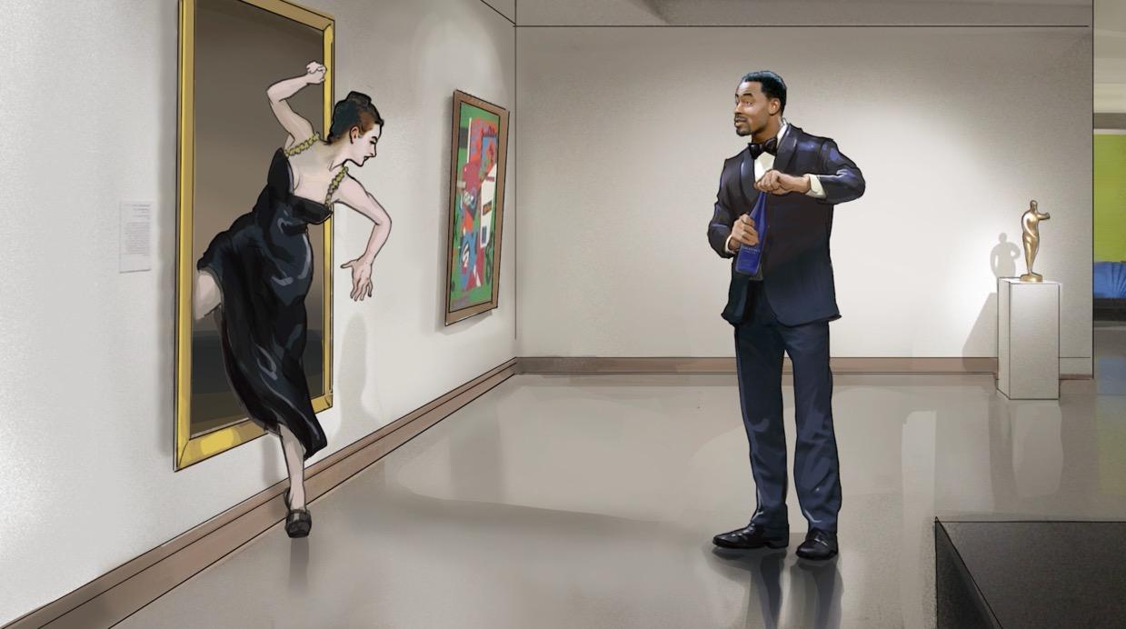
Where It SPARKLES “Museum”
Of all concepts, “Pursuing the art of water” felt the most complementary to “Museum.” Respondents liked that the tagline related to the action in the scene and suggested attention to detail (which conveyed a sense of luxury).
"I thought they were really playing with the idea of 'the art of water' and [positioning] their water as art."
The museum setting was well received, as it expanded respondents’ perceptions of Saratoga as a fit for on the go moments, in settings beyond just fine dining. A museum felt like a “classy” setting and therefore still in line with a premium message, but with a creative twist.
"I liked that [the water] was in different scenes. The man and woman are walking around the museum with their bottles of water, and then they're sitting down for a meal together. I liked that."
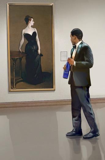
“The museum [setting] and experiencing art and different things, like paintings coming to life, is pretty enjoyable.”
“Museum” best conveys the concepts’ tagline and broadens Saratoga’s occasional reach.
25
Where It FIZZLES “Museum”
Respondents understood this concept to be about history, but in a general sense they didn’t necessarily connect the art history focus of the scene with the brand’s longevity or story. While they liked the idea of “connecting our past with the present,” it wasn’t clear to them how that conveys premium water.
Some thought the art displayed in the ad conflicted with the concept’s intended message: showing art from other cultures (i.e., the sculpture of the man in a toga, which they perceived to be “ancient” art) didn’t support the idea of a 150 year old American brand.
“This one didn't feel as American because there's a certain reference to Europeans. This one's more European than American.”
“We’re talking about a 150 year old brand but then something from ancient Greece comes to life?”
“I'd say I would skip the Roman statue in lieu of a more contemporary painting or something that's from 150 years ago, not ancient Romans.”
Some of the concept’s details tip the scales from “fun” to “absurd.”
Many described this concept as fun and whimsical in comparison to the others. However, some of the concept’s details felt silly or disconnected from the intended message:
Drinking from the large bottle: Several noted that the woman walking and drinking from the oversized bottle was unrealistic and unsophisticated, which undermined the sense of luxury they felt the concept was trying to communicate.
The crumbling sculpture: This was described as an “awkward” scene, and the idea of art crumbling to reveal something “new” felt at odds with the idea of timelessness and consistency.
“This whole concept just felt silly to me.”
“I did not like at all that they were drinking directly out of the bottle. It felt cheesy, which is the opposite of what they’re trying to say.”
“When they start drinking out of the giant bottles, that’s not luxury to me.”
“With the statue crumbling, that’s exactly the opposite of what you want in a museum. You don’t want something new. You want the original.”
It’s not clear how “Museum” relates to the brand.
26
If proceeding with “Museum”,
we recommend the following modifications to ensure that the concept ladders up to the desired key messages:
GRRR SAYS:
CONSIDERATIONS FOR OPTIMIZATION
Boost the brand story: Strengthen the connection between the museum scene and Saratoga’s history, to ensure the brand remains the focus.
Swap the statue: Change out the toga sculpture for a piece of art that feels culturally and historically relevant to Saratoga’s story.
Dial up (and clarify) the premium message: Clear “unclassy” elements like drinking from oversized bottles.
“Museum”
27
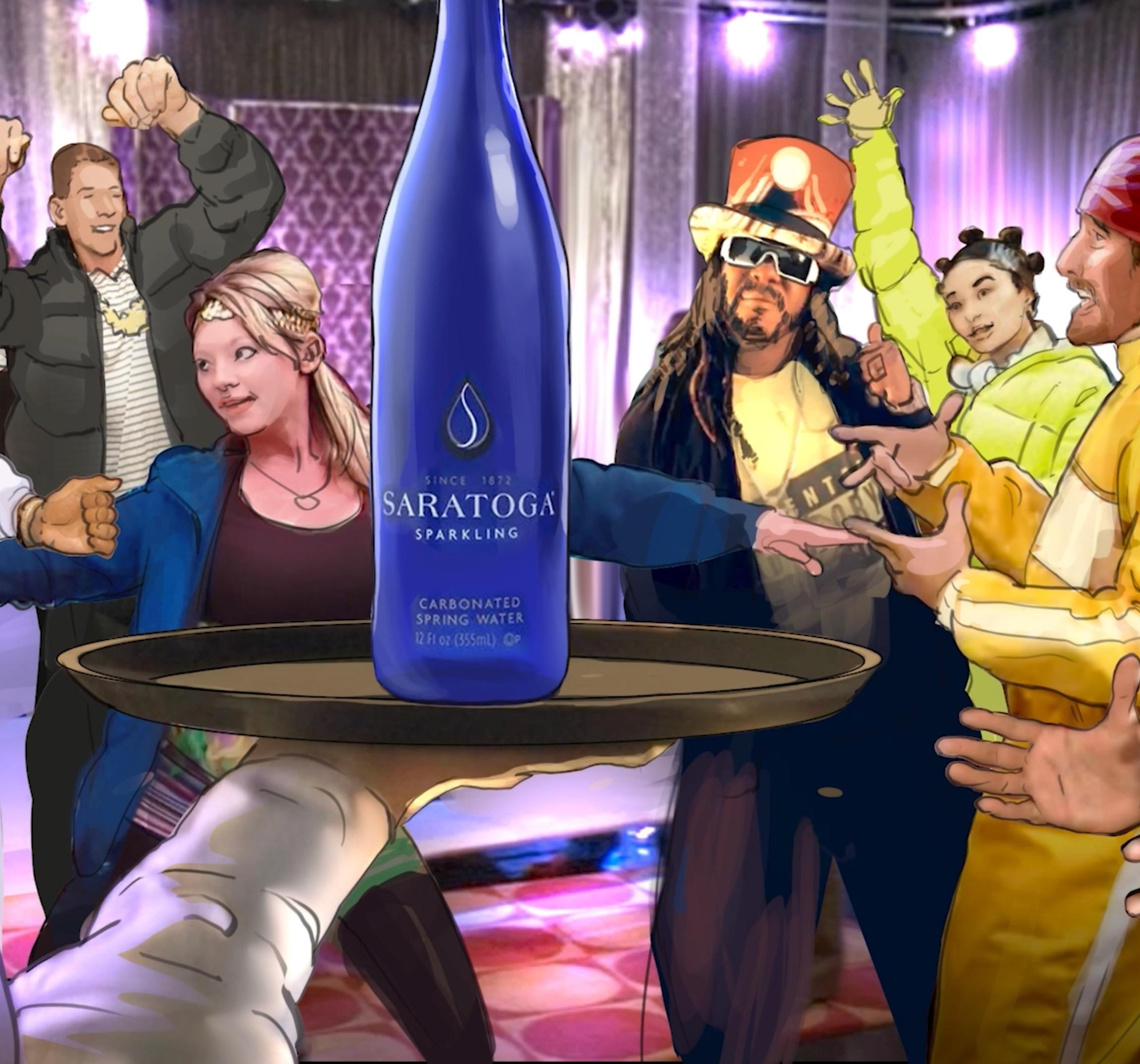
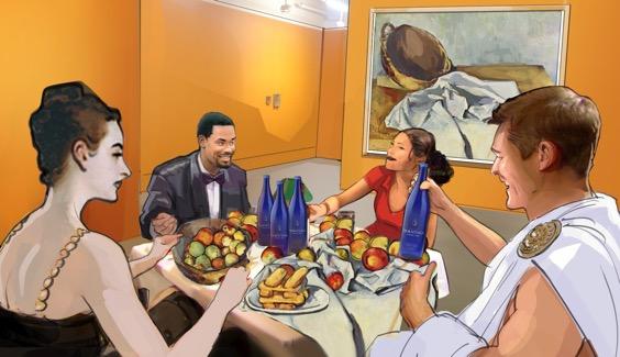
Where It SPARKLES “Brushes”
The “fun” vibe of this concept appealed to respondents. They sparked to the artists’ NYC loft setting, which felt inviting and “not stuffy.”
“It’s a great setting. Who wouldn’t want to have their own big loft with all that light coming in, just creating art?”
Of all 4 concepts, respondents felt that this concept best reflected the line “where the old rules don’t apply” though they still wondered exactly which rules were being referred to, they saw this concept as the best reflection of the concept of breaking old rules in general.
“Old rules not applying makes more sense in this one than the others.”
Some respondents appreciated the connection to the blue bottle, which felt like a unique and ownable piece of the brand identity.
"I really liked that they mentioned the purposeful design of the bottle and the color, since those are two of their best and most noticeable aspects."
Where It FIZZLES
The “edgy” tone of this concept was seen as a mismatch for Saratoga, especially against the “elegant” bottle and perceptions of the brand as premium. While they felt like this concept best conveyed “where the old rules don’t apply”, the concept of rule breaking felt at odds with the positioning of Saratoga as consistent and timeless.
“Rule breaking isn’t a great concept, especially since they’re touting history so heavily.”
“This felt like it wasn’t authentic [to the brand].” "Are you artistic, are you classy, or are you edgy? It's confusing."
While some appreciated the nod to the cobalt blue bottle, respondents thought that the execution was a miss. While "Lines" felt like a celebration of the blue bottle's elegance, the rough outline of the blue bottle in "Brushes" felt more unpolished and didn't accurately convey careful craftsmanship.
"I thought it was kind of corny...you zoom out and think, 'Oh, that guy just painted a bottle on a photo?' That's not really creating a whole lot."
GRRR Says: Instead of a full reco list for this one, we’ll keep it brief: We don’t recommend moving forward with the “Brushes” concept due to its perceived disconnect from the Saratoga brand. Chalk it up as an insightful illuminator of what feels off track for Saratoga, and validation of the relative strength of the other concepts a win!
“Brushes” wins points for fun energy and connection to the blue bottle.
“Brushes” doesn’t read as a tonal fit for the brand.
28
CELEBRITY
ENDORSMENT REVIEW
FASHIONABLE POTENTIAL: Blake Lively blends high style with approachability and could be seen as a match for Saratoga.
Respondents associated Blake Lively with high fashion and an easygoing personality. They felt her strong sense of style could be a fit with the Saratoga brand, while her “fun” personality would boost the brand’s sense of approachability and accessibility.
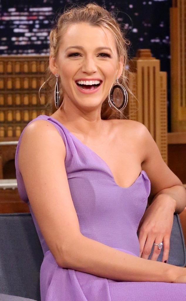
Respondents could, however, see her fitting just as well with other premium brands, especially Evian, which they perceive as a fit for her image as an “on the go” mom.
“She’s classy, but in a wholesome kind of way. It makes me feel like ‘Oh, I can drink that water.’”
“The elegance of the bottle is what I associate with Blake Lively.”
BOUGIE BULLSEYE: Padma Lakshmi conveys food authority and elegance and is considered the best fit for Saratoga.
Of all the potential endorsers presented, Padma Lakshmi registered as the best fit for the Saratoga brand. Respondents associated her with credibility in the food and wine industry, good taste, and “timeless” elegance, and they said that they said that they can “see” her in the ad concepts more clearly than any other endorser presented.
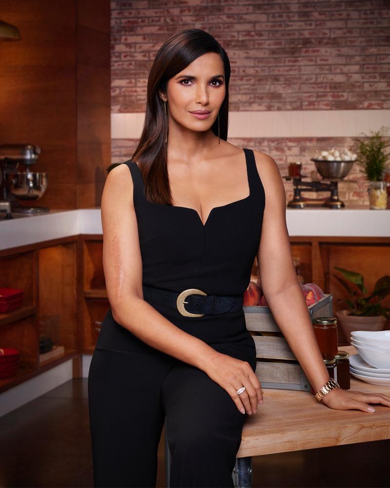
“She exudes elegance and good taste. She gives off a timeless, kind of classy vibe.”
“It could be more potentially genuine from her.”
“I could see her being a good fit for Saratoga.”
30
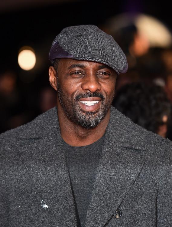
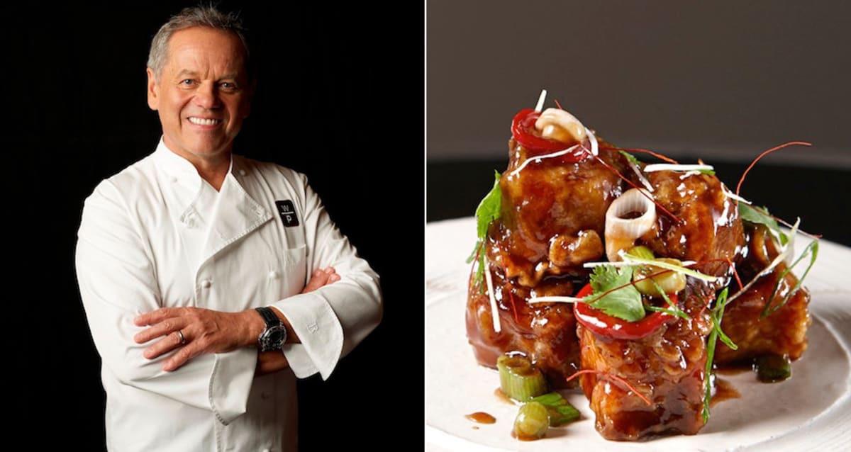
ACROSS THE POND: Wolfgang Puck, Daniel Craig, and Idris Elba suggest sophistication, but aren’t seen as a fit with Saratoga’s American identity.
These 3 personalities were considered “sophisticated” Puck for his connection with fine dining and restaurants, Daniel Craig for his association with James Bond, and Idris Elba for his personal style. For the luxury side of Saratoga’s positioning, all were considered good potential fits.

However, respondents saw them as poor matches for Saratoga’s tie ins to 150 years of American history and positioning as a heritage brand. For this side of Saratoga, they felt an American endorser would make more sense.
“[Idris Elba] isn’t American…if they’re pushing 150 years of our history, 150 years of American history, then they’re gonna have an [American] spokesperson.”
“[Wolfgang Puck] doesn’t scream ‘American history’ to me.”
“I don’t see how Daniel Craig fits with a U.S. brand… especially because they tout the history of it.”
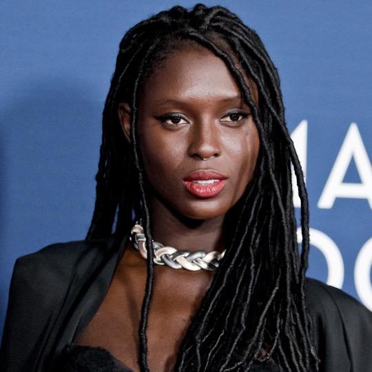
RELATIVE UNKNOWNS: Timothée Chalamet and Jodie Turner Smith fly under the radar, leaving their brand fit uncertain.
Due to limited familiarity, respondents found it difficult to determine Timothée Chalamet’s and Jodie Turner Smith's potential fit with Saratoga.
Those who were familiar with Chalamet identified him as a good match for a Gen Z crowd, which they found unlikely to be Saratoga’s target. He was associated with fashion and style, but in a more “eccentric” way than they perceived the Saratoga brand.
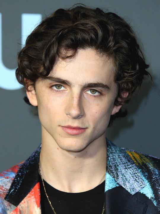
“If you’re going toward a younger demographic, maybe, but for [Saratoga] I don’t see it fitting.”
Jodie Turner Smith, meanwhile, was a complete unknown. No respondent was familiar with her, and therefore none were able to identify why she would or wouldn’t be a fit for the brand.
31
H2O NO GO: Johnny Depp is perceived as a good match for anything but water.
Respondents found Johnny Depp a mismatch for a water brand, noting that his persona and reputation make him a better fit for an alcohol brand. They couldn’t imagine him as a credible endorser of Saratoga.
Commentary around Depp revealed polarizing opinions: A few were fans of his work, noting his long and eclectic film career. However, most immediately associated him with bad press and scandal, noting that his recent, highly publicized lawsuit has tarnished their reputation of him.

Regardless of their opinion of him, all agreed that having him as a spokesperson wouldn’t be a wise move for any brand at this time, due to his association with domestic violence and general fatigue of hearing about him.
“If this brand used him as a [spokesperson], I would literally never, ever buy the water, because he’s an abuser.”
“He’s exhausting. I’m just tired of seeing him, tired of hearing about him.”
Based on respondent feedback to the endorser options, here are the key ingredients to an on brand influencer for Saratoga:
1. A credible perspective on food and bev: Padma Lakshmi and Wolfgang Puck’s association with fine food lends them an air of “authority” on premium water. A just right endorser is one whose opinion in this space feels credible to consumers.
2. Associated with luxury: An endorser who feels at home in the luxury space will help drive home the perception of Saratoga as premium water.
3. American: Due to the brand’s focus on American heritage and history, an endorser from another culture reads as a mismatch. If American history is going to remain central to the brand story, an endorser who helps convey this theme would be a complementary fit.
32 GRRR Says: The Spokesperson Sweet Spot

Visit Richmond It’s all GOOD here.

34 GoodRunResearch.com