Times change, we grow up, evolve and so does our company. We offer metal solutions for a safer and more sustainable future. As a result of this evolution, Gonvarri Industries is born. A new brand that shows what we want to be. A global leader. in our industry. A brand that makes us better known, valued and competitive, being a true reflection of the reality we live in. Because we are anticipating the future, keeping the essence of our origin.
Our brand
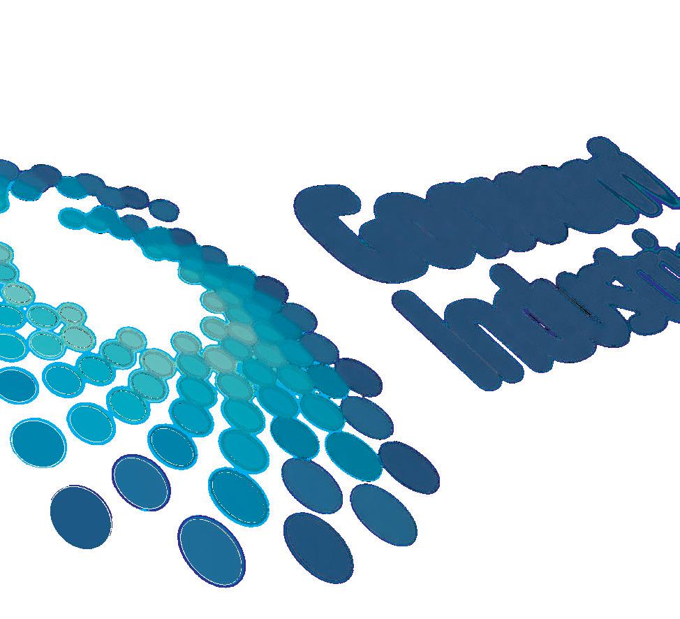
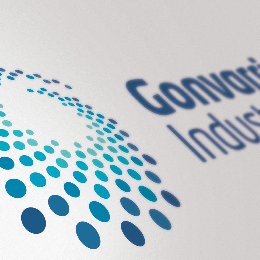
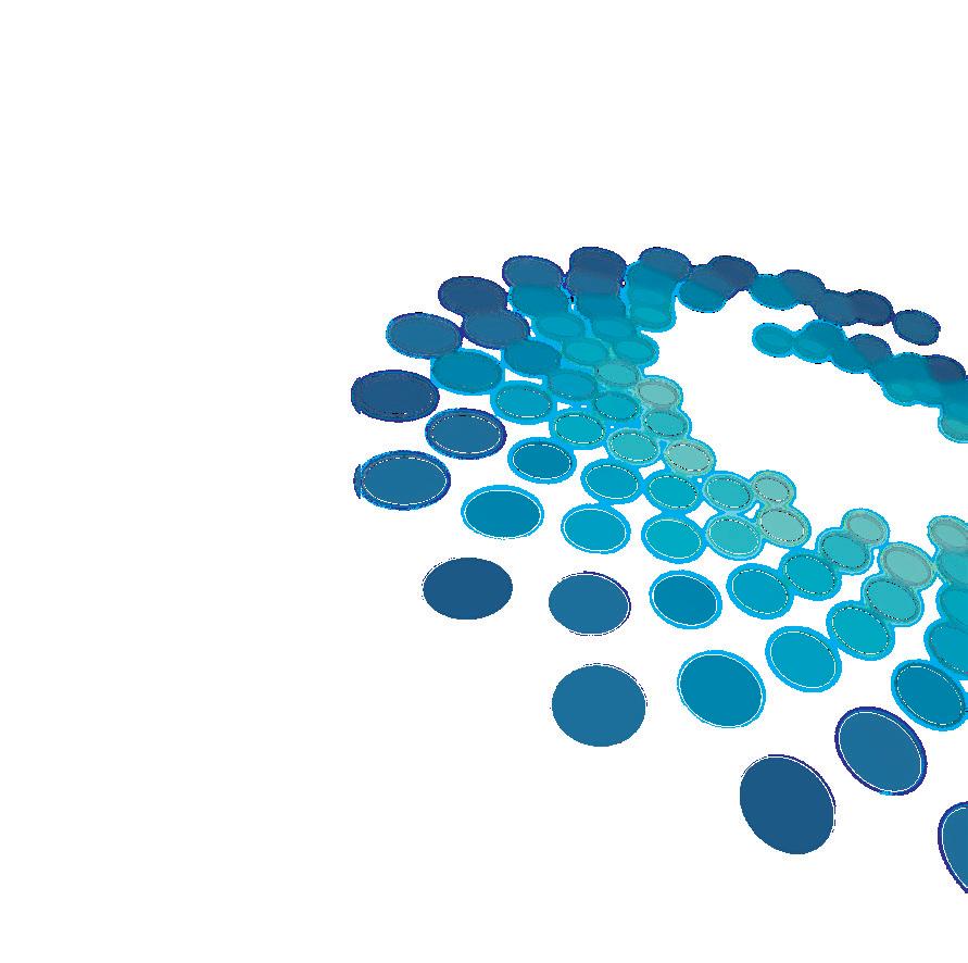
This is our brand, composed of a symbol and a logo. A brand balanced by the composition of its elements, respecting the symbol that provides dynamism and how this is compensated with the robustness of the logo, thus comprising a harmonious unit of simple proportions that enhance its construction.
Both the structure of the brand and its proportions are based on measurements that originate from the brand itself. In this regard, the capital “G” of Gonvarri serves as a basic measure to create the space between the symbol and the logo. On the other hand, both parts of the logo form a compact block to enable the overall balance.
Protection area
In order to ensure the optimum application of the brand, a space is defined to determine the minimum distance to avoid texts, graphic elements, symbols or logos trespass this area.
Branding over backgrounds
The brand’s legibility must always take precedence over the choice of the representation format. It must remain visible at any point, legible, identifiable and nonconflicting with other graphic elements.
Minimum sizes
To ensure the legibility of the brand, a minimum size of its representation is recommended for online and offline materials.
2 cm.
Versions
There are times in which it is not possible to use the brand with all its colors, we put forward various solutions.
Main version
Single ink version B/W monochromatic version
Wrong versions
Neither proportions and colors of the brand can ever be modified. To ensure the coherence of the applications, it is compulsory the usage of the source files of the brand.
Do not stretch it
Do not use shadows
Do not rotate it
Do not separate its elements
Do not add elements
Do not change the typography
Nombre
Colours
The Pantone blue 3025 is our main corporate color, supplemented with secondary colors that add life and reinforce the identity.
To enrich and stand out the communication, we can supplement blue with the enhancing color that fits best in its piece, bearing in mind that white is also important in our identity.
Main color Secondary colors
GONVARRI BLUE 1
GONVARRI BLUE 2
GONVARRI BLUE 3
GONVARRI BLUE 4
CMYK 88 / 52 / 21/ 3
RGB 0 / 106 / 150
HTML #026b96
GONVARRI BLUE 5
CMYK 82 / 36 / 17 / 0
RGB 8 / 133 / 174
HTML #0685ae
GONVARRI BLUE 6
Pantone 3025C
CMYK 93 / 65 / 25 / 9
RGB 0 / 83 / 127
HTML #005380
RAL 5009
CMYK 75 / 8 / 19 / 0
RGB 7 / 170 / 196
HTML #08abc4
It is essential the correct reproduction of the range of colors, for such purpose we define the values of each color according to different methods of reproductions.
CMYK 72 / 0 / 23 / 0
RGB 35 / 181 / 196
HTML #26b5c3
CMYK 77 / 16 / 15 / 0
RGB 0 / 160 / 195
HTML #08a0c3
GONVARRI BLUE 7
CMYK 59 / 0 / 26 / 0
RGB 108 / 194 / 194
HTML #6ec3c3
GONVARRI GREY
Pantone 424C
CMYK 0 / 0 / 10 / 70
RGB 112 / 112 / 107
HTML #70706b
RAL 7000
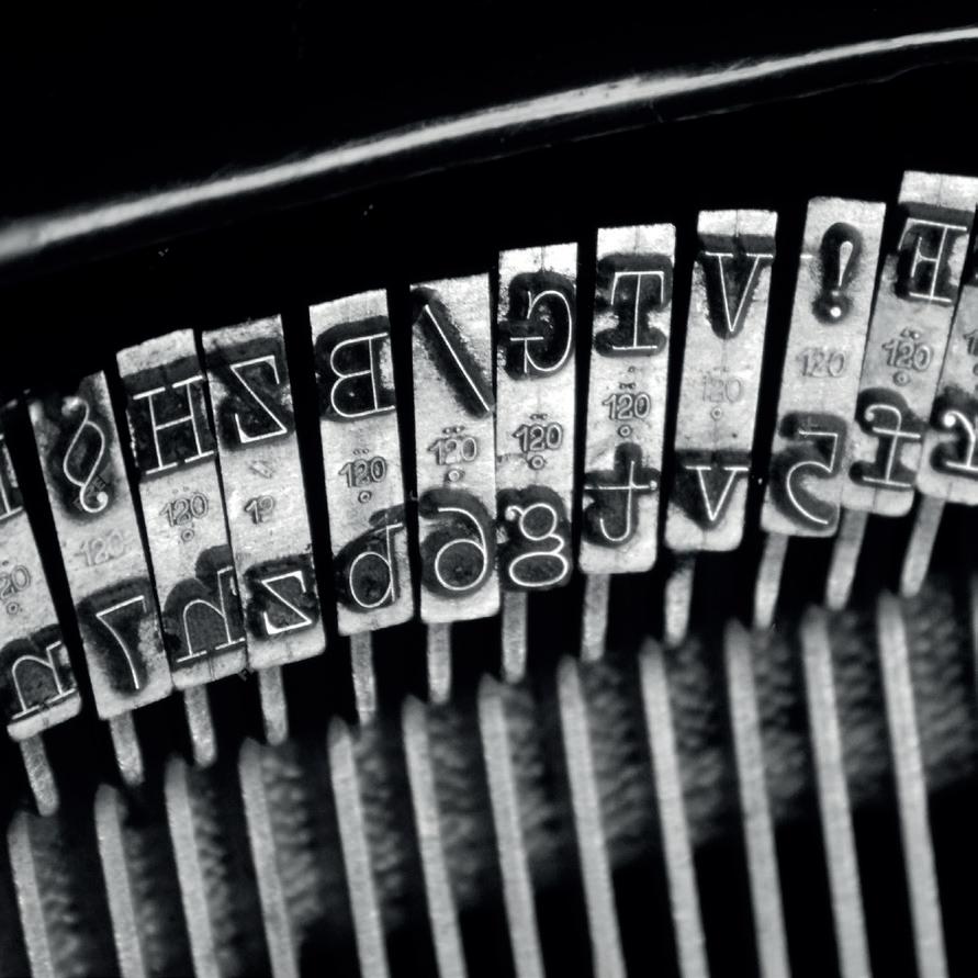
Fonts
A typography with personality is one of the essential tools for the creation of a solid and coherent corporate identity. Use it with rigor. Our typography is close, legible and with an industrial and technological nature. Therefore, it is a component that helps to transmit the company values.
A typography rich in versions and capable of adapting to any edition necessities has been chose aiming to meet different levels of communication.
Corporate typography
Sustainable growth is the best path towards the compliance of our mission
Neo Tech Light
abcdefghijklmnñopqrstvwxyz.!?&€0123456789
ABCDEFGHIJKLMNÑOPQRSTUVWXY
Neo Tech Regular
abcdefghijklmnñopqrstvwxyz.!?&€0123456789
ABCDEFGHIJKLMNÑOPQRSTUVWXY
Neo Tech Medium
abcdefghijklmnñopqrstvwxyz.!?&€0123456789
ABCDEFGHIJKLMNÑOPQRSTUVWXY
On digital media and internal communication, in which the corporate typography can’t be applied, the Arial specific typography has been defined. This typography can never be used in external communication and advertising.
Paper
Corporate stationery is one of the most important issues regarding brand identity, given that it is through which our company’s image is projected outwards and will help to identify us in determined cases. In many times, it is the first communication element of our company.
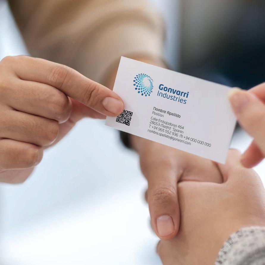
Business card
Size: 85 x 50 mm.
Color: 4/4
Paper type
Graphic cardboard + matt varnishing.
Grammage: 350 grs.
www.gonvarri.com
Nombre Apellido Position
Calle Embajadores 464 28053 Madrid · Spainin
T +34 965 552 936 M +34 000 000 000 nombre.apellido@gonvarri.com
Large Business Card
Paper type
Graphic cardboard + matt varnishing.
Grammage: 350 grs.
Gonvarri Industries
Size: A4
Estimado cliente:
Texto simulado, Nos at. Ut aliquis modolor ipis erit, sequisl ea conse exerosto commodigna facidunt nullamet nullut augue commy nit lorerilit, qui blaortie exer sum ilis nit voloboreet, conse dolor irilis euismodolor iriustrud molumsa ndreet aliscin iamcons equisl ullandrem nim quat. Onsenim il ut lam exero dio ex er in henit nonse modionullut nostrud et wiscil et praestio consed dolesed esequi tin ute commod te veliqui tem zzriuscip er suscill andrera essismo dolore do diat vel ut at lam zzrilis do do ea consectet lan vel ulput ex eu feu feuiscing eriuscipit ing et, core dio deliquatin utatis ad tate el et iril et nis nos nostrud te te ver adionsequat. Ut nonsed min ullan vendrerillut inim volenibh euguerostio dolore commodigna conumsandre faccumsan ent lummolor iriusci tat.
Nos at. Ut aliquis modolor ipis erit, sequisl ea conse exerosto commodigna facidunt nullamet nullut augue commy nit lorerilit, qui blaortie exer sum ilis nit voloboreet, conse dolor irilis euismodolor iriustrud molumsa ndreet aliscin iamcons equisl ullandrem nim quat. Onsenim il ut lam exero dio ex er in henit nonse modionullut nostrud et wiscil et praestio consed dolesed esequi tin ute commod te veliqui tem zzriuscip er suscill andrera essismo dolore do diat vel ut at lam zzrilis do do ea consectet lan vel ulput ex eu feu feuiscing eriuscipit ing et, core dio commodigna conumsandre faccumsan ent lummolor iriusci tat.
Nos at. Ut aliquis modolor ipis erit, sequisl ea conse exerosto commodigna lorerilit, qui blaortie exer sum ilis nit voloboreet, conse dolor irilis euismodolor iriustrud molumsa ndreet aliscin iamcons equisl ullandrem nim quat. Onsenim il ut lam exero dio ex er in henit nonse modionullut nostrud.
Reciba un cordial saludo
American Envelope
Size: 220 x 115 mm.
Color: Four colors
Bag-Envelope
Size: 229 x 324 mm.
Color: Four colors
A5 Envelope
Size: 220 x 150 mm.
Color: Four colors
Luptibus, quibus excerum quaecto eriatiandi sit que cus in rem eius quiatest es ut alitatus arum facerorio. Est, omnimai ostiis rem dolorro volore sequat este enda deles endae pro mos ut quias accum ex esequi ipsapera sectiat ecuptas moditia es exerrum ium aut maionse aut es dit rentior ibusam, volore vollupt.
Un saludo
Jose
A. Salmerón
Embajadores
Madrid · Spain
Luptibus, quibus excerum quaecto eriatiandi sit que cus in rem eius quiatest es ut alitatus arum facerorio. Est, omnimai ostiis rem dolorro volore sequat este enda deles endae pro mos ut quias accum ex esequi ipsapera sectiat ecuptas moditia es exerrum ium aut maionse aut es dit rentior ibusam, volore vollupt.
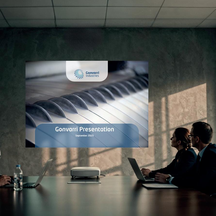
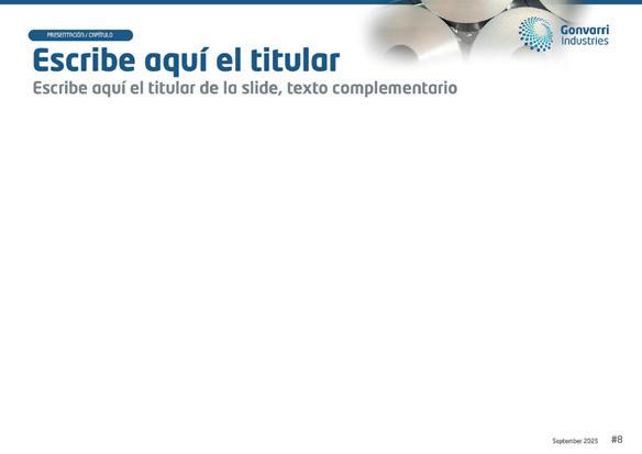
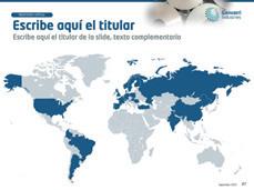
Corporate presentations are one of the most utilized resources. Therefore, it is determined a system capable of reflecting the identity using typographies, graphics, images, and so on. It is a flexible tool that enables the articulation of diverse contents and contemplates the various communications requirements of the company safeguarding the coherence among them.
Page margins and common elements
Examples
Margins: 25 mm.
Space for title and subtitle
Content, text, images, graphics, and so on
Page number, date and presentation title
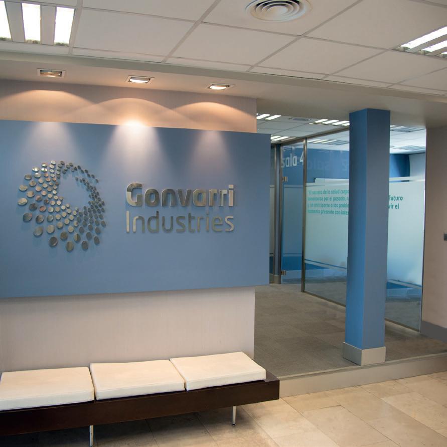
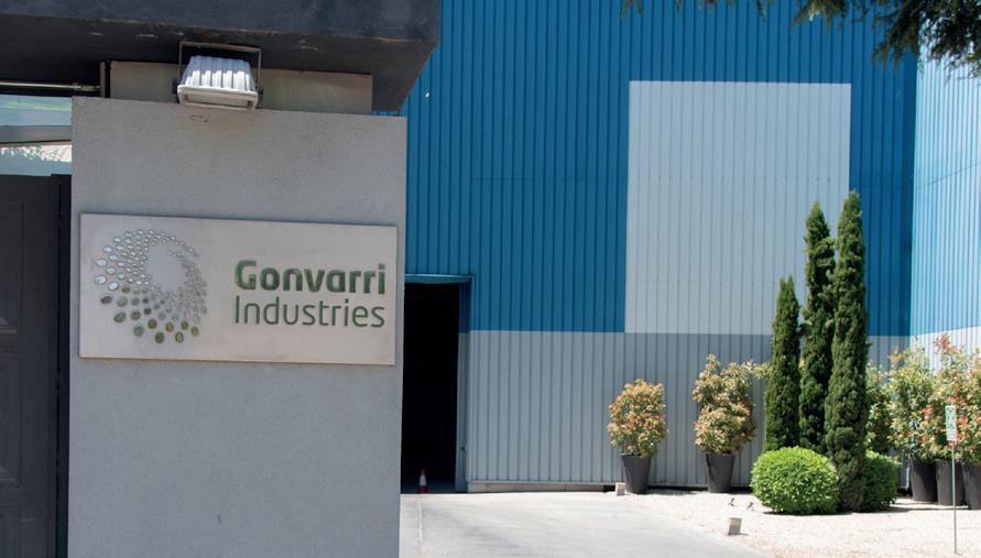
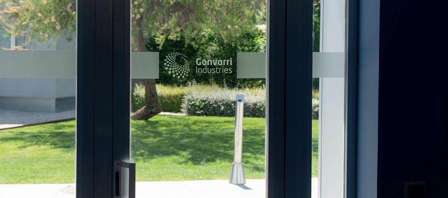
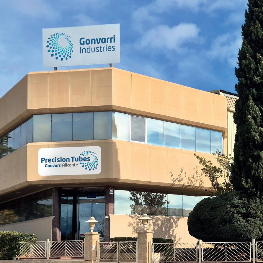
Signage
The spaces of the company, both external and internal, must also reflect the built brand identity.
Through the implementation of brands, as well as graphics and chromatics, it helps identify such spaces ownership.
Corporate brands
A clear brand architecture helps us to classify and establish order and coherence in the assets of the company. For such purpose, the implementation of “Gonvarri Industries” is established as endorsement and always horizontal to ease the brand reading as a whole. To achieve a clear identification with the main brand, all brands meet with the colors and typography of the main one, as well as the symbol, although the nature of each of them will determine the utilization of different parts of the symbol, provided that its recognition is respected.
Endorsement Gonvarri Industries
Corporate brands
Business line brands (examples)
Business brands (examples)
Project brands (examples)
In order to have access to the brand Final Artwork, as well as the templates of the various elements shown in this Guide, contact the Marketing Department: brand@gonvarri.com